Embed Size (px)
Citation preview

CSSSECRETS
LEA VEROU
Better solutions to everydayweb design problems
priscilacng

Lea Verou"(Lea being short for Michailia or Μιχαήλια)and I’m a computer scientist / web standards
geek / frontend developer / web designer /
speaker / author, originally from Greece."http://lea.verou.me/about/
"CSS has grown so much thatit’s practically impossible forany single person to hold all
of it in their brain."

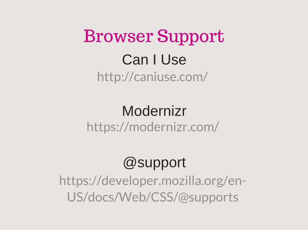
Browser SupportCan I Use
Modernizr
@support
http://caniuse.com/
https://modernizr.com/
https://developer.mozilla.org/en-US/docs/Web/CSS/@supports

CSS3, CSS4, and othermythical creatures
"Despite the popularity of the “CSS3”buzzword, there's actually
no specification defining such athing, like there was for CSS 2.1 or its
predecessors."
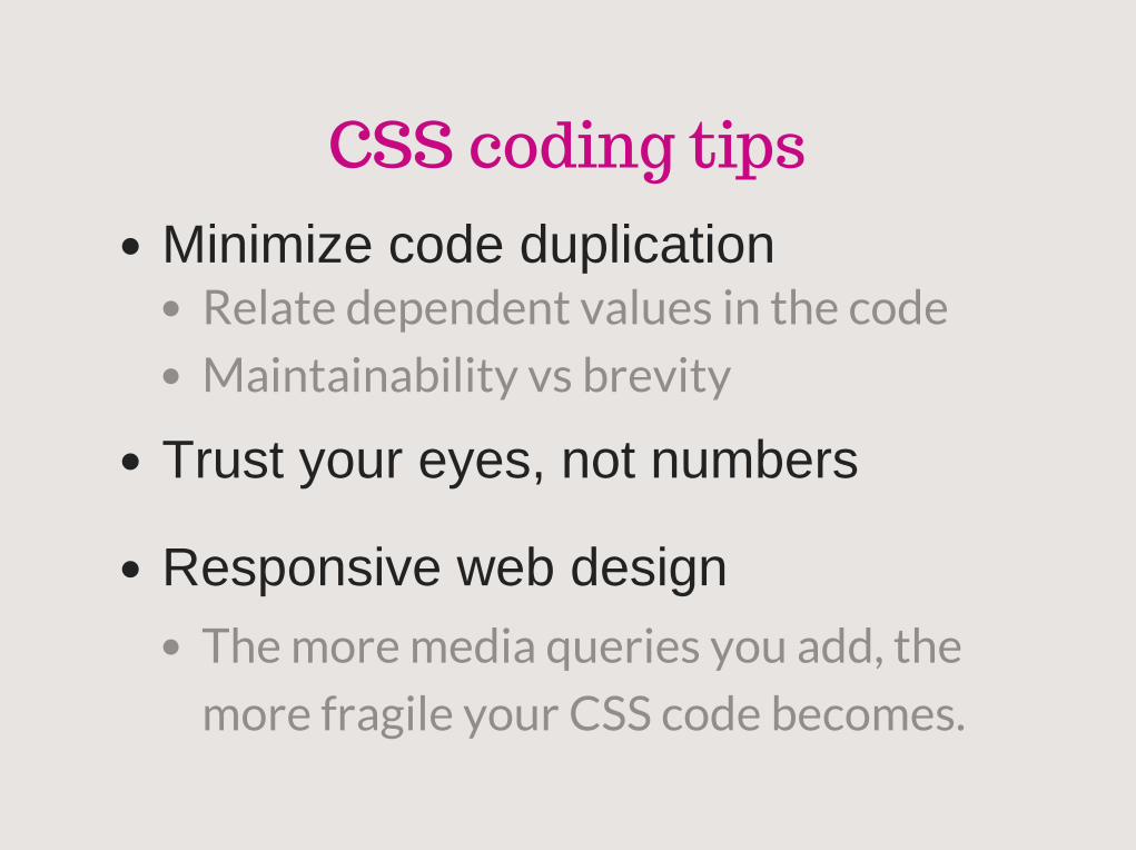
CSS coding tipsMinimize code duplication
Trust your eyes, not numbers
Responsive web design
Relate dependent values in the code
Maintainability vs brevity
The more media queries you add, the
more fragile your CSS code becomes.

Should I use a preprocessor?
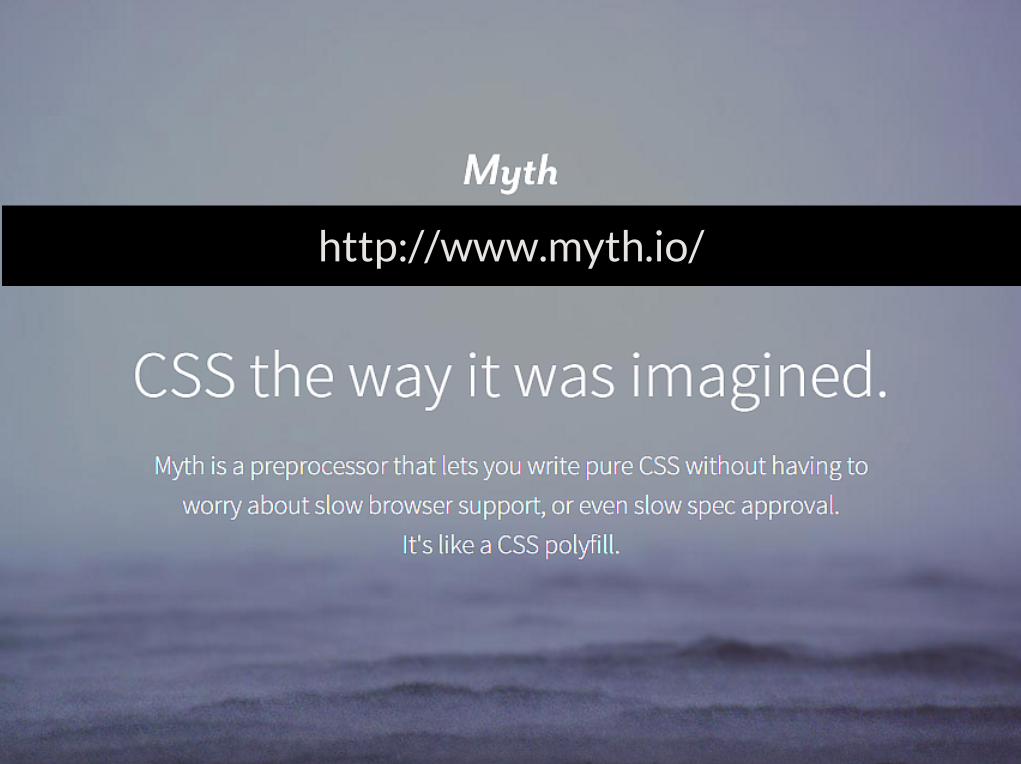
http://www.myth.io/
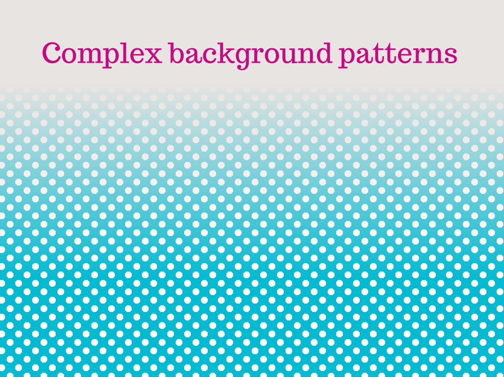
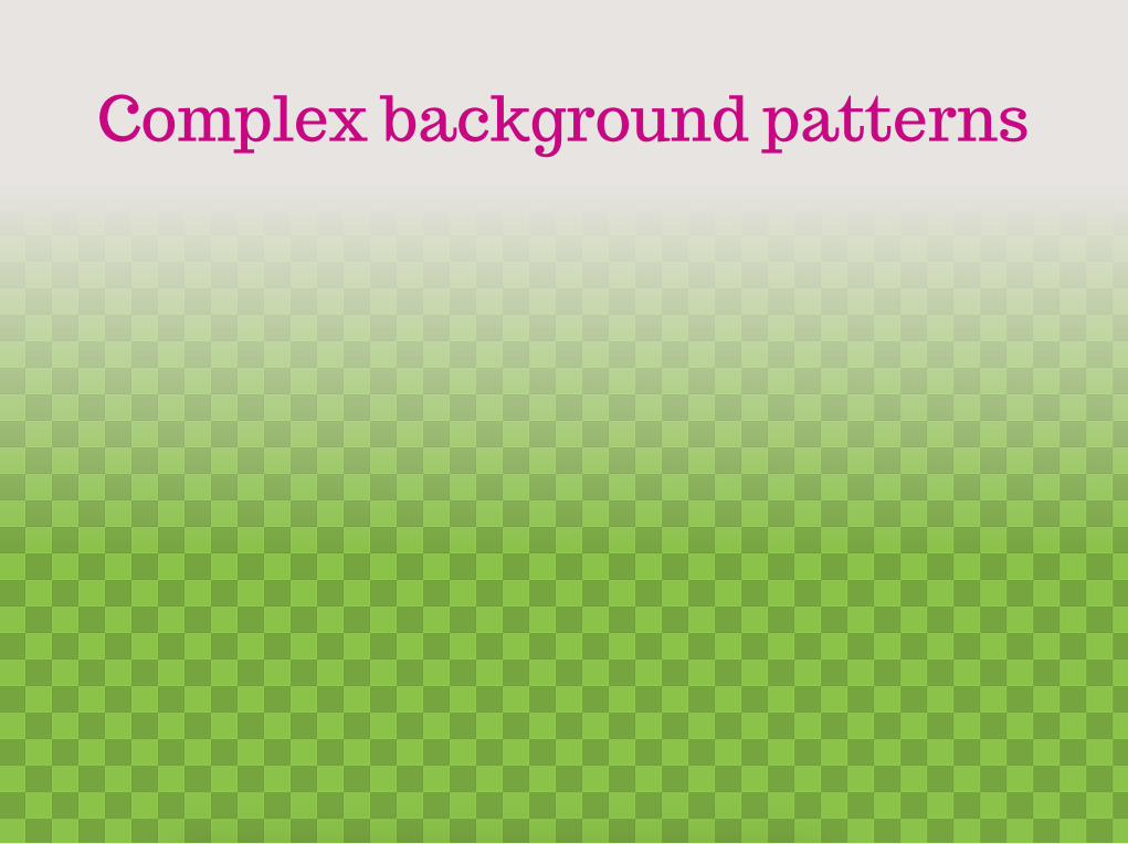
Complex background patterns
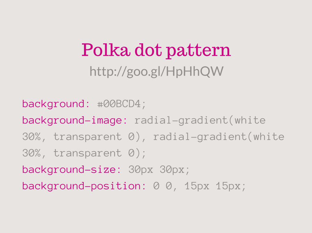
background: #00BCD4;
background-image: radial-gradient(white
30%, transparent 0), radial-gradient(white
30%, transparent 0);
background-size: 30px 30px;
background-position: 0 0, 15px 15px;
http://goo.gl/HpHhQW
Polka dot pattern
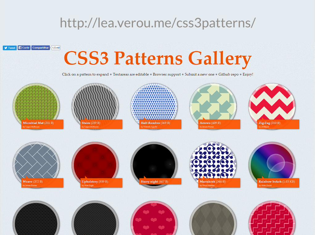
http://lea.verou.me/css3patterns/

But sometimes..."This is so much code that it might
actually be better to go the SVG route"
"But CSS gradients save usHTTP requests!"
"Modern browsers, we can embedthe SVG file in our stylesheet
as a data URI "
Complex background patterns
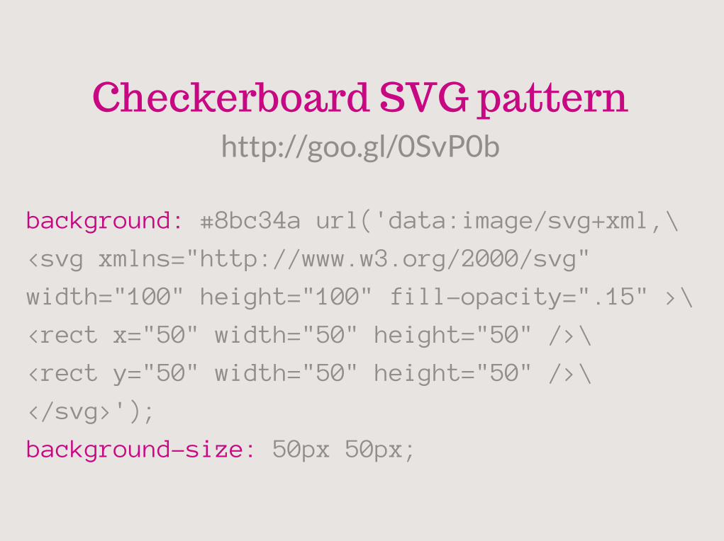
background: #8bc34a url('data:image/svg+xml,\
<svg xmlns="http://www.w3.org/2000/svg"
width="100" height="100" fill-opacity=".15" >\
<rect x="50" width="50" height="50" />\
<rect y="50" width="50" height="50" />\
</svg>');
background-size: 50px 50px;
http://goo.gl/0SvP0b
Checkerboard SVG pattern
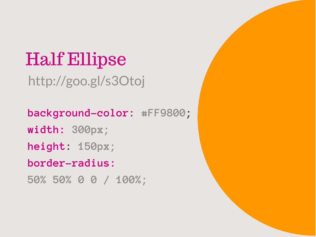
Half Ellipse
background-color: #FF9800;
width: 300px;
height: 150px;
border-radius:
50% 50% 0 0 / 100%;
http://goo.gl/s3Otoj

http://philbit.com/svgpatterns/
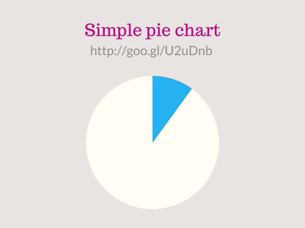
Simple pie charthttp://goo.gl/U2uDnb
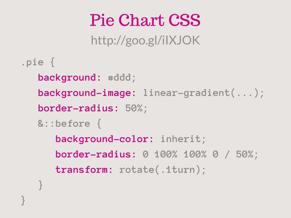
.pie {
background: #ddd;
background-image: linear-gradient(...);
border-radius: 50%;
&::before {
background-color: inherit;
border-radius: 0 100% 100% 0 / 50%;
transform: rotate(.1turn);
}
}
http://goo.gl/iIXJOK
Pie Chart CSS
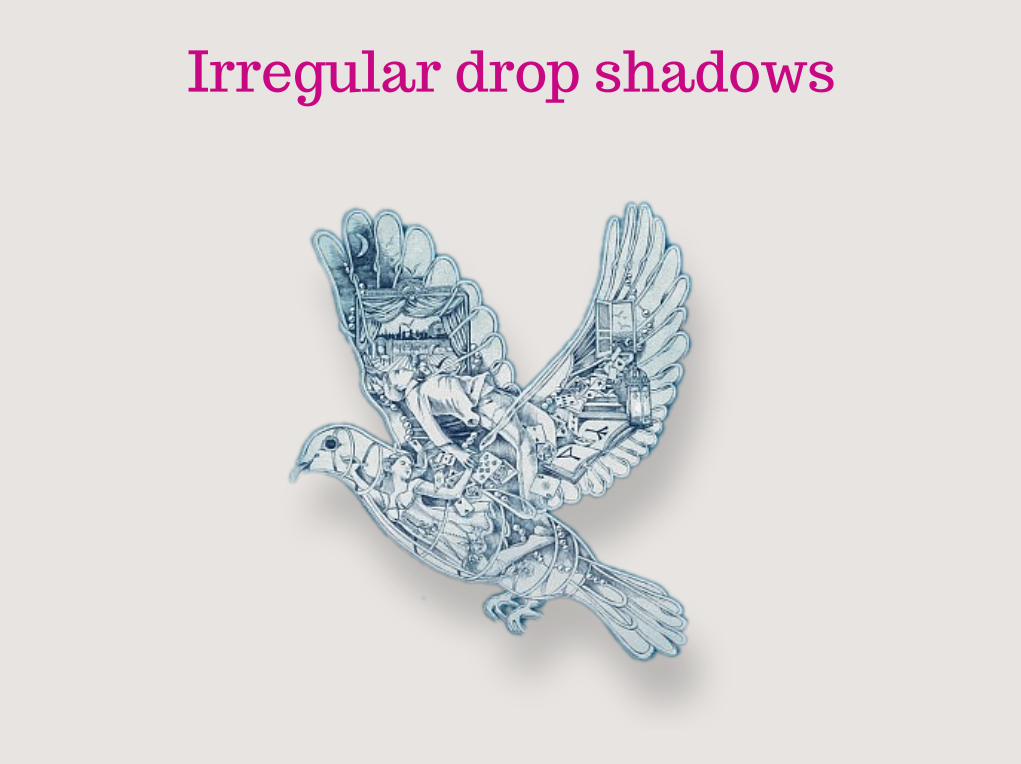
Irregular drop shadows
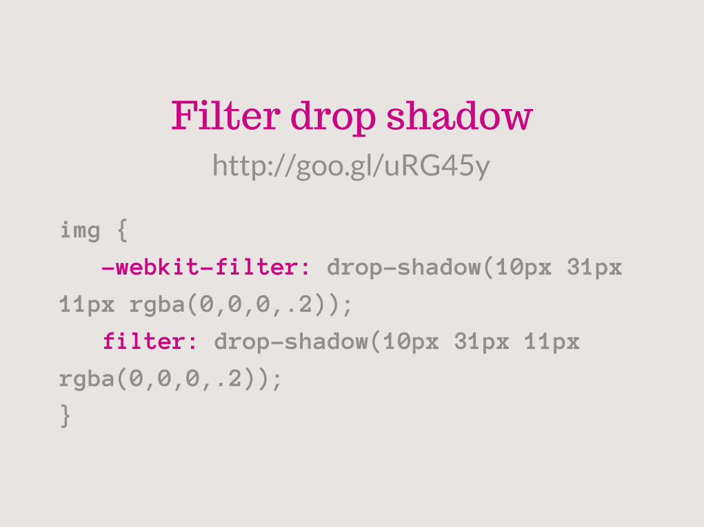
img {
-webkit-filter: drop-shadow(10px 31px
11px rgba(0,0,0,.2));
filter: drop-shadow(10px 31px 11px
rgba(0,0,0,.2));
}
Filter drop shadowhttp://goo.gl/uRG45y
Other secretshttp://lea.verou.me/more-css-secrets/
http://lea.verou.me/css3-secrets/

THANKSpriscilacng


![[HTML, Css] HTML & Css Learning](https://img.dokumen.tips/doc/110x75/55cf9813550346d0339570eb/html-css-html-css-learning.jpg)