Embed Size (px)
Citation preview
Horror Poster Analysis
By Lydia Gould

First Poster; Halloween
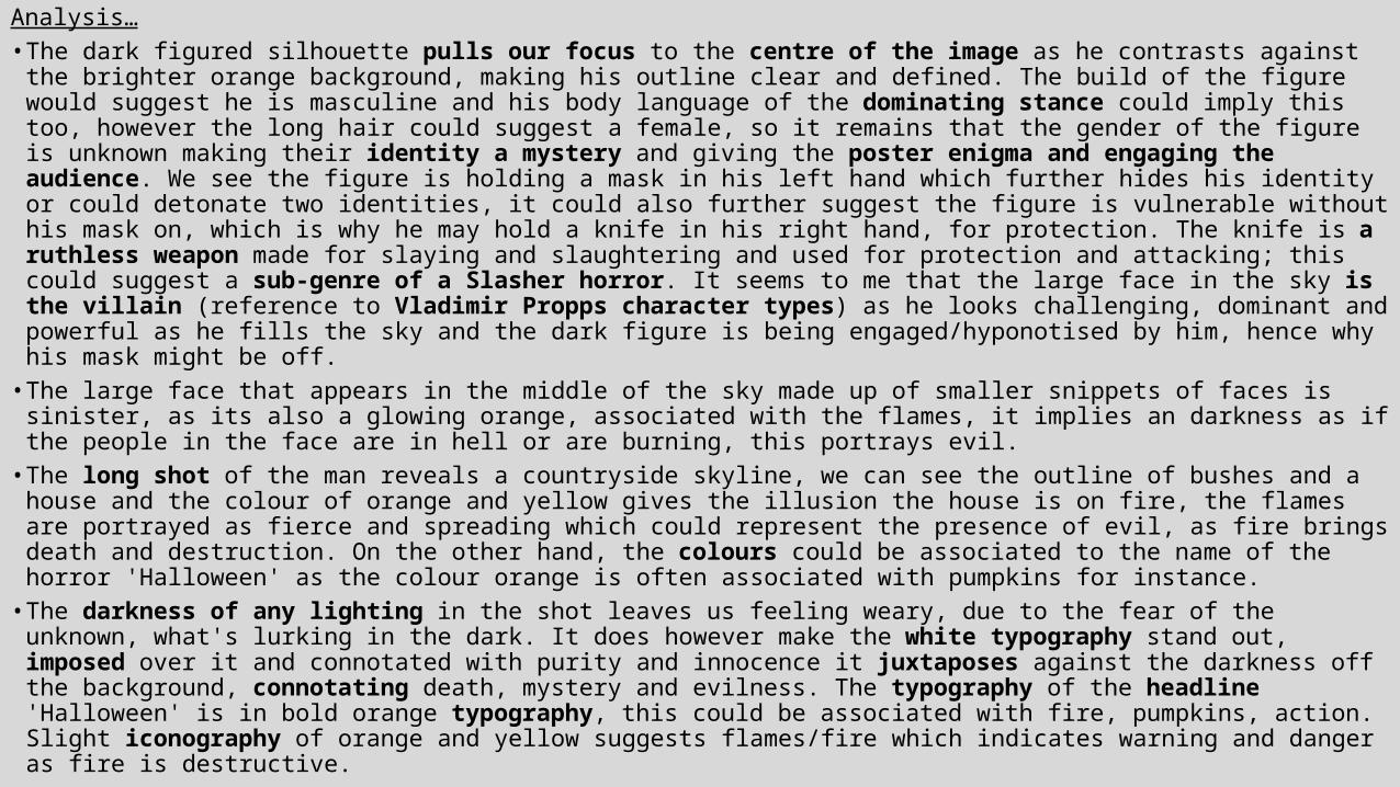
Analysis…• The dark figured silhouette pulls our focus to the centre of the image as he contrasts against the brighter orange
background, making his outline clear and defined. The build of the figure would suggest he is masculine and his body language of the dominating stance could imply this too, however the long hair could suggest a female, so it remains that the gender of the figure is unknown making their identity a mystery and giving the poster enigma and engaging the audience. We see the figure is holding a mask in his left hand which further hides his identity or could detonate two identities, it could also further suggest the figure is vulnerable without his mask on, which is why he may hold a knife in his right hand, for protection. The knife is a ruthless weapon made for slaying and slaughtering and used for protection and attacking; this could suggest a sub-genre of a Slasher horror. It seems to me that the large face in the sky is the villain (reference to Vladimir Propps character types) as he looks challenging, dominant and powerful as he fills the sky and the dark figure is being engaged/hyponotised by him, hence why his mask might be off.
• The large face that appears in the middle of the sky made up of smaller snippets of faces is sinister, as its also a glowing orange, associated with the flames, it implies an darkness as if the people in the face are in hell or are burning, this portrays evil.
• The long shot of the man reveals a countryside skyline, we can see the outline of bushes and a house and the colour of orange and yellow gives the illusion the house is on fire, the flames are portrayed as fierce and spreading which could represent the presence of evil, as fire brings death and destruction. On the other hand, the colours could be associated to the name of the horror 'Halloween' as the colour orange is often associated with pumpkins for instance.
• The darkness of any lighting in the shot leaves us feeling weary, due to the fear of the unknown, what's lurking in the dark. It does however make the white typography stand out, imposed over it and connotated with purity and innocence it juxtaposes against the darkness off the background, connotating death, mystery and evilness. The typography of the headline 'Halloween' is in bold orange typography, this could be associated with fire, pumpkins, action. Slight iconography of orange and yellow suggests flames/fire which indicates warning and danger as fire is destructive.
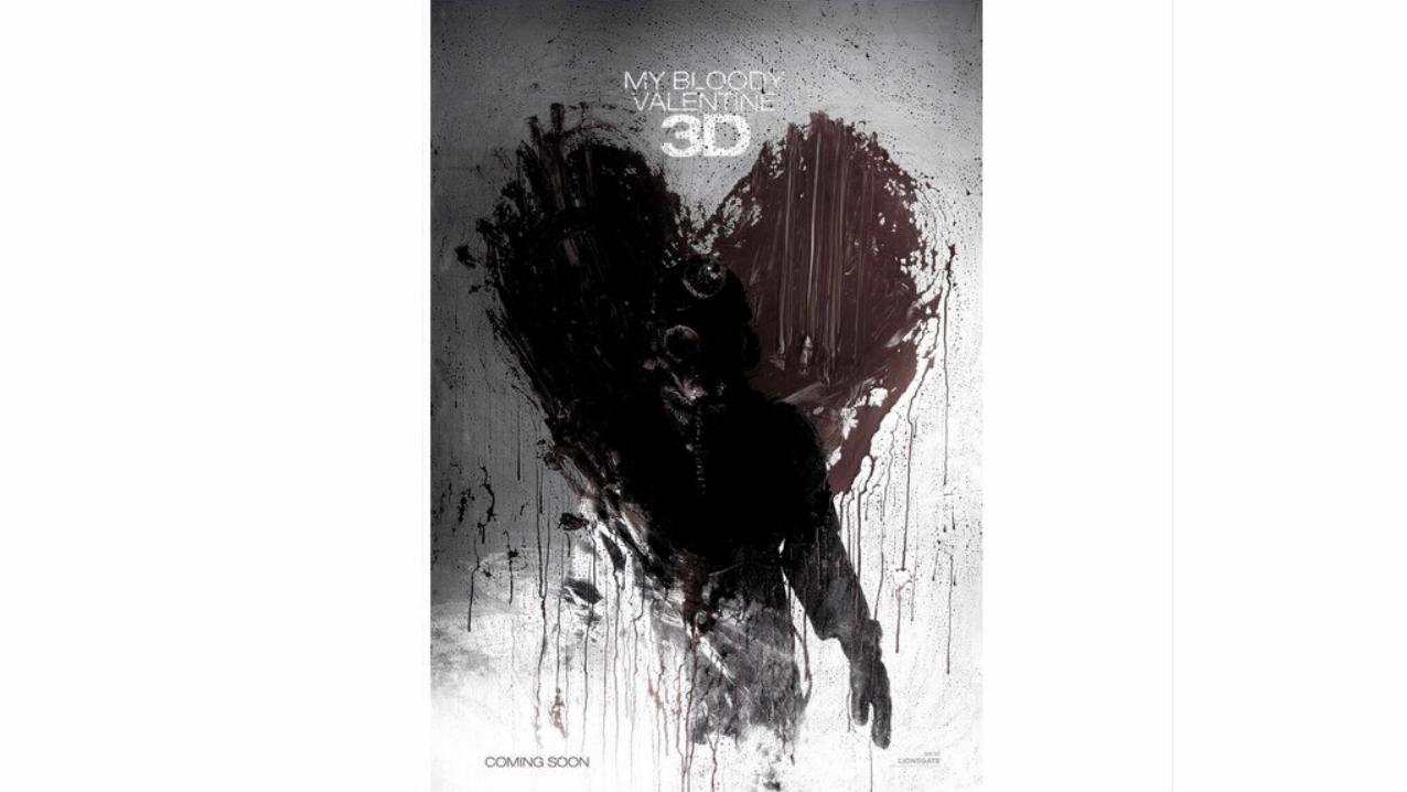
Second Poster;My Bloody Valentine
Analysis…
• The lack of typography on the page guides our attention solely to the figure and the heart. The headline of the horror however is clever, ‘My bloody valentine’ its associating a day which is filled with sharing love and affection with murder! The pronoun ‘my’ makes it a whole lot more personal and possessive which adds to the eeriness. The word ‘bloody’ prepares us for gore and murder, making its genre of horror very clear.
• The mid shot of the figure is eerie, as it looks like he’s walking towards us, engaging a one on one interaction with the viewer and making them feel fearful as if he’s making a personal attack on them. He walks out the centre of a bloody heart which could suggests how he’s heartless, or killing, is something he loves, due to the irony of the heart being made out of blood. We view him as the villain,(Vladimir Propps character types) mainly due to his dress code, a full, rubbery body suit and gas mask. The gas mask makes him look alien like, unusual and dehumanizing him because we’re unable to see his face or more specifically his eyes, this makes him a figure of fear and power, as we’re unaware of his intentions or his next move. Gas masks also have a strong iconography linked with war which we associate with guns and violence. Combining a military figure with a dehumanizing symbol such as the gasmask, results in a unhuman killer who’s objective is to destroy those on the opposing team. This makes him an object of fear. The fact its so dull and dark is also scary because the low key lighting sets the atmosphere of dread and foreshadows bad happenings.
• The symbol of the heart has turned something nice and pleasant into something dark, by making the heart from smeared and dripping blood reinforces gore and murder in this film and is uneasy to look at as we’re not used to seeing these things combined together.