Embed Size (px)
Citation preview
Double PageSpread
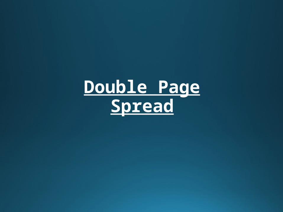
KERRANG
• Here is an article from KERRANG about the band My Chemical Romance. It was on the right of the page and the brightest thing on the page, everything else was dark coloured. As this is a bright coloured article it catches your eye to see what its about, using red is the best colour for this job as it’s the most noticeable colour; on this page there is a lot of red, however with the white behind it, it gets emphasized.
• The headline of this column is in a sharp banner type form with black and white bold text in it. The text used within the headline will also draw people in ‘Here’s a teaser’ makes people want to see what new songs will be coming from this band. The subheadings are in bold red writing to split off each paragraph, to help with this there is a black line. The text to explain of the stories in the column is coloured black as it works well with a white background.
• The article is structured in a way that it goes down a list of songs explaining/informing what the new songs will be like. Also to point out, the banner at the top looks like an arrow pointing down, showing the route to follow while reading.
• The language used within this column is a slang based language, ‘Down n dirty’ ‘rock n roll’ are both slang talk. Other than the words here and there, anyone will be able to understand what the paragraphs are talking about.
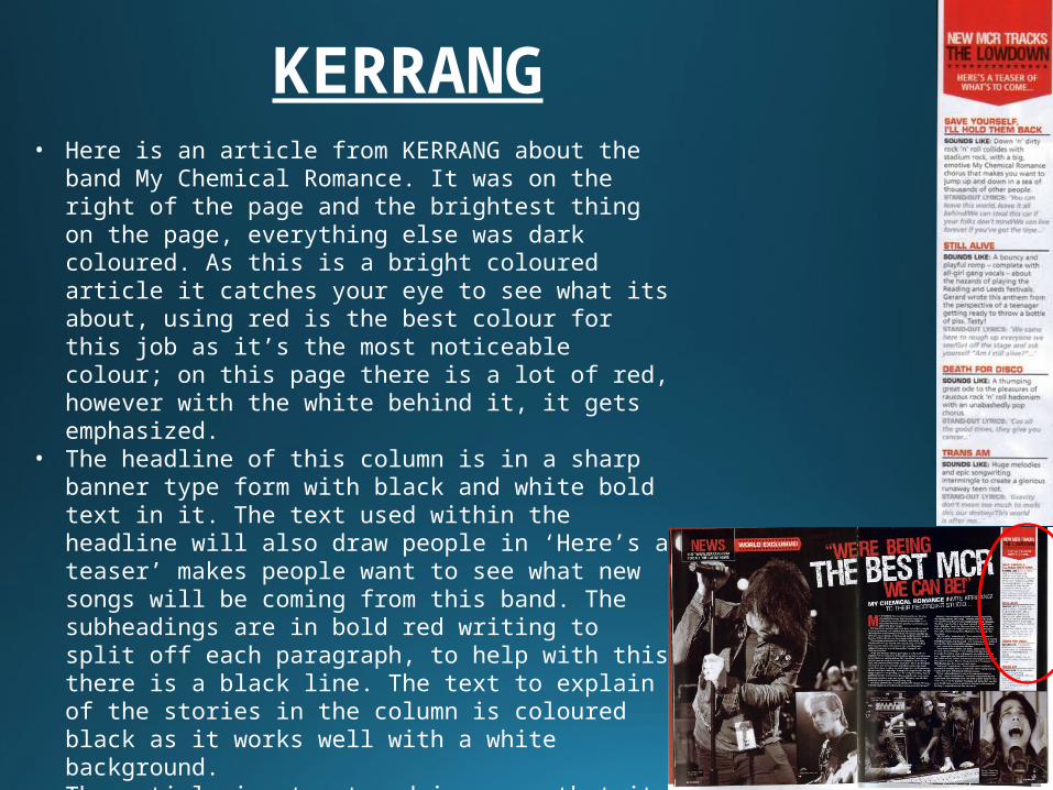
XXL• Here is an article from the XXL magazine that is
about 50 cent backing up soulja boy. The reason I chose this article in particular is because it had racist words and swear words in. The article might be simple looking but I believe that these words bring people to read it as when there is something that is controversial.
• The look of this article took up half a double page spread, the other half had a picture of 50 cent on. The colours used were black and white, it makes it look a bit like a newspaper which could be a good thing if you read newspapers often.
• The headline is the controversial quote of this article. Again, this will draw people in because of what it says. However, from what it looks like it is a bold text that takes up half of the singular page, standing out to the reader.
• The article is structured in a story like way, it is explaining the headline in more detail, then at the end asking a question to 50 cent about soulja boy.
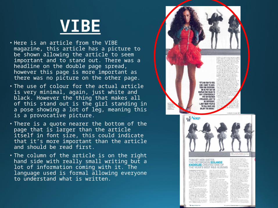
VIBE• Here is an article from the VIBE magazine,
this article has a picture to be shown allowing the article to seem important and to stand out. There was a headline on the double page spread, however this page is more important as there was no picture on the other page.
• The use of colour for the actual article is very minimal, again, just white and black. However the thing that makes all of this stand out is the girl standing in a pose showing a lot of leg, meaning this is a provocative picture.
• There is a quote nearer the bottom of the page that is larger than the article itself in font size, this could indicate that it’s more important than the article and should be read first.
• The column of the article is on the right hand side with really small writing but a lot of information coming with it. The language used is formal allowing everyone to understand what is written.
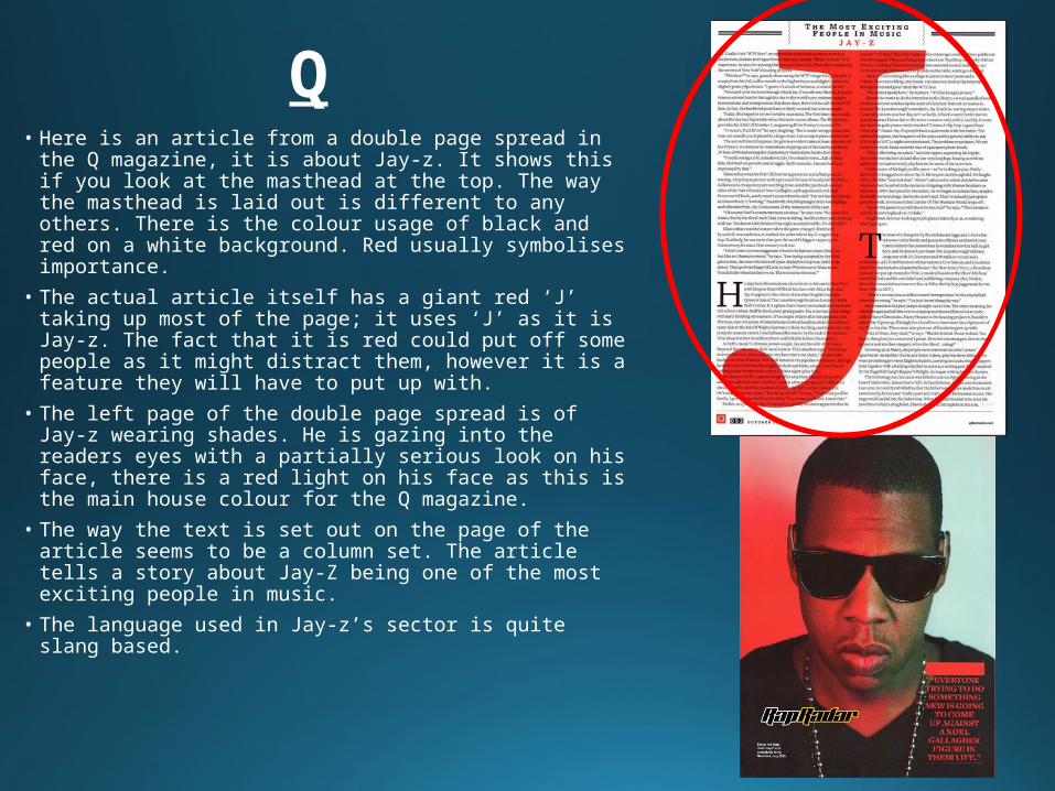
Q• Here is an article from a double page spread in the Q
magazine, it is about Jay-z. It shows this if you look at the masthead at the top. The way the masthead is laid out is different to any others. There is the colour usage of black and red on a white background. Red usually symbolises importance.
• The actual article itself has a giant red ‘J’ taking up most of the page; it uses ‘J’ as it is Jay-z. The fact that it is red could put off some people as it might distract them, however it is a feature they will have to put up with.
• The left page of the double page spread is of Jay-z wearing shades. He is gazing into the readers eyes with a partially serious look on his face, there is a red light on his face as this is the main house colour for the Q magazine.
• The way the text is set out on the page of the article seems to be a column set. The article tells a story about Jay-Z being one of the most exciting people in music.
• The language used in Jay-z’s sector is quite slang based.
Similarities
• The actual articles are all in black text and really small on the page. Also, red is a widely used colour through all of the articles to draw peoples attention in.• VIBE and Q have pictures within them, this can give the article a bit more of a story just by having a picture.• XXL and KERRANG do not have pictures, this can be useful if the way that the article is set out is eye catching.• The articles all have distinct quotes that give a little bit of the story from someone's point of view, this is clever as it allows the reader to see what the artist trying to achieve.