Embed Size (px)
Citation preview
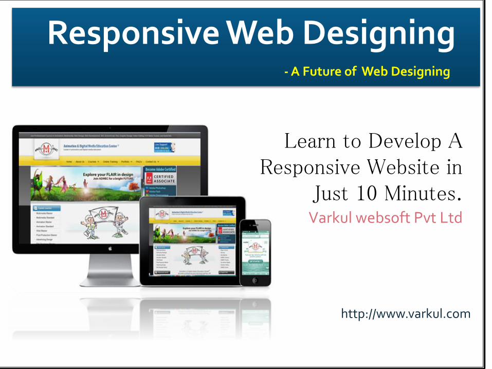
Responsive Web Designing- A Future of Web Designing
Learn to Develop A Responsive Website in
Just 10 Minutes.Varkul websoft Pvt Ltd
http://www.varkul.com

Topics Going to be Covered
Meaning of Responsive
What is A Responsive Web Design (RWD)?
What is the Need to Construct Responsive Designs?
Basics of Responsive Web Designing
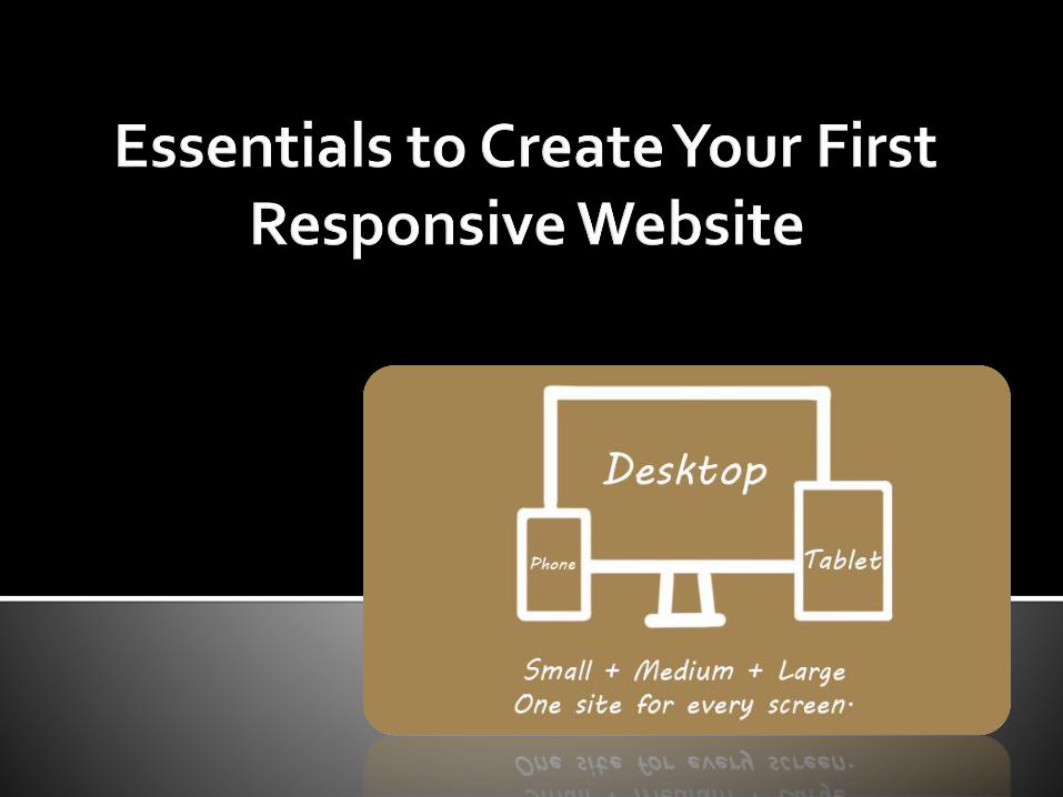
Essentials to Create your First Responsive Website
Advantages of RWD
Can send feedback at: @varkul.com
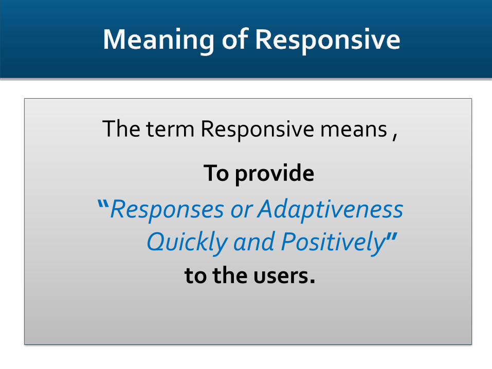
The term Responsive means ,
To provide
“Responses or AdaptivenessQuickly and Positively”
to the users.
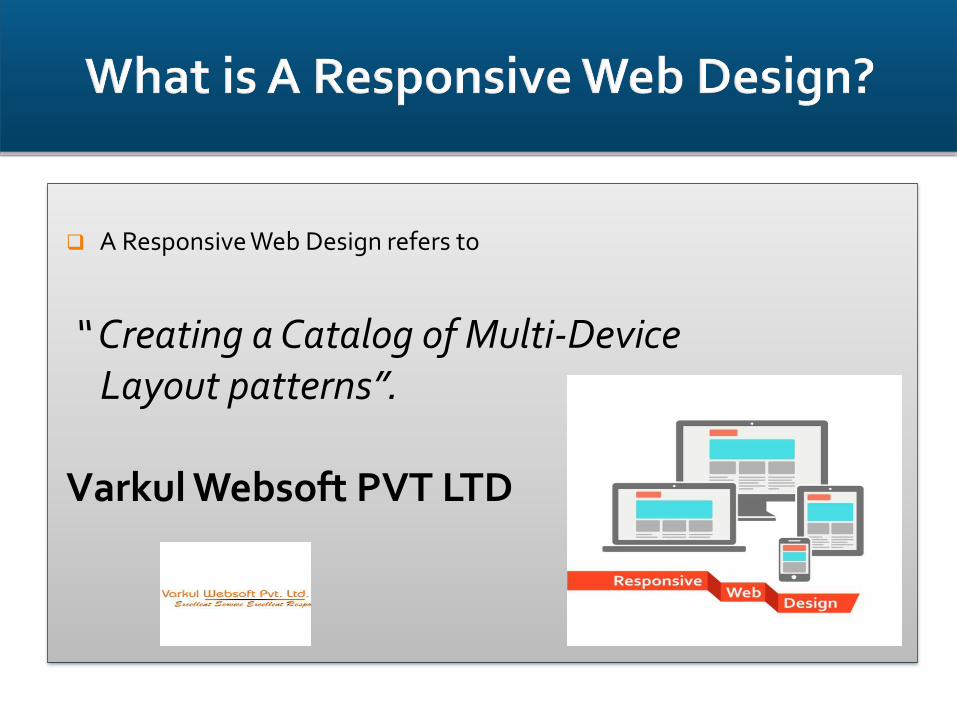
A Responsive Web Design refers to
“ Creating a Catalog of Multi-Device Layout patterns”.
Varkul Websoft PVT LTD
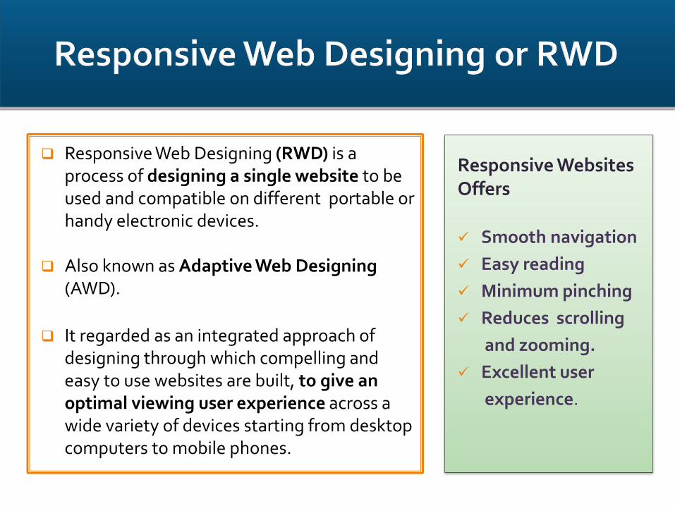
Responsive Web Designing (RWD) is a process of designing a single website to be used and compatible on different portable or handy electronic devices.
Also known as Adaptive Web Designing (AWD).
It regarded as an integrated approach of designing through which compelling and easy to use websites are built, to give an optimal viewing user experience across a wide variety of devices starting from desktop computers to mobile phones.
Responsive WebsitesOffers
Smooth navigation
Easy reading
Minimum pinching
Reduces scrolling
and zooming.
Excellent user
experience.
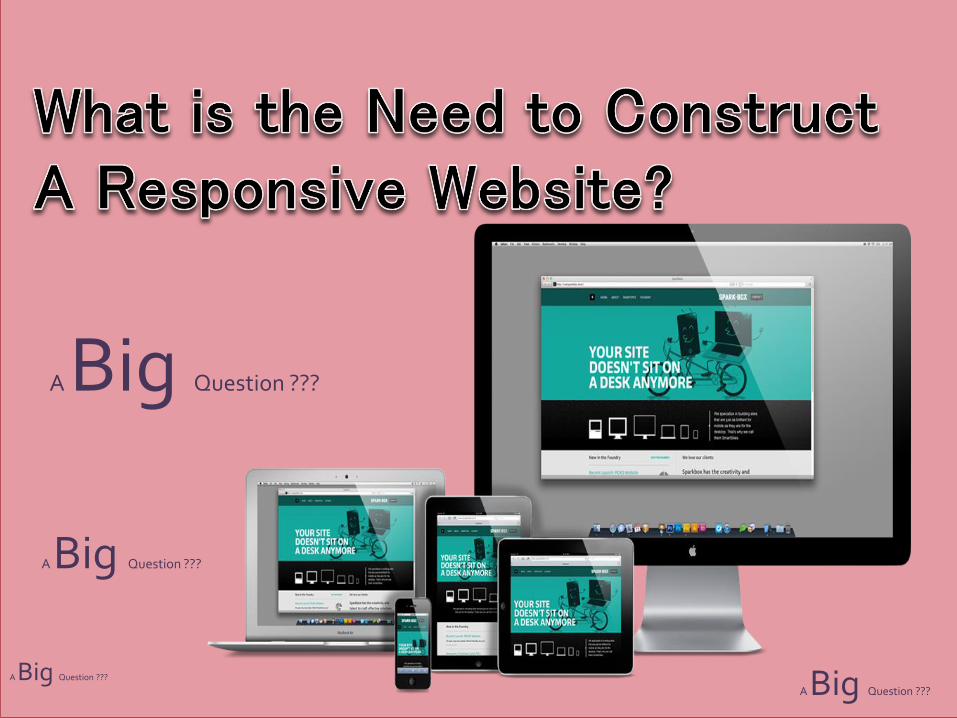
A Big Question ???
A Big Question ???
A Big Question ???A Big Question ???
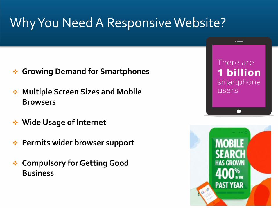
Growing Demand for Smartphones
Multiple Screen Sizes and Mobile Browsers
Wide Usage of Internet
Permits wider browser support
Compulsory for Getting Good Business
Why You Need A Responsive Website?
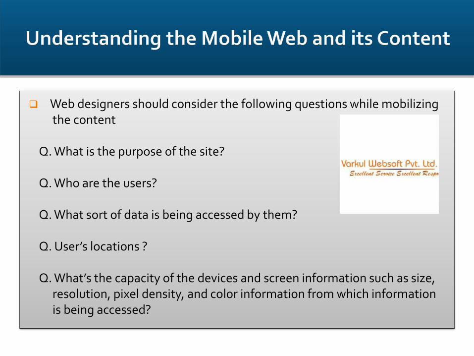
Web designers should consider the following questions while mobilizing the content
Q. What is the purpose of the site?
Q. Who are the users?
Q. What sort of data is being accessed by them?
Q. User’s locations ?
Q. What’s the capacity of the devices and screen information such as size,resolution, pixel density, and color information from which information is being accessed?
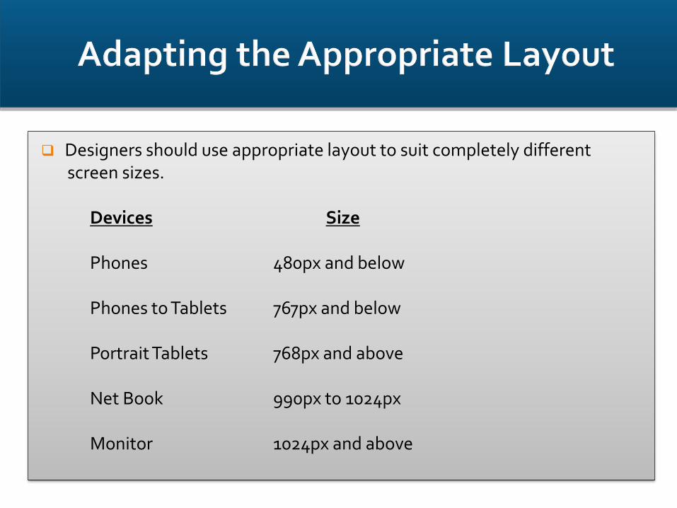
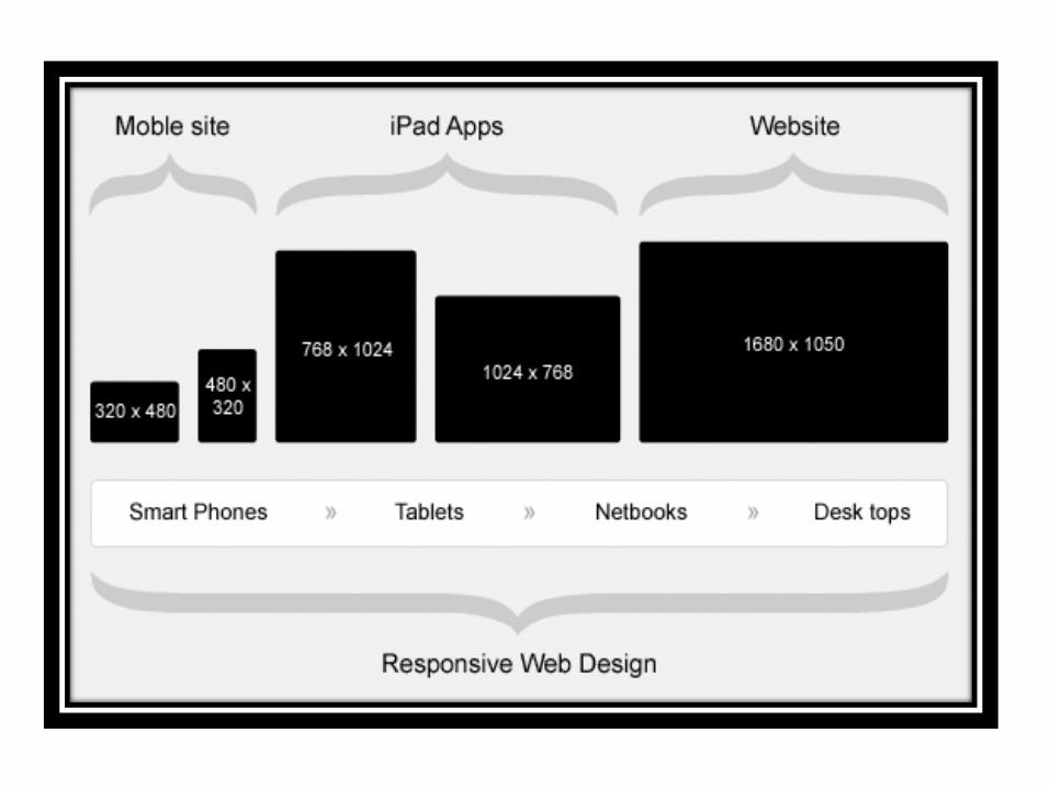
Designers should use appropriate layout to suit completely differentscreen sizes.
Devices Size
Phones 480px and below
Phones to Tablets 767px and below
Portrait Tablets 768px and above
Net Book 990px to 1024px
Monitor 1024px and above
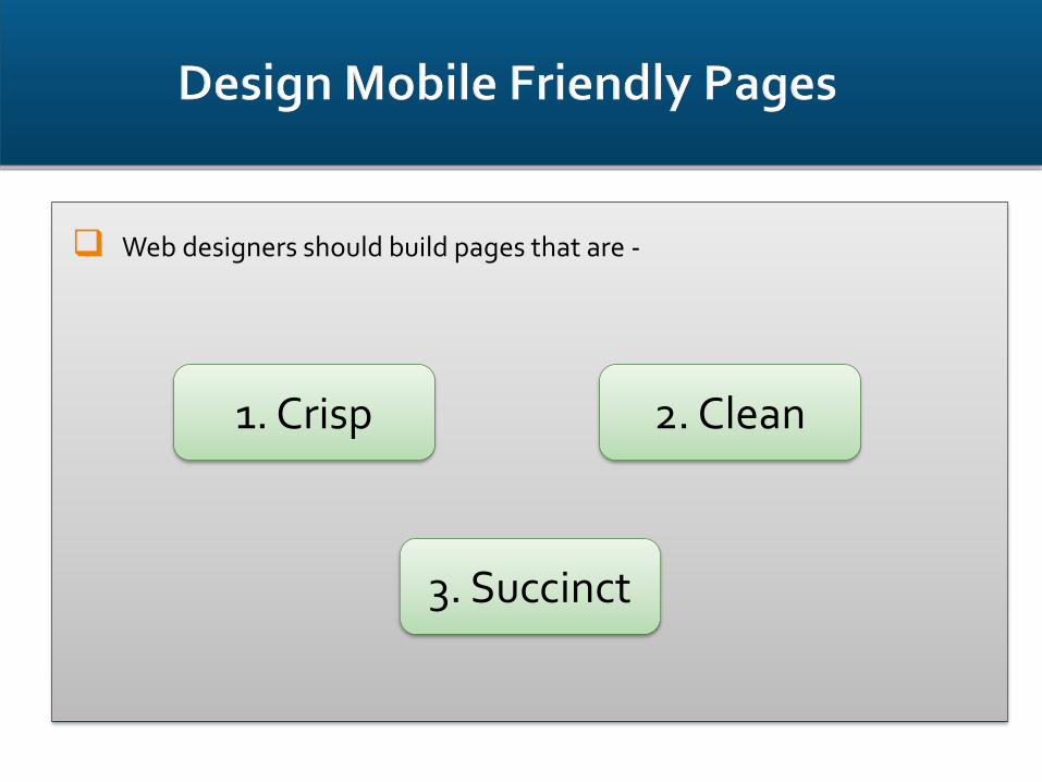
Web designers should build pages that are -
1. Crisp
3. Succinct
2. Clean
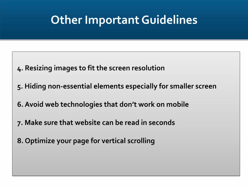
4. Resizing images to fit the screen resolution
5. Hiding non-essential elements especially for smaller screen
6. Avoid web technologies that don’t work on mobile
7. Make sure that website can be read in seconds
8. Optimize your page for vertical scrolling
Other Important Guidelines
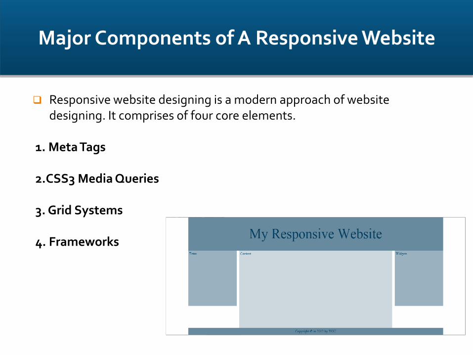
Responsive website designing is a modern approach of website designing. It comprises of four core elements.
1. Meta Tags
2.CSS3 Media Queries
3. Grid Systems
4. Frameworks
Major Components of A Responsive Website

Meta tag is a coding statement in HTML.
It describes few aspects of the contents of a web page.
Information provided in the meta tags is used by the search engines for page indexation.
Placed at the top of a web page as a part of heading.
We use viewport meta tag for making a web page Mobile Optimized. See the example on next page.
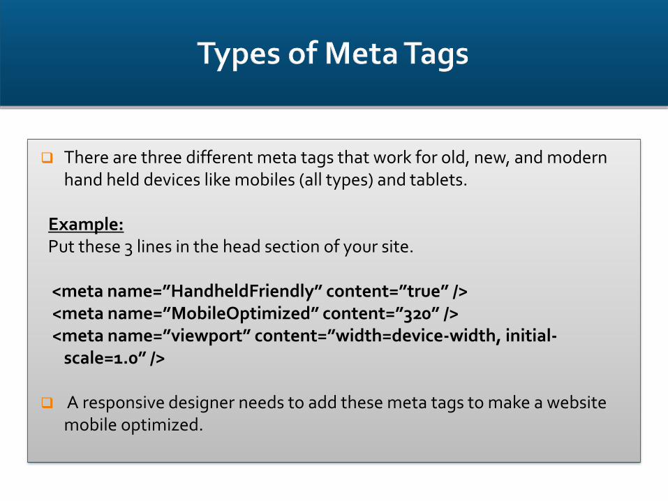
There are three different meta tags that work for old, new, and modern hand held devices like mobiles (all types) and tablets.
Example:Put these 3 lines in the head section of your site.
<meta name=”HandheldFriendly” content=”true” /><meta name=”MobileOptimized” content=”320” /><meta name=”viewport” content=”width=device-width, initial-
scale=1.0” />
A responsive designer needs to add these meta tags to make a website mobile optimized.
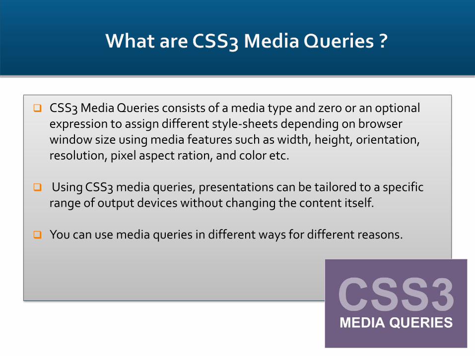
CSS3 Media Queries consists of a media type and zero or an optional expression to assign different style-sheets depending on browser window size using media features such as width, height, orientation, resolution, pixel aspect ration, and color etc.
Using CSS3 media queries, presentations can be tailored to a specific range of output devices without changing the content itself.
You can use media queries in different ways for different reasons.

Use following CSS media query syntax for calling an external stylesheet:
<link rel='stylesheet' media='screen and (min-width: 320px) and (max-width: 480px)' href='css/phone.css' />
And you can control css presentation in css file too:
@media screen { body {
width: 75%; }
}
@media print { body {
width: 100%; }
}
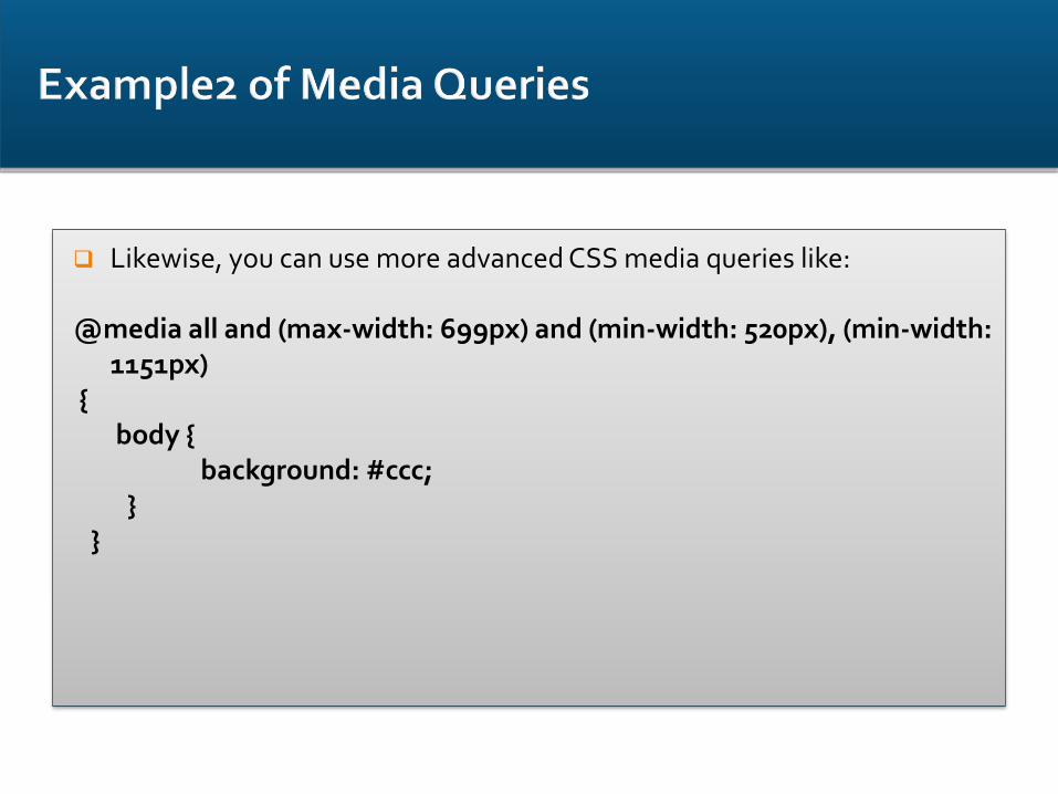
Likewise, you can use more advanced CSS media queries like:
@media all and (max-width: 699px) and (min-width: 520px), (min-width: 1151px)
{ body {
background: #ccc; }
}
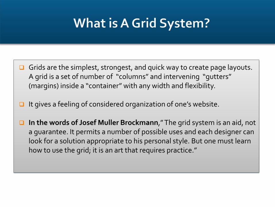
Grids are the simplest, strongest, and quick way to create page layouts. A grid is a set of number of “columns” and intervening “gutters” (margins) inside a “container” with any width and flexibility.
It gives a feeling of considered organization of one’s website.
In the words of Josef Muller Brockmann,” The grid system is an aid, not a guarantee. It permits a number of possible uses and each designer can look for a solution appropriate to his personal style. But one must learn how to use the grid; it is an art that requires practice.”

Following are some of the common grid system used to create a responsive website:
YUI CSS Grid
960 Grid System
Golden Grid System(also referred to as Folding Grid)
Frameworks can be defined as a set of tools, libraries, conventions and best practices that enable the designers to cut down their routine tasks into reusable generic modules.
CSS3 frameworks provide following benefits to web designers and developers:
1. Faster designing and building of websites.
2. Designers can focus on crucial segments of website building-using a grid, including a print style sheet, browser compliance, creation of multiple layouts,etc.
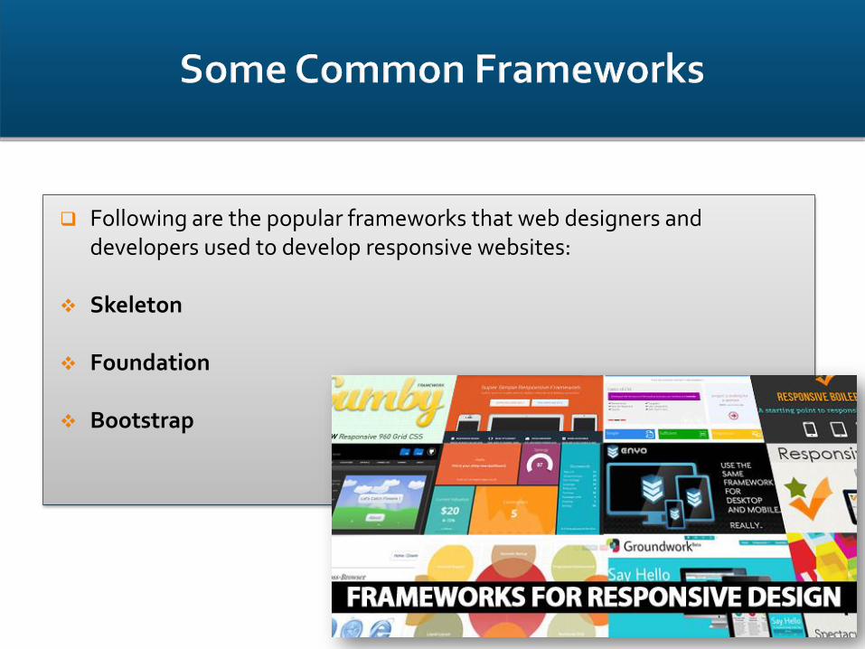
Following are the popular frameworks that web designers and developers used to develop responsive websites:
Skeleton
Foundation
Bootstrap
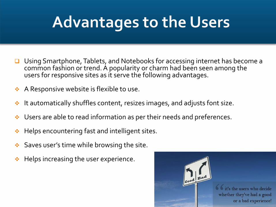
Using Smartphone, Tablets, and Notebooks for accessing internet has become a common fashion or trend. A popularity or charm had been seen among the users for responsive sites as it serve the following advantages.
A Responsive website is flexible to use.
It automatically shuffles content, resizes images, and adjusts font size.
Users are able to read information as per their needs and preferences.
Helps encountering fast and intelligent sites.
Saves user’s time while browsing the site.
Helps increasing the user experience.
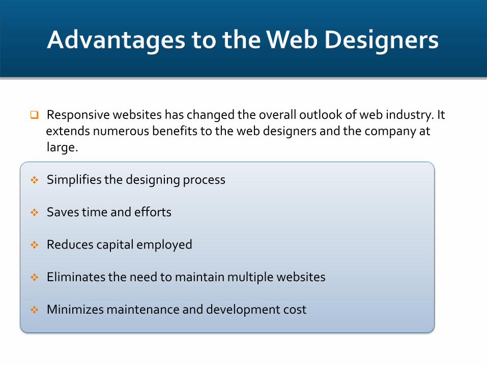
Responsive websites has changed the overall outlook of web industry. It extends numerous benefits to the web designers and the company at large.
Simplifies the designing process
Saves time and efforts
Reduces capital employed
Eliminates the need to maintain multiple websites
Minimizes maintenance and development cost

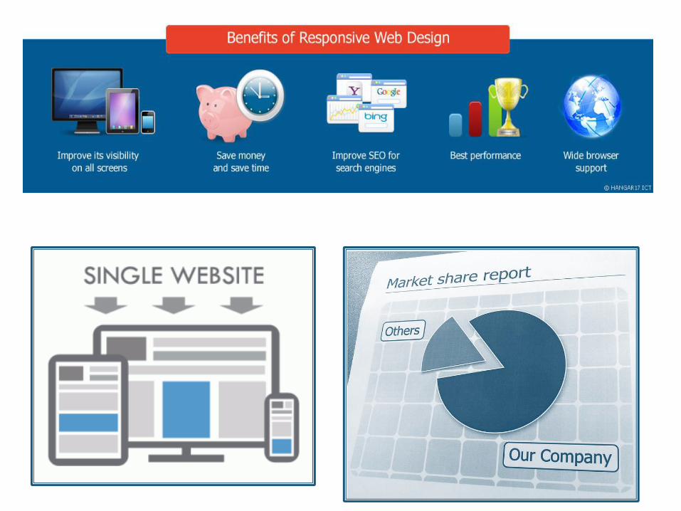
Increases Return on Investment in long run.
Improved SEO rank
Better performance means better sales
Higher conversion rates
Key to create competitive advantage over the competitors
Increasing market share
For more info you can visitwww.varkul.com
Or click on the link:
Varkul Websoft PVT LTD For Course Related Enquiry, Please Ring Us At:
91-9873048739