Embed Size (px)
Citation preview

MANIPULATING AND REPORTING ON DATA

REPORTING ON DATA
Data can be presented as a percentage, a real number and
pictorially in a graph. There are some simple rules you can follow
for deciding which option to use.
Graphs and ChartsUseful for visually comparing data across more than two categories and/or over time.
PercentagesConverts numbers to a proportion of 100, that allows the reader to compare increases and decreases (change) or differences between companies or business units of different sizes.
Real NumbersShould be used when the number itself is significant, and changing it to a percentage can be either impractical or misleading.

To start off with, we will review:
1. When different types of graphs and charts can or should be used
2. The advantages of presenting data in a graph or chart
Graphs and ChartsUseful for visually comparing data across more than two categories and/or over time.
REPORTING ON DATA: PIE CHARTS
Consider the following statement:
This last month has seen an additional 5 manual handling related injuries. This
brings this year’s total to 30, already a 20% increase on the previous year (24
manual handling injuries). The reasons for these injuries are fourfold:
1. 14% were caused due to employees lifting loads incorrectly (i.e. not
bending at the knees).
2. 33% were caused due to employees not using the correct equipment or
team lifting heavy loads.
3. 43% were caused due to employees running or walking too fast when
carrying loads.
4. 10% were caused due to slips or trips on debris while carrying loads.
“
”Make sense? Or a bit confusing? The next slide shows how this information can be
presented clearer by using different graphs.

REPORTING ON DATA: PIE CHARTSThe same information could be presented as follows:
This last month has seen an additional 5 manual handling related injuries on
last month. This brings this year’s total to 30, already a 20% increase on the
previous year (24 manual handling injuries). The reasons for these injuries are
fourfold:
14%
33%43%
10% Lifting loads incorrectly (i.e. not bending at the knees)
Not using the correct equipment or team lifting heavy loads
Running or walking too fast when carrying loads
Slips or trips on debris while carrying
Note: The notes section includes more information on using pie charts

REPORTING ON DATA: LINE GRAPHS
When showing change or performance over time, line charts are
often a good choice.
Line graphs are useful to compare data, so you can benchmark
progress and get an idea of the overall trends. For example, rather
than saying:
In 2005, the number of workplace injuries was 5. The following year saw a 60% increase to 8 injuries. In both 2007 and 2008 only 7 injuries occurred. 2009 had 10 injuries, and in 2010 saw a significant increase
of 20 injuries that year. This level was maintained over the next 4 years, with an average of 22 injuries over this period. 2015 has already
seen another significant increase (20%) in injuries (30 on day of reporting).

REPORTING ON DATA: LINE GRAPHS
You can say:
Since 2005, the number of workplace injuries has been increasing. There were significant increases in both 2010 and 2015 (see graph below).
2005 2006 2007 2008 2009 2010 2011 2012 2013 2014 20150
5
10
15
20
25
30
35
5
8
7 7
10
20
21
20
2324
30
Number of Workplace Injuries '05 to '15

REPORTING ON DATA: BAR GRAPHSBar graphs can be used to compare whole numbers of different categories.
Instead of the pie chart in the first example, we could show the same
information using a bar graph:
Note that individual scores are emphasised as opposed to the proportion each cause type contributes to the total number of injuries for that year.
Inco
rrec
tly lif
ting
load
s
Not u
sing
the
correc
t equ
ipm
ent
Running
/fast w
alkin
g
Slips/t
rips
0
4
8
12
4
1013
3
2015 Workplace Injuries by Cause
Num
ber
of
inju
ries

REPORTING ON DATA: BAR GRAPHSWe could also show the same information from the line graph using a bar
graph:
Note that individual scores are emphasised as opposed to the trend.
2005 2006 2007 2008 2009 2010 2011 2012 2013 2014 20150
5
10
15
20
25
30
35
58 7 7
10
20 21 2023 24
30
Number of Workplace Injuries '05 to '15
Year
Num
ber
of
inju
ries
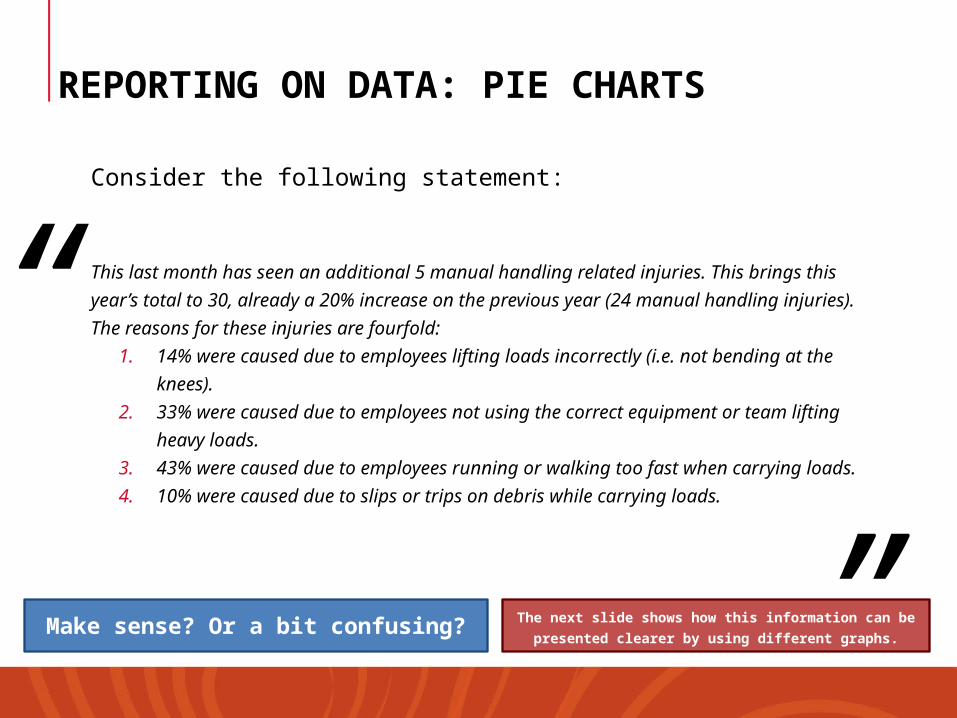
REPORTING ON DATA: GRAPH/CHART SUMMARY
• There are many different types of graphs and charts that can be
used to convey data much better than the raw data in
sentence/paragraph form:
Make sure you include data to tell a story
In our example, it would be useful to start with the trend
Then show the breakdown of why the injuries occurred
Then review the potential cause(s) of the increase in injuries
Potential Cause: if KPIs were adjusted upward in 2010 to 2015 which are the years that display significant increases in injuries, we can infer the effect the upward KPI adjustment had on manual injuries incurred.

REPORTING ON DATA: GRAPH/CHART SUMMARY
Use pie charts when showing how different categories contribute to the whole proportion
Use line graphs to show change over time and identify trends
Use bar graphs to emphasise individual scores (rather than the trend or proportion).

Converting numbers to percentages can be useful in certain situations.
Example 1:
If you are told expenses for your division has “increased by $50,000 in 2015”
you might assume this is not a good thing.
But maybe not if you find out that total expenses for you division in 2014 was
$5 million, making the increase in expenses just 1%. And if you find out that
expenses doubled (increased by 100%) in the 2013 period, you would
probably no longer be thinking the expense increase in 2015 is not so bad.
In this example, presenting expense increase (or decrease) as a percentage of
total expenses is more valuable than the expense figure’s cash value on its
own, as it allows the reader to understand the increase as a proportion of total
expenses.
It is even more useful once it has been compared with the previous years.
PercentagesConverts numbers to a proportion of 100, that allows the reader to compare increases and decreases (change) or differences between companies or business units of different sizes.

REPORTING DATA: PERCENTAGES
Converting numbers to percentages can be useful in certain
situations.
Example 1:
2013 2014 20150123456
2.5
5 5.05
Expense increase per year
Year
Million
$
100% increase
1%increase

REPORTING DATA: PERCENTAGES
Example 2:
You wish to compare the staff turnover of your own unit (transport
fleet) with other divisions within your transport company.
Last year you had to replace and re-train 20 staff members, while the
sales division only had to replace 15. You might assume from the real
numbers provided that the sales division has less staff turnover than
you do.
Before we draw this conclusion, it is important to consider the size of
the sales unit (i.e. the total number of staff) compared with the
transport fleet.
As the next slide will show, using percentages can be useful for
making comparisons between company divisions of different sizes.

REPORTING DATA: PERCENTAGES
Example 2:
As shown below, you can calculate that even though you had to retrain more
staff, your division is much larger (more staff) and therefore has a significantly
better staff turnover rate than sales.
Sales Division
Total staff turnover (2015):
10 people
Total number of staff:15 people
Sales staff turnover rate: 67%
Fleet Division
Total staff turnover (2015):
20 people
Total number of staff:60 people
Fleet staff turnover rate:33%

Remember, just because we can convert numbers to graphs or
percentages, doesn’t mean we have to or should.
In some cases percentages can be misleading or used to hide problems.
Example 3:
Someone could advise you that they have had a 100% increase in
employee satisfaction on the previous month. This sounds like an
excellent outcome until…
…you find out that only one person in their team of 50 was satisfied last
month, and this month there are two. The 100% increase is not a lie, but
it is misleading (as 96% of employees are potentially unsatisfied!).
The data that tells the clearest story in this case is the real number, not
the percentage.
Real NumbersShould be used when the number itself is significant, and changing it to a percentage can be either impractical or misleading.

REPORTING DATA: REAL NUMBERS
Example 4:
Someone could advise you that workplace injuries have decreased by
10% over last month. Good news again?
Hopefully by now you are getting the hang of this! Before we get too
excited we need to ask ourselves:
What were the total injuries last month and the
month before that?
What are the total injuries as a proportion of the workforce/workgroup?

REPORTING DATA: REAL NUMBERS
We can’t tell if problems are being addressed by a standalone figure,
and we need to use some discretion when reading and interpreting
statistics.
When reporting injuries (for example) the actual or real number
places emphasis on how many injuries have occurred (as opposed to
a %).
When in doubt you can always use both (provided you don’t confuse
the reader).

REPORTING DATA: REAL NUMBERS
If you are unsure of whether to use a real number or % form, you can
consider using both!
If we Reword Example 1 to include percentages:
If we Reword Example 2 to include percentages:
Expenses increased by 1% last year ($50,000), that is a significant drop from the previous year when expenses doubled.
This year our staff turnover rate was 33% (20 people) that is a lower staff turnover than the sales division (67% or 15 people).

REPORTING DATA: REAL NUMBERS
Rounding:
• When presenting real numbers in a report, it is common to round
to the nearest useful figure, to make comparisons easier.
• You will notice that nice even numbers were used throughout all
the previous examples.
• This is because it enhances readability.
It is very unlikely that any business will actually make a nice
even number of anything!

REPORTING DATA: REAL NUMBERSRounding:
What is the nearest useful figure? That depends on what you are communicating, who your
intended audience is and comes down to your own discretion.
Consider if the increase in expenses from Example 1 was actually $49,692.
Is there any value in reporting that the profit was actually $308 less than $50,000?
You can see that the actual number adds complexity and decreases readability.
If $49,692 was the real figure you could use it when calculating the percentage
But when referring to the whole number in your report, round up or down to the nearest useful
figure.
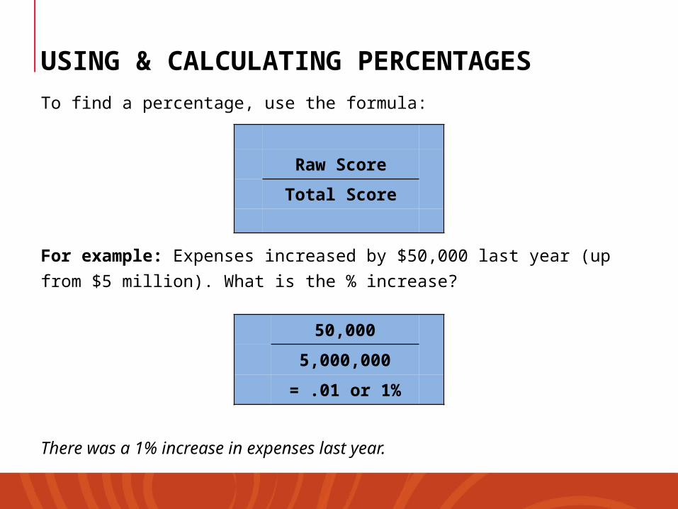
USING & CALCULATING PERCENTAGES
To find a percentage, use the formula:
For example: Expenses increased by $50,000 last year (up from $5
million). What is the % increase?
There was a 1% increase in expenses last year.
Raw Score
Total Score
50,000
5,000,000
= .01 or 1%

Working the other way around, if you wished to find the value of a percentage, you would use the following formula:
For example: If staff turnover for 2015 was 33% for a team of 60 people, how many people did you need to replace?
You had to replace 20 people in 2015.
% x Total value
.33 x 60
= 19.8
USING & CALCULATING PERCENTAGES