Embed Size (px)
Citation preview
School publication front page evaluation
Font evaluation

Harris times
Harris times
Harris times
Harris times
Harris times
Harris times
Harris times
Harris times
I needed to choose the most suitable font for the masthead, because I don’t want the font to look to cartoonish or too much like a real news paper cover.I tried a Varity of different fonts.
I thought that this text font was very hard to read also this type of font is used for circus posters so it would send the wrong impression
I though that this text was quite appalling and was simple, however it was too simplistic and did not stand out enough
This text was hard to read and was not very appealing due to both the caps and under caps letter being the same.

I had to choose between these two fonts, I thought this font was the best because it was nice and bold, it stood out and looked mature.
I very much liked this text font as its simple and stands out however this is the default font you would get when typing, because of this I thought it would look too generic.
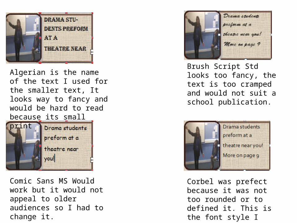
Algerian is the name of the text I used for the smaller text, It looks way to fancy and would be hard to read because its small print
Brush Script Std looks too fancy, the text is too cramped and would not suit a school publication.
Comic Sans MS Would work but it would not appeal to older audiences so I had to change it.
Corbel was prefect because it was not too rounded or to defined it. This is the font style I choose.