Embed Size (px)
Citation preview

Regarding Responsive Web Designing

IntroductionInternet is one of the most important forms of media,
How do people access the Internet -> Via PC right??How About Mobile DevicesSmartphonesTablets
The share of Mobile Users and Tablet using accessing the internet is growing Rapidly,
Responsive Website, RESPONDS to the User screen size and enhances the user experience
Instead of creating different website's we create 1 website which responds to gives a unique experience to the user depending on the screen size

To understand responsive design, we need to understand the concept of View Ports
->Layout Viewport
->Visual Viewport
The Layout Viewport never changes on a phoneunless you change the orientation, hence, we need to zoom the area which we need to read

When we see the same website on the phone, the visual viewport (of the phone) tries to match the layout viewport (around 920px which was designed on a PC)
How do we make sure that the Layout Viewport is the same as the Visual Viewport

Here we change the Layout viewport by mentioning that the viewport is equal to the width + height of the visual viewport
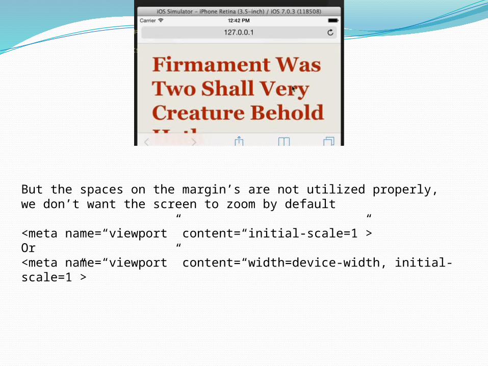
But the spaces on the margin’s are not utilized properly, we don’t want the screen to zoom by default
<meta name=“viewport” content=“initial-scale=1”>Or<meta name=“viewport” content=“width=device-width, initial-scale=1”>

View port for IE 10.0 and above

A Brief History of Responsive Web Design
Before Responsive Design, layout was one of the first things people thought about when designing for the web. Many web designers came from print backgrounds.
In print, the canvas was always a specific size. Whether it was a magazine spread, or the cover of a book, print designers knew the dimensions that they were designing for.
With the explosion of mobile phones and tablets, the canvas of the web now has infinite screen sizes and resolutions. Your website may be viewed on a high-definition television or a smartphone.
The point is, there is no longer a fixed canvas. People are seeking out your business information on all sorts of devices. Responsive Design came along a few years ago as a solution to this important problem.
In 2010 Ethan Marcotte wrote an article on A List Apart and effectively coined the term Responsive Web Design. Responsive Design, as coined in his article and book requires a design to have a fluid grid, flexible images and media queries.

Fixed Width DesignThere are a few other terms that often get lumped together with Responsive Design, and it can help to understand the differences. Fixed width design allowed designers great amounts of control over layout, typography and other graphic elements. This allowed designers to think about web pages as static pages similar to pages found in a magazine. It led to some beautiful designs that looked great at very specific screen sizes.

Fluid DesignFluid Design was possible long before Responsive Design.
There was a long standing debate in the web community between the benefits of fixed width vs. fluid designs.
Fixed width offered designers greater amounts of control, but fluid design was more flexible to the needs of the user’s experience.
Even before the onslaught of smartphones and tablets, advocates of fluid design believed all users would have a different experience of the web, depending on variables such as monitor size and browser window size.
The web, by nature, is fluid. HTML, without applied CSS, will flow to be 100% of the width of the page’s body. As a browser window shrinks, text adjusts. Fluid Design embraced this fluidity before Responsive Design was even a possibility.

Introduction of Media QueriesResponsive Design wasn’t possible until
media queries were fully supported by modern browsers. Media queries allowed web designers to change how content appears at different screen sizes.
Media queries made it possible to change CSS properties at different breakpoints (usually the size of the browser’s width). In short, fluid design evolved into responsive design with the help of Media Queries.


So, What is Responsive Design?Rather than setting breakpoints at common screen sizes
(like adaptive design), Responsive design makes decisions based on the needs of the content.
Web designers will often grow and shrink their browser windows to analyze type, margins, padding, line-height, and other layout considerations. When a line of text or an image is uncomfortably squished or has too much space, a breakpoint will be added via a CSS media query. The text, image or layout will change size based on the needs of the content.
Responsive design also uses flexible images so that images scale depending on the width of the browser window or device. There is actually a lot more to talk about in the world of responsive images as working groups are currently working out specifications for how to best handle image sizes, but that is for another blog post.

Fluid Grid + Flexible Images + Media Queries = Responsive Design
In short, responsive design is defined as having a fluid grid, flexible images and CSS media queries. Responsive Design has become the current industry standard for how a website should be built.