Embed Size (px)
Citation preview

POSTER CONSTRUCTION
Joe Burke

Firstly I rotated an A4 page 90* CW as from my research I found most adverts are horizontal, I then placed an image and slightly expanded it so that it covered the whole page.
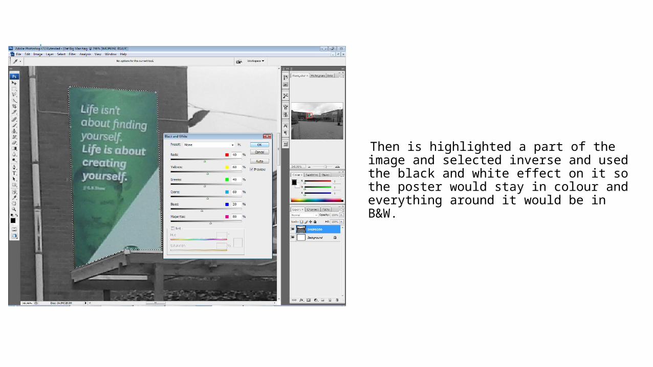
Then is highlighted a part of the image and selected inverse and used the black and white effect on it so the poster would stay in colour and everything around it would be in B&W.

After this I then placed an image of hand drawn Letters and numbers on the page and stared to crop them and use the letters to make the tile Tough education. I used hand drawn images because it fit in with the theme of my documentary as it represents school because it looks like a student could have drawn it.

After I had finished cropping the title I then went back to the main image and used the blur tool so that when I later added the images of the characters they would stand out more.

I then placed the image of one of the documentary's characters and cropped around him so I got rid of the background, I then flipped the image horizontally as I wanted him on the left hand side of the mage and it made more sense if he was facing the middle.
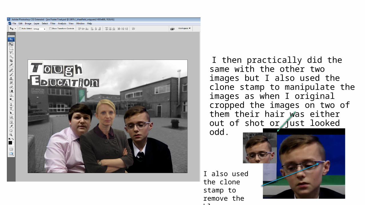
I then practically did the same with the other two images but I also used the clone stamp to manipulate the images as when I original cropped the images on two of them their hair was either out of shot or just looked odd.
I also used the clone stamp to remove the blue reflection from the students glasses

I then added some text to the bottom corers of the page and applied the stroke effect to them to make them stand out even more

I then added my logo to the top right hand side to help with the branding of my documentary

After this I applied a blue tint to my poster as blue represents sadness and my documentary is about a serious topic so it made sense