Embed Size (px)
Citation preview
All front covers are from the front cover of NME magazine and so they have all been designed with the intention of attracting fans of Indie Rock music. Through carrying out an investigation of them and by comparing them to each other, it is possible to identify shared features within them and to establish repeated patterns.
All six front covers feature conventions that you would typically expect to see on a front cover. Such as the main image that dominates that front cover, sell lines that surround the main image, feature article photographs that relate to what is inside the magazine and a masthead design in an appropriate font.
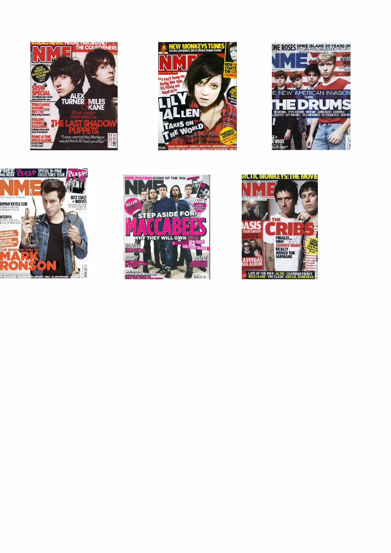
We also see other repeated pattrens. All front covers feature a band as the main image. We expect to see some kind of music artists on the front of a music magazine, but the apperance of a band on NME indicates that solo artists are rare in the would of indie rock. This could be due to the kind of sound that is synonymous with these with these genres of music, a powerful, sound that is generated by electric guitars and live pereformances from a band. In all front covers we see that one member of the band is placed at the front of the image, closest to the camera, and the rest of the band create a triangle behind the main singer. This composition is repeated conisitentely to indicate the importance and status of the lading member of each band, who is usually the lead vocalist. This is a powefull and efective way of attracting the target audience as the main singer is likely to be the most recognised and popular member of a band.
Intrestingly, almost all of the artists featured are male; Lily Allen is the only female artist on the cover of the magazines, and although she is female, she could be considered not feminine and her short cut, black, messy hair with the oversized, checkered shirt prove this. This applies also to the smaller feature acticle photographs that appear too. This reflects the fact that the genre of indie rock, which is usually associated with beer, cigarettes, and underground gigs, is male dominated. It could also be said, however, that this reflects the way in which females are underepresented in the music press.
There are other similarities in the mise-en-scene elements that are presented on each front cover. In terms of costume, the artists have the fact that they are all wearing plain muted colours and costume that is fairly low key and relaxed in common. This is a look that is fairly synonymous with bands within the genre of indie rock. On one front cover, the members of ‘The Drums’ are wearing lighter colours, namely red and white, which is unlikely in the genre of indie rock, but this could be to show the way that they are breaking from the steriotypical indie rock dark style and trying to be different to other people. It also compliments the overall colour scheme of this particular front cover, which features the American flag. The fact that they are wearing red and white is a clear link to the fact that they are nAmerican and to the main sell-line, which reads as ‘The American Revolution’. Although they are wearing light colours, not one of the artists are smiling and this shows a contrast with the costume they wear and the facial expressions. This could also attract the readership because they would be interested in seeing why they have changed the way they dress; this could encourage them to buy the magazine to read the article about this band. It is also worth mentioning that this neutral facial expression is seen in all the front covers within the selection, therefore maintaining the serious, masculine and cool persona of indie rock.
Another feature that is shared across the six nme front covers is that they they almost all include feature article photographs. Generally, these tend to showcase, in a smaller form, the competitions and artciles related to the chances to win things that are to found inside the magzine. The fact that space on the cover is devoted to presenting the competitions, illustrates how the typical fan of indie rock music is partial to a freeby, saving money or compotition. Many of the competiitons relate to live gigs, which is a clear sign that this reader likes to attend live gigs. Other feature article photographs relate to bands that are featured with in the issue in question. Again, with the exception of Lily Allen, the feature article photograohs present only male arrtists. Mise-en-scene is consistent with the larger, main images.
On each of the front covers, the signature and recognisable NME masthead appears in exactly the same bold font and in exactly the same place. Each time, the masthead is either the typical red and white colour, or is a colour that reflects the main image on the front of NME magazine. The heads of some artists in the main image are covering the masthead, and this sugests that maybe
audience do not need to see the whole masthead to know that the magazine is NME. This suggests popularity and the sucsess of NME as a magazine. If a new magazine that was unestablished and did not have a loyal fan base did this, audience might not buy the magazine or might be confused as to what the magazine is about/what genre the magazine is, and what the name of the magazine is.
Sell-lines feature a lot on all front covers of the magazine. This helps the audience to know if they will enjoy the content of the magazine or not. The sell lines tell the reader about what the main image about. This will help audiences to want to buy the magazine because all sell lines are interesting and revealing, this will inform the audience and as proved in Blumler and Katz theory, media consumers want to be informed and to have knowledge on artists in the genre they are
interested in.
Colourwise, NME tend to stick to use a mixture of colour, but often colour coordinate masthead, sell lines and main image. Red features strongly in NME as it is the colour of the main masthead when it is not changedm and also is a very storong colour that NME tend to use often. Bring a primary colour, red will appeal to a male readership.
Layout is consistant across the front covers, as mentioned earlier, the placement of bands and artists is similar in all of the chosen magazines. The front cover could be describesd and messy or cramped, this would appeak to a male audience as they do not look for neatness and organisation with in the front cover of a magazine. The cover also contains a lot of information and this could be appealing to a male audience as they would be interested more on what is in the magazine than what the magazine looks like, and by looking at the front cover of the NME magazine they can be assured that there will be a lot of information with in the magazine.
Having caried out this overview, it is clear to me that NME magazine has a unique brand identity and signiture look that can be recognised by it’s readership and target audience. The brand identity is maintained through the repetition of stylisstic and layout features in each issue and it is a clever way of helping thr magazine to sell coppies and to sucseed as a company.