Embed Size (px)
Citation preview
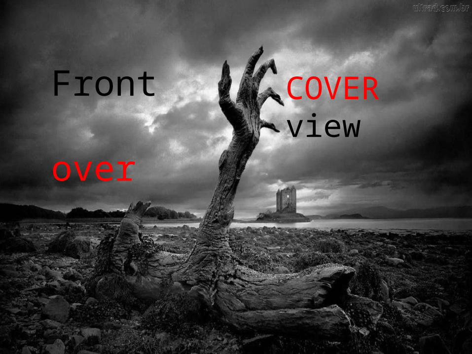
Front over
COVERview
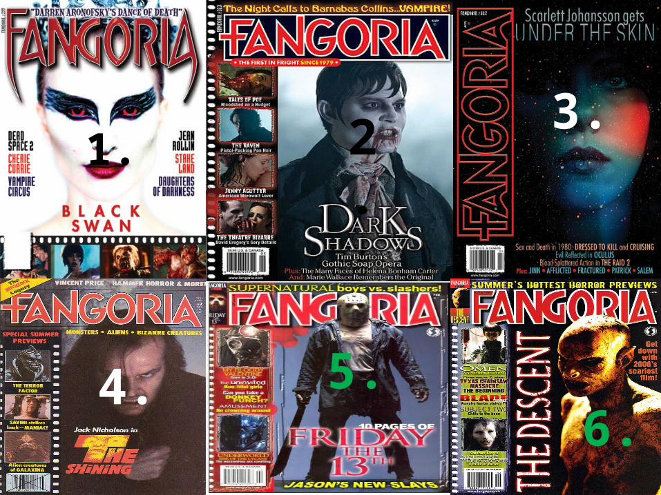
1. 2. 3.
4. 5.6.
These six front covers are taken from the ‘Fangoria’ horror magazine, and have been chosen because I feel they relate closely to my own magazine. Unlike more established magazines such as Empire and Total Film, these magazines appreciate horror as an important genre, and are able to advertise it through a more unique, tailored aesthetic that appeals directly to the horror movie fan.
In order to reflect this love of the genre on to
my own work, the typical conventions of movie magazines that
are altered and applied to these front covers
must be analysed. The symbiosis recurrent on
each of the front covers must also be noted, as it
is of paramount importance that
symbiosis is maintained throughout my own
promotional package.
CONVENTIONSEach of these six front covers abides strictly by all variants of conventions within the horror
genre, but alter or ignore the conventions of most magazine covers in general. Regarding the conventions of the genre itself, the magazines subject matter means that the editors can fully embrace the theatricality and imagery that fans will come to expect from horror. They do this through using colours on each front cover that are very suggestive of the genre, and this can be seen in the recurrent red masthead across all six images, as well as the prominent uses of
black and blue through darkness and fog seen especially on covers 2-6. Furthermore, the editors have opted to place the antagonist instead of the protagonist on every front cover –
and although this is unconventional in terms of the magazine layout, this fits in perfectly with all forms of horror film promotion, as the majority of posters and trailers always focus on the evil in the film. Graphic and violent imagery is used on the majority of the front covers, with
the exception of 3, which further roots the magazine into the conventions of the horror genre, and all its relevant subgenres as well. Evidently, this is a magazine that embraces horror and all that is used to promote it, as the editors are fully aware that it is this that will entice their
selective target audience of horror fans to buy the magazine.Embracing the horror genre is an obvious necessity for a
horror film magazine. Layout-wise, however, Fangoria has
the potential to alter conventions of most magazines
in order to create a unique aesthetic that will resonate more with what horror fans will expect, and it does just this. Although it abides to certain principles of other
magazines, it mainly retains its own brand identity through it’s
recurrent alteration of conventions.
Regarding the masthead of the magazine, Fangoria generally places it conventionally at the top of the frame – although this is altered for front cover 3 to divert attention to the image. This alteration suggests that if the editors and reviewers are very enthusiastic about a new film, they are willing to forsake the prominence of their masthead in order to display said film in greater clarity. Generally, this is a break of conventions that established magazines would never commit, and highlights how Fangoria is truly made by fans of the horror genre. The creators are willing to forsake their dominant masthead in order to share their enthusiasm regarding this film with the target audience, and it is likely that this audience will appreciate this and be able to relate to this sense of enthusiasm. Similarly to most film front covers, Fangoria litters their front covers with feature article photographs and film titles in the place of sell lines. Evidently, the content of such images and titles differ notably to magazines like Total Film – but this is due to the more focused target audience that Fangoria are appealing to. Elsewise, the FAPs and sell lines are mostly placed conventionally upon the front covers, and although front cover 1 places them at the bottom of the image as opposed to the side, this is not unusual amongst film magazines and allows for a greater variety and depth of construction to be shown (if each front cover looked exactly the same within an institution, fans would easily bore and look elsewhere for variety). The placement of the cover image is also similar in this regard – front covers 2 – 6 place it to the more conventional right hand
side, whereas front cover 1 places it in the centre of the magazine. Again, this only allows for variation and the chance to create exciting new aesthetics without changing any of the features that fans love. On the other hand, unlike most magazines, Fangoria’s uppermost slogan changes depending on the content within each edition of the magazine, from 1’s ‘Darren Aronofsky’s Dance of Death’ to 6’s ‘Hottest Horror Previews’. Some magazines, such as Empire, alter their slogans in a similar way, but still mainly use a recurrent slogan to enforce the brand identity. Due to Fangoria being a lesser-known magazine, the select few who buy it are likely to be more satisfied by the witty, catchy summarisation of the magazine that they provide. It is still effective in summarising the brand identity, as it allows new viewers to instantly familiarise themselves with the chatty, excitable mode of address that Fangoria encapsulates, but it is achieved through other means.Unconventionally, the barcode is also placed in the bottom left hand third, when it would usually be placed in the bottom right. Although this creates less space for the textual information on the left – demonstrated by front covers 4, 5 and 6 especially – it creates more visual space for the cover image. This implies that the editors are Fangoria realise that the die-hard fans of horror who buy their magazine will be more interested in the content of the images themselves,
presuming that they already have sufficient knowledge of what films are currently in cinemas. The inclusion of the barcode within the text appears to cheapen and roughen the aesthetic of the magazine, but the Fangoria editors will see this as an advantage as it is more befitting of the cheap scares and mix of new and old films that are being covered. It further emphasises Fangoria’s success as an old-fashioned, fanmade style of magazine, and consolidates why the editors have chosen to make the convention-defying decisions that are evident on their front covers.The unique mode of address itself is easily visible on the magazine front cover, and this in itself is a convention of all magazines. Puns such as 3’s ‘Scarlett Johansson gets under the skin’ and alliteration such as 5’s ‘Supernatural boys vs. Slashers’ enforce the witty, enthusiastic approach of the writers, and these language devices are common across other film magazines as well. This shows how Fangoria recognises the importance of their mode of address as a convention, and how they want to relate to the target audience as much as possible.
Layout and textInterestingly, the layout and text used on each front cover varies in order to fit the secular identity of the
cover film being promoted. Front cover 3 exemplifies this notion, as the entire layout is adjusted in favour of ‘Under the Skin’ – a sub-horror science fiction arthouse film. The amount of text is substantially reduced and appropriated to the bottom third of the magazine, and in the usual place of the left hand strip, the masthead is unconventionally placed. Effectively, this draws more attention to the unique aesthetic and individuality of the cover image in an unconventional way, which in turn reflects the ‘unconventional’ nature of the film and
it’s differentiation from other films of the horror genre. Moreover, the mode of address that enforces the brand identity is altered in a similar way, as the more plosive, fanboy-esque words seen on covers 5 and 6 are
less prominent here. This further reflects the sophistication of Under The Skin, and a similar approach is used in front cover 1 is used to mirror this ‘alternative’ style of horror film, this time with Black Swan. Here, the usual ‘film reel’ of FAPs is allocated to the bottom third, again to generate a greater sense of focus for the
cover image and reflect the individuality of ‘Darren Aronofsky’s Dance of Death’. As the directors’ name is used for the slogan here, it will reinforce audience’s presumptions about the film, especially as the target
audience for Fangoria mostly consists of dedicated horror fans who will be familiar with his style and understand why the magazine has shaped itself to fit Black Swan’s identity. However, the fact that a mainly conventional structure is still used does suggest that Black Swan, although evidently revered by the editors,
still contains many conventions of a typical psychological horror. Ultimately, the other front covers are the more ‘typical’ of the Fangoria magazine, as they generally follow a repeated structural layout with similar methods of address. Once again, however, this is largely due to the
films being promoted on the cover image – and these are notably more ‘conventional’ than the ones used on front covers 1 and 3. This means they contain more elements of violence/supernatural threat/danger,
relevant to their subgenres of slasher and supernatural. Furthermore, front covers 5 and 6 represent this notion, as the films being promoted are clearly violent, gore-infested horrors that fall within the slasher and
monster subgenre. Ultimately, this allows for a more ‘cheesy’ approach to their text style, and this is reflected in the use of rhetorical questions (‘Can YOU take a donkey punch?’) and extended use of informal
imperatives (‘Get down with 2006’s scariest film!’). This insinuates that fans more interested in these type of films are likely to be younger than those interested in ‘highbrow’ horrors such as Under The Skin, and
therefore shows how Fangoria consistently alters its mode of address to fit the audience relevant to each front cover. Alliteration is used more commonly in front covers 2-6 as well, such as the ‘special summer
previews’ of front cover 4, and this enforces the younger, more quirky/comical mode of address associated with younger fans of the genre – teenagers are more likely to be interested in slashers, for example.
Moreover, front covers 2, 4, 5 and 6 generally retain the same structural layout, consolidating how they are firmly rooted in appealing to the same kinds of audience. The font is also the same on these front covers, as
opposed to the leaner, more supernatural-orientated font of front covers 1 and 3.
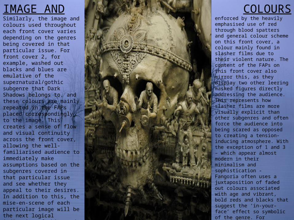
IMAGE ANDSimilarly, the image and colours used throughout each front cover varies depending on the genres being covered in that particular issue. For front cover 2, for example, washed out blacks and blues are emulative of the supernatural/gothic subgenre that Dark Shadows belongs to, and these colours are mainly repeated in the FAPs placed correspondingly to the image. This creates a sense of flow and visual continuity across the front cover, allowing the well-familiarised audience to immediately make assumptions based on the subgenres covered in that particular issue and see whether they appeal to their desires. In addition to this, the mise-en-scene of each particular image will be the next logical indication of this, and Fangoria utilises this across each of its front covers here – in front cover 2’s case, the period clothing, pale skin, and blood allow them to see Barnabas is a vampire and therefore belongs to a gothic horror film. Similarly, front cover 5 depicts a masked figure armed with the prop of a machete – both conventions of a slasher film. This is further
COLOURSenforced by the heavily emphasised use of red through blood spatters and general colour scheme on this front cover, a colour mainly found in slasher films due to their violent nature. The content of the FAPs on this front cover also mirror this, as they display two other leering masked figures directly addressing the audience. This represents how slasher films are more visually explicit than other subgenres and often force the audience into being scared as opposed to creating a tension-inducing atmosphere. With the exception of 1 and 3 – which appear almost modern in their minimalism and sophistication - Fangoria often uses a juxtaposition of faded out colours associated with age and vibrant, bold reds and blacks that suggest the ‘in-your-face’ effect so symbolic of the genre. For example, front cover 6 uses scratched out purples and yellows to emphasise the amateurish ‘homemade’ effect that symbolises the editors’ love for the genre. However, it is contrasted with the stark darkness and yellow lighting of the antagonist on the cover image, creating a bold visual identity that could only be associated with a magazine such as Fangoria.
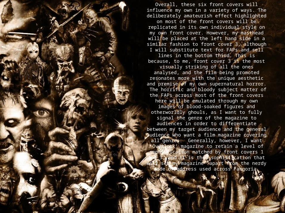
Overall, these six front covers will influence my own in a variety of ways. The deliberately
amateurish effect highlighted on most of the front covers will be replicated in its own individual style
on my own front cover. However, my masthead will be placed at the left hand side in a similar
fashion to front cover 3, although I will substitute text for FAPs and sell lines in the bottom third. This is because, to me, front cover 3 is the most visually striking of all the ones analysed, and the
film being promoted resonates more with the unique aesthetic and premise of my own
supernatural horror. The horrific and bloody subject matter of the FAPs across most of the front covers here will be emulated through my
own images of blood-soaked figures and otherworldly ghouls, as I want to fully signal the genre of the magazine to audiences in order to
differentiate between my target audience and the general audience who want a film magazine
covering all genres. Generally, however, I want ‘Overlook’ magazine to retain a level of
sophistication matched by front covers 1 and 3, and it is this sophistication that will set my
magazine apart from the nerdy mode of address used across Fangoria.