Embed Size (px)
Citation preview
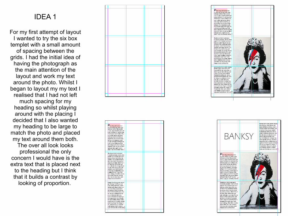
IDEA 1
For my first attempt of layout I wanted to try the six box
templet with a small amount of spacing between the
grids. I had the initial idea of having the photograph as the main attention of the layout and work my text
around the photo. Whilst I began to layout my my text I
realised that I had not left much spacing for my
heading so whilst playing around with the placing I
decided that I also wanted my heading to be large to
match the photo and placed my text around them both.
The over all look looks professional the only
concern I would have is the extra text that is placed next
to the heading but I think that it builds a contrast by
looking of proportion.
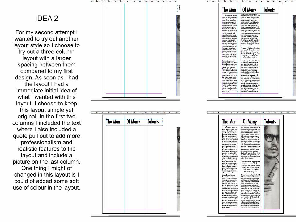
IDEA 2
For my second attempt I wanted to try out another layout style so I choose to
try out a three column layout with a larger
spacing between them compared to my first
design. As soon as I had the layout I had a
immediate initial idea of what I wanted with this layout, I choose to keep
this layout simple yet original. In the first two
columns I included the text where I also included a
quote pull out to add more professionalism and
realistic features to the layout and include a
picture on the last column. One thing I might of
changed in this layout is I could of added some soft use of colour in the layout.
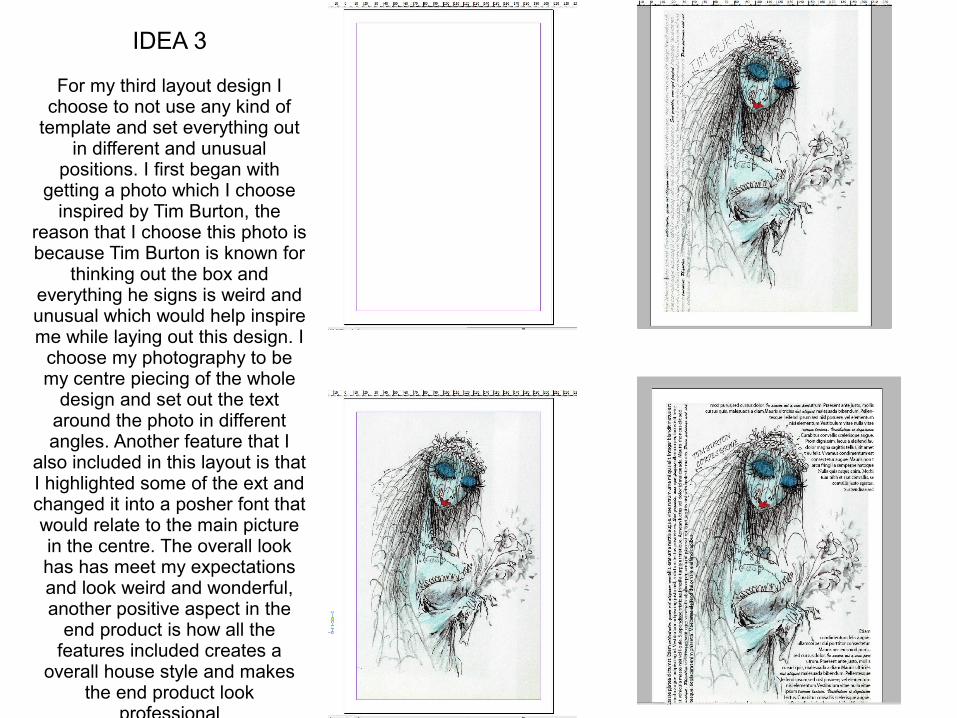
IDEA 3
For my third layout design I choose to not use any kind of
template and set everything out in different and unusual
positions. I first began with getting a photo which I choose
inspired by Tim Burton, the reason that I choose this photo is because Tim Burton is known for
thinking out the box and everything he signs is weird and unusual which would help inspire me while laying out this design. I
choose my photography to be my centre piecing of the whole
design and set out the text around the photo in different angles. Another feature that I
also included in this layout is that I highlighted some of the ext and changed it into a posher font that would relate to the main picture in the centre. The overall look has has meet my expectations and look weird and wonderful, another positive aspect in the
end product is how all the features included creates a
overall house style and makes the end product look
professional