
R
Identity guidelinesMarch 2017
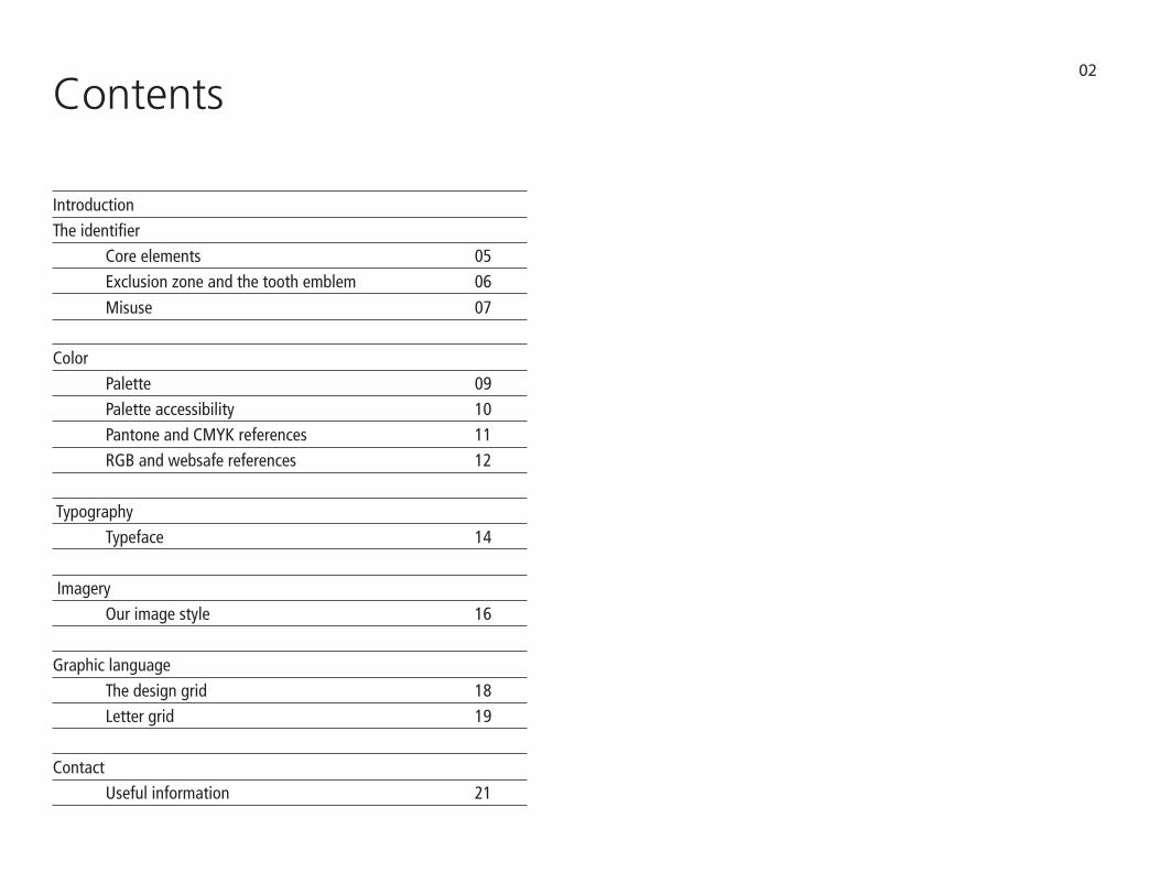
Contents
The identifier Core elements 05 Exclusion zone and the tooth emblem 06
Color
Introduction
02
Palette 09 Palette accessibility 10 Pantone and CMYK references 11 RGB and websafe references 12
Typography Typeface 14 Imagery Our image style 16
Graphic language The design grid 18 Letter grid 19
Contact Useful information 21
Misuse 07

INTRODUCTION
The guidlines
The purpose of this document is to ensure that the Viafield brand is consistently portrayed in all of our various touchpoints, from the way we interact with each other to the way we deliver our brand promise.
As we communicate, it’s important that we create greater awareness of our brand and our vision to be a leader in providing the very best products and services for all our stakeholders. This requires us to:
*Bring specific definition to the Viafield brand and drive greater consistency of its use throughout the organization. *Elevate the Viafield brand as a strategic asset, evolving the way people think, feel and talk about our organization
These identity guidelines are an important step toward achieving these goals. In some cases we simplified our brand elements for more effective communications. In all cases we worked to strike the right balance among consistency, flexibility and creativity. Consistently using the new guidelines and working together, we can continuously strengthen and advance awareness of our desire to strengthen the important role of agriculture in the modern world.
The Viafield Team
03

The identifierSecond edition - March 2017
04

THE IDENTIFIER
Core element
The identifier consists of the oval with rows emblem, the Viafield logotype and tag. It should not be redrawn, digitaly manipulated or altered. It must always be positioned centrally with the logotype.
The identifier must always be reproduced from a digital master reference. This is available in eps, jpeg and gif format. Please ensure the appropriate artwork format is used.
File formatseps: all professionally printed applicationsjpeg: desktop publishing programsgif: online usage
ColorThe identifier only appears in the three color variants shown on this page.
The colorized logo consists of two letter color variations with the company name in each color. When the logo appears on a background that is similar in color to either variant, the all black or all white logo is to be used. Please try to avoid any other combinations. CMYK breakdowns will be determined by individual application software.
AccessibilityThe identifier must always have good contrast with the background to ensure maximum impact and accessibility.
A sufficient exclusion zone is required around the identifier (see page 6).
R
R
05
R

THE IDENTIFIER
Exclusion zone
In order to maximuze its visual presence, the identifier requires a surrounding area clear of any other graphic elements or text.
The exclusion zone is equal to the height and width of the lower case “e” in “Viafield.” Always allow at least this amount of clear space around the identifier. It is important that this rule is observed and the exclusion zone is maintained at all times.
The recommended minimum clearance is to protect the identifier. The identifier will appear on many different applications and formats and this will help to give it clarity and presence. This is not a placement guide. It is a minimum only.
06
R
ee
e
e

THE IDENTIFIER
Misuse
07
Display the Viafield identifier only in the forms specified in this guide.
The Viafield identifier may NOT appear in any color.
Do not rotate, skew, scale, redraw, reproduce, alter or distort the identifier in any way.
Do not combine a identifier with any other element such as other logos, words, graphics, photos, slogans, or symbols, that may seem to create a hybrid mark.
R
All aspects of the sizing must stay the same Do not apply any type of gradient
R
R
R
Do not rotate in any way Do not change the color
R
Do not rearrange the elements

ColorSecond edition - March 2017
08

COLOR
Palette
The core color palette is shown to the right. It should be used on all our communications.
A set of tonally secondary colors have been developed in order to support the two core colors. These 4 supporting colors are designed to work with the core colors, in various combinations. They should be used to add depth and variety only.
Attention should be given to the use of appropriate colors. Minimal color usage is often the most effective.
PRIMARY
SECONDARY
09
Pantone® 300 C Pantone® 376 C
Pantone® 2597 C Pantone® 457 C Pantone® 167 C Pantone® 716 C
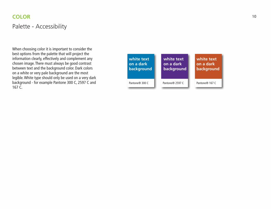
When choosing color it is important to consider the best options from the palette that will project the information clearly, effectively and complement any chosen image. There must always be good contrast between text and the background color. Dark colors on a white or very pale background are the most legible. White type should only be used on a very dark background - for example Pantone 300 C, 2597 C and 167 C.
COLOR
Palette - Accessibility
Pantone® 2597 C
white text on a dark background
10
Pantone® 300 C Pantone® 167 C
white text on a dark background
white text on a dark background

The Pantone and CMYK references for the palettes are:
COLOR
Pantone and CMYK references
Pantone 376 C.53 M.0 Y.96 K.0
Pantone 300 C.100 M.42 Y.0 K.0
Pantone 2597 C. 82 M.100 Y.7 K.3
Pantone 457 C.31 M.37 Y.100 K.4
Pantone 167 C.18 M.80 Y.100 K.7
Pantone 716 C.2 M.63 Y.100 K.0
11
PRIMARY
SECONDARY
Pantone® 300 C Pantone® 376 C
Pantone® 2597 C Pantone® 457 C Pantone® 167 C Pantone® 716 C

The RGB and websafe references for the palettes are:
COLOR
RGB and websafe references
Pantone 376 R.122 G.184 B.0 #7AB800
Pantone 300 R.0 G.101 B.189 #0065BD
Pantone 2597 R.88 G.15 B.139 #580F8B
Pantone 457 R.180 G.148 B.0 #B49400
Pantone 167 R.192 G.80 B.23 #C05017
Pantone 716 R.240 G.123 B.5 #F07B05
12
Professionalprinting
Desktop printing
Web
Use the RGB references above to change colors given on template
PRIMARY
SECONDARY
Pantone® 300 C Pantone® 376 C
Pantone® 2597 C Pantone® 457 C Pantone® 167 C Pantone® 716 C

TypographySecond edition - March 2017
13

Frutiger has been selected as the Viafield’s primary typeface, and is used for promotional materials that are produced in-house.
Frutiger has been selected due to the presence and feel of the typeface. We know it will not suit every application and have provided alternatives that are more widely available.
TYPOGRAPHY
Typeface
Frutigerabcdefghijklmnopqrstuvwxyz
ABCDEFGHIJKLMNOPQRSTUVWXYZ1234567890(&@?!$;:%”)
Myrad Proabcdefghijklmnopqrstuvwxyz
ABCDEFGHIJKLMNOPQRSTUVWXYZ1234567890(&@?!$;:%”)
Font alternative
Trebuchetabcdefghijklmnopqrstuvwxyz
ABCDEFGHIJKLMNOPQRSTUVWXYZ1234567890(&@?!$;:%”)
Font alternative - web
14

ImagerySecond edition - March 2017
15

Photography is a powerful and dynamic tool. Our value and ethos are reflected in the images we use. They should communicate the pride, value, and personality of what we do.
Photography should convey emotions and atmosphere. Look beyond the straightforward and typical to find a more inspirational perspective. Consider detail or unusual angles to increase impact and create effective communications. Our images show natural, real-life people and situations. They should convey dynamic strength and engage the audience.
Images should feel observational and spontaneous rather than staged, and show a relationship with our company values and cultural surroundings.
Images can be reproduced in full color, single color (monotone) and black and white.
Only use images that are relevant and add value. Ensure the content does not offend or alienate. Avoid cliches, and undesirable situational depictions.
Images that are used in printed materials should be reproduced at print quality - 300 dpi.
IMAGERY
Our image style
16
Ag Related images
Life images

Graphic LanguageSecond edition - March 2017
17
18
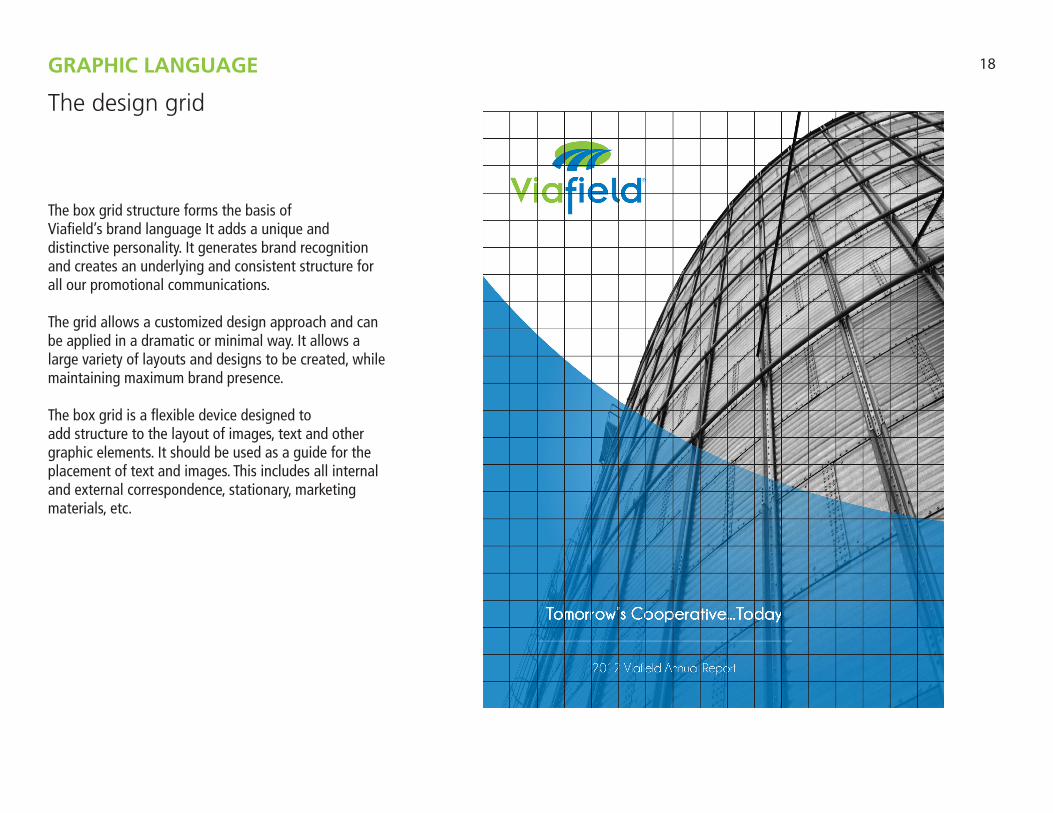
The box grid structure forms the basis ofViafield’s brand language It adds a unique and distinctive personality. It generates brand recognition and creates an underlying and consistent structure for all our promotional communications.
The grid allows a customized design approach and can be applied in a dramatic or minimal way. It allows a large variety of layouts and designs to be created, while maintaining maximum brand presence.
The box grid is a flexible device designed toadd structure to the layout of images, text and other graphic elements. It should be used as a guide for the placement of text and images. This includes all internal and external correspondence, stationary, marketing materials, etc.
GRAPHIC LANGUAGE
The design grid

19
The example opposite illustrates our letter box grid template. The identifier should always appear in a consistant size with appropriate exclusion area either at the top or base of the page. See page 6 for size and exclusion area guidance.
The letter box grid consists of 22 horizontal panels and 17 vetical panels. Each panel has a depth of 3 picas.
The grid is available in indd. and eps. file formats.
The grid should be used as a guide for the placement of text and images on all printed or designed materials for the company.
GRAPHIC LANGUAGE
Letter grid
Base of page identifier positioning option
ContactSecond edition - March 2017
20
21
Viafield
Address:1001 Blunt PkwyCharles City, IA 50616
Phone:641-715-1203
Website:www.viafield.com
Social Media:www.facebook.com/viafieldtwitter.com/viafield
CONTACT
Useful information

R
Copyright © 2017 Viafield, a cooperative. All rights reserved. Reproduction in
whole or in part without the express written permission of Viafield is prohibited.
Recommended


