Embed Size (px)
Citation preview

1
Where is Colour Education Now? David Briggs a Julian Ashton Art School and National Art School, Sydney, Australia
Presented at the Munsell Centennial Color Symposium, Boston, 2018
In several important ways colour education today presents not a simplified but a fossilized version of our
current understanding of colour. To explain what I mean I must begin with a short sketch of the
development of that understanding.
Colour Vision: Trichromacy, Cone Opponency and Hue Opponency (p. 6 – 8)
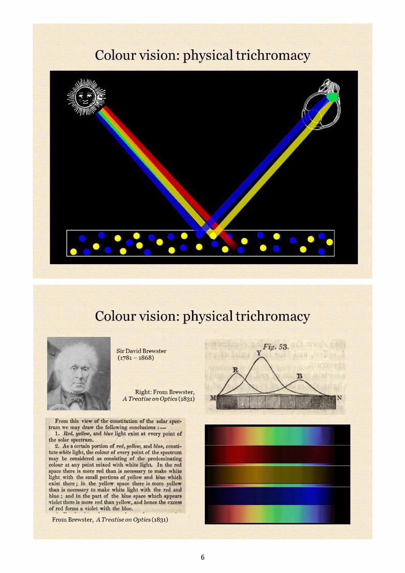
The idea that three primary colours, red, yellow and blue, are the ultimate components of all other colours
became established progressively over the course of the 17th century. But how could these three primaries
be reconciled with Newton’s conclusion that the daylight spectrum consists of a contnuous series of rays
appearing different colours? Where did that number three come from? One solution was to conclude that
Newton was wrong and that the seemingly continuous spectrum is actually made up of physically distinct
red, yellow and blue components that overlap to produce the intermediate hues green and orange. The
suggestion that colour vision involves three types of visual receptor was first made by Mikhail Lomonosov
and George Palmer in the 18th century based on this belief that light is physically trichromatic. By this view
a mixture of yellow and blue paints appears green because it reflects only the yellow and blue components
of light, which stimulate the yellow and blue receptors in the eye, just as they do when mixed to make the
green of the spectrum. In this enviably simple view of colour, the primary colours of light-mixing, paint-
mixing and human perception all coincide. This idea of a physically trichromatic spectrum predominated
throughout the first half of the 19th century through the efforts of the formidable Scottish physicist Sir
David Brewster, who convinced himself he could see the red, yellow and blue components of light by
viewing the solar spectrum through coloured filters.

2
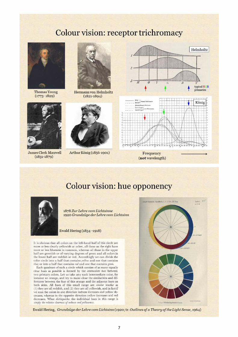
Hermann von Helmholtz elegantly and definitively showed that Brewster was mistaken in 1852, and later
revived an alternative solution suggested by Thomas Young in 1801. Young had held that the receptor types
are three in number, as the number of painters’ primaries had previously suggested, but that the spectrum is
physically continuous as Newton had believed, and the receptors each respond to a range of wavelengths
about a central peak. Young and later Helmholtz postulated that the three receptors evoke red, green and
violet fundamental senations respectively that combine to create compound colour sensations. For example,
spectral blue is a mix of green and violet sensations, spectral yellow is a mix of red and green sensations,
and white is a mix of red, green and violet sensations. Young and Helmholtz had envisioned the three
receptors as having broad but well separated sensitivity peaks, but Konig’s extensive studies of
“colourblind” subjects showed correctly that the so-called red and green receptors overlap greatly and
respond through most of the visible spectrum.
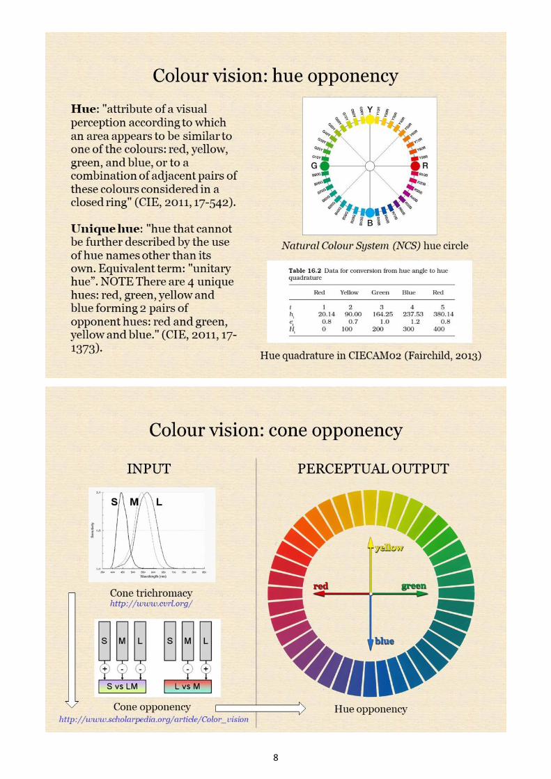
Important as this receptoral trichromacy is, there was still one vital piece of the puzzle missing. Ewald
Hering disputed Helmholtz’s view that yellow and white are compound sensations. Instead he proposed an
opponent model in which all hue perceptions are combinations of red or green and yellow or blue unique
hues. For each of these four hues we can imagine a pure version, for example, a yellow that is neither
greenish nor reddish, a green that is neither yellowish nor bluish, and so on. Hue opponency is now written
in to the standard definitions of the CIE International Lighting Vocabulary and is also the foundation of
models outside the CIE, notably the Scandinavian Natural Colour System (NCS). In turn the NCS-specified
unique hues are employed in converting hue angle to a predicted hue perception (hue quadrature) in modern
colour appearance models. Unfortunately most colour education outside the NCS system still fails to address
this fundamental aspect of our current understanding of colour.
In the mid-20th century it was establshed that cone cells do not send signals directly to the brain, but rather
their signals are compared with each other begnning in the retina in a process called cone opponency. It was
intially thought that the L/M and S/LM cone opponent responses might correspond directly to the red/green
and blue/yellow hue opponent perceptions, but it’s now known that these do not align in this way. So at
present, though it seems well established that the input to the visual system involves cone trichromacy and
cone opponency, and that the perceptual output of the visual system involves hue opponency, the connection
between the two remains uncertain. Together, cone trichromacy and cone opponency detect variations in the
balance of long-, middle- and short-wavelength components of light across the visual field, and ultimately
this information contributes to colour perceptions made up of red/green and blue/yellow hue-opponent
components.
Traditional Colour Theory (p. 9-13)
The defining tenet of traditional colour theory is the idea that there are three primary colours, red, yellow
and blue, that all other colours can be mixed from, but which can’t be mixed from other colours. This tenet
is a fossil of the scientific view of colour demolished by Helmholtz in the mid-19th century. Traditional
colour theory still appears extensively in textbooks written for college/tertiary level courses in art and
design, as well innumerable books and websites written for painters, designers and other colour users.
Historically one of the most influential statements was Johannes Itten’s The Art of Color (1961). A Google
image search for “colour wheel” shows the prevalence of the primaries of “Brewster’s theory” that Munsell
railed against over a century ago.
The ultimate basis for the supposed unmixability of the traditional primaries is often misunderstood. Don’t
think for a moment that you can just whip out your modern cyan, magenta and yellow paints and
triumphantly prove that red is not a primary colour by “making” red from magenta and yellow paint! The
traditional colour theorist will explain to you that the magenta paint already contains red (you can see it!),
but also contains purple, the complementary of yellow. By adding yellow you didn’t make red, you merely
neutralized the purple and revealed the pure red that was already there (!). Similarly you’ll be informed that
you didn’t make blue by mixing cyan and magenta paint. You can see that the cyan paint already contains
blue and green, and that the magenta paint contains red and purple, and of course purple contains red and

3
blue, so when you added magenta to cyan the red component of the magenta neutralized the green
component of the cyan to reveal the pure blue already present in both paints.
Thus these unmixable traditional primary colours ultimately are not colours of paints as such, they are the
pure colours that we see in the colours of paints. They are an expression of the unique hues of modern
science, but with one major difference. Whereas the unique hues are thought to be the components of
perceptions created by the visual system, the traditional primary colours are assumed to be properties
residing and mixing in paints themselves. On this assumption they really are unmixable! We really can’t mix
a red paint without using paints that are already reddish, we can’t mix a blue paint without using bluish
paints, and we can’t mix a yellow paint without using very yellowish paints.
But we can mix a green paint from paints that are not greenish, and that’s why there are three traditional
primaries and not four. From a scientific point of view we know that a paint we perceive as yellow reflects
strongly the long- and middle-wavelength parts of the spectrum and a paint we perceive as blue reflects
mainly the short wavelength half. Mixing these paints involves a subtractive process that leaves mostly the
middle part of the spectrum, which we see as green. Thus when we mix paints it isn’t their hues that are
mixing. But what if we don’t know about all this modern science, and instead subscribe to the fossilized
belief that hues reside and mix in the paints themselves? If we can mix a yellow and a blue paint that do not
contain green and yet produce a green mixture, it’s clear from this perspective that the colour green is not
primary, but must be made of yellow and blue.
Still, you might argue that although traditional colour theory is not scientifically correct, it’s simple and it
works in practice. Well, it sort-of works. By eliminating green and distributing the remaining three unique
hues symmetrically, we end up with a hue scale that is very unevenly spaced perceptually, moving very
rapidly from yellow to green, and very slowly from yellow to red. It also destroys the striking symmetry that
an opponent hue scale displays about the yellow-blue axis. We can mix paints of all hues using just a middle
red, a middle yellow and a middle blue paint, but the gamut (range) of colours we obtain is both
disappointingly small and inexplicably misshapen. Why is it that we get high-chroma orange, medium-
chroma greens and very low-chroma purples if all colours are made of red, yellow and blue? One way of
defending the traditional primaries is to blame this odd and disappointing gamut on the impurity of available
primary paints. But then why is it that very impure reds (magenta) and blues (cyan) can mix a larger and
more even gamut?
The “Split Primary” Theory (p. 14 -15)
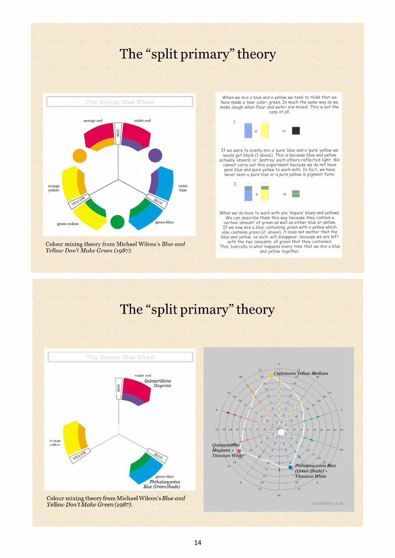
An alternative approach to defending the traditional primaries argues that we wouldn’t expect a middle red,
middle blue and middle yellow paint to mix a full range of colours. According to this approach a perfect
yellow paint would just reflect yellow wavelengths (which if you were paying attention a few slides ago
you’ll know isn’t true!) and would have no wavelengths in common with a perfect red or blue paint. Colour
mixing by this view depends on having primaries containing an impurity or “bias” of an adjacent secondary
colour, so we need two paints for each primary, with an impurity or bias in each direction. The theory
appears to account for why a palette of six such paints can mix a full range of colours, but can not explain
how a CMY palette of a purplish red, a greenish blue and an orange yellow can mix anything! Although the
theory is completely bogus, a split primary palette works well in practice, especially if we choose a magenta
paint as our “cool” or purplish red, but largely because it contains cyan and magenta subtractive mixing
primaries that with yellow are doing most of the work.
The YouTube Theory of Colour Vision (p. 16 -22)
When writing for a general audience, vision scientists often refer to the long-, middle- and short-wavelength
cone classes (L, M and S) as red, green and blue cones respectively. While this simplification may seem
harmless it unfortunately has been the starting point for a cascade of misunderstandings about human colour
vision. To begin with it reinforces the common assumption that hues are properties residing in wavelengths
of light, and then understandably leads to the assumption that the three cone types individually detect red,
green and blue hues/wavelengths. Together these assumptions lead to the conclusion commonly encountered

4
in discussions of colour vision on social media that we “only really see three colours”. In turn this
conclusion has teamed up with the homunculus fallacy to spawn a model of colour vision in which the cone
cells send hue signals directly to an observing brain. This model is a veritable fossil collection of outdated
views about colour vision, but has achieved the status of orthodoxy on several online platforms.
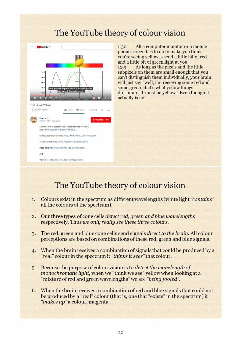
By this view the spectral hues are “real colours” because they “exist” in the spectrum. When the brain
receives a combination of cone signals that could be produced by a “real” colour it “thinks it sees” that
colour. Thus the brain “thinks it sees” yellow while we look at a mixture of “red and green wavelengths”
because it (somehow) knows that yellow “exists” in the spectrum between red and green. (It’s unclear how it
knows this since we supposedly can’t see yellow “directly”). When our brain “thinks it sees yellow” in this
way it is being “tricked” or ”lied to”- this mixture of wavelengths is only “fake yellow” – based on the
entirely unjustified assumption that the purpose of colour vision is to detect wavelengths of monochromatic
light. When the brain receives a combination of “red cone” and “blue cone” signals, which could not be
produced by a “real colour” (i.e. a single wavelength), it “makes up” a colour, magenta. Individual
explanations add other misconceptions, like cone cells facing the wrong way or the idea that yellow objects
reflect only “real yellow” wavelengths. The explanations make no mention of the important concept of hue
opponency, and it’s difficult to see how this concept could be grafted, without causing great confusion, onto
an explanation that already invokes “red, green and blue” signals at the level of the cones.
Hue as a Way of Seeing Wavelength Balance (p. 23 - 24)
Hue is not a property of the external world that we “detect” either with red, yellow and blue or red, green
and blue colour detectors. Hue is the way in which we perceive wavelength bias of lights and of the spectral
reflectance of objects. Together, cone trichromacy and cone opponency constitute a device by which we can
detect variations in the relative balance of the long-, middle- and short-wavelength components of light
across the visual field. Not coincidentally, a computer screen is a device that generates light in which the
proportions of the long-, middle- and short-wavelength components can be varied at will. Colour education
should begin with a thorough exploration of colour as a perception, and a computer screen is a ready-made
device for systematically exploring the attributes of perceived colour like hue in the classroom.
Now a computer screen is designed so that when the RGB levels are equal the screen emits light with the
same balance of long-, middle- and short-wavelength components as daylight (a specific daylight balance
called D65). If there is no long- or middle- or short-wavelength bias relative to daylight we perceive the
screen area and the light emitted from it as lacking hue. The hue of a digital colour or of an isolated light is
the way in which we perceive a direction of bias among its long-, middle- and short-wavelength components
relative to daylight. Students can be led to question the usual presentation of screen colours in terms of
“additive colour mixing” of red, green and blue. This seems to work for digital cyan, which looks to be a
mix of green and blue, and digital magenta, which looks to be a mix of red and blue. But if we mix red and
green in the right proportion we get a colour that looks to contain neither red nor green. This anomaly can
then be explained using the concept of hue opponency. Digital colours can be considered both as light and
object colours, so a computer screen can also be used to explore all of the remaining attributes of perceived
colour.
The Munsell Framework: Hue, Lightness and Chroma (p. 25 - 30)
If anyone tells you that after a hundred years the time has come to retire the framework of hue, lightness and
chroma you can tell them that they have no idea how useful the system can be for painters. (Admittedly
though, there are still many painters who have no idea how useful the system can be for painters!) The
prevalence of the hue-lightness- chroma framework over other systems is no doubt because of the primary
importance of lightness for painters, both representationally and compositionally.
Traditional colour theory tends to treat the colour wheel and the lightness scale separately, or to integrate
them only in a simplistic way as in the colour sphere of Johannes Itten, who ignored Munsell and resurrected
19th century conceptions. Spherical models do not represent lightness, as full colours of widely varying
lightness are all placed on the equator, or chroma, as the colour scales must be greatly distorted to fit the

5
symmetrical model. There is a real need for an inexpensive physical model that actually illustrates lightness
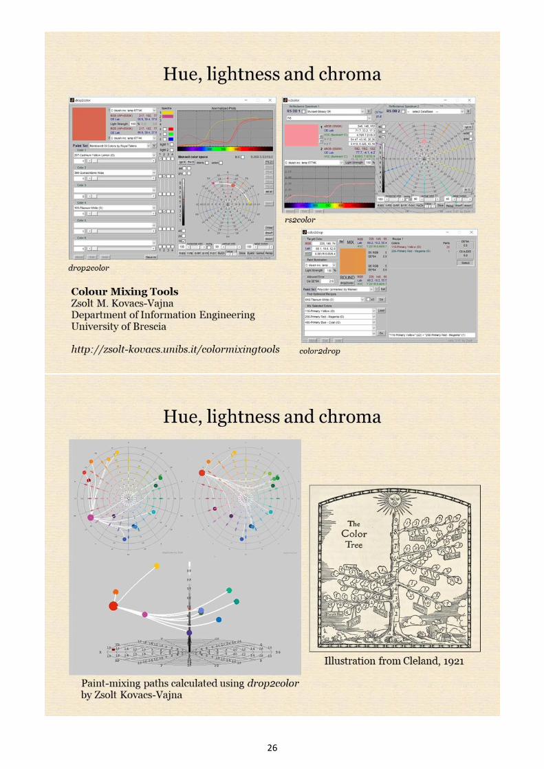
and chroma instead of this fossilized spherical concept. Fortunately, a suite of free programs by Zsolt
Kovacs-Vajna, especially his drop2color, are unprecedented in providing painters with three-dimensional
computer representations of colorant mixing paths in Munsell space.
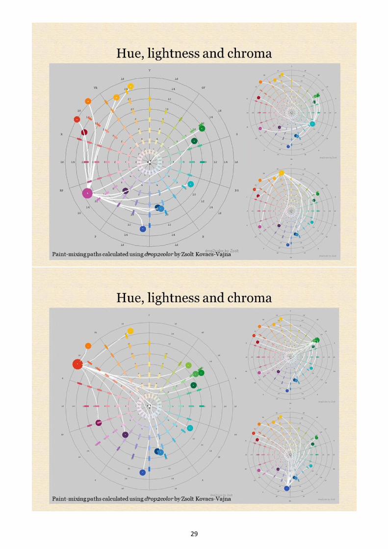
The accompanying slides show various ways in which drop2color and other programs help the student to
visualize characteristic paint-mixing paths in colour space. I like to picture paint mixing as throwing ropes
between paints in the Munsell “tree” and ferrying mixtures along the ropes by varying the proportions of the
components. For close paints the rope can be pulled straight, but to a good approximation the more distant
the paints the more the rope will sag. (This is one reason why it’s easier to neutralize a paint using a grey of
the same value rather than the more distant complementary). In plan view notice the characteristic mixing
patterns for paints close to the ideal subtractive (CMY) primaries (a pattern I liken to an extroverted
octopus) and the contrasting pattern for paints close the ideal additive (RGB) primaries (the introverted
octopus). These patterns are discussed further on my website www.huevaluechroma.com.
From a painter’s point of view the one unfortunate aspect of the Munsell system is the hue scale, which
designates as “Purple Blue” paints that we conventionally classify as middle blue and designates as “Blue”
paints we generally call cyan. Similarly, “Red Blue” is the painter’s magenta, and “Yellow Red” and “Green
Yellow” are more awkward than orange and yellow green. A useful modern nomenclature of the Munsell
hue scale has been used in a poster by X-Rite based on a proposal by Cal McCamy.
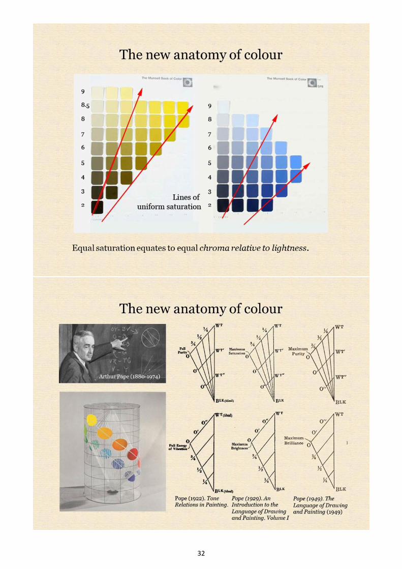
The New Anatomy of Colour: Brightness, Colourfulness, Saturation and Brilliance (p. 31 - 33)
The CIE International Lighting Vocabulary defines six attributes of perceived colour: hue, brightness,
lightness, colourfulness, saturation and chroma. In addition to these a seventh attribute, brilliance (with its
inverse, blackness), has long been used in various forms outside the CIE system, including the NCS System.
A very pervasive “fossil” in colour education is the idea that colour has just three dimensions, and with it the
idea that chroma, saturation and colourfulness are synonmyms. This may be largely because the CIE
definitions were difficult to access until they were made available online a few years ago, and are difficult
for the general public to understand without suitable illustrations and explanation.
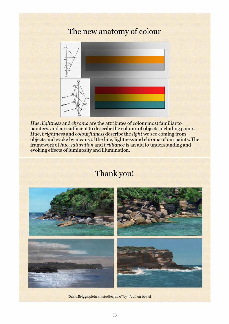
To understand these terms, consider a stripe of red paint in light and shadow. We see the stripe as
maintaining the same intrinsic colour – the same hue, lightness and chroma – in shadow and in light. Hue,
lightness and chroma are sufficient to describe the colours of objects, including artists’ paints.
Nevertheless, the stripe appears brighter and more colourful in the light than in the shadow. Whereas
lightness and chroma describe the colour seen as belonging to the object, brightness and colourfulness
describe the colour of the light coming from different areas of the object. In painting we represent variations
in brightness and colourfulness by means of variations in the lightness and chroma of our paints.
Because the brightness and colourfulness of the stripe increase in step with each other as the illumination
increases, the colourfulness relative to the brightness, called the saturation, remains the same. Equal
saturation equates to equal chroma relative to lightness, so we would expect that the series of paints we
would use to depict a variably illuminated object should maintain this relationship and thus radiate from the
zero-value point on a Munsell hue page. (In practice these shading series are found to wander slightly and
on average trend from a point about one Munsell value step below zero). Just as Albert Munsell crystallized
the framework of hue, lightness and chroma, the dimensional framework of saturation and brilliance was
crystallized (under various names) by another artist and art teacher, Arthur Pope. The framework of hue,
saturation and brilliance is an excellent aid to painters in understanding and evoking effects of luminosity
and illumination. These attributes of perceived colour and their relevance to painters are discussed in more
detail in the pdf of my Munsell 2018 breakout session and poster presentation Dimensions of Colour for
Artists and in my ISCC International Colour Day 2018 webinar The New Anatomy of Colour, a recording of
which is available on the ISCC website.
6
7
8

9

10

11

12

13
14

15

16

17

18

19

20

21
22

23

24

25
26

27

28
29

30

31
32
33