Embed Size (px)
Citation preview
Visualizing Categorical Data�
Michael FriendlyYork UniversityToronto, Ontario
Abstract
Graphical methods for quantitative data are well-developed, and widely used in both data anal-ysis (e.g., detecting outliers, verifying model assumptions) and data presentation. Graphical meth-ods for categorical data, however, are only now being developed, and are not widely used.
This paper outlines a general framework for data visualization methods in terms of communi-cation goal (analysis vs. presentation), display goal, and the psychological and graphical designprinciples which graphical methods for different purposes should adhere to.
These ideas are illustrated with a variety of graphical methods for categorical data, some oldand some relatively new, with particular emphasis on methods designed for large, multi-way con-tingency tables. Some methods (sieve diagrams, mosaic displays) are well-suited for detecting andpatterns of association in the process of model building; others are useful in model diagnosis, oras graphical summaries for presentation of results.
Contents
1 Introduction . . . . . . . . . . . . . . . . . . . . . . . . . . . . . . . . . . . . . . . 2
2 Goals and Design Principles for Visual Data Display. . . . . . . . . . . . . . . . . 2
3 Some Graphical Methods for Categorical Data. . . . . . . . . . . . . . . . . . . . 3
4 Example: NAEP 1992 Grade 12 Mathematics. . . . . . . . . . . . . . . . . . . . . 14
5 Effect Ordering for Data Displays . . . . . . . . . . . . . . . . . . . . . . . . . . . 21
6 Mosaic Matrices and Coplots for Categorical Data. . . . . . . . . . . . . . . . . . 22
�To appear as Chapter 20 (pp. 319–348) inCognition and Survey Research, edited by M. G. Sirken, D. J. Hermann,S. Schechter, N. Schwartz, J. M. Tanur, and R Tourangeau, 1999, John Wiley and Sons, Inc. ISBN 0-471-24138-5. Thiscopy reflects the submitted draft, but not editorial changes in the final copy. I am grateful to Douglas Hermann for helpfulcomments on the manuscript.
1
1 INTRODUCTION 2
1 Introduction
For some time I have wondered why graphical methods for categorical data are so poorly developedand little used compared with methods for quantitative data. For quantitative data, graphical methodsare commonplace adjuncts to all aspects of statistical analysis, from the basic display of data in ascatterplot, to diagnostic methods for assessing assumptions and finding transformations, to the finalpresentation of results. In contrast, graphical methods for categorical data are still in infancy. There arenot many methods, and those that are available in the literature are not accessible in common statisticalsoftware; consequently they are not widely used.
What has made this contrast puzzling is the fact that the statistical methods for categorical data, arein many respects, discrete analogs of corresponding methods for quantitative data: log-linear modelsand logistic regression, for example, are such close parallels of analysis of variance and regressionmodels that they can all be seen as special cases of generalized linear models.
Several possible explanations for this apparent puzzle may be suggested. First, it may just be thatthose who have worked with and developed methods for categorical data are just more comfortablewith tabular data, or that frequency tables, representing sums over all cases in a dataset are more easilyapprehended in tables than quantitative data. Second, it may be argued that graphical methods forquantitative data are easily generalized; for example, the scatterplot for two variables provides thebasis for visualizing any number of variables in a scatterplot matrix; available graphical methods forcategorical data tend to be more specialized.
However, a more fundamental reason may be that quantitative and categorical data display are bestserved by different visual metaphors. Quantitative data rely on the natural visual representation ofmagnitude by length or position along a scale; for categorical data, it will be seen that a count is morenaturally displayed by an area or by the visual density of an area.
To make the contrast clear, Section3 describes and illustrates several graphical methods for cat-egorical data, some old and some relatively novel, with particular emphasis on methods designed forlarge, multi-way contingency tables. Some methods (sieve diagrams, mosaic displays) are well-suitedfor detecting and patterns of association in the process of model building; others are useful in modeldiagnosis, or as graphical summaries for presentation of results. A more substantive illustration fol-lows in Section4. A final section describes some ideas for effective visual presentation. But first I willoutline a general framework for data visualization methods in terms of communication goal (analysisvs. presentation), display goal, and the psychological and graphical design principles which graphicalmethods for different purposes should adhere to.
2 Goals and Design Principles for Visual Data Display
Designing good graphics is surely an art, but equally surely, it is one that ought to be informed byscience. In constructing a graph, quantitative and qualitative information is encoded by visual features,such as position, size, texture, symbols and color. This translation is reversed when a person studiesa graph. The representation of numerical magnitude and categorical grouping, and the aperception ofpatterns and theirmeaningmust be extracted from the visual display.
There are many views of graphs, of graphical perception, and of the roles of data visualizationin discovering and communicating information. On the one hand, one may regard a graphical dis-play as a ’stimulus’ – a package of information to be conveyed to an idealized observer. From this

3 SOME GRAPHICAL METHODS FOR CATEGORICAL DATA 3
perspective certain questions are of interest: which form or graphic aspect promotes greater accuracyor speed of judgment (for a particular task or question)? What aspects lead to greatest memorabil-ity or impact? ClevelandCleveland and McGill(1984, 1985), Cleveland(1993a), Lewandowsky andSpenceLewandowsky and Spence(1989), Spence(1990) have made important contributions to ourunderstanding of these aspects of graphical display.
An alternative view regards a graphical display as an act of communication—like a narrative, oreven a poetic text or work of art. This perspective places the greatest emphasis on the desired com-munication goal, and judges the effectiveness of a graphical display in how well that goal is achieved.Kosslyn(1985, 1989) has articulated this perspective most clearly from a cognitive perspective.
In this view, an effective graphical display, like good writing, requires an understanding of itspurpose—what aspects of the data are to be communicated to the viewer. In writing we communicatemost effectively when we know our audience and tailor the message appropriately. So too, we mayconstruct a graph in different ways to use ourselves, to present at a conference or meeting of ourcolleagues, or to publish in a research report, or a communication to a general audience (Friendly,1991, Ch. 1).
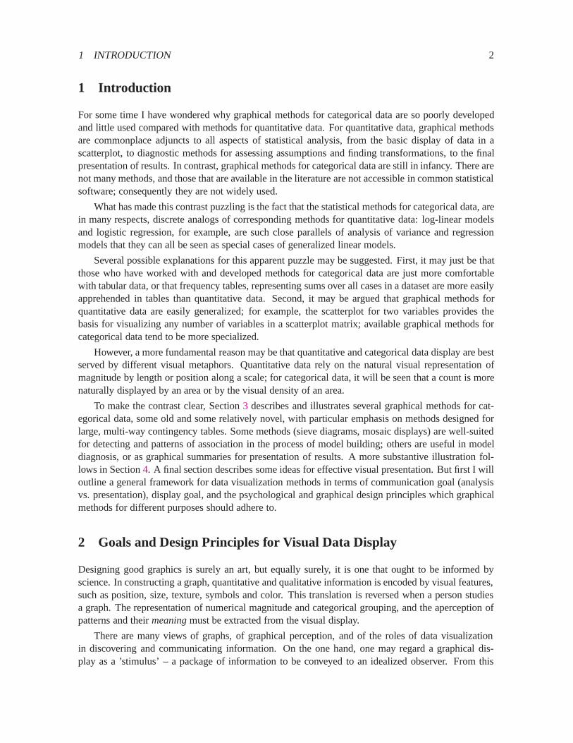
Figure1 shows one organization of visualization methods in terms of the primary use or intendedcommunication goal, the functional presentation goal, and suggested corresponding design principles.
The first distinction identifiesAnalysisor Presentationas the primary communication goal of adata graphic (with the understanding that a given graph may serve both purposes—or neither). Amonggraphical methods designed to help study or understand a body of data, I distinguish those designedfor:
� reconnaissance—a preliminary examination, or an overview of a possibly complex terrain;
� exploration—graphs designed to help detect patterns or unusual circumstances, or to suggesthypotheses, analyses or models;
� diagnosis—graphs designed to summarize or critique a numerical statistical summary.
Presentation graphics have different presentation goals as well. We may wish to stimulate, or topersuade, or simply to inform. As in writing, it is usually a good idea to know what it is you want tosay with a graph, and tailor its message to that goal. (In what follows, my presentation goal is primarilydidactic.)
3 Some Graphical Methods for Categorical Data
One-way frequency tables may be conveniently displayed in a variety of ways: typically as bar charts(though the bars should often be ordered by frequency, rather than by bar-label), dot chartsCleveland(1993b) or pie charts (when percent of total is important).
For two- (and higher-) way tables, however, the design principles of perception, detection, andcomparison imply that we should try to show the observed frequencies in the cells in relation to whatwe would expect those frequencies to be under a reasonable null model — for example, the hypothesisthat the row and column variables are unassociated.
3 SOME GRAPHICAL METHODS FOR CATEGORICAL DATA 4
Presentation
Exploration
Reconnaisance
Diagnosis
to Persuade
to Inform
to Stimulate
DisplayData
Primary Use Presentation Goal
Analysis
Aesthetics
Rhetoric
Exposition
Design
Principles
Perception
Detection
Comparison
Model building
Basic Functions of Data Display
Figure 1: Basic functions of data display.
3 SOME GRAPHICAL METHODS FOR CATEGORICAL DATA 5
Table 1: Hair-color eye-color data.
Hair ColorEyeColor BLACK BROWN RED BLOND Total
Green 5 29 14 16 64Hazel 15 54 14 10 93Blue 20 84 17 94 215Brown 68 119 26 7 220
Total 108 286 71 127 592
To this end, several schemes for representing contingency tables graphically are based on the factthat when the row and column variables are independent, the estimated expected frequencies,mij , areproducts of the row and column totals (divided by the grand total):mij = ni+n+j=n++. Then, eachcell can be represented by a rectangle whose area shows the cell frequency,nij, or the deviation fromindependence.
3.1 Sieve diagrams
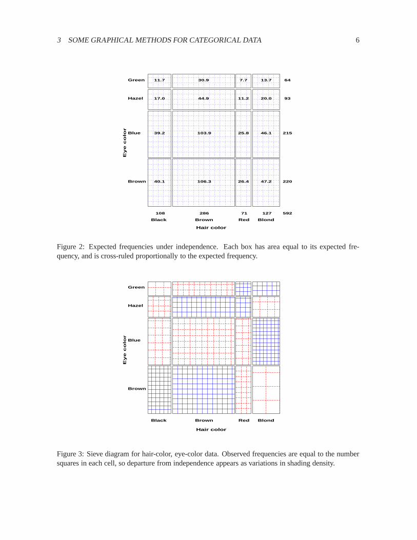
Table1 shows data on the relation between hair color and eye color among 592 subjects (students in astatistics course) collected bySnee(1974). The Pearson�2 for these data is 138.3 with nine degreesof freedom, indicating substantial departure from independence. Assume the goal is to understand thenatureof the association between hair and eye color.
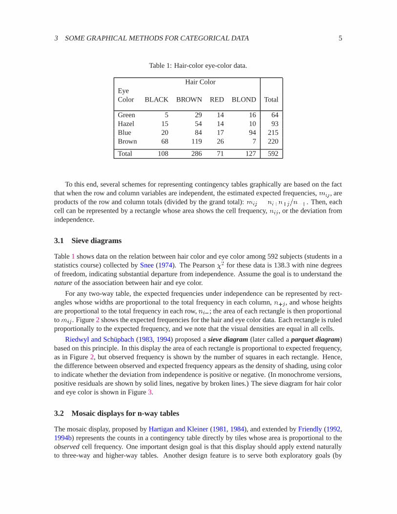
For any two-way table, the expected frequencies under independence can be represented by rect-angles whose widths are proportional to the total frequency in each column,n+j, and whose heightsare proportional to the total frequency in each row,ni+; the area of each rectangle is then proportionaltomij . Figure2 shows the expected frequencies for the hair and eye color data. Each rectangle is ruledproportionally to the expected frequency, and we note that the visual densities are equal in all cells.
Riedwyl and Sch¨upbach(1983, 1994) proposed asieve diagram(later called aparquet diagram)based on this principle. In this display the area of each rectangle is proportional to expected frequency,as in Figure2, but observed frequency is shown by the number of squares in each rectangle. Hence,the difference between observed and expected frequency appears as the density of shading, using colorto indicate whether the deviation from independence is positive or negative. (In monochrome versions,positive residuals are shown by solid lines, negative by broken lines.) The sieve diagram for hair colorand eye color is shown in Figure3.
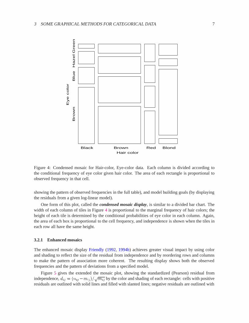
3.2 Mosaic displays for n-way tables
The mosaic display, proposed byHartigan and Kleiner(1981, 1984), and extended byFriendly(1992,1994b) represents the counts in a contingency table directly by tiles whose area is proportional to theobservedcell frequency. One important design goal is that this display should apply extend naturallyto three-way and higher-way tables. Another design feature is to serve both exploratory goals (by
3 SOME GRAPHICAL METHODS FOR CATEGORICAL DATA 6
Green
Hazel
Blue
Brown
Black Brown Red Blond
Eye c
olo
r
Hair color
11.7 30.9 7.7 13.7
17.0 44.9 11.2 20.0
39.2 103.9 25.8 46.1
40.1 106.3 26.4 47.2
64
93
215
220
108 286 71 127 592
Figure 2: Expected frequencies under independence. Each box has area equal to its expected fre-quency, and is cross-ruled proportionally to the expected frequency.
Green
Hazel
Blue
Brown
Black Brown Red Blond
Eye c
olo
r
Hair color
Figure 3: Sieve diagram for hair-color, eye-color data. Observed frequencies are equal to the numbersquares in each cell, so departure from independence appears as variations in shading density.
3 SOME GRAPHICAL METHODS FOR CATEGORICAL DATA 7
Black Brown Red Blond
Hair color
Bro
wn
Blu
e
Hazel G
reen
Eye c
olo
r
Figure 4: Condensed mosaic for Hair-color, Eye-color data. Each column is divided according tothe conditional frequency of eye color given hair color. The area of each rectangle is proportional toobserved frequency in that cell.
showing the pattern of observed frequencies in the full table), and model building goals (by displayingthe residuals from a given log-linear model).
One form of this plot, called thecondensed mosaic display, is similar to a divided bar chart. Thewidth of each column of tiles in Figure4 is proportional to the marginal frequency of hair colors; theheight of each tile is determined by the conditional probabilities of eye color in each column. Again,the area of each box is proportional to the cell frequency, and independence is shown when the tiles ineach row all have the same height.
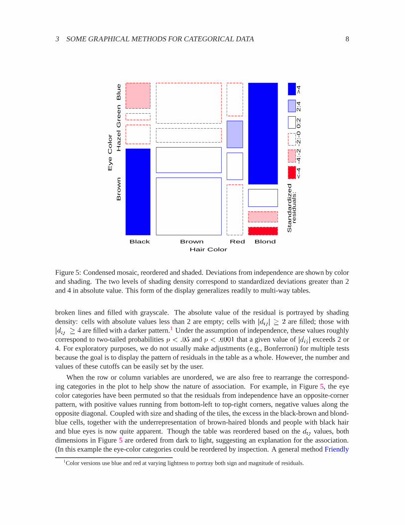
3.2.1 Enhanced mosaics
The enhanced mosaic displayFriendly (1992, 1994b) achieves greater visual impact by using colorand shading to reflect the size of the residual from independence and by reordering rows and columnsto make the pattern of association more coherent. The resulting display shows both the observedfrequencies and the pattern of deviations from a specified model.
Figure 5 gives the extended the mosaic plot, showing the standardized (Pearson) residual fromindependence,dij = (nij�mij)=
pmij by the color and shading of each rectangle: cells with positive
residuals are outlined with solid lines and filled with slanted lines; negative residuals are outlined with
3 SOME GRAPHICAL METHODS FOR CATEGORICAL DATA 8
Black Brown Red Blond
Hair Color
Bro
wn
Hazel G
reen B
lue
Eye C
olo
r
Sta
ndard
ized
resid
ua
ls:
<
-4-4
:-2
-2:-
00
:22
:4>
4
Figure 5: Condensed mosaic, reordered and shaded. Deviations from independence are shown by colorand shading. The two levels of shading density correspond to standardized deviations greater than 2and 4 in absolute value. This form of the display generalizes readily to multi-way tables.
broken lines and filled with grayscale. The absolute value of the residual is portrayed by shadingdensity: cells with absolute values less than 2 are empty; cells withjdij j � 2 are filled; those withjdij j � 4 are filled with a darker pattern.1 Under the assumption of independence, these values roughlycorrespond to two-tailed probabilitiesp < :05 andp < :0001 that a given value ofjdij j exceeds 2 or4. For exploratory purposes, we do not usually make adjustments (e.g., Bonferroni) for multiple testsbecause the goal is to display the pattern of residuals in the table as a whole. However, the number andvalues of these cutoffs can be easily set by the user.
When the row or column variables are unordered, we are also free to rearrange the correspond-ing categories in the plot to help show the nature of association. For example, in Figure5, the eyecolor categories have been permuted so that the residuals from independence have an opposite-cornerpattern, with positive values running from bottom-left to top-right corners, negative values along theopposite diagonal. Coupled with size and shading of the tiles, the excess in the black-brown and blond-blue cells, together with the underrepresentation of brown-haired blonds and people with black hairand blue eyes is now quite apparent. Though the table was reordered based on thedij values, bothdimensions in Figure5 are ordered from dark to light, suggesting an explanation for the association.(In this example the eye-color categories could be reordered by inspection. A general methodFriendly
1Color versions use blue and red at varying lightness to portray both sign and magnitude of residuals.

3 SOME GRAPHICAL METHODS FOR CATEGORICAL DATA 9
(1994b) uses category scores on the largest correspondence analysis dimension.)
3.2.2 Multi-way tables
Like the scatterplot matrix for quantitative data, the mosaic plot generalizes readily to the displayof multi-dimensional contingency tables. Imagine that each cell of the two-way table for hair and eyecolor is further classified by one or more additional variables—sex and level of education, for example.Then each rectangle in Figure5 can be divided vertically to show the proportion of males and femalesin that cell, and each of those portions can be subdivided again to show the proportions of people ateach educational level in the hair-eye-sex group.
3.2.3 Fitting models
When three or more variables are represented in the mosaic, we can fit several different models ofindependence and display the residuals from that model. We treat these models as null or baselinemodels, which may not fit the data particularly well. The deviations of observed frequencies fromexpected, displayed by shading, will often suggest terms to be added to an explanatory model thatachieves a better fit. Two examples are:
� Complete independence: The model of complete independence asserts that all joint probabilitiesare products of the one-way marginal probabilities:
�ijk = �i++ �+j+ �++k (1)
for all i; j; k in a three-way table. This corresponds to the log-linear model[A] [B] [C]. Fittingthis model puts all higher terms, and hence all association among the variables, into the residuals,displayed in the mosaic.
� Joint independence: Another possibility is to fit the model in which variableC is jointly inde-pendent of variablesA andB,
�ijk = �ij+ �++k: (2)
This corresponds to the log-linear model[AB] [C]. Residuals from this model show the extentto which variableC is related to the combinations of variablesA andB but they do not showany association betweenA andB.
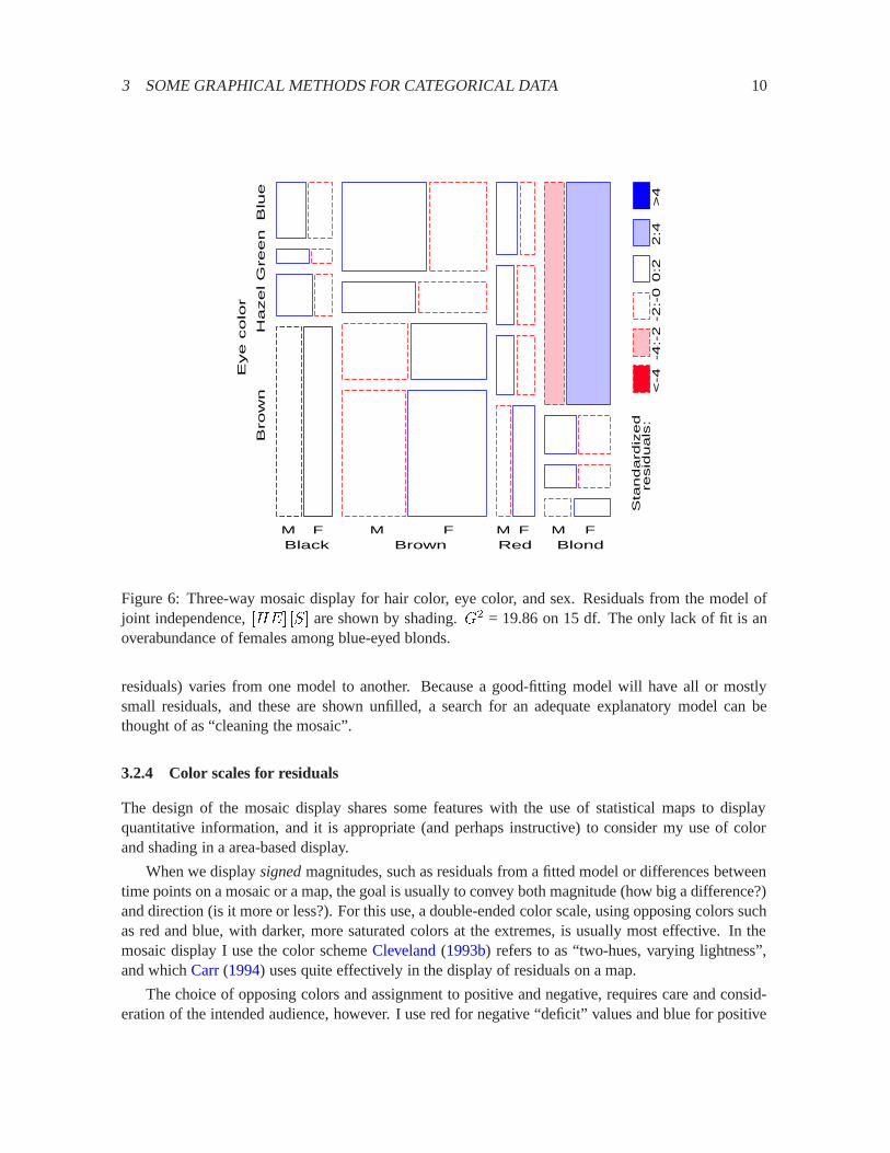
For example, with the data from Table1 broken down by sex, fitting the joint independence model[HairEye][Sex] allows us to see the extent to which the joint distribution of hair-color and eye-color isassociated with sex. For this model, the likelihood-ratioG2 is 19.86 on 15df (p = :178), indicatingan acceptable overall fit. The three-way mosaic, shown in Figure6, highlights two cells: among blue-eyed blonds, there are more females (and fewer males) than would be if hair color and eye color werejointly independent of sex. Except for these cells hair color and eye color appear unassociated withsex.
For higher-way tables, there are many more possible models that can be fit. However, they havethe characteristic that, for any given table (or marginal subtable), the size of tiles in the mosaic alwaysshows the same observed frequencies, while the shading (showing the sign and magnitude of the
3 SOME GRAPHICAL METHODS FOR CATEGORICAL DATA 10
Black Brown Red Blond
Bro
wn
Hazel G
reen B
lue
Eye c
olo
r
M F M F M F M F
Sta
nd
ard
ize
dre
sid
ua
ls:
<
-4-4
:-2
-2:-
00
:22
:4>
4
Figure 6: Three-way mosaic display for hair color, eye color, and sex. Residuals from the model ofjoint independence,[HE] [S] are shown by shading.G2 = 19.86 on 15 df. The only lack of fit is anoverabundance of females among blue-eyed blonds.
residuals) varies from one model to another. Because a good-fitting model will have all or mostlysmall residuals, and these are shown unfilled, a search for an adequate explanatory model can bethought of as “cleaning the mosaic”.
3.2.4 Color scales for residuals
The design of the mosaic display shares some features with the use of statistical maps to displayquantitative information, and it is appropriate (and perhaps instructive) to consider my use of colorand shading in a area-based display.
When we displaysignedmagnitudes, such as residuals from a fitted model or differences betweentime points on a mosaic or a map, the goal is usually to convey both magnitude (how big a difference?)and direction (is it more or less?). For this use, a double-ended color scale, using opposing colors suchas red and blue, with darker, more saturated colors at the extremes, is usually most effective. In themosaic display I use the color schemeCleveland(1993b) refers to as “two-hues, varying lightness”,and whichCarr(1994) uses quite effectively in the display of residuals on a map.
The choice of opposing colors and assignment to positive and negative, requires care and consid-eration of the intended audience, however. I use red for negative “deficit” values and blue for positive
3 SOME GRAPHICAL METHODS FOR CATEGORICAL DATA 11
“excesses”;Carr (1994) in displays of rates of disease assigns red to positive “hot spots” and coolerblue to negative values. Various government agencies have other conventions about the assignment ofcolor. Unfortunately, black and white reproduction of red/blue displays folds red and blue to approxi-mately equal gray levels. In the mosaic displays, I usually prepare different versions—using gray leveland pattern fills for figures to be shown in black and white. Color versions of the figures shown hereare available on the WWW athttp://www.math.yorku.ca/SCS/Papers/casm/ .
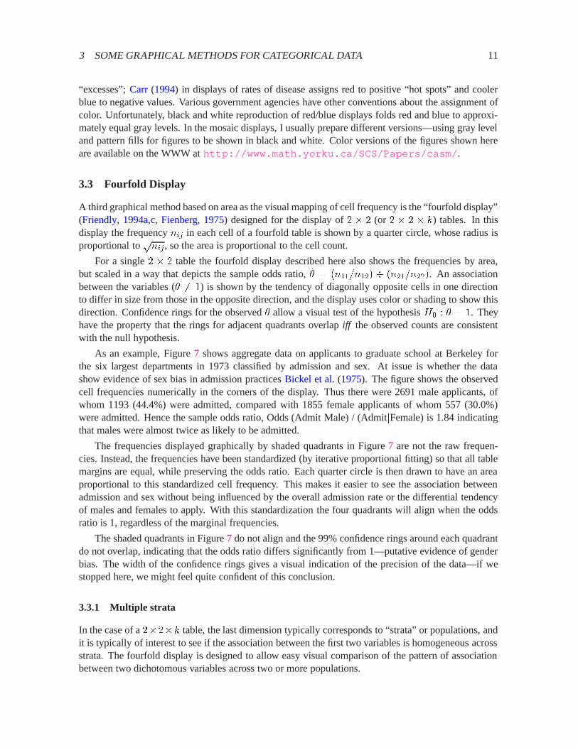
3.3 Fourfold Display
A third graphical method based on area as the visual mapping of cell frequency is the “fourfold display”(Friendly, 1994a,c, Fienberg, 1975) designed for the display of2 � 2 (or 2 � 2 � k) tables. In thisdisplay the frequencynij in each cell of a fourfold table is shown by a quarter circle, whose radius isproportional to
pnij, so the area is proportional to the cell count.
For a single2 � 2 table the fourfold display described here also shows the frequencies by area,but scaled in a way that depicts the sample odds ratio,�̂ = (n11=n12) � (n21=n22). An associationbetween the variables (� 6= 1) is shown by the tendency of diagonally opposite cells in one directionto differ in size from those in the opposite direction, and the display uses color or shading to show thisdirection. Confidence rings for the observed� allow a visual test of the hypothesisH0 : � = 1. Theyhave the property that the rings for adjacent quadrants overlapiff the observed counts are consistentwith the null hypothesis.
As an example, Figure7 shows aggregate data on applicants to graduate school at Berkeley forthe six largest departments in 1973 classified by admission and sex. At issue is whether the datashow evidence of sex bias in admission practicesBickel et al.(1975). The figure shows the observedcell frequencies numerically in the corners of the display. Thus there were 2691 male applicants, ofwhom 1193 (44.4%) were admitted, compared with 1855 female applicants of whom 557 (30.0%)were admitted. Hence the sample odds ratio, Odds (AdmitjMale) / (AdmitjFemale) is 1.84 indicatingthat males were almost twice as likely to be admitted.
The frequencies displayed graphically by shaded quadrants in Figure7 are not the raw frequen-cies. Instead, the frequencies have been standardized (by iterative proportional fitting) so that all tablemargins are equal, while preserving the odds ratio. Each quarter circle is then drawn to have an areaproportional to this standardized cell frequency. This makes it easier to see the association betweenadmission and sex without being influenced by the overall admission rate or the differential tendencyof males and females to apply. With this standardization the four quadrants will align when the oddsratio is 1, regardless of the marginal frequencies.
The shaded quadrants in Figure7 do not align and the 99% confidence rings around each quadrantdo not overlap, indicating that the odds ratio differs significantly from 1—putative evidence of genderbias. The width of the confidence rings gives a visual indication of the precision of the data—if westopped here, we might feel quite confident of this conclusion.
3.3.1 Multiple strata
In the case of a2�2�k table, the last dimension typically corresponds to “strata” or populations, andit is typically of interest to see if the association between the first two variables is homogeneous acrossstrata. The fourfold display is designed to allow easy visual comparison of the pattern of associationbetween two dichotomous variables across two or more populations.
3 SOME GRAPHICAL METHODS FOR CATEGORICAL DATA 12
Sex: Male
Adm
it?: Y
es
Sex: Female
Adm
it?: N
o
1198 1493
557 1278
Figure 7: Four-fold display for Berkeley admissions: Evidence for sex bias? The area of each shadedquadrant shows the frequency, standardized to equate the margins for sex and admission. Circular arcsshow the limits of a 99% confidence interval for the odds ratio.
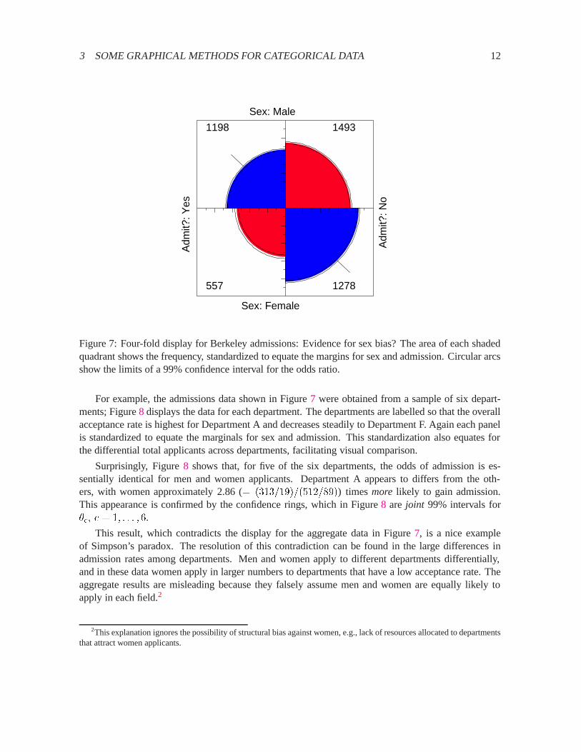
For example, the admissions data shown in Figure7 were obtained from a sample of six depart-ments; Figure8 displays the data for each department. The departments are labelled so that the overallacceptance rate is highest for Department A and decreases steadily to Department F. Again each panelis standardized to equate the marginals for sex and admission. This standardization also equates forthe differential total applicants across departments, facilitating visual comparison.
Surprisingly, Figure8 shows that, for five of the six departments, the odds of admission is es-sentially identical for men and women applicants. Department A appears to differs from the oth-ers, with women approximately 2.86 (= (313=19)=(512=89)) timesmore likely to gain admission.This appearance is confirmed by the confidence rings, which in Figure8 are joint 99% intervals for�c; c = 1; : : : ; 6.
This result, which contradicts the display for the aggregate data in Figure7, is a nice exampleof Simpson’s paradox. The resolution of this contradiction can be found in the large differences inadmission rates among departments. Men and women apply to different departments differentially,and in these data women apply in larger numbers to departments that have a low acceptance rate. Theaggregate results are misleading because they falsely assume men and women are equally likely toapply in each field.2
2This explanation ignores the possibility of structural bias against women, e.g., lack of resources allocated to departmentsthat attract women applicants.
3 SOME GRAPHICAL METHODS FOR CATEGORICAL DATA 13
Sex: Male
Adm
it?: Y
es
Sex: Female
Adm
it?: N
o
512 313
89 19
Department: A Sex: Male
Adm
it?: Y
es
Sex: Female
Adm
it?: N
o
353 207
17 8
Department: B
Sex: Male
Adm
it?: Y
es
Sex: Female
Adm
it?: N
o
120 205
202 391
Department: C Sex: Male
Adm
it?: Y
es
Sex: Female
Adm
it?: N
o
138 279
131 244
Department: D
Sex: Male
Adm
it?: Y
es
Sex: Female
Adm
it?: N
o
53 138
94 299
Department: E Sex: Male
Adm
it?: Y
es
Sex: Female
Adm
it?: N
o
22 351
24 317
Department: F
Figure 8: Fourfold display of Berkeley admissions, by department. In each panel the confidence ringsfor adjacent quadrants overlap if the odds ratio for admission and sex does not differ significantly from1. The data in each panel have been standardized as in Figure7.
3.3.2 Visualization principles
An important principle in the display of large, complex datasets iscontrolled comparison—we wantto make comparisons against a clear standard, with other things held constant. The fourfold displaydiffers from a pie chart in that it holds the angles of the segments constant and varies the radius,whereas the pie chart varies the angles and holds the radius constant. An important consequence isthat we can quite easily compare a series of fourfold displays for different strata, since correspondingcells of the table are always in the same position. As a result, an array of fourfold displays serve thegoals of comparison and detection better than an array of pie charts. Moreover, it allows the observedfrequencies to be standardized by equating either the row or column totals, while preserving the oddsratio. In Figure8, for example, the proportion of men and women, and the proportion of accepted
4 EXAMPLE: NAEP 1992 GRADE 12 MATHEMATICS 14
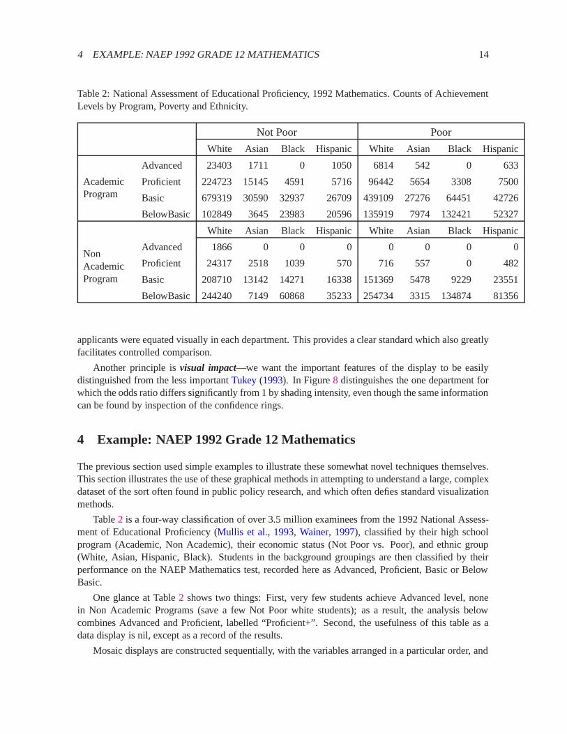
Table 2: National Assessment of Educational Proficiency, 1992 Mathematics. Counts of AchievementLevels by Program, Poverty and Ethnicity.
Not Poor Poor
White Asian Black Hispanic White Asian Black Hispanic
AcademicProgram
Advanced 23403 1711 0 1050 6814 542 0 633
Proficient 224723 15145 4591 5716 96442 5654 3308 7500
Basic 679319 30590 32937 26709439109 27276 64451 42726
BelowBasic 102849 3645 23983 20596135919 7974 132421 52327
NonAcademicProgram
White Asian Black Hispanic White Asian Black Hispanic
Advanced 1866 0 0 0 0 0 0 0
Proficient 24317 2518 1039 570 716 557 0 482
Basic 208710 13142 14271 16338151369 5478 9229 23551
BelowBasic 244240 7149 60868 35233254734 3315 134874 81356
applicants were equated visually in each department. This provides a clear standard which also greatlyfacilitates controlled comparison.
Another principle isvisual impact—we want the important features of the display to be easilydistinguished from the less importantTukey(1993). In Figure8 distinguishes the one department forwhich the odds ratio differs significantly from 1 by shading intensity, even though the same informationcan be found by inspection of the confidence rings.
4 Example: NAEP 1992 Grade 12 Mathematics
The previous section used simple examples to illustrate these somewhat novel techniques themselves.This section illustrates the use of these graphical methods in attempting to understand a large, complexdataset of the sort often found in public policy research, and which often defies standard visualizationmethods.
Table2 is a four-way classification of over 3.5 million examinees from the 1992 National Assess-ment of Educational Proficiency (Mullis et al., 1993, Wainer, 1997), classified by their high schoolprogram (Academic, Non Academic), their economic status (Not Poor vs. Poor), and ethnic group(White, Asian, Hispanic, Black). Students in the background groupings are then classified by theirperformance on the NAEP Mathematics test, recorded here as Advanced, Proficient, Basic or BelowBasic.
One glance at Table2 shows two things: First, very few students achieve Advanced level, nonein Non Academic Programs (save a few Not Poor white students); as a result, the analysis belowcombines Advanced and Proficient, labelled “Proficient+”. Second, the usefulness of this table as adata display is nil, except as a record of the results.
Mosaic displays are constructed sequentially, with the variables arranged in a particular order, and

4 EXAMPLE: NAEP 1992 GRADE 12 MATHEMATICS 15
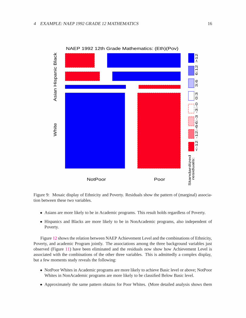
it usually makes sense to order the variables in a quasi-causal, or predictor-response fashion. Here Iconsider Ethnicity and Poverty as (partial) determinants of academic Program, and all three of theseas potential predictors of achievement level.
4.1 Analysis of [Ethnicity, Poverty, Achievement Level]
For simplicity, we begin with an analysis of the marginal table of Ethnicity, Poverty and Level, collaps-ing over Program. Figure9 shows the mosaic for (the marginal table of) Ethnicity and Poverty, fittingthe independence model. If Poverty were unrelated to Ethnic group, the tiles would all be equally widein each column. There is, of course, a pronounced association between Poverty and Ethnic Group(G2(3) = 193:95), as shown by the shading pattern of the residuals: Asians and Whites are more fre-quently NotPoor and Hispanics and Blacks are more frequently Poor, than would be the case if thesevariables were independent.3
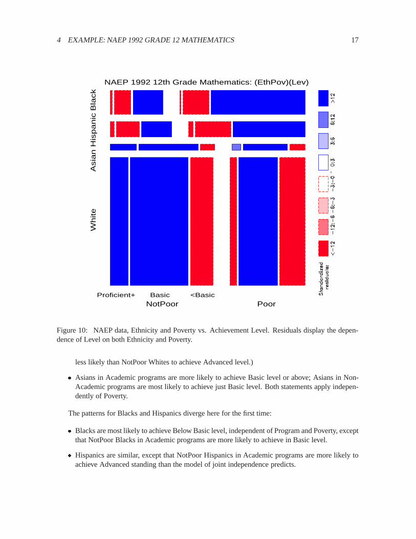
Figure10shows the relation between Achievement Level and Ethnicity and Poverty, fitting a model[(EthPov)(Level)] which says that Level is independent of the combinations of Ethnicity and Povertyjointly. The shading pattern shows how violently this model is contradicted by the data (G2(14) =553; 568):
� Among NotPoor Whites, an over-abundance are in Basic level or higher; for Poor Whites, how-ever, frequencies significantly greater than expected under this model of joint independenceoccur only in the Basic level.
� Among Asians, there are greater than expected frequencies in all but the Below Basic category,independent of Poverty.
� Among both Hispanics and Blacks, there are greater than expected frequencies in the BelowBasic level.
It is depressingly striking how few 12th grade children are classified in the Advanced or Proficientcategories.
4.2 Analysis of the Full Table
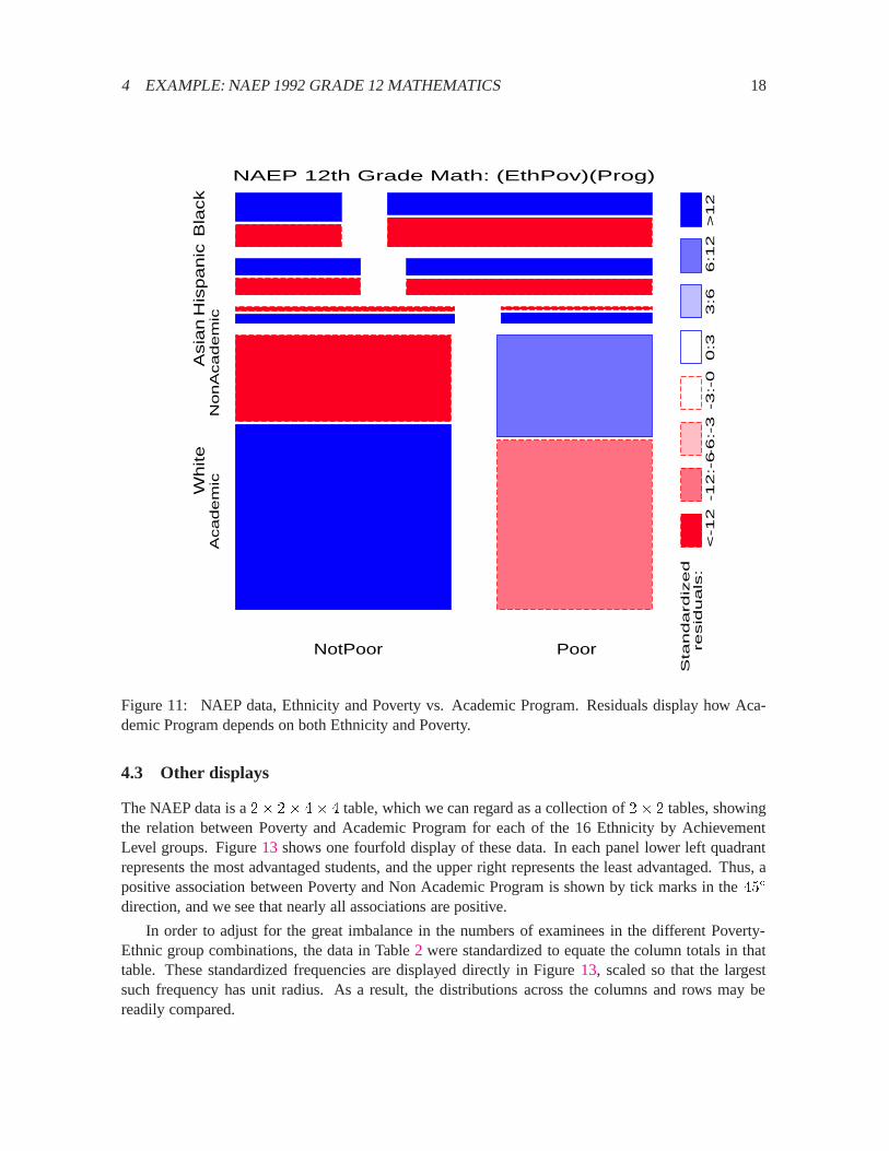
With some understanding among the relations among Poverty, Ethnicity and Achievement Level, weproceed to fitting sequential models of joint independence to the full table. The analysis goal is notto provide an adequate model, but simply to remove the associations we have already seen, therebyrevealing the associations which remain.4
Figure11 shows the relation between Academic Program and the combinations of Ethnicity andPoverty; residuals show how Program is associated with the categories of the other two variables:
� NotPoor Whites are more likely to be in Academic programs, while the reverse is true for PoorWhites.
3 Blacks and Hispanics are interchanged from the original table, in accord with association ordering, described below.4All of these models fit very badly, partly due to the enormous sample size, but they are to be regarded only as baseline
models. When a model of joint independence, say, (Ethnicity, Poverty)(Program), is fit, the association between Ethnicityand Poverty is fitexactly, and so does not appear in the residuals.
4 EXAMPLE: NAEP 1992 GRADE 12 MATHEMATICS 16
White
Asia
n
His
panic
Bla
ck
NotPoor Poor
NAEP 1992 12th Grade Mathematics: (Eth)(Pov)
Sta
ndard
ized
resid
uals
:
<-1
2-1
2:-
6-6
:-3
-3:-
00:3
3:6
6:1
2>
12
Figure 9: Mosaic display of Ethnicity and Poverty. Residuals show the pattern of (marginal) associa-tion between these two variables.
� Asians are more likely to be in Academic programs. This result holds regardless of Poverty.
� Hispanics and Blacks are more likely to be in NonAcademic programs, also independent ofPoverty.
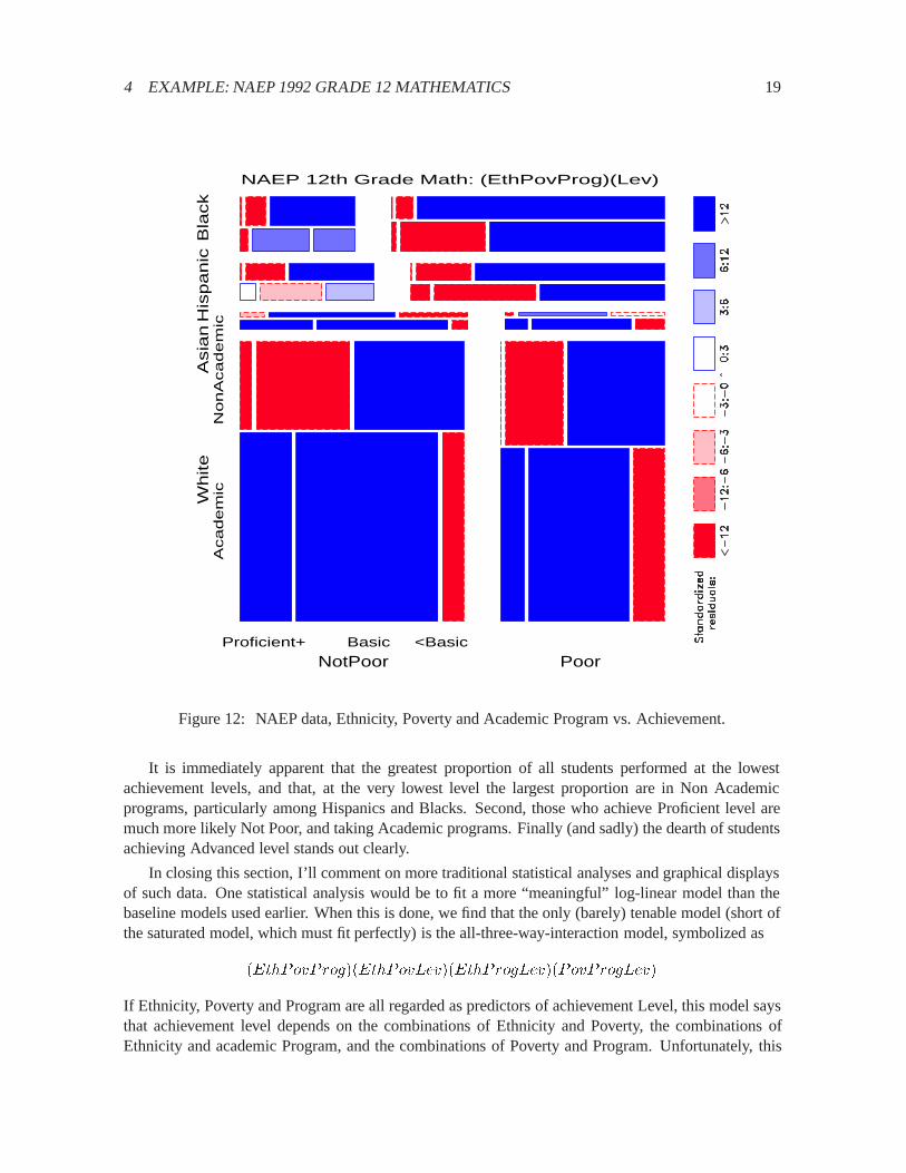
Figure12shows the relation between NAEP Achievement Level and the combinations of Ethnicity,Poverty, and academic Program jointly. The associations among the three background variables justobserved (Figure11) have been eliminated and the residuals now show how Achievement Level isassociated with the combinations of the other three variables. This is admittedly a complex display,but a few moments study reveals the following:
� NotPoor Whites in Academic programs are more likely to achieve Basic level or above; NotPoorWhites in NonAcademic programs are more likely to be classified Below Basic level.
� Approximately the same pattern obtains for Poor Whites. (More detailed analysis shows them
4 EXAMPLE: NAEP 1992 GRADE 12 MATHEMATICS 17
White
Asia
n
His
panic
Bla
ck
NotPoor Poor Proficient+ Basic <Basic
NAEP 1992 12th Grade Mathematics: (EthPov)(Lev)
Figure 10: NAEP data, Ethnicity and Poverty vs. Achievement Level. Residuals display the depen-dence of Level on both Ethnicity and Poverty.
less likely than NotPoor Whites to achieve Advanced level.)
� Asians in Academic programs are more likely to achieve Basic level or above; Asians in Non-Academic programs are most likely to achieve just Basic level. Both statements apply indepen-dently of Poverty.
The patterns for Blacks and Hispanics diverge here for the first time:
� Blacks are most likely to achieve Below Basic level, independent of Program and Poverty, exceptthat NotPoor Blacks in Academic programs are more likely to achieve in Basic level.
� Hispanics are similar, except that NotPoor Hispanics in Academic programs are more likely toachieve Advanced standing than the model of joint independence predicts.
4 EXAMPLE: NAEP 1992 GRADE 12 MATHEMATICS 18
White
Asia
n
His
panic
Bla
ck
NotPoor Poor
Aca
de
mic
No
nA
ca
de
mic
NAEP 12th Grade Math: (EthPov)(Prog)
Sta
ndard
ized
resid
uals
:
<-1
2-1
2:-
6-6
:-3
-3:-
00:3
3:6
6:1
2>
12
Figure 11: NAEP data, Ethnicity and Poverty vs. Academic Program. Residuals display how Aca-demic Program depends on both Ethnicity and Poverty.
4.3 Other displays
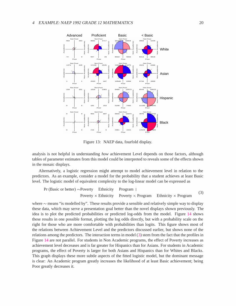
The NAEP data is a2� 2� 4� 4 table, which we can regard as a collection of2� 2 tables, showingthe relation between Poverty and Academic Program for each of the 16 Ethnicity by AchievementLevel groups. Figure13 shows one fourfold display of these data. In each panel lower left quadrantrepresents the most advantaged students, and the upper right represents the least advantaged. Thus, apositive association between Poverty and Non Academic Program is shown by tick marks in the45�
direction, and we see that nearly all associations are positive.
In order to adjust for the great imbalance in the numbers of examinees in the different Poverty-Ethnic group combinations, the data in Table2 were standardized to equate the column totals in thattable. These standardized frequencies are displayed directly in Figure13, scaled so that the largestsuch frequency has unit radius. As a result, the distributions across the columns and rows may bereadily compared.
4 EXAMPLE: NAEP 1992 GRADE 12 MATHEMATICS 19
White
Asia
n
His
panic
Bla
ck
NotPoor Poor
Aca
de
mic
No
nA
ca
de
mic
Proficient+ Basic <Basic
NAEP 12th Grade Math: (EthPovProg)(Lev)
Figure 12: NAEP data, Ethnicity, Poverty and Academic Program vs. Achievement.
It is immediately apparent that the greatest proportion of all students performed at the lowestachievement levels, and that, at the very lowest level the largest proportion are in Non Academicprograms, particularly among Hispanics and Blacks. Second, those who achieve Proficient level aremuch more likely Not Poor, and taking Academic programs. Finally (and sadly) the dearth of studentsachieving Advanced level stands out clearly.
In closing this section, I’ll comment on more traditional statistical analyses and graphical displaysof such data. One statistical analysis would be to fit a more “meaningful” log-linear model than thebaseline models used earlier. When this is done, we find that the only (barely) tenable model (short ofthe saturated model, which must fit perfectly) is the all-three-way-interaction model, symbolized as
(EthPovProg)(EthPovLev)(EthProgLev)(PovProgLev)
If Ethnicity, Poverty and Program are all regarded as predictors of achievement Level, this model saysthat achievement level depends on the combinations of Ethnicity and Poverty, the combinations ofEthnicity and academic Program, and the combinations of Poverty and Program. Unfortunately, this
4 EXAMPLE: NAEP 1992 GRADE 12 MATHEMATICS 20
Not Poor
Aca
de
mic
Poor
No
n A
ca
de
mic
902 263
72 0
Not Poor
Aca
de
mic
Poor
No
n A
ca
de
mic
8661 3717
937 28
Not Poor
Aca
de
mic
Poor
No
n A
ca
de
mic
26183 16924
8044 5834
Not Poor
Aca
de
mic
Poor
No
n A
ca
de
mic
3964 5239
9414 9818
Not PoorA
ca
de
mic
PoorN
on
Aca
de
mic
1373 435
1 1
Not Poor
Aca
de
mic
Poor
No
n A
ca
de
mic
12146 4535
2020 447
Not Poor
Aca
de
mic
Poor
No
n A
ca
de
mic
24532 21875
10540 4394
Not Poor
Aca
de
mic
Poor
No
n A
ca
de
mic
2924 6396
5734 2659
Not Poor
Aca
de
mic
Poor
No
n A
ca
de
mic
334 201
0 0
Not PoorA
ca
de
mic
PoorN
on
Aca
de
mic
1816 2383
181 153
Not Poor
Aca
de
mic
Poor
No
n A
ca
de
mic
8485 13573
5190 7482
Not Poor
Aca
de
mic
Poor
No
n A
ca
de
mic
6543 16623
11193 25845
Not Poor
Aca
de
mic
Poor
No
n A
ca
de
mic
0 0
0 0
Not Poor
Aca
de
mic
Poor
No
n A
ca
de
mic
953 687
216 0
Not PoorA
ca
de
mic
PoorN
on
Aca
de
mic
6834 13373
2961 1915
Not Poor
Aca
de
mic
Poor
No
n A
ca
de
mic
4976 27475
12629 27984
Advanced Proficient Basic < Basic
White
Asian
Hispanic
Black
Figure 13: NAEP data, fourfold display.
analysis is not helpful in understandinghow achievement Level depends on those factors, althoughtables of parameter estimates from this model could be interpreted to reveals some of the effects shownin the mosaic displays.
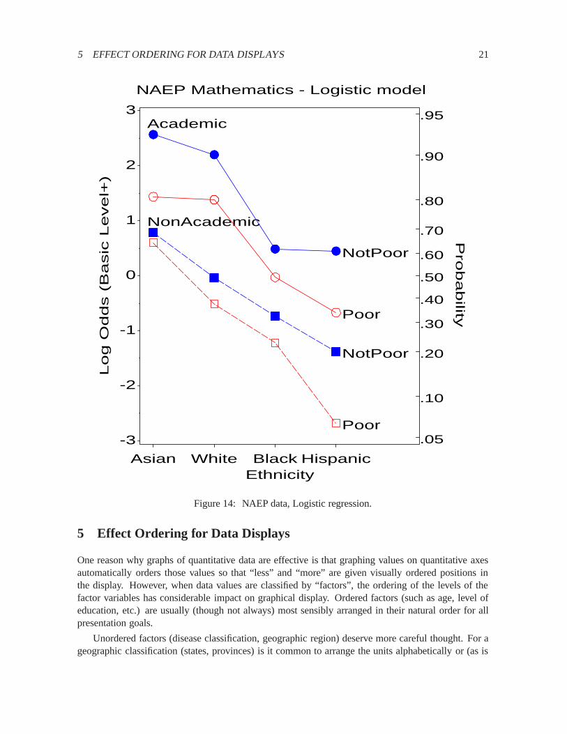
Alternatively, a logistic regression might attempt to model achievement level in relation to thepredictors. As an example, consider a model for the probability that a student achieves at least Basiclevel. The logistic model of equivalent complexity to the log-linear model can be expressed as
Pr (Basic or better)�Poverty+ Ethnicity+ Program+
Poverty� Ethnicity+ Poverty� Program+ Ethnicity� Program(3)
where�means “is modelled by”. These results provide a sensible and relatively simple way to displaythese data, which may serve a presentation goal better than the novel displays shown previously. Theidea is to plot the predicted probabilities or predicted log-odds from the model. Figure14 showsthese results in one possible format, plotting the log odds directly, but with a probability scale on theright for those who are more comfortable with probabilities than logits. This figure shows most ofthe relations between Achievement Level and the predictors discussed earlier, but shows none of therelations among the predictors. The interaction terms in model (3) stem from the fact that the profiles inFigure14 are not parallel. For students in Non Academic programs, the effect of Poverty increases asachievement level decreases and is far greater for Hispanics than for Asians. For students in Academicprograms, the effect of Poverty is larger for both Asians and Hispanics than for Whites and Blacks.This graph displays these more subtle aspects of the fitted logistic model, but the dominant messageis clear: An Academic program greatly increases the likelihood of at least Basic achievement; beingPoor greatly decreases it.
5 EFFECT ORDERING FOR DATA DISPLAYS 21
Academic
NotPoor
Poor
NonAcademic
NotPoor
Poor.05
.10
.20
.30
.40
.50
.60
.70
.80
.90
.95
NAEP Mathematics - Logistic modelP
robability
Log O
dds (
Basic
Level+
)
-3
-2
-1
0
1
2
3
EthnicityAsian White Black Hispanic
Figure 14: NAEP data, Logistic regression.
5 Effect Ordering for Data Displays
One reason why graphs of quantitative data are effective is that graphing values on quantitative axesautomatically orders those values so that “less” and “more” are given visually ordered positions inthe display. However, when data values are classified by “factors”, the ordering of the levels of thefactor variables has considerable impact on graphical display. Ordered factors (such as age, level ofeducation, etc.) are usually (though not always) most sensibly arranged in their natural order for allpresentation goals.
Unordered factors (disease classification, geographic region) deserve more careful thought. For ageographic classification (states, provinces) is it common to arrange the units alphabetically or (as is

6 MOSAIC MATRICES AND COPLOTS FOR CATEGORICAL DATA 22
common in Canada) from east to west. When the goal of presentation is detection or comparison (asopposed to table lookup), this is almost always a bad idea.
Instead, I suggest a general rule for arranging the levels of unordered factors in visual displays— tables as well as graphs:sort the data by the effects to be observed. Sorting has both global andlocal effects: globally, a more coherent pattern appears, making it easier to spot exceptions; locally,effect-ordering brings similar items together, making them easier to compare. Seede Falguerolleset al.(1997) for related ideas.
The use of this principle is illustrated by the following:
� Main-effects ordering: For quantitative data where the goal is to see “typical” values, sort theunits in boxplots, dotplots and tables by means, medians, or by row and column effects. (If thegoal is to see differences in variability, sort by standard deviation or interquartile range.)
For example, Figure15 shows a Trellis dotplot displayCleveland(1993b) of data on barleyyields in a three-factor design: Year by Site by Variety. All three factors have been ordered inthe panels by median overall yield. With this arrangement, the plot shows a startling anomalywhich is not apparent in conventional plots: for all sites and for all varieties, yields in 1931were greater than in 1932, except at the Morris site, where this difference is reversed.Wainer(1993) andCarr and Olsen(1996) have presented similar arguments for the effectiveness of suchorderings on detection.
� Discriminant ordering: For multivariate data, where the goal is to compare different groups intheir means on a (possibly large) number of variables, arrange thevariablesin tables or visualdisplays according to the weights of those variables on the dimensions which best discriminateamong the groups (canonical discriminant dimensions).
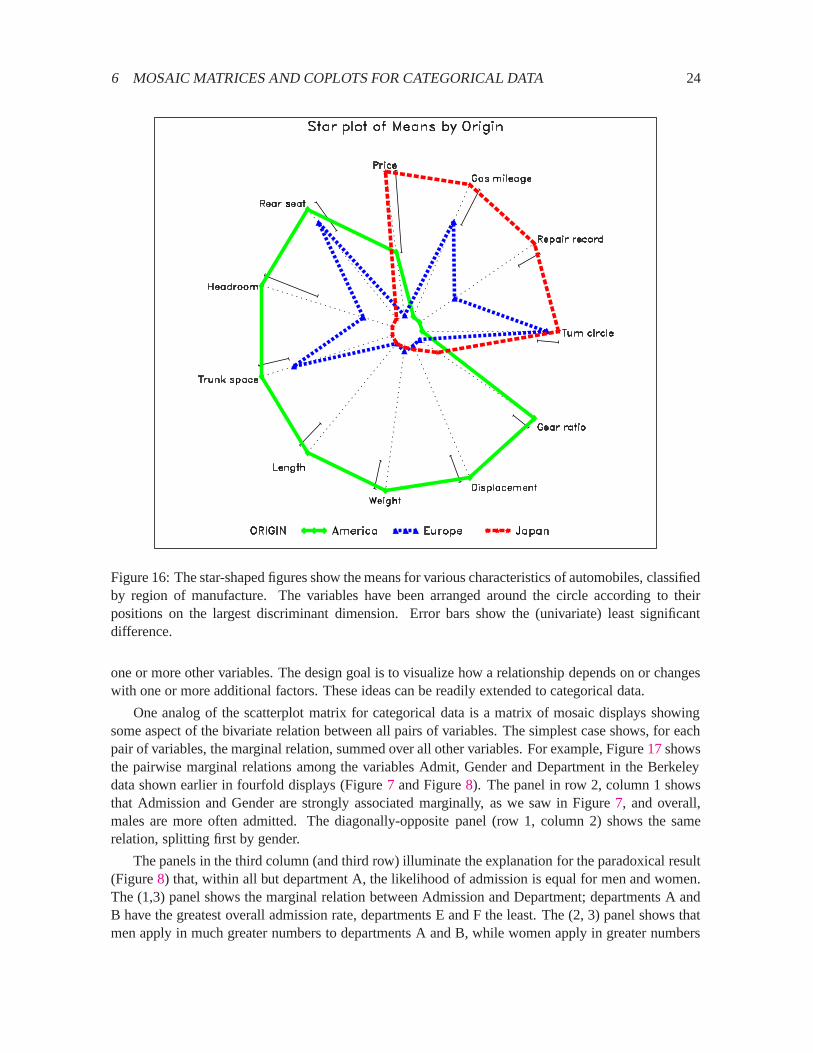
Figure16shows the means for various characteristics of automobiles (1972 data fromChamberset al. (1983) ), classified by region of manufacture. The variables have been scaled so thatlonger rays represent “better” for all variables, and arranged around the circle according to theirpositions on the largest discriminant dimension. The figure makes it immediately clear thatAmerican cars are mainly larger and heavier, Japanese cars are better in price, mileage andrepair record, while European cars have intermediate and mixed patterns. The same idea ofordering variables could be used in a profile plot or parallel coordinates plot.
� Correlation ordering: A related idea is that in the display of multivariate data by glyph plots,star plots, parallel coordinate plots and so forth, the variables should be ordered according tothe largest principal component or biplotGabriel(1980, 1981) dimension(s). This arrangementbrings similar variables together, where similarity is defined in terms of patterns of correlation.
� Association ordering: For categorical data, where the goal is to understand the pattern of as-sociation among variables, order the levels of factors according to their position on the largestcorrespondence analysis dimensionFriendly(1994b).
6 Mosaic Matrices and Coplots for Categorical Data
A second reason for the wide usefulness of graphs of quantitative data has been the recognition thatcombining multiple views of data into a single display allows detection of patterns which could not

6 MOSAIC MATRICES AND COPLOTS FOR CATEGORICAL DATA 23
o
o
o
o
o
o
o
o
o
o
o
o
o
o
o
o
o
o
o
o
SvansotaNo. 462
ManchuriaNo. 475
VelvetPeatlandGlabronNo. 457
Wisconsin No. 38Trebi
Grand Rapids
20 30 40 50 60
o
o
o
o
o
o
o
o
o
o
o
o
o
o
o
o
o
o
o
o
SvansotaNo. 462
ManchuriaNo. 475
VelvetPeatlandGlabronNo. 457
Wisconsin No. 38Trebi
Duluth
o
o
o
o
o
o
o
o
o
o
o
o
o
o
o
o
o
o
o
o
SvansotaNo. 462
ManchuriaNo. 475
VelvetPeatlandGlabronNo. 457
Wisconsin No. 38Trebi
University Farm
o
o
o
o
o
o
o
o
o
o
o
o
o
o
o
o
o
o
o
o
SvansotaNo. 462
ManchuriaNo. 475
VelvetPeatlandGlabronNo. 457
Wisconsin No. 38Trebi
Morris
o
o
o
o
o
o
o
o
o
o
o
o
o
o
o
o
o
o
o
o
SvansotaNo. 462
ManchuriaNo. 475
VelvetPeatlandGlabronNo. 457
Wisconsin No. 38Trebi
Crookston
o
o
o
o
o
o
o
o
o
o
o
o
o
o
o
o
o
o
o
o
SvansotaNo. 462
ManchuriaNo. 475
VelvetPeatlandGlabronNo. 457
Wisconsin No. 38Trebi
Waseca
Barley Yield (bushels/acre)
o o1932 1931
Figure 15: Three factor data, each factor ordered by median overall yield.
readily be discerned from a series of separate graphs. The scatterplot matrix shows all pairwise(marginal) views of a set of variables in a coherent display, whose design goal is to show the inter-dependence among the collection of variables as a whole. The conditioning plot, orcoplotCleveland(1993b) shows a collection of (conditional) views of several variables, conditioned by the values of
6 MOSAIC MATRICES AND COPLOTS FOR CATEGORICAL DATA 24
Figure 16: The star-shaped figures show the means for various characteristics of automobiles, classifiedby region of manufacture. The variables have been arranged around the circle according to theirpositions on the largest discriminant dimension. Error bars show the (univariate) least significantdifference.
one or more other variables. The design goal is to visualize how a relationship depends on or changeswith one or more additional factors. These ideas can be readily extended to categorical data.
One analog of the scatterplot matrix for categorical data is a matrix of mosaic displays showingsome aspect of the bivariate relation between all pairs of variables. The simplest case shows, for eachpair of variables, the marginal relation, summed over all other variables. For example, Figure17showsthe pairwise marginal relations among the variables Admit, Gender and Department in the Berkeleydata shown earlier in fourfold displays (Figure7 and Figure8). The panel in row 2, column 1 showsthat Admission and Gender are strongly associated marginally, as we saw in Figure7, and overall,males are more often admitted. The diagonally-opposite panel (row 1, column 2) shows the samerelation, splitting first by gender.
The panels in the third column (and third row) illuminate the explanation for the paradoxical result(Figure8) that, within all but department A, the likelihood of admission is equal for men and women.The (1,3) panel shows the marginal relation between Admission and Department; departments A andB have the greatest overall admission rate, departments E and F the least. The (2, 3) panel shows thatmen apply in much greater numbers to departments A and B, while women apply in greater numbers
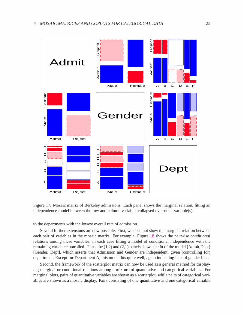
6 MOSAIC MATRICES AND COPLOTS FOR CATEGORICAL DATA 25
Admit
Male Female
Ad
mit
R
eje
ct
A B C D E F
Ad
mit
R
eje
ct
Admit Reject
Ma
le
F
em
ale
Gender
A B C D E F
Ma
le
F
em
ale
Admit Reject
A
B
C
D
E
F
Male Female
A
B
C
D
E
F
Dept
Figure 17: Mosaic matrix of Berkeley admissions. Each panel shows the marginal relation, fitting anindependence model between the row and column variable, collapsed over other variable(s)
to the departments with the lowest overall rate of admission.
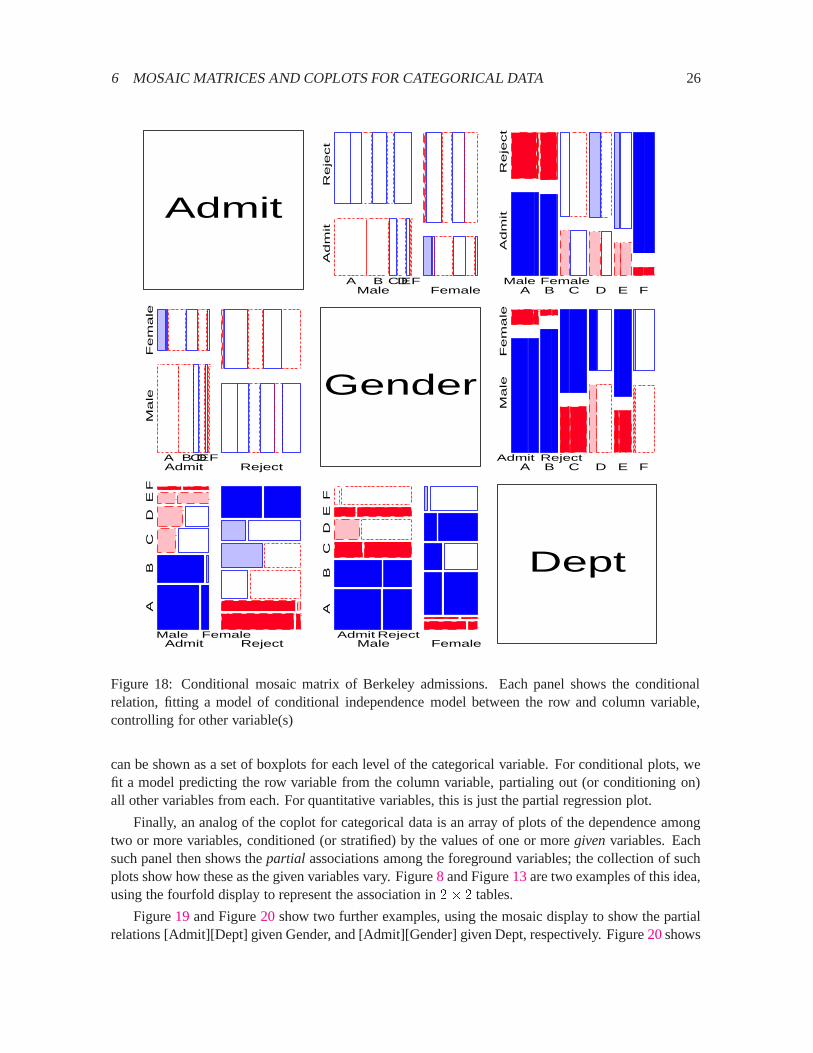
Several further extensions are now possible. First, we need not show the marginal relation betweeneach pair of variables in the mosaic matrix. For example, Figure18 shows the pairwiseconditionalrelations among these variables, in each case fitting a model of conditional independence with theremaining variable controlled. Thus, the (1,2) and (2,1) panels shows the fit of the model [Admit,Dept][Gender, Dept], which asserts that Admission and Gender are independent, given (controlling for)department. Except for Department A, this model fits quite well, again indicating lack of gender bias.
Second, the framework of the scatterplot matrix can now be used as a general method for display-ing marginal or conditional relations among a mixture of quantitative and categorical variables. Formarginal plots, pairs of quantitative variables are shown as a scatterplot, while pairs of categorical vari-ables are shown as a mosaic display. Pairs consisting of one quantitative and one categorical variable
6 MOSAIC MATRICES AND COPLOTS FOR CATEGORICAL DATA 26
Admit
Male Female
Ad
mit
R
eje
ct
A B C D E F A B C D E F
Ad
mit
R
eje
ct
Male Female
Admit Reject
Ma
le
F
em
ale
A B C D E F
Gender
A B C D E F
Ma
le
F
em
ale
Admit Reject
Admit Reject
A
B
C
D
E
F
Male Female Male Female
A
B
C
D
E
F
Admit Reject
Dept
Figure 18: Conditional mosaic matrix of Berkeley admissions. Each panel shows the conditionalrelation, fitting a model of conditional independence model between the row and column variable,controlling for other variable(s)
can be shown as a set of boxplots for each level of the categorical variable. For conditional plots, wefit a model predicting the row variable from the column variable, partialing out (or conditioning on)all other variables from each. For quantitative variables, this is just the partial regression plot.
Finally, an analog of the coplot for categorical data is an array of plots of the dependence amongtwo or more variables, conditioned (or stratified) by the values of one or moregivenvariables. Eachsuch panel then shows thepartial associations among the foreground variables; the collection of suchplots show how these as the given variables vary. Figure8 and Figure13are two examples of this idea,using the fourfold display to represent the association in2� 2 tables.
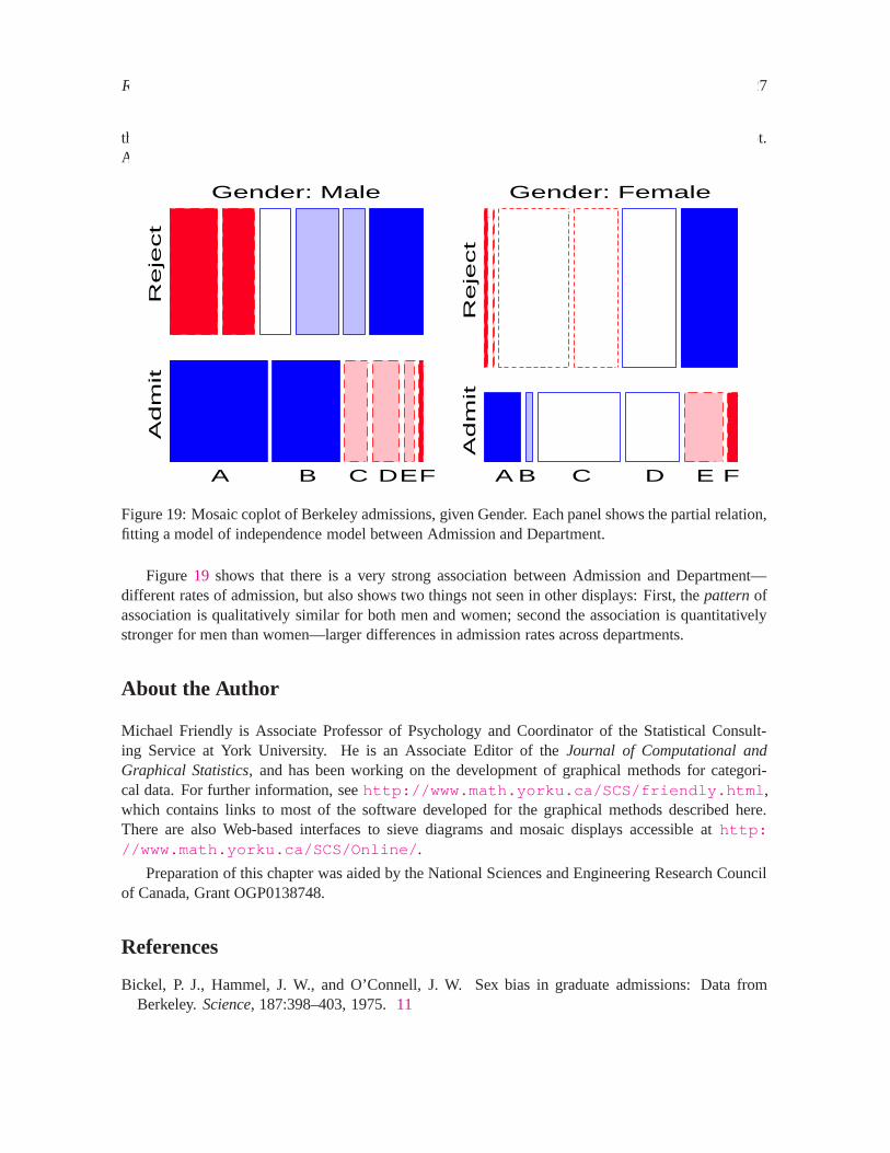
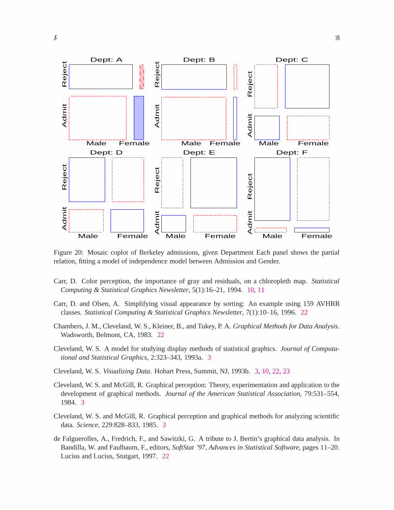
Figure19 and Figure20 show two further examples, using the mosaic display to show the partialrelations [Admit][Dept] given Gender, and [Admit][Gender] given Dept, respectively. Figure20shows
REFERENCES 27
the same results displayed in Figure8: no association between Admission and Gender, except in Dept.A, where females are relatively more likely to gain admission.
Adm
it
Reje
ct
A B C D E F
Gender: Male
Adm
it
Reje
ct
A B C D E F
Gender: Female
Figure 19: Mosaic coplot of Berkeley admissions, given Gender. Each panel shows the partial relation,fitting a model of independence model between Admission and Department.
Figure 19 shows that there is a very strong association between Admission and Department—different rates of admission, but also shows two things not seen in other displays: First, thepatternofassociation is qualitatively similar for both men and women; second the association is quantitativelystronger for men than women—larger differences in admission rates across departments.
About the Author
Michael Friendly is Associate Professor of Psychology and Coordinator of the Statistical Consult-ing Service at York University. He is an Associate Editor of theJournal of Computational andGraphical Statistics, and has been working on the development of graphical methods for categori-cal data. For further information, seehttp://www.math.yorku.ca/SCS/friendly.html ,which contains links to most of the software developed for the graphical methods described here.There are also Web-based interfaces to sieve diagrams and mosaic displays accessible athttp://www.math.yorku.ca/SCS/Online/ .
Preparation of this chapter was aided by the National Sciences and Engineering Research Councilof Canada, Grant OGP0138748.
References
Bickel, P. J., Hammel, J. W., and O’Connell, J. W. Sex bias in graduate admissions: Data fromBerkeley.Science, 187:398–403, 1975.11
REFERENCES 28
Ad
mit
R
eje
ct
Male Female
Dept: A
Ad
mit
R
eje
ct
Male Female
Dept: B
Ad
mit
R
eje
ct
Male Female
Dept: C A
dm
it
R
eje
ct
Male Female
Dept: D A
dm
it
R
eje
ct
Male Female
Dept: E
Ad
mit
R
eje
ct
Male Female
Dept: F
Figure 20: Mosaic coplot of Berkeley admissions, given Department Each panel shows the partialrelation, fitting a model of independence model between Admission and Gender.
Carr, D. Color perception, the importance of gray and residuals, on a chloropleth map.StatisticalComputing & Statistical Graphics Newsletter, 5(1):16–21, 1994.10, 11
Carr, D. and Olsen, A. Simplifying visual appearance by sorting: An example using 159 AVHRRclasses.Statistical Computing & Statistical Graphics Newsletter, 7(1):10–16, 1996.22
Chambers, J. M., Cleveland, W. S., Kleiner, B., and Tukey, P. A.Graphical Methods for Data Analysis.Wadsworth, Belmont, CA, 1983.22
Cleveland, W. S. A model for studying display methods of statistical graphics.Journal of Computa-tional and Statistical Graphics, 2:323–343, 1993a.3
Cleveland, W. S.Visualizing Data. Hobart Press, Summit, NJ, 1993b.3, 10, 22, 23
Cleveland, W. S. and McGill, R. Graphical perception: Theory, experimentation and application to thedevelopment of graphical methods.Journal of the American Statistical Association, 79:531–554,1984. 3
Cleveland, W. S. and McGill, R. Graphical perception and graphical methods for analyzing scientificdata.Science, 229:828–833, 1985.3
de Falguerolles, A., Fredrich, F., and Sawitzki, G. A tribute to J. Bertin’s graphical data analysis. InBandilla, W. and Faulbaum, F., editors,SoftStat ’97, Advances in Statistical Software, pages 11–20.Lucius and Lucius, Stutgart, 1997.22
REFERENCES 29
Fienberg, S. E. Perspective canada as a social report.Social Indicators Research, 2:153–174, 1975.11
Friendly, M. SAS System for Statistical Graphics. SAS Institute Inc, Cary, NC, 1st edition, 1991.3
Friendly, M. Mosaic displays for loglinear models. InASA, Proceedings of the Statistical GraphicsSection, pages 61–68, Alexandria, VA, 1992.5, 7
Friendly, M. A fourfold display for 2 by 2 by K tables. Technical Report 217, York University,Psychology Dept, 1994a.11
Friendly, M. Mosaic displays for multi-way contingency tables.Journal of the American StatisticalAssociation, 89:190–200, 1994b.5, 7, 8, 22
Friendly, M. SAS/IML graphics for fourfold displays.Observations, 3(4):47–56, 1994c.11
Gabriel, K. R. Biplot. In Johnson, N. L. and Kotz, S., editors,Encyclopedia of Statistical Sciences,volume 1, pages 263–271. John Wiley and Sons, New York, 1980.22
Gabriel, K. R. Biplot display of multivariate matrices for inspection of data and diagnosis. In Barnett,V., editor,Interpreting Multivariate Data, chapter 8, pages 147–173. John Wiley and Sons, London,1981. 22
Hartigan, J. A. and Kleiner, B. Mosaics for contingency tables. In Eddy, W. F., editor,Computer Sci-ence and Statistics: Proceedings of the 13th Symposium on the Interface, pages 286–273. Springer-Verlag, New York, NY, 1981.5
Hartigan, J. A. and Kleiner, B. A mosaic of television ratings.The American Statistician, 38:32–35,1984. 5
Kosslyn, S. M. Graphics and human information processing: A review of five books.Journal of theAmerican Statistical Association, 80:499–512, 1985.3
Kosslyn, S. M. Understanding charts and graphs.Applied Cognitive Psychology, 3:185–225, 1989.3
Lewandowsky, S. and Spence, I. The perception of statistical graphs.Sociological Methods & Re-search, pages 200–242, 1989. Beverly Hills, CA: Sage Publications.3
Mullis, I. V. S., Dossey, J. A., Owen, E. H., and Phillips, G. W. NAEP 1992: Mathematics report cardfor the nation and the states. Technical Report 23-ST02, National Center for Education Statistics,Washington, D. C., 1993.14
Riedwyl, H. and Sch¨upbach, M. Siebdiagramme: Graphische darstellung von kontingenztafeln. Tech-nical Report 12, Institute for Mathematical Statistics, University of Bern, Bern, Switzerland., 1983.5
Riedwyl, H. and Sch¨upbach, M. Parquet diagram to plot contingency tables. In Faulbaum, F., editor,Softstat ’93: Advances In Statistical Software, pages 293–299. Gustav Fischer, New York, 1994.5
Snee, R. D. Graphical display of two-way contingency tables.The American Statistician, 28:9–12,1974. 5

REFERENCES 30
Spence, I. Visual psychophysics of simple graphical elements.Journal of Experimental Psychology:Human Perception and Performance, 16:683–692, 1990.3
Tukey, J. W. Graphic comparisons of several linked aspects: Alternative and suggested principles.Journal of Computational and Statistical Graphics, 2(1):1–33, 1993.14
Wainer, H. Tabular presentation.Chance, 6(3):52–56, 1993.22
Wainer, H. Some multivariate displays for NAEP results.Psychological Methods, 2(1):34–63, 1997.14