Embed Size (px)
DESCRIPTION
U&lc Vol. 18 ©fonts.com
Citation preview

Qq Rr SsTt UuVvWwXxYyZz1234567890&7ECE$ UPPER AND LOWER CASE. THE INTERNATIONAL JOURNAL OF TYPE AND GRAPHIC DESIGN
• PUBLISHED BY INTERNATIONAL TYPEFACE CORPORATION. VOLUME 18, NUMBER 1, SPRING 1
N
• • • • • • • • • • • • • • • • • • • • • • • •
• ^411/114111 AMMAN •

Let Us Take You Beyond The
The MO Thunderbolt II, selected from the Arts &
Letters clip-art collection of over 15,000 images.
Warp is an exciting addition to the Arts & Letters array of powerful drawing
and editing tools, 15,000 clip-art images, automatic blending, hole cutting, gradient
fills and other sophisticated features. Once again, Arts & Letters gives its users
the means to make their ideas real — in less time, with less work.

To illustrate how warp works, a grid was placed behind the airplane shown above. The grid defines the shape of the envelope into which the airplane fits. You can redefine the shape of the envelope by interactively manipulating the control points of the envelope, and Arts
& Letters automatically reshapes the object.
Limits of Your Drawing Skills.
Warping is the the latest first from Computer Support Corporation, the developers of Arts & Letters. The Warp feature can be applied to any Arts & Letters clip-art image, typeface
or Type 1 PostScript typeface to produce eye-catching special effects.
IT A T HAT is it that makes an artist? Is it an innate skill that only a few
V V possess . . . or is it a quality that we all share? For years,"artistic" skill has been limited to the few gifted with hand-to-eye coor-dination, to those with the ability to convey with their hand what their eyes have seen. But true artistic skill transcends mere drawing skill; it depends upon the ability to assemble visual images into a composition that com-municates to us all.
The computer is a magical tool that makes it possible to go beyond the limitation of draw-ing skill. From the earliest days of research at Computer Support Corporation, we saw that computers could be the means to record and assemble graphic forms into coherent compo-sitions.
Our goal in developing Arts & Letters has been to serve both ends of the spectrum of ar-tistic skill: those who are untrained in the disciplines of art and those who are expert, experienced artists. For the untrained artist, we offer the ability to compose, assemble, and complete unique finished artwork based upon a set of ready-made sketches, or clip-art. For the professional, we offer a system capable of both easy freehand drawing and editing on the computer screen, instant composition, and professional features for printing in color in a variety of ways to the leading output devices of the marketplace.
The challenge each of us must face in creating artwork is to realize that we can do it ourselves. Arts & Letters is a tool designed to make the best of your creative insight, resources, and perceptions. Now you can ex-perience the fulfillment that comes with discovering skills and powers within yourself that you didn't know you possessed.
— Excerpted from The Official Arts & Letters Hand-book, written by Michael Utvich and published by Ban-tam Books. Available at bookstores everywhere.
Computer Support Corporation 15926 Midway Road, Dallas, Texas 75244 214/661-8960 Fax: 214/661-5429
This ad was created and automatically separated using the Arts & Letters Graphics Editor, which retails for $695.
Circle 227 on Reader Service Card

POSTSCRIPT' LANGUA & APPLETALK' NETW
COMPATIBLE
TurboReeEnhanced PostScript'Output
LL/"J
SYSTEMS' 7150 Shady Oak Road Eden Prairie, Minnesota 55344 TEL (612) 944-9696 FAX: (612) 944-9151 0 1991 LaserMAX Systems
High Resolution Solutions by LaserMAX
LaserMAX 1000 Personal Typesetter
Looking for an affordable desktop printer for your Macintosh system? Need typeset quality output and
typeface diversity? If so, you'll want the LaserMAX 1000 Personal Typesetter on your side. It delivers high resolution, 1000 x 1000
TurboResTm output and comes standard with 135 premium typefaces in Type 1 format.
As with all LaserMAX printers, the LaserMAX 1000 utilizes patented TurboRes"" technology to produce camera-ready text and graphics. TurboRes'"' enhances resolution by
controlling the position and height
of pixels on the printed page, eliminating coarse steps between
the pixels. With output this sharp,
you won't need to send out for expensive and time-consuming typeset output.
If you're looking for an
extraordinary resolution
solution, call LaserMAX today:
(612) 944-9696, Dept. 254.
LaserMAX 400 Personal Printer
Who said quality doesn't come cheap? The LaserMAX 400 provides Macintosh users with 400 x 400 TurboRes'"' output, 50 premium typefaces in Type 1 format and still sells for less than $2,500. That's a bargain any way
you look at it.
The LaserMAX 400 is a powerful PostScript-language compatible laser printer that works with many of your desktop publishing and graphics applications. The 4-page-per-minute printer is based on the same LBP-LX print engine that's
used with other personal printers, including Apple's new
Personal LaserWriter SC and NT
and HP's LaserJet IIP.
LaserMAX 1200 Personal Typesetter II
You knew it was only a matter of time before LaserMAX gave you
more. With the introduction of the LaserMAX 1200, Macintosh users are given far more publishing power than ever: 1200 x 800 TurboRes'"
output in an 11 x 17-inch format and 135 typefaces in Type 1 font format.
At 1200 x 800 TurboResn" the LaserMAX 1200 provides you with text that's crisp and accurate—even delicate serifs are reproduced with amazing precision.
And the large format gives you the freedom to create two-page
spreads, CAD designs, tabloid-size newsletters and posters and print the entire image without having to shrink or tile.
TurboRes is a trademark and patented technology of LaserMaster Corporation. Macintosh, TrueType and AppleTalk are registered trademarks of Apple Computer, Inc. PostScript is a registered trademark of Adobe Systems, Inc. Truelmage is a registered trademark of Microsoft Corporation. The AppleTalkn' protocols and computer programs are licensed from Apple Computer, Inc. Specifications are subject to change.
Circle 250 on Reader Service Card

rc GOUDY OLD STYLE
131:20AIDWAY
ITC KORINNA
FLANGE ITALIC
UNIVERSITY
ITC GARAMOND
BRITANNIC BOLD kyyt GOUDY BOLD
ITC CLEARFACE
BRODY
HOBO
WINDSOR
ebauter
PALTON LIGHT
OPTIMUM
SQUARE SERIF
)4t2141.1141.Milt fir
INFONFSILkineP
)1,FItiltilitkAt1001t
ITC GARAMOND CONDENSED
THE LIST TINUES...
TM
DIGITAL
TYPEFACE CORPORATION
A NEW VISION IN TYPE
AVAILABLE NOW FOR YOUR MACINTOSH
Boost Your Creativity A Hundred- Fold 100 PostScript® Typefaces for $1695 Introducing the Digital Typeface Corporation MasterWorks' Type Library When the Basic 35 Are Not Enough The more you use your desktop publishing system, the more you need TYPE. The basic 35 typefaces that came with your laser printer were fine to begin with, but as your work has grown more sophisticated, you've come to require MORE.
You could build your collection gradually, choosing one typeface here and another there, but you'd pay a premium price to do so. Now, however, there's a better way to buy type—the MasterWorks Type Library from Digital Typeface Corporation.
100 MasterWorks For the Price of 35 DTC's MasterWorks Volume 1 is a complete set of 100 first-class typefaces for the incredible price of 161695—about what it would normally cost for just 35 typefaces!
With this single volume, you can expand your type library quickly and affordably, with world-class faces from the foundries of ITC, URW, and DTC. You'll get
distinctive typefaces, like ITC New Baskerville °, ITC Clearface,° ITC Garamond,° ITC Korinna,° and ITC Souvenir° The set also includes premium sans serif families like Eurostile, Flange, and Frugal Sans, plus 9 additional varieties of Sans (our cousin to Helvetica °). Many families come in expanded ranges of weights and styles to provide true typographic flexibility. Plus you get 8 decorative and 8 script faces for specialty applications.
Everything You Need in One Package All DTC typefaces come fully-hinted to look their best at any level of output resolution. Because they're in PostScript® Type 1 outline format, they work with any PostScript language printer or imagesetter, and with all your favorite Macintosh applications. Volume 1 also comes with screen bitmaps and our Font Manager utility for easy installation,
Free Type Guide and Poster! To help you get better acquainted with the DTC MasterWorks Type Library, just call (612) 943-8920.
We'll send you a FREE DTC Type Guide plus our four-color poster.
So if you've been stuck at 35 typefaces, now's the time to boost your creativity a hundredfold. Unleash your creative power with all 100 typefaces in Volume 1 of the DTC MasterWorks Type Library. Volume 1 of Digital Typeface Corporation's MasterWorks Type Library is now available on the Moonlight Software Publishing label. Call (612) 943-8920, Dept. 257.
TM
Moonlight SOFTWARE PUBLISHING
9955 West 69th Street Eden Prairie, Minnesota 55344 TEL: (612) 943-8920 FAX: (612) 943-3462
MasterWorks is a trademark of Digital Typeface Corporation. ITC typeface names used in this ad are registered trademarks of International Typeface Corporation. PostScript is a registered trademark of Adobe Systems, Inc. Helvetica is a registered trademark of Linotype AG. Macintosh is a registered trademark of Apple Computers, Inc.
„,,..

Design Inside and Out:
A Look at Champion International Corporation
Some designers are fortunate enough to be on the mail-
ing list of Champion International Corporation. They
receive elegantly designed paper promotions featuring exquisite typography, illustration, photography, printing and, of course, beautiful papers.
But Champion's corporate commitment to excellence in design goes beyond the company's designer constituency. Internal and community communications also reflect this dedication, whether in employee benefits brochures or announcements for Champion-sponsored programs and events that are open to the public.
Design: Inside and Out examines the role of design in the running of Champion's day-to-day business.
TVP0(1111141V: (1111114111/90
TYPOGRAPHY: GERMANY '90 is a collection of some of the best typographic design created during the past four years in both parts of this newly reunited nation.
More than 250 advertisements, books, annual reports, calendars, brochures, corporate identity programs, posters, album covers, stationery and other printed ephem-era were selected from nearly 1,000 entries to this Juried competition.
April 3—May 23
6
IT( UNT111
Exhibition Schedule February 6—March 21
Open Monday—Friday Hours: Noon-5:00 p.m. Tuesday until 8:00 p.m.
(Closed February 18, 1991) Admission: Free
ITC Center 2 Hammarskjold Plaza (866 Second Avenue between 46th and
47th Streets) Third Floor
New York, NY 10017
HEADLINES, ITC ANNA, ITC KABEL DEMI, ITC NEW BASKERVILLE BOLD ITALIC SUBHEAD: ITC NEW BASKERVILLE BOLD ITALIC TEXT: ITC KABEL BOLD, DEMI, MEDIUM; ITC NEW BASKERVILLE ROMAN, BOLD ITALIC
in this issue:
7
The Letter N Phoenician sound and Greek design come together.
8
Speaking in Tongues Marshall Arisman moves his themes off the canvas and into three-dimensional works.
12
What's New from ITC Four additions to the ITC Typographica series are introduced.
No Stone Unturned Greece restores the Parthenon; captured in dramatic photographs.
22
fy(t)i Kerning: Fine Typography or Marketing Hype?
26
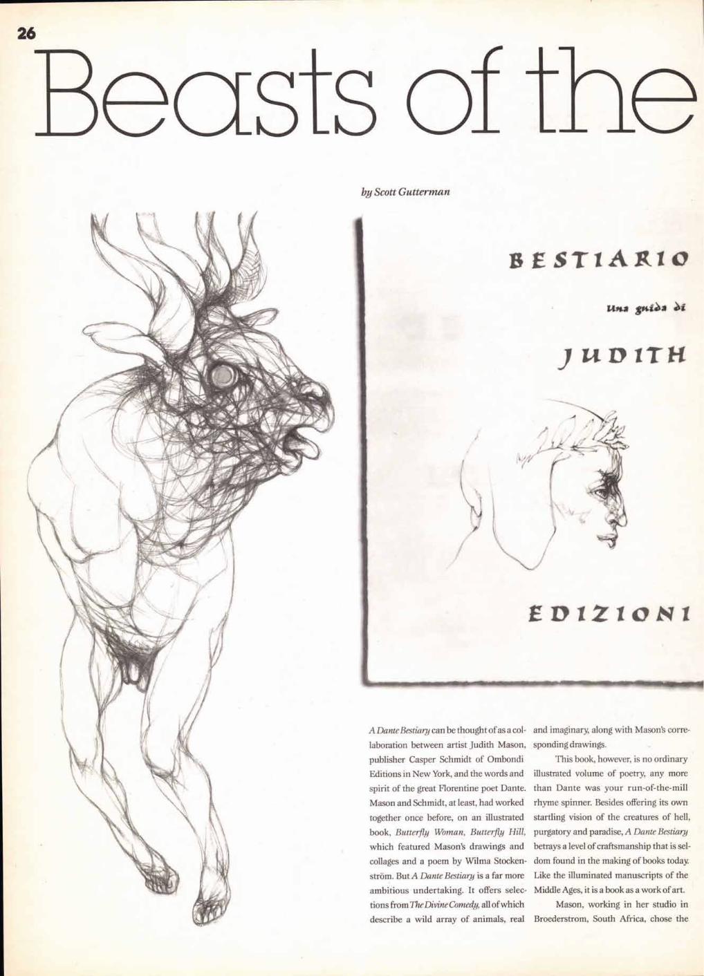
Beasts of the Imagination "A Dante Bestiary" is a meticulously produced book as a work of art.
30
The Unseen Art of "Fantasia" Before the film there were the animation ideas.
34 26 Letters, Lettern, Lettres
ATypl's annual and calendar is an international project celebrating letterforms.
38
Drive Smart, Drive Sober Winners of the 1990 Herb Lubalin Student Design Competition.
42
Recycle! A call for entries in the seventh annual Herb Lubalin Student Design Competition.
47
Tech Talk What's new and where to find it.
Cover Sculpture: Night Spirit
VOLUME EIGHTEEN, NUMBER ONE, SPRING 1991
EXECUTIVE PUBLISHER: CHARLES M. WILHELM
EDITOR: MARGARET RICHARDSON
ASSISTANT EDITOR: TOM GILBERG
EDITORIAL DIRECTOR: ALLAN HALEY
CONSULTING EDITOR: EDWARD GOTTSCHALL
CONTRIBUTING EDITOR: MARION MULLER
DIRECTOR OF CREATIVE SERVICES: PAT KRUGMAN
GRAPHIC DESIGN: WYD
ART/PRODUCTION COORDINATOR: JANE DI BUCCI
ART/PRODUCTION: SID TIMM
ADVERTISING: SUSAN FORREST-REYNOLDS
FULFILLMENT MANAGER: REBECCA L. PAPPAS
SUBSCRIPTIONS: ELOISE COLEMAN
© INTERNATIONAL TYPEFACE CORPORATION 1991. U&Ic (ISSN 0362 6245)
IS PUBLISHED QUARTERLY BY INTERNATIONAL TYPEFACE CORPORATION, 2 HAMMARSKJOLD PLAZA,
NEW YORK, NY 10017. ITC IS A SUBSIDIARY OF ESSELTE LETRASET. U.S. SUBSCRIPTION RATES
$20 ONE YEAR: FOREIGN SUBSCRIPTIONS, $25 ONE YEAR: U.S. FUNDS DRAWN ON U.S. BANK. FOREIGN AIR MAIL
SUBSCRIPTIONS—PLEASE INQUIRE. (212) 371-0699. SECOND-CLASS POSTAGE PAID AT NEW YORK, NY
AND ADDITIONAL MAILING OFFICES. POSTMASTER: SEND ADDRESS CHANGES TO
U&Ic, SUBSCRIPTION DEPARTMENT, 2 HAMMARSKJOLD PLAZA, NEW YORK, NY 10017.
ITC OPERATING EXECUTIVE BOARD 1991
MARK J. BATTY, PRESIDENT AND CEO
AARON BURNS, CHAIRMAN
ALLAN HALEY, EXECUTIVE VICE PRESIDENT
MAUREEN A. MOCKLER, CONTROLLER
CHARLES M. WILHELM, DIRECTOR, CORPORATE COMMUNICATIONS
LAURIE BURNS, DIRECTOR OF PUBLIC RELATIONS AND EDUCATIONAL ACTIVITIES
ILENE STRIZVER, DIRECTOR OF TYPEFACE DEVELOPMENT
ITC FOUNDERS:
AARON BURNS, HERB LUBALIN, EDWARD RONDTHALER
U&Ic AND THE U&Ic LOGOTYPE ARE REGISTERED TRADEMARKS OF INTERNATIONAL TYPEFACE CORPORATION.
MICROFILM COPIES OF U&Ic MAY BE OBTAINED FROM MICRO PHOTO DIVISION,
BELL & HOWELL, OLD MANSFIELD ROAD, WOOSTER, OH 44691
BPA MAGAZINE AUDIT APPLIED FOR JULY 1990.
PHOTOTYPESET FOR QUALITY
TABLE OF CONTENTS: ITC NAGEL BOLD, DEMI, BOOK MASTHEAD: ITC NEWTEXT REGULAR, DEMI FRONT COVER, ITC ANNA, ITC BEESKNEES THE INDEX TO ITC TYPEFACES APPEARS ON PAGE 50.
7
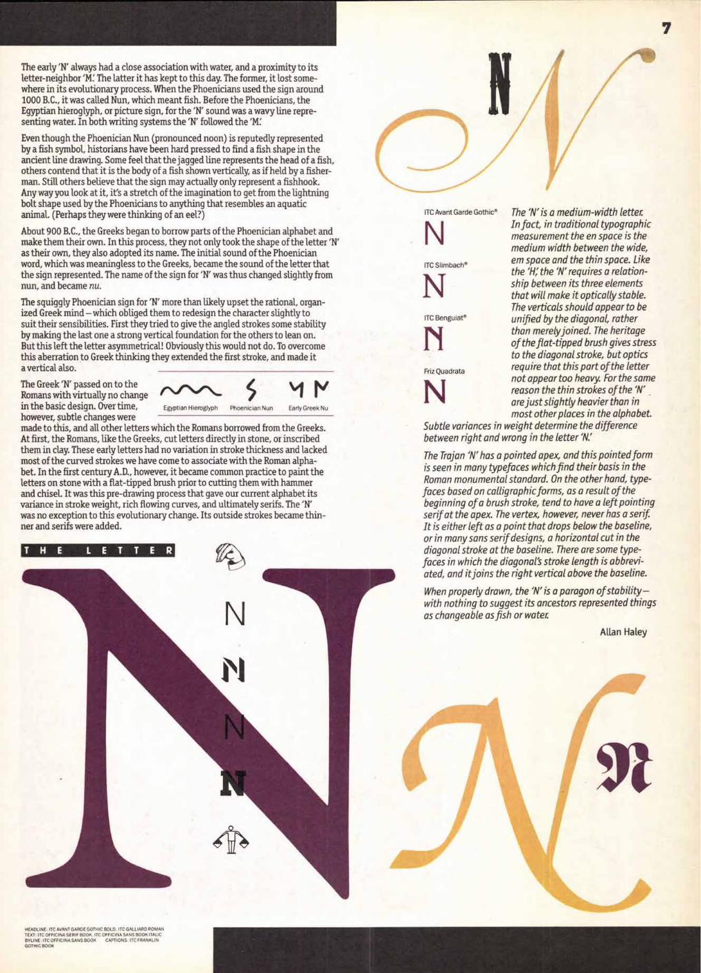
The early 'N' always had a close association with water, and a proximity to its letter-neighbor 'M. The latter it has kept to this day. The former, it lost some-where in its evolutionary process. When the Phoenicians used the sign around 1000 B.C., it was called Nun, which meant fish. Before the Phoenicians, the Egyptian hieroglyph, or picture sign, for the 'N' sound was a wavy line repre-senting water. In both writing systems the 'N' followed the 'M.
Even though the Phoenician Nun (pronounced noon) is reputedly represented by a fish symbol, historians have been hard pressed to find a fish shape in the ancient line drawing. Some feel that the jagged line represents the head of a fish, others contend that it is the body of a fish shown vertically, as if held by a fisher-man. Still others believe that the sign may actually only represent a fishhook. Any way you look at it, it's a stretch of the imagination to get from the lightning bolt shape used by the Phoenicians to anything that resembles an aquatic animal. (Perhaps they were thinking of an eel?)
About 900 B.C., the Greeks began to borrow parts of the Phoenician alphabet and make them their own. In this process, they not only took the shape of the letter 'N' as their own, they also adopted its name. The initial sound of the Phoenician word, which was meaningless to the Greeks, became the sound of the letter that the sign represented. The name of the sign for 'N' was thus changed slightly from nun, and became nu. The squiggly Phoenician sign for 'N' more than likely upset the rational, organ-ized Greek mind — which obliged them to redesign the character slightly to suit their sensibilities. First they tried to give the angled strokes some stability by making the last one a strong vertical foundation for the others to lean on. But this left the letter asymmetrical! Obviously this would not do. To overcome this aberration to Greek thinking they extended the first stroke, and made it a vertical also.
The Greek 'N' passed on to the Romans with virtually no change in the basic design. Over time, however, subtle changes were made to this, and all other letters which the Romans borrowed from the Greeks. At first, the Romans, like the Greeks, cut letters directly in stone, or inscribed them in clay. These early letters had no variation in stroke thickness and lacked most of the curved strokes we have come to associate with the Roman alpha-bet. In the first century A.D., however, it became common practice to paint the letters on stone with a flat-tipped brush prior to cutting them with hammer and chisel. It was this pre-drawing process that gave our current alphabet its variance in stroke weight, rich flowing curves, and ultimately serifs. The 'N' was no exception to this evolutionary change. Its outside strokes became thin-ner and serifs were added.
The 'N' is a medium-width letter. In fact, in traditional typographic measurement the en space is the medium width between the wide,
ITC Slimbach® em space and the thin space. Like the 'H; the 'N' requires a relation- ship between its three elements that will make it optically stable. The verticals should appear to be unified by the diagonal, rather
N than merely joined. The heritage of the flat-tipped brush gives stress to the diagonal stroke, but optics
Friz Quadrats require that this part of the letter not appear too heavy. For the same
N reason the thin strokes of the 'N' are just slightly heavier than in most other places in the alphabet.
Subtle variances in weight determine the difference between right and wrong in the letter 'N.'
The Trojan 'N' has a pointed apex, and this pointed form is seen in many typefaces which find their basis in the Roman monumental standard. On the other hand, type-faces based on calligraphic forms, as a result of the beginning of a brush stroke, tend to have a left pointing serif at the apex. The vertex, however, never has a serif It is either left as a point that drops below the baseline, or in many sans serif designs, a horizontal cut in the diagonal stroke at the baseline. There are some type-faces in which the diagonal's stroke length is abbrevi-ated, and itjoins the right vertical above the baseline.
When properly drawn, the 'N' is a paragon of stability—with nothing to suggest its ancestors represented things as changeable as fish or water.
N Early Greek Nu Egyptian Hieroglyph Phoenician Nun
ITC Avant Garde Gothic ®
N
ITC Benguiat®
Allan Haley
HEADLINE: ITC AVANT GARDE GOTHIC BOLD. ITC GALLIARD ROMAN TEXT: ITC OFFICINA SERIF BOOK, ITC OFFICINA SANS BOOK ITALIC BYLINE: ITC OFFICINA SANS BOOK CAPTIONS: ITC FRANKLIN GOTHIC BOOK

4■41111114111 4111/^4111
by Dee Ito New York-based painter and illustrator Marshall Arisman has moved his concepts and themes off the canvas and into three-dimensional works. This is not an entirely new direction for Arisman who is best known for dramatic expression- istic canvases and effective, disturbing illustrations.
Arisman began working with differing shapes 20 years ago in an attempt to find fresh approaches
to the flat surface. This experience restructured his thinking about the limitation of surface and has continued to influence his work.
Last September a month-long exhibition at the Nerlino Gallery in New York presented Arisman's first one-man show of sculpture, or as he refers to it, "three-dimensional works!' As a painter, he feels that the word "sculpture" carries with it more art history than he wants to acknowledge. This recent series of masks, objects, figures and collages in mixed media—wood, bone, stone, fur, steel, oil and rags—is not really a departure from his most recent work in painting. Influ-enced by Arisman's long-time obsession with man's tribal antecedents,
Baboon Spirit
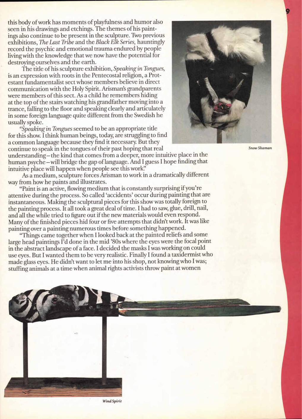
Snow Shaman
this body of work has moments of playfulness and humor also seen in his drawings and etchings. The themes of his paint-ings also continue to be present in the sculpture. Two previous exhibitions, The Last Tribe and the Black Elk Series, hauntingly record the psychic and emotional trauma endured by people living with the knowledge that we now have the potential for destroying ourselves and the earth.
The title of his sculpture exhibition, Speaking in Tongues, is an expression with roots in the Pentecostal religion, a Prot-estant fundamentalist sect whose members believe in direct communication with the Holy Spirit. Arisman's grandparents were members of this sect. As a child he remembers hiding at the top of the stairs watching his grandfather moving into a trance, falling to the floor and speaking clearly and articulately in some foreign language quite different from the Swedish he usually spoke.
"Speaking in Tongues seemed to be an appropriate title for this show. I think human beings, today, are struggling to find a common language because they find it necessary. But they continue to speak in the tongues of their past hoping that real understanding—the kind that comes from a deeper, more intuitive place in the human psyche —will bridge the gap of language. And I guess I hope finding that intuitive place will happen when people see this work!"
As a medium, sculpture forces Arisman to work in a dramatically different way from how he paints and illustrates.
"Paint is an active, flowing medium that is constantly surprising if you're attentive during the process. So called 'accidents' occur during painting that are instantaneous. Making the sculptural pieces for this show was totally foreign to the painting process. It all took a great deal of time. I had to saw, glue, drill, nail, and all the while tried to figure out if the new materials would even respond. Many of the finished pieces hid four or five attempts that didn't work. It was like painting over a painting numerous times before something happened.
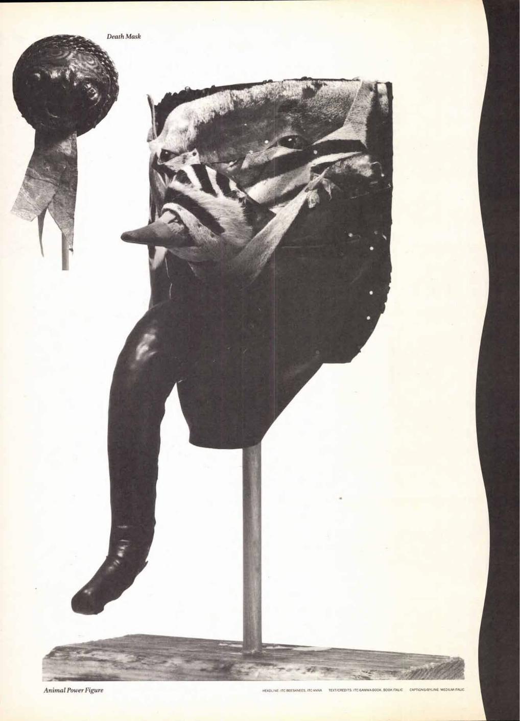
"Things came together when I looked back at the painted reliefs and some large head paintings I'd done in the mid '80s where the eyes were the focal point in the abstract landscape of a face. I decided the masks I was working on could use eyes. But I wanted them to be very realistic. Finally I found a taxidermist who made glass eyes. He didn't want to let me into his shop, not knowing who I was; stuffing animals at a time when animal rights activists throw paint at women
10 in mink coats tends to make you a little cautious. But he opened the door a crack and I showed him an animal mask in progress explaining what I needed until he let me in. Then I understood the secrecy. He was working on a huge moose in the corner. Standing next to me was a tiger, a water buffalo, a zebra, an antelope and birds of varying species. It crossed my mind that this was what animals had come to — no longer serving to teach and guide us, but simply to be present as decoration. Our immediate neighbors are no longer wild beasts living in a natural environ-ment we all share; rather they're other human beings who have learned violence, and practice it more treacherously than any animal, and for no purpose. So I bought my eyes and on the way out the taxidermist sold me a bag of scrap animal skins for $30. On the street I was trying to stuff the pieces down into a bag when an out-of-control animal activist screamed at me, `My god, those are real skins!' I fantasized about engag-ing her in a discussion about how we shared similar philosophies but simply had different styles of activ-ism. Maybe she would see that we used animals for the same end —to remind people that a way of life we've known is gone and that if we're going to have an earth we have to protect what we need to live. The verbal abuse followed me. She certainly made me feel guilty. Maybe screaming does have more impact than art!'
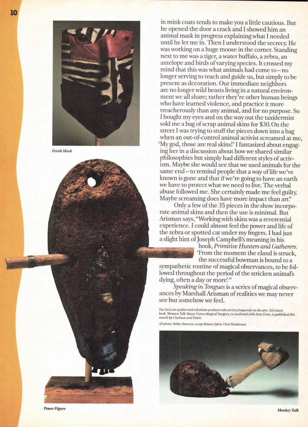
Only a few of the 35 pieces in the show incorpo-rate animal skins and then the use is minimal. But Arisman says, "Working with skins was a reverential experience. I could almost feel the power and life of the zebra or spotted cat under my fingers. I had just a slight hint of Joseph Campbell's meaning in his
book, Primitive Hunters and Gatherers. `From the moment the eland is struck, the successful bowman is bound to a
sympathetic routine of magical observances, to be fol-lowed throughout the period of the stricken animal's dying, often a day or more'. "
Speaking in Tongues is a series of magical observ-ances by Marshall Arisman of realities we may never see but somehow we feel.
Dee Ito is an author and television producer who writes frequently on the arts. Ito's latest book, Women Talk About Gynecological Surgery, co-authored with Amy Gross, is published this month by Clarkson and Potter.
All photos: Bobby Hannon, except Baboon Spirit: Chris Pizzolorusso.
Power Figure Monkey Talk
Animal Power Figure HEADLINE ITC BEESKNEES, ITC ANNA TEXT/CREDITS: ITC GAMMA BOOK. BOOK ITALIC CAPTIONS/BYLINE: MEDIUM ITALIC
12
ITC TYPI
The ITC Typographica 'Series is a growing resource of typefaces intended for larger sizes and display applications. They are faces which have been created to attract attention, create a mood or make a statement. ■ in this issue of U&Ic, we are announcing four additions to the ITC Typographica Series of alphabets. Each is a "single weight" design which can easily be added to your type library. Two are cap-only designs, one is an inline Modern and the other is a casual script. Each is available in a full complement of charac- ters to satisfy a wide range of typographic needs. ■ Only licensed ITC Subscribers and their sublicensees are authorized to reproduce, manufacture and offer for sale these and other ITC typefaces shown in this issue. This license is your guarantee of authentic-ity. These new typefaces will be available from our Subscribers on or after February 18, 1991, depending on each manufacturer's release schedule.
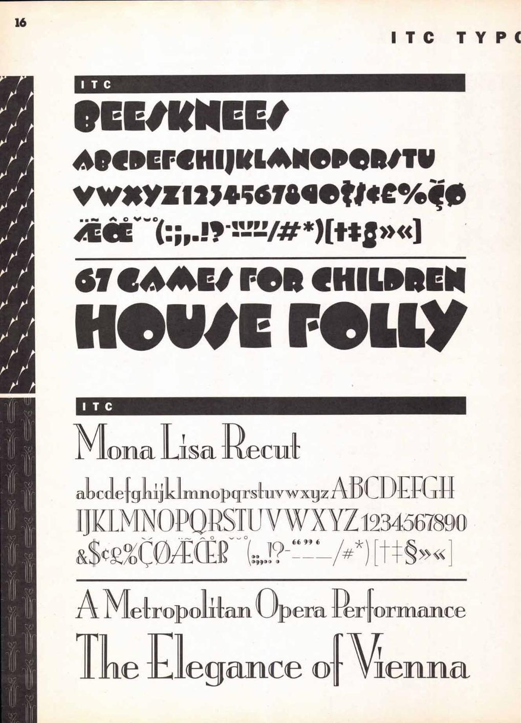
I CMOnd Lisa -Recut
Some typeface design traits just say "sophistication": strong contrast in thick and thin
stroke weights, hairline serifs and tall, elegant ascenders. Add to this a stressed inline
cut to the design and the end result is the typographic equivalent of Fred Astaire or Greta
Garbo. ITC Mona Lisa Recut is such a face. Originally drawn in the 1930s by Albert
Auspurg, it has recently been refurbished and polished to a high luster by Ms. Pat H ickson.
Much loving time and attention was put into the design project. The original drawings
were long gone and any surviving metal type was severely worn and missing much of the
intended charm and subtle sophistication. lickson carefully studied prints of
Auspurg's design in an attempt to meld the '30s flavor of the original with current design
standards. We believe that she met her goal with remarkable success. Some of the
minor idiosyncrasies of the first design were removed and a new, slightly "starched" look
was imparted to the recut. Obviously, ITC Mona Lisa Recut is not a face to be
confined to small sizes. Use it above 24 point. Its hairline construction and condensed
proportions allow it to maintain its grace and composure at even the largest sizes.

13
iIRAPHICA
Ecript types usually conjure up images of formal documents and sophisticated graphics.
But sometimes sophistication and formality are not what is called for in graphic com-
munication—and yet a script would still be the correct typographic choice. It is for these
7- applications that ITC Studio Script was created. first designed by Pat Hickson of
Manchester, England, as a "house" face for one of her many clients, ITC happened across
the design during one of its expeditions for new alphabets.
ITC®
TM
ITC has a script or two in its library, but up to now these have been of the more
formal variety. ?ylistically a casual script, ITC Studio Script is intended for
those applications that would benefit from handwritten, but informal letterforms. Casual
script types first became popular in the early part of this century and have since become a
staple of graphic communication. We believe that ITC Studio Script will become
Ta valuable addition to this portion of the typographic palette. o enable fine-
tuning to individual needs, a wide variety of alternate characters has been drawn
to complement the basic alphabet. Like most scripts, ITC Studio Script is at
its best when set in larger sizes and with spacing as intended by the designer.
ITC Studio Script's designer studied fine art and fabric printing in college, but her
first job after graduation provided a slight turn to her career path. Letraset hired her in
1969, and trained her in the art and craft of typeface design. After working several years
for Letraset, she was hired by Face Photosetting in London as a type designer. During
her stay there she worked on many designs which have since become standards of graphic
communication, including a collaboration with Erik Spiekermann on faces he was creat-
ing for H. Berthold. fn 1980, Hickson left Face and set up her own design and consulting
firm in Manchester, England. Alphabets and type design are still the lion's share of her
work, but she frequently is asked to supplement this with graphic and communication
design. ackson is a member of the Association Typographique Internationale, and a
founding member of Letter Exchange and Letter Exchange North-West in England.
14
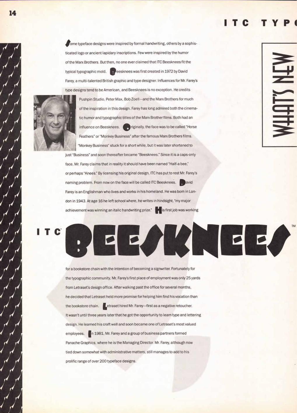
ITC TYPI
Some typeface designs were inspired by formal handwriting, others by a sophis-
ticated logo or ancient lapidary inscriptions. Few were inspired by the humor
of the Marx Brothers. But then, no one ever claimed that ITC Beesknees fit the
typical typographic mold. •eesknees was first created in 1972 by David
Farey, a multi-talented British graphic and type designer. Influences for Mr. Farey's
type designs tend to be American, and Beesknees is no exception. He credits
Pushpin Studio, Peter Max, Bob Zoell—and the Marx Brothers for much
of the inspiration in this design. Farey has long admired both the cinema-
tic humor and typographic titles of the Marx Brother films. Both had an
influence on Beesknees. Originally, the face was to be called "Horse
Feathers" or "Monkey Business" after the famous Marx Brothers films.
"Monkey Business" stuck for a short while, but it was later shortened to
just "Business" and soon thereafter became "Beesknees." Since it is a caps-only
face, Mr. Farey claims that in reality it should have been named "Half-a bee,"
or perhaps "Knees." By licensing his original design, ITC has put to rest Mr. Farey's
naming problem. From now on the face will be called ITC Beesknees. David
Farey is an Englishman who lives and works in his homeland. He was born in Lon-
don in 1943. At age 16 he left school where, he writes in hindsight, "my major
achievement was winning an italic handwriting prize." His first job was working
Cb.
C111101 le* for a bookstore chain with the intention of becoming a signwriter. Fortunately for
the typographic community, Mr. Farey's first place of employment was only 25 yards
from Letraset's design office. After walking past the office for several months,
he decided that Letraset held more promise for helping him find his vocation than
the bookstore chain. Letraset hired Mr. Farey—first as a negative retoucher.
It wasn't until three years later that he got the opportunity to learn type and lettering
design. He learned his craft well and soon became one of Letraset's most valued
employees. In 1981, Mr. Farey and a group of business partners formed
Panache Graphics, where he is the Managing Director. Mr. Farey, although now
tied down somewhat with administrative matters, still manages to add to his
prolific range of over 200 typeface designs.

E4i ei
Eg4i eves
AYM AvA'r
AVM AVM A10 AVM AVM
AAA'???Ati AVM AVM AVM even Ai'Av Erie AVA Aye eve gA AVA AVA 4'41
•
15 GRAPHICA
ITC
Typefaces are personal things—especially to their designers. Few, however, get
as entwined in a designer's life as "Anna" did in Daniel Pelavin's. While growing up
near Detroit, he had his first experience with type by playing with a set of rubber
stamps. The typographic images on the stamps were the inspiration for those he
drew for Anna, his first type design. When he later married graphic designer
Lorraine Louie, Pelavin handlettered his wedding invitation—in the same face
as his rubber stamp set. Upon the birth of their first child the familiar letterforms
were again put to use, this time for her birth announcement. Occasionally, the
design would resurface on one of the many book covers he created in his career
as an illustrator and book jacket designer. ITC first saw the alphabet on
TM
Louie's business card. We were immediately taken by its geometric, Art
Deco shapes and friendly personality. At our request, Pelavin drew the
complete character set required to convert the handlettering into an
alphabet design—which he named "Anna" after his daughter. When
asked about his work, Pelavin will tell you that he is an illustrator, graphic
designer and lettering artist. Although he won't tell you, he is also very
good at these crafts. His illustrations and book covers have earned recognition
from the American Institute of Graphic Arts, the Society of Illustrators, the Society
of Publication Designers, the Type Directors Club and the Art Directors Clubs of
New York, Boston, San Francisco and Washingon, D.C. We think that typeface
design should now be added to Pelavin's list of accomplishments.
ITC TYPC
T C
MIMIC* vwxyzt2)41467.410tilt%40
61 411/4C/ FOR 1111111101114
tilely*C 11,113► I T C
,isa, Recut
-ghii1( m opqrsluvwxw ABCDEFGT- K I 4MNOPQRSTUVWXYZ12345678
66996
AMetro
The lawn_ Opera Per
egance
0 oirmance

17 GRAPHICA
T C
Ettidioarpt oaaalicadcimegg4latikaliimiwkielfr000ppqiutorog)
Aadttaititvuowwxyyz 40EODEECFTW4g191/ci ii(signklitifiCknO0cPQQS)76UUliqici/t/tO XQRNG/212345678q0S-86,11?-9
9&3terdagioDreato-4 AokEaek
e 6sogettelep tocPario I T C
41-D(DiAllnlillNOPNTUVWXV11214-02 ill[ttss»«1 I I
WM 14 MU TURKING DOWN I eSg N QU-EST IKELLitia
evg

18
000- cc\Ace\P
10,01°'
ve,-\146 e,cec` • g,,62)1c-\
4-aA\c'e
6, \\e„c\oc\
cc-0A ockss‘G* (a-\'
Noo
c`a‘e.°(e.c\ rex.c
19
so
4C.° \142k
OW
\)'(\'C\ \ \\r\e
fasN4C)°
. '
ItOttiA421% albS• ter,Nw-
a,,
204°
20,c59 00,0 o- .c` •
,4.0co` \`'s\e:c
o\
•'Pc>
,e,c\o
\e4c\ e° 6
\:)Wc ec.\\S\a'c\
okez:c‘c \e5"c\a.c\ o) 4,o•c`e \\&e
\i4e'ce 0
• oc:Ccaq) e
vc,c\80-
•,6\*0 \0\ \60. ‘c`
0:cc‘e
6 bo, cogs
ac\
oN0 Gcee Ke.c\c/
4falY \c`e
la \
\ *c
06:6 \c`e
\)5a \*)\ °
N6e oVcc`cak.c. .ce5
'es" e o4A
c\ecc\ .cc\\
••\*cc` \Ls ra'c\166"c
cue'
)..c\OP, oee .ceise4` e\LcOs '
e'o 000' Se ze Ve'c
No.c.o\vo'.c`
?).c`a!ak4°a
cee\L
a.c\--- g 60,,
1\r'ei.cc\' \c`e
ee e\leck\.c\ \e
W\ d\"c`a c\
oc:ce°'NO
'\06p \)\ e0e
c.cc\C \e'se
cc)Oe •c\ -
4c'e e(34̀c
\I.C\ cedes
e'"
\00cece

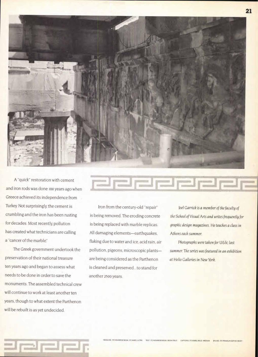
Ravages of
cannon blasts
and pollution
are evident under
a temporary roof.
Far right: The
Parthenon "frieze;
blackened by
exhaust fumes,
will be restored.
Workmen prepare to
hoist a repaired
piece of the cornice
back into place
on the eastern
pediment.
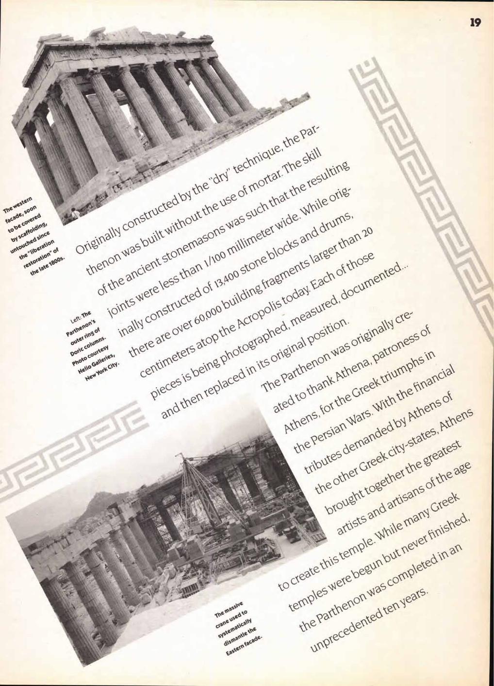
For 200 years, the Parthenon attracted
geniuses in all forms of art and thought.
Socrates, Plato, Aristotle, Aeschylus, Sopho-
cles, Euripides, Aristophanes, Herodotus
and Thucydides all lived, walked and taught
in the shadow of this building.
By the Second Century A.D., however,
Roman emperors—especially Hadrian—
began to change Athens' public buildings.
While the Goths in the Fourth Century
started the Parthenon's real decline, it was
the Roman Emperor Justinian in 529 who
dealt the actual deathblow to the Olym-
pian gods, converting the Parthenon into
a Christian church.
The Turkish conquest in 1456 was fol-
lowed by 400 years of occupation, leaving
the Parthenon with the incongruous addi-
tion of a minaret. One section was even
used to store gunpowder and, in 1687, was
hit by a Venetian cannonball, destroying
the roof and much of the northern wall.
During the next 150 years Turkish sultans
allowed favored visitors to carry away
statuary and reliefs from the Parthenon—
including the Elgin Marbles now in the
British Museum.
21
A "quick" restoration with cement
and iron rods was done loo years ago when
Greece achieved its independence from
Turkey. Not surprisingly, the cement is
crumbling and the iron has been rusting
for decades. Most recently, pollution
has created what technicians are calling
a "cancer of the marble:'
The Greek government undertook the
preservation of their national treasure
ten years ago and began to assess what
needs to be done in order to save the
monuments. The assembled technical crew
will continue to work at least another ten
years, though to what extent the Parthenon
will be rebuilt is as yet undecided.
Iron from the century-old "repair"
is being removed. The eroding concrete
is being replaced with marble replicas.
All damaging elements—earthquakes,
flaking due to water and ice, acid rain, air
pollution, pigeons, microscopic plants—
are being considered as the Parthenon
is cleaned and preserved...to stand for
another 2500 years.
Joel Garrick is a member of the faculty of
the School of Visual Arts and writes frequently for
graphic design magazines. He teaches a class in
Athens each summer.
Photographs were taken for U &lc last
summer. The series was featured in an exhibition
at Helio Galleries in New York.
HEADLINE: ITC NOVARESE BOOK, ITC KABEL ULTRA TEXT: ITC NOVARESE BOOK. BOOK ITALIC CAPTIONS: ITC KABEL BOLD. MEDIUM BYLINE: ITC FRANKLIN GOTHIC HEAVY
In the 1960s American automobile manufacturers were involved in what is now called the "Horse-power Wars: Each was trying to outdo the others by producing cars with ever higher engine horse-power ratings. America's driving public was led to believe that a bigger engine somehow made the whole automobile better.
Wrong.
22
47101111FOR YOUR
(TYPOGRAPHIC) INFORMATION
Kernin Fine Typography or Marketing Hype?
Before long many automobile engines were much more power-ful than the other components of their drive-trains. The cars could accelerate in a straight line with remarkable speed, but cor-nering, braking, and stability were, in many cases, inferior to the "family" sedan.
In the 1980s type suppliers entered a similar kind of "war," each trying to outdo the other by incorporating more kerning pair combinations in their fonts. The logic was pretty much the same as used by the automobile manufacturers in the previous decades: bigger numbers equal better fonts.
Wrong again.
It's not that kerning pairs aren't important, and a goodly num-ber of them are a valuable typo-graphic asset, but just how many we really need seems to have got-ten lost in the type vendor's quest
for increased market-share. So how many kerning pairs do we need? Are 150 enough? Or do we need more—say, 300, 500,1500, or even 5000? There is a correct number—but it varies. Just as a small commuter car doesn't need a 300 horsepower engine, while a large sports car could probably benefit from such power, the number of kerning pairs should vary from typeface to typeface. But more on this later.
A Definition First, what is this thing called
"kerning" that we seem to need so much of? The classic definition says that it is the selective reduc-tion of white space between irreg-ularly shaped letters to create even optical spacing in a line of text copy. (An important part of the definition is that kerning is about "little type" in text copy. Inter-letter space adjustment in
BV To DIN

23
Before and after kerning:
Railways Railways Swash letters generally need to be kerned:
refinement and ease of use, more kerning pairs were obviously among the first things on every typographer's "wish list:' But even with all this available power and capability, kerning pairs were limited to a few hundred.
The Old-Timers Got It Right
large size display type is called "letter fitting" and here letter com-bination is subject to adjustment depending upon the size of type, the letters involved, and length of line.) In handset metal type, kerning letters were those in which a portion of the character protruded beyond the designated body of the type. Cap 'Qs,' and swash versions of letters like 'F' and were typical kerned letters.
In the better shops (read "more expensive"), sometimes the typog-raphers took the time to adjust spacing on characters which didn't come "kerned" from the factory. Letters like A and 'W' were cut by hand, or filed down to allow an otherwise awkward letter combi-nation to "color out" evenly. The problem with this kind of custom work was that it was very time-consuming, demanded great skill, and the filed down letters were then rendered useless for any future normal typesetting.
Kerning and Readability
Typographic fact: kerning is first cosmetic, and second an aid to readability. Kerning makes a page of text copy look better, and to the degree that a page has even spac-ing, the reader is likely to enjoy reading it; but kerning does not, in itself, make for improved read-ing. Numerous studies have shown that kerned copy does not necessarily improve reading speed or comprehension. What's more, the reader almost never realizes that he or she is reading kerned copy. Since it was expen-sive, took extra time to produce, and readers didn't really care anyway, kerning was one of those typographic niceties that never really caught on when type was set in metal, one letter at a time When machine-set metal type replaced the setting of type by hand, kerning ceased to exist.
Then phototype came along, and with it the ability to selectively move letters around virtually at will. Kerning made a comeback! But with the first phototypeset-ters, kerning was still a manual operation that required skill—and a good memory. The operators had to remember which letters to kern, by how much, and at what point sizes. In the early days of photocomposition the better equipment operators could easily be identified by the sheets of paper with handwritten kern tables tacked to the wall above their keyboards. As phototypeset-ting equipment became more sophisticated, and "front end sys-tems" began to replace simple keyboards, kerning tables became computerized. These first com-puterized tables were, however, still pretty basic and offered only a hundred or so kerning pairs. When digital typography was born, and type-editing software reached its all-time high for
Why? Because typographers don't need any more. If a typeface is designed with care, and spaced properly (old-timers call it "uni-tized"), it should color-out well on its own. Automated typesetting equipment (whether metal, photo or digital) requires a "spacing sys-tem" to produce acceptable typog-raphy. This "system" is nothing more than a number of defined
"width spaces" which enclose let-ters and their surrounding white space. In the 1920s type designers had to make do with a coarse system that allowed only 18 width values. (Take a look sometime, and flip through an old metal type specimen book to see how well these old type designers could do with just 18 units.) In the 1970s the available spacing values were upped to 54. Today, spacing values are limited only by the resolution of the output device. What's this all mean? That a good typeface design should space just fine right out of the box.
But still there will be the occa-sional letter combination that cannot be made perfect with nor-mal spacing, and a few (or even quite a few) kerns can help almost any block of text copy. How many kern pairs do you need? 100 is a good number; 400 is better, and 800 is downright super. At 1500 the number becomes something of an overkill, and anything above 2000 is just silly. And what's more, not every typeface will need the same number of kerns or the same kerned pairs. Kerning requirements can vary from type-
koala koala Words may be kerned by degrees:
Wail Wail Wail
by
KO
r. vg
Lu

Kerning:
24
face family to typeface family—and even from face to face within the same family. Kerning isn't like buying "one size fits all" socks.
And the good news is that most major suppliers of type take the time to make a reasonable num-ber of kerning pairs part of the fonts they sell. They determine, as part of the design and production process, which are the necessary kern pairs and what the kerning values should be. The best sup-pliers offer fonts which require virtually no hand-tuning on the part of the type user.
On Achieving Maximum Kerning
If you insist on having mega-kern-ing capabilities, you need to remember two important things: one, either you or someone else will have to determine the indi-vidual kerning values; and two, if you do the determining, be pre-pared for a lot of tedious work. A thousand pairs in a hundred or so faces, even if you spend only a couple of minutes on each pair, means about 3000 hours devoted to the project—and that's a lot of work in anybody's language! If you choose to purchase "off the shelf' kerning pairs remember that most of the very large kerning tables come from software com-panies—not type suppliers. (Ask yourself who creates all those kerning values, trained typogra-phers—or maybe somebody else?)
Listed below are the steps to follow to manually kern individ-ual letters on the screen in the most frequently used personal computer software packages. (It's also possible with a special utility or as part of the program in QuarkXpress to make global changes to the automatic kern pairs.) Kerning on the screen does not affect the kerning tables that are built into each font. Most programs default to the automatic pair-kerning option, which uses each font's pair-kerning tables to adjust the letterfit. Typically only page lay-out and illustration programs offer the potential for manual kerning; it's not possible to kern in most word processing, paint or draw packages.
When kerning in any software program, the units removed are often so small you won't see the effect on the screen. Yes, in order to perfect the kerning you must print a number of proofs. Adobe Type Manager," a soft-ware utility available for both the Mac and the PC, renders most fonts on the screen with their true outline, eliminating the jagged edges that can make it impossible to predict the results of manual kerning.
Most of the space increments for kerning are in relation to an
"em:' An em is a unit of space that is dependent on the type size. In metal type, it was a little square piece of lead that was as tall as the point size, say 12-point, and as wide as the point size. With electronic type, the same principle applies—if you are working with 48-point type, an em space will be 48 points wide; in 9-point type, the em is 9 points wide. Thus, when the kerning factor is dependent on ems, the actual size of the incre-ments will be proportional to the text size.
A Good Place to Start
If you're looking for the most basic starting point, the following are the top 20 most-used kern pairs.
Yo We To Tr Ta Wo Tu Tw Ya Te P Ty Wa yo we T. Y. TA PA WA If you are interested in building a world-class palette of kerning pairs the above list could be mul-tiplied by a factor of 20 or even 40! Rather than give you a list, which will change somewhat from type-face to typeface anyway, below are a list of guidelines for determin-ing your own set.
• Commas, periods and quotes almost always have to kern.
• Cap and lowercase letters with outside diagonal strokes require kerning more often than not.
• 'VC and '13' generally need to be kerned with non-ascending lowercase letters.
Kerning in text copy is a good thing. It creates a more attractive page, it probably eases the read-ing process, and it shows that you care about your work. (It's a detail worth sweating ) It's not, how-ever, a guarantee of typographic perfection or a satisfactory way of dealing with a poorly spaced typeface. Whether it's automobiles or typefaces, numbers alone do not make the product a good one.
Allan Haley
25
Keystrokes for Desktop Publishing
Letraset DesignStudio' 1.01
DesignStudio kerns in units of 1/1000 (.001) of an em.
When you kern using keyboard commands, the default increment is 1/100 (.01) of an em. The units are added or deleted from the space to the left of the selected characters.
■ For each procedure, first select a range of text with the I-beam tool.
■ If you select a word, don't select the first character, as that will cause units of space to be added or deleted from the word space.
■ If you want to kern between two characters, select the one on the right.
To kern from the keyboard using the default increment (.01) of an em:
■ To delete units, press Command (left arrow).
■ To add units, press Command-, (right arrow).
To delete units, using custom increments:
■ From the Format menu, choose "Horiz Spacing...7
■ Click the "Kern" button.
■ In the "Amount" edit box, enter a value from 0 to .250.
■ To see the effect, click the "Apply" button. When you're satisfied, click OK.
To add units, using custom increments:
■ From the Format menu, choose "Horiz Spacing...:'
■ Click the "Letterspace" button.
■ In the 'Amount" edit box, enter a value from 0 to 7.000.
■ Toisee the effect, click the "Apply" button. When you're satisfied, click OK.
To remove any kerning or letterspacing:
■ From the Format menu, choose "Horiz Spacing...
■ Click the "Kern" button or the "Letterspace" button, whichever is appropriate.
■ In the "Amount" edit box, enter 0 (zero). Click OK.
Letraset ReadySetGor 4.5a
ReadySetGo! kerns in units of 1/1000 (.001) of an em.
When you kern using keyboard commands, the default increment is 1/100 (.01) of an em. The units are added or deleted from the space to the left of the selected characters.
■ For each procedure, first select a range of text with the I-beam tool.
■ If you select a word, don't select the first character, as that will cause units of space to be added or deleted from the word space.
■ If you want to kern between two charac-ters, select the one on the right.
To kern from the keyboard using the default increment (.01) of an em:
■ To delete units, press Command- •— (left arrow).
■ To add units, press Command-, (right arrow).
To delete units, using custom increments:
■ From the Format menu, choose "Kern...:'
■ Enter a value in the edit box from 0 to .5.
■ To see the effect, click the 'Apply" button. When you're satisfied, click OK.
To add units, using custom increments:
■ From the Format menu, choose "Letter'- space...:'
■ Enter a value in the edit box from 0 to 7.000.
■ To see the effect, click the 'Apply" button. When you're satisfied, click OK.
To remove any kerning or letterspacing:
■ From the Format menu, choose "Letter-space" or "Kern," whichever is appropriate.
■ Enter 0 (zero) in the edit box; click OK.
- -
88 Illustrator 88 does not kern • type. If you want to adjust
the space between letters, you must set each character in its own text block and then pick up each one and physically move it into position.
F. . •• Adobe Illustrator 3.0'
Illustrator 3.0 measures its kerning values in 1/1000 of an em. The term "kerning"
in Illustrator 3.0 is specifically applied to the space between two selected characters; when a range of text is selected, Illustrator calls it "tracking:' (Tracking is available in all the page layout programs, where it usually func-tions in a slightly different sense than kerning.)
■ To kern, use the type tool to click the inser-tion point between the two characters you want to kern. The menu and dialog box will have "Kerning" options.
■ To track, use the type tool to select a range of text. The menu and dialog box will have
"Tracking" options.
Auto pair-kerning does not default to On. Auto kerning is character-specific in this program, rather than paragraph-specific, as in most other programs.
To use the Auto-Kern option to kern:
■ With the type tool, click between two characters.
■ From the Type menu, choose "Style,' or preiss Command—T.
■ Click in the 'Auto kerning" checkbox. If there is a kerning table value for the two characters, it will appear in the "Kerning" edit box. If there is none, the default of 0 will appear. If you enter any manual kerning values in this edit box, they will override the auto kerning.
To kern/track in a specific increment:
■ From the Type menu, either choose "Kern-ing" or "Tracking" to get their mini-dialog boxes, or choose "Style" (press Command —T) to get the "Type Style" dialog box.
■ In the "Kerning" or "Tracking" edit box, enter a positive number to add space; enter a negative number to delete space. The value you enter will be the number of parts of 1000 of an em; e.g. — 43 would delete 43/1000 of an em space.
You can kern/track from the keyboard, and you can set the exact increments that each kerning or tracking keystroke shortcut will use; for instance, you can set 12/1000 or 153/1000 as the increment of space to add or delete. The default is 20/1000 of an em.
To change the default keyboard increment values for kerning and tracking:
■ From the Edit menu, choose "Preferences; or press Command—K.
■ Click the "Type Preferences..:' button.
■ In the "Kerning/Tracking" edit box, enter a positive value.
To track/kern from the keyboard, using the value set in "Preferences" (above):
■ Select the text, or set the insertion point between two characters.
■ To delete space, press Option - I- (left arrow).
■ To add space, press Option--0(right arrow).
To track/kern from the keyboard, using five times the value set in "Preferences" (above):
■ Select the text, or set the insertion point between two characters.
■ To delete space, press Command-Option—K— (left arrow).
■ To add space, press Command—Option— —0(right arrow).
To view the kerning value between two characters:
■ With the type tool, set the insertion point between two characters.
■ Press the Option key.
■ The total kerning value for the two charac-ters is displayed in the lower left corner of the screen.
Aldus FreeHand -
\ FreeHand can kern in coarse increments of 1/10 (.1) of an em, or in fine increments of 1/100 (.01) of an em, up to
■2 ems. You can only kern between two char-acters at a time; you cannot kern over a range of text.
■ With the pointer fool, double-click on the text you want to kern.
■ In the "Text" dialog box, click to set an inser- tion point between the two characters.
To delete fine units (.01):
■ Press Command 4-- (left arrow) or Command—Backspace/Delete key.
To delete coarse units (.1):
■ Press Command—Shift-4— (left arrow).
To add fine units (.01):
■ Press Command— (right arrow), or Com- mand—Shift—Backspace/Delete key.
To add coarse units (.1):
■ Press Command—Shift— , (right arrow).
To remove kerning:
■ Retype the text.
You won't see any changes in the "Text" dialog box. Move the dialog box so you can see the characters on the page. Click the "Apply' button to see the effect in the illustration (you'll notice the kerning value is displayed in the information bar). When you are satisfied, click OK.
Adobe Illustrator® 88
(continued on page 52)
HEADLINE: ITC MODERN NO. 216 BOLD, MEDIUM ITALIC SUBHEADS: BOLD TEXT: LIGHT CAPTIONS/BYLINE: LIGHT ITALIC TYPE ILLUSTRATIONS: MEDIUM. BOLD; ITC KABEL BOLD; ITC BOOKMAN DEM I BOLD WITH SWASH SIDEBAR HEADLINE: ITC KABEL DEMI SUBHEADS: BOLD TEXT: MEDIUM, BOOK CREDIT: DEMI. MEDIUM
26
Beasts of by Scott Gutterman
A Dante Bestiary can be thought of as a col-
laboration between artist Judith Mason,
publisher Casper Schmidt of Ombondi
Editions in New York, and the words and
spirit of the great Florentine poet Dante.
Mason and Schmidt, at least, had worked
together once before, on an illustrated
book, Butterfly Woman, Butterfly Hill,
which featured Mason's drawings and
collages and a poem by Wilma Stocken-
strom. But A Dante Bestiary is a far more
ambitious undertaking. It offers selec-
tions from The Divine Comedy, all of which
describe a wild array of animals, real
and imaginary, along with Mason's corre-
sponding drawings.
This book, however, is no ordinary
illustrated volume of poetry, any more
than Dante was your run-of-the-mill
rhyme spinner. Besides offering its own
startling vision of the creatures of hell,
purgatory and paradise, A Dante Bestiary
betrays a level of craftsmanship that is sel-
dom found in the making of books today.
Like the illuminated manuscripts of the
Middle Ages, it is a book as a work of art.
Mason, working in her studio in
Broederstrom, South Africa, chose the
27
patio
magi
DA TESCO
*f !et litiograAt aown /asp*
MASON
Azle v s tart, *04104
Fortosott atett tratti
LA pi INA COMME
DANTP A1.19141E/t1t
A
Aorotstino
Pot ► laicata a New yerk net xg9q .4a
passages she would illustrate, and within
six months completed 6o accompanying
drawings. Previously, Schmidt had con-
tacted noted calligrapher Arthur Baker
about the possibility of creating a new
typeface for the book. Baker did several
studies before developing a loose, heavily
shaded typeface based on Gothic cur-
sive. The final version was christened
"Visigoth"; among its features were
unusual ligatures, such as "qu:' Visigoth
was developed and digitized by Cynthia
Hollandsworth, and the texts were set in
Poughkeepsie, New York. The typeface
has been released since then by Agfa
Compugraphic.
The actual making of the book
required several transcontinental hops
between New York, South Africa, and
Italy, where Mason moved after complet-
ing her drawings. Some initial proofs
were pulled in August, 1988, in order to
find the right print and paper combina-
tions. In December of that year, Schmidt
and Mason got together and laid out the
book in one week. Rather than have text
and image on facing pages throughout,
the two sought to make what Schmidt
refers to as "syncopated layout;' in which
the imagery appears in various sizes and
at various intervals.
Once the order of the book had been
mapped out, Bruce Attwood, a master
printer and Mason's husband, began the
arduous task of realizing it. Both text and
illustrations were printed on a single-
color lithographic offset press. Plates were
photographically made from line scans of
the pencil drawings. This made it possible
for Attwood to print the graphics while
maintaining the quality of Mason's metic-
ulously executed drawings. Color was

THE EyES OF THE ENV'1014S
WIRED SHUT
1 cannot think there walk( the earth. today
A man fo li..At4) that he Ivo-14a not be move
by wkat 1 f2fY next on that afhen_ stay.
For when 1 ,trew near and CettUx fee tke whole-
penance oftrcrfe,?) upon thole praying reertey
my eyef milked great angftifh ro my foul.
Tkeir ciesah were mate o hal-ire/eta, co-arfe an.3 ftiff.
FAch font inrrorte another with kif fhonaer,
an.3 all leaned f"rprt againft the cliff.
The iftroverifhe bitnt who- fit ail in a row
Inftig-eneef to beg their brea
lean witk their- kea,4 together exactly for,
the better to win the pity they befeeek,
not only with. their crief, but with their look
which of loud of freeck.
28
added in the negative spaces of some of surcharge levied on "luxury" goods
the drawings, and was printed from plates
made with ink-and-water repulsion
effects on mylar, creating some spectacu-
lar efforts. The final image in each book,
"The Direct Vision of God;' is embellished
with gold leaf by hand, and an original oil
painting on vellum is tipped into each edi-
tion at the story of Paolo and Francesca.
The book was printed on Rives
BFK paper that Schmidt had purchased
in New Jersey and shipped to Pretoria
in order to avoid having to pay the 6o%
bought within South Africa. Despite the
expense of the paper, many pages had to
be printed in third or even fourth versions
before everyone was satisfied. Further-
more, Attwood had to modify his press in
order to feed the paper, since the dry
African air created unusual amounts of
static. Finished pages were shipped to
Schmidt in New York, where they were
collated and their edges were hand-torn
to a deckle edge by Schmidt's assistant,
Edgar Soberofm.
But the book's transcontinental
journey was not yet complete. When
Schmidt went looking for a place to bind
and box these very weighty tomes, he
found the finest craftsmen located in vari-
ous parts of New England. The books
were handbound by Eric Zimmerman of
Markey & Asplund, in Foster, Rhode
Island. He also created false spines for the
books so that the pages would open up
flat, the better to see the images that
spilled across the spine in most of the
double-page spreads. He bound the books
in calf vellum, with quarter leathers of
sheepskin and a buffalo hide imprint.
The lipped clamshell boxes in which
the books are nested were fabricated
by Stuart Einhorn of Portfoliobox, Inc.,
in Providence, Rhode Island. The boxes
are covered in black Italian book cloth
and lined with salmon-colored ultra-
suede. The books' titles were embossed
on the covers in matte black film by
Adolph Bauer.
The fruits of all these esthetic labors
are apparent throughout. Mason's draw-
ings have an expressive urgency that suits
their subject. A drawing depicting "The
Wood of the Suicides',' for instance, where
those who have taken their own lives are
turned into trees, shows a hand trans-
forming into a tree, running red with
blood, and with half a razor blade sitting
at its root. With its careful juxtapositions
of imagery that is traditional and contem-
porary, fantastic and mundane, the book
newly awakens the horror and sublimity
of Dante's vision.
Schmidt publishedA Dante Bestiary
in English in a signed, limited edition of
110, and in the original Italian in an edi-
tion of 15. The audience for these kinds of
finely wrought books — known variously
as livres des artistes or livres deluxe — is quite
limited, and the $5200 price tag per book
only adds to their preciousness. Nonethe-
less, several new projects of limited-
edition artist's books are under way at
Ombondi Editions. For these projects,
Schmidt is working again with Arthur
Baker to develop new typefaces, two of
which are named after Rabelais' great
comic figures, Gargantua and Pantagruel.
Schmidt seems to be heeding the advice of
Virgil, who, in the Inferno, scolds Dante
with the words,"Up on your feet! There is
not time to tire! The man who lies asleep
will never waken fame, and his desire and
all his life drift past him like a dream, and
the traces of his memory fade from time
like smoke in air or ripples in a stream!'
Scott Guttertnan writes frequently on art and
design. He is senior editor of The Journal of
Art and is co-author of the recently released
The Art of Miles Davis published by Pren-
tice Hall Press.
HEADLINE: ITC LUBALIN GRAPH EXTRA LIGHT TEXT, ITC ESPRIT BOOK, BOOK ITALIC BYLINE: MEDIUM ITALIC
29
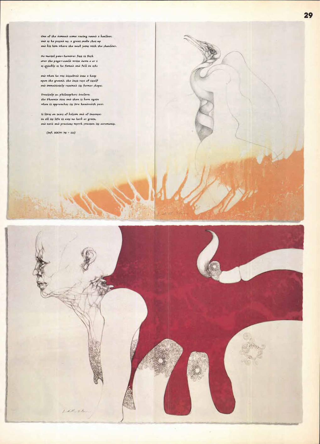
one of tke ea*VteJ crone racing ronn2, a Lootaer,
att, kc pallee nl, a great hake iket nfr
ar14 bit kirn wkere tke neck join" witk tke ikonaer.
No mortal ren—kowever fait it //ail.
over tke rasc—c.,ae Write e■.ovta o or i
al V.lekty al ke flamaeJ ariJ fell in aik;
an.) wken. ke wai Otilotire2, into a licar
Fran tke gronit, tke Jnit role of itself
ane iwatie.Oiately repinceJ itJ former Aaret.
PrEtiftly 50, prItiloiorkeri eectare,
tke Pkoonin Oiei axe tken it born apart
wkon it irrroackoi its Ave linnere,4k year.
It Iivei on teary of lialiant at of imconiet
in all ity Ur* it dati mo kerb or grain,
an.4 nar.J axe reties., lityrrk jrweeters it; cerententi.
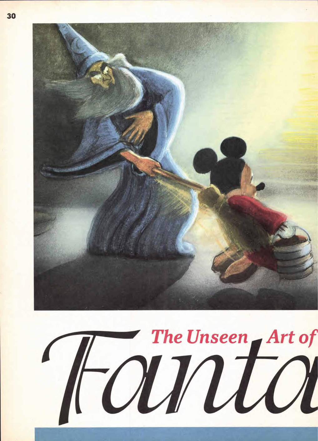
The Unseen Art of

31 Left and bottom: Two examples of the color story-boards of The Sorcerer's Apprentice prepared in gouache by art director Tom Codrick in early November, 193Z The boards were photographed sequentially onto a Leica Reel, a film synchro-nized to the musical soundtrack in order to test the staging of the whole piece before proceeding with expensive animation. Courtesy Christie's East.
Below: Two red conte crayon studies, circa 1932 of silent movie actor Nigel de Brulier, the model for the Sorcerer in Fantasia's Mickey Mouse sequence, The Sorcerer's Apprentice. The Disney studio maintained its own art school on the studio lot and life studies of models were often adapted to the current production's cartoon characters. Courtesy Sotheby's.
A moody story sketch in pastel (perhaps by Elmer Plummer) of the dancing mushrooms entering a forest. In the final film, a black teardrop and spot-light effect proved a less expensive background for the terpsichorean fungi.
•
Last fall, Walt Disney's Fantasia by John Canemaher turned 50. To honor the leg-
endary animation and the art of sound production, the Disney studio re-released the film nationwide in October with a dazzlingly spruced up sound-track and picture.
Over a two-year period, Leopold Stokowski's original soundtrack was restored and reprocessed to remove hisses, pops and other imperfections. The resulting dimensional clar-ity approximates 1940's so-called "Fantasound," Stokowski's experimental system that used 96 speakers to give movie-goers their first stereophonic sound experience.
The picture received equally meticulous restorative care: YCM Laboratories, the team responsible for restoring Gone with the Wind, hand-cleaned original nitrate nega-tive material one frame at a time and printed the film onto today's improved film stocks with precision lenses.
In the refurbished Fantasia, subtle nuances of color, motion and sound are revealed for the first time in half a cen-tury. Yet, for all its many visual and aural delights, the film remains one of Walt Disney's most controversial works.
Music purists have long been dismayed by Stokowski's Hollywood-ized interpretations of Bach, Beethoven, Stra-vinsky and the other five composers represented in the film, as well as the cavalier truncation of their scores. Others have balked at the very idea of visually interpreting classical music, especially when the imagery often suffers from a kitsch sensibility, the nadir of which is generally thought to be Disney's version of Beethoven's Pastoral Symphony, which a critic in 1940 called "Olympus in diapers'.'
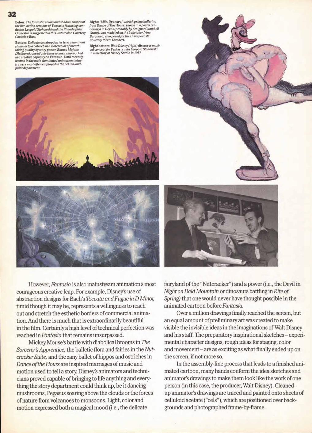
32 Below: The fantastic colors and shadow shapes of the live-action sections of Fantasia featuring con-ductor Leopold Stokowski and the Philadelphia Orchestra is suggested in this watercolor. Courtesy Christie's East.
Bottom: Delicate dewdrop fairies lend a luminous shimmer to a cobweb in a watercolor of breath- taking quality by story person Bianca Majolie (Heilbom), one of only three women who worked in a creative capacity on Fantasia. Until recently, women in the male-dominated animation indus-try were most often employed in the cel ink-and-paint department.
Right: "Mlle. Upanova," ostrich prima ballerina from Dance of the Hours, shown in a pastel ren-dering a la Degas (probably by designer Campbell Grant), was modeled on the ballet star Irina Baronova, who posed for the Disney artists. Courtesy Pierre Lambert.
Right bottom: Walt Disney (right) discusses musi-cal concept for Fantasia with Leopold Stokowski in a meeting at Disney Studio in 1937
However, Fantasia is also mainstream animation's most courageous creative leap. For example, Disney's use of abstraction designs for Bach's Toccata and Fugue in D Minor; timid though it maybe, represents a willingness to reach out and stretch the esthetic borders of commercial anima-tion. And there is much that is extraordinarily beautiful in the film. Certainly a high level of technical perfection was reached in Fantasia that remains unsurpassed.
Mickey Mouse's battle with diabolical brooms in The Sorcerer's Apprentice, the balletic flora and fairies in the Nut-cracker Suite, and the zany ballet of hippos and ostriches in Dance of the Hours are inspired marriages of music and motion used to tell a story. Disney's animators and techni-cians proved capable of bringing to life anything and every-thing the story department could think up, be it dancing mushrooms, Pegasus soaring above the clouds or the forces of nature from volcanoes to monsoons. Light, color and motion expressed both a magical mood (i.e., the delicate
fairyland of the "Nutcracker") and a power (i.e., the Devil in Night on Bald Mountain or dinosaurs battling in Rite of Spring) that one would never have thought possible in the animated cartoon before Fantasia.
Over a million drawings finally reached the screen, but an equal amount of preliminary art was created to make visible the invisible ideas in the imaginations of Walt Disney and his staff. The preparatory inspirational sketches— experi-mental character designs, rough ideas for staging, color and movement— are as exciting as what finally ended up on the screen, if not more so.
In the assembly-line process that leads to a finished ani-mated cartoon, many hands conform the idea sketches and animator's drawings to make them look like the work of one person (in this case, the producer, Walt Disney). Cleaned- up animator's drawings are traced and painted onto sheets of celluloid acetate ("cels"), which are positioned over back-grounds and photographed frame-by-frame.

33 Disney hired the renowned children's book illustrator, Kay Nielsen, to design and color-key the eerie Night on Bald Mountain sequence. This magnificent pastel rendering of the Devil commanding a swirl of demons and witches is Nielsen at his most lush and stylized. Collection of Mike and Jeanne Glad.
Bottom: A character model suggestion in pen-and-ink and watercolor fora hippo ballerina from Dance of the Hours, is based on designs adapted from the art of Heinrich Kley and T.S. Sullivant.
The preliminary artwork is free from the technical stric-tures of the cel method. Drawings are done in a variety of media, including pastel, watercolor and charcoal on paper, which lends a spontaneity and more expressive quality to the art, and allows the graphic signature of the individual artists to announce itself.
Featured here are examples of a small portion of the beautiful "unseen" art of Fantasia, which has recently become much sought after at animation art auctions at Sotheby's and Christie's East. © John Canemaker 1991.
.01,150*.e. MASSYGRIKIS0,75-19....10
All art is © Walt Disney Pictures. All Rights Reserved.
John Canemaker is an animator and author. His most recent book, Felix, the Twisted Tale of the World's Most Famous Cat, will be published by Pantheon in Spring, 1991. He is currently animator for "The Creative Spirit," an IBM-sponsored series.
HEADLINE: ITC PACELLA BOLD ITALIC. ITC ISADORA REGULAR TEXT/CREDITS: ITC PACELLA BOOK, BOOK ITALIC CAPTIONS: BOLD, MEDIUM, MEDIUM ITALIC BYLINE: BOLD ITALIC

■ ■
ten a I
28
5
12
Title: logo of ATypl's 26 Letters.
34
• • • • • • • • • • • • • •
• • • • •
An elaborate annual and calendar for 1991 is a tribute to
type and letterforms. It is a collaborative project designed by
Banks&Miles in London.
Colin Banks explains how it was devised.
• • • • • • • • • • • • • •
• • ■
Haas i Aldo Nova rest,
>v,y04, Hasa
Novarese abcdefghtjklmnopqrstuvwxyz ABCDEFGH 1 1KLMNOPORSTUVWXYZ 1234567890 1234567890
morkrn rimes. He has treated 70 rygdace.. whkh have 704 separate
Petlizd leachtnigtiroPhit ■ttl at a tYPOIllaOlsk school he blond the Nei**, lvperrsundrs, where he rose to become ha, an director, Since 0075 has worked as a freelance type desiimer and painter Amen): his most
weights between them. Born In moo he attended the School at Pt -truing In ladn where he studied wood carving, cubing and lithographs Alter a
tatnotts type deugns are 4,010,Coroklos, Recta, Eurostyle, Forma, Fevre MI‘age and Kraft,
Schtlhentwerler, *chid 70 Schutter) mu trisgesamt zth verscluedenen Schnitten. root, erbrw en, stlidiene er an der &Mule or Drockgewerhe In
an crier Typographieschule Graphik-Desten outer -rad-net hone. &Mg or
Turin Holzschnitt, R.vdierung and Utlxvoaphie. Nachdem er tonaChsi
water no der SchrtheleBorel Neblolo and wurde den kiinstbrrischer
Aldo Novareve h one or the moo prollIk type &wieners 01
Akin Novarese or amer der produktImen zelreenossnwhen
Leiter Soil tom arbertct Aldo Novarese of. trckw Schdltge+:lalterand Millet V!, scbnon beruhmtesten &Mitten 2ahlen Fgiz7c. t:araldus, Recta ,Eurostyle. Forma, Fenice. Mirage and Novarew
de nova temps II en a dossing 70 au total, oh erawses Ne en m20. tl a
dIreeteor artistique Depots 1975 il travaille an independant, kw carat-
Maul tea cours de fecate de typographic de holm ou it a appris la gravure nor boles, our tuisre or la tithOgraphie Apres avobr la-Mort ensettme yuckum Tempe la typographic, II est entre chez NebiO10. dont II &sant le
teres Ws plus COttne15 cont Egazio, Ckaakitts, Recta. Eurostyle. Forma, Funky, Mirage et Norarese
Akin Novarese est on des dessinateurs ban ploy prokhques
Tyr No, aro. .alv.,InorRy umgm,, , ,,M.,:ry,ass, .54 Wvairu woe, , m
eiaots'e'r'c'ho- mvgfduhi
April April Avrii May Mai Mai l 1991
Fr.* Freitag
Vendredt
Saturday Sarustag Satnedi
Sunday Sonnlay
Dintanche
Thursday Donnerslay
Wadi
Wednesday Mithumn Marry&
Tuesday Denstag
Mardi
Monday Montag
Lunch
21
19
20
18
17
16
15
22 23 24 25 26 27
29 30 1 2 3 4
6 7 a 9 10 11
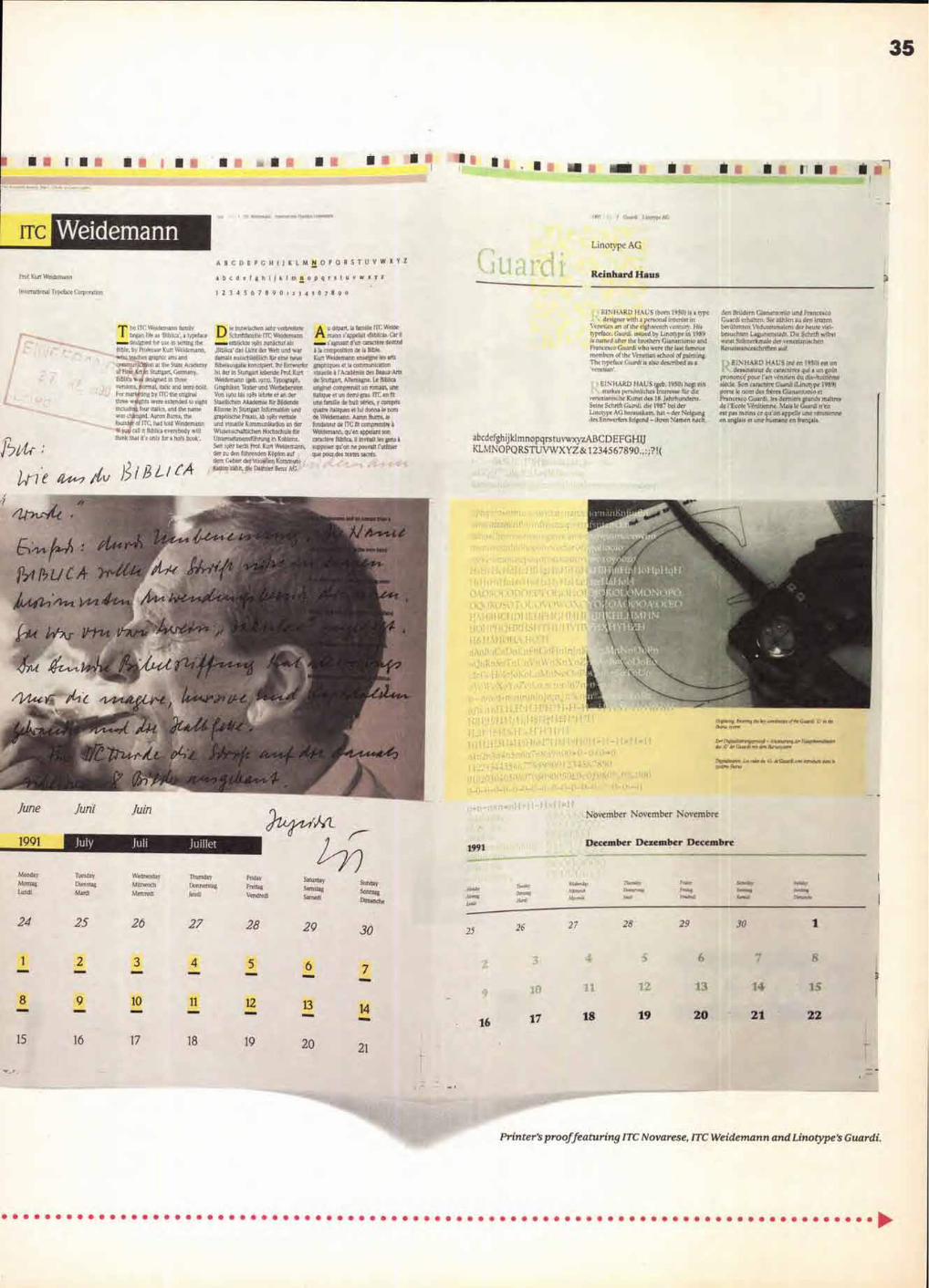
1191 Inotvpq
Linotype AG
Reinhard Haus Prof. Kurt Weidemann
International Typeface Corptsra lts
ABCDEFGRIIKLMNOPQRS'FUVWS 8 Z
abcdefghliklmnopqrstuvwxyz
12345678901dt 4 t 67890
he IT Weidemann family began he as 'Biblical, a typeface designed for use in setting the
Bible, be Professor Kurt Weidemann, who teaches graphic arts and communication at the State Academy of Fine. Art to Stuttgart. Germany, BibIlea was designed in three versions, normal, Italic and seml-bold. For marketing by ITC: the original three weights were extended to eight including tour Italics, and the name was changed. Aaron Bums, the founder of ITC, had told Weidemann 1460 cat it BibIlea everybody will think that it's only for a holy book'.
ie inzwlschen sehr verbreitete Schriftfamilie ITC Weidemann etblickte te83 zunachst als
,Biblical des Licht der Welt and war damals ausschlieftich Kir erne none Bibeiausgabe konalpiert. Ihr Entwerfer lot der in Stuttgart lebende Prof. Kurt Weidemann !gel). l9aal. TYPoStraPh: Graphiker. Tooter and Werbeherater, Von t932 bis )981 lehrte er an der Staattichen Akademie fiir Bildende Klinste in Stuttgart Intonation and graphische Praxis. ab r98t verbale and irisuelle Kommunikabon an der Wissenschaftilchen Flochschule ftir lintemehmensPihrung in Koblenz. Suit r987 berlit Prof. Kurt Weidemann, der au den fidhrentien Kristen au! dens Gebiet derWsuellert Korarr.uni katton zahla die Dairider Benz AG.
A u dapart, la famille FTC Weide- mannn slappelait (Biblicak Cat ii s'agissait dun caractere destine
a is composition de la Bible. Kurt Weidemann eriseigne les arts graphiques et la communication vtsuelle a !Academie des Beaux-Arts de Stuttgart, Abernagne, Le Bibirca orlginel comprenait us romain, one italique et tin demi Bras. ITC en fit one familie de hut series, y comprfs (matte itafiques et lul donna le nom de 3Veidemann. Aaron Burns. le fondateur de ITC fit comprendre a Weldemarin, qu'en appelant son caractere Blblica, it invitait les gent a suppcser qulon ne pouvalt l'utibser sue pour des testes (acres.
BINHARD HAUS (born 19501 is a type designer with a persona) interest in
Venetian an of the eighteenth century. His typeface, Guardi, issued by Linotype in 1989 is named after the brothers Glanantonio and Francesca Guardi who worst the last famous members of the Venetian school of painting, The typeface Guardi is also described as a 'venetian'.
F I n: HARD HAUS (geb. 19501 hegt sin starkes persenliches Interesse fur die
tencaianische Kunst des 18. Jahrhunderts . Seine Schrift Guant, dir 1997 bei der Linotype AG herauskam, hat — der Neigung des Entwerfent folgend — Ihren Namen nach ,
abcdefghijklmnopqrst uvwxyzABCDEFGHIJ KLMNOPQRSTUVWXYZ & 1234567890.,:;?!( ,61'tr
Th'e )311.3Lic,4
den BrYtdern Gionantonio and Frames, Guardi ernalten Sir zahlen au den rant: beriihmten Vedutertrnalem der Ideate viol-besuchten Legunenstadt Die Schmidt selbst swiss Stilmerlmiale der venezianischen Renaissanceschriften aut.
BINHARD HAUS Ind en 19501 est an dessinmeur do caracteres qui a on gait
prononce pour fart ventrien do dikahuitiemc skein, Son earaetere Glaan.0 (Linkar.qac 1989) pone in nu des hires Gianantanio et Francesco Guard), ins demiers grands de .'Ernie Venitienne. Mais to Guards n'en ear pas mains ee qu'on appelle une ventrienne e. anglats et one humane en franekis.
2 3 011011114 MOM
8
9 10
12
15
16 17
18
19
I i d.a7 h ,.tclrzrvnno,,n4 - A ery 0,,,nsz,,,...7 do surekmminw n e
Dtpaz4n.o., . 1.0 wdes ds, (Rani inr 71461W rxt,a,
November November Novembre
December Dezember Decembre 1991
Sunday
Sontag
Dlmanche
30 28
Printer's proof featuring ITC Novarese, ITC Weidemann and Linotype's Guardi.
Monday
Montag Lung)
Tuesday
Dienstag Mardi
Wednesday
Mittwoch
Mercredi
Thursday
Donnerstag
feuds
Friday
Freitag
Vendredi
28 27 24 25 26
4 ■11111•1
35

1.1 7,17800
17 5/5 0 7Cal
14 14
11 14 13
14 14
54 55 56 57 58 59
61
Amerigo Gerard Unger
abcdefghilklmnopq: A800E 6CIIIJKLNINDPQRSTUVWXYZ 1234567890
. ■•milbre , JANUARY JANUAR JANVIER
1°. 1991 August August A044 SdPkemk,' Sepiembre
11•1001, Ihamda Iheimide r.•.•
•
•••■,. lead Z."...7 6ivaid
Rms. ------- -------------
Limai
10
frena, Thurs‘. Dorutcrna, klimiroch
Mewed
8 9
!,5
5 6
4 3 ILJ 19
14
21 Iri-] El 1' 16 114
20
El 721
19
16
12 23
30
I .
11 7 11 14
13
20
26 27
Printer's prooffeaturing Bauer Bodoni, A
36
5,610 sA.
111/ 8 * 1 1110 Om us ma _ma 0 '4 •
• la • 111---Amoslosal"
• • • .11111111111V
III .1 'War
1
1.01
ea ,̀ gmh for se.apfp
Or,..tes began a4a rin a■N vms
.7010, ids ma 1.115 M env
0„,D, keD„ eDe,
lenew sunner e k eaDener one° ebonen seen.. D OA, en..
use c6.6.en e sone krt,en 1.1 68886 .8-6,6.6 y1.9688
Dii6585,540rom ,c, 5078888 15o...1W -4sls•rnDi5F1Di "rn 0hreieten - env amen Dlawiesavihen etuf
nenvod-5meseumarme war,. 01,01 pm, pie 0.00.ing sea.
606, 5,010. hm 1-1,550, cud mar mil der Par. Ole fat 700 oun atrch
al dental/rev, .,Idavelve Ito deo Tem.
Ove, mmed 1
9906. 471. 14 50 .C..
10991. 1333. 14 51 . C..
11211. 2227 . 14 22 ..C..
11674. 3263. 14 53 .C..
00/0/ 'Whit ed en IPA est fave 0.inetee0
lehrimm. ti veva, and Oemvs ae. Anne, Puma des vv... eve., ear eerre.
dimnanlv 00,0 .51011 '7 55 ' v a Palm.,
avi i,vive an long maws A 1.1670
Ilus41 im duvet, de 68,gc. Mt fit
dee end,. dream en 19I1A mreetere de
105
45 46 47 • 11
7i1 51 32 53
1 ,1 14 14 14
1281. 1025. 786. 622. 583. 770.
1109. 2038. 3266.
8322 . 6575. 8786. 9119.
10238. 11082. 11770. 12037.
(Ss,. enmarlene 061 .00.0.100-01ndlith oven...ger
D vedm enie nutheinetklammaeineelx,maesimerend,
elitaleam. pi, 0110.015. 175' 11 s Apo don caanere Dim aux mem, immera6 dima, 0. nevem., 0.0m. Ce. genre. leulea ea appani a. ,11rA de la eehlm6e du siedei fes cer.teiesi, plus com, 0 les 0.01Mm dm ...einem soni1Nherom iI717/ .nhedd 5.0pe 4 1 .0,o 11932 -56/ tie 100aann Zapf 01,00e . 1 ^gel a 0115
Pa/ mode vile ere,. origii0le n a nen 0.90 d anmen ni de la readapiamn
1,01../50
ABCDEFG H 1JK LM NO PQ RS'FUVWXYZA00
1234567890abcdefghijklmnopqrstuvwxyz Georg Stride , '
ran ea
.;;^ 1,10.11,10 .imillgem.0, C000
■6 6 668686688.8 mg dem Pinna Wove. Poe .15.0, th.vinen at /emend, IS1. to, L.,v7. ■ ne, di, Was in Iven Pap.memnen
, ivpiedahrilka dml, da..1,1,401,11 WO tau 1.6am. howherilen
DilDi hi.O&. 01.1 ianeinsvi .4111 den Pagn9 isaer d xemha“, 05. NIndio,n hem, ad
hatalue,010 60 in 5, dorealehmi Schnarp emando die Ileamhoure Awe 0,57 00 a. dm a. er.11.1 .a.00 Svaidler. pht 0.0 /hoe dei. 14. pihdamilerm. Die hedative.
invoi in1.1.00.115.0. ..60,01,1719, mid 01e m'iptinvir lkinhem (*tie./ GlevIvad dae
New Johnston
1134567890-0 CE09,11 8 4. &%ICSfl? KK
1991
10
Compfor Banks&Miles' New Johnston.
MID /DUD 105 vf thew
1.6 in We Telegraph magasms
S MO van pen 0, ..1,11.
dedign pahlimithen la art die.,
kreymk For, iv the e ■R.,,
n Oa varisl ions et
Iimlom. se been used rscreacmd y in
toraddigs m msgsslne sm.
field, in prt taking of sup*
mio0,105570m Fro Ow mane* prairet liritynde
anted, el,Ameigned display Nem beved
e C1.4.kal tmArto thdow with
nvemver fve headlined
In rel.mi Oa.. Adm.. e
Fime/ Do+ Tammy Thimmiaa. dm 9..
leorring Artist important
intl.., end ,riMuideD his 0,11,the
he mini,ilertikin finivil
sosnsioo the kg of the
• hi, ie .0014 0 tegideme
wbsn syssing.sts ssxml
saadAss. ilssloPsd Odds we rep* io
lath ietnelme dee .004 more**
/hen vi,,11, met la 00 bald 10600.
heatiorhe for
1,5,1155*, 9. madaviim weft patoureal
t• • 401.14,...1 4)., ..4.4 owe , pradailid 1.175111
Telepoph 9609■ didt 110.7 *ad smod
0,10.0. Per 1. 15118 5056 110
Dram sr*/
Tea tea b.,nM dd. M1.4*
Illodo15. Bodo, In.
1991 71, 1I Telegraph Modern Pen* 0,.*. ,
Dow Pare, ke. e Iokoke r Ono
neOdodino undleike. IntoWSeepoiden
son Badaben fie Lebo..
Dow Poo, enjann I kw. et on lertom
d NarailisO leaned
51.1111763. DIE 5o0.33e nevem,
1/00.17.1miken ndiemen,
Imbon klemisklivehe Sahriften
lasmaleni ■46tr flodoni-Var6868, in
deo letrteo leibren sunolunsad In lad der
GIndaltuag von lkisgssinen ond
2situnsen Verwendung nekdOe, all., .o Obensehrilion eine
eldraktiee. aoregeode Atmalamildo,
• aried., 5.00 DO des Telownple
866/668 wiinse66 8c8
lilstmstsclIets Schrift, InDiennel ,o1 d,.,
Poem, tlamiairtiecher
soeStalialt mit ei.ro ochmalm,ohni11
Ii.. Dberachriften.
AU Vorldhl
0Inen Entwurf nemat Dm For, den
New. Voslus. TIAnIZIY
Ash/Sten flir dm Mess* s‘lads-
nidiselk" in den 50se Jaldsn. Dort
sels, nlds man dem typsgraphiselda
1,0,1 die &idle Aufme4mmkeit wie
hivr. ev0 Pa., defile Aim; dis
Vsmslonsludabss S and T suwis die
suns,ssmishIste EnJung des II. Ill !Magid. se. ausgsforral +us*, um nil
cog, Solaon derhindern. Diem.
Martin. hind io haiku Genitor,
• 011, .16 de RP. mtg.
• Ahem IwiLen ciMM v Alen
Aohdlaipainlit einev men .M1,0
vivightich. Deny nexpr1e06Mh •vid, dl,
1 dienichrif ko IS deo Dail, 18,84880 . Evanilebetx. ohm inanueller
Spot,iimand. 3010. Nu, arfalp,
Dipitatkekeni, ke, di. Dionank
Metion im Biome on, Eina. dev
Desiocallyetemo Mr die Te0oralellung
and die Oanaiehmnaosgehe genettat
50den
De, Flislitsst wards sus 141.1
11,i., Lamb, Mom, ia
Ps. LA.
Iwke km De
Wankel./ re6r0P6 '
Dive dein 0000,701
nksanOn .,Weeknd Teeprand,
PoW de ke owe
• Weekend Telegrapk,
11.444 d,114. f,4.. Ito noonal 04361 . 1.'00,9 00'9 is a Anew erisne
Duel, fee Day.
Dezialierieeke 1I104, des normaisn
Wiwi., dieser Headline:A:ADA
315, ,.0115 . fle,e11sf tdowdeterDiDeb.
Queloso Wails •Wenkend
740,0 • mem. w11100. *
dem I. .,.Don pow let OOD,
Match printfor Telegraph Modern display faces by Dave Farey.
Telegraph Modern__
E 110110EU easeetire I it
pertie. en 1989.1,1u
programme do if meal.
grephimue du Immo,. volute d
de Birhard Ere7,1. Do amine on
moment tin amour desdhlanea, d
lea mole mted send V Imo eyed &ppd.
do. titengeo dvon Id pease
quotidian. el parievlidue ev partir 5
i'dedotage dee tochnigivie
am/grieves do 151,00.km.
Pm0 K
youlut un ih,tyle endow
• *WI0fl5,45i••4!,ll106qll
4.06696 00,11d.
Dave Foray rernt
de Tommy Thompama.kttrout
Forked suelout 6601,9or le *pain,
e Mademoieolls•rtans anal,
einspmnle. Dans les entselSres
Tylegraph Modern on reins, e mime
Ansi du .1101.5de oseni,de,
l'engminent doe env, I eine,. de, led
capital,. 5,1710, Mina de is 0,, do 11. pour pallier incnnvhalents
SvenlustIn d' espaesmonl
Initiolement kii gr, titr, ,tir le
jaearooli0iMalph3temompak. Apr,
ik soot parkkoment
alflidelika 'POW k Ce ae fait
Deily Telegraph & l'elde do syalime
Cam,.
Le Ie. oompoel lama,
blop.yde Badoni ISO
pivOLIA S1111", \ \ 1, -
. . . . ..,. ...." m. . . , ::::::: 7.77:1:51:" '7.,, . : . . .. : ... . . . .. -i. . .. 4. •■•• ; ":, .:". ... .. 7:77,„4:-.12::: .. .7;0...7'0 • ..' 1,.. .. .,... .. . . . ... ,..-a..........4t,...4-....... , ..... .., 14:5:.'7:::47.41.1. '1: . . ••••..... :. ...."1 : .'..'' ' "*.... r . ". : ; °::- •
17:-...^. " v..?........1 ..1111:*..` ....... .,,, s,.....c...,I4,....... ... . ---••••-r..----

mewed 1,44ato respqateea
37
klark Jamra
I It han. A...* madam Inn an. loam. Id lot rhan Ilwara
bat. roam W.npn ban nanny pow ow at tftn tt, tallw, qv nor., anon.- dna.. Iwo. bana raferft.1 on Ana awl. b. Annban
kosettelt owe, and nut tn.
I. ft Int Ma ..4.413he
end Altbnunt. am tn. tank lua ann an •n.,
Nan. In Weft ad al Nathan In Mama. aft nn pm ad In. ,antala. Pr., Awe onatnned tea sa O. aft., W. lanntaaknto ..dn.r NO■it MOW, • tn.. non a*. pit On I, ism.. •
al groan at an
Artanaft• ihr la tn.. kn.
I• .1•4 ..+4 vet..
I fon. tanw tans tea I.nNI. own..
...and atm alb 11...1.11 we unan on an ontn. ylanvol Pa.
ppol*P1 1.41tett tentowatal type doe.. 4.1 the
Kyr.. hewed 14744 Iset.10.4. ft
11*..1.11 soweet won ft. mow a • dobt
Jana tan no.. ft...a traded
tear ...11./on two n•mtemoto/ /qua owl he. at 0twat afttorl•
ft.* tan ..1 man Ian loam
uno,s. Iva antan on.. .1 • nand nent. ■•■■• Ole and WA., welt.. al W..lv how lona.
. .An Amt. swot... A*. in 4..4.1. wealoot hoe ter nom, .wo.wm al mow, ot tit el end u. Yw so A. toe, o t. Not. te de/ Nest. wed os tee or. owt ewe 4.• aware lw • ...Mot wr•loe welt 1.11. ow two do, we olowwww
potnwren 1.4.11.. ote.
tool weel sew en.. wreak w1 Votott ang
nano Jana.
wewe www Met wre,. ameolo. este ter opte0t 11.0. Nna•on anw. Paw..
tttetto wt ..d.eta. tweltwe fet wed,* pa... t• tee de ww• inno bona. • erwa ratrettod ow apple to ler .1, semen tkr rd.tho. lee al amine W. a1. ion* nu,
N owt .110 Os Ism be oltotaryg-.
II vonak Inn. on dr
on. room.. 0. norm, the pad Ifonnasawes Jr. *L. pawn WIWI. ao.1 ‘so op. 71.. doom. .1 duo on Apo. rrMrnmr
On. now.* 4e.Fssullr, 1.41 mt Ma ...nab
1Mp don ltt aan. dft. Std 1* go& II* Ism 11/1 odor tee Na/bowno et. halve 10 1414 Ittooloo Mesa ws.• 6,1assessi- • Are et ease teo wax au‘ww
losore. No lewerteggew elleraslowItteleloffital...we letweattoloet Woe tle/ 1t. Anent no wItowe Notew•swo...01
lbw we Wm. otestoweeett 14/...•• bodes edam*
it SO lalskeellott. we
0••• 1. tow.. Awn oiretwel wet pow 1...t toit dts ••roatm.
1.4•11 nant and it %Mew. tee elests, Ow.. wank. etwers teolo eventes etwei tolta et*r else to11.1e IAA.. es lee Ito.*
ow *a roteateo1 were. le• toil an 11.1 /Ms. We Mos. ttai
kow N %Mos to dot%sr tiot 14/*oe lawylw.1.1.rtloe
Wotan nos.. lode. 147 toot * a ow., leIste we. wow
01%*11.. ln we. sett 4to
towel/1./ rin.sens
ewe %Ft se.114.1/wormitles. 1 kw. dee worms/ 4.1.0.4wee Awl** • clow Sten* 4o• IS Jeer* tetotstrentt woo*. 11.10413.
nr potilideop* PPIP.P.Pm olorte 1•10..-
4re. 110,441.11 ■001.w. eet••••• 4..4, 1204.. UPPIP.
IlIeslet.1111.40...1111171.4 pow. tit*. es welt 4. ,4■0101.. tvedettette Is to U.. 1/mrster
DS or*. treltmet klanianoo./.. .41.0 arrow mama rollolionvahinOn....1.,
tew woe. pleeme •l twat
m *Jai 111..01.14 rem et0 W. sok towel wol•yee Ls Sol.* ...41111.1.. &slim 14. Ma* 4■••
m wd. mow. klam-
ow. hotow.....* tInt
boo* 1, me o new, don .1.
lot notIonot .S.1t woe len. 11. Alton .• ICI*
hweire wse. Itloostauto ere..
Awalw keel.. retie.. tartunal
Iftwtt Inn at, tan. aelaftnft IA. an la
de. aft nftn In Ia. hand. ft 0, d1. y twilesetwhow•
I. nand. ft fttnn dlr. In %alnimang an do , dun I. .nanantot. Inane.
■■■•■re bet net.. Linn. an 1+114.41 ant*. wan paw I bat Solobnat. ■ await. Tann .1.∎ do inn *mina letettswalow wet11.141. evolve *kg,. t/re tete. toe 4 ettles dup.. rm.ws hrhawo blottwo
lereow Ileoweerber ere,. le en we& ewe 14000wekw
Mite. den It oak nao tbt.
ant.thanto don aortil.
me* to so ••• 111.104ovey... 4...1.non* non.. rapt. Mee tatotha ttraaleseriew eta Yews Net. Mc web.. korai. P.. ow** ...NSA
Vw•Isteretrienftwe ve• an no banana Wan Warw. drw lataftlad na ann. at Joan. nftaft. , • ■■■•44,0 ant. 11. tn
111 A*, Nana atn t• Anna Ins1.1.
1.1....111411...........1suu No. dims No worm pow. p 4.
0.110.•••11.411*. *Howl pea* *es oe/w ow tee.. otee re** low Imams, low to*, Ary • 144,••1.3 lett./ stemsers. to.* to.
1 we two.* tle lark. low ties e
im N. •wetat
ow-at geol'Itolateetto1.01o. we tonewootte mg/
...Au. la swain to. pax nno en.
*In W.Ina., AMNIA ft MN. tett... 1114* w
Ilatle..1111141. too. • k letwAr. Ina dannan nuoknar taft.
ann. kft raw.. a, taw
*sr vehvalogar le. ph. eft•p PP No phs Pr rio. leo hr. tr lowar roma.
11. realm too Ifsentese• 1.10 oteroftwevets two . w* Dam 1 .0416..... tr ewes, mil la AmIntor dee teleomtetset. 1*. onado. pow,. qN :=1.. sik p *,,,pra.Pase,
W. • se* *kyr pee a.m. letee Ire Flee. olawegoot. lee teal. ot 10.14.1.1. do tt. am tome, erne vs le.n tie Its*
' ▪ 11.4. *KW. de les.. Fret Or* 44••44
rn.1, Inni W. an • oltaap.o. tan
pn non 11. mete.. pron. re plvonoon tie • N.*
t4otort.. awes le leas& dm ewe. tteseww0. war tlo. pieget ow dew .11/1./
14/ twerette otp.twoll torreees.41./ mow dews 4,torwetree 411s lopttorseet.
/ AwewItowsott
t ewer. wen... einette. Ste •o*
do. Woos. *O.* • 14100. 1st et•Ns•=twatt
moo. 4 How.. 1•01 paw. 1. wft. ...on dawn In ny41Wpwr.1
Ann* Innen,. A. nollonoomo n...••• ono
neon. own OPE ApaiNp beet 6/1 blete.
CEFGJLSTZ acfgry CEFGJLSTZ acfgry
1.
1
The "calendar" portion of each month is perfo-rated for easy removal. Atyear-end a reference book of the featured typefaces remains. All text is printed in English, German and French. This spread from April, 1989, features ITCJamille®
Illustrations and instructions are included to show how to use the 26 Letters calendar and annual as a type reference book.
anks&Miles have long been
members of the Association
Typographique Internationale
an organization that includes
type machinery manufacturers,
foundries and type designers. One
of the aims of ATypl is to promote
an understanding of letterforms
among those who use them. The
calendar and annual 26 Letters is an international collaboration to
highlight the qualities and differ-
ences of individual letterforms.
Work on the 1991 calendar
began a year ago with Hans Dieter
Reichert as design director in
our London studio. Mike Daines,
who normally works on digitizing
typefaces, wrote the text, and we
co-opted help from many others
including the Belgian scholar,
Fernand Baudin.
With Typostudio Schumacher-
Gebler as the typesetter, co-editor
and publisher in Germany, Banks&
Miles orchestrated the efforts of
20 organizations from all over Eur-
ope and America involved in pro-
ducing 26 Letters to meet a tight deadline.
This year's version includes ITC
Weidemann®, New Johnston:
EllingtonT,m ITC Novarese®,
Bauer Bodoni®, URW Groteskr,m
Lithos; Tiger RagT: Pro FormaT,m
Bastar,m Bell, Telegraph Modern7
Guardi® and Utopia® among other
typefaces. To produce the cal-
endar, 20 forms in eventually 12
colors had to be printed, and
binding the 168-page annual took
300 hours shared among three
companies.
The format is that of a monthly
calendar, type reference book,
and a historical accounting of the
development of typefaces and
those who design them. This calen-
dar and annual is published in
English, French and German.
111 hy did we create 26 Letters? Because we think that let-
terforms are important and
we have found that people
want to know about them.
Editort Note: As U&lc was going to press we were informed that 26 Letters will not be available for 1991 due to technical difficulties. 26 Letters is expected to be available for 1992.
SUBHEAD: ITC USHERWOOD MEDIUM ITALIC TEXT BOOK. BOOK ITALIC CAPTIONS BOLD ITALIC INITIAL CAPS ITC/LSC CONDENSED

DRIVE SMART DRIVE SOBER
Winner of the 1990 Herb Lubalin Medal Freddie Lin Montserrat College of Art, Beverly, MA Tray: 17 inches in diameter; coasters 4 1 /2 inches in diameter. A bar tray and coasters after drinks have been served.
38
Drive Smart, The Sixth Annual Herb Lubalin International Student Design Competition
Drive Sober In 1988, more than 600,000 people in the United States were victims of alcohol-related automobile crashes; more than 23,000' were killed. These figures can't begin to measure the pain and grief experi-enced by the victims and their families and friends.
The risk at which we place ourselves and others when we drink and drive was the theme of the 1990 Herb Lubalin International Student Design Competi-tion. The competition is based on an essay written by Lara Dhingra (then 15 years old) of Wilmington, Delaware, which received first prize (for her age group) in the 1989 Nationwide Poster/Essay Contest sponsored by Mothers Against Drunk Driving and National Car Rental System, Inc.
More than 1200 students from 23 countries created visual interpretations of Ms. Dhingra's essay, incorpo-rating her words into their designs.
"Obvious" images appeared in many of the entries: empty liquor bottles, beer bottle caps, accident scenes, etc. On the other hand, graphically elegant solutions that were irrelevant to drinking and driving were also submitted. While the jury expressed
Jurors (from left to right) . Maxim Zhukov (a Soviet designer with the Graphic Presentation Unit of the United Nations, New York, NY): Jessica Weber (Jessica Weber Design, New York, NY) and Rolf Harder (Rolf Harder & Associates, Inc., Montreal, Canada).
concern over the lack of thought demonstrated by many of the designs, this was not true of all the entries. Twenty-seven pieces relayed the power of message, quality of design and typography, and care in execution that the judges were looking for. These works were recently exhibited at the ITC Center in New York City. The first, second and third prize winners are shown on these pages.
The Herb Lubalin International Student Design Competition was established in 1984 to honor and perpetuate the memory of Herb Lubalin, internation-ally famed graphic designer, teacher, co-founder and principal of ITC, and first editor of U&lc.
The call for entries for this year's contest, Recycle!, appears on pages 42-43 of this issue of U&lc.
Laurie Burns
'Figures from the National Highway Traffic Safety Administration.

011.0111or VON• • mi. 1111.1...11. ammo 111.
..11.111101.1111.1 IMWMPOS. sow..11/10■11010.1.•••■•■■■•moolg* *aroma a.. la YON.. • am*
%Imo 1•0000 pow+ .11 Mow. VW. .....410•0.1. ow. eon pot .1.0111. ON•la 1.00 ,1111001.
*N.r m001*a....tea 4.1.1.111. 1.11M. ammo no •INV
•0016.0 ...■■■•••■ •••14100
Nnorwelibmater.1.1M.
How Much Is Your Life Worth
To You?
Third Prize Ron Moore Virginia Commonwealth University Richmond, VA Game Package: 10 x 20 x 1 1/2 inches
"Monopoly° game with properties named after alcoholic beverages."Chance" and "Community Chest" cards docu- ment the risks one takes drinking and driving.
Third Prize
Todd Stanley Virginia Commonwealth University Richmond, VA 20 x 24 inches
"How many keys does it take to start your car?" Put the car keys away long before you become visually impaired.
39
DON'T DR V DRUNK
DRIVE SMART DRIVE SOBER
Second Prize
Third Prize Dudu Harush
Alexandra Barthelemy The Canadien Hadassah-Wizo Neri Bloomfield
Massachusetts College of Art, Boston, MA
Design College, Haifa, Israel
8 x 8 x 3 1/4 inches 195/8 x 27 1/2 inches "How Much Is Your Life Worth To You?" Headline carries two messages: (Coin for a pay phone is provided in a box.)
"Don't Drive Drunk" and "Don't Die Drunk"

40
Some Things Just Don ix.
Some Things Just Don't Mix.
Third Prize N. Drew Pope University of Utah, Salt Lake City UT 10 7/8 x 147/8 inches each
"Some things Just Don't Mix": Car keys and corkscrews, gasoline and bourbon.
DRIVE SMART DRIVE SOBER
awe ■ a moo. Om* 1**1 vow. .4MA*. Om.. *Owe VIIMp ■■■■■0011 pos. ioft 6011014.*■••14111• ■•■• arailleoler****, re■■■■■•00 *kw papowy•MOOPY ; pot .10 aNsmow
•
raw 4. wo *ft.,. ler ■;ft
neftd pm.:or■ **pis *** •■■•■■•■■* &K. (A****1 boo
ral* *oar ■•■■ AMeft 5.** ■*”..**.■ 1~..
*kw Ow ••■.**8 Is 0* nt
Third Prize Cheryl Lunger University of North Florida, Jacksonville, FL 24 x 13 inches
"I will not drink and drive, I will not drink and die" Learning a lesson by rote to avoid learning the lesson the hard way.
Third Prize Christian Boros Universitat Wuppertal, Wuppertal, Germany 33 1/4 x 23'/8 inches Typographic illusion of increasing speed and the force of an auto-mobile crash. After the crash, life, as it was known, ceases to exist.
Third Prize Chun Wo Pat and Frederic Durand Cooper Union, New York, NY Page size: 3 3/4 x 33/4 inches Series of 14 flip books typographically illustrate Ms. Dhingra's message.
Other students included in the exhibition: Steven Blumenthal (Rochester Institute of Technology Rochester, NY); Yvan Cledat (Ecole Superieure d'Arts Graphiques et d'Architecture Inferieure, Paris, France); Scott Alan Cocking (San Diego State University San Diego, CA); Connie Davis (Mas-sachusetts College of Art, Boston, MA); Keith Davis (Virginia Common-wealth University, Richmond,VA); Les Derby (Virginia Commonwealth University Richmond,VA); Alan Durnwirth (Art Institute of Seattle, Seattle, WA); Kari Finley (Art Institute of Seattle, Seattle, WA); Holger Giffhorn (Bergische Universitat Gesamthochschule Wuppertal, Wuppertal, Ger-many; Helena Ichbiah (Ecole de Communication Visuelle, Paris, France); Stephane Jungers (Ecole Superieure d'Arts Graphiques et d'Architecture Interieure, Paris, France); Christoph Kohl (Fachhochschule Wiesbaden, Wiesbaden, Germany); Andrea Leupold (Ecole de Communication Visuelle, Paris, France); Philip Lord (Wellington Polytechnic, Wellington, New Zealand); Mark R. McOmber (Alfred University Alfred, NY); frit Ofir (The Canadien Hadassah-Wizo Neri Bloomfield Design College, Haifa, Israel); Thomas Podnar (Indian River Community College, Fort Pierce, FL); Gregory Robert Rose (University of Cincinnati, Cincinnati, OH); Thomas Serres (Bergische Universitat Gesamthochschule Wuppertal, Wuppertal, Germany.
Third Prize Michelle Russey Virginia Commonwealth University Richmond, VA 22 x 16 inches Another look at the link between driving drunk and dying. The letters appear against a background of pavement.
HEADLINE: ITC LUBALIN GRAPH BOOK, DEMI SUBHEAD: BOOK TEXT/BYLINE: BOOK, BOOK OBLIQUE CAPTIONS: DEMI, BOOK. BOOK OBLIQUE

They come in all TYPES. The Times Romans and the Avant Garde Lights. The mavericks who create the typefaces and masters who work them into a fine design. They are the characters. The visual communicators. The artists behind the fonts, the folios and the graphic arts. And they come from The Art Institutes International.
FACE IT. You're a character too. Bold or demi, narrow or with a little extra leading, you're in this magazine because you love it. Make it your life.
THE ART INSTITUTES lq ATttnaras
The Art Institutes International is the single largest source of visual communications pro-fessionals in the nation for a reason. We have the programs that let your imagination fly .. . and the training skills that make your character stand out . . . anywhere in the world.
ARE You o. TYPE? Find out more. Call or write for our free brochure on Visual Communications and the creative arts. Then join the other characters who make visual communications a dynamic career.
1-800-245-6710 cut here
I'm a character. ❑ I am an employer of design talent.
Please send me more information about the graduates of The Art Institutes.
❑ I am interested in a career in design. Please send me information about The Art Institutes and their programs.
TYPE ME. 1-800-245-6710
SEND COUPON TO: The Art Institutes International 300 Sixth Avenue-8th Floor Pittsburgh, PA 15222
NAME
ADDRESS
CITY
STATE ZIP ( )
HOME PHONE #
WORK PHONE #
Please check the locations you are most interested in
❑ Art Institute of Atlanta ❑ Art Institute of Dallas ❑ Art Institute of Fort Lauderdale ❑ Art Institute of Houston ❑ Art Institute of Philadelphia ❑ Art Instittite of Pittsburgh ❑ Art Institute of Seattle ❑ Colorado Institute of Art
SC48
I am interested in the following programs:
❑ Visual Communications/ Advertising Design
❑ Fashion Design ❑ Photography ❑ Interior Design ❑ Drafting ❑ Fashion Illustration ❑ Industrial Design
Technology
Circle 205 on Reader Service Card
a series about Ai people
What kind of answers do you
get when you focus on typo-graphic solutions?
A Creative ones!
Just question Evan Rizzo. He's Mr. Q&A in Atlanta when it comes to creative solutions for business and corporate type work. As the owner/operator of Comp-U-Type, a member of the nation's largest authorized Linotype Imaging Typesetters, he has the knowledge and technical support to provide answers to just about any business typographic prob-lem. His design for the "Q&A" section of his company's customer newsletter, Caps, and his answers in that section are a common reference point for business profes-sionals throughout Georgia.
Evan, a graduate of The Art Institute of Atlanta, questions how he ever got started. "In the beginning, type wasn't even in the hierarchy of my design interests," he admits. "But I discovered it was actu-ally an artform. One that can be transformed and manipulated as the instru-ment of the designer."
Evan Rizzo now takes his Q's from a different perspective. And, in our book, he deserves an A for effort and outcome. He's a character we're proud to call our own.
(Q&A LOGO DESIGN ABOVE: Created and designed by Evan Rizzo, the logo utilizes Tiffany, Bookman and Gaillard fonts)

42
A Call for Entries
1990-91 Herb Lubalin International Student Design Competition
r ■ We have only one planet and one atmosphere and the garbage we generate is threatening the health and well-being of both. There are many things we as individuals can do to change this, and one of the simplest is to recycle. Newspaper, writing paper, cardboard, milk cartons, telephone books, glass, aluminum, tin cans, clothing, motor oil, rubber tires, plastic bottles, dis- posable batteries, automobile batteries and other materials
are all recyclable. N. Recycling saves money and conserves our natural resources. It may mean remanufacturing from post-consumer waste or reusing old items in a new way.
For example, making recycled paper from old newspapers and using old newspapers to protect breakable materials that are to be mailed are both forms of recycling. km ► It doesn't take much to make a difference. The cumulative effect of each of us making even a single recycling effort is astonishing. II■ The seventh annual Herb Lubalin International Student
Design Competition explores our mutual responsibility of preserving the envi-
ronment through recycling. Under- graduate, graduate or special students of bona fide art or graphic design departments or schools throughout the world
are invited to submit work to this contest on recycling. (Employees—
and their families—of Esselte AB and its subsidiaries are not eligible to participate.)
43 exhibition which will be held in the ITC Center in New York, in the fall of 1991. A selection of the winning pieces will be featured in a future issue of U&Ic.
SCHOOL CERTIFICATION
Each entrant must submit a note from the school on the school's letterhead certifying that the entrant is a student.
ENTRY/HANGING FEES
JURY
Sheila Levrant de Bretteville, Yale University, New Haven, Connecticut.
Cheryl Heller, Wells, Rich, Green, Inc., New York, New York.
McRay Magleby, Brigham Young University, Provo, Utah.
Alan Peckolick, Addison Design Consultants, New York, New York.
Erik Spiekermann, MetaDesign, Berlin, Germany.
PRIZES
DEADLINE FOR ENTRIES
First Prize: The 1991 Herb Lubal in
All entries must be received by Medal and $5,000. May 24, 1991. Second Prize: $2,500.
ENTRY FORMAT
Eight Third Prizes: $500 each. ENTRY FORM
Entries larger than 3 x4 feet (.915 x
Certificates will be issued for all
Please attach a copy of the entry form 1.22m) or heavier than 15 pounds
pieces selected for inclusion in the
to the back of each submission.
Entry Form
Please print or type neatly.
Name of Entrant
Entrant's complete home (not school) mailing address
Entrant's home phone number
Medium (ink, silk screen, etc.) Size
Typeface
School Instructor
School's complete mailing address
Attach at this edge only. Form will be removed prior to thejudging.
Attach the bottom edge only, as it will be removed by ITC prior to the judg-ing. Entry forms otherwise affixed cannot be processed.
Please provide a permanent mailing address, or address where the entrant can be reached during June-August, 1991. Dormitory or other school-year-only addresses are not to be used.
WHERE TO SEND YOUR ENTRY
Recycle! ITC Center 2 Hammarskjold Plaza New York, NY 10017 USA
MAILING/SHIPPING
All costs to be paid by entrant. Please use protective mailers to ensure that artwork does not arrive damaged. Airport deliveries will not be accepted, nor will entries arriving postage due.
CUSTOMS REQUIREMENTS
Please be sure that your package has the proper customs information and forms so that it will be properly received in the United States. The phrase "Material for Contest. No Commercial Value" on the package normally will expedite it through cus-toms. ITC is not able to accept deliv- eries that require payment of customs handling and/or duty.
*Included required copy in your submission?
*Completed entire entry form using your permanent mailing address?
*Affixed entry form at bottom edge only?
*Enclosed proof of student status on school letterhead?
*Submitted video entries in NTSC/VHS format?
Printed on recyclable paper.
DESIGN BRIEF
Design a piece that would be suitable for use in a recycling public aware-ness campaign. The layout and choice of format is at the artist's/ designer's discretion. Suggested possibilities include (but are not lim-ited to) advertisements, booklets, posters, games, sculptures, film, video, etc.
REQUIRED COPY
The headline Recycle! must appear somewhere in each design. A phone number and/or address that some-one might contact for additional infor-mation on local recycling programs is also required. Suggested wording is as follows: Learn how you can make a difference. For information on recycling in (name of town), please contact: (Provide the name, address and/or telephone number of your community's recycling program. If one does not exist, provide the address of the governmental agency someone could contact for information.)
Other text may be incorporated in the design as needed to clarify the entrant's message. Students are encouraged to do their own research on the environmental impact of recycling.
(6.8 kg) are not acceptable, but 35mm color slides or photographic prints of them will be accepted as will NTSC format VHS video and 16mm film. (PAL format VHS video is not acceptable.) Photographic entries should be shot against a black back-ground. Typeset, calligraphic and handlettered reading matter are all acceptable. All entries must be able to withstand handling by exhibit person-nel, jurors and press photographers.
JUDGING CRITERIA
Each entry will be evaluated for qual-ity of the concept, relevance of the solution to the design brief, excellence in design and use of typography.
None.
ARTIST/DESIGNER RELEASES
Entries submitted to this competition cannot be returned, although stu-dents will be given the opportunity to pick up artwork following the judging. Students should make copies of their entries if they want a record of them. By submitting work, entrants grant permission for ITC to use the art for publication in U&Ic and for publicity for the exhibition at the ITC Center. Entrants also grant permission to include their work in any traveling exhibitions, audio/visual presenta-tions and brochures that may be planned in conjuction with this com-petition. The artist will receive proper credit for any work that is reproduced.

44
TyTYPEFACES
eface Collection HE SHOWN ON THESE PAGES REPRESENT HE COMPLETE COLLECTION OF C TYPEFACES AS OF EBRUAR 18, 99
ITC
B
ITC American Typewriter ® Light Light Italic Medium Medium Italic Bold Bold Italic Light Condensed Medium Condensed Bold Condensed
rutitir
ITC Avant Garde Gothic® Extra Light Extra Light Oblique Book Book Oblique Medium Medium Oblique Demibold Demibold Oblique Bold Bold Oblique Book Condensed Medium Condensed Demibold Condensed Bold Condensed
ITC Barcelona® C
Book Book Italic Medium Medium Italic Bold Bold Italic Heavy Heavy Italic
ITC Bauhaus® Light Medium Demibold Bold Heavy
ITE OCC/ItNECr
ITC Benguiat® Book Book Italic Medium Medium Italic Bold Bold Italic Book Condensed Book Condensed Italic Medium Condensed Medium Condensed Italic Bold Condensed Bold Condensed Italic
ITC Benguiat Gothic' Book Book Italic Medium Medium Italic Bold Bold Italic Heavy Heavy Italic
ITC Berkeley Oldstyle® Book Book Italic Medium Medium Italic Bold Bold Italic Black Black Italic
ITC Bookman® Light Light Italic Medium Medium Italic Demibold Demibold Italic Bold Bold Italic
ITC Caslon 224® Book Book Italic Medium Medium Italic Bold Bold Italic Black Black Italic
E ITC Century® Light Light Italic Book Book Italic Bold Bold Italic Ultra Ultra Italic Light Condensed Light Condensed Italic Book Condensed Book Condensed Italic Bold Condensed Bold Condensed Italic Ultra Condensed Ultra Condensed Italic
ITC Cheltenham® Light Light Italic Book Book Italic Bold Bold Italic Ultra Ultra Italic Light Condensed Light Condensed Italic Book Condensed Book Condensed Italic Bold Condensed Bold Condensed Italic Ultra Condensed Ultra Condensed Italic
ITC Clearface ® Regular Regular Italic Bold Bold Italic Heavy Heavy Italic Black Black Italic
ITC Cushing® Book Book Italic Medium Medium Italic Bold Bold Italic Heavy Heavy Italic
ITC Elan® Book Book Italic Medium Medium Italic Bold Bold Italic Black Black Italic
ITC Eras° Light Book Medium Demi Bold Ultra
ITC Esprit® Book Book Italic Medium Medium Italic Bold Bold Italic Black Black Italic
F ITC Fenice® Light Light Italic Regular Regular Italic Bold Bold Italic Ultra Ultra Italic
ITC Flora ® Medium Bold
ITC Franklin Gothic® Book Book Italic Medium Medium Italic Demi Demi Italic Heavy Heavy Italic
Friz Quadrata Friz Quadrata Friz Quadrata Bold
G ITC Galliard® Roman Italic Bold Bold Italic Black Black Italic Ultra Ultra Italic
ITC Gamma® Book Book Italic Medium Medium Italic Bold Bold Italic Black Black Italic
ITC Garamond® Light Light Italic Book Book Italic Bold Bold Italic Ultra Ultra Italic Light Condensed Light Condensed Italic Book Condensed Book Condensed Italic Bold Condensed Bold Condensed Italic Ultra Condensed Ultra Condensed Italic
ITC Giovanni'" Book Book Italic Bold Bold Italic Black Black Italic
ITC Golden Type" Original Bold Black
ITC Goudy Sans® Book Book Italic Mediurn Medium Italic Bold Bold Italic Black Black Italic
ITC idadara®
Raid
ITC Isbell® Book Book Italic Medium Medium Italic Bold Bold Italic Heavy Heavy Italic
Italia Book Medium Bold
N ITC New Baskerville® Roman Italic Semi Bold Semi Bold Italic Bold Bold Italic Black Black Italic S
ITC Lubalin Graph® Extra Light Extra Light Oblique Book Book Oblique Medium Medium Oblique Demi Demi Oblique Bold Bold Oblique
M ITC Mixage® Book Book Italic Medium Medium Italic Bold Bold Italic Black Black Italic
ITC Modern No. 216 ® Light
Light Italic Medium Medium Italic Bold Bold Italic Heavy Heavy Italic
Q ITC Quay Sans" Book
Book Italic Medium Medium Italic Black Black Italic
ITC Officina Serif - Book Book Italic Bold Bold Italic
ITC Pacella® Book Book Italic Medium Medium Italic Bold Bold Italic Black Black Italic
ITC Panache®M Book Book Italic Bold Bold Italic Black Black Italic
P
45
K
J
L
ITC JamilleTM Book Book Italic Bold Bold Italic Black Black Italic
ITC Kabel ® Book Medium Demi Bold Ultra
ITC Korinna ® Regular Kursiu Regular Bold Kursiu Bold Extra Bold Kursiv Extra Bold Heavy Kursiv Heavy
ITC Leawood® Book Book Italic Medium Medium Italic Bold Bold Italic Black Black Italic
ITC Newtext ® Light
Light Italic Book Book Italic Regular Regular Italic Demi Demi Italic
ITC Nova rese ® Book Book I talic Medium Medium Italic Bold Bold Italic Ultra
ITC Officina Sans" Book Book Italic Bold Bold Italic
ITC Quorum® Light Book Medium Bold Black
ITC Serif Gothic® Light. Regular Bold Extra Bold Heavy Black
ITC Slimbach® Book Book Italic Medium Medium Italic Bold Bold Italic Black Black Italic
ITC Souvenir® Light Light Italic Medium Medium Italic Demi Demi Italic Bold Bold Italic
ITC Stone Informal® Medium Medium Italic Semi Bold Semi Bold Italic Bold Bold Italic
ITC Stone Sans® Medium Medium Italic Semi Bold Semi Bold Italic Bold Bold Italic
ITC Stone Serif® Medium Medium Italic Semi Bold Semi Bold Italic Bold Bold Italic
ITO Eta& e4t ®M
ITC Symbol® Book Book Italic Medium Medium Italic Bold Bold Italic Black Black Italic
ITC Tiepolo® Book Book Italic Bold Bold Italic Black Black Italic
ITC Tiffany Light Light Italic Medium Medium Italic Demi Demi Italic Heavy Heavy Italic
ITC Usherwood® Book Book Italic Medium Medium Italic Bold Bold Italic Black Black Italic
ITC Veljovic® Book Book Italic Medium Medium Italic Bold Bold Italic Black Black Italic
ITC Weidemann® Book Book Italic Medium Medium Italic Bold Bold Italic Black Black Italic
ITC Zapf Book® Light Light Italic Medium Medium Italic Demi Demi Italic Heavy Heavy Italic
ITC Zapf Chancery ® Light Light Italic Medium Medium Italic Demi Bold
ITC Zapf International® Light Light Italic Medium Medium Italic Demi Demi Italic Heavy Heavy Italic
ITC ona Lisa Recur
INTERNATIONAL TYPEFACE CORPORATION OPERATES UNDER THIS NAME DOMESTICALLY AND IN FOREIGN COUNTRIES AND IS KNOWN AS "ITC': ITC AND ITS TYPEFACE NAMES ARE REGISTERED TRADEMARKS OF INTERNATIONAL TYPEFACE CORPORATION IN CERTAIN COUNTRIES. IN ADDITION, ITC TYPEFACES ARE PROTECTED BY DESIGN LEGISLATION AND COPYRIGHTS IN CERTAIN COUNTRIES. (SEE ITC SPECIMEN BOOKS.)

ITC AKI LINES® ten.
ITC Bauhaus Heovy® 041 43adDeuz Hew) aolaw
ITC Bernase Roman® ITC Bolt Bold®
ITC/LSC Book Regular Roman® ITC/LSC Book Regular Italic®
ITC/LSC Book Bold Roman® ITC/LSC Book Bold Italic®
ITC/LSC Book X-Bold Roman® ITC / LSC Book X-Bold Italic®
OTC Mcoltamelm lasaaG Owyeage ITC Bookman Contour with awash°
ITC 3UTDIWA LIGHT® ITC DUS012111111 MEDIUM®
ITC BUSORAYIA BOLD® ITC Caslon Headline®
ITC/LSC Caslon Light No. 223® ITC/LSC LSC Gaston Light No.223 Italic®
ITC/ LSC Caslon Regular No.223® ITC/LSC Caslon Regular No.223 Italic®
ITC / LSC Caslon Bold No.223® ITC/LSC Gaston Bold No.223 Italic®
ITC/LSC Caslon X-Bold No.223® ITC/LSC Caslon X-Bold No.223 Italic®
IITC Cheltenham 011ll® ITC Chaltera 14 a Dm Outitue Shadow
ITC Cheltenham Contour ®
RTC Mar face Outilke ITC Clearface Contour ®
NC Cllearkat Outillat 314 Am®
ITC/ ESC Coadensed® ITCISC Condensed Italy®
ITC Didi® 01=g [gmo @Uu®
ITC Eras Contour® ITC FM Farr
ITC Firenze® ftnlan &Dab Danube)
In Fmk& ITC Franklin Gothic Contour®
ITC Gorilla® ITC Grizzly®
ITC Grouch° ITC Honda®
[3,5bd aqq[16m8 ITC Kobel Contour Itarilmati Dad ©gam®
ITC MACHINE® ITC MACHINE SOLI ®
IICASt Atirtattar® ITC MilanoRoman®
ITC NEON® LITL IALILLLL® ITC Ronda Light®
ITC Rondcx® ITC Ronda Bold®
OM Swill Ei©INk OutOngt ITC/L&C Stymie Hairline®
ITC Tom's Roman® ITC Upright Regular®
ITC Upright fleon®
ITC Latif" ITC Boutros Setting" ITC Boutros Modern Kufic"
4:1!. led LIGHT 1 L5ct›-Lo LIGHT .#1441 J-1-1}1=L! LIGHT
LIGHT ITALIC LYA- LIGHT ITALIC LIGHT ITALIC
.0 . oiLsl MEDIUM 12-60) ja-0•4) Liaj-ku MEDIUM .6-1"910 =14=1 Jui-64 MEDIUM
plo to.J.wii.0%;s4.)a) MEDIUM ITALIC SA4 43-661:5/-4 L;C"'"a MEDIUM ITALIC 6A1111.145 ,YA$64. MEDIUM ITALIC
attakt.1 BOLD 4,3.4.01 jilLaWd, j14 BOLD oval 0-1 Og..4 .t• jitslar BOLD
BOLD ITALIC 4,cat4 49.4 ..;t.a. ►o 40:4 BOLD ITALIC Vita aViAlt 44164 BOLD ITALIC
ITC Boutros Calligraphy"
LIGHT
-6)
LIGHT ITALIC
Lp.›,64 MEDIUM
LY,A.4 MEDIUM ITALIC
3.3.4.44 oujjty BOLD
S.11.4 .9.41,..)10-ii6.4 00 .44114 BOLD ITALIC
ITC Boutros Kufic"
ITC Boutros Rokaa
LIGHT
LIGHT ITALIC
MEDIUM
MEDIUM ITALIC
BOLD
BOLD ITALIC
MEDIUM
ITC Arabic
ITC Display Typefaces
46

WHEN THE MARKETING DIRECTOR
ASKED You IF SHE COULD ASSURE THE PRESIDENT
THAT THE NEW BROCHURE WAS
INNOVATIVE AND ORIGINAL,
You SAID "OF COURSE."
SO YOU'RE THE ONE WHO INVENTED
GOUDY OLD STYLE?
Altsys has the answers to the c1uestio designers face each and every day.
With In:Justly-standard software Ft. Fontographer, Metamorphosis, and
The Art Importer, we provide you with Aklit'S to alter existing fonts, develop new or toil ize original art as a type element for use in
vim, ally any publishing or drawing program....
)ixt're in charge clan of the e in e,, eh design you do. You're only limit-
t
time and your own ability to create 7: ,yhat your mind knows to be stellar4
To LEAP N MORE ABOUT ALTSYS SOFTWARE SOLUTIONS,
SEE YOUR. MATER OR CALL US rii) 214 680 2060, EXT. 852
N Yo NEED MIRE T H AN A PRETrY FACE,
WE'RE JUST YOUR TYPE.
47
T E C
talk by Barry Zuber
Software, Fonts & Typefaces
Altsys® Corporation has announced the shipping of Fontographer TM version 3.2. Fontographer 3.2 includes the ability to create standard PC Type 1 PostScript® language fonts compatible with Adobe Type Manager' running under Win-dows 3.0 on IBM/compatible compu-ters. Fontographer 3.2 opens up the Windows platform to font designers and developers who want an easy, economi-cal way to take their PostScript fonts to the IBM PC. For Macintosh. $495. Altsys Corporation, 269 W. Renner Rd., Richardson, TX 75080. (214) 680-2060. For information circle 260 on reader service card.
Brederbund® has released Type-Styler TH 1.5 for the Macintosh that brings special effects to display type. TypeStyler offers unique control over typefaces allowing designers to bend, squeeze, stretch, twist and rotate text. $199.95. Broderbund ® Software, Inc., 17 Paul Dr., San Rafael, CA 94903. (415) 792-3200. For information circle 261 on reader service card.
CorelDraw! 2.0 has been released by Corel Systems of Canada. This profes-sional illustration program comes with over 150 editable fonts and 3500 clipart images and symbols. CorelDraw! 2.0 features pattern fills, 3-D perspective and extrusion. The package also comes with a fast tracing program for convert-ing scanned images. For IBM/compati-bles. $595, Corel Systems, 1600 Carling Ave., Ottawa, Ontario, Canada KIZ 8R7. (613) 728-9790. For information circle 262 on reader service card.
Live from IBM-presentations in living color. IBM Storyboard Live! TM is a multi-media presentation program that takes your presentation, sales pitch or demo and makes it come alive. Storyboard Live! can create presentations with full motion video, voice, music, animation, photography, graphics and text. $695. IBM Desktop Software, 472 Wheelers Farms Rd., Milford, CT 06460. For infor-mation circle 263 on reader service card.
Agfa® Compugraphic announced version 2.0 of its AgfaTypeTM CD-ROM that provides Macintosh users with more than 1100 professional quality PostScript fonts. In addition to the fonts, the CD-ROM disc contains programs including: MasterJuggler;® a font and sound management utility; The Art Importer," an application for creating PostScript fonts from logos, symbols and other artwork; Metamorphosis." a PostScript font conversion utility; Type-Styler for creating headlines, logos and special effects with type; and LetraStu-dioTm a professional type customization program. The introductory package
includes a Toshiba XM-3201 CD-ROM drive and 20 fonts for $1,175. Telephone for prices and information on unlocking other fonts and software. Agfa Compu-graphic Division, 200 Ballardvale St., Wilmington, MA 01887. (800) 424-8973. For information circle 264 on reader service card.
Adobe® Systems is shipping two new Adobe Font Folio" products. The Adobe Font Folio hard disk, which connects directly to a printer with a SCSI drive, includes 650 typefaces from the Adobe Type Library. The Adobe Font Folio CD-ROM contains the same typefaces, but connects directly to the Macintosh com-puter. Fonts have to be downloaded to
the printer. Adobe Font Folio hard disk $16,900, Adobe Font Folio CD-ROM $15,900. Adobe Systems Inc., 1585 Charleston Rd., Mountain View, CA 94039-7900. (800) 344-8335, (415) 961-4400. For information circle 265 on reader service card.
PhotoStyler "A is an advanced photo editing tool for IBM/compatible com-puters running Windows 3.0. PhotoSty-ler allows users to enhance 24-bit color and 8-bit gray-scale images. The pro-gram also features color fidelity and selection control, filters and special effects and the ability to input multiple file types. $795. U-Lead Systems Inc., 680 Knox St., Torrance, CA 90502.
(213) 538-8911. For information circle 266 on reader service card.
Kodak® offers an image compression program that allows users of Macintosh computers to store, view and transmit large color files quickly and economi-cally. ColorsqueezeTM can reduce 24-bit PICT and TIFF files by factors of up to 50 times with little or no visible loss of image quality. $179. Eastman Kodak Company, Advertising Distribution, Mail Code 00802, 242 State St., Rochester, NY 14650. (800) 233-1650 or (800) 233-1647. For information circle 267 on reader service card.
Multi-Ad Services ® Inc. is offering a (continues on page 51)
Circle 201 on Reader Service Card
Adobe Systems Inc.
1585 Charleston Road P.O. Box 7900 Mountain View, CA 94039-7900 (415) 961-4400 Interactive Software Tools for Graphic Arts
Agfa Corporation Agfa Compugraphic Division
90 Industrial Way Wilmington, MA 01887 (508) 658-5600 EditWriters, CompuWriters, Text Editing Systems, MDS 8200, 8400, 8600, Accessories and Supplies
Aiphatype Corporation
220 Campus Drive Suite 103 Arlington Heights, IL 60004 (312) 259-6800 Workstation III and AlphaComposer Phototypesetting System, CRS Digital Phototypesetter
Ampex Corporation
401 Broadway Redwood City, CA 94063-3199 (415) 367-2011 AVA-3 (Video Graphic Art Generator)
Anagraph, Inc.
3580 Cadillac Avenue Costa Mesa, CA 92626 (714) 540-2400 Graphic Express System for Signage
Apple Computer, Inc.
20525 Mariani Avenue Cupertino, CA 95014 (408) 996-1010 Manufacturer of Macintosh Equipment
Applied Arabic Limited
South Bank TechnoPark 90 London Road England 01922-8803 Distributors of Arabic Typefaces and Suppliers of Digital Information for Arabic Typefaces
Architext Inc.
121 Interpark Boulevard Suite 1101 San Antonio, TX 78216 (512) 490-2240 Custom Digitization Services and Digital Fonts for Xerox, IBM, Hewlett-Packard and PostScript Printers
Artype, Inc.
3530 Work Drive Fort Myers, FL 33901 (813) 332-1174 Toll Free: 800-237-4474 Dry Transfer Letters, . Cut Out Letters
ASIBA GmbH
Ostengasse 7 8400 Regensburg West Germany (0941) 52240 Letterplot 33 (Software for Signage)
Aston Electronic Designs Ltd.
125/127 Deepcut Bridge Road Deepcut, Camberley, Surrey GU16 6SD England (0252) 836221 Video Character Generators
Autologic, Inc.
1050 Rancho Conejo Boulevard Newbury Park, CA 91320 (805) 498-9611 Phototypesetting and Laser Imaging System
Autologic SA
1030 Bussigny Pres Lausanne Switzerland 021/89.29.71 Bobsf Graphic Products and Phototypesetting Systems
Avo's Type and Lettering, Inc.
17562 Eddy Drive Santa Ana, CA 92705 (714) 669-1327 2" Film Fonts
H. Berthold AG
Teltowkanalstrasse 1-4 D-1000 Berlin 46 West Germany (030) 7795-1 Front-Ends, Optomechanical Photo Units, Digital Photo Units/ Digital Recorders, Laser Recorders, Headline Typesetters, Scanners
Berthold Corporation •
6035 Bristol Parkway Culver City, CA 90230 (213) 670-9606 Front-Ends, Optomechanical Photo Units, Digital Photo Units/ Digital Recorders Laser Recorders, Headline Typesetters, Scanners
Berthold Inc.
60 McPherson Street Markham, Ontario L3R 3V6 Canada (416) 475-8570 Front-Ends, Optomechanical Photo Units, Digital Photo Units/ Digital Recorders, Laser Recorders, Headline Typesetters, Scanners
Bitstream Inc.
Athenaeum House 215 First Street Cambridge, MA 02142 (617) 497-6222 Fontware and Digital Type
British Broadcasting Corporation
Broadcasting House London W1A IAA England 01-580-4468 Video Fonts for the BBC
Camex, Inc.
75 Kneeland Street Boston, MA 02111 (617) 426-3577 SuperSetter Digital Imaging Systems for Text
Casady & Greene Inc.
26080 Carmel Rancho Boulevard Suite 202 Carmel, CA 93923 1-800-359-4920 Manufacturer of Bitmap and PostScript Typefaces for Macintosh
C. Centennial, Inc.
2 Centennial Drive Centennial Park Peabody, MA 01960 (508) 532-5908 Manufacturer of Custom and Standard Font Products for Laser Printers and Dot Matrix Printers
Cello-Tak Mfg., Inc.
35 Alabama Avenue Island Park, NY 11558 (516) 431-7733 Dry Transfer Letters
Chartpak
One River Road Leeds, MA 01053 (413) 584-5446 Dry Transfer Letters
Color Image Products Company
1116 Manheim Pike Lancaster, PA 17601 (717) 393-2591 Manufacturer of Dry Transfer Letters
Computer Associates International, Inc.
Great Valley Corporate Center 40 Valley Stream Parkway Malvern, PA 19355 (215) 251-9890 Develop, Market, and Distribute Graphic Software for Apple Macintosh Computer
Computer Gesellschaft Konstanz MBH
Max-Stromeyer-Strasse 116 D-7750 Konstanz West Germany (07531) 87-4433 Laserset-Laser Typesetter OCR-Equipment
Computer Output Printing, Inc.
4828 Loop Central Drive Houston, TX 77081 (713) 666-0911 High End Electronic Printing Systems and Digital Fonts
Crosfield Lightspeed Inc.
47 Farnsworth Street Boston, MA 02210 (617) 338-2173 Color Page Layout Systems
Digital Composition Systems, Inc.
1715 West Northern Suite 201 Phoenix, AZ 85021 (602) 870-7666 Database Publishing Software for Microcomputer Users
Dubner Computer Systems, Inc.
6 Forest Avenue Paramus, NJ 07652 (201) 845-8900 Broadcast TV Equipment
Electra Font Technologies
1601 Trapelo Road Waltham, MA 02154 (617) 890-1288 Distribution of High Quality Image Printers/Fonts (Standard/PostScript)
Eisner/Flake Designstudios
Dorfstrage 11 D-2081 Langeln Germany 04123/4843
ETP Systems, Inc.
2906 North East GI isen Street Portland, OR 97232 (503) 234-5522 Manufacturers of Laser Publishing Systems Incorporating Typesetting and Fonts into Unix Based Computer Systems
Filmotype Supplies, Inc.
2952 Peachgate Court Glenview, IL 60025 (708) 998-0871 Film Fonts
The Font Company
12629 North Tatum Boulevard Suite 210 Phoenix, AZ 85032 (602) 998-9711 PostScript Publisher of URW Library for Macintosh and PC
The Font Factory
2400 Central Parkway Suite A Houston, TX 77092 (713) 682-8973 Desktop Publishing Typefaces for Ventura Publisher and Window/Pagemaker
FONTS
Hardy-Williams (Design) Ltd. 300A High Street Sutton, Surrey .
SM1 PQ England 01-636-0474 Font Manufacturer
FundiciOn Tipografica Neufvllle, S.A.
Puigmarti, 22 Barcelona-12 Spain 219 50 00 Poster Types
GDT Softworks Inc.
Suite 188 4664 Lougheed Highway Bumaby British Columbia V5C 6B7 Canada (604) 291-9121 - Developer of Macintosh Printer Driver, Employs Outline Font Technology for HP Deskjet, HP Laserjet Series, and HP Laser Compatible Printers
General Parametrics Corp.
1250 Ninth Street Berkeley, CA 94710 (415) 524-3950
Genlgraphics Corporation
4806 West Taft Road Liverpool, NY 13088 (315) 451-6600 Computer Generated Graphic Production
Geographies, Inc.
P.O. Box R-1 Blaine, WA 98230 (206) 332-6711 Dry Transfer Letters
Gepeto Electronica Ltda
Praia de Botafog 440-16 a ndar Rio de Janeiro CEP 22250 Brazil (021) 286-8284 Telex 021-33499 Digital Phototypesetters, Photocomposition Systems
Graphic Products Corporation
1480 South Wolf Road Wheeling, IL 60090 (708) 537-9300 Format Cut-Out Acetate Letters and Graphic Art Aids
GST Software Products Limited
Meadow Lane, St. Ives Huntington, Cambridgeshire PE17 4LG England 44-480-496789
Hampstead Computer Graphics
378 Emerson Avenue Hampstead, NH 03841 (603) 329-5076 Software for Typesetting on Personal Computers
Harris Corporation Harris Composition Systems Div.
407 John Rodes Boulevard Melbourne, FL 32901 (407) 242-4000 Fototronic 4000, TXT, 1200, 600, CRT 7400, 7450
Heidelberg-PMT Co., Ltd.
3-21-4 Minami Oi Shinagawa-ku, Tokyo Japan (03) 763-4141
Dr.-Ing Rudolf Hell GmbH
D-2300 Kiel 14 Grenzstrasse 1-5 West Germany (0431) 2001-1 Digiset Phototypesetting Equipment and Systems, Digiset-Fonts
Hewlett Packard
Vancouver Division, Washington 18110 S.E. 34th Street Camas, WA 98607 (206) 944-8110
High Technology Solutions
PO. Box 3426 Poughkeepsie, NY 12603 (914) 473-5700 MPS Front End System and Fastsetter Typesetter
Image Club Graphics Inc.
#5 1902 11th Street Southeast Calgary, Alberta T2G 2G2 Canada (403) 262-8008 Manufacturer of PostScript Typefaces
Information International, Inc.
5933 Slauson Avenue Culver City, CA 90230 (213) 390-8611 Phototypesetting Systems
International Business Machines Corporation
Old Orchard Road Armonk, NY 10504 Electronic Printing Systems
International Digital Fonts
1431 6th Street Northwest Calgary, Alberta T2M 3E7 Canada (403) 284-2288 Digital Fonts for Laser Printers and Typemasters
48
ITC International Typeface Corporation is a devel-oper and marketer of high quality type-face designs that are applicable to a wide variety of graphic communication needs. ITC has a professional understanding of both the esthetics & business of type.
As a result, we have established a busi-ness relationship with the companies listed to the right of this column. Purchasing fonts and type imaging equipment from any of these companies assures authenticity of ITC typefaces & opti-mal quality design representation.
These Subscriber companies are licensed to manufacture and sell ITC typefaces.

Authorized Suppliers of ITC Typefaces in Digital Form Adobe Systems Inc. Agfa Compugraphic Division Bitstream Inc. Digital Type Systems, Ltd. Linotype GmbH Nippon Information Science Ltd. URW Untemehmensberatung
Authorized Distributors of ITC Typefaces AGFA-Gevaert N.V. Apple Computer Inc. Bitstream Inc. Cubicomp Datalogics Incorporated Delphax Systems Digital Equipment Corporation Digitized Information Systems
Corporation (Ghent, Belgium) Eocom General Optronics Corporation Kanematsu Electronics Ltd. Scitex Corporation Ltd.
FOR FURTHER INFORMATION WRITE OR CALL INTERNATIONAL TYPEFACE CORPORATION 2 HAMMARSKJOLD PLAZA, NEW YORK, NEW YORK 10017 (212) 371-0699 TELEX: 669204
ftek Graphix Corp. Composition Systems Division
34 Cellu Drive Nashua, NH 03063 (603) 889-1400 Phototypesetting Systems and Equipment, Film Strips, Standard and Segmented Discs, and Digitized Fonts
lzumiya Co., Inc.
Ebisu Subaru Building 4F 20-08, Ebisu 1-chome Shibuya-ku, Tokyo 150 Japan 011-81-3-440-1531
Knowledge Engineering
115 Mason Street Greenwich, CT 06830 (203) 622-8770 Knowledge Engineering's Ultre*Setter System
LaserGo, Inc.
9369 Carroll Park Suite A San Diego, CA 92121 (619) 450-4600 PostScript Interpreter Software-GoScript,GoScript Plus
LeBaugh Software Corporation
10824 Old Mill Road Suite 6 Omaha, NE 68154 (402) 593-0590 Manufacturer of LePrint Software
Esselte Letraset Limited
St. George's House 195-203 Waterloo Road London SE1 8X1 England 071 928 7551/3411 Dry Transfer Letters
Letraset USA Inc.
40 Eisenhower Drive Paramus, NJ 07652 (201) 845-6100 Dry Transfer Letters
Unographics
770 N. Main Street Orange, CA 92668 (714) 639-0511 Display Typesetters, 2" Film Fonts
Linotype
Linotype Company 425 Oser Avenue Hauppauge, NY 11788 (516) 434-2074
Linotype Limited Chelham House Bath Road Cheltenham-Glos. GL53 7LR England (0242) 222 333
Linotype GmbH Mergenthaler Allee 55-75 D-6236 Eschborn bei Frankfurt West Germany (06196) 982 260 Typefaces and Fonts of Digital Typesetters (CRT and Laser), and other Visual Communication Equipment (e.g. PostScript LaserPrinters). Li notron ic Laser Imagesetters CRTronic Imagesetting Equipment and Systems
Management Graphics, Inc.
140179th Street East Minneapolis, MN 55425 (612) 854-1220 Manufacturer of Slide-Making System
Mecanorma
78610 LePerray-en-Yvelines Paris, France 34.83.92.66 Dry Transfer Letters
Mephistopheles Systems Design
3629 Lankershim Boulevard Hollywood, CA 90068-1217 (818) 762-8150 MSD Fonts
Mesac GmbH
Saarstrasse 29 6360 Friedberg/H. West Germany 06031/3677 UNI .LET (CAD-CAM System)
Microtype
8 Faubourg St. Jean 21200 Beaune France Film Fonts Manufacturer, Alphabet Designers
The Monotype Corporation Ltd.
Salfords, Redhill, Surrey England (737) 65959 Visual Communications Equipment
NEC Corporation
7-1, Shiba 5-Chome Minato-Ku, Tokyo 108-01 Japan
NEC Information Systems, Inc.
1414 Massachusetts Avenue Boxborough, MA 0719 (508) 264-8000 Personal and Small Business Computer Systems, Printers and Peripherals
Neo-Visuals, Inc.
1200 Eglington Avenue E Suite 404 Don Mills, Ontario Canada M3C 1H9 (416) 443-9811 High End 3D Computer Graphics and Animation
Nippon information Science Ltd.
Sumire Building 4F 5-4-4 Koishikawa Bunkyo-ku, Tokyo 112 Japan (03) 945-5955 Digital Fonts, Latin and Non-Latin Alphabets, including Ka nji Characters
Officine Simoncinl s.p.a.
Casella Postale 776 40100 Bologna Italy (051) 744246 Hot Metal Composing Matrices and Phototypesetting Systems
Phoenix Technologies Ltd.
320 Norwood Park South Norwood, MA 02062 (617) 551-4000 Operating System for Laser Printers
PhotoVision of California, Inc.
P.O. Box 552 Culver City, CA 90230 (213) 870-4828 Toll Free: 800-421-4106 Spectra Setter 100, Visual Display Setter, and 2" Film Fonts
Polycutters Limited
25 Bridge Street Rothwell, Kettering Northants NN14 2JW England (0536) 712627
Presentation Technologies, Inc.
743 North Pastoria Avenue Sunnyvale, CA 94086 (408) 749-1959 Image-Maker Slide-Making System
Pressure Graphics, Inc.
1725 Armitage Court Addison, IL 60101 (708) 620-6900 Dry Transfer Letters
PROSOFT Tesler Software Corporation
7248 Bellaire Avenue No. Hollywood, CA 91605 (818) 764-4555
"Fontasy" Software
Purdy and Associates, Inc.
100 Perimeter Road Nashua, NH 03063 (603) 883-9796 Device Independent Computer Board for Printers
Pump Electronics
5 Sonderskowej 8520 Lystrup Denmark 456-28 2211 Laser Forms Printers
Xerox Corporation
Xerox Font Center 880 Apollo Street MS P2-83 El Segundo, CA 90245 (213) 333-6612 Fonts for Xerox Printing Systems
Xerox Corporation intran Operation
8400 Normandale Lake Boulevard Bloomington, MN 55431 (612) 831-0342 Digital Fonts, Xerox High-End Printing Systems
Zenographlcs, Inc.
4 Executive Park Circle Irvine, CA 92714 (714) 851-6352 Professional Graphics Software and Windows-Based Printing Solutions
ZIpatone, Inc.
150 Fencl Lane Hillside, IL 60162 Dry Transfer Letters
Technographics/Film Fonts
P.O. Box 552 Culver City, CA 90230 (213) 870-4828 Toll Free: 800-421-4106 Film Fonts, Studio Film Kits, and Alphabet Designers
Tegra, Inc.
Middlesex Technology Center 900 Middlesex Turnpike Billerica, MA 01821 (508) 663-7435 Electronic Printing and Imaging Systems
Tektronix, Inc.
Wilsonville Industrial Park 26600 S.W. Parkway Wilsonville, OR 97077 (503) 682-3411 Ink Jet Printers 4692/4695/ 4696, Laser Printer 4636, Thermal Wax Printer 4693 Models, Phaser Printer Card 4530 and Quick Draw Printer Driver
TypeMasters, Inc.
15 Union Hill Road West Conshohocken, PA 19428 (215) 834-7840 2" Film Fonts
URW Untemehmensberatung
Karow Rubow Weber GmbH Harksheider Strasse 102 2000 Hamburg 65 West Germany (040) 60 605-0 IKARUS-Digital Type Production SIGNUS-Type Setting with Foils
U.S. Lynx
853 Broadway New York, NY 10003 (212) 673-3210 Lynx Laser Plain-Paper Proofing System
Varitronic Systems, Inc.
300 Shelard Tower 600 South County Road 18 Minneapolis, MN 55426 (612) 542-1500 Merlin Electronic Lettering Systems for the Office
Varityper Inc. A Tegra Company
11 Mt. Pleasant Avenue East Hanover, NJ 07936 (201) 887-8000 Phototypesetting and Photolettering Systems
VCG Holdings
Berkshire House 56 Herschel Street Slouth SL1 1PY England Software Developers for Presentation Graphics for Macintosh and IBM Systems
VideoSoft, Inc.
2101 South Broadway Little Rock, AR 72215 (501) 376-2083 Supplier and Manufacturer of Digital Fonts for Electronic Systems
Vlsi-Graphics
8119 Central Avenue Washington, DC 20027 (301) 366-1144 Dry Transfer Letters
Visual Graphics Corporation
5701 N.W. 94th Avenue Tamarac, FL 33321 (305) 722-3000 Manufacturer of Photo Typositor and Original Typositor Film Fonts
Wang Laboratories, Inc.
One Industrial Avenue Lowell, MA 01851 (508) 459-5000 Office Automation Specialist
Xenotron, S.A.
3, Rue Sandoz B.P. 118 93130 Noisy-le-Sec France (1) 48 91 78 33 Manufacturer of Laser lmagesetters
QMS, Inc.
One Magnum Pass Mobile, AL 36618 (205) 633-4300
QMS/Imagen Corporation
2650 San Tomas Expressway Santa Clara, CA 95052-8101 (408) 986-9400 Electronic Printing Systems
Quantel Group Ltd.
Kenley House Kenley Lane Kenley Surrey, CR2 5YR England 01-668-4151 Designers and Manufacturers of Digital Television Broadcasting Equipment; the Paint Box
Qume Corporation
500 Yosemite Drive Milpitas, CA 95035 1-800-223-2479 Manufacture and Distribute Electronic Office Printing Systems
Raster Devices Corporation
9955 West 69th Street Eden Prairie, MN 55344 (612) 944-9457 Manufacturer of Printer Controllers/Typesetters for PC Compatibles/Macintosh
Ryobi Limited Printing Equipment Division
762 Mesaki-cho Fuchu-shi Hiroshima-ken 72 Japan Text Display Phototypesetters
Scangraphic Dr. Boger GmbH
Rissener Strasse 112-114 2000 Wedel/Hamburg West Germany (04103) 6021-25 Manufacturer of the Scantext Phototypesetting System, Frontend, Typesetter, Graphic Page, Logoscanner, Interfaces and Digital Fonts
Simulation Excel A.S.
Dag Hammarskjolds vei 15 Oslo 5, Norway 47-2-15 66 90 PAGEscan Digital Typesetter PAGEcomp Interactive Ad and Page Make-up Terminal
SoftCraft, Inc.
227 N. El Camino Real #201 Encinitas, CA 92024 (619) 944-0151 SoftCraft Font Library
Special Graphic Lettering Systems Holland B.V.
PO. Box 211 2160 AE Lisse The Netherlands 01718-26114/22871 Dry Transfer Lettering
Straightforward
15000 Ha Ildale Avenue Gardena, CA 90249 (213) 324-8827 Z-Font Software
Sumitomo Bakelite Co., Ltd.
2-2, 1-chome, Uchisaiwai-cho Chiyoda-ku, Tokyo 100, Japan (03) 595-9391 Printwheels, Daisy Wheels and Thimbles
Sun Microsystems/Folio
100 View Street Suite 106 Mountain View, CA 94042 (415) 960-1300 Technology for Digital Typography
Synapsis Corporation
5460 White Oak Avenue Suite A336 Encino, CA 91316-2407 (818) 906-1596 Electronic Forms Vendor Focusing in All CPU Hardware Environments/50 Page Per Minute/Below Non-Impact Printers
49

Advertisers Index
Advertiser RSC # Page #
Altsys 201 47
Computer Support Corp. 227 2-3
Daige 245 50
Daige 246 51
Daige 247 63
Design Schools 205 41
Digital Typeface Corp. 248 5
Font Company 249 54-55
Font Haus 223 56
Identicolor 207 53
LaserMax 250 4
Morisawa 251 59
Phil's Photo 211 BC
Postcraft 252 57
50
index to TC TYPEFACES
* ITC° Anna"' ITC Avant Garde Gothic ° ITC° Beesknees"' ITC Benguiat® ITC Bookman° ITC Esprit° ITC Franklin Gothic° ITC Gaillard® ITC Gamma® ITC Isadora ° ITC Kobel ® ITC/LSC Condensed® ITC Lubalin Graph® ITC Modern No. 216 ® ITC° Mona Lisa Recur" ITC New Baskerville° ITC Newtext° ITC Novarese® ITC Officina Sans"' ITC Officina Serif"' ITC Pacella° ITC° Studio Script"' ITC Usherwood °
7,
Front Cover, 6, 8, 14, 15, 17 7
Front Cover, 8, 14-16 42, 43
23 26-28
12-18, 42, 43, 47, 51, 63 7
8-11 30, 31
6, 18-20, 23-25, 52, 56 37
26, 27, 38-40 22-24
12, 13, 16 6 6
18-21 7 7
30-33 12, 13, 17
34-37, 47, 51, 63
Daige Wax: better than Mother Nature's.
Daige wax is made with a unique blend of pressure sensitive adhesives and offers sev-eral important benefits exclusive to Daige:
-** • Superior adhesion, unequalled control—you can reposition material as often as you like and still get super-tight adhesion.
• Will not bleed, pop or curl—denser con-sistency means a smoother, non-bleeding mechanical. A 25% higher melting point assures that material stays put, even in the hottest weather.
• Fresh, odorless, safe to use, there is no wax odor and all ingredients in our formula are FDA approved as food grade.
• BB-9 wax is for use in all table top waxers. Prostik is for use in all hand waxers.
For more information, call your dealer or contact us.
Circle 245 on Reader Service Card
1 Albertson Avenue, Albertson, NY 11507 • (800) 645-3323 • (516) 621-2100

Daige Procote 2000: it beats all other handwaxers by a wide margin.
With its 3" roller, Daige Procote 2000 covers twice as much paper area as the ordinary 1V2" handwaxer. More coverage means less effort, less time. Precision temperature control is another Daige advantage. A stronger heating unit melts wax faster and an exclusive thermostat keeps operating tempera-ture at 180° for optimum flow and adhesion. Daige Procote 2000 is made so it doesn't leak or spill, it's break-resistant and an on/off switch is right on the cord.
For more information, call your dealer—or contact us.
Daige The name Products, — Inc. to stick with.
51
Center Rd., Suite J, San Diego, CA 92126. (619) 695 -6956. For information circle 270 on reader service card.
The new FreeHand TM 3.0 is here! FreeHand 3.0 includes features such as palettes that list color or graphic style choices, text effects such as zoom or shadow and the ability to trans-form fonts into outlines for editing. For Macintosh. $595. Aldus Corporation, 411 First Ave. S., Seattle, WA 98104. (206) 622 -5500. For information circle 273 on reader service card.
901 Elmgrove Rd., Rochester, NY 14653-6304. (716) 253-0058. For infor-mation circle 275 on reader service card.
Kodak continues to advance into the printer market with the XL 7700 Contin-uous Tone Printer. The XL 7700 pro-duces 8 1/2"x I I" photographic quality prints from your Mac or PC. $24,895. The SV6510 Printer produces continu-ous tone prints in a 4" x 5.2" size in just 90 seconds. It accepts both digital and video input and has a built-in 24-bit framegrabber for both the Mac and PC. $4,500. Eastman Kodak Company, 343 State St., Rochester, NY 14650. (800) 445-6325 ext. 110. For information circle 276 on reader service card.
Agfa° Compugraphic is shipping a thermal printer that produces true Post-Script output over an 11"x 17" area. The TabScript TM C500 produces 300 dpi images using four-color wax ink and uses a new printer technology that allows its four-color process to provide colors that are more vibrant. For IBM/ compatibles & Macintosh. $18,300. Agfa Compugraphic Division, 200 Bal-lardvale St., Wilmington, MA 01887. (508) 658 -5600. For information circle 277 on reader service card.
Printware offers a plain paper Post-Script laser printer with a resolution of 1200 x 600 dpi. The 720 IQ offers Post-Script emulation, has 35 resident fonts and comes with a 20 MB hard drive. For IBM/compatibles & Macintosh. $11,990. Printware, 1385 Mendota Heights Rd., St. Paul, MN 55120. (800) 456-1616 ext.
101 or (612) 456-1400. For information circle 278 on reader service card.
Mitsubishi has announced the arrival of two new color thermal printers. The CHC-445 is a 300 dpi printer that pro-vides vivid colors and sharp contrasts. The A size printer prints a full-color page in 50 seconds. The CHC-745 color printer can print up to a full 11"x 17" page, including a bleed. For Macintosh & IBM/compatibles. CHC-445 $7,500, CHC-745 $11,000. Mitsubishi Interna- tional Corporation, 701 Westchester Ave., White Plains, NY 10604. (914) 997-4999. For information circle 279 on reader service card.
ECM talk continued from page 47
solution for Mac users who can't find graphic images on their disks. Multi-Ad Search' is an electronic catalog for organizing and managing art images. The program can catalog images in many formats such as PICT, TIFF, RIFF, MacPaint and Encapsulated PostScript. Users can double-click on thumbnails to preview an image. Images can be found using several search methods. $199. Multi-Ad Services Inc., 1720 W. Detweiller Dr., Peoria, IL 61615-1695. (309) 692 - 1530. For information circle 268 on reader service card.
MediaLab Technologies Inc. has announced a $295 color program that does six advanced functions all in one package. PictureAccessTM capabilities include: image-retouching, 24-bit color painting, live-video capture, file com-pression and a built-in communications program. For Macintosh. MediaLab Technologies Inc., 1166-F Triton Dr., Foster City CA 94404. (415) 345-4620. For information circle 269 on reader service card.
Silicon Beach has released a new version of Digital Darkroom!' Version 2.0 is a powerful image-editing program for retouching, enhancing, and compos-ing scanned photographs and other bit-mapped images. For Macintosh. $395 or $75 upgrade for registered owners. Silicon Beach Software, 9770 Carroll
Printers & Imagesetters
BayTech has released the LaserShareTM peripheral sharing device. LaserShare provides increased return on your laser printer investment by allowing four computers to share the same HP, Canon, Wang or Brother laser printer. LaserShare is an expansion card that plugs directly into the I/O slot of the laser printer. Prices start at $449. Bay Technical Associates, Inc., 200 North St., Bay St. Louis, MS 39520. (800) 523-2702. For information circle 274 on reader service card.
Kodak has announced a high-speed centralized PostScript printing system. The LionHeart family allows multiple PCs, Macs and workstations to be connected on a local area network to the high-speed Kodak 1392 printer. The 1392 PostScript printer can print originals up to 92 pages per minute. S250,000. Eastman Kodak Company,
Systems
Crosfield° has updated its Crosfield Lightspeed System (CLS) with the release of version 2.5. The new version improves Lightspeed's interface to the Crosfield Studio pre-press system. The Crosfield Lightspeed System is used in the graphic arts industry for the design. layout and production of advertising, magazine, catalog and package design. For Macintosh. $2,995. Crosfield Light-speed, 47 Farnsworth St., Boston, MA 01220. (617) 338-2173. For information circle 280 on reader service card.
Linotype ® Company has announced the LinoColorTM color system designed to increase productivity in the pre-press environment. The system is comprised of four modules: a LinoColor worksta-
(continues on page 63)
Circle 246 on Reader service Card
1 Albertson Avenue, Albertson, NY 11507 • (800) 645-3323 • (516) 621-2100

11 Kerning Keystrokes for Desktop Publishing (continued from page 25)
Genicom Corporation Genicom Corporation (Waynesboro, Virginia), whose stock is traded on the NASDAQ market (symbol: GECM), is a leading U.S. manufacturer of computer printers marketed to a wide range of commercial business and industrial cus-tomers. Printer technologies include daisywheel, serial dot matrix, line matrix, band line and laser. It is the only inde-pendent printer manufacturer with its own field service network. The company also manufactures electromechanical relays for aerospace, defense and trans-portation applications.
Genicom Corporation
One Genicom Drive
Waynesboro, VA 22980
(703) 949- moo
Hewlett Packard Company, Vancouver Division Hewlett Packard Company, Vancouver Divi-sion (Vancouver, Washington) has recently finalized a font licensing agreement with ITC. This enables Hewlett Packard to use ITC scalable typefaces within Hewlett Packard's DeskWriter Font Collection. The DeskWriter printer is designed exclusively for the Macintosh computer providing afford- able 3oo dpi print quality.
Hewlett Packard Company I P.O. Box 8906 Vancouver, WA 98668-8906 (206) 254-8110
New ITC Subscribers Include:
All product names are trademarks or registered trademarks of their respective manufacturers.
52
Who's New at ITC
Aldus PageMaker 3.02
PageMaker 3.02 kerns between two characters in
units of 1/48 of an em. The keys mentioned are for use with the Mac version; on a PC, substi-tute the Control key for the Command key.
To kern from the keyboard:
■ With the text tool, click the I-beam between the two characters.
■ To delete units, press Command-Backspace/Delete.
■ To add units, press Command—Shift-Backspace/Delete.
To remove kerning:
■ Retype the text.
Aldus PageMaker 4.0
PageMaker 4.0 kerns in coarse units of 1/25 of an
em, or in fine units of 1/100 of an em, between two characters or over a range of text. The units are added or deleted in the space to the right of the selected characters. (Actually, the kerning literally becomes part of the character on the left; if you copy the character, you will also copy the kerning factor.)You cannot kern in the Story Editor.
■ For each procedure, first select a range of text with the text tool.
■ If you select a word, don't select the last character, as that will cause units of space to be added or deleted from the word space.
■ If you want to kern between two charac-ters, select the one on the left, or click an insertion point between the two.
To delete coarse units:
■ On a Mac, press Command—Backspace/ Delete, or press Command—, (left arrow).
■ On a PC, press Command— — (minus sign from the numeric keypad).
To delete fine units:
■ On a Mac, press Option—Backspace/ Delete, or press Command—Shift-, (left arrow).
■ On a PC, press Command—Shift-- (minus sign from the numeric keypad).
To add coarse units:
■ On a Mac, press Command—Shift—Back- space/Delete, or press Command — - (right arrow).
■ On a PC, press Command— + (plus sign from the numeric keypad).
To add fine units:
■ On a Mac, press Option—Shift—Back-space/Delete, or press Command—Shift- - (right arrow).
■ On a PC, press Command—Shift— + (plus sign from the numeric keypad).
To remove kerning:
■ With the text tool, select the characters.
■ On a Mac, press Command—Option—K.
Frame Technology FrameMaker® 2.0
FrameMaker kerns in per-centages of the point size
(point sizes range from 4 to 400 point, in 001-point increments). It's technically called micropositioning," as it can also be applied vertically, and can be applied to graphics as well.
FrameMaker allows zooming from 25% to 1600% in 1% increments. At 100%, microposi-tioning is in 1-point increments. At 200%, micropositioning is in .5-point increments, etc. To kern from the keyboard in increments relative to the zoom factor:
■ Select the character(s).
■ To move the character a unit to the left:
• On a Mac, press Option—l— (left arrow); • On a Unix, press Meta—'— (left arrow); • On a NeXT, press Command-
, (left arrow).
■ To move the character a unit to the right, press the same descriptor key and the —0(right arrow).
■ In FrameMaker if is also possible to move the character up by pressing the t (up arrow), and down by pressing thel (down arrow), while pressing the appropriate descriptor key.
When you use the dialog box to kern, the units are added or deleted from the space to the right of the character. If you are selecting a word, don't select the last character, as that will cause units of space to be added or deleted from the word space. To kern in custom units, based on a percentage of the point size:
■ Select the characters. If you are kerning between two characters, select the one on the left.
■ From Format menu, choose "Character...:'
(continued on page 56)
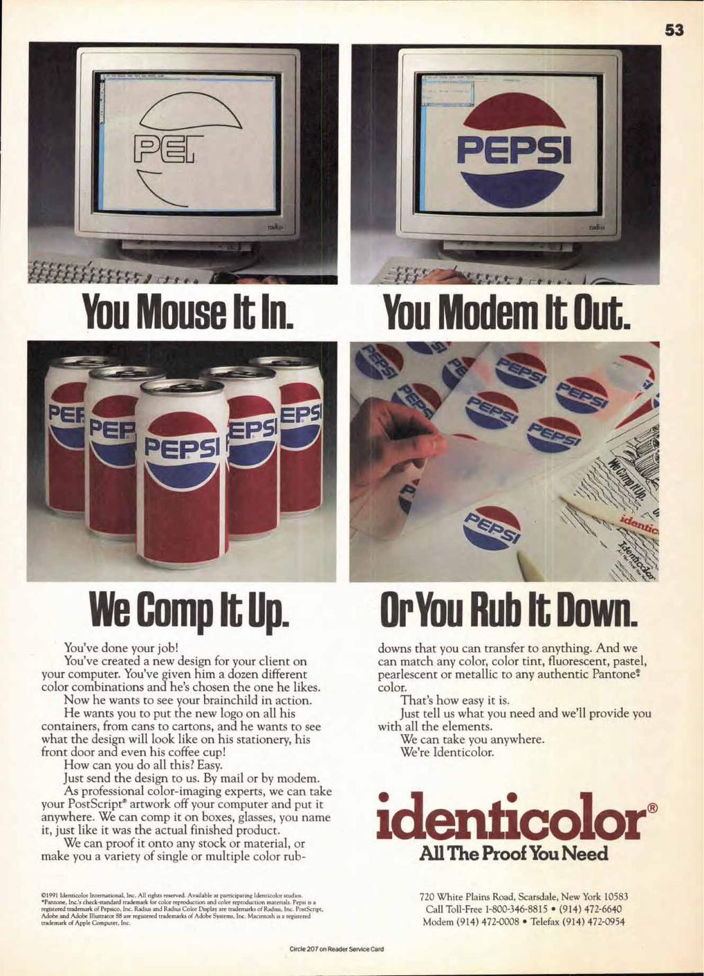
re f f-f I f t f- f 41-
53
You Mouse It In. You Modem It Out.
We Comp It Op. You've done your job! You've created a new design for your client on
your computer. You've given him a dozen different color combinations and he's chosen the one he likes.
Now he wants to see your brainchild in action. He wants you to put the new logo on all his
containers, from cans to cartons, and he wants to see what the design will look like on his stationery, his front door and even his coffee cup!
How can you do all this? Easy. Just send the design to us. By mail or by modem. As professional color-imaging experts, we can take
your PostScript® artwork off your computer and put it anywhere. We can comp it on boxes, glasses, you name it, just like it was the actual finished product.
We can proof it onto any stock or material, or make you a variety of single or multiple color rub-
OrYou Rub It Down. downs that you can transfer to anything. And we can match any color, color tint, fluorescent, pastel, pearlescent or metallic to any authentic Pantonet color.
That's how easy it is. Just tell us what you need and we'll provide you
with all the elements. We can take you anywhere. We're Identicolor.
identicolor® All The Proof You Need
©1991 Identicolor International, Inc. All rights reserved. Available at participating Identicolor studios. •Pantone, Inc.'s check-standard trademark for color reproduction and color reproduction materials. Pepsi is a registered trademark of Pepsico, Inc. Radius and Radius Color Display are trademarks of Radius, Inc. PostScript, Adobe and Adobe Illustrator 88 are registered trademarks of Adobe Systems, Inc. Macintosh is a registered trademark of Apple Computer, Inc.
720 White Plains Road, Scarsdale, New York 10583 Call Toll-Free 1-800-346-8815 • (914) 472-6640
Modem (914) 472-0008 • Telefax (914) 472-0954
Circle 207 on Reader Service Card
Whether it's 2:17 a.m., Tuesday in Taos or 5:52 p.m., Saturday in Singapore—you can buy the
PostScript® language font you need to beat your deadline.*
Adobe Type Beunion'' supports
The Font Company fonts, all
installed weights appear on
your font listings in submenus.
Font packages sold on diskettes
for NeXT or Macintosh; free
UPS Blue shipping. Catalo ,
with free font (w/o C
$14.95, credited on first order.
Call 800-442-3668 to order

RBCDEF GH OP Bauhaus-Ueouy
M. Baullaus-LIghl Illtaullaus-Medlum CS Beeson-Bold CI Beacon-OW ❑ Beacon-Medlum
Bee-r our Bee-One
Select on!
Seim!! ants To Perth s
You can browse the 1600-face library anytime with the easy Font Buyer' program—even see an on-screen type specimen before buying.
For output and font sales there's a Master Font Center location near you:
1-800-442-FON11 3 6 6 8
Introducing The Font Company's new CD type collection for only $29.95.
The Font Company' Type Library is all
on one little compact disk for the Macintosh.® Printer fonts are individually
encrypted. Screen fonts are unencrypted,
ready to use for layouts. When you need to purchase the printer font, just call through
your modem or fax your printed order. Your credit card is billed; you get a decryption
code to enter. Then, your chosen font is
downloaded to your hard disk, ready to
install. Buy as few or as many as you want—the more fonts in one
order, the lower the price.
Type that makes a point. Cuts from The Font Company
are razor-sharp, sparkling with
details missing from other
foundry's fonts. One reason is that all The Font Company
fonts originate as "point-on-
curve"
IKARUS data,
plotted on a grid
15,000 by 15,000 units per
em square. At high resolution, you'll discov-
er that your PostScript output equals com-
mercial phototypesetting.
Built in letter kerning that meets the demanding standards of professionals.
When you're facing deadlines, you want
professional-quality typesetting in the very
least amount of time. Fonts from The Font Company get you closer to your personal
standards, right off the keyboard. Shipped
with precise letter and word-spacing, packed with as many as 440 kerning pairs,
these fonts keep tedious manual kerning to a minimum.
Compatible with industry- standard software.
Fonts from The Font Company meet
Adobe® specs for PostScript Type 1 fonts—including advanced hinting for ATM' 2.0
and the new PostScript printers. Use any typeface
with your favorite
Macintosh® program
such as Aldus Page-Maker,' Quark Xpress: Design-Studio: LetraStudio:
FrameMaker,® Aldus FreeHand: Broder-
bund TypeStyler:
Adobe
Microsoft® Word and others.
Typography's greatest hits. You can own The Font Company Type
Library CD for just $29.95, including the 250-page master type catalog and a free Macintosh-format font. Call 800-442-3668
now with your credit card, we'll send your
CD right out.
New York. NY
Arnold & Debel 212/594-5494
NYC/Rutherford, NJ Granite Graphics 212/112-0364 201/438.7398
NYC/Orange, NJ
Newark Trade Type 201/614-3727
NYC/Newark, NJ Arrow Typographers 201/622-0111
Lancaster, PA
Centennial Graphics 717/397-8863
Washington, DC
Phil's Photo 202/293-2214
Birmingham, Al
Communication Arts 205/2516642
Memphis, TN
Graphic Arts Associates 901/795-8973
Indianapolis, IN Weimer Typesetting 317/6354487
Minneapolis, MN
Dahl & Curry 612/338.7171
Minneapolis, MN Great Faces, Inc. 612/339.2933
Milwaukee, WI
Peter A. Altenhofen 414/352-3590
Chicago, IL
The Typesmiths 312/781.8200
Chicago, IL
Eddie Price Typographic 312/738.5130
Cleveland, OH Typesetting Service, Inc. 216/241-2641
Cincinnati, OH Typo-set, Inc. 513/151-5116
Cedar Rapids, IA Morgan Meredith, Inc., 319/362.9615
Fort Worth, TX LinoTypographers 811/3324070
Houston, TX Microtype 113/963.8117
Pacesetters Typographies 214/235.2222
San Francisco, CA Design & Type 415/495-6280
Los Angeles. CA
PrePress Studio 213/938-3956
Los Angeles. CA Skil-Set/ Alpha Graphix 213/937.5757
IA/ Andresen Santa Monica, CA Typographies
213/452.5521
LA/ Gene Toth Huntington Beach, CA Typographers
114/962-2755
LA/Orange, CA DeLine-O-Type 714/639.2562
Montreal. GU Typographie Compoplus 514/861-1488
Toronto, ON
Southside Publishing Studios 416/9202500
Vancouver, BC Typex Graphics 604/688-6285
Vancouver, BC
La The Font Company 12629 N. Tatum Blvd. Suite 210 Phoenix, AZ 85032 602-998-9711 Fax: 602-998-7964
*24-hour availability requires a Macintosh-based system with CD reader and Hayes-compatible modem. Without modem, a fax machine is required and decryption codes available 9 a.m. to 5 p.m. MST, Monday through Friday. Font Buyer access program is supplied with all CD's.
The Font Company is a trademark of The Font Company, Inc. Adobe and PostScript are registered trademarks of Adobe Systems, Inc. Macin-tosh is a registered trademark of Apple Computer, Inc. NeXT is a registered trademark ofNeXT, Inc. All other trademarks acknowledged as properties of their respective owners.
Doug Fleming Graphics 604/669-2296
Circle 249 on Reader Service Card

TAKE A DEAD FLY, ONE KILLED BY
Regardless of the message you need to communicate, using the
DROWNING, PLACE IT IN A GLASS
right typeface will bring it to life. And FontHaus can help you
FULL OF WATER, AND COVER IT UP
find it. We offer over 3,000 PostScript typefaces from the
SO AS TO DEPRIVE THE FLY OF
world's great type foundries (like Adobe, Agfa Compugraphic,
ALL AIR. IVIIIEN THE FLY BECOMES
Bitstream, Linotype and Monotype), not to mention a grow-
MOTIONLESS, TAKE IT OUT, PUT IT
ing collection of exclusive and hard-to-find fonts from smaller
IN THE SUN, AND COVER IT WITH
foundries (like ATF, Castle Systems, EmDash, The Font
SALT. IN ABOUT TWO MINUTES, IT
Bureau, Giampa Textware, Treacyfaces, and our own foundry,
WILL COME TO LIFE AND FLY
the FontHaus Foundry.) FontHaus gladly accepts American
AWAY. THE FLY MAY HAVE BEEN
Express and can ship your order overnight if you wish.
DEAD FOR TWENTY-FOUR HOURS.
LET US HELP YOU BREATHE LIFE INTO YOUR MESSAGE!
56
■ In the "Character Format" dialog box, use the "Spread" edit box to enter a negative value (any number below zero; e.g., — 2) to reduce white space by a percentage of the point size in use. Add a positive value (any number above zero; e.g., 2) to add units of space.
To remove all kerning, select the characters:
■ On a Mac, press Option-5 (on the numeric keyboard).
■ On a Unix, press the Meta or Control key and R11.
■ On a NeXT, the process may be mapped to any keyboard combination.
QuarkXPress' 2.0 and 3.0
QuarkXpress measures its kerning values in 1/200 (.005) of an em. The term
"kerning" in Quark is specifically applied to the space between two selected characters; when a range of text is selected, Quark calls it
"tracking." (Tracking is available in all the page layout programs, where it usually functions in a slightly different sense than kerning.) The space is deleted or added evenly between the characters.
To kern, use the type tool to click the insertion point between the two characters you want to kern. The menu and dialog box will have
"Kerning" options.
■ To track, use the type tool to select a range of text. The menu and dialog box will have
"Tracking" options.
From the keyboard:
■ To delete fine units (.005), press Command —Option—Shift—[.
■ To delete coarse units (.05), press Com-mand—Shift—I.
■ To add fine units (.005), press Com-mand—Option—Shift—I.
■ To add coarse units (.05), press Command —Shift—I.
To kern/track in a specific increment:
■ From the Style menu, choose either "Kern.... or "Track..:' to get the mini-dialog boxes, or choose "Character...: (press Command-Shift—D) to get the "Character Attributes" dialog box.
■ In the "Kern Amount" or "Track Amount" edit box, enter a positive number (up to 100) to add space; enter a negative number (down to —100) to delete space. The value you enter will be the number of parts of 200ths of an em; e.g. — 43 would delete 43/200 of an em space.
■ To remove kerning, enter 0 (zero) in the edit box.
Xerox Ventura Publisher' 2 or 3
Ventura Publisher kerns in units of 1/100 (.01) of an em.
When you kern using the keyboard com-mands, the default increment is 1/50 (.02) of an em. As you kern, the units are added or deleted from the space to the right of the character. If you are selecting a word, don't select the last character, as that will cause units of space to be added or deleted from the word space.
Before doing any kerning, you must first:
■ Switch to text editing mode.
■ Select a range of text. If you are kerning between two characters, select the charac-ter on the left.
To kern from the keyboard using the default increment (.02) of an em:
■ To delete units, press Shift (left arrow).
■ To add units, press Shift--° (right arrow).
To kern in custom increments in the DOS/GEM version:
■ Click the "Set Font" button.
■ Type in the value of reduction or enlarge-ment, from .01 to 1.27. Click OK.
■ To remove kerning, click "Normal" in the "Assignment List" on the left side of the screen.
To kern in custom increments in the Windows version:
■ From the Text menu, choose "Set font attributes..."
■ In the "Font setting" dialog box, type in the value of reduction or enlargement, from .01 to 1.27. Click OK.
■ To remove kerning, from the "Text" menu choose "Normal .; or press Alt-T-N.
Robin Williams teaches desktop design and electronic typography at Santa Rosa Junior College. She has written extensively on desktop publishing and is currently working on The Little Design Book, which will be published in Spring '91 by Peachpit Press.
■
To Bring a
Dead Fly to Life,
FONTHAUS, INC.
IS PERRY AVENUE
SUITE A8
NORWALK, CT 06850
TEL. (800) 942-9110
OR (203) 846-3087
FAX (203) 849-8527
Kerning Keystrokes for Desktop Publishing (continued from page 52)
COMPOSED IN METROPOLIS BLACK (CONDENSED) AND MONOTYPE CENTAUR
Instructions for resuscitating flies from L. W. Yaggy, Wit and Humor of the Age, Chicago, 1883.
Circle 243 on Reader Service Card
57
That's what you want from your words The purpose of any document is to grab the attention of the reader. Nothing gives you more impact than Effects Specialist". It is, quite simply, the most powerful typographical tool available anywhere for any computer. Create logos, advertisements, flyers, menus, or any document instantly... effortlessly! Even novices can obtain professional results on their very first try! Type in a word or two, and click the mouse a couple of times to get eye-catching headlines or logos. Nothing could be simpler! Choose from 120 effects which can suggest emotion, movement, or impact. With pop-up help screens available for each effect, and billions of variables to choose from, font styling couldn't be made easier, or more powerful. Your imagination is your only limitation!
Features include: WYSIWYG (What You See Is What You Get) on- screen representation, color, kerning, a complete background generator, and much more! Import or export PICT or EPSF files to and from your favorite graphics, multimedia, and desktop publishing programs. Since Effects Specialist works with any font in your system, you may print your files on laser printers, color printers, film recorders, image setters, or even dot-matrix printers. The program's intuitive interface makes it very powerful, easy to learn,
and easy to use. Suggested Retail Price: $199.95 • Requirements:
any Macintosh with one megabyte of RAM.
...and from your documents. Our pre-designed templates save you time and money. Create professional looking documents with your favorite fonts in PageMaker", QuarkXPressTM, or Ready,Set,Go!TM (DesignStudio"). Use your custom effects created in Effects Specialist" for maximum visual impact. Designed by award-winning graphic artists, this page layout package features over 200 templates with color capabilities for newsletters, brochures, flyers, letterheads, business reply mail, envelopes and business cards. The finished documents are truly camera/printer ready, complete with all fold, trim, and register marks in place. These templates are perfect for jobs where time and quality deadlines are important.
Layouts have received a **** rating from Publish Magazine and ***41/2 from MacUser!
Suggested Retail Price: $149.95
Flyer Packs A & B offer ten flyer templates each, with color capabilities. Add logos or special clip art. EPS graphics enables beautiful output from any laser printer or LinotronicTM. Suggested Price $69.95
Stationery Packs A & B offer an exciting assortment of templates for letterheads, envelopes, and business cards. Layouts allow you to move elements, specify PantoneTM colors by numbers, and insert your logos or
special graphics to quickly create stationery with that "quality, custom look."
Suggested Retail Price: $69.95
Available from your local dealer or directly from
IIIVIVERIVIRTILIIRMIL MAW.
27811 Avenue Hopkins - Suite 6 Valencia, CA 91355 (805) 257-1797 FAX (805) 257-1759
Circle 252 on Reader Service Card

58 International Typeface Corporation is pleased to offer the ITC Typeface Directory, which details all IT'C typeface families available for both IBM and Macintosh computer environments from rrc licensed Subscribers. In the chart, • squares indicate the Subscriber offers the complete ITC typeface family. Likewise, • circles indicate a partial availability for that typeface family. For more information, please call the ITC Typeface Directory at (800) 634-9325 or Fax (212) 752-4752.
1111
11111.
1.1
1117B
M A
dobe
IB
M
Ag f
a
IBM
Au
tolo
aic I
nc.
IBM
H. B
erth
old
AG
Mac
*elm
Com
pan
y M
ac
I BM
Im
age C
lub
IBM
O
MS.
Inc
.
IBM
Lin
oty
p e
IBM
Mo n
otyp
e
3a1A1
,todICIMIJA
1118I
:
LL.
0_
ITC American Typewriter® ■ ■ • • • • • • ■ ■ • ■ • • ITC Avant Garde Gothic® ■ ■ • • • • ■ • ■ ■ • • • • ■ ■ ■ ■ • • ITC Barcelona® ■ • • ITC Bauhaus® ■ ■ ■ ■ ■ ■ ■ ■ ■ ■ ■ ■ ■ ■ ■ ■ ITC Benguiat® • • • • • • ■ • ■ ■ • • • • • • • • ITC Benguiat Gothic® ■ ■ • ■ ■ ■ • • ■ ■ ■ ■ ITC Berkeley Oldstyle® ■ ■ ■ ■ ■ ■ ■ ■ • • ■ ■ ■ ■ ■ ■ ITC Bookman® ■ ■ ■ ■ ■ ■ ■ • ■ ■ • • • • ■ ■ ■ ■ • • ITC Caslon No. 224® ■ ■ ■ ■ ■ ■ • • ■ ■ ■ ■ ITC Century® ■ ■ ■ ■ ■ ■ ■ ■ ■ ■ ■ ■ ITC Cheltenham® ■ ■ • • • • • ■ ■ • • • • ■ ■ ■ ■ • • ITC Clearface® ■ ■ ■ ■ ■ ■ • ■ ■ • • ■ ■ ■ ■ ■ ■ ITC Cushing® ■ ■ ■ ■ ■ ■ ■ ■ • • ■ ■ ■ ■ ITC Ian® ■ ■ ■ ■ ITC Eras® ■ ■ ■ ■ ■ ■ ■ ■ ■ ■ ■ ■ ■ ■ ■ ■ ITC Esprit® ■ ■ • • ITC Fenice® ■ ■ ■ ■ ■ ■ • • ■ ■ ■ ■ ITC Flora® ■ ■ ITC Franklin Gothic® • • • • • • ■ • ■ ■ • • ■ ■ • • • • Friz Quadrats® ■ ■ • • ■ ■ ■ ■ ■ ■ ■ ■ ■ ■ ■ ■ ITC Gaillard° ■ ■ • • • • • ■ ■ • • ■ ■ ■ • ITC Gamma® ■ ■ ■ ■ • • ITC Garamond® ■ ■ ■ ■ ■ ■ ■ • ■ ■ ■ ■ • • ■ ■ ■ ■ • • ITC Giovanni '" ■ ■ ITC Golden Type - ■ ITC Goudy Sans® ■ ■ ■ ■ ■ ITC Isadora® ■ ■ ITC Isbell® • ■ ■ ■ ■ • • Italia ■ ■ ■ ■ ■ ■ ■ ■ ■ ■ ■ ■ ■ ■ ■ ■ ITC Jamille TM ■ ■ ■ ■ ■ ■ ITC Kabel® ■ ■ ■ ■ ■ ■ ■ ■ ■ ■ ■ ■ ■ ■ ■ ■ ■ ITC Korinna® • • • • • • ■ • ■ ■ • • • • ■ ■ • • • • ITC Leawood® ■ ■ ■ ■ ■ ■ • ' • ■ ■ ■ ■ ITC Lubalin Graph® • • • • • • ■ • ■ ■ ■ ■ • • ■ ■ • • • • ITC Mixage® ■ ■ ■ ■ ITC Modern No. 216® ■ ■ ■ • • ITC New Baskervi I le® • • • • • • ■ ■ • • • • ■ ■ • • • • ITC Newtext® ■ ■ ■ ■ ■ ■ ITC Novarese® ■ ■ ■ ■ ■ ■ ■ ■ ■ • • ■ ■ ■ ■ ■ ■ ITC Officina Sans - ■ ITC Officina Serif - ■ ITC Pacella ® ■ ■ ■ ■ • • ITC Panache `" ■ • • ITC Quay Sans - ■ ■ ITC Quorum® ■ ■ ■ ■ ■ ■ ■ ■ ■ • • ■ ■ ■ ■ ■ ■ ITC Serif Gothic® ■ ■ ■ ■ ■ ■ ■ ■ • • ■ ■ ■ ■ ■ ■ ITC SI imbach® ■ ■ • • ITC Souvenir® ■ ■ • • ■ ■ ■ • ■ ■ • • • • ■ ■ ■ ■ ■ ■ ITC Stone Informal® ■ ■ ■ ■ ■ ■ ■ ■ ■ ■ ■ ■ ■ ■ ■ ITC Stone Sans® ■ ■ ■ ■ ■ ■ ■ ■ ■ ■ ■ ■ ■ ■ ■ ITC Stone Serif® ■ ■ ■ ■ ■ ■ • ■ ■ ■ ■ ■ ■ ■ ■ ■ ITC Symbol® ■ ■ ■ ■ ■ ■ • • ■ ■ ■ ■ ITC Tiepolo® ■ ■ ■ ■ ■ ■ ITC Tiffany • • • • • • • ■ ■ ■ ■ ■ ■ • • • • ITC Usherwood ® ■ ■ ■ ■ • • ■ ■ ■ ■ ITC Veljovic° ■ ■ • • ITC Weidemann® ■ ■ ■ ■ ■ ■ ■ ■ ■ • • ■ ■ ■ ■ ■ ■ ITC Zapf Book® ■ ■ ■ ■ ■ ITC Zapf Chancery® ■ ■ ■ ■ • • ■ • ■ ■ • • • • ■ ■ ■ ■ • • ITC Zapf Dingbats® ■ ■ ■ ■ ■ ■ ■ ■ ■ ■ ■ ■ ■ ■ ■ ■ ITC Zapf International® ■ ■ ■ • •
■ complete family • partial family IBM is a registered trademark of International Business Machines. Macintosh is a registered trademark of Apple Computer Incorporated.
See ITC Subscriber Listing on page 48 for company locations and phone numbers.
INTERNATIONAL TYPEFACE CORPORATION OPERATES UNDER THIS NAME DOMESTICALLY AND IN FOREIGN COUNTRIES AND IS KNOWN AS "ITC: ITC AND ITS TYPEFACE NAMES ARE REGISTERED TRADEMARKS OF INTERNATIONAL TYPEFACE CORPORATION IN CERTAIN COUNTRIES. IN ADDITION, ITC TYPEFACES ARE PROTECTED BY DESIGN LEGISLATION AND COPYRIGHTS IN CERTAIN COUNTRIES. (SEE ITC SPECIMEN BOOKS.)
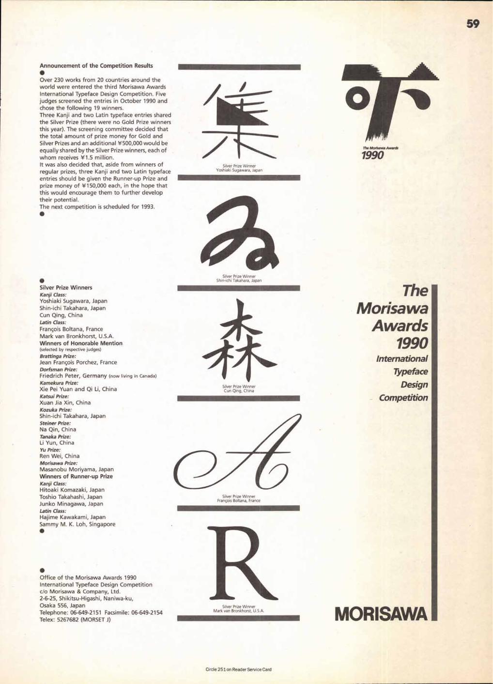
The Morisawa Awards
1990
The Morisawa
Awards 1990
International Typeface
Design
Competition
MORISAWA
Silver Prize Winner Yoshiaki Sugawara, Japan
59
Announcement of the Competition Results • Over 230 works from 20 countries around the world were entered the third Morisawa Awards International Typeface Design Competition. Five judges screened the entries in October 1990 and chose the following 19 winners. Three Kanji and two Latin typeface entries shared the Silver Prize (there were no Gold Prize winners this year). The screening committee decided that the total amount of prize money for Gold and Silver Prizes and an additional Y500,000 would be equally shared by the Silver Prize winners, each of
61/ whom receives Y1.5 million. It was also decided that, aside from winners of regular prizes, three Kanji and two Latin typeface entries should be given the Runner-up Prize and prize money of Y150,000 each, in the hope that this would encourage them to further develop their potential. The next competition is scheduled for 1993. •
Silver Prize Winner Cun Qing, China
•
• Office of the Morisawa Awards 1990 International Typeface Design Competition c/o Morisawa & Company, Ltd. 2-6-25, Shikitsu-Higashi, Naniwa-ku, Osaka 556, Japan Telephone: 06-649-2151 Facsimile: 06-649-2154 Telex: 5267682 (MORSET J)
• Silver Prize Winners Kanji Class: Yoshiaki Sugawara, Japan Shin-ichi Takahara, Japan Cun Qing, China Latin Class:
Francois Boltana, France Mark van Bronkhorst, U.S.A. Winners of Honorable Mention (selected by respective judges)
Brattinga Prize: Jean Francois Porchez, France Dorfsman Prize: Friedrich Peter, Germany (now living in Canada)
Kamekura Prize: Xie Pei Yuan and Qi Li, China Katsui Prize: Xuan Jia Xin, China Kozuka Prize: Shin-ichi Takahara, Japan Steiner Prize: Na Qin, China Tanaka Prize: Li Yun, China Yu Prize: Ren Wei, China Morisawa Prize: Masanobu Moriyama, Japan Winners of Runner-up Prize Kanji Class: Hitoaki Komazaki, Japan Toshio Takahashi, Japan Junko Minagawa, Japan Latin Class: Hajime Kawakami, Japan Sammy M. K. Loh, Singapore
Circle 251 on Reader Service Card

#1064 Armin Hofmann: His Work Quest and Philosophy edited by Hans Wichmann
#1065 The New Cranbrook Design Discourse
#1063 Low Budget/High Quality Design by Steven Heller and Anne Fink
With troubling economic times facing us, Low Budget/High Quality Design is a very timely addition to the U&Ic BookShop ros-ter. Subtitled The Art of Inexpensive Visual Communication, Steven Heller and Anne Fink present nearly 100 practical case histo-ries from six categories of effective, inex-pensive graphic design. The examples include posters, promotional mailers, pack-ages, logotypes, and magazines by some of today's finest designers and design firms.
Since budget or expense is relative, it is put in the context of the client and the
project at hand by a brief narrative that accompanies each piece showcased. Unlike many other design books, Heller and Fink reveal valuable information on each pro-ject's purpose, budget and resources, with an occasional statement from the artist; thus making this book more of an actual tool than simply a source of visual stimulation.
Steven Heller is a senior art director of The New York Times and editor of the ALGA Journal of Graphic Design. He is also a contributing editor for Print and ID magazines. Heller teaches design history at the School of Visual Arts. He is the author of several graphic design titles including Graphic Style: From Victorian to Postmodern (also available through the BookShop). Anne Fink is a graphic designer with a studio in New York City.
160 pages. 8 1/2 " x 11:' Hardcover. Illustrated. #1063 $35.00, U.S. and Canada. Elsewhere, $4700.
This volume presents the collected works of Armin Hofmann, the internationally acclaimed graphic designer and teacher. His visionary contributions have had a profound and universal impact in this century. The scope of his work is enormously varied; it includes posters, logos, stage settings, typo-graphic work, orientation systems, and three-dimensional designs, mostly for pub-lic buildings. With 11 color and 187 black and white illustrations, and notes and com-mentaries by both Armin Hofmann himself as well as a number of his renowned col-leagues, this book will be an incentive to rising generations to return again and again to the central issues of graphic design.
For more than 40 years, Armin Hofmann has devoted his life to teaching the unteach-able—art/design. The works of his stu-dents are models of excellence, and the envy of others, both students and teachers. His influence has been as strong beyond the classroom as within it. Even those who
are his critics are as eager about his ideas as those who sit at his feet.
Armin Hofmann was awarded the title of Honary Member of the Royal Academy of Arts in London in 1988, and in 1981, the Museum of Modern Art in New York devoted a one-man-show to his work.
223 pages. 11"x 7:' Hardbound. Illustrated. English/German text. #1064 $54.00, U.S. and Canada. Elsewhere, $65.00.
The New Cranbrook Design Discourse is a look back at the last ten years of design as well as a look ahead from one of America's most respected and influential design schools. The largest segment of the book, Projects, is a showcase of the best in prod-uct, graphic, furniture, and interior design produced by students, faculty and alumni of Cranbrook throughout the 1980s.
Essays by such notables as Roy Slade, President of Cranbrook Academy of Art; Neils Diffrient, Hugh Aldersey-Williams, author of New American Design (also avail-able through the BookShop); and Lorraine Wild explore a variety of topics including the origin, progress and role of this pres-tigious institution in contemporary design;
the tension between art and science in design; graphic design; life after Cranbrook and form and function. The New Discourse makes for sumptuous reading and viewing.
The latest generation of Cranbrook-trained designers is part of the great tradi-tion of American designers who have been associated with the historic Bloomfield Hills, Michigan, campus. Eliel Sarrinen, Charles and Ray Eames, Jack Lenor Larson, Florence Knoll, and many others who have contributed to the American design phe-nomenon are Cranbrook alumni. But the new Cranbrook design is anything but traditional. The late 20th century Cran-brook is known as an experimental labora-tory of cutting-edge design.
207 pages. 8 1/2" x 11" Softbound. 300 illustrations, 200 full-color. #1065 $35.00, U.S. and Canada. Elsewhere, $47.00.
Uelc BookShop 866 Second Avenue, 3rd Floor New York, New York 10017 • 800 634-9327
Due to the cost of processing drafts on foreign banks, those ordering books from outside the U.S. must have their funds drawn on a U.S. bank. Alternatively, your MasterCard, Visa or postal money order are acceptable modes of payment.
Listed here are books that were
BINBooK
reviewed in previous
issues of U&/c.
ABC's of Type #1055, $27.50
Brodovitch, #1051, $39.95
Florilege, #1004 Originally $80.00/Now $60.00
Graphis Photo 88, #1007 Originally $60.00/Now $40.00
Graphis Poster 88, #1008 Originally $65.00/Now $40.00
Graphis Poster 89, #1031 $65.00
Liberated Page, #1001 Originally $39.95/Now $29.95
The Mac is not a Typewriter, #1053, $9.95
Menu Design 3, #1016 Originally $49.95/Now $24.95
New American Design, #1037 $35.00
PageMaker 4 #1054, $24.95
Posters Made Possible by a Grant from Mobil, #1023 Originally $50.00/Now $39.75
Typographic Communications Today #1024, $55.00
Ventura Publishers Solutions Book #1045, $24.95
The Visual Display of Quantitative Information #1058, $36.00
For orders outside the U.S. please add $12.00 per book to your order.
61
# 1 0 5 9 Anatomy of a Typeface by Alexander Lawson
Anatomy of a Typeface is Alexander Law-son's second investigation of typographic classification and evolution. Lawson docu-ments 30 typestyles in this expanded study, with generous narrative on their principal designers and chronologies. A must-have for all typographers!
428 pages. 9 1/4 " x 61/4" Illustrated. Hardbound. #1059 $40.00, U.S. and Canada. Elsewhere, $49.95.
# 1 0 6 2 Modern Encyclopedia of Typefaces by Lawrence W Wallis
Modem EacYcloPedia of Typefaces 1960-90
Immo. W tgllb
This exciting new volume is an essential reference book for all the principal type designs introduced specifically for the new technologies since 1960. Not only are nearly 1,200 typestyles exhibited, a number of indices are also included for ease of ref-erence, including an index of designers, a chronological index, an index of manufac-turers and design agencies and an index of alternative typeface names. Designer pro-files and a bibliography are also included.
192 pages. 8 1/4 " x 11 1/4 :' Softbound. #1062 $24.95, U.S. and Canada. Elsewhere, $32 00.
# 1 0 6 0 Promo 1 by Rose DeNeve
11111.1111°b'
Promo 1 is an indispensable showcase for the best self-promotion by America's most innovative graphic designers and illustra-tors. Promo 1 presents outstanding work from 72 design and illustration groups—all in over 200 full-color photographs. These projects reveal that there are as many solu-tions as there are needs.
163 pages. 200+ illustrations. Hardbound. 9" x 12:' #1060 $39.95, U.S. and Canada. Elsewhere, $52.00.
# 1 0 5 6 Roger Black's Desktop Design Power by Roger Black Forward by William Randolph Hearst III
Roger Black's Desktop Design Power was created and written for both professionals and newcomers to desktop design.
Design Power gives advice, tips, and tricks from one of the design community's foremost desktop designers. Sample topics covered are: layout, typography, covers, color production, management, and DTP systems.
320 pages. 8" x 9 1/4 :Illustrated. Paperbound. #1056 $24.95, U.S. and Canada. Elsewhere, $39.95.
# 1 0 6 1 Frederic Goudy by D.J.R. Bruckner
Frederic Goudy is the second book of the Masters of American Design Series (the first being Brodovitch, also available through the BookShop). This beautifully produced vol-ume is the first critical biography of Frederic W. Goudy (1865-1945), considered to be one of the leading type makers in history.
144 pages. 9 1/4 " x 12 1/4 " 250 illustrations. Hardbound. #1061 $39.95, U.S. and Canada. Elsewhere, $55.00.
# 1 0 5 7 Envisioning Information by Edward R. Tufte
Envisioning Information
Edward Tufte's newest book is a stunning display of the classics of information design, combined with close analysis of design strategies that produce excellence in infor-mation displays. Revealed here are design strategies for enhancing the dimensionality and density of portrayals of information-techniques exemplified in maps, the man-uscripts of Galileo, timetables, the Vietnam Veterans Memorial, drawings of Calder and Klee, and textbook of Euclid's geometry.
126 pages. 874" x 400+ illustrations, 100+ full color. Hardcover. #1057 $48.00, U.S. and Canada. Elsewhere, $58.00.
PLEASE PRINT CLEARLY
Uelc BookShop 866 Second Avenue, 3rd Floor New York, New York 10017
Name Title
Company Address
City
State
Zip Code
Country
Phone
0 Home
0 Business
0 I Am 0 I Am Not A U(.71c Subscriber
Quanity Book# Title Cost USA/Canada
Cost Outside USA/Canada Total Price
FOR FASTER SERVICE CALL 800 634-9325 Monday — Friday, 9-5 EST (USA Only
Sub-Total
Shipping Charges
Applicable NY Sales Tax
FREE
New York City area, call 212-371-0699 Order Total
For questions or problems regarding shipments, please contact Ll ✓rk Bookshop Manager. All orders shipped postpaid. New York State residents add state/local tax. Allow 4-6 weeks for delivery. Individual books may arrive separately. We cannot deliver to a P.O. Box without a street address.
Payment in full must accompany order.
Drafts on foreign banks must have their funds drawn on a U.S. Bank.
Bookshop returns valid within 10 days of receipt. Please return via Registered Mail. Exchange for BookShop credit only.
Payment (no cash or COD orders) 0 My check/money order for U.S. $
is enclosed.
0 Please charge my 0 Mastercard 0 VISA
S. 1 1 1 1 1 1 1 1 1 1 1 1 1 1 1 1 1 1 I Include all numbers - card comp nies require it.
Expiration Date
Name (print) AS IT APPEARS ON CARD
Date
Signature REQUIRED FOR CREDIT CARD ORDERS

Ace.
Company
Electronic Publishing Consultants
ELECTRONIC DIRECTIONS
X X
before
after
G OODMAN
O RLICK
D ESIGN
Desktop Design, Consultation & Production
461 West 47th Street New York, NY 10036
212 974 0297 fax: 212 582 7062
Consultation
for the
Publishing
Professional
PRINTERS
20 WEST • 22 STREET
NEW YORK • NY 10010
PHONE: (212) 6754981
FAX: (212) 633-2743
Electronic Directions 23 East 4th Street New York, NY 10003 212-533-9651 A Wheeler Hawkins Company
Waldman Graphics 9100 Pennsauken Highway Pennsauken, NJ 08810 800-543-0955 Fax: 609-665-1789
Goodman/Orlick Design, Inc. 461 West 47th Street New York, NY 10036-2304 212-974-0297 Fax: 212-582-7062
4. Pre-Press Services
Waldman Graphics 9100 Pennsauken Highway Pennsauken, NJ 08810 800-543-0955 Fax: 609-665-1789
Rates and Circulation
lx 2x
3x
4x
Bold Company Listing
$75.00
$70.00
$65.00
$60.00
Logo Listing (2 1/4" x 1 3/4")
$325.00 $300.00
$280.00 $250.00
Standard Classified Display
$725.00 $685.00
$640.00 $600.00 (2 1/4" x 4")
62
The Business-to-Business Directory of Products and Services in the Graphic Arts & Printing Industries
1. Bar Code Masters 3. Desktop Publishing 3. Desktop Publishing 5. Printers
Infinity Symbology 2277 Science Parkway Okemos, MI 48864 800-292-2633 Fax: 517-349-7608 All major symbologies in encapsulated PostScript or as FilMasters or ReproMasters. Free phone consultation. Same day service.
2. Color Separations
Graphic Technology and Information Inc. 18 East 16th Street New York, NY 10003 212-727-0050 Fax: 212-727-7577 Contact: Gerry Mc Keon Cost effective quality pre-press services for the magazine & catalogue industry.
Waldman Graphics 9100 Pennsauken Highway Pennsauken, NJ 08810 800-543-0955 Fax: 609-665-1789
3. Desktop Publishing
Graphic Technology and Information Inc. 18 East 16th Street New York, NY 10003 212-727-0500 Fax: 212-727-7577 Contact: Gerry McKeon Combine high quality separations with the cost saving advantages of PostScript output.
Super Bold Company Listing
Additional Line
Additional Listing (under different heading)
Waldman Graphics 9100 Pennsauken Highway Pennsauken, NJ 08810 800-543-0955 Fax: 609-665-1789
5a. Offset-Web-Commercial
Lincoln Graphics 1670 Old Country Road Plainview, NY 11803 516-293-7608 Fax: 516-293-7608 We print U&lc.
6. Typesetting
Characters Typographic Services, Inc. 5 West 36th Street New York, NY 10018-7912 212-947-0900 Fax: 212-695-5594
$125.00
$115.00
$110.00
$100.00
$50.00
$50.00
Call 800-634-9325 and see how you can qualify to be listed!
or write: The U&lc Buyer's Guide 866 2nd Avenue New York, NY 10017 Fax: 212-223-1915
Advertising Closing Dates
1991: Issue
18.1
18.2
18.3
18.4
Latent Lettering 29 W. 38 St. NYC 10018 (212)221-0055 Fax: (212)221-1146 Contact: Francine Stein 7000 display faces, 2400 text. Also desktop. 40% unusual/specialty. Day/nite service. PU/del. Manhattan. Fed exp. out of town. Portable typebook avail.
Waldman Graphics 9100 Pennsauken Highway Pennsauken, NJ 08810 800-543-0955 Fax: 609-665-1789
Closing
1/18/91
4/19/91
7/26/91
10/18/91

Introducing the new Speedcote wax coater from Daige.
Good looks combined with great performance; that's the new
Daige Speedcote wax coater. Its sophisticated technology ensures smooth,
even waxing all through your working day. And since the Speedcote is designed for simplicity, you'll
never have to fuss with dial settings or temperature adjustments. Unlike other wax coaters, the Speedcote is fully
automatic. Precision temperature controls eliminate bleed-throughs, and the Speecicote's exclusive floating roller adjusts wax thickness
automatically. You get microthin coating on any stock, with no bumps, hills, or stripes.
And while the Speedcote is working hard, its also looking good. The contemporary style of the Speedcote blends in beautifully with the professional image of your office or studio. Its revolutionary design includes such special features as quick-touch controls and a convenient wax-loading door. There's even an indicator light that warns you automatically when the wax level is too low. You won't need to worry about maintenance, either. The Speedcote needs no lubrication and has no complicated electronic parts to break down. Available in 12" and 18" sizes at your dealer.
With its streamlined design and easy operation, the Speedcote is beautifully simple, simply beautiful.
Speedcote Daige
Products, Inc. The name to stick with.
1 Albertson Avenue, Albertson, N Y 11507 (800) 645-3323 • (516) 621-2100
63
1133C13 talk continued from page 51
tion with scanners for input and image processing, a page layout workstation, a file server and an imagesetter with a RIP for output of four-color separation film. Linotype Company, 425 Oser Ave., Hauppauge, NY 11788. (516) 434-2000. For information circle 281 on reader service card.
Computers, Memories & Storage
Articulate Systems Inc. now lets you talk to your Mac. The Voice Navigator inte-grates voice recognition with the graph-ical user interface of the Macintosh. Selecting menu items, graphic tools or response to dialog boxes can be accom-plished "hands free" with this device. $795. Articulate Systems, Inc., 99 Erie St., Cambridge, MA 02139. (617) 876-5236. For information circle 282 on reader service card.
Macintosh System Software 6.0.7 is the latest version of the system software for the Macintosh family of computers. System 6.0.7 is required for the new Macintosh Classic, Macintosh LC and the Macintosh Ilsi and requires one megabyte of memory. $49. Apple Com-puter, Inc. Apple Computer, Inc., 20525 Mariani Ave., Cupertino, CA 95014. (408) 996-1010. For information circle 283 on reader service card.
Monitors
Radius Inc. is now shipping the Radius Pivot' Ilsi Interface and the Radius Two Page Display' IIsi Interface for the new Apple Macintosh Hsi computer. The new interfaces allow the Radius Pivot and Radius Two Page Display to work with the Mac IIsi computer. Radius Pivot Ilsi Interface $695, Radius Two Page Display Ilsi Interface $595. Radius Inc., 1710 Fortune Dr., San Jose, CA 95131. (408) 434-1010. For information circle 284 on reader service card.
Scanners
Agfa® Compugraphic has announced its new FocusTM Color Scanner for profes-sional color scanning applications. The Focus Color Scanner provides variable resolution input of up to 800 dpi, 8-bit 256 gray levels and provides 24-bit scan-ning of up to 16.7 million colors. To use the scanner, Agfa has also released the MC ViewTM Color software for the Mac-intosh. PC View TM Color for IBM/compat-ibles is also available. Focus Color Scanner $7,995, MC View Color software $695. Agfa Compugraphic Division, 200 Ballardvale St., Wilmington, MA 01887. (508) 658-5600. For information circle 285 on reader service card.
Legal, Mergers & Agreements
Eastman Kodak Company and Interleaf, Inc. have announced an agreement to provide increased publishing function-ality to users of Kodak's publishing sys-tems. Interleaf will supply its Technical
Publishing Software (TPS) to users of the Kodak Ektaprint electronic publishing systems (KEEPS), to work with the Kodak advanced printing/publishing software (AP/PS) product series. In return, Kodak will offer Interleaf cus-tomers its AP/PS software and high-volume printers, including the Kodak Ektaprint 1392 printer, model 24, the world's fastest PostScript printer. For information circle 287 on reader service card.
Trends
Radius Inc. has developed a technology for the compression, storage and
decompression of still images. The tech-nology can achieve compression ratios of up to 50 to 1 in only a few seconds. This means that large files such as 24-bit color images can be made smaller to fit onto storage devices. Radius Inc., 1710 Fortune Dr., San Jose, CA 95131. (408) 434-1010. For information circle 288 on reader service card.
A new industry standard for file com-pression has finally emerged. The Joint Photographic Experts Group ()PEG) standard enables cross platform transfer and worldwide exchange of data. JPEG establishes a common compression format allowing easy transfer and exchange of picture data among many
software and hardware environments. A report issued by BIS CAP Interna-
tional views the new PostScript Level 2 product from Adobe as a major advance. When PostScript Level 2 is released, users will have: 1) Device independent color enabling users to exactly repro-duce any given color on any device; 2) Data compression; 3) Print management features.
Barry Zuber is a consultant and computer instructor for the Electronic Publishing & Design Center based in Schenectady, NY He is also a principal of Egeland Wood & Zuber Inc., an award-winning graphic design and advertising agency.
Circle 247 on Reader Service Card
YOU'VE BEEN DRAGGING YOUR HEE BOUT JOINING THE CO REVOLUTION,
CONNATETIONS.
64 RETURN ADDRESS SECOND CLASS POSTAGE PAID
INTERNATIONAL TYPEFACE CORPORATION 2 Hammarskjold Plaza New York, NY 10017
Waiting until now turns out to have been a very smart nonmove.
Phil's Photo is offering an unprecedented 1600 PostScript ® type 1 ATM compatible fonts on a single CD, and to give you the means to work it, an NEC drive and interface—all for sharply less than you'd usually pay for the drive package alone. You'll see why in just a bit.
161111 FACES, RR THE REAL THINK Collected by The Font Com-
pany, these faces are not knock-offs or look-alikes—they come straight from the original digital masters or foundry drawings. Most are licensed by their originators.
The fonts are digitized using
the IKARUS system, the same used for commercial typesetting com-puters. IKARUS maintains the sub-tleties often lost in other digitizing processes and has such incredi-bly high resolution you could out-put a letter a foot high and it would still be perfectly sharp and clean.
ONE ED, ONE VAST [IIIRRRY. On this one little rainbow
gadget you'll find a connoisseur's collection of all the classic families like Garamonds, Times Romans, Bodonis, Helveticas (43 of them!), all of the ITC faces, numerous scripts, oldies from the forties and fifties, calligraphic faces, black letter and old English faces, Art Nouveau. Every category is well
covered. With the package comes a 250 page full showing catalog and one free Macintosh format font.
HERE'S HOW YOU ACCESS TH[fREES. To begin with, all 1600 fonts
are available to use on your screen for layout purposes. Only when you're ready for hard copy do you actually buy faces—and then just one at a time if you wish. Fax or modem in your selection, along with a $30. payment on your credit card and back will come an access code that automatically downloads the face into your files. Buy more than one font at a time and the price diminishes accord- ingly. Can you think of a more financially painless way to build
an extensive type library?
ONLY$19.FH THE DISK? We would give them away but
we're afraid some people would use them as miniature frisbees. Still, we are actually losing money on the disks and we just break even on the CD drive. But we start making money after you order a few fonts, so we both benefit.
Call Phil's Photo at 800-424-2977. Pay with a credit card and the package will be on its way to you ASAP. But hurry, this offer will last only as long as there are people willing to send money.
2380 Champlain Street NW, Washington, DC 20009 Circle 211 on Reader Service Card