Embed Size (px)
Citation preview

Topological Data Analysis of DNA sequence data in human gutmicrobiome
by
Pavel Petrov
A thesis submitted in partial fulfillment of the
requirements for the degree of
Master of Science
in
Statistics
Department of Mathematical and Statistical Sciences
University of Alberta
© Pavel Petrov, 2014

Abstract
Persistent Homology broadly refers to tracking the topological features of a
geometric object. This study aims to use persistent homology to explore the effect
of Human Biotherapy on patients suffering from Clotridium Difficile Infection. The
data is presented in the form of several distance matrices and these are analyzed
applying summary statistics of persistent homology, namely barcodes, persistence
diagrams and persistence landscapes. It is found that there is a difference in the area
under the persistence landscapes before and after treatment in dimensions zero and
one. These differences are explored using projection onto lower dimensions using
isometric mapping. It is found that there are differences in the number of clusters
in dimension zero and the number and length of loops in dimension one.
ii

Preface
This thesis is an original work by Pavel Petrov. The research project, of which
this thesis is a part, received research ethics approval from the University of Alberta
Research Ethics Board, Project Name: “Statistical and Topological Data Analysis”,
Pro00047221, 08/05/2014
iii

Acknowledgements
I would like to thank My advisor, Dr Heo for always being supportive, effi-
cient and entertaining. In addition I would like to thank Violeta Kovacev-Nikolic
and Stephen Rush for their help in understanding Matlab and DNA sequence data
respectively.
Finally, I would like to thank my friends and family for their continued support
in all of my undertakings.
iv

Table of Contents
1 Introduction 1
1.1 Clostridium difficile infection . . . . . . . . . . . . . . . . . . . . . 1
1.2 Objectives of the study . . . . . . . . . . . . . . . . . . . . . . . . 4
1.3 DNA and DNA sequencing . . . . . . . . . . . . . . . . . . . . . . 4
1.4 Distance matrices . . . . . . . . . . . . . . . . . . . . . . . . . . . 6
1.5 The data . . . . . . . . . . . . . . . . . . . . . . . . . . . . . . . . 7
1.6 Persistent Homology . . . . . . . . . . . . . . . . . . . . . . . . . 9
1.7 Vietoris-Rips Complex . . . . . . . . . . . . . . . . . . . . . . . . 16
1.8 Measure of Similarity . . . . . . . . . . . . . . . . . . . . . . . . . 26
1.9 Dimensionality Reduction Methods . . . . . . . . . . . . . . . . . 28
1.10 Hierarchical Clustering . . . . . . . . . . . . . . . . . . . . . . . . 32
2 Results 34
2.1 Introduction . . . . . . . . . . . . . . . . . . . . . . . . . . . . . . 34
2.2 Clostridium Difficile Infection . . . . . . . . . . . . . . . . . . . . 35
2.2.1 Human Biotherapy . . . . . . . . . . . . . . . . . . . . . . 36
2.2.2 The data . . . . . . . . . . . . . . . . . . . . . . . . . . . . 36
2.3 Methodology . . . . . . . . . . . . . . . . . . . . . . . . . . . . . 38
2.3.1 Vietoris-Rips (VR) complex . . . . . . . . . . . . . . . . . 38
v

2.3.2 Barcodes and Persistence Diagrams . . . . . . . . . . . . . 40
2.3.3 Persistence Landscape . . . . . . . . . . . . . . . . . . . . 41
2.3.4 Measures of similarity . . . . . . . . . . . . . . . . . . . . 45
2.3.5 Dimensionality Reduction Methods . . . . . . . . . . . . . 46
2.4 Results on individual DNA sequences . . . . . . . . . . . . . . . . 47
2.4.1 147 unique sequences . . . . . . . . . . . . . . . . . . . . 48
2.4.2 Barcode and persistence diagrams . . . . . . . . . . . . . . 48
2.4.3 Persistence Landscapes . . . . . . . . . . . . . . . . . . . . 50
2.4.4 Comparison of area under PLs . . . . . . . . . . . . . . . . 51
2.4.5 Full distance matrices . . . . . . . . . . . . . . . . . . . . 54
2.4.6 Barcodes and persistence landscapes . . . . . . . . . . . . . 54
2.4.7 Isomap on original distance matrices . . . . . . . . . . . . . 56
2.5 Results of comparing patients with donors . . . . . . . . . . . . . . 57
2.5.1 Pairwise comparison between landscapes . . . . . . . . . . 57
2.5.2 Pairwise comparison using Wasserstein distance . . . . . . 60
2.5.3 Comparing donors and HBT treatments in terms of DNA
sequences . . . . . . . . . . . . . . . . . . . . . . . . . . . 65
2.5.4 Bootstrap . . . . . . . . . . . . . . . . . . . . . . . . . . . 66
2.6 Conclusion . . . . . . . . . . . . . . . . . . . . . . . . . . . . . . 67
A Additional graphs 73
1.1 Patients 1-19 persistent loops embedded in 3D using Isomap . . . . 73
1.2 Patient 09 persistent loops embedded in 3D using MDS . . . . . . . 80
vi

List of Tables
1.1 Attributable mortality rate 30 days after date of positive culture per
100 healthcare-associated Cdiff infection (HA-CDI) cases . . . . . 2
1.2 Descriptive statistics for total number of sequences . . . . . . . . . 8
1.3 Descriptive statistics for unique number of sequences . . . . . . . . 8
1.4 Betti numbers for the 5 figures from figure 1.6 . . . . . . . . . . . . 16
2.1 Number of Healthcare-Associated-Clostridium difficile infection cases
and incidence rates per 1,000 patient admissions by region (adapted
from Public Health Agency of Canada) . . . . . . . . . . . . . . . . 36
2.2 t-test and permutation test results comparing treatment effects . . . 51
2.3 t-test and permutation test p-values comparing area under persis-
tence landscapes using all sequences . . . . . . . . . . . . . . . . . 56
2.4 Predicted recipients for each donor using pairwise comparsions be-
tween PLs in dimensions zero and one . . . . . . . . . . . . . . . . 60
2.5 Predicted recipients for each donor using Wasserstein distance in
dimensions zero and one) . . . . . . . . . . . . . . . . . . . . . . . 62
2.6 Values of test statistic from different samples of size 147×147. The
critical value is T18,0.025 = 2.101 . . . . . . . . . . . . . . . . . . . 66
vii

List of Figures
1.1 Illustration of undirected p-simplices for p = 0, 1, 2, 3 . . . . . . . 10
1.2 Illustration of directed p-simplices for p = 1, 2, 3 . . . . . . . . . . 11
1.3 Illustration of collection of simplices that do not form a simplicial
complex. First case (left) has two edges intersecting at a vertex that
is not part of the complex. Second picture (middle) has an edge
entering a simplex (triangle) at a point that is not a vertex in the
complex. The last picture (right) shows two triangles that intersect
along an edge that is not a face of any of the vertices . . . . . . . . 12
1.4 Example of a simplicial complex. It consists of 6 vertices (a, b, c,
d, e and f), 9 edges (ab, ac, cd, ce, be, ef), 5 triangles (abc, bcd, bde,
cde, bce) and 1 tetrahedron (bcde) . . . . . . . . . . . . . . . . . . 12
1.5 Illustration of boundaries of oriented p-simplices for p=1, 2, 3 shown
in figure 1.2. Boundary of left figure is b - a, the middle figure
boundary is [a, b] + [b, c] + [c, a] and the right side has boundary
[b, c, d] + [a, b, d] + [d, c, a] + [b, c, a] . . . . . . . . . . . . . . . . 14
1.6 Illustration of Betti numbers . . . . . . . . . . . . . . . . . . . . . 15
viii

1.7 Illustration of Rips complex construction. Three skew circles are
connected and 26 points are sampled from this shape with noise.
At ε = 0, there are 26 components (β0 = 26). At ε = 0.5, β0 = 17.
At ε = 0.7, β0 = 4. At ε = 1, β0 = 1, β1 = 3. At ε = 1.1, β0 =
1, β1 = 3. . . . . . . . . . . . . . . . . . . . . . . . . . . . . . . . 18
1.8 Illustration of barcode construction of point cloud in figure 1.7 . . . 20
1.9 Illustration of persistence diagram . . . . . . . . . . . . . . . . . . 21
1.10 Illustration of persistence landscape construction. Start with the
barcode as in the top left. Next take the intervals one at a time and
create the isosceles triangles. Place all the triangles on one axis and
finally, the topmost contour is denoted by λ1, the second contour
denoted by λ2 and the third contour by λ3. Together the contours
are known as a persistence landscape. . . . . . . . . . . . . . . . . 24
1.11 Illustration of the Wasserstein distance computation. Find a match-
ing of points from X to X′ such that the distance of assigning all
points in X to all points in X′ is minimized. The bold lines indicate
the optimal matching as calculated by the Hungarian algorithm and
the dashed lines are mappings from diagonal to diagonal that have
weight zero. . . . . . . . . . . . . . . . . . . . . . . . . . . . . . . 28
1.12 Illustration of how MDS and Isomap would calculate the distance
between points a and b. Figure on the left shows MDS as taking the
Euclidean distance between points. Isomap on the right takes the
geodesic distance between points. . . . . . . . . . . . . . . . . . . 30
2.1 Points randomly sampled from snowman . . . . . . . . . . . . . . . 39
ix

2.2 Barcodes for snowman point cloud data (2.1) in dimensions zero
and one. There is one persistent component, β0 = 1, and three
persistent loops, thus β1 = 3. . . . . . . . . . . . . . . . . . . . . . 41
2.3 Persistence diagrams for snowman data (2.1) in dimensions zero
and one. There is one persistent component, β0 = 1, and three
persistent loops β1 = 3. . . . . . . . . . . . . . . . . . . . . . . . . 42
2.4 Example showing construction of Persistence Landscape from Bar-
code . . . . . . . . . . . . . . . . . . . . . . . . . . . . . . . . . . 43
2.5 Barcode for patient 9 before and after treatment in dimensions zero
and one . . . . . . . . . . . . . . . . . . . . . . . . . . . . . . . . 49
2.6 Persistence diagrams for patient 9 before and after treatment in di-
mensions zero and one. Note that the triangles have birth at time
zero but are moved slightly for visual purposes . . . . . . . . . . . 49
2.7 Persistence landscape for patient 9 before and after treatment in
dimensions zero and one . . . . . . . . . . . . . . . . . . . . . . . 50
2.8 Average persistence landscape for pre and post patients in dimen-
sions zero and one. In dimension zero the post group has a denser
grouping of contours, which means that there are more clusters than
in the pre samples. In dimension one the pre group has three per-
sistent loops on average and the post sample has two. However, the
post sample loops are more persistent than the pre samples. . . . . . 51
2.9 Scree plots showing residual variance of dimension reduction using
Isomap . . . . . . . . . . . . . . . . . . . . . . . . . . . . . . . . . 53
x

2.10 Most persistent loop on β1 Isomap embedded coordinates for pre
09 and post 09. (a) The loops consist of sequences 6, 24, 30, 64,
137, 141 and 129, 141, 137, 144, 1 ,2. The loops share an edge
[137, 141]. (b) The one loop consists of sequences 133, 147, 74,
137, 3, 58, 127, 79 . . . . . . . . . . . . . . . . . . . . . . . . . . 54
2.11 Barcode for patient 9 before and after treatment in dimensions zero
and one, using all unique sequences . . . . . . . . . . . . . . . . . 55
2.12 Persistence Landscapes for patient 9 before and after treatment in
dimensions zero and one, using all unique sequences . . . . . . . . 55
2.13 Scatterplots for patient 9 showing points that were selected in the
subsample of size 147 as well as the remaining points . . . . . . . . 56
2.14 Scatterplots for patient 9 showing the Isomap embedded coordi-
nates for pre and post samples for both subsamples of size 147 and
all sequences. . . . . . . . . . . . . . . . . . . . . . . . . . . . . . 57
2.15 Scree plots showing residual variance from embedding system in
lower dimension using Isomap . . . . . . . . . . . . . . . . . . . . 58
2.16 Pairwise differences between persistence landscapes embedded in
3D using Isomap. In dimension zero a pattern of separation by gen-
der is observed, but no pattern when separating by success/failure
of treatment and use of anti-biotics. No patterns are visible in di-
mension one. . . . . . . . . . . . . . . . . . . . . . . . . . . . . . 59
2.17 Single linkage hierarchical clustering carried out on distance matrix
between samples computed by pairwise distance between PLs . . . 60
xi

2.18 Pairwise differences between persistence landscapes embedded in
3D using Isomap. In dimension zero most of the pre points are on
one side, and donors are on the opposite side with the post samples
being in the middle. In dimension one difference are difficult to see
as many of the pre and post samples are close together. The donors
are generally spread out from the pre and post samples. . . . . . . . 61
2.19 Scree plots showing residual variance from reducing dimensional-
ity of Wasserstein distances using Isomap . . . . . . . . . . . . . . 62
2.20 Pairwise differences calculated using Wasserstein distance embed-
ded in 3D using Isomap . . . . . . . . . . . . . . . . . . . . . . . . 63
2.21 Pairwise differences calculated using Wasserstein distance embed-
ded in 3D using Isomap. Similar to pairwise difference between
PLs, a visual separation can be made between males and females
but not by success/failure of treatment and antibiotic use. In dimen-
sion one the scatterplot is more spread out than when looking at the
pairwise difference between PLs, and there is a pattern that patients
for whom the treatment failed are further away from the donors than
those for whom it was successful. . . . . . . . . . . . . . . . . . . 64
2.22 Single linkage hierarchical clustering carried out on distance matrix
between samples computed by Wasserstein distance . . . . . . . . . 64
2.23 Donor 4 and post patient 7 3D embedded coordinates. Both samples
have roughly the same number of clusters and spread of the data.
These points are compared since they are close in the dendrogram
in figure 2.17 . . . . . . . . . . . . . . . . . . . . . . . . . . . . . 65
xii

2.24 Most persistent loop on β1 Isomap embedded coordinates for don
02 and post 18. (a) the loops are formed by sequences 23, 134, 15,
20, 142, 3, 127 and 80, 140, 23, 123, 9, 20, 3 (b) loops formed by
sequences 43, 57, 16, 69, 120, 4, 140, 10 and 7, 113, 32, 106, 46, 13 66
xiii

Chapter 1
Introduction
1.1 Clostridium difficile infection
“Clostridium difficile (Cdiff) is a bacterium that causes mild to severe diarrhea and
intestinal conditions. Cdiff infection is the most frequent cause of infectious di-
arrhea in hospitals and long-term care facilities in Canada and other industrialized
countries” [32] [34]. The reported incidence of healthcare associated cases of Cdiff
infection has increased over the last decade. With this increase, the costs of treat-
ment have increased substantially as well. For Canadian patients the average cost of
treatment increases by $10,000 to $20,000 if a patient suffers from Cdiff infection
[5].
Despite the negative connotation implied by the word ‘bacteria’, they are actu-
ally needed throughout the body to help it to function normally. However, antibi-
otics can reduce the normal level of healthy bacteria found in the gut microbiome.
With fewer bacteria left in the gut to fight infection, Cdiff bacteria can infiltrate the
body and produce toxins which can then lead to infection. The presence of Cd-
iff bacteria, combined with several patients taking antibiotics are the main reasons
1

number of death mortality rate per 100 HA-CDI cases2007 33 4.92008 25 5.02009 33 3.12010 88 6.12011 88 5.3
Table 1.1: Attributable mortality rate 30 days after date of positive culture per 100healthcare-associated Cdiff infection (HA-CDI) cases
why healthcare facilities are most susceptible to Cdiff infection outbreaks. In this
context, microbiome refers to the ‘ecosystem’ found within the gut; namely the mi-
crobes, bacteria and the interaction between the gut and bacteria. Since a healthy
gut microbiome and immune system is the primary method of defense against Cdiff
infection, elderly patients are more susceptible to Cdiff infection.
Another important factor in the spread of Cdiff infection in Canada has been
the proliferation of a strain that is highly resistant to traditional treatments, namely
antibiotics. This strain is referred to as North American pulsed field (NAP) type
1 [28]. This strain was first found in the USA around 2000 and quickly spread
throughout Canada after being introduced to Montreal in 2002. In addition to being
more resistant to treatment, this strain also has more toxins that lead to infection. All
these factors combined to a steadily growing number of deaths and mortality rate
from Cdiff infection as shown in table (1.1) (Adapted from Public Health Agency
of Canada).
The primary transmission method for Cdiff infection within healthcare facilities
is by person-to-person spread through the fecal-oral route. The hands of the health-
care workers are often contaminated with spores from infected patients and then
spread to other patients. The Public Health Agency of Canada (PHAC) lays out
clear guidelines on prevention of Cdiff infection outbreaks. Most of these focus on
2

personal hygiene and being attentive about contact between patients and healthcare
workers [20] [19].
The first cases of Cdiff bacteria causing infectious diseases were recorded in
1978 [4]. That same year part of the same research group reported on using oral
Vancomycin to treat Cdiff infection [41]. Since then, the preferred method of com-
bating Cdiff infection is through oral Vancomycin and another antibiotic known as
metranizadole. However, the effectiveness of these antibiotics is limited since they
also inhibit the growth of anaerobic bacteria that protect the gut from Cdiff infection
[17]. The disruption caused to the gut microbiome by these antibiotics explains the
recurrences that often follow after treatment using this method. Metronizadole is
the most commonly used antibiotic for mild Cdiff infections and the recurrence rate
has increased from 2.5% in 2000 to over 18% in 2011 [25]. High recurrence rates
are especially pronounced in the elderly population. Patients resistant to Metron-
izadole can be treated with Vancomycin, but this drug is losing its popularity due to
potentially harmful side effects [39].
An increasingly popular alternative to treatment with antibiotics is human bio-
therapy (HBT). This method aims to introduce healthy gut bacteria from a donor
into the gut of an afflicted patient. The procedure involves taking a stool sample
from a healthy donor, diluting it in water and then administering the resultant su-
pernatant via retention enema to a patient suffering from Cdiff infection. Unlike
antibiotic treatments which inhibit growth of healthy bacteria, this method rein-
vigorates the gut microbiome by providing it with the healthy bacteria needed for
Cdiff resistance. Summaries of two studies revealed a 92% success rate out of 333
infected patients in one [13] and 90% success rate out of 273 patients in another
[21].
Antibiotic treatments, especially Vancomycin, are also very expensive. A non-
3

medical benefit of HBT is the reduced cost of the treatment when compared to
antibiotic treatments [33].
1.2 Objectives of the study
The main objective of the study is to explore the efficacy of the HBT treatment from
a topological standpoint. This study shall be split up as follows: the rest of chapter
1 will introduce DNA data and the topological methods that will be used. Chapter
2 will briefly review and link together the elements in chapter 1 as well as provide
the results of the data analysis and a conclusion.
On a very basic level, the study aims to look at the DNA sequences and how
the various topological features that they form in a space differ from patients before
and after HBT treatment. Before explaining the methods further, it is necessary to
briefly look at DNA data and how it is generated.
1.3 DNA and DNA sequencing
DNA is a microscopically small, double-helix shaped molecule that encodes the
genetic instructions used in the development of all known living organisms. It can
be thought of as a blueprint that has the instructions for all life to follow. The two
DNA strands carry complimentary building blocks of life, known as nucleotides.
The nucleotides are categorized into one of four types, namely guanine(G), ade-
nine(A), thymine(T) or cytosine(C). On the two complimentary strands, adenine
links only to thymine and cytosine links only to guanine. Hence for example, two
complimentary strands of DNA can have the following structure:
Strand 1: ATGCATGCATGC
4

Strand 2: TACGTACGTACG
Each combination of pairs is known as a base pair, and one sequence can be
millions of base pairs long.
However, the actual structure of DNA sequences is unknown, and hence DNA
sequencing is needed to figure out this structure. DNA sequencing proceeds as
follows:
• ‘Melt’ the sequence in order to denature it and separate the strands
• Isolate one of the strands and keep it in a solution of dideoxynucletides (ddn)
- The ddn’s are marked with four different colours that correspond to the
four nucleotides; A, C, G and T
• Attach a primer (endpoint) to the template strand
• Over time the various ddns will attach to the primer based on the template
strand and recreate the sequence
• The created sequence is passed under a scanner which reads the colour and
associates that colour to one of 4 nucleotides, thus effectively recreating the
sequence
It must be noted that the process is not fully accurate, and some mutations are
unavoidable. For example a sequencer may not notice a colour and leave it as blank
or assign the wrong colour. A plethora of modern sequencing methods exist and all
have their own advantages and disadvantages [14]. The main factors to consider are
the cost per sequence, the accuracy, the length in base pairs of the generated strands
and the time constraint.
5

For this study, the Roche 454 sequencing procedure was used. This procedure
generates sequence reads with an average length of approximately 450bps and is
relatively cheap and fast. Unfortunately it is not possible to ensure that all the
sequences are of the same length, a problem that will be discussed in more detail at
a later stage.
The output from the 454 pyrosequencing is a multitude of DNA sequences of
varying lengths, with quality scores assigned to each of the nucleotides in the base
pairs. In recent years there has been a development in bioinformatic software and
several packages exist to allow analysis of DNA data. For this project, mothur
[37] was used to carry out the filtering, trimming, aligning references to databases
and checking for errors. Note that this process can create ‘gaps’ in the sequences,
where the software tries to align a sequence as best as possible to a known reference
sequence. Gaps will be illustrated by ‘-’ and their importance will be explained in
the next section.
1.4 Distance matrices
Once quality control has been carried out on sequences using mothur, the statis-
tical procedures can begin. This project aims to look at the topological features
of DNA sequences, and so it will be necessary to obtain data that can be used for
topological analysis. One such data format is a symmetric distance matrix between
points in an unknown d dimensional space.
A distance matrix can be created between DNA sequences in a specific sample
using one of several methods [38]. The method used here is commonly used by
researchers and is known as the onegap method. This method is best explained by
an example. Suppose there are two DNA sequences with the following base pair
6

(bp) orientation.
Sequence A: AGCATTCGTATG
Sequence B: AGCAGTCT---G
Here there are two mismatches and one gap. The distance is calculated as the
number of mismatches divided by the length of the shorter sequence. The onegap
method treats any gap as a single position, so the three dashes are considered as
one gap. The length of the shorter sequence is then 10 base pairs (bp), and hence
distance = 3/10 = 0.3. The reasoning for treating several gaps next to each other
as one is as follows; gaps represent insertions and it is probable that a gap of any
length represents a single insertion. Alternative methods of distance calculation
exist, one such method ignores gaps altogether and another method penalizes each
gap individually.
It should be noted that these are technically not distances but dissimilarities,
with a value close to zero indicating that two sequences are similar and close to
one meaning that distances are dissimilar. However, the term distance will be
used throughout here for convenience. The pairwise distance between each pair
of unique sequences is calculated and these are formed into a symmetric distance
matrix. The significance of unique sequences is explained in the next section.
1.5 The data
Gut microbiome DNA samples were taken from 7 donors and 19 patients before
and after HBT treatment. Hence there are 45 samples that were found in total
(7+19+19). The total number of DNA sequences found in each of the samples is
presented in table (1.2). However, several of those sequences are identical and the
distance between identical sequences is going to be zero. Hence if all sequences
7

description min max mean median IQR S.D.pre 3230 15140 9534.9 9777 4972 3545.9post 2294 28566 11308.11 10570 4881.5 6642.6
post-pre -373 426 57.53 28 199 184.26
Table 1.2: Descriptive statistics for total number of sequences
description min max mean median IQR S.D.pre 147 879 428.89 364 183 217.26post 185 1114 486.42 460 292 230.57
post-pre -373 426 57.53 28 199 184.26
Table 1.3: Descriptive statistics for unique number of sequences
are used the distance matrices will have a lot of zero elements that will not help in
the analysis. To solve this problem the unique sequences are taken. The number of
unique sequences in each sample is presented in table (1.3).
From table (1.3) the smallest number of unique sequences is 147. The nature
of DNA sequencing is such that as the number of sequence reads (total number of
sequences) increases, the number of unique sequences also increases due to errors
and mutations [36]. Pre-analysis with mothur is not able to catch all these errors
and hence as a precautionary measure it is standard operational procedure to take a
weighted subsample of the smallest number of sequences from all the samples, in
this case a subsample of size 147 is taken from all the sequences.
There are a couple of things that need to be noted. Firstly, the analysis here
does not strictly follow protocol. At this stage it is usual to classify the sequences
into operational taxonomic units (OTUs) but this project looks at distances between
individual sequences. Secondly, it is more customary to first take a subsample from
the total number of sequences in the samples and then take unique sequences from
the subsamples. However, gut microbiome data can sometimes have a few very
dominant sequences and several that are not as frequent [3]. As a result, following
8

the standard procedure would result in some samples having less than 15 sequences
selected, which isn’t sufficient to investigate topological features.
1.6 Persistent Homology
Once the distance matrices have been calculated, the natural question that arises
is how to compare them. One of the first techniques introduced was the Mantel
test [26] which has some restrictions on the rank of the distance matrices. More
recently researchers have suggested computing a “compromise” distance matrix
for each group and then comparing each sample to the compromise [1]. Several
other methods exist and authors have made comparisons between them [23]. This
study uses an approach that compares the topological features of distance matrices,
broadly referred to as persistent homology. The main objective of this method is to
identify topological features of a dataset, be it a point cloud or a distance matrix.
The idea of persistence was developed in the late 20th and early 21st century by
independent groups of researchers. A full historical overview of developments in
persistent homology is presented in the article by Edelsbrunner and Harer [9].
Several definitions will have to be outlined and linked together. Most of the
definitions in this section have been adapted from several sources, [16] [15] [10]
[45].
Consider a distance matrix S which represents points embedded in some d-
dimensional space Y. Assume that S is sampled from some unknown k-dimensional
space X ⊂ Y, where k ≤ d. The goal of topological data analysis is to recover
information about X using S.
To represent such a topological space it is first necessary to decompose it into
many pieces. An example of these pieces is known as a simplex. Before defining a
9

simplex it is necessary to introduce some other concepts.
A set of points x0, x1, . . . , xp in Rd is affine independent if for any real
scalar ai, the equations∑
i ai = 0 and∑
i aixi = 0 imply that a0 =
a1 = · · · = ap = 0
A d-dimensional space can have at most d + 1 affine independent points since
there are at most d linearly independent vectors. Using this property the next defi-
nition follows:
For a set of affine independent points x0, x1, . . . , xp in Rd, the p-dimensional
simplex spanned by x0, x1, . . . , xp is the set of all points in Rd for which
there exist nonnegative real numbers t0, t1, . . . , tp such that:
x =∑p
i=0 tixi where∑p
i=1 ti = 1
The points x0, x1, . . . , xp that span the simplex σ are referred to as the vertices
of σ. As an example for p = 0, 1, 2, 3 refer to figure 1.1. Here the 0-simplex is a
single point, a 1-simplex is a line segment joining two vertices, a 2-simplex is the
interior and boundary of a triangle and a 3-simplex is the interior and boundary of
a tetrahedron.
vertex
edge
triangletetrahedron
Figure 1.1: Illustration of undirected p-simplices for p = 0, 1, 2, 3
Often times it is necessary to introduce direction. Suppose there is a 2-simplex
spanned by three points x1, x2, x3, There are 6 ways of labelling the three vertices,
10

namely (x0, x1, x2), (x2, x0, x1), (x1, x2, x0), (x0, x2, x1), (x2, x1, x0) and (x1, x0, x2).
Moving along the edges, it can be seen that the first three are in one direction and
the last three are in the opposite direction. From this example, the first 3 orderings
are an equivalence class and the last three are a second equivalence class. Here
the vertices of a 2-simplex have the same orientation if one can be obtained from
the other by an even number of permutations in neighbouring vertices (xi, xi+1) →(xi+1, xi). An oriented simplex σ is an equivalence class of a particular ordering of
the p + 1 vertices of a p-simplex. Oriented simplices upto p = 1, 2, 3 are shown in
figure 1.2. Note that a single vertex will not have direction.
a
aa
bb
bc
c
Figure 1.2: Illustration of directed p-simplices for p = 1, 2, 3
Any simplex τ spanned by a subset of x0, x1, . . . , xp is called a face of σ. A
simplicial complex K is defined as follows:
• if σ is a simplex belonging to K it follows that every face of σ also belongs
to K (closed under faces).
• if σ1, σ2 ∈ K, then either σ1 ∩ σ2 = ∅ or σ1 ∩ σ2 is a common face of both
σ1 and σ2 (no improper intersections).
The largest simplex in K is also the dimension of K. Figure 1.3 shows collections
of simplices that do not represent a simplicial complex because they violate one of
the above conditions. Figure 1.4 shows an example of a simplex.
11

Figure 1.3: Illustration of collection of simplices that do not form a simplicial com-
plex. First case (left) has two edges intersecting at a vertex that is not part of the
complex. Second picture (middle) has an edge entering a simplex (triangle) at a
point that is not a vertex in the complex. The last picture (right) shows two trian-
gles that intersect along an edge that is not a face of any of the vertices
a
b
c
d
e
f
Figure 1.4: Example of a simplicial complex. It consists of 6 vertices (a, b, c, d, e
and f), 9 edges (ab, ac, cd, ce, be, ef), 5 triangles (abc, bcd, bde, cde, bce) and 1
tetrahedron (bcde)
12

The next definition uses the concept of an abelian group. This is a set with
additive or multiplicative binary operator that is associative and commutative with
identity and inverse element.
A collection gi of elements of a group G generates G if for every g ∈ G there
exist integers ai such that finitely many of them are non-zero and g =∑
i aigi. G
is finitely generated if gi is a finite set. If the integers ai are unique, gi is called
a basis of G. If an abelian group G has a basis, it is called free.
Combining previous definitions, a p-chain can be defined asC =∑
i aiσi where
σi is an oriented p-simplex. Define Cp(K) as the set of all p chains on K, then this
set with the binary additive operator is a free abelian group with the oriented p-
simplices as a basis. The basis of oriented simplices is called a standard basis.
Cp(K) is a trivial group if p <0 or p >dim K.
A boundary homomorphism ∂p : Cp(K)→ Cp−1(K) is defined as:
∂pσ =∑i
(−1)i(x0, x1, . . . , xi−1, xi+1, . . . , xp) (1.1)
This equation describes the effect of the operator ∂ on a p-simplex σ = [x0, x1, . . . , xp].
Using the above definition, the boundary operator is applied to oriented simplices
and the results are shown in figure 1.5. The boundaries are given by:
∂1[a, b] = b− a
∂2[a, b, c] = [a, b] + [b, c] + [c, a]
∂3[a, b, c, d] = [b, c, d] + [a, b, d] + [d, c, a] + [c, b, a]
Note that −[a, c] is equivalent to [c, a].
Two subgroups of Cp(K) are of particular interest, namely cycle and boundary
groups. As mentioned in [16], the p-th cycle group is the kernel of ∂p : Cp(K) →
Cp−1(K), and is denoted by Zp(K). The p-th boundary group Bp(K) is the image
13

a
aa
bb
bc
c
d
Figure 1.5: Illustration of boundaries of oriented p-simplices for p=1, 2, 3 shown
in figure 1.2. Boundary of left figure is b - a, the middle figure boundary is [a, b] +[b, c] + [c, a] and the right side has boundary [b, c, d] + [a, b, d] + [d, c, a] + [b, c, a]
of ∂p+1 : Cp+1(K) → Cp(K). In simpler terms a p-cycle is a p-chain with zero
boundary and a p-boundary is the boundary of a (p + 1) chain.
The boundary homomorphisms connect the chain groups. A sequence of abelian
chain groups connected with their boundary homomorphisms is known as a chain
complex. Denote the chain complex by C∗:
0 = Cp+1∂p+1−−→ Cp
∂p−→ Cp−1∂p−1−−→ . . .
∂2−→ C1∂1−→ C0
∂0−→ C−1 = 0 (1.2)
Since dim(K) = p, Cp+1 is a trivial group since the highest simplex is a p-
simplex. The cycle and boundary groups are subgroups of the free abelian group
Cp. Using the fact that ∂p−1∂p = 0 for all p, each boundary of a p + 1 chain is
a p-cycle. In other words, Bp ⊂ Zp ⊂ Cp. The chains in Bp are cycles that are
boundaries of higher dimensional cycles. However, of interest here are cycles that
are not boundaries. This provides the motivation for equivalence groups known as
homology groups.
The p-th homology group Hp of a simplicial complex K is a quotient
14

group such that:
Hp(K) = Zp(K)/Bp(K) (1.3)
From the above definition, the p-th Betti number is the rank of the homology
group Hp. Equivalently:
rank Hp = rank Zp − rank Bp (1.4)
The pth Betti number is denoted by βp. Betti numbers are used to describe the
topological properties of a geometrical object. In lower dimensions Betti numbers
have an intuitive interpretation:
• β0: number of connected components
• β1: number of loops
• β2: number of voids
Figure 1.6 gives a system of vertices and edges and table 1.4 gives the corre-
sponding Betti numbers. Note that the last two pictures are homotopy equivalent.
Intuitively this means that a filled in triangle can be compressed to a single pixel
and will still have the same topological features. A loop is not homotopy equivalent
to a point because it is not possible to compress the loop into a point.
a b c d e
Figure 1.6: Illustration of Betti numbers
15

a b c d eβ0 4 2 1 1 1β1 0 0 2 1 1
Table 1.4: Betti numbers for the 5 figures from figure 1.6
The question that arises is how to construct a simplicial complex. From the def-
inition of a simplicial complex and figure 1.4 it can be seen that a simplicial com-
plex consists of vertices, edges, triangles, tetrahedrons and their higher-dimensional
generalizations. What is needed now is a rule that defines when such at topological
feature will join the simplex. Such a rule is known as a filtration and the resulting
simplicial complex is known as a filtered complex. More formally, a filtration of a
complex K is a sequence of nested subcomplexes K0 ⊆ K1 ⊆ · · · ⊆ Km = K,
where a subcomplex is a subset Ki ⊆ Kj that is also a simplicial complex and
K0 = ∅
For this study, the filtration that will be used is the distance between points.
1.7 Vietoris-Rips Complex
Suppose there is a finite set of points S in d dimensions. The Vietoris-Rips complex
Vε(S) of S at filtration ε is given in equation (1.5) [45].
Vε(S) = σ ⊆ S|d(u, v) ≤ ε,∀u 6= v ∈ σ (1.5)
Here, σ are the k-simplexes in Vε(S), u and v are two points in S, and d is the
Euclidean distance between those two points. Each of the simplices σ has vertices
that are pairwise within distance ε. The VR complex is computed up to a maximum
filtration value ε′ . The complex can then be extracted at any ε < ε′ . The evolu-
tion of the simplicial complexes over increasing values of ε can be tracked using
16

persistence diagrams or barcodes.
Practically this can be explained as follows. Suppose we start with a set of
points in a space Rd. Consider the pairwise distance between points, ε. At the
start with ε = 0 there are no 1-simplices as none of the points are less than zero
length apart. The number of 0-simplices is equal to the number of points in the
point cloud. Gradually increase ε, i.e. the pairwise distance between points. If
the distance between two points becomes less than ε then those two points are
connected to form a 1-simplex. As ε increases more points will join and form
higher order simplices. Eventually for a high enough value of ε all the points will
join in a single component and β0 will be one.
In dimension one the number of loops is tracked. We are interested in cycles
that are boundaries. The objective is to find the non-bounding cycles that last a long
time before turning into bounding cycles. In other words we would like to find the
hollow “loops” that are created and “persist” for a long time before getting filled in
and becoming homotopy equivalent to a point for a high enough epsilon. Loops that
persist for a long time are thought to be true features and loops that are created and
destroyed quickly are thought to be noise. Hence persistent homology records the
life of topological features that are born and die. For example, consider 26 points in
R2 as in figure 1.7. At a filtration of zero, every point forms its own vertex and there
are 26 components; β0 in this case is 26. As the filtration increases to 0.5, vertices
start to join and form 1-simplices. There are now 17 individual components. At
filtration 0.7, a pair of 2-simplices are created and more points start to join. The
number of individual components here is 4. At filtration 1, several higher order
simplices exist and in addition there are three loops visible. At filtration 1.1 one
of the smaller loops has died and the loop has been “closed” at the bottom of the
graph.
17

ε = 0 ε = 0.5
ε = 0.7 ε = 1.0
ε = 1.1
Figure 1.7: Illustration of Rips complex construction. Three skew circles are con-nected and 26 points are sampled from this shape with noise. At ε = 0, thereare 26 components (β0 = 26). At ε = 0.5, β0 = 17. At ε = 0.7, β0 = 4. Atε = 1, β0 = 1, β1 = 3. At ε = 1.1, β0 = 1, β1 = 3.
18

As the filtration increases several loops are created, and the “persistent” loops
are tracked. The topological features all have a time when they are created (birth)
and when they are destroyed (death). Hence each feature can be presented in a
form (bi, di), where bi and di represent the birth and death respectively of the ith
topological feature.
One way of keeping track of birth and death times is to use a barcode, which is a
multiset of intervals. Intervals are drawn as horizontal bars where the left endpoints
represent the birth of a topological feature and the right endpoints represents the
death of the feature. The values on the horizontal axis correspond to the filtration
at which the features were born and died. The difference between death and birth is
known as the persistence of the feature and more persistent features are represented
by longer bars.
A barcode can be expressed as the persistence equivalent of a Betti number.
The kth Betti number of a complex, βk = rank Hk = rank Zk - rank Bk can be used
as a numerical measure of Hk. The number of intervals in the barcode that span
the parameter interval is equal to the rank of the persistent homology group [12].
In particular, it can be thought of as the number of intervals that contain i, where i
represents the intervals. The barcodes for the example of 26 points in R2 is shown in
figure 1.8. Note that as the filtration increases the number of connected components
decreases and in dimension one the birth and death of the loops are recorded by the
left and right endpoints of the barcode intervals respectively.
An alternative representation of the birth and death times of features is known
as a persistence diagram. The births and deaths of the topological features are
presented by a set of points in R2. Every topological feature in each dimension is
expressed as xi = (bi, di), where the values bi and di represent the birth and death
times of the ith topological feature. Thus the births are drawn on the horizontal
19

(a) Dimension 0 (b) Dimension 1
Figure 1.8: Illustration of barcode construction of point cloud in figure 1.7
axis and deaths on the vertical axis. Since deaths happen after births, all points lie
above the diagonal. The diagram also includes this diagonal to represent features
or homology groups that were born and died at the same filtration. The persistence
of a point, xi, is the persistence of the corresponding homology group and is equal
to the vertical (or horizontal) distance from xi to the diagonal. Figure 1.9 shows
the persistence diagram for the example from figure 1.8. Note how the triangles
corresponds to the loops and the circles are all on the left hand side, indicating that
all the individual vertices were born at time zero.
In order to carry out further statistical analysis, some additional concepts need
to be defined which are adapted from the paper by Bubenik [6]. A persistence
module M consists of a vector space Ma for all a ∈ R and linear maps M(a ≤ b) :
Ma →Mb for all a ≤ b such that:
20

Figure 1.9: Illustration of persistence diagram
• M(a ≤ a) is the identity map
• for all a ≤ b ≤ c; if M(b ≤ c) and M(a ≤ b) then M(a ≤ c).
Consider a set of points in an unknown dimensional space, Rd. Perform the VR
complex on these points, which means replace each point, x, with Vx(r) = y ∈
Rd|d(x, y) ≤ r, a circle with radius r centered at x. This is analogous to equation
1.5 only with radius r instead of ε and points (x, y) instead of (u, v). The resulting
union is taken at different values of r and is defined as:
Xr =n⋃
i=1
Vr(xi) (1.6)
At each value of r calculate H(Xr), which is the homology group of the re-
sulting union of circles. If r ≤ s the inclusion lsr : Xr → Xs induces a map
21

H(lsr) : H(Xr) → H(Xs). In simpler terms as r increases the union of circles
grows and the resulting inclusions induce maps between the corresponding homol-
ogy groups. The images of these maps are the persistent homology groups. The
collection of vector spaces H(Xr) and linear maps H(lsr) is a persistence module.
For any real valued function f : S → R on a topological space S, the associated
persistence module, M(f), can be defined, where M(f)(a) = H(f−1((∞, a])) and
M(f)(a ≤ b) is induced by inclusion.
Let M be a persistence module. For a ≤ b the corresponding Betti number of M
is given by the dimension of the image of the linear map from Ma to Mb, i.e. [6]:
βa,b = dim(im(M(a ≤ b))) (1.7)
One possible definition for a persistence landscape is called the rank function
λ : R2 → R given by:
λ(b, d) =
βb,d if b ≤ d
0 otherwise(1.8)
The coordinate system of birth and death times can be changed as follows; let
m =b+ d
2and h =
d− b2
(1.9)
The rescaled rank function then becomes the function λ : R2 → R given by:
λ(m,h) =
βm−h,m+h if h ≥ 0
0 otherwise(1.10)
The above definitions are equivalent and generally acceptable for practical pur-
22

poses, however it is necessary to provide another definition of persistence land-
scapes that has some advantageous properties. Firstly, note that for a fixed t ∈
R, βt−v,t+v is a decreasing function; that is, βt−h1,t+h1 ≥ βt−h2,t+h2 for 0 ≤ h1 ≤
h2.
Using this, the persistence landscape can be thought of as a sequence of func-
tions λk : R→ R, where λk(t) = λ(k, t) defined as:
λk(t) = sup(m ≥ 0|βt−m,t+m ≥ k) (1.11)
Three properties of persistence landscapes are:
1. λk(t) ≥ 0
2. λk(t) ≥ λk+1(t)
3. λk is 1− Lipschitz
Intuitively a persistence landscape can be constructed from barcodes as follows.
Suppose there are 4 intervals (bi, di) as in figure 1.10. For each interval construct
an isosceles triangle that has as base the endpoints of the interval and height equal
to di−bi2
. Construct these triangles and place them all on one graph, this will create
the contours.
In order to carry out statistical analysis, first assume that the persistence land-
scapes lie in a Lp(R2) for some 1 ≤ p < ∞. In this case, Lp(R2) is a separable
Banach space. Consider the data X as a random variable on some underlying prob-
ability space (Ω,F , P ), and so the corresponding persistence landscape λ(X) is
a Borel random variable with values in the separable Banach space Lp(S), where
S = R2. Let X1, X2, . . . , Xn be independent and identically distributed samples,
23

1 2 3 4 5 6 7 8 9 1 2 3 4 5 6 7 8 9
1234
10 10
1 2 3 4 5 6 7 8 9
1234
10
1 2 3 4 5 6 7 8 9
1234
10
1 2 3 4 5 6 7 8 9
1234
10
1 2 3 4 5 6 7 8 9
1234
10
λ1λ2
λ3
Figure 1.10: Illustration of persistence landscape construction. Start with the bar-code as in the top left. Next take the intervals one at a time and create the isoscelestriangles. Place all the triangles on one axis and finally, the topmost contour is de-noted by λ1, the second contour denoted by λ2 and the third contour by λ3. Togetherthe contours are known as a persistence landscape.
and let λ(X1), . . . , λ(Xn) be the corresponding persistence landscapes. The mean
landscape λ(X)n is given by the pointwise mean:
λ(X)n(x, y) =1
n
n∑i=1
λ(Xi)(x, y) (1.12)
Using the strong law of large numbers and applying it to persistence landscapes,
λ(X)n → E(λ(X)) almost surely if and only if E||λ(X)|| <∞. Here || · || corre-
sponds to the Lp norm. Similarly, adapting the central limit theorem for persistence
landscapes; assume λ(X) ∈ Lp(S) with 2 ≤ p < ∞. If E||λ(X)|| < ∞ and
E(||λ(X)||2) < ∞ then√n[λ(X)n − E(λ(X))] converges weakly to a Gaussian
random variable with covariance matrix Var[λ(X)].
As mentioned in Bubenik [6], the above results of strong law of large numbers
and central theorem can be applied to obtain a real-valued random variable that
satisfies the CLT. Let λ(X) ∈ Lp(S) where 2 ≤ p < ∞ with E||λ(X)|| < ∞ and
24

E(||λ(X)||2) <∞. Then for any f ∈ Lq(S) with 1p
+ 1q
= 1, let
Y =
∫S
fλ(X) = ||fλ(X)||1 (1.13)
The second equality shows that here we are dealing with the L1 norm. From
this it follows that
√n[Y n − E(Y )]
d−→ N(0,Var(Y )) (1.14)
The above results can be used for statistical inference. Suppose X1, X2, . . . , Xn
are an iid sample of the random variable X and similarly X ′1, X′2, . . . , X
′n are an iid
sample of X ′ . Assume that all the above assumptions hold and Y is defined as in
equation (1.13). Define µ = E(Y ) and µ′ = E(Y′). The hypothesis of interest is
µ = µ′ .
The sample mean Y = 1n
∑ni=1(Yi) is an unbiased estimator of µ and the sample
variance s2Y = 1n−1
∑ni=1(Yi − Y )2 is an unbiased estimator of Var(Y). Similar
results hold for Y ′ and s2Y ′
.
Assuming that the samples are paired (before and after), the paired samples
t-test statistic can then be defined as:
t =XD − µ0
sD/√n
(1.15)
Where XD is the average of the difference vector, V = [V1, V2, . . . , Vn] where
each Vi = Yi − Y′i and sD is the corresponding standard deviation of V .
There are several options for choosing a function based on persistence land-
scapes. A popular function considers the total area under the landscapes. A condi-
tion required for this is that the corresponding barcode needs to have a finite number
25

of intervals. Since this is fulfilled in the distance matrix data that will be used, this
is a feasible assumption. In this case, take f to be the indicator function on the
support of λ(X).
X = fp(λ(k, t)) =
(∑k
∫R[λk(t)]pdt
)1/p
(1.16)
Here 1 ≤ p <∞
1.8 Measure of Similarity
The test statistic defined in equation 1.16 will find if there is a difference in the
average area under the top k contours between groups 1 and 2. However, often it
is useful to visualize where these differences are. In other words, we would like to
visually represent the relationship between the elements of the distance matrix.
One possibility to achieve this is to look at the difference in the area under the
persistence landscapes. Consider a sample of points Si in a space of unknown but
finite dimension Rd where i = 1, 2, . . . , n. For the point clouds Si we can calculate
the homology groups, the barcodes and persistence landscapes. At the end of this
we will have n persistence landscapes. Equation (1.16) can be used to calculate the
area under the landscapes and of interest is the comparison of the area under the
landscapes. Suppose there are two persistence landscapes λ(k, t) and λ′(k, t). The
p-landscape distance between the two landscapes can be defined as:
||λ− λ′ ||p =
(∑k
∫R|λk(t)− λ′k(t)|p
)1/p
(1.17)
For a pairwise comparison between n persistence landscapes, this will create
n× (n−1)/2 distances. These can then be embedded in a lower dimensional space
26

using dimensionality reduction techniques explained in the next section.
An alternative to the comparison of persistence landscapes is to compare the
persistence diagrams using the Wasserstein distance.
Suppose there are two persistence diagrams X and X′ . We are interested in find-
ing a mapping from X to X′ such that the total distance between points is minimized.
Firstly, consider a bijection ϕ : X −→ X′ that maps all points from X to X
′ . Note
that the number of points in X and X′ doesn’t have to be equal, any extra points can
be mapped to the diagonal where birth time is equal to death time.
More formally, the Wasserstein distance between persistence diagrams (PDs) X
and X′ is given by:
Wp(X,X′) = inf
ϕ:X−→X′
(∑x∈X
(||x− ϕ(x)||)p)1/p
(1.18)
If there is a mismatch in the number of points between the two samples, then
the Wasserstein distance maps these points to the diagonal where birth is equal to
death in the persistence diagram [10].
Suppose X = [x1, x2, . . . , xn] and X ′ = [x′1, x
′2, . . . , x
′m] are two persistence
diagrams. Construct a bipartite graph with vertices W = U ∪ V . U has a vertex for
each xi and m vertices corresponding to the diagonal, D. Similarly, V has a vertex
for each x′i as well as n vertices representing D. Take all edges from U to V to make
this a complete bipartite graph as shown in the second part of figure (1.11). Each
edge of the bipartite graph (xi, D) and (D, x′j) has weight ||xi−D|| and ||x′j −D||
respectively where ||a − b|| = minz∈b||a − z||. The edges between two vertices
representing diagonals are given weight zero to avoid mapping from one diagonal
to the other. The weighted bipartite graph can then by analyzed using the Hungarian
algorithm [30].
27
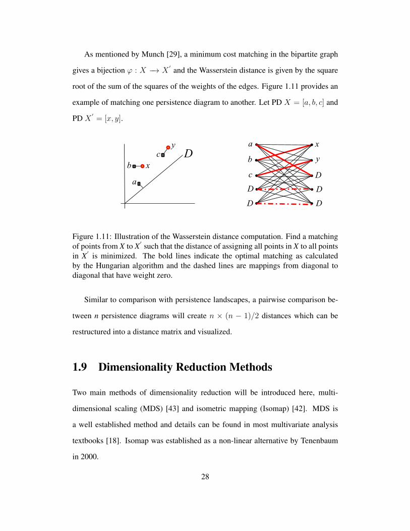
As mentioned by Munch [29], a minimum cost matching in the bipartite graph
gives a bijection ϕ : X −→ X′ and the Wasserstein distance is given by the square
root of the sum of the squares of the weights of the edges. Figure 1.11 provides an
example of matching one persistence diagram to another. Let PD X = [a, b, c] and
PD X′= [x, y].
D
a
b
c
x
y a
b
c
x
y
D
D
D
D
D
Figure 1.11: Illustration of the Wasserstein distance computation. Find a matchingof points from X to X
′ such that the distance of assigning all points in X to all pointsin X
′ is minimized. The bold lines indicate the optimal matching as calculatedby the Hungarian algorithm and the dashed lines are mappings from diagonal todiagonal that have weight zero.
Similar to comparison with persistence landscapes, a pairwise comparison be-
tween n persistence diagrams will create n × (n − 1)/2 distances which can be
restructured into a distance matrix and visualized.
1.9 Dimensionality Reduction Methods
Two main methods of dimensionality reduction will be introduced here, multi-
dimensional scaling (MDS) [43] and isometric mapping (Isomap) [42]. MDS is
a well established method and details can be found in most multivariate analysis
textbooks [18]. Isomap was established as a non-linear alternative by Tenenbaum
in 2000.
28

The problem of MDS can be set up as follows. For a set of pairwise distances
between n items, find a representation of the items in low dimensions such that
the new distances match the original ones as much as possible. The order of the
distances is compared in data from the original dimension to data in the lower di-
mension. However, these orderings are often not correct after embedding data in
a lower dimension. Hence scaling techniques attempt to find configurations in q
dimensions, where q < n(n− 1)/2, such that the match is as close as possible. The
measure of this closeness is known as the stress.
As mentioned earlier if there are n items then there will be m = n(n − 1)/2
pairwise distances. Assuming no ties, the similarities can be arranged in ascending
order:
s1 < s2 < · · · < sm (1.19)
Here the first item corresponds to the smallest pairwise distance, the second
item the second smallest and so on. We want to find a q-dimensional representation
of the n items such that the order of the pairwise distances between any two points
i and k matches the ordering above, only in reverse. A perfect match occurs when:
dq1 > dq2 > · · · > dqm (1.20)
So here the d1 refers to the inverse of the similarity s1. Note that in the perfect
case the order of the similarities and distances is the same in q dimensions as it
was in the original dimension. The stress measures how close the distances in the
current dimension match the original distances and is given by:
29
Stress(q) =
∑mi=1(d
qi − d
qi )
2∑mi=1[d
qi ]2
1/2
(1.21)
Where dqi are numbers known to satisfy equation (1.20). The idea is to find a
representation of items in q-dimensions such that the stress is as small as possible.
Once the items are located in q dimensions, their n × 1 vectors of coordinates
can be treated as multivariate observations. If q is set to two or three, then this will
allow for a visualization of the information represented in the distance matrix. For
more details the book by Johnson and Wichern is good source of information [18].
a
b
a
b
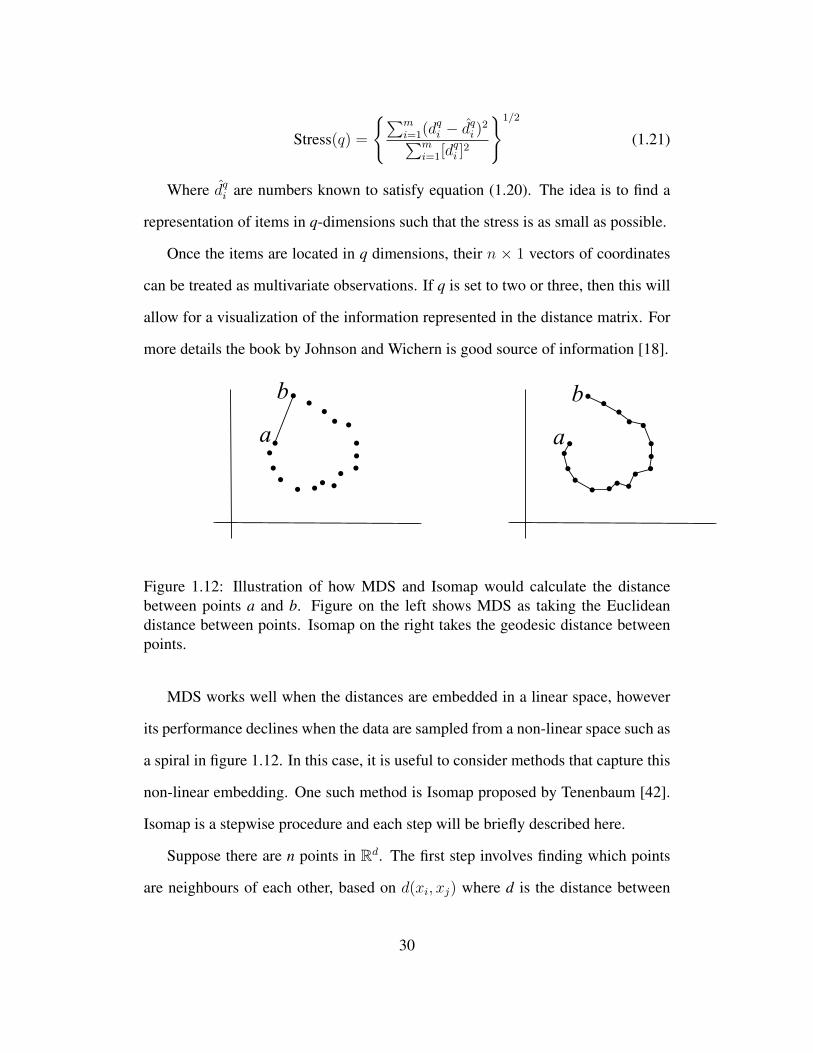
Figure 1.12: Illustration of how MDS and Isomap would calculate the distancebetween points a and b. Figure on the left shows MDS as taking the Euclideandistance between points. Isomap on the right takes the geodesic distance betweenpoints.
MDS works well when the distances are embedded in a linear space, however
its performance declines when the data are sampled from a non-linear space such as
a spiral in figure 1.12. In this case, it is useful to consider methods that capture this
non-linear embedding. One such method is Isomap proposed by Tenenbaum [42].
Isomap is a stepwise procedure and each step will be briefly described here.
Suppose there are n points in Rd. The first step involves finding which points
are neighbours of each other, based on d(xi, xj) where d is the distance between
30

points xi and xj . Simply put, two points will be connected if they are less than a
certain distance apart. Two ways exist to check if two points are close, k-nearest
neighbour and epsilon method. The first method involves connecting two points
if they are within k of each others nearest neighbours, for k = 1, 2, . . . , n and the
second method involves connecting two points if the distance between them is less
than some ε. The connected points will create a graph G.
The second step will be to find the geodesic distances dG(xi, xj). Initially, set
dG(xi, xj) =
d(xi, xj) if xi, xj are connected by an edge
∞ otherwise(1.22)
For each value of k = 1, 2, . . . , n replace all entries by the minimum of dG(xi, xj)
and dG(xi, xk)+dG(xk, xj). If two points were previously unconnected by an edge,
this algorithm will ensure that a graph is formed, assuming the epsilon or number
of nearest neighbors is high enough. The matrix of final values DG will contain the
shortest path distances between all pairs of points in G.
The final step applies classical MDS as described previously to the matrix of
graph distances, DG = dG(xi, xj) for i, j = 1, 2, . . . , n. This will construct an
embedding of the data in a d-dimensional Euclidean space that best preserves the
original point cloud’s intrinsic geometry.
Given enough data, MDS is guaranteed to recover the true structure of linear
manifolds and Isomap is likewise guaranteed to recover the structure of non-linear
manifolds.
31

1.10 Hierarchical Clustering
The final technique that will be implemented in this study is the hierarchical clus-
tering algorithm. The technique that will be considered is agglomerative hierar-
chical clustering which starts with each object being in an individual cluster and
then merging objects as distance between them decreases. Hierarchical clustering
depends on the choice of linkage algorithm that is selected, and for this study single
linkage was used. Single linkage looks at the distance between the closest members
within clusters. Two other linkage types are complete linkage looks at the distance
between the furthest points in the clusters and average linkage, which looks at the
average.
The hierarchical clustering method is a stepwise procedure as well and more
details can be found in the book by Johnson and Wichern [18].
1. Start with n clusters each of which contains a single element and an n × n
distance matrix, D = d(xi, xj)
2. Find the nearest clusters based on the chosen linkage method and let the dis-
tance between the closest clusters be dC1,C2 , where C1 and C2 are the two
closest clusters.
3. Merge clusters C1 and C2 and label the new cluster as C1C2. Update the
distance matrix by:
deleting the rows and columns corresponding to clusters C1 and C2
adding a row and column giving the distances between cluster C1C2 and
the remaining clusters
4. Repeat steps 2 and 3 a total of n - 1 times. Record the elements in each cluster
and the distance at which they joined the specific clusters.
32

Using single linkage, the distance between the cluster C1C2 and another cluster
Cj will be given as:
d(C1C2)Cj= mindC1Cj
, dC2Cj (1.23)
Where dC1Cjand dC2Cj
are the distances between the nearest neighbours of
clusters C1 and Cj and clusters C2 and Cj respectively.
33

Chapter 2
Results
2.1 Introduction
In recent years there has been an advance in the field of persistent homology. Sim-
ply put, persistent homology measures the d-dimensional topological features of a
space at different values of a filtration. As a simple example, consider a point cloud
in a 2-dimensional space. Here, we say that the n points in the 2D space are born
at diameter zero. Create a ball with diameter ε around each point and gradually
increase it. At every increase of the diameter ε track which points become con-
nected. As two or more points become connected, some of the components die and
we are interested in tracking which components persist. In this context, die means a
merging of two or more components into one. This will be covered in more detail in
section 2 but this example serves to illustrate the basic point of persistent homology.
The interesting question that arises is how to keep track of the n × 2 matrices
of birth and death times that are created for each sample. This project will consider
three such measures, barcodes, persistence diagrams and persistence landscapes.
Barcodes and persistence diagrams were the first measures to be introduced, but
34

the statistical pace of progress was rather slow. This changed after the introduction
of persistence landscapes by Bubenik in 2012 . The persistence landscapes have
useful statistical properties which will be explained in more detail in section 2.3.3.
This study will be split up as follows; section 2.2 will discuss the Clostridium
difficile bacteria, current techniques to combat it and will explain the data used for
this analysis. Section 2.3 will discuss the methods that will be used for this analysis,
namely; Vietoris-Rips complex, persistence diagrams, barcodes, persistence land-
scapes, Wasserstein distances and isometric mapping (Isomap). Sections 2.4 and
2.5 will present the results of these methods applied to the data. Finally, section 2.6
will conclude and present the key findings.
2.2 Clostridium Difficile Infection
Clostridium difficile is a bacterium whose presence can lead to Clostridium difficile
(Cdiff ) infection. This is a common type of infectious diarrhea that is common in
Canadian hospitals [34]. It is commonly found amongst elderly patients in hospi-
tals and long-term care facilities. Its presence can increase the costs of treatment
four-fold hence the need to find an effective way to treat it [44]. The human body
contains millions of bacteria in the gut, most of which help to protect the body
from infection. However, the combination of age and certain medications can kill
some of the healthy bacteria [22]. Without enough healthy bacteria to protect the
host body, Cdiff infection can quickly get out of control. An aggressive strain of
Clostridium difficile has emerged that produces more toxins than other strains [35].
It is more resistant to treatments than other strains and has been responsible for
many outbreaks of Cdiff since 2000. Table (2.1) shows the infection rates that have
been occurring in Canada from 2007 to 2011, note that there has been an increase
35
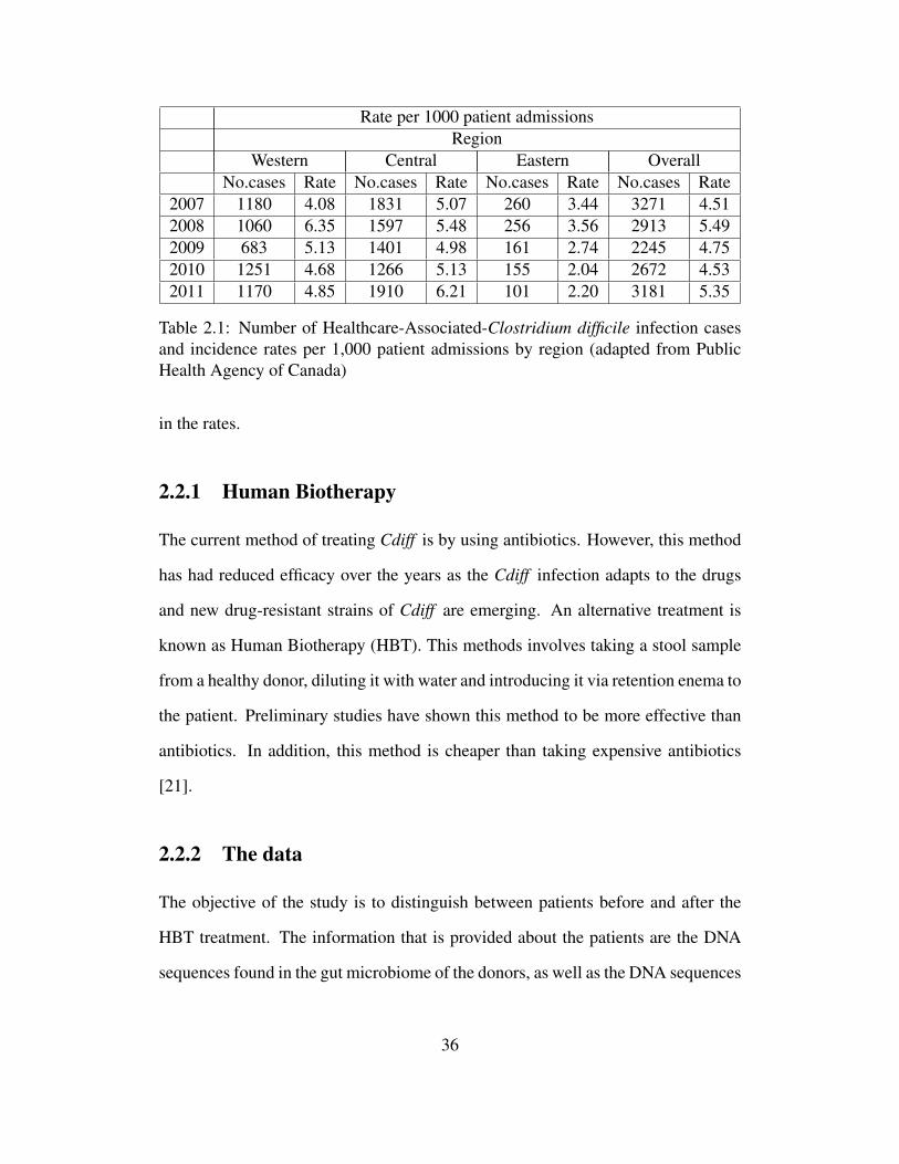
Rate per 1000 patient admissionsRegion
Western Central Eastern OverallNo.cases Rate No.cases Rate No.cases Rate No.cases Rate
2007 1180 4.08 1831 5.07 260 3.44 3271 4.512008 1060 6.35 1597 5.48 256 3.56 2913 5.492009 683 5.13 1401 4.98 161 2.74 2245 4.752010 1251 4.68 1266 5.13 155 2.04 2672 4.532011 1170 4.85 1910 6.21 101 2.20 3181 5.35
Table 2.1: Number of Healthcare-Associated-Clostridium difficile infection casesand incidence rates per 1,000 patient admissions by region (adapted from PublicHealth Agency of Canada)
in the rates.
2.2.1 Human Biotherapy
The current method of treating Cdiff is by using antibiotics. However, this method
has had reduced efficacy over the years as the Cdiff infection adapts to the drugs
and new drug-resistant strains of Cdiff are emerging. An alternative treatment is
known as Human Biotherapy (HBT). This methods involves taking a stool sample
from a healthy donor, diluting it with water and introducing it via retention enema to
the patient. Preliminary studies have shown this method to be more effective than
antibiotics. In addition, this method is cheaper than taking expensive antibiotics
[21].
2.2.2 The data
The objective of the study is to distinguish between patients before and after the
HBT treatment. The information that is provided about the patients are the DNA
sequences found in the gut microbiome of the donors, as well as the DNA sequences
36

found in the patients before and after the treatment. In total, there are 7 donor sam-
ples as well as a before and after measurement for each of the 19 patients, giving
a total of 45 samples (7+19+19). For each of the 45 samples, DNA is collected
and sequenced using Roche 454 DNA sequencing. Interested readers can refer to
http://www.454.com for details of the process. Pre-processing is done using
the software known as Mothur [37] and follows the Standard Operating Procedure
outlined by Pat Schloss and explained by Rush et al [36]. Tables (1.2) and (1.3)
provide some descriptive statistics about the total and unique number of DNA se-
quences found in the 45 samples. Note that it is impossible to ensure that we have
an approximately equal number of sequences in each sample [24].
Recall that distance is calculated as the number of mismatches divided by the
number of base pairs in the shorter sequence (refer to Chapter 1). Note that there
are other definitions of distance, but the definition provided is the one most com-
monly used. In addition, the results do not vary significantly. As can be seen from
the definition, this is not technically a distance, but a similarity index. The possible
values range from zero to one, zero meaning that the sequences are identical, and
one meaning that there are no common base pairs between the samples. Most of the
DNA sequences found in the samples appear several times, and hence the distance
between them will be zero as they are identical. For this reason, the unique se-
quences are taken because otherwise there will be several zero values for distance,
which will not aid in calculation but will only increase the memory required for
computations.
Table (1.3) provides descriptive statistics about the number of unique sequences
found in the samples. In that table, the smallest number of unique sequences is 147.
DNA sequencing does not provide exact results, hence as the number of sequences
in a sample increases, some mutations inevitably occur and these are recorded as
37

unique sequences [36]. In other words, as the total number of sequences increases,
the number of unique sequences is also inflated. For this reason, it is necessary to
subsample from the number of unique sequences. The smallest number of unique
sequences is 147, hence a weighted subsample of size 147 is taken from the number
of unique sequences. The pairwise distance between the 147 sequences is calculated
in each of the 45 samples. The pairwise distances are then converted into a 147 ×
147 distance matrix. Finally, the data that is used for the primary analysis is a col-
lection of 45 147 × 147 distance matrices. Several samples of size 147 × 147 will
be obtained to create a “bootstrap” sample whose goal will be to check for stability
of the results. Finally, the analysis will be repeated using all unique samples, which
isn’t technically correct from a biological viewpoint but is interesting from a statis-
tical standpoint. In addition to the DNA sequences, covariates such as gender, age,
medical history and others are available about the patients.
2.3 Methodology
2.3.1 Vietoris-Rips (VR) complex
Suppose there is a finite set of points S in d dimensions. The Vietoris-Rips complex
Vε(S) of S at filtration ε is given in equation (2.1).
Vε(S) = σ ⊆ S|d(u, v) ≤ ε,∀u 6= v ∈ σ (2.1)
Here, σ are the k-simplexes in Vε(S), u and v are two points in S, and d is the
Euclidean distance between those two points. Each of the simplices σ has vertices
that are pairwise within distance ε. The VR complex is computed up to a maximum
filtration value ε′ . The complex can then be extracted at any ε < ε′ [45]. The
38
evolution of the simplicial complexes over increasing values of ε can be tracked
using persistence diagrams and barcodes.
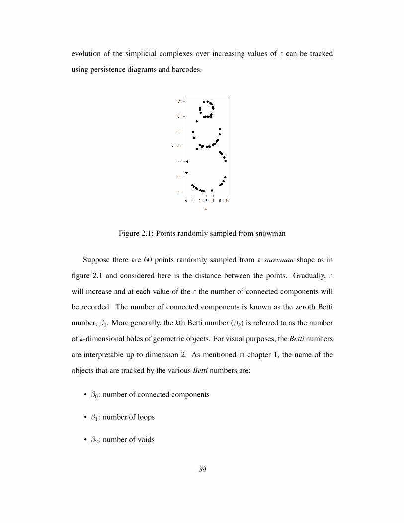
Figure 2.1: Points randomly sampled from snowman
Suppose there are 60 points randomly sampled from a snowman shape as in
figure 2.1 and considered here is the distance between the points. Gradually, ε
will increase and at each value of the ε the number of connected components will
be recorded. The number of connected components is known as the zeroth Betti
number, β0. More generally, the kth Betti number (βk) is referred to as the number
of k-dimensional holes of geometric objects. For visual purposes, the Betti numbers
are interpretable up to dimension 2. As mentioned in chapter 1, the name of the
objects that are tracked by the various Betti numbers are:
• β0: number of connected components
• β1: number of loops
• β2: number of voids
39

From figure 2.1 it can be seen that as the filtration increases, several points will
join together and eventually all the points are combined into one component. This
is an example of the Vietoris-Rips (VR) Complex. More formal definitions of the
VR complex can be found in the paper by Zomorodian [45].
2.3.2 Barcodes and Persistence Diagrams
Once the Vietoris-Rips complex is constructed, the question arises how to analyze
the m × 2 matrix of birth and death times of the various connected components?
One possible way is to use a barcode in each dimension. A barcode is a multiset of
intervals where the horizontal axis records the birth and death of the components
and the vertical axis shows the component number. A barcode can be generalized
to dimensions higher than zero. For dimension one the barcode plot tracks the birth
and death of the loops, for dimension two it tracks the birth and death of the voids.
Looking at figure 2.1 visual inspection suggests that there will be three persistent
loops. Referring to the snowman example, the dimension 0 and dimension 1 bar-
codes are presented in figure 2.2.
As can be seen, the left endpoints of the barcodes correspond to the birth of the
k-dimensional topological features and the right endpoint corresponds to the death
of those topological features. At filtration zero in dimension zero, all the points are
their own components. As the filtration increases, the points start to combine in
dimension zero and loops start to form in dimension one. The three bars that are in
the dimension one barcode correspond to the three loops in figure 2.1.
An alternative representation is known as a persistence diagram. Here, the hor-
izontal axis corresponds to the birth time of the k-dimensional topological features
and the vertical axis corresponds to the death of those topological features, with
40

(a) Dimension 0 (b) Dimension 1
Figure 2.2: Barcodes for snowman point cloud data (2.1) in dimensions zero andone. There is one persistent component, β0 = 1, and three persistent loops, thusβ1 = 3.
points on the diagonal line symbolizing trivial objects for which birth is equal to
death. Barcodes provide the same information as persistence diagrams and to illus-
trate this figure 2.3 shows the persistence diagrams generated for the snowman data
in dimensions zero and one.
Barcodes and persistence diagrams provide the same information and picking
one over the other is usually a matter of preference. Barcodes are slightly more
useful if two or more components have the same birth and death time, as these will
be represented separately, whereas on persistence diagram they will be shown as
one component.
2.3.3 Persistence Landscape
Statistical analysis using barcodes and persistence diagrams is limited because the
Frechet mean is not unique. Some advances have been in this area, but the pace
41

(a) Dimension 0 (b) Dimension 1
Figure 2.3: Persistence diagrams for snowman data (2.1) in dimensions zero andone. There is one persistent component, β0 = 1, and three persistent loops β1 = 3.
of progress was slow. For these purposes it is necessary to introduce Persistence
Landscapes [6]. They are constructed from either barcodes or persistence diagrams
but have the additional benefit of being useful for statistical analyses. The main
advantage of landscapes is that unlike barcodes and persistence diagrams they are
functions, and so the vector space structure of its underlying function space can be
used [6]. This function space is a separable Banach space and the theory of random
variables with values in such spaces can be applied. More specifically, continuous
random variables in a Banach space satisfy the Strong Law of Large Numbers and
Central Limit Theorem [6]. Hence t-tests and other statistical procedures such as
ANOVA can be used to analyze persistence landscapes.
Their construction is briefly explained with an example in figure 2.4.
Suppose we begin with the barcode plot in (a). Consider the intervals one at
a time. Each of the intervals in the barcode has a start and end time. These are
the birth and death times of each topological feature respectively. Define t as the
current filtration value. Start with t at the birth and gradually increase it up to the
42

1 2 3 4 5 6 7 8 9 1 2 3 4 5 6 7 8 9
1234
10 10
1 2 3 4 5 6 7 8 9
1234
10
1 2 3 4 5 6 7 8 9
1234
10
1 2 3 4 5 6 7 8 9
1234
10
λλ2
λ3
1
Figure 2.4: Example showing construction of Persistence Landscape from Barcode
death of the component. At each value of t calculate h = min(d− t, t− b)+, where
b and d represent the birth and death times respectively. Here “+” is used to avoid
negative values. Next, plot the values of h vs t. This creates an isosceles triangle
like in figure 2.4b, where the maximum height occurs at the midpoint between the
birth and the death time. Repeat the procedure for the other two horizontal bars as
in figure 2.4. Finally, the persistence landscape can be obtained as follows.
Suppose there are j intervals of birth death times, where bj and dj correspond to
the birth and death times of the jth interval respectively. The persistence landscape
of these j intervals represents a map λ : N× R→ R, where λ is shown in equation
(2.2)
λk(t) = kthlargest value ofhjnj=1 (2.2)
Where h is defined previously and is calculated for each of the j intervals and at
each filtration t; k is the maximum number of overlapping intervals.
In the examples provided, the topmost contour of the persistence landscape is
taken to be λ1, the second top contour is λ2 and so on until k.
43

As explained earlier, persistence landscapes have the advantage that statistical
analyses can be performed using them. One such test considers the area under the
persistence landscapes. Equation (2.3) gives the area under the persistence land-
scapes
X = fp(λ(k, t)) =
(∑k
∫R[λk(t)]pdt
)1/p
(2.3)
Here, p corresponds to the Lp space that is used, which is set to one for this
project. Here, setting p to one means that X is equal to the total area under the k
landscapes. In this formula, the k corresponds to the minimum maximum number
of overlapping intervals. For example, suppose there are three samples. Sample A
has 10 maximum overlapping landscapes, sample B has 3 maximum overlapping
landscapes and sample C has 7 maximum overlapping landscapes, then only the top
3 landscapes will be considered for the analysis.
H0 : µ1 = µ2
HA : µ1 6= µ2
(2.4)
Here µ1 and µ2 correspond to the average area under the k landscapes from pre
and post samples. For our data, a paired t-test is carried out to test that there is a
difference in the area under the top k persistence landscapes in dimensions zero and
one. It is carried out for dimension two but not with all the samples as not all of
them have any topological features in dimension two. In addition to a paired t-test,
a paired permutation test can be carried out if the number of samples is quite small.
The tests in equation (2.4) identify if there are any differences in the landscapes
between before and after HBT groups. If there are differences present, the next
44

goal is to see where these differences lie. Visualization will be done in terms of
DNA sequences and groups (pre, post and donor) by obtaining coordinates in low-
dimensional Euclidean space. To obtain embedded coordinates, two dimensionality
reduction methods will be applied; multidimensional scaling (MDS) and isometric
mapping (Isomap). For MDS and Isomap, distance is calculated using two methods:
• Distance based on PL similar to equation (2.3).
• Wasserstein distance between persistence diagrams for each dimension.
2.3.4 Measures of similarity
Firstly, we explain the distance based on PL.
Suppose there are two samples that have landscapes denoted as λk(t) and λ∗k(t).
Then distance can be measured by equation (2.5). This compares pairwise the area
under the top k contours between λ and λ′
||λ− λ′ ||p =
(∑k
∫R|λk(t)− λ′k(t)|p
)1/p
(2.5)
One of the drawbacks of distance measure based on equation (2.5) is that only
the top k landscapes are considered and the rest are discarded. This problem can be
overcome using Wasserstein distance which can be defined as follows.
Suppose there are two persistence diagrams X and Y. We are interested in finding
a mapping from X to Y such that the total distance between the points is minimized.
Firstly, consider a bijection ϕ : X −→ Y that maps all points from X to Y. Note that
the number of points in X and Y doesn’t have to be equal, any extra points can be
mapped to the diagonal where birth time is equal to death time.
More formally, the Wasserstein distance between PDs X and Y is given by:
45

Wp(X, Y ) = infϕ:X−→Y
(∑x∈X
(||x− ϕ(x)||)p)1/p
(2.6)
If there is a mismatch in the number of points between the two samples, then
the Wasserstein distance maps these points to the diagonal where birth is equal to
death in the persistence diagram [10].
2.3.5 Dimensionality Reduction Methods
In this section brief explanations of Multidimensional scaling (MDS) and Isometric
mapping (Isomap) are provided.
The main objective of MDS is to display the information contained in a distance
matrix. The algorithm reduces to the user specified number of dimensions while
attempting as best possible to preserve the distances between the points as specified
by the distance matrix.
Suppose there is a distance matrix D defined as follows:
D =
d1,1 d1,2 . . . d1,n
d2,1 d2,2 . . . d2,n...
......
dn,1 dn,2 . . . dn,n
(2.7)
The goal of MDS is to find n vectors such that ||xi − xj|| ≈ di,j for all i, j ∈ 1,
..., n. The vector norm taken here is the Euclidean distance, which is analogous to
classical MDS.
And alternative proposed by Tenenbaum is called Isomap. This is analogous
to MDS except that it is more accurate when the intrinsic structure of the data is
nonlinear [42].
46

As an example of such a nonlinear structure consider a Swiss roll. Classical
MDS would take the Euclidean distance between the points and project it to lower
Euclidean space. However, this misses the curl that is inherent in the Swiss roll.
Isomap procedure uses the following algorithm:
• Construct the neighborhood graph. For two points u and v, if they are closer
than ε or if u is one of the k nearest neighbors of v, connect the points and
calculate the distance between them, d(u, v).
• Compute the shortest paths. If (u, v) are linked by an edge then set d(u, v)
equal to the length of that edge. Otherwise, set it to infinity. Iteratively,
for each value of w = 1, 2, . . . , n update the distance between u and v as
mind(u, v), d(u,w)+d(w, v). The final distance matrix will contain the
shortest path from points u to v.
• Construct d-dimensional embedding. The final step involves performing MDS
on the distance matrix computed in the previous step.
Isomap is sensitive to the values of ε or k that are used in the first step. Setting
k equal to the number of points is analogous to the MDS procedure.
These two techniques allow for the visualization of the topological features. The
one-dimensional topological features (loops) can be found by visual inspection or
more formally they can be found using the software Shortloop [8]. Shortloop takes
as input a point cloud in 3 dimensions and for a user specified filtration will find all
the loops that exist in the point cloud.
2.4 Results on individual DNA sequences
This section presents the results of analysis on individual DNA samples.
47

2.4.1 147 unique sequences
The first procedure carried out is the most computationally intensive one; the com-
putation of the Vietoris-Rips complex. This is carried out using the phom package
in R [40] on the Westgrid computer network. When calculating the VR complex,
the values specified by the user are the maximum dimension to use and the max-
imum filtration. These values must be increased with care since this will greatly
increase the computational time. For this project, the maximum ε was set to 1.
Since the maximum distance between any two points is one, there will not be any
new topological features created at values higher than this. The maximum dimen-
sion was set to two. A trial run was made up to dimension three but no topological
features were detected at this dimension.
All 45 samples had persistent homology in dimensions zero and one. However
in dimension two, only 12 of the pre samples and 15 of the post samples have
persistent homology.
2.4.2 Barcode and persistence diagrams
Once the VR complex is calculated, it can be visualized using barcodes and persis-
tence diagrams. All 45 samples had persistent homology up to at least dimension
one, hence there are at least 90 barcode diagrams and persistence landscapes. Hence
only the diagrams that have multiple features will be presented here, the remainder
can be found in the Appendix. Figure 2.5 shows a selection of barcodes for patient
9. Figure 2.6 shows the corresponding persistence diagrams.
At first glance there does not appear to be anything interesting but there are some
general trends. Firstly, note that the dimension zero barcode for the ‘pre’ samples
have components that die a lot sooner than in the ‘post’ samples. Secondly, many
48

(a) pre09, dim0 (b) pos09, dim0 (c) pre09, dim1 (d) pos09, dim1
Figure 2.5: Barcode for patient 9 before and after treatment in dimensions zero andone
(a) dimension zero (b) dimension one
Figure 2.6: Persistence diagrams for patient 9 before and after treatment in dimen-sions zero and one. Note that the triangles have birth at time zero but are movedslightly for visual purposes
49

of the intervals in dimension one are very short, hence it is possible that these may
be noise and not true topological features. However, the birth and death times of
these loops are smaller for the pre samples than for the post samples, which may
indicate that there is a true difference in the topological structure in dimension one
between the two groups.
Persistence diagrams allow plotting of several points on the same diagram,
which makes pairwise comparisons easier. Here the pre and post components are
plotted on the same graphs. Note that persistence diagrams can be difficult to read
for dimension zero where all the intervals start at zero, and hence all the components
appear in one vertical line.
2.4.3 Persistence Landscapes
As mentioned earlier, statistical analysis using barcodes and persistence diagrams
is limited. This is because these descriptors are not functions, and so properties
of the underlying function space cannot be used. Some work in this area has been
done by researchers [16] [11] [27]. Persistence Landscapes have the advantage
that traditional tests such as t-tests and ANOVA can be carried out using them [6].
Figure 2.7 shows the persistence landscapes for patient 9, in dimensions zero and
one.
(a) pre09, dim0 (b) pos09, dim0 (c) pre09, dim1 (d) pos09, dim1
Figure 2.7: Persistence landscape for patient 9 before and after treatment in dimen-sions zero and one
50

t-test permutation testdim 0 0.00636 0.0048dim 1 0.00831 0.0076dim 2 0.2591 0.3477
Table 2.2: t-test and permutation test results comparing treatment effects
From the landscapes, the post samples have slightly longer intervals than the
pre in dimension one.
2.4.4 Comparison of area under PLs
As mentioned earlier, the area under the persistence landscapes can be compared
using equation (2.3). The hypotheses to be tested are in equation (2.4). Note that
k has to be the same for all samples. For testing the hypothesis in dimension zero,
each sample has 147 overlapping persistence landscapes, hence k is set to 147. For
dimension one, one of the samples only has one persistence landscape, hence only
the areas under the top landscape can be compared. This is a drawback of the
persistence landscape method. The results of the paired t-test and permutation test
are presented in table (2.2).
(a) pre, dim0 (b) post, dim0 (c) pre, dim1 (d) post, dim1
Figure 2.8: Average persistence landscape for pre and post patients in dimensionszero and one. In dimension zero the post group has a denser grouping of contours,which means that there are more clusters than in the pre samples. In dimension onethe pre group has three persistent loops on average and the post sample has two.However, the post sample loops are more persistent than the pre samples.
51

Table (2.2) shows that there is a difference in the total area under the 147 land-
scapes in dimension zero and under the topmost landscape in dimension one. There
is no difference under the topmost landscape between pre and post samples in di-
mension two. Note that for dimension two only 11 of the 19 patients had persistent
homology up to dimension two for both pre and post samples. The average per-
sistence landscape is presented in figure 2.8. This shows the average of each of
the kth contours for k = 1, 2, ...,maxOI, where maxOI is the maximum number of
overlapping intervals, which is 147 in dimension zero and 9 in dimension one. This
is shown in equation 2.8.
λk =1
n
n∑i=1
λik (2.8)
Here λik refers to the kth contour of sample i. The difference in area under the
landscapes can also be interpreted in another way. A small p-value means that there
is a difference in the average area under the top k landscapes between the pre and
post samples. This means that the either the length of the topological features is
different, or there is a difference in the number of features. One of the objectives of
the next section will be to identify where these differences are.
To visualize where the topological features are, it is necessary to project to
lower dimensional Euclidean space by applying Isomap or MDS. Isomap was used
to embed the data in 3 dimensions. MDS was also attempted but the results are
similar so Isomap results will be used throughout. Once the data are reduced to a
coordinate system they can be plotted in a 3D scatterplot. This is done in figure 2.10
for patient 9 before and after the HBT treatment. The Javaplex library created in
MATLAB [2] is then used to identify which 1-simplices make up the longest loops
on the original distance matrices. Once these are available, they can be visualized
52

on the 3D scatterplot.
(a) pre09 (b) pos09
Figure 2.9: Scree plots showing residual variance of dimension reduction usingIsomap
Some distortion is expected since the scree plots in figure 2.9 show that there is
high residual variance in three dimensions. The loops obtained from the distance
matrix are projected onto 3 dimensions via Isomap. The projection using MDS is
presented in the appendix. The 2 most persistent loops in pre 09 have 6 vertices
each, and the only persistent loop in post 09 has 8 vertices which are marked (see
figure 2.10). Figure 2.24 in section 2.5.3 shows the 2 most persistent loops for
donor 2 and patient 18. It can be seen that the most persistent loops are generally
close to each other and in some cases share an edge. The appendix contains the
loops found in the remaining patients projected onto 3D using Isomap.
In addition to the DNA sequence data, other covariates from the data are avail-
able. Variables selected include age, sex, success of treatment, the use of various
medication (metronizadole, vancomycin, antibiotics), resistance to said medication,
abdominal pain and whether or not the patient had a fever. ANOVA and ANCOVA
can be performed using the area under the landscapes as the dependent variable. No
noteworthy results were discovered hence these sections are not included.
53
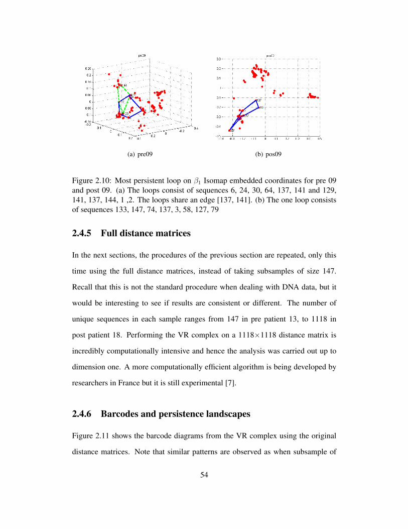
(a) pre09 (b) pos09
Figure 2.10: Most persistent loop on β1 Isomap embedded coordinates for pre 09and post 09. (a) The loops consist of sequences 6, 24, 30, 64, 137, 141 and 129,141, 137, 144, 1 ,2. The loops share an edge [137, 141]. (b) The one loop consistsof sequences 133, 147, 74, 137, 3, 58, 127, 79
2.4.5 Full distance matrices
In the next sections, the procedures of the previous section are repeated, only this
time using the full distance matrices, instead of taking subsamples of size 147.
Recall that this is not the standard procedure when dealing with DNA data, but it
would be interesting to see if results are consistent or different. The number of
unique sequences in each sample ranges from 147 in pre patient 13, to 1118 in
post patient 18. Performing the VR complex on a 1118×1118 distance matrix is
incredibly computationally intensive and hence the analysis was carried out up to
dimension one. A more computationally efficient algorithm is being developed by
researchers in France but it is still experimental [7].
2.4.6 Barcodes and persistence landscapes
Figure 2.11 shows the barcode diagrams from the VR complex using the original
distance matrices. Note that similar patterns are observed as when subsample of
54

size 147 was used. These plots are similar to the plots obtained using a subsample
of size 147. Since more points are used, there are more bars in the barcode. Since
persistence diagrams show the same information as barcodes, they are not included
here.
(a) pre01, dim0 (b) pos19, dim0 (c) pre09, dim1 (d) pos19, dim1
Figure 2.11: Barcode for patient 9 before and after treatment in dimensions zeroand one, using all unique sequences
Figure 2.12 illustrates the corresponding persistence landscapes.
(a) pre01, dim0 (b) pos19, dim0 (c) pre09, dim1 (d) pos19, dim1
Figure 2.12: Persistence Landscapes for patient 9 before and after treatment indimensions zero and one, using all unique sequences
Using paired t-test and permutation test to compare the average area under the
landscapes, table (2.3) shows that there are differences between pre and post sam-
ples for both dimensions zero and one.
55

t-test permutation testdim 0 0.0044 0.0042dim 1 0.0136 0.0102
Table 2.3: t-test and permutation test p-values comparing area under persistencelandscapes using all sequences
2.4.7 Isomap on original distance matrices
Like with the 147 unique sequences, the original distance matrices can also be
embedded in 3 dimensions to see where the differences reported in table (2.3) lie.
Figure 2.13 shows the 3D scatterplot for patient 9 before and after treatment using
all unique sequences. The filled in points represent those that were selected as a
subsample of size 147 used in the original analysis. It can be seen that the spread
of the points is roughly evenly spread out throughout the point cloud, symbolizing
that it is possible that the analysis with a subsample of 147 unique sequences has
similar results to that when using all the samples.
(a) pre09 (b) pos09
Figure 2.13: Scatterplots for patient 9 showing points that were selected in thesubsample of size 147 as well as the remaining points
In figure 2.14 it can be seen that when using subsamples of size 147 and when
using all sequences the post sample has three visually separable clusters, whereas
for the pre sample there appears to be a more even spread and the clusters aren’t
56

(a) pre09 147 (b) pre09 all (c) pos09 147 (d) pos09 all
Figure 2.14: Scatterplots for patient 9 showing the Isomap embedded coordinatesfor pre and post samples for both subsamples of size 147 and all sequences.
easily visible. Generally, the post samples has more clusters than the pre sample
and these are more clearly visible.
2.5 Results of comparing patients with donors
In this section, the pairwise distance between persistence landscapes and the Wasser-
stein distance between persistence diagrams is calculated for the three groups (donor,
pre, post)
2.5.1 Pairwise comparison between landscapes
The objective here is to find a pairwise difference between the persistence land-
scapes and visualize it using Isomap embedded coordinates. Using equation 3, this
will create 45 combination 2 comparisons between the samples, which can be ar-
ranged into a 45×45 distance matrix. Next, Isomap is performed to embed the data
into 3-dimensions to allow for visualization. Figure 2.15 shows the scree plots for
dimensions zero and one.
The residual variance for dimension zero is much lower than for dimension one,
which means that the results of this section are more reliable for dimension zero
than dimension one. Figure 2.16 shows the 3D embedded coordinates as calculated
57

(a) dimension 0 (b) dimension 1
Figure 2.15: Scree plots showing residual variance from embedding system in lowerdimension using Isomap
by Isomap of the pairwise distance between the samples, separated by a selection
of covariates.
Looking at the dimension zero plots (figure 2.16a-c), what stands out from the
above plots is that the donors form a cluster on the right side of the graph, and the
majority of the pre samples are on the left side of the graph. The post samples are
roughly in between the donors and the pre samples. This is to be expected since the
post samples contain sequences from both the pre group and the donors. Generally,
the females are closer to the donors than the males.
One of the objectives of the study was to see if we can predict which donors
are used for which patient. One way to do this will be to look at the plot and see
which donors are closest to the post samples. Figure 2.18 shows the 3D plots in
dimensions zero and one. From this plot, the distance between the points can be
measured and the donor closest to each of the post samples will be taken as the
predicted donor for that patient. However, this is based on the 3D scatterplots that
were reduced from the original unknown dimensions using Isomap.
More reliable predictions that use the original 45×45 distance matrices between
samples can be done using hierarchical clustering. [31]. This was carried out using
58

(a) dim 0, by sex (b) dim 0, by success
(c) dim 0, by anti-biotic use (d) dim 1, by sex
(e) dim 1,by success (f) dim 1, by anti-biotic use
Figure 2.16: Pairwise differences between persistence landscapes embedded in 3Dusing Isomap. In dimension zero a pattern of separation by gender is observed, butno pattern when separating by success/failure of treatment and use of anti-biotics.No patterns are visible in dimension one.
59

predicted recipientsdonor PL dim 0 PL dim 1
1 19 82 1 8 9 10 11 12 14 15 16 17 18 3 11 12 13 10 43 74 4 7 16 195 2 3 5 6 1 26 57 13 6 15 17 14 18
unknown
Table 2.4: Predicted recipients for each donor using pairwise comparsions betweenPLs in dimensions zero and one
the single linkage algorithm. Dendrograms in figure 2.17 were created using the
subsamples of size 147 only since the results were similar to those obtained when
using all the sequences. The corresponding prediction are in table 2.4. From the
plots it appears that donor 2 was used for most of the patients.
(a) dim 0 (b) dim 1
Figure 2.17: Single linkage hierarchical clustering carried out on distance matrixbetween samples computed by pairwise distance between PLs
2.5.2 Pairwise comparison using Wasserstein distance
This section is similar to the previous one, only instead of looking at the pairwise
distance between persistence landscapes, the pairwise distance between persistence
60

(a) dimension 0 (b) dimension 1
Figure 2.18: Pairwise differences between persistence landscapes embedded in 3Dusing Isomap. In dimension zero most of the pre points are on one side, and donorsare on the opposite side with the post samples being in the middle. In dimensionone difference are difficult to see as many of the pre and post samples are closetogether. The donors are generally spread out from the pre and post samples.
diagrams is calculated using Wasserstein distance. Once the pairwise distances are
found, they are formed into a 45 × 45 distance matrix and the Isomap procedure
is repeated to embded the coordinates in 3 dimensions. Recall that Wasserstein
distance uses all points in a persistence diagram, and not the top k as in persistence
landscapes.
The Wasserstein distance results are similar to those obtained using persistance
landscapes, with donors clustered together on one side, pre on the other side and
post in the middle for dimension zero. For dimension one the pre are all clustered
tightly and the donors are spread out. The post samples are again somewhere be-
tween the two.
Figure 2.21 shows embedding in 3 dimensions and figure 2.22 shows the den-
drogram from the hierarchical clustering algorithm performed on Wasserstein dis-
tances between samples with table 2.5 showing the corresponding predictions. As
61

(a) dimension 0 (b) dimension 1
Figure 2.19: Scree plots showing residual variance from reducing dimensionalityof Wasserstein distances using Isomap
predicted recipientsdonor wasser dim 0 wasser dim 1
1 19 1 7 8 162 2 4 5 6 9 12 14 11 15 17 18 19 3 4 5 6 9 10 14 15 16 17 183 54 7 105 8 16 1 97 13 16 3 7 11 12 13
unknown
Table 2.5: Predicted recipients for each donor using Wasserstein distance in dimen-sions zero and one)
with the pairwise distance between PLs, donor 2 seems to be the one that was used
for most of the patients.
A comparison using total number of unique sequences presented similar results
and is not included here.
62

(a) dim 0, by sex (b) dim 0, by success
(c) dim 0, by anti-biotic use (d) dim 1, by sex
(e) dim 1, by success (f) dim 1, by anti-biotic use
Figure 2.20: Pairwise differences calculated using Wasserstein distance embeddedin 3D using Isomap
63

(a) dimension 0 (b) dimension 1
Figure 2.21: Pairwise differences calculated using Wasserstein distance embeddedin 3D using Isomap. Similar to pairwise difference between PLs, a visual separationcan be made between males and females but not by success/failure of treatmentand antibiotic use. In dimension one the scatterplot is more spread out than whenlooking at the pairwise difference between PLs, and there is a pattern that patientsfor whom the treatment failed are further away from the donors than those for whomit was successful.
(a) dimension 0 (b) dimension 1
Figure 2.22: Single linkage hierarchical clustering carried out on distance matrixbetween samples computed by Wasserstein distance
64

2.5.3 Comparing donors and HBT treatments in terms of DNA
sequences
From the dendrograms patients were identified that formed close clusters with donors.
For example donor 4 formed a cluster early with patient 7 and donor 2 formed a
cluster with patient 18. This section aims to compare the topological features be-
tween donors and patients that were identified as being extremely close. Figure
2.23 shows the 3D embedded coordinates for donor 4 and patient 7 and figure 2.24
shows the coordinates for donor 2 and patient 18. From the figures it can be seen
that donor 4 and patient 7 have a similar spread among the sequences and there are
2 distinct clusters. Donor 2 and patient 18 also have similar structures. The donors
generally have a wider spread, which would indicate more diverse DNA sequences
in those samples and a healthier gut microbiome.
(a) Donor 4 (b) Post 7
Figure 2.23: Donor 4 and post patient 7 3D embedded coordinates. Both sampleshave roughly the same number of clusters and spread of the data. These points arecompared since they are close in the dendrogram in figure 2.17
65

(a) Donor 2 (b) Patient 18
Figure 2.24: Most persistent loop on β1 Isomap embedded coordinates for don 02and post 18. (a) the loops are formed by sequences 23, 134, 15, 20, 142, 3, 127 and80, 140, 23, 123, 9, 20, 3 (b) loops formed by sequences 43, 57, 16, 69, 120, 4, 140,10 and 7, 113, 32, 106, 46, 13
run 1 2 3 4 5dim 0 4.1251 3.6772 3.5232 2.9521 3.9822dim 1 4.0053 3.5229 4.1089 4.4156 3.9682run 6 7 8 9 10
dim 0 3.7510 4.2129 2.8364 3.0825 3.1984dim 1 3.4161 3.3107 3.1180 3.3080 2.8657
Table 2.6: Values of test statistic from different samples of size 147×147. Thecritical value is T18,0.025 = 2.101
2.5.4 Bootstrap
While not a bootstrap in the traditional sense, the objective of this section is to check
that the results using different subsamples of size 147 are consistent. One way to
measure this is to look at the the value of the test statistic calculated in equation 2.3
and check that the values obtained are consistent. In 10 different subsamples of size
147, there was a significant difference in the area under the PLs in dimensions zero
and one.
The results of this experiment from 10 runs are in table (2.6).
66

2.6 Conclusion
DNA sequence data was analyzed using three summary statistics of persistent ho-
mology; namely, barcodes, persistence diagrams and persistence landscapes. The
main objective was to see if there are any differences in the topological structure of
DNA sequences in the gut microbiome of patients before and after HBT treatment.
From visual inspection of barcodes and persistence diagrams it was seen that
the components in dimensions zero and one died sooner in the pre samples than in
the post samples. Persistence landscapes were able to present this difference more
formally, showing that there is a difference in the average area under the persistence
landscapes for pre and post samples. Alternative interpretation of this was that their
was a difference in the number and size of clusters in dimension zero, and the
number and amount of loops in dimension one. The pre samples had more clusters
than the post samples, whereas there was no visually obvious difference in the size
of the loops, but the loops were longer for the post samples.
Using information about the covariates, in the form of an ANCOVA test did not
yield any significant results.
Pairwise distances between both landscapes and persistence diagrams via Wasser-
stein distance were calculated. The results showed that donors samples and pre
samples were clearly separated with the post samples generally in between the two.
Information regarding covariates shows that there is a split by gender, and success
status of the procedure to a lesser degree. One of the secondary objectives was to
see if predictions can be made of which donors were used for which patients. The
predictions were not very reliable, and suggest that most of the patients received a
sample from donor 2.
Similar results were obtained when repeating the analysis with the full distance
67

matrices. This is not surprising since the sampling done was weighted, and as a
result the most common sequences are selected more often than the rare ones. This
also explains the stability of the test statistic as different samples of size 147 are
taken.
For future work, it may be interesting to explore dimensions higher than 2. At
the moment computational resources are the bottleneck but the technology is rapidly
developing. Additionally, interest is developing in using covariates in topological
data analysis directly, and not simply as descriptive statistics.
Finally, one of the major drawbacks of this analysis is that information about
individual sequences is lost. This project looked at the topological structure created
by the sequences but no details were provided about the individual sequences. As
the biological technology and methods improve it may be interesting to incorporate
this information.
68

Bibliography
[1] H. Abdi, D. Valentin, and B. Edelman. DISTASIS: The analysis of multipledistance matricess. In Proceedings of the IEEE Computer Society: Interna-tional Conference on Computer Vision and Pattern Recognition, pages 42–47,2005.
[2] H. Adams and A. Tausz. Javaplex: A toolbox for persistent homology, 2011.
[3] F. Backhed, C. Fraser, Y. Ringel, M. Sanders, R. Sartor, P. Sherman, J. Versa-lovic, V. Young, and B. Finlay. Defning a Healthy Human Gut Microbiome:Current Concepts, Future Directions, and Clinical Applications. Cell HostMicrobe, 12(5):611–622, 2012.
[4] J. Bartlett, T. Chang, M. Gurwith, S. Gorbach, and A. Onderdonk. Antibioticassociated pseudomembranous colitis due to toxin-producing clostridia. NewEngland Journal of Medicine, 298:531–534, 1978.
[5] B. Birnbaum. Antimicrobial resistance: A deadly burden no country can af-ford to ignore. Canada Communicable Disease Report, 29(18), 2003.
[6] P. Bubenik. Statistical topological data analysis using persistence landscapes.arXiv:1207.6437, 2012.
[7] F. Chazal, B. Fasy, F. Lecci, A. Rinaldo, and L. Wasserman. Subsamplingmethods for persistent homology. arXiv:1406.1901, 2014.
[8] T. Dey, J. Sun, and Y. Wang. Approximating loops in a short homology basisfrom point data. ACM 26th Annual Symposium on Computational Geometry,pages 166–175, 2010.
[9] H. Edelsbrunner and J. Harer. Persistent Homology - a survey. ContemporaryMathematics, 2008.
[10] H. Edelsbrunner and J. Harer. Computational Topology, an Introduction.American Mathematical Society, 2010.
69

[11] B. Fasy, F. Lecci, A. Rinaldo, L. Wasserman, S. Balakrishnan, and A. Singh.Statistical Inference For Persistent Homology: Confidence Sets For Persis-tence Diagrams. arXiv:1303.7117, 2013.
[12] R. Ghrist. Barcodes: The persistent topology of data. 2014.
[13] E. Gough, H. Shaikh, and A. Manges. A systematic review of Intestinal Micro-biota Transplantation (Fecal Bacteriotherapy) for recurrent Clostridium Diffi-cile infection. Clinical Infectious Diseases, 53:994–1002, 2011.
[14] R. Harris, T. Wang, C. Coarfa, R. Nagarajan, C. Hong, S. Downey, B. John-son, S. Fouse, A. Delaney, Y. Zhao, A. Olshen, T. Ballinger, X. Zhou, K. Fors-berg, J. Gu, L. Echipare, H. O’Geen, R. Lister, Pelizzola, Y. Xi, C. Epstein,B. Bernstein, R. Hawkins, B. Ren, W. Chung, H. Gu, C. Bock, A. Gnirkle,M. Zhang, D. Haussler, J. Ecker, W. Li, P. Farnham, R. Waterland, A. Meiss-ner, M. Marra, M. Hirst, A. Milosavljevic, and J. Costello. Comparison ofsequencing-based methods to profile DNA methylation and identification ofmonoallelic epigenetic modifications. Nature, 28:1097–1105, 2010.
[15] G. Heo. Topological and Statistical Data Analysis. Notes for Math 600 course,Summer 2013, 2013.
[16] G. Heo, J. Gamble, and P. Kim. Topological analysis of variance and themaxillary complex. Journal of the American Statistical Association, 107:477–492, 2012.
[17] M. Hopkins and G. MacFarlane. Changes in predominant bacterial popula-tions in human faeces with age and with Clostridium difficile infection. Jour-nal of Medical Microbiology, 51(5):448–454, 2002.
[18] R. Johnson and D. Wichern. Applied Multivariate Statistical Anaysis. PearsonPrentice Hall, 2007.
[19] S. Johnson and D. Gerding. Clostridium Difficile associated diarrhea. ClinicalInfectious Diseases, 26:1027–1036, 1998.
[20] S. Johnson, D. Gerding, M. Olson, M. Weiler, R. Hughes, C. Clabots, andL. Peterson. Prospective, concontrol study of vinyl glove use to inter-rupt Clostridium Difficile nosocomial transmission. American Journal ofMedicine, 88(2):137–140, 1990.
[21] Z. Kassam, C. Lee, Y. Yuan, and R. Hunt. Fecal Microbiota Transplantationfor Clostridium Difficile Infection: Systematic Review and Meta-Analysis.The American Journal of Gastroenterology, 108:500–508, 2013.
70

[22] S. Khanna and D. Pardi. Clostridium difficile infection: new insights intomanagement. Mayo Clinic Proceedings, 87:1106, 2012.
[23] P. Legendre and M. Fortin. Comparison of the Mantel test and alternative ap-proaches for detecting complex multivariate relationships in the spatial analy-sis of genetic data. Molecular Ecology, 10(5):831–844, 2010.
[24] H. Li, J. Ruan, and R. Durbin. Mapping short DNA sequencing reads andcalling variants using mapping quality scores. Genome Research, 18:1851–1858, 2008.
[25] T. Louie, M. Miller, K. Mullane, K. Weiss, A. Lentnek, and Y. Golan. Fidax-omicin versus Vancomycin for Clostridium difficile Infection. New EnglandJournal of Medicine, 364(5):422–431, 2011.
[26] N. Mantel. The detection of disease clustering and a generalized regressionapproach. Cancer Research, 27(2):209–220, 1967.
[27] Y. Mileyko, S. Mukherjee, and J. Harer. Probability measures on the space ofpersistence diagrams. Inverse Problems, 27:1–22, 2011.
[28] M. Miller, D. Gravel, M. Mulvey, G. Taylor, D. Boyd, A. Simon, M. Gardam,A. McGeer, J. Hutchinson, D. Moore, and S. Kelly. Health Care AssociatedClostridium Difficile Infection in Canada: Patient Age and Infecting StrainType are Highly Predictive of Severe Outcome and Mortallity. Clinical Infec-tious Diseases, 50:194–201, 2010.
[29] E. Munch. Applications of Persistent Homology to Time Varying Systems.PhD thesis, Duke University, Department of Mathematics, 2013.
[30] J. Munkres. Algorithms for the Assignment and Transportation Problems.Journal of the Society for Industrial and Applied Mathematics, 5(1):32–38,1957.
[31] F. Murtagh and P. Contreras. Methods of hierarchical clustering.arXiv:11050121, 2011.
[32] P. H. A. of Canada. Fact Sheet - Clostridium difficile. http://www.phac-aspc.gc.ca/id-mi/cdiff-eng.php, 2014.
[33] J. Pepin. Vancomycin for the treatment of Clostridium difficile infection: Forwhom is this expensive bullet really magic? Clinical Infectious Diseases,59(3):1493–1498, 2014.
[34] S. Poutanen and A. Simon. Clostridium difficile- associated diarrhea in adults.Canadian Medical Association Journal, 171:51–58, 2004.
71
[35] T. Rebmann and R. Carrico. Preventing Clostridium difficile infections: an ex-ecutive summary of the Association for Professionals in Infection Control andEpidemiology’s elimination guide. American Journal of Infection Control,39:239–42, 2011.
[36] S. Rush, S. Pinder, M. Costa, and P. Kim. A microbilogy primer for pyrose-quencing. Quantitative Bio-Science, 31:53–81, 2012.
[37] P. Schloss, S. Westcott, T. Ryabin, J. Hall, M. Hartmann, E. Hollis-ter, R. Lesniewski, B. Oakley, D. Parks, C. Robinson, J. Sahl, B. Stres,G. Thallinger, D. Van Horn, and C. Weber. Introducing mothur: Open-Source,Platform-Independent, Community-Supported Software for Describing andComparing Microbial Communities. Applied and Environmental Microbiol-ogy, 75:7537–7541, 2009.
[38] M. Sogin, H. Morrison, J. Huber, D. Welch, S. Huse, P. Neal, J. Arrieta, andG. Herndl. Microbial diversity in the deep sea and the underexplored rarebiosphere. Proceedings of the National Academy of Sciences of the UnitedStates of America, 103:12115–12120, 2006.
[39] T. Stinear, D. Olden, P. Johnson, J. Davies, and M. Grayson. Enterococ-cal vanB resistance locus in anaerobic bacteria in human faeces. Lancet,357(9259):855–856, 2001.
[40] A. Tausz. phom: persistent homology in R, version 1.0.3. Available at CRANhttp://cran.r-project.org., 2011.
[41] F. Tedesco, R. Markham, M. Gurwith, D. Christie, and J. Bartlett. Oral van-comycin for antibiotic-associated pseudomembranous colitis. Lancet, 2:226–228, 1978.
[42] J. Tenenbaum, V. de Silva, and J. Langford. Isomap: A global geometricframework for nonlinear dimensionality reduction. Science, 290:2319–2323,2000.
[43] W. Torgerson. Multidimensional Scaling: Theory and Method. Psychome-trika, 17(4):401–419, 1952.
[44] R. Vonberg, C. Reichart, M. Behnke, F. Schwab, S. Zindler, and P. Gastmeier.Costs of nosocomial Clostridium difficile-associated diarrhea. Journal of Hos-pital Infection, 70:15–20, 2008.
[45] A. Zomorodian. Fast construction of the Vietoris-Rips complex. Computerand Graphics, pages 263–271, 2010.
72
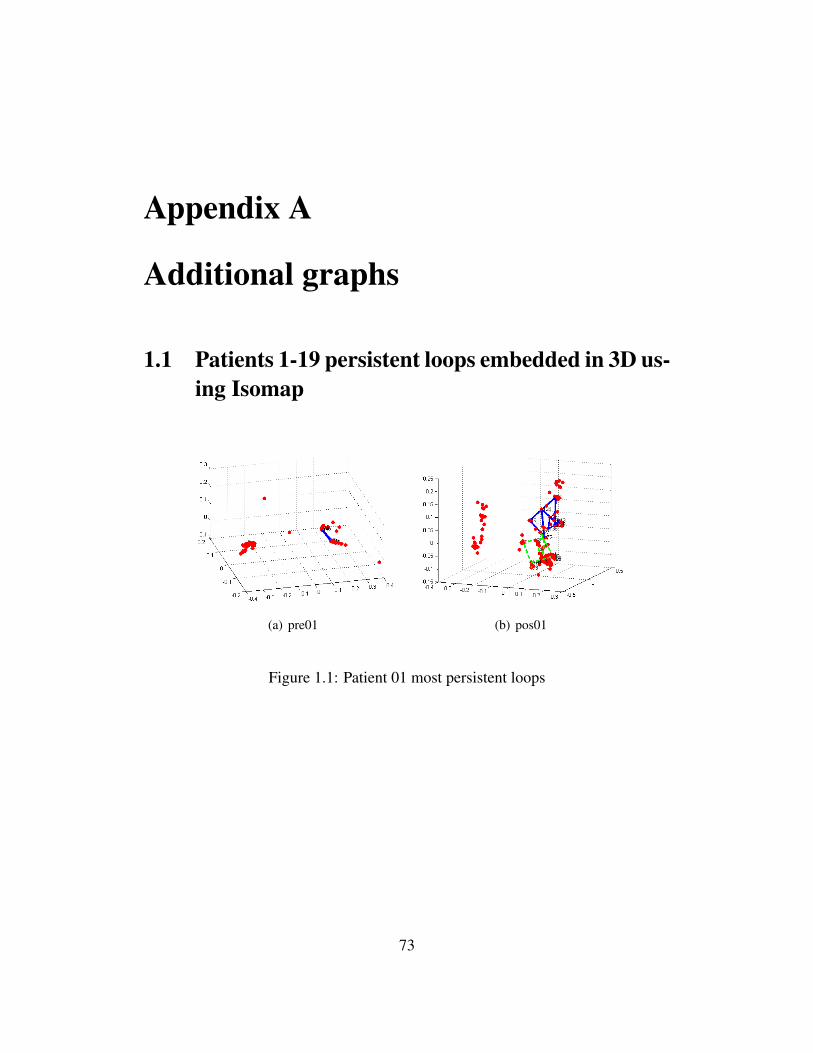
Appendix A
Additional graphs
1.1 Patients 1-19 persistent loops embedded in 3D us-ing Isomap
(a) pre01 (b) pos01
Figure 1.1: Patient 01 most persistent loops
73

(a) pre02 (b) pos02
Figure 1.2: Patient 02 most persistent loops
(a) pre03 (b) pos03
Figure 1.3: Patient 03 most persistent loops
(a) pre04 (b) pos04
Figure 1.4: Patient 04 most persistent loops
74

(a) pre05 (b) pos05
Figure 1.5: Patient 05 most persistent loops
(a) pre06 (b) pos06
Figure 1.6: Patient 06 most persistent loops
75

(a) pre07 (b) pos07
Figure 1.7: Patient 07 most persistent loops
(a) pre08 (b) pos08
Figure 1.8: Patient 08 most persistent loops
(a) pre10 (b) pos10
Figure 1.9: Patient 10 most persistent loops
76

(a) pre11 (b) pos11
Figure 1.10: Patient 11 most persistent loops
(a) pre12 (b) pos12
Figure 1.11: Patient 12 most persistent loops
(a) pre13 (b) pos13
Figure 1.12: Patient 13 most persistent loops
77

(a) pre14 (b) pos14
Figure 1.13: Patient 14 most persistent loops
(a) pre15 (b) pos15
Figure 1.14: Patient 15 most persistent loops
(a) pre16 (b) pos16
Figure 1.15: Patient 16 most persistent loops
78

(a) pre17 (b) pos17
Figure 1.16: Patient 17 most persistent loops
(a) pre18 (b) pos18
Figure 1.17: Patient 18 most persistent loops
(a) pre19 (b) pos19
Figure 1.18: Patient 19 most persistent loops
79
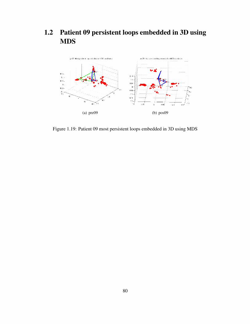
1.2 Patient 09 persistent loops embedded in 3D usingMDS
(a) pre09 (b) pos09
Figure 1.19: Patient 09 most persistent loops embedded in 3D using MDS
80


![Union of Balls, Alpha-Complexes and Delaunay filtrationsThe Vietoris-Rips complex was used by Leopold Vietoris [57] in the early days of homology theory as a means of creating Þnite](https://img.dokumen.tips/doc/110x75/60868b3f7b3ac873ad672a4d/union-of-balls-alpha-complexes-and-delaunay-filtrations-the-vietoris-rips-complex.jpg)