Embed Size (px)
Citation preview

Ticket Vending MachineUsability
Qualitative ResearchReport of Findings
July 2010


i
ForewordThe latest results from the National Passenger Survey (NPS)1, undertakenby Passenger Focus, show that 72% of passengers surveyed were satisfiedwith ticket-buying facilities at stations. This is good but there is still room forimprovement. Passenger Focus’s work on identifying passenger priorities2
shows that reducing queuing times at stations is still one of the top tenpriorities for improvement.
In 2008 we conducted research with South West Trains3
to get a better understanding of the reasons for queuingand the potential for using alternative channels to the ticketoffice to purchase tickets. The report showed that the vastmajority of those in ticket office queues could have boughttheir ticket from a ticket vending machine (TVM) and hadindeed used one in the past. It also showed that non-usageof TVMs was often due to a lack of confidence in themachines, a desire for a face-to-face encounter or concernsover ease of use, price or ticket availability. More recentresearch by Passenger Focus into queuing times4 found thatqueues for ticket offices were longer (in some cases quiteconsiderably so) than for TVMs – again suggesting thatthere are barriers preventing some people from using TVMs.
It is important to stress at this stage that millions of ticketsare sold using TVMs without any particular problems being
encountered. TVMs clearly have an important role to playin retailing tickets, and yet it is equally clear that somepassengers still have doubts about using them.
This report looks at why this might be. What preventssome people from using TVMs, what can be done to makethe process of selecting and buying a ticket from a TVMeasier, and what new features/functions would passengersvalue?
We would like to thank East MidlandsTrains, First GreatWestern, Southeastern and South West Trains for providingaccess to their Ticket Vending Machines.
Key findings:The research highlighted three fundamental areas whereimprovements could be made so as to further improvepassenger satisfaction:
Ticket Vending Machine Usability

ii
1 Screen LayoutOne of the barriers surrounded the way information waspresented – the sheer volume of information at times wasfelt to be overwhelming and difficult to decode. Amongthe suggested improvements were:• Reducing the volume of information on certain screens,especially the first ones.• Making more use of colour contrasting to improve theidentification of key buttons.
2 Programme SequenceThe research found that more needed to be done toease the passenger through the process of selectingand purchasing the correct ticket.
There was a sense of the passenger having to do allthe work to find the most appropriate ticket rather than themachine. When buying from a ticket office for instance, theclerk will ask some basic questions (about destination, dayand time of travel and, where appropriate, about the choiceof route/operator) and then offer the passenger a narrowed-down range of options. In essence the ticket clerk navigatesthe passenger through the decision-making process. WithTVMs on the other hand, passengers are left to work thingsout on their own.
In the longer-term there may be value in a further pieceof research looking at whether passengers would welcometrying to replicate some of the ease and functionality of web-based retailing. Is there, for instance, a ‘Google’ typesolution for rail?
3 InformationOne of the key barriers to using TVMs was one ofconfidence. Even some passengers who were used tobuying tickets through a TVM experienced difficulty whenasked to find the correct ticket for an unfamiliar journey,especially when this was complex or expensive. The maincause of this confusion was linked to questions over thevalidity of ticket types and the restrictions that apply. Unlikebuying tickets from staff or online, TVMs were often unableto provide the precise information or reassurance needed
by the passenger. This potentially results in passengersbuying the more expensive ticket, utilising a ‘better safethan sorry’ mentality, or taking a chance on the cheaperticket and ‘hoping for the best’.
Among the recommendations suggested by the reportare:• providing clearer information on ticket restrictions androutes• using less industry jargon
The research also looked at what additional functionalityor use passengers would like from TVMs. Among the mostpopular were the ability to collect pre-ordered tickets, to buymonthly season tickets and, in London, to be able to top-upOyster cards.
Passenger Focus will be working with the industry toaddress the issues identified by this research.
1 National Passenger Survey (Spring 2010)2 Passengers’ priorities for improvements in rail services (2007)3 Buying a ticket at the station: Research on ticket machine use
(October 2008)4 Ticket queuing times at large rail stations (July 2010)


Outlook Research Limited ! 32 Camden Lock Place ! London NW1 8AL tel 020 7482 2424 ! fax 020 7482 2427 ! [email protected]
Ticket Vending Machine Usability
Qualitative Research
Report of Findings
Prepared for:
Passenger Focus and
Southeastern South West Trains
East Midlands Trains First Great Western
Date: July 2010
Outlook Research Limited � 32 Camden Lock Place � London NW1 8ALtel 020 7482 2424 � fax 020 7482 2427 � [email protected]
TVM UsabilityPassenger Focus July 2010
ContentsManagement Summary>
Research Context & Objectives1
Methodology & Sample2
Main Findings3
3.1 Current TVM Usage and Barriers 93.1.1 Experiences 93.1.2 Barriers to Use 10
3.2 Transaction Specifics 113.2.1 Interface 123.2.2 Front Screen 143.2.3 (More) Popular Destinations 193.2.4 Destination Finder 223.2.5 Selecting the Ticket 283.2.6 Ticket Type and Validity 313.2.7 Journey Details 383.2.8 Payment 42
3.3 Passengers with Disabilities 443.4 TOC Proposed Enhancements 48
3.4.1 Highest Priority 483.4.2 Useful Functionality 493.4.3 Low Intererest 51
53
56
3
6
8
9
Conclusions & Recommendations4
Appendix5
5.1 Discussion Guide 56
TVM UsabilityPassenger Focus July 2010
3
Management Summary
Research was conducted to provide an understanding of the usability of Ticket
Vending Machines (TVMs) among passengers by identifying strengths and
weaknesses as well as barriers and how these could be addressed. The
research also set out to establish functionality and product requirements and
to identify principles that could be used by the industry to help make TVMs
more user-friendly.
60 semi-structured depth interviews (45 minutes each) were conducted
among passengers of each of the participating train operating companies
(TOCs). The research was conducted in March and April 2010 and findings
were presented in May 2010.
The key findings that Passenger Focus and the TOCs should note are:
1. There is consistent evidence from the research to suggest that in many
instances passengers do not feel confident enough to use TVMs to
purchase tickets for unfamiliar journeys.
2. The majority are unlikely to spontaneously consider TVMs as a natural
alternative to buying a ticket from staff. Some assume that a full range of
tickets will not be available from TVMs and many have low confidence in
their ability to buy the correct ticket from the range offered for their journey
through this channel.
3. The research identified a number of barriers that currently prevent
passengers from navigating TVMs to a successful intended outcome for
many transactions although these are mostly programming issues that
should be easy to resolve.
4. Encouragingly, most respondents were able to select the correct ticket and
cheapest available fare for a range of journey scenarios that were
presented for research, although a steep learning curve to achieve this
was often acknowledged.
5. Importantly however, most of the respondents in this sample claimed to
lack the confidence that would be required in reality to purchase the ticket
selected from a TVM. The key barriers in this respect are uncertainty over
the validity of tickets due to timing restrictions that apply and the inability to
be certain that the best fare has been achieved

Conclusions
This research indicates that the following suggestions could be
considered by the industry as principles that could help inform
programming and making TVMs more user-friendly:
1. Screen layout
• Improve the overall clarity and layout of screens
• Reduce the volume of information on certain screens (especially
the first ones)
• Use colour contrasting to make identification and selection of
options easier
• Highlight the ‘one step / screen back’ option to make it more
visible
2. Programme Sequence
• Consider using the A-Z destination finder as the first step with
preset hot destinations as another option
• Consider using more screens with simplified steps (in the form of
easy to answer questions)
• Extend the timed-out period or offer the option of more time to
confirm or complete a transaction
• Offer PlusBus as an option later in the process rather than
needing to select this at the outset as a destination
• Simplify the basket function (or provide usage instructions)
3. Information
• Provide clearer explanation of London Travelcard Zones with
information available (especially for those who are less familiar
with them)
• Improve labelling and terminology to facilitate decision-making
and to make the process more intuitive. For example, using ‘1st
Class’ instead of the word ‘First’ would be less ambiguous and
putting ‘5 – 15 yrs’ on the Child ticket button would overcome any
uncertainty regarding eligibility
• Provide an option to request more information at more stages in
the transaction process to facilitate selections
• A help button to provide information or assistance may allay
concerns at various stages of the process
• Provide clearer communication of restrictions to increase
purchasing confidence
• Improve clarity of route options and journey information
TVM UsabilityPassenger Focus July 2010
4

• Indicate when the best fare has been achieved and when it is valid
or if a cheaper fare is available for the ticket requested
• Provide a clear confirmation summary of the ticket being
purchased prior to completion of the transaction (especially an
explanation of what is not included)
4. Other issues to bear in mind to assist passengers using TVMs
• Provide staff / Floor Walkers where possible to provide help and
reassurance
• Give further consideration to the specific needs of disability
groups
TVM UsabilityPassenger Focus July 2010
5

1. Research Context & Objectives
Train companies are investing heavily in installing ticket machines at stations
and yet passengers are still relying on the ticket office to purchase their
tickets. In 2008, Outlook conducted joint research for Passenger Focus and
South West Trains to understand why passengers were still prepared to
queue at a ticket window rather than purchasing their ticket from a TVM.1 The
key findings of this research, in relation to the issue of advance purchase,
identified that:
• Almost all of those who were queuing during pinch-points2 were buying
tickets that could have been purchased in advance
• The majority were aware that this was the case but consideration of doing
so was very limited
• Barriers were many and varied but, in summary, advance purchase was
not ‘top of mind’, was not seen as a convenient solution or was simply a
less favourable proposition than buying tickets face-to-face
• Despite this, the majority did not reject outright the possibility of purchasing
tickets in advance of the day of travel
With regard to TVMs specifically, our research concluded that:
• The vast majority of those in ticket offices queues could have bought their
tickets from TVMs
• Non-usage was not attributable to lack of awareness since nine out of 10
of those in ticket office queues were aware of TVMs at the station
• Rather, non usage of TVMs was a result of a lack of consideration or
rejection due to distrust, a desire for a face to face encounter or concerns
regarding ease of use, prices or ticket validity
• Again, despite these barriers, the majority had not dismissed the possibility
of using TVMs at some stage in the future
The conscious decision to purchase at ticket offices is largely driven by:
• The passenger’s lack of confidence in using a TVM
• The passenger’s lack of confidence in their ability to select a ticket at the
appropriate price with the necessary validity or relevant route (as specified
on the ticket and reflected in the price);
• Age - older passengers are less inclined to use ticket machines;
• A preference for face-to-face transactions for reassurance.
1
Buying a ticket at the station – research published by Passenger Focus, October 2008 2
Refers to Monday/Tuesday a.m. peak periods (07:00 – 10:00hrs), Friday p.m. peak periods (16:00 – 19:00hrs) and weekends (all day)
TVM UsabilityPassenger Focus July 2010
6

Passenger Focus, along with Southeastern, South West Trains, East
Midlands Trains and First Great Western, were keen to undertake further
research to add to the existing body of evidence and give a clear indication of
passengers’ priorities in the design and functionality of TVMs.
The overall objectives of this research were:
1. To gain an understanding of the views of passengers about the perceived overall usability of TVMs
2. To provide Passenger Focus and the TOCs with an understanding of
strengths and weaknesses of TVMs based on past experiences of using them
3. To identify current barriers to using TVMs and how these could be
overcome (by addressing current weaknesses) 4. Based on experiences from real-life and the research process, to identify
which potential improvements passengers require from TVMs
5. To identify any additional functionality or products passengers might want or need from TVMs
6. To provide an assessment of the way information is provided on the
machines and to identify how this can be best displayed and explained 7. To identify a list of principles which can be used by the industry to develop
a good practice guide that will inform programming to ensure that TVMs are user friendly
TVM UsabilityPassenger Focus July 2010
7

2. Methodology & Sample
Qualitative research comprising semi-structured depth interviews was
conducted to meet the research objectives. The sample was constructed to
represent a broad cross-section of passengers of each of the TOCs who were
recruited on the basis of their past experiences and confidence levels of using
TVMs.
Fieldwork was conducted in London, Derby and Reading in March and April
2010. Full details of the sample structure are outlined below:
60 semi-structured depth interviews, each lasting approximately 45
minutes as follows:
• 15 x Southeastern (SE)
• 15 x South West Trains (SWT)
• 15 x East Midlands Trains (EMT)
• 15 x First Great Western (FGW)
Recruitment criteria: • A mix of both sexes across the sample
• A representation of lifestages for each TOC, e.g. mothers with (pre-)
school-age children, students, retired/grandparents etc.
• Among those recruited as confident users of TVMs, some were buying the
same ticket regularly and others had experience of buying a variety of
ticket types. Others were recruited as unconfident, occasional TVM users
and a few were very infrequent or non-users of TVMs
• An appropriate mix of purchase frequencies among confident users to reflect the types of tickets being purchased
• A good mix of stations being used by respondents for each of the TOCs to ensure that findings were not biased to any specific location or the place where the interviews are being conducted
• A representation of those travelling for different purposes to include commuting, leisure and business journeys
• Some with experience of buying tickets for first-class travel • Inclusion of a few passengers who buy tickets for group travel • All were non-rejectors of using TVMs to purchase tickets in future • A representation of six passengers with disabilities (two with vision
impairments, two with learning difficulties and two wheelchair users) Standard industry exclusions were applied to ensure that the research did not include any respondents who work in market research, marketing, advertising, journalism or anyone who works within the train industry or public transport.
TVM UsabilityPassenger Focus July 2010
8
3. Main Findings
3.1 Current TVM Usage and Barriers
3.1.1 Experiences
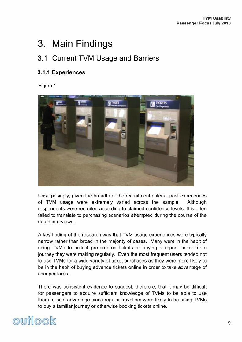
Figure 1
Unsurprisingly, given the breadth of the recruitment criteria, past experiences
of TVM usage were extremely varied across the sample. Although
respondents were recruited according to claimed confidence levels, this often
failed to translate to purchasing scenarios attempted during the course of the
depth interviews.
A key finding of the research was that TVM usage experiences were typically
narrow rather than broad in the majority of cases. Many were in the habit of
using TVMs to collect pre-ordered tickets or buying a repeat ticket for a
journey they were making regularly. Even the most frequent users tended not
to use TVMs for a wide variety of ticket purchases as they were more likely to
be in the habit of buying advance tickets online in order to take advantage of
cheaper fares.
There was consistent evidence to suggest, therefore, that it may be difficult
for passengers to acquire sufficient knowledge of TVMs to be able to use
them to best advantage since regular travellers were likely to be using TVMs
to buy a familiar journey or otherwise booking tickets online.
TVM UsabilityPassenger Focus July 2010
9

TVM UsabilityPassenger Focus July 2010
10
“lf I was going to make a booking for a specific type of journey and was trying
to get the best deal, then I would probably go and talk to somebody because
you want to know Advance this or SuperSaver that or whatever. You’re not
going to get that information out of a machine. If it was just a ‘here to London’
and I’m going now, here’s my money and away we go”
[Leisure User]
3.1.2 Barriers to Use
The key barriers identified across the sample relate to confidence levels and
the need for reassurance, rather than concerns among passengers about
their ability to use TVMs. These can be separated into three groups; Main
Concerns, Disincentives and Minor Issues that can be summarised as follows
in order of overall importance:
Main Concerns
1. Even those who were the most capable were not always confident enough
to buy a ticket from a TVM
2. Many feel the need to ask questions about the journey, especially one that
is unfamiliar or complex
3. Most passengers do not know enough about ticket types or restrictions
that apply to make informed decisions
4. Specific issues apply to various disability groups that will require further
consideration
“If I’m going to London and I don’t know which Underground areas to go to,
sometimes I’ll go and ask, but if it’s a straightforward journey, if I’m going to
Birmingham and back, I’ll go straight for the machine”
[Business User]
Disincentives
5. The need for reassurance is especially important for more expensive fares
6. Some may not expect all ticket types to be available from a TVM
7. Passengers occasionally suspect that the cheapest ticket for their journey
will not be available from a TVM in sufficient time to catch the first off-peak
train of the day
8. In addition to buying a ticket, many need additional information about the
journey they are making, especially train times
9. Some simply prefer to interact with a person rather than a machine

TVM UsabilityPassenger Focus July 2010
11
“I don’t think you always get the best deal; I’m not 100% sure you do. If I want
a return to somewhere, I probably am getting the best deal, but I don’t know.
If I speak to a person then I do know”
[Commuter]
Minor Issues
10. A small minority was fearful of technology or uncomfortable with it
11. Some expressed concern that there is often no visible staff presence in
the event of help being needed
12. Many claimed to be put off by the prospect of feeling under pressure from
a queue forming behind them if their transaction was not a straightforward
one
13. One or two had had a poor experience of getting the wrong ticket in the
past
14. Some were concerned about experiencing technical problems or losing
their payment card in the machine
15. A minority had been unable to use a TVM due to having creased
banknotes or assuming that correct change was required
“I have to look, I have to think of what I’m doing and I never know if I’ve got
the right change and you try to put the notes in and then you think that
somebody is waiting behind you”
[Leisure User]
3.2 Transaction Specifics
During the course of the interview, each respondent was asked to ‘purchase’
at least one ticket type from a wide range of scenarios provided by the TOCs
and Passenger Focus. These were intended to reflect a broad range of
journey types with varying degrees of difficulty and complexity and where
possible, scenarios were matched to the respondents’ claimed confidence
with TVMs and types of journeys most often made.
Throughout this report, screen shots from the TVMs of the TOCs represented
in the research have been used to illustrate elements of the transaction
processes. These have been selected to reflect an equal representation of
each type of TVM rather than being intended to demonstrate best or worst
examples experienced.

TVM UsabilityPassenger Focus July 2010
12
NB: In some SWT examples, the red cross only appears over the ITSO logo
because it was necessary to unplug a component in the TVM in order to get
the screen shots. In normal circumstances, the red cross would not be visible.
3.2.1 Interface
There is nothing from this research to suggest that touchscreen technology is
not the obvious and most natural solution in the context of using TVMs.
However, it should be noted that this interface is not universally familiar or
comfortable for all to use. Indeed, one or two older respondents mentioned
that this represented an immediate disincentive for them as they assumed a
degree of computer literacy would be required in order to operate the TVM
efficiently.
“I’m not computer literate, I’m learning, slowly. To me, these machines are
not easy to use. I worry that I would take too long and there would be a big
queue forming behind me”
[Leisure User]
Figure 2
Even among those more comfortable with the technology, it was not always
immediately obvious what needed to be done in order to initiate the
transaction. In Figure 2 above, a few were inclined to focus on the visuals or
the bold tagline rather than the smaller and more recessive instruction to
touch the screen to start. This was exacerbated in instances where the
screen featured moving rather than static images. One respondent tried to
begin the transaction by touching the word ‘welcome’ that appeared on the
screen above the keypad used for card payment.

TVM UsabilityPassenger Focus July 2010
13
“Do they need all the little men on there? Can it not just say ‘East Midlands
Trains, touch screen to start’?”
[Leisure User]
“’Touch screen to start’, it would be nice if that was in red and a little more
bold because there’s quite a lot of white text in there”
[Business User]
“The front screen is a bit distracting with that logo moving around. I don’t think
that is needed”
[Commuter]
The only other evidence of touchscreen difficulties came at later stages in the
process when a few respondents (especially men) were too clumsy or heavy-
handed and became frustrated when the TVM failed to respond as expected.
The following example was not always immediately obvious to all, but there
was some feeling that the more directive approach of offering users with a
choice to touch one option to buy tickets and another to collect previously
bought tickets is helpful at this stage.
Figure 3

This has the further advantage of instantly narrowing the nature of the
transaction to make the subsequent stages of the process quicker and easier.
This is therefore a good illustration of the potential to adopt a protocol of
simplifying TVM transactions for users by taking them through a series of
stages via easy-to-answer questions.
The key learnings and conclusions in relation to the touchscreen interface
can be summarised as follows:
• Ensure that the instruction to touch the screen to start the process is
clearly visible rather than recessive, especially if moving images are used
• When the process is initiated by the customer having to make a choice
(e.g. between “buying” or “collecting” tickets) this needs to be immediately
obvious.
3.2.2 Front Screen
First Impressions
The introductory screen often created a very negative first impression and
epitomised the feeling among users of being overloaded by information at
many subsequent stages in the TVM transaction process.
Figure 4
TVM UsabilityPassenger Focus July 2010
14

TVM UsabilityPassenger Focus July 2010
15
Many passengers felt that this volume of information was very off-putting and
were often unsure where to start when confronted with this array of choices
and buttons.
“I find the screen sort of busy. Sometimes they’re a bit too designed. We
need something plainer, simpler”
[Leisure User]
“When you first start off, there’s probably too much on there. You could
probably narrow it down on a separate menu before all of this comes up”
[Commuter]
“There’s quite a lot of reading to do here, and the screen’s quite bland”
[Business User]
“The font and type is not great, there’s too much on the screen, there’s too
much to take in. You’ve got to read everything, if there were fewer choices
you could do it at a glance”
[Commuter]
Furthermore, most thought that there was too much information on each of
the destination buttons to easily digest. A further difficulty for some was the
terminology, which although familiar, was not always recognisable in the
context of TVM language. For example, ‘Anytime’ was not always known but
was easy enough to work out but it was not always obvious that ‘First’ means
First Class since this could be assumed to relate to the name of certain TOCs.
Figure 5
“If I was travelling First Class for the first time, the fact that it didn’t say First
Class, it just said ‘first’, I would find a bit confusing”
[Commuter]
‘”I find the options on there a bit off-putting. Do you want standard, return,
railcard, anytime, off-peak, peak time. There’s an Anytime, an Off-Peak and a
Super Off-Peak and sometimes I have to look really closely at the screen to
think of which one I want”
[Leisure User]

There was frequent evidence from the research therefore to suggest that
some of the least confident users would not get beyond this screen in a real-
life situation.
“I think you automatically make the customer feel anxious, because there are
too many options”
[Commuter]
Hot Destinations
The intensity of these lists was often felt to defeat the primary object of using
a TVM (i.e. to make ticket purchasing more time-efficient) as the quantity of
destinations offered was usually considered to be confusing rather than
helpful within decision-making processes. This was occasionally exacerbated
by the fact that there was no apparent order or logic in the way these buttons
were arranged.
“I like that. It saves time if those are one of the ones you are going to go for,
but there are too many to look through”
[Business User] Figure 6
TVM UsabilityPassenger Focus July 2010
16

The popularity of destinations is relevant only to the machine and not to users
who expect all buttons for the same destination to appear together. In the
example above, respondents who were looking for a Standard Anytime Single
to London Terminals would have expected this to have been located with the
other London Terminal options at the top of the screen and would have
overlooked the ticket they needed in the bottom left corner.
Visibility / Legibility
This emerged as a consistent theme throughout the research. Although it
was not possible to provide the direct comparison shown in figure 7 due to the
nature of the research exercise, similar problems regarding screen visibility
and legibility were raised for each TOC.
Figure 7
Two main issues were identified in this respect. Firstly, dark buttons out of a
similar coloured background were generally felt to be less-user friendly than
the lighter examples shown. This was especially important for screens
showing large quantities of information. A second, and less important
problem for some respondents, was the contrast between the colour of the
button and the text contained within it.
TVM UsabilityPassenger Focus July 2010
17

“The only thing that could be changed is differentiation between colours, so
you can differentiate between singles and returns and perhaps between first
and standard class. I’ve pressed the wrong one before when I’ve been in a
rush and realised after I paid for it and had to go back”
[Commuter]
“I think they should split up the peak and off peak and singles and returns,
maybe a different colour for each ticket type. They are all the same which
isn’t helpful when you are trying to find your ticket”
[Business User] The issue of how colour contrast and highlighting can be used to good effect to improve functionality and facilitate decision making is discussed further in section 3.2.6 Ticket Type and Validity Centre Screen Dominance There appears to be a strong argument to separate function buttons from destination choices since they tend to be blocked by TVM users at present, even when clear colour contrasting is employed. The common tendency was to focus on the central area of screen only, especially during the initial stage of the transaction when the emphasis is on needing to locate and select the intended destination.
Figure 8
TVM UsabilityPassenger Focus July 2010
18

The buttons around edge of the screen were therefore often overlooked at start of the process, which meant that many respondents missed critical navigational cues at outset. In this respect, the ‘Tickets For Tomorrow’ function was widely unknown and not noticed during the course of the work and most claimed they would go to the ticket office to buy such a ticket. The consequences of overlooking the buttons at the bottom of the screen were more important as failure to know how to progress beyond this screen may cause passenger to abort rather than persevere at this stage.
The key learnings and conclusions in relation to the front screen(s) can be
summarised as follows:
• Improve the overall clarity and layout to create a more welcoming first
impression to users
• Reduce the volume of information on screens in the early stages of
transactions
• Improve labelling and terminology to facilitate decision-making and to
make the process more intuitive. For example, using ‘1st Class’ instead of
the word ‘First’ would be less ambiguous
• Use colour contrasting to make identification and selection of options
easier
• Highlight the ‘one-step / screen back’ option to make it more visible to
users
• Consider using the A-Z destination finder as the first step with preset hot
destinations as another option
3.2.3 (More) Popular Destinations
London Tickets and Travelcards
Due to the TOCs involved with this project and the interview locations used,
these screens tended to be heavily weighted towards London tickets and
Travelcards. It was therefore apparent in many cases that the wide selection
of tickets to London (Terminals) offered often caused problems when
displayed on the front screen or subsequently as a choice of more popular
destinations. Some respondents found this type of screen confusing and
expected to be overwhelmed by it if confronted with such a choice under
pressure. There needs to be clarification of the London Terminals to which
the ticket is valid and via which route.
“The fact that they are all for London is okay if that’s where you want to go
but I need a ticket for Slough. I think the options should be broader up front,
not everyone wants to go to London”
[Business User]
TVM UsabilityPassenger Focus July 2010
19

“From here, I know they only go into St. Pancras, but for somebody who
doesn’t know it would be helpful if it said in brackets ‘St Pancras’”
[Business User]
Even those living in London or those who were regular visitors had
considerable difficulty decoding some of the London zonal fare information in
this and similar screens.
Figure 9
Travelcards ranked among the most difficult of all ticket types that
respondents were asked to buy. Even those who had bought Travelcards in
the past found the choice of options confusing from the way in which they
were described on the TVM. Specifically in this respect, none knew the
difference between ‘R’ and ‘U’ and there was no understanding of what the
inclusion of the [ * ] symbol meant.
“It assumes that you are aware of London terminology. What are all these
zones about? Does that mean each place has a code or number?
[Leisure User]
“There was nothing to actually describe that it would include the
Underground. I’d be looking at it being a step-by-step thing where you buy
your train ticket and you can add on the underground afterwards”
[Commuter]
TVM UsabilityPassenger Focus July 2010
20

Additionally, Some confused Travelcards with Railcards and selected the
Travelcard button when they were attempting to apply a Railcard discount.
“There’s nothing here jumping out at me about the Railcard. I pressed the
Travelcard button, I presume that’s the right one because these are all
Travelcards, but I can’t see Railcards”
[Leisure User]
Figure 10
The way in which Zones are explained was felt to be especially confusing,
especially since no option to obtain further information was available at this
stage. Respondents were especially confused by the truncating of the zones
as illustrated by Zone U1245. In this example the status of Zone 3 was
unclear to the extent that there was some concern about what would happen
if the holder attempted to start or end a journey at a station in Zone 3.
Expressing the validity as Z12345 or Z1 – 5 was universally felt to be clearer
and therefore preferable.
“Travelcard zones 2345, 2356, can’t see 23456, that’s what I want 2 to 6 but I
can’t see that. I might try putting in London, but it’s not really going to work.
I’d probably have a fiddle round, then go and talk to someone”
[Business User]
TVM UsabilityPassenger Focus July 2010
21

“If I was going to zone 4 I’d be absolutely baffled. I’d have to go to the ticket
desk and probably miss my train”
[Leisure User]
“So we want 2 to 6, that isn’t actually an option here. You’ve got zones 2 to 3,
2 to 4, 2 to 5, 3 to 4 and 3 to 5, but 2 to 6 isn’t actually an option. I don’t
honestly know what I’d do”
[Leisure User]
Even the most confident TVM users were often unable to complete the
Travelcard purchase scenarios provided for research and the indications were
that the real-life outcome of such transactions would be to abort or to
purchase an all zones Travelcard as a security measure and therefore to
overpay.
The key learnings and conclusions in relation to London tickets and
travelcards can be summarised as follows:
• Provide clearer explanation of London Travelcard Zones with information
available (especially for those who are less familiar with them)
• Provide an option to request more information at this stage in the
transaction process to facilitate selections
• A help button to provide information or assistance may allay concerns and
overcome uncertainty
• Provide clearer communication of restrictions to increase purchasing
confidence
• Improve clarity of route options and journey information
• Indicate when the best fare has been achieved or if a cheaper fare is
available for the ticket requested
• Reduce the volume of information on these screens
• Use colour contrasting to make identification and selection of options
easier
• Consider using more screens with simplified steps (in the form of easy to
answer questions)
3.2.4 Destination Finder
A – Z Destination Finder
Across the sample, responses to this facility were extremely positive since it
was regarded as a simple and intuitive navigational device that provides a
helpful short-cut to locate most destinations easily.
TVM UsabilityPassenger Focus July 2010
22

Figure 11
A further advantage was that it was always obvious that this facility was
available from the outset, even for least regular or confident users, although it
was more clearly flagged on some TVMs than others. On this screen (and
wherever else it appeared), the ‘One Step Back’ button was considered to be
extremely useful, although it was often overlooked due to the tendency to
focus on the central area of the screen, as previously described.
There was some feeling that the Destination Finder should be first screen in
the transaction process since it was regarded as the most logical start point,
although there was some resistance to this among those who buy regularly
from the hot list.
London Stations
Once again, London stations caused some difficulties for passengers since
they proved to be much more difficult to locate within the Destination Finder
than any of the other journey scenarios. However, this is likely to be a unique
problem associated with London due to the number of station choices
available in this area.
TVM UsabilityPassenger Focus July 2010
23

The main difficulty experienced was that the majority tended to think in terms
of the station name only and were therefore inclined to enter this rather than
preceding it with ‘London’. This was especially true of those living in or
around London with experience of using multiple stations frequently.
“I want to go to London so I think of the specific station, I don’t think in terms
of ‘London Terminals’”
[Leisure User]
“ I want Charing Cross so I type in C H A but it only comes up with Charing
Cross Underground. I don’t know how to get to the main station. I would give
up at this point”
[Commuter]
“I’ll try London Terminals but which zone do I need? There’s no information
about that”
[Business User]
The word ‘Terminal’ also has the potential to cause confusion, especially in
terms of whether such a ticket would be valid for travel to any London train
station or only the most obviously accessible ones from where the ticket was
being purchased. Some were also unsure about whether ‘Terminal’ in this
context means terminal stations only or any train station in London. One
respondent claimed to have had a problem with such a ticket that was valid at
Farringdon but not Blackfriars.
“London Terminals isn’t clear, I’m not sure which stations are London
terminals. I’ve come unstuck with that before”
[Commuter]
Predictive Input
The facility to anticipate and suggest destinations based on the first letters
entered was welcomed by passengers as a user-friendly and time-saving
device and was universally recognised as a genuine example of a way in
which the TVM assists passengers with ticket purchasing.
“I didn’t punch in the whole thing, because it searches and throws it up, that
was obvious”
[Commuter]
TVM UsabilityPassenger Focus July 2010
24

“It’s common sense I suppose. It’s so common now on many things, even on
your mobile call register, or using Google, you just put in the first few letters.
That’s very straightforward”
[Business User]
“It’s good that it narrows your search down for you when you put in the letters,
that makes it easier”
[Leisure User]
Figure 12
However, the predictive element was not always immediately obvious,
especially by the least frequent or non-users. Some failed to notice the list of
stations that appeared and changed as each letter was entered and others
noticed the list when the first letter was entered but started to scroll too early
using the arrows rather than entering more letters to narrow the search.
On the Southeastern machine, the highlighting of the next letter possibilities
was welcomed as a customer-facing benefit (when it was noticed) but in one
or two instances caused confusion when additional letters were not accepted
when there was only one option remaining.
“I love that it highlights the letters that you could then need. I think it’s brilliant
for someone who’s not a typist”
[Leisure User]
TVM UsabilityPassenger Focus July 2010
25

PlusBus
(PlusBus is an add-on element, which can be purchased as part of the
through rail tickets to allow unlimited travel on participating bus operators'
services in the area around the destination rail station in certain towns.)
None of the respondents in this sample was aware of PlusBus. This made
locating PlusBus tickets especially challenging for those who were asked to
do so within their scenarios since none expected to have to make this
decision at this stage in the transaction. Furthermore, the fact that PlusBus
options are not highlighted meant that respondents were unlikely to notice
them spontaneously. However, highlighting was not considered to be the
ideal solution and instead some felt that a separate screen would be
preferable.
“If they’re thinking of doing PlusBus at a lot of destinations, then it’s not going
to work having it highlighted. It would have to be an option on a separate
screen where at some point in the transaction it offers you PlusBus, then if
you’re not used to it you could press it and it would tell you what it means”
[Business User]
A further problem was that PlusBus was not expected to be listed as a
separate option to the destinations where it is available and suffered from lack
of clear differentiation within the listing, as shown in the Canterbury East
example below:
When C A N is entered (see Figure 13), Canterbury East appears at the
bottom of the list of destination possibilities and the natural inclination is to
‘Press to select’ at this point (as instructed).
TVM UsabilityPassenger Focus July 2010
26

Figure 13
If C A N T is entered, Canterbury East appears at the top of the list with Canterbury East PlusBus underneath. However even in this situation, the PlusBus option is likely to be overlooked since passengers are not expecting it to appear at this stage as a different station option. Figure 14
TVM UsabilityPassenger Focus July 2010
27

“I’ve just noticed Canterbury East PlusBus. I didn’t see that at all the first time
around and not knowing about it, I probably would have looked at that and
thought ‘I don’t know what that is’ and just pressed Canterbury East”
[Leisure User]
The key learnings and conclusions in relation to the destination finder can
be summarised as follows:
• Consider using this as the first step with preset hot destinations as another
option
• Provide greater clarity in terms of the way that London stations are defined
and described
• Offer PlusBus as an option later in the process rather than needing to
select this at this stage as the destination
3.2.5 Selecting the Ticket
Route Options
Passengers were not always expecting to be presented with route options and many did not cope well when asked to make these choices as part of the journey scenarios. The need to select the relevant route option is a critical stage in the process to ensure that the correct ticket is purchased for the intended journey. However, the TVM currently assumes an unreasonable level of familiarity with the rail network to give the majority of users the best chance of achieving this. Figure 15
“’Select your preferred route’, I’ve never seen this before, ‘not valid on HS1. I
have absolutely no idea what that is so I would try ‘any route permitted’”
[Commuter]
TVM UsabilityPassenger Focus July 2010
28

‘Any Permitted’ is an industry term and the meaning of this is not always obvious to passengers who felt there was a danger that they may not know which routes are not permitted unless they are clearly specified. Furthermore, the way in which route options are provided assumes that passengers know as much about the alternatives as the TOC or the TVM. In this example, none was aware of what HS1 means so the information buttons would therefore be relied on to help make the correct ticket choice. Figure 16
When the “i” button was touched, the details provided were unhelpful to passengers who claimed to have no idea of whether the train they needed would be likely to stop at either of the stations mentioned. The result was that respondents claimed that they would therefore need to seek assistance from staff or buy the more expensive Any Permitted ticket from the TVM to be sure.
“I think this bit is confusing. I don’t think it’s very clear at all because what this
actually means is that if you press ‘any permitted’ it’s actually the more
expensive option, but if I don’t get the expensive one I can’t get on the high-
speed rail link. I mean, how would you know?”
[Business User] The lack of coherent information at this stage minimises the chances of passengers obtaining the correct or cheapest fare. It may therefore be helpful to provide additional route specific information that may assist passengers with route selection such as a comparison of typical journey times or the difference in fares.
TVM UsabilityPassenger Focus July 2010
29
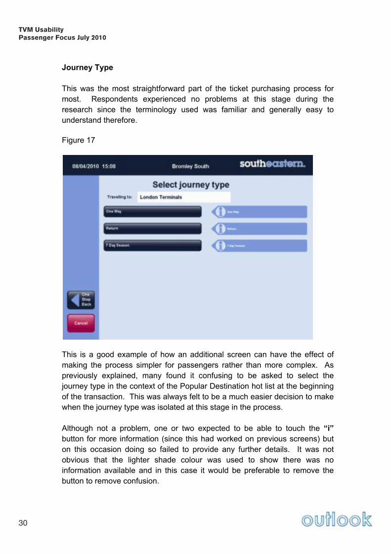
Journey Type
This was the most straightforward part of the ticket purchasing process for
most. Respondents experienced no problems at this stage during the
research since the terminology used was familiar and generally easy to
understand therefore.
Figure 17
This is a good example of how an additional screen can have the effect of
making the process simpler for passengers rather than more complex. As
previously explained, many found it confusing to be asked to select the
journey type in the context of the Popular Destination hot list at the beginning
of the transaction. This was always felt to be a much easier decision to make
when the journey type was isolated at this stage in the process.
Although not a problem, one or two expected to be able to touch the “i”
button for more information (since this had worked on previous screens) but
on this occasion doing so failed to provide any further details. It was not
obvious that the lighter shade colour was used to show there was no
information available and in this case it would be preferable to remove the
button to remove confusion.
TVM UsabilityPassenger Focus July 2010
30

The key learnings and conclusions in relation to selecting tickets can be
summarised as follows:
• Consider using more screens with simplified steps (in the form of easy to
answer questions – e.g. Travel time, Single/Return)
• Improve clarity of route options and journey information
• Provide an option to request more information at this stage in the
transaction process to facilitate selections
• A help button to provide information or assistance may allay concerns at
this stage in the process
• Provide clearer communication of restrictions to increase purchasing
confidence
3.2.6 Ticket Type and Validity
This represents the main area of difficulty and confusion for most users. The
lack of confidence surrounding the definition and validity of ticket types
emerged as a key barrier to buying tickets from a TVM.
Figure 18
When presented with the choice shown on the screen above (or similar), the
majority were confident about the likely validity of an Anytime ticket, even
when the difference between Off-Peak and Super Off-Peak were not known.
Although some claimed they would consider buying an Anytime ticket to
resolve this uncertainty, the price differential was usually sufficient to preclude
this or create concern that this was unlikely to be the cheapest fare for their
journey.
TVM UsabilityPassenger Focus July 2010
31

“If you asked me the times of Peak and Off-Peak, I could have a rough stab at
them but I couldn’t be sure, it’s all based on guess work. There isn’t enough
information on this. It’s like they want to confuse you”
[Business User]
A further difficulty that some respondents also identified is the fact that validity
definitions are not consistent across all TOCs, which makes this a crucial item
of information
“It would be good if there was something on the machine, saying Off-Peak
times, and Peak. I think you generally know, but it’s good to have a little
reminder”
[Commuter]
The majority therefore require further information at this stage to assist their
decision making. Given the importance of making the correct choice, there is
no room for ambiguity or gaps in the information available at this critical stage
in the process.
Figure 19
The information shown in this illustration epitomised the difficulties that many
experienced when attempting to buy tickets from a TVM. Being told simply
that travel time restrictions apply does not help passengers to determine
whether an Off-Peak or Super Off-Peak ticket will be valid and if so how to
decide between these options.
“I got caught with the wrong ticket travelling to London once and was fined
which makes me reluctant to use the machines now. At least if you talk to a
person you can be sure you have the right one. It isn’t that clear based on
this machine”
[Leisure User]
TVM UsabilityPassenger Focus July 2010
32
“What is Super Off-Peak? I know I need to get to Bristol Off-Peak but would
Super Off-Peak work? There doesn’t seem to be anything explaining the
difference. I wouldn’t risk it, I would go to the ticket office at this point”
[Leisure User]
Given the importance and complexity of the decisions that need to be made
at this point, it may be easier to deal with the validity issue as a series of
screens and simple questions (single or return; First or Standard class, travel
today or tomorrow) to narrow the choice of tickets available. At this point,
restrictions applying to each ticket type could be clearly laid out in order to
help the customer to decide what is needed.
A key issue arising from the research is therefore the need to find a more
obvious and visible way of communicating crucial validity restrictions that
apply on the outward and return leg of the journey from the TVM to users.
“What I did wasn’t very difficult but it’s left me with a feeling that I’m not very
sure if I’ve got the right ticket”
[Commuter]
TVM UsabilityPassenger Focus July 2010
33

Figure 20
The TVM used for the East Midlands Trains interviews at Derby station
(shown in Figure 20), displayed validity information at eye level on the
machine. Interestingly however, most respondents failed to notice these
details due to the fact that their attention was focused on the screen
throughout the transaction.
On occasions when this panel was noticed or pointed out by the moderator,
respondents welcomed the principle of providing it but felt that the information
was insufficient to help them make informed choices in certain circumstances.
TVM UsabilityPassenger Focus July 2010
34

Figure 21
For example, defining Off-Peak and Super Off-Peak in terms of arrival times
into London was clear enough but the majority claimed they were more likely
to think in terms of departure time. Furthermore, this example assumes
knowledge of journey times to London that many claimed not to have and
offered no help for buying tickets to other destinations.
“I’m travelling at 10.40 and coming back that afternoon. I think that I’m okay
for Super Off-Peak, I’m not too sure though”
[Business User]
The information on local services was thought to be much less clear and
created the potential for confusion and genuine mistakes to be made.
Given that many passengers felt it was incumbent on TOCs to equip TVMs
with the information required to help them select the correct ticket to avoid
penalty fares, some suggested that additional information should be provided
to help answer questions about ticket validity.
“I think there needs to be a little bracket in there, where it says Standard
Anytime Day Single. Just put in brackets 9.30am onwards, just for a bit of
clarity”
[Commuter]
TVM UsabilityPassenger Focus July 2010
35

Figure 22
Although the preference overall was for screens to avoid being overloaded
with information, there were some suggestions that the space on the screen
above could perhaps be used for route details and timetable information,
especially times of the next available trains that each ticket type would be
valid on, to help with the selection of the correct ticket type.
There was evidence from the research to suggest that visual differentiation
can help customers to choose from the multiple options that they are often
presented with.
In the following example (Figure 23), the uniformity of the way in which the options are presented was felt to exacerbate legibility difficulties.
TVM UsabilityPassenger Focus July 2010
36

Figure 23
In contrast, the dark red highlighting in the following screen helps customers
to (de)select the First Class fares in order to narrow their choice within a long
and potentially confusing list.
Figure 24
TVM UsabilityPassenger Focus July 2010
37

The key learnings and conclusions in relation to ticket type and validity can
be summarised as follows:
• Consider using more screens with simplified steps (in the form of easy to
answer questions, i.e. First class/Standard class)
• Use colour contrasting to make identification and selection of options
easier
• Provide an option to request more information at this stage in the
transaction process to facilitate selections
• A help button to provide information or assistance may allay concerns at
this stage of the process
• Provide clearer communication of restrictions to increase purchasing
confidence
• Provide staff / Floor Walkers where possible to provide help and
reassurance
3.2.7 Journey Details
Changing and Adding Details
Changing and adding details was identified as an important but complex stage
of the transaction. It may therefore be helpful to separate the functions
available on this screen from the confirmation of details.
Figure 25
TVM UsabilityPassenger Focus July 2010
38
The facility to change details at this stage was welcomed as an alternative to
using the ‘One Step Back’ button. However, since this facility was often
overlooked it would be helpful for these buttons to be more clearly flagged.
It was not always obvious to respondents how to add extra passengers,
especially children. This was another area in which there were indications
that a two-stage process would be easier than the current solution (i.e. are
you travelling alone or with other passengers? How many adults? How many
children?).
Many who wanted to add children were unsure of the qualifying age range for
child fares. Many were surprised that this information was either not
displayed at all or in a way that is misleading; (under 15 as indicated is
inaccurate if children under five travel free).
“I don’t know if a 14 year old is classed as an adult or a child. I don’t think
they’re classed as an adult until they’re 16, but I couldn’t be sure”
[Business User]
“I didn’t know that if a child is 4 and a half then they get free rail travel. I think
it should say 5 to 15 years in brackets on there. That would have answered
my question”
[Leisure User]
“I have no idea how old a child has to be, where is the information?”
[Commuter]
Railcards
There was also some confusion about the order in which passengers and
railcards should be added. Some discovered that a specific order needs to be
followed for some transactions but this was not explained or clear to users.
This is a further example of functionality that could be asked as part of a
sequence of questions.
TVM UsabilityPassenger Focus July 2010
39

Figure 26
“It shouldn’t just be ‘Railcard’ it should be ‘do you have a Railcard?’ I went to
add more passengers first and then confirm selection but had no Railcard so I
needed to go back. The order was the wrong way around, the Railcard needs
to come before the ‘more passengers’ option”
[Commuter]
“I’ve got my two adults and one child and I’m going to confirm. Oh no, I need a
Railcard and I’m not quite sure what to do about the Railcard. I’m a bit stuck”
[Business User]
Basket Function
The basket function was often not understood and was generally thought to
be confusing rather than helpful. Most were familiar with the principle from
online shopping experiences but found it difficult to switch between the basket
and the journey details in order to complete the transaction.
“It was a bit difficult when it came up with the basket because you could add
the adult and the child on one screen, but to add a senior citizen you had to
go back and start from the beginning”
[Leisure User]
TVM UsabilityPassenger Focus July 2010
40

Confirmation
Responses to this stage of the process were closely aligned to views
expressed regarding ticket validity. Respondents were concerned about the
general lack of clarity over fare details and restrictions, especially regarding
the validity of Off-Peak and Super-Off Peak tickets on departing trains.
Restrictions were often overlooked in the position shown on the screen in
Figure 20 above. This was universally regarded as important information and
respondents were therefore surprised to see it separated from the fare details
and validity
The following screen was welcomed in principle but illustrates the difficulty of
ensuring that the correct ticket will be obtained from a TVM. This was felt to
be very helpful as a way of providing reassurance before confirming ticket
selections but was still inadequate due to the need to check weekday morning
peak restrictions.
Figure 27
“It’s good that you get to double check your purchase before you commit to
buy, that’s quite reassuring”
[Commuter]
Contrastingly, the following screen (Figure 28) was a major source of irritation
to customers and a key barrier to successful completion of the transaction
during the interviews. The white box appears much too quickly and always
before customers had finished checking the journey details and were ready to
confirm. Most were too flustered to notice the ‘touch here to clear’ message
and were therefore inclined to either start again or abort the transaction
altogether.
TVM UsabilityPassenger Focus July 2010
41

Figure 28
“I was just checking everything and the box came up right on top of what I was
checking to say just to press confirm to go ahead, so at that stage I was not
sure what to do so”
[Commuter]
The key learnings and conclusions in relation to finalising and confirming
journey details can be summarised as follows:
• Provide greater clarity in terms of how to add passengers or railcards
• Improve labelling and terminology to facilitate decision-making and to
make the process more intuitive. For example, putting ‘5 – 15’ on the
Child ticket button would overcome any uncertainty regarding eligibility
• Indicate when the best fare has been achieved or if a cheaper fare is
available for the ticket requested
• Provide a clear confirmation summary of the ticket being purchased prior
to completion of the transaction (especially an explanation of what is not
included)
3.2.8 Payment
NB: Due to a number of practical difficulties associated with this part of
the transaction, it was agreed that payment would not be explored in
detail as part of this project.
TVM UsabilityPassenger Focus July 2010
42

Figure 29
The majority of respondents claimed to be comfortable with the options and
payment mechanics of TVMs and had generally not experienced problems in
the past.
One or two minor issues were identified in the context of the research
scenarios and purchasing processes. All were clear about what was required
in terms of payment but cash users occasionally expressed concerns that
notes would get stuck or were unclear about whether change would be
provided and if so whether it was available. On one occasion when card
payment was unavailable, one respondent failed to notice either the
information on the screen or the crossed out icon intended to communicate
this.
The only other difficulty experienced was the time allowed by the TVM to
complete the transaction was occasionally felt to be too quick if the payment
method had not been decided in advance. In which case it would be
frustrating to have to start again from scratch. Being asked by the TVM if
more time is required would be an obvious solution to this problem.
TVM UsabilityPassenger Focus July 2010
43

44
“That times out far too quickly. It made me feel more under pressure as I had
to start again”
[Business User]
“It’s got to time out, but perhaps it’s a little short, especially for elderly people”
[Leisure User]
3.3 Passengers with Disabilities3
Issues for Disabled Passengers It is worth noting that six respondents with three different types of disability
took part in the research. As is the case with such small samples, it is not
possible to draw firm conclusions on the basis of these findings alone and the
following should therefore be used as a guide only.
Unsurprisingly, passengers with disabilities can find TVMs difficult and
frustrating to use and reported various barriers during the interviews.
Consequently, those represented in this research tended to have limited
experiences of using TVMs and as anticipated, highlighted a different set of
needs and concerns to the non-disabled sample.
“I prefer to speak to people, I don’t like machines. I get in a panic, that’s
probably the dyslexia … I tend to rush ahead of things and press buttons that I
haven’t thought about and get myself in a pickle, and it ends up taking much
longer than it would to queue and speak to somebody”
[Learning Difficulties]
Those with milder impairments claimed similar barriers to TVM usage as other
passengers. One respondent with tunnel vision reported a preference for
TVMs and found face-to-face interactions more difficult.
Findings regarding the assumed breadth of tickets available from TVMs were
consistent in that disabled passengers assumed that tickets with a Disabled
Persons Railcard discount would not be available and expected to purchase
these from the ticket office.
3The National Rail Conditions of Carriage and individual TOCs’ Disabled People’s Protection
Policies accept the difficulties facing disabled people when purchasing tickets and allow them to pay aboard the train without incurring a penalty.
TVM UsabilityPassenger Focus July 2010
44

Vision Impaired Passengers
Using TVMs can present a significant challenge for vision-impaired
passengers as the nature of their disability can vary significantly (one
respondent was partially sighted in both eyes and the other had tunnel vision).
There was some recognition from these passengers therefore that it would be
difficult for the TOCs to ensure that TVMs met all of the diverse needs of
passengers with vision impairments.
“Vision impairments are all different; some people can see better in less light,
some can see better in more light, so it’s difficult.”
[Vision Impaired]
Screen glare (from windows and lighting) can be especially difficult for vision-
impaired passengers, often making it very difficult for them to read the
information on the screen. There is a need for functional buttons to be bold
and clear as small buttons or information boxes are easily missed. The edge
of buttons can be difficult to distinguish, particularly if they are close together
and this can result in incorrect selections being made. The use of contrasting
colours for text and background is also appreciated.
Figure 30
“Sometimes it’s difficult to see where the edge of buttons are and screens
can be very sensitive to touch, so it can be difficult to press the right thing.”
[Vision Impaired]
TVM UsabilityPassenger Focus July 2010
45

Although not tested directly in the context of this research, the positioning of
the TVM can also be an issue. If the TVM is not instantly visible or clearly
signposted as the passenger enters the station, it is less likely to be noticed
by passengers with impaired vision.
Wheelchair Users
The overriding issue for wheelchair users is the lack of accessibility of TVMs,
as demonstrated by this research. Even DDA (Disability Discrimination Act)
compliant machines can be difficult for some wheelchair users, particularly
those who are elderly or lack the upper body strength or mobility to reach the
touch screen.
Neither of the wheelchair users was able to position themselves close enough
to the TVM to use the touch screen in the same way as other respondents.
One attempted a side-on approach which got her closer, but she found the
twisting motion required to touch the screen awkward and uncomfortable and
she still experienced problems with the reach distance.
“I’m not very comfortable for a start, I’m twisted and I’ve got to spell out
Hastings and it’s hard for me to reach the screen.”
[Wheelchair User]
Unsurprisingly the main usage enhancements suggested were related to
screen positioning and the general ergonomics of the TVM. Wheelchair users
felt a lower touch screen with legroom underneath that would allow a face-on
approach to be the most important improvement that could be made. One
wheelchair accessible TVM per station was considered to be acceptable.
Station accessibility is an important consideration for wheelchair users who
rely on face-to-face interaction at the ticket desk to check if facilities are
available at the destination station. There were questions about how a TVM
could handle the provision of this information and whether in practice it would
be realistic to expect them to do so.
Passengers with Learning Difficulties (e.g. dyslexia)
The main issue for passengers with dyslexia is the amount of information they
may be required to read and digest when using TVMs to ensure the correct
ticket is purchased. Some screens were described by dyslexic passengers as
‘busy’ and ‘text heavy’, especially when important ticket-related information
was in small fonts. This can result in frustration or panic and an inclination to
rush through the transaction and skim over potentially important information.
TVM UsabilityPassenger Focus July 2010
46

Figure 31
“I think anyone with dyslexia would panic at reading that. I think you just can’t
digest the information quickly enough. I would tend to steer clear of it and
read the bolder type and boxes”
[Learning Difficulties]
Functional buttons and textual information therefore need to be large and
clear and at the same time there is a need to ensure the screen does not
become too crowded and overloaded with information.
“Because the text is so light and it’s quite small, I wouldn’t even read that
because I’m more of a visual person, I need to see big, bold letters”
[Learning Difficulties]
“You shouldn’t overcrowd it. I think for dyslexic people that’s the problem with
lots of things going on; it just makes you panic a bit. If there are so many
options to choose from you literally go ‘oh my God where do I start, what do I
want?’”
[Learning Difficulties]
The colour and contrast of backgrounds and text can also be challenging.
White text in particular (on any colour background) can be difficult and yellow
text is often preferred.
The destination finder, although recognised as a useful tool by other
respondents, can be problematic for dyslexic passengers. One of the dyslexic
respondents had problems at this stage of the transaction as she was unsure
how to spell ‘Surbiton’.
Reading maps can also be more difficult for those with learning difficulties and
one respondent found the network map on the South West Trains TVM
challenging to interpret rather than helpful within the decision-making process.
TVM UsabilityPassenger Focus July 2010
47

3.4 TOC Proposed Enhancements
A range of current and potential TVM functions were suggested by the TOCs
as proposed enhancements which were explored briefly with respondents at
the end of the interviews. Responses have been grouped to indicate overall
levels of interest and appeal and can be summarised as follows:
3.4.1 Highest Priority
The suggestions that emerged from the research as having the highest priority
status were all functions that were either assumed to be available currently or
if not were expected to be.
Collect Pre-ordered Tickets
Although not part of the recruitment criteria for respondents, this was identified
as the most frequent TVM usage association across the sample. This was
therefore considered to be standard functionality that users especially felt was
essential to retain.
“I use that all the time now. If you book in advance online then collect the
tickets from a machine it’s a great way to save money”
[Leisure User]
Top-up Oyster Cards
Many were aware that the TVMs they use most frequently already provide this
facility. Awareness of Oyster was universal, as was interest in TVMs offering
this functionality, which was considered to be a natural part of the evolution of
remote vending. Many of the respondents interviewed in Derby had Oyster
cards that they used when visiting London and welcomed the facility to top
them up at their local stations in order to avoid the queues that they had
previously experienced on arrival into London.
“I’ve got an Oyster card because I go to London a lot so it would be good to
be able to top it up at Derby before I travel”
[Business User]
“That’s a big issue for me at the moment. It’s a nonsense that I can’t top up
my Oyster card at Wimbledon. The machines should already have that
facility”
[Commuter]
TVM UsabilityPassenger Focus July 2010
48

“That’s especially important because £5 is now the minimum amount you can
top up at a window so you need to have as many options as possible”
[Leisure User]
Monthly Season Ticket
Most were unable to think of a reason not to include this facility. The
expectation was that this would become a simple, routine purchase for those
who would make use of it, helping them to avoid the ticket office without
causing queues at TVMs for other users.
“That would be really handy for me rather than having to do it when the ticket
office is open. I would do it at the machine at 10pm to avoid the queues”
[Commuter]
3.4.2 Useful Functionality
The general perception was that it should be possible to include any of the
enhancements without making the TVM or transactions too complex.
GroupSave Tickets
Some respondents who knew about GroupSave Tickets were aware from
experience that it is currently not possible to purchase them from TVMs.
From a passenger perspective, it is perhaps unsurprising that there was no
perceived reason why this is the case. Indeed, there was some feeling that
the failure to apply this discount automatically where eligible is consistent with
the concern that it is not possible to obtain the cheapest fare from a TVM.
“That would be great because you can’t get the same offers from a ticket
machine as you can if you buy online”
[Leisure User]
“There’s no reason why that couldn’t be on there. If you can get it from the
ticket office you should be able to get it from the machine”
[Business User]
TVM UsabilityPassenger Focus July 2010
49

Valid From Any Station (not just where TVM is situated)
Many claimed to be interested in this facility as they regarded it as a limitation
on their current usage of TVMs. Some therefore indicated that this would
encourage them to make wider use of TVMs in future, especially if the service
is provided in conjunction with the ability to purchase tickets for the next day
or, ideally, further in advance.
“That would be a useful option for me, especially to be able to buy Off-Peak
tickets because I travel around by train a lot”
[Business User]
PlusBus
Although none of the respondents in this sample had experience of using a
PlusBus ticket, some expressed interest in the principle and the possibility of
doing so in future. The common assumption was that this would be simple
enough to offer as an option (with an explanation) at the end stage of the
transaction where additional passengers and railcards are added.
“It could be useful I suppose but you might not know if you were going to use
the bus at the destination until you get there”
[Leisure User]
Car-Parking Tickets
Most were unaware of this facility being currently available, but those who
used the car park at their local station felt that this could be a potentially useful
option. Although there was some uncertainty about the logistics of how
leaving the car park to buy a parking ticket would work (especially at larger
stations), most were interested in the principle of combining payment for the
car park and the train ticket in the same transaction.
“That would be handy because I am always worried about not having the right
change for the car park”
[Leisure User]
TVM UsabilityPassenger Focus July 2010
50

3.4.3 Low Interest
The additional complexity that was often anticipated for the following group of
suggested enhancements was usually expected to outweigh the benefits that
passengers thought they would derive.
Multiple Ticket Basket
Most claimed that the inclusion of this facility would be difficult to justify on the
basis of the low frequency of current requirements to buy multiple tickets
within the same transaction. Some were clearly put off by the complexity of
the current basket function and thought this would become even more
confusing if two types of basket were available.
“It would be useful to have when you need it but I can’t imagine needing it that
often”
[Commuter]
“It would be confusing and would take too much time. I would make mistakes
and need to get a refund. The benefit isn’t worth it for the extra time it would
take”
[Leisure User]
Discounted Tickets to Attractions at Destination
This suggestion was positively received at a theoretical level but was
expected to be too complex to implement in practice. While many were
familiar with the principle of being offered discounts with rail tickets, most
expected that this would detract from the key benefit of TVM usage by making
transactions too long and would result in long queues.
“It’s a good idea for days out in London especially but I would feel guilty about
doing it if there was a queue behind me”
[Leisure User]
Pre-pay For Breakfast / Catering on Trains
There was no interest in this suggestion across the sample. The main barrier
was claimed to be the need to make this decision in advance on the basis of
no menu details, strongly reinforced by the expectation that this would prove
to be too inflexible and expensive compared to other alternatives available.
TVM UsabilityPassenger Focus July 2010
51
“They wouldn’t be able to give you all the details and it would be too complex.
I’d rather do it on the train because you don’t always know what you want in
advance”
[Business User]
Upgrade to First Class in One Direction
Some acknowledged occasional interest in this based on past experiences but
there was low interest overall in adding this to the functionality of TVMs. The
main barrier in this respect was that it was expected to add complexity to what
was recognised as being currently the easiest element of the decision making
and purchasing processes.
“That might be useful I suppose but ideally you want to keep it simple rather
than being bombarded by information”
[Business User]
TVM UsabilityPassenger Focus July 2010
52

4. Conclusions & Recommendations Unlike buying tickets from staff or online, TVMs are often unable to provide
customers with the information or reassurance that they require in order to
have confidence to purchase tickets through this channel.
There is evidence from this research to indicate that even those who claim to
have the highest levels of confidence from past experiences of using TVMs
can experience difficulty in obtaining correct tickets for unfamiliar journeys
from them.
A key issue in this respect is the frequency of usage and range of tickets that
passengers are likely to buy from TVMs since most appear to have a comfort
zone that does not extend beyond a limited repertoire of regular journeys or
ticket types. Those who are frequent travellers to multiple destinations are
more likely to be buying tickets online and collecting them from a TVM.
Consequently, where barriers exist they are likely to relate to uncertainty
arising from the need to purchase tickets for an unfamiliar journey, especially
when this is complex and / or expensive. In this situation, users are unable to
get the reassurance they require from a TVM that would otherwise be
available through alternative channels.
Most therefore are confident about using a TVM but not in their ability to
identify and select the correct ticket for an unfamiliar journey. When
customers use TVMs to find the ticket they need, many are reluctant to
confirm and purchase in this way.
The key barrier to completion is that most lack the knowledge required in
order to make informed choices and decisions, primarily due to the complexity
of the fare structure and the inconsistent way in which it is applied across
TOCs. Purchasing a ticket from a TVM requires a level of familiarity with the
network that most passengers are unlikely to have.
The main cause of confusion in this respect relates to concerns about the
validity of ticket types offered due to restrictions that apply. There was
frequent evidence from the research to suggest that some are inclined pay
more (in order to be safe rather than sorry) or less (hope for the best
approach) than the correct fare for their journey.
TVM UsabilityPassenger Focus July 2010
53

In addition to these inherent TVM problems, certain programming and
navigational issues can provide additional barriers to prevent purchasing in
some situations since there were indications from the research to suggest that
passenger uncertainty can be compounded by TVM usability difficulties. The
key issues highlighted in this respect can be summarised as follows:
• The volume of information presented on certain screens can be
overwhelming and difficult to decode
• The transaction journey can feel complex rather than straightforward due
to the need to process too many decisions within too few stages
• Navigation is not always as obvious and intuitive as some expect it to be
(compared to similar experiences of purchasing tickets online)
• TVM purchasing assumes a level of familiarity with the fare structure and
TOC restrictions that passengers are unlikely to have
• Where provided, information is often unclear or insufficient to provide the
reassurance required to be confident that the correct ticket is being
purchased
Conclusions
This research indicates that the following suggestions could be
considered by the industry as principles that could help inform
programming and making TVMs more user friendly:
1. Screen layout
• Improve the overall clarity and layout of screens
• Reduce the volume of information on certain screens (especially the
first ones)
• Use colour contrasting to make identification and selection of
options easier
• Highlight the ‘one step / screen back’ option to make it more visible
2. Programme Sequence
• Consider using the A-Z destination finder as the first step with preset
hot destinations as another option
• Consider using more screens with simplified steps (in the form of
easy to answer questions)
• Extend the timed-out period or offer the option of more time to
confirm or complete a transaction
• Offer PlusBus as an option later in the process rather than needing
to select this at the outset as a destination
• Simplify the basket function (or provide usage instructions)
TVM UsabilityPassenger Focus July 2010
54

3. Information
• Provide clearer explanation of London Travelcard Zones with
information available (especially for those who are less familiar with
them)
• Improve labelling and terminology to facilitate decision-making and
to make the process more intuitive. For example, using ‘1st Class’
instead of the word ‘First’ would be less ambiguous and putting ‘5 –
15 yrs’ on the Child ticket button would overcome any uncertainty
regarding eligibility
• Provide an option to request more information at more stages in the
transaction process to facilitate selections
• A help button to provide information or assistance may allay
concerns at various stages of the process
• Provide clearer communication of restrictions to increase purchasing
confidence
• Improve clarity of route options and journey information
• Indicate when the best fare has been achieved and when it is valid or
if a cheaper fare is available for the ticket requested
• Provide a clear confirmation summary of the ticket being purchased
prior to completion of the transaction (especially an explanation of
what is not included)
4. Other issues to bear in mind to assist passengers using TVMs
• Provide staff / Floor Walkers where possible to provide help and
reassurance
• Give further consideration to the specific needs of disability groups
TVM UsabilityPassenger Focus July 2010
55

5. Appendix
5.1 Discussion Guide
TVM Usability Discussion Guide (45-minute interviews) Introduction (2 mins) • Explanation of nature and purpose of research • Respondent name, age, occupation, local train station • Train journey examples (why / where / when / time of day / who with)
TVM Experiences (3 mins) • Explore past experiences and perceptions • Explain confidence level with reasons • Where / when / why used in the past • How decide whether to use or not • Usage triggers including queues (at ticket office or machine) • Key strengths and weaknesses • Identify key barriers. For each, how to overcome (ideally) • What do you want / expect TVMs to be able to do
• Any ticket or journey (alternative to ticket office)
• Simple journeys / functions only (back up to ticket office)
• What are the limitations. What do you not want from TVMs
Ticket Purchasing Exercise (20 mins)
[All respondents will be given purchasing tasks to complete, relevant to their
travel patterns and confidence level]
[Moderator to observe and keep notes throughout process, especially any
problems experienced or questions asked and how confident respondent
seemed. Also note details of ticket ‘purchased’ including cost]
Detailed discussion of purchase journey
• How did it compare to previous experiences / expectations
• In what way was it better / worse
• How easy / difficult was the machine to use / navigate
• How intuitive was the experience. Why not
• How clear were the instructions at each stage
• Did you know this ticket was available from the TVM
• How confident were you that you ‘bought’ the correct ticket
• How do you know this was the best ticket / price for you
• Compare with target price and review perceptions
TVM UsabilityPassenger Focus July 2010
56

[Respondent to repeat purchase journey and explain all aspects in detail.
Moderator to refer to observation notes to remind and prompt, as required]
Repeat Ticket Purchasing Exercise for another journey, if time available
Specific details / issues (5mins)
• Front screen - What information / products need to be shown in order to
make correct product choice for journey (to avoid penalty fare)
• Top destinations first (then other journey decisions to follow)?
• Other options first (Tickets for today; Tickets for tomorrow; collect
pre-booked tickets; tickets with railcards; Parking tickets
• Travel restrictions e.g. time of travel / peak periods
• Multiple passengers – whether offered, how coped with
• Child fares – awareness of 5-15 and ease of purchase
• Railcard discounts / concessions – ease of applying discount
• Payment –card / cash payment issues. Change available?
• Peak / off peak – are tickets available all day? After certain time only?
Future Improvements (5mins)
• Passenger ideas on enhancements and increased product offer
• What changes can be made to improve the experience
• How to make it easier to use (without hindering frequent users)
• What information do passengers need from TVMs (and possibly not need),
and how is this best conveyed
• How can less confident users be encouraged to use TVMs
• How to allay concerns about buying the correct ticket (validity and price)
• Response to additional features
• Prioritise the improvements identified
• Can TVM siting and signage improve or hinder usage
TVM UsabilityPassenger Focus July 2010
57

TVM UsabilityPassenger Focus July 2010
58
TOC proposed enhancements (5mins)
• Identify spontaneous needs / requirements
• Which products do passengers want available via TVMs
• Response to TOC specific suggestions
• Monthly season ticket
• Top up Oyster cards (show screen flow if time)
• Collect pre-ordered tickets
• Basket function for multiple ticket purchases
• Group save tickets (e.g. 4 for the price of 3)
• Plus bus
• Buy from any station not just where TVM is located
• Car parking tickets
• Offer (discounted) tickets for attractions (relevant to purchase)
• Pre-pay for catering / breakfast on trains
• First class upgrade in one direction only
• How do these fit with experiences / spontaneous needs identified
• How much value would each of the enhancements add
• Assessment of potential impact on TVM ease of use
• Trade off likely benefit against additional transaction time
• Prioritisation of potential enhancements
Wrap (5mins)
• Summarise attitudes to TVMs based on previous experiences
• How have these been affected by use of machine during research
• What were best and worst elements of the experience
• What improvements need to be made
• Propensity to use TVMs in future
• What would make you use a TVM rather than a ticket office
• How confident would you be to use the machine in future
• How would you explain the experience to non-users

TVM UsabilityPassenger Focus July 2010
59

TVM UsabilityPassenger Focus July 2010
60


Contact us
© 2010 Passenger Focus
2nd Floor, One Drummond GatePimlico, London SW1V 2QY
t 0300 123 0860w www.passengerfocus.org.uke [email protected]
Passenger Focus is the operatingname of the Passengers’ Council
Design and Print by TU ink www.tuink.co.uk