Embed Size (px)
Citation preview
Theia: Visual Signatures for Problem Diagnosis in Large Hadoop Clusters
Elmer Garduno, Soila P. Kavulya, Jiaqi Tan, Rajeev Gandhi, Priya NarasimhanCarnegie Mellon University
Abstract
Diagnosing performance problems in large distributedsystems can be daunting as the copious volume of mon-itoring information available can obscure the root-causeof the problem. Automated diagnosis tools help narrowdown the possible root-causes—however, these tools arenot perfect thereby motivating the need for visualizationtools that allow users to explore their data and gain in-sight on the root-cause. In this paper we describe Theia,a visualization tool that analyzes application-level logs ina Hadoop cluster, and generates visual signatures of eachjob’s performance. These visual signatures provide com-pact representations of task durations, task status, anddata consumption by jobs. We demonstrate the utilityof Theia on real incidents experienced by users on a pro-duction Hadoop cluster.
1 Introduction
Hadoop [29] is an open-source implementation ofGoogle’s MapReduce [9] framework. As of 2012, a typi-cal Hadoop deployment consisted of tens to thousands ofnodes [30, 31]. Manual diagnosis of performance prob-lems in a Hadoop cluster requires users to comb throughthe logs on each node—a daunting task, even on clus-ters consisting of tens of nodes. Fortunately, there hasbeen significant research on automated diagnosis in dis-tributed systems; ranging from techniques that generateand analyze end-to-end causal traces [14, 25], to alarm-correlation techniques [13, 20, 16].
In recent years, there has also been an increased inter-est in developing diagnosis techniques that understandthe application-specific semantics of MapReduce jobs,thereby providing users with insight into the behavior oftheir jobs [8, 28, 2]. However, the use of automated di-agnosis techniques in isolation is not always sufficient tolocalize problems at the level of granularity desired byusers. Visualization tools help bridge this gap by pro-
viding interactive interfaces that allow users to exploretheir data, and formulate their own hypothesis about theroot-cause of problems. A number of visualization toolsfocus on visualizing time-series data [17, 18], requestflows [26, 10], and the outputs of automated diagnosisalgorithms [15].
Our tool, Theia1, leverages application-specific se-mantics about the structure of the MapReduce program-ming model to generate high-density, interactive visu-alizations of job performance that scale to support cur-rent industry deployments. A recent study of users ata production Hadoop cluster [5] highlighted users’ needto differentiate application-level problems (e.g., softwarebugs, workload imbalances) from infrastructural prob-lems (e.g., contention problems, hardware problems).In Theia, we have developed visual signatures that al-low users to easily spot performance problems due toapplication-level and infrastructural issues.
We developed three different visualizations: one atthe cluster-level that represents the performance of jobsacross nodes over time, and two others at the job-levelthat summarize task performance across nodes in termsof task duration, task status and volume of data pro-cessed. We evaluated these visualizations using realproblems experienced by Hadoop users at a productioncluster over a one-month period. Our visualizations cor-rectly identified 192 out of 204 problems that we ob-served during that time period.
The rest of the paper is organized as follows. Sec-tion 2 describes the Hadoop production cluster, and thechallenges of diagnosing problems at scale. Section 3describes the design and implementation of our visual-ization tool, Theia. Section 4 describes our visualizationsusing case studies drawn from real problems experiencedby Hadoop users in the cluster. Finally, Section 5 and 6present related work and conclusions.
1Named after the Greek goddess of light.
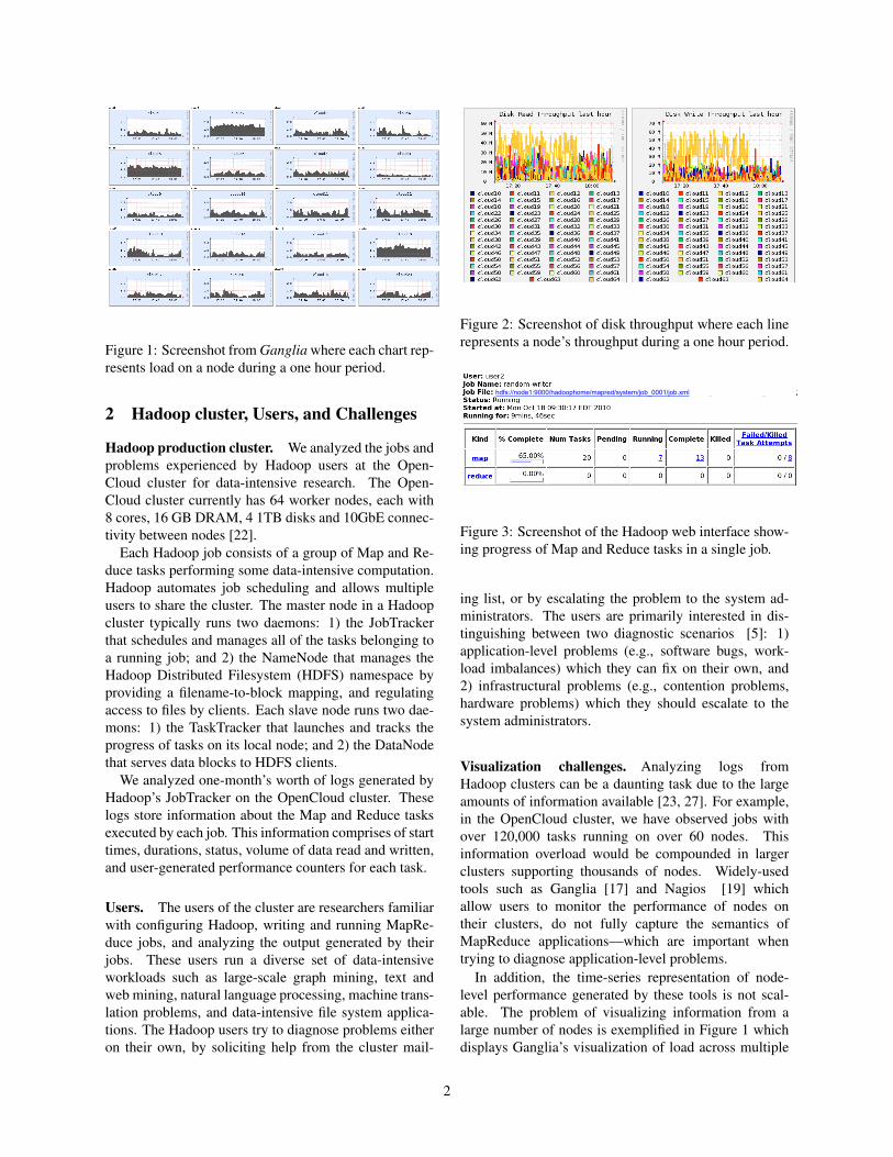
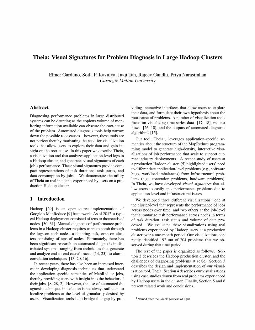
Figure 1: Screenshot from Ganglia where each chart rep-resents load on a node during a one hour period.
2 Hadoop cluster, Users, and Challenges
Hadoop production cluster. We analyzed the jobs andproblems experienced by Hadoop users at the Open-Cloud cluster for data-intensive research. The Open-Cloud cluster currently has 64 worker nodes, each with8 cores, 16 GB DRAM, 4 1TB disks and 10GbE connec-tivity between nodes [22].
Each Hadoop job consists of a group of Map and Re-duce tasks performing some data-intensive computation.Hadoop automates job scheduling and allows multipleusers to share the cluster. The master node in a Hadoopcluster typically runs two daemons: 1) the JobTrackerthat schedules and manages all of the tasks belonging toa running job; and 2) the NameNode that manages theHadoop Distributed Filesystem (HDFS) namespace byproviding a filename-to-block mapping, and regulatingaccess to files by clients. Each slave node runs two dae-mons: 1) the TaskTracker that launches and tracks theprogress of tasks on its local node; and 2) the DataNodethat serves data blocks to HDFS clients.
We analyzed one-month’s worth of logs generated byHadoop’s JobTracker on the OpenCloud cluster. Theselogs store information about the Map and Reduce tasksexecuted by each job. This information comprises of starttimes, durations, status, volume of data read and written,and user-generated performance counters for each task.
Users. The users of the cluster are researchers familiarwith configuring Hadoop, writing and running MapRe-duce jobs, and analyzing the output generated by theirjobs. These users run a diverse set of data-intensiveworkloads such as large-scale graph mining, text andweb mining, natural language processing, machine trans-lation problems, and data-intensive file system applica-tions. The Hadoop users try to diagnose problems eitheron their own, by soliciting help from the cluster mail-
Figure 2: Screenshot of disk throughput where each linerepresents a node’s throughput during a one hour period.
hdfs://node1:9000/hadoophome/mapred/system/job_0001/job.xml
Figure 3: Screenshot of the Hadoop web interface show-ing progress of Map and Reduce tasks in a single job.
ing list, or by escalating the problem to the system ad-ministrators. The users are primarily interested in dis-tinguishing between two diagnostic scenarios [5]: 1)application-level problems (e.g., software bugs, work-load imbalances) which they can fix on their own, and2) infrastructural problems (e.g., contention problems,hardware problems) which they should escalate to thesystem administrators.
Visualization challenges. Analyzing logs fromHadoop clusters can be a daunting task due to the largeamounts of information available [23, 27]. For example,in the OpenCloud cluster, we have observed jobs withover 120,000 tasks running on over 60 nodes. Thisinformation overload would be compounded in largerclusters supporting thousands of nodes. Widely-usedtools such as Ganglia [17] and Nagios [19] whichallow users to monitor the performance of nodes ontheir clusters, do not fully capture the semantics ofMapReduce applications—which are important whentrying to diagnose application-level problems.
In addition, the time-series representation of node-level performance generated by these tools is not scal-able. The problem of visualizing information from alarge number of nodes is exemplified in Figure 1 whichdisplays Ganglia’s visualization of load across multiple
2
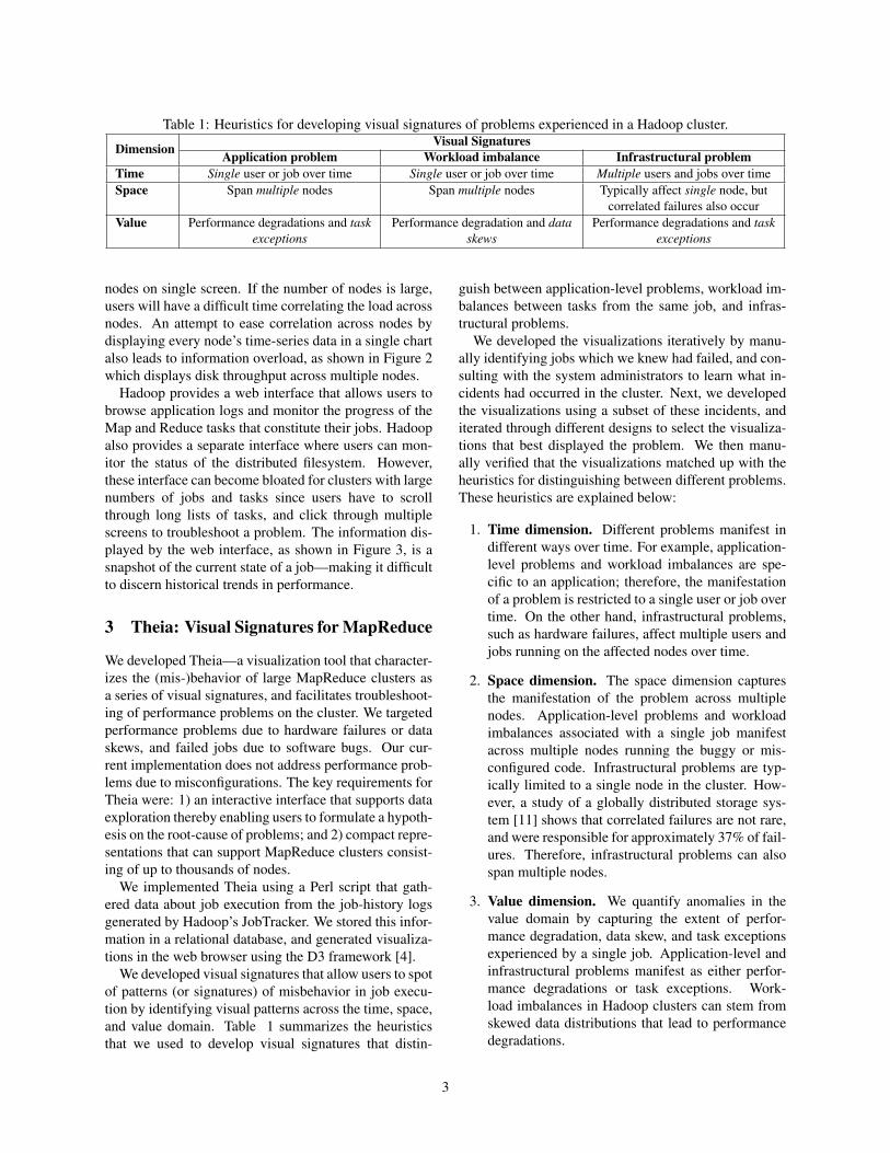
Table 1: Heuristics for developing visual signatures of problems experienced in a Hadoop cluster.
Dimension Visual SignaturesApplication problem Workload imbalance Infrastructural problem
Time Single user or job over time Single user or job over time Multiple users and jobs over timeSpace Span multiple nodes Span multiple nodes Typically affect single node, but
correlated failures also occurValue Performance degradations and task
exceptionsPerformance degradation and data
skewsPerformance degradations and task
exceptions
nodes on single screen. If the number of nodes is large,users will have a difficult time correlating the load acrossnodes. An attempt to ease correlation across nodes bydisplaying every node’s time-series data in a single chartalso leads to information overload, as shown in Figure 2which displays disk throughput across multiple nodes.
Hadoop provides a web interface that allows users tobrowse application logs and monitor the progress of theMap and Reduce tasks that constitute their jobs. Hadoopalso provides a separate interface where users can mon-itor the status of the distributed filesystem. However,these interface can become bloated for clusters with largenumbers of jobs and tasks since users have to scrollthrough long lists of tasks, and click through multiplescreens to troubleshoot a problem. The information dis-played by the web interface, as shown in Figure 3, is asnapshot of the current state of a job—making it difficultto discern historical trends in performance.
3 Theia: Visual Signatures for MapReduce
We developed Theia—a visualization tool that character-izes the (mis-)behavior of large MapReduce clusters asa series of visual signatures, and facilitates troubleshoot-ing of performance problems on the cluster. We targetedperformance problems due to hardware failures or dataskews, and failed jobs due to software bugs. Our cur-rent implementation does not address performance prob-lems due to misconfigurations. The key requirements forTheia were: 1) an interactive interface that supports dataexploration thereby enabling users to formulate a hypoth-esis on the root-cause of problems; and 2) compact repre-sentations that can support MapReduce clusters consist-ing of up to thousands of nodes.
We implemented Theia using a Perl script that gath-ered data about job execution from the job-history logsgenerated by Hadoop’s JobTracker. We stored this infor-mation in a relational database, and generated visualiza-tions in the web browser using the D3 framework [4].
We developed visual signatures that allow users to spotof patterns (or signatures) of misbehavior in job execu-tion by identifying visual patterns across the time, space,and value domain. Table 1 summarizes the heuristicsthat we used to develop visual signatures that distin-
guish between application-level problems, workload im-balances between tasks from the same job, and infras-tructural problems.
We developed the visualizations iteratively by manu-ally identifying jobs which we knew had failed, and con-sulting with the system administrators to learn what in-cidents had occurred in the cluster. Next, we developedthe visualizations using a subset of these incidents, anditerated through different designs to select the visualiza-tions that best displayed the problem. We then manu-ally verified that the visualizations matched up with theheuristics for distinguishing between different problems.These heuristics are explained below:
1. Time dimension. Different problems manifest indifferent ways over time. For example, application-level problems and workload imbalances are spe-cific to an application; therefore, the manifestationof a problem is restricted to a single user or job overtime. On the other hand, infrastructural problems,such as hardware failures, affect multiple users andjobs running on the affected nodes over time.
2. Space dimension. The space dimension capturesthe manifestation of the problem across multiplenodes. Application-level problems and workloadimbalances associated with a single job manifestacross multiple nodes running the buggy or mis-configured code. Infrastructural problems are typ-ically limited to a single node in the cluster. How-ever, a study of a globally distributed storage sys-tem [11] shows that correlated failures are not rare,and were responsible for approximately 37% of fail-ures. Therefore, infrastructural problems can alsospan multiple nodes.
3. Value dimension. We quantify anomalies in thevalue domain by capturing the extent of perfor-mance degradation, data skew, and task exceptionsexperienced by a single job. Application-level andinfrastructural problems manifest as either perfor-mance degradations or task exceptions. Work-load imbalances in Hadoop clusters can stem fromskewed data distributions that lead to performancedegradations.
3

3.1 Quantifying Anomalies
To generate the visual signatures of problems, we quan-tify the anomalies experienced during job execution us-ing a small number of metrics. We visualize Map andReduce tasks separately because these tasks have verydifferent semantics. We detect anomalies by first assum-ing that under fault-free conditions, the workload in aHadoop cluster is relatively well-balanced across nodesexecuting the same job—therefore, these nodes are peersand should exhibit similar behavior [21]. Next, we iden-tify nodes whose task executions differ markedly fromtheir peers and flag them as anomalous. Aggregating taskbehavior on a per-node basis allows us to build compactsignatures of job behavior because the number of nodesin the cluster can be several orders of magnitudes smallerthan the maximum number of tasks in a job. We flaganomalous nodes based on the following metrics:
1. Task duration. Task duration refers to the span ofa task execution for a given job on a single node.Performance degradations are detected by identify-ing nodes whose task durations significantly exceedthose of its peers.
2. Data volumes. The volume of data processed is thetotal number of bytes read or written from the lo-cal filesystem, and the Hadoop Distributed Filesys-tem (HDFS). We flag anomalies when nodes pro-cess significantly more data than their peers (indi-cating a workload imbalance) or significantly lessdata (possibly indicating performance problem atthe node).
3. Failure ratios The failure ratio is computed by ag-gregating tasks on a per-node basis, and calculat-ing the ratio of failed to successful tasks. In our vi-sualizations, we distinguish failed tasks from killedtasks which arise when speculatively-executed tasksare terminated by the task scheduler.
To compute the anomaly score we assume that metricsfollow a normal distribution and use the z-score, a di-mensionless quantity that indicates how much each valuedeviates from the mean in term of standard deviations,and is computed using the following formula: z = x−µ
σ,
where µ is the mean of the values, and σ is the corre-sponding standard deviation.
For the cluster-level visualization, we estimate theseverity of problems by using a single anomalyscore that flags nodes as anomalous if the geomet-ric mean of the absolute value of the z-scores ishigh, i.e., AnomalyScore=(|zTaskDuration|∗|zDataVolume|∗|zFailureRatio|)(1/3).
Table 2: Metrics utilized by the visualizations.Metric TypeDuration Scalar/AnomalyInformation volume Scalar/AnomalySuccessful tasks CountKilled tasks CountFailed tasks CountData skew PercentageJob name & job id TextDate & time Text
3.2 Visualizing AnomaliesTo generate visualizations that are meaningful in clusterswith hundreds or thousands of nodes, we take advantageof the human brain’s deduction and perception capabili-ties [12]. Human perception is determined by two kindsof processes: bottom-up, driven by the visual informa-tion in the pattern of light falling on the retina, and top-down, driven by the demands of attention, which in turnare determined by the needs of the tasks. [33]. In ourcase, the top-down task is to find those nodes, tasks, orjobs that are exhibiting anomalous behavior. We havegenerated three visualizations that represent different as-pects of a job’s execution at varying levels of granularity.
All of the visualizations in our system are designedwith the following guidelines: 1) they display jobs andnodes in an order that preserves contextual information,e.g., sorting nodes by the amount of data they process;2) they clearly distinguish between attributes that havedifferent semantics, e.g., distinguishing between Map orReduce tasks, and failed and killed tasks; and 3) they pre-serve the structure of the information across the differentvisualizations. We use a square as the unit of representa-tion for the different metrics of the tasks executing on anode. Table 2 shows the different metrics represented inour visualizations.
We also made the following design decisions: 1)present as much information as is understandable in asingle viewport by using color and size to signal the rel-evant information—this allows the brain’s visual querymechanism to process large chunks of information; 2)postpone the display of non-relevant attributes and takeadvantage of the interactive nature of web-browsers—allof our visualizations provide access to additional infor-mation by using the mouseover gesture, and allowingusers to drill-down to a more detailed view of the databy clicking on the relevant interface elements.
3.3 ScalabilityA Hadoop cluster might be composed of hundreds orthousands of nodes—leading to challenges in problem
4

Nod
e ID
Job ID (sorted by start time)
Performance degradation due to failing disk1
26
Figure 4: Visual signature of an infrastructural problemshows succession of anomalous jobs (darker color) dueto a failing disk controller on a node.
diagnosis brought about by the scale of the system. Re-search on human perception has shown that the braincan manage to distinguish features at a very high reso-lution, e.g., differentiating up to 250 features per linearinch [32]. The following formula can be used to calculatethe data density of a visualization:
Data density =Number of data entries or features
Area of data display
For scalability, we leveraged high-resolution datagraphics to display the relevant information of each nodein the cluster. Our heatmap visualization is capableof representing between 1,500 and 2,900 features persquare inch, depending on the resolution of the display;this contrasts with the approximately 10 features persquare inch shown in a typical publication [32].
4 Visualizations and Case Studies
We developed three different visualizations that facili-tate problem diagnosis. We describe their design con-siderations, and use cases in this section. The first vi-sualization is the anomaly heatmap which summarizesjob behavior at the cluster-level; the other two visualiza-tions are at the job-level. The first job-level visualization,referred to as the job-execution stream, allows users toscroll through jobs sequentially thus preserving the timecontext. The second job-level visualization, referred toas the job-execution detail, provides a more detailed viewof task execution over time on each node in terms of taskduration and amount of data processed.
Nod
e ID
126
Job ID (sorted by start time)
Resource contention due to buggy job
Figure 5: Visual signature of an application-level prob-lem. In this case, the problem was caused by a single usersubmitting a resource-intensive job to the cluster repeat-edly causing degraded performance on multiple nodeswhich were eventually blacklisted.
4.1 Anomaly Heatmap
A heatmap is a high-density representation of a matrix,that we use to provide users with a high-level overview ofjobs execution at the cluster-level. This visualization isformulated over a grid that shows nodes on the rows andjobs on the columns, as shown in Figure 4. The dark-ness of an intersection on the grid indicates a higher de-gree of anomaly on that node for that job. By using thisvisualization, anomalies due to application-level and in-frastructural problems can be easily spotted as bursts ofcolor that contrast with non-faulty nodes and jobs in thebackground.
Figure 4 displays the visual signature of an infras-tructural problem identified by a succession of anoma-lous jobs (darker color) due to a failing disk controlleron a node. Figure 5 illustrates the visual signature ofan application-level problem caused by a single user re-peatedly submitting a resource-intensive job to the clus-ter. The resource contention led to degraded performanceacross multiple nodes which were eventually blacklisted.It is easy to identify when a node has gone offline or hasbeen blacklisted by spotting a sudden sequence of hor-izontal white-space; vertical white-space indicates peri-ods of time when the cluster was idle.
The data density of the anomaly heatmap is around2,900 features per square inch on a 109 ppi 2 display,using 2x2 pixels per job/node. This gives us a capacity toshow approximately 54×54 ≈ 2900 features per squareinch 3; which is equivalent to fit 1200 jobs x 700 nodeson a 27′′ display.
2ppi: pixels per inch3(109*109ppi)/(2*2pixels) = 2970.25 features per square inch
5
M
R
job_9438 / HALFCAM5_kmeans_iteration_0 -- SUCCESS21:54:47 / 0h 5m 44s / Oct -10
Maps
Reduces
Yellow borders indicatespeculative tasks were killed
Red borders indicate failed tasks (darkerborders signal higher failure rates)
Darker colored squares indicate anomalous task durations
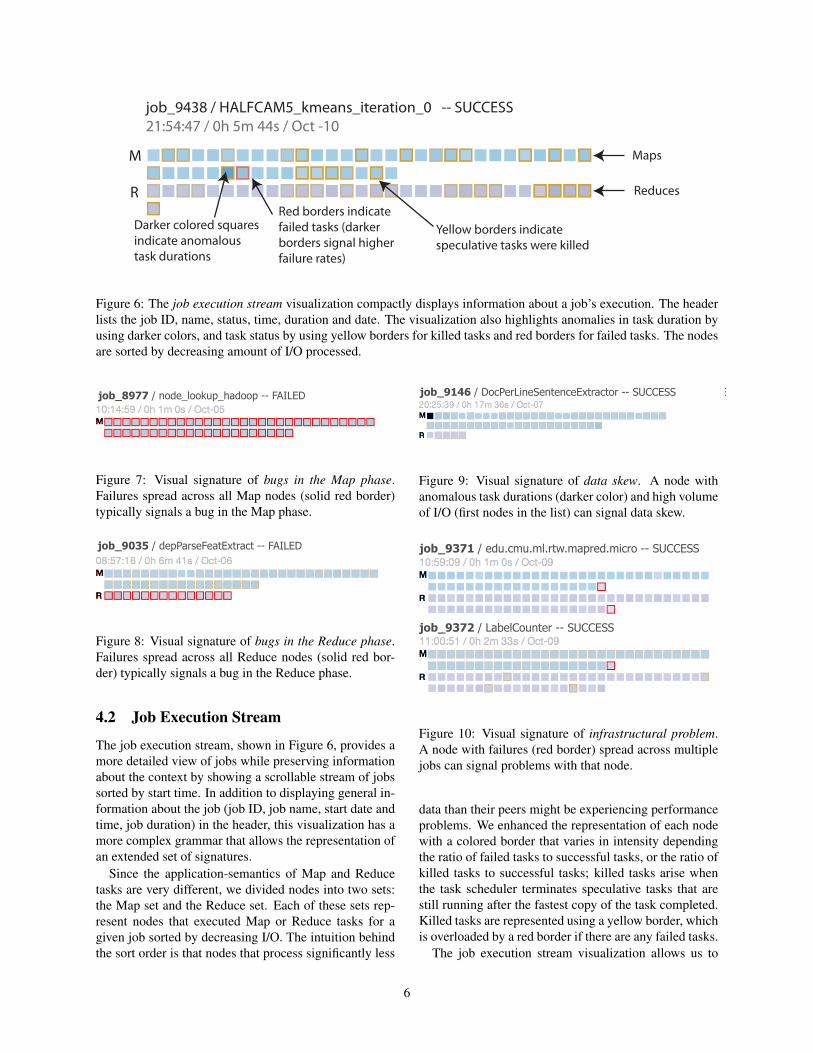
Figure 6: The job execution stream visualization compactly displays information about a job’s execution. The headerlists the job ID, name, status, time, duration and date. The visualization also highlights anomalies in task duration byusing darker colors, and task status by using yellow borders for killed tasks and red borders for failed tasks. The nodesare sorted by decreasing amount of I/O processed.
job_8977 / node_lookup_hadoop -- FAILED
Figure 7: Visual signature of bugs in the Map phase.Failures spread across all Map nodes (solid red border)typically signals a bug in the Map phase.
job_9035 / depParseFeatExtract -- FAILED
Figure 8: Visual signature of bugs in the Reduce phase.Failures spread across all Reduce nodes (solid red bor-der) typically signals a bug in the Reduce phase.
4.2 Job Execution Stream
The job execution stream, shown in Figure 6, provides amore detailed view of jobs while preserving informationabout the context by showing a scrollable stream of jobssorted by start time. In addition to displaying general in-formation about the job (job ID, job name, start date andtime, job duration) in the header, this visualization has amore complex grammar that allows the representation ofan extended set of signatures.
Since the application-semantics of Map and Reducetasks are very different, we divided nodes into two sets:the Map set and the Reduce set. Each of these sets rep-resent nodes that executed Map or Reduce tasks for agiven job sorted by decreasing I/O. The intuition behindthe sort order is that nodes that process significantly less
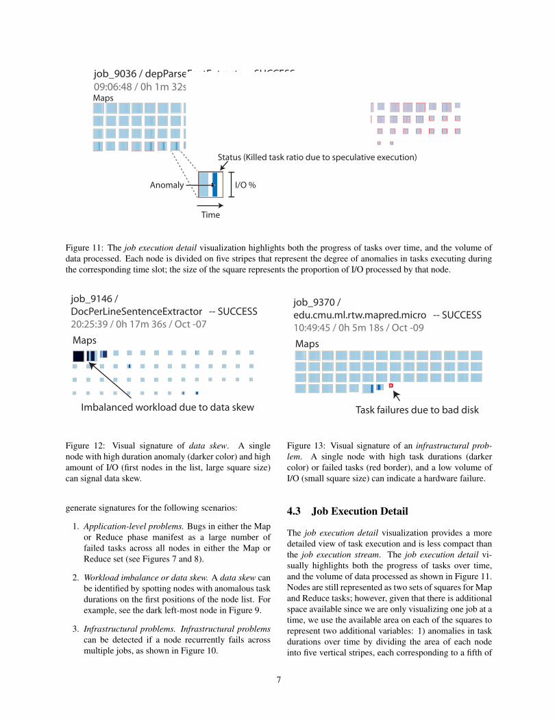
job_9146 / DocPerLineSentenceExtractor -- SUCCESS
Figure 9: Visual signature of data skew. A node withanomalous task durations (darker color) and high volumeof I/O (first nodes in the list) can signal data skew.
job_9369 / PerceptronTrainer:cat:1.0_040 -- SUCCESS
job_9370 / edu.cmu.ml.rtw.mapred.micro -- SUCCESS
job_9371 / edu.cmu.ml.rtw.mapred.micro -- SUCCESS
job_9372 / LabelCounter -- SUCCESS
Figure 10: Visual signature of infrastructural problem.A node with failures (red border) spread across multiplejobs can signal problems with that node.
data than their peers might be experiencing performanceproblems. We enhanced the representation of each nodewith a colored border that varies in intensity dependingthe ratio of failed tasks to successful tasks, or the ratio ofkilled tasks to successful tasks; killed tasks arise whenthe task scheduler terminates speculative tasks that arestill running after the fastest copy of the task completed.Killed tasks are represented using a yellow border, whichis overloaded by a red border if there are any failed tasks.
The job execution stream visualization allows us to
6
Maps Reduces
job_9036 / depParseFeatExtract -- SUCCESS09:06:48 / 0h 1m 32s / Oct -10
Anomaly
Time
I/O %
Status (Killed task ratio due to speculative execution)
Figure 11: The job execution detail visualization highlights both the progress of tasks over time, and the volume ofdata processed. Each node is divided on five stripes that represent the degree of anomalies in tasks executing duringthe corresponding time slot; the size of the square represents the proportion of I/O processed by that node.
job_9146 / DocPerLineSentenceExtractor -- SUCCESS20:25:39 / 0h 17m 36s / Oct -07
Imbalanced workload due to data skew
Maps
Figure 12: Visual signature of data skew. A singlenode with high duration anomaly (darker color) and highamount of I/O (first nodes in the list, large square size)can signal data skew.
generate signatures for the following scenarios:
1. Application-level problems. Bugs in either the Mapor Reduce phase manifest as a large number offailed tasks across all nodes in either the Map orReduce set (see Figures 7 and 8).
2. Workload imbalance or data skew. A data skew canbe identified by spotting nodes with anomalous taskdurations on the first positions of the node list. Forexample, see the dark left-most node in Figure 9.
3. Infrastructural problems. Infrastructural problemscan be detected if a node recurrently fails acrossmultiple jobs, as shown in Figure 10.
job_9370 / edu.cmu.ml.rtw.mapred.micro -- SUCCESS10:49:45 / 0h 5m 18s / Oct -09
Task failures due to bad disk
Maps
Figure 13: Visual signature of an infrastructural prob-lem. A single node with high task durations (darkercolor) or failed tasks (red border), and a low volume ofI/O (small square size) can indicate a hardware failure.
4.3 Job Execution Detail
The job execution detail visualization provides a moredetailed view of task execution and is less compact thanthe job execution stream. The job execution detail vi-sually highlights both the progress of tasks over time,and the volume of data processed as shown in Figure 11.Nodes are still represented as two sets of squares for Mapand Reduce tasks; however, given that there is additionalspace available since we are only visualizing one job at atime, we use the available area on each of the squares torepresent two additional variables: 1) anomalies in taskdurations over time by dividing the area of each nodeinto five vertical stripes, each corresponding to a fifth of
7
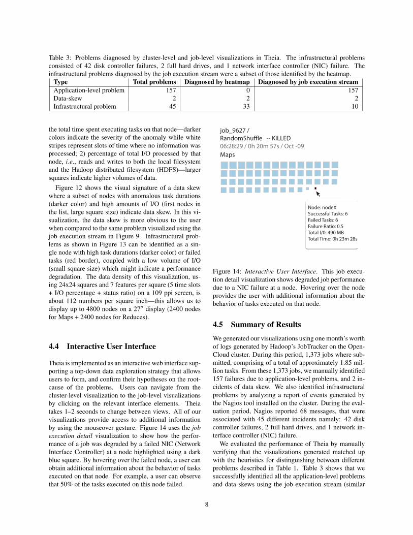
Table 3: Problems diagnosed by cluster-level and job-level visualizations in Theia. The infrastructural problemsconsisted of 42 disk controller failures, 2 full hard drives, and 1 network interface controller (NIC) failure. Theinfrastructural problems diagnosed by the job execution stream were a subset of those identified by the heatmap.
Type Total problems Diagnosed by heatmap Diagnosed by job execution streamApplication-level problem 157 0 157Data-skew 2 2 2Infrastructural problem 45 33 10
the total time spent executing tasks on that node—darkercolors indicate the severity of the anomaly while whitestripes represent slots of time where no information wasprocessed; 2) percentage of total I/O processed by thatnode, i.e., reads and writes to both the local filesystemand the Hadoop distributed filesystem (HDFS)—largersquares indicate higher volumes of data.
Figure 12 shows the visual signature of a data skewwhere a subset of nodes with anomalous task durations(darker color) and high amounts of I/O (first nodes inthe list, large square size) indicate data skew. In this vi-sualization, the data skew is more obvious to the userwhen compared to the same problem visualized using thejob execution stream in Figure 9. Infrastructural prob-lems as shown in Figure 13 can be identified as a sin-gle node with high task durations (darker color) or failedtasks (red border), coupled with a low volume of I/O(small square size) which might indicate a performancedegradation. The data density of this visualization, us-ing 24x24 squares and 7 features per square (5 time slots+ I/O percentage + status ratio) on a 109 ppi screen, isabout 112 numbers per square inch—this allows us todisplay up to 4800 nodes on a 27′′ display (2400 nodesfor Maps + 2400 nodes for Reduces).
4.4 Interactive User Interface
Theia is implemented as an interactive web interface sup-porting a top-down data exploration strategy that allowsusers to form, and confirm their hypotheses on the root-cause of the problems. Users can navigate from thecluster-level visualization to the job-level visualizationsby clicking on the relevant interface elements. Theiatakes 1–2 seconds to change between views. All of ourvisualizations provide access to additional informationby using the mouseover gesture. Figure 14 uses the jobexecution detail visualization to show how the perfor-mance of a job was degraded by a failed NIC (NetworkInterface Controller) at a node highlighted using a darkblue square. By hovering over the failed node, a user canobtain additional information about the behavior of tasksexecuted on that node. For example, a user can observethat 50% of the tasks executed on this node failed.
Node: nodeXSuccessful Tasks: 6Failed Tasks: 6Failure Ratio: 0.5Total I/0: 490 MBTotal Time: 0h 23m 28s
job_9627 / RandomShu�e -- KILLED06:28:29 / 0h 20m 57s / Oct -09Maps
Figure 14: Interactive User Interface. This job execu-tion detail visualization shows degraded job performancedue to a NIC failure at a node. Hovering over the nodeprovides the user with additional information about thebehavior of tasks executed on that node.
4.5 Summary of Results
We generated our visualizations using one month’s worthof logs generated by Hadoop’s JobTracker on the Open-Cloud cluster. During this period, 1,373 jobs where sub-mitted, comprising of a total of approximately 1.85 mil-lion tasks. From these 1,373 jobs, we manually identified157 failures due to application-level problems, and 2 in-cidents of data skew. We also identified infrastructuralproblems by analyzing a report of events generated bythe Nagios tool installed on the cluster. During the eval-uation period, Nagios reported 68 messages, that wereassociated with 45 different incidents namely: 42 diskcontroller failures, 2 full hard drives, and 1 network in-terface controller (NIC) failure.
We evaluated the performance of Theia by manuallyverifying that the visualizations generated matched upwith the heuristics for distinguishing between differentproblems described in Table 1. Table 3 shows that wesuccessfully identified all the application-level problemsand data skews using the job execution stream (similar
8
results are obtained using the job execution detail). Inaddition, the anomaly heatmap was able to identify 33 ofthe 45 infrastructural problems (the problems identifiedby the job execution stream are a subset of those iden-tified by the heatmap). We were unable to detect 4 ofthe infrastructural problems because the nodes had beenblacklisted. We hypothesize that the heatmap was un-able to detect the remaining 8 infrastructural problemsbecause they occurred when the cluster was idle.
5 Related Work
The visualizations we generated are based on previ-ous research on visual log-based performance debug-ging [27]. This paper presents a Host-State decompo-sition visualization from which we borrowed elementsto build our Job-Node heatmap visualization. Bodik etal. [3] present a combined approach to failure localiza-tion using anomaly detection and visualization that lever-ages heatmaps. Theia also uses heatmaps to visualizeanomalies, but we also present heuristics that allow usersto distinguish between different types of problems.
HiTune [8], X-trace [10], and Dapper [26] are tech-niques for tracing causal request paths in distributed sys-tems, but they also offer support for visualizing requestswhose causal structure or duration are anomalous. WhileTheia does not currently support the visualization of thecausal structure of Hadoop jobs, our visualizations pro-vide a compact representation of multiple aspects of jobbehavior such as task duration, task status, and data vol-ume within a single viewport.
Artemis [7] provides a pluggable framework for dis-tributed log collection, data analysis, and visualization.LiveRAC [18] is tool for browsing and correlating time-series data in large-scale systems. Otus [24] collects andcorrelates performance metrics from distributed compo-nents and provides views of the data as a time-series.Both LiveRAC and Otus support visualization of generictime-series data. Artemis supports visualization plug-ins that display domain-specific histograms and time-series data. Theia, on the other hand, incoporates seman-tic information about job execution—allowing us to dis-tinguish application-level problems from infrastructuralproblems.
Chau et al. [6] present an initiative for combining ma-chine learning and visualizations for large network dataexploration. Amershi et al. [1] use a similar approach foralarm triage on a network of more than 15,000 devices.We are investigating whether we can incorporate moresophisticated anomaly detectors into our tool.
6 Conclusion
Theia is a visualization tool that exploits application-specific semantics about the structure of MapReducejobs to generate high-density, interactive visualizationsof job performance that scale to support current indus-try deployments. Theia uses heuristics to identify visualsignatures of problems that allow users to distinguishapplication-level problems (e.g., software bugs, work-load imbalances) from infrastructural problems (e.g.,contention problems, hardware problems). We have eval-uated our visualizations using real problems experiencedby Hadoop users at a production cluster over a one-month period. Our visualizations correctly identified 192out of 204 problems that we observed.
In the future, we plan to integrate these visualizationsas part of the standard stack of tools for Hadoop diagno-sis. Detecting anomalies in heterogeneous clusters is anopen issue as our assumption of peer-similarity might nothold in these systems. Other enhancements to the visualinterfaces that we are considering are: 1) to display nodeshosted in the same rack together to increase our ability tospot failures at the rack-level; 2) to generate high-densityper-task views and to incorporate resource-usage infor-mation such as CPU and memory usage; and 3) to de-velop algorithms that automatically classify application-level and infrastructural problems using the heuristics de-scribed in this paper.
7 Acknowledgments
We thank Mitch Franzos, Michael Stroucken, ZisimosEconomou, and Kai Ren for access to the OpenCloud Hadooplogs. We thank our shepherd, Cory Lueninghoener, theconference reviewers, and our colleagues, Raja Sambasivanand Ilari Shafer, for their valuable feedback. We thank themembers and companies of the PDL Consortium (includingActifio, APC, EMC, Emulex, Facebook, Fusion-io, Google,Hewlett-Packard Labs, Hitachi, Intel, Microsoft Research,NEC Labs, NetApp, Oracle, Panasas, Riverbed, Samsung, Sea-gate, STEC, Symantec, VMware, and Western Digital) fortheir support. This research was sponsored in part by theproject CMUPT/RNQ/0015/2009 (TRONE—Trustworthy andResilient Operations in a Network Environment), and by Intelvia the Intel Science and Technology Center for Cloud Com-puting (ISTC-CC).
References[1] AMERSHI, S., LEE, B., KAPOOR, A., MAHAJAN, R., AND
CHRISTIAN, B. CueT: human-guided fast and accurate networkalarm triage. In ACM Conference on Human Factors in Comput-ing Systems (CHI) (Vancouver, BC, Canada, May 2011).
[2] ANANTHANARAYANAN, G., KANDULA, S., GREENBERG, A.,STOICA, I., LU, Y., SAHA, B., AND HARRIS, E. Reining in the
9
outliers in map-reduce clusters using Mantri. In USENIX Sympo-sium on Operating Systems Design and Implementation (OSDI)(Vancouver, BC, Canada, October 2010), pp. 1–16.
[3] BODIK, P., FRIEDMAN, G., BIEWALD, L., LEVINE, H., CAN-DEA, G., PATEL, K., TOLLE, G., HUI, J., FOX, A., JORDAN,M. I., AND ET AL. Combining visualization and statistical anal-ysis to improve operator confidence and efficiency for failure de-tection and localization. In IEEE International Conference onAutomatic Computing (ICAC) (Seattle, WA, June 2005), pp. 89–100.
[4] BOSTOCK, M., OGIEVETSKY, V., AND HEER, J. D3: Data-driven documents. IEEE Trans. Visualization & Comp. Graphics(Proc. InfoVis) (2011).
[5] CAMPBELL, J. D., GANESAN, A. B., GOTOW, B., KAVULYA,S. P., MULHOLLAND, J., NARASIMHAN, P., RAMASUBRAMA-NIAN, S., SHUSTER, M., AND TAN, J. Understanding and im-proving the diagnostic workflow of mapreduce users. In ACMSymposium on Computer Human Interaction for Management ofInformation Technology (CHIMIT) (Boston, Massachusetts, De-cember 2011).
[6] CHAU, D. H., KITTUR, A., HONG, J. I., AND FALOUTSOS,C. Apolo: making sense of large network data by combiningrich user interaction and machine learning. In ACM Conferenceon Human Factors in Computing Systems (CHI) (Vancouver, BC,Canada, May 2011).
[7] CRETU-CIOCARLIE, G. F., BUDIU, M., AND GOLDSZMIDT,M. Hunting for problems with artemis. In USENIX Workshop onAnalysis of System Logs (San Diego, CA, December 2008).
[8] DAI, J., HUANG, J., HUANG, S., HUANG, B., AND LIU, Y.Hitune: dataflow-based performance analysis for big data cloud.In USENIX Annual Technical Conference (ATC) (Portland, OR,June 2011).
[9] DEAN, J., AND GHEMAWAT, S. MapReduce: simplified dataprocessing on large clusters. In USENIX Symposium on Operat-ing Systems Design and Implementation (OSDI) (San Francisco,CA, December 2004), pp. 137–150.
[10] FONSECA, R., PORTER, G., KATZ, R. H., SHENKER, S., ANDSTOICA, I. X-Trace: A pervasive network tracing framework. InUSENIX Symposium on Networked Systems Design and Imple-mentation (NSDI) (Cambridge, MA, Apr. 2007).
[11] FORD, D., LABELLE, F., POPOVICI, F. I., STOKELY, M.,TRUONG, V.-A., BARROSO, L., GRIMES, C., AND QUIN-LAN, S. Availability in globally distributed storage systems. InUSENIX Symposium on Operating Systems Design and Imple-mentation (OSDI) (Vancouver, CA, October 2010), pp. 61–74.
[12] KALAWSKY, R. S. Gaining greater insight through interactivevisualization: A human factors perspective. In Trends in Inter-active Visualization, R. Liere, T. Adriaansen, and E. Zudilova-Seinstra, Eds., Advanced Information and Knowledge Process-ing. Springer London, 2009.
[13] KANDULA, S., MAHAJAN, R., VERKAIK, P., AGARWAL, S.,PADHYE, J., AND BAHL, P. Detailed diagnosis in enterprise net-works. In ACM Conference on Applications, Technologies, Ar-chitectures, and Protocols for Computer Communications (SIG-COMM) (Barcelona, Spain, August 2009), pp. 243–254.
[14] KAVULYA, S., DANIELS, S., JOSHI, K. R., HILTUNEN, M. A.,GANDHI, R., AND NARASIMHAN, P. Practical experienceswith chronics discovery in large telecommunications systems. InIEEE Conference on Dependable Systems and Networks (DSN)(Boston, MA, June 2012).
[15] LIU, Z., LEE, B., KANDULA, S., AND MAHAJAN, R. Net-clinic: Interactive visualization to enhance automated fault di-agnosis in enterprise networks. In IEEE Conference on VisualAnalytics Science and Technology (Salt Lake City, UT, October2010), pp. 131–138.
[16] MAHIMKAR, A. A., GE, Z., SHAIKH, A., WANG, J., YATES,J., ZHANG, Y., AND ZHAO, Q. Towards automated performance
diagnosis in a large IPTV network. In ACM Conference on Appli-cations, Technologies, Architectures, and Protocols for ComputerCommunications (SIGCOMM) (Barcelona, Spain, August 2009),pp. 231–242.
[17] MASSIE, M. L., CHUN, B. N., AND CULLER, D. E. The gan-glia distributed monitoring system: Design, implementation, andexperience. Parallel Computing 30 (June 2004), 817–840.
[18] MCLACHLAN, P., MUNZNER, T., KOUTSOFIOS, E., ANDNORTH, S. C. LiveRAC: interactive visual exploration of sys-tem management time-series data. In ACM Conference on Hu-man Factors in Computing Systems (CHI) (Florence, Italy, April2008), pp. 1483–1492.
[19] NAGIOS ENTERPRISES LLC. Nagios. http://www.nagios.org/,September 2012.
[20] OLINER, A. J., KULKARNI, A. V., AND AIKEN, A. Using cor-related surprise to infer shared influence. In IEEE Conferenceon Dependable Systems and Networks (DSN) (Chicago, IL, July2010), pp. 191–200.
[21] PAN, X., TAN, J., KAVULYA, S., GANDHI, R., ANDNARASIMHAN, P. Ganesha: Blackbox diagnosis of MapReducesystems. SIGMETRICS Perform. Eval. Rev. 37 (January 2010).
[22] PARALLEL DATA LAB. Apache Hadoop. http://wiki.pdl.
cmu.edu/opencloudwiki/, September 2012.
[23] RABKIN, A., AND KATZ, R. Chukwa: a system for reliablelarge-scale log collection. In USENIX Conference on Large In-stallation System Administration (LISA) (San Jose, CA, Novem-ber 2010), USENIX Association.
[24] REN, K., LOPEZ, J., AND GIBSON, G. Otus: resource attribu-tion in data-intensive clusters. In Workshop on MapReduce andits applications (MapReduce) (San Jose, CA, June 2011).
[25] SAMBASIVAN, R. R., ZHENG, A. X., ROSA, M. D., KREVAT,E., WHITMAN, S., STROUCKEN, M., WANG, W., XU, L., ANDGANGER, G. R. Diagnosing performance changes by compar-ing request flows. In USENIX Symposium on Networked SystemsDesign and Implementation (NSDI) (Boston, MA, March 2011),pp. 43–56.
[26] SIGELMAN, B. H., BARROSO, L. A., BURROWS, M.,STEPHENSON, P., PLAKAL, M., BEAVER, D., JASPAN, S., ANDSHANBHAG, C. Dapper, a large-scale distributed systems tracinginfrastructure. Tech. rep., Google, Inc., 2010.
[27] TAN, J., KAVULYA, S., GANDHI, R., AND NARASIMHAN, P.Visual, log-based causal tracing for performance debugging ofmapreduce systems. In IEEE International Conference on Dis-tributed Computing Systems (ICDCS) (Genova, Italy, June 2010),pp. 795–806.
[28] TAN, J., PAN, X., KAVULYA, S., GANDHI, R., ANDNARASIMHAN, P. SALSA: Analyzing Logs as StAte Machines.In USENIX Workshop on Analysis of system logs (San Diego, Cal-ifornia, December 2008).
[29] THE APACHE SOFTWARE FOUNDATION. Apache Hadoop.http://hadoop.apache.org/, September 2012.
[30] THE APACHE SOFTWARE FOUNDATION. PoweredBy Hadoop.http://wiki.apache.org/hadoop/PoweredBy, September2012.
[31] THUSOO, A., SHAO, Z., ANTHONY, S., BORTHAKUR, D.,JAIN, N., SEN SARMA, J., MURTHY, R., AND LIU, H. Datawarehousing and analytics infrastructure at facebook. In ACMConference on Management of Data (SIGMOD) (Indianapolis,IN, June 2010).
[32] TUFTE, E. R. The Visual Display of Quantitative Information,2nd ed. Graphics Pr, May 2001.
[33] WARE, C. Visual Thinking: for Design. Morgan Kaufmann Pub-lishers Inc., San Francisco, CA, USA, 2008.
10


