Embed Size (px)
Citation preview

THE
QUARTERLY JOURNALOF ECONOMICS
Vol. CXXI May 2006 Issue 2
THE WORLD DISTRIBUTION OF INCOME: FALLINGPOVERTY AND . . . CONVERGENCE, PERIOD*
XAVIER SALA-I-MARTIN
We estimate the World Distribution of Income by integrating individualincome distributions for 138 countries between 1970 and 2000. Country distribu-tions are constructed by combining national accounts GDP per capita to anchorthe mean with survey data to pin down the dispersion. Poverty rates and headcounts are reported for four specific poverty lines. Rates in 2000 were betweenone-third and one-half of what they were in 1970 for all four lines. There werebetween 250 and 500 million fewer poor in 2000 than in 1970. We estimate eightindexes of income inequality implied by our world distribution of income. All ofthem show reductions in global inequality during the 1980s and 1990s.
I. INTRODUCTION
The world distribution of income (WDI) has been an ongoingconcern for economists and scholars worldwide. The convergenceliterature convincingly established divergence among countriesin two dimensions:1 first, growth rates of poor countries havebeen lower than the growth rates of their rich counterparts (aphenomenon called �-divergence by Barro and Sala-i-Martin
* This paper was partly written when I was visiting Universitat PompeuFabra in Barcelona. I thank Sanket Mohapatra for extraordinary research assis-tance and for comments and suggestions. I also benefited from the comments ofAnthony Atkinson, Victoria Baranov, Gary Becker, Francois Bourguignon, Gideondu Rand, Edward Glaeser, Richard Freeman, Laila Haider, Allan Heston, Law-rence Katz, Michael Kremer, Casey B. Mulligan, Kevin Murphy, Martin Raval-lion, and seminar participants at Universitat Pompeu Fabra, Harvard University,University of Chicago, Columbia University, the American Enterprise Institute,Universidad de Santander, Fordham University, and the International MonetaryFund. I would like to thank NSF Grant 20-3367-00-0-79-447 and the SpanishMEC Grants SEC 2001-0674 and SEC 2001-0769 for financial support.
1. See Baumol [1986], De Long [1988], Barro and Sala-i-Martin [1992], Man-kiw, Romer, and Weil [1992], Sala-i-Martin [1996], and Pritchett [1997].
© 2006 by the President and Fellows of Harvard College and the Massachusetts Institute ofTechnology.The Quarterly Journal of Economics, May 2006
351
[1992]); and second, the dispersion of income per capita acrosscountries has tended to increase over time (a phenomenon called�-divergence by Barro and Sala-i-Martin [1992]). Following Quah[1993], the “twin peaks” literature analyzed the evolution of theentire world distribution of incomes per capita across countries[Quah 1996; Jones 1997; Kremer, Onatski, and Stock 2001]. Herethe conclusions are a bit less stark: although Quah [1993, 1996]and Jones [1997] found that the world seemed to move toward abimodal (or “twin peaked”) distribution, Kremer, Onatski, andStock [2001] emphasized the fragility of this result.
Both these literatures analyzed aspects of the WDI, and usedcountries as their unit of analysis. This is the correct approachwhen, for example, one tries to test theories of economic growth2
because aggregate growth theories tend to predict that growthdepends on “national factors” such as policies, institutions, andother elements determined at the economywide level. To theextent that those determinants are independent across nations,each country can be correctly treated as an independent datapoint of an economic “experiment.” Using countries as units ofanalysis, however, is not useful if one worries about humanwelfare because different countries have different populationsizes. After all, there is no reason to down-weight the well-beingof a Chinese peasant relative to a Senegalese farmer just becausethe population in China is larger than that of Senegal. Thecountry analysis, for example, does not help answer questions,such as “how many people in the world live in poverty,” “how havepoverty rates changed over the last few decades,” or “are inequal-ities across citizens growing over time?”
Scholars partially solve this problem by using population-weighted distributions of income. Jones [1997] showed that theemergence of a bimodal distribution disappears once each countrydata point is weighted by population. And Schultz [1998] foundthat, when one uses population-weights, it is no longer true thatincomes tend to diverge:3 on the contrary, the incomes of poorcitizens have grown faster (�-convergence), and measures of in-come inequality have declined (�-convergence). The striking dif-
2. The convergence literature, for example, was centered on the testing of theneoclassical growth model that predicts conditional convergence. See Barro andSala-i-Martin [1992].
3. Theil [1979, 1996], Berry, Bourguignon, and Morrison [1983], Theil andSeale [1994], Firebaugh [1999], and Melchior, Telle, and Wiig [2000] also con-struct population-weighted measures of per capita income inequality.
352 QUARTERLY JOURNAL OF ECONOMICS

ference can be appreciated in Figure I. Figure Ia displays thewell-known scatter plot of the growth rate between 1970 and 2000versus the logarithm of income per capita in 1970. The correlation
FIGURE IaGrowth Versus Initial Income (Unweighted)
FIGURE IbGrowth Versus Initial Income (Population-Weighted)
353THE WORLD DISTRIBUTION OF INCOME

is virtually zero. If anything, the slope of a univariate regressionis positive. Figure Ib displays the same picture, but the size ofeach dot is now proportional to that country’s population. Thenegative relation between growth and the initial level of income isapparent: the few countries in Asia that have converged to incomelevels of the OECD are large and populous, while many of thecountries that have diverged (chiefly African countries) are not.Since the total population of the 41 African nations is about halfof that of China or India and only twice the population of Indo-nesia, the results where each country is one observation (andtherefore Africa gets 41 times the weight of China) are completelydifferent from those where each citizen is one observation (whereAfrica gets about half the weight of China).
Using population-weighted distributions of per capita income(from national accounts) is a step in the right direction, but it isnot sufficient to provide accurate estimates of concepts like pov-erty rates or indexes of income inequality. These measures stillmiss within-country dispersion, a factor that needs to be includedif sensible estimates of the WDI are to be constructed. By usingpopulation weights, researchers recognize that different coun-tries have different population sizes . . . but they implicitly as-sume that all citizens of a country have the same level of incomecorresponding to the per capita income implied by the nationalaccounts. This can yield misleading results: if the per capitaincome in a country were a couple of dollars above the povertyline, researchers using distributions based on population-weighted per capita income would conclude that no poor citizenslived in that country. Similarly, they would tend to find dramaticdeclines in poverty rates as the income per capita of very popu-lated countries grows from a few dollars below to a few dollarsabove the poverty line. In terms of inequality, population-weighted indexes of inequality could show a decline in overallglobal inequality, while the true individual inequalities could berising if within-country inequalities increase sufficiently.
Incorporating information about the within-country distribu-tion is problematic, however, because it is not readily available.Deininger and Squire [1996] collect data from a large number ofmicroeconomic surveys conducted in a variety of countries overthe last 30 years. The United Nations University’s World Insti-tute for Development Research (UNU-WIDER) keeps an updateof this collection. Although these surveys contain a large amountof information about the distribution of income (or expenditure)within many countries, they are still incomplete: surveys do not
354 QUARTERLY JOURNAL OF ECONOMICS

exist for a number of economies, and for the countries for whichsurveys do exist, many years are missing. However, this informa-tion can and should be used to complement the population-weighted national accounts and to construct estimates of theWDI.
And this is what we do in this paper: we estimate the WDI foreach year from 1970 to 2000 by integrating the income distribu-tions of 138 countries. The means of the individual country dis-tributions are the population-weighted levels of GDP per capitareported by the Penn World Tables 6.1 [Heston, Summers, andAten 2002]. The dispersion around each of these means is esti-mated using the micro surveys reported by Deininger and Squire[1996] and UNU-WIDER. Since microeconomic surveys are notavailable annually for every country, we impute the missing databy forecasting quintile income shares for the countries for whichmultiple surveys are available. For countries with no surveyinformation, we assign the average quintile income shares of the“neighboring region” (defined in Section II). We then use a non-parametric approach to estimate a smooth income distribution foreach country/year.
We are not the first ones to merge survey and nationalaccount data to estimate characteristics of the WDI. Schultz[1998] expands the population-weighted distributions mentionedabove with information from the Deininger and Squire [1996]surveys. To fill in the missing data, he regresses the variance oflog income and various other measures of income inequality oncountry characteristics. He then uses the coefficients to forecastthe missing cells. Although he provides global measures of in-equality, he does not construct an estimate of the WDI, and as aresult, he cannot estimate poverty rates and headcounts.
Bhalla [2002]4 also combines survey and national accountdata to produced estimates of the WDI, but his procedure is quitedifferent: he uses a parametric approach called the “Simple Ac-counting Procedure” (SAP) to approximate the Lorenz Curve foreach individual country. The SAP is based on Kakwani’s [1980]method of approximating the Lorenz curve using limited data.Estimates are made using quintile data and then projected forany number of centiles. Bourguignon and Morrison [2002], Quah[2002], and Sala-i-Martin [2002a, 2002b] are other papers thatcombine national accounts and survey data.
Finally, early work by the World Bank on poverty estimation
4. Bhalla wrote his book as the first drafts of this paper were written.
355THE WORLD DISTRIBUTION OF INCOME

also combined microeconomic surveys with national accountsdata [Ahluwalia, Carter, and Chenery 1979]. However, the WorldBank decided to abandon this tradition in the mid-1990s and toanchor their data to the survey mean. In fact, they recommendedthat individual countries estimating poverty rates do the samething so that countries like India, which had long anchored thesurvey distributions to the national account means decided to useboth distributions and means from surveys. As argued by Deaton[2001], “no very convincing reason was ever given for the change.”
The rest of the paper is organized as follows: Section IIdescribes the methodology to construct individual country distri-butions and the WDI. Section III uses the WDI to provide esti-mates of poverty rates and head counts for the world as well as forthe various regions of the globe. Section IV reports eight inequal-ity measures derived from the estimated WDI. All measures pointin the same direction: not only has world income inequality notincreased as dramatically as many feared, but it has, instead,fallen since its peak in the late 1970s. Section V concludes.
II. ESTIMATING THE WDI
We construct the WDI by estimating an annual income dis-tribution for each of 138 countries, and then integrating thesecountry distributions for all levels of income. The starting point ofour analysis is the population-weighted income per capita, whichwe will use as the mean of each country’s distribution. As ameasure of income, we use the PPP-adjusted GDP per capita fromthe Penn World Tables 6.1 [Heston, Summers, and Aten 2002].We could anchor our country distributions to other measures ofaverage income such as the mean income from surveys. Wechoose not to do so for a variety of reasons. First, we want to buildon the population-weighted distributions that are already used inthe literature. Second, the properties of survey means are notwell understood. The mean survey income does not always coin-cide with the national accounts per capita income, and for somecountries the two tend to diverge over time, which means that thesurvey mean tends to capture a declining fraction of the nationalaccounts mean. This is not surprising, given the differences inmethods of collection, recall periods, survey methodologies, fam-ily units, and popular attitudes toward surveys in different coun-tries. Third, and this is perhaps the most important reason,survey data are not available for every year and for every country.
356 QUARTERLY JOURNAL OF ECONOMICS

In fact, of the 138 countries included in this paper, 29 have onlyone survey between 1970 and 2000, and 28 additional countrieshave no surveys at all. If one uses the survey means to anchor theaverage of the income distribution of these countries, then wewould have to somehow forecast these survey means for themissing country/year cells. National accounts data, on the otherhand, are reported by the PWT yearly for all countries during oursample period.5
Once we have the mean of the distribution, we complement itwith within-country information on income distribution con-tained in microeconomic income surveys reported by Deiningerand Squire [1996] (DS) and extended with the UNU-WIDERcompilations.6 Throughout this paper we use both individual andhousehold data without distinguishing between them, and we useonly income surveys. Of the various statistics reported by thesetwo studies we only use the quintile income shares to get a firstapproximation of the distribution of income around the mean.
In order to construct a distribution for every country andevery year, we need to have some estimate of the quintile incomeshares for every country and every year. Since yearly surveyswere not conducted in every country, we need to approximate themissing data.7 Based on data availability, we can divide thesample of countries into four groups:
5. Deaton [2005], after documenting that average consumption from surveysis substantially smaller than household consumption as it appears in the nationalaccounts, argues that combining national accounts consumption with survey datato estimate within-country dispersion will bias poverty estimates downwards. Healso argues that using the survey means to anchor country distribution of con-sumption, on the other hand, will bias poverty estimates upwards. He calls for “aninternational initiative to provide a set of consistent international protocols forsurvey design, as well as a deeper study into the effects of nonsampling errors,particularly noncompliance.” Some of his arguments for not using national ac-counts’ consumption do not apply to national accounts’ income or GDP. Forexample, one of his main complaints is that national accounts consumption istypically estimated as a residual using the commodity flow method (see alsoRavallion [2000]: starting from an estimate of GDP of each commodity, net exportsand government consumption are deducted, as are the amounts used in invest-ment and intermediate consumption, with the residuals attributed to householdconsumption. There are many opportunities for error along this chain of calcula-tion. For example, intermediate business consumption is usually estimated ap-plying preset ratios to measured production. These ratios come from businesssurveys and are often outdated, particularly in economies that grow and experi-ence structural changes. Notice that these criticisms, while they apply to con-sumption, they do not apply to income, which is what we estimate in this paper.
6. For a critical description of these surveys, see Atkinson and Brandolini[2001].
7. Only the United States has surveys for every year.
357THE WORLD DISTRIBUTION OF INCOME

Group A—Countries for which GDP per capita is availableand income surveys are reported for various years.
Group B—Countries for which GDP per capita is availableand only one survey is reported between 1970 and 2000.
Group C—Countries for which GDP per capita is availableand microeconomic surveys are not reported.
Group D—Countries for which no GDP per capita isavailable.
II.A. Income Shares for Countries in Group A
There are 81 countries with more than one survey over the30-year period from 1970 to 2000.8 Overall, the countries of thisgroup had a total of 5.089 billion citizens in the year 2000 (over 84percent of the world population). A first look at the income sharesfor each country reveals that they tend to follow very smoothtrends (see Sala-i-Martin [2002a, 2002b]). Thus, a simple lineartime-trend forecast is used to estimate the missing values.9
II.B. Income Shares for Countries in Group B
For 29 countries (with a total population of 329 millioninhabitants in 2000 or 5 percent of the world population), onlyone microeconomic survey is available. Since we cannot reallymeasure the “evolution” of within-country income inequalityfor these countries, we could exclude them from the analysis.10
We include the data we have on these countries as discardingthem would lead to sample selection bias because countrieswith no survey data tend to be poor and tend to have “di-verged.” Their exclusion from our analysis, therefore, would
8. See Appendix 1 for the names of the countries in this category. Fourteen ofthe 81 countries are republics of the former Soviet Union. Since all these republicswere part of the same country, the number of countries in Group A is 68 before1990.
9. This was done using two methods. First, the regressions were estimatedindependently for each of the five quintiles without worrying about adding upconstraints. A second method estimated the regressions for the top two andbottom two quintiles, leaving the income share of the middle quintile as theresidual. Both methods gave identical results.
It can be persuasively argued that some of these countries (for example, Indiaor China) experienced large increases in inequality after large reforms took placein the 1980s. Sala-i-Martin [2002a, 2002b] allows for two “slopes” for both Indiaand China (one for pre- and one for postliberalization) and shows that the esti-mated WDI does not change substantially. In particular, his measures of globalincome inequality (measured by the Gini coefficient, the Theil Index, variousAtkinson indexes, or the mean logarithmic deviation) are virtually identical tothose estimated with the same trend for both periods.
10. This is the choice made, for example, by Dowrick and Akmal [2003] orMilanovic [2002a].
358 QUARTERLY JOURNAL OF ECONOMICS

tend to bias the results toward finding an excessive reductionin income inequality.
Berry, Bourguignon, and Morrison [1983] and Sala-i-Mar-tin [2002a, 2002b] assign the same dispersion estimated fromthe only survey available for all periods (the mean would bechanging over time because we do have annual national ac-counts data for these countries). This ignores movement in thewithin-country distributions, which could be problematic inregions, like Africa or Latin America, where there is a wide-spread belief that within-country dispersion has increased overthe last few decades.
Instead, for each country in Group B we use the availablesurvey to anchor the quintile income shares for the year in whichthe single survey is available, and then we “forecast” the sharesfor the remaining years by imputing the average11 trends esti-mated for the “neighboring countries” in Group A. “Neighboringcountries” are defined to be those that belong to the same “region”as defined by the World Bank.12 The regions are East Asia andPacific, Eastern Europe and Central Asia, Latin America and theCaribbean, Middle East and North Africa (MENA), South Asia,Sub-Saharan Africa, High-Income Non-OECD and High-IncomeOECD. The list of countries that belong to each region is dis-played in the footnote to Table II.
II.C. Income Shares for Countries in Group C
There are 28 countries with no survey data but with avail-able annual national accounts. In 2000 the population for thesecountries totaled 242 million (4 percent of the world popula-tion). Again, excluding these economies from the analysis couldpotentially bias our estimates of the evolution of income in-
11. This is the simple mean, not the population-weighted average. The rea-son for using the simple mean is that individual inequality within a country isprobably determined by countrywide policies and institutions. As a result, eachcountry represents an independent experiment from which we can drawinformation.
12. Bourguignon and Morrison [2002] also assign the within-country distri-butions of “similar” countries where “similar” is sometimes defined as “regionalproximity” and sometimes as “common historical roots.” Bhalla [2002] also usesthe survey data of neighboring regions. Alternatively, we could follow Schultz[1998] and construct “forecasted” measures of dispersion for the countries ofGroup A by using observed characteristics that are thought to be determinants ofthe within-country income distribution (such as macroeconomic, regional, reli-gious, institutional, or policy variables). The problem with this approach is thatthe determinants of income inequality within a country are not well understood,so that the variables to be incorporated into the analysis would be subject todebate.
359THE WORLD DISTRIBUTION OF INCOME

equality toward finding too large a reduction and would ignorethe useful information provided by the mean. To construct thefive annual income shares for each country in this group, wesimply impute the neighboring countries’ average quintileshare and the average time trend of each of the shares ingroups A and B.
Countries in Group D (that is, countries with no survey dataand no GDP data) are excluded from the analysis.
The 138 countries included comprise 93 percent of the worldpopulation in 2000.
II.D. A Note on the Soviet Union and Former Soviet Union(FSU) Republics
The Soviet Union officially dissolved into fifteen independentstates in 1991. Instead of excluding this large country (or coun-tries) from our analysis, we incorporate it as a single entity before1989 and as fourteen different republics after that moment (thePWT start reporting GDP data for the independent republics in1989).13 Starting in 1990, we treat each of the FSU republics asan independent unit, each with its own survey income shares andmean per capita GDP from the PWT.
II.E. A Note on Democratic Republic of Congo/former Zaire
The PWT do not report GDP data for the Democratic Repub-lic of Congo (the former Zaire) for the latter part of the 1990s:national accounts data were not produced by the Congolese gov-ernment because of the civil war. However, we do not exclude itfrom our analysis because it is one of the poorest countries inAfrica and, with more than 50 million citizens, one of the largest:its exclusion would cause an underestimate of poverty rates andhead counts. In order to include Congo/Zaire, we “forecasted”GDP per capita for the final three years of the sample using asimple moving average of the growth rates of the previous fiveyears. Since these previous years were disastrous, the growthrates used for this “forecast” were large negative numbers. Theresult is that Congo/Zaire’s per capita income falls from morethan $1000 in 1970 to about $230 in 2000 in our data. Since this
13. The analysis post-1990 excludes the republic of Moldova because PWTdata are not available for that country.
360 QUARTERLY JOURNAL OF ECONOMICS

large negative growth rate is probably overestimated,14 our esti-mates of the mean of the Congolese distribution of income areprobably too low, and the poverty estimates reported in SectionIII are probably overly pessimistic.
II.F. Estimating Annual Country DistributionsNonparametrically
Once an income share is assigned to each quintile of eachcountry for each year, we approximate each country’s annualincome distribution using a nonparametric kernel densityfunction.15 This procedure does not impose specific functionalforms on individual country distributions.16 One key parame-ter that needs to be specified is the bandwidth of the kernel. Wefollow the convention in the literature and use the bandwidthw � 0.9 � sd � n�1/5, where sd is the standard deviation oflog-income and n is the number of observations. Obviously,each country has a different sd so, if we use this formula for w,we would have to assume a different w for each country andyear. Instead, we prefer to use the same bandwidth for allcountries and periods. One reason is that, with a constantbandwidth it is very easy to visualize whether the variance ofthe distribution has increased or decreased over time. Given abandwidth, the density function will have the regular hump(normal) shape when the variance of the distribution is rela-tively small. As the variance increases, the kernel densityfunction starts displaying peaks and valleys.
In choosing the bandwidth, we note that the average sdimplied by the survey data for the United States between 1970and 1998 is close to 0.9, the average Chinese sd is 0.6 (althoughit has increased substantially over time), and the average Indiansd is 0.5. For many European countries the average sd is close to
14. According to the World Bank, Congolese PPP-adjusted GDP per capitafell by 66 percent (our data display a much sharper decline of 87.6 percent). Thedecline for the period 1997–2000 is 4.3 percent (we assume a fall of 17 percent).Given that our assumed growth rates are more negative, the growth of poverty inCongo/Zaire is likely to be overestimated.
15. Quah [2002] and Sala-i-Martin [2005] follow the microeconomic litera-ture on income distribution for developed countries (see, for example, Cowell[1995]) and estimate a log-normal distribution where the mean is GDP per capitaand the variance is estimated from surveys. One problem with this approach isthat the exact functional form of the distribution for each country is not reallyknown so imposing normality would lead to estimation errors, especially at thetails.
16. We use Gaussian kernel weights, but we experimented with otherweights. The results do not seem to be affected by this choice.
361THE WORLD DISTRIBUTION OF INCOME

0.6. We settle on the simple (nonpopulation-weighted) meanvalue for sd which is sd � 0.6. The implied bandwidth used is,therefore, 0.34.17
We evaluate the density function at 100 different points sothat each country’s distribution is decomposed into 100 centiles.Once the kernel density function for a particular year and countryis estimated, we normalize it so that the area is equal to thatyear’s total population of the country, and we anchor it so that itsmean corresponds to PPP-adjusted GDP per capita from thePWT.
II.G. Annual Country Distributions: Results
Figure II displays the results for some of the largest coun-tries for 1970, 1980, 1990, and 2000. Figure IIa shows theevolution of the Chinese distribution of income. To get a senseof the level of income and poverty for each country, the figurealso plots a vertical line which roughly corresponds to theWorld Bank’s extreme poverty line: one-dollar-a-day in 1985prices.18
We notice that the mode of the Chinese distribution for1970 is around $750 a year. Roughly one-third of the functionlies to the left of the $1/day poverty line, which means thatabout one-third of the Chinese citizens in 1970 lived in abso-lute poverty. Note that the whole density function “shifts” tothe right over time. This, of course, reflects the fact thatChinese incomes have grown. Over time, we note that theincomes of the richest citizens increased more than those of thepoorest Chinese. This implies that income inequality withinChina has increased. By 2000, the distribution has a mode at$2,400, and the fraction of the distribution below the one-dollarline is substantially smaller.
Figure IIb reproduces the income distributions for India, thesecond most populated country in the world. The positive aggre-gate growth rates of India over this period have also shifted thedistribution to the right, especially during the 1980s and 1990s.The total area increases dramatically over time (corresponding tothe large increase in the Indian population), while the area belowthe poverty line (the fraction of population that is poor) declines,which implies that poverty rates have fallen.
17. We also tried the optimal Silverman [1986] bandwidth and got verysimilar results in terms of poverty and income inequality.
18. In Section III we define this poverty line more precisely.
362 QUARTERLY JOURNAL OF ECONOMICS

FIGURE IIaDistribution of Income in China
FIGURE IIbDistribution of Income in India
FIGURE IIcDistribution of Income in the United States
363THE WORLD DISTRIBUTION OF INCOME
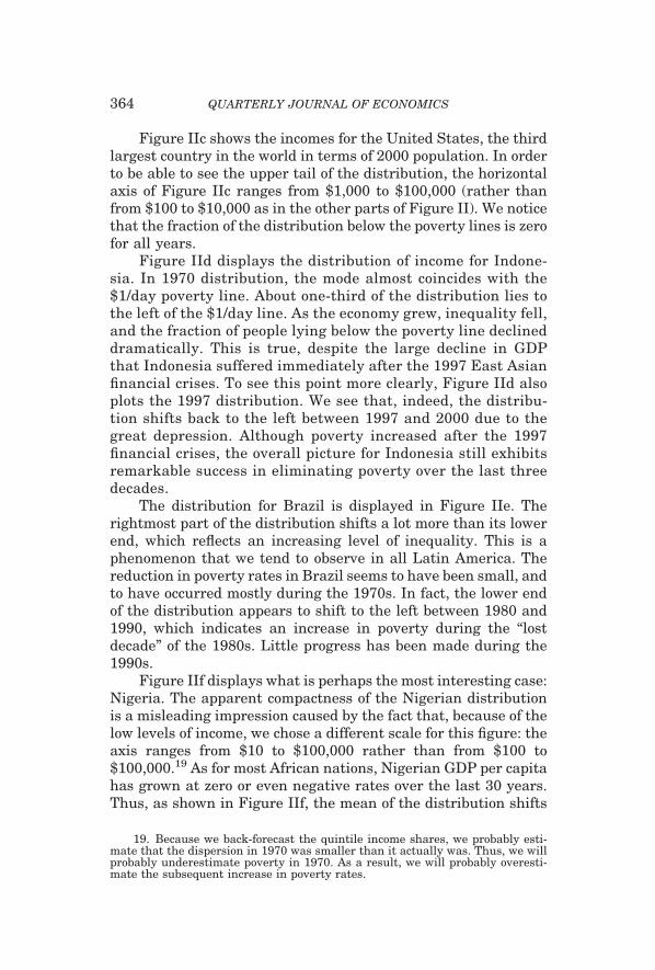
Figure IIc shows the incomes for the United States, the thirdlargest country in the world in terms of 2000 population. In orderto be able to see the upper tail of the distribution, the horizontalaxis of Figure IIc ranges from $1,000 to $100,000 (rather thanfrom $100 to $10,000 as in the other parts of Figure II). We noticethat the fraction of the distribution below the poverty lines is zerofor all years.
Figure IId displays the distribution of income for Indone-sia. In 1970 distribution, the mode almost coincides with the$1/day poverty line. About one-third of the distribution lies tothe left of the $1/day line. As the economy grew, inequality fell,and the fraction of people lying below the poverty line declineddramatically. This is true, despite the large decline in GDPthat Indonesia suffered immediately after the 1997 East Asianfinancial crises. To see this point more clearly, Figure IId alsoplots the 1997 distribution. We see that, indeed, the distribu-tion shifts back to the left between 1997 and 2000 due to thegreat depression. Although poverty increased after the 1997financial crises, the overall picture for Indonesia still exhibitsremarkable success in eliminating poverty over the last threedecades.
The distribution for Brazil is displayed in Figure IIe. Therightmost part of the distribution shifts a lot more than its lowerend, which reflects an increasing level of inequality. This is aphenomenon that we tend to observe in all Latin America. Thereduction in poverty rates in Brazil seems to have been small, andto have occurred mostly during the 1970s. In fact, the lower endof the distribution appears to shift to the left between 1980 and1990, which indicates an increase in poverty during the “lostdecade” of the 1980s. Little progress has been made during the1990s.
Figure IIf displays what is perhaps the most interesting case:Nigeria. The apparent compactness of the Nigerian distributionis a misleading impression caused by the fact that, because of thelow levels of income, we chose a different scale for this figure: theaxis ranges from $10 to $100,000 rather than from $100 to$100,000.19 As for most African nations, Nigerian GDP per capitahas grown at zero or even negative rates over the last 30 years.Thus, as shown in Figure IIf, the mean of the distribution shifts
19. Because we back-forecast the quintile income shares, we probably esti-mate that the dispersion in 1970 was smaller than it actually was. Thus, we willprobably underestimate poverty in 1970. As a result, we will probably overesti-mate the subsequent increase in poverty rates.
364 QUARTERLY JOURNAL OF ECONOMICS

FIGURE IIdDistribution of Income in Indonesia
FIGURE IIeDistribution of Income in Brazil
FIGURE IIfDistribution of Income in Nigeria
365THE WORLD DISTRIBUTION OF INCOME

to the left. At the same time, income inequality has exploded. Thedramatic implication of these two phenomena is that, while thefraction of people living with less than $1/day has increasedbetween 1970 and 2000, the upper tail of the distribution hasactually moved to the right! In other words, although the averagecitizen was worse off in 2000 than in 1970, the richest Nigerianswere much better off. This may have important policy implica-tions because these rich Nigerians are likely to be the economicand political elites who need to make decisions about potentialreforms. Unfortunately, although this phenomenon is uniqueamong the largest countries reported in Figure II, it is not un-common in Africa.
Figure IIg displays the distribution of income of the USSR for1970, 1980, and 1989, and the joint distribution of the FormerSoviet Union Republics for 1990 and 2000. The distributionsseem to be moving to the right between 1970 and 1990. Thisreflects the fact that reported Soviet GDP per capita was continu-ously growing. The distribution for 1990 shows a noticeable in-crease in overall income inequality (the distribution spreads vis-ibly). In fact, we find that the leftmost end of the distributionshifts to the left. The distribution for 2000 has both moved to theleft (reflecting the well-documented decline in overall GDP percapita in the largest former soviet republics, especially Russiaand Ukraine) and shown a discernable increase in dispersion(which reflects the well-known increase in within-country incomeinequality). The two phenomena contribute to the increase in the
FIGURE IIgDistribution of Income in USSR-FSU
366 QUARTERLY JOURNAL OF ECONOMICS

fraction of the population below the poverty line. But, since thestarting point is so far away from the $1-a-day line, the overallincrease in poverty is small.
II.H. Integrating the Annual Country Distributions to Estimatethe Annual World Distribution of Income
Once a distribution of income has been estimated for eachcountry/year, we construct an annual World Distribution of In-come (WDI) by integrating all the country distributions. FigureIII reports the estimates of the density function for each country
FIGURE IIIaThe WDI and Individual Country Distributions in 1970
FIGURE IIIbThe WDI and Individual Country Distributions in 2000
367THE WORLD DISTRIBUTION OF INCOME

as well as WDI for 1970 and 2000 (IIIa and IIIb, respectively).The “tallest” country distribution corresponds to China followedby India. In Figure IIIa, the third tallest is the Soviet Unionfollowed by the United States (in Figure IIIb the Soviet Union hasdisintegrated, so the third largest country in the world is theUnited States). The mode for 1970 occurs at $850. The distribu-tion seems to have a little local maximum at $9600, which mainlycaptures the larger levels of income of the United States andEurope. An interesting aspect of Figure IIIa is that one canvisually appreciate that a substantial part of individual incomeinequality across the world comes from differences in per capitaincomes across countries rather than differences within coun-tries. In other words, the distance between country distributions(say the difference between the mean of the United States andChina) seems to be much larger than the differences between richand poor Americans or rich and poor Chinese. In Section IV wedecompose measures of world income inequality into within- andacross-country components and confirm this visual impression.
A quick comparison of Figures IIIa and IIIb reveals thefollowing features: first, the WDI has shifted to the right. This, ofcourse, reflects the fact that per capita GDP is much larger in2000 than in 1970. Second, it is not visually evident whether theWDI is more dispersed in 1970 than in 2000. That is, it is notobvious that world income inequality changed over time. Third, ifwe analyze the reasons for the change in shape of the WDI, weobserve that a major change occurs in China, whose distributionboth shifts dramatically to the right (China is getting richer) andincreases in dispersion (China is becoming more unequal). Notethat, by the year 2000, the top fifth of the Chinese distributionlies around $10,000. This is the (per capita) level of income ofcountries like Mexico, Latvia, Poland, or Russia, and slightlybelow that of Greece. Fourth, a close look at the lower left cornerof Figure IIIb reveals that Nigeria (as well as some smallerAfrican nations) seems to be filling up the gap left by China,India, and Indonesia. While the three Asian nations grew (andtheir distributions shifted to the right), the largest African coun-try became poorer and more unequal over time. Thus, in 2000 itstands as the only large country with a substantial portion of itspopulation living below the poverty lines.
To see the evolution of the WDI over time, Figure IV plotstogether the global distributions (without the individual countryfunctions) for 1970, 1980, 1990, and 2000. It is now apparent that
368 QUARTERLY JOURNAL OF ECONOMICS

the distribution shifts rightward, implying that the incomes ofthe majority of the world’s citizens increased over time. It is alsoclear that the fraction of the overall area that lies to the left of thepoverty line declines (which indicates a reduction in povertyrates) and that the absolute area to the left of the poverty line alsodiminishes (which indicates an overall reduction in the number ofpoor citizens in the world). Again, the figure does not show clearlywhether world income inequality increased or decreased, so thatprecise measures of income inequality will have to be used if wewant to discuss the evolution of inequality over the last threedecades.
III. ANALYSIS OF THE WDI (1): POVERTY
III.A. World Poverty
Once the WDI has been constructed, we can analyze itsfeatures. One important feature is the implied number of peopleliving below a predetermined poverty line. One problem is thevery definition of poverty. For a long time, analysts identifiedpoverty with the lack of physical means for survival. Thus, someattempted to define poverty in terms of a minimum requiredcaloric intake. Other analysts define poverty in monetary terms:poor people are those whose income (or consumption) is less thana specified amount. Some attempts have been made to reconcilethe two definitions by putting a monetary value on the minimum
FIGURE IVThe WDI in Various Years
369THE WORLD DISTRIBUTION OF INCOME

caloric intake. In fact, this is how the first widely used monetarypoverty line may have been born (See Bhalla [2002]). Even whenanalysts agree that poverty should be defined as some monetarymeasure, they do not agree on whether we should measure thenumber of people whose consumption or income lies level below aspecified poverty line: Ravallion, Datt, and Van de Walle [1991],Chen and Ravallion [2001], and Bhalla [2002], for example, useconsumption poverty while the United Nations’ Millennium De-velopment Goals (MDG) [United Nations 2000] and Pritchett[2003] use income poverty.
Another source of disagreement is the exact position of thepoverty line. For example, the poverty line used by the UnitedNations when they first proposed the Millennium Goals was“one-dollar-a-day.” The World Bank uses both one-dollar-a-dayand two-dollars-a-day lines. Bhalla [2002] settles in the middleand prefers 1.5 dollars per day. Pritchett [2003] is more extremeand argues that the poverty line should be put at 15 dollars perday.
An additional problem concerns the “baseline year.” Manyanalysts talk about the number of people who “live with less thanone-dollar-a-day,” and they quote, for example, World Bank pov-erty estimates. In 1990 the World Bank defined the extremepoverty line to be 1.02 dollars-a-day in 1985 prices. In 2000 thedefinition changed to its current value of 1.08 dollars-a-day in1993 prices. Although this mysterious change in the povertythreshold has never been explained by the World Bank, what isclear is that 1.02 dollars a day in 1985 prices do not correspond to1.08 dollars in 1993 prices. Similarly, in the year 2000 the UnitedNations’ MDGs refer to the poor as those whose income is “lessthan one-dollar-a-day” without being specific about the baselineyear in which this “one dollar” is defined. One might assume thatthe dollar they refer to is valued in 2000 prices, but then they usethe World Bank estimates of poverty which, as just mentioned,are now defined in 1993 prices. These distinctions may seemtrivial at first, but they are not: one-dollar-a-day in 2000 corre-sponds to $340 a year,20 whereas one-dollar-a-day in 1985 corre-sponds to $495 a year. The lack of precision as to what baselineyear a particular definition applies has enormous implications forestimates of poverty rates and head counts and their evolution
20. This calculation uses 1996 prices, the baseline used throughout thepaper.
370 QUARTERLY JOURNAL OF ECONOMICS

over time: the difference between the number of people who livewith less than $340 and less than $495 is in the hundreds ofmillions.
The fundamental problem is that all of these definitions areboth reasonable and, to some extent, arbitrary. If we settle on apoverty line, then the number of poor people in the world can bereadily estimated by integrating the estimated WDI from minusinfinity to a predetermined income threshold (known as the pov-erty line). Poverty rates can then be computed by dividing thetotal number of poor by the overall population. The only questionis what poverty threshold to use. Given this ambiguity, we useour estimates of the WDI to analyze the evolution of poverty intwo different ways. The first strategy is to construct the normal-ized Cumulative Distribution Function (CDF) of the WDI for eachdecade. Since the poverty rate is the fraction of the global popu-lation whose income is less than a given poverty line, the image ofthe normalized CDF for a particular level of income yields exactlythe poverty rate corresponding to a poverty line at that particularlevel of income. The reader, then, can pick his favorite povertyline and see whether its image on the CDF falls over time.
Figure V displays the CDFs for 1970, 1980, 1990, and 2000.If we choose a poverty line of $570 a year, poverty rates fell from20 percent in 1970, to 16 percent in 1980, to 10 percent in 1990,to 7 percent in 2000. If we choose $2000 a year, poverty rates fellfrom 62 percent of the world population in 1970 to 41 percent in2000. For $5000 a year the rates fell from 78 percent to 67
FIGURE VCumulative Distribution Functions (Various Years)
371THE WORLD DISTRIBUTION OF INCOME

percent. In fact, inspection of Figure V reveals that the 1980 CDFstochastically dominates that of 1970 and that the 1990 curvedominates 1980. That is, poverty rates unambiguously fell be-tween 1970 and 1990 for ALL conceivable poverty lines. The 2000CDF dominates the three other curves for all levels of incomeabove $393. It crosses the 1970 line at $262 (73 cents a day in1996 prices). The reason these two curves cross is the effect of theDemocratic Republic of Congo (former Zaire). As was discussed inSection II, the lack of National Accounts data for this war-torncountry forced us to essentially make up the mean of its incomedistribution. Our moving-average guess for GDP per capita in2000 was $230. If we exclude Congo/Zaire from our analysis, the2000 CDF dominates the 1990 curve so we can say that povertyhas declined for all potential poverty lines, for all four decades.Figure V also shows that the downward “shifts” of the CDF (andtherefore, the decline in poverty rates) are especially pronouncedin the region between $450 and $5000 a year. The decline wasparticularly dramatic over the last two decades.
The second strategy for analyzing the poverty rates and headcounts is to determine a specific poverty line and integrate theWDI between minus infinity and that particular threshold. Since,as explained above, there is no agreement on the level of incomebelow which people are poor, we use four different lines. First, themost widely publicized poverty line: the World Bank’s one-dollar-a-day line. Since the World Bank’s original poverty line wasexpressed in 1985 prices,21 and given that our baseline year is1996, the corresponding annual income in our analysis is $495.The results, labeled “WB Poverty Line or $1/day” are reported inthe first row of Table I and in Figure VI.
The survey data used to construct our WDI are said to in-clude systematic errors. In particular, it is believed that the richtend to underreport their income relatively more than the poor. Ifthis is the case, then reanchoring the survey mean to the nationalaccounts mean (as we do in this paper) biases poverty estimatesdownwards (although it is not clear whether there are biases inthe trend). Bhalla [2002] argues that this bias is best correctednot by using survey means (as done by the World Bank), but by
21. The WB poverty line was defined for consumption levels, but analysts andthe popular press always refer to “one-dollar-a-day” line when they talk aboutincome poverty. For example, one of the United Nations’ Millennium Goals is to“halve the number of people whose income is less than one dollar a day by 2015.”
372 QUARTERLY JOURNAL OF ECONOMICS

adjusting the poverty line by roughly 15 percent. If we increasethe $495 poverty line by 15 percent, we get an annual income of$570.22 Since this roughly corresponds to $1.5/day in 1996 prices,we refer to this as the $1.5/day line in Table I and Figure VI.
We finally report two additional poverty lines: an annualincome of $730 (roughly two-dollars-a-day in 1996 prices) and$1140 per year (which is twice $570; since $570 was labeled$1.5/day line, we call this the $3/day line).23
Table I reports the poverty rates using the above four povertylines for every five years starting in 1970. Figure VI reportsannual rates and counts for each of the poverty lines. Using theoriginal World Bank definition ($495 annual income), the povertyrate declined from 15.4 percent of the world population in 1970 to5.7 percent in 2000, a decline of a factor of almost three! This isespecially impressive given that, during the same period, worldpopulation increased by almost 50 percent (from 3.5 to 5.7 billion
22. Of course, if the errors in reporting were increasing over time (as they doin some, but not all, countries), the adjustment should also increase over time.Since we do not have a good sense of whether the errors indeed grow or, if they do,by how much, we stick with a constant poverty line at $570 per year.
23. Strictly speaking, three dollars a day would correspond to $1095 a year.Instead, we report poverty figures for $1140 a year because this is exactly double$570. Since $570 a year is the $1/day poverty line as defined by the World Bankonce it is adjusted by 15 percent to correct for underreporting of the rich, the$1140 dollars a year line corresponds to twice the original WB poverty line. Thedifferences between the $1095 and $1140 lines are quite small so, in order toeconomize on space, we no not report the results for both.
FIGURE VIPoverty Rates
373THE WORLD DISTRIBUTION OF INCOME

TA
BL
EI
PO
VE
RT
YR
AT
ES
AN
DH
EA
DC
OU
NT
SF
OR
VA
RIO
US
PO
VE
RT
YL
INE
S
Pov
erty
lin
eD
efin
itio
n
Pov
erty
rate
sC
han
ge19
70–2
000
1970
1975
1980
1985
1990
1995
2000
$495
WB
Pov
erty
Lin
e($
1/D
ay)
15.4
%14
.0%
11.9
%8.
8%7.
3%6.
2%5.
7%�
0.09
7
$570
$1.5
/Day
20.2
%18
.5%
15.9
%12
.1%
10.0
%8.
0%7.
0%�
0.13
1$7
30$2
/Day
29.6
%27
.5%
24.2
%19
.3%
16.2
%12
.6%
10.6
%�
0.19
0$1
,140
$3/D
ay46
.6%
44.2
%40
.3%
34.7
%30
.7%
25.0
%21
.1%
�0.
254
Pov
erty
hea
dco
un
ts(t
hou
san
ds)
Ch
ange
1970
–200
019
7019
7519
8019
8519
9019
9520
00
Pop
ula
tion
3,47
2,48
53,
830,
514
4,17
5,42
04,
539,
477
4,93
8,17
75,
305,
563
5,66
0,34
22,
187,
858
Pov
erty
lin
eD
efin
itio
n
$495
WB
Pov
erty
Lin
e($
1/D
ay)
533,
861
536,
379
498,
032
399,
527
362,
902
327,
943
321,
518
�21
2,34
3$5
70$1
.5/D
ay69
9,89
670
8,82
566
5,78
154
8,53
349
5,22
142
4,62
639
8,40
3�
301,
493
$730
$2/D
ay1,
028,
532
1,05
2,76
11,
008,
789
874,
115
798,
945
671,
069
600,
275
�42
8,25
7$1
,140
$3/D
ay1,
616,
772
1,69
1,18
41,
681,
712
1,57
5,41
51,
517,
778
1,32
7,63
51,
197,
080
�41
9,69
1
Pov
erty
Rat
esar
eth
epe
rcen
tage
sof
citi
zen
sw
ith
inco
mes
belo
wth
eco
rres
pon
din
gpo
vert
yli
ne.
Pov
erty
hea
dco
un
tsar
eco
nst
ruct
edas
the
tota
lnu
mbe
rof
peop
lew
ith
inco
mes
low
erth
anth
eco
rres
pon
din
gpo
vert
yli
ne.
Th
efi
rst
pove
rty
lin
e(c
alle
dW
Bpo
vert
yor
1$/D
ay)l
ine
isth
epo
vert
yli
ne
orig
inal
lyu
sed
byth
eW
orld
Ban
kan
dco
rres
pon
dsto
$1.0
5/D
ayin
1985
pric
es.
Th
isco
rres
pon
dsto
$495
per
year
in19
96pr
ices
.T
he
seco
nd
pove
rty
lin
eis
the
one
use
dby
Bh
alla
[200
2],
wh
ich
incr
ease
sth
eW
Bby
15pe
rcen
tto
adju
stfo
ru
nde
rrep
orti
ng
atth
eto
pof
the
dist
ribu
tion
.Th
isco
rres
pon
dsto
$570
per
year
or,r
ough
ly,$
1.5/
Day
.Th
eth
ird
and
fou
rth
lin
esco
rres
pon
dto
$2/D
ayan
d$3
/Day
in19
96pr
ices
($73
0an
d$1
140
per
year
,re
spec
tive
ly).
374 QUARTERLY JOURNAL OF ECONOMICS

citizens). The implication is that the total number of poor citizenswent from 534 to 322 million, a decline of 50 percent.
Using the $1.5/day line, we see a similar picture: the povertyrate fell from 20 percent to 7 percent, a decline of a factor close to3. The poverty head count declined by about 300 million citizens(from close to 700 million people to a little less than 400 million).In other words, the total number of poor citizens declined byabout 56 percent in a period during which world populationincreased by 50 percent.
With the two-dollars a day definition ($730 a year), the pov-erty rate was close to 30 percent in 1970 and a little below 11percent in 2000. Again, the poverty rate declined by a factor closeto 3. The number of citizens whose income was less than $2 a daywas just above one billion people in 1970 and about 600 million in2000, a decline of 428 million citizens or 54 percent.
Finally, using the three-dollar-a-day definition ($1140 dol-lars a year), the poverty rate was 47 percent in 1970 and 21percent in 2000, again a healthy decline over the last 30 years.The overall poverty head count declined by more than 400 millionpeople, from 1.6 billion in 1970 to 1.2 billion in 2000.
It is interesting to note that the total number of people whoseincome is less than one-dollar-a-day is nowhere near the widelycited number of 1.2 billion. Our estimates of $1/day are between33 percent and 40 percent lower. One reason is that the widelycited numbers are those provided by the World Bank. As arguedby Ravallion [2004], the main reason is that the World Bank usesa concept of poverty based on household consumption, not income.He says: “It is not clear how much higher Mr. Sala-i-Martin’spoverty line should be to assure comparability with the Bank’s$1-a-day standard. However, a good guess might be that hispoverty threshold should be doubled to reflect the other itemsthat he has implicitly included in his measure of income.” If wedo, he claims, “the two series line up rather well” (see Chen andRavallion [2004]). Since our corrected $1/day line corresponds to$570 per year, the doubling of that threshold would yield $1140/year. Note that our 2000 estimate for that poverty line is, indeed,1.2 billion people.
III.B. The Role of China in Reducing World Poverty
Given its large size and the remarkable rate at which it hasreduced poverty, the exact growth of per capita GDP in China isa key determinant of the reduction of worldwide poverty. Econo-mists have recently pointed out that Chinese statistical reporting
375THE WORLD DISTRIBUTION OF INCOME

during the last few years has been less than accurate (see forexample, Ren [1997], Maddison [1998], Meng and Wang [2000],and Rawski [2001]). The complaints pertain mainly to the periodstarting in 1996 and especially after 1998 (see Rawski [2001]).This coincides with the very end of and after our sample period,so it does not affect our estimates. However, we should rememberthat we do not use the official statistics of Net Material Productsupplied by Chinese officials. The PWT numbers used in thispaper attempt to deal with some of the anomalies following Mad-dison [1998] (see the China Appendix in Heston, Summers, andAten [2002]). For example, the growth rate of Chinese GDP percapita in our data set is 5 percent per year, more than twopercentage points less than the official estimates (the growth ratefor the period 1978–2000 is 6.2 percent in our data set as opposedto the 8.0 percent reported by the Chinese Statistical Office). TheWorld Bank reports an annual growth rate of 7.6 percent over thesame period.24
Using survey data only, the World Bank estimates that $1/day consumption poverty in China fell from 53 percent in 1980 to8 percent in 2000 (see Chen and Ravallion [2004]). If we use theRavallion rule of thumb and compare their $1/day consumptionpoverty line with our $2/day income line, we see that our $2/daypoverty estimates display a slightly smaller decline: from 48percent in 1980 to 11 percent in 2000. Thus, our estimated re-duction in poverty rates in China does not seem to be exaggeratedin comparison to what is found in the literature.
III.C. Regional Poverty
This subsection decomposes world poverty by region. Table IIand Figure VII report poverty rates for East Asia, South Asia,Africa, Latin America, Eastern Europe and Former Soviet Union,and Middle East and North Africa (MENA). To economize onspace, we only report the poverty rates and head counts corre-sponding to the $570/year ($1.5/day) line.
With over 1.7 billion citizens in 2000, East Asia is the mostpopulous region in the world accounting for 30 percent of theworld population. Poverty Rates in East Asia were close to one-
24. Bhalla [2002] uses World Bank PPP-adjusted GDP data rather than PWTdata to pin down the mean of the distribution. The fact that the annual growthrates of PPP-adjusted per capita GDP reported by the World Bank are 2.1 percentlarger than those reported by the PWT might explain why the reduction in povertyrates reported by Bhalla are substantially larger than ours.
376 QUARTERLY JOURNAL OF ECONOMICS

third in 1970. By 2000, poverty rates had declined to about 2.4percent. Poverty rates in East Asia, thus, were cut by a factor of12! The poverty head count was reduced by over 300 millioncitizens, from 350 million in 1970 to 41 million in 2000. Thepoverty head count fell by 68 million citizens in the 1970s, and by127 and 114 million people in the 1980s and 1990s, respectively.This tremendous achievement, together with the great disaster inAfrica which we discuss below, meant that while 54 percent of theworld’s poor lived in East Asia in 1970, by the year 2000 thisfraction was only 10 percent (see the bottom panel of Table II).
Although China is an important part of this success story (adecline of the poverty rate from 32 percent in 1970 to 3.1 percentin 2000 which accounts for 251 million people escaping poverty),it is by no means the whole story. Indonesia saw its poverty ratedecline from 35 percent in 1970 to 0.1 percent in 2000 (a reductionin the head count of about 41 million). Thailand, with a povertyrate over 23 percent in 1970, had practically eliminated povertyby 2000 (a reduction of more than 8 million people). In fact, all thecountries in this region experienced reduction in poverty rates.The only country that lived through an increase in poverty headcount was Papua New Guinea.
South Asia is the second most populous region in theworld, with 1.3 billion people in 2000 (24 percent of the worldpopulation). The evolution of poverty in South Asia is similarto that in East Asia: the poverty rate fell from 30 percent in1970 to 2.5 percent in 2000. The poverty head count fell by 178million people, from 211 million poor in 1970 to 33 million in2000. This success was achieved primarily over the last twodecades. Most of the decline in the poverty head count (178million), can be attributed to the success of the post-1980Indian economy (between 1970 and 1980, the total number ofpoor Indians actually increased by 15 million). This is not tosay that the other countries in the region did not improve. Withthe exception of Nepal, all the other countries also experienceda positive evolution of overall poverty.
The great Asian success contrasts dramatically with the Af-rican tragedy. With a total population of just over 608 millioncitizens, Sub-Saharan Africa is the third most populated region inour data set. A total of 41 countries are analyzed in this paper.Most of them had such dismal growth performances that povertyincreased all over the continent. Overall, poverty rates in 1970were similar to those in South and East Asia: 35 percent. By 2000,
377THE WORLD DISTRIBUTION OF INCOME

TA
BL
EII
PO
VE
RT
YB
YR
EG
ION
(OR
IGIN
AL
WB
PO
VE
RT
YL
INE,
$1.5
/DA
YO
R$5
70/Y
EA
R)
Pov
erty
Rat
es20
00po
pula
tion
1970
1975
1980
1985
1990
1995
2000
Ch
ange
1970
–200
0C
han
ge19
70s
Ch
ange
1980
sC
han
ge19
90s
Wor
ld5,
660,
040
0.20
20.
185
0.15
90.
121
0.10
00.
080
0.07
0�
0.13
2�
0.04
3�
0.05
9�
0.03
0E
ast
Asi
a1,
704,
242
0.32
70.
278
0.21
70.
130
0.10
20.
038
0.02
4�
0.30
3�
0.11
0�
0.11
5�
0.07
8S
outh
Asi
a1,
327,
455
0.30
30.
297
0.26
70.
178
0.10
30.
057
0.02
5�
0.27
7�
0.03
6�
0.16
4�
0.07
8A
fric
a60
8,22
10.
351
0.36
00.
372
0.42
60.
437
0.50
50.
488
0.13
70.
020
0.06
50.
051
Lat
inA
mer
ica
499,
716
0.10
30.
056
0.03
00.
036
0.04
10.
038
0.04
2�
0.06
1�
0.07
40.
012
0.00
1E
aste
rnE
uro
pe43
6,37
30.
013
0.00
50.
004
0.00
10.
004
0.01
00.
010
�0.
003
�0.
009
0.00
10.
006
ME
NA
220,
026
0.10
70.
092
0.03
60.
016
0.01
20.
007
0.00
6�
0.10
2�
0.07
1�
0.02
5�
0.00
6
Pov
erty
Hea
dcou
nts
2000
popu
lati
on19
7019
7519
8019
8519
9019
9520
00C
han
ge19
70–2
000
Ch
ange
1970
sC
han
ge19
80s
Ch
ange
1990
s
Wor
ld5,
660,
040
699,
896
708,
825
665,
781
548,
533
495,
221
424,
626
398,
403
�30
1,49
3�
34,1
15�
170,
560
�96
,818
Eas
tA
sia
1,70
4,24
235
0,26
333
4,26
628
1,91
418
2,20
515
4,97
361
,625
41,0
71�
309,
192
�68
,349
�12
6,94
1�
113,
902
Sou
thA
sia
1,32
7,45
521
1,36
423
4,07
023
6,36
617
6,53
611
3,66
169
,582
33,4
38�
177,
926
25,0
02�
122,
705
�80
,223
Afr
ica
608,
221
93,5
2810
9,49
112
9,89
017
2,17
520
4,36
426
9,73
329
6,73
320
3,20
536
,361
74,4
7492
,369
Lat
inA
mer
ica
499,
716
27,8
9717
,014
10,1
9513
,836
17,4
0617
,379
21,0
12�
6,88
5�
17,7
027,
211
3,60
7E
aste
rnE
uro
pe43
6,37
34,
590
1,99
11,
418
369
1,90
64,
238
4,40
2�
188
�3,
172
488
2,49
6M
EN
A22
0,02
611
,250
10,9
544,
991
2,50
72,
101
1,46
61,
264
�9,
986
�6,
259
�2,
890
�83
7
378 QUARTERLY JOURNAL OF ECONOMICS

TA
BL
EII
(CO
NT
INU
ED
)
Fra
ctio
nof
Wor
ld’s
poor
inea
chre
gion
2000
popu
lati
on19
7019
7519
8019
8519
9019
9520
00C
han
ge19
70–2
000
Ch
ange
1970
sC
han
ge19
80s
Ch
ange
1990
s
Wor
ld10
0.0%
100.
0%10
0.0%
100.
0%10
0.0%
100.
0%10
0.0%
100.
0%E
ast
Asi
a30
.1%
50.0
%47
.2%
42.3
%33
.2%
31.3
%14
.5%
10.3
%�
39.7
%�
7.7%
�11
.0%
�21
.0%
Sou
thA
sia
23.5
%30
.2%
33.0
%35
.5%
32.2
%23
.0%
16.4
%8.
4%�
21.8
%5.
3%�
12.6
%�
14.6
%A
fric
a10
.7%
13.4
%15
.4%
19.5
%31
.4%
41.3
%63
.5%
74.5
%61
.1%
6.1%
21.8
%33
.2%
Lat
inA
mer
ica
8.8%
4.0%
2.4%
1.5%
2.5%
3.5%
4.1%
5.3%
1.3%
�2.
5%2.
0%1.
8%E
aste
rnE
uro
pe7.
7%0.
7%0.
3%0.
2%0.
1%0.
4%1.
0%1.
1%0.
4%�
0.4%
0.2%
0.7%
ME
NA
3.9%
1.6%
1.5%
0.7%
0.5%
0.4%
0.3%
0.3%
�1.
3%�
0.9%
�0.
3%�
0.1%
Th
eco
un
trie
sin
clu
ded
inea
chre
gion
are
asfo
llow
s.(1
)E
ast
Asi
a:C
hin
a,F
iji,
Indo
nes
ia,K
orea
,Mal
aysi
a,P
hil
ippi
nes
,Pap
ua
New
Gu
inea
,Th
aila
nd,
and
Tai
wan
.(2)
Sou
thA
sia:
Ban
glad
esh
,In
dia,
Sri
Lan
ka,N
epal
,an
dP
akis
tan
.(3)
Afr
ica:
An
gola
,Bu
run
di,B
enin
,Bu
rkin
aF
aso,
Bot
swan
a,C
AR
,Ivo
ryC
oast
,Cam
eroo
n,C
ongo
,DR
Con
go—
form
erZ
aire
,C
omor
os,C
ape
Ver
de,E
thio
pia,
Gab
on,G
ambi
a,G
han
a,G
uin
ea,G
uin
ea-B
issa
u,E
quat
oria
lGu
inea
,Ken
ya,L
esot
ho,
Mad
agas
car,
Mal
i,M
ozam
biqu
e,M
auri
tiu
s,M
alaw
i,N
amib
ia,
Nig
er,N
iger
ia,R
wan
da,S
eneg
al,S
eych
elle
s,T
ogo,
Tan
zan
ia,U
gan
da,S
outh
Afr
ica,
Zam
bia,
Zim
babw
e,S
aoT
ome
eP
rin
cipe
,Ch
ad,a
nd
Sie
rra
Leo
ne.
(4)
Lat
inA
mer
ica:
An
tigu
aA
rgen
tin
a,B
eliz
eB
oliv
ia,B
razi
l,B
arba
dos,
Ch
ile,
Col
ombi
a,C
osta
Ric
a,D
omin
ica,
Dom
inic
anR
epu
blic
,Ecu
ador
,Gre
nad
a,G
uat
emal
a,G
uya
na,
Hai
ti,H
ondu
ras,
Jam
aica
,Mex
ico,
Nic
arag
ua,
Par
agu
ay,P
anam
a,P
eru
,ElS
alva
dor,
Sai
nt
Kit
tsan
dN
evis
,Sai
nt
Lu
cia,
Sai
nt
Vin
cen
t,an
dth
eG
ren
adin
es,T
rin
idad
and
Tob
ago,
Uru
guay
,an
dV
enez
uel
a.(5
)Eas
tern
Eu
rope
:R
oman
ia,
Tu
rkey
,C
zech
oslo
vaki
a,P
olan
d,H
un
gary
,an
dS
ovie
tU
nio
n/F
orm
erS
ovie
tU
nio
n.
(6)
Mid
dle
Eas
tan
dN
orth
Afr
ica
(ME
NA
):E
gypt
,Ir
an,
Jord
an,
Mor
occo
,M
auri
tan
ia,
Syr
ia,
Tu
nis
ia,
and
Alg
eria
.
379THE WORLD DISTRIBUTION OF INCOME

poverty rates in Africa had reached close to 50 percent, whilethose in Asia had declined to less than 3 percent. The threedecades have been almost equally terrible: the poverty rate in-creased from 35.1 percent to 37.2 percent in the 1970s, to 43.7percent in 1990, and to 48.8 percent in 2000. The overall numberof poor grew from 94 million in 1970 to almost 297 million in2000. That is, the total number of poor in Africa jumped by morethan 200 million citizens (an increase of 36 million during the1970s, 74 during the 1980s, and 92 during the 1990s). WithinAfrica, poverty head counts increased in all countries with theexception of Botswana, the Republic of Congo, and the smallislands of Mauritius, Cape Verde, and the Seychelles.
This disappointing performance, together with the great suc-cess of the other two poor regions of the world (East and SouthAsia) means that the majority of the world’s poor now live inAfrica. Indeed, Africa accounted for only 14.5 percent of theworld’s poor in 1970. Today, despite the fact that Africa accountsfor only 10.7 percent of the world population, it accounts for 74.5percent of the world’s poor (see the bottom panel of Table II).Poverty, once an essentially Asian phenomenon, has become anessentially African phenomenon.
With close to 500 million citizens (about 9 percent of theworld population), Latin America has had a mixed performanceover the last three decades. Poverty rates were cut by morethan one-half between 1970 (poverty rate of 10.3 percent) and2000 (4.2 percent). This would be an optimistic picture if it
FIGURE VIIRegional Poverty Rates ($1.5 a Day Line)
380 QUARTERLY JOURNAL OF ECONOMICS

were not for the fact that all of the gains occurred during thefirst decade. Little progress has been achieved after that. In-deed, the poverty rate in Latin America grew from 3 percent in1980 to 4.1 percent in 1990 and to 4.2 in 2000. The povertyhead count declined by 17 million during the 1970s and in-creased by 10 million over the following twenty years. Thismixed performance has meant that, although Latin Americastarted from a superior position relative to both East andSouth Asia (where poverty rates were well above 30 percent in1970), we see that poverty rates were larger in Latin Americathan in both Asian regions by 2000. The fraction of the world’spoor who live in Latin America declined from 4.0 percent in1970 to 1.5 percent in 1980. It then increased to 3.5 percent in1990 and to 5.3 percent by the year 2000.
Our next region is Eastern Europe and Central Asia, whichincludes the USSR and, after 1990, the former Soviet Repub-lics. About 436 million people inhabited this region in 2000. Alot has been written about the deterioration of living conditionsin this region after the fall of communism. The fact, however,is that although poverty has increased since 1990, the level ofincome in this region was so high to begin with that povertyrates were a lot smaller than in any of the regions analyzed upuntil now. The rate, which was at the already low level of 1.3percent in 1970, had declined to 0.4 percent by 1980. It did notchange at all during the 1980s. And then, it more than doubledduring the decade that followed the fall of communism. Theincrease in poverty was the result of both a decline in percapita income and an increase in inequality within countries.But the starting level was so small in magnitude that, despiteits doubling, the rate remained at 0.1 percent in 2000. In termsof absolute numbers, the Eastern Block managed to almosteradicate poverty between 1970 and 1985, when the overallnumber of poor citizens was 369,000. The poverty head countmultiplied by 5 over the following five years to 1.9 million, andthen doubled again to 4.4 million in 2000.
Our sample of Middle Eastern and North African (MENA)countries has 220 million citizens (7.7 percent of the world’ssampled population in 2000). Poverty rates in MENA countrieshave declined over the last three decades. Although the startingpoint was better than that of East Asia, South Asia, and Sub-Saharan Africa, MENA has nevertheless managed to reducethose rates even further.
381THE WORLD DISTRIBUTION OF INCOME

IV. ANALYSIS OF THE WDI (2): WORLD INCOME INEQUALITY
Researchers have long worried about world income inequal-ity.25 Recently, policy-makers have joined the debate. For exam-ple, the 2001 Human Development Report of the United Nations’Development Program (UNDP) argues that global income in-equality has risen based on the following logic:
Claim 1: “Income inequalities within countries haveincreased.”
Claim 2: “Income inequalities across countries haveincreased.”
Conclusion: “Global income inequalities have also increased.”To document Claim 1, analysts collect the Gini coefficients for
a number of countries. They notice that the Gini “has increased in45 countries and fell in 16.”26 To document the second claim,analysts go to the convergence/divergence literature and showthat the Gini coefficient of per capita GDP across countries hasbeen unambiguously increasing over the last 30 years.27 Thisincreasing difference in per capita income across countries is awell-known phenomenon called “absolute divergence” by empiri-cal growth economists. Pritchett [1997] famously labeled it as“divergence big time.”
Although it is true that within-country inequalities are in-creasing on average, and it is also true that income per capitaacross countries have been diverging, the conclusion that globalincome inequality has risen does not follow logically from thesepremises. The reason is that Claim 1 refers to the income of“individuals,” and Claim 2 refers to per capita incomes of “coun-tries.” By adding up two different concepts of inequality to some-how analyze the evolution of world income inequality, the UNDPfalls into the fallacy of comparing apples to oranges.
The argument would be correct if the concept of inequalityimplicit in Claim 2 was not “the level of income inequality acrosscountries” but, instead, the “inequality across individuals thatwould exist in the world if all citizens in each country had the samelevel of income, but different countries had different levels of per
25. The extensive literature examining individual income inequalities at theglobal level includes, among others, Bourguignon and Morrison [2001], Schultz[1998], Dikhanov and Ward [2001], Chotikapanich, Valenzuela, and Rao [1997],Dowrick and Akmal [2001], and Milanovic [2000a, 2002b].
26. United Nations, UNDP [2001], p. 17. See also UNDP [2003].27. This is also true for other measures of per capita income dispersion. See,
for example, Barro and Sala-i-Martin [1992, 2003].
382 QUARTERLY JOURNAL OF ECONOMICS

capita income.” Notice that the difference is that the correct state-ment would recognize that there are four Chinese citizens for everyAmerican so that the income per capita of China gets four times theweight. In other words, instead of using a measure of inequality inwhich each country’s income per capita is one data point, the correctmeasure would weight by the size of the country.28 The problem forthe UNDP is that, population-weighted measures of income inequal-ity show a downward trend over the last twenty years.29 The ques-tion, then, is whether the decline in across-country individual in-equality (correctly weighted by population) more than offsets thepopulation-weighted average increase in within-country individualinequality. Since we have estimated the WDI, we are well equippedto answer this question.
Many indexes of income inequality have been proposed in theliterature.30 We report eight of the most popular ones: the Ginicoefficient, two Atkinson indexes with coefficients 0.5 and 1, respec-tively,31 the variance of the logarithm of income, the ratio of theaverage income of top 20 percent of the distribution to the bottom 20percent and the ratio of the top 10 percent to the bottom 10 percentof the distribution,32 the Mean Logarithmic Deviation (MLD, whichcorresponds to the Generalized Entropy Index with coefficient 0),and finally, the Theil Index (which corresponds to the GeneralizedEntropy Index with coefficient 1).
IV.A. Global Income Inequality: Convergence, Period!
The results of estimating each of the eight indexes for eachyear between 1970 and 2000 are reported in Table III. Column 1
28. Even in this case, the conclusion would not be entirely true if the measureof inequality is the Gini coefficient (the concept used by UNDP [2001]). As shownby Bourguignon [1979] and Shorrocks [1980], the Gini coefficient does not satisfythe additivity or decomposability property so the “within-country Gini” and the“across-country Gini” do not add up to a global Gini. Bourguignon [1979] andShorrocks [1980] show that the only indexes that satisfy the “decomposabilityproperty” (and other desirable axioms such as “scale independence” and the“Pigou-Dalton Transfer Principle”) are those called “Generalized Entropy In-dexes.” Two of the widely used indexes in the inequality literature are the TheilIndex and the Mean Logarithmic Deviation. We discuss these decompositions inSection IV below.
29. This phenomenon was first documented by Schultz [1998]. To see thatpopulation-weighted incomes have converged in the � sense, see Figure Ib.
30. See Cowell [1995] for a description and properties of each of these in-equality indexes.
31. See Atkinson [1970].32. The top-20-percent-to-bottom-20-percent is the ratio of the income of the
person located at the top twentieth centile divided by the income of the corre-sponding person at the bottom twentieth centile. A similar definition applies tothe top-10-percent-to-bottom-10-percent ratio.
383THE WORLD DISTRIBUTION OF INCOME

of Table III reports the evolution of the Gini coefficient (see alsoFigure VIII). According to this index, world income inequalityremained more or less flat during the 1970s. After peaking in1979 (at 0.662), it followed a downward trend over the followingtwo decades. In 2000 the world Gini coefficient was 0.637. Over-all, the Gini declined by almost 4 percent since 1979.
TABLE IIIWORLD INCOME INEQUALITY: INDIVIDUAL INDEXES
Year Gini A(0.5) A(1)Variance
log income 20/20 10/10 MLD THEIL
1970 0.653 0.351 0.577 1.581 10.319 28.215 0.861 0.8121971 0.653 0.352 0.579 1.587 10.430 28.395 0.864 0.8141972 0.657 0.357 0.585 1.620 10.732 29.345 0.880 0.8251973 0.660 0.360 0.590 1.647 11.004 30.059 0.893 0.8321974 0.660 0.360 0.590 1.651 11.031 30.223 0.892 0.8301975 0.654 0.353 0.581 1.612 10.737 28.943 0.871 0.8141976 0.658 0.358 0.589 1.655 11.130 30.234 0.890 0.8261977 0.659 0.358 0.589 1.648 11.002 30.008 0.888 0.8281978 0.661 0.361 0.592 1.669 11.152 30.592 0.898 0.8351979 0.662 0.362 0.593 1.665 11.048 30.544 0.898 0.8391980 0.660 0.359 0.589 1.644 10.772 29.922 0.888 0.8331981 0.657 0.356 0.584 1.617 10.485 29.137 0.876 0.8281982 0.651 0.348 0.574 1.578 10.132 28.018 0.852 0.8071983 0.649 0.346 0.570 1.565 9.949 27.486 0.845 0.8031984 0.649 0.346 0.569 1.559 9.720 27.150 0.843 0.8061985 0.650 0.347 0.571 1.570 9.714 27.397 0.847 0.8091986 0.647 0.344 0.567 1.552 9.459 26.933 0.837 0.8031987 0.647 0.344 0.566 1.550 9.344 26.929 0.836 0.8031988 0.649 0.346 0.569 1.566 9.367 27.220 0.842 0.8081989 0.653 0.351 0.576 1.593 9.514 28.100 0.857 0.8201990 0.652 0.350 0.575 1.593 9.503 28.137 0.855 0.8181991 0.648 0.345 0.569 1.578 9.159 27.479 0.842 0.8071992 0.645 0.342 0.565 1.571 8.793 26.879 0.833 0.8001993 0.640 0.337 0.559 1.558 8.533 26.195 0.819 0.7871994 0.640 0.337 0.559 1.568 8.322 26.039 0.819 0.7891995 0.638 0.335 0.557 1.561 8.174 25.731 0.814 0.7841996 0.636 0.333 0.555 1.562 8.082 25.486 0.809 0.7791997 0.637 0.334 0.557 1.580 7.960 25.736 0.814 0.7821998 0.638 0.335 0.558 1.585 8.048 25.560 0.816 0.7851999 0.638 0.335 0.559 1.600 8.074 25.718 0.819 0.7872000 0.637 0.335 0.560 1.623 8.220 25.704 0.820 0.783
% Change �2.4% �4.9% �3.1% 2.6% �22.7% �9.3% �4.9% �3.7%% Change
since 1979 �3.8% �7.8% �5.7% �2.6% �29.6% �17.3% �9.0% �6.9%
Gini is the Gini Index. A(0.5) refers to the Atkinson Index with coefficient 0.5. A(1) refers to the AtkinsonIndex with coefficient 1. Variance Log income is the variance of log income. 20/20 is the ratio of the incomeof top 20 centile to bottom 20 centile. 10/10 is the ratio of the income of top 10 centile to bottom 10 centile.MLD is the Mean Logarithmic Deviation. Theil is the Theil Index of income inequality.
384 QUARTERLY JOURNAL OF ECONOMICS

An important aspect of the yearly evolution of the Gini coef-ficient is that its behavior is not monotonic. For example, we seea sudden decline in 1975 which is explained by the fact that richcountries suffered an important recession in that year due to thefirst oil shock, a recession that was not felt in some of the poorestand largest countries in the world. For example, in 1975 thegrowth rate in China was 3.6 percent and that of India was over7 percent. Of course, when the rich suffer and the poor gain, worldincome inequality is reduced. Another example of a short-termreversal occurred in the late 1980s, when inequality increased fora few years before returning to its longer term downward trend.This increase in inequality can be partly explained by the large1988 recession in China. The central point is that business cyclesin the largest countries or groups of countries are associated withshort-term reversals in the trend of world inequality, which im-plies that we should distrust empirical studies of this problemthat cover very short time spans.
The rest of Table III reports the estimates of seven other in-equality indexes. The main lessons are first, all indexes show aremarkably similar pattern of worldwide inequality over time. Sec-ond, inequality remained more or less constant (or possibly in-creased) during the 1970s. Third, inequality declined substantiallyduring the 1980s and 1990s. The size of the decline depends a bit onthe exact measure: the largest reduction occurred in the top-20-percent-to-bottom-20-percent ratio, which declined by almost 30 per-cent between 1979 and 2000, followed by the top-10-percent-to-
FIGURE VIIIWorld Income Inequality: Gini
385THE WORLD DISTRIBUTION OF INCOME

bottom-10-percent ratio (a decline of 17.3 percent), the MLD index(which declined by 9 percent), the Atkinson (0.5) Index (down by 7.8percent), the Theil Index (which declined by almost 7 percent), theAtkinson (1) Index (down by 5.7 percent), the Gini coefficient (downby 3.8 percent), and finally, the variance of the logarithm (down by2.6 percent). Despite these small differences across measures, theoverall picture is clear: inequality declined during the last twentyyears. In 1997, Pritchett famously described the evolution of incomeper capita across countries with the expression “divergence, bigtime.” Using a similarly spirited expression, we could say that ouranalysis shows that, if rather than considering GDP per capitaacross countries, we analyze the incomes of individual citizens, thelast two decades have witnessed an unambiguous process of “con-vergence, period!”33
Our analysis shows that, after having stagnated during the1970s, global income inequality started a two-decade-long processof decline. This change in trend is surprising because, accordingto Bourguignon and Morrison [2002], world income inequalityhad continuously increased over the last century and a half. Whatcaused this reversal? The answer is the growth rate of some of thelargest yet poorest countries in the planet: China, India, and therest of Asia. We could say that in 1820 the whole world was poor.Equal and poor. Slowly, the incomes of the one billion citizens (inpopulation size of 2000) of what is today the OECD grew anddiverged away from the incomes of the five billion people of thedeveloping world. The dramatic growth rates of China, India, andthe rest of the Asian countries from the 1970s meant that theincomes of three to four billion people started to converge to thoseof the OECD. This reduced worldwide income inequality for thefirst time in centuries because it more than offset the divergentincomes of 608 million Africans. The problem now is, therefore,
33. Finally, it is interesting to note that Sala-i-Martin [2002a, 2002b] reachesexactly the same conclusions, even though those studies used a different meth-odology and did not include the USSR/FSU in the analysis. In other words,contrary to what one might have suspected, the collapse of the Soviet Union andthe subsequent explosion of income across former soviet citizens does not alter theoverall picture. As conjectured in Sala-i-Martin [2002a, footnote 22], the collapseof the Soviet Union has two offsetting implications for worldwide inequality. First,the increase in within-country inequality tends to increase the overall worldwideinequality. Second, the reduction of per capita GDP of a relatively rich countrytends to induce convergence of per capita income between the citizens of the FSUand those of the developing world, which tends to reduce the estimates of overallworld income inequality. The two effects roughly offset each other so that theoverall trend of world inequality turns out not to change when we incorporate theUSSR/FSU in our analysis.
386 QUARTERLY JOURNAL OF ECONOMICS

that unless the incomes of these African citizens start growingfast, world income inequality will start rising again.
To gauge the importance of China in this whole process,Figure IX displays the Gini coefficient for the WDI when this, thelargest country of the world is ignored. The picture reveals thatwhen China is excluded from the analysis, worldwide individualincome inequalities increase from 0.620 to 0.648, an overall in-crease of 4.4 percent. Of course, eliminating 22 percent of the datapoints (that is excluding 1.58 billion citizens out of 5.66 billion) inany empirical analysis can overturn any result. And this is thecase here: excluding the incomes of 22 percent of the citizens whohave converged, the remaining incomes have, of course, diverged.We should not conclude, however, that all our results are drivenby China. They are driven by China, and by all other citizens ofthe world. For example, excluding the United States from theanalysis (5 percent of the data points), the tendency for incomesto converge is reinforced: the Gini coefficient declines from 0.637in 1970 to 0.605 in 2000, a decline of 5.27 percent (compared with2.44 percent when the United States is included). If, instead, weexclude the people of Africa (Africa has a total of 41 countries but,with 608 million people, it has only half of the Chinese populationand thus accounts for 11 percent of the data points), the decline ininequality is also reinforced from 0.646 to 0.615 (a reduction of 5percent over three decades). Finally, if we exclude China, theUnited States, and Africa (which, overall account for 2.1 billionpeople or 38 percent of the data points), the Gini coefficient still
FIGURE IXGini Coefficient Excluding Various Countries
387THE WORLD DISTRIBUTION OF INCOME

declines from 0.599 in 1970 to 0.591 in 2000, an overall decline of1.32 percent. In other words, if we exclude the “main convergers”(namely China) and the “main divergers” (Africa and the UnitedStates), we still reach the conclusion that world income inequalityhas decreased over the last three decades.
IV.B. Inequality Decomposition
Our final analysis decomposes global income inequality intotwo components: within-country and across-country inequality.The “within-country” component is the amount of inequality thatwould exist in the world if all countries had the same income percapita (that is, the same distribution mean) but the actual within-country differences across individuals. This measure is a weightedaverage of within-country inequalities.
The “across-country” component is the amount of inequalitythat would exist in the world if all citizens within each countryhad the same level of income, but there were differences in percapita incomes across countries. An important point is that thiswould roughly correspond to a population-weighted (or aggregateincome-weighted) measure of inequality.34
Table IV reports the decomposition of world income inequal-ity using our two decomposable indexes. The first three columnsuse the Mean Logarithmic Deviation (MLD). For 1970 the aggre-gate MLD is 0.861. Of this, 0.616 corresponds to “across-country”inequality, and 0.246 to within-country. In other words, over 71percent of income inequality across individuals in the world isaccounted for by differences across countries and only 29 percentis accounted for by within-country differences. The numbers forthe Theil Index do not look very different: 69 percent of theoverall inequality (0.821) for 1970 is accounted for by across-country differences, and only 31 percent by within-country dis-persion. Recall that, when we inspected Figure IIa we alreadysuspected that most of world income inequality was accounted forby across-country differences. We now confirm this suspicion.
The second interesting lesson of Table IV is that within-country inequality has been increasing over time, both accordingto the MLD and the Theil Index. The third finding is that across-country inequality has experienced the opposite trend. The com-bined effect of these two findings implies that the fraction of
34. The methodology followed by the UNDP [2001] is flawed, as it puts equalweight on each country. See the discussion at the beginning of this section.
388 QUARTERLY JOURNAL OF ECONOMICS

global inequality which can be accounted for by across-countrydifferences has been decreasing. In fact, by the year 2000, only 61percent of global MLD, and only 64 percent of the global TheilIndex come from the across-country component (down from 72percent and 69 percent in 1970, respectively).
The fourth result is that the decline in across-country in-equality has been larger than the increase in within-country sothat the sum has gone down. In other words, despite the fact thatinequality within China, within Russia, within the United States,and within many other countries has gone up, the growth of someof the largest and poorest countries in the world (most notablyChina, India, and the rest of Asia) has tended to reduce overallincome inequality across the citizens of the world.35
V. SUMMARY AND CONCLUSIONS
We combine micro and macro data to estimate the worlddistribution of income. We use microeconomic surveys to estimatethe dispersion of the distribution of 138 countries for each yearbetween 1970 and 2000 and population-weighted PPP-adjustednational accounts GDP per capita data to pin down the mean ofeach of these distributions. We integrate the 138 individual dis-tributions to construct the WDI. A number of interesting lessonsarise from this analysis.
The first finding is that global poverty rates (defined as thefraction of the WDI below a certain poverty line) declined signifi-cantly over the last three decades. The CDF for 1990 stochasti-cally dominates that of 1970. This means that poverty ratesdeclined for all conceivable poverty lines. The 2000 CDF alsodominates the 1970 distribution for all levels of income above$262. If Congo/Zaire is excluded from the analysis, then the 2000CDF stochastically dominates the 1970 curve so we again con-clude that poverty rates fell for all conceivable poverty lines.
In order to provide specific poverty numbers, we report pov-erty rates and head counts for four different poverty lines: theoriginal World Bank’s poverty line or $1/day, $1.5/day, $2/day,and $3/day lines. Poverty rates were cut by a factor of almost
35. However, Sala-i-Martin [2002a] shows that if South and East Asia keepgrowing at current rates and Africa keeps falling behind, global inequalities willincrease again as the incomes of Asian citizens will have fully converged to thoseof OECD citizens, and together, they will diverge away from African incomes.
389THE WORLD DISTRIBUTION OF INCOME

TA
BL
EIV
DE
CO
MP
OS
ITIO
NO
FW
OR
LD
INC
OM
EIN
EQ
UA
LIT
Y
Yea
r
Mea
nlo
gde
viat
ion
Th
eil
Inde
x
Glo
bal
Acr
oss
%A
cros
sW
ith
in%
Wit
hin
Glo
bal
Acr
oss
%A
cros
sW
ith
in%
Wit
hin
1970
0.86
10.
616
71.5
%0.
246
28.5
%0.
812
0.55
768
.6%
0.25
531
.4%
1971
0.86
40.
618
71.5
%0.
246
28.5
%0.
814
0.55
868
.6%
0.25
631
.4%
1972
0.88
00.
634
72.0
%0.
247
28.0
%0.
825
0.56
868
.9%
0.25
631
.1%
1973
0.89
30.
645
72.3
%0.
247
27.7
%0.
832
0.57
669
.2%
0.25
730
.8%
1974
0.89
20.
644
72.2
%0.
248
27.8
%0.
830
0.57
369
.0%
0.25
731
.0%
1975
0.87
10.
622
71.5
%0.
248
28.5
%0.
814
0.55
768
.3%
0.25
831
.7%
1976
0.89
00.
640
71.9
%0.
250
28.1
%0.
826
0.56
768
.6%
0.25
931
.4%
1977
0.88
80.
637
71.7
%0.
251
28.3
%0.
828
0.56
968
.7%
0.25
931
.3%
1978
0.89
80.
645
71.8
%0.
253
28.2
%0.
835
0.57
668
.9%
0.25
931
.1%
1979
0.89
80.
643
71.6
%0.
255
28.4
%0.
839
0.57
868
.9%
0.26
131
.1%
1980
0.88
80.
632
71.1
%0.
256
28.9
%0.
833
0.57
168
.6%
0.26
231
.4%
1981
0.87
60.
618
70.6
%0.
258
29.4
%0.
828
0.56
668
.3%
0.26
231
.7%
1982
0.85
20.
592
69.5
%0.
260
30.5
%0.
807
0.54
667
.6%
0.26
232
.4%
1983
0.84
50.
583
69.0
%0.
262
31.0
%0.
803
0.54
367
.6%
0.26
032
.4%
1984
0.84
30.
579
68.7
%0.
264
31.3
%0.
806
0.54
667
.7%
0.26
032
.3%
1985
0.84
70.
581
68.6
%0.
266
31.4
%0.
809
0.54
967
.8%
0.26
132
.2%
1986
0.83
70.
569
68.0
%0.
268
32.0
%0.
803
0.54
267
.5%
0.26
132
.5%
1987
0.83
60.
565
67.7
%0.
270
32.3
%0.
803
0.54
267
.5%
0.26
132
.5%
1988
0.84
20.
569
67.6
%0.
273
32.4
%0.
808
0.54
867
.8%
0.26
032
.2%
1989
0.85
70.
581
67.9
%0.
275
32.1
%0.
820
0.55
968
.2%
0.26
131
.8%
1990
0.85
50.
577
67.5
%0.
278
32.5
%0.
818
0.55
768
.1%
0.26
131
.9%
1991
0.84
20.
559
66.4
%0.
283
33.6
%0.
807
0.54
267
.2%
0.26
432
.8%
1992
0.83
30.
546
65.6
%0.
287
34.4
%0.
800
0.53
366
.6%
0.26
733
.4%
390 QUARTERLY JOURNAL OF ECONOMICS

TA
BL
EIV
(CO
NT
INU
ED
)
Yea
r
Mea
nlo
gde
viat
ion
Th
eil
Inde
x
Glo
bal
Acr
oss
%A
cros
sW
ith
in%
Wit
hin
Glo
bal
Acr
oss
%A
cros
sW
ith
in%
Wit
hin
1993
0.81
90.
529
64.6
%0.
290
35.4
%0.
787
0.51
865
.8%
0.26
934
.2%
1994
0.81
90.
525
64.1
%0.
294
35.9
%0.
789
0.51
765
.5%
0.27
234
.5%
1995
0.81
40.
516
63.5
%0.
297
36.5
%0.
784
0.51
165
.1%
0.27
334
.9%
1996
0.80
90.
508
62.8
%0.
301
37.2
%0.
779
0.50
464
.7%
0.27
535
.3%
1997
0.81
40.
509
62.5
%0.
305
37.5
%0.
782
0.50
564
.5%
0.27
735
.5%
1998
0.81
60.
506
62.0
%0.
310
38.0
%0.
785
0.50
664
.4%
0.27
935
.6%
1999
0.81
90.
504
61.6
%0.
315
38.4
%0.
787
0.50
664
.3%
0.28
135
.7%
2000
0.82
00.
501
61.1
%0.
319
38.9
%0.
783
0.49
963
.8%
0.28
436
.2%
Ch
ange
�0.
041
�0.
114
�0.
104
0.07
30.
104
�0.
030
�0.
058
�0.
048
0.02
90.
048
Ch
ange
sin
ce19
79�
0.07
8�
0.14
2�
0.10
50.
064
0.10
5�
0.05
6�
0.07
9�
0.05
20.
023
0.05
2%
Ch
ange
sin
ce19
79�
9.04
%�
24.9
2%22
.50%
�6.
91%
�14
.68%
8.44
%
Glo
bal
mea
sure
sin
dica
teth
eov
eral
lin
dex
ofin
equ
alit
y(f
orth
eM
ean
Log
arit
hm
icD
evia
tion
and
the
Th
eil
Inde
x,re
spec
tive
ly).
Acr
oss
refe
rsto
the
amou
nt
ofin
equ
alit
yth
atw
ould
exis
tin
the
wor
ldif
all
the
citi
zen
sof
each
cou
ntr
yh
adth
esa
me
leve
lof
inco
me.
Th
eco
lum
n%
Acr
oss
disp
lays
the
perc
enta
geof
the
glob
alin
dex
that
can
beat
trib
ute
dto
acro
ss-c
oun
try
ineq
ual
ity.
Wit
hin
isth
eam
oun
tof
ineq
ual
ity
that
wou
ldex
ist
ifal
lco
un
trie
sh
adth
esa
me
leve
lof
inco
me,
but
wit
hin
-cou
ntr
yin
equ
alit
ies
rem
ain
ed.T
he
colu
mn
%W
ith
insh
ows
the
perc
enta
geof
glob
alin
equ
alit
yth
atis
attr
ibu
ted
toth
ew
ith
in-c
oun
try
disp
ersi
on.
391THE WORLD DISTRIBUTION OF INCOME

three according to all four lines, and the total decline in povertyhead counts was between 212 million and 428 million people.
The spectacular reduction of worldwide poverty hides theuneven performance of various regions in the world. East andSouth Asia account for a large fraction of the success. Africa, onthe other hand, seems to have moved in the opposite direction.The dismal growth performance of the African continent hasmeant that poverty rates and head counts increased substantiallyover the last three decades. The implication is that where povertywas mostly an Asian phenomenon 30 years ago (80 percent of theworld’s poor lived in East and South Asia), poverty is, today, anessentially African problem (75 percent of the poor live in Africatoday whereas only 19 percent live in Asia).
Our estimated WDI allows us to compute various measuresof inequality across individuals. We report eight measures ofglobal income inequality. All of them deliver the same picture:after remaining constant during the 1970s, inequality declinedsubstantially during the last two decades. The main reason isthat incomes of some of the poorest and most populated countriesin the World (most notably China and India, but also many othercountries in Asia) rapidly converged to the incomes of OECDcitizens. This force has been larger than the divergence effectcaused by the dismal performance of African countries. The esti-mates range from a 2.6 percent reduction in the variance oflog-income to a 30 percent decline in the top-20-percent-to-bottom-20-percent ratio. Rather than the “divergence, big time” famouslydescribed by Pritchett [1997], we find that individual incomeshave followed a process of “convergence, period!”
The decomposition of inequality into “within-country” and“across-country” components reflects that within-country in-equality increased over the sample period. However, the declinein across-country inequality more than offset the first effect anddelivered an overall reduction in global income inequality.
One final thought. In 2000, the United Nations establishedthe MDGs. Its first and main goal was to “reduce by half theproportion of people that, in 1990, lived on less than one dollar aday.” The deadline was 2015. Table I shows that the poverty ratein 1990 was 10 percent. The MDG will be achieved, therefore,when poverty rates are 5 percent. The poverty rate in 2000 was 7percent. Thus, when the MDG was established in 2000, the worldwas already 60 percent of the way toward achieving it. If weexclude Congo/Zaire from the analysis (because no good GDP data
392 QUARTERLY JOURNAL OF ECONOMICS
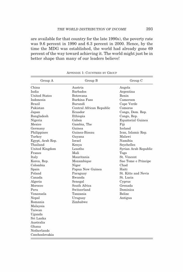
are available for that country for the late 1990s), the poverty ratewas 9.6 percent in 1990 and 6.3 percent in 2000. Hence, by thetime the MDG was established, the world had already gone 69percent of the way toward achieving it. The world might just be inbetter shape than many of our leaders believe!
APPENDIX 1: COUNTRIES BY GROUP
Group A Group B Group C
China Austria AngolaIndia Barbados ArgentinaUnited States Botswana BeninIndonesia Burkina Faso CameroonBrazil Burundi Cape VerdePakistan Central African Republic ComorosJapan Ecuador Congo, Dem. Rep.Bangladesh Ethiopia Congo, Rep.Nigeria Gabon Equatorial GuineaMexico Gambia, The FijiGermany Guinea IcelandPhilippines Guinea-Bissau Iran, Islamic Rep.Turkey Guyana MalawiEgypt, Arab Rep. Israel NamibiaThailand Kenya SeychellesUnited Kingdom Lesotho Syrian Arab RepublicFrance Mali TogoItaly Mauritania St. VincentKorea, Rep. Mozambique Sao Tome e PrincipeColombia Niger ChadSpain Papua New Guinea HaitiPoland Paraguay St. Kitts and NevisCanada Rwanda St. LuciaAlgeria Senegal CyprusMorocco South Africa GrenadaPeru Switzerland DominicaVenezuela Tanzania BelizeNepal Uruguay AntiguaRomania ZimbabweMalaysiaTaiwanUgandaSri LankaAustraliaGhanaNetherlandsCzechoslovakia
393THE WORLD DISTRIBUTION OF INCOME

APPENDIX 1: (CONTINUED)
Group A Group B Group C
ChileMadagascarCote d’IvoireGuatemalaGreeceBelgiumHungaryPortugalZambiaTunisiaSwedenDominican RepublicBoliviaHong Kong, ChinaHondurasEl SalvadorDenmarkFinlandSierra LeoneNicaraguaJordanNorwayNew ZealandIrelandCosta RicaSingaporePanamaJamaicaTrinidad and TobagoMauritiusLuxembourgSoviet UnionArmeniaAzerbaijanBelarusEstoniaGeorgiaKazakhstanKyrgyzstanLithuaniaLatviaRussian FederationTajikistanTurkmenistanUkraineUzbekistan
394 QUARTERLY JOURNAL OF ECONOMICS

COLUMBIA UNIVERSITY
REFERENCES
Ahluwalia, Montek S., Nicholas Carter, and Hollis Chenery, “Growth and Povertyin Developing Countries,” Journal of Development Economics, VI (1979),299–341.
Atkinson, Anthony B., “On the Measurement of Inequality,” Journal of EconomicTheory, II (1970), 244–263.
Atkinson, Anthony B., and Andrea Brandolini, “Promise and Pitfalls in the Use of‘Secondary’ Data-Sets: Income Inequality in OECD Countries as a CaseStudy,” Journal of Economic Literature, XXXIX (2001), 771–800.
Barro, Robert J., and Xavier Sala-i-Martin, “Convergence,” Journal of PoliticalEconomy, C (1992), 223–251.
Barro, Robert J., and Xavier Sala-i-Martin, Economic Growth, 2nd ed. (Cam-bridge, MA: MIT Press, 2003).
Baumol, William, “Productivity Growth, Convergence, and Welfare: What theLong-Run Data Show,” American Economic Review, LXXVI (1986), 1072–1085.
Berry, Albert, Francois Bourguignon, and Christian Morrison, “Changes in theWorld Distribution of Income between 1950 and 1977,” Economic Journal,XCIII (1983), 331–350.
Bhalla, Surjit S., Imagine There is No Country (Washington, DC: Institute forInternational Economics, 2002).
Blanke, Jennifer, “Growth, Income Distribution and Poverty Trends: A Long-RunPerspective,” mimeo, Graduate Institute of International Studies, Geneva,2005.
Bourguignon, Francois, “Decomposable Income Inequality Measures,” Economet-rica, XLVII (1979), 901–920.
Bourguignon, Francois, and Christian Morrison, “Inequality among World Citi-zens: 1820–1992,” American Economic Review, XCII (2002), 727–744.
Chen, Shaoua, and Martin Ravallion, “How Did the World’s Poorest Fare in the1990s?” Review of Income and Wealth, XLVII (2001), 283–300.
Chen, Shaoua, and Martin Ravallion, “How Did the World’s Poorest Fare since theEarly 1980s?” The World Bank’s Research Observer, XIX (2004), 141–170.
Chotikapanich, Duangkamon, Rebbeca Valenzuela, and D. S. Prasada Rao,“Global and Regional Inequality in the Distribution of Income: Estimationwith Limited and Incomplete Data,” Empirical Economics, XXII (1997), 533–546.
Cowell, Frank A., Measuring Income Inequality, 2nd Edition (London, UK: Har-vester Wheatsheaf, 1995).
Deaton, Angus, “Counting the World’s Poor: Problems and Possible Solutions,”mimeo Princeton University, 2001.
——, “ ‘Measuring Poverty in a Growing World’ (or ‘Measuring Growth in a PoorWorld’),” Review of Economics and Statistics, LXXXVII (2005), 1–19.
Deininger, Klaus, and Lyn Squire, “A New Data Set Measuring Income Inequal-ity,” World Bank Economic Review, X (1996), 565–591.
De Long, J. Bradford, “Productivity Growth, Convergence, and Welfare: Com-ment,” American Economic Review, LXXVIII (1988), 1138–1154.
Dikhanov, Yuri, and Michael Ward, “Evolution of the Global Distribution ofIncome, 1970–99,” mimeograph, August 2001.
Dowrick, Steve, and Muhammad Akmal, “Contradictory Trends in Global IncomeInequality: A Tale of Two Biases,” mimeo, Australian National University,2003.
Firebaugh, Glenn, “Empirics of World Income Inequality,” American Journal ofSociology, CIV (1999), 1597–1630.
Heston, Allan, Robert Summers, and Bettina Aten, Penn World Table Version 6.0,Center for International Comparisons at the University of Pennsylvania(CICUP), 2002.
Jones, Charles, “On the Evolution of the World Income Distribution,” Journal ofEconomic Perspectives, XI (1997), 19–36.
395THE WORLD DISTRIBUTION OF INCOME

Kakwani, Nanak, Income Inequality and Poverty: Methods of Estimation andPolicy Applications (Oxford, UK: Oxford University Press, 1980).
Kremer, Michael, Alexei Onatski, and James Stock, “Searching for Prosperity,”Carnegie-Rochester Conference Series on Public Policy, LV (2001), 275–303.
Maddison, Angus, Chinese Economic Performance in the Long Run (Paris, France:OECD, 1998).
Mankiw, N. Gregory, David Romer, and David Weil, “A Contribution to theEmpirics of Economic Growth,” Quarterly Journal of Economics, CVII (1992),407–437.
Melchior, Arne, Kjetil Telle, and Henrik Wiig, Globalisation and Inequality—World Income Distribution and Living Standards, 1960–1998 (Oslo, Norway:Royal Norwegian Ministry of Foreign Affairs, 2000).
Meng, Lian, and Xiaolu Wang, “An Estimate of the Reliability of Statistical Dataon China’s Economic Growth,” Jingji yanji (Economic Research), X (2000),3–13.
Milanovic, Branko, “True World Income Distribution, 1988 and 1993: First Cal-culation Based on Household Surveys Alone,” Economic Journal, CXII (2002),51–92.
——, “Worlds Apart: The Twentieth Century’s Promise That Failed,” manuscript,World Bank, 2002.
Pritchett, Lant, “Divergence, Big Time,” Journal of Economics Perspectives, XI(1997), 3–17.
——, “One World, One World Bank, One Poverty Line: Proposing a New Standardfor Poverty Reduction,” mimeo, Center for Global Development, 2003.
Quah, Danny, “Twin Peaks: Growth and Convergence in Models of DistributionDynamics,” Economic Journal, CVI (1996), 1045–1055.
——, “Empirics for Growth and Distribution: Polarization, Stratification, andConvergence Clubs,” Journal of Economic Growth, II (1997), 27–59.
——, “One-Third of the World’s Growth and Inequality,” mimeo, London School ofEconomics, 2002.
Ravallion, Martin, “Should Poverty Measures be Anchored to the National Ac-counts?” Economic and Political Weekly, August (2000).
——, “Pessimistic on Poverty?” The Economist, April 7, 2004.Ravallion, Martin, and Shaohua Chen, “Learning from Success: Understanding
China’s (Uneven) Progress against Poverty,” Finance and Development, (De-cember 2004), 16–19.
Ravallion, Martin, Gaurav Datt, and Dominique van de Walle, “Qualifying Abso-lute Poverty in the Developing World,” Review of Income and Wealth, XXXVII(1991), 345–361.
Rawski, Thomas, “What’s Happening to Chinese Statistics?” China EconomicReview, XII (2001), 347–354.
Ren, Ruoen, China’s Economic Performance in International Perspective (Paris,France: OECD, 1997).
Sala-i-Martin, Xavier, “Regional Cohesion: Evidence and Theories of RegionalGrowth and Convergence,” European Economic Review, XL (1996), 1325–1352.
——, “The Disturbing ‘Rise’ of Global Income Inequality,” NBER Working Paper8904, 2002a.
——, “The World Distribution of Income (Estimated from Individual CountryDistributions),” NBER Working Paper 8933, 2002b.
——, “The World Distribution of Income Estimated from Log-Normal CountryDistributions,” mimeo, Columbia University, 2004.
Schultz, T. Paul, “Inequality and the Distribution of Personal Income in theWorld: How It Is Changing and Why,” Journal of Population Economics, XI(1998), 307–344.
Shorrocks, Anthony F., “The Class of Additively Decomposable Inequality Mea-sures,” Econometrica, XLVIII (1980), 613–625.
Silverman, Bernard W., Density Estimation for Statistics and Data Analysis(London, UK: Chapman and Hall, 1986).
Theil, Henri, “World Income Inequality and its Components,” Economics Letters,II (1979), 99–102.
396 QUARTERLY JOURNAL OF ECONOMICS

——, Studies in Global Econometrics (Amsterdam, The Netherlands: KluwertAcademic Publishers, 1996).
Theil, Henri, and James Seale, “The Geographic Distribution of World Income,1950–1990,” The Economist, IV (1994), 387–419.
United Nations, “The UN Development Goals,” www.un.org/millenniumgoals,2000.
United Nations Development Program, Human Development Report (New York,NY: 2001).
——, Human Development Report (New York, NY: 2003).United Nations University’s World Institute for Development Research, UNU-
WIDER, “World Income Inequality Database,” http://www.wider.unu.edu/wiid/wiid.htm.
397THE WORLD DISTRIBUTION OF INCOME


![QUARTERLY JOURNAL OF ECONOMICS - … · The Quarterly Journal of Economics, ... Hastorf and Cantril [1954] examine student perceptions of a contentious football game be- tween Princeton](https://img.dokumen.tips/doc/110x75/5b5fab827f8b9a415d8e71e9/quarterly-journal-of-economics-the-quarterly-journal-of-economics-hastorf.jpg)