Embed Size (px)
Citation preview

WM2011 Conference, February 27-March 3, 2011, Phoenix, AZ
The Power of Data Imaging – 11614
Jeffrey W. Lively MACTEC Development Corporation, Grand Junction, Colorado 81506
ABSTRACT
Data imaging and visual data assessment are veritable gold mines in the scientist’s quest to understand and accurately interpret numerical data. Graphical displays of various aspects of a dataset offer the analyst insight to the data that no mathematical computation or statistic can provide. Consider that to truly understand a statistic requires that one understands both how the statistic was calculated and what the resulting value implies. The implication (or interpretation) of the statistic depends largely upon the underlying structure of the data for which the statistic was calculated. It is difficult, at best, for even a skilled and observant statistician to understand the underlying structure of a dataset. Often, there is either too little data to get a good “picture” of the structure that might be present or there is so much data that one cannot readily assimilate it. Of course, the latter problem (too much data) is, in reality, no problem at all given the abilities of modern computers and software systems to manage large amounts of data. If one makes use of the computer’s ability to create visual images constructed from the data, the richness and structure of the data becomes obvious.
Along with the advances in computer technology, the advent of the global positioning satellite system (and other spatially referenced positioning tools) has enabled scientists from many fields of endeavor to collect and view data in its spatial context. The spatial context of radiological data is an imminently powerful asset in the health physicist’s data evaluation arsenal. So powerful is data collected with spatial context that a relatively new branch of mathematical statistics - geospatial statistics – has emerged. Geospatial statistics seek to exploit this context rich data form to better understand the spatial relationships and co-relationships that might exist, but would be otherwise hidden in tabular data or obscured with classic statistical approaches.
This paper (and accompanying presentation) will show the power that visual data assessment possesses to understand radiological scanning data and to make confident and accurate decisions based on the data images. It will challenge the traditional mathematical concept of detection limits for scanning. It will demonstrate that more data, even if the individual datum comprising the dataset is of “poorer quality” (i.e., has a larger uncertainty and, thus, a larger calculated minimum detection value), is significantly more powerful than a smaller dataset comprised of higher quality measurements. This presentation will cause the open-minded health physicist to rethink the way they prescribe, collect, evaluate, and make decisions based upon radiological scan data.
INTRODUCTION
There is a well-known and often quoted saying that testifies to the superior power of visual images to convey information or meaning. That saying goes something like, “a picture is worth

WM2011 Conference, February 27-March 3, 2011, Phoenix, AZ
a thousand words.” The truthfulness of that saying is readily recognized by most people, and it is manifest in the way that information is presented to us. For example, consider the assembly procedure that is supplied with a new personal computer system. Rather than a book with pages of words, the assembly procedure is communicated to us by the manufacturer with a series of color-coded images arranged in a deliberate sequence and contained on just one chart-sized page. The visual presentation is far more effective because it is presented in a way that intuitively conveys meaning. If we sometimes find it difficult to accurately convey meaning with words, then conveying meaning with data presents even greater challenges.
Why is it that images readily convey meaning yet we often struggle to convey meaning with words and numbers alone? The answer lies in the manner that the human brain processes information. New information is always processed within an accepted or understood context. Even if there is precious little context provided with a sequence of words or numbers, our brains automatically search for what we consider to be an appropriate context within which to examine the words or numbers. That does not mean that the context we understand or accept will be correct. In any communication, the more context provided, the more likely the recipient is to accurately understand the message. Images have the distinct advantage of being inherently context rich.
Images are so powerful at revealing context and conveying thought and meaning that they are the first tools a child uses to communicate cognitive thought. We teach our children language by linking words and sounds to images. The ability to communicate mathematics and to evaluate data comes much later and with far more difficulty for most. Often, people will say that mathematics is too abstract for them to grasp or understand. The Latin root of the word abstract literally means “to draw away.” It conveys the idea of being devoid of, or lacking in, context. Think of the genre of art known as abstract art. This art form is one in which the intellectual and affective content depends solely on the intrinsic form of the art itself. In other words, it cannot be evaluated in an objective sense.
Even those among us who are mathematically literate will arrive at incorrect conclusions about data if it is not presented and understood in the proper context. Context is everything! The sciences are based upon the collection and interpretation of observations (data). Like all good scientists, health physicists seek to be objective and analytical in the assessment of radiological data, particularly when we are asked to make a decision regarding compliance or radiological release. That is the essence of the MARSSIM [1] guidance. These protocols seek to establish an accepted analytical framework within which one can assess radiological data to arrive at logical and defensible decisions. These methods rely heavily on mathematical data evaluation. Significantly, MARSSIM recommends that data be graphically interpreted and presented for review in order to learn about the structure of the data and to identify patterns, relationships, and anomalies (MARSSIM, page Roadmap-12). It suggests that both histograms and posting plots be developed at a minimum. In other words, these visual representations of the data provide the necessary context required to appropriately interpret the data.
The NIST Engineering Statistics Handbook [2] describes the vital role that visual data imaging plays in properly assessing data using an approach called exploratory data analysis (EDA). The underlying reason that the EDA approach relies so heavily on data imaging (graphics) is that graphics give the analyst unparalleled power to open-mindedly explore the data without preconception or assumption. Visual data assessment entices the data to reveal its structural

WM2011 Conference, February 27-March 3, 2011, Phoenix, AZ
secrets offering new, often unsuspected, insight into the data. It powerfully combines the natural pattern recognition capabilities that we all possess with the raw data collected providing unparalleled power to the assessor. The NIST Engineering Statistics Handbook [2] so strongly recommends visual data analysis that it boldly states, “if one is not using statistical graphics [visual data presentation], then one is forfeiting insight into one or more aspects of the underlying structure of the data.”
TYPES of VISUAL DATA PRESENTATIONS
There are many applications for the concepts of data imaging, and scientists have long employed these techniques in a variety of scenarios. For example, histograms, density plots, scatter plots, probability plots, run sequence plots, box plots, correlation plots, and lag plots (among others) are tools that allow the analyst to visually represent numerical data. The power of these visual tools is significant. They reveal structure (or the lack of structure) that underlies the numerical data and offer the analyst insight and intuitive understanding that cannot be readily recognized by tabular mathematical evaluation alone.
Each of the graphical techniques described above are designed to reveal some aspect of the mathematical nature of a dataset. Contour plots are unique in that they allow the presentation of three dimensions, allowing the analyst to evaluate numerical data within the spatial context from which they were collected. They are commonly used in spatial data analysis where the “x” and “y” coordinates are used to represent directional distance (such as northing and easting, or latitude and longitude) while the “z” dimension is used to represent the magnitude of the variable of interest. One of the earliest and most commonly recognized applications of the contour plot is the topographical map. There, the “z” dimension is used to represent elevation.
The contour map is conceptually the same as the posting plot recommended in the MARSSIM [1]. The difference is that the posting plot simply displays numerical data in a spatial context while the contour plot extends the concept by interpolating the numerical data1 in order to graphically represent the data with iso-response contour lines (Fig. 1).
Even in this simple example, the more graphically rich contour plot conveys more intuitively what the data is suggesting.
1 The actual techniques for determining the correct iso-response values are rather complex and are almost always computer generated. It is not the purpose of this paper to discuss the various techniques that can be used to derive iso-response values and draw iso-response curves.

WM2011 Conference, February 27-March 3, 2011, Phoenix, AZ
Fig. 1. Example Posting and Contour Plots [2]
This paper focuses primarily on the use of contour plots generated with spatially referenced radiological data.

WM2011 Conference, February 27-March 3, 2011, Phoenix, AZ
DATUM QUALITY vs. IMAGE QUALITY
Advances in computer technology together with the advent of the global positioning satellite (GPS) system (and other spatial referencing tools) have enabled scientists from many fields of endeavor to collect and view data in its spatial context. This is true for health physicists with radiological data collected in support of characterization and remediation activities. Unfortunately, we sometimes overlook or discard the richness that can be derived from the visual assessment and interpretation of spatially referenced radiological scanning data. This is, in part, because as health physicists we are trained to assess data quality on an individual measurement basis. However, such an approach ignores critically relevant information or, worse, biases the assessment of data quality when there are multiple measurements that relate to one another (correlate) in space or in time.
For example, the common formula [classically described by Currie [3] and revised and recommended in the MARSSIM [1] used to calculate the minimum detectable concentration (MDC) is fundamentally designed to predict the value above which the measure (e.g., concentration, count rate, or activity) of a single data point would be statistically significant relative to background and confidently measured in the presence of varying background.
(Eq. 1)
To be fair, the MDC described by MARSSIM is intended to be used as an a priori estimator of the sensitivity and, thus, detection capability of a given measurement system. Unfortunately, the very design of this mathematical approach is constructed to produce a point-by-point estimate, discounting the fact that in many cases it is a population of data that is being collected and evaluated. In addition, the construct of the MDC beckons the analysts to perform point-by-point comparisons of each data point. Of course, if only one, or few, data points are available, the point-by-point comparison might be the most appropriate approach. However, this approach ignores two critically valuable aspects of a voluminous, multi-point dataset that is collected within a spatially referenced context. First, the mathematical construct of the MDC formula uses a single data point to represent the background response of the measurement method and to then predict, by assumption, the distribution and variance in the measured background. With modern spatially referenced data-logging measurement systems, it is possible to actually measure the response of the measurement method to the background distribution and variance directly using a large, multi-point dataset, thereby avoiding the assumptions inherent in the traditional approach.
Second, it discounts the valuable information that can be derived by evaluating the spatial construct (the context) of the data. This has the effect of ‘forcing’ the analyst to evaluate individual data points in isolation and on a purely mathematical basis. Considering the inherent probabilities involved with any inferential statistical method, the likelihood is that some data points will be judged to exceed background (or exceed detection limits) when, in reality, they are simply properties of the inherent variability in background and the measure of it. To reduce the likelihood of such anomalies, health physicists naturally drive measurement times up in an attempt to smooth out the measured response over time. When this occurs, the analyst is actually averaging the response over time and perhaps unwittingly discarding potentially critical information that is collected from a different context, the time domain.

WM2011 Conference, February 27-March 3, 2011, Phoenix, AZ
To avoid these pitfalls and to get the most from our measurement data, we must rethink the way we collect and analyze data. The natural and most effective way to evaluate data and derive meaning from it is to consider the data in the domain from which it was observed or collected. The human mind automatically and inextricably works in this way. When collecting data, we should strive to collect as much data (both radiological data and contextually relevant meta-data) as we possibly can while avoiding measurement techniques that deprive us of valuable context. When evaluating data, it is imperative that we understand and consider the context(s) that applies to the data.
To illustrate the concept, consider the following example. A paragraph that is widely publicized on the internet refers to a study reportedly conducted by Cambridge University. That study was designed to evaluate the cognitive capabilities of the human mind with respect to proper (or improper) spelling of words, but it well illustrates the vital importance of context. Attempt to read the following paragraph. The context has been obscured by removing every 2nd, 3rd, and 4th word in a sequence of four (i.e., the modified paragraph contains every fourth word, only the 1st…5th…9th…13th…etc. words, from the original paragraph).
According at doesn't order a only that. ls at the rest total can without because does letter the whole.
Could you make sense of the paragraph? NOT Likely! The missing words deprive you of the logic that is derived from the sequential “context” of the language, dramatically limiting the value of the words that are present. Interestingly, since we cannot make contextual sense of the paragraph, the human mind naturally redirects its focus to analyzing each word independently in an attempt to derive any meaning from the words.
Now, read the same paragraph again. This time all of the words are displayed in their intended sequence (context), but most are badly misspelled. See if you can make sense of the paragraph this time.
Aoccdrnig to rscheearch at Cmabrigde Uinervtisy, it deosn't mttaer in waht oredr the ltteers in a wrod are, the olny iprmoetnt tihng is taht the frist and lsat ltteer be at the rghit pclae. The rset can be a toatl mses and you can sitll raed it wouthit porbelm. Tihs is bcuseae the huamn mnid deos not raed ervey lteter by istlef, but the wrod as a wlohe.
Which version yields the most useful information? Likely, you had little problem reading and deriving meaning from the latter version. When the missing words are provided, the context is readily discerned even though most of the words are grossly misspelled. The quality of the individual words is poor, but their relationship to one another (the context) is far more important to deriving meaning than their spelling. It is clear that more context, not better spelling (i.e., quality) is more valuable! There is a similar relationship applicable to spatially referenced numerical data.
WM2011 Conference, February 27-March 3, 2011, Phoenix, AZ
SIGNIFICANCE of IMAGING RESOLUTION
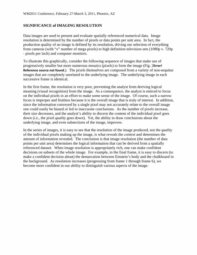
Data images are used to present and evaluate spatially referenced numerical data. Image resolution is determined by the number of pixels or data points per unit area. In fact, the production quality of an image is defined by its resolution, driving our selection of everything from cameras (with “x” number of mega pixels) to high definition television sets (1080p v. 720p - pixels per inch) and computer monitors.
To illustrate this graphically, consider the following sequence of images that make use of progressively smaller but more numerous mosaics (pixels) to form the image (Fig. 2Error! Reference source not found.). The pixels themselves are composed from a variety of non-sequitur images that are completely unrelated to the underlying image. The underlying image in each successive frame is identical.
In the first frame, the resolution is very poor, preventing the analyst from deriving logical meaning (visual recognition) from the image. As a consequence, the analyst is enticed to focus on the individual pixels in an effort to make some sense of the image. Of course, such a narrow focus is improper and fruitless because it is the overall image that is truly of interest. In addition, since the information conveyed by a single pixel may not accurately relate to the overall image one could easily be biased or led to inaccurate conclusions. As the number of pixels increase, their size decreases, and the analyst’s ability to discern the content of the individual pixel goes down (i.e., the pixel quality goes down). Yet, the ability to draw conclusions about the underlying image, and even subsections of the image, improves.
In the series of images, it is easy to see that the resolution of the image produced, not the quality of the individual pixels making up the image, is what reveals the context and determines the amount of information revealed. The conclusion is that image resolution (the number of data points per unit area) determines the logical information that can be derived from a spatially referenced dataset. When image resolution is appropriately rich, one can make confident decisions on subsets of the whole image. For example, in the final frame, it is easy to discern (to make a confident decision about) the demarcation between Einstein’s body and the chalkboard in the background. As resolution increases (progressing from frame 1 through frame 6), we become more confident in our ability to distinguish various aspects of the image.

WM2011 Conference, February 27-March 3, 2011, Phoenix, AZ
Fig. 2. The impact of data volume (pixel size) on image quality

WM2011 Conference, February 27-March 3, 2011, Phoenix, AZ
APPLICATION TO RADIOLOGICAL DATA
This concept has a direct and powerful relationship to spatially referenced radiological data such as that collected with automated data-logging radiological scanning systems. In radiological scanning terminology, image resolution is the number of data points per unit area. Pixel quality is analogous to MDC.
Consider the following example in which two scenarios involving non-spatially referenced data are compared.
SCENARIO A: A technician makes a single, 10-minute-long measurement of the radioactive emission from a discrete sample.
SCENARIO B: A technician makes ten, 1-minute-long measurements of the radioactive emission from the same sample.
The total measurement time in the two scenarios is equivalent, suggesting that the average or mean count rate in the two scenarios should be equal. The single, 10-minute measurement from Scenario A is more accurate than any individual 1-minute measurement from Scenario B. But the set of ten, 1-minute measurements from Scenario B reveals more information about the radioactivity in the sample than does the single 10-minute measurement! One could, for example, plot the sequence of measurements in time series and possibly discern some information about the radioactive half-life or ingrowth relationships. One could plot the sequence of measurements using a histogram or a probability plot and graphically discern the nature of the distribution of the data. Neither of these techniques is available if the data were collected as described in Scenario A. Both techniques rely upon evaluating data in the context from which they were collected. Even in this simple example, it is clear that context is vitally important to the analyst’s ability to discern meaning from the data.
When the capability to measure and record data in its spatial context is exploited, it is as if entirely new vistas are opened up, revealing new aspects of the data in ways that can lead to new insights with remarkable clarity. But, in order to take full advantage of this powerful exploratory data imaging technique, the analyst must acknowledge that it is not the so-called quality of the individual piece of data that matters, but rather it is the resolution (the number of pieces of data per unit area or volume) of the image produced by evaluating clusters of spatially oriented data that provides insight.
It is precisely this concept, aided by modern computer technology, that has driven the dramatic advances in medical imaging, including radiological imaging techniques such as computed axial tomography (CAT) scanning. The CAT scan (as well as other spatially referenced radio imaging techniques) relies on the detection of emitted or scattered radiation and provides a nearly perfect analogue for spatially referenced scanning measurements made in radiological characterization and remediation surveys. CAT scanning systems collect many tens of thousands of measurements made in just a fraction of a second. The pixel (or voxel, for 3-dimensional images) size is variable but is always quite small, commonly on the order of 0.2mm. As a result, the data quality of each individual logged data point is very poor. However, the number of pixels per unit area is extremely high. The computer logs the radiological data, together with the axial and radial position of the detector relative to the patient and then assembles the large,

WM2011 Conference, February 27-March 3, 2011, Phoenix, AZ
spatially relevant data to form a high-resolution, high-quality image. These images provide an exceptional degree of accuracy and precision upon which physicians and experts in the field rely to make exacting diagnostic decisions (remedial action decisions) and surgical interventions (remedial actions). Not once does the analyst question the quality of an individual pixel of data, because in the bigger picture, it is simply not important. Rather, the analyst looks quite naturally to the image formed by the spatially presented dataset and can readily see patterns that signal either a normal or abnormal physiology.
In this final example, a radiologically impacted site was measured with a radiological scanning system connected to a computer and a real-time, spatial-referencing detection system. The resulting dataset contained over 30,000 discrete, spatially referenced measurements distributed over a space smaller than 1 acre. Graphically displaying the spatially oriented data using a series of various-sized, color-coded mosaic tiles provides insight to the significant role that spatial resolution has on our interpretation of the data. The progressive sequence of images (frames 1 through 9 of Fig. 3) shows the radiological data from the site with greater and greater resolution (smaller and smaller pixel size). The number of pixels (and, thus, the resolution) increases progressively in each successive frame.
It is informative and noteworthy to consider how the analyst’s perception and interpretation of the data might evolve as the image resolution presented evolves. If the conventional, point-by-point, tabular mathematical approach to the assessment of the data were employed, more than 1,500 measurements would have been judged to “exceed background by more than the MDC” even if there was no added radioactivity (no radiological impacts) present. Conversely, a significant number of the individual measurements would have been judged as lacking sufficient quality, as defined by the MDC. However, when the same dataset is evaluated in its spatial context, a clear and accurate image emerges. The high resolution, data-rich image that results did not specifically contradict previously collected data, but did dramatically refine the analyst’s understanding of the deposition and distribution of radiological contamination at the site. More importantly, it fundamentally changed the remedial approach to the site, saving millions of dollars in unnecessary and improperly focused remediation. Furthermore, it substantially changed and improved the assessment of the as left radiological condition of the site.

WM2011 Conference, February 27-March 3, 2011, Phoenix, AZ
Fig. 3. The impact of pixel size (resolution) on the radiological data image quality
GRAPHICAL DETERMINATION of DETECTION LIMIT
This paper has advocated that the quality of individual data pieces (as measured by the classic assessment of detection limits) is substantially less important than collecting and evaluating high resolution, spatially referenced datasets. This is not to say that an understanding and measure of the actual detection sensitivity (limit) achieved is without value. But, there is a better, holistic,
WM2011 Conference, February 27-March 3, 2011, Phoenix, AZ
and graphical way to assess and interpret radiological detection limits as they relate to populations of data such as that measured with scanning systems.
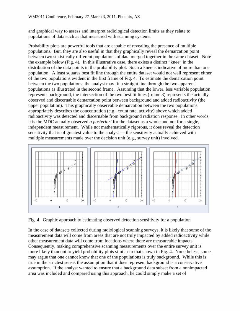
Probability plots are powerful tools that are capable of revealing the presence of multiple populations. But, they are also useful in that they graphically reveal the demarcation point between two statistically different populations of data merged together in the same dataset. Note the example below (Fig. 4). In this illustrative case, there exists a distinct “knee” in the distribution of the data points in the probability plot. Such a knee is indicative of more than one population. A least squares best fit line through the entire dataset would not well represent either of the two populations evident in the first frame of Fig. 4. To estimate the demarcation point between the two populations, the analyst may fit a straight line through the two apparent populations as illustrated in the second frame. Assuming that the lower, less variable population represents background, the intersection of the two best fit lines (frame 3) represents the actually observed and discernable demarcation point between background and added radioactivity (the upper population). This graphically observable demarcation between the two populations appropriately describes the concentration (e.g., count rate, activity) above which added radioactivity was detected and discernable from background radiation response. In other words, it is the MDC actually observed a posteriori for the dataset as a whole and not for a single, independent measurement. While not mathematically rigorous, it does reveal the detection sensitivity that is of greatest value to the analyst — the sensitivity actually achieved with multiple measurements made over the decision unit (e.g., survey unit) involved.
Fig. 4. Graphic approach to estimating observed detection sensitivity for a population
In the case of datasets collected during radiological scanning surveys, it is likely that some of the measurement data will come from areas that are not truly impacted by added radioactivity while other measurement data will come from locations where there are measureable impacts. Consequently, making comprehensive scanning measurements over the entire survey unit is more likely than not to yield probability plots similar to that shown in Fig. 4. Nonetheless, some may argue that one cannot know that one of the populations is truly background. While this is true in the strictest sense, the assumption that it does represent background is a conservative assumption. If the analyst wanted to ensure that a background data subset from a nonimpacted area was included and compared using this approach, he could simply make a set of

WM2011 Conference, February 27-March 3, 2011, Phoenix, AZ
measurements in the selected reference background area (although such a technique is not without its own unique set of statistical problems).
CONCLUSION
Like the physician who seeks greater insight by means of high resolution, spatially oriented data imaging tools like the CAT scan, health physicists should seek greater insight into the relative distribution of radiological contaminants in the remedial environment. We should make use of the techniques and tools available to us to more competently evaluate the significance of the measurements we make. We must avoid the temptation to demand that individual measurement quality meet some a priori estimator of sensitivity when our decisions are more appropriately based on a population of measurements representing the whole.
Rather than blindly following a recipe conceived and intended to address a different technique altogether, we should embrace the fact that advances in technology have moved us to a place that allows us to use new tools and new ingredients in ways that give us unprecedented insight. This insight, if we choose to consider it, provides us with the means to make more informed and accurate decisions regarding the assessment and remediation of residual radioactivity in our environment. Imagine what we would be saying about our physician if he ordered a CAT scan for some diagnostic purpose, and then rather than reading the computer-generated, spatially referenced image, he insisted on reviewing each individual (0.2 mm) pixel of data in tabular form, discounting those that independently failed to yield a conclusive result.
REFERENCES
1. Environmental Protection Agency (EPA). 2000. Multi-Agency Radiation Survey and Site Investigation Manual (MARSSIM). EPA-402-R-97-016, Rev. 1, August 2000, EPA, Washington, D.C.
2. National Institute of Standards and Technology (NIST). 2010. NIST/SEMATECH e-Handbook of Statistical Methods, http://www.itl.nist.gov/div898/handbook/ , December 1, 2010.
3. Currie, L.A. 1968. Limits for Qualitative Detection and Quantitative Determination. Analytical Chemistry 40(3):586-693.