Embed Size (px)
Citation preview

1
The application of Gestalt Perception Principles of Visual Communication
for Fresha Dairy Products, Githunguri
By
IDA KATHURE
B05/1066/2007
A RESEARCH PROJECT SUBMITTED IN PARTIAL FULFILLMENT OF
THEREQUIREMENTS FOR THE AWARD OF B.A (DESIGN) AT THE
UNIVERSITY OF NAIROBI
February, 2013
2
DECLARATION
This is my original work and has not been presented in part or full for an award of a degree course in any
other university or institution to the best of my knowledge.
STUDENT:
IDA KATHURE
Signature………………………………….…………Date………………..
This research paper is submitted as partial fulfillment of the University examinations requirements for the
award of B.A (Design) at The University of Nairobi.
SUPERVISOR:
MR. MURITHI KINYUA
Signature…………………………………………..Date…………..………….

3
DEDICATION
To my mother Helden Ndegwa.
To my supervisor Mr. Murithi Kinyua for his immense guidance that has seen this project to fruition.
To my lecturers Mr. Mutune Gitau and Dr. Lilac Osanjo for their ardent assistance through this project.

4
ACKNOWLEDGEMENT
I wish to thank my mum and dad (my hero) for their continued support throughout my college life and
beyond. Thank you for finally letting go and believing in me. Much love.
Much thanks to my lecturers Mr. Murithi Kinyua, Mr. Mutune Gitau, Dr.Lilac Osanjo and Mr. Maina
Mwituria for their support, guidance and advice accorded to me during my research. Thank you.
I also wish to thank my classmates Irene ‘Kari’ Wangari and Winfred ‘Roomie’ Muthoni. We had a good
run.
5
Abstract
Cow milk is rich in high-quality protein, calcium and phosphorous, the essential raw materials for making
bone and muscle. In respect to human nutrition, cow’s milk frequently is described as “the most nearly
perfect food” (Patton, 2005). Production of milk and milk products has spread all over the world and in
Kenya, Fresha Dairy Products commissioned its own milk processing plant in July 2004. Milk is
processed and packed in form of packed fresh milk, yoghurt, Maziwa Lala (fermented milk), butter, ghee
and cream under the flagship of “Fresha”.
This research will explore the use of Gestalt perception principles including the international typographic
style and sustainability in visual communication. With more than 75% of all information the brain
receives being estimated to be visual; the importance of successful visual communication cannot be
underplayed. The researcher seeks to create concepts that could be used in rebranding the corporate
identity, advertisement, packaging and photography for Fresha Dairy Products as well.
Chapter one, the introduction, covers the introduction to the problem, its background and gives the
problem statement. After that the researcher outlines the objectives of the study, and research questions.
The researcher closes the chapter with significance of the study, justification and definition of terms.
Chapter two, the literature review starts by discussing the benefits of dairy products. The researcher then
describes the three main design philosophies to be used in rebranding Fresha Dairy Products. The
researcher then touches on each of the four graphic design units. Lastly, she covers the design process.
Chapter three, methodology, discusses the research design, population and sample and various methods of
data collection and presentation. Chapter four illustrates the findings according to the researcher while
chapter five covers a summary of the findings, conclusions and recommendations.

6
Table of Contents
Chapter 1: Introduction
1.1 Introduction………………..…………………………………………………......................................10
1.2 Background....……………………...……………………………………………………………….…11
1.3 Problem Statement…………………………………………..……………………….………………..12
1.4 Objectives of the Study…...………………………………………...…………………………………12
1.5 Research Questions………………………………………………….…….………….……………….12
1.6 Hypothesis………………………………………………………………….…………………………13
1.7 Significance of the Study...…………………………………….………….…………………….…….13
1.8 Justification…………………………………………………….………….…………………….…….13
1.9 Scope of the Study………………..………………………….…………….………………………… 13
1.10 Limitations of the Study…..………………………………….………….…………………….……..14
1.11 Assumptions.….………………………………………………………….………………..…………14
1.12 Definition of Terms………………………………………………….………………..……………...15
Chapter 2: Literature Review
2.0 Introduction…..………..………………………………………………………………………………16
2.1 Nutritional Benefits of Dairy Products……………………….………….…………………….……...16
2.1.1 Benefits of Milk …………………………….………….…………………….…………….16
2.1.2 Benefits of Yoghurt………………………….………….…………………….……………17
2.2 Graphic Design.……..………………………………………………………………………………...18
2.2.1 The Difference between Graphic Design and Art…………………………………………..18
2.2.1 Graphic Designer……………………………….…………………………………………..19
2.2.1 Attributes of a good Graphic Designer………..……………………………………………19
2.3 Corporate Identity..………………………………………………………………………………........21
2.3.1 History of Corporate Identity………………….……………………………………………21
2.3.2 Elements of a good Corporate Identity…………………………………………………......22
7
2.4 Advertisement…………………………………………………………………………………………25
2.4.1 History of advertising………………………………………………………………………26
2.4.2 Elements of a “winning ad”………………………………………………………………...26
2.5 Packaging………...……………………………………………………………………………………29
2.5.1 History of Packaging……………………………………………………………………….30
2.5.2 Food Packaging……………………………………………………………………………..30
2.5.3 Functions of food packaging……………………………………………………………….31
2.5.4 Elements of a good Package………………………………………………………………..31
2.6 Photography……..….…………………………………………………………………………………34
2.6.2 Elements and Principles of Design in photography………………………………………...35
2.6.3 Elements That Make a Photo “Great”………………………………………………………37
2.7 Design Concepts………………………………………………………………………………………38
2.7.1 Visual Perception…………………………………………………………………………...39
2.7.1 Gestalt Principles of Perception…………………………………………………………….39
2.8 Sustainable Design..…………………………..…………………………………………………….…40
2.8.1 Sustainable Graphic Design………………………………………………………………...41
2.8.2 Reduced materials…………………………………………………………………………..41
2.8.3 Recycled materials………………………………………………………………………….42
2.8.4 Reusable materials………………………………………………………………………….42
2.9 International Typographic Style………………………………………………………………………42
2.10 Design Process……………………………………………………………………………………….42
2.10.1 Graphic Design Process…………………………………………………………………...42
2.10.2 David Airey………………………………………………………………………………..43
2.10.3 David Airey’s identity design process…………………………………………………….44
8
Chapter 3: Methodology
3.0 Introduction…….…………………………………………………………………….….…………….46
3.1 Research Designs……………………………………………………………….……………………..46
3.2 Population ……………………………………………………………….……………………..……..47
3.3 Sample…...……………………………………………………………….……………………..……..47
3.4 Sampling Techniques…………………………………………………….……………………..……..47
3.5 Instruments……………………………………………………………….……………………..……..47
3.6 Data analysis…………………………………………………………….……………………..….…..48
3.7 Data Presentation…………………………………………………………….………………………..49
Chapter 4: Findings
4.0 Introduction…….…………………………………………………………………….….…………….51
4.1 Historical Background……………………………………………………………….….…………….51
4.2 Fresha Dairy Products Activities…….………………………………………………………………..52
4.3Fresha Dairy Products…….…………………………………………………………………….….…..53
4.4 Corporate Identity…..…….…………………………………………………………………….….….54
4.4.1 Branding…………………………………………………………………………………….54
4.4.2 Logo………………………………………………………………………………………...54
4.4.3 Color………………………………………………………………………………………..55
4.4.4 Slogan………………………………………………………………………………………55
4.5 Advertisement…………………………………………………………………………………………56
4.5.1 Print Adverts………………………………………………………………………….…….56
4.5.2 Website……………………………………………………………………………………..58

9
4.6 Packaging……………………………………………………………………………………………..58
4.7 Photography…………………………………………………………………………………………...62
4.8 The Chi Squire Distribution…………………………………………………………………………...64
4.8.1 Githunguri sample Chi Squire Test…………………………………………………………65
4.8.2 Nairobi Sample Chi Squire Test……………………………………………………………66
Chapter 5: Recommendations
5.1 Summary of the Findings…….…………………………………………………………………….….68
5.2 Kenyan Dairy Brands …….…………………………………………………………………….……..69
5.3 Fresha Dairy Products…….……………………………………….……………………………….….71
5.4 Corporate Identity……..….……………………………………….……………………………….….72
5.5 Packaging…….……………………………………….……………………………….………………73
5.6 Advertisement…….……………………………………….……………………………….………….74
5.7 Conclusion: …….……………………………………….……………………………….………...….74
5.8 Recommendations……………………………………………………………………………………..75

10
CHAPTER 1: INTRODUCTION
1.1 Introduction
Robert E. Horn, an award-winning scholar at Stanford University's Center for the Study of Language and
Information, said, "When words and visual elements are closely entwined, we create something new and
we augment our communal intelligence. visual language has the potential for increasing ‘human
bandwidth'—the capacity to take in, comprehend, and more efficiently synthesize large amounts of new
information.” Recent research supports the idea that visual communication can be more powerful than
verbal communication, suggesting in many instances that people learn and retain information that is
presented to them visually much better than that which is only provided verbally. Behavioral
Psychologists agree that most of our decisions are based on intuitive judgment and emotions. Herbert A.
Simon, Nobel Prize winning scholar at the Carnegie Mellon Institute in Pittsburgh, studied corporate
decision-making and found that people often ignored formal decision-making models because of time
constraints, incomplete information, the inability to calculate consequences, and other variables.
Neurologist Antonio Damasio studied research on patients with damaged ventromedial frontal cortices of
the brain, which impaired their ability to feel but left their ability to think analytically intact. Damasio
discovered that the patients were unable to make rational decisions even though their ability to reason was
fully functional. He concluded that reasoning depends, to a considerable extent, on a continual ability to
experience feelings (Sokolow, 2004). P
eople think using pictures. According to John Berger (1972), Seeing comes before words. The child looks
and recognizes before it can speak. Dr. Lynell Burmark, Ph.D. Associate at the Thornburg Center for
Professional Development and writer of several books and papers on visual literacy, said, "...unless our
words, concepts, and ideas are hooked onto an image, they will go in one ear, sail through the brain, and
go out the other ear. Words are processed by our short-term memory. Images, on the other hand, go
directly into long-term memory where they are indelibly etched." Perception is essential in improving the
visual communication of a company. No matter what you are looking at, you are forming an impression
about it. And the way you are treated depends on the image you reflect. It would be helpful to decide on
what kind of emotion a company evokes before evoking it. It doesn’t matter what emotion as long as you
are able to successfully extract those feelings from the viewer. It makes the viewer stop and think.
Therefore, a positive corporate image is an indispensable condition in Fresha dairy products’ strategic
continuity and success. The consistent design of a corporate identity, in accordance with objectives set for
the business, uphold and reflect the ethos, culture, principles, future ambitions, or visionary goals of the
business.
11
1.2 Background of the Study
It is recommended that every human being should consume a certain amount of milk for fulfilling their
nutritional deficits. Calcium recommendations set by the National Academy of Sciences range from 500
mg to 1300 mg depending on your age. One glass of milk contributes about 44% to our daily-
recommended vitamins intake. As a source of calcium milk makes our bones and teeth strong, it provides
the body with high quality proteins that contain the essential amino acids, which the body is incapable of
producing by itself. Studies show dairy foods, when consumed as part of a healthy diet, improve overall
diet quality and may help to reduce the risk of osteoporosis, hypertension, obesity, colon cancer and
metabolic syndrome. In respect to human nutrition, cow’s milk frequently is described as “the most nearly
perfect food” (Patton, 2005). Milk is therefore generally referred as a complete food. On 27th June 2012,
Kenya Dairy Processors Association (KDPA launched a multi-million shilling milk campaign at the
Kenyan, capital Nairobi. The “Stay young, Do milk” campaign is aimed at driving the consumption of
milk and creating a milk drinking culture and ultimately a healthy wealthy nation by supporting the dairy
Industry.
The dairy industry is the single largest agricultural sub-sector in Kenya, larger even than tea (Muriuki et
a, 2004). It contributes 14 percent of agricultural GDP and 3.5 percent of total GDP (Government of
Kenya, 2008). The industry continues to grow, posing even more competition, since its liberalization in
1992. The official statistics place the number of milking cattle at 3.8 million (Government of Kenya,
2008). A survey conducted by Smallholder Dairy Project (SDP) asserts that there are approximately 6.7
million dairy cattle in Kenya (SDP, 2005). The Food Agricultural Organization on the other hand
estimates a figure of 5.5 million milking animals (TechnoServe, 2008). The informal milk market controls
an estimated 70 percent of the total milk marketed in Kenya (Kenya Dairy Board, 2012).
Research has shown that in the largest dairy category, Fresh Milk, Brookside and New KCC share the
spoils at one third each. Their brands seem to connect with consumers, despite their relatively low
advertising spend. The remaining 40% is shared by more than four other milk brands (Reja, 2012).
Githunguri Dairy Farmers Cooperative plays a key role in the marketing of its members’ milk which is
processed and packed in form of packed fresh milk, yoghurt, Maziwa Lala (fermented milk), butter, ghee
and cream under the flagship of “Fresha”. The quest for the remaining third of the market-share is the
source of innovation and price competition for Fresha. Research on effective visual communication has
become necessary in the design of a company to fit within the current and future growing needs. In
addition, the realization of the importance of the dynamic demands of a competitive industry develops the
growing need of a company to meet international graphic design standards.

12
1.3 Problem Statement
Fresha Dairy Products has not adequately made the most of the Gestalt principles of perception,
International typographic style and sustainable design for effective Visual communication. Areas that
need to be improved include photography, advertisement, packaging and the corporate identity.
1.4 Objectives of the Study
The main aim of the research is to investigate and determine a graphic design solution, for Fresha Dairy
Products, that is both visually effective and environment friendly.
The specific objectives are:
i. To establish the application of Gestalt perception principles of visual communication to improve
the visual image of a company.
ii. To establish the application of Gestalt principles of perception in graphic design of the Fresha
Dairy Products.
iii. To investigate how International Typographic Style and sustainable graphic design can be used to
improve visual communication.
iv. To propose graphic design solutions that revamps the visual communication of Fresha Dairy
Products.
1.5 Research Questions
The main research question of this research is; does graphic design provide visual communication
solutions that are effective and environmentally friendly?
The specific research questions are:
i. Can Gestalt perception principles of visual communication be used to improve the visual
image of a company?
ii. Has Fresha Dairy Products effectively brought Gestalt perception principles of visual
communication perception into play?
iii. Has Fresha Dairy Products exploited International Typographic Style and sustainable graphic
design?
iv. Can graphic design provide solutions that can revamp the visual communication of Fresha
Dairy Products?
13
1.6 Hypothesis
Null hypothesis: Gestalt principles of perception, color psychology and sustainable design have not been
effectively brought into play at Fresha Dairy Products.
Alternative hypothesis: Gestalt principles of perception, color psychology and sustainable design have
been effectively brought into play at Fresha Dairy Products.
1.7 Significance of the Study
i. To show how Gestalt perception principles of visual communication can be used to improve the
visual image of a company.
ii. To show the application of Gestalt principles of perception in visual communication of the Fresha
Dairy Products.
iii. To show how International Typographic Style and sustainable graphic design can be used to
improve visual communication.
1.8 Justification
The information collected can be used by government and related institutions. The research will also
provide academicians with thesis for more research reference point when researching on the same study.
The researcher also believes that the data collected and the possible solutions to be proposed at the end of
the research will be of great value to Fresha Dairy Products in solving their current and prospected future
graphic design problems. Successful visual communication of Fresha Dairy Product enhances their
potential as a commercial business.
1.9 Scope of the Study
In terms of concepts, the research generally concentrates on Gestalt principles of psychology,
International typographic style and sustainable design. It will refer to data, ideas, concepts and materials
that embrace gestalt principles of psychology in visual communication. The content of this research will
principally refer to three types of data. Primary sources: interviews, questionnaires, and observation.
Secondary sources: research from former students, books, journals, and videos. Tertiary sources: internet.
In addition, literature relevant to the four graphic design areas; corporate identity, advertisement,
packaging and photography will be reviewed as well. The research will limit itself to Fresha dairy
products towards establishing the best way graphic design can be used to improve it. Geographically, the
research was carried out in Nairobi area, with the precise study area confined to Nairobi central business
centre.
14
1.10 Limitations of the Stdy
The researcher intends not to be involved in any data extraneous to the research goal-no matter how
enticing or interesting such an exploratory may be. However, the following limitations are expected;
Time constraints, lack of adequate information, and biasness caused by both external and internal
influences.
Working on a short notice of just 3 months and on a low budget, the researcher feels that the research may
be too rushed. She is limited by time and resources to interview only a few people of the larger population
without dwelling on a particular issue too long. Thus, data collected may be forced to be based on the
importance of the issue in the research and a representation of the views of the larger majority. Lack of
adequate information written about Fresha Dairy Products will also restrict the researcher to primary
sources of information, without providing a secondary source of information to reference or compare
collected data with.
During a pilot study conducted at Githunguri, the research found out that the informants were likely to
provide biased information. The informants working at Fresha Dairy would avoid providing negative
opinions as managers try to portray a positive image of their organization, and staff’s fear to lose their
jobs. Fresha Dairy Product is owned by Githunguri dairy farmers. The consumers, who also happened to
be Githunguri dairy farmers, may portray their loyalty, biasing the information. Again, Over 75%
Githunguri residents are more conversant with Kikuyu Language than English. Therefore, some
consumers may interpret the message in ignorance.
1.11 Assumptions
Fresha dairy products not only needs rebranding but can be rebranded and the researcher possesses
technical abilities to provide a solution. The researcher made this assumption in two general ways that
reflect positivist presuppositions about and goals for knowledge. The first focuses on the “validility” and
“reliability” of operationalized variables and the general “replicability” of a study. The second focuses on
“threats” to the goal of causal inference.
Validility: The researcher assumes the research process was divorced from the meaning-making of
research participants.
Reliability: This refers to consistency. The reliability of this research, rests on the assumption that the
same measurement procedure, carried out again can produce the same result (assuming the phenomenon
under study has not changed).
15
Replicability: This concerns the question of whether the same research project, from data collection to
analysis, would, if carried out by another researcher produce the same results. The assumption is that a
different researcher with the same research question in hand should reach similar conclusions as this
researcher has.
Objectivity: The research assumes that the researcher could generate knowledge of the research setting
from a point external to it. The research and the researcher was objective: stand outside the subject of
study-meaning, to have both physical and emotional distance from it.
Researcher presence: In the research setting, the physical presence of the researcher is tied to not only
the potential biasing of research processes and analysis, but also to its potential to alter events in the field.
The researcher assumes that the independent variable of interest rather than her presence caused effects
perceived during the study.
1.12 Definition of Terms
For the purpose of this research, the researcher has adopted and used the following terms in the context
defined thereof throughout the research;
Design philosophies/concepts/theories: Fundamental guiding principles that dictate how a designer
approaches his/her practice (Simon, 1996).
Gestalt principles of visual communication or Gestalt theory/principle: Theories of visual
perception developed by German psychologists to describe how people tend to organize visual elements
into groups or unified wholes when certain principles are applied (Wertheimer, 1990).
Color psychology: The human visual perception perceived when we look at an individual color
depending on the lighting, our personal eye functionality and the reflected light that enters our eyes
(Childress, 2008).
Sustainable design: The philosophy of designing packages and printing while implementing waste
reduction and recycling (Macnab, 2011).
Recyclability or reusability: Packaging or printing from materials that are 100% recyclable to ensure
they can be readily recycled to encourage reuse (Chick, Micklethwaite, 2011)
Recycle or reuse: The process of re-using a given product or producing a new form or product from a
recycled material to prevent waste of potentially useful materials, reduce the consumption of fresh raw
materials, and reduce energy usage, air pollution, water pollution and land pollution (Jedlicka, 2009).

16
CHAPTER 2: LITERATURE REVIEW
2.0 Introduction
Having the research based on a dairy firm, the researcher opens the chapter with the benefits of dairy
products. She then reviews literature of graphic design before breaking it down into its four graphic units
namely; Corporate identity, advertisement, packaging and photography. In addition, the researcher
mentions the elements that make each thematic unit good. Also, the chapter discusses three design
philosophies/theories/ concepts that may affect the researcher’s final project. The researcher lastly
discusses her design process and that of an exemplar. The sources of information for the researcher
included books, journals, publications, former researches and the internet.
2.1 Nutritional benefits of dairy products
Milk and Milk products are nutritious food items containing numerous essential nutrients with numerous
health benefits. These essential nutrient include minerals (calcium and potassium) Vitamin (A, D, B),
proteins, fat (Fatty acids) and carbohydrates (lactose) .Milk is therefore generally referred as a complete
food. As a source of calcium milk makes our bones and teeth strong, it provides the body with high
quality proteins that contain the essential amino acids, which the body is incapable of producing by itself.
Milk helps in meeting the body’s requirement for vitamins. One glass of milk contributes about 44% to
our daily-recommended vitamins intake. It is recommended that every human being should consume a
certain amount of milk for fulfilling their nutritional deficits.
The Average Composition of Cow Milk is as Follows:
• Water: 87.5%
• Fat 3.9%
• Carbohydrate (Lactose) 4.8%
• Protein (Casein/Albumin) 3.4%
• Ash (Minerals) 0.8%
• Total Solids 13.0%
2.1.1 Benefits of Milk
Raw milk: Raw milk consists of important enzymes (phosphatase, lipase, and catalase) that aid in
assimilating the nutrients present in milk. It also serves as the best source of calcium consumption.
However, raw milk should be pasteurized before consumption in order to eliminate pathogens (disease
causing bacteria) which easily enter the milk during handling.

17
Whole Milk: Whole milk, or popularly known as full-cream milk, is one from which no constituents,
such as fat, has been removed. However, it is a strict no-no for figure conscious individuals or those who
are looking forward to get slim.
Skim Milk: Skim milk helps when you want to lose weight and also retain your habit of taking milk and
dairy products. Many people are lactose intolerant and cannot digest lactose in fresh dairy product.
However due to the breakdown of lactose during the fermentation process into lactic acid yoghurt and
cultured product are the preferred choice of dairy product for this group of people and the elderly.
2.1.2 Benefits of yoghurt
Bones support: Our skeleton is constantly being broken down and built up again and we need a regular
supply of calcium and vitamin D to maintain the density of our bones. Childhood and adolescence are
times of rapid growth. Around half the strength of the adult skeleton is laid down during adolescence and
a pot of fruit yogurt every day can give them a regular calcium supply. From our mid fifties however, the
density and strength of our bones starts to reduce. Here the bones become porous and brittle, making them
more likely to break easily. This condition is known as ‘osteoporosis’. Also, women will start to lose
calcium as a result of lower oestrogen levels during menopause, thereby increasing the risk of
osteoporosis. A delicious daily habit of a pot of yogurt can help provide some of this essential calcium.
Lactose Intolerance: Some people find they are sensitive to lactose and may feel bloated or feel some
abdominal discomfort after drinking milk. The live and active ferments contained in yogurt facilitate the
digestion of lactose, the sugar naturally found in milk. That means yogurt ferments could allow those
people to tolerate milk and other foods that contains lactose better.
Healthy bodies: Nourishing a child from an early age provides the building blocks for a strong and
healthy body in adulthood. Every cell is made up of protein and essential nutrients, every bone is made up
of calcium, proteins, and other minerals, and what we feed our children has an impact on their growth,
development and long term health. Yogurt is a good source of both protein and calcium. And the protein
in yogurt has a good “biological value”, which simply means it is easily assimilated by the body. This
protein has excellent proportions of 9 amino acids which help support the proper daily maintenance of our
muscles and vital organs. These 9 amino acids are said to be “essential” amino acids because our bodies
can’t manufacture them, and we need to find them in foods we eat.
Positive Snacking: Its official – healthy snacking is good for you. Moving our bodies and getting the
blood sugar up with a healthy snack can help to invigorate and refresh. A yogurt can provide energy,
helping set us up for the challenges ahead.

18
2.2 Graphic Design
The word design entered English from the Renaissance French word dessiner and the later Italian word
disegno, which meant drawing, planning, sketching and designing. Tibor Kalman (1991) proposes a very
broad definition of graphic design; a medium, a means of communication, consisting in the use of words
and images on more or less everything, more or less everywhere. Kalman says that graphics is a ‘means
of communication’ (1991). Hollis implies that it is a kind of ‘visual communication’ (1994). Although
Jobling and Crowley appear to eschew the word entirely, it is clear that ‘a means of conveying ideas’
(1996) indicates communication. Graphic designers use the art or profession of using design elements (as
typography and images) to convey information or create an effect. As any other form of communication,
it is a process that involves a sender, a receiver and a medium through which the message is conveyed.
The different types of media include: print media such as magazines and newspapers, digital or electronic
media such as television, motion pictures, the world wide web (www) and animation. Graphic design is
broken down into areas: Corporate Identity, Advertising, Packaging and Photography.
2.2.1 The difference between Graphic Design and Art
In his graphic design; a concise history, Richard Hollis (1994) suggests that graphic design is a form of
visual communication. More precisely, it is ‘the business of making or choosing marks and arranging
them on a surface to convey an idea’ Hollis (1994). Like Kalman, Hollis presents graphic design as a
form of visual communication: it is there to convey ideas. And like Kalman’s, his definition does not
explicitly exclude the artistic production of imagery; Monet’s oil painting or Matisse’s collages are
examples of making, choosing and arranging marks on a surface in order to convey an idea. It is the point
concerning actual or potential reproduction of the work that differentiates graphic design from art;
Artistic production exists in unique ‘one-offs’ and graphic design is mass produced. Paul Jobling and
David Crowley say that graphic design is a form of visual culture. In order to determine what constitutes
graphic design, they propose three ‘interdependent factors’ (Jobling and Crowley, 1996). The first is that
graphic design is mass reproduced. The second is that it is ‘affordable and/or made accessible to wide
audience.’ And the third is that it conveys ideas through a combination of words and image (Jobling and
Crowley, 1996). The mass production or reproduction of graphic design is necessary in order to
distinguish it from art. However, the second and third factors are acceptable up to a point, yet stand in
need of some qualification. If graphic design is the ‘juxtaposition or integration of word and image’
(Jobling and Crowley, 1996), then most logos, all typefaces, all text-only graphics and all image-only
graphics that are not a juxtaposition or integration of word and image must be allowed.

19
2.2.2 Graphic designer
In practice, anyone who creates tangible or intangible objects, such as consumer products, processes,
laws, games and graphics, is referred to as a designer. In today’s world, a graphic designer does more than
just design posters or Web sites. It takes one level of talent to work at a small, local newspaper designing
classified ads for small businesses but it takes a very different level of talent to land a job at a top
advertising agency. There are many traits that distinguish great graphic designers. Among them include,
having an eye for details, basic communication and graphic skills knowledge, being innovative, adaptive
and deadline oriented. It is these attributes that help a graphic designer succeed in building the seemingly
impossible, complex graphics that are necessary in today's world.
2.2.3 Attributes of a good graphic designer
Detail Oriented: A good graphic designer attends to details. They understands text, images and space,
arranges them where appropriate, and understands the concept of good design, meets client expectations
and feels satisfied by a job well done. They are detail oriented; pays close attention to small things that
usually go unnoticed. They avoid missing things; they are not sloppy or half-baked. A good designer has
the ability to both envision the big picture and craft the details producing clean end products. Good
graphic designers have strong emotive reactions to even tiny niggles they see in the visual world around
them. They take time to adjust something over and over until it is just right because they understand the
aesthetic considerations at play. This is an important attribute because projects need to be free of minor
flaws to increase the designer's and the client's integrity and credibility (Dorst, 2007).
Innovative while minimizing complexity: Graphic designing is a field that has somewhat of recycled
inspiration. In broader terms, it means that the first idea you might get for a project will not always be
unique. A designer does not have to always reinvent the wheel. A good designer seeks inspiration from
their surroundings, from nature, from people they know instead of just focusing on online designs. Good
graphic designers are innovative when creating designs. They think outside the box, avoid clichés and
common trends. They play with graphic software as a good exercise and a great way to learn various
techniques and still, a good graphic designer knows when to stop. Design exists for solving a problem,
not for making complicated designs. A designer does not build something into the project unless it helps
solve the problem. They are able to look at a problem, analyze it, work out what class of problems it
comes from, can find colors, forms or other pre-existing solutions that might fit the problem well aiming
to minimize complexity.

20
Communication skills: The best graphic designers have both strong written, verbal and Visual
Communication Skills. Graphic design is also often referred to as Visual communication or
Communication Design. A good graphic designer is able to clearly communicate their ideas and the
research findings they’re based on before that happens. They can verbally describe everything from
squishy user motivations to rigid, detailed sequences of events and supplement verbal communication
with visuals. They don’t need to be an artist but good designers can sketch their ideas and create clean,
clear prototypes or wireframes. An important part of communication skills they also have is the listening
skills; to understand the clients, the targeted audience, their boss and their subordinates. Again, good
designers give themselves maximum exposure, creating professional relations and gaining abundant
knowledge regarding the design field (Millman, 2010).
Deep graphic design knowledge: A good graphic designer might not have a degree in the field but must
know the basics – art and design. The software skills are just as important - a good graphic designer must
know and internalize the basics. A good graphic designer is competent in the most basic of basic graphic
design principles and software. Even when already well versed with the software, they continually
educate themselves on new features and functionality that are part of new version releases. A good
graphic designer reads. Graphics is a very dynamic environment with new techniques and methodologies
evolving at a very rapid rate. Graphic designing is not wild imagination; it is a tamed art that can mold
itself according to the needs of an industry. A good designer never says, “I know it all.” The best
designers are constantly learning. Every day they learn new tricks and tips, explore new strategies and
get brand new ideas. They stay updated with the latest tutorials, design ideas and software (Arnston,
2007)
Flexible and adaptive: Being a good graphic designer means being flexible and adaptable. Graphic
design is a process which requires constant adaptation. Technical knowledge becomes obsolete. New
methodologies and processes for developing design are being created constantly. A good designer learns
and adapts to the upcoming changes that are directly related with their job environment like trends, new
materials and technologies. Severally, a designer won’t always get to do what they prefer to do. But they
have to do it, so a good designer adapts. They are flexible. Graphic designers will get opportunities to
work with various types of individuals and companies. An ability to cater other people's needs and skill
levels is crucial to working in the fast paced world of graphic design. A good designer does expand their
skills and learn about various spheres of digital designing. They improvise on their design style by
learning to work on multiple graphic programs, including 2D and 3D modes making themselves an “in-
demand” designer, catering to any sector (Bowen, 1999).
21
Deadline focused: A good graphic designer manages time effectively. No graphic artist has unlimited
amounts of time to create a project. Designers are inherently results focused. They are tunnel visioned
about result they want and the journey towards producing that result. Good designers are deadline
focused. They manage their time / task allocations with a keen eye on that deadline. And when need be,
successful designers have learned to “let it go”. That is, once time is up, the work is complete. Yes, the
work would be with more time – but the needs of the next job soon need attention as well (Roberts,
2007).
2.3 Corporate Identity
A company’s corporate identity is the customer’s first impression of that company. Expertise, efficiency
and service fall in behind the Visual Identity and build what will become a solid reputation where
customers will associate certain experiences and emotions with a company. Everything your potential
customer sees, your logo, business cards, letterhead, brochure, website or any marketing material,
contributes to the image your potential customer forms about your company. That is your corporate
identity. As you look at each matrial, consciously or subconsciously, you are forming an impression about
that company. Some give the impression of a professional operation, while others look like low budget
operations. Some look classy, while others look crude. The corporate identity or the corporate personality
is based on the company products and philosophy. It is important to understand what the corporate
identity means to be able to reflect it on company advertising, promotions, logos and print etc. All
materials need to have the same look and feel across the board and you achieve this by using the same
colors, positioning on a page and so on. Everything needs to ‘match’. A standardized approach ensures
you create a Visual Identity that can be recognized easily by your customers.
2.3.1 History of Corporate Identity
The idea of a logo dates back to the simple identifying ciphers of ancient Greece. These generally
consisted of a single letter paired with a symbol or simple design to create a distinctive identifier. They
were used by those in positions of great power and were not part of the everyday life of most people.
Nearly 7,000 years ago, Transylvanian potters inscribed their personal marks on the earthenware they
created. Ancient religions created some of the most recognized logos: the Christian cross, the Judaic Star
of David, and the Islamic crescent moon. In addition, Kings and nobles in medieval times had clothing,
armor, flags, shields, tableware, entryways, and manuscript bindings that all bore coats of arms and royal
seals. The symbols depicted a lord’s lineage, aspirations, familial virtues, as well as memoirs to cavalry,
infantry, and mercenaries of who they were fighting for on the battlefields.
22
Wider use and adoption of logos began in the 13th century. Individual craftsmen would “mark” their
products as an identifier of their handiwork. This practice had obvious utility and it soon extended beyond
the realm of masons and furniture builders. A trademark became a symbol of individuals’ professional
qualifications to perform a particular skill by the 15th century. For example, the caduceus on a
physician’s sign signified that the doctor was a well-trained practitioner of the medical arts. The branding
irons of the old west were merely means of putting one’s mark on his property.
Simple graphics such as the caduceus carried so much socioeconomic and political weight by the 16th
century that government offices were established throughout Europe to register and protect the growing
collection of trademarks used by numerous craft guilds. By the 1700s, traders had developed the habit of
marking their goods with simple logos, as well. As the industrial revolution took hold, the frequency of
logo use became even more pronounced. The concept of visually trademarking one’s business spread
heavily during the Industrial Revolution. The shift of business in favor of nonagricultural enterprise
caused business, and corporate consciousness, to boom. Logos are now the visual identifiers of
corporations. The evolution of symbols went from a way for a king to seal a letter, to how businesses
establish their credibility and sell everything from financial services to hamburgers. Therefore, although
the specific terms "corporate image" and "brand identity" didn’t enter business or design vocabulary until
the 1940s, within twenty years they became key elements to business success. By the 1950s, the logo was
not a mere symbol. It was an asset. Logos became the faces of business.
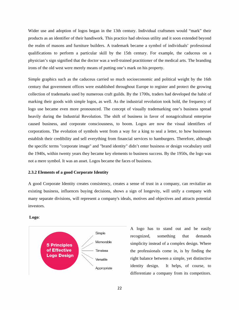
2.3.2 Elements of a good Corporate Identity
A good Corporate Identity creates consistency, creates a sense of trust in a company, can revitalize an
existing business, influences buying decisions, shows a sign of longevity, will unify a company with
many separate divisions, will represent a company's ideals, motives and objectives and attracts potential
investors.
Logo:
A logo has to stand out and be easily
recognized, something that demands
simplicity instead of a complex design. Where
the professionals come in, is by finding the
right balance between a simple, yet distinctive
identity design. It helps, of course, to
differentiate a company from its competitors.
23
A great logo doesn’t mean anything until the brand makes it worth something. It is an abstract image that
is clean, simple and carries very little meaning until the brand of the organization adds that meaning. A
logo derives its meaning and usefulness from the quality of that which it symbolizes. If a company is
second rate, the logo will eventually be perceived as second rate (Paul Rand). In order to design a logo
that is striking and memorable, the logo needs to be as simple as possible. The logo designed should be
scalable which can be used anywhere irrespective of size. This will help in the future when you plan to
enlarge the logo to be used in banners and billboards. Colors should not change the structure and
appearance of the logo when it is converted as a black and white image. Bold font is always appreciated
for logos as it increases the visibility of the text even from longer distances.
Color: The use of color in identity design is all too often underestimated, yet is the perfect way of further
enhancing a striking visual identity of a corporation. We should take into consideration different color
combinations, color meanings and color theory. The corporate color scheme that the designer chooses
makes a strong statement about the organization and how it does business. As with all of the other
elements, colors should emphasize the philosophy and strategy of the corporation. Colors speak emotions;
they evoke a feeling, a response – which is exactly the aim of a brand identity. Therefore, the right color
sets off the right response. However, for a brand identity to really work, the logo design has to work in
monotone or just black and white as well.
Typeface: A well-proportioned, clean font can make all the difference on a website or even a corporate
flyer. A typeface should reflect the company’s image and beliefs. If a company is a little conservative,
then it should use serif typefaces, such as Times New Roman: these typefaces reflect classical designs.
Large corporations tend to adopt clear sans-serif typefaces. Looking at brand identities first, some use
pure typeface logos. For instance, Coca Cola, IBM or Kelloggs show how much of an impact a typeface
has on brand identity. Though, the typeface used in the logo will not necessarily be the same as that used
for literature, website and advertising – the ‘house font’ has the purpose to match the style of the main
logo in both appearance and attitude without fighting with it.
Business Card: The goal here is to make a business card that stands out from that of competitors. This
can be achieved by the address and other contact details provided in the business card being accurate and
up-to-date. This would reflect the identity and stability of a business which would unconsciously be
registered in the customers’ mind. Include only the mobile number and the office number on the business
card as inclusion of the home phone number does not reflect professionalism. Remember that a business
card should be printed on good quality paper. Also, color printing will enhance the look of a card without
increasing the cost. Printing the business card on an inkjet printer would be unprofessional.

24
Letterhead: A letterhead design will be read and viewed by thousands of people. The header should
contain the business name and the business logo. The business address may be placed in the footer, at the
top right, or at a location that is visually pleasing to the eye. The header should not be cluttered with
information but should be simple and elegant.
The scalable business logo should be resized to fit the header of the letterhead, while ensuring that it is
legible. The top left corner is the recommended position for placing the business logo as research shows
that the human eye normally searches for information starting from the top left corner. The headers
should not be too narrow or too broad as that will dominate the page more than the message. A
professional letterhead in most cases is white in color with a colored header and footer that would match
the overall color scheme.
Envelope: As the envelope is what would create the first impression, the design should be appealing. The
envelope for a business can be designed to match the letterhead with the same look and feel. The goal is
to have the recipient recognize a company by just looking at the envelope. The business logo, business
name and the address can be printed in the left top/bottom corner of the envelope as it is the traditional
way of printing the sender’s address on the envelope. It should be seen that the sender’s address and the
business logo do not dominate the envelope design as the recipient’s address should be prominent. The
background color or design, if it should be used, should be contrasting to the font color so that the
addresses (‘From’ and ‘To addresses) are clearly visible.
Brand: Brand is the definition of corporate business. These are the organization’s characteristics, and
they must reflect the organization’s philosophy, processes, image, etc. A strong brand builds credibility
and motivates clients. The name of an organization can also serve as its brand. Brand value reflects how a
company is perceived in the marketplace. Brand identity communicates an organization’s strategy in a
universal way to target audiences. Branding is not about getting a target market to choose one corporation
over its competition, but about getting prospects to see the corporation as the only one that provides a
solution to their problems.
Quality: Quality is one of the most important elements. It defines a company through its policies,
procedures and responsibilities to its users. A company that offers quality products or services has a great
chance of bringing a user back not just once but many times over. Quality should be reflected in every
aspect of a corporation: how it does business, the kind of products or services it produces, how it handles
its prospects and clients. The same is true for the corporation’s website design, too.
25
Community: Many large corporations tend to neglect this aspect of their business. It’s not an easy task to
form enthusiastic communities and to leverage that power. One way of forming a community is by
recruiting company product evangelists. Evangelism is a form of word-of-mouth marketing in which a
company nurtures customers who strongly believe in the company’s products, with the result that these
customers actively promote them and try to convince others to buy and use them.
These people often become the key influencers in the community, and because they’re not paid or
affiliated with the company, they are perceived by others as being credible.
Culture: When speaking of culture, one shouldn’t take it to mean community. Culture is the tastes,
manners, knowledge and values that are shared and favored by the community. If a corporation has
communities formed around its products, it doesn’t necessarily mean that these communities have a
healthy culture. In fact, a bad culture can ruin a company’s reputation with future prospects.
To stand out from their competitors, every company needs to have a good brand image, to create a niche
in the client’s mind by having a unique, pleasing appearance and identity. The consistent design of a
corporate identity, in accordance with objectives set for the business, uphold and reflect the ethos, culture,
principles, future ambitions, or visionary goals of the business. Customers who find this to be in
accordance with their philosophy and liking feel connected to this image and are more likely to develop
loyalty to the business. Personal experiences with a corporate identity influence consumers and their
purchasing decisions. A corporate identity with a strong and positive impact creates a favorable mental
image of the business in a consumer's mind.
2.4 Advertisement
The goal of an advertisement is to motivate action. In order to accomplish any of its objectives, the ad
will contain a simple, highly repetitious message. Nothing motivates action like desire. In any
advertisement, the timeframe you have to make an impression on your audience is limited to seconds. For
billboard and print ads, this may be as little as 3-5 seconds; for radio and television, 30 seconds is usually
standard. This limited time and space may encourage the notion that the ad or commercial must be full to
the brim with information. This is misleading, and merely creates a cluttered, schizophrenic ad that
becomes lost among similar amateur efforts. It is far more effective to develop a concise, coherent ad that
appeals well to its audience. So in general term, we can sort the ad from its surrounding content by its
simplicity, its redundancy and by its clarity in which it urges adoption, choice or action. Messages are
tailored to persuade an audience to accept a product. However, the advertiser is bound by law and public
taste to control what the message says.
26
2.4.1 History of advertising
In order to understand advertising as a form of communication and as an influential social institution, it is
important to see it as part of an historical and social process. Egyptians used papyrus to make sales
messages and wall posters. Commercial messages and political campaign displays have been found in the
ruins of Pompeii and ancient Arabia.
Lost and found advertising on papyrus was common in Ancient Greece and Ancient Rome. Wall or rock
painting for commercial advertising is another manifestation of an ancient advertising form, which is
present to this day in many parts of Asia, Africa, and South America. As the towns and cities of the
Middle Ages began to grow, and the general populace was unable to read, signs that today would say
cobbler, miller, tailor or blacksmith would use an image associated with their trade such as a boot, a suit,
a hat, a clock, a diamond, a horse shoe, a candle or even a bag of flour.
A major shift occurred when television, radio and print became conduits of advertising. As education
became an apparent need and reading, as well as printing, developed advertising expanded to include
handbills. With the publication of the first newspapers during the early part of the 18th century, the
volume of advertising in newspapers increased. Street posters and hand bills were also popular during this
period and men and vehicles were hired to display both. Unlike the sales men, none of these media could
bring the real product into people’s homes. Most of them tried to persuade the consumer to go where the
product can be found. By the middle of the 19th century, advertising had ascertained itself as an
influential social institution in most industrialized countries. Today, advertising has become an
international enterprise.
2.4.2 Elements of a “winning ad”
Headline: The header, also known as the title, attracts attention to the ad and lets the reader know what he
will find out in the copy. The header is commonly the strongest element of a print advertisement, and can
determine whether the viewer reads the remainder of the ad. Studies have shown that ads have about 3
seconds to grab attention. This is the headline’s job. A powerful headline is, (1) benefit driven, (2) news
oriented, (3) curiosity driven, or (4) how-to oriented. It can be a brand promise such as “The fastest
machine anywhere!” or a benefit like “Earn higher profits with attractive rental options.” A headline is
clear and concise, avoiding the temptation to become so “creative” that meaning is lost or obscured.
Where the headline is placed within the ad is as important as what the headline says. The headline
dominates the ad so it can be quickly understood.
27
Artwork: Photographs, drawings, and graphic embellishments are a key visual element of many types of
ads. Even text-only ads might have some graphics in the form of decorative bullets or borders. The
graphic element of an ad is there to attract the readers’ eyes and interest them enough to read the body
copy. Photography, illustration and logo symbols raise interest in any ad. A study by Texas State
University showed that more attention goes to pictures than words.
An image at the top or in the body of the ad creates curiosity and communicates what the viewer will
learn by continuing to read the ad. Although a picture is worth a thousand words, it can also be interpreted
a thousand different ways, sometimes causing confusion. Choose an image relevant to the product or
service for sale, and use one, strong image if possible to keep the ad simple. Inconsistency between
headline and illustration confuses the viewer and reduces the ad's impact. Graphics should draw attention
and add to the message.
Body copy: The body copy, also known as the sell copy, is where you can explain your offer in detail.
The copy or text must communicate in clear, concise and focused language. Potential customers have
only seconds to read a billboard. Include the company signature; identifying slogan and/or logo. Use fonts
(typefaces) that complement the message and are easy to read. The body elaborates on the concept of the
title, and should build interest in the product or service. Print ad copy should be well organized. While the
words are the most important part of the copy, visual elements such as indentation, pull-quotes, bullet
lists, and creative kerning and tracking can help to organize and emphasize the message of the body of the
ad. The body of an ad includes details about the offer, details about the store or product and any other
information you want to highlight.
Layout: The design and layout of an ad is everything. The layout is the way you put all the elements
together to create the final ad. A layout needs a focal point. Usually, the picture or headline is for readers'
eyes to land on, then the white space, graphic and text elements to lead them through the copy to the
company signature. The final layout ought to match the ad's ultimate printed appearance in every detail.
The exact dimensions may vary by publication, but are priced as fractions of a page. Special locations,
like the back cover, cost more. Use appropriate size and shape, linked to purpose and corporate image, for
non-publication print advertising.
Brand Identity: Easily recognized by its logo, a winning ad helps people to understand what its brand
stands for. The identity created on a website, through advertising and in interactions with people at a
company, persists even after customers leave their computers, close their magazines, or hang up their
phones. Some may suggest that brand is the image, the graphic look, or the logo of a company. But, it is
more than that. It’s what people remember.

28
Whatever a winning ad’s objective is, it gears all the elements of the ad to persuade consumers to fulfill
that objective. Suppose you want readers to call your toll-free telephone number, then your call-to-action
should be, “call our toll-free number now!” Multiple objectives will confuse the prospect and when
people get confused, they usually do nothing.
The Offer: A good advertisement offers readers an immediate benefit or reason to learn more about a
product. This can be anything from a hot new product to a sale or limited-time discount.
The offer is the hook that draws the reader in and it should be the focus on an ad. The secret to
constructing an irresistible offer is to add valuable bonuses and extend risk-free, easy-to-pay terms.
Though, sometimes you can make your offer so irresistible that it appears too good to be true. Hence,
always tell the reason why you can make such a great offer, to add credibility to an incredulous ad. Again,
your prospects don’t care about you. They only care about how you, and what your offer, can benefit
them. Ultimately people only want two things; to gain pleasure, or to avoid pain. Good ads tell people
how the offer will help them either gain pleasure or avoid pain by expressing them in the form of benefits.
Studies have shown people respond better to the fear of loss (pain) than they do to the promise of gain.
Call to Action: Adverts, it has been argued profess to “move” dash to advocate one purchasing decision
other than another. In contrast to news or other types of programming, the end of advertising is more
likely to be explicit action. This element moves the buyers from interest into action. Don't just tell readers
about your product; urge them to take action in order to benefit from your offer. Set a time limit and clear,
concise instructions for what readers should do. Use facts and statistics from reliable sources to bolster
your claims. People find comfort in positive, scientific proof. People do want to be told what to do. In
fact, people need to be told what to do and when to do it.
Phrases such as, “call now”, “come in today”, and “sign up right now” triggers emotional response
mechanisms. Make your call-to-action explicit and clear, so your prospect knows exactly what to do.
Calls to action don’t need to be verbal. Humans often act based on how they see others acting. So if
someone they respect in the advertisement does an action, the viewer ads this behavior to his repertoire of
suitable behaviors and is relatively likely to follow suit. Testimonials from real people are powerful. If
they’ve seen that someone else has received the promised benefits, it provides instant credibility. Because
readers can quickly forget the body copy, the call to action needs to create a sense of urgency. Phrases
like "call today" and "this offer expires…" with a date direct the reader to do something now.
29
Urgency A vast majority of people are naturally lazy and like to procrastinate. To compel your prospect
to act immediately you must inject a feeling of “scarcity”. Without a real or perceived sense of urgency
your prospects will drag their feet. Scarcity is felt when the supply of either time or product quantity is
limited. For instance, placing a deadline on your offer makes your prospect feel as though they have to
take advantage of your offer before they lose the opportunity. An example of this tactic could be
rescinding a discount offer or a special additional bonus within a specified period of time. Another tactic
is to limit the quantity available so that people will feel the need to take advantage of your offer before
your product runs out. If you use scarcity tactics (and you should), make sure that you keep your word by
rescinding the offer when you say you will. If not, you will lose credibility.
Contact Information Contact information tells the viewer how to get in touch with the business to take
advantage of the offer. Include as much information as appropriate to make it easy for the reader to find
the business. This section usually includes the company name, address, telephone number and website
address. The contact or signature of an ad may appear anywhere in the ad although it is usually near the
bottom. It consists of one or more of: Logo, Advertiser Name, Address, Phone Number, Map or Driving
Directions, or Web Site Address. A winning ad includes the address and phone number for the store,
along with any other information a reader needs to follow through on the call to action.
Placement: Where an ad is placed affects its success. The first step in positioning an ad for success is
increasing its chance of being seen by the target market. A winning ad is placed in a publication that
reaches its target market. The publication reaches potential clients who are the right age, demographic and
income bracket. Find out what your target market watches (i.e. sports, cooking, business), where they
watch it (i.e. car, home, airport), and how they watch it (i.e. newspaper, magazine, radio). Until you know
this information, you cannot make smart choices about ad placement and you’ll likely end up wasting a
lot of time and money on an ad that didn’t even get seen by your target market.
2.5 Packaging
Packaging refers to the process of design, evaluation, and production of packages. Packaging is relevant
for it protects, preserves, and contains the product for an easy transport. It also informs the consumers as
to what the product is all about. The entire packaging could speak for the product even without someone
telling you what it is. Packaging is the last message a consumer sees and a last chance to convince him to
buy the product. Today there are more products on the market than ever before giving consumers an
abundance of choice and flexibility in what they buy. Hence, graphic designers play a vital role in
creating designs for products.
30
Primary packaging is the main package that holds the food that is being processed. Secondary packaging
combines the primary packages into one box being made. Tertiary packaging combines all of the
secondary packages into one pallet. The materials fashioned into different types of food packages and
containers depend on the type of food being packaged. Packaging types include plastic trays, bags, boxes,
cans, cartons and wrappers, among others.
2.5.1 History of Packaging
The first packages used the natural materials available at the time: Baskets of reeds, wineskins (Bota
bags), wooden boxes, pottery vases, ceramic amphorae, wooden barrels, woven bags, etc. Paperboard
cartons and corrugated fiberboard boxes were first introduced in the late 19th century. In 1952, Michigan
State University became the first university in the world to offer a degree in Packaging Engineering.
Packaging advancements in the early 20th century included Bakelite closures on bottles, transparent
cellophane overwraps and panels on cartons, increased processing efficiency and improved food safety.
Several types of plastic were developed; they were incorporated into packages to improve performance
and functionality.
The Chicago Tylenol murders of 1982 brought increased attention and regulation to tamper resistant
packaging of pharmaceuticals. Many of the most prominent innovations in the packaging industry were
developed first for military uses. As a prominent concept in the military, mil spec packaging officially
came into being around 1941, due to operations in Iceland experiencing critical losses due to what the
military eventually attributed to bad packaging solutions. As of 2003, the packaging sector accounted for
about two percent of the gross national product in developed countries. About half of this market was
related to food packaging.
2.5.2 Food Packaging
Food packaging involves packaging food and requires protection, tampering resistance, and special
physical, chemical, or biological needs. Food packaging has evolved from simply a container to hold food
to something today that can play an active role in food quality. Many packages have been developed to
protect the food. These include barriers to oxygen, moisture, and flavors. Active packaging, or that which
plays an active role in food quality, includes some microwave packaging as well as packaging that has
absorbers built in to remove oxygen from the atmosphere surrounding the product or to provide
antimicrobials to the surface of the food. Packaging has allowed access to many foods year-round that
otherwise could not be preserved. They also show the product that is labeled to show any nutrition
information on the food being consumed.

31
2.5.3 Functions of food packaging
Whether primary, secondary or tertiary packaging, food packaging has several objectives:
i. Physical protection; The foodtwerk enclosed in the package may require protection from, among
other things, shock, vibration, compression, and temperature.
ii. Barrier protection; A barrier from oxygen, water vapor, dust, etc., is often required. Modified
atmospheres or controlled atmospheres are maintained in some food packages to keep the
contents clean, fresh, and safe for the intended shelf life.
iii. Containment; Small items are typically grouped together in one direction package for reasons of
efficiency. Powders and granular materials need containment.
iv. Information transmission; Packages and labels communicate how to use, transport, recycle, or
dispose of the package or product. Some types of information are required by governments.
v. Marketing; The packaging and labels can be used by marketers to encourage potential buyers to
purchase the product. Package design has been an important phenomenon for several decades.
vi. Security; Packages can be made with improved tamper resistance to deter tampering or have
tamper-evident features to help indicate tampering like authentication seals and anti-theft devices.
vii. Convenience; Packages can have features which add convenience in distribution, handling,
stacking, display, sale, opening, reclosing, use, and reuse.
viii. Portion control; Single serving packaging has a precise amount of contents to control usage. Bulk
commodities (such as salt) can be divided into packages that are a more suitable size for
individual households to aid the control of inventory.
2.5.4 Elements of a good Package
Audience: Understanding the wants and needs of the clientele is the very first step in designing a package
for their products. Customers expect to see fresh designs, that stand out and that stay consistent from
product to products. If catering to natural food consumers for example, the audience will expect a clean,
natural feel that suggests Organic, safe and nutritious. Another important factor to take into consideration
is location. Customers in different states and in different countries expect to see different things.
Clarity and simplicity: A good package design is simple yet striking. It is easier for both kids and adults
to utilize and uses different colors for color coding. A simpler design with the right labels and contents
will have a better impact than a crowded one. Failing to identify the product in terms of content, usage or
brand identity is a horrible practice which usually results in a packaging design which doesn’t perform
well in stores. A good package is clear about the product and the brand.
32
Honesty: Customers want a good product. A good package sells the best product on the market. Little
other promotion would work as well as word of mouth once people appreciate the quality of the product.
By depicting a product ten times better than it actually is, misleads and ultimately disappoints the
consumer, which only leads to poor sales performance and very bad brand image. Of course they expect
“face lifting” to some degree but not to a point where product appears to be something entirely different.
Visibility: Unless the package is noticed on the shelf, it cannot be selected for purchase; fundamentally,
unseen is unsold. The key is to create contrast against the surroundings. A product that is patronized by
many starts with a creative packaging. For instance, some products have mazes, crossword puzzles and
others to encourage consumers to buy the item. If the category norm is to use rectangular cartons, then
something different, such as an oval shaped carton will stand apart quite readily. Packaging can be made
to stand out by using a strong visual element; typography or device that is noticeable and distinctive, and
especially if it can unite a line of products. Better packaging may increase cost of production but it can
result in higher sales. A good package encourages the ability to charge more as shoppers believe the
product is worth more.
Engagement: Once it has managed to catch the shopper’s attention, a good package draws the shopper in
and gets them to spend some of their precious time looking at it in more detail. The fastest and most
effective way to do this is by using a visual. A picture truly is worth a thousand words, as it acts quickly,
holds attention and is highly credible. Having a positive emotional reaction to a package is more likely to
result in a desire to engage with it.
This can be also be done with an attention-getting announcement about this being a new product, that the
product has been changed or that it is selling for a lower price. It can also be a compelling claim about the
product ingredients (All Natural), its place of manufacture (Kenya), or the outcome of using it
(cholesterol lowering). It is critical, therefore, to determine which messages are the most vital and be sure
that these are the ones that are emphasized.
Authenticity: It’s easy to understand why there are hundreds of products out there, all competing for
consumers’ attention. The only way a good package sets their brand apart is by being different, being
authentic. If a product is stuck with a generic looking packaging design then apply an uncommon design
style with strong “visual standards.” For example, if everybody is going for product photography, use
illustration or type-based design. If everybody is using a horizontal layout, reach for vertical. If most
designs are rather contemporary, try introducing something retro with focus on quality appeal.

33
Shelf impact: From a shopper’s point of view, a product is never seen alone and never in great detail. All
we see are veritable patterns made of various products. This distinctiveness and appeal of the product
when placed on an actual shelf is something retailers call “shelf impact,” and it makes a huge difference
in product sales. Shelf impact is something a good package tests and explores in its designs. This can be
done by imitating the placement of the design on an actual shelf and surrounding it with other products.
Brand Story: A good package design incorporates the elements used in creating a strong brand identity
to differentiate a product from the competition. Ultimately, packages are striving to achieve brand
recognition in the retail environment that is already overcrowded with products. A package design’s job is
to tell a compelling story. Having a unique, easy to read package, while necessary to get the consumer to
pick it up, is not enough to get them to put it in the cart and seal the deal. The consumer wants to know
why they should buy it. This “why” is the brand story. Whatever you have that your competitors don’t
can be the basis of a brand story. A brand story creates that distinction. Also, a packaging design always
designs packaging with the future in mind.
Consumer Expectations: A good package doesn’t try to change the way people have been conditioned.
It cautiously differentiates just enough so it stands out from its competitors. It is impossible to retrain the
entire population and wipe away generations of habit. Clients often pick the “tried and true” route.
Always think practicality and how you can make the product easier to use, carry or store. People don’t
want to spend much time just to figure out how to open the packaging of the product they bought. Leave
some instructions as to where to tear and how to open it. Even if it is already self-explanatory, just place
those texts so that it could serve as a guide to the consumers. Practicality deals with the actual shape, size
and functionality of the product container, not just the label or wrap.
Focus: Something on a good package is more important than everything else. It could be the company
name, the tagline, the product’s name, how it’s used, what’s inside, its key differentiator, or an illustration
or photo. Its brand strategy determines what this element ultimately is. This element is bigger, bolder, and
more interesting than the rest. You can use size, color, texture, shape, placement, or psychological and
emotional triggers to create this interest.
Visual Hierarchy: Visually, all successful package design comes down to hierarchy and flow. Hierarchy
allows a customer to digest a large amount of information easily. When composed properly, a package
design layout takes the customer on a journey of discovery, taking a path with an infinite loop. This
infinite loop keeps the customer’s eyes on the move where each design element leads them to the next
one, which leads to another, until they complete their journey and are prompted to take it again.

34
A design may encourage a customer to start at the top, the middle, the bottom, or on the margin. The
composition of the package and the stylistic elements of each part should point you somewhere.
Color and font: The color in the packaging design is the most active factors of the visual impact; they
can play a role in the promotion of sales, to establish a brand image. A good package comes in the color
that suits the product. Make sure to use the right color combination and contrast for the clear and readable
text. Choose the right font that will best represent the product. Fancy fonts could be too hard to read.
2.6 Photography
Getting a great photo is much easier when you do a controlled photo shoot, because all the elements of
great photography are carefully arranged. Snapshot photography is a bigger challenge because of its
unpredictability. For the basic, you must understand the theme, rules and regulation, requirement and
most importantly the media format. Successful photos rely on order, and the main elements that bring and
emphasize order in a composition are: line, shape, form, texture, pattern, and color. Every photograph,
intentionally or not, contains one or more of these elements, which are known as the elements of design.
Usually we recognize and utilize these elements unconsciously. Other elements that make a photo "great"
are perfect lighting, having a story, provoking emotion, rule of the thirds, framing and the proper use of
elements and principles of design.
2.6.1 History of Photography
The early cave paintings attest to the fact that man has always wanted to record himself, his activities and
the environment around him. Painters of great renown abound throughout the centuries and have left
remarkable pictorial histories of our journey through time. While the camera was not invented until the
19th century, the two basic elements of a camera had been well known for hundreds of years. The first
element of a working camera known by the ancients is the effect of a lighted area separated from a dark
area with only a pin hole opening between them. The second known element of a working camera was the
existence of materials capable of permanent change when exposed to light. Photography took many twists
and turns as people experimented with chemicals to make the image capturing more practical. The well
known stereotype of the photographer buried in his portable dark tent had its start around the time of the
Civil War, or mid-1800's. By the 1870's, the wet developing process gave way to a new innovation called
the gelatin dry plate. Treated plates could be taken out to the field, exposed, and brought back to a dark
room for later processing.
35
The final revolution of the 1800's took place when a man named George Eastman developed the "Kodak
Camera." The innovations which have evolved from this point on have made picture taking easier,
improved the ability of professionals to specialize, and of course, include the introduction of color
photography. The charge-coupled device (CCD) was invented in 1969 by Willard Boyle and George E.
Smith at AT&T Bell Labs. Other notable inventions made towards digital photography include; Fairchild
Semiconductor releases the first large image forming CCD chip (1973). Kodak scientists develop the
world's first megapixel sensor (1986). The web has been a popular medium for storing and sharing photos
ever since the first photograph was published on the web by Tim Berners-Lee in 1992. Today, popular
sites such as Flickr, Picasa and PhotoBucket are used by millions of people to share their pictures.
2.6.2 Elements and Principles of Design in photography
Elements of design are the most basic visual components of any composition. Understanding the elements
and principles of design, how they affect and complement each other, and what messages they convey is
the way to step up with photographic images and create stunning work that reaches out to people’s hearts
and souls. These are the building blocks for creating great photography compositions.
Lines: Without line there can be no shape. Without shape there can be no form. Without form there can
be no texture and there can be no pattern. Lines can lead you away, or move you forward in an image.
Thin lines can be experienced by some as unstable, and by others as vulnerable. Thick lines can be
experienced as rigid and dependant, or can be experienced as dominating or stern. Curved lines are often
perceived as soft, soothing, settling, and relaxing. Jagged lines can be perceived as forceful, chaotic,
sharp, and threatening. Vertical lines tend to convey different moods, ranging from power and strength, to
growth. Horizontal lines cast a feeling of restfulness, permanency, and stability. Layers of multiple
horizontal lines can create drama and rhythm, and can become the main interest of the image all by
themselves. Diagonal lines work well to guide the viewers’ attention towards the main subject of the
photo. They can convey a sense of action and render photos as dynamic and interesting.
Color Balance: Color is characterized by attributes such as value, hue, and saturation. Colors, and how
they’re arranged, can make or break a shot. Different colors can send out different messages, and they
indeed have an important visual weight and impact on a photo. A good mixture of color can produce
dramatic effects. Paying attention to color and it’s emotional messages and meanings is an important step
towards photographic maturity. Note that yellow, red, and orange are warm colors. These are associated
with sun and fire. Blue, violet, and green are cool colors and are associated with snow, water, and
shadows. Most photographs that leap out of the page usually display at least some adherence to color

36
theory. Contrasting or complimentary colors can sometimes even save an otherwise ordinary shot.
Highlighting color within a certain area can be used effectively as a compositional element.
Shape and Form: Shape is the principal element of identification. The most important thing to keep in
mind when shape is the essential element in an image is that it is best defined when the subject is front lit
or backlit. For that shape to be successfully identifiable, it needs to be in strong contrast with its
surroundings so that it is detached from the clutter around it. Shapes in images can also be seen as
silhouettes. It is also worth mentioning that silhouettes are the purist and strongest of all shapes. Form is
basically a three-dimensional shape, and is best accentuated by side lighting since it casts soft elegant
shadows, and the difference between light and shadows gives a better illustration of the depth of an object
and amplifies the sensual understanding of its meaning and message.
Symmetry and Patterns: We are surrounded by symmetry and patterns, both natural and man-made.
They can make for very eye-catching compositions, particularly in situations where they are not expected.
Emphasizing a pattern can accentuate a sense of size and expansion. Shots that use symmetry can often be
very boring, but incorporation of other elements of design such as shadow, pattern or color then they can
also be quite eye-catching. Breaking a pattern is all about finding an object that disrupts the continuous
flow of a pattern.
Texture: Images are a two dimensional thing yet with the clever use of ‘texture’ they can come alive and
become almost three dimensional. Texture particularly comes into play when light hits objects at
interesting angles. No design element is more capable of moving deep emotions than texture. The
challenge of seeing and capturing texture is mostly based on one element; light. While the impact is
subtle, it adds more depth, interest, and reality to the shots. Furthermore, it is worth noting that texture as
a background can create an exciting and emotion-filled composition..
Depth: The depth of field that drastically impacts the composition of an image. It can isolate a subject
from its background and foreground (when using a shallow depth of field) or it can put the same subject
in context by revealing it’s surrounds with a larger depth of field. Because photography is a two-
dimensional medium, we have to choose our composition carefully to convey the sense of depth that was
present in the actual scene. You can create depth in a photo by including objects in the foreground, middle
ground and background. Another useful composition technique is overlapping. If you have an adjustable
camera, you can set it for large depth of field by choosing the f-stop with the biggest number. This is
desirable for landscapes, in which you want most of the scene in sharp focus. Using the smaller numbers
will leave just a narrow field of focus, which can be especially distracting backgrounds. They will still be
visible, but not in focus, drawing the viewer's eye to the intended subject.

37
2.6.3 Elements That Make a Photo “Great”
Lighting: Getting a perfect exposure is very important when it comes to creating detail and dimension
which defines an image. Effective use of light is the element that truly sets a photo apart as "great" instead
of simply adequate. Too much light gets out a washed out picture. Too little light makes a photo too dark
and has too many shadows. When the light gives up more contrast, a photo will have more detail, shape
and texture. Experienced photographers seek out the light either right after sunrise or just before sunset,
because the angle of the sun is low, illuminating the subject with a lovely glow. However, many cameras
have settings to help compensate exposure to achieve nice light effects.
A story: Generally, photos that are considered great always do tell a story. A photo can convey emotion,
mood, narrative, ideas and messages. These are the elements that make a statement and tell a story. If it’s
a photograph of a person, a good photograph is about “who” the person is. Know the feeling you want to
evoke and the story you want to tell. This element is the most difficult to describe, yet the one that often
sets a photo apart from all the rest. Many great photos’ power to convey a mood or moment in time
transcends those shortcomings. Watch for intensity of emotion; whether it be absorption in an activity,
movement or interaction. Direct eye-contact is great but consider watching for those unguarded moments.
“There is nothing worse than a brilliant image of a fuzzy concept.” (Ansel Adams).
Focus: If the subjects are active, trying to achieve a crisp focus is a real challenge. Using the focus points
on an SLR screen, auto yields crisp results. Also, our viewpoint has a massive impact on the composition
of our photo, and as a result it can greatly affect the message that the shot conveys. Rather than just
shooting from eye level, consider photographing from high above, down at ground level, from the side,
from the back, from a long way away, from very close up, and so on. Again, often a photo will lack
impact because the main subject is so small it becomes lost among the clutter of its surroundings. By
cropping tight around the subject you eliminate the background "noise", to keep the viewer's attention
focused on the subject.
Emotions: One of the secrets to great photography is feelings. A good photo sparks interest, while a truly
great photo evokes strong emotion. It does not matter what that emotion is. May it be awe from a
beautiful sight or hope for humanity through showing acts of kindness; it doesn’t matter as long as you
are able to successfully extract those feelings from the viewer. A truly great photograph says something
about life itself. It makes the viewer to stop and think.

38
The rule of thirds: The Rule of Thirds states that the main element of an image should be at a point
within the frame of view that places it one-third of the way into the photo. This can be one-third from the
top, bottom, left or right-hand side of the frame. Placing a subject in such a fashion makes the image more
dynamic. Divide the image into 9 equal segments by 2 vertical and 2 horizontal lines. The rule of
thirds says that you should position the most important elements in your scene along these lines, or at the
points where they intersect. The rule of the thirds holds more drama. If shooting a landscape, finding an
“s” curve to incorporate into an image adds more interest. Streams and rivers meanders so move around
until you capture the gentle curves the stream takes. The winding paths add movement and interest to a
photograph. A strong photograph often composes the subject in a diagonal line. Doing so adds balance
and interest to a photo. Some cameras even offer an option to superimpose a rule of thirds grid over the
LCD screen, making it even easier to use.
Framing: Simply put, framing can add interest and draw your eye into the main subject, adding depth.
Sometimes the subject itself provides framing. The world is full of objects which make perfect natural
frames, such as trees, archways and holes. By placing these around the edge of the composition helps
isolate the main subject from the outside world. The result is a more focused image which draws attention
naturally to the main point of interest. The “frame” doesn’t have to be perfectly focused.
2.7 Design Concepts
Graphic designers are responsible of shaping diverse messages to create powerful and effective
communication (Ambrose, Harris, 2008). Therefore, design philosophies/concepts/theories have been
formulated to act as fundamental guiding principles that dictate how a designer approaches his/her
practice (Simon, 1996). The purpose of graphic design is communication (Arntson, 2011). The form that
communication takes can be anything and the intent of the communication can also vary depending on the
message. Paper and paperboard continue to make up 35-45% of material discarded in the waste stream
(Dougherty, 2008). Intentional reuse means aiming for waste that can be recycled or reused (Macnab,
2011). While packaging’s footprint may be small, its importance cannot be understated. Over time the
Swiss Style and visual perception has been used in publications, on posters, and in signage, and now it is
beginning to evolve and become popular online. This evolution has been happening for some time now in
the design community, quickly being spread to social media sites, and the Online News Industry.

39
2.7.1 Visual Perception
No form of communication has a more profound effect on the private minds of individuals or the
development of the public mind and culture than the visual imagery of today’s media. Images are the
carrier of media messages produced by the most sophisticated handlers of media-savvy politicians,
corporate public relations campaigns, and product advertising. Before and beyond the ability of words,
visual images communicate complex and complete concepts instantaneously to the whole mind
(Ambrose, Harris, 2008). Advances in neuro-science and psychology indicate that the human brain uses
imagery, as well as other information perceived by the senses, to guide our actions subconsciously before
sending information to the neocortex, the center of words and rational thought. The brain encodes both
forms of imagery into memory as if they are real and as if we have perceived the information directly
from real-life experiences. Behavioral Psychologists agree that most of our decisions are based on
intuitive judgment and emotions.
2.7.1 Gestalt Principles of Perception
Also called Gestaltism, (German: Gestalt - "essence or shape of an entity's complete form"), Gestalt
principles of perception refers to theories of visual perception developed by a German psychologists
toward the close of the 19th century in Austria and south Germany (Hollis, 2006). Max Wertheimer,
Wolfgang Köhler and Kurt Koffka collaborated to found Gestalt, a psychology term which means
"unified whole" (Wertheimer, 1990). These theories attempt to describe how people tend to organize
visual elements into groups or unified wholes when certain principles are applied. The phrase "The whole
is greater than the sum of the parts" is often used when explaining gestalt theory, though Kurt Koffka's
original phrase, "The whole is other than the sum of the parts" tends to disagree (Koffka, 1999). Instead,
Gestalt principles allows for the breakup of elements from the whole situation into what it really is. These
6 principles are: closure, Continuity, Figure ground, Proximity, symmetry and Similarity (Hollis, 2006).
The Gestalt law of proximity states that "objects or shapes that are close to one another appear to form
groups". Even if the shapes, sizes, and objects are radically different, they will appear as a group if they
are close together.
The law of similarity occurs when objects look similar to one another. Gestalt theory states that things
which share visual characteristics such as shape, size, color, texture, or value will be seen as belonging
together in the viewer’s mind.

40
Law of Prägnanz (figure-ground) captures the idea that eye differentiates an object from its surrounding
area. A form, silhouette, or shape is naturally perceived as figure (object), while the surrounding area is
perceived as ground (background) based on one or more of a number of possible variables, such as
contrast, color and size (Wertheimer, 1990).
The law of symmetry captures the idea that when we perceive objects we tend to perceive them
as symmetrical shapes that form around their centre.
The law of closure posits that we perceptually close up, or complete, objects that are not, in fact,
complete. Closure occurs when an object is incomplete or a space is not completely enclosed. If enough
of the shape is indicated, people perceive the whole by filling in the missing information.
Law of Continuity applies when the eye is compelled to move through one object and continue to
another object This Gestalt law states that learners "tend to continue shapes beyond their ending points”.
The edge of one shape will continue into the space and meet up with other shapes or the edge of the
picture plane. "Seeing comes before words.
2.8 Sustainable design
“Design sustainability” means understanding a product’s entire lifecycle starting with the materials, and
finally, the “end of life” options. Recyclability or reusability in graphic design is packaging or printing
from materials that are 100% recyclable to ensure they can be readily recycled to encourage reuse (Chick,
Micklethwaite, 2011). Chick and Micklewaite says packaging or printing materials—including glass,
plastic, paper, and aluminum—cannot be classified as good or bad. Each has its advantages and
shortcomings, depending upon the product application and the goals and mission of the packager
(Jedlicka, 2009). To make the right choice on the most sustainable material to use entails understanding a
product’s entire lifecycle starting with analyzing the materials before use, while in use, and finally, their
“end of life” options. Recyclability capitalizes on the “end of life” of a package or print out. By
implementing waste reduction and recycling, graphic designers help divert paper, as well as plastics,
glass, and other materials from landfills and waste incinerators. Reuse can be ingenious, while taking
items with former lives and reinventing them can be unique and charming, and environmentally
responsible (Macnab, 2011). While packaging’s footprint may be small, its importance cannot be
understated. By creating products and processes that “reduce, reuse and recycle” our resources and waste
we can move towards a much more sustainable graphic design model while also rewarding financially.

41
2.8.1 Sustainable Graphic Design
The Fundamentals of Graphic Design offers a unique overview of a challenging and dynamic profession
from new media to marketing, from package design and print design to typography; opportunities in
graphic design are everywhere. Ambrose and Harris discuss social responsibility, the art world, and the
future (Ambrose, Harris, 2008). They give creative examples of reusing packaging and prints after they
have served their initial purposes such as, a glass soda bottle can become a flower vase or a beautiful
brochure morphs a bookmark.
Some of the techniques that are employed to encourage reusability are; designing for recycling or
composting, reusability of packaging, repeated reuse of package, reuse for other purposes and planned
obsolescence. The Big Book of Green Design explores the specific techniques and methods that graphic
designers are employing worldwide to make their business a more earth-friendly one (Stephens, 2009).
For instance, synthetic paper is used, recycled, and used again without compromising quality because
synthetic paper is inorganic, therefore avoiding the landfill entirely (Collin, 2009).
2.8.2 Reduced materials
According to Eric Benson (2012), reduced graphic design is trying to use as few as possible materials to
create multipacks, bundles, and pallets, as well as creating shelf-ready packaging or prints that minimizes
waste at the retailer level. Macnab (2011) notes that the ultimate aim of practicing reduced design is to
reduce waste, use as little resources as possible, and use resources that are not harmful to our
environment. “The print industry generates relatively high levels of waste” says Eric Benson and
continues to explain that “ways to practice reduced materials include rightsizing which eliminates excess
or unnecessary material”. Reducing packaging material/size to a weight that uses less material minimizes
waste, Pre-Consumer Waste, printer's waste that includes trims and unused copies. Furthermore, the
packages that use fewer materials are easier to dispose of (Macnab, 2011).
Also, reducing the number of printed pieces has obvious cost and waste reduction savings associated with
it. Sherin Aaris insists on printing, strictly, when absolutely necessary, and says “it creates less trash”.
Sherin Aaris further explains that creating less trash starts by evaluating how much paper you use versus
how much paper you really should be using. Lowering paper basis weight too because fewer fibers are
needed per sheet of paper, saving resources and printing or photocopying on both sides would save paper,
hence energy and trees (Sherin, 2008). Some projects could be done entirely on the web, eliminating the
need for paper, ink, and the energy to create and ship them.
42
2.8.3 Recycled materials
Recycled materials involve designing packages or printing on recycled, reclaimed and renewable
materials. The pulp and paper industry is one of the world's largest emitters of greenhouse gases
(Jedlicka, 2008). “The pulp and paper industry uses vast amounts of water and energy and produces
significant amounts of pollutants and landfill waste”, says Jedlicka Wendy. Recycled paper is the greenest
option overall; it uses up waste paper and its production requires less energy and fewer chemicals
(Dougherty, 2008). Taking items with former lives and reinventing them can be unique and charming, and
environmentally responsible. According to Collin Morris (2009) most toners from copiers, fax machines,
and printers can now be recycled. Recyclability is basically the use of materials which are frequently and
easily recycled and reduction of materials which hinder recyclability of major components. It is the
process of creating new products from reclaiming used products and materials (Boylston, 2009).
2.8.4 Reusable materials
Reusable prints/packages is packages or prints made from materials that are 100% recyclable to ensure
they can be readily recycled to encourage reuse (Chick, Micklethwaite, 2011). Chick and Micklewaite
says that design for recyclability is one of the most effective ways to preserve the energy expended in
manufacturing packaging materials. Intentional reuse means aiming for waste that can be recycled or
reused. There are many creative ways of reusing packaging and prints after they have served their initial
purposes. When designers create for a purposeful reuse of their work, this prolongs the life of an object,
saving energy and material which reduces a project's carbon footprint. For instance, synthetic paper is
made from plastic resins and inorganic fillers that can be easily recycled in most places by conventional
methods. It can be used, recycled, and used again without compromising quality because synthetic paper
is inorganic, therefore avoiding the landfill entirely (Collin, 2009).
2.9 International Typographic Style
International Typographic Style, also known as the Swiss style, is a graphic design style developed
in Switzerland in the 1950s that emphasizes cleanliness, readability and objectivity. Pioneers of the Swiss
style were Max Huber, Emil Ruder, Josef Müller-Brockman, Armin Hofman and Ernst Keller (1891-
1968), who is, in fact, often referred to as the “father of Swiss graphic design.” The Swiss movement
grew out of the Bauhaus and New Typography Movements, which were grounded in function. Swiss
Style can be defined as the beauty in the underlines of a purpose, not beauty as a purpose in itself, the
principle “form follows function” (Klanten, Bourhuin, Maries, 2006). The Swiss style stemmed from the
need for clarity and simplicity in a world that was urbanizing at a fast pace.

43
In addition, the range of different movements that were prevalent at this time (Futurism, Cubism,
Surrealism, Fluxus, Marxism, Dada, Abstract) influenced graphic designers to adopt a uniform and strict
language, a unified international style based on clear visual communication with an emphasis on text,
negative space, and objective imagery, a great example of the ‘less is more’ principle and of the ‘the
content is the interface’ wisdom (Rabinowitz, 2006). The Chief characteristics of the international
typographic style are designs that include minimal graphics and a focus on typography, black and white
photography, Mathematical grids (often on a tilted axis), Sans serif typefaces (primarily Akzidenz
Grotesk, Helvetica, and Univers), Asymmetrical compositions, Flush left, ragged right text alignment,
Extreme geometric reduction of illustrated images, and Bright, flat areas of color (Mazza, 2009).
2.10 Design Process
When starting a new design project, there are steps of the design process to follow that help to achieve the
best results. Design formulas certainly can be devised and followed letter by letter, ending in solutions
lacking imagination and mental rigor. The process is not linear; rather, it is one of interaction and
ambiguity where paths appear to meander aimlessly towards durable and innovative solutions.
Traditionally, these steps have been thought to occur in a linear manner, beginning with defining the
problem and progressing towards realizing the solution. But rarely, if ever, is the process so smooth and
predictable.
Rather than jump right into a graphics software program to try to create a final version, a graphic designer
can save themselves time and energy by first researching the topic, finalizing their content, starting with
simple sketches and getting several rounds of approval on designs. A well-known model of the graphic
design process consists of six steps which are explained below. This is the design process the researcher is
going to use, as given in class by Mutune Gitau (2012).
2.10.1 Graphic Design Process
i. Research: The researcher will carry out research on the subject upon which the brief is based
to uplift and update the researcher’s experience or awareness on the subject. Sources of data
may include; exhibitions, galleries, publications, supermarkets, and the internet.
ii. Sketches: The researcher will then visualize certain ideas as probable solutions to the design
problem. The researcher there after makes thumb nail sketches of these ideas in the form of
roughs or incomplete drawings, sometimes even lacking color.

44
iii. Discussion Round: Under this process, the researcher will then present these sketches to the
client, who is going to be the supervisor. The lecturer will have a chance to contribute to the
solution development.
iv. Comprehensive Sketches: The designer will then make adjustments, modifications or
improvements based on the issues arising during the discussion round.
The end result is a more refined or a comp sketch which may be done in a variety of color
schemes or layout format.
v. Discussion Round: The comprehensive sketch will then be presented to the lecturer/
supervisor for final decision. The designer and the supervisor will here agree on all elements
to appear on the final design.
vi. Production: Production will be left to other professionals like constructors, depending on the
assignment. Though, the designer will do supervisory work and make sure the designs are
executed accordingly.
2.10.2 David Airey
David Airey is a graphic designer from Northern Ireland and he has been intrigued about brand identity
since the 1990s, when he enrolled on his first graphic design course. Self-employed since 2005, David has
amassed an impressive global client list, including Yellow Pages (Canada), Giacom (England), and
Berthier Associates (Japan). He writes two of the most popular graphic design blogs on the Internet:
www.logodesignlove.com and www.davidairey.com, attracting more than 250,000 online visitors per
month and approximately one million monthly page views (Airey, 2009).
2.10.3 David Airey’s identity design process
Having honed his skills working in the UK and the United States, he then made a conscious choice to
specialize in logo design. To give prospective clients the lowdown on how David Airey works, here’s a
brief overview his brand identity design process.
i. The Design Brief: A design brief helps saves time. Topics for inclusion in a design brief
includes; Corporate profile, Market position, Current situation, Communication task, Target
market, Objectives, Schedule and deadline (Airey, 2009). If, Airey is dealing with a client
without a brief, he has his own questionnaire that he can supply at the beginning.
ii. Research & Brainstorming: Airey spends time reviewing client information, and then begin
the research and brainstorming stage. He takes into account competitors, market trends,
product/service differentiators, history of the business, the future, and the brand.
45
iii. Sketching: Sketching helps generate a strong set of possible directions. A mouse and
computer adds an extra level of restriction that hinders the process. Most sketches will
eventually be made redundant, but the point is to explore every possible direction before
choosing the most effective idea.
iv. Rendering: Airey normally narrows the design focus until he has one or two strong options
for digitizing and conceptualizing. The rendering stage involves transferring these options to
Adobe Illustrator, to Photoshop, and finally to Acrobat (for the presentation).
v. Presentation: The design presentation is supplied as a PDF file, with each concept shown in
context, using digital mock-ups. Now it’s over to the client to consider the designs and
prepare feedback based upon how the ideas fulfill the design brief.
vi. Finishing Touches: Following client review, Airey will either finalize the project, or make
any revisions agreed upon. His main aim here is to create a visual identity that works for the
respective business, and for many years to come. There’s always flexibility in Airey’s
process.
vii. Artwork Supply: Artwork is supplied via email and/or made available for download. Where
the brand mark (logo) is concerned, files can be scaled to any size without loss of quality. The
brand marks he creates are used for a wide variety of purposes; websites, corporate
stationery, vehicle wraps, billboard etc. Additional marketing collateral is certainly an option.
viii. Customer services: What Airey offers doesn’t end once his client pays the final installment.
Should any design-related questions crop-up; he is on hand to answer them, or to offer his
opinion on how the new design has been applied. Airey can also help with print procurement,
or offer design assistance in whatever way possible.

46
CHAPTER 3: METHODOLOGY
3.0 Introduction
The research will be a qualitative research, using qualitative methods such as interviews, direct
observation to understand consumer perceptions, patterns of behavior and emotional responses, although
quantitative methods will be used in conclusion, to verify the findings. Therefore, the research may
include ethnography, product life cycle and color psychology studies designed to understand the products
and consumer attitudes, beliefs and culture.
This chapter discusses the research design; the total populations from which a sample will be taking out
of, and how that sample will be arrive at. Data collection instruments to be used and how the data
collected will be analyzed and presented will be discussed, ending with a discussion on the limitations
that the researcher expects as she carries out the research.
3.1 Research Designs
A qualitative research design will be used to shed light on a set of decisions to be implemented with
visual aids while analyzing and presenting. This is because a descriptive method is used for gathering
prevailing conditions (Jackson, 2009). The main objective of this research is to investigate and determine
a graphic design solution that is both visually effective and environment friendly for Fresha dairy
products. The research will make use of three types of data. Primary data: answers from respondents
during interviews, observations, questionnaires and individual insights of the interviewees. Secondary
data: findings stated in former students’ researches, books, journals, videos and e-books. Tertiary data:
internet research. The research will evaluate the present condition and also of the direction of future
problems that could be alleviated with the help of the research and development. Qualitative methods will
be used in data collection analysis and presentation. In presentation, visual aids of quantitative methods
may be borrowed. In 1986, a 3M-sponsored study at the University of Minnesota, School of Management
found that presenters who use visual aids are 43% more effective in persuading audience members to take
a desired course of action than presenters who don't use visuals. The researcher will use this research
methodology and research design because the research carried out is a case qualitative research whereby
there are no subject variables in the study making it a field research (Leedy, Ormrod, 2005).

47
3.2 Population
To gather pertinent data, the population of the research will involve four categories of respondents. These
stakeholders are; retailers and the general public. With fully fledged operations in Kenya, the scope has
been narrowed to Nairobi County. A pilot study conducted in Githunguri turned out biased for the reason
that Fresha is located in Githunguri. Over 80% of the consumers did not buy milk as they were already
dairy farmers. And being the owners of Fresha, the loyalty was to the extent that no shop sold any other
milk brand other than Fresha. Therefore, the researcher shifted the research to Nairobi city which proved
to be a ‘neutral’ ground.
3.3 Sample
After determining the population, due to the large population, the researcher is going to select a sample of
respondents who represent the entire population being surveyed. It is essential to select a sample from a
population because it is usually unrealistic and unnecessary to include every possible responded in a
survey. These criteria will help to achieve generalized findings as the selected respondents are
knowledgeable in their field and on the research topic. Also, because the choice of respondents may
influence the type of questions asked, as well as the way they are asked (Kibera, Waruingi, 2009).
3.4 Sampling Techniques
The sampling procedure to be used will be a simple stratified random sampling. First, the population will
be stratified into 2 stratas: retailers (shop keepers/supermarkets/ hawkers) and Consumers
(hotels/schools/individuals). On each of these stratas, a simple random procedure will be applied to select
a non-biased sample. Each member of the population will have an equal chance of becoming a part of the
sample as required by when random population sampling (Yates et al, 2008).
3.5 Instruments
To collect data, the researcher is going to observation, interview and survey on the samples selected. The
instruments to be used in collection of information will be: existing documents, questionnaires, interview
guides, observation, photographs, and video footages.
a) Review on existing documents: Earlier documents of the organization like gallery, advertisement
campaigns, logo, brand, posters, consumer feedback and yearly reports of the organization will be viewed
as an important source of secondary source of data. The researcher has already gone through the company
website describing the history, activities, and product range of Fresha Dairy Products.

48
b) Questionnaires: The researcher will administer open ended questionnaires to selected key informants
to gather background information. The researcher will follow with questionnaires that use a mixture of
both open ended (to avoid leading the informant where applicable) and closed ended (to filter out
irrelevant answers where need be) questions to collect data from the Fresha product consumers and to the
staff at Fresha.
c) Informal and Formal Interviews: The interviews will help the researcher to gather first hand
information from a diverse group of people because they are easy to carry out and are less time
consuming compared to other methods. Informal interviews will be conducted informally i.e. on a one on
one basis. Formal interviews will be conducted with key informants and expert executives in the dairy
industry by use of interview guides provided at the end of the paper.
d) Observation: Working hand in hand with the interviews, the researcher will be keen to observe how
the informants answer the questions, their body language, which questions they react to, and how, while
making notes of these reactions as she undertakes the research on the interview guide.
e) Photographs and Video footage: The researcher will take photographs of the site as a tool of
information recalling. Photography is also a cheap means of data collection compared to others. This
mode of data collection is not only a course requirement but data collection means as it is not possible to
sketch in exact details or bear in mind all observed phenomena to sketch later. The researcher will also
record videos to add the visual element to the pictures.
3.6 Data analysis
Before the data can be processed, the researcher is going to examine the questionnaires to see whether
there are obvious errors or incomplete responses and ignore faulty ones. Then, the researcher is going to
code, then tabulate and there after analyze the data using various statistical techniques. The researcher
will analyze each data collection instrument separately as follows;
a) Existing Documents: Earlier documents of the organization found will be studied analytically and
viewed as a source of secondary source of data. They will provide the basic background information, and
consumer behavior or trends, to get a general common idea of the problems observed and the history of
the organization.
b) Questionnaires: The researcher will go through each and every question in the questionnaire, noting
the questions answered, how and by whom. The answers will be analyzed and where need be, quantitative
methods will be adopted to group and simplify the information.

49
c) Interview guides: The notes the researcher takes on the interview guides regarding observations made
or the informant’s feedback will be used to compare the current problems and the information gathered in
the literature review. Notes will be used to show the history of the organization, current status, consumer
trends, and prospected expectations of the future.
d) Photographs and videos: The researcher will print out the photographs of the organization and study
the video footages to point out issues that appear to be causing the current problems, comparing them to
possible solutions. This visual and audio visual information will help point out issues that appear to be
causing the current problems of the organization and compare them to possible solutions.
e) Sketches: Overall, the researcher will make sketches of the possible solutions of the organization’s
main areas of studies; photography, typography, advertisement and corporate identity. Sketches and
drawings will help the researcher remember new ideas that come to mind as they go through the data
collected.
3.7 Data Presentation
Before presenting the data, the researcher will analyze each data collection instrument separately to
understand the information better. Analysis will apply Gestalt principles of perception because its visual
language has the potential for more efficient synthesizing of large amounts of new information. The
researcher will exhibit with the aid of graphic presentations of the project paper report i.e. tables of the
analyzed data, pie charts, histograms and time charts. Graphs are recommended because people not only
think using pictures but graphs are also easier to understand complex information.
Report paper
Data will formulate a written paper complete with the key issues that the researcher was handling her
findings and a set of recommendations after completion of the research. The researcher will explain her
research process and document what she has learned. This report paper will be a source of secondary
information for other academicians interested in the same study.
PowerPoint presentation
The researcher will prepare slides of the report paper including the photographs, video footage, and
graphs of the report. This is because even at the neurobiological level we perceive and process images in
a quite different way to words and text.
50
DVD
The researcher will also write a soft copy of the whole research paper and the report with the
photographs, video footage and graphical interpretations of the data on a DVD. This DVD will also act as
the report paper’s storage device for the data collected from the research.
Online
A copy of the research paper will also be uploaded into the researcher’s webpage to make it accessible to
anyone from anyone in the world. Links and copies of the same will also be uploaded in the researcher’s
social media accounts; facebook, twitter and myspace.
Exhibition
The researcher will exhibit data in form of a portfolio of all the sketches made and a pin-up of the
recommended changes in form of photographs print outs, changes in typography, publicity materials,
packages and the corporate identity of the company. This will give a clear picture of the organization, the
problems identified and the proposed solutions.

51
CHAPTER 4: FINDINGS
4.0 Introduction
This chapter presents the analysis and evaluation of the present state of the visual communication of
Fresha Dairy Products. Findings covers a short historical background of Fresha Dairy, the process used
and an evaluation of all milk and milk products produced. Eventually, the researcher presents findings
subdivided into four graphic design areas namely; Corporate identity, advertisement, packaging and
photography. The main data analysis tool applied is mainly, Photograph analysis and observation.
4.1 Historical Background
Githunguri Dairy Farmers Cooperative plays a key role in the marketing of its members’ milk which is
processed and packed in form of packed fresh milk, yoghurt, Maziwa Lala (fermented milk)butter, ghee
and cream under the flagship of “Fresha”. The choice of the brand name denotes freshness and is
epitomized in products selling slogan “Real Farm Freshness”. Githunguri Dairy Farmers Cooperative was
registered in August 1961 with a membership of 31. Githunguri town was the only milk collection centre.
The only market then was Githunguri & Ruiru town. In 1964 Mr. Bruce Mackenzie opened Kambaa
centre (route 2). By 1965, we were selling to KCC 4,275 litres daily. In 1968, UNICEF provided coolers,
payment being by giving nearby nursery skimmed milk. In 1975 banking services were started and
members were given loans & as a result milk production increase tremendously. The society started with
one collection centre, which have increased to 58 fully computerized to date. The investment resulted
from members contributing Kshs 1 for every kg of milk sold. Today Fresha has revolutionalised the Dairy
industry in Kenya. The society has over 16000 members drawn from Githunguri Division. The society is
governed by a mission statement, a vision statement (which they use as a slogan), and core values.
Mission Statement: To maximize stakeholder value by providing high quality dairy brands to the market
Vision Statement: Real Farm Freshness For All!
Core Values: Self Help, Equity, Customer Focus, Teamwork, Integrity, Continuous improvement and
innovation, Social responsibility and Equality.
Awards: The society was awarded “the most improved company” in the COYA award in 2006. The
society added two more awards; the best managed Marketing Cooperative and Best Marketing
Cooperative in the 2008 Ushirika Day celebrations.
52
Currently the cooperative has grown tremendously to 17,000 registered members, annual turn over of
Kshs 3 billion and an average of 170,000 litres of milk per day. This growth has emanated from a
proactive response to be successful in pursuit of significant growth in a rapidly changing economic, social
and political environment. Processing & Packaging of milk started in 2004. In July 2004 the society
commissioned its own milk processing plant and was able to access wide market through value addition
and wide range of dairy products.
4.2 Fresha Dairy Products Activities
i. Farm: Githunguri Dairy Farmers Co-operative Society members practice zero grazing method of
dairy farming where cows are wholly confined and feed brought to them. Factors of production
such as feeding, disease management, and breeding and general animal husbandry practices are
closely monitored under this system.
ii. Milk Collection: The society has over 59 milk collection centers distributed across its milk
catchment area. Milk collection from members is carried out twice a day within stipulated time
frame. The society owns a fleet of trucks that collects members’ milk and transports the same to
the processing plant. Milk is transported fast within two hours of collection to minimize losses.
iii. Raw milk reception: Raw milk from the farms is offloaded and graded before filtration and
weighing. It is then tipped into the dump tank and projected through the inline filters and then
through PHEs (chiller) where it is cooled to below 6 degrees centigrade before storage in raw
milk storage tanks. The stored milk is continuously monitored until its depletion.
iv. Milk processing: Chilled raw milk in the storage tanks is pumped into the pasteurizer through
inline filters where it is preheated to 55 degrees centigrade and then to the separator where it is
also clarified to remove any remaining dirt. It is then heated further and homogenized at 150 bars.
Homogenization breaks down the fat globules and blends it with the other milk components a
process that prevents any of their separation after packing. The homogenized milk is then heated
further to between 78 and 80 degrees centigrade and then cooled to below 6 degrees then
projected into pasteurized milk tanks. This process eliminates all disease causing micro
organisms. Quality analysis for acidity development, butter fat standardization as well as
phosphates tests are carried out continuously until all milk is depleted from the raw milk tanks.
Fresh milk is then packed in pouches, bottles or tetra classic packs.
v. Yoghurt Processing: High quality pasteurized milk is preheated to about 50 degrees centigrade
to mix ingredients i.e. sugar, stabilizer or milk skim powder. It is then batch pasteurized to 90
degrees centigrade for 30 minutes before being cooled to inoculation temperatures i.e. 43 degrees
when starter culture is added.

53
It is then incubated at that temperature for 6 hours as acidity development is monitored. Then
yoghurt coagulum is agitated after attaining the right acidity and at the same time cooled to below
20 degrees. Yoghurt is then cooled, flavoured and colour added before packing. For the natural
yoghurt there is no addition of sugar, flavours or colours. For the real fruit yoghurt, real fruit pulp
and pieces are added before packing is done.
vi. Lala Processing: High quality milk free from preservatives, chemical residues and antibiotics is
pasteurized to 90 degrees for and held for 5 minutes before being cooled to 22 degrees. The milk
is then pumped to a tank where it is inoculated and incubated for 15 hours as its acidity
development is continuously monitored by the Quality department. Once its acidity is right,
agitation and cooling follows before packing and transferring it to the cold stores.
vii. Butter Processing: High quality cream is standardized to 40 % butter fat before batch
pasteurizing it through heating to 85 degrees and holding it for 30 minutes. The cream is then
cooled to below 10 degrees and stored at that temperature for 18hours after which is churned and
butter milk drained. It is then washed using previously pasteurized and cooled water before being
worked and then packed. For salted butter some salt is added during washing stage followed by
working, packing and finally storing it at temperatures below 0 degrees.
viii. Ghee Processing: High quality cream is churned to get rid off butter milk and remain with butter.
The realized butter is then loaded into the ghee boiler and heated at 110 degrees centigrade. Once
the ghee is ready after being analyzed, it is sieved and packed at 50 degrees centigrade.
ix. Cream Processing: After harvesting of raw cream, it is standardized to 40 % bf for double cream
and 35% bf for single cream. All other parameters are checked by the quality assurance personnel
before its heating commences. It is then batch pasteurized to 90 degrees for 30 minutes before
being cooled to 10 degrees and then packed.
x. Distribution: Fresha Dairy products are sold to the consumers through the distributors or direct
sales. The ventured markets includes Nairobi and its environs, currently Nakuru , Naivasha and
Machakos are the newt markets being offered the great value Of Fresha dairy products.
4.3Fresha Dairy Products
Milk is one of the richest sources of calcium and D vitamin that are important for building strong bones
and teeth and securing the best protection against the development of osteoporosis in the senior age.
Fresha Dairy products contain almost all basic nutrients that a developing child needs fats, sugars,
proteins, vitamins and minerals (except iron). Fresha Dairy products product range includes; Fresha
Whole Milk, Flavored Yoghurt, Real fruit yoghurt,40% Double cream, Superfine Ghee and Butter.

54
4.4 Corporate Identity
Standardized use of a logo and all its adjoining elements and by using materials that are well crafted and
attractive conveys a level of professionalism. The corporate identity is necessary as an element of
differentiation in markets that are increasingly saturated by unspecified products whose consumption
many times depends on an emotional or affective response. A positive corporate image is an
indispensable condition to the company’s strategic continuity and success.
4.4.1 Branding
Also known as a trademark, a brand is a symbol, sometimes verbal, sometimes visual and sometimes both
that tells the consumer who makes the product. It is the identity of a specific product, service, or business.
The type of branding used by Fresha Dairy products is called; Umbrella branding. An umbrella branding
is brand is an overarching brand used across multiple related products. Umbrella branding is also known
as family branding. Githunguri Dairy Farmers Cooperative processes and packs milk in form of packed
fresh milk, yoghurt, Maziwa Lala (fermented milk) butter, ghee and cream under the flagship of “Fresha”
Below is Fresha yuppi yoghurt, Fresha yoghurt and Fresha whole milk to show an example of the
umbrella brands.
Fig 4.2.1 Fresha Yuppi Yoghurt Fig 4.2.2 Fresha Whole Milk Fig 4.2.3 Fresha Yoghurt
4.4.2 Logo
Fig 4.2.2 Logo
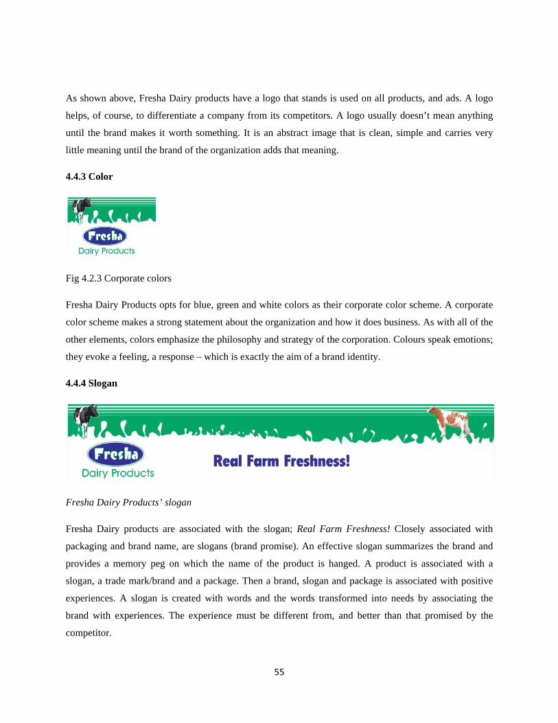
55
As shown above, Fresha Dairy products have a logo that stands is used on all products, and ads. A logo
helps, of course, to differentiate a company from its competitors. A logo usually doesn’t mean anything
until the brand makes it worth something. It is an abstract image that is clean, simple and carries very
little meaning until the brand of the organization adds that meaning.
4.4.3 Color
Fig 4.2.3 Corporate colors
Fresha Dairy Products opts for blue, green and white colors as their corporate color scheme. A corporate
color scheme makes a strong statement about the organization and how it does business. As with all of the
other elements, colors emphasize the philosophy and strategy of the corporation. Colours speak emotions;
they evoke a feeling, a response – which is exactly the aim of a brand identity.
4.4.4 Slogan
Fresha Dairy Products’ slogan
Fresha Dairy products are associated with the slogan; Real Farm Freshness! Closely associated with
packaging and brand name, are slogans (brand promise). An effective slogan summarizes the brand and
provides a memory peg on which the name of the product is hanged. A product is associated with a
slogan, a trade mark/brand and a package. Then a brand, slogan and package is associated with positive
experiences. A slogan is created with words and the words transformed into needs by associating the
brand with experiences. The experience must be different from, and better than that promised by the
competitor.

56
4.5 Advertisement
The researcher found a pool of five Fresha dairy products’ print advertisements. The ads were placed on
billboards and online as well. Each ad of the campaign concentrated on an individual product. In addition,
Fresha Dairy Products has an up and running website. The web page is further divided into two columns.
The content of the website includes both product and contact information of the company, adverts,
announcements and news. The image of the website shown below is the home page as on December,
2012. These print and online ads were as follows;
4.5.1 Print Adverts
Fig 4.3.1 Whole milk Ad
Fig 4.3.2 Whole milk Ad

57
Fig 4.3.3Yoghurt Ad
Fig 4.3.4 Real Fruit Yoghurt Ad
4.3.5 Mala Milk Ad

58
4.5.2 Website
Figure 4.3.6 website
4.6 Packaging
Pouch Tetra Classic Bottle
Fig 4.4 Primary packaging
The primary packaging used includes pouch, tetra pack and plastic bottles that come in different sizes
depending on the product being packaged. The amount for pouch is 200ml and 500ml milk. Tetra pack is
used to package a quantity of 500ml milk and mala milk. Plastic bottles are used to pack 500ml, 1lt, 2lts,
3lts and 5lts milk, yoghurt, ghee, butter and cream. Individually, the products’ packaging was found to be
as follows;

59
i. Fresha whole milk (Available in a Tetra pack, pouch and plastic containers)
Fig 4.4.1 Whole milk packaging
Fresha Whole milk is 100% fresh milk from the finest breed of cows reared in hygienic standards
to reach you within 6 hours from the farm, hence retaining the goodness of real farm freshness.
Fresha milk has no preservatives. Fresha whole milk assures uncompromised real milk taste and
creaminess. Fresha is available in pouch packs of 200ml and 500ml, tetra pack of 500ml, and
plastic containers of 2lts and 5lts.
ii. Fresha Maisha Long Life Milk (Available in a Pouch)
Fresha Maisha Long Life Milk has all the creaminess and nutritional
goodness of Fresha Whole Milk that families all over the country have
come to know, trust and love. Fresha Maisha Long Life Milk is made
from 100% fresh milk and lasts up to 6 months without refrigeration.
The milk is processed using Ultra Heated High temperatures.
Fig 4.4.2 Long Life Packaging
iii. Fresha yoghurt (Available in Cups and Bottles)
Fig 4.4.3 Yoghurt Packaging
Fresha yoghurt is made from 100% pure milk, cultured to give it that yummy, creamy and smooth
taste. Fresha yoghurt is available in cup package in 150ml, 250ml and 500ml while bottle is
available in 250ml and 500ml. Fresha Yoghurt comes in yummy and creamy flavors such as
Strawberry, Vanilla, Pineapple, banana, Mango, passion and a low fat Natural yoghurt.

60
iv. Fresha Yuppi Real Fruit Yoghurt (Available in Bottles)
Fresha Yuppi Real fruit yoghurt is available in Strawberry and Apricot fruits
extracts. Fresha Yuppi Real Fruit Yoghurt contains active and living cultures
composed of unique living microorganisms, responsible for many of the health
and nutritional benefits of yogurt.
Fig 4.4.5 Yuppi Real fruit Yoghurt Packaging
v. Fresh Natural Low fat Yoghurt (Available in Cups)
Fresha Natural low fat Yoghurt is also available and the ideal low fat yoghurt
to assist with the difficult task of weight management. It has a unique tasty,
smooth taste made from 100% fresh milk with approximately 2.0% fat. It helps
stay healthy, look great and still enjoy great-tasting yoghurt.
Fig 4.4.6 Natural Low fat Yoghurt Packaging
vi. Fresha flavoured yoghurt (Available in Cups)
Fresha yoghurt is available in cup package in 150ml, 250ml and 500ml
while bottle is available in 250ml and 500ml. Fresha Yoghurt comes in
yummy and creamy flavours such as Strawberry, Vanilla, Pineapple,
banana, Mango and Passion.
Fig 4.4.7 Flavored Yoghurt Packaging
vii. Fresha Real fruit Yoghurt (Available in Cups)
Fresha Real Fruit Yoghurt is specially made from 100% fresh milk. It’s
made with natural real fruits, it helps stay healthy, look great and enjoy
great-tasting yoghurt. Fresha Real Fruit Yoghurt is rich in calcium,
protein and vitamins. Available Real fruits are Strawberry and Apricot.
Fig 4.4.8 Real Fruit Yoghurt Packaging
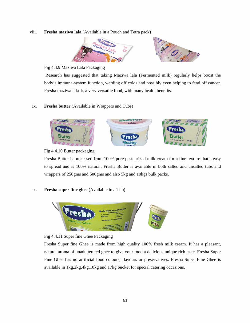
61
viii. Fresha maziwa lala (Available in a Pouch and Tetra pack)
Fig 4.4.9 Maziwa Lala Packaging
Research has suggested that taking Maziwa lala (Fermented milk) regularly helps boost the
body’s immune-system function, warding off colds and possibly even helping to fend off cancer.
Fresha maziwa lala is a very versatile food, with many health benefits.
ix. Fresha butter (Available in Wrappers and Tubs)
Fig 4.4.10 Butter packaging
Fresha Butter is processed from 100% pure pasteurized milk cream for a fine texture that’s easy
to spread and is 100% natural. Fresha Butter is available in both salted and unsalted tubs and
wrappers of 250gms and 500gms and also 5kg and 10kgs bulk packs.
x. Fresha super fine ghee (Available in a Tub)
Fig 4.4.11 Super fine Ghee Packaging
Fresha Super fine Ghee is made from high quality 100% fresh milk cream. It has a pleasant,
natural aroma of unadulterated ghee to give your food a delicious unique rich taste. Fresha Super
Fine Ghee has no artificial food colours, flavours or preservatives. Fresha Super Fine Ghee is
available in 1kg,2kg,4kg,10kg and 17kg bucket for special catering occasions.

62
xi. Fresha cream (Available in a plastic container)
Fig 4.4.12 Cream Packaging
Fresh Cream is made from 100% fresh Cream milk and has a smooth texture. Fresh cream is also
pasteurized, which means that all harmful bacteria is killed to ensure fresh, fine, superior quality
product.
4.7 Photography
Fresha Dairy Products has a pool of 7 pictures which depict the company’s activities. 2 pictures show the
farm, 2 show the collection, 1 shows the processing stage, 1 other picture show distribution and a final
one showing consumption. The first 6 images have been used for the online marketing purposes while the
one depicting consumption has been used for print advertisements (Fig 4.5.7 & Fig 4.3.3). All the feature
photography is as follows;
Fig 4.5.1 The Farm Fig 4.5.2 The Farm
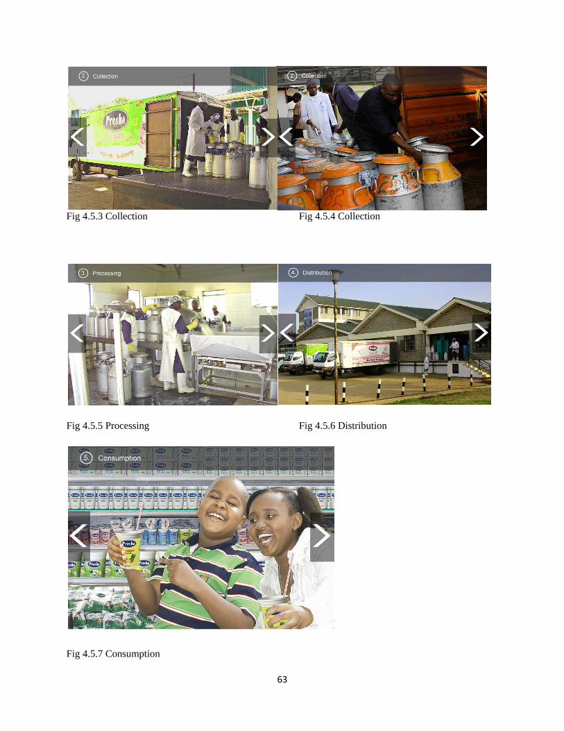
63
Fig 4.5.3 Collection Fig 4.5.4 Collection
Fig 4.5.5 Processing Fig 4.5.6 Distribution
Fig 4.5.7 Consumption

64
4.8 The Chi Squire Distribution
In some research situations, one may be confronted with qualitative variables where Normal distribution
is meaningless because of the small sizes of samples involved and because the quantities being measured
cannot be quantified in exact terms (King’oriah, 2004). The Chi Squire distribution is used extensively in
testing the independence of any two distributions. For this comparison to be done, the subject observed
frequencies are compared to those familiar situations-which are called expected frequencies. The
differences are then noted and manipulated statistically in order to test whether such differences are
significant. The expression for the Chi Squire is;
Where;
i. The letter x is the Greek letter Chi. The expression “x2” is “Chi-Squired” which is the parameter
used in statistical testing and analysis of qualitative samples.
ii. O1 = The observed frequency of the characteristic of interest
iii. E1 = The expected frequency of the characteristic of interest
iv. K = The number of paired groups in each class comprising the observed frequencies O1 and the
expected frequencies E1
v. C = An individual observations of paired groups
The Chi Squire distribution is such that if the observed values differ very little from the expected values
then the Chi Squire value is very little and vice versa. There are distribution tables for the Chi Squire
statistic which are used in an analogous manner to the Standard normal tables for building confidence
intervals and hypothesis testing. The decision rule for the Chi Squire test has an upper rejection region. If
the calculated Chi Squire is bigger than the one found in the tables at the prescribed degrees of freedom,
the null hypothesis is rejected and vice versa. With that in mind, the researcher initially set out on an
experimental pilot study to test the suitability of the selected sample in Githunguri.
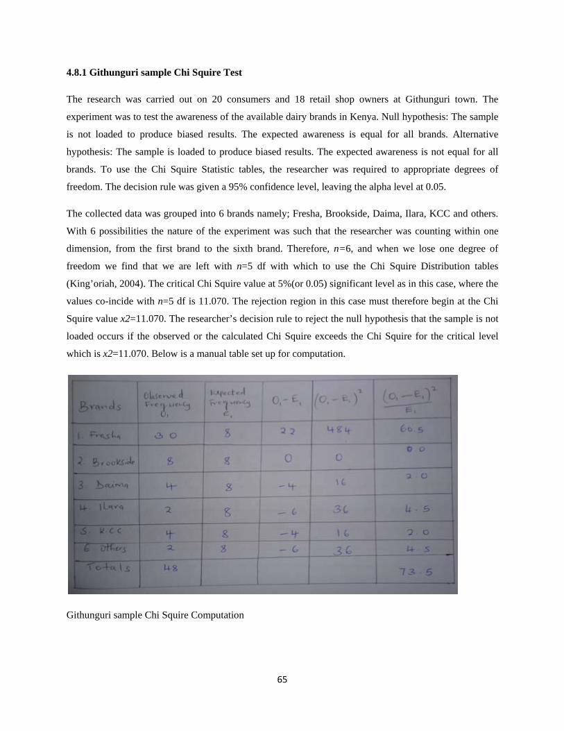
65
4.8.1 Githunguri sample Chi Squire Test
The research was carried out on 20 consumers and 18 retail shop owners at Githunguri town. The
experiment was to test the awareness of the available dairy brands in Kenya. Null hypothesis: The sample
is not loaded to produce biased results. The expected awareness is equal for all brands. Alternative
hypothesis: The sample is loaded to produce biased results. The expected awareness is not equal for all
brands. To use the Chi Squire Statistic tables, the researcher was required to appropriate degrees of
freedom. The decision rule was given a 95% confidence level, leaving the alpha level at 0.05.
The collected data was grouped into 6 brands namely; Fresha, Brookside, Daima, Ilara, KCC and others.
With 6 possibilities the nature of the experiment was such that the researcher was counting within one
dimension, from the first brand to the sixth brand. Therefore, n=6, and when we lose one degree of
freedom we find that we are left with n=5 df with which to use the Chi Squire Distribution tables
(King’oriah, 2004). The critical Chi Squire value at 5%(or 0.05) significant level as in this case, where the
values co-incide with n=5 df is 11.070. The rejection region in this case must therefore begin at the Chi
Squire value x2=11.070. The researcher’s decision rule to reject the null hypothesis that the sample is not
loaded occurs if the observed or the calculated Chi Squire exceeds the Chi Squire for the critical level
which is x2=11.070. Below is a manual table set up for computation.
Githunguri sample Chi Squire Computation

66
The calculated Chi Squire turns out to be 73.5 which is much larger than the value defining the critical
point of Chi Squire which separate the rejection region from the acceptance region. The researcher
rejected the null hypothesis and accepted the alternative hypothesis that the Githunguri sample was not
fair, it was loaded.
Githunguri sample Chi Squire Distribution at 5% of freedom & 95% confidence level
If the researcher’s computation was such that she obtained a calculated Chi Squire below 10.070, she
would have accepted the null hypothesis that the Githunguri sample was not loaded and used it as a
presentation of the whole population.
4.8.2 Nairobi Sample Chi Squire Test
Having rejected the first sample, the researcher set out to select another sample from a neutral location;
Nairobi. The same research was then carried out on 20 consumers and 18 retail shop owners in Nairobi
city centre. The same brands were tested, with the same null hypothesis maintained and the same degree
of freedom being allowed. The calculated Chi Squire turned out to be 1.76 which is much lesser than the
value defining the critical point of Chi Squire 10.070. The researcher did not reject null hypothesis but
accepted that the Nairobi sample was fair, it was not biased. If the researcher’s computation was such
that she obtained a calculated Chi Squire above 10.070, she would have rejected the Nairobi sample as
well. The following table and graph illustrates the findings of the Nairobi sample Chi Squire
Computation;
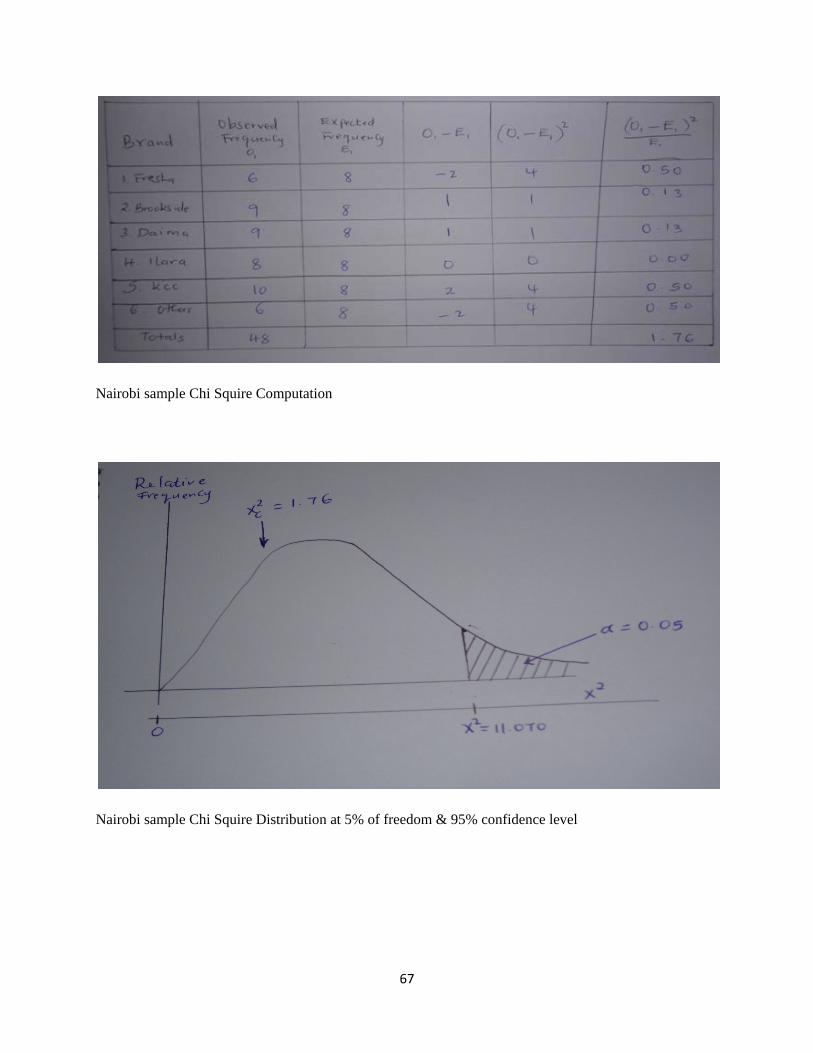
67
Nairobi sample Chi Squire Computation
Nairobi sample Chi Squire Distribution at 5% of freedom & 95% confidence level

68
CHAPTER FIVE: RECCOMMENDATIONS
5.1 Summary of the Findings
Generally, a method of quantifying qualitative data was adopted. The points awarded ranged from 1-5 as
shown in the table and pie chart below. Using this method, the questionnaires were analyzed and the pie
charts below provide a summary of the findings.
Quality: Very Bad Bad Fair Good Very Good
Points
awarded 1 2 3 4 5
Table; Method used to quantify qualitative data
Pie Chart; Method used to quantify qualitative data
Very bad was the poorest rating possible, being awarded a quantity equivalent to 1 out of the possible 5.
Bad was awarded 2 points while Fair represented an average. Fair was rounded off to the nearest whole
number, which is 3 points instead of the exact 2.5 for easier computation. Good stood for a score of 4 and
very good represented excellence.
7%13%
20%
27%
33%
Method used to quantify qualitative data
Very Bad
Bad
Fair
Good
Very Good

69
5.2 Kenyan Dairy Brands
The researcher commenced the research by collecting general information about Dairy brands in Kenya
before narrowing to Fresha and Graphic design details. In terms of awareness, 5 brands of milk were
found to be recognized by almost every one. These brands were; Fresha, Brookside, Daima, Ilara, and
K.C.C. The range of the difference of awareness was very narrow with K.C.C narrowly being on the lead
(refer to pie chart below)
Pie chart; Dairy brands awareness in Nairobi
12%
19%
19%17%
21%
12%
Dairy Brands Awareness in Nairobi
Fresha
Brookside
Daima
Ilara
K.C.C
Others
70
As shown below, the awareness of Fresha compared to the other brands was pretty fair but in terms of
preference, Fresha scored a mere 12%. A majority of 25% Nairobi residents opted to go with Brookside
making Brookside the consumers’ choice.
Pie Chart; Dairy brands preference in Nairobi
12%
25%
21%
17%
21%
4%
Dairy Brand Preference in Nairobi
Fresha
Brookside
Daima
Ilara
K.C.C
Others

71
5.3 Fresha Dairy Products
Comparing the attributes of Fresha Dairy Products individually, 96% of the researcher’s respondents
complained on the low quality of Fresha products. More specifically, the milk was accused of going bad
faster than every other brand. Also, 50% of the sample mentioned the ratio of water to “milk” being
highest with Fresha products.
Doughnut pie chart; Fresha dairy products general rating
6%
13%
25%
25%
31%
Fresha Dairy Products General Rating
Quality
Advertisement
Price
Brand
Package

72
5.4 Corporate Identity
The corporate identity of Fresha was reviewed independent and the results as illustrated below confirmed
that the company portrays a neutral image. The respondents noted that the visual image of Fresha did not
make them think or trigger any emotion. 50% rated it fair with a majority of the remainder (22%) leaning
towards the ‘bad’ side. Some of the adjectives used to describe Fresha Dairy products visual identity
were; “Neutral”, “Fine”, “Just there”, “Normal”, “I don’t know”, “Fair”, “Okay” among others.
Doughnut pie chart; Fresha Dairy Products corporate identity rating
7%
14%
50%
22%
7%
Fresha Dairy products Corporate identity Rating
Very Good
Good
Fair
Bad
very Bad
73
5.5 Packaging
The primary packages of Fresha were also put to test and the tetra pak turned out to be a favorite, by
commanding a 42 % of the market share. However, Fresha uses tetra pak to package whole milk and lala
only. The most common package, the pouch scored lowest by not being ranked by anyone at all.
Doughnut pie chart; Fresha Dairy Products primary packaging rating
3%3%
21%
31%
42%
Fresha Dairy Products Primary Packaging Rating
Wrappers
Tubs
Bottles
Cups
Tetra pak

74
5.6 Advertisement
Last but not least, advertisement was found to be the poorest form of visual communication used by
Fresha Dairy Products. A total of 73% respondents rated Fresha ads bad or very bad. This was attributed
by the fact that over half of the respondents dismissed the question by claiming they have never seen a
Fresha Dairy Products’ advertisement.
Doughnut pie chart; Fresha dairy products advertisement rating
5.7 Conclusion:
The research has shown that Fresha’s identity is blending in. Fresha gets swallowed by the lately high
populated dairy industry. Nothing is setting Fresha aside from the other milk and milk products. Elements
that can be used to make it strike out is; manipulation of the type, color, logo, layout or the even the
whole package. The quality of the milk is beyond the researcher’s objectives but it has been found to
affect the overall impression of Fresha.
The value of advertisement cannot be undervalued. However, Fresha has not exploited the mediums of
advertising to the maximum. The ads found look like a single ad that was reproduced by use of a different
image and text. The same text color and style is flashed top-left, an image of the product centered and an
image of the model(s) aligned to the right. More so, the ads have not effectively reached the target market
of Fresha dairy products.
4%9%
14%
41%
32%
Fresha Dairy Products Advertisement Rating
Very Good
Good
Fair
Bad
Very Bad

75
More than half of Fresha whole milk is packaged in a pouch while much less goes into tetra paks, and
bottles. The pouch package is light, cheap and convenient but its popularity has been found to be below
zero. The pouch has to be bite into or cut with a sharp object to open. Once open, it cannot stand on its
own or offer a way to carry it around. People want a package they will use little to no effort to open or
use. The tetra pak, cups, and bottles have won the people’s hearts. Also, the photography “bank” of
Fresha needs a revamp. The images are obvious, they do tell a story but no memory trigger. The focus on
a point of interest is lacking. The quantity of photos is also low which has led to recycling of images in
advertisement. The available pictures are not even showing all aspects of Fresha activities.
5.8 Recommendations
The corporate identity recommended for Fresha is one that triggers people to notice it from the “blue-
white-green” dairy products filling the supermarket milk section shelves. Gestalt principles of perception
can be used to create the visual perception Fresha wants the consumers to form about it. With the high
competition facing Fresha, rebranding is inevitable. The image being recommended ought to demand
attention from far by differentiating Fresha from the rest. Fresha needs to visually show and remind
people that it exists by making a huge come back. The research carried has shown how little people think
about the visual image of Fresha. Fresha is family branded. If one product makes a mistake, it
simultaneously affects the whole line of products’ image. The impression people form about a company
affects their decision about doing business with that company. Currently, the quality (milk going bad and
the low cream) claims need a damage control before it is too late.
The researcher recommends less use of pouch packages that are not only non environment friendly but
also not-preferred by the consumers. Visually, the packages of Fresha milk and milk products need to be
redesigned, to set them aside from the large pool of other dairy products. The packages need to be
environment friendly and reflecting the brand they are selling. Due to the quality issues that have been
found through the research, the researcher recommends an advertisement that proves Fresha’s worth.
Again, the existing ads neither call for action nor give the consumer an urgent reason to purchase the
product. The choice of medium has not been a success because over half of the researcher’s sample had a
hard time remembering when they lastly saw or whether they have ever seen a Fresha ad. In addition, the
researcher recommends a rich pool of digital images that can be used to reflect the brand of Fresha . The
images need to be both large in number and showing different aspects of Fresha, to avoid the se of the
same models for every occasion.

76
List of References
Airey David (2009): Logo Design Love: A Guide to Creating Iconic Brand Identities, New Riders
Ambrose G, Harris P (2008): The Fundamentals of Graphic Design, AVA Publishing
Arntson Amy (2011): Graphic Design Basics, Learning
Bowen Linda (1999): The Graphic Designer's Guide to Creative Marketing: Finding & Keeping Your Best Clients, John Wiley & Sons.
Boylston Scott (2009): Designing Sustainable Packaging, Laurence King Publishers
Chick A, Micklethwaite P (2011): Design for Sustainable Change: How Design and Designers Can Drive the Sustainability Agenda, AVA Publishing
Collin Morris (2009): Encyclopedia of sustainability, ABC-CLIO
Creswell J W (2007): Qualitative inquiry & research design, Sage publications
Dorst Kees (2007): Understanding design, Gingko press.
Dougherty Brian (2008): Green Graphic Design, Allworth Press.
Hollis Richard (2006): Swiss Graphic Design: The Origins and Growth of an International Style 1920-1965, Laurence King Publishing
Jackson S.L (2009): Research methods and Statistics: A critical Thinking Approach, Wadsworth.
Jayme A. Sokolow, "How Do Reviewers Really Evaluate Your Proposal? What the Cognitive Science of Heuristics Tells Us About Making Decisions," Journal of the Association of Proposal Management Professionals (Spring/Summer 2004): 34-50.
Jedlicka Wendy (2008): Packaging Sustainability: Tools, Systems and Strategies for Innovative Package Design, John Wiley & Sons
Jedlicka Wendy (2009): Sustainable Graphic Design: Tools, Systems and Strategies for Innovative Print Design, John Wiley & Sons
Leedy P.D, Ormrod J.E (2005): Practical research; Planning as design, Pearson Education
Kibera F N, Waruingi B C (2007): Fundamentals of marketing; An African perspective, Kenya Literature Bureau
King’oriah G K, Research design and data analysis, Kenya Methodist University
Klanten R, Bourhuin N, Maries C (2006): Altitude: contemporary Swiss graphic design, Die Gestalten Verlag
Koffka Kurt (1999): The growth of the mind, Routledge

77
Macnab Maggie (2011): Design by Nature: Using Universal Forms and Principles in Design, New Riders
Marczyk G, DeMatteo D, Festinger D (2005): Essentials of research design and methodology, John Wiley & Sons
Mazza Riccardo (2009): Introduction to Information Visualization, Springer
Millman Debbie (2010): How to Think Like a Great Graphic Designer, Skyhorse Publishing Inc
Oostendorp, Preece and Arnold (guest editorial), "Designing Multimedia for Human Needs and Capabilities," Interacting with Computers Volume 12, Issue 1 (September 1999): 1-5.
Rabinowitz Tova (2006): Exploring Typography, Cengage Learning
Roberts Lucienne (2007): Good: An Introduction to Ethics in Graphic Design; Advanced Level Series; Required Reading Range AVA Book, AVA publishing.
Schwartz-Shea P, Yanow Dvora (2012): Interpretive research design; concepts and processes, Routledge
Sherin Aaris (2008): SustainAble: A Handbook of Materials and Applications for Graphic Designers and Their Clients, Rockport Publishers
Stephens S, Stephens A (2009): The Big Book of Green Design, HarperCollins
Stevenson Johnson, "Beauty and the Beastly PC, The Graphics on Your Screen Can Affect the Way You Feel—and Think," Discover Volume 25: Number 5 (May 2004): 20-21
Wertheimer Max (1990): Gestalt Theory, Hayes Barton Press
W.H. Levie and R. Lentz, "Effects of Text Illustrations: A Review of Research,"Educational Communications and Technology Journal 30 (4) (1982): 195-232.
Yates Daniel, Moore David and Starnes Daren (2008): The practice of Statistics, Freeman.

78
Internet
www.smashingmagazine.com
www.about.com
www.interaction-design.org
www.scholarpedia.org
www.packagingdigest.com
www.printnet.com
www.design-sustainability.com
www.ethicsingraphicdesign.org
www.Re-nourish.com
www.printing.org
swisstype.wordpress.com
www.billiondollargraphics.com
www.davidairey.com,

79
Appendix 1
Structured Questionnaire to be administered to the general public
1. How often do you buy milk?
More than once a day
Once a day
A few days a week
Once a week
Once a month
Never
2. Which brand(s) of milk do you know?
3. Which brand(s) of milk do you use?
4. What easily attracts your attention when buying milk or milk products?
5. Have you ever heard of ‘Fresha’? If yes, how did you know about Fresha?
6. Do you like Fresha milk and milk products? If yes, which products?
7. Do you like the milk and milk product packages that are available in Kenyan market?
8. What is the best package for ideal milk and milk products?
9. Which type of colors do you like?
10. Which type of colors don’t you like?
11. Do you like the color used to brand and package Fresha Dairy products?
12. If no, what do you suggest can be done to make Fresha dairy products more appealing?
80
Appendix 2
Structured questionnaire to be administered to Retail Stores
1. Which brands of milk and milk products do you sell?
Most? Least?
1. Do you sell Fresha Dairy products? If yes, how would you their rate the quality?
Very bad Bad Fair Good Very good
2. What is the level of Fresha milk and milk products sales?
Very bad Bad Fair Good Very good
3. What do you attribute to this?
4. Who are your major customers?
Children Youth Adults
5. How do you find the price of Fresha milk and milk products?
Very expensive Expensive Fair Good Very good
6. What do you think about the current brand/visual identity of Fresha Dairy Products?
7. How would you rate Fresha milk and milk products’ corporate/brand/visual identity/image?
Very bad Bad Fair Good Very good
Why?
8. How do you rate Fresha milk and milk products packaging?
Very bad Bad Fair Good Very good
Why?
9. How would you rate Fresha milk and milk products’ advertisement?
Very bad Bad Fair Good Very good
Why?

81
Appendix 3
Unstructured questionnaire to be administered to Fresha Dairy Products staff, Githunguri
Corporate identity
1. Do you think about the current brand identity of Fresha Dairy Products?
2. a) Given a better option would you change the current Fresha Dairy Products’ visual image?
b) If yes, what would you change, add, reduce, add or eliminate?
Advertisement
1. On average, how much milk and milk products do you distribute per day?
2. How regularly do you advertise or change advertisements of Fresha milk and milk products?
3. Which is the most effective form of advertisement for Fresha Dairy Products?
Package
1. What type of package is ideal for the dairy products?
2. Do you think the current Fresha milk and milk products’ package is ideal for the company?
3. Given a chance, what would you change about the Fresha Dairy Products packages?
Photography
1. On average, how many pictures of Fresha Dairy Products does the company have (archived)?
2. Do you think Fresha has sufficient photographs to show all the company’s activities?
82
Appendix 4
Interview guide for Fresha Dairy Products’ managers interviews
Introduction
1. When was Fresha dairy products started?
2. Can you please give a brief history?
3. In the scale of 1-10, rate how Fresha milk and milk products values a graphic designer?
4. What are the duties of a graphic designer at Fresha Dairy Products?
Corporate Identity
1. How regular do you rebrand Fresha?
2. Do you think the current brand identity is effective or do you think it can be improved?
Advertisement
1. How regularly do you advertise Fresha milk and milk products?
2. Do you think the current advertisement style is effective or do you think they can be improved?
3. Who formulates your adverts?
Packaging
1. How regular do you change the packages of Fresha milk and milk products?
2. Do you think the current packages are effective?
Photography
1. What do you think about the current Fresha photography?
2. Do you think the current Fresha photographs are great or do you think they can be improved?