Embed Size (px)
Citation preview
Textual Analysis for Two Absolut Vodka’ s Advertisements in Different Periods
Juan Wei1, a
1The University of Melbourne, Melbourne, 3010, Victoria, Australia
Keywords: Absolut Vodka; advertising; semiology study; sign; colour semiotics
Abstract: This article aims at exploring the application of semiotics in advertising, based on the textual
analysis for two Absolut Vodka’s print advertisements. The first one was launched in 1981 which was the very
initial Absolut Vodka advertisement, another one is adopted from the series print ad, called ‘In an Absolut
World’ released in 2006. In the analysis process, the theory of semiotics and some other branched theories
such as colour semiotics and the semiology in nature are quoted in this article to support the analysation. There
are some differences between these two advertisements on the employment of semiotics, however, the main
purposes are consistent which is enhancing Absolut Vodka’s product concept: purity.
1. Introduction
Semiotics or semiology is the research of signs and the main study course is from Ferdinand de Saussure. After
the analysis of Saussure’s Course in General Linguistics in 1974, Bignell [1] echoes Saussure’s theory that
sign consists of the signifier and the signified. In the material world, a certain object could be named as
referent, and signified is the conceptual image in people’s mind for this referent. Finally, the language used to
describe this referent and the letters of an alphabet applied to record by handwriting is signifier. According to
Saussure [2], the linguistic signs are not limited to the study of a language system, however, all kinds of other
objects which convey connotations could be involved in the research of linguistic signs. Beasley and Danesi
[3] mention that advertising, as a communicating medium, could be regarded as the practice of cultural
tendency, and it always plays the role of transmitting information and promoting sales between business and
the public. Employing semiotics permits us to interpret the connotation and images in advertisements,
assisting people to comprehend the connections of the brand value, the company philosophy and the social
trend with them. When a company plans the brand strategy, every single element should be considered
carefully [4]. The brand logo, brand font, product appearance and brand colour choices are all the signifiers
which could position the brand position and exhibit the company’s philosophy in society. Applying signs to
advertisements accurately could enhance the brand identity in the market [4]. This essay will analyse two print
advertisements separately launched by Absolut Vodka in different periods by utilizing semiotics theories.
Based on the analyzation, the information that Absolut intends to convey will become better comprehensible.
Then, a brief comparison of the two advertisements will follow the analysis. Finally, a conclusion will be
provided at the end of this article.
3rd International Conference on Education, Culture and Social Development (ICECSD 2019)
Copyright © 2019, the Authors. Published by Atlantis Press. This is an open access article under the CC BY-NC license (http://creativecommons.org/licenses/by-nc/4.0/).
Advances in Social Science, Education and Humanities Research, volume 344
88

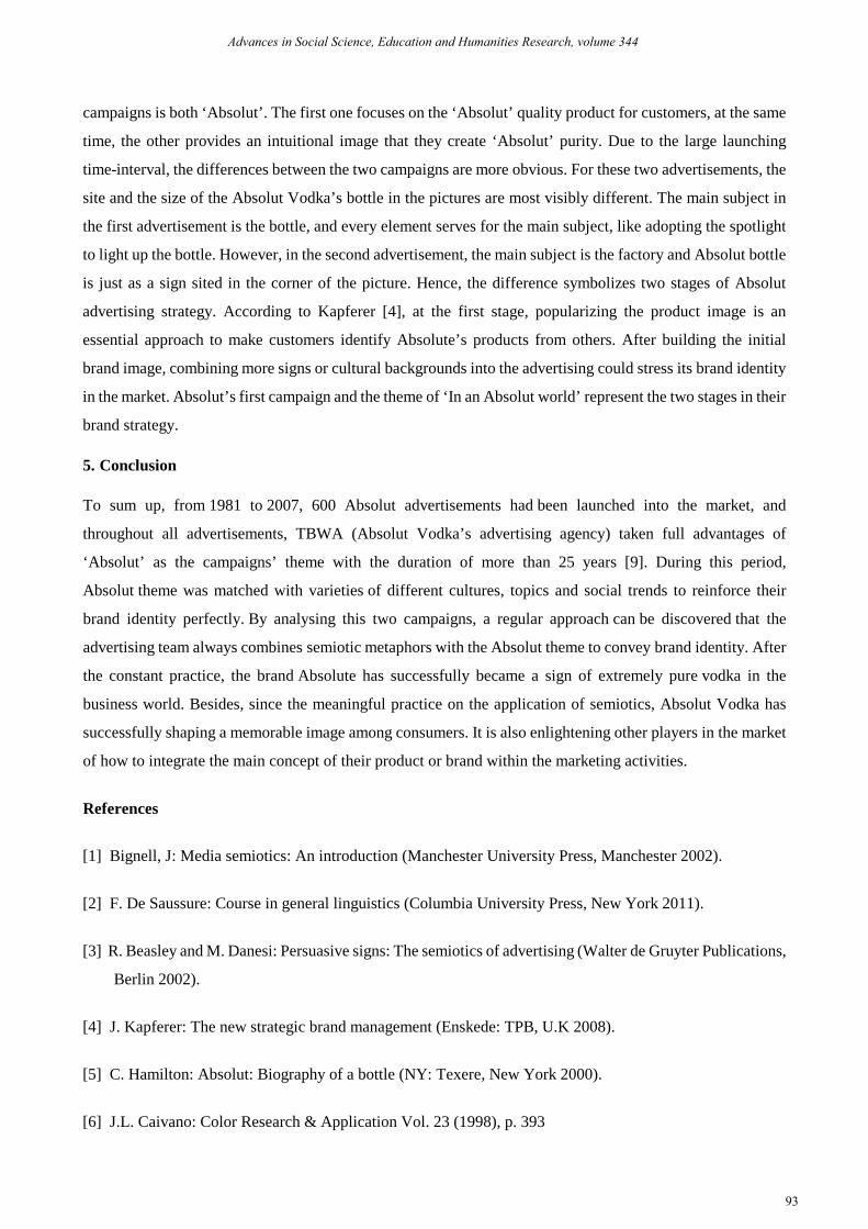
In 1981, Absolut Vodka’s first print advertisement was designed by TBWA advertising agency on a magazine
[5]. This was the first time for Absolut emerging in the market, and the advertising team tried to reveal the
purest image of Absolut Vodka to the public. The image style is quite simple for the first print ad which just
includes spotlight background and a bottle of Absolut vodka, and the bottle is right in the middle of the
background. The bottle is transparent with the blue brand name and the founder’s head portrait on the body.
Particularly, the shape of the bottle is quite unique with the short bottleneck and thick body, as Hamilton [5]
mentions that the bottle of Absolut Vodka has become a symbolic sign in the business world. Although the
first ad looks relatively simple, still, it delivers the brand value directly and clearly. In this ad, there are two
signs can be distinguished. The transparent bottle and blue font as the first sign could be explained in colour
semiotics which connects with the quality of Absolut vodka, also the colour semiotics theories will be further
interpreted by pointing out examples. Spotlight is the other significant sign that has direct relevance with the
semiotics in theatres. As Absolut company’ s first ad, the adopting of the spotlight is associated with their
brand value and advertising strategy.
2. Textual analysis for the first advertisement
Figure1. Absolut Vodka 1
The signs of the transparent bottle and blue font indicate the quality of Absolut Vodka. To more details,
specific colour relates to s particular meaning. Red colour, for example, can remind the Chinese people of war
and holidays. Furthermore, the green colour is associated with the Brazilian flag for most Brazilians.
Meanwhile, the meaning of transparent and blue colours could be explained in colour semiotics field.
According to José Luis Caivano [6], colour could be regarded as an icon which shapes the relationship
between colours and referents based on the similarity. For instance, due to the similar tint, red, orange and
yellow always convey a commonly visual sense of mildness for people, like the brand colours adopted by
McDonald are orange, red and yellow which are applied in their commercials, food package and dining room
decorating schemes. Conversely, the colour of green, blue and turquoise are frequently associated with the
visual feeling of chillness, also in this context, the transparent bottle and blue font applied by Absolut Vodka
are providing a precise viewpoint. This is because the colours of blue and transparent have a close bearing on
sky, clearness, water and glasses, which has become a colour sign turning into people’s conceptual map. The
official website Absolut [7] points out that the ingredients of Absolut Vodka are simple since they persist in
Advances in Social Science, Education and Humanities Research, volume 344
89
utilizing deep well water and winter wheat with continuous distillation technique to ensure the quality and
purity of the alcohol. Although a large proportion of Absolut Vodka is purchased in the United States, the
company insists on maintaining the whole production line in Sweden to guarantee the purity of raw
materials. Therefore, as Hamilton [5] mentions, this is the most crucial reason why Absolut Vodka company
adopts the transparent colour for the bottle body and the blue font for its brand name. It could be interpreted
that the company is trying to broadly transmit brand values-simplicity and purity. If the transmission result is
ideal, once customers catch the sight of the bottle of Absolut vodka, they may associate with the purity and
simplicity of this product. The association that appears in customers’ minds is the signified of this advert from
Absolut vodka.
The spotlight background is the third signifier for the first Absolut campaign, as the first-time appearance in
front of the public, Absolut company tries to convey a message that Absolut will be a focus in the market. In
our everyday life, the spotlight technique is regularly utilized in theatres, speeches and concerts, especially in
the situation when one performer should be the only eye appeal in performance. As Elam [8] points out that
lighting up the performance space can gather audience attention in dramas. For instance, soliloquy is a
significant performance form in the theatre, and it requires the actor to complete a part of the drama
individually. During the solo time, the actor is the only focus on the stage, and the stage set could be weakened
to assist the monologue performance. Therefore, making use of the spotlight technique could ensure the
audience focusing on the actor, which is a direct approach to attract targets from the visual aspect. In
accordance with the Absolut advert, the background colour is black and a spotlight illuminates the bottle’s
body from behind. The bottle is placed on a mirror surface platform which also casts the shadow from the
bottle. In general, the setting of this advert is resembling a stage, in which a spotlight lights up Absolut vodka
who plays the role of a protagonist in a drama and receives attention from the audience. As Hamilton [5]
describes, Russian-made vodka maintained a higher market occupancy in the world scale when Absolut
entering the alcohol market. Since Russia is widely assumed that it is the origin place of vodka with the highest
brewing technique. Thus, occupying a position is difficult for Absolut company under this marketing
environment. However, applying the spotlight into advert expresses the confidence from Absolut company for
their product while transmitting a message for customers that they are the focus in the market. In fact,
Hamilton [5] indicates that the sales of Absolut Vodka risen sharply and it has become one of the best-selling
vodka among the world.
Advances in Social Science, Education and Humanities Research, volume 344
90

3. Textual analysis for the second advertisement
Figure2. Absolut Vodka 2
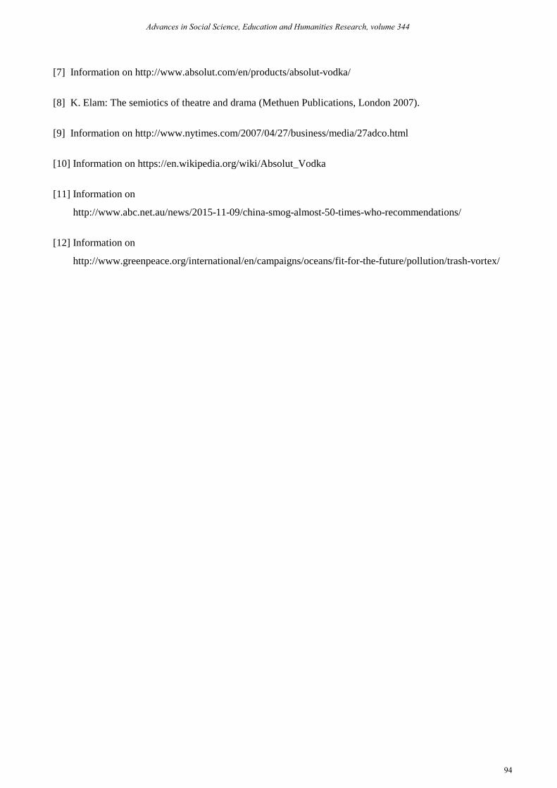
The second campaign was released in 2006, which involves a theme campaign, called ‘In an absolut world’.
As Elliott [9] reports that the new campaign contains various subjects, including geography, humanity,
painting, politics and nature. In this print advertisement, Absolut company adopts a realistic picture of Absolut
vodka’s factory in Sweden, the advert team also applies the digital technique to add visual effect in this
campaign. The main colour tune in this picture is blue. Most facilities in the factory are decorated in blue
colour, and the factory is established by the sea, blue sky and blue sea water compose a clean scene behind the
factory. It is worth noting that the working distillation machines in the factory are discharging bubbles into the
air. This advertisement consists of three symbols: the colour sign, brand sign and natural sign. With the
integration of these symbols, the brand value-purity could be reinforced. To be specific, the blue colour tune
in the factory is the colour sign that reflecting the cooperate philosophy from Absolut vodka. The distillation
machine in the factory is the brand sign to communicate the message that the Absolut company focus on
producing ‘purity’. In addition, because of Absolut company persists in producing ‘purity’, the blue sky and
clean sea water turn into the natural sign in this advertisement.
In this campaign, the blue colour that Absolut company adopts to decorate the factory is a colour sign. It also
has direct relevance with the blue font brand name in the first campaign. For the two-successful usage of blue
colour, it can be seen that Absolut cooperate regards the blue colour as their brand identity which is broadly
applied to the product design and their factory’s facilities. According to Kapferer [4], the brand identity
represents the differences between one brand and their rivals’, and it is also an essential approach for
customers to distinguish one from another. Kapferer further offers an method as the brand identity prism with
six sides to analyse a brand identity. In one part, the physique prism, the same as the signified, representing the
appearance characteristics for the product, appears in consumer ’s minds when the brand name is mentioned. It
is also associated with semiotics theory. For example, Kapferer takes the physique prism of Coca Cola as an
example to interpret that the red colour bottle is a sign for consumers to identify Coca Cola from Pepsi. When
the second campaign ‘In an Absolut world’ is interpreted by physique prism, the blue colour decorated on the
factory facilities in this advertisement could reflect that Absolut company attempts to reinforce the blue colour
sign for customers, building up the brand identity to differentiate with their rivals’ brands additionally.
Advances in Social Science, Education and Humanities Research, volume 344
91

The distillation machine is the second sign in this campaign. Particularly, there are plentiful bubbles that are
discharged from the machine’s chimney. In 1879, Smith created a continuous distillation method to produce
Absolut vodka, unlike others, the continuous distillation method could remove all impurities in the alcohol
[10]. Even until today, the Absolut company maintains this technique to produce Absolut vodkas [7]. In this
advertisement, the continuous distillation machine is arranged in the middle part of the factory. On the upper
part of the machine, there are two huge chimneys. When the distillation machine is working, steam will be
discharged through the chimneys, however, the advert production team changes the steam into bubbles out of
the chimneys. Steam is a gas form of water which could not lead to environmental pollution. Besides, in
modern society, the large-sized chimney is increasingly becoming a sign of smoke, haze and large chemical
factories. This sign could be associated with dense smoke with poisonous gas. Moreover, a lot of public
service advertisements employ this sign to reflect the polluted environment. Under this situation, when the
factory’s chimneys emit bubbles rather than exhausts, it will attract the attention from the targets immediately.
The combination of machine, chimneys and bubbles gives a more accurate attitude to the public that the whole
Absolut industry focuses on producing ‘purity’.
The sky and the sea could be regarded as a natural sign which assists to construct a pure atmosphere for this
advertisement. This sign also presents the company philosophy-purity. Contrary to the rapid industrial
development which is pacing into almost every corner of the world and probably causes
environmentally-unfriendly problems, whether the sky is blue or not has become an intuitive method for the
public to distinguish the air quality. Besides, in China, some lexical items like haze and PM2.5 (particles
smaller than 2.5 microns in the air) have become a top topic in people’s everyday life. According to Australian
Broadcasting Corporation [11], in 2015, people who lived in Beijing had a period around half a year to breathe
the substandard air. Also, as stated by the Beijing Environmental Protection Agency, there were 49 heavily
polluted days in a totally 179-polluted-day in 2015 particularly. It means that most time in that year, citizens
barely had opportunities to see the blue sky. Additionally, marine pollution is very serious as well. As reported
by Greenpeace [12], more than 200 kilograms of plastic waste is being dumped into the ocean per second.
Precisely in contrast to the deterioration of the pollution, the blue sky and the clean sea water are thought to be
the symbols of a clean atmosphere for the public. Thus, the blue sky and clean ocean in this picture involve a
natural sign that reinforces the purity image of Absolut Vodka in consumers’ minds. The name of this
campaign is ‘In an Absolut world’, and the advertisement producing team combines the signs of factory
facilities colour, the distillation machine and the natural environment to echo a deep impression that Absolut
vodka is produced in an absolutely pure world.
4. ·Similarity and Difference
After applying semiotics to analyse the signs in these two campaigns, the similarities and differences can be
clarified. As for the similarities, the first one is adopting the colour sign. These two campaigns take advantage
of the special meaning of blue colour in semiotics to reflect the brand value, and the utilities of the blue font,
blue facilities, the blue sky and the ocean could prove this point in turn. Secondly, the theme of these two
Advances in Social Science, Education and Humanities Research, volume 344
92
campaigns is both ‘Absolut’. The first one focuses on the ‘Absolut’ quality product for customers, at the same
time, the other provides an intuitional image that they create ‘Absolut’ purity. Due to the large launching
time-interval, the differences between the two campaigns are more obvious. For these two advertisements, the
site and the size of the Absolut Vodka’s bottle in the pictures are most visibly different. The main subject in
the first advertisement is the bottle, and every element serves for the main subject, like adopting the spotlight
to light up the bottle. However, in the second advertisement, the main subject is the factory and Absolut bottle
is just as a sign sited in the corner of the picture. Hence, the difference symbolizes two stages of Absolut
advertising strategy. According to Kapferer [4], at the first stage, popularizing the product image is an
essential approach to make customers identify Absolute’s products from others. After building the initial
brand image, combining more signs or cultural backgrounds into the advertising could stress its brand identity
in the market. Absolut’s first campaign and the theme of ‘In an Absolut world’ represent the two stages in their
brand strategy.
5. Conclusion
To sum up, from 1981 to 2007, 600 Absolut advertisements had been launched into the market, and
throughout all advertisements, TBWA (Absolut Vodka’s advertising agency) taken full advantages of
‘Absolut’ as the campaigns’ theme with the duration of more than 25 years [9]. During this period,
Absolut theme was matched with varieties of different cultures, topics and social trends to reinforce their
brand identity perfectly. By analysing this two campaigns, a regular approach can be discovered that the
advertising team always combines semiotic metaphors with the Absolut theme to convey brand identity. After
the constant practice, the brand Absolute has successfully became a sign of extremely pure vodka in the
business world. Besides, since the meaningful practice on the application of semiotics, Absolut Vodka has
successfully shaping a memorable image among consumers. It is also enlightening other players in the market
of how to integrate the main concept of their product or brand within the marketing activities.
References
[1] Bignell, J: Media semiotics: An introduction (Manchester University Press, Manchester 2002).
[2] F. De Saussure: Course in general linguistics (Columbia University Press, New York 2011).
[3] R. Beasley and M. Danesi: Persuasive signs: The semiotics of advertising (Walter de Gruyter Publications,
Berlin 2002).
[4] J. Kapferer: The new strategic brand management (Enskede: TPB, U.K 2008).
[5] C. Hamilton: Absolut: Biography of a bottle (NY: Texere, New York 2000).
[6] J.L. Caivano: Color Research & Application Vol. 23 (1998), p. 393
Advances in Social Science, Education and Humanities Research, volume 344
93
[7] Information on http://www.absolut.com/en/products/absolut-vodka/
[8] K. Elam: The semiotics of theatre and drama (Methuen Publications, London 2007).
[9] Information on http://www.nytimes.com/2007/04/27/business/media/27adco.html
[10] Information on https://en.wikipedia.org/wiki/Absolut_Vodka
[11] Information on
http://www.abc.net.au/news/2015-11-09/china-smog-almost-50-times-who-recommendations/
[12] Information on
http://www.greenpeace.org/international/en/campaigns/oceans/fit-for-the-future/pollution/trash-vortex/
Advances in Social Science, Education and Humanities Research, volume 344
94