Embed Size (px)
DESCRIPTION
Book that explains basic technical analysis in simple language
Citation preview

The methods used to analyze securities and make investment decisions fall into two very broad categories: fundamental analysisand technical analysis. Fundamental analysis involves analyzing the characteristics of a company in order to estimate its value.Technical analysis takes a completely different approach; it doesn't care one bit about the "value" of a company or a commodity.Technicians (sometimes called chartists) are only interested in the price movements in the market.
Despite all the fancy and exotic tools it employs, technical analysis really just studies supply and demand in a market in anattempt to determine what direction or trend will continue in the future. In other words, technical analysis attempts to understandthe emotions in the market by studying the market itself, as opposed to its components. If you understand the benefits andlimitations of technical analysis, it can give you a new set of tools or skills that will enable you to be a better trader or investor.
In this tutorial, we'll introduce you to the subject of technical analysis. It's a broad topic, so we'll just cover the basics, providingyou with the foundation you'll need to understand more advanced concepts down the road.
Figure 1.1
INTRODUCTIONINTRODUCTION
1 2
What does Technical Analysis mean?
Technical analysis is a method of evaluating securities by analyzing the statics generated by market activity, such as past pricesand volume. Technical analysts do not attempt to measure a security’s intrinsic, value, but instead use charts and other toolsto identify patterns that can suggest activity.
Just as there are many investment styles on the fundamental side, there also many different types of technical traders. Somerely on chart patterns, other use technical indicators and oscillators, and most use some combination of the two. In any case,technical analysis’ exclusive use of historical price and volume data is what separates them from their fundamental counterparts.Unlike fundamental analysts, technical analysis do not care whether a stock is undervalued – the only thing that matters is asecurity’s past trading data and what information this data can provide about where the security might move in the future.
The purpose of technical analysis is identify trend changes that precede the fundamental trend and do not (yet) make senseif compared to the concurrent fundamental trends.
According to Wikipedia – the free encyclopedia, “Technical analysis is a security analysis discipline for forecasting the futuredirection of prices through the study post market data, primarily price and volume {1}. In its purest form, technical analysisconsiders only the actual price and volume behavior of the market or investment.”
Investopedia explains Technical analysis as “Technical analysts believe that the historical performance of stocks and marketsare indications of future performance”.
It further explains the same with the help of the following example:
In a shopping mall, a fundamental analyst would go to each store, study the product that was being sold, and then decidewhether to buy it or not. By contrast, a technical analyst would sit on a bench in the mall and watch people go into the stores.Disregarding the intrinsic value of the products in the store, his or her decision would be based on the patterns or activity ofpeople going into each store.
DEFINITIONDEFINITION
Chapter 2Chapter 1

Application of Technical Analysis:
Stock charts us a lot about what companies are doing, what they will be doing and what the markets thinks of it all. However,we have to learn how to read the stock charts. At the most basics level, there are some important concepts that should be keptmind:
• Uptrends are characterized by rising bottoms on the stock chart and can be described as periods of optimism.
• Downtrends are characterized by falling tops on the stock charts, and can be described as periods of pessimism.
• Abnormal trading activity often signals significant fundamental change in the company’s business.
• Support is a floor price that the market has shown an unwillingness to trade under in the past.
• Resistance is a ceiling price that the market has shown unwillingness to trade above in the past.
Note: in the same manner compute the DPO and DIO.
3 4
Not Just for Stocks
Technical analysis can be used on any security with historical trading data. This includes stocks, futures and commodities,
fixed-income securities, forex, etc. In this tutorial, we’ll usually analyze stocks in our examples, but keep in mind that these
concepts can be applied to any type of security. In fact, technical analysis is more frequently associated with commoditized
and forex, where the participants are predominantly traders.
Chapter 3
PRINCIPLESPRINCIPLES
Technicians say that a markets’s price reflects all relevant informations, so their analysis looks more at “internals” than at
“externals” such as news events. Price action also tends to repeat itself because investors collectively tend toward patterned
behavior – hence technicians ‘focus on identifiable trends and condition. The study of technical analysis is based on the following
three broad principles:
The Market Discounts Everything
A major criticism of technical analysis is that it only considers price movement, ignoring the fundamental factors of the company.
However, technical analysis assumes that, at given time, a stock’s price reflects everything that has or could affect the company
– including fundamental factors. Technical analysts believe that the company’s fundamentals, along with broader economic
factors and market psychology, are all priced into the stock, removing the need to actually consider these factors separately.
This only leaves the analysis of price movement, which technical theory views as a product of the supply and dement for
particular stock in the market.
Price Moves in Trend
In technical analysis, price movements are believed to follow trends. This means that after a trend has been established, the
future price movement is more likely to be in the same direction as the trend that to be against it. Most technical trading strategies
are based on this assumption.
History Tends To Repeat Itself
Another important idea in technical analysis is that history tends to repeat itself, mainly in terms of price movement. The repetitive
nature of price movements is attributed to market psychology; in other words, market participants tend to provide a consistent
reaction to similar market stimuli over time. Technical analysis uses chart patterns to analyze market movements and understand
trends. Although many of there charts have been used for more than 100 years, they are still believed to be relevant because
they illustrate patterns in price movements that often repeat themselves.

Technical analysis and fundamental analysis are the two main schools of thought in the financial markets. As mentioned earlier,technical analysis looks at the price movement of a security and used this data to predict its future price movements. Fundamentalanalysis, on the other hand, looks at economic factors, known as fundamentals. Let’s get into the details of how these twoapproaches differ, the criticism against technical analysis and how technical and fundamental analysis can be used togetherto analyze securities.
Charts vs. Financial Statements
At the most basic level, a technical analyst approaches a security from the charts, while a fundamental analyst starts with thefinancial statements.By looking at the balance sheet, cash flow statements and income statement, a fundamental analyst tries to determine acompany’s value. In future terms, an analyst attempts to measure a company’s intrinsic value. In this approach, investmentdecisions are fairly easy to make – if the price of a stock trades below its intrinsic value, it’s a good investment.
Technical traders, on the other hand, believe there is no reason to analyze a company’s fundamentals because there are allaccounted for in the stock’s price. Technicians believe that all the information they need about a stock can be found in its charts.
Time Horizon
Fundamental analysis takes a relatively long-term approach in analyzing the market compared to technical analysis. Whiletechnical analysis can be used on a timeframe of weeks, days or even minutes, fundamental analysis often looks at data overa number of years.
5 6
The different timeframes that these two approaches use is a result of the nature of the investing style to which they each adhere.It can take a long time for a company's value to be reflected in the market, so when a fundamental analyst estimates intrinsicvalue, a gain is not realized until the stock's market price rises to its "correct" value. This type of investing is called valueinvesting and assumes that the short-term market is wrong, but that the price of a particular stock will correct itself over thelong run. This "long run" can represent a timeframe of as long as several years, in some cases.
Furthermore, the numbers that a fundamentalist analyzes are only released over long periods of time. Financial statementsare filed quarterly and changes in earnings per share do not emerge on a daily basis like price and volume information. Alsoremember that fundamentals are the actual characteristics of a business. New management cannot implement sweepingchanges overnight and it takes time to create new products, marketing campaigns, supply chains, etc. Part of the reason thatfundamental analysts use a long-term timeframe, therefore, is because the data they use to analyze a stock is generated muchmore slowly than the price and volume data used by technical analysts.
Trading Versus Investing
Not only is technical analysis more short term in nature than fundamental analysis, but the goals of a purchase (or sale) of astock are usually different for each approach. In general, technical analysis is used for trading, whereas fundamental analysisis used to make an investment. Investors buy assets they believe can increase in value, while traders buy assets they believethey can sell to somebody else at a greater price. The line between a trade and an investment can be blurry, but it doescharacterize a difference between the two schools.
Chapter 4
“The fundamentalist studies the cause of the market movements while the technicians studies the effect” – John Murphy
FUNDAMENTAL ANALYSIS VS. TECHNICAL ANALYSISFUNDAMENTAL ANALYSIS VS. TECHNICAL ANALYSIS

7 8
Chapter 5
TECHNICAL ANALYSIS PRE-EMPTS FUNDAMENTAL ANALYSISTECHNICAL ANALYSIS PRE-EMPTS FUNDAMENTAL ANALYSIS
Fundamentalists believe that there is a cause and effect between fundamental factors and price changes. This means that ifthe fundamental news is positive, the price should rise, whereas if the news is negative, the price should fall. However, long-term analyses of price changes in financial markets globally show that such a correlation is present only in the short-termhorizon and only to a limited extent. It is non-existent on both the medium-term and long-term basis.
However, the contrary is true. The stock market itself is the best predictor of the future fundamental trend. Most often, pricesstart rising in a new bull trend while the economy is still in recession (as depicted by position B on chart shown below), i.e.while there is no cause for such an uptrend. As against this, prices start falling in a new bear trend while the economy is stillgrowing (as depicted by position A on the chart below), and not providing fundamental reasons to sell. There is a time-lag ofseveral months by which the fundamental trend follows the stock market trend. Moreover, this is not only true for the stockmarket and the economy alone but also for the price trends of individual equities and company earnings. Stock prices peakahead of peak earnings while bottoming ahead of peak losses.
The purpose of technical analysis is to identify trend changes that precede the fundamental trend and do not (yet) make senseif compared to the concurrent fundamental trend.(line repeated from pg 6)
Chapter 6
INVESTORS' PSYCHOLOGYINVESTORS' PSYCHOLOGY
There are many characteristics and skills required by investors/ traders in order to be successful in the - financial markets. Theability to understand the inner workings of a company, its fundamentals and the ability to determine the direction of the trendare a few of the key traits needed, but none of these is as important as the ability to contain emotions and maintain discipline.
The psychological aspect of investing / trading is extremely important, and the reason for that is fairly simple. Investors/ tradersoften dart in and out of stocks on short notice, and are forced to make quick decisions. To accomplish this, they need a certainpresence of mind. They also, by extension, need discipline, so that they stick to the previously established trading plans andknow when to book profits and losses. Emotions simply cannot get in their way.
In this context, the following must be made a note of:Mood is stronger than ratio
"Know yourself and knowledge of the stock market will soon follow" - Ego and emotions determine far more of investors' stockmarket decisions than most would be willing to admit. For years, we have dealt with professional money managers andinvestment committees and have found that they were as much subject to crowd following and other irrational emotional
mistakes as a novice investor. Despite being well informed, facts alone do not help individuals to make profitable decisions.The human element, which encompasses a range of emotions from fear to greed, plays a much bigger role in the decisionmaking process than most investors realize.
On the contrary, most investors act exactly in the opposite manner to the rational wisdom of buying low and selling high basedon very predictable emotional responses to rising or falling prices. Falling prices that at first appear to be bargains generatefear of loss at much lower prices when opportunities are the greatest. Rising prices that at first appear to be good opportunitiesto sell ultimately lead to greed-induced buying at much higher levels. Here, reason is replaced by emotion and respectiverationalization with such cyclical regularity, that those who recognize the symptoms and the trend changes on the charts canprofit very well from this knowledge.
GREED
GREED
FEAR

9 10
Optimism and pessimism - greed and fear
People are motivated by greed (optimism) while buying and by fear (pessimism) while selling. They are motivated to buy andsell by changes in emotion from optimism to pessimism and vice versa. They formulate fundamental scenarios based on theiremotional state (a rationalization of the emotions), which prevents them from realizing that the main drive is emotion.
The chart below shows that if investors buy on the basis of confidence or conviction (optimism), they BUY near or at the TOP.Likewise, if investors act on concern or capitulation (pessimism), they SELL near or at the BOTTOM. Investors remain underthe bullish impression of the recent uptrend beyond the forming price top and during a large part of the bear trend. As againstthis, they remain pessimistic under the bearish impression from the past downtrend through the market bottom and during alarge part of the next bull trend. They adjust their bullish fundamental scenarios to bearish AFTER having become pessimisticunder the pressure of the downtrend or AFTER having become optimistic under the pressure of the uptrend. Once havingturned bearish, investors formulate bearish scenarios, looking for more weakness just when it is about time to buy again. Thesame occurs in an uptrend when mood shifts from pessimism to optimism.
Chapter 7
Figure 6.2
TREND & TRENDLINESTREND & TRENDLINES
Investors formulate bullish scenarios AFTER having turned bullish, which is after a large part of the bull trend is already over.Emotions are the drawback of fundamental analysis. Investors must learn to buy when they are afraid (pessimistic) and sellwhen they feel euphoric (optimistic). This may sound easy (simple contrary opinion), but without charts it is hard to achieve.The main purpose of technical analysis is to help investors identify turning points which they cannot see because of individualand group psychological factors.
A "trend" can be defined as the general direction of a market or of the price of an asset. Trends can vary in length from short,to intermediate, to long term. If one can identify a trend, it can be highly profitable, because he / she will be able to trade withthe trend.
DEFINITION
Figure 7.1
As a general strategy, it is best to trade with trends, meaning that if the general trend of the market is headed up, you shouldbe very cautious about taking any positions that rely on the trend going in the opposite direction.
A trend can also apply to interest rates, yields, equities and any other market which is characterized by a long term movementin price or volume.
The Use of Trend
One of the most important concepts in technical analysis is that of trend. The meaning of the term "trend" in finance is quitesimilar to its general definition - "a trend is nothing more than the general direction in which a security or market is headed".Take a look at the chart (Figure 7.2) below:

11 12
the general direction in which a security or market is headed". Take a look at the chart (Figure 7.2) below:
Figure 7.2
It is not really hard to see that the trend in the chart above is up. However, it's not always this easy to see a trend:
Figure 7.3
There are lots of ups and downs in the chart above (Figure 7.3) but there is no clear indication of which direction this securityis headed.
Unfortunately, trends are not always easy to see. In any given chart, you will probably notice that prices do not tend to movein a straight line in any direction. They, however, move in a series of highs and lows.
Types of Trends
In technical analysis, it is the movement of the highs and lows that constitutes a trend. The following are the 3 types of trends:
Uptrend
An uptrend is classified as a series of higher highs and higher lows or higher peaks and higher troughs.
Figure 7.4 above is an example of an uptrend. Point 2 in the chart is the first high, which is determined after the price falls fromthis point. Point 3 is the low that is established as the price falls from the high. For this to remain an up-trend each successivelow must not fall below the previous lowest point or the trend is deemed a reversal.
1
3
2
4
5
6
Figure 7.4

13 14
Downtrend
A downtrend is classified as a series of lower lows and lower highs or lower peaks and lower troughs. It describes the pricemovement of a financial asset when the overall direction is downward. A formal downtrend occurs when each successive peakand trough is lower than the ones found earlier in the trend.
Here, note that each successive peak and trough is lower than the previous one. For example, in Figure 7.5 above, the lowat Point 3 is lower than the low at Point 1. The downtrend will be deemed broken once the price closes above the high atPoint 4.
Figure 7.5
1
2
3
Sideways/ Horizontal Trend / Consolidation
Sideways trend, also known as horizontal trend or consolidation, describes the horizontal price movement that occurs whenthe forces of supply and demand are nearly equal. A sideways trend is often regarded as a period of consolidation before theprice continues in the direction of the previous move. It is classified as a series of horizontal peaks and horizontal troughs.
Sideways / Horizontal Trend / Consolidation
Sideways trend, also known as horizontal trend or consolidation, describes the horizontal price movement that occurs whenthe forces of supply and demand are nearly equal. A sideways trend is often regarded as a period of consolidation before theprice continues in the direction of the previous move. It is classified as a series of horizontal peaks and horizontal troughs.
Figure 7.6
TrendlinesA trendline can be described as a simple charting technique that adds a line to a chart to represent the trend in the market ora stock. Drawing a trendline is as simple as drawing a straight l ine that fol lows a general trend.These lines are used to clearly show the trend and are also used in the identification of trend reversals.
As seen in Figure 7.7 above, an upward trendline is drawn at the lows of an upward trend. This line represents the supportthe stock has every time it moves from a high to a low. Notice how the price is propped up by this support. This type of trendlinehelps traders to anticipate the point at which a stock's price will begin moving upwards again. Similarly, a downward trendlineis drawn at the highs of the downward trend. This line represents the resistance level that a stock faces every time the pricemoves from a low to a high.
The trendline can also said to be nothing more than a straight line drawn between at least three points. In an uptrend, the lowpoints are connected to form an uptrend line (Figure 7.8 below). For a downtrend, the peaks are connected (Figure 7.9 below).The important point is that it should not be drawn over the price action.
Trendlines must incorporate all of the price data, i.e. connect the highs in a downtrend and the lows in an uptrend. The closingprices are not connected. The trend line becomes more important and gains credibility as the number of price extremes thatcan be connected by a single line increases. The validity and viability of a line that connects only two price extremes (forexample the starting point and one price low) is questionable.
Figure 7.7

15 16
The trend is broken when the price falls below the uptrend line or rises above the downtrend line (as in Figures 7.8 and 7.9below). Some analysts use a 2-day rule, which means that the trend is only seen as broken if the price closes above/belowthe trendline for at least two days. Others use a 1% stop (could be higher depending
on market volatility), which means that the trend is only seen as broken if the price closes over 1% above/below the trend line.Figure 7.8 - Uptrend
Trendlineis broken
Trendlineis broken
Time HorizonFundamental analysis takes a relatively long-term approach in analyzing the market compared to technical analysis. Whiletechnical analysis can be used on a timeframe of weeks, days or even minutes, fundamental analysis often looks at data overa number of years.
Figure 7.8 - Uptrend
Figure 7.9 - Downtrend
Chapter 8
INVESTMENT HORIZONSINVESTMENT HORIZONS
HOURSLong-term trend
(lasts about12 months)
MINUTESIntermediate-term
trend(lasts about3-6 months)
SECONDSShort-term trend
(lasts about2-6 weeks)
121
2
3
4
567
8
9
10
11
Figure 8.1 – Investment Horizon – A Technician’s Perspective
The charts on the previous pages show that investors require a certain perspective. It is imperative to differentiate between ashort-term, a medium-term and a long-term trend. If someone asks you to buy the US dollar because it is likely to rise, makesure that you understand whether the dollar is expected to rise over a few days or a few months and if you should buy the dollarwith the intention to hold it for several days, several weeks or several months.
For a technician on the trading floor, the long-term horizon is entirely different from that of institutional investors. For a trader,long-term can mean several days, while for the investor it can mean 12 to 18 months.
We can compare the charts and indicators to a clock (as shown in Figure 8.1 above). Short-term trends (the seconds) are bestanalyzed on daily bar charts. Medium-term trends (the minutes) are best seen on weekly bar charts and long-term trends (thehours) are best seen on monthly bar charts. Some investors only want to know the hour, some want to know the seconds andsome want to know the exact time.
However, the best investment results are achieved when all three trends on the daily, weekly and monthly charts point in thesame direction.

17 18
Chapter 9
Trend LengthsApart from the above-mentioned 3 trend directions, there are three trend classifications as well. A trend of any direction canbe classified as:
Long-term trendIn terms of the stock market, a long-term trend is generally categorized as one that lasts for a period longer than a year.
Intermediate trend
An intermediate trend is considered to last between one and three months and a near-term trend is anything less than a month.A long-term trend is composed of several intermediate trends, which often move against the direction of the major trend. If themajor trend is upward and there is a downward correction in price movement followed by a continuation of the uptrend, thecorrection is considered to be an intermediate trend.
Short-term trend
The short-term trends are components of both major and intermediate trends. Refer to Figure 8.2 below to get a clear pictureof how these three trend lengths might look like.
While analyzing trends, it is very important that the chart is constructed to reflect the type of trend being analyzed in the bestpossible manner. To help identify long-term trends, weekly charts or daily charts spanning a five-year period are used by chartiststo get a better idea of the long-term trend. Daily data charts are best used when analyzing both intermediate and short-termtrends. It is also important to remember that the longer the trend, the more important it is; for example, a one-month trend isnot as significant as a five-year trend.
SUPPORT AND RESISTANCESUPPORT AND RESISTANCE
Technical analysts often discuss the ongoing battle between the bulls and the bears, or the struggle between buyers (demand)and sellers (supply). This is revealed by the prices a security seldom moves above (resistance) or below (support).
Figure 8.2
Figure 9.1
As you can see in the Figure 9.1 above, support is the price level below which a stock or market seldom falls (illustrated bythe blue arrows). Resistance, on the other hand, is the price level that a stock or market seldom surpasses (illustrated by thered arrows).
Resistance lines are horizontal lines that start at a recent extreme price peak with the line pointing horizontally into the future(Figure 9.2).
Break of resistance Last peak becomesresistance
Last peak becomesresistance
Last peak becomesresistance
Resistancebecomes support
Figure 9.2

19 20
Support lines are horizontal lines that start at a recent extreme of a correction low and also point towards the future on thetime axis (Figure 9.3)
SUPPORT AND RESISTANCESUPPORT AND RESISTANCE
Figure 9.3
An uptrend continues as long as the most recent peak is surpassed and new peak levels are reached. A downtrend continuesas long as past lows are broken, sustaining a series of lower lows and lower highs. Notice that the previous support oftenbecomes resistance and resistance becomes support. A resistance or a support line becomes more important and its breakgains more credibility as the number of price extremes (peaks for resistance; or lows for support) that can be connected by asingle line increases.
Why does it happen?
The support and resistance levels are considered important in terms of market psychology and supply and demand. Supportand resistance levels are the levels at which a lot of traders are willing to buy the stock (in case of a support) or sell it (in caseof resistance). When these trendlines are broken, the supply and demand and the psychology behind the stock's movementsis considered to have shifted, in which case new levels of support and resistance are likely to be established.
Role Reversal
Once a resistance or a support level is broken, its role is reversed. If the price falls below a support level, that level will becomeresistance. If the price rises above a resistance level, it will often become support. As the price moves past a level of supportor resistance, it is considered that supply and demand have shifted, causing the breached level to reverse its role. For a truereversal to occur, however, it is important that the prices make a strong move through either the support or resistance.
Last lowbecomes support
Support becomesresisitance
Last lowbecomes support
Last lowbecomes supportBreak of support
Figure 9.4
1 2
3 4
As you can see in Figure 9.4 above, the dotted line is shown as a level of resistance that has prevented the price from headinghigher on two previous occasions (Points 1 and 2). However, once the resistance is broken, it becomes a level of support(shown by Points 3 and 4) by propping up the price and preventing it from heading lower again.
Many traders who begin using technical analysis find this concept hard to believe and do not realize that this phenomenonoccurs rather frequently, even with some of the most well-known companies. For example, as you can see in Figure 9.5 below,this phenomenon is evident on the Wal-Mart Stores Inc. (WMT) chart between 2003 and 2006. Notice how the role of the $51level changes from a strong level of support to a level of resistance.
In almost every case, a stock will have both a level of support and a level of resistance and will trade in this range as it bouncesbetween these levels. This is most often seen when a stock is trading in a generally sideways manner as the price movesthrough successive peaks and troughs, testing resistance and support.
Figure 9.5
21 22
Chapter 10
Importance of Support and Resistance
Support and resistance analysis is an important part of trends because it can be used to make trading decisions and identifywhen a trend is reversing. For example, if a trader identifies an important level of resistance that has been tested several timesbut never broken, he or she may decide to take profits as the security moves towards this point because it is unlikely that itwill move past this level.Support and resistance levels both test and confirm trends and need to be monitored by anyone who uses technical analysis.As long as the price of a share remains between these levels of support and resistance, the trend is likely to continue. It isimportant to note, however, that a break beyond a level of support or resistance does not always have to be a reversal. Forexample, if prices move above the resistance levels of an upward trending channel, the trend has accelerated, not reversed.This means that the price appreciation is expected to be faster than it was in the channel.
Being aware of these important support and resistance points should affect the way that you trade a stock. Traders shouldavoid placing orders at these major points, as the area around them is usually marked by a lot of volatility. If you feel confidentabout making a trade near a support or resistance level, it is important that you follow this simple rule: do not place ordersdirectly at the support or resistance level. This is because in many cases, the price never actually reaches the whole number,but flirts with it instead. So if you're bullish on a stock that is moving toward an important support level, do not place the tradeat the support level. Instead, place it above the support level, but within a few points. On the other hand, if you are placingstops or short selling, set up your trade price at or below the level of support.
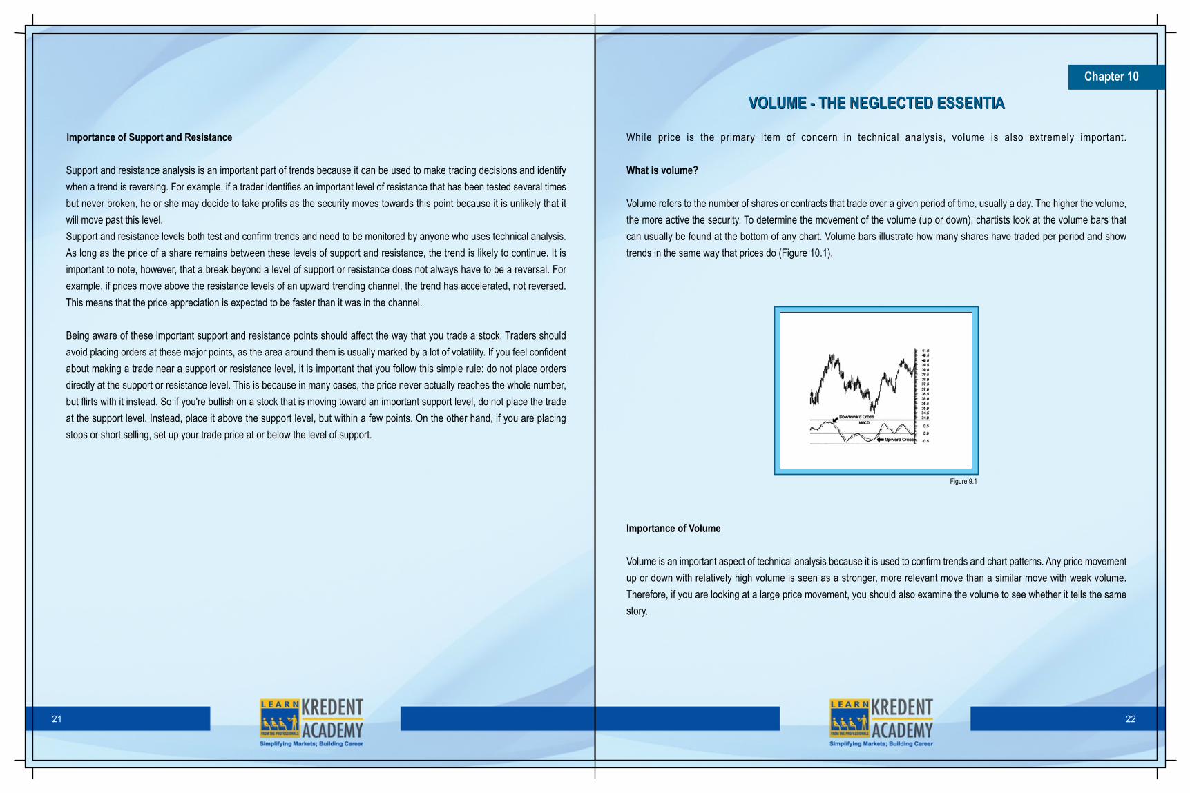
While price is the primary item of concern in technical analysis, volume is also extremely important.
What is volume?
Volume refers to the number of shares or contracts that trade over a given period of time, usually a day. The higher the volume,the more active the security. To determine the movement of the volume (up or down), chartists look at the volume bars thatcan usually be found at the bottom of any chart. Volume bars illustrate how many shares have traded per period and showtrends in the same way that prices do (Figure 10.1).
VOLUME - THE NEGLECTED ESSENTIAVOLUME - THE NEGLECTED ESSENTIA
Importance of Volume
Volume is an important aspect of technical analysis because it is used to confirm trends and chart patterns. Any price movementup or down with relatively high volume is seen as a stronger, more relevant move than a similar move with weak volume.Therefore, if you are looking at a large price movement, you should also examine the volume to see whether it tells the samestory.
Figure 9.1

23 24
Say, for example, a stock jumps 5% in one trading day after being in a long downtrend. Is this a sign of a trend reversal? Thisis where volume helps traders. If volume is high during the day relative to the average daily volume, it is a sign that the reversalis probably for real. On the other hand, if the volume is below average, there may not be enough conviction to support a truetrend reversal.
Volume should move with the trend. If prices are moving in an upward trend, volume should increase (and vice versa). If theprevious relationship between volume and price movements starts to deteriorate, it is usually a sign of weakness in the trend.For example, if the stock is in an uptrend but the up trading days are marked with lower volume, it is a sign that the trend isstarting to lose its legs and may soon end.
When volume tells a different story, it is a case of divergence, which refers to a contradiction between two different indicators.The simplest example of divergence is a clear upward trend on declining volume.
Volume and Chart Patterns
The other use of volume is to confirm chart patterns. Patterns such as head and shoulders, triangles, flags, and other pricepatterns can be confirmed with volume. In most chart patterns, there are several pivotal points that are vital to what the chartis able to convey to chartists. Basically, if the volume is not there to confirm the pivotal moments of a chart pattern, the qualityof the signal formed by the pattern is weakened.
Volume precedes price
Another important idea in technical analysis is that price is preceded by volume. Volume is closely monitored by techniciansand chartists to form ideas on upcoming trend reversals. If volume starts decreasing in an uptrend, it is usually a sign that theupward run is about to end.
Now that we have a better understanding of some of the important factors of technical analysis, we can move on to charts,which help to identify trading opportunities in price movements.
Open Interest
Open Interest is the number of contracts that are held by buyers or are owned by short sellers in a given market on a givenday. It shows the number of existing contracts. Open interest equals either a total long or a total short position.
Open Interest is also said to be the total number of options and/or futures contracts that are not closed or delivered on aparticular day. Open interest applies primarily to the futures market.
Technicians usually plot open interest as a line below the price bars (Figure 10.2 below). Some chart services also plotaverage open interest for the past several years. Open interest gives important messages when it deviates from its seasonalnorm. It varies from season to season in many markets because of huge hedging by commercial interests at various stagesin production cycles.
Stock market shares are traded for as long as a company stays in the business as a separate unit. On the other hand, futuresand options traders deal in contracts for a future delivery that expires at a pre-defined time.
A futures or options buyer who wants to accept a delivery and a seller who wants to deliver, have to wait until the first noticeday. This waiting period ensures that the numbers of contracts that are long and short are always equal.
However, very few futures and options traders plan to deliver or to accept delivery. They usually close out their positions beforethe first notice day.Open interest rises or falls depending upon whether new traders enter the market or old traders exit it. In this context, thefollowing points must be noted:
1. It rises only when a new buyer and a new seller enter the market, thereby creating a new contract.2. It falls when a trader who is long, trades with someone who is short. When both of them close out their positions,
open interest falls by one contract because one contract disappears.3. If a new bull buys from an old bull that is getting out of his position, open interest remains unchanged.4. Open interest also does not change when a new bear sells to an old bear who needs to buy because he is
closing out his short position.
The following table will serve as a ready reckoner for the above:
Buyer Seller Open Interest
New Buyer New seller Increases
New buyer Former buyer sells Unchanged
Former seller buys to cover New seller Unchanged
Former seller buys to cover Former buyer sells Decrease

25 26
Figure 10.2 – Open Interest
As already discussed, open interest (01) reflects the number of all short and long positions in any futures or options market.
It depends on the intensity of conflict between bulls and bears.
The findings of the above can be enumerated as under:
1. Rising 01 indicates that the conflict between bulls and bears is becoming more intense and confirms the existing
trend.
2. Rising OI during uptrends show that it is safe to add to long positions (A and D).
3. Flat 01 shows that fewer losers are entering the market. This means that a mature trend is nearing its end and
it is time to take profits or tighten stops (8 and E).
4. Falling 01 shows that losers are leaving the market and winners are cashing in - that a trend is nearing its end.
5. As a fire cannot continue when fuel is withdrawn, a sharp drop in 01during a trend signals the nearing of a
reversal (C and F).
6. At the right edge of the chart, cocoa prices have stabilized after falling in October and 01 is flat. It shows that
the decline in cocoa has shaken out weak bulls and the uptrend is ready to resume. It is time to go long, with
a protective stop below the recent lows.
Chapter 11
What is a chart?
In technical analysis, charts are similar to the charts that you see in any business setting. A chart is simply a graphical
representation of a series of prices over a set time frame. It helps to identify trading opportunities in prices movements. For
example, a chart may show a stock's price movement over a one-year period, where each point on the graph represents the
closing price for each day the stock is traded.
CHARTCHART
Figure 11.1
Figure11.1 above is an illustration of a basic chart. It is a representation of the price movements of a stock over a one and a
half year period. The bottom of the graph, running horizontally (x-axis) is the date or time scale. On the right hand side, running
vertically (y-axis), is the price of the security. By looking at the graph, we cannot ice that in October 2004 (Point # 1), the price
of this stock was around $245, whereas in June 2005 (Point# 2), the stock's price was around $265. This tells us that the stock
has risen between October 2004 andJune2005.
Properties of Charts
The following are some of the properties of charts that one should be aware of when looking at a chart, as these factors can
affect the information that is provided:

27 28
The Time Scale
The time scale refers to the range of dates at the bottom of the chart, which can vary from decades to seconds. The most
frequently used time scales are intraday, daily, weekly, monthly, quarterly and annually. It should be noted that the shorter the
time frame, the more detailed the chart. Each data point can represent the closing price of the period or show the open, the
high, the low and the close depending on the chart used.
Intraday charts plot price movements within the period of one day. This means that the time scale could be as short as five
minutes or could cover the whole trading day from the opening bell to the closing bell.
Daily charts are comprised of a series of price movements in which each price point on the chart is a full day's trading condensed
into one point. Again, each point on the graph can be simply the closing price or can entail the open, high, low and close for
the stock over the day. These data points are spread out over weekly, monthly and even yearly time scales to monitor both
short-term and intermediate trends in price movement.
Weekly, monthly, quarterly and yearly charts are used to analyze long term trends in the movement of a stock's price. Each
data point in these graphs will be a condensed version of what happened over the specified period. So for a weekly chart, each
data point will be a representation of the price movement of the week.
Price Scale and Price Point
The price scale is on the right-hand side of the chart. It shows a stock's current price and compares it to past data points. This
may seem like a simple concept in that the price scale goes from lower prices to higher prices as you move along the scale
from the bottom to the top. The problem, however, is in the structure of the scale itself. A scale can either be constructed in a
linear (arithmetic) or logarithmic way, and both of these options are available on most charting services.
Refer to the Figure 11.2 below. If a price scale is constructed using a linear scale, the space between each price point (10,
20, 30, 40) is separated by an equal amount. A price move from 10 to 20 on a linear scale is the same distance on the chart
as a move from 40 to 50. In other words, the price scale measures moves in absolute terms and does not show the effects of
percent change.
Now refer to the Figure 11.3 below. If a price scale is in logarithmic scale, then the distance between points will be equal in
terms of percent change. A price change from 10 to 20 is a 100% increase in the price, while a move from 40 to 50 is only a
25% change, even though they are represented by the same distance on a linear scale. On a logarithmic scale, the distance
of the 100% price change from 10 to 20 will not be the same as the 25% change from 40 to 50. In this case, the move from
10 to 20 is represented by a larger space on the chart while the move from 40 to 50, is represented by a smaller space because,
percentage-wise, it indicates a smaller move. In Figure 11.2, the logarithmic price scale on the right leaves the same amount
of space between 10 and 20 as it does between 20 and 30 because both represent 100% increase.
Figure 11.2
Figure 11.3

29 30
Types of Charts
There are four main types of charts that are used by investors and traders depending on the information that they are seeking
to derive and their individual skill levels. The chart types are: the line chart, the bar chart, the candlestick chart and the point
and figure chart. In the following section, we will focus on the S&P 500 Index during the period of January 2006 through May
2006. Notice how the data used to create the charts is the same, but the way the data is plotted and shown in the charts is
different.
Line Charts
The most basic of the four charts is the line chart because it represents only the closing prices over a set period of time. The
line is formed by connecting the closing prices over the time frame. Line charts do not provide visual information of the trading
range for the individual points such as the high, low and opening prices. However, the closing price is often considered to be
the most important price in stock data compared to the high and low for the day and this is why it is the only value used in line
charts.
Bar Charts
The bar chart expands on the line chart by adding several more key pieces of information to each data point. The chart is made
up of a series of vertical lines that represent each data point. This vertical line represents the high and low for the trading period,
along with the closing price. The close and open are represented on the vertical line by a horizontal dash. The opening price
on a bar chart is illustrated by the dash that is located on the left side of the vertical bar. Conversely, the close is represented
by the dash on the right. Generally, if the left dash (open)
Figure 11.4 – Line Chart
is lower than the right dash (close) then the bar will be shaded black, representing an up period for the stock, which means
that it has gained value. A bar that is coloured red signals that the stock has gone down in value over that period. When this
is the case, the dash on the right (close) is lower than the dash on the left (open)
Candlestick Charts
The candlestick chart is similar to a bar chart, but it differs in the way that it is visually constructed. Similar to the bar chart,
the candlestick also has a thin vertical line showing the period's trading range. The difference comes in the formation of a wide
bar on the vertical line, which illustrates the difference between the open and close.
Figure 11.5 – Bar Charts
Figure 11.6 – Candlestick Charts
Point and Figure Charts
The point and figure chart is not very popular, nor is it widely used by the average investor, but it has had a long history of use
dating back to the first technical traders. This type of chart reflects price movements and is not as concerned about time and
volume in the formulation of the points. The point and figure chart removes the noise, or insignificant price movements, in the
stock, which can distort the traders' view of the price trends. These types of charts also try to neutralize the skewing effect that
time has on chart analysis.
31 32
Charts are one of the most fundamental aspects of technical analysis. It is important that you clearly understand what is being
shown on a chart and the information that it provides.
Figure 11.7 – Point & Figure Charts
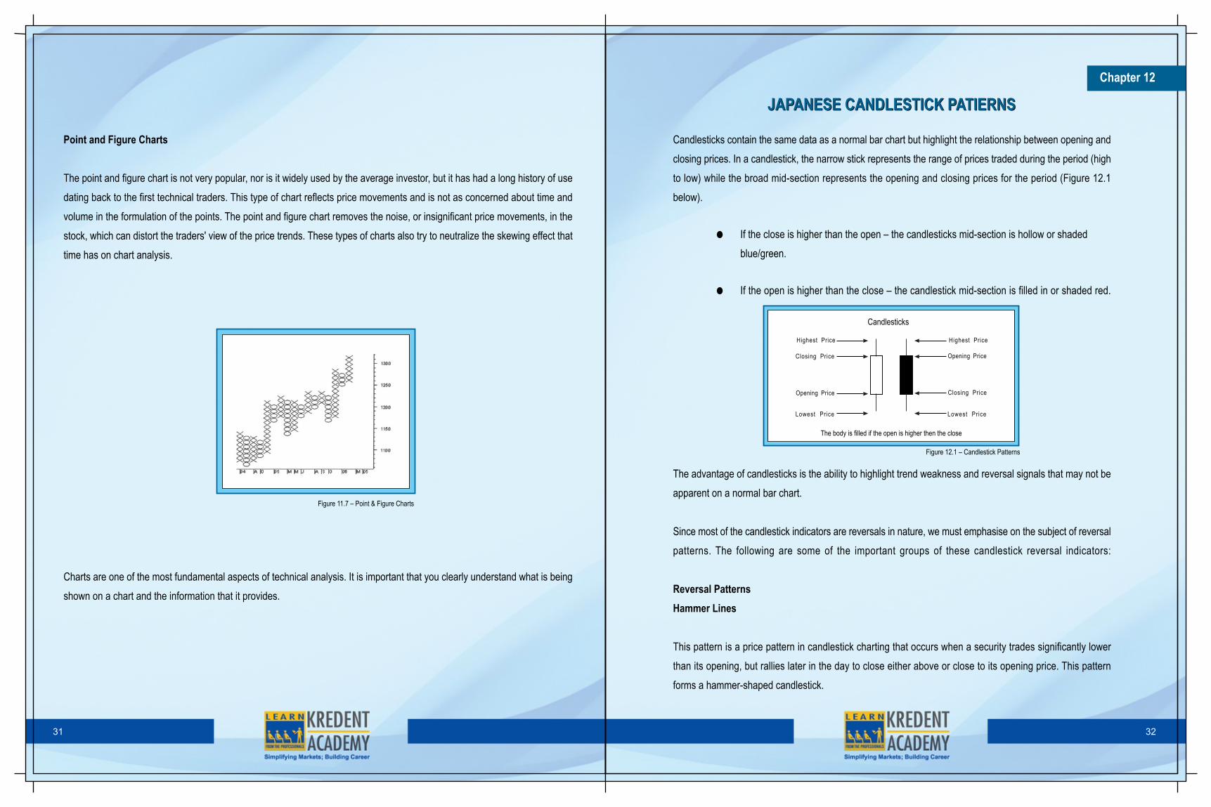
Candlesticks contain the same data as a normal bar chart but highlight the relationship between opening and
closing prices. In a candlestick, the narrow stick represents the range of prices traded during the period (high
to low) while the broad mid-section represents the opening and closing prices for the period (Figure 12.1
below).
• If the close is higher than the open – the candlesticks mid-section is hollow or shaded
blue/green.
• If the open is higher than the close – the candlestick mid-section is filled in or shaded red.
Chapter 12
JAPANESE CANDLESTICK PATIERNSJAPANESE CANDLESTICK PATIERNS
The advantage of candlesticks is the ability to highlight trend weakness and reversal signals that may not be
apparent on a normal bar chart.
Since most of the candlestick indicators are reversals in nature, we must emphasise on the subject of reversal
patterns. The following are some of the important groups of these candlestick reversal indicators:
Reversal Patterns
Hammer Lines
This pattern is a price pattern in candlestick charting that occurs when a security trades significantly lower
than its opening, but rallies later in the day to close either above or close to its opening price. This pattern
forms a hammer-shaped candlestick.
Candlesticks
The body is filled if the open is higher then the close
Highest Price
Closing Price
Opening Price
Lowest Price
Highest Price
Opening Price
Closing Price
Lowest Price
Figure 12.1 – Candlestick Patterns

A hammer occurs after a security has been declining, possibly suggesting that the market is attempting to determine a bottom.
However, it does not mean that the bullish investors have taken full control of a security; it simply indicates that the bulls are
strengthening.
Hanging-man Lines
This pattern is a bearish candlestick pattern that forms at the end of an uptrend. It is created when there is a significant sell-
off near the market open price, but buyers are able to push this stock back up so that it closes at or near the opening price.
Generally the large sell-off is seen as an early indication that the bulls (buyers) are losing control and demand for the asset is
waning
33 34
the highest price for the day
Opening Price
Closing Price
Body is black (or red) ifstock closed lower, Bodyis white (or green) if itclosed higher
the lowest price for the day
Figure 12.2 – Candlestick Reversal Pattern: Hammer Lines
Engulfing Pattern – Bullish
This chart pattern forms when a large white candlestick that completely eclipses or "engulfs" the previous day's candlestick
follows a small black candlestick. The shadows or tails of the small candlestick are short, which enables the body of the large
candlestick to cover the entire candlestick from the previous day.
Figure 12.3 – Candlestick Reversal Pattern: Hanging-man Line
This trend suggests that the bulls have taken control of a security's price movement from the bears. This type of pattern usually
accompanies a declining trend in a security, suggesting that a low or end to a security's decline has occurred. However, as
usual in candlestick analysis, the trader must take the preceding and the following days' prices into account before making
any decisions regarding the security.
Engulfing Pattern – Bearish
A chart pattern that consists of a small white candlestick with short shadows or tails followed by a large black candlestick that
eclipses or "engulfs" the small white one.
A bearish engulfing pattern may provide an indication of a future bearish trend. This type of pattern usually accompanies an
uptrend in a security, possibly signaling a peak or slowdown in its advancement. However, whenever a trader analyzes any
candlestick pattern, before making any decisions, it is important for him or her to consider the prices of the days that precede
and follow the formation of the pattern.
smaller body
closing price
opening price
the highest price for the day
the lowest price for the day
Figure 12.2 – Candlestick Reversal Pattern: Hammer Lines
Figure 12.4 – Candle Reversal Pattern: Engulfing Pattern – Bullish
smaller body
closing price
opening price
the highest price for the day
the lowest price for the day
Figure 12.2 – Candlestick Reversal Pattern: Hammer Lines
Figure 12.5 – Candlestick reversal Pattern: Engulfing Pattern – Bearish

35 36
Stars
Another group of fascinating reversal patterns is that which includes stars. A Star is a small real body that gaps away from thelarge real body preceding it. It is a warning that the prior trend may be ending. The star is a part of 4 reversal patterns thatinclude the following:
i. The Morning Star
This is a bullish candlestick pattern that consists of 3 candles that have demonstrated the following characteristics:
• The first bar is a large red candlestick located within a defined downtend
• The second bar is a small-bodied candle (either red or white) that closes below the first red bar.
• The last bar is a large white candle that opens above the middle candle and closes near the center of the firstbar's body.
As shown by the chart below (Figure 12.8), this pattern is used by traders as an early indication that the downtrend is aboutto reverse.
A morning star pattern can be useful in determining trend changes, particularly when used in conjunction with other technicalindicators. Many traders also use price oscillators such as the MACD (Moving Average Convergence Divergence) and RSI(Relative Strength Index), explained later in this tutorial, to confirm the reversal.
Figure 12.8 – The Morning Star
Dark Cloud Cover
In candlestick charting, Dark Cloud Cover is a pattern where a black candlestick follows a long white candlestick. It can be anindication of a future bearish trend.
Essentially, the large black candle is forming a "dark cloud" over the preceding bullish trend. The dark cloud must have a closingprice that is :
1. Within the price range of the previous day, but2. Below the mid-point between open and closing prices of the previous day.
Piercing PatternThis refers to a day's trading activity that often signals the end of a small to moderate downward trend. Following a closingdown day with a good-sized trading range, the next day's trading gap (drops) lowers, but also covers at least half of the upwardlength of the previous day's real body (the range between the opening and closing prices), and then closes up for the day.A piercing pattern can serve as an indicator that it is time to either buy a stock or close out short positions, because he stockmay be trending upwards soon. It should not, however, be used as a stand-alone indicator, but rather compared against otherbullish and bearish indicators.
Figure 12.6 – Candlestick Reversal Patterns: Dark Cloud Cover
the highest price for the dayClosing price
Large white candlestick
opening price
the lowest price for the day
opening price
confirmation
Figure 12.7 – Candlestick Reversal Pattern: Piercing Pattern
Closing at leasthalfwaythe prior body
Loweropening price
Strongblack body

37 38
ii. The Evening Star
This is a bearish candlestick pattern consisting of three candles that have demonstrated the following characteristics:
• The first bar is large white candlestick located within an uptrend.
• The middle bar is a small-bodied candle (red-white) that closes above the first white bar.
• The last bar is a large red candle that opens below the middle candle and closes near the center of the firstbar's body.
As shown by the chart below (Figure 12.9), this pattern is used by traders as an early indication that the uptrend is about toreverse.
Figure 12.9 – The Evening Star
Evening star formations can be useful in determining trend changes, particularly when used in conjunction with other indicators.Many traders use price oscillators and trend lines to confirm this candlestick pattern.
iii. The Morning and Evening Doji Stars
A doji is a candle that lacks a real body, meaning the open and close of the bar are the same or have a very small difference.It has a strong significance after substantial advances or declines. The lack of direction that the doji illustrates can offer a potentreversal signal, especially if it is followed by a candle in the anticipated direction. Therefore, when a doji represents the starof the morning and evening star pattern, you need to take notice. When a doji represents the morning star and evening star,the formations are known as the morning doji star and evening doji star.
Stars
Another group of fascinating reversal patterns is that which includes stars. A Star is a small real body that gaps away from thelarge real body preceding it. It is a warning that the prior trend may be ending. The star is a part of 4 reversal patterns thatinclude the following:
i. The Morning Star
This is a bullish candlestick pattern that consists of 3 candles that have demonstrated the following characteristics:
• The first bar is a large red candlestick located within a defined downtend
• The second bar is a small-bodied candle (either red or white) that closes below the first red bar.
• The last bar is a large white candle that opens above the middle candle and closes near the center of the firstbar's body.
As shown by the chart below (Figure 12.8), this pattern is used by traders as an early indication that the downtrend is aboutto reverse.

39 40
An extremely powerful version of the doji star is known as the abandoned baby top or abandoned baby bottom. This patternis equivalent to what we heard of through using bar charts, the island reversal. The abandoned baby candlestick has a dojias the second candle with a gap on both sides.
Gap Gap
Abandoned Baby
Gap Gap
Abandoned Baby
Figure 12.11 – The Abandoned Baby Top and The Abandoned Baby Bottom
Figure 12.10 – The Evening Doji Star and The Morning Star.
iv. Shooting Star and The Inverted Hammer
A type of candlestick formation that results when a security's price, at some point during the day, advances well above theopening price but closes lower than the opening price.
Figure 12.12 – Shooting Star
the highest price for the day
open price
closing price
the lowost price for the day
In order for a candlestick to be considered a shooting star, the formation must be on an upward or bullish trend. Furthermore,the distance between the highest price for the day and the opening price must be more than twice as large as the shootingstar's body. Finally, the distance between the lowest price for the day and the closing price must be very small or non-existent.A shooting star shaped candlestick, after a downturn, could be a bullish signal. Such a line is called an Inverted Hammer. Figure12.13 below illustrates that an inverted hammer looks like a shooting star line with its long upper shadow and small real bodyat the lower end of the range. However, while the shooting star is a top reversal line, the inverted hammer is a bottom reversalline. As with a regular hammer, the inverted hammer is a bullish pattern after a downtrend.
Figure 12.13 – Inverted Hammer
The Inverted Hammer pattern is a two candle, bottom reversal pattern, but requires a third candle for confirmation, becauseof the way the pattern is formed.
More Reversal Patterns
The reversal formations discussed above, namely, reversal patterns and stars, are comparatively strong reversal signals. Theyshow that the bulls have taken over from the bears (as in the bullish engulfing pattern, a morning star, or a piercing pattern)or that the bears have wrested control from the bulls (as in the bearish engulfing pattern, the evening star, or the dark-cloudcover). We shall now discuss more reversal indicators which are usually, but not always, less powerful reversal signals.
Harami Pattern
The harami pattern (see Figure 12.14 below) is a small real body which is contained within a prior relatively long real body.'Harami' is an old Japanese term which means 'pregnant'. The long candlestick is 'the mother' candlestick and the smallcandlestick is the 'baby' or 'foetus'. The harami pattern is the reverse of the engulfing pattern. In the engulfing pattern, a lengthy

41 42
real body engulfs the preceding small real body. For the harami, a small real body follows an unusually long real body.
Figure 12.14 – The Harami Pattern
i. Bullish Harami Pattern
This is a candlestick chart pattern in which a large candlestick is followed by a smaller candlestick whose body is located withinthe vertical range of the larger body. In terms of candlestick colors, the bullish harami is a downtrend of negative-colored (black)candlesticks engulfing a small positive (white) candlestick, giving a sign of a reversal of the downward trend.
Because the bullish harami indicates that the falling trend (bearish trend) may be reversing, it signals that it is a good time toenter into a long position. The smaller the second (white) candlestick, the more likely the reversal.
smaller bodyclosing price
opening price
the highest price for the day
the lowest price for the day
body is black (or red) ifstock closed lower. Bodyis white (or green) if itclosed higher
Figure 12.15 – Bullish Harami Pattern
i. Bearish Harami Pattern
This is a candlestick pattern which is indicated by a large candlestick followed by a much smaller candlestick where in thatbody is located within the vertical range of the larger candle's body. Such a pattern is an indication that the previous upwardtrend is coming to an end.
Figure 12.16 – Bearish Harami Pattern
the highest price for the day
Closing price
opening price
the lowest price for the day
smaller body
body is black (or red) ifstock closed lower. Bodyis white (or green) if itclosed higher
A bearish harami may be formed from a combination of a large white or black candlestick and a smaller white or black candlestick.The smaller the second and lestick, the more likely the reversal. When a large white candle stick is followed by a small blackcandlestick, it is thought to be a strong sign of a trend ending.Harami Cross
This candlestick pattern is indicated by a large candlestick followed by a doji that is located within the top and bottom of thecandlestick's body. This indicates that the previous trend is about to reverse.
the highest price for the dayclosing price
body is black (or red) ifstock closed lower. Bodyis white (or green) if itclosed higher
opening price
the lowest price for the day
Doji (cross)
the highest price for the dayopening price
closing price
body is black (or red) ifstock closed lower. Bodyis white (or green) if itclosed higher
the lowest price for the day
Bearish Harami Cross
Bearish Harami Cross
Doji (cross)
Figure 12.17 Harami Cross – Bearish & Bullish

43 44
A Harami cross can be either bullish or bearish, depending on the previous trend (Figure 12.17 above). The appearance of aHarami Cross, rather than a smaller body, increases the likelihood that the trend will reverse.
Tweezer Tops and Bottoms
The Candlestick theory recognizes both a tweezer top and a tweezer bottom. The tweezers formation always involves twocandles. At a tweezer top, the high price of two nearby sessions is identical. Meanwhile, at a tweezer bottom, the low price oftwo sessions that come in close succession is the same.
In some instances, the tweezer bottom is formed by two real candlestick bodies that make an identical low. In other instances,the lower shadows of two nearby candles touch the same price level and the stock then bounces higher. Meanwhile, a thirdpossibility is that the lower shadow of one day and the real body of a nearby session hit the same bottom level.Tweezers can also be defined as a pattern found in technical analysis of options trading. Tweezer patterns occur when two ormore candlesticks touch the same bottom for a tweezer bottom pattern or top for a tweezer top pattern. This type of patterncan be made with candlestick charts of various types.
Tweezer bottoms are considered to be short-term bullish reversal patterns. Tops are bearish, and either end means that buyersor sellers were not able to push the top or bottom any further. Both types of patterns require close observation and researchin order to be interpreted and used correctly.
Continuation Pattern
Most candlestick signals are trend reversals. However, there are a group of candlestick patterns which are continuation indicators.As the Japanese express it, "there are times to buy, times to sell, and times to rest." Many of these patterns imply a time ofrest, a breather, before the market resumes its prior trend.
Figure 12.18 Tweezer Top Patterns
Windows
A window is a gap between the prior and the current session's price extremes. It can be said to be a break between prices ona chart that occurs when the price of a stock makes a sharp move up or down with no trading occurring in between. Suchwindows, also referred to as gaps, can be created by factors such as regular buying or selling pressure, earnings announcements,a change in an analyst's outlook or any other type of news release.
Figure 12.20 – Windows or Gaps
An example of two different gaps can be seen in the chart above (Figure 12.20). Notice how the stock closes the trading sessionbefore the first gap at $50 and opens the next trading day near $46 with no trading occurring between the two prices. Gapsare a regular occurrence in all financial markets. However, they are rarely seen in the forex market since it is highly liquid andtrades 24 hours a day.
Figure 12.21 below shows an open window that forms in an uptrend. There is a gap between the prior upper shadow and thissession's lower shadow.
Window
Closed WindowBut No SellingFollow Through
Figure 12.21 – Window in an uptrend

45 46
Figure 12.22 – Window in a downtrend
Window
Figure 12.22 below shows a window in a downtrend. It shows no price activity between the previous day's lower shadow andthe current day's upper shadow.
Upward/ Upside Tasuki Gap
The Upside Tasuki Gap is a three day candlestick continuation pattern. The pattern starts with a green candlestick that hasgapped above the previous green candlestick. The third and final candlestick is a red candlestick that opens inside the bodyof the second green candlestick. Traders should go long on the close of the third candlestick. Traders should trade in thedirection of the Upside Tasuki Gap, which is a defined uptrend.
Figure 12.23 – Upward Tasuki Gap
Gap up
Downward Tasuki Gap
The Downside Tasuki Gap is a three day candlestick continuation pattern. The pattern starts with a red candlestick that hasgapped below the previous red candlestick. The third and final candlestick is a green candlestick that opens inside the bodyof the second red candlestick. Traders should go short on the close of the third candlestick. They should trade in the directionof the Downside Tasuki Gap, which is a defined up downtrend.
High-price and Low-price Gapping Plays
After a sharp one to two session advance, it is normal for the market to consolidate the gains. Sometimes this consolidationis by a series of small real bodies. A group of small real bodies after a strong session tells us that the market is undecided.However, if there is an upside gap on the opening (a window) from these small real bodies, it is time to buy. This is high-pricegapping play pattern (Figure 12.25 below), so called because prices hover near their recent highs and then gaps to the upside.
Figure 12.24 –Downward Tasuki Gap
Gap Downside
Figure 12.25 – High-price Gapping Play
Window

47 48
Contrary to the general belief, a low-price gapping play is not the bearish counterpart of the high-price gapping play. The low-price gapping play (Figure 12.26 below) is a downside window from a low-price congestion band. This congestion band (aseries of small real bodies) initially stabilized a steep one to two session decline. At first, this group of small candlesticks givesthe appearance that a base is forming. The break to the downside via a window dashes these bullish hopes.
The side-by-side white candlesticks described previously are rare. Even more rare are side-by-side white lines which gap lower.These are called downgap side-by-side white lines (Figure 12.28 below). In a downtrend, the side-by-side white lines are alsoa continuation pattern. That is, prices should continue to lower. The reason this pattern is not bullish (as is the upgap variety)is because in a falling market, these white lines are viewed as short covering.
Gapping Side-by-side White Lines
In an uptrend, an upward-gapping white candlestick follows the next session by another similar sized white candlestick withabout the same opening is a bullish continuation pattern. This two candlestick pattern is referred to as upgap side-by-side whitelines (Figure 12.27 below). If the market closes above the higher of the side-by-side white candlesticks, another leg up shouldunfold.
Window
Figure 12.26 – Low price Gapping Play
Window
Figure 12.27 – Gapping Side-by-side White Lines in an uptrend
Rising and Falling Three Methods
These three methods include the bullish rising three methods and the bearish falling three methods. These are both continuouspatterns.
i. Bullish Rising Three Methods Pattern
The Rising Three Methods is a candlestick continuation pattern which indicates the continuation of a bullish trend even aftera temporary halt in trading. It is a multiple candlestick pattern which includes more than three candlesticks (ideally include fivecandlesticks) of which the first and last candlesticks are long bullish (white/colorless) candlesticks. The middle candlesticksmay be all bearish (black/colored) or can be a mixture of bullish and bearish candlesticks. Bullish rising three methods is highlyreliable when all middle candlesticks are bearish.
This pattern occurs when bears are unable to bring the prices down below first day's range. This boosts the confidence of thebulls and the prices are then taken to the new highs.
Figure 12.28 – Gapping Side-by-side White Lines in a Downtrend
Window
Figure 12.29 – Bullish Rising Three Methods Pattern
Bullish Rising Three Methods

49 50
This formation occurs when the bulls are unable to bring the price to new highs after a significant downtrend. It boosts theconfidence of bears and prices are then taken to new lows.
This is a highly reliable pattern of trend continuation. Reliability increases with shortening of real-body of middle candlesticksand reduction in trading volume on middle days. Confirmation of trend-continuation is still suggested which can be a newcandlestick with lower closing.
The Magic Doji
A doji is a candlestick in which the opening and closing prices are the same. If prices close very close to the same level (sothat no real body is visible), then that candle is read as a doji. A doji candlestick looks like a cross, inverted cross, or plus sign.Alone, doji are neutral patterns. There are four types of dojis:Common Doji
A Common Doji has a relatively small trading range. It reflects indecision in some manner.
This pattern is considered to be a highly reliable trend continuation pattern. Reliability of the pattern increases with shortening
of real-bodies (doji formations) of middle candlesticks and decrease in trading volumes on middle days. Confirmation is still
suggested with this formation which can be a bullish candlestick on new day.
i. Bearish Falling Three Methods Pattern
The Falling Three Methods is a candlestick pattern which indicates bearish market continuation even after a temporary halt in
trend. This is a multiple candlestick pattern which includes more than three candlesticks, of wt1ich,the first and the last will be
long bearish candlesticks. The middle candlesticks can be all white (bullish or colorless) or a mix of white and black (bearish
or colored) candlesticks. Reliability is the highest when all middle candlesticks are bullish.
Figure 12.30 – Bearish Falling Three Methods Pattern
Falling Three Methods
Long-legged Doji
A long-legged doji is a far more dramatic candle. It signifies that prices moved far higher on the day, but that profit taking haskicked in. Typically, it leaves a very large upper shadow. A close below the midpoint of the candle shows a lot of weakness.
Doji
Figure 12.31 – Common Doji / Doji
Long - LeggedDoji
Figure 12.32 – Long legged DojiGravestone Doji
A gravestone doji, as the name implies, is probably the most ominous candle of all. On the day this candle is formed, pricesrally, but cannot stand the 'altitude' they achieved. By the end of the day, they come back and close at the opening level.
GravestoneDoji
Figure 12.33 – Gravestone Doji
Dragonfly Doji
A dragonfly doji depicts a day on which prices opened at a high, sold off, and then returned to the opening price. Dragonfliesare fairly unusual. However, when they do occur, they often resole bullishly (provided the stock is not already overbought).
DragonflyDoji
Figure 12.34 _ Dragobfly Doji
The philosophy is that a doji can be a significant warning and that it is better to attend to a false warning than to ignore a realone. To ignore a doji, with all its inherent implications, could be dangerous.

51 52
What are Chart Patterns?
A chart pattern is a distinct formation on a stock chart that creates a trading signal, or a sign of future price movements. Chartistsuse these patterns to identify current trends and trend reversals and to trigger buy and sell signals.
The theory behind chart patterns is based on the assumption that "history repeats itself", as discussed earlier. The idea hereis that certain patterns are seen many times, and that these patterns signal a certain high probability move in a stock. Basedon such historic trend of a chart pattern setting up a certain price movement, chartists look for these patterns to identify tradingopportunities.
While there are general ideas and components related to every chart pattern, there is no chart pattern that will tell you with100% certainty where a security is headed. This creates some leeway and debate as to what a good pattern looks like, andis a major reason why charting is often seen as more of an art than a science.
Types of Chart Patterns
Essentially, there are 2 types of patterns within this area of technical analysis. These patterns can be found over charts of anytimeframe: Reversal Patterns
A reversal pattern signals that a prior trend will reverse upon the completion of the pattern.
i. Head and Shoulder – This is one of the most popular and reliable chart patterns in technical analysis. Head and shouldersis reversal chart pattern that when formed, signals that the security is likely to move against the previous trend.
Chapter 13
CHART PATTERNSCHART PATTERNS
ii. Double Tops and Bottoms - This chart pattern is another well-known pattern that signals a trend reversal - it is considered
to be one of the most reliable patterns and is commonly used. These patterns are formed after a sustained trend and signal
to chartists that the trend is about to reverse. The pattern is created when a price movement tests support or resistance levels
twice and is unable to break through. This pattern is often used to signal intermediate and long-term trend reversals.
Figure 13.2 – Head and Shoulders Bottom or Inverse Head and Shoulders
Figure 13.3 – Double Top Pattern Figure 13.4 – Double Bottom Pattern
Figure 13.1 - Head and shoulders Top Pattern

53 54
iii. Triple Tops and Bottoms - These are another type of reversal chart pattern in chart analysis. These are not as prevalent incharts as head and shoulders and double tops and bottoms, but they act in a similar fashion. These two chart patterns areformed when the price movement tests a level of support or resistance three times and is unable to break through; this signalsa reversal of the prior trend.
iv. Rounding Bottom - A rounding bottom, also referred to as a saucer bottom, is a long-term reversal pattern that signals ashift from a downward trend to an upward trend. This pattern is traditionally thought to last anywhere from several months toseveral years.
Figure 13.6 – Triple Bottom Pattern
Figure 13.7 – Rounding Bottom Pattern
Continuation Patterns
A continuation pattern signals that a trend will continue once the pattern is complete.
i. Cup and Handle - A cup and handle chart is a bullish continuation pattern in which the upward trend has paused but will
continue in an upward direction once the pattern is confirmed.
Figure 13.8 – Cup and Handle Pattern
ii. Triangles - Triangles are one of the most well-known chart patterns used in technical analysis. The three types of triangles,
which vary in construct and implications, are symmetrical triangle, ascending triangle and descending triangle. These chart
patterns are considered to last anywhere from a couple of weeks to several months.
Figure 13.9 – Symmetrical Triangle Pattern

55 56
iii. Flag and Pennant - These two short-term chart patterns are continuation patterns that are formed when there is a sharp
price movement followed by a generally sideways price movement. This pattern is then completed upon another sharp price
movement in the same direction as the move that started the trend. The patterns are generally thought to last from one to three
weeks.
Figure 13.10 – Ascending Triangle Pattern
Figure 13.11 – Descending Triangle Pattern
Figure 13.11 – Descending Triangle Pattern
Figure 13.10 – Ascending Triangle Pattern
Other Patterns
i. Wedge - The wedge chart pattern can be either a continuation or reversal pattern. It is similar to a symmetrical triangle except
that the wedge pattern slants in an upward or downward direction, while the symmetrical triangle generally shows a sideways
movement. The other difference is that wedges tend to form over longer periods, usually between three and six months. The
fact that wedges are classified as both continuation and reversal patterns can make reading signals confusing. However, at
the most basic level, a falling wedge is bullish and a rising wedge is bearish.
Figure 13.14 – Wedge Pattern
ii. Gaps - A gap in a chart is an empty space between a trading period and the following trading period. This occurs when
there is a large difference in prices between two sequential trading periods. Gap price movements can be found on bar charts
and candlestick charts but will not be found on point and figure or basic line charts.
Gaps generally indicate that some event of significance has occurred in relation to a security, such as a better than- expected
earnings announcement.

57 58
Chapter 14
There are three main types of gaps - breakaway, runaway (measuring) and exhaustion. A breakaway gapforms at the start of a trend, a runaway gap forms during the middle of a trend and an exhaustion gap formsnear the end of a trend.
iii. Channels - A channel, or channel lines, can be described as the addition of two parallel trendlines thatact as strong areas of support and resistance. The upper trendline connects a series of highs, while the lowertrend line connects a series of lows. A channel can slope upward, downward or sideways. However, regardlessof the direction, the interpretation still remains the same. Traders will expect a given security to trade betweenthe two levels of support and resistance until it breaks beyond one of the levels. In this case, traders canexpect a sharp move in the direction of the break. Along with clearly displaying the trend, channels are mainlyused to illustrate important areas of support and resistance.
Figure 13.10 – Ascending Triangle Pattern
Figure 13.15 above illustrates a descending channel on a stock chart; the upper trendline has been placedon the highs and the lower trend line is on the lows. The price has bounced off these lines several times, andhas remained range-bound for several months. As long as the price does not fall below the lower line or movebeyond the upper resistance, the range-bound downtrend is expected to cont inue.
It is important to be able to understand and identify trends so that you can trade with them, and not againstthem. The following are the two important sayings in technical analysis that illustrate how important trendanalysis is for technical traders:
1. Trend is your friend2. Dont’t buck the trend
What are Moving Averages?
Chart patterns usually show a lot of variation in price movement. This can make it difficult for traders to getan idea of a security's overall trend. One simple method traders use to combat this is to apply moving averages.A moving average is the average price of a security over a set period of time. By plotting a security's averageprice, the price movement is smoothed out. Once the day-to-day fluctuations are removed, traders are betterable to identify the true trend and increase the probability that it will work in their favour.
Example: For a 5-day moving average you simply add the closing prices of the last five closings and dividethis sum by 5. You add each new closing price and skip the oldest. Thus, the number of closing pricesconsidered always remains constant at 5 days (Figure 14.2).
Day Close 5-day Total 5-day Average
21 4822 4023 4324 4125 3526 3927 3528 3729 2530 1831 3532 5033 4034 4535 5036 7037 7038 6039 7540 70
271 34.2186 37.2199 39.8205 41207 41.4198 39.6193 37.4187 37.4171 34.2154 30.8150 30165 33168 33.6188 37.6220 44255 51275 55295 59325 65345 69
Day Close 5-day Total 5-day Average
1 502 553 574 605 656 707 668 609 5010 5411 4512 4313 3314 4015 3516 3017 2518 3019 3520 33
x xx xx xx x
287 57.4307 61.4318 63.6321 64.2311 62.2300 60275 55252 50.4225 45215 43196 39.2181 36.2163 32.6160 32155 31153 30.6
Figure 14.1

59 60
Linear Weighted Average
This moving average indicator is the least common method out of the three and is used to address the problemof equal weights. The linear weighted moving average is calculated by taking the sum of all the closing pricesover a certain time period and multiplying them with the position of the data point and then dividing the totalby the sum of the number of periods. For example, in a five-day linear weighted average, today's closingprice is multiplied by 5, yesterday's price by 4 and so on until the first day in the period range is reached.These numbers are then added together and divided by the sum of the mult ipl iers.Exponential Moving Average (EMA)
This moving average calculation method uses a smoothing factor to place a higher weight on recent datapoints and is regarded as much more efficient method than the linear weighted average. Having an understandingof the calculation is not generally required for most traders because most charting packages do the calculationfor you. The most important thing to remember about the exponential moving average is that it is moreresponsive to new information relative to the simple moving average. This responsiveness is one of the keyfactors of why this is the moving average of choice among many technical traders. As you can see in Figure14.4 below, a 15-period EMA rises and falls faster than a 15-period SMA. This slight difference doesn't seemlike much, but it is an important factor to be aware of since it can affect returns.
Figure 14.3 – Simple Moving Average
Figure 14.2 – Price and 5-day Moving Average
However, whether you choose a 1O-day average or a 40-week average, the calculation is the same; insteadof adding 5 days, you add the closing prices of 10 days or 40 weeks and divide the sum by 10 or 40 respectively.
Functions of Moving Averages
Moving averages are popular for identifying price trends and are versatile in nature. They smooth outfluctuations in market prices thereby making it easier to determine underlying trends. Their other function isto signal significant changes in the direction as early as possible.
Types of Moving Averages
There are different types of moving averages that vary in the way these are calculated, but how each averageis interpreted remains the same. The calculations only differ in regards to the weight placed on the price data,varying from equal weight applied to each price point to more weight being applied to recent data. The threemost common types of moving averages are:Simple Moving Average (SMA)
This is the most common method used to calculate the moving average of prices. It simply takes the sumof all of the past closing prices over a given time period and divides the result by the number of prices usedin the calculation. For example, in a 10-day moving average, the last 10 closing prices are added togetherand then divided by 10. As you can see in Figure 14.3 below, a trader is able to make the average lessresponsive to changing prices by increasing the number of periods used in the calculation. Increasing thenumber of time periods in the calculation is one of the best ways to gauge the strength of the long-term trendand the likelihood that it will reverse.

61 62
Major Uses of Moving Averages
The following are some of the major uses of Moving Averages:
1. To identify current trends and trend reversals as well as to set support and resistance levels2. To quickly identify whether a security is moving in an uptrend or a downtrend depending on thedirection of the moving average. As you can see in Figure 14.5 below, when a moving average is headingupward and the price is above it, the security is in an uptrend. Conversely, a downward sloping movingaverage with the price below can be used to signal a downtrend.
Figure 14.4 – Exponential Moving Average
Figure 14.5
1. Another method of determining momentum is to look at the order of a pair of moving averages. When ashort-term average is above a longer-term average, the trend is up. On the other hand, a long-term averageabove a shorter-term average signals a downward movement in the trend.
2. Moving average trend reversals are interpreted in two main ways: when the price moves through a movingaverage and when it moves through moving average cross overs. The first common signal is when the pricemoves through an important moving average. For example, when the price of a security that was in an uptrendfalls below a 50-period moving average, like in Figure 14.6 below, it is a sign that the uptrend may be reversing.
Figure 14.5
5. Moving averages are a powerful tool for analyzing the trend in a security. They provide useful support and
resistance points and are very easy to use. The most common time frames that are used when creating
moving averages are the 200-day, 100-day, 50-day, 20-day and 1O-day.The 200-day average is thought to
be a good measure of a trading year, a 1OO-dayaverage of a half a year, a 50-day average of a quarter of
a year, a 20-day average of a month and 1O-day average of two weeks.
6. Moving averages help technical traders to smooth out some of the noise that is found in day-to-day price
movements, giving traders a clearer view of the price trend.
Trends in Moving Averages
The three basic trends that are followed in moving averages to track the various investment horizons are:
Long-term averages

63 64
Figure 14.7 – Long term average
On the monthly chart shown below (Figure 14.7), the 11-month moving average tracks the long-term trend.
Medium-term averages
On the weekly chart above, the 11-week moving average tracks the medium-term trend.
Figure 14.8 – Medium-term average
Short-term averages
On the daily chart on the right, the 11-day moving average tracks the short-term trend.
Figure 14.9 – Short-term average
However, instead of using three separate charts to illustrate the three basic trends, we often use a daily chartdisplaying all three moving averages. On the daily chart (as shown in Figure 14.10 below), the 11-monthmoving average equals the 233-day moving average, the 11-week average equals the 55-day average andthe 11-day remains the 11-day moving average.
Moving Average Crossover
Figure 14.10 – Daily chart displaying all the three moving averages.

65 66
Chapter 15
MOMENTUMMOMENTUM
The three moving averages discussed above are shown again here on the daily chart (Figure 14.10) - the11- day moving average (short-term trend), the 55-day moving average (medium-term trend) and the 233-day (long-term trend) moving average which tracks the long-term trend (we also track the more popular 200-day moving average). Displaying the three moving averages on one chart provides important signals basedon the moving average crossovers.
BUY and SELL signals are given:
• When the price crosses the moving average.
• When the moving average itself changes direction and
• When the moving averages cross each other
A short-term buy signal (B 1) is given when the price rises above the 11-day moving average. However, thebuy signal is confirmed when the 11-day average itself starts rising. The sell signals (51) are given in theopposite direction.
A medium-term buy signal (B2) is given when the price rises above the 55-day moving average and isconfirmed when the 55-day average itself starts rising and the 11-day average crosses above the 55-dayaverage. The sell signals (52) are given in the opposite direction.
A long-term buy signal (B3) is given when the price rises above the 233-day moving average. However, thesignal is confirmed when the 233-day average itself starts rising and the 55-day average crosses above the233-day moving average. The sel l signals (53) are given in the opposite direction.
What is Momentum?
In physics, momentum is measured by the rate of increase and decrease in the speed of an object. In financialmarkets, it is measured by the speed of the price trend, i.e. whether a trend is accelerating or decelerating,rather than the actual price level itself.
Momentum can also be described as the rate of acceleration of a security's price or volume. Once a tradersees an acceleration in a stock's price, earnings, or revenues, the trader will often take a long or short positionin the stock with the hope that its momentum will continue in either an upwards or downwards direction.
We have noted that moving averages are lagging indicators and give signals after the price trend has alreadyturned. On the other hand, momentum indicators lead the price trend. They give signals before the price trendturns. Once momentum provides a signal, it has to be confirmed by a moving average crossover. Instead ofcalculating the moving average of the sum of 5 days, we calculate the difference over a constant 5-day periodfor a 5-day rate of change.
This is shown on the chart below (Figure 15.1) together with the zero line. If today's price is higher than thatof five days ago, the indicator is positive, i.e. above the zero line. If the price continues to rise compared tothat of five days earlier, the indicator rises. If the price today is lower than that of five days ago, the indicatoris negative, i.e. below the zero line. The rate of change oscillator is rather volatile. Therefore, we havesmoothed it out (see thick-curved line) so that it provides easy-to-read directional change.
Figure 15.1

67 68
Chapter 16
NDICATORS AND OSCILLATORSNDICATORS AND OSCILLATORS
What are indicators?
Indicators are calculations based on the price and the volume of a security that measure such factors asmoney flow, trends, volatility and momentum. Indicators are used as a secondary measure to the actual pricemovements and add additional information to the analysis of securities.
Uses of indication
Indicators are used in two main ways:
1. To confirm price movement and the quality of chart patterns2. To form buy and sell signals
Types of indicators
There are two main types of indicators:
1. Leading - A leading indicator precedes price movements, giving them a predictive quality. It is thoughtto be the strongest during periods of sideways or non-trending trading ranges.2. Lagging - A lagging indicator is a confirmation tool because it follows price movement. It is still usefulduring trending periods.
Types of Indicator Constructions
There are also two types of indicator constructions - those that fall in a bounded range and those that do not.The ones that are bound within a range are called oscillators - these are the most common type of indicators.Oscillator indicators have a range, for example between zero and 100, and signal periods where the securityis overbought (near 100) or oversold (near zero). Non-bounded indicators still form buy and sell signals alongwith displaying strength or weakness, but they vary in the way they do this.
Crossovers and Divergence
The two main ways that indicators are used to form buy and sell signals in technical analysis is throughcrossovers and divergence. Crossovers are the most popular and are reflected when either the price movesthrough the moving average, or when two different moving averages
cross over each other. The second way indicators are used is through divergence, which happens when thedirection of the price trend and the direction of the indicator trend are moving in the opposite direction. Thissignals to the indicator users that the direction of the price trend is weakening.
Indicators that are used in technical analysis provide an extremely useful source of additional information.These indicators help identify momentum, trends, volatility and various other aspects in a security to aid thetechnical analysis of trends. It is important to note that while some traders use a single indicator solely forbuy and sell signals, these are best used in conjunction with price movement, chart patterns and otherindicators.
Moving Average Convergence Divergence – MACD
Moving average convergence divergence (MACD) is one of the most well known and widely used indicatorsin technical analysis. This indicator comprises of two exponential moving averages, which helps to measuremomentum in the security. MACD can simply be defined as the difference between these two moving averagesplotted against a centerline (The centerline is the point at which the two moving averages are equal). Alongwith the MACD and the centerline, an exponential moving average of the MACD itself is plotted on the chart.The idea behind this momentum indicator is to measure short-term momentum compared to longer termmomentum to help signal the current direction of momentum.
MACD = Short-term moving average - Long-term moving average
The findings of the MACD can be enumerated as under:
1. When the MACD is positive, it signals that the short-term moving average is above the long-termmoving average and suggests an upward momentum.2. The opposite holds true when the MACD is negative - this signals that the short-term is below thelong term and suggests a downward momentum.3. When the MACD line crosses over the centerline, it signals a crossing in the moving averages.
The most common moving average values used in the calculation are the 26-day and 12-day exponentialmoving averages. The signal line is commonly created by using a 9-day exponential moving average of theMACD values. These values can be adjusted to meet the needs of the technician and the security. For morevolatile securities, short-term averages are used while less volatile securities should have longer averages.

69 70
MACD Histogram
The MACD histogram is plotted on the centerline and is represented by bars. Each bar is the differencebetween the MACD and the signal line or, in most cases, the 9-day exponential moving average. The higherthe bars are in either direction, the more momentum is present behind the direction in which the bars point.
Figure 16.1 – Moving Average Convergence Divergence Indicator
Figure 16.2 – Relative Strength Index Indicator
Relative Strength Index – RSI
The relative strength index (RSI) is another widely used and well-known momentum indicator in technicalanalysis. RSI helps to signal the overbought and oversold condit ions in a security.
As seen in Figure 16.2 below, the RSI indicator ranges from zero and 100. An asset is deemed to be overboughtonce the RSI approaches the 70 level, meaning that it may be getting overvalued and is a good candidatefor a pullback. Likewise, if the RSI approaches 30, it is an indication that the asset may be getting oversoldand therefore likely to become undervalued.
OBV attempts to detect when a financial instrument (stock, bond, etc.) is being accumulated by a large numberof buyers or sold by many sellers. Traders will use an upward sloping OBV to confirm an uptrend, while adownward sloping OBV is used to confirm a downtrend. Finding a downward sloping OBV while the price ofan asset is trending upward can be used to suggest that the "smart" traders have started exiting from theirpositions and that a shift in trend may be expected to come.
Stochastic Oscillator
Stochastic Oscillator is a technical momentum indicator that compares a security's closing price to its pricerange over a given time period. The oscillator's sensitivity to market movements can be reduced by adjustingthe time period or by taking a moving average of the result.
However, the standard calculation for RSI uses 14 trading days as the basis, which can be adjusted to meetthe needs of the user. If the trading period is adjusted to use fewer days, the RSI will be more volatile andwill be used for shorter term trades.
On-balance Volume – OBV
On-Balance Volume, an indicator developed by Joe Granville, is a method used in technical analysis to detectmomentum, the calculation of which relates volume to price change. OBV provides a running total of volumeand shows whether this volume is flowing in or out of a given security.
The on-balance volume (OBV) indicator is a well-known technical indicator that reflects movements in volume.It is also one of the simplest volume indicators to compute and understand.
Figure 16.3 – On Balance Volume Indicator

71 72
The theory behind this indicator is that in an upward-trending market, prices tend to close near their high,and during a downward-trending market, prices tend to close near their low.
The stochastic oscillator (Figure 16.4 below) is plotted within a range of zero and 100 and signals overboughtconditions above 80 and oversold conditions below 20. Basically, it contains two lines. The first line is the%K, which is essentially the raw measure used to formulate the idea of momentum behind the oscillator. Thesecond line is the %0, which is simply a moving average of the %K. The %0 line is considered to be the moreimportant of the two lines as it is seen to produce better signals. The stochastic oscillator generally uses thepast 14 trading periods in its calculation but can be adjusted to meet the needs of the user. Transactionsignals occur when the %K crosses through a three-period moving average called the "%D".
Figure 16.4 – Stochastic Oscillator
This indicator is calculated with the following formula:
%k = 100{(C-l14)/(H14-L14)}
C = the most recent closing price
L14 = the low of the 14 previous trading sessions
H14 = the highest price traded during the same 14-day period.
%D = 3 period moving average of %K
Chapter 17
FASCINATING FIBONACCIFASCINATING FIBONACCI
What does Fibonacci Numbers / Lines mean?
Leonardo Fibonacci, an Italian mathematician born in the 12th century, is known to have discovered theFibonacci numbers - a sequence of numbers where each successive number is the sum of the two previousnumbers.
Example: 0, 1, 1, 2, 3, 4, 5, 8, 13, 21, 34, 55, 89,144……
For reasons unknown, these numbers play an important role in determining relative areas where the pricesof financial assets experience large price moves or change direction. These numbers possess a number ofinterrelationships, such as the fact that any given number is approximately 1.618 times the preceding number.
Figure 17.1

73 74
Fibonacci fans are created by first drawing a trendline through 2 points (usually the high and low in a givenperiod), and then by dividing the vertical distance between the two points by the key Fibonacci ratios of 38.2%,50% and 61.8%. The results of these divisions each represent a point within the vertical distance. The three'fan' lines are then created by drawing a line from the leftmost point to each of the 3 representing a Fibonacciratio.
Fibonacci Retracement
This is a charting technique used in technical analysis that refers to the likelihood that a financial asset's pricewill retrace a large portion of an original move and find support or resistance at the key Fibonacci levels beforeit continues in the original direction. These levels are created by drawing a trendline between 2 extreme pointsand then dividing the vertical distance by the key Fibonacci ratios of 23.6%, 38.2%, 50%, 61.8% and 100%.
Figure 17.4 – Fibonacci Retracement
Fibonacci retracement is a very popular tool used by many technical traders to help identify strategic placesfor transactions to be placed, target prices or stop losses. The notion of retracement is used in many indicatorssuch as Tirone levels, Gartley patterns, Elliott Wave theory, etc.Fibonacci Time Zones
This is an indicator used by technical traders to identify periods in which the price of an asset will experiencea significant amount of movement. This charting technique consists of a series of vertical lines that correspondto the sequence of numbers known as Fibonacci numbers (1, 2, 3, 5,8, 13, 21, 34, etc.). Once a traderchooses a starting position (most commonly following a major move) on the chart, a vertical line is placedon every subsequent day that corresponds to the position in the Fibonacci number sequence.
Fibonacci arcs are created by first drawing an invisible trendline between two points (usually the high andlow in a given period), and then by drawing 3 curves that intersect this trendline at the key Fibonacci levelsof 38.2%, 50% and 61.8%. Transaction decisions are made when the price of the asset crosses throughthese key levels.
Fibonacci Fan
This is a charting technique that consists of 3 diagonal lines that use Fibonacci ratios to help identify keylevels of support and resistance
Fibonacci studies
Interpretation of the Fibonacci numbers in technical analysis anticipates changes in trends as prices tend tobe near lines created by the Fibonacci studies. The four popular Fibonacci studies are arcs, fans, retracementsand time zones:Fibonacci Arc
This is a charting technique consisting of 3 curved lines that are drawn for the purpose of anticipating keysupport and resistance levels, and areas of ranging.
Figure 17.2 – Fibonacci Arc
Figure 17.3 – Fibonacci Fan

75 76
Fibonacci arcs are created by first drawing an invisible trendline between two points (usually the high andlow in a given period), and then by drawing 3 curves that intersect this trendline at the key Fibonacci levelsof 38.2%, 50% and 61.8%. Transaction decisions are made when the price of the asset crosses throughthese key levels.
Fibonacci Fan
This is a charting technique that consists of 3 diagonal lines that use Fibonacci ratios to help identify keylevels of support and resistance
Figure 17.5 – Fibonacci Time Zones
Properties of Fibonacci Numbers
This sequence of numbers has some very important properties.
1. The ratio of any number to the next number in the sequence is 0.618 to 1 and to the next lowernumber is 1.618.2. The ratio between alternative numbers in the sequences is 2.618 or its inverse 0.382.
These numbers have some special relationship of their own such as:
1. 2.618 - 1.618 = 12. 1 - 0.618 = 0.3823. 2.618 x 0.382 = 14. 0.618 x 0.618 = 0.3825. 1.618x1.618=2.618
Additional phenomena relating to the Fibonacci sequence includes:
1. No two consecutive numbers in the sequence have any common factors.
2. The sum of any ten numbers in the sequence is divisible by 11.
3. The sum of all Fibonacci numbers in the sequence +1 equals the Fibonacci number two steps ahead.
4. The square of a Fibonacci number minus the square of the second number below it in the sequence
is always a Fibonacci number.
There are numerous relationships within this series, but the most important is 1.618 or 0.618. It is known as
the Golden Ratio or Golden Mean and governs nature's growth patterns.

77 78
What is money management?
Money management can be defined as the process of budgeting, saving, investing, spending or otherwiseoverseeing the cash usage of an individual or group. The predominant use of the phrase in financial marketsis in relation to an investment professional making investment decisions for large pools of funds, such asmutual funds or pension plans. While the term is usually used with reference to professional money managers,everyone practices some form of investment management with their personal finances.Importance of Money ManagementMoney management is used in investment management and deals with the question of how much risk adecision maker should take in situations where uncertainty is present. More precisely, what percentage orwhat part of the decision maker's wealth should be put into risk in order to maximize the decision maker'sutility function. However, in the context of an effective money management process, the following pointsshould necessarily be adhered to:
Chapter 18
MONEY MANAGEMENTMONEY MANAGEMENT
Survival First
The following are some of the important goals of money management:
a. To ensure survival – risks that can put one out of business should be avoided.b. To earn a steady rate of return.c. To earn high returns –but survival comes first.
It is widely advocated that we should not risk our whole world in trading. Losers violate it by betting too muchon a single trade. They continue to trade on the same or even a bigger size during a losing streak. Often,losers go bust while trying to trade their way out of a hole. Good money management can keep one out ofthe hole in the first place.
We must know in advance how much we can lose - when and at what level can we cut our losses. Professionalstend to run as soon as they smell trouble and re-enter the market when they think it is fit to do so. Amateurs,on the other hand, hang on and hope for something better to take place. Get Rich Slowly
An amateur trying to get rich quickly is like a monkey sitting on a thin branch. He reaches for a ripe fruit butcrashes when the branch breaks under his weight.
Institutional traders, as a group, tend to be more successful than private traders because of their bosses whoenforce a certain (trading) discipline on them. If a trader loses more than his limit on a single trade, he maybe fired for in-subordination. If he loses his monthly limit, his trading privileges may be suspended for therest of the month. If similar incidents occur severally in a row, he can also be fired or transferred. Such asystem makes institutional traders avoid losses. Private traders have to be their own enforcers.
Amateurs often ask about the percentage of profit that they can make over a period of time by trading. Theanswer depends on their individual skill sets and/ or on market conditions. However, what people never askabout is the extent of losses that should be enough to stop them from trading further and re-evaluatethemselves, their system and the markets. If we can focus on handling losses, profits will take care ofthemselves. One should trade to establish the best track record, with steady gains and small drawdowns.How much should one risk?
Most traders get killed by one of the 2 bullets - ignorance or emotion. Amateurs act on hunches and stumbleinto trades that they should never get into because of negative mathematical expectations. Those who survivethe stage of virginal ignorance graduate to design better systems. When they become more confident, theylift their heads out of the foxholes - and then, the second bullet (emotion) hits them. Confidence makes themgreedy, they risk too much money on a trade and a short string of losses blows them out of the market.A professional cannot afford to lose more than a tiny percentage of his equity on a single trade whereas anamateur has the same tendency towards trading as that of an aicoholic towards drinking. The latter oftengets carried away and sets out to have a good time, but ends up destroying/ damaging his prospective.
Limiting LossesIt is simply not possible for any trader - whether amateur, professional or anywhere in between - to avoidevery single loss. A disciplined trader is fully cognizant of the inevitability of losing hard-earned profits, andis able to accept losses without an motional upheaval. At the same time, however, there are systematicmethods by which one can ensure that losses are kept to a minimum. The following are some of the mostp r e v a l e n t m e t h o d s o f d o i n g t h e s a m e :
Stop-Loss Order
a. Concept of Stop-LossStop-loss is an order that is placed by an investor/ trader with a broker to buy or sell a security (or a part thereof) once the stock reaches a certain price. A stop-loss is designed to limit an investor's loss on a securityposition. Setting a stop-loss order for 10% below the

79 80
stop loss should always be thought of as an insurance policy - you hope you never have to use it, but it'sgood to know that you have the protection should you require it.
The 2% Rule
Extensive testing has shown that the maximum amount that a trader may lose on a single trade withoutdamaging his long-term prospects is 2% of his account. This limit includes both slippage and commissions.
Example: If you have an INR 20,000 account, you may not risk more than INR400 on any trade. If you havean INR 100,000 account, you may not risk more than INR 2,000 on any trade. Similarly, if you have only anINR 10,000 account, then you should not risk more than INR 200 on any single trade.
Every trader has a different reaction to the 2% rule of thumb. Many think that a 2% risk limit is too small andthat it stifles their ability to engage in riskier trading decisions with a larger portion of their trading accounts.On the other hand, most professionals think that 2% is a ridiculously high level of risk and prefer losses tobe limited to around 0.5-0.25% of their portfolios. The pros would naturally be more risk averse than thosewith smaller accounts - a 2% loss on a large portfolio is a devastating blow. Irrespective of the size of yourcapital, it is advisable to be conservative rather than aggressive when first devising your trading strategy.
The 2% rule puts a solid floor under the amount of damage the market can do to your account. Even a stringof 5 or 6 losing trades will not cripple your prospects. In any case, if you are trading to create the best trackrecord, you will not want to show more than a 6% or 8% monthly loss. When you hit that limit, stop tradingfor the rest of the month. Use this cooling-off period to re-examine yourself, your methods and the markets.
The 2% rule also helps one to stay out of riskier trades. When the system gives an entry signal, one shouldcheck to see where to place a logical stop. If that would expose more than 2% of the account, pass that trade.It would pay to wait for trades that allow very close stops. Waiting for them reduces the excitement of tradingbut enhances profit potential. One must choose which of the two one really wants.
The 2% rule is highly recommended for all traders, especially for those who are prone to the emotional painof experienced losses. If you are more risk averse, by all means, adjust the percentage loss to lower numbersthan 2%. However, it is not recommended that you increase your thresholds beyond that - the pros rarelystray above such potential for losses. So you should think twice before increasing your risk thresholds.
price at which you bought the stock will limit your loss to 10%.Example: Let's say you just purchased Microsoft (Nasdaq: MSFT) at $20 per share. Right after buying thestock, you enter a stop-loss order for $18. This means that if the stock falls below $18, your shares will thenbe sold at the prevailing market price.b. Advantages of the Stop-loss OrderThe primary advantage of a stop loss order is that you do not have to monitor how a stock is performing ona regular basis. This is especially handy when you are on vacation or in a situation that prevents you fromwatching your stocks for an extended period of time.
Another use of this tool is to lock in profits, in which case, it is sometimes referred to as a 'trailing stop'. Thestop-loss order is set at a percentage level below, not at the price atwhich you bought it, but at the current market price. The price of the stop loss adjusts as the stock pricefluctuates.The beauty of the stop-loss order is that it costs nothing to implement. The regular commission is chargedonce the stop-loss price has been reached and the stock must be sold. It can thus be thought of as a freeinsurance policy.Most importantly, a stop loss order allows decision making to be free from any emotional influences. Peopletend to fall in love with certain stocks, believing that if they give a stock another chance, it will come around.
This causes procrastination and delay, giving the stock yet another chance. Meanwhile, the losses may justmount higher.c. Disadvantages of the Stop-loss OrderThe disadvantage of the stop-loss order is that the stop price could be activated by a short-term fluctuationin a stock's price. The key here is to pick a stop-loss percentage that allows a stock to fluctuate day to daywhile preventing as much downside risk as possible.Once the stop price is reached, the stop order becomes a market order and the price at which you sell maybe much different from the stop price. This is especially true in a fast-moving market where stock prices can
Change rapidlyA last restriction with the stop-loss order is that many brokers do not allow placing a stop order on certainsecurities like OTC Bulletin Board stocks or penny stocks.A stop-loss order is a simple tool, yet so many investors fail to use it; whether to prevent excessive lossesor to lock in profits, nearly all investing styles can benefit from this trade. A

81 82
This section of technical analysis provides a broad overview of technical analysis. Here's a brief summaryof what we've covered:
1. Technical analysis is a method of evaluating securities by analyzing the statistics generated bymarket activity. It is based on three assumptions:a. the market discounts everything,b. price movies in trendsc. history tends to repeat itself.
2. Technicians believe that all the information they need about a stock can be found in its charts.3. Technical traders take a short-term approach to analyzing the market.4. Criticism of technical analysis stems from the efficient market hypothesis, which states that themarket price is always the correct one, making any historical analysis useless.5. One of the most important concepts in technical analysis is that of a trend - the general directionthat a security is headed in. There are three types of trends: uptrends, downtrends and sideways/horizontaltrends.6. A trendline is a simple charting technique that adds a line to a chart to represent the trend in themarket or a stock.7. A channel, or channel lines, is the addition of two parallel trend lines that act as strong areas ofsupport and resistance.8. Support is the price level through which a stock or market seldom falls.9. Resistance is the price level that a stock or market seldom surpasses.10. Volume is the number of shares or contracts that trade over a given period of time, usually a day.The higher the volume, the more active the security.11. A chart is a graphical representation of a series of prices over a set time frame.The time scale refers to the range of dates at the bottom of the chart, which can vary from decades to seconds.The most frequently used time scales are intra-day, daily,
Re-investing Profits
The term re-investing refers to using dividends, interest and capital gains earned in an investment or mutualfund to purchase additional shares or units, rather than receiving the distributions in cash. This is a great wayto significantly increase the value of a stock or mutual fund. In the case of stocks, investors can use dividendsto buy additional shares instead of receiving payments in cash. Traders, on the other hand, can use theirearnings, whole or a part thereof, to increase their investable equity/ account in order to earn more profits.
Handling profits is a very important task. Many traders feel torn between a craving for faster and bigger profitand a fear of losing all. Professional traders carefully sideline a portion of profits from their accounts. On theother hand, an amateur trader, who grabs some profit rather fearfully and buys something before he can loseit, is less confident in his ability to make profit.Re-investing can turn a winning system into a losing one but it cannot turn a losing system into a winningone. Leaving profits in your account allows you to make money faster by trading more number of contractsor being able to establish long-term positions using wider stop-loss orders. Removing some of your profitsprovides a cash flow.However, there is no strict rule or guideline to split your profits between re-investment and personal use. Itdepends completely on your personal decision and the size of your trading account. One must make surethat he uses intellect and not his emotions while deciding on such issues.
Chapter 19
CONCLUSIONCONCLUSION

83 84
13. weekly, monthly, quarterly and annually.
14. The price scale is on the right-hand side of the chart. It shows a stock's current price and compares
it to past data points. It can be either linear or logarithmic.
15. There are four main types of charts used by investors and traders: line charts, bar charts, candlestick
charts and point and figure charts.
16. A chart pattern is a distinct formation on a stock chart that creates a trading signal, or a sign of future
price movements. There are two types: reversal and continuation.
17. A head and shoulders pattern is a reversal pattern that signals that a security is likely to move against
its previous trend.
18. A cup and handle pattern is a bullish continuation pattern in which the upward trend has paused but
will continue in an upward direction once the pattern is confirmed.
19. Double tops and double bottoms are formed after a sustained trend and indicates that the trend is
about to reverse. The pattern is created when a price movement tests support or resistance levels
twice and is unable to break through.
20. A triangle is a technical analysis pattern created by drawing trendlines along a price range that gets
narrower over time because of lower tops and higher bottoms. Variations of a triangle include
ascending and descending triangles.
21. Flags and pennants are short-term continuation patterns that are formed when there is a sharp price
movement followed by a sideways price movement.
22. The wedge chart pattern can be either a continuation or reversal pattern. It is similar to a symmetrical
triangle except that the wedge pattern slants in an upward or downward direction.
23. A gap in a chart is an empty space between a trading period and the following trading period. This
occurs when there is a large difference in prices between two sequential trading periods.
24. Triple tops and triple bottoms are reversal patterns that are formed when the price movement tests
a level of support or resistance three times and are unable to break through, signalling a trend
reversal.
A rounding bottom (or saucer bottom) is a long-term reversal pattern that signals a shift from a downward
trend to an upward trend.
24. A moving average is the average price of a security over a set period of time. There are three types:simple, linear and exponential.
25. Moving averages help technical traders smooth out some of the noise that is found in day-to-day price movements, giving traders a clearer view of the price trend.
26. Indicators are calculations based on the price and the volume of a security that measures such things as money flow, trends, volatility and momentum. Indicators are of the following two types: leading and lagging.
27. The accumulation/distribution line is a volume indicator that attempts to measure the ratio of buyingto selling of a security.
28. The average directional index (ADX) is a trend indicator that is used to measure the strength of a current trend.
29. The moving average convergence divergence (MACD)is comprised of two exponential moving averages, which help to measure a security's momentum.
30. The relative strength index (RSI) helps to signal overbought and oversold conditions in a security.31. The on-balance volume (OBV) indicator is one of the most well-known technical indicators that reflect
movements in volume.32. The Stochastic oscillator compares a security’s closing price to its price range over a given time
period.33. Fibonacci numbers is a sequence of numbers where each successive number is the sum of two
previous numbers.34. Fibonacci Arc is a charting technique consisting of 3 curved lines that are drawn for the purpose of
anticipating key support and resistance levels and areas of ranging.35. Fibonacci Fan is a charting technique that consists of 3 diagonal lines that use Fibonacci ratios to
help identify key levels of support and resistance.36. Fibonacci Retracement is a charting technique that refers to the likelihood that a financial asset's
price will retrace a large portion of an original move and find support or resistance at the key Fibonaccilevels before it continues in the original direction.Fibonacci Time Zone is an indicator used by technical traders to identify periods in which the priceof an asset will experience a significant amount of movement.

85 86
37. Money management is the process of budgeting, saving, investing, spending or otherwise in
overseeing the cash usage of an individual or group.
38. Stop-loss is an order that is placed by an investor/ trader with a broker to buy or sell a security (or
a part thereof) once the stock reaches a certain price in order to limit his loss on a security position.
39. The 2% Rule is a belief that the traders/ investors follow in order to safeguard their losses. The
maximum amount that a trader may lose on a single trade without damaging his long-term prospects
is said to be 2% of his equity / account, including both slippage and commissions.
40. Re-investing Profits refers to using dividends, interest and capital gains earned in an investment or
mutual fund to purchase additional shares or units, rather than receiving the distribution