Embed Size (px)
Citation preview

SUPPORTING THE VISUALIZATION AND
FORENSIC ANALYSIS OF NETWORK EVENTS
A DISSERTATION
SUBMITTED TO THE DEPARTMENT OF COMPUTER SCIENCE
AND THE COMMITTEE ON GRADUATE STUDIES
OF STANFORD UNIVERSITY
IN PARTIAL FULFILLMENT OF THE REQUIREMENTS
FOR THE DEGREE OF
DOCTOR OF PHILOSOPHY
Doantam Phan
December 2007

ii
© Copyright by Doantam Phan 2008
All Rights Reserved

iii
I certify that I have read this dissertation and that, in my opinion, it is fully adequate in scope and quality as a dissertation for the degree of Doctor of Philosophy.
________________________________________ (Terry Allen Winograd) Principal Adviser
I certify that I have read this dissertation and that, in my opinion, it is fully adequate in scope and quality as a dissertation for the degree of Doctor of Philosophy.
_________________________________________ (Scott Robert Klemmer)
I certify that I have read this dissertation and that, in my opinion, it is fully adequate in scope and quality as a dissertation for the degree of Doctor of Philosophy.
________________________________________ (Andreas Paepcke)
Approved for the University Committee on Graduate Studies.

iv
0BAbstract
The flow of traffic among computers on the Internet, the exchange of goods
and services between countries, or the propagation of an epidemic in a population are
all examples of causally connected measurable events in a network. Understanding the
behavior of such networks often requires the ability to discover temporal connections
among the events in a large data set. The problem is that relevant events are hard to
identify automatically, so the investigator must organize events into a narrative se-
quence by hand. The investigation process often requires backtracking and multiple
comparisons, which is not well supported by current tools. This dissertation contri-
butes new interactive visualization techniques for analyzing, organizing, and
presenting network event data at multiple levels of detail for the purpose of forensic
analysis - tracking down causal sequences of importance.
The first contribution is a technique that supports event analysis, called pro-
gressive multiples. We combine ideas from progressive disclosure, which reveals data to
the user on demand, small multiples, which allows users to compare many images at
once, and Bertin’s reorderable matrices. Analyzing events requires inspecting the
communication history of the network and the ability to change the investigative focus
through pivoting. Dynamic event plots and timelines provide visual recognition of
temporal patterns and comparisons through juxtaposition. Affordances are provided
to explore the space of events. A structured layout provides a history of exploration
and supports backtracking. Our techniques are instantiated in a system for network
incident investigation, Isis, which we validated with a long-term collaboration and

v
deployment with the principal network analyst of the EE and CS departments at Stan-
ford University.
The second contribution is a technique for automatically generating flow maps,
which present summaries of network topology and behavior at a higher level than
event plots and timelines. Cartographers have long used flow maps to show the
movement of objects from one location to another. Hierarchical clustering is used to
generate the maps much faster than was previously possible. Our technique has been
adopted by a diverse group of users to depict the flow of computer networks, docu-
ments, and international ecological trade.

vi
1BAcknowledgments
A dissertation is attributed to a single person, but the reality is that it would be imposs-
ible without the support of many individuals, only some of whom are listed in this
section.
I’d like to thank my adviser, Terry Winograd, for his guidance in helping me to
get to this point. My inclination has always been to plan the perfect system before
doing anything else; Terry has always pushed me to try rough designs with real users.
Without his help, I might still be in my office, thinking about the right design, and
very far from finishing. He has even provided housing for me in my last quarter, above
and beyond the normal duties of an adviser.
I greatly enjoyed my weekly conversations with Andreas Paepcke, who was al-
ways willing to discuss the problem of the week, from a programming bug to questions
about the big picture of life. I’d like to thank Scott Klemmer for helping me to precisely
define the contributions and evaluation of the dissertation. I’d like to thank Pat Ha-
nrahan for inspiring me to work in the area of visualization through his course and for
guiding my early forays into research. I’d like to thank Barbara Tversky for the pers-
pective she has brought from cognitive psychology and for flying in from New York to
serve as my committee chair.
This dissertation would not exist without John Gerth. I am forever grateful for
his participation. Not only did he set up the infrastructure for the network security
project, but he was the primary beta tester for every prototype I have developed over
the last few years. He was very patient and put up with many buggy versions of the
software. The fact that he has done this while maintaining a full-time job supporting

vii
the computer systems in the Graphics Lab boggles the mind. I’d also like to thank
Heather and Ada who keep the lab from crumbling into disarray.
Funding was provided by NDSEG and the Stanford Regional Visualization and
Analytics Center. I’m especially grateful to the ARCS Foundation and Sandy and Paul
Otellini, whose fellowship supported me at a critical juncture.
Jeff Klingner has always tolerated my interruptions and given me great feed-
back on my ideas and my writing. Ron Yeh and Ling Xiao were essential to the flow
map project. Ron and I both worked on the initial prototype in Pat’s course. Ling is
responsible for the port to prefuse, which made the project much better.
Marcia Lee deserves a special mention for her implementation of the event
plot. Without her, Isis would only have timelines and a less interesting name.
Thanks to my officemates from the Cookie Office (Billy Chen, Gaurav Garg,
Leslie Ikemoto, and Vaibhav Vaish) and from 382 (Bryan Chan, Taemie Kim, Manu
Kumar, and Neil Patel) who provided a great environment for procrastination and
scholarship, but mostly the former.
The friends that I made in graduate school are incredible and I’m very fortu-
nate to have met them. We’ve had adventures real and virtual, in snow and in
sunshine, and on land and at sea (well, the beach, in any case). Our long discussions
about research, life, and Wikipedia facts provided much-needed laughter and support.
I only hope that I have been as good an influence on their lives as they have been on
mine. Thanks to Leith Abdulla, Billy Chen, Jim Chow, Kayvon Fatahalian, Tal Garfin-
kel, Gaurav Garg, Neel Joshi, Jeff Klingner, Augusto Román, Dan Morris, Merrie
Ringel Morris, Joel Sandin, Vaibhav Vaish, Bennett Wilburn, Sue Xia, Ron Yeh, and
many, many others in and out of graduate school.
Finally, a huge thank you to my whole extended family, and especially my
mother, father, sister, and grandmother. Their encouragement kept me going whenev-
er times got tough.

viii
For my family,
who have always loved me.
ix
2BContents
UABSTRACTU IV
UACKNOWLEDGMENTSU VI
UCONTENTSU IX
ULIST OF TABLESU XII
ULIST OF ILLUSTRATIONSU XIII
U1U UINTRODUCTION U 1
U1.1U UContributionsU 3
U1.2U UDissertation RoadmapU 4
U2U URELATED WORKU 5
U2.1U UData GraphicsU 5
U2.2U UExploratory VisualizationU 6
U2.3U UVisualizing Time and EventsU 7
U2.4U UCommunication-Minded VisualizationU 8
U2.5U UNetwork VisualizationU 9
U2.6U UEvaluating VisualizationsU 11
U2.7U UNetwork Security U 11
U3U UNETWORK INCIDENT INVESTIGATION U 14
U3.1U UNetwork Flow Data U 15
U3.1.1U UFlow SensorU 16
U3.1.2U UDatabase Repository U 16
U3.2U UThe Investigation ProcessU 18

x
U3.3U UA Case of Mysterious IRC Traffic U 20
U4U UPROGRESSIVE MULTIPLES FOR FORENSIC ANALYSISU 33
U4.1U UInitial Flow Map PrototypeU 33
U4.2U UDesign Rationale U 35
U4.2.1U UUse row-based timelinesU 35
U4.2.2U USmall multiples for comparisonU 37
U4.2.3U UFind related events by pivoting U 37
U4.2.4U UReorder to reveal structure U 38
U4.2.5U USupport iterative investigationU 39
U4.3U UTimelinesU 39
U4.4U UEvent Plots U 40
U4.4.1U UCollecting BrushesU 42
U4.4.2U UContinuous and Ordinal TimeU 42
U5U UEVALUATION U 44
U5.1U UTask Analysis of Isis U 44
U5.1.1U UAccelerating InspectionU 45
U5.1.2U UAccelerating ComparisonsU 46
U5.2U UEpidemic Case Study U 49
U5.2.1U USimulation Data U 50
U5.2.2U UVisualization PrototypeU 51
U5.2.3U UResults of User Observation U 52
U5.3U UHistorical IntrusionsU 57
U5.4U UDeployment with Analysts U 59
U5.4.1U UUseful featuresU 60
U5.4.2U UUnused featuresU 61
U5.5U UConclusionU 61
U6U UFLOW MAP LAYOUTU 63

xi
U6.1U UIntroductionU 64
U6.2U USystem DesignU 64
U6.3U ULayoutU 66
U6.3.1U ULayout Adjustment U 67
U6.3.2U UPrimary Hierarchical ClusteringU 67
U6.3.3U URooted Hierarchical Clustering U 68
U6.3.4U USpatial LayoutU 69
U6.3.5U UEdge Routing U 71
U6.3.6U UMultiple LayersU 71
U6.4U URendering U 72
U6.5U UResultsU 73
U6.6U URelated Work U 75
U6.7U UDiscussionU 76
U6.8U UConclusionU 77
U7U UCONCLUSIONS AND FUTURE WORKU 79
U7.1U UDesign GuidelinesU 79
U7.2U ULimitationsU 81
U7.3U UClosing RemarksU 82
UAPPENDIX A: INVESTIGATION TASK ANALYSISU 83
UAPPENDIX B: EPIDEMIC USER STUDY MATERIALSU 94
UBIBLIOGRAPHYU 101

xii
3BList of Tables
UTable 1 U UThe columns for each flow that is stored in the database. U 17
UTable 2 U UA list of the 43 historical intrusions from 9/2005 – 11/2007 on
the EE and CS networks and the symptoms that triggered an
investigationU 57

xiii
4BList of Illustrations
UFigure 1.1U UWhen the parameters of a visualization are changed, some
systems completely replace the contents of the screen which
makes it hard to compare previous results with the current one. U 2
UFigure 2.1U UTable Lens (left) and Siirtola’s interactive matrix (right) U 6
UFigure 2.2U UPlaisant et al.’s Lifelines (left) and a medical event chart (right)U 8
UFigure 2.3 U UNode maps in SeeNet (left) and matrix displays (right) U 10
UFigure 2.4U USeeNet 3D (left) and Munzner’s Mbone Map (right) U 10
UFigure 2.5U UA screenshot of Goodall’s TNV showing a portion of a dataset
containing 170,000 packets. U 12
UFigure 3.1U UA block diagram showing all the tools available to a network
administrator for reconstructing a sequence of events, U 19
UFigure 3.2U UTimeline using an aggregation expression that shows the
maximum total packets to and from the local IP that is
suspected to be compromised. U 20
UFigure 3.3U UTimeline using an aggregation expression that shows the total
number of connections to and from the local IP that is
suspected to be compromised. U 21
UFigure 3.4U UA tearoff menu showing the distribution of traffic by
destination port. U 21

xiv
UFigure 3.5U UA brushed timeline where the orange highlighting indicates the
presence of connections to IRC servers on port 6667 that
extends over the whole period. U 22
UFigure 3.6U UA brushed timeline where the orange highlighting indicates
connections to IRC servers on a different port, 6666. U 22
UFigure 3.7U UA progression of queries generated in the timeline display
showing how the user has narrowed the time window from a
two-day period to two-hour period. The letters in circles used in
the text description to describe the individual rows. U 23
UFigure 3.8U UAn example of the sortable event table that is generated when
the analyst looks at the raw data. U 23
UFigure 3.9 U UAn event plot generated by Isis of a two-hour time window
containing around 1600 events. Notice that many events lie off-
screen, due to limited resolution. We introduce the ability to
collect a brush to allow analysts to make off-screen elements
visible.U 25
UFigure 3.10U UBrushing the sidebar on port 22, which highlights two rows
containing suspicious SSH connections. U 26
UFigure 3.11U UThe left event plot shows the results of coloring port 22 a shade
of blue. U 26
UFigure 3.12U UThe event plot shows how the analyst has brushed port 6667
and used the “collect a brush” action to bring the IPs with flows
on port 6667 to the top of the display so they can be made
visible.U 27
UFigure 3.13U UAn event plot where the analyst has colored SSH connections on
port 22 in blue, web traffic on port 80 in light green, and IRC
traffic on port 6667 in red. She has also reordered the rows so

xv
that the flow of events can be more easily read in a left-to-right
and top-to-bottom manner. U 28
UFigure 3.14U UAn plot with the same data as Figure 3.13, but uses an ordinal
space which distributes marks evenly across the x-axis, instead
of with continuous time. U 29
UFigure 3.15 U UAn ordinal event plot where the rows have been reordered to
show a string of proxy scans from machines presumably
controlled by the intruder. U 30
UFigure 3.16U UThe event plot using ordinal time where the gridlines have been
adjusted to show the intrusion. The SSH connection that
compromised the system are the blue circles. The download of
the IRC bot is in green. The red triangles show the IRC
connections. The remaining traffic in grey are proxy scans. U 31
UFigure 4.1U URadial flow maps with the ASN nodes contacted by the focus
node arrayed in a semicircle. Time increases clockwise, and the
ASN node positions are determined by the first time that they
contacted the focus. The attacker is the second node on the left
and the thick edge shows the initial scan made by an attacker
(left). The outgoing scans made by the compromised victim at a
later time (right). U 34
UFigure 4.2U UA node-link diagram that shows the traffic from computer “A”
(left). A timeline that shows the traffic from computer “A”
(right) U 35
UFigure 4.3U UTimelines are compact and may be stacked for comparisons.
Users control what timelines by interacting with existing
timelines using popup menus or by issuing new queries U 36

xvi
UFigure 4.4U U(1) shows a data table about the guests at a hotel for each month
over a two year period. (2) shows the reorderable matrix used to
extract patterns of the hotel guests. From Bertin [8]. U 38
UFigure 4.5U UAn event table is turned into an event plot by mapping each row
of an event table to a point in an event plot, determined by the
time of the event and the IP of the event. Both event tables and
event plots assume a specific focus IP U 41
UFigure 4.6U UContinuous time places events on the horizontal axis to show
the distribution of the events in time. Ordinal time equally
distributes events on the horizontal axis. U 43
UFigure 5.1U UTimelines showing a periodic connection from remote
computers A and B on the X-Windows port. The blue marks
indicate the presence of the keylogged machine. The keylogged
machine is also connected to C, which indicates how the
attackers were able to break into C. U 45
UFigure 5.2U U(left) An Event Table showing 1432 connections that occurred
in one hour. The original image is 1920 pixels high and only
shows 8% of the rows. (right) An Event Plot showing the same
data, which is completely visible. The Event Plot may use less
space than the event table because each row is mapped to a
mark and overplotting is allowed. U 47
UFigure 5.3U UShows the same data and scaling as Figure 5.2 as a timeline with
all of its tearoffs to compare the amount of space used by
different representations. Timelines accelerate comparison
because they use much less vertical space than an Event Table.
Although this aggregation hides certain details it allows
administrators to understand high level patterns of traffic for

xvii
multiple IP addresses since more timelines are visible on screen
at once. U 48
UFigure 5.4U UThe initial view of the epidemic visualization. The first row
shows the days of the month and the second row counts the
number of people who got sick on each day. Clicking on a bar
shows a list of people who got sick on that day, grouped by
location. In this image, Charleen Smith got sick on the 25th, but
was infected some number of days before taking that flight.
Selecting a name creates a timeline of that person’s movement. U 50
UFigure 5.5U UTimeline for Charleen Smith’s Travel on Airplanes. The 14 gray
boxes indicate the days she took a flight and the red box on the
25th of the month indicates when she got sick. The height of the
black bar counts the number of people who traveled with
Charleen who later got sick at any time. Clicking on a gray box
shows the timelines for the other people on the flight who are
sick or healthy at the end of the simulation. The lack of black
bars until January 21st means that until then, Charleen never
traveled with anyone who later got sick. On the 21st, 6 other
people got sick after being on a flight with her. Here the user is
creating a folder containing timelines for healthy people who
traveled with Charleen on American Eagle 5992. Selecting #9
means the black bars of the new timelines will only count the
other people who got sick exactly 9 days after traveling with the
healthy people from American Eagle 5992. U 52
UFigure 5.6U UAn example of an analysis performed by a user to locate the
carrier, Bill Biloudeau. Donny Jacobson was the first person to

xviii
become sick. During the interview, the user created a new folder
labeled “Story” to explain his reasoning to the interviewer. U 54
UFigure 6.1U UFlow Maps. (a) Minard’s 1864 flow map of wine exports from
France [59] (b) Tobler’s computer generated flow map of
migration from California from 1995 - 2000. [56] (c) A flow
map produced by our system with the same migration data. U 63
UFigure 6.2U USystem Diagram U 65
UFigure 6.3U UHierarchical Clustering. A flow map tree is generated by
clustering a set of nodes. (a) We show a spatial representation of
the primary hierarchical clustering (PHC) and its equivalent
tree. Rooted hierarchical clustering (RHC) modifies the PHC to
produce a flow map for a particular root. The x’s on the
bounding boxes indicate the clusters that are not reused. (b) The
RHC for a flow map from C. The (A,B) and the ((D,E),F)
clusters are kept. (c) The RHC for a flow map from D. Only the
(A,B) cluster is preserved. U 68
UFigure 6.4U USpatial Layout. The binary structure of the rooted clustering
allows to us generate the layout recursively. Branching points
are always placed on the line between the start node and the
destination that has more weight (or flow). U 70
UFigure 6.5U UEdge Routing. Spatial layout may cause an intersection by
placing b3 in a way that intersects c1. The algorithm finds the
intersection of b1-b3 with c1, and adds a new node and adjusts
the position of b3 to avoid c1 if necessary. U 72
UFigure 6.6U UOutgoing migration map from Colorado from 1995-2000,
generated by our algorithm without layout adjustment or edge
routing. Note how the spatial structure imposed by our

xix
hierarchical clustering still merges edges in a way that produces
a clean map despite the lack of edge routing. U 73
UFigure 6.7U UImports to China. A part of a flow map showing the top 200
countries from which China receives imports. The thick line
curving around the top are the imports from the USA (not
shown), which without edge routing would have gone straight
through the middle of the image. Edge crossings still occur in
some parts of the map, illustrating cases where our routing does
not work. For more information see the discussion. U 74
UFigure 6.8U UOutgoing migration map from Colorado for 1995-2000
generated using edge routing but no layout adjustment. U 75
UFigure 6.9U UBranching Structure. A close-up of top 15 imports to Spain and
France. Notice the branching structure is shared across different
nodes, for example Spain, and France branch to the
Netherlands, Germany and the UK in the same way. Arrows are
not rendered by the system. U 76
UFigure 6.10 U UCalifornia and New York migration. Another example of how
layering can be used in our system. The map shows the top 10
states that migrate to California and New York. Flow maps
make it easy to spot an interesting spatial pattern, namely that
New York tends to attract people from the East Coast, while
California residents come from more geographic regions in the
United States. U 77
UFigure 6.11U UAn example of the top ASN (Autonomous Systems) that a
computer from our lab communicated with in one day. The
latitudes and longitudes for the ASNs were obtained by

xx
manually looking for the city or state in which the ASN was
registered.U 77

1
1 5BIntroduction
A network models digital, economic, physical, or other connections among its
members. The flow of traffic among computers on the Internet, the exchange of goods
and services between countries, or the propagation of an epidemic in a population are
all examples of measurable events in a network. An event describes a single transaction
between two members of the network that occurs at a specific time. When a network
behaves unexpectedly, an investigation is conducted to reconstruct the sequence of
events that explains this behavior. The goal of the forensic analysis is to identify the
extent of the anomaly as well as its cause, so that malicious behavior does not reoccur.
However, conducting a forensic analysis of an anomalous event can be very
difficult. It is hard to identify relevant events because their number is usually very
small compared to the total number of events on the network. Although there are
many research projects for classification of network traffic, these systems are imperfect
and cannot perform as well as a human expert. For example, a recent system for net-
work traffic classification achieved up to 90% coverage with 95% accuracy [27]. The
problem is that automated systems may still produce a large number of false positives,
which must be inspected by hand. In addition, these systems tend to only classify
single events; the extraction of relevant sequences is still an open research problem.
Since automatic systems cannot extract these patterns effectively, we developed visua-
lization systems that would augment the pattern-recognition abilities of a human
analyst engaged in the iterative process of forensic analysis.

2
Information visualization is the
use of computer-supported, interactive,
visual representations of abstract data to
amplify cognition [10]. Dynamic visuali-
zations take advantage of a person’s
ability to discern visual patterns that
programmatic techniques might not be
able to recognize. Mapping data to a
graphical representation can allow more
data to be presented than would be poss-
ible with text. The challenge is to design
an interactive graphical representation
that makes the information of interest
visually apparent. This dissertation developed visualization representations by observ-
ing dozens of investigations conducted by a network analyst over a two-year period.
Our observations produced a cognitive task analysis of the investigation
process. We concluded that investigation is difficult because forensic analysis involves
inspecting many events which may turn out to be unrelated to the anomalous beha-
vior. As a result, evidence that can explain the behavior is often collected out of order.
The extensive backtracking that accompanies this process is not well supported by
current systems. Figure 1.1 illustrates a problem that can occur in visualization sys-
tems, where changing the parameters of the visualization changes the entire screen.
This makes it very difficult for analysts to remember what they have already explored,
which is exacerbated by limited working memory [37].
This analysis led us to design a system that would serve as a form of external
cognition by making the history of exploration apparent. Prior network visualizations
have often focused on node-link representations that emphasize the topology of the
Figure 1.1 When the parameters of avisualization are changed, some systemscompletely replace the contents of thescreen which makes it hard to compareprevious results with the current one.

3
network [7, 18]. We found the problem with topological representations is that their
emphasis on the structure of the network instead of its time-varying behavior makes
them unsuitable for event analysis.
1.1 15BContributions
1. A technique for exploring the historical behavior of a network by visualizing its
events with event plots and timelines, which we call progressive multiples. This was
developed in a long-term collaboration and deployment with the principal net-
work analyst of the EE and CS departments at Stanford University. It provides:
a. Visual recognition of temporal patterns by using time for the horizontal
axis, which allows users to compare query results through juxtaposition.
b. Affordances for exploring the space of events and their relationships with
pivoting and brushing.
c. Reorderable rows which allow the user to organize the display and reveal
traffic structure and patterns.
2. A technique for automatically generating flow maps, which can combine net-
work topology with a high-level summary of its historical behavior.
Our first contribution, progressive multiples, is designed for an analyst who is investi-
gating unexpected behavior on the network [45]. We combine ideas from progressive
disclosure, which reveals data to the user on demand, small multiples, which allows
users to compare many images at once, and Bertin’s reorderable matrices [8], where
rows are rearranged to reveal visual structure in the data through juxtaposition. Our
technique uses two linked representations of temporal sequences of network flow
traffic: the timeline and the event plot. In both representations, categorical values are
on the vertical axis and time is on the horizontal axis. Timelines show an aggregate
value over all events, while event plots reveal the patterns of individual events. We

4
tested our ideas by developing and deploying a system for network security analysts,
called Isis [44].
Our second contribution is a technique to automatically generate flow maps,
which have been long used by cartographers to show the movement of objects from
one location to another [46]. Flow maps trade off an exact representation of network
topology in order to show a summary of network behavior by changing the width of
outgoing edges from a source node [16, 53]. Most flow maps are drawn by hand,
which is slow. Our method rapidly generates flow maps using hierarchical clustering,
given a set of nodes, positions, and flow data between the nodes.
1.2 16BDissertation Roadmap
Chapter X2X discusses related work in graphic design, visualization, and security. Chap-
ter X3 X introduces network incident investigation and presents a case study of Isis in use.
Chapter X4X discusses how the progressive multiples technique can be generalized.
Chapter X5X provides an evaluation of the technique using a simulated epidemic scenario
and results from our deployment with network security analysts. Chapter X6X describes
our technique for automatically generating flow maps and provides examples of how
they can be used to summarize network behavior. Chapter X7X concludes with design
recommendations for visualizations that support forensic analysis and directions for
future work. XAppendix A: Investigation Task AnalysisX provides a detailed task analysis
of the investigation process used by administrators. XAppendix B: Epidemic User Study
MaterialsX provides the handouts given to participants in our user study.

5
2 6BRelated Work
This dissertation research builds on prior work in a number of areas. This chapter
describes this prior work, how it has inspired this dissertation, and the contributions
that this dissertation offers beyond existing research.
2.1 17BData Graphics
Visualization draws upon work in statistics on data graphics, which can be used for
presentation or exploration of the data. William Playfair, a political economist, pub-
lished the first known time-series of economic data in 1786. Edward Tufte describes
Playfair as being responsible for developing or improving all the fundamental graphi-
cal designs [59]. Tufte’s work on data graphics [58-60] described a theory of data
graphics that emphasized maximizing data-ink ratio in order to maximize the amount
of relevant information.
The use of data graphics for the purpose of exploration was advocated by John
Tukey. He proposed using exploratory data analysis (EDA) to gain rapid insight into
data by using simple pictures instead of worrying about the quality of the graphics
[61]. EDA is described as numerical or graphical detective work, which generates
hypotheses about the data which can then be evaluated using confirmatory statistics.
He distinguishes the collection of evidence (exploratory data analysis) from the evalua-
tion of that evidence’s strength (confirmatory data analysis).

6
2.2 18BExploratory Visualization
Research in information visualization combined data graphics with computer systems.
This has allowed the development of interactive data graphics and the ability to quick-
ly plot larger amounts of data than is possible by hand.
Rao and Card describe Table Lens (Figure 2.1), which allows users to interac-
tively make sense of large tables of data [48]. A user-chosen distortion maps some of
the rows and columns to a graphical representation which allows more rows and
columns to be displayed than possible with a text table. Siirtola describes an imple-
mentation of interactive reordering matrices (Figure 2.1) which directly translated
Bertin’s example to a computer [52]. The pilot study showed that novice users were
able to discover some correlations in the data using the tool. Kincaid [29] describes
VistaClara, a system to look for correlations in microarray data by rearranging rows
and columns. VistaClara provides an extension to sort rows and columns by different
similarity metrics. The primary difference between Isis and these systems is that Isis
supports an iterative investigation process.
Shneiderman’s information-seeking mantra for designing interfaces [50] is
“Overview first, zoom and filter, then details-on-demand.” Flow maps, timelines, and
event plots follow this mantra by providing different levels of detail of time-varying
Figure 2.1 Table Lens (left) and Siirtola’s interactive matrix (right)

7
network behavior. Flow maps are the highest level of detail, providing a network con-
nectivity map with an aggregated view of traffic for all IP addresses. A timeline focuses
on the traffic for a single IP address, and its connections can be explored through
pivoting and brushing. In a timeline, the details about each partner IP’s communica-
tions is still aggregated into each bin. Event plots provide a breakdown of traffic by
placing the communications for each partner IP on a separate row.
Stolte’s system, Polaris, allowed users to graphically explore a relational data-
base instead of using text. Images are interactively constructed by selecting the
dimensions and measures of a data set that should be displayed [54]. Polaris extends
Mackinlay’s APT, a system that automatically generated presentations based on the
types of the data and the desired communicative intent [35]. Isis also allows users to
explore a relational database, but for a more limited domain than Polaris. These con-
straints on the data allow Isis to support pivoting and brushing over the data set.
The notion of brushing was introduced by Becker and Cleveland in their work
on brushing scatterplots [6]. Their goal was to inspect multidimensional data by using
a matrix of scatterplots. Each plot showed two different dimensions of the data set.
When a user hovered over a point in one plot, the same point was highlighted in the
other scatterplots. This idea was extended by Ahlberg et al. [3, 4] in Homefinder and
Filmfinder. Their idea of using tight coupling, which emphasizes progressive refine-
ment, is extended in progressive multiples. Instead of having each refinement step
change the display completely, each step becomes a new row in the display, which
makes it easier to compare the results of different refinements.
2.3 19BVisualizing Time and Events
Some visualization systems have limited their focus to time and events. Plaisant et al.
[47] describe Lifelines (Figure 2.2), a system for visualizing personal histories as time-
lines. They apply their system to youth records for juvenile justice and to medical

8
records. Aspects such as medical conditions appear as horizontal lines and discrete
events such as physician consultations appear as icons. Other temporal event plots
with categorical values on the vertical axis are the Gantt and PERT charts used in job
shop and project scheduling. These differ in that events are the categorical variables
whereas in Isis, events are the marks in our plots. This makes the event plot similar to
the medical event chart (Figure 2.2) used to track disease progression and treatment
[31].
TimeSearcher is a system by Hochheiser and Shneiderman [23] for graphically
querying a single time series in the domain of molecular biology. Their system can be
used to look for trends and features in a single time-series. Their techniques could
enhance the interaction with a single timeline in progressive multiples.
2.4 20BCommunication‐Minded Visualization
In the process of developing tools for network security administrators, we observed
that their workflow does not end with the moment the analyst gains an insight. Often
the result of their analysis must be conveyed to an interested third party. A system that
conveys this analysis has been termed a communication-minded visualization (CMV)
by Viégas and Wattenberg [63]. In our system an analyst may reorder exploration
Figure 2.2 Plaisant et al.’s Lifelines (left) and a medical event chart (right)

9
history and interact with event plots to present narrative sequences that illustrate the
chain of events that lead to a failure in the network.
Recent work in CMV research by Heer et al. [22] has presented techniques that
allow users to share visualizations asynchronously by allowing users to create, share,
and annotate visualizations through the Web. These techniques could enhance the
ability of progressive multiples to provide collaboration among analysts.
2.5 21BNetwork Visualization
Prior work in network visualization has used node-link representations as it is natural
to apply graph-drawing techniques to a network. Eick and Wills [18] describe a system
that can be used to explore hierarchical networks such as email networks. HierNet
allows nodes to be placed according to the weights of the links between the nodes,
instead of by geography. Viewing parameters can be adjusted and brushing is used to
link the graph display with other informational displays.
Other visualization systems attempt to represent network flow, topology, and
geography in a single image. This is challenging because displaying a large number of
connections with lines results in visual clutter. SeeNet (Figure 2.3) lets users adjust the
visualization parameters of the map to manually reduce clutter and provides alterna-
tive designs to link maps [7]. Node maps eliminated links and displayed connection
data as node size. The volume of traffic to or from a location is represented as the size
of the square at that location. Matrix displays removed the geographic layout and
encoded data by color. A mark is placed at the (source node, destination node) pair if
the two nodes are communicating. Other work tried to minimize clutter by using an
extra dimension. SeeNet 3D [13] and work by Munzner [41] on MBone visualization,
drew links as variable-height arcs over a 2D map, where the height was encoded as the
traffic volume (Figure 2.4). Unfortunately, these techniques still produce cluttered
maps when encoding geographic detail, connectivity, and traffic volume on one map.

10
Cartographers have solved this problem with flow maps, which illustrate the
movement of objects among locations. A flow map shows the spatial distribution of
univariate geographic phenomena [53]. Lines of varying width which represent the
number of objects being transferred are overlaid on the map. Visual clutter is reduced
by merging edges that share destinations. The first flow map was created by Henry
Drury Harness in 1837, which illustrated rail ridership in Ireland [19]. Flow maps were
later popularized by Charles Joseph Minard. Since then, cartographers have used flow
maps to depict migrations, trade, and any data set with a from-to relationship [16].
Tobler [56] was the first to use computers to automatically generate flow maps in 1987
to show migration among different states. However, the generated maps were visually
Figure 2.3 Node maps in SeeNet (left) and matrix displays (right)
Figure 2.4 SeeNet 3D (left) and Munzner’s Mbone Map (right)

11
cluttered because they did not take advantage of graph-drawing techniques to minim-
ize edge crossings.
2.6 22BEvaluating Visualizations
Human-computer interaction has traditionally evaluated interfaces using the standard
metrics of time to task completion and task efficiency. While this technique is useful
for simple tasks that can be studied in a lab setting, it may not be suitable for more
complex problem-solving tasks that may require expert users and or more time to
learn and use an expert interface effectively.
Shneiderman and Plaisant [51] propose a strategy for doing evaluation of visu-
alization by moving away from laboratory studies to long-term real world usage
scenarios. They call this a multi-dimensional in-depth long-term case study. Instead of
relying on simple quantitative measures they suggest documenting many aspects of a
visualization system. They suggest recording a history of tool evolution, determining
what constitutes professional success for the tool, creating a regular schedule of obser-
vations and interviews with users, tool instrumentation to provide usage data, log
books to allow users to keep diaries, and documentation by designers of successes and
failures with the tool. The evaluation of our work has followed the approach outlined
by Shneiderman and Plaisant.
2.7 23BNetwork Security
There are many examples of applying visualization to improve monitoring and situa-
tional awareness of a network. Lakkaraju et al. [30] describe a tool called NVisionIP,
which visualizes flows using three levels of granularity: a galaxy view, which shows the
whole network, a small multiples view which shows the information for a selected set
of hosts, and a view which shows the behavior of one machine. Similarly, Yin et al.

12
describe VisFlowConnect [65], which uses parallel coordinates to monitor the state of
a network.
To represent time, some systems [30, 42] have used animation instead of allo-
cating an axis. Among those with spatial layouts of time, PortVis [36] visualizes port
activity with time on the y-axis and IDS Rainstorm [1] which visualizes alarms from
an IDS for a large IP space in columns where the x-axis of each column is time. Livnat
et al. [32] describe polar layouts with time on the radius while Radial Traffic Analyzer
[28] uses an angular measure for time.
Isis differs from the preceding visualizations in that its focus is incident inves-
tigation using network flows. VIAssist [14] is a framework also designed for escalation
and correlation analysis. It integrates multiple data sources, visualizations, and sup-
Figure 2.5 A screenshot of Goodall’s TNV showing a portion of a dataset containing170,000 packets.

13
ports collaboration among analysts. The timelines and event plots of Isis are not found
in VIAssist, but could be incorporated into such a framework.
Goodall et al. describe TNV (Figure 2.5) which maps each IP address to a row
to produce a timeline of activity [20]. Connections between IP addresses are drawn as
lines among rows, in contrast to Isis, which maps an aggregate over connections for a
specific IP address as a bar in a bin on a single timeline, or maps connections into
marks along the x-axis of an event plot.

14
3 7BNetwork Incident Investigation
Networks are a critical part of modern communications infrastructure and ensuring
their performance, stability, and security is an ongoing challenge. As the size and use
of networks increases, it becomes more difficult for administrators to understand their
behavior, since any reasonable traffic volume will generate a significant amount of data
in the form of system logs, network flows, and packet traces. Developing techniques
for incident investigation on a computer network provides insight into the develop-
ment of more general event analysis systems.
For the last two years, we have been researching visual tools to aid network
security investigations by working with the principal network analyst for the EE and
CS departments at Stanford. The analyst is trying to decide if some suspicious behavior
is the result of an intrusion. Intrusions are usually caused by a remote attacker who is
trying to gain control of local machines in order to conduct some malicious activity.
Some possible uses of compromised machines would be to cause denial-of-service
attacks as part of a botnet, to host illegal software, or to attempt to steal personal in-
formation. In the period from September 2005 to November 2007, there were 43
investigations of intrusions reported on the Stanford EE and CS security mailing list.
This list is used by network administrators to communicate information about ongo-
ing security threats or incidents that have been resolved.
The analyst must isolate the vector of the intrusion by reconstructing the se-
quence of connections made to and from computers at Stanford. This allows them to
understand the vulnerability that was exploited so that other systems may be updated

15
to prevent the intrusion from reoccurring. The analyst must also determine the scope
of the intrusion to decide if there was collateral damage to other systems. Depending
on the sensitivity of the data stored on the compromised systems, the analyst may need
to verify that data was not lost to comply with privacy laws. Once the analyst under-
stands the vector and the scope of the intrusion, she will need to make sure the
compromised systems are clean. For regulatory compliance or to have a historical
record, she may write a report that summarizes the intrusion and the actions taken.
This chapter describes Isis, a system that uses progressive multiples of timelines
and event plots to support the iterative investigation of intrusions by experienced
analysts using network flow data. The visual representations make temporal relation-
ships apparent, allow classification of events with dynamic brushing, and enable users
to organize their visualizations to reveal structure and patterns by reordering rows. Isis
combines visual affordances with SQL to provide a flexible tool for investigation. We
present an annotated case study using anonymized data of a real intrusion that de-
monstrates the features of Isis.
3.1 24BNetwork Flow Data
The data for our visualizations are the routed ICMP, UDP, and TCP network flows,
captured by a sensor at the network gateway, and stored in a relational database. Each
flow summarizes the time and duration of a network connection at the transport layer.
Packet counts and bytes are stored, but the contents are not. To be useful for the analy-
sis of network incidents, flows must be organized for fast searches over the tens of
millions of daily flows. The EE and CS buildings at Stanford participate in 0.5 to 3
million flows per hour, with daily accumulations in the tens of millions of events. A
MySQL database stores the flows, which provides the analyst with a flexible and famil-
iar interface for specifying queries.

16
3.1.1 47BFlow Sensor
Flow records can be uni-directional or bi-directional. Bi-directional flows collapse the
two uni-directional flows of a conversation into one record, with separate fields for the
port, packet and byte counts. Bi-directional flows are used because they are more
compact. We are using the open source Argus flow system which is configured to
create bi-directional flows for routed ICMP, UDP, and TCP traffic [5]. Each flow is
defined by the 5-tuple key of protocol, source/destination IP, source/destination port.
The orientation of a flow is determined by the srcIP in the packet that created the flow.
For long-running connections, a flow record is generated every 60 seconds, but any
connection which is idle for more than 300 seconds will be dropped. It is re-
established as a new flow if subsequent packets are seen.
3.1.2 48BDatabase Repository
Many incidents begin with a report of anomalous behavior involving a local IP ad-
dress. As a result, the analyst will issue a query for all the traffic associated with that
focus IP. Once the analyst locates a suspect IP that contacted the focus, he will often
want to retrieve the suspect IP's communication with other local IPs. We call this a
pivot from the focus IP. Because flows are relatively modest in size compared to the
traffic they summarize, both the flow sensor and the database repositories can be
housed on inexpensive commodity hardware.
Initially we directly mapped flow record fields to table columns, but this re-
sulted in unsatisfactory performance. More importantly, it did not match up well with
the analyst's needs so we modified the schema. The problem is that a SQL table con-
structed with columns directly mapping raw flow record fields will have srcIP and
dstIP columns. Obtaining all the traffic for a single IP would require two queries of the
database, one with the IP as the source and one with the IP as the destination using

17
expensive OR or UNION clauses. The investigation process is easier to reason about in
terms of local and remote addresses.
To improve query performance, we transform all the src/dst fields in flow
records into local and remote columns in the database table. This allows us to issue a
single query for either a local IP or a remote IP. To preserve the critical orientation
information of the src/dst relationship, we add a column that specifies the role played
by the local IP in each flow. Because we capture some local traffic, there can be flows
with two local addresses. In this case we arbitrarily choose the destination as the local
IP. Using local and remote designations makes a query about a flow's destination port
more complex, because the client often uses an ephemeral port and the server uses a
fixed port. The destination port is usually mapped to the fixed port and is included as a
convenience column.
The database schema also incorporates metadata reflecting aspects of the struc-
ture of the network. Our local network is subdivided along lines reflecting the
administrative and technical groups. Since analysts are responsible for these logical
subnets, called VLANS (for virtual LANS), the database allows queries to be restricted
by VLAN. A similar segmentation is made for remote IPs because the Internet is
divided into Autonomous System Numbers (ASNs) which define responsibility for IP
address ranges. Since an ASN is roughly equivalent to an Internet Service Provider
(ISP) and resolving network incidents is usually done at the ISP level, the database also
associates ASNs with an IP address.
Local IP, Remote IP Local Port, Remote
Port, Destination Port
Locality Role Virtual
LAN
ASN Measures
Table 1 The columns for each flow that is stored in the database.

18
3.2 25BThe Investigation Process
Network security incidents can be triggered in a variety of ways: by an automatic alert
generated by Intrusion Detection Systems (IDS), by an e-mail complaint from an
administrator at a remote network, or by a user noticing that a machine has started
behaving oddly.
Once a report has been received, analysts perform a variety of tasks [15] while
engaging in an iterative process of hypothesis generation and evaluation: Triage to
decide whether a report merits investigation; Escalation to determine method of com-
promise and its extent; Correlation to compare this incident with those of the past;
Threat Analysis to search for attacker identity and motivation; Incident Response to
recommend or implement a course of action; and Forensic Analysis to gather and
preserve evidence. Our tools support the escalation, correlation, threat analysis, and
forensic analysis stages.
The network flows collected by the sensor show details of the times and extent
of communications among machines and so are valuable for triage and escalation. If
sufficiently fast access to historical data is available, they may also be used for correla-
tion analysis. During an investigation, analysts are trying to identify flows that
comprise an intrusion out of a vastly larger set of flows. By providing filtering, sorting,
and compact visualization of the flows, Isis can help the analyst build a mental model
of the network activity to distinguish intrusion flows from normal flows.
An analyst begins an investigation focused on the IP thought to be compro-
mised. The analyst inspects all of the traffic looking for sources of possibly malicious
traffic. The analyst would then pivot to focus on the suspect IPs and inspect their
traffic. If that traffic indicated additional possible compromises, he would pivot again.
This process is described in XAppendix A: Investigation Task AnalysisX. (Step X11X) Action:
Get Traffic Overview and Inspect Connections, is simplified as follows:

19
For each IP to investigate
i. Inspect its traffic to determine it is related to the intrusion
ii. Compare its traffic to others for correlations in time and attributes
iii. Refine the query by adding filters if necessary
iv. Pivot to see related traffic if necessary
Analysts typically use a variety of tools to
conduct an investigation (Figure 3.1). To
interact with the database of flow
records, analysts either use a command-
line MySQL client or a graphical query
tool like Tableau [55]. The problem with
the MySQL client is that it is difficult to
see patterns using raw text. Tableau
avoids this problem by presenting a graphical query result, but the problem is that it
does not support the investigative process very well. The problem is that adjusting a
query parameter in Tableau causes the entire display to be refreshed with the new
result, which makes it difficult for an analyst to keep track of what she has already
investigated.
Flows are not the only source of information. System logs that are stored on
individual machines provide records of who has used the system. Since flows do not
contain any contents, analysts use grep to search system logs for confirmatory evi-
dence. Analysts also use command-line tools such as nmap and whois to find open
ports on a system or to look up the registration information for an IP address.
Figure 3.1 A block diagram showing allthe tools available to a network administratorfor reconstructing a sequence of events,

20
3.3 26BA Case of Mysterious IRC Traffic
To better understand the investigation process and how Isis supports it, we describe an
investigation using an anonymized data set which contains a real intrusion. This intru-
sion was not found using Isis, but has been recreated to illustrate its features.
Each step in the investigation is labeled by a bolded number, separating the ac-
tions taken by the analyst, the features of Isis that support those actions, and
discussion of design rationale for those features.
1 – Action: Look at traffic of local machine. After looking at a routine sum-
mary of network activity, an analyst noticed that there was a high level of IRC traffic to
a server in northern Europe from a local machine, 75.64.71.22. Since hackers often use
an IRC channel to control a bot on a compromised host, she decided to look at the last
24 hours of the machine's traffic by providing Isis with a focus IP, time window, aggre-
gation function, and filter string. The aggregation and filter are specified as SQL
expressions.
1 - Feature: View query results as a timeline. Figure 3.2 shows the result of a
query of 75.64.71.22 with the aggregation: max(l_pkt + r_pkt) which maps the
height of each bar to the flow in that bin with the largest total number of packets.
1 - Design Discussion. To ensure the entire query result fits on the screen,
events are binned and shown as bars. The height of the bars is controlled by the aggre-
gation expression, which can be any expression that returns a non-negative scalar
value, such as the min, max, or average of the number of packets. The aggregation
expression count(*) will count the rows satisfying a query and creates a timeline
where the bar heights are proportional to the number of connections in each bin. In
Figure 3.2 Timeline using an aggregation expression that shows the maximum totalpackets to and from the local IP that is suspected to be compromised.

21
network incidents, the existence of a connection is often as important as its size or
duration so it is a common for an analyst to use this aggregation to begin exploring
traffic. Figure 3.3 shows the result of a query of using count(*) to get an overview of
the traffic spanning the last day. The use of timelines is discussed further in X4.2.1 X.
2 – Action: Understand what ports were used. The analyst can see the tem-
poral distribution of traffic with a timeline. However, the timeline does not make
apparent what ports were used in that time period.
2 – Feature: Use tearoff window to see traffic by another dimension. Figure
3.4 shows the tearoff window which lists the ports that were used. This list can be
sorted by the aggregate value. The analyst is able to see that port 6667, an IRC port, has
approximately 63,000 flows.
3 – Action: Understand when ports were used. The analyst needs to see when
different ports were used in order to
locate the time when IRC traffic began.
She believes that the intrusion most likely
occurred very close to the beginning of
the IRC traffic.
3 – Feature: Brush to see tem-
poral distribution of a tearoff menu.
The analyst can see how activity on the
port is distributed in the timeline by
brushing its cell. If she sees a value of
interest, she can create new timelines that
Figure 3.3 Timeline using an aggregation expression that shows the total number ofconnections to and from the local IP that is suspected to be compromised.
Figure 3.4 A tearoff menu showing thedistribution of traffic by destination port.

22
filter traffic on these ports. Figure 3.5 shows the results of brushing port 6667. Orange
highlighting is overlaid on all of the existing timelines. The height indicates the pro-
portion of traffic using port 6667. Orange marks underneath the bins indicate the
presence of port 6667 traffic, even if the height of the orange may not be visible in the
bar. As a result, the analyst can see that IRC traffic has been present over the whole
time period.
Figure 3.6 shows a brush from the same tearoff menu for port 6666, which is
another IRC port. This reveals a different connection to an IRC server that is corre-
lated with the spike in activity. Since the goal is to determine the first incidence of IRC
traffic, the analyst makes a mental note to come back and look at the traffic on port
6666 at a later time.
3 – Design Discussion. The analyst can bring up tearoff menus for several di-
mensions that have been found to be useful: partner IPs, ports, role, ASN, locality, or
Vlan. From the IP tearoffs, the analyst can also pivot to new IPs and create new time-
lines for those IP addresses.
4 – Action: Locate the beginning of IRC Traffic. The analyst realizes that the
IRC traffic began more than 24 hours ago. She must look further back in time to locate
the beginning of the IRC Traffic.
4 – Feature: Create new timelines that span earlier periods. Figure 3.7 shows
a progression of queries the analyst generates to discover the beginning of the IRC
Figure 3.5 A brushed timeline where the orange highlighting indicates the presence ofconnections to IRC servers on port 6667 that extends over the whole period.
Figure 3.6 A brushed timeline where the orange highlighting indicates connections toIRC servers on a different port, 6666.

23
traffic. To determine when the IRC traffic began, she limits the traffic to port 6667 and
changes the time window to be another day earlier, which produces row B, and shows
the beginning of the IRC traffic. To look for the source of the compromise, she queries
for all traffic in a two-hour window centered on the beginning of the IRC traffic, re-
sulting in row C. Since the focus IP is a web server, the analyst removes all web traffic
served by the focus. She restricts the traffic to be nonlocal, as local traffic is usually
benign. This is done using the filter not(l_role>0 and d_port=80) and
locality=1, resulting in row D.
4 – Design Discussion. Timelines in the same folder share a common bin size
and aggregate, which makes it easy to juxtapose rows and compare query results. Since
the bin size of the larger folder is constrained by the earlier queries, the analyst moves
row D to new folder on row E. The bin sizes are recalculated, and changes the binning
to 30 seconds. Each folder has different bin sizes and aggregates so that the system can
display a wider dynamic range of data. X4.2.2X discusses small multiples and how it
relates to the creation of new timelines. X4.2.3X discusses how to create new timelines
through the use of pivoting.
5 – Action: Look at individual flows to locate intruder’s connection. Now
Figure 3.7 A progression of queries generated in the timeline display showing how theuser has narrowed the time window from a two‐day period to two‐hour period. The letters incircles used in the text description to describe the individual rows.
Figure 3.8 An example of the sortable event table that is generated when the analystlooks at the raw data.

24
that the analyst has narrowed her focus to a two-hour window, she must look at all the
individual flows to locate the connections made by the intruder.
5 – Feature: Use event table to see raw data. She creates an event table to look
at the raw data, which has approximately ~1600 flows, the first few rows of which are
shown in Figure 3.8. Each row in the table is a flow between the focus and partner IP.
5 – Design Discussion. The problem with an event table is that too many rows
of text make it hard to see any structure in the data. Isis allows the analyst to change
the visual representation to make the temporal structure more clear.
6 – Action: Locate Initial SSH Connection. To isolate the initial intrusion, she
looks for an SSH connection that occurs before the start of traffic to the IRC servers.
6 - Feature: Use event plot to isolate SSH connection. The analyst changes to
the event plot seen in Figure 3.9 which maps each row in the table to a mark. The
horizontal position of the mark is determined by a row's timestamp. Each row of the
event plot represents a different partner IP address. She can find the SSH connection
by using the sidebar, which provides a breakdown of the traffic into its constituent
parts. The sidebar supports the same dimensions as the tearoffs in the timeline display:
ASN, Port, Vlan, Locality, and Role. Hovering over port 22 (SSH) in the sidebar causes
the system to highlight all the rows in the event plot that contain flows with that desti-
nation port, revealing SSH server connections from two IPs as seen in Figure 3.10.
To keep permanent track of port 22, the analyst colors its sidebar entry a shade
of blue, seen in Figure 3.11. The system allows the user to color marks by any of the
sidebar dimensions. The color space for each dimension is global, so marks in other
event plots with port 22 will now also be colored blue. A mark is only colored by one
dimension at a time to avoid conflicts in displaying a mark that has had multiple
attributes colored.
6 – Design Discussion. The event plot is discussed further in X4.4X.

25
Figure 3.9 An event plot generated by Isis of a two‐hour time window containingaround 1600 events. Notice that many events lie off‐screen, due to limited resolution. Weintroduce the ability to collect a brush to allow analysts to make off‐screen elements visible.

26
7 – Action: Locate IRC Traffic. She wants to see if there is a correlation with
Figure 3.10 Brushing the sidebar on port 22, which highlights two rows containing suspi‐cious SSH connections.
Figure 3.11 The left event plot shows the results of coloring port 22 a shade of blue.

27
the beginning of the SSH and IRC traffic. The analyst brushes over port 6667, but does
not see any highlighting. The problem is that the number of rows that need to be
displayed can exceed the physical limitations of the screen. Note that Figure 3.9 is 1920
pixels high, but she only has 1200 pixels, or 60% of that vertical resolution. When a
user brushes a dimension, off-screen rows are logically highlighted but are not visible.
7 – Feature: Collect a brush. The system allows users hovering over a dimen-
sion to "collect a brush", to force all brushed rows to move to the top of display. This
also allows her to easily group IP addresses by their different attributes in order to
organize the display visually. In Figure 3.12, we see her collect the brushed rows for
IRC port 6667, which are moved to the top of the display. She also marks the IRC
traffic in red for future reference.
7 – Discussion. Please see X4.4.1X for discussion about collecting a brush.
8 – Action: Locate download of client tools. After coloring the marks for port
6667 in red, she now searches for the prior download of the IRC tools themselves. The
Figure 3.12 The event plot shows how the analyst has brushed port 6667 and used the“collect a brush” action to bring the IPs with flows on port 6667 to the top of the display sothey can be made visible.

28
analyst knows that once an intruder logs in via SSH, he will usually download a set of
exploit tools via a web server or ftp. The analyst selects web traffic on port 80 in the
sidebar and colors it light green.
9 – Action: Make display readable. At this point the analyst has a good idea of
the intrusion sequence, but the display does not yet reflect this structure.
9 – Feature: Reorder rows. The system allows her to reorder rows to create
visual structure out of the events. Figure 3.13 shows the results of the analyst moving
the rows containing SSH traffic (port 22) and Web traffic (port 80) so that the image
can be read top-to-bottom, left-to right. The juxtaposition allows her to compare the
behavior of different IP addresses or group IP addresses by their role in an intrusion.
9 – Design Discussion. Further discussion of reordering may be found in X4.2.4 X.
Figure 3.13 An event plot where the analyst has colored SSH connections on port 22 inblue, web traffic on port 80 in light green, and IRC traffic on port 6667 in red. She has alsoreordered the rows so that the flow of events can be more easily read in a left‐to‐right andtop‐to‐bottom manner.

29
10 – Action: Make sure sequence of events is complete. The analyst needs to
make sure that the sequence of events she has discovered is a complete representation
of what occurred during the intrusion.
10 – Feature: Switch to ordinal time. Up to this point the analyst has been
working with the event plot scaled with a traditional continuous time axis. To make
more space for the events, the analyst switches the view to be ordinal, as seen in Figure
3.14. This reveals a gap between the SSH connections and the onset of IRC connec-
tions suggesting that there may be interesting events in the off-screen flows. Scrolling
down, the analyst discovers that the spacing is due to the presence of proxy scans from
computers presumably controlled by the intruder which are mapping the compro-
mised computer. Figure 3.15 shows the cause of the gap.
10 – Design Discussion. The advantage of continuous time is that the horizon-
tal distance between marks is linearly related to the number of seconds between those
flows. This allows her to get a sense of how events are clustered or distributed in time.
Figure 3.14 An plot with the same data as Figure 3.13, but uses an ordinal space whichdistributes marks evenly across the x‐axis, instead of with continuous time.

30
Since intrusion events often occur in a small time interval, a continuous view of time
can result in overplotting and reduced visibility. Overplotting occurs when multiple
marks are drawn on the same screen location, causing some marks to be occluded.
To reduce the effects of overplotting, the system can show events in an ordinal
space. This distributes them evenly across the x-axis such that the distance between the
marks does not encode the number of seconds between events. However, because
understanding the ordering of events is often more important than knowing the pre-
cise time at which they occurred, the ordinal view can be very useful. This is discussed
further in X4.4.2 X.
11 – Action: Emphasize intrusion events and de-emphasize uninteresting
events. Now that the analyst has established a sequence of events for the intrusion, she
wants to precisely adjust the spacing of the marks so as to create a narrative.
11 – Feature: Adjust gridlines to allocate more space to interesting events.
The system allows her to interactively edit and adjust the location of the temporal
Figure 3.15 An ordinal event plot where the rows have been reordered to show a stringof proxy scans from machines presumably controlled by the intruder.

31
gridlines to segment the event plot and make it easier to read visually. This allows her
to create multiple regions with different horizontal distortion, similar to the technique
offered by Table Lens and other systems [48].
Figure 3.16 shows the result of adjusting gridlines to allocate more space to the
events that make up the intrusion. The SSH connection in blue circles indicates a
remote login from 69.42.69.18. The analyst concludes that it is the IP that is likely to be
responsible for the initial intrusion and that IRC bot tools were downloaded from
66.175.39.28 by the flow in yellow. The remaining connections in red are the client
connections to the IRC servers. The gray connections are the proxy scans.
12 – Action: Investigation additional compromised machines. The analyst
wants to understand what other machines were affected by the intrusion.
12 – Feature: Use exploration history to continue investigation. At this
point, she will want to return to the timeline display to pivot upon the intruder IP to
Figure 3.16 The event plot using ordinal time where the gridlines have been adjusted toshow the intrusion. The SSH connection that compromised the system are the blue circles.The download of the IRC bot is in green. The red triangles show the IRC connections. Theremaining traffic in grey are proxy scans.

32
determine if other computers have been affected and begin this process anew.
12 – Design Discussion. For more information about how the exploration his-
tory supports iterative investigation, please see X4.2.5X.
This case study has demonstrated how an analyst is able to investigate intru-
sions using a combination of small multiples of timelines and event plots. Both
representations make temporal relationships apparent and make it easy to visually
classify events. Users can organize the displays to create a visual structure that can be
read from top-to-bottom and left-to-right. The two displays are complementa-
ry: timelines provide overviews, navigation through pivoting, and support iteration,
whereas event plots allow the analyst to classify events and create visual structure
through the reordering of rows.

33
4 8BProgressive Multiples for Forensic Analysis
This chapter describes the evolution of progressive multiples from the initial flow map
prototype to the final design. Although we found that flow maps were useful for ob-
taining overviews of traffic, they did not prove to be useful for forensic analysis.
Although the system described by this dissertation targets the domain of computer
network security investigation, the visualization techniques used in Isis can be applied
to the forensic analysis of other kinds of networks. Progressive multiples was inspired
by examples of designs from visualization and human-computer interaction, including
small multiples, reorderable matrices, and progressive disclosure.
4.1 27BInitial Flow Map Prototype
Flow maps are a type of node-link diagram where the width of the edges encodes the
number of objects that are moving among nodes on a network. Our first attempt to
visualize network intrusions used flow maps to show the number of connections to
and from computers at Stanford.
Cartographers have long used flow maps to illustrate the movement of objects
among locations. A flow map shows the spatial distribution of univariate geographic
phenomena [53]. Lines of varying width which represent the number of objects being
transferred are overlaid on the map. Visual clutter is reduced by merging edges that
share destinations. We developed an automatic flow map layout technique that simu-
lated the effects of a hand drawn map. This technique is described in more detail in
Chapter X6X. Unlike the majority of the maps in Chapter X6X, which primarily used geo-

34
graphic layout, these maps used a radial layout where time was the primary factor, to
allow analysts to understand the sequence of events.
Figure 4.1 shows the radial flow maps used to visualize the intrusion. Each flow
map shows the communication from a single computer at Stanford to external ASNs,
which represents multiple IP addresses. We use ASNs in order to reduce the number
of nodes that we would have to plot. The focus IP is centered at the bottom of the
display. The ASN nodes are arrayed in a semicircle around the focus, where time
increases clockwise. The position of the ASN nodes reflects the first time that an IP
from that ASN contacted the focus node. The width of the edge from the ASN to the
focus node represents the number of connections between the focus and the ASN
during a given time period.
We developed a prototype to allow analysts to create flow maps of network be-
havior. The analyst could specify the IP and time period of interest to get a map that
showed the behavior of the focus IP. The analyst could modify the query using a SQL
expression to show different subsets of the traffic. The analysts found that the flow
maps could generate very striking images for presenting intrusions. The problem was
that it was only possible to select the correct parameters after the fact. There were two
reasons why it was difficult to discover these parameters in the first place. First, node-
Figure 4.1 Radial flow maps with the ASN nodes contacted by the focus node arrayed ina semicircle. Time increases clockwise, and the ASN node positions are determined by thefirst time that they contacted the focus. The attacker is the second node on the left and thethick edge shows the initial scan made by an attacker (left). The outgoing scans made by thecompromised victim at a later time (right).

link diagram
investigation
maps emph
The lack of
traffic of dif
Flow
but cannot
encodes the
does not di
multiple no
make the vi
it would be
difficult to c
be accuratel
4.2 28BDes
Our experie
inappropria
that would
technique, w
matrices, an
4.2.1 49BUse
Figure 4.2
gram, which
from a focu
E. The prob
ms are not c
n, as we hav
hasize netwo
a consistent
fferent comp
w maps can
provide ad
e time of the
istinguish be
des for each
sualization l
e ineffective.
comprehend
ly perceived
sign Ratio
ence with th
ate for foren
be compact
which we ca
nd progressiv
e row‐base
illustrates
h shows the
us IP A to no
blem with th
compact visu
ve previousl
ork topology
t scale for ti
puters.
encode the
ditional det
e first conne
etween a sin
connection
less compact
. Research i
d animations
by a user [62
onale
he flow map
sic analysis
t and afford
all progressiv
ve disclosure
ed timeline
a node-link
e communic
odes B, C, D
his diagram i
35
ual represent
ly discussed.
y instead of
ime across fl
number of
tail about in
ection with t
ngle connec
to an ASN (
t. We consid
in cognitive
s because the
2].
prototype s
on a networ
comparison
ve multiples,
e.
es
k dia-
cation
D, and
is that
FigshoA com
5
tations, whic
. Second, no
the time-va
low maps m
events betw
ndividual ev
the position
ction and m
(or IP) woul
dered using a
psychology
ey are often
uggested tha
rk. We set o
ns more dire
, combines s
gure 4.2ows the trafftimeline thamputer “A” (r
ch make the
ode-link diag
arying natur
made it hard
ween nodes i
vents. The ra
n of the ASN
multiple conn
ld result in o
animation, b
y has shown
too complex
at a node-lin
out to design
ectly than a
small multip
A node‐linkic from compat shows thright)
em ill suited
grams and f
re of its eve
to compare
in the netwo
adial flow m
N node, but
nections. Us
overplotting
but decided t
n that it can
x and too fas
nk diagram
n a visualizat
flow map. O
ples, reordera
k diagram thputer “A” (lefe traffic fro
d for
flow
ents.
the
ork,
map
this
sing
and
that
n be
st to
was
tion
Our
able
hat ft). om

36
it only depicts one point in time, similar to our flow map, which only could show
when each ASN first contacted the focus IP. This does not provide enough detail to
understand the sequence of communications. The topology of the network is not
important for event analysis because in general, the network is completely connected.
Progressive multiples uses multiple timelines to show communication over a whole
time range, instead of a single moment in time or an aggregation over time, as with
node-link diagrams.
If the timeline uses a continuous view of time, and multiple events that occur at
the same point in time, which often occurs, the events must share the same position on
the horizontal axis. The system aggregates events into bins, and each bin is drawn as a
bar on screen. By default, the height of the bars counts the number of events in the bin,
but it is possible to count some other aspect of each event; in the network security case
this could be the number of unique connections, or the average number of packets of
the events in that bin. The choice of this aggregation is made by the administrator.
The aggregation string is passed directly to the database and can be any valid
SQL expression that returns a scalar
value in the SELECT clause. This allows
the administrator to take advantage of
SQL’s expressivity. For example, al-
though overall traffic volume using the
query count(sequence_id) is an
obvious choice for the analyst, it can be
useful to use other aggregations. If the
analyst is concerned that one of his
machines may be infected and attacking
others, he could use count(distinct
remote_ip) to identify local machines
Figure 4.3 Timelines are compact andmay be stacked for comparisons. Users con‐trol what timelines by interacting with existingtimelines using popup menus or by issuingnew queries.

37
with unusually large numbers of remote partners which would indicate that a machine
may be scanning the network.
This aggregation in the timeline allows the system to place as many timelines
on screen as possible. To make the timeline space efficient, we place additional infor-
mation in a dynamic popup menu. Figure 4.3 illustrates how clicking on a bin reveals a
popup menu which lists the names of the partner nodes.
4.2.2 50BSmall multiples for comparison
Small multiples is a technique described by Tufte [59], who states that an effective way
to facilitate comparisons is to use small multiples of images. Each image contains a
different view of the data set, but all the images share a common spatial substrate. As a
result, it is easy to visually discover their commonalities and differences. Timelines can
easily be stacked and used as small multiples.
Although the compact representation allows more timelines to be visible at
once than with flow maps, there is still a limit to physical screen space. Showing all the
timelines for the whole network would be too much detail for the analyst. Since we are
supporting an investigation task, it is unnecessary to show all the timelines at once. We
provide affordances to give the user control over what timelines are visible.
4.2.3 51BFind related events by pivoting
In an investigation, the goal of the analyst is to reconstruct an event sequence that
explains some observed anomalous behavior. The analyst does this by inspecting the
traffic of one node to find out who talked to it and when they talked to it. As he finds
interesting connections, he traces back the sequence of contacts to different nodes, in
order to find the cause of the anomalous behavior. The act of changing focus is called a
pivot, because the user is asking for more events where some aspects are fixed and the
other aspects are allowed to vary. In Figure 4.3, the user is inspecting the timeline for

38
A and sees a connection from A to D that is of interest. By selecting that element in the
popup menu, a new timeline for D is created and added below the timeline for A. In
this case, the user has constrained that new events contain connections to and from D.
The timeline for A only shows events with connections to and from A.
In progressive multiples, the use of popup menus to reveal details on demand
is an instance of progressive disclosure [25]. Instead of showing all the timelines at
once, the analyst can interact with previous timelines to create new timelines that are
relevant to the current investigation focus.
4.2.4 52BReorder to reveal structure
Since the investigation process involves many dead ends, it is possible that after many
pivots, the display will become cluttered with timelines that do not contribute to a
clear understanding of the sequence. Although deletion of timelines can remove
clutter, we also allow for reordering of the timelines to allow the analyst to organize
the timelines into an understandable sequence.
The idea of reorderable matrices was introduced by Jacques Bertin in his in-
fluential books on data graphics [8, 9]. Our design was inspired by his example (Figure
Figure 4.4 (1) shows a data table about the guests at a hotel for each month over a twoyear period. (2) shows the reorderable matrix used to extract patterns of the hotel guests.From Bertin [8].

39
4.4) which showed how reorderable matrices can be used to discover patterns about
the guests of a hotel [8]. The original data table details the guests who stayed at the
hotel over a year. Each column represents a month, and each row categorizes the
guests by different, possibly overlapping variables, such as country of origin, occupa-
tion, and age. The percentages are mapped to vertical bars and colored in black if the
value of the cell is above the average for that row. Bertin realized that since the rows
have no intrinsic vertical ordering, they could be reordered to reveal temporal struc-
ture and similarities among the categorical variables.
4.2.5 53BSupport iterative investigation
Timelines are added sequentially to the display on a new query or pivot, which sup-
ports backtracking during an investigation. The vertical order of the timelines should
to be a history of what the analyst has done but also allow for reordering of rows.
Progressive multiples is a hybrid approach which uses a hierarchical structure with
folders. To provide a history of exploration, the vertical order of folders is fixed. With-
in a folder, however, users can reorder timelines for the purpose of comparison. By
default, when users drag-and-drop a timeline from one folder to another, the behavior
is to copy a timeline, but not to move it, in order to encourage the preservation of a
historical record.
Keeping a record of what the user has interacted with on-screen is a form of ex-
ternal cognition. By keeping the intermediate steps visible as rows, the user does not
have to devote limited cognitive resources to remembering what he did. Instead, the
user can focus on analyzing the data and looking for comparisons among the rows.
4.3 29BTimelines
Timelines can show the variation of traffic over time. In addition, the analyst can use a
tearoff menu (Figure 3.4) to see the composition of traffic by a dimension other than

40
time. The menu aggregates the dimension by the same expression used to compute the
height of the bars. The user can either inspect the numbers or brush [6] the values to
see the temporal distribution of those values in the timelines. When a user hovers over
the value, the bins in the timelines containing those values are highlighted in propor-
tion to the percentage of that bin that is taken up by that value. Examples of brushing
can be seen in Figure 3.5 and Figure 3.6. Brushing reveals temporal patterns among
events which share a common value.
In the display, timelines are organized hierarchically in folders, which also
serve as basic units of comparison. Timelines must share a common vertical and hori-
zontal scale in order for juxtaposition to be meaningful. Each folder constrains its
timelines to have the same scale, but different folders can have a different scaling. This
allows our technique to support investigations for a network which spans a wide range
of time and the dynamic range of the data, seen in Figure 3.7.
4.4 30BEvent Plots
Although aggregation makes each timeline compact and useful for overviews of traffic,
they are not very useful for sequencing events. Although the raw data is always availa-
ble to the user in tabular form, this table is hard to interpret. An event plot is an
intermediate representation that reveals some visual structure and provides a middle
ground between the detail of the event table and the summary view of the timeline.
The horizontal axis of an event plot represents time and the vertical axis of an
event plot is mapped to partner IP addresses. Each event table and plot implicitly
represents the communication to and from a focus IP. Each row of an event table is
mapped to a point in the event plot (Figure 4.5), based on the time and partner IP
address. Figure 3.8 shows the first few rows of an event table and Figure 3.9 shows the
same data as an event plot. The event table is another instance of Bertin’s reorderable
matrix, with additional interactive mechanisms that facilitate the sequencing of events.

41
Each mark is mapped to one of three bin sizes (first quartile, middle quartiles,
last quartile) depending upon the total number of packets exchanged between the two
IP addresses. From the sidebar, the analyst can adjust the thresholds for the mark size
to reduce visual clutter or highlight outliers.
The shape of the mark initially shows the role of the focus IP. If the connection
was initiated by the focus IP then it is the client and the mark is a triangle. Otherwise,
the focus IP is server and the mark is a circle. Being able to see when a computer
switches from being a client to being a server is often a useful heuristic for localizing
intrusions. Since too many encodings can interfere with preattentive search, the ana-
lyst can choose to view all marks as squares.
The system allows users to brush marks as well as the entries in the sidebar.
Hovering over a mark highlights the values in the sidebar that appear in the IP's con-
nections and highlights bins in any timeline containing that IP. For instance, if an IP
uses both port 22 and port 80, Isis will highlight those ports when the mouse is over
Figure 4.5 An event table is turned into an event plot by mapping each row of an eventtable to a point in an event plot, determined by the time of the event and the IP of the event.Both event tables and event plots assume a specific focus IP

42
that row. Hovering over an entry in the sidebar will highlight all the rows that contain
that value and the bins in the timeline display that contain that value.
4.4.1 54BCollecting Brushes
The brushing mechanisms in the timeline displays are also present in the event plot.
Instead of a tearoff menu, a sidebar provides a breakdown of the data by different
dimensions. A brush of a value will highlight all the rows that contain that value. Due
to limited screen space, rows that are brushed may be off-screen and not visible to the
user. We address this issue by introducing a new technique that allows users to collect
the results of a brush. Since the rows of an event plot have no intrinsic ordering, we
can move all the rows that are brushed to the top of the display.
Brushing allows the analyst to visually discover non-temporal structure in the
data. The advantage of collecting a brush is that the analyst can spatially group related
rows together and interactively organize the event plot into a structure that is relevant
to his investigation. Figure 3.13 illustrates an example of collecting a brush by shared
ports, which creates an image that can be read top-to-bottom and left-to-right.
4.4.2 55BContinuous and Ordinal Time
To make sequencing events easier, users can change the view of the event plot (Figure
4.6) between continuous and ordinal time. In continuous time, events are placed on the
horizontal axis such that the distance between the events is proportional to the amount
of time between the events. Although using continuous time allows users to see the
distribution of events in time, sometimes users may only care about the order of the
events and not about when they occurred. Continuous time is useful for an initial view
of the data. Ordinal time equally distributes the events on the horizontal axis, regard-
less of their timestamp. The advantage of ordinal time is that gaps in the event plot
(Figure 3.14) indicate to the analyst that there is information that is not visible on-

43
Figure 4.6 Continuous time placesevents on the horizontal axis to show thedistribution of the events in time. Ordinaltime equally distributes events on thehorizontal axis.
screen. However, the disadvantage of
ordinal time is that large bursts of activi-
ty may overwhelm the event plot and
allocate too much space to a small period
of time.
To control the spacing of events,
users may also manipulate gridlines. A
gridline is associated with a mark on the
event plot. The gridlines fix the positions
of events in the plot. Gridlines may be
interactively dragged to compress pe-
riods of time that are unimportant and expand periods where precise sequencing of
events is necessary for readability. Figure 3.16 shows an example of manipulated grid-
lines.

44
5 9BEvaluation
Our evaluation addresses the following questions:
1) How well do progressive multiples support network investigation?
2) Is Isis useful to network analysts, and if so, in what way?
To answer the first question, we conducted a task analysis of the investigation process.
We use this task analysis to distinguish which parts of the investigation process are
accelerated by the use of progressive multiples. We also applied progressive multiples
to the investigation of a simulated epidemic and ran a study with novice users. As we
had access to only a small number of expert users, this allowed us to evaluate interac-
tion techniques for investigation with a larger group of users.
To answer the second question, we conducted analyses of historical intrusions
to make sure Isis was able to investigate these older intrusions. We also deployed Isis
with existing analysts to evaluate its performance with live intrusions. The intrusions
were later verified by inspecting the system logs of the identified systems.
5.1 31BTask Analysis of Isis
We conducted a task analysis of the investigation process both before and after Isis was
introduced, which can be found in XAppendix A: Investigation Task AnalysisX. We use
this task analysis to argue that the main acceleration comes from using visualization
for (Step X11X) Action: Get Traffic Overview and Inspect Connections. The analyst repeats
this action constantly throughout his or her analysis. Making this inner loop faster will
improve his or her ability to investigate an intrusion.

Before I
sults by look
visual repre
graphics. He
For each
a. I
b. C
c. R
d. P
The next sec
son. Isis also
automatic q
5.1.1 56BAcc
Timelines a
easy to see p
Figure 5.1 the X‐Windokeylogged mbreak into C.
Isis was avai
king at raw
esentation, th
ere is the sim
h IP to invest
Inspect its tr
Compare its
Refine the qu
Pivot to see r
ctions descr
o makes it e
query constru
elerating I
accelerate ins
periodicity,
Timelinesows port. Themachine is als
ilable, the an
text. Althou
he discovery
mplified inve
tigate
raffic to deter
traffic to oth
uery by addi
related traffi
ibe how Isis
easier to refin
uction, rathe
Inspection
spection bec
spikes, or bu
s showing a pe blue marks o connected
45
nalyst would
ugh the raw t
y of pattern
estigation pr
rmine it is re
hers for corr
ing filters if n
ic if necessar
accelerates
ne a query a
er than the d
n
cause they p
ursts of activ
periodic conneindicate the to C, which
5
d have to (S
text contain
s is made m
rocess, repea
elated to the
relations in t
necessary
ry
the process
and to pivot.
difference bet
provide traffi
vity. Figure 5
ection from rpresence of indicates how
tep X18X) Inter
s all the info
much easier
ated from X3.2
intrusion
time and attr
of inspectio
. These are t
tween text a
ic overviews
5.1 shows a
remote compthe keyloggew the attack
rpret Query
ormation of
with the use
2 X:
ributes
n and comp
the result of
nd graphics.
s which mak
set of timeli
uters A and Bed machine. ers were able
Re-
f the
e of
pari-
f the
.
ke it
ines
B onThee to

46
that reveal a periodic connection from a remote machine to a computer at Stanford. It
would be difficult to extract the periodicity, spikes, or bursts from raw text.
Brushing accelerates inspection because it makes the temporal distribution of
different dimensions in a timeline visible. These dimensions were chosen by the ana-
lyst as the ones most useful for an investigation:
• IP addresses are the unit of investigation.
• Port often indicates the traffic type of a connection.
• Role indicates if the computer is primarily acting as a client or a server, use-
ful for spotting if a system is changing roles. Since most systems used as
clients to fetch web pages or email, a switch to a different role usually sug-
gests that a system has been compromised.
• Virtual LANs are units of administrative control at Stanford. Different ad-
ministrators control different subnets, and making it easy to differentiate
subnets can aid the investigator in locating the appropriate administrator.
• ASNs represent blocks of remote IP addresses controlled by the same ad-
ministrative unit. Seeing the distribution of traffic by ASN can reveal the
presence of multiple IP addresses controlled by the same attacker.
5.1.2 57BAccelerating Comparisons
To illustrate how comparisons are accelerated with Isis, we use the investigation case
study described in X3.3X. To understand the results of a query, the analyst has three
visual representations available: an event table, an event plot, and a timeline. Figure 5.2
shows the same data viewed with an event table and an event plot. Both images are
1920 pixels high, yet only 8% of the event table is visible, while the event plot is com-
pletely visible.

47
The event plot accelerates comparisons as compared to the event table because
it changes the focus of the representation to be at the level of an IP rather than an
individual communication. The event plot hides the extra detail from an event table
through the use of tooltips. This allows the analyst to focus on sequencing events by
comparing the position of the marks on each row with one another.
The event plot can use less space than the event table because each row in the
event table is mapped to a single mark and overplotting is allowed. The compression
by the event plot depends upon the number of partner IPs in the data set. The most
efficient use of space occurs if there is only one partner IP. In that case, the event plot
Figure 5.2 (left) An Event Table showing 1432 connections that occurred in one hour.The original image is 1920 pixels high and only shows 8% of the rows. (right) An Event Plotshowing the same data, which is completely visible. The Event Plot may use less space thanthe event table because each row is mapped to a mark and overplotting is allowed.

48
will only have one row. The least efficient use of space occurs if each partner IP makes
one connection. In that case, the number of rows taken up in the event plot will be
equivalent to the number of rows in the event table and no compression will occur.
Although the efficient use of vertical space in an event plot contributes to its
improvement over an event table, even in the least efficient case, the event plot makes
temporal comparison easier. In this case, each row would have a single mark. The
position of the mark still encodes when this connection occurred, which is still more
useful for sequencing than the raw text.
Figure 5.3 Shows the same data and scaling as Figure 5.2 as a timeline with all of itstearoffs to compare the amount of space used by different representations. Timelines acce‐lerate comparison because they use much less vertical space than an Event Table. Althoughthis aggregation hides certain details it allows administrators to understand high level pat‐terns of traffic for multiple IP addresses since more timelines are visible on screen at once.

49
Figure 5.3 shows a timeline and its tearoff menus using the same vertical scale
as Figure 5.2. Timelines display the information for an IP address in a small vertical
area, which allows more timelines to be on screen. The presence of multiple timelines
makes comparisons among different IPs easier than with an event table or an event
plot, which use the whole screen to display a single instance. Timelines use less space
because they use more aggregation than the other techniques. The use of tearoff menus
allows the user to get additional details on demand for the dimension that he is inter-
ested in, instead of showing all the detail at once.
5.2 32BEpidemic Case Study
To get more feedback about specific interface elements of progressive multiples and
extend the technique to the visualization of other kinds of event data, we turned to
epidemiology, which also required the forensic analysis of event data. For this domain,
we constructed a simulation, not intended to be a realistic infection model, but de-
signed to create temporal data that could be analyzed by a broad range of users. For
the domain of network security, it was difficult to get experimental time from experts.
An advantage of choosing the epidemic domain was that we were able to have more
people give feedback on the interface because it did not require expert knowledge to
interpret the visualizations.
The scenario presented to subjects was that they were analysts for the CDC
during an epidemic. Subjects were told there was a single carrier and that the length of
the incubation period of the disease was fixed, but unknown. The subject’s goal was to
determine the identity of the carrier by using the interface. Subjects had the ability to
“test” a person, which represented sending a CDC team out into the field to verify if
the person carried the virus or not. A cost was associated with the test to encourage

50
Figure 5.4 The initial view of the epidemic visualization. The first row shows the days of the month and the second row counts the number of people who got sick on each day. Clicking on a bar shows a list of people who got sick on that day, grouped by location. In this image, Charleen Smith got sick on the 25th, but was infected some number of days before taking that flight. Selecting a name creates a timeline of that person’s movement.
subjects to use the interface to accumulate enough visual evidence to decide if some-
one was a carrier, instead of “solving” the problem by testing everyone.
Eight subjects used the prototype on two data sets. Seven subjects were engi-
neering graduate students and the eighth was a researcher in computer science.
Subjects were asked to follow a talk-aloud protocol as they worked. Each study took
between 60 and 90 minutes. The last 30 minutes were reserved for questions to ask
about their reactions to different interface components, such as the pivoting interface
and the use of folders.
During the study we took notes and asked questions of the subjects about their
analysis process. By having subjects talk aloud as they worked, we were able to judge
which features of the interface were useful to their analysis. We asked them to justify
why they were pivoting on certain people and to explain why they wanted to “test” a
particular person as the carrier. We were also able to see if subjects referred to the
visualization history to explain their reasoning.
Before we present the results of the study, we discuss the specifics of the simu-
lation and the prototype.
5.2.1 58BSimulation Data
The simulation has 14 cities. Each day, some of the people in each city travel to anoth-
er city on a flight. A single carrier is chosen at random from the population. If the
carrier shares a flight with a person, that person is infected with a fixed probability.

51
After becoming infected, people continue to travel and spread the virus with the same
probability as the carrier. Once a fixed incubation period passes, infected people ma-
nifest symptoms, become sick, and stop traveling. The carrier never gets sick and
continues taking flights. The first 40 days of two epidemics were simulated, with dif-
ferent incubation periods and initial populations. The first set had 200 people per city
and the second had 300 people per city.
5.2.2 59BVisualization Prototype
The prototype that was developed for the user study also uses timelines, but is not the
same system as Isis. It is an earlier version of the Isis code modified for this scenario.
The epidemic prototype shares the same interaction techniques, including the ability
to brush related events, pivot, and to reorder rows. In the epidemic prototype the
investigative focus is on a single person, as opposed to an IP address, as it was with
Isis. In the network security domain each event represents a communication between
two IP addresses.
In the epidemic domain, each event in the system is a record of each person’s
apparent health and location for every day. This information is presented in two ways.
First, there is an overview timeline which shows when people got sick, as seen in Fig-
ure 5.4. Users may also create the timeline of a person who got sick on a given day,
which can be seen in Figure 5.5. Users can interact with existing timelines to produce
new ones. These interactions are the same as in Isis, although they have been modified
to be relevant for the investigation of an epidemic.
Brushing to expose structure in the data. We provide brushing to reveal un-
derlying structure in the data. For the epidemic task, events are linked if their location
is the same. Moving a cursor over a bar will highlight that bar in blue-green. If the
cursor is over a person’s timeline, the system highlights other bars in other rows with

52
Figure 5.5 Timeline for Charleen Smith’s Travel on Airplanes. The 14 gray boxes indi‐cate the days she took a flight and the red box on the 25th of the month indicates when she got sick. The height of the black bar counts the number of people who traveled with Char‐leen who later got sick at any time. Clicking on a gray box shows the timelines for the other people on the flight who are sick or healthy at the end of the simulation. The lack of black bars until January 21st means that until then, Charleen never traveled with anyone who later got sick. On the 21st, 6 other people got sick after being on a flight with her. Here the user is creating a folder containing timelines for healthy people who traveled with Charleen on American Eagle 5992. Selecting #9 means the black bars of the new timelines will only count the other people who got sick exactly 9 days after traveling with the healthy people from American Eagle 5992.
the same location as the current bar. For example, in Figure 5.4, if any other bars
contained American Eagle 5992, they would be highlighted.
Managing rows. We use a hierarchical folder representation similar to that of
Windows Explorer. We chose not to allow folders within other folders as we wanted to
keep the grouping mechanism simple. Timelines created by the same interaction
appear in the same folder so that they are meaningfully grouped. Within folders, users
can reorder timelines to facilitate comparisons. Users manage space by deleting rows
or expanding and collapsing folders.
History and narrative. Folders are added sequentially to the display in the or-
der of their creation. Their position is fixed to provide users with a history of
exploration. Comments can be added to any row. Users may create empty folders and
populate them by dragging timelines from other folders.
5.2.3 60BResults of User Observation
Seven of our eight subjects were able to find the carrier with one or two tests.
Each subject worked with two data sets. Of the subjects who found the carrier, the first
53
time it often took 30 to 50 minutes to understand the strategy necessary to find the
carrier. However, once they understood the strategy, they were able to use the visuali-
zation to quickly find the carrier, often on the order of 5 minutes. In and of itself, this
does not prove the utility of our interface. However, our observation of users’ interac-
tions with a set of timelines allowed us to identify issues for improving the design of
future systems.
A successful investigation depended upon understanding that the fixed incuba-
tion period could limit the number of potential pivots. When a user selects a bar on a
timeline for one passenger, he can pivot to see the timelines of the other passengers on
the same flight. He can see all people who are sick at the end of the simulation or all
the people who are healthy. The height of the bars in a person’s timeline represents the
number of people on that flight who got sick N days after taking that flight. N can be a
specific number of days or count people who got sick at any point after taking the
flight. Once the user finds the incubation period, he can create timelines for the incu-
bation period. This makes the height of the black bars more useful, because only users
who are infected will have black bars.
Finding the incubation period has no exact analog in the network security do-
main, because there is no constraint on when a hacker can start using a compromised
machine. We included the incubation period as a simplified proxy for the filtering of
traffic in the network domain by a port or by a packet threshold to remove irrelevant
communication. Our purpose was to simulate the information overload faced by an
administrator when beginning an investigation.
Narrative and History Management
We observed that the user’s ability to construct a narrative often depended on
their search strategy. Some users were disciplined about their exploration and used a
depth-first approach. They would pivot to create a new set of timelines, and then
recursively explore those timelines before coming back to the first level.

54
In the post-task interview, these users explicitly referred to the row history to
recall how they had analyzed the epidemic. Figure 5.6 is an example of a visualization
created by a participant who had successfully found the carrier. Donny Jacobson was
the first person to become sick. The user concluded that the incubation period was 5
days by intersecting the possible set of incubation periods for Pedro, Della, and Har-
riet. Five days before Donny became sick, he traveled on JetBlue 2181, on January 3rd.
The second folder shows the healthy people from that flight. The height of the black
bars only counts people who got sick exactly 5 days after traveling with this group. By
looking at the black bars and gray boxes for Bill Bilodeau, the user observed that many
people became sick 5 days after traveling with him. Other passengers, such as Greg
Figure 5.6 An example of an analysis performed by a user to locate the carrier, Bill Biloudeau. Donny Jacobson was the first person to become sick. During the interview, the user created a new folder labeled “Story” to explain his reasoning to the interviewer.

55
Baron, never flew with anyone who got sick 5 days later. The user verified that Donny
had infected Chadwick, but Bill had infected Donny and the other passengers. During
the interview, the user created a new folder labeled “Story” to explain his reasoning to
the interviewer.
The folder labeled “Story” shows the carrier, Bill Bilodeau’s pattern of move-
ment, followed by the first several people he infected. In particular, 5 days before
Donny Jacobsen became sick, he took a plane flight, JetBlue 2181 with Bilodeau.
However, other users employed a breadth-first approach. These users would
pivot on multiple events on a single timeline before looking at the results of their
pivots. This would add multiple folders of results to the interface. When the user
encountered that pivot result much later, he was unable to remember why he had
created it. This was exacerbated because users did not usually add comments to the
row. Users stated that they had forgotten which object they had interacted with to
generate a row. We describe this problem as being unable to determine a row’s lineage.
To support investigation for both search strategies, it is important to develop
interaction techniques for making lineage more visible. The network administrators
that we have worked with have not needed these row lineage tools. However, we be-
lieve that this is primarily due to a lack of complexity in the intrusions that we have
faced, as they only involve in the tens of computers, whereas this investigation
spanned hundreds of different passengers.
When there were a large number of rows, users did not remember having al-
ready seen a timeline for a specific person’s movements, which led them to repeat
pivots and create the same row twice. Users wanted to be able to mark a person with
an icon, such as a star, and then have the system “star” other occurrences of that per-
son.
However, users generally liked the row history and the organization imposed
by collecting timelines in the same folder. Most users were careful about deleting

56
unnecessary rows and did not run into as many problems as users who expanded
many rows. Users found brushing of similar rows to be helpful, although sometimes
there were so many rows that the highlighted ones were off-screen.
Brushing
As we have mentioned, although timelines are useful when looking for tem-
poral patterns, it is difficult to see non-temporal structure in event data. By
implementing different kinds of brushing, it is possible to reveal non-temporal infor-
mation
The advantage of using brushing is that it is transient in nature and does not
clutter the display. On the other hand, sometimes brushing may reveal an interesting
pattern, but there is no way to record that in the history. One way to combine the
advantage of transient and permanent display would be to have a brush-to-folders,
which allows users to save highlighted rows into a folder. This is similar to the collect-
brushed-rows that was implemented in the event plot.
Other Feature Requests
Users wanted to sort the timelines in a folder by one of their attributes. For ex-
ample, some users wanted to sort the rows by location to see who had traveled
together, or by the height of the black bars, which counted how many people got sick
after being in a particular location.
Users also wanted to operate on sets of folders. For example, they wanted to in-
tersect two folders and store the result as a new folder. A common strategy was to find
two flights the carrier must have taken. Users would expand the set of healthy people
for each flight, and then manually intersect the contents of the two folders. For folders
with 10-20 people, this was tractable, but for larger numbers of people this was im-
possible.

57
5.3 33BHistorical Intrusions
To assess the usefulness of Isis, we evaluated its performance on historical intrusions
from September 2005 to November 2007. We compiled the list in Table 2 by inspect-
ing the archives of a security mailing list for the administrators in the EE and CS
buildings at Stanford, which is used to notify other administrators about an ongoing
intrusion where action needs to be taken or to report upon the results of an investiga-
tion. For each type of intrusion, we used Isis on a representative intrusion to see how
handle that case.
Scanning Others, DOS, Spam. When we began working with network admin-
istrators, intrusions that caused high volumes of traffic were the most common kind of
problem. Since a large volume of traffic produced by a single computer is not difficult
to notice, it served as a good test case for Isis. The different traffic volumes required
the ability to display different traffic with high dynamic range and spurred the devel-
opment of different vertical scaling across folders.
IRC Usage and Open FTP. More recently, the most common intrusion type is
caused by a SSH troll that guesses a weak password and then starts up a connection to
an IRC server. An investigation of this type of intrusion is detailed in X3.3X. Intrusions
that use well-known ports like IRC or FTP can be isolated with the text filters in SQL.
Count Symptom
24 IRC usage
12 Scanning Others
2 Open FTP
2 DOS or Spam
2 User noticed odd behavior
1 Not reported
Table 2 A list of the 43 historical intrusions from 9/2005 – 11/2007 on the EE and CS networks and the symptoms that triggered an investigation

58
Unlike the earlier intrusions which identified IPs by traffic volume, these intru-
sions required understanding the composition of traffic. Early designs of Isis only
allowed users to brush the partner IP addresses, but to handle the IRC and FTP intru-
sions, it was important to allow users to brush attributes to see their temporal
distribution. As can be seen in the investigation of X3.3X, being able to see when traffic on
different ports began is important for localizing an intrusion.
Another challenge was that the sequence of events posed by the IRC and FTP
intrusions was more complicated than the ones posed by denial of service or spam
attacks. Those attacks were usually caused by a computer getting infected and then
immediately flooding the network with traffic. There were only two steps: the activa-
tion of the virus and the start of malicious behavior. The stages of an IRC or FTP
Intrusion were separated by longer stretches of time.
The timeline display by itself was not useful for sequencing an intrusion. Each
timeline showed all the traffic to and from a single focus IP. The problem was that the
high level of aggregation obscured detail about individual events. Filtering a timeline
using SQL would reduce the number of events, but could not pick out individual
events. The other problem was that the event table view which showed the raw detail
was similarly too detailed, and so it was not until we experimented with the event plot
that we were able to easily sequence these events.
Odd Behavior. The most challenging historical intrusion consisted of a break-
in on a low-traffic machine that survived a reformat and reinstall of the client machine
over a week. After some investigation, the administrators realized that one of the users
of the machine used an X-Windows program that allowed anyone in the world to
connect to it by default. This allowed hackers to remotely connect to his system and
use a keylogger to steal his password, which granted them access to the system. Figure
5.1 shows part of the investigation that was recreated using Isis.

59
This intrusion was challenging because the development of Isis had assumed a
model where the analyst always had a focus IP in mind. In earlier investigations, the
analyst would receive a report that notified them about the suspicious behavior of a
specific computer. Although the investigation began in the same way in this instance,
we soon realized that sometimes the analyst would identify a suspicious traffic pattern
but not have a specific focus IP in mind. The analyst knew that the attackers were
scanning computers at Stanford on port 6000 to look for open X-servers, but he did
not know the identity of those computers.
Prior to this case, Isis only allowed the analyst to pivot on an IP address, but we
added the ability to do a pivot-by-attribute. Using this feature, the analyst can pivot on
other dimensions than just IP address. He can specify a traffic pattern to look for, such
as “all IPs with traffic on port 6000” or “all IPs with traffic above a certain number of
bytes.”
5.4 34BDeployment with Analysts
Since the beginning of this project we have deployed early versions of Isis with the
principal network analyst of the EE and CS department in order to get immediate
feedback on different design ideas. Since July 2007, we have been able to deploy a fully-
functional version of Isis that has been used to investigate 5 intrusions of the 43 used
to generate Table 2. This section describes the lessons we have learned from this dep-
loyment.
After the deployment, the analyst estimates that 2/3 of the time in an investiga-
tion is now spent inspecting system logs, whereas only 1/3 of the time is spent looking
at flow records. Isis has accelerated the process of interacting with the database so that
now the majority of the time is spent inspecting system logs. The reason that system
logs must be used is that flow records only indicate that two computers communicated
with one another but do not contain any confirmatory evidence. System logs must be

60
looked at for traces of activity at the times indicated by the flow records. We chose to
focus on accelerating flow analysis because locating the appropriate system logs to
inspect can only be done after completing a flow analysis. Without the system, the
process of inspecting flow records would take much longer.
Although the system was developed in consultation with a single analyst over a
long period of time, we have been able to demonstrate our system to other analysts as
well, to get their feedback. In particular, we have presented the system to experts at
US-CERT (the Department of Homeland Security’s United States Computer Emer-
gency Readiness Team) who have expressed interest in participating in a pilot
deployment.
5.4.1 61BUseful features
Analysts liked the use of timelines in the system, the facilitation of pivoting and filter-
ing, and the brushing of related events. However, there were three other novel features
that we would like to discuss in more detail.
Collecting Brushed Events. Our analyst, the response from attendees at the
2007 Workshop of Visualization for Computer Security, and from the demonstration
to analysts at US-CERT indicated that this was one of the most interesting techniques.
The ability to use dynamic brushing to affect the static layout of the visualization is
very powerful because it allows users to impose structure that reflects the connections
that they have discovered in the data.
Ordinal Time in Event Plots. The ability to change the representation of time
provided the analyst with multiple views of the sequence of the data. A continuous
representation presents the analyst with an accurate idea of the temporal pattern of
events. However, the ordinal representation allows the analyst to understand the se-
quence and to notice if there are gaps in the sequence of events that he has assembled.
61
Filtering and Aggregation in SQL. The initial decision to allow the analyst to
directly alter the WHERE clause of the SQL query was thought to be a temporary
scaffolding to enable rapid prototyping of interface elements. However, we soon rea-
lized that selectively exposing SQL in parts of the interface provided flexibility for
expert users.
Pivoting by Attribute. We assumed that the analyst would always have an IP
to focus on during the investigation. However, some investigations required a more
general pivoting mechanism. Instead of focusing on a single IP, the analyst might need
to look for “any IP using port 6000” or “any IP from ASN 32” which was not sup-
ported under a simple pivoting model. The introduction of the pivot by attribute
feature allowed the analyst to pose more open-ended questions to the system which
supported more kinds of investigation.
5.4.2 62BUnused features
Row Lineage. Our experience with the epidemic case study suggested that the
analyst could get lost if the investigation spanned too many levels, despite the fact that
the ordering of the rows provided them with a simple exploration history. We in-
cluded a mechanism that would highlight the ‘parent’ timeline of the timeline hovered
over by the mouse. However, the investigations we observed for network security did
not create as many rows as the epidemic case study did. As a result the analyst did not
use the row lineage brushing as much as we had thought.
5.5 35BConclusion
This chapter shows that the progressive multiples technique supports the intrusion
process. We did this by describing the investigation of a single IP address as a four-
step loop: inspection, comparison, refining, and pivoting. The inspection and compar-
ison steps are accelerated by Isis through the use of visual representations. We

62
described the results of an epidemic case study which allowed us to test some interac-
tive techniques such as brushing and reordering with a larger group of users. We
found that the search strategy employed by the users could affect how well they were
able to use the interface to identify the cause of the epidemic.
We then evaluated the system we had built based on progressive multiples.
First, we categorized the intrusions analysts had observed over the last two years. We
then used Isis to investigate these intrusions and to ensure that our design was able to
deal with the differences among known intrusion types. Second, we used Isis to inves-
tigate new intrusions during a four-month deployment. This experience suggests that
some features were useful: collecting of brushed events, ordinal time, the use of SQL,
and pivoting by attribute. Row lineage was not used. The results indicated that Isis was
a useful complement for the analysis of intrusions.

63
6 10BFlow Map Layout
Cartographers have long used flow maps to illustrate the movement of objects among
locations. A flow map shows the spatial distribution of univariate geographic pheno-
mena [53]. Lines of varying width which represent the number of objects being
transferred are overlaid on the map. Visual clutter is reduced by merging edges that
share destinations. The first flow maps illustrated rail ridership in Ireland and since
then, cartographers have used flow maps to depict migrations, trade, and any data set
with a from-to relationship [16]. A well-drawn flow map allows a user to see the differ-
ences in magnitude among the flows with a minimum of clutter. Figure 6.1a is a hand
drawn map by Minard illustrating the export of wine from France. Figure 6.1b shows a
computer generated flow map by Tobler [56], which is cluttered because it does not
take advantage of the techniques of hand-drawn maps.
Figure 6.1 Flow Maps. (a) Minard’s 1864 flow map of wine exports from France [59] (b)Tobler’s computer generated flow map of migration from California from 1995 ‐ 2000. [56](c) A flow map produced by our system with the same migration data.

64
This chapter describes a technique used to automatically generate flow maps
using hierarchical clustering. Its focus is the generation of geographic flow maps. We
applied a variant of this technique to the visualization of network intrusions, and
section X4.1X describes this effort in more detail. The network intrusion flow maps used
an alternate layout that emphasized time. The results suggest that flow maps are good
for presenting summaries of events on a network at a higher level of aggregation than
event plots and timelines. Unfortunately, they do not support the process of forensic
analysis very well, which resulted in the use of timelines and event plots in Isis.
6.1 36BIntroduction
Our initial goal was to see if it was possible to automatically generate a flow map.
Figure 6.1c illustrates a flow map generated automatically by our system. Hierarchical
clustering creates a flow tree that connects a source (the root) to a set of destinations
(the leaves). The algorithm attempts to minimize edge crossings and supports the
layering of single-source flow maps to create multiple-source flow maps. The algo-
rithm preserves branching substructure across flow maps with different roots that
share a common set of nodes.
This technique supports the production of flow maps for a variety of data sets.
Using data from the US Census and the local network, we were able to produce geo-
graphic maps of migration and computer traffic. This technique was adopted by other
users to illustrate the flow of ecological resources [39, 40] or the flow of documents in
an organization.
6.2 37BSystem Design
Good, hand-drawn flow maps share three common characteristics: intelligent distor-
tion of positions, merging of edges that share destinations, and intelligent edge
routing. The technique attempts to produce flow maps with the same characteristics as

65
Figure 6.2 System Diagram
these hand-drawn exemplars. Minard’s map of wine exports
(Figure 6.1) illustrates these characteristics. The Strait of
Gibraltar has been widened and the UK has been shifted away
from France to make room for the flow lines. However, these
distortions preserve the relative positions of countries with
respect to one another. Edges going to different regions of the
world are merged and in this map, edge crossings are mini-
mized.
Other characteristics of flow maps described by carto-
graphers concern their visual appearance [43]. Flow lines should be the dominant
visual element and should be easily distinguishable from other map symbols. A linear
mapping should be used to transform data values to line thickness. The map legend
must be clear and provide key values for line widths. If edges cross, smaller lines
should rest on top of larger lines. To our knowledge, there are no published guidelines
describing automatic layout of a flow map that looks hand-drawn.
A layout adjustment algorithm achieves intelligent distortion of positions by
ensuring that the separation distance between nodes is greater than the maximum
thickness of the flow lines. This algorithm guarantees that nodes maintain their left-
right and up-down positions relative to one another [38].
Merging edges that share destinations is done by using hierarchical clustering
to find nodes that are close together. The tree formed by the hierarchical clustering is
the basis for the branching structure of the flow map. The clustering is generated such
that the root of the flow map is the root of the tree. Binary hierarchical clustering
allows a layout formulation in a simple and recursive manner. A non-binary approach
would result in a better visual layout and is an area for future work.
Edge drawing and routing also uses hierarchical clustering. The recursive
procedure to layout node positions uses the fact that all branches are binary. Clusters

66
are modeled as rectangular bounding boxes enclosing their nodes. The edges check for
intersections with the bounding boxes of their siblings. If an intersection exists, the
node is placed such that edges connected to that node are routed around the bounding
box.
To visualize more general networks using flow maps, it is necessary to support
maps with more than one root. Multiple-source maps can be created by layering sin-
gle-source maps that have been generated by the algorithm. To make layering more
effective, node position and branching structure is preserved across flow maps, which
makes it easier to compare and contrast flow patterns across different layers. This is
done by generating a primary hierarchical clustering that relies on the positions of the
input set of nodes. The rooted clustering tree used to lay out each flow map is a mod-
ification of the primary hierarchical clustering tree.
Figure 6.2 presents an overview of the system. The input consists of a set of
nodes, positions, and flow data among the nodes. There are layout phases and a ren-
dering phase.
Layout phases ensure that nodes are adequately spaced, generate a topological
layout tree, choose the positions of the branching points, and route edges around
obstacles. The rendering phase converts the given spatial layout tree into a set of thick
splines for each edge and generates a legend for the flow map.
6.3 38BLayout
Sections X6.3.1 X to X6.3.5X describe the steps of the algorithm for generating a single-source
flow map. In X6.3.6X we describe the additional considerations that arise from having
multiple layers.

67
6.3.1 63BLayout Adjustment
The layout adjustment step enforces a minimum separation distance among the nodes
in the horizontal and vertical directions and preserves their relative positions to one
another. The minimum separation distance is the maximum width of a flow line in
pixels. We use Misue et al.’s force scan algorithm [38] which runs in O(n2). We have
observed that good flow maps contain a moderate number of nodes (less than 100), so
the efficiency of the algorithm is not an issue for static maps. Nodes are sorted into
two lists, one ordered by x-coordinate and the other ordered by y-coordinate. The
algorithm consists of a horizontal scan followed by a vertical scan to enforce minimum
separation distances.
We also experimented with a force directed scheme from the graph drawing li-
terature [57]. Force directed methods often included randomness in the system to
avoid local minima in layout. However, we were interested in generating flow maps
with stable node positions for a given set of nodes. The force directed technique re-
sulted in slightly different layouts each time and the algorithm of Misue et al. [38]
remains stable. The stability of node positions allows layering of flow maps on top of
one another. Without this constraint, there might have been a better way to create a
flow map by adjusting positions.
6.3.2 64BPrimary Hierarchical Clustering
The primary hierarchical clustering captures information about the spatial distribution
of the input nodes. An agglomerative hierarchical clustering [24] creates a binary tree
from the input set of nodes. The input nodes are at the leaves of the primary hierar-
chical clustering. The distance between two clusters is the Euclidean distance between
the centers of their rectangular bounding boxes. Figure 6.3 gives an example of how a
primary clustering is generated.
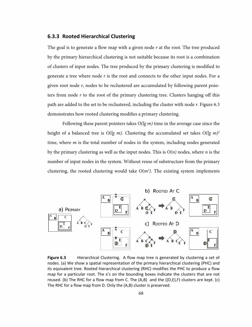
68
6.3.3 65BRooted Hierarchical Clustering
The goal is to generate a flow map with a given node r at the root. The tree produced
by the primary hierarchical clustering is not suitable because its root is a combination
of clusters of input nodes. The tree produced by the primary clustering is modified to
generate a tree where node r is the root and connects to the other input nodes. For a
given root node r, nodes to be reclustered are accumulated by following parent poin-
ters from node r to the root of the primary clustering tree. Clusters hanging off this
path are added to the set to be reclustered, including the cluster with node r. Figure 6.3
demonstrates how rooted clustering modifies a primary clustering.
Following these parent pointers takes O(lg m) time in the average case since the
height of a balanced tree is O(lg m). Clustering the accumulated set takes O(lg m)2
time, where m is the total number of nodes in the system, including nodes generated
by the primary clustering as well as the input nodes. This is O(n) nodes, where n is the
number of input nodes in the system. Without reuse of substructure from the primary
clustering, the rooted clustering would take O(m2). The existing system implements
Figure 6.3 Hierarchical Clustering. A flow map tree is generated by clustering a set ofnodes. (a) We show a spatial representation of the primary hierarchical clustering (PHC) andits equivalent tree. Rooted hierarchical clustering (RHC) modifies the PHC to produce a flowmap for a particular root. The x’s on the bounding boxes indicate the clusters that are notreused. (b) The RHC for a flow map from C. The (A,B) and the ((D,E),F) clusters are kept. (c)The RHC for a flow map from D. Only the (A,B) cluster is preserved.

69
this simplified version of the algorithm that takes O(m2).
Rooted hierarchical clustering merges nodes differently from standard hierar-
chical clustering. Suppose the algorithm wants to merge clusters C1 and C2 because
they are the closest in the system. Before it does so, it checks to see if C1 or C2 contains
the root node r. Suppose C1 contains r. C2 is marked for attempting to merge with the
root. The algorithm looks for another cluster C3 to merge with C2. C3 must be un-
marked and distance(C2,C3) ≤ distance(C2, root). If only the C2 cluster was marked
without looking for C3, the algorithm might miss an opportunity to merge clusters on
the same side of the root. The distance check ensures nodes are not merged on oppo-
site sides of the root. It terminates if it cannot find an unmarked cluster C3.
When the reclustering terminates due to the algorithm being unable to find
any unmarked clusters, the remaining clusters in the system become the children of
the source cluster. All the nodes except for the root of a rooted clustering have two
children. Since reclustering may terminate with more than two marked clusters, a
rooted hierarchical clustering is not always a binary tree, in contrast to a primary
clustering, which is always binary.
The last step in the rooted clustering computes the weights of the clusters. Giv-
en the flow data among the nodes, it is possible to compute the amount of flow from
the root r to the destination nodes. This is recorded as the weight of a node. The
weight for each cluster is computed bottom-up, in O(m) time.
6.3.4 66BSpatial Layout
The next step is to recursively lay out the tree of flows rooted at the source. Each node
creates a branching structure from the parent to its two children. The challenge is to
minimize edge crossings. The algorithm assumes the bounding boxes of the children
do not overlap. If the layout of the subtrees corresponding to each child is contained

within its b
the branch
and the chi
the tree co
child.
A b
created bet
each of it
clusters. Th
node is ch
the line l fro
tion of l wit
average pos
of the root n
Figu
cases: a spli
Branching n
another poi
other cases,
est point to
both cases th
An e
an edge from
branching p
one of its ch
next section
bounding b
between th
ild will not
orresponding
branching
tween the r
ts immedia
he position
hosen by co
om the root’
th c’s bound
ition of a an
nodes.
ure 6.4 illust
it between t
nodes n are
int b. For tw
let l be a lin
a, on the lin
he position o
edge is alway
m n to the le
point may be
hildren. We
n.
box, then
he parent
intersect
g to the
node is
root and
ate child
of that
omputing
’s position a
ding box is c
nd b, or (a+b
rates the pla
two leaf nod
placed halfw
wo leaf clust
ne between a
ne l, that int
of the branch
ys added fro
eaf nodes. T
e placed whe
e describe h
70
, to the cent
called b. The
b)/2. The alg
acement of a
des, one lea
way between
ters, b is the
a and the cen
tersects the b
hing node n
om the starti
he algorithm
ere an outgoi
how the algo
Figure 6.4of the roolayout recplaced on destination
0
ter of the clu
e position of
gorithm recu
a binary bra
af node and
n the positio
e location of
nter of the h
bounding bo
is set to be (
ing node to
m always rec
ing edge inte
orithm avoid
Spatial oted clusterincursively. Brthe line betwn that has mo
uster c. The c
f the branch
urses on the
anching poin
a cluster, o
on of the sta
f the heavier
heavier cluste
ox of either c
(a+b)/2.
the branchi
curses on clu
ersects the b
ds these inte
Layout. The ng allows to ranching poiween the staore weight (o
closest inters
hing node is
grand child
nt for the th
or two clust
art node, a,
r node. For
er. b is the c
child cluster
ing node n,
usters. Note
bounding box
rsections in
binary structus generate ints are alwart node and r flow).
sec-
the
dren
hree
ters.
and
the
clos-
r. In
and
the
x of
the
turethe
waysthe

71
6.3.5 67BEdge Routing
Edges are routed around the bounding boxes within the same hierarchical cluster. A
consequence of this is that the edges from the root node to its immediate children are
not routed, because they are not in a cluster with one another. We will discuss this
issue in more detail in X6.5X. We illustrate how the algorithm routes edges around sibling
clusters for the case of two clusters in Figure 6.5. Step 1 illustrates for each branching
point b1, the algorithm checks if the edge b1-b2 or the edge b1-b3 intersects its sibl-
ing’s bounding box. b1-b3 intersects the bounding box of cluster c1, so c1 occludes c2.
Step 2 shows how to find the closest corner on the bounding box c1 to the line b1-b3
and how to create a new node at that corner to route the edge around the bounding
box. Step 3 checks the line from the new node to b3 to see if it intersects c1. If an inter-
section exists, the point b3 is moved to just outside the corner of the bounding box of
c1.
Figure 6.5 also illustrates how the algorithm decides which corner to position
nodes. If an edge that intersects a bounding box, it splits it into two parts. The algo-
rithm computes each area of each part of the box split by the edge. It chooses the
corner on the side of the edge with less area.
6.3.6 68BMultiple Layers
Previous sections described how the layout works for a single layer, which is created to
depict data from an initial query. Here we describe the modifications to the algorithm
when users generate further queries to get a combined visualization.
Each additional query might introduce new nodes that did not exist in the pre-
vious query. As a result, the layout adjustment step must be re-run for each new query,
which may take O(m2) where m is the total number of unique nodes accumulated over
all the queries. The positions of all the nodes are reset to their initial locations, and the

layout adjus
described i
algorithm g
runs the p
clustering
takes O(m2)
The
ing steps in
modified to
that not eve
every layer.
list of the la
associated. C
appear in th
This is beca
ing the prim
subclusters
each level, t
mulate node
The
crossings if
6.4 39BRen
To make th
spline whic
duced. The
of the edge
stment step
in X6.3.1 X. W
ets new nod
primary hie
step again
.
hierarchica
n the system
o account for
ery cluster b
Every clust
ayers with w
Clusters also
hat layer. Th
ause we do n
mary hierarch
appear in w
this would im
es and O(lg m
edge routin
too many m
ndering
he flow map
h interpolat
splines are r
and the wi
is run as
When the
des, it also
erarchical
n, which
l cluster-
must be
r the fact
elongs to
ter has a
which it is
o store a map
he current im
ot propagate
hical cluster
which layer.
mprove the
m)2 to reclus
ng is done o
maps are layer
p visually ap
tes between
rendered suc
dths are con
72
pping from l
mplementati
e the layer in
ing, so we h
. However,
running tim
ster the set.
on a per-lay
red on top o
ppealing, eac
the nodes o
ch that they
nstrained by
Figure 6.5cause an iintersects b1‐b3 withposition of
2
layers to a lis
ion of roote
nformation u
ave to inspe
by storing s
me of rooted
yer basis, wh
of one anothe
ch edge is re
of the spatia
y have width
y a minimum
Edge Rintersection c1. The algorh c1, and addf b3 to avoid c
st of their su
d clustering
up the tree w
ct the subtre
subclusters’
clustering O
hich will ca
er.
endered as a
al layout tre
proportion
m and a ma
Routing. Spaby placing brithm finds ths a new nodec1 if necessar
ubclusters wh
g runs in O(m
when constru
ee to find wh
information
O(lg m) to ac
ause many e
a Catmull-R
ee that we p
al to the wei
aximum disp
tial layout mb3 in a way he intersectioe and adjustsry.
hich
m2).
uct-
hich
n at
ccu-
edge
Rom
pro-
ight
play
maythatn of the
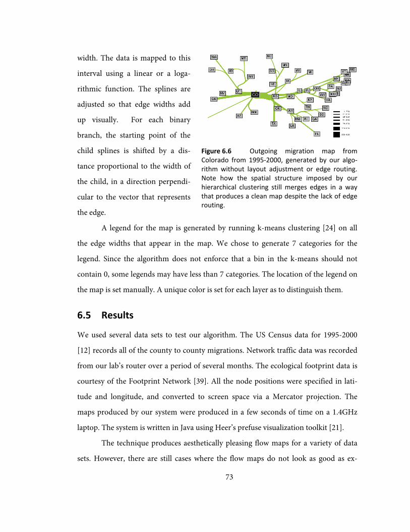
73
Figure 6.6 Outgoing migration map fromColorado from 1995‐2000, generated by our algo‐rithm without layout adjustment or edge routing.Note how the spatial structure imposed by ourhierarchical clustering still merges edges in a waythat produces a clean map despite the lack of edgerouting.
width. The data is mapped to this
interval using a linear or a loga-
rithmic function. The splines are
adjusted so that edge widths add
up visually. For each binary
branch, the starting point of the
child splines is shifted by a dis-
tance proportional to the width of
the child, in a direction perpendi-
cular to the vector that represents
the edge.
A legend for the map is generated by running k-means clustering [24] on all
the edge widths that appear in the map. We chose to generate 7 categories for the
legend. Since the algorithm does not enforce that a bin in the k-means should not
contain 0, some legends may have less than 7 categories. The location of the legend on
the map is set manually. A unique color is set for each layer as to distinguish them.
6.5 40BResults
We used several data sets to test our algorithm. The US Census data for 1995-2000
[12] records all of the county to county migrations. Network traffic data was recorded
from our lab’s router over a period of several months. The ecological footprint data is
courtesy of the Footprint Network [39]. All the node positions were specified in lati-
tude and longitude, and converted to screen space via a Mercator projection. The
maps produced by our system were produced in a few seconds of time on a 1.4GHz
laptop. The system is written in Java using Heer’s prefuse visualization toolkit [21].
The technique produces aesthetically pleasing flow maps for a variety of data
sets. However, there are still cases where the flow maps do not look as good as ex-

74
pected. To understand these failure cases, we analyzed the technique in terms of the
three characteristics of good flow maps.
Intelligent Distortion. The force scan algorithm [38] used for layout adjust-
ment separates the nodes and guarantees that the relative positions of the nodes are
not changing with respect to one another. The problem with this method can be seen
by comparing Figure 6.1c with Figure 6.6. While Figure 6.6 is clearly recognizable as
the outline of the United States, Figure 6.1c has been vertically distorted so that the
states on the East Coast are spread apart. This stretches out the West Coast too much.
Merging of edges that share destinations. The implementation of hierarchical
clustering is able to find spatial clusters in the data sets we use. The biggest drawback
to the algorithm in this regard is that all splits are binary. If there are too many desti-
nation nodes in a small area, forcing binary splits introduces too many extra routing
nodes and leads to clutter. In addition, with too many nodes, continuity constraints for
splines cause them to loop.
Intelligent edge routing.
The heuristic works well for simp-
ler cases and sometimes does not
work well for larger cases. One
problem is that there is no routing
on the edges leaving the root.
Branches in these separate binary
trees don’t know about each other
and may overlap. In Figure 6.8, the
reason why there are so many edge
crossings is that our method as-
sumes bounding boxes created by
our spatial clustering are disjoint.
Figure 6.7 Imports to China. A part of a flowmap showing the top 200 countries from which Chinareceives imports. The thick line curving around thetop are the imports from the USA (not shown), whichwithout edge routing would have gone straightthrough the middle of the image. Edge crossings stilloccur in some parts of the map, illustrating caseswhere our routing does not work. For more informa‐tion see the discussion.

75
However, our clustering does not
always produce disjoint boxes, so
we cannot always apply our heu-
ristic. A better solution would be
to use a clustering technique
where the bounding regions are
polygons.
Layering and branching
structure. We have found that the
method for sharing substructure across flow maps that share a common set of nodes
works quite well. Figure 6.9 has an example where two flow maps layered together
share branching structure to several nodes.
Linear or logarithmic display widths. In our initial maps we used logarithms
to map our data to a display width, because we were working with network data where
there were many orders of magnitude in the data that we were plotting. However, for
data sets not dominated by a few high magnitude values, we find that linear mappings
draw the eye more. All the maps we demonstrated in this chapter use linear mappings.
6.6 41BRelated Work
A survey of American flow mapping history and techniques is described in [43]. Flow
map design is discussed in various geography textbooks [16, 53]. Guidelines are given
on legend design and the use of a visual hierarchy to emphasize flow lines over region
boundaries. However, there are no guidelines that are given on how to create a flow
map. Ruggles and Armstrong [49] discuss a framework for the cartographic visualiza-
tion of networks. More generally, map design is discussed in [34].
An alternative method of layout adjustment is described by Lyons [33], who
improves the distribution of nodes in a graph and uses measures for graph similarity
Figure 6.8 Outgoing migration map from Colo‐rado for 1995‐2000 generated using edge routing butno layout adjustment.
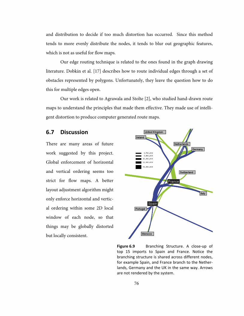
76
and distribution to decide if too much distortion has occurred. Since this method
tends to more evenly distribute the nodes, it tends to blur out geographic features,
which is not as useful for flow maps.
Our edge routing technique is related to the ones found in the graph drawing
literature. Dobkin et al. [17] describes how to route individual edges through a set of
obstacles represented by polygons. Unfortunately, they leave the question how to do
this for multiple edges open.
Our work is related to Agrawala and Stolte [2], who studied hand-drawn route
maps to understand the principles that made them effective. They made use of intelli-
gent distortion to produce computer generated route maps.
6.7 42BDiscussion
There are many areas of future
work suggested by this project.
Global enforcement of horizontal
and vertical ordering seems too
strict for flow maps. A better
layout adjustment algorithm might
only enforce horizontal and vertic-
al ordering within some 2D local
window of each node, so that
things may be globally distorted
but locally consistent.
Figure 6.9 Branching Structure. A close‐up oftop 15 imports to Spain and France. Notice thebranching structure is shared across different nodes,for example Spain, and France branch to the Nether‐lands, Germany and the UK in the same way. Arrowsare not rendered by the system.

77
Although using binary
clustering makes our spatial layout
step simpler, having non-binary
splits could eliminate some clutter
and some loopy edges. Also, in-
stead of our heuristic-based
method for edge routing, it may be
possible to use simulated anneal-
ing to adjust the edge positions.
We are also interested in
the layout and display of data that
does not explicitly have a location.
Although all of our work has been
on data sets with geographic locations, it may be interesting to generate flow maps for
more abstract sets of objects that have no predefined positions but that can be grouped
in other ways.
6.8 43BConclusion
This chapter presents a method to
automatically generate flow maps.
Distortion is used to ensure that
our nodes are well spaced but still
preserve their relative positions to
one another. Edges are merged
based on their destinations using
hierarchical clustering. This al-
lows flow maps with the same
Figure 6.10 California and New York migration.Another example of how layering can be used in oursystem. The map shows the top 10 states that mi‐grate to California and New York. Flow maps make iteasy to spot an interesting spatial pattern, namelythat New York tends to attract people from the EastCoast, while California residents come from moregeographic regions in the United States.
Figure 6.11 An example of the top ASN (Auto‐nomous Systems) that a computer from our labcommunicated with in one day. The latitudes andlongitudes for the ASNs were obtained by manuallylooking for the city or state in which the ASN wasregistered.

78
input nodes to share branching structures. Finally, the spatial information from the
hierarchical clustering is used to do edge routing to avoid edge crossings.

79
7 11BConclusions and Future Work
This dissertation has demonstrated that interactive visualizations consisting of pro-
gressive multiples of timelines and event plots can support the forensic analysis of
network events. It has also demonstrated that flow maps are useful for presenting
summaries of network behavior and provides a technique for automatically generating
a geographic flow map.
Progressive multiples of timelines and event plots were designed in collabora-
tion with the principal network security analyst of the EE and CS departments at
Stanford. We developed a system, Isis, for network security analysts, which has been
used to successfully investigate intrusions in a long-term deployment. Based on our
observations of usage, we have formulated several design guidelines for future systems
that visualize network events or conduct forensic analysis.
7.1 44BDesign Guidelines
Use timelines instead of node-link diagrams to sequence network events for foren-
sic analysis
Our experience with the flow map prototype suggested that using node-link di-
agrams to sequence network events was difficult for users to understand. The flow
map prototype used a radial layout, where time increased clockwise around a focus
node. The primary task is to sequence events, which requires comparisons of multiple
focus nodes. The problem is that the same position on the circle around a focus node
might mean different things across different node-link diagrams, since the radial flow

80
map uses an ordinal view of time. Using a continuous view of time to facilitate com-
parisons across node-link diagrams yields space-inefficient timelines that are curved.
As a result, it makes more sense to directly use a normal timeline, which can be easily
stacked for the purposes of comparison and sequencing.
Provide dynamic previews to make an exploration history more meaningful
Brushing’s primary purpose is to allow the user to quickly understand the
temporal distribution of other dimensions of the data. Brushing has been used in prior
work for dynamic previews [6]. However, this dissertation suggests that brushing also
improves the quality of an exploration history. Without brushing, users would have to
create new rows in order to understand different traffic patterns, which is an ineffi-
cient use of space. Brushing makes an exploration history more meaningful because it
allows users to preview the effects of their actions. As a result, they only create time-
lines for states which they want to refer back to as they continue with their
investigation.
Allow users to save the results of a dynamic preview in a static form
Brushing reveals objects that share common attributes, but the result is often
transient, which can make it hard for users to remember what they have just brushed.
We allow users to save the results of a brush by restructuring the display. In our sys-
tem, the user may collect the rows that have been brushed and move them to the top of
the display. This makes off-screen rows visible to the user. The novel idea is that this
allows the display to be reorganized by first brushing related events and then grouping
them together. We believe that the idea of restructuring displays based on brushing
can be applied to other exploratory visualization systems.

81
Support interactive views of time
The event plot also supports continuous and ordinal views of time. Both views
support the sequencing of events. A continuous view of time allows users to under-
stand the distribution of events in time. However, since an intrusion may take place
over a very short amount of time, a continuous view of time may only allocate a small
amount of space to the relevant time period. An ordinal view of time allocates space
more equitably and allows users to see any missing gaps in the event sequence. How-
ever, an ordinal view of time can allocate too much space to large numbers of events
that are concentrated in a small period of time, such as a denial-of-service attack. As a
result, we allow users to use both views of time and to control the space allocated to
time periods with interactive gridlines.
7.2 45BLimitations
The size of the datasets being visualized is constantly growing. For example, the traffic
at the university's border is an order of magnitude larger than the traffic seen in the EE
and CS departments. Given the volume of data, the visualization that runs on the
analyst's workstation should offload calculation to a remote database. We have been
able to conduct analyses spanning a few days, using queries that run over tens of mil-
lions of events and select tens of thousands for display. If an analyst needed to search a
few billion rows, our preliminary evidence suggests that this could be done by distri-
buting a query across a clustered database server. However, even if the query
eliminated 99.99% of the rows, it might still generate a result set of several hundred
thousand events and a degree of overplotting that could easily overwhelm event plots
with ordinal time. Incorporating methods that abstract flows into larger behaviors by
Kannan [26], Xiao [64], or Karagiannis [27] holds promise for reducing clutter as well
as adding useful information for the analyst.

82
Designing tools for expert users that leverage their domain knowledge remains
a difficult problem. Expert users are often reluctant to adopt new tools unless they
provide a significant improvement over existing tools. Since these tools tend to have a
significant learning curve, it can be difficult to engage expert users who will take the
time to evaluate and use the design prototypes. Practices that work well for novices or
for tools used occasionally can be inefficient and even annoying for those who must
use them every day. The ad hoc nature of incident analysis suggests we should design
each tool to do one task well, knowing that the analyst will combine it with other tools.
It is important to provide import and export mechanisms to make it easier to move
among different tools. Network incident response is still more art than science and
likely to remain that way for some time to come.
7.3 46BClosing Remarks
This dissertation integrates the user-centered iterative design practices of human-
computer interaction with the development and evaluation of visualization techniques.
The goal of this work has been to create visualizations that are useful for solving real
problems that are faced by real users. A long-term engagement with a small user popu-
lation can inspire the creation of visualizations that are useful to a broader group of
users. We hope that the user-focused process of design and evaluation described in
this dissertation can inspire further research into the development of aesthetic and
effective visualization systems.

83
12BAppendix A: Investigation Task Analysis
This appendix contains a task analysis of the process of network intrusion investiga-
tion based on our observations of investigations conducted by the principal network
analyst, John Gerth, of the EE and CS departments at Stanford University. This task
analysis is inspired by the GOMS methodology [11] presented by Card, Moran, and
Newell. The task analysis motivated the development of our technique to support the
investigation process.
Our task analysis is a high-level description of the investigation process using
the old technique (indicated by SQL) and our new system (indicated by ISIS). It con-
sists of goals, which refer to what the user is trying to accomplish, and actions, which
refer to how the user can move closer to a goal in our system. Goals and Actions can
have subgoals or subactions.
Goals (marked with G:) and Actions (marked with A:) are numbered so that
they may be referenced in the text. SQL or ISIS indicates the differences in actions
depending on the tool used. If the description of the Action is brief, the action is de-
scribed inline with the goal it supports. If the Action is more complicated, it can be
found in a separate description and a reference number is provided.
The difference between Goals and Actions is that Goals are not specific to the sys-
tem. For instance, (Step 8) Find Connections of Intruders is a goal and the only action
that is listed is (Step 11) Get Traffic Overview and Inspect Connections. In our system,
the only way to find connections is by looking at traffic overviews, but there are many
other ways of achieving this goal. For example, the administrator might run an auto-
mated data mining algorithm to extract possible connections.

84
1. Investigate Intrusion. Once an analyst is notified a computer may be compro-
mised, he or she begins with this high level goal.
a. G: Find Compromise on Machine ( X2X)
b. G: Find Connections of Intruder ( X8X)
c. G: Find Other Compromised Machines ( X9X)
d. G: Create Report ( X10X)
2. Find Compromise on Machine. Log onto a computer to inspect it
a. G: Inspect ports ( X3X)
b. G: Inspect binaries for tampering ( X7X)
3. Inspect Ports. One way to discover if a computer is compromised is to look at its
open ports to see if it is running a non-standard service.
a. G: Find Open Ports ( X4X)
b. G: Determine if port is suspicious ( X5X)
c. G: Find users associated with open ports ( X6X)
4. Find Open Ports. Open ports on a system are a symptom of a compromised
computer, and may indicate that it is running an unauthorized service
a. Run nmap against the system to find the current set of open ports
5. Determine if Port is Suspicious. Given a list of open ports, the analyst needs to
determine if any of those ports are suspicious
a. Use domain knowledge of ports
b. Connect to a port with telnet to see if it is running an interesting service

85
6. Find Users Associated with Open Ports. If a suspicious port is running, find the
users associated with the open ports.
a. Logon to system and look at running processes
b. Associate the start time of process with user logins by scanning text logs
7. Inspect binaries for tampering. Another way to discover a compromise is to in-
spect system binaries to make sure they are legitimate. For example, an intruder
may have modified the programs running on the machine to log keystrokes to
steal passwords.
a. Hash the system binaries and compare to known-good copies
8. Find Connections of Intruders
a. A: Get Traffic Overview and Inspect Connections ( X11X)
9. Find Other Compromised Machines. Given the set of machines involved in the
initial intrusion, look for other local machines contacted by those intruders and
repeat the process of ‘Investigate Intrusion’ for those local machines.
10. Create Report. The analyst usually writes an email to summarize the investiga-
tion. The email provides a list of compromised computers and is sent to other
analysts so that he or she can take action. The email may contain different types
of evidence:
a. System logs that show the time of the connection made by the intruder
b. A list of running processes on the system and the time they were started
c. An image from Tableau that shows timelines of connections made
to/from remote computers, color coded by port

86
11. A: Get Traffic Overview and Inspect Connections (IPs, Time Interval)
a. For each IP
i. A: Formulate Query [SQL, ISIS] (X12X)
ii. A: Interpret Query Results[SQL, ISIS] (X18X)
iii. A: Compare Query Results to Others[SQL, ISIS] ( X31X)
iv. A: Refine Query [SQL, ISIS] if necessary ( X33X)
v. A: Pivot to See Related Traffic if necessary ( X26X)
12. A: Formulate Query
a. A: Choose Time Range ( X13X)
b. A: Choose Measure and Aggregation ( X14X)
c. A: Choose Filter Statement ( X15X)
d. A: Construct Query [SQL, ISIS] ( X16X)
e. A: Run SQL(Query, [SQL, ISIS]) ( X17X)
13. A: Choose Time Range. Intruders tend to be impatient, and start using the com-
puter immediately after they break into the system. As a result, 24 hours is the
usual time range that is chosen. However, there have been instances where the
compromised computer was compromised long before it was used by the attacker.
14. A: Choose Measure and Aggregation. The traffic measures are determined by
the available event data and the aggregation expressions are provided by
MySQL.
a. Select Measure
i. # of total flows, # of incoming or outgoing flows
ii. # of total bytes, # of incoming or outgoing bytes

87
iii. # of total packets, # of incoming or outgoing packets
iv. # of application bytes (excludes bytes for communication over-
load), # of incoming / outgoing application bytes
b. Select Aggregation Statement
i. Minimum
ii. Maximum
iii. Average
iv. Count, or Count Distinct
v. Sum
15. A: Choose Filter Statement. A filter determines what traffic to include or ex-
clude, through SQL expressions. Select from:
a. IP
b. ASN
i. Include or exclude results to computers from similar ASNs. Can
filter a block of IPs from ASNs that are known scanners
c. Ports
i. Include traffic using a specific port of interest (IRC or SSH)
ii. Exclude traffic on benign ports such as web traffic, DNS, or mail
d. Role
i. Distinguishes when a computer is a client or a server. Useful for
seeing when a computer switches from being a server (an in-
truder logs onto it) to being a client (the compromised
computer connects to remote IRC servers).
e. Locality
i. Exclude traffic local to Stanford to look for remote attackers
ii. Virtual Lan (Subnet)

88
iii. Different administrators control different subnets at Stanford,
so can be useful to limit queries by the Virtual Lan
f. Measures. Some examples are:
i. Packets. Exclude connections with less than 30 total packets. It
takes at least that many packets to be exchanged for connection
to be established.
ii. Bytes. Exclude connections where number of bytes transferred
is below 10,000 bytes. The more bytes transferred, the more
likely a significant download took place.
16. A: Construct Query. Done by hand in SQL, but Isis will construct this automati-
cally. This provides a minor speedup to the analyst.
17. A: Run SQL (Query, SQL or ISIS). Wait for query to return results, which may
appear textually or graphically.
SQL (Returns a textual list of results)
ISIS (Returns a graphical timeline)
i. A: Make Folder(Label: Use IP) ( X27X)
ii. A: Make Timeline(Query, Folder: Use the one just created) ( X28X)
18. A: Interpret Query Results. Look at query results for one of the following things
which might suggest a suspicious connection. Select from:
a. Spikes, bursts, or periodic patterns of activity
b. Volume above/below a threshold of bytes, packets, or flows transferred
c. Traffic using a suspicious port
d. Traffic from a suspicious IP or ASN

89
SQL
i. A: Look at Text
ISIS
i. A: Look at Visual Timeline
ii. A: Interact with Timeline
19. A: Look at Text. Inspect a text list of results for one of the items described under
( X18X). This provides detail but makes it hard to understand temporal distribution
of the traffic. See the discussion in X5.1X.
20. A: Look at Visual Timeline. The timeline provides an overview of traffic and can
find spikes, bursts, or periodic patterns of activity. See the discussion in X5.1X.
21. A: Interact with Timeline. Obtain additional information by getting more detail,
breaking down traffic by other dimensions, or viewing traffic in different visual
representations. Select from:
a. Get menu for the whole timeline or a subset of the bins
i. A: Create Tearoff (Query, Bin, Dimension) ( X22X)
ii. A: Make Event Plot(Bin) ( X34X)
iii. A: See Underlying Data as Text Table ( X32X)
iv. A: Adjust Vertical Scaling (X29X)
b. A: See Tooltip for Bin ( X30X)
c. A: Compare Timeline ( X31X)
d. Delete Timeline

90
22. A: Create Tearoff (Query, Bin, Dimension). Creates a tearoff menu that displays
a table that shows the distribution of traffic in the bin by one of the following di-
mensions: ip, port, vlan, asn, locality, and role. Select from:
a. Sort by increasing or decreasing aggregate value or by name
b. A: Brush(Current Item, Dimension) ( X23X)
c. A: Scan highlighted bins ( X24X)
d. A: Subdivide Timeline(Bin, Dimension) (X25X)
e. A: Pivot(Bin, IP of current item) only if Dimension = IP ( X26X)
23. Brush(Item, Dimension). Highlights all other bins in all other timelines that
contain an event with same name and dimension
24. Scan Highlighted Bins. Highlights show the temporal distribution of the brushed
non-temporal dimensions: ip, port, vlan, asn, locality, and role
25. Subdivide Timeline(Bin, Dimension). Create a new folder that contains a time-
line for each value of the dimension in the given bin. For example, subdividing a
timeline T on port would result in a new folder where each timeline T’ would
show the traffic of T filtered on a single port.
a. Make Folder(Label: Focus IP)
b. For each value of dimension in the given bin that was selected
ii. A: Filter(Query, Folder) ( X33X)
26. Pivot(Query, New IP)
a. A: Update Query so that the New IP is the focus
b. A: Run SQL ( X17X)

91
27. Make Folder(Label). Add a new folder to the display with the provided label
28. Make Timeline(Query, Folder)
a. Run SQL(Query) ( X17X)
b. Add timeline of the query results to the given folder
29. Adjust Vertical Scaling(Folder, Log or Linear). Timelines are scaled in relation
to the maximum value of the aggregate in the current folder. Linear or logarith-
mic scaling can be used.
30. See Tooltip for Bin. Hovering over a bin shows the time range spanned by the
bin and displays the value for the aggregate.
31. Compare Timeline. The analyst can reorder timelines within a folder to make
comparisons easier. If timelines are in different folders, an analyst can copy a
timeline from one folder to another.
32. See Underlying Data(Bin). Creates a table that shows the raw data for the bin
a. Sort table by column (local/remote packets/bytes/flows, local/remote
port, local/remote IP, local/remote ASN, time, role, locality, vlan)
33. Filter (Query, Filter String, Folder)
a. Update query with the newly provided filter string
b. A: Run SQL(Query) ( X17X)
c. A: Make Timeline(Updated Query, Folder) ( X28X)

92
34. A: Make Event Plot(Bin). View the traffic contained in the bin as an event plot
for the focus IP. Each partner IP is a row on the vertical axis and time is mapped
to the horizontal. Each mark represents a connection between the focus IP and
the partner IP. Select from:
a. A: Switch View of Time ([Continuous or Ordinal]) ( X35X)
b. A: See Tooltip for Mark ( X36X)
c. A: Map Size of Mark ( X37X)
d. A: Map Shape of Mark ( X38X)
e. A: Manipulate Gridline ( X39X)
f. A: Brush Dimension ( X23X)
g. A: Mark Dimension with Color ( X40X)
h. A: Collect by Brushing ( X41X)
35. Switch View of Time([Continuous, Ordinal]). Events are either plotted on the
x-axis in continuous or in ordinal space. In continuous space the distance be-
tween events on the x-axis is proportional to the amount of time between the two
events. In ordinal space the distance between events on the x-axis only indicate
that an event came before or after another.
36. See Tooltip for Event Plot Mark. Displays additional information about the
connection in a popup window: time, # of packets, role, ASN
37. Map Size of Mark. Make the mark size into small, medium, or large, based on
the # of packets. Marks are ordered by # of packets. If the mark is below the 25%
percentile, it is shown in a small size. If the mark is above the 75% percentile, it is
show in a large size. Otherwise it is shown in a medium size. The thresholds are
adjustable by the analyst.

93
38. Map Shape of Mark. A user may choose to map client connections to a triangle
and server connections to a circle to disambiguate between outgoing and incom-
ing connections.
39. Interact with Gridlines. Gridlines are added to the event plot at reasonable time
intervals (every 5, 10, 15, 20, etc… minutes), depending on the time span of the
data. Port scanning and other kinds of network activity far outweigh the few
connections that make up the SSH connection that is the intrusion. This may
cause salient events to be spaced too closely to be read. Adjusting the gridlines al-
lows users to change the spacing allocated to each mark. Select from:
a. Add Gridline
b. Remove Gridline
c. Adjust Gridline (drag it to the right or to the left)
40. Mark Dimension with Color. If an analyst is interested in a particular value for
a dimension, he or she can pick a color for the marks that with that value. This
color is reflected across all other event plots for that dimension. Each dimension
has a unique set of colors, but different dimensions may share the same color. To
avoid confusion, only one dimension is colored at a time.
41. Collect Brushing. Moves all the rows that are brushed to the top of the display.
This allows the analyst to organize an event plot to more clearly show a sequence
of events.

94
13BAppendix B: Epidemic User Study Materials

95

96

97

98

99

100

101
14BBibliography
1 Abdullah, K., C. P. Lee, G. Conti, J. A. Copeland, and J. Stasko. IDS RainStorm:
Visualizing IDS alarms. IEEE Workshop on Visualization for Computer Securi-
ty, 2005. (VizSEC 05). pp. 1-10, 2005.
2 Agrawala, M. and C. Stolte. Rendering effective route maps: improving usabili-
ty through generalization. Proceedings of the 28th annual conference on
Computer graphics and interactive techniques: ACM Press New York, NY, USA.
pp. 241-49, 2001.
3 Ahlberg, C. and B. Shneiderman. Visual information seeking using the Film-
Finder. Conference on Human Factors in Computing Systems: ACM Press New
York, NY, USA. pp. 433-34, 1994.
4 Ahlberg, C., C. Williamson, and B. Shneiderman. Dynamic Queries for Infor-
mation Exploration: An Implementation and Evaluation. In Proceedings of
ACM CHI, 1992.
5 Argus. HUhttp://www.qosient.com/argusU
6 Becker, R. A. and W. S. Cleveland. Brushing Scatterplots. Technometrics 29(2):
JSTOR. pp. 127-42, 1987.
7 Becker, R. A., S. G. Eick, and A. R. Wilks. Visualizing network data. IEEE
Transactions on Visualization and Computer Graphics 1(1). pp. 16-28, 1995.

102
8 Bertin, J., Graphics and Graphic Information Processing. Berlin: Walter de
Gruyter. 273 pp. 1981.
9 Bertin, J., Semiology of Graphics: Diagrams, Networks, Maps: University of
Wisconsin Press. 432 pp. 1983.
10 Card, S. K., J. Mackinlay, and B. Shneiderman, Readings in Information Visua-
lization: Using Vision to Think: Morgan Kaufmann Publishers, Inc. 686 pp.
1999.
11 Card, S. K., T. P. Moran, and A. Newell. The Psychology of Human-Computer
Interaction. Lawrence Erlbaum Associates, 1983.
12 Census, United States County to County Migration Flow Files,
HUhttp://www.census.gov/population/www/cen2000/ctytoctyflow.htmlUH. 2003.
13 Cox, K. C. and S. G. Eick. Case study: 3D displays of Internet traffic. Proceed-
ings of INFOVIS 1995. pp. 129-31, 1995.
14 D'Amico, A., J. R. Goodall, D.R. Tesone, and J.K. Kopylec. Visual Discovery in
Computer Network Defense. IEEE Computer Graphics and Applications, 2007.
15 D'Amico, A., K. Whitley, D.R. Tesone, O'Brien B., and E. Roth. Achieving
Cyber Defense Situational Awareness: A Cognitive Task Analysis of Informa-
tion Assurance Analysts. In Proceedings of Human Factors and Ergonomics
Soc. 49th Ann. Meeting. pp. 229-33, 2005.
16 Dent, Borden D., Cartography: Thematic Map Design. New York: McGraw-
Hill. 417 pp. 1999.

103
17 Dobkin, D. P., E. R. Gansner, E. Koutsofios, and S. C. North. Implementing a
general-purpose edge router. Graph Drawing. pp. 262-71, 1997.
18 Eick, S. G. and G. J. Wills. Navigating large networks with hierarchies. In Pro-
ceedings of IEEE Conference on Visualization. pp. 204-10, 1993.
19 Friendly, Michael and Daniel J. Denis, Milestones in the History of Cartography,
2007. HUhttp://www.math.yorku.ca/SCS/Gallery/milestone/ U
20 Goodall, J. R., W. G. Lutters, P. Rheingans, and A. Komlodi. Preserving the Big
Picture: Visual Network Traffic Analysis with TNV. IEEE Workshop on Visua-
lization for Computer Security, 2005. (VizSEC 05). 2005.
21 Heer, J., S. K. Card, and J. A. Landay. prefuse: a toolkit for interactive informa-
tion visualization. Conference on Human Factors in Computing Systems: ACM
Press New York, NY, USA. pp. 421-30, 2005.
22 Heer, J., F. B. Viégas, and M. Wattenberg. Voyagers and voyeurs: supporting
asynchronous collaborative information visualization. Proceedings of the
SIGCHI conference on Human factors in computing systems: ACM Press New
York, NY, USA. pp. 1029-38, 2007.
23 Hochheiser, H. and B. Shneiderman. Dynamic query tools for time series data
sets: Timebox widgets for interactive exploration. Information Visualization 3.
pp. 1-18, 2004.
24 Jain, A. K., M. N. Murty, and P. J. Flynn. Data clustering: a review. ACM Com-
puting Surveys (CSUR) 31(3): ACM Press New York, NY, USA. pp. 264-323,
1999.

104
25 Johnson, J., T. L. Roberts, W. Verplank, D. C. Smith, C. H. Irby, M. Beard, and
K. Mackey. The Xerox Star: a retrospective. Computer 22(9). pp. 11-26, 1989.
26 Kannan, J., J. Jung, V. Paxson, and C. E. Koksal. Semi-automated discovery of
application session structure. Proceedings of the 6th ACM SIGCOMM on Inter-
net measurement, 2006.
27 Karagiannis, T., K. Papagiannaki, and M. Faloutsos. BLINC: multilevel traffic
classification in the dark. ACM SIGCOMM Computer Communication Review
35(4): ACM Press New York, NY, USA. pp. 229-40, 2005.
28 Keim, D. A., F. Mansmann, J. Schneidewind, and T. Schreck. Monitoring
Network Traffic with Radial Traffic Analyzer. IEEE Symposium on Visual Ana-
lytics Science And Technology, 2006.
29 Kincaid, R. VistaClara: an interactive visualization for exploratory analysis of
DNA microarrays. Proceedings of the 2004 ACM symposium on Applied compu-
ting: ACM Press New York, NY, USA. pp. 167-74, 2004.
30 Lakkaraju, K., W. Yurcik, and A. J. Lee. NVisionIP: netflow visualizations of
system state for security situational awareness. Proceedings of the 2004 ACM
workshop on Visualization and data mining for computer security: ACM Press
New York, NY, USA. pp. 65-72, 2004.
31 Lee, J. J., K. R. Hess, and J. A. Dubin. Extensions and Applications of Event
Charts. The American Statistician 54(1), 2000.
32 Livnat, Y., J. Agutter, S. Moon, R. F. Erbacher, and S. Foresti. A Visualization
Paradigm for Network Intrusion Detection. In Proceedings of IEEE Workshop
on Information Assurance and Security, 2005.

105
33 Lyons, K. A., H. Meijer, and D. Rappaport. Algorithms for cluster busting in
anchored graph drawing. J. Graph Algorithms Appl 2(1). pp. 1-24, 1998.
34 MacEachren, A. M. How Maps Work: Representation, Visualization, and
Design. Guilford Press, 1995.
35 Mackinlay, J. Automating the Design of Graphical Presentations of Relational
Information. ACM Transactions on Graphics 5(2), 1986.
36 McPherson, J., K. L. Ma, P. Krystosk, T. Bartoletti, and M. Christensen. Port-
Vis: a tool for port-based detection of security events. Proceedings of the 2004
ACM workshop on Visualization and data mining for computer security: ACM
Press New York, NY, USA. pp. 73-81, 2004.
37 Miller, G. A. The Magic Number Seven, Plus or Minus Seven. Psychological
Review 63. pp. 81, 1965.
38 Misue, K., P. Eades, W. Lai, and K. Sugiyama. Layout Adjustment and the
Mental Map. Journal of Visual Languages and Computing 6(2). pp. 183-210,
1995.
39 Moran, D., M. Wackernagel, S. Goldfinger, and M. Murray, International
Ecological Trade Flows. 2005, Global Footprint Network. www. footprintnet-
work. org.
40 Moran, T. P., M. Wackernagel, M. Kitzes, M. Murray, B. Heumann, and D.
Phan. Trading Spaces: Embodied Ecological Footprints in Trade. Ecological
Economics, 2007.

106
41 Munzner, T., E. Hoffman, K. Claffy, and B. Fenner. Visualizing the global
topology of the MBone. Proceedings of IEEE Symposium on Information Visua-
lization, San Francisco, California, USA, 1996.
42 Musa, S. and D. J. Parish. Visualising Communication Network Security At-
tacks. Information Visualization, 2007. IV'07. 11th International Conference.
pp. 726-33, 2007.
43 Parks, M. J. American Flow Mapping. Unpublished master’s thesis. Atlanta:
Georgia State University, Department of Geography:
44 Phan, D., J. Gerth, M. Lee, A. Paepcke, and T. Winograd. Visual Analysis of
Network Flow Data with Timelines and Event Plots. In Proceedings of Work-
shop on Visualization for Computer Security (VizSEC), 2007.
45 Phan, D., A. Paepcke, and T. Winograd. Progressive Multiples for Communi-
cation-Minded Visualization. In Proceedings of Graphics Interface, 2007.
46 Phan, D., L. Xiao, R. Yeh, P. Hanrahan, and T. Winograd. Flow Map Layout.
IEEE Symposium on Information Visualization (INFOVIS). pp. 219-24, 2005.
47 Plaisant, C., B. Milash, A. Rose, S. Widoff, and B. Shneiderman. LifeLines:
visualizing personal histories. Proceedings of the SIGCHI conference on Human
factors in computing systems: common ground: ACM Press New York, NY,
USA, 1996.
48 Rao, R. and S. K. Card. The table lens: merging graphical and symbolic repre-
sentations in an interactive focus+ context visualization for tabular
information. Proceedings of the SIGCHI conference on Human factors in com-
puting systems, 1994.
107
49 Ruggles, A. J. and M. P. Armstrong. Toward a Conceptual Framework for the
Cartographic Visualization of Network Information. Cartographica: The Inter-
national Journal for Geographic Information and Geovisualization 34(1):
University of Toronto Press. pp. 33-48, 1997.
50 Shneiderman, B. The eyes have it: a task by data type taxonomy for informa-
tion visualizations. IEEE Symposium on Visual Languages. pp. 336-43, 1996.
51 Shneiderman, B. and C. Plaisant, Strategies for evaluating information visuali-
zation tools: multi-dimensional in-depth long-term case studies, in Proceedings
of the 2006 AVI workshop on Beyond time and errors: novel evaluation methods
for information visualization. 2006, ACM Press: Venice, Italy.
52 Siirtola, H. Interaction with the Reorderable Matrix. In Proceedings of IEEE
International Conference on Information Visualization. pp. 272-77, 1999.
53 Slocum, Terry A., Thematic Cartography and Visualization. New Jersey: Pren-
tice Hall. 293 pp. 1999.
54 Stolte, C., D. Tang, and P. Hanrahan. Polaris: A System for Query, Analysis,
and Visualization of Multidimensional Relational Databases. IEEE Transac-
tions on Visualization and Computer Graphics 8(1). pp. 52-65, 2002.
55 Tableau. http://www.tableausoftware.com/
56 Tobler, W. R. Experiments in migration mapping by computer. The American
Cartographer 14(2). pp. 155-63, 1987.
57 Tollis, I., P. Eades, G. Di Battista, and L. Tollis, Graph Drawing: Algorithms for
the Visualization of Graphs. 1998, Prentice Hall.

108
58 Tufte, E. R., Envisioning Information: Graphics Press. 256 pp. 1990.
59 Tufte, E. R., The Visual Display of Quantitative Information. 2nd ed: Graphics
Press. 197 pp. 2001.
60 Tufte, E. R., Visual Explanations: Graphics Press. 156 pp. 1997.
61 Tukey, J. W., Exploratory Data Analysis: Addison-Wesley. 503 pp. 1977.
62 Tversky, B., J. B. Morrison, and M. Betrancourt. Animation: can it facilitate.
International Journal of Human-Computer Studies 57(4): Academic Press, Inc.
Duluth, MN, USA. pp. 247-62, 2002.
63 Viégas, Fernanda and Martin Wattenberg. Communication-Minded Visualiza-
tion: A Call to Action. IBM Systems Journal 45(4), 2006.
64 Xiao, L., J. Gerth, and P. Hanrahan. Enhancing Visual Analysis of Network
Traffic Using a Knowledge Representation. IEEE Symposium on Visual Analyt-
ics Science And Technology. pp. 107-14, 2006.
65 Yin, X., W. Yurcik, M. Treaster, Y. Li, and K. Lakkaraju. VisFlowConnect:
netflow visualizations of link relationships for security situational awareness.
Proceedings of the 2004 ACM workshop on Visualization and data mining for
computer security: ACM Press New York, NY, USA. pp. 26-34, 2004.