Embed Size (px)
Citation preview
Aki Taanila
SUMMARIZING AND ANALYZING DATA
Excel 2007/2010/2013 instructions included
18.9.2013
CONTENTS
PREFACE ............................................................................................................................................... 1
1 ORIENTATION .................................................................................................................................... 2
2 DATA SET ........................................................................................................................................... 4 2.1 SAVING DATA SET .................................................................................................................................... 4 2.2 HANDLING DATA SET IN EXCEL ................................................................................................................ 5
Tables, sorting and filtering ....................................................................................................................... 5 Grouping/Recoding .................................................................................................................................... 6
3 SUMMARIZING .................................................................................................................................. 7 3.1 FREQUENCY DISTRIBUTION ..................................................................................................................... 7
Frequency distribution and Excel .............................................................................................................. 9 3.2 DESCRIPTIVE STATISTICS .......................................................................................................................... 9
Mode ....................................................................................................................................................... 10 Arithmetic Mean ...................................................................................................................................... 10 Standard Deviation and Variance ............................................................................................................ 12 Median ..................................................................................................................................................... 12 Quartiles .................................................................................................................................................. 13 Descriptive statistics and Excel ................................................................................................................ 13
4 RELATIONSHIP BETWEEN TWO VARIABLES .................................................................................... 14 4.1 CROSS TABULATION ............................................................................................................................... 14
Cross tabulation and Excel ....................................................................................................................... 15 4.2 CORRELATION ........................................................................................................................................ 16
Pearson's correlation coefficient ............................................................................................................. 16 Correlation and Excel ............................................................................................................................... 19
5 GRAPHICS ........................................................................................................................................ 20 5.1 How to create graphics in Excel ............................................................................................................. 20
6 STATISTICAL INFERENCE .................................................................................................................. 24 6.1 ROADMAP .............................................................................................................................................. 26 6.2 INFERENCE - PROPORTION .................................................................................................................... 26 6.3 INFERENCE - MEAN ................................................................................................................................ 27 6.4 INFERENCE – TWO GROUPS ................................................................................................................... 29
Two independent samples t-test ............................................................................................................. 29 Paired samples t-test ............................................................................................................................... 30
6.5 INFERENCE – CROSS TABULATION ......................................................................................................... 31 6.6 INFERENCE - CORRELATION ................................................................................................................... 32
Pearson's correlation coefficient ............................................................................................................. 32
APPENDIX 1: SAMPLING ..................................................................................................................... 33 Population ............................................................................................................................................... 33 Sample ..................................................................................................................................................... 33 Non probability sample ........................................................................................................................... 33 Error sources ............................................................................................................................................ 33 Sample size .............................................................................................................................................. 34 Sampling methods ................................................................................................................................... 35
1
PREFACE
This material is about summarizing and analyzing data by using statistical methods.
Before anything else you should read chapter 1 ORIENTATION. It gives you an overall picture on using statistical methods in decision making.
Usually you need to prepare data before doing any analyses. In chapter 2 DATA SET you find valuable Excel instructions for entering, sorting, filtering and grouping data.
Summarizing includes calculating frequencies and characterizing variable distribution by using descriptive statistics. These topics are covered in chapter 3 SUMMARIZING.
After basic description you can go deeper into your data by digging relationships between variables. This is done by using cross tabulation (categorical variables) or scatter diagrams and correlation coefficients (quantitative variables). Chapter 4 RELATIONSHIP BETWEEN TWO VARIABLES covers basic methods for analyzing relationship.
Although graphics is used in relation to summarizing and analysis, it is covered in separate chapter 5 GRAPHICS.
If data comes from a sample then you have to justify conclusions about the whole population. This is covered in chapter 6 STATISTICAL INFERENCE. Valid statistical inference is based on appropriate data collection method. Basic sampling methods are covered in appendix 1 SAMPLING.
This material contains Excel 2007/2010 instructions for all the statistical methods covered (if you are not going to use Excel you can skip these instructions). This doesn’t mean that Excel is the only or even the best tool for statistical methods. Nevertheless Excel is so widely available and used that it is worth learning to use it for statistical methods, too.
If you find Excel functions and pivot tables cumbersome then you may like my add-in StatAid. It works inside Excel and makes statistical analyses extremely easy. See http://myy.haaga-helia.fi/~taaak/r
If you need more than Excel can give then you should consider software designed especially for statistical analysis. The most widely used such software is SPSS. If SPSS is available to you and you like to learn to use it, refer to my SPSS GUIDE http://myy.haaga-helia.fi/~taaak/r/spsstutorial.pdf
Learning by doing is the best method to learn statistical methods. If you don’t have a data set of your own then you can use my Excel examples to practice and improve your skills:
http://myy.haaga-helia.fi/~taaak/r/data1.xlsx (data set)
http://myy.haaga-helia.fi/~taaak/r/table.xlsx (handling data set, descriptive statistics)
http://myy.haaga-helia.fi/~taaak/r/pivot.xlsx (pivot tables)
http://myy.haaga-helia.fi/~taaak/r/corre.xlsx (correlation coefficient)
http://myy.haaga-helia.fi/~taaak/r/chart.xlsx (graphics)
http://myy.haaga-helia.fi/~taaak/r/p.xlsx (statistical inference)
2
1 ORIENTATION
Modern companies have increasing amounts of internal data in their databases and data warehouses, like accounting data, financial data, sales data, quality performance data, employee productivity data, and so on. These kinds of data are produced as a result of daily operations.
Data may also be purposely generated like when doing a marketing research.
External data are available from governmental, industrial, or individual sources.
Data supporting decision making
Business managers and decision makers have access to large amounts of information. A major issue is how to use available information in order to make better decisions.
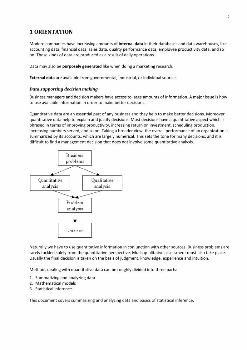
Quantitative data are an essential part of any business and they help to make better decisions. Moreover quantitative data help to explain and justify decisions. Most decisions have a quantitative aspect which is phrased in terms of improving productivity, increasing return on investment, scheduling production, increasing numbers served, and so on. Taking a broader view, the overall performance of an organization is summarized by its accounts, which are largely numerical. This sets the tone for many decisions, and it is difficult to find a management decision that does not involve some quantitative analysis.
Naturally we have to use quantitative information in conjunction with other sources. Business problems are rarely tackled solely from the quantitative perspective. Much qualitative assessment must also take place. Usually the final decision is taken on the basis of judgment, knowledge, experience and intuition.
Methods dealing with quantitative data can be roughly divided into three parts:
1. Summarizing and analyzing data 2. Mathematical models 3. Statistical inference.
This document covers summarizing and analyzing data and basics of statistical inference.
3
Summarizing and analyzing data
Data have to be collected and converted into understandable and interpretable information. A decision maker should be able to read, interpret and understand information correctly. Converting data into useful information can be done by using charts, tables and descriptive statistics (like mean, median, standard deviation, quartiles).
Raw data = Just a collection of numbers. Information= Data presented in a way one can understand, interpret and use.
Statistical inference
Often it is not worthwhile or reasonable to collect data from the whole population of interest. It is essential to know how to collect a representative sample to draw reliable conclusions about the whole population. Drawing conclusions about the population on the basis of a sample is one of the key issues in statistics.
Common applications of statistical inference are
Inspecting issues related to auditing Quality control Marketing research.
Critical thinking
On the basis of facts and beliefs you can make claims and draw conclusions. You may use your claims and conclusions to back up the decision making. But are your claims and conclusions valid in the first place? Critical thinking is needed to evaluate and specify reasons and evidence supporting claims and conclusions. Moreover you need to consider all the assumptions behind your reasoning. There may be some implicit assumptions which are difficult to notice. Justify claims and conclusions you have made:
Clarify all the underlying assumptions; if they are unstated, make them explicit. Support any claim or conclusion by evidence; when using quantitative methods, evidence may be a
table, chart or descriptive statistic. Make sure that your evidence is valid. Make sure that you can really deduce your claim or conclusion from the evidence. Make clear distinction between claims/conclusions and evidence supporting them.
When evaluating validity of reasoning it is useful to make distinction between deductive and inductive reasoning:
Deductive reasoning is deriving a logical conclusion from something known as true. Inductive reasoning is deriving a conclusion by generalizing observations or known facts. The conclusion
is not necessarily true (as in deductive reasoning), but it has a high probability of being true.
A critical thinker gives all the necessary evidence to support conclusions and also states all the assumptions affecting reasoning. This helps to convince others. Still, you have to consider your audience and justify your reasoning in a way your audience can understand. So, you should be careful when presenting complex mathematical calculations or models as evidence to your conclusions.
4
2 DATA SET
2.1 SAVING DATA SET
Enter data (or transform existing data set) as follows:
Write short variable names on the first row. Each row corresponds to one research unit, e.g. responses of one respondent. Each column corresponds to one variable, e.g. age of respondent. Do not leave any empty rows or columns inside data set.
Variables are essential while using quantitative research methods.
If you are interested in people then you may use gender, age, salary and attitude to nuclear power as variables.
If you are interested in cars then you may use fuel consumption, engine power and age as variables. If you are interested in states then you may use gross domestic product, population, and proportion of
people who can read as variables. If you are interested in trading days in a stock exchange then you may use stock index value and trading
volume as variables.
It is wise to use a research unit number as an additional variable. For example, when using questionnaires you can number the questionnaires consecutively and use a questionnaire number as unit number. Afterwards it is easy, for example, to check suspicious data from the original questionnaire.
Variable values are mainly numeric. So, you need to assign numbers to represent different variable values. This is called coding.
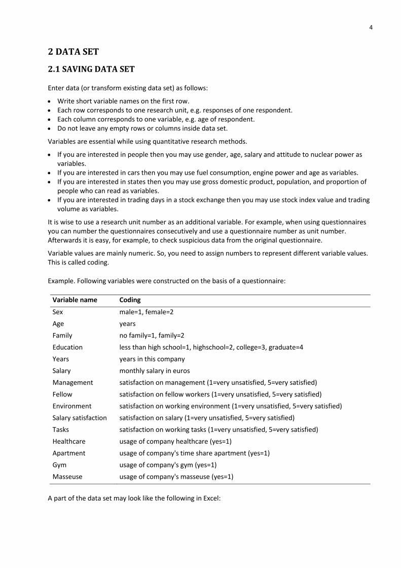
Example. Following variables were constructed on the basis of a questionnaire:
Variable name Coding
Sex male=1, female=2
Age years
Family no family=1, family=2
Education less than high school=1, highschool=2, college=3, graduate=4
Years years in this company
Salary monthly salary in euros
Management satisfaction on management (1=very unsatisfied, 5=very satisfied)
Fellow satisfaction on fellow workers (1=very unsatisfied, 5=very satisfied)
Environment satisfaction on working environment (1=very unsatisfied, 5=very satisfied)
Salary satisfaction satisfaction on salary (1=very unsatisfied, 5=very satisfied)
Tasks satisfaction on working tasks (1=very unsatisfied, 5=very satisfied)
Healthcare usage of company healthcare (yes=1)
Apartment usage of company's time share apartment (yes=1)
Gym usage of company's gym (yes=1)
Masseuse usage of company's masseuse (yes=1)
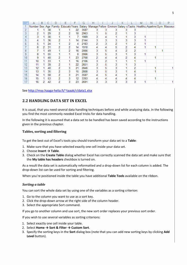
A part of the data set may look like the following in Excel:
5
See http://myy.haaga-helia.fi/~taaak/r/data1.xlsx
2.2 HANDLING DATA SET IN EXCEL
It is usual, that you need several data handling techniques before and while analyzing data. In the following you find the most commonly needed Excel tricks for data handling.
In the following it is assumed that a data set to be handled has been saved according to the instructions given in the previous chapter.
Tables, sorting and filtering
To get the best out of Excel’s tools you should transform your data set to a Table:
1. Make sure that you have selected exactly one cell inside your data set. 2. Choose Insert → Table. 3. Check on the Create Table dialog whether Excel has correctly scanned the data set and make sure that
the My table has headers checkbox is turned on.
As a result the data set is automatically reformatted and a drop-down list for each column is added. The drop-down list can be used for sorting and filtering.
When you’re positioned inside the table you have additional Table Tools available on the ribbon.
Sorting a table
You can sort the whole data set by using one of the variables as a sorting criterion:
1. Go to the column you want to use as a sort key. 2. Click the drop-down arrow at the right side of the column header. 3. Select the appropriate Sort command.
If you go to another column and use sort, the new sort order replaces your previous sort order.
If you wish to use several variables as sorting criterions:
1. Select exactly one cell inside your table. 2. Select Home → Sort & Filter → Custom Sort. 3. Specify the sorting keys in the Sort dialog box (note that you can add new sorting keys by clicking Add
Level button).
6
Filtering a table
You can use sorting to select the desired subset of your data:
1. Sort the data set so that the desired rows are one below the other 2. Select the desired subset of data 3. By using the clipboard, copy the selected subset to another spreadsheet for further use.
You can also form subsets by using filtering:
1. Go to the column you want to use as a filter key. 2. Click the drop-down arrow at the right side of the column header. 3. Select the desired values from the list of distinct values.
To use more complicated smarter filters, open the column’s drop-down list, and choose Number Filters (depending on the data type you may have to choose Date Filters or Text Filters).
To remove a filter, open the drop-down list and choose Clear Filter.
Grouping/Recoding
Before grouping variable values, you should consider whether you like to keep the original values. If so, you should copy the original values to a new column for grouping.
You can use sorting to help grouping:
1. Use the variable to group as a criterion to sort the data set. 2. Select the values for which you are going to give a new value (after sorting the values should be one
below the other). 3. Enter the new value and quit using the key combination ctrl-enter. 4. Repeat the previous two steps as many times as needed.
Another and in many cases the easiest way to group is to use
Home → Find & Select → Replace
Note that replacing is targeted to the whole table or worksheet unless you select the specific cells before the operation.
Learn more by studying the Excel file http://myy.haaga-helia.fi/~taaak/r/table.xlsx
7
3 SUMMARIZING
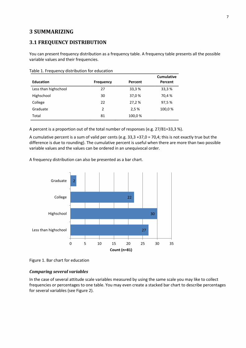
3.1 FREQUENCY DISTRIBUTION
You can present frequency distribution as a frequency table. A frequency table presents all the possible variable values and their frequencies.
Table 1. Frequency distribution for education
Education Frequency Percent Cumulative
Percent
Less than highschool 27 33,3 % 33,3 %
Highschool 30 37,0 % 70,4 %
College 22 27,2 % 97,5 %
Graduate 2 2,5 % 100,0 %
Total 81 100,0 %
A percent is a proportion out of the total number of responses (e.g. 27/81=33,3 %).
A cumulative percent is a sum of valid per cents (e.g. 33,3 +37,0 = 70,4; this is not exactly true but the difference is due to rounding). The cumulative percent is useful when there are more than two possible variable values and the values can be ordered in an unequivocal order.
A frequency distribution can also be presented as a bar chart.
Figure 1. Bar chart for education
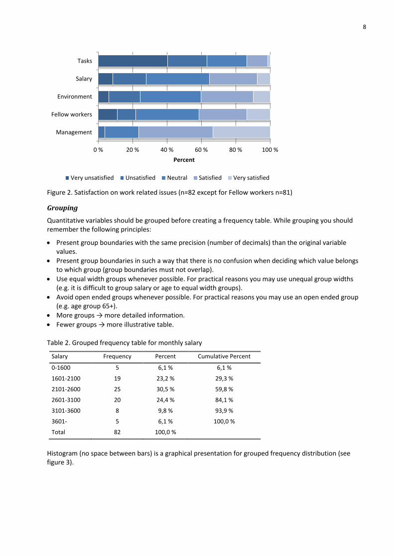
Comparing several variables
In the case of several attitude scale variables measured by using the same scale you may like to collect frequencies or percentages to one table. You may even create a stacked bar chart to describe percentages for several variables (see Figure 2).
27
30
22
2
0 5 10 15 20 25 30 35
Less than highschool
Highschool
College
Graduate
Count (n=81)
8
Figure 2. Satisfaction on work related issues (n=82 except for Fellow workers n=81)
Grouping
Quantitative variables should be grouped before creating a frequency table. While grouping you should remember the following principles:
Present group boundaries with the same precision (number of decimals) than the original variable values.
Present group boundaries in such a way that there is no confusion when deciding which value belongs to which group (group boundaries must not overlap).
Use equal width groups whenever possible. For practical reasons you may use unequal group widths (e.g. it is difficult to group salary or age to equal width groups).
Avoid open ended groups whenever possible. For practical reasons you may use an open ended group (e.g. age group 65+).
More groups → more detailed information.
Fewer groups → more illustrative table.
Table 2. Grouped frequency table for monthly salary
Salary Frequency Percent Cumulative Percent
0-1600 5 6,1 % 6,1 %
1601-2100 19 23,2 % 29,3 %
2101-2600 25 30,5 % 59,8 %
2601-3100 20 24,4 % 84,1 %
3101-3600 8 9,8 % 93,9 %
3601- 5 6,1 % 100,0 %
Total 82 100,0 %
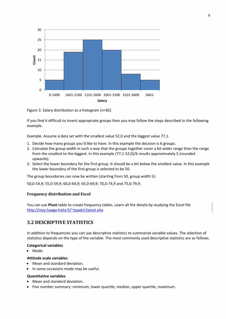
Histogram (no space between bars) is a graphical presentation for grouped frequency distribution (see figure 3).
0 % 20 % 40 % 60 % 80 % 100 %
Management
Fellow workers
Environment
Salary
Tasks
Percent
Very unsatisfied Unsatisfied Neutral Satisfied Very satisfied
9
Figure 3. Salary distribution as a histogram (n=82)
If you find it difficult to invent appropriate groups then you may follow the steps described in the following example.
Example. Assume a data set with the smallest value 52,0 and the biggest value 77,1.
1. Decide how many groups you’d like to have. In this example the decision is 6 groups. 2. Calculate the group width in such a way that the groups together cover a bit wider range than the range
from the smallest to the biggest. In this example (77,1-52,0)/6 results approximately 5 (rounded upwards).
3. Select the lower boundary for the first group. It should be a bit below the smallest value. In this example the lower boundary of the first group is selected to be 50.
The group boundaries can now be written (starting from 50, group width 5):
50,0-54,9; 55,0-59,9; 60,0-64,9; 65,0-69,9; 70,0-74,9 and 75,0-79,9.
Frequency distribution and Excel
You can use Pivot-table to create frequency tables. Learn all the details by studying the Excel file http://myy.haaga-helia.fi/~taaak/r/pivot.xlsx
3.2 DESCRIPTIVE STATISTICS
In addition to frequencies you can use descriptive statistics to summarize variable values. The selection of statistics depends on the type of the variable. The most commonly used descriptive statistics are as follows.
Categorical variables
Mode.
Attitude scale variables
Mean and standard deviation.
In some occasions mode may be useful.
Quantitative variables
Mean and standard deviation.
Five number summary: minimum, lower quartile, median, upper quartile, maximum.
0
5
10
15
20
25
30
0-1600 1601-2100 2101-2600 2601-3100 3101-3600 3601-
Co
un
t
Salary
10
It is evident that while using descriptive statistics you lose part of the original information. A couple of descriptive statistics just can't completely characterize a set of variable values. When using only a set of descriptive statistics, you can easily draw wrong conclusions. So, before calculating any descriptive statistics you should look at the variable’s frequency distribution (see previous chapter). While reading published statistics, you should be cautious if you have no idea on the frequency distribution.
Example. In a company there are 11 employees with salaries 1500, 1500, 1500, 1500, 1500, 2500, 4500, 4500, 5500, 5500 and 35000 euros.
A manager can claim that the average salary is above 5900 euros (mean).
Employees can claim that the average salary is only 1500 euros (mode).
Somebody else may say that the average salary is 2500 euros (median).
To avoid the confusion, it is much better to present the frequency distribution.
Table 3. Frequency distribution for salary
Salary Employees
1500 5
2500 1
4500 2
5500 2
35000 1
Mode
The mode is a value that occurs most often (the highest frequency). A variable may have more than one mode.
Example. A typical reader of a computer magazine is 30-35 years, academically educated male.
It is obvious that the mode can be misleading. In the previous example there may be almost as much not academically educated readers but the mode doesn't give any hint on that.
Arithmetic Mean
The mean can be used with quantitative variables. The mean is also used with attitude scale variables when it can be assumed that the intervals between categories are of equal width.
Example. Customer satisfaction can be measured using the scale 1-5 (1=completely dissatisfied, 5=completely satisfied). It is useful to compare average satisfaction to different issues using satisfaction means.
The arithmetic mean is the sum of variable values divided by the number of values. The mean can be illustrated as a balance point of a seesaw.
Extremely small or big values affect strongly on a balance point of a seesaw. That is why the mean is misleading and hard to interpret if the distribution is skewed. For a symmetrical distribution the mean is convenient and easy to interpret. If a distribution is skewed then you should prefer the median.
11
Example. For the data 1, 1, 2, 1, 10 the mean equals 3. The mean doesn't characterize the data set well because the data set is skewed (one extremely big value compared to the other values).
Note: When presenting the mean you should also present the standard deviation as a measure of variation. Minimum and maximum should always be presented.
Comparing several variables
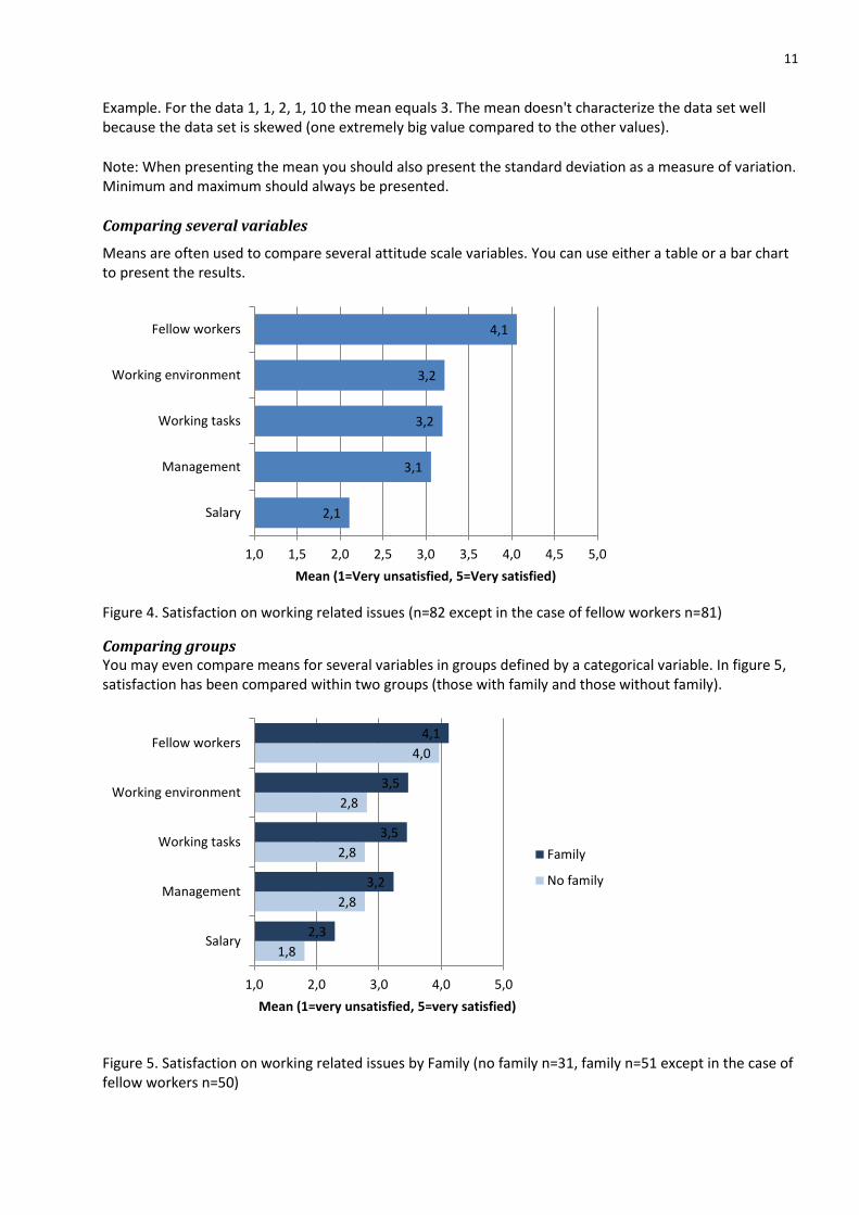
Means are often used to compare several attitude scale variables. You can use either a table or a bar chart to present the results.
Figure 4. Satisfaction on working related issues (n=82 except in the case of fellow workers n=81)
Comparing groups You may even compare means for several variables in groups defined by a categorical variable. In figure 5, satisfaction has been compared within two groups (those with family and those without family).
Figure 5. Satisfaction on working related issues by Family (no family n=31, family n=51 except in the case of fellow workers n=50)
2,1
3,1
3,2
3,2
4,1
1,0 1,5 2,0 2,5 3,0 3,5 4,0 4,5 5,0
Salary
Management
Working tasks
Working environment
Fellow workers
Mean (1=Very unsatisfied, 5=Very satisfied)
1,8
2,8
2,8
2,8
4,0
2,3
3,2
3,5
3,5
4,1
1,0 2,0 3,0 4,0 5,0
Salary
Management
Working tasks
Working environment
Fellow workers
Mean (1=very unsatisfied, 5=very satisfied)
Family
No family
12
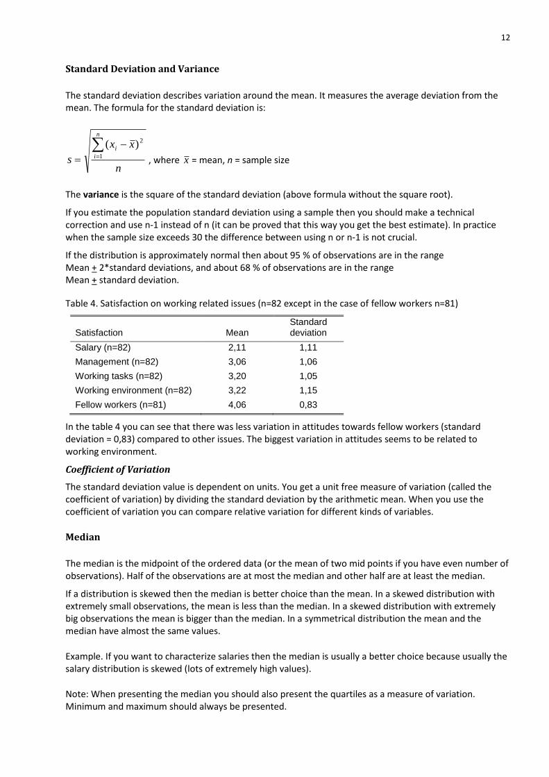
Standard Deviation and Variance
The standard deviation describes variation around the mean. It measures the average deviation from the mean. The formula for the standard deviation is:
n
xx
s
n
i
i
1
2)(
, where x = mean, n = sample size
The variance is the square of the standard deviation (above formula without the square root).
If you estimate the population standard deviation using a sample then you should make a technical correction and use n-1 instead of n (it can be proved that this way you get the best estimate). In practice when the sample size exceeds 30 the difference between using n or n-1 is not crucial.
If the distribution is approximately normal then about 95 % of observations are in the range Mean + 2*standard deviations, and about 68 % of observations are in the range Mean + standard deviation.
Table 4. Satisfaction on working related issues (n=82 except in the case of fellow workers n=81)
Satisfaction Mean Standard deviation
Salary (n=82) 2,11 1,11
Management (n=82) 3,06 1,06
Working tasks (n=82) 3,20 1,05
Working environment (n=82) 3,22 1,15
Fellow workers (n=81) 4,06 0,83
In the table 4 you can see that there was less variation in attitudes towards fellow workers (standard deviation = 0,83) compared to other issues. The biggest variation in attitudes seems to be related to working environment.
Coefficient of Variation
The standard deviation value is dependent on units. You get a unit free measure of variation (called the coefficient of variation) by dividing the standard deviation by the arithmetic mean. When you use the coefficient of variation you can compare relative variation for different kinds of variables.
Median
The median is the midpoint of the ordered data (or the mean of two mid points if you have even number of observations). Half of the observations are at most the median and other half are at least the median.
If a distribution is skewed then the median is better choice than the mean. In a skewed distribution with extremely small observations, the mean is less than the median. In a skewed distribution with extremely big observations the mean is bigger than the median. In a symmetrical distribution the mean and the median have almost the same values.
Example. If you want to characterize salaries then the median is usually a better choice because usually the salary distribution is skewed (lots of extremely high values).
Note: When presenting the median you should also present the quartiles as a measure of variation. Minimum and maximum should always be presented.
13
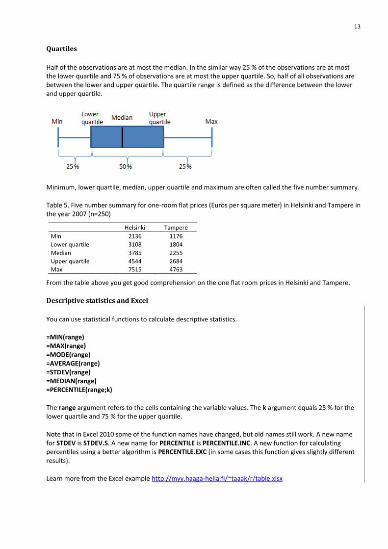
Quartiles
Half of the observations are at most the median. In the similar way 25 % of the observations are at most the lower quartile and 75 % of observations are at most the upper quartile. So, half of all observations are between the lower and upper quartile. The quartile range is defined as the difference between the lower and upper quartile.
Minimum, lower quartile, median, upper quartile and maximum are often called the five number summary.
Table 5. Five number summary for one-room flat prices (Euros per square meter) in Helsinki and Tampere in the year 2007 (n=250)
Helsinki Tampere
Min 2136 1176
Lower quartile 3108 1804
Median 3785 2255
Upper quartile 4544 2684
Max 7515 4763
From the table above you get good comprehension on the one flat room prices in Helsinki and Tampere.
Descriptive statistics and Excel
You can use statistical functions to calculate descriptive statistics.
=MIN(range) =MAX(range) =MODE(range) =AVERAGE(range) =STDEV(range) =MEDIAN(range) =PERCENTILE(range;k)
The range argument refers to the cells containing the variable values. The k argument equals 25 % for the lower quartile and 75 % for the upper quartile.
Note that in Excel 2010 some of the function names have changed, but old names still work. A new name for STDEV is STDEV.S. A new name for PERCENTILE is PERCENTILE.INC. A new function for calculating percentiles using a better algorithm is PERCENTILE.EXC (in some cases this function gives slightly different results).
Learn more from the Excel example http://myy.haaga-helia.fi/~taaak/r/table.xlsx
14
4 RELATIONSHIP BETWEEN TWO VARIABLES
The way to analyze relationship depends on the variable type:
Use cross tabulation for categorical and attitude scale variables.
Use scatter diagram and correlation coefficient for quantitative variables.
4.1 CROSS TABULATION
If you observe variation then you may study whether the variation is related to the variation of other variables. For example, is there a relationship between respondent's sex and opinion; is there a relationship between the number of faults in a car model and the manufacturing country? A Cross tabulation is a good way to look for a possible relation between two variables.
Table 6. Relationship between sex and education
Male Female Total
High school 35,5 % 26,3 % 33,3 %
Junior college 37,1 % 36,8 % 37,0 %
Bachelor 24,2 % 36,8 % 27,2 %
Graduate 3,2 % 0,0 % 2,5 %
Total 100,0 % 100,0 % 100,0 %
n 62 19 81
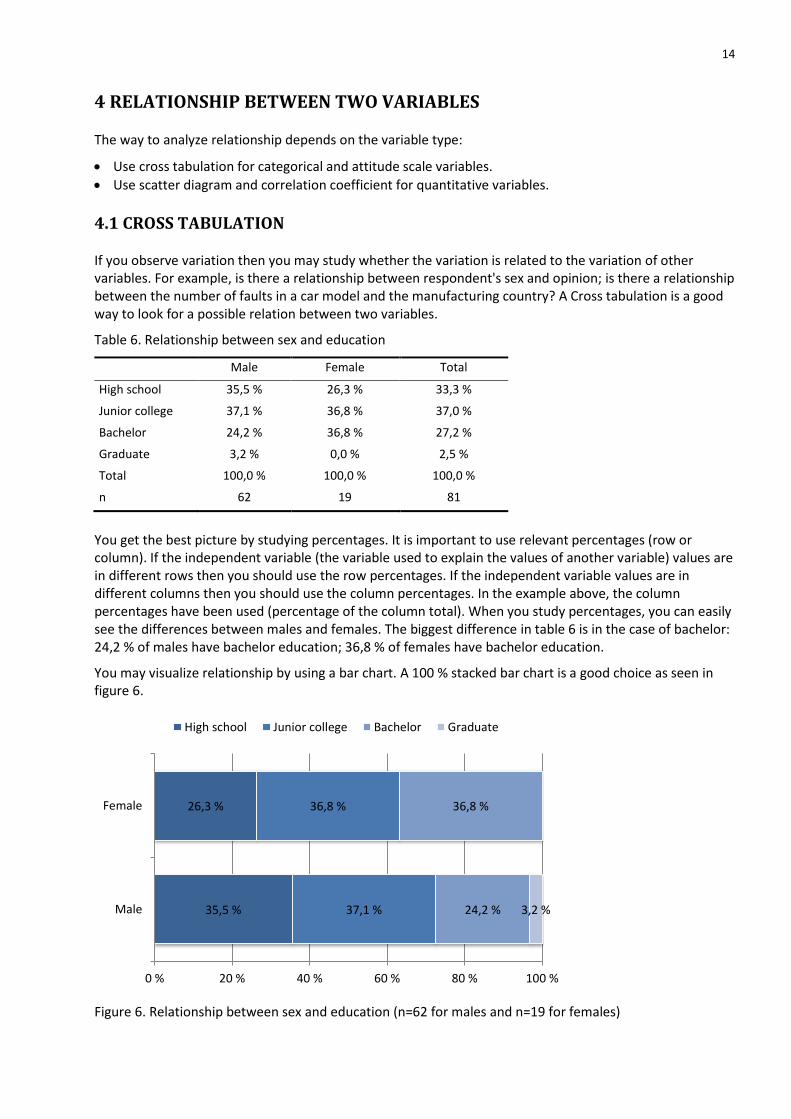
You get the best picture by studying percentages. It is important to use relevant percentages (row or column). If the independent variable (the variable used to explain the values of another variable) values are in different rows then you should use the row percentages. If the independent variable values are in different columns then you should use the column percentages. In the example above, the column percentages have been used (percentage of the column total). When you study percentages, you can easily see the differences between males and females. The biggest difference in table 6 is in the case of bachelor: 24,2 % of males have bachelor education; 36,8 % of females have bachelor education.
You may visualize relationship by using a bar chart. A 100 % stacked bar chart is a good choice as seen in figure 6.
Figure 6. Relationship between sex and education (n=62 for males and n=19 for females)
35,5 %
26,3 %
37,1 %
36,8 %
24,2 %
36,8 %
3,2 %
0 % 20 % 40 % 60 % 80 % 100 %
Male
Female
High school Junior college Bachelor Graduate
15
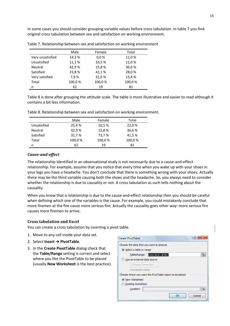
In some cases you should consider grouping variable values before cross tabulation. In table 7 you find original cross tabulation between sex and satisfaction on working environment.
Table 7. Relationship between sex and satisfaction on working environment
Male Female Total
Very unsatisfied 14,3 % 0,0 % 11,0 %
Unsatisfied 11,1 % 10,5 % 11,0 %
Neutral 42,9 % 15,8 % 36,6 %
Satisfied 23,8 % 42,1 % 28,0 %
Very satisfied 7,9 % 31,6 % 13,4 %
Total 100,0 % 100,0 % 100,0 %
n 62 19 81
Table 8 is done after grouping the attitude scale. The table is more illustrative and easier to read although it contains a bit less information.
Table 8. Relationship between sex and satisfaction on working environment.
Male Female Total
Unsatisfied 25,4 % 10,5 % 22,0 %
Neutral 42,9 % 15,8 % 36,6 %
Satisfied 31,7 % 73,7 % 41,5 %
Total 100,0 % 100,0 % 100,0 %
n 62 19 81
Cause-and-effect
The relationship identified in an observational study is not necessarily due to a cause-and-effect relationship. For example, assume that you notice that every time when you wake up with your shoes in your legs you have a headache. You don't conclude that there is something wrong with your shoes. Actually there may be the third variable causing both the shoes and the headache. So, you always need to consider whether the relationship is due to causality or not. A cross tabulation as such tells nothing about the causality.
When you know that a relationship is due to the cause-and-effect relationship then you should be careful when defining which one of the variables is the cause. For example, you could mistakenly conclude that more firemen at the fire cause more serious fire. Actually the causality goes other way: more serious fire causes more firemen to arrive.
Cross tabulation and Excel
You can create a cross tabulation by inserting a pivot table.
1. Move to any cell inside your data set.
2. Select Insert → PivotTable.
3. In the Create PivotTable dialog check that the Table/Range setting is correct and select where you like the PivotTable to be placed (usually New Worksheet is the best practice).
16
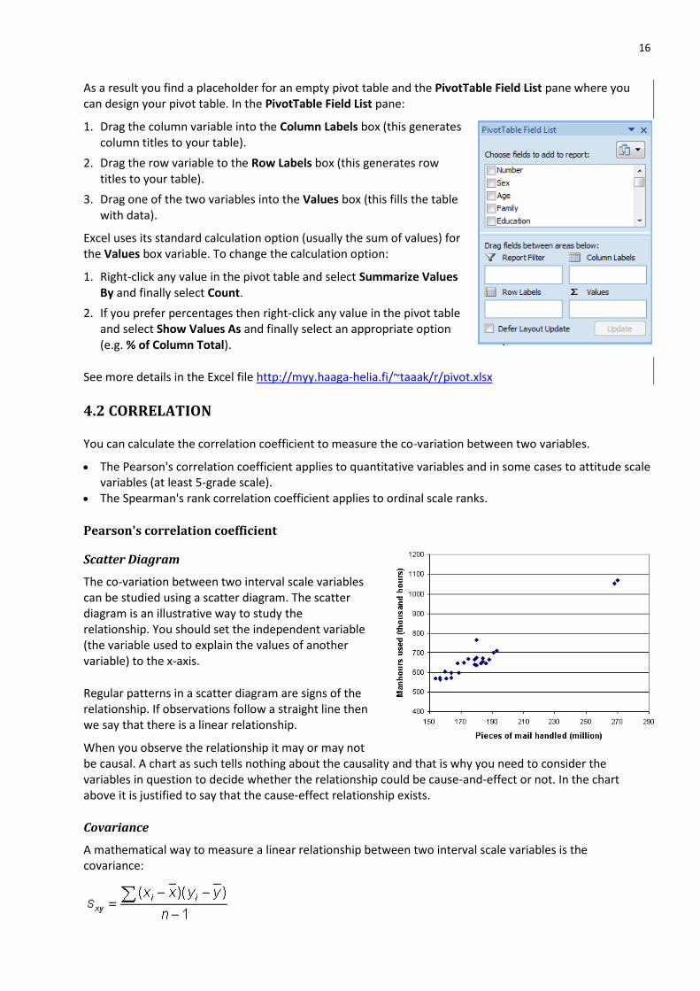
As a result you find a placeholder for an empty pivot table and the PivotTable Field List pane where you can design your pivot table. In the PivotTable Field List pane:
1. Drag the column variable into the Column Labels box (this generates column titles to your table).
2. Drag the row variable to the Row Labels box (this generates row titles to your table).
3. Drag one of the two variables into the Values box (this fills the table with data).
Excel uses its standard calculation option (usually the sum of values) for the Values box variable. To change the calculation option:
1. Right-click any value in the pivot table and select Summarize Values By and finally select Count.
2. If you prefer percentages then right-click any value in the pivot table and select Show Values As and finally select an appropriate option (e.g. % of Column Total).
See more details in the Excel file http://myy.haaga-helia.fi/~taaak/r/pivot.xlsx
4.2 CORRELATION
You can calculate the correlation coefficient to measure the co-variation between two variables.
The Pearson's correlation coefficient applies to quantitative variables and in some cases to attitude scale variables (at least 5-grade scale).
The Spearman's rank correlation coefficient applies to ordinal scale ranks.
Pearson's correlation coefficient
Scatter Diagram
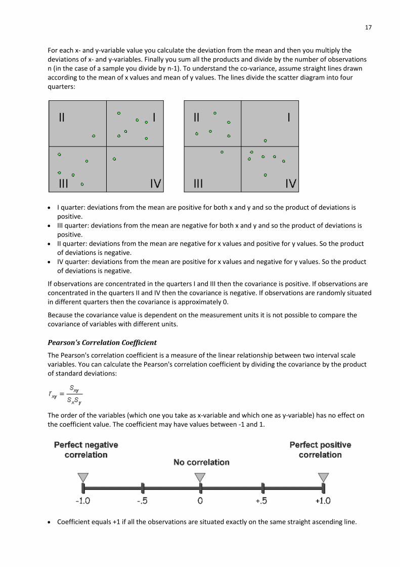
The co-variation between two interval scale variables can be studied using a scatter diagram. The scatter diagram is an illustrative way to study the relationship. You should set the independent variable (the variable used to explain the values of another variable) to the x-axis.
Regular patterns in a scatter diagram are signs of the relationship. If observations follow a straight line then we say that there is a linear relationship.
When you observe the relationship it may or may not be causal. A chart as such tells nothing about the causality and that is why you need to consider the variables in question to decide whether the relationship could be cause-and-effect or not. In the chart above it is justified to say that the cause-effect relationship exists.
Covariance
A mathematical way to measure a linear relationship between two interval scale variables is the covariance:
17
For each x- and y-variable value you calculate the deviation from the mean and then you multiply the deviations of x- and y-variables. Finally you sum all the products and divide by the number of observations n (in the case of a sample you divide by n-1). To understand the co-variance, assume straight lines drawn according to the mean of x values and mean of y values. The lines divide the scatter diagram into four quarters:
I quarter: deviations from the mean are positive for both x and y and so the product of deviations is positive.
III quarter: deviations from the mean are negative for both x and y and so the product of deviations is positive.
II quarter: deviations from the mean are negative for x values and positive for y values. So the product of deviations is negative.
IV quarter: deviations from the mean are positive for x values and negative for y values. So the product of deviations is negative.
If observations are concentrated in the quarters I and III then the covariance is positive. If observations are concentrated in the quarters II and IV then the covariance is negative. If observations are randomly situated in different quarters then the covariance is approximately 0.
Because the covariance value is dependent on the measurement units it is not possible to compare the covariance of variables with different units.
Pearson's Correlation Coefficient
The Pearson's correlation coefficient is a measure of the linear relationship between two interval scale variables. You can calculate the Pearson's correlation coefficient by dividing the covariance by the product of standard deviations:
The order of the variables (which one you take as x-variable and which one as y-variable) has no effect on the coefficient value. The coefficient may have values between -1 and 1.
Coefficient equals +1 if all the observations are situated exactly on the same straight ascending line.
18
Coefficient equals -1 if all the observations are situated exactly on the same straight descending line. Coefficient equals 0 if there is no linear relationship between the two variables. There may still be some
nonlinear relationship.
There is no unequivocal rule for interpreting the correlation coefficient value but a rough rule for absolute values is the following:
|rxy| < 0,3 there is hardly any linear relationship between variables 0,3 < |rxy| < 0,7 there is some linear relationship between variables |rxy| > 0,7 there is clear linear relationship between variables.
Note still, that the sample size has effect on the interpretation. For big samples smaller coefficients may be significant (see further information in chapter 6).
The correlation coefficients are not dependent on the units of variables. So, you can compare the correlation coefficients of different variables.
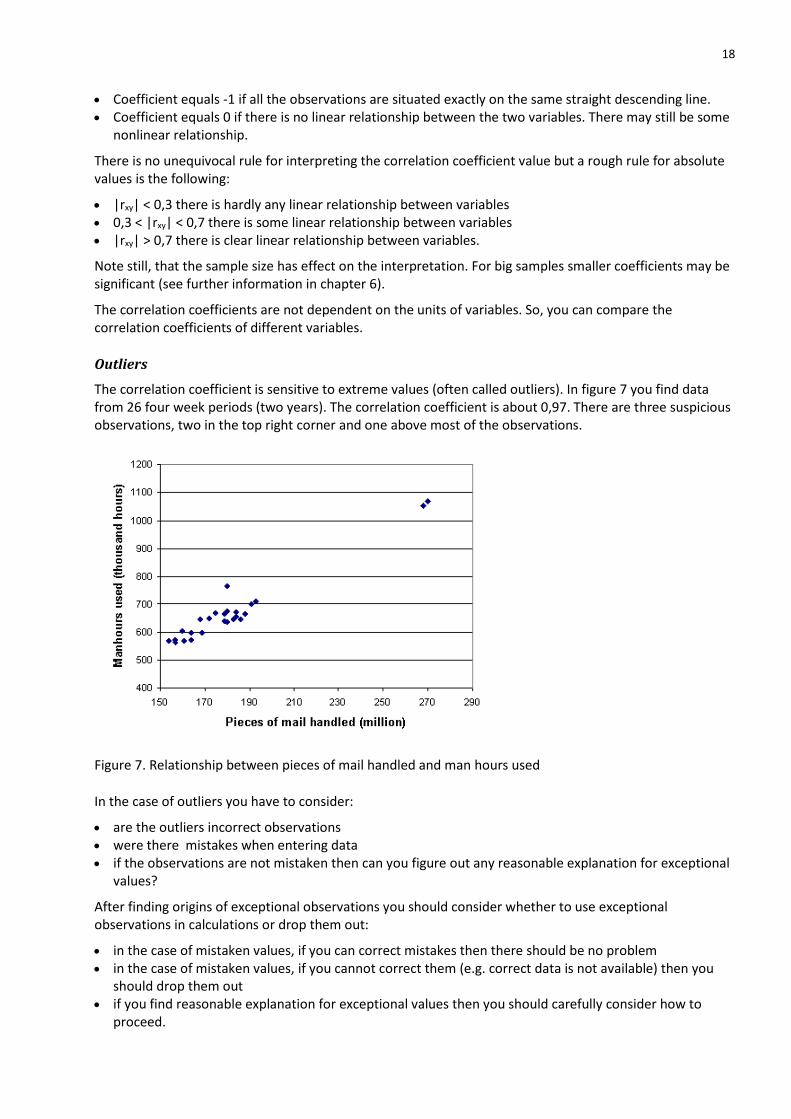
Outliers
The correlation coefficient is sensitive to extreme values (often called outliers). In figure 7 you find data from 26 four week periods (two years). The correlation coefficient is about 0,97. There are three suspicious observations, two in the top right corner and one above most of the observations.
Figure 7. Relationship between pieces of mail handled and man hours used
In the case of outliers you have to consider:
are the outliers incorrect observations were there mistakes when entering data if the observations are not mistaken then can you figure out any reasonable explanation for exceptional
values?
After finding origins of exceptional observations you should consider whether to use exceptional observations in calculations or drop them out:
in the case of mistaken values, if you can correct mistakes then there should be no problem in the case of mistaken values, if you cannot correct them (e.g. correct data is not available) then you
should drop them out if you find reasonable explanation for exceptional values then you should carefully consider how to
proceed.

19
In the example above an explanation for exceptional values was found. Values were related to the Christmas season. It was also known that during the Christmas season lots of temporary workers are used. Main purpose of relationship study was to find out relationship between pieces of mail and man hours in the normal situation. Because the Christmas season is not a normal situation and because temporary workers are not as efficient as full-time workers, the Christmas season observations were dropped out. After dropping three observations the correlation coefficient value was about 0,906.
Correlation and Excel
Use the Scatter chart type to create a scatter diagram (see chapter 5 for further information). Use the CORREL function to calculate the correlation coefficient. For example,
=CORREL(A2:A11;B2:B11)
gives you the correlation coefficient between the values in the cells A2:A11 and B2:B11. In the case of ranks you call the result the Spearman's rank correlation.
Practice by using the Excel example http://myy.haaga-helia.fi/~taaak/r/corre.xlsx
20
5 GRAPHICS
Keep the following principles in mind when using graphical presentation of data:
Each chart should have a purpose. Try different possibilities and select the most suitable format for the purpose. A chart should be clear and easy to understand. Present data fairly and honestly. State the source of data. Give each chart a title. Give clear and accurate labels for each axis. Use consistent units and tell what these units are. Avoid unnecessary extra effects (like 3D). Integrate a chart naturally with the surrounding text.
5.1 How to create graphics in Excel
The following is written for Excel 2007 and Excel 2010. In the case of Excel 2013 you should note that there is no Layout tab. Instead of Layout there is a + -button beside an active chart.
First of all you should know what kind of chart you want to create. When you know your objective, you can start with the following three steps:
1. Select the range of cells that includes the data you want to chart. 2. Select the Insert tab and click one of the chart types. 3. When you click a chart type, you get a drop-down list of the subtypes. Click the subtype you want to
use. As a result you get a tentative chart.
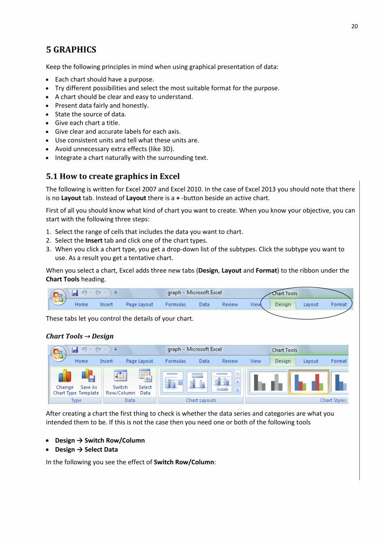
When you select a chart, Excel adds three new tabs (Design, Layout and Format) to the ribbon under the Chart Tools heading.
These tabs let you control the details of your chart.
Chart Tools → Design
After creating a chart the first thing to check is whether the data series and categories are what you intended them to be. If this is not the case then you need one or both of the following tools
Design → Switch Row/Column
Design → Select Data
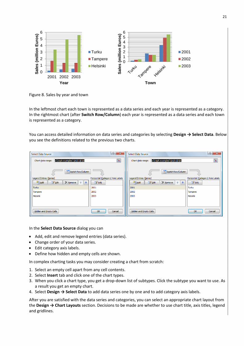
In the following you see the effect of Switch Row/Column:
21
Figure 8. Sales by year and town
In the leftmost chart each town is represented as a data series and each year is represented as a category. In the rightmost chart (after Switch Row/Column) each year is represented as a data series and each town is represented as a category.
You can access detailed information on data series and categories by selecting Design → Select Data. Below you see the definitions related to the previous two charts.
In the Select Data Source dialog you can
Add, edit and remove legend entries (data series).
Change order of your data series.
Edit category axis labels.
Define how hidden and empty cells are shown.
In complex charting tasks you may consider creating a chart from scratch:
1. Select an empty cell apart from any cell contents. 2. Select Insert tab and click one of the chart types. 3. When you click a chart type, you get a drop-down list of subtypes. Click the subtype you want to use. As
a result you get an empty chart. 4. Select Design → Select Data to add data series one by one and to add category axis labels.
After you are satisfied with the data series and categories, you can select an appropriate chart layout from the Design → Chart Layouts section. Decisions to be made are whether to use chart title, axis titles, legend and gridlines.
0
1
2
3
4
5
6
2001 2002 2003
Sale
s (
millio
n E
uro
s)
Year
Turku
Tampere
Helsinki0
1
2
3
4
5
6
Sale
s (
millio
n E
uro
s)
Town
2001
2002
2003

22
To edit a title click the title to select it and then click another time to edit the text.
If ready to use Chart Layouts do not satisfy you then you can alternatively add titles, gridlines etc. by using the Chart Tools → Layout tab.
Chart Tools → Layout (+ -button beside an active chart in Excel 2013)
A chart contains objects like category axis, category axis title, value axis, value axis title, legend, data series, and so on. The Layout tools let you add and format objects.
By using the tools on the Layout - Insert section, you can add text boxes, shapes and pictures to you chart.
By using the tools on the Layout – Labels section you can add the chart title, the axis titles, the legend, data labels and the data table. To edit a title click the title to select it and then click another time to edit the text.
By using the tools on the Layout – Axes section you can add and modify axes and gridlines (gridlines are vertical or horizontal lines on the chart’s background).
To format an object you must first select it. An object can be selected by clicking it. Some objects may be difficult to locate exactly. If you have difficulties to select an object you can use the arrow keys. Each time you press an arrow key, Excel selects the next chart object. So, if you keep pressing an arrow key, you’ll eventually cycle through all the objects that you can select in the current chart. You can also select chart objects with the ribbon’s Layout → Current Selection section. Using the object list, you can select any of the chart objects, except individual data points.
After selecting the object you can format it by choosing Layout → Format Selection (or right-click mouse above the object and select Format).
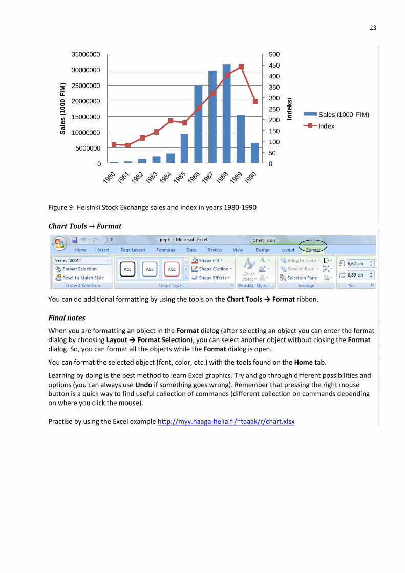
If you present two data series with different scales then you must add another value axis:
Select the data series you like to use with another value axis.
Select Layout → Format Selection.
Under the Series Options select Secondary Axis.
In the following chart the index values are shown on the secondary axis. Moreover sales and index are charted by using different chart types. After creating e.g. a line chart you can select one of the series and change the chart type (Design → Change Chart Type)
23
Figure 9. Helsinki Stock Exchange sales and index in years 1980-1990
Chart Tools → Format
You can do additional formatting by using the tools on the Chart Tools → Format ribbon.
Final notes
When you are formatting an object in the Format dialog (after selecting an object you can enter the format dialog by choosing Layout → Format Selection), you can select another object without closing the Format dialog. So, you can format all the objects while the Format dialog is open.
You can format the selected object (font, color, etc.) with the tools found on the Home tab.
Learning by doing is the best method to learn Excel graphics. Try and go through different possibilities and options (you can always use Undo if something goes wrong). Remember that pressing the right mouse button is a quick way to find useful collection of commands (different collection on commands depending on where you click the mouse).
Practise by using the Excel example http://myy.haaga-helia.fi/~taaak/r/chart.xlsx
0
50
100
150
200
250
300
350
400
450
500
0
5000000
10000000
15000000
20000000
25000000
30000000
35000000
Ind
eksi
Sale
s (
1000 F
IM)
Helsinki Stock Exchange 1980-1990
Sales (1000 FIM)
Index
24
6 STATISTICAL INFERENCE
Statistical inference: drawing conclusions about the whole population on the basis of a sample. When drawing conclusions on the basis of a sample you need to consider uncertainty related to a sampling error. Methods for statistical inference are
Parameter estimation Hypothesis testing
Note, that population parameters are usually denoted by using Greek alphabets:
Population Sample
Mean μ x
Standard deviation σ s
Proportion π p
Sampling Error
Tables and descriptive statistics, computed from a sample, describe only the sample. You can't straight away generalize results to the population. It is possible to draw conclusions about the whole population, if the sample can be assumed to be representative. See the appendix 1 for further information on how get a representative sample.
However, conclusions based on a sample are never absolutely firm. You have to accept a risk of wrong conclusion. A risk of being mistaken is due to the sampling error: composition of a sample is due to chance and that is why results vary randomly from sample to sample.
Parameter estimation A population parameter can be estimated by calculating an estimate from a sample. Uncertainty (due to the sampling error) related to the estimate is represented as an error margin. It is common to present the result as a confidence interval: estimate + error margin. Usually, the error margin related to 95% confidence level is used.
Example. Suppose that a survey showed that 51% of respondents were in favour of a new nuclear power plant. The error margin calculated from the sample was 3 percentage points. Thus the 95 % confidence interval for supporters of the new nuclear power plant is 48% - 54%. This can be interpreted as follows: I am 95% confident that the proportion of supporters is somewhere between 48 % and 54 %.
The way to calculate an error margin is different for different kinds of population parameters.
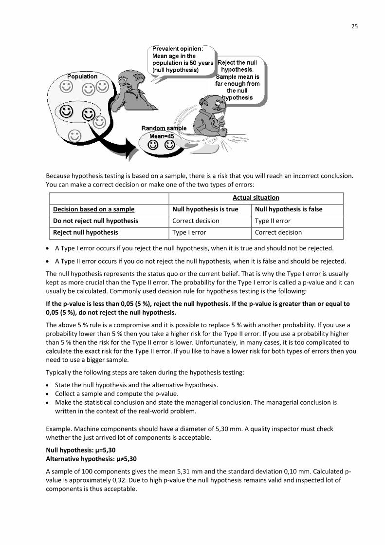
Hypotheses testing
Hypothesis testing begins with a claim about a population. A sample taken from the population is used to see if it better supports the stated claim, called the null hypothesis, or the mutually exclusive alternative, called the alternative hypothesis. You reject the null hypothesis when there is sufficient evidence from the sample information against the null hypothesis.
25
Because hypothesis testing is based on a sample, there is a risk that you will reach an incorrect conclusion. You can make a correct decision or make one of the two types of errors:
Actual situation
Decision based on a sample Null hypothesis is true Null hypothesis is false
Do not reject null hypothesis Correct decision Type II error
Reject null hypothesis Type I error Correct decision
A Type I error occurs if you reject the null hypothesis, when it is true and should not be rejected.
A Type II error occurs if you do not reject the null hypothesis, when it is false and should be rejected.
The null hypothesis represents the status quo or the current belief. That is why the Type I error is usually kept as more crucial than the Type II error. The probability for the Type I error is called a p-value and it can usually be calculated. Commonly used decision rule for hypothesis testing is the following:
If the p-value is less than 0,05 (5 %), reject the null hypothesis. If the p-value is greater than or equal to 0,05 (5 %), do not reject the null hypothesis.
The above 5 % rule is a compromise and it is possible to replace 5 % with another probability. If you use a probability lower than 5 % then you take a higher risk for the Type II error. If you use a probability higher than 5 % then the risk for the Type II error is lower. Unfortunately, in many cases, it is too complicated to calculate the exact risk for the Type II error. If you like to have a lower risk for both types of errors then you need to use a bigger sample.
Typically the following steps are taken during the hypothesis testing:
State the null hypothesis and the alternative hypothesis. Collect a sample and compute the p-value. Make the statistical conclusion and state the managerial conclusion. The managerial conclusion is
written in the context of the real-world problem.
Example. Machine components should have a diameter of 5,30 mm. A quality inspector must check whether the just arrived lot of components is acceptable.
Null hypothesis: µ=5,30 Alternative hypothesis: µ≠5,30
A sample of 100 components gives the mean 5,31 mm and the standard deviation 0,10 mm. Calculated p-value is approximately 0,32. Due to high p-value the null hypothesis remains valid and inspected lot of components is thus acceptable.
26
The way to calculate a p-value is different for different kinds of hypotheses. Statistical software like SPSS has ready to use commands for calculating p-values. P-values for some tests can be calculated with Excel, too.
6.1 ROADMAP
In the following table you find the methods covered in this material.
Purpose
Variable type
Quantitative Categorical
One variable inference Confidence interval for mean One sample t-test for mean
Confidence interval for proportion One sample z-test for proportion
Comparign two groups Two independent samples: -Independent samples t-test Two dependent samples: -Dependent (paired) samples t-test
Chi square test
Relationship between two variables
Testing correlation Chi square test
6.2 INFERENCE - PROPORTION
Preconditions
Sample is randomly chosen (see appendix 1) Sample is big enough (several hundred)
Estimation
The objective is to estimate the population proportion. If you have a sample then the best guess is that the population proportion equals the sample proportion. Rarely a sample proportion equals exactly the population proportion. This is due to the sampling error. Uncertainty can be expressed by giving the error margin. Usually the error margin is related to the 95 % confidence level.
In the Excel file http://myy.haaga-helia.fi/~taaak/r/p.xlsx you find a template for calculating the error margin. You need to enter the sample size, the sample proportion and the confidence level (usually 95 %) into the template.
Example. In a sample of 1800 proportion of defectives is 5,0%. The error margin is 1,0 percentage points. Thus the confidence interval for defectives is 4,0% - 6,0%.
So, you can be 95 % sure that the true proportion of defectives is in the range 4,0 % - 6,0 %.
You can easily calculate the error margin with your pocket calculator. In practice you get accurate enough results by using the formula (p = population proportion, n = sample size):
n
pp )1(2
27
Finite population correction
If the sample size is more than 5 % of the population size then you can multiply the error margin by a correction term (N=population size, n=sample size):
1
N
nN
The correction term makes the error margin smaller.
Hypothesis testing Hypotheses
If you have a claim (a null hypothesis) concerning the value of the population proportion then the sample proportion can be compared to the null hypothesis. The null hypothesis can originate from an existing theory, prevalent opinion, previous research, manufacturers announcement, and so on.
In a two tailed test hypotheses are (p0 is a value between 0 and 1):
Null hypothesis: Population proportion equals p0*100 %. Alternative hypothesis: Population proportion doesn't equal p0*100 %.
If you are interested in the deviation to the one direction only then it is possible to use a one tailed test. In the one tailed test the alternative hypothesis is:
Alternative hypothesis: Population proportion is smaller than p0. (or greater than p0).
P-value
In the Excel file http://myy.haaga-helia.fi/~taaak/r/p.xlsx you find a template for calculating the p-value. You need to enter the sample size, the sample proportion and the null hypothesis value into the template. Examples are included in the file.
The commonly used decision rule is as follows: If the p-value is less than 0,05 (5 %), reject the null hypothesis. If the p-value is greater than or equal to 0,05 (5 %), do not reject the null hypothesis.
In any case, you must give the p-value as a justification for your decision.
Example. A political party support was earlier 22,8 %. A researcher set hypotheses:
Nollahypoteesi: Support equals 22,8 %. Vaihtoehtoinen hypoteesi: Support is lower than earlier. (less than 22,8 %).
A random sample of 800 contains 166 supporters. One tailed p-value equals 0,076. Because 0,076 is bigger than 0,050, the null hypothesis remains valid.
6.3 INFERENCE - MEAN
Preconditions
Sample is randomly chosen (see appendix 1) Variable values are approximately normally distributed in the population. If the sample size is more than
30 then normality can be compromised.
28
Estimation
The objective is to estimate the population mean. If you have a sample then the best guess is that the population mean equals the sample mean. Rarely a sample mean equals exactly the population mean. This is due to the sampling error. Uncertainty can be expressed by giving the error margin. Usually the error margin related to a 95 % confidence level is used.
In the Excel file http://myy.haaga-helia.fi/~taaak/r/p.xlsx you find a template for calculating the error margin. You need to enter the sample size, the population standard deviation and the confidence level (usually 95 %) into the template. Examples are included in the file.
Example. Machine components should have a length of 156 mm. A quality inspector must check whether the just arrived lot of components is acceptable. A sample of 50 components gives the mean 156,30 and the standard deviation 0,34 mm. Error margin is approximately 0,10 mm. Thus you can be 95% sure that the true mean is in the range 156,2 mm – 156,4 mm. Thus you may conclude that the lot of components is not acceptable.
You can easily calculate the error margin with your pocket calculator. In practice you get accurate enough results by using the formula (σ = population standard deviation, n = sample size):
n
2
If the population standard deviation is unknown then you should use sample standard deviation instead.
Then the sample size should be at least 30.
Finite population correction
If the sample size is more than 5 % of the population size then you can multiply the error margin by a correction term (N=population size, n=sample size):
1
N
nN
Correction term makes error margin smaller.
Hypothesis testing
Hypotheses
If you have a claim (a null hypothesis) concerning the value of the population mean then the sample mean can be compared to the null hypothesis. The null hypothesis can originate from an existing theory, prevalent opinion, previous research, manufacturers announcement, and so on.
In a two-tailed test hypotheses are (x0 is some number):
Null hypothesis: Population mean equals x0. Alternative hypothesis: Population mean doesn't equal x0.
If you are interested in a deviation to the one direction only then it is possible to use a one-tailed test. In the one-tailed test the alternative hypothesis is:
Alternative hypothesis: Population mean is smaller than x0. (or greater than x0).
29
P-value
In the Excel file http://myy.haaga-helia.fi/~taaak/r/p.xlsx you find a template for calculating the p-value. You need to enter the sample size, the sample mean, the population/sample standard deviation and the null hypothesis value into the template. Examples are included in the file.
The commonly used decision rule is as follows: If the p-value is less than 0,05 (5 %), reject the null hypothesis. If the p-value is greater than or equal to 0,05 (5 %), do not reject the null hypothesis.
In any case, you must give the p-value as a justification for your decision.
6.4 INFERENCE – TWO GROUPS
Tests covered in this document are:
Two independent samples t-test. This test can be calculated in two different ways depending on whether the group variances are assumed equal or not.
Paired samples t-test
Two independent samples t-test
Preconditions
Variables have been measured using an interval scale. Samples are randomly chosen and they are independent. Variables are approximately normally distributed in the population. If the sample size is bigger than 30
then normality can be compromised.
Hypotheses In the two tailed test hypotheses are
Null hypothesis: Group means are equal in the population. Alternative hypothesis: Group means are not equal in the population.
If you are interested in a deviation to the one direction only then it is possible to use one tailed test. In the one tailed test the alternative hypothesis is:
Alternative hypothesis: Other group has bigger mean in the population.
P-value
In Excel you calculate the p-value by using the function
=TTEST(group1;group2;tail;type) (In Excel 2010 this function has a new name T.TEST but the old name works as well)
group1 refers to cells containing data for the group1 and group2 refers to cells containing data for the group2
tail may be 1 (one tailed test) or 2 (two tailed test) type may be 2 (independent samples t-test for equal variances) or 3 (independent samples t-test for
unequal variances); see next page for further information on equal or unequal variances.
See examples in the Excel file http://myy.haaga-helia.fi/~taaak/r/p.xlsx
The commonly used decision rule is as follows: If the p-value is less than 0,05 (5 %), reject the null hypothesis. If the p-value is greater than or equal to 0,05 (5 %), do not reject the null hypothesis.
In any case, you must give the p-value as a justification for your decision.
30
Equal or unequal variances?
The two sample t-test is calculated differently depending on whether you assume population variances equal or unequal. If sample standard deviations are near each other you can use the equal variances test. In most cases both ways give almost the same p-value. If you are unsure which one to use then you can test whether the variances are equal or not by using the 2-tailed F-test:
Null hypothesis: Variances are equal Alternative hypothesis: Variances are unequal
In Excel you can calculate the 2-tailed p-value by using the function
=FTEST(group1;group2) (In Excel 2010 this function has a new name F.TEST but the old name works as well)
If the 2-tailed p-value is less than 0,05 (5 %) then you should reject the null hypothesis and use the t-test for unequal variances.
Paired samples t-test
If you have an experiment, in which observations are paired (e.g. group1: salesmen’s monthly sales before training and group2: same salesmen’s monthly sales after training), then you should use the paired sample t-test.
Preconditions
Variables have been measured using the interval scale. Samples are randomly chosen and they are dependent on each other. Variables are approximately normally distributed in the population. If the sample size is bigger than 30
then normality can be compromised.
Hypotheses
In the 2-tailed test hypotheses are
Null hypothesis: The mean of paired differences equals zero. Alternative hypothesis: The mean of paired differences is different from zero.
If you are interested in deviation to the one direction only then it is possible to use the one tailed test. In the one tailed test the alternative hypothesis is:
Alternative hypothesis: The mean of paired differences is positive (or negative).
P-value In Excel you calculate the p-value by using the function
=TTEST(group1;group2;tail;type) (In Excel 2010 this function has a new name T.TEST but the old name works as well)
group1 refers to cells containing data for the group1 and group2 refers to cells containing data for the group2
tail may be 1 (one tailed test) or 2 (two tailed test) type equals 1 in the case of the paired t-test.
See examples in the Excel file http://myy.haaga-helia.fi/~taaak/r/p.xlsx
The commonly used decision rule is as follows: If the p-value is less than 0,05 (5 %), reject the null hypothesis. If the p-value is greater than or equal to 0,05 (5 %), do not reject the null hypothesis.
In any case, you must give the p-value as a justification for your decision.
31
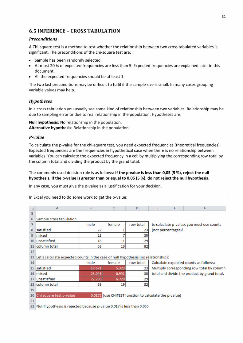
6.5 INFERENCE – CROSS TABULATION
Preconditions
A Chi-square test is a method to test whether the relationship between two cross tabulated variables is significant. The preconditions of the chi-square test are:
Sample has been randomly selected. At most 20 % of expected frequencies are less than 5. Expected frequencies are explained later in this
document. All the expected frequencies should be at least 1.
The two last preconditions may be difficult to fulfil if the sample size is small. In many cases grouping variable values may help.
Hypotheses
In a cross tabulation you usually see some kind of relationship between two variables. Relationship may be due to sampling error or due to real relationship in the population. Hypotheses are:
Null hypothesis: No relationship in the population. Alternative hypothesis: Relationship in the population.
P-value
To calculate the p-value for the chi-square test, you need expected frequencies (theoretical frequencies). Expected frequencies are the frequencies in hypothetical case when there is no relationship between variables. You can calculate the expected frequency in a cell by multiplying the corresponding row total by the column total and dividing the product by the grand total.
The commonly used decision rule is as follows: If the p-value is less than 0,05 (5 %), reject the null hypothesis. If the p-value is greater than or equal to 0,05 (5 %), do not reject the null hypothesis.
In any case, you must give the p-value as a justification for your decision.
In Excel you need to do some work to get the p-value:
32
In our example case the expected frequencies are big enough (preconditions are fulfilled) and we can calculate the p-value by using the function:
=CHITEST(B8:C10;B15:C17)
Arguments of the function are reference to the observed frequencies (B8:C10) and reference to the expected frequencies (B15:C17).
Note that in Excel 2010 some of the functions have changed, but old functions still work. A new name for CHITEST is CHISQ.TEST.
See example in the Excel file http://myy.haaga-helia.fi/~taaak/r/p.xlsx
6.6 INFERENCE - CORRELATION
Preconditions
In the inference related to Pearson's and Spearman's correlations it is assumed that a sample is randomly chosen from the population.
In the case of the Pearson's it is also assumed that variables follow approximately normal distribution in the population. If the sample size is bigger than 30 then normality assumption can be compromised.
Pearson's correlation coefficient
Hypotheses
In the case of the Pearson's correlation you are interested whether there is a linear relationship between two variables or not. Usually the sample correlation deviates from zero indicating some relationship. You should ask whether the deviation from zero is due to chance only or is there true correlation in the population. Hypotheses when testing the correlation are:
Null hypothesis: Correlation coefficient equals 0 in the population Alternative hypothesis: Correlation coefficient is different from 0 in the population.
If you are interested in the correlation of certain sign (positive or negative) then you can use the one tailed test. In the one tailed test the alternative hypothesis is:
Alternative hypothesis: Correlation coefficient is positive (or negative) in the population.
P-value
In the Excel file http://myy.haaga-helia.fi/~taaak/r/p.xlsx you find a template for calculating the p-value.
The commonly used decision rule is as follows: If the p-value is less than 0,05 (5 %), reject the null hypothesis. If the p-value is greater than or equal to 0,05 (5 %), do not reject the null hypothesis.
In any case, you must give the p-value as a justification for your decision.
33
APPENDIX 1: SAMPLING
Population
A population is the whole group you are interested in. Examples of populations: persons suffering high blood pressure, customers of a company, cars registered in year 2009, products produced in a factory, and so on.
In some cases you can use the whole population in you research (census).
Sample
If it is not possible or wise to study the whole population, then you can take a sample. If you have a good reason to think that your sample is representative (miniature of population), then you may draw conclusions about the whole population.
By using appropriate sampling methods, you try to guarantee that your sample is representative. In most sampling methods you select sample members randomly.
Non probability sample
If you select only units, which are available (convenience), or you use experience (judgment) to select a sample then your sample may not be representative.
Example. Street Gallup uses non probability sample because usually those walking on the street at a particular time don't represent the whole population (unless population equals those walking on the street at a particular time). In addition, an interviewer may use her/his judgment to select a sample.
Example. If watchers can e-mail their opinion during a TV program, then we have self-selecting sample. Those who participate may not represent the whole population.
Usually you can't draw any conclusions about the population, if you use a non-probability sample (or at least you should be very careful while drawing conclusions).
Error sources
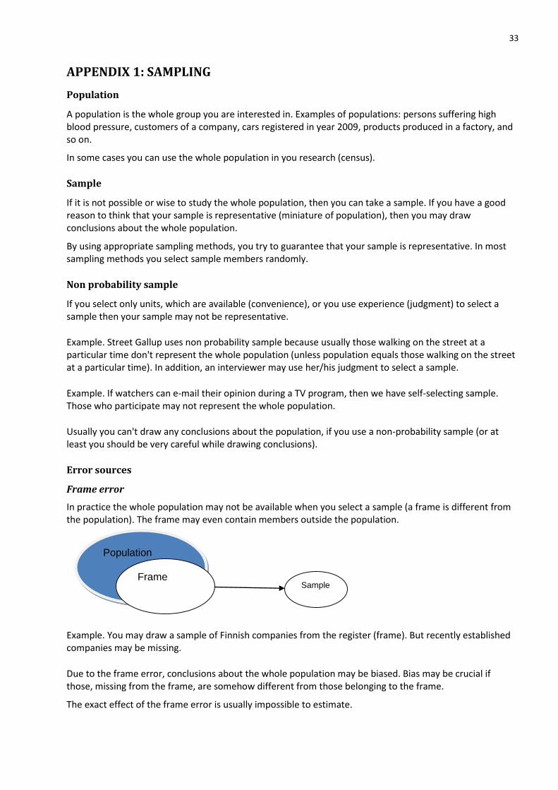
Frame error
In practice the whole population may not be available when you select a sample (a frame is different from the population). The frame may even contain members outside the population.
Example. You may draw a sample of Finnish companies from the register (frame). But recently established companies may be missing.
Due to the frame error, conclusions about the whole population may be biased. Bias may be crucial if those, missing from the frame, are somehow different from those belonging to the frame.
The exact effect of the frame error is usually impossible to estimate.
Population
Frame Sample
34
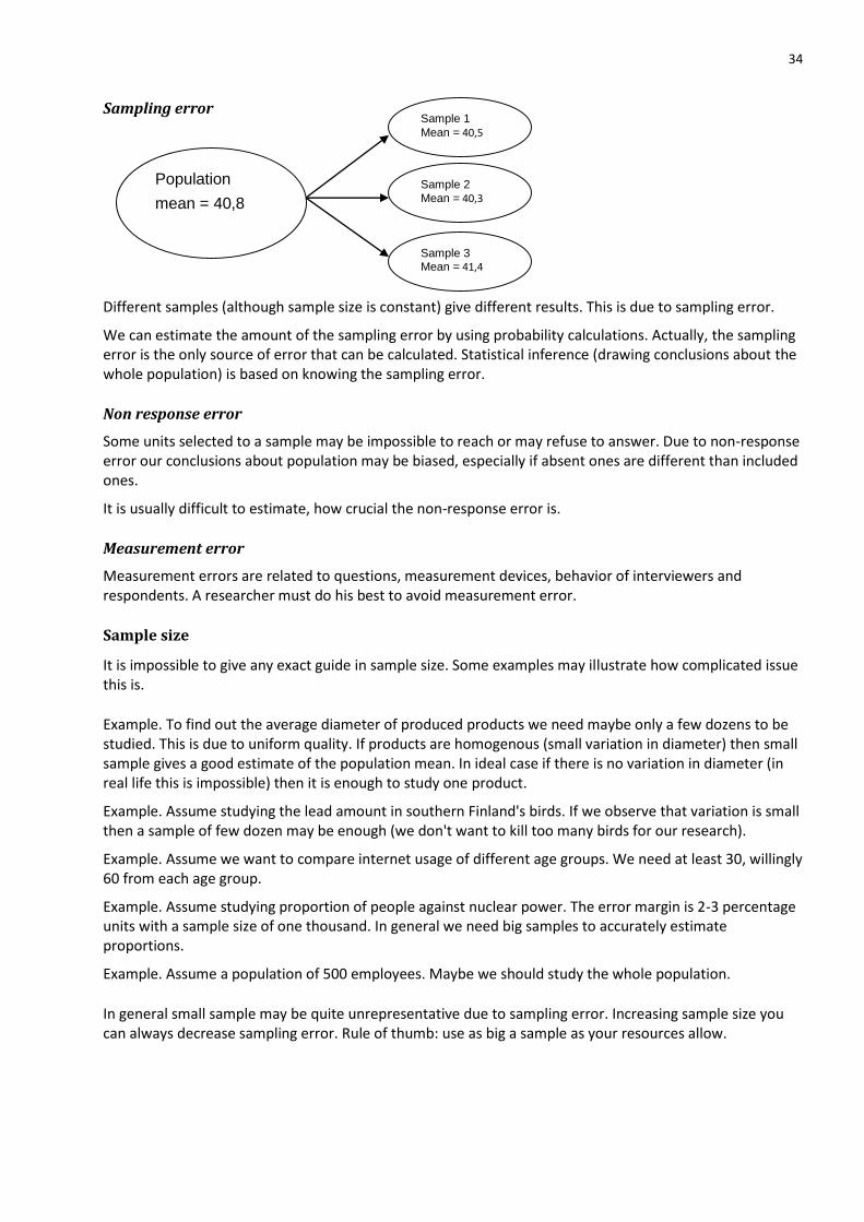
Sampling error
Different samples (although sample size is constant) give different results. This is due to sampling error.
We can estimate the amount of the sampling error by using probability calculations. Actually, the sampling error is the only source of error that can be calculated. Statistical inference (drawing conclusions about the whole population) is based on knowing the sampling error.
Non response error
Some units selected to a sample may be impossible to reach or may refuse to answer. Due to non-response error our conclusions about population may be biased, especially if absent ones are different than included ones.
It is usually difficult to estimate, how crucial the non-response error is.
Measurement error
Measurement errors are related to questions, measurement devices, behavior of interviewers and respondents. A researcher must do his best to avoid measurement error.
Sample size
It is impossible to give any exact guide in sample size. Some examples may illustrate how complicated issue this is.
Example. To find out the average diameter of produced products we need maybe only a few dozens to be studied. This is due to uniform quality. If products are homogenous (small variation in diameter) then small sample gives a good estimate of the population mean. In ideal case if there is no variation in diameter (in real life this is impossible) then it is enough to study one product.
Example. Assume studying the lead amount in southern Finland's birds. If we observe that variation is small then a sample of few dozen may be enough (we don't want to kill too many birds for our research).
Example. Assume we want to compare internet usage of different age groups. We need at least 30, willingly 60 from each age group.
Example. Assume studying proportion of people against nuclear power. The error margin is 2-3 percentage units with a sample size of one thousand. In general we need big samples to accurately estimate proportions.
Example. Assume a population of 500 employees. Maybe we should study the whole population.
In general small sample may be quite unrepresentative due to sampling error. Increasing sample size you can always decrease sampling error. Rule of thumb: use as big a sample as your resources allow.
Population
mean = 40,8
Sample 1
Mean = 40,5
Sample 2
Mean = 40,3
Sample 3 Mean = 41,4
35
Sampling methods
Example. Assume studying product quality by selecting part of Monday morning production. Your sample may not be representative because Monday morning production may be different in quality than production in some other time.
Example. Assume making customer survey in a shop selling alcohol. If you interview customers during lunch time on different days then your sample may not be representative (it may be, if population equals lunch time customers). Customers in different times may be different.
Example. Assume drawing a sample of HAAGA-HELIA's students by selecting randomly classrooms and interviewing those in the classrooms at 13-14 o'clock. The sample may be representative sample of day time students but you should consider evening students and students making their thesis and not participating classes anymore.
If a researcher or interviewer uses his own judgment when selecting a sample then the sample may not be representative. Writer of this may pick willingly beautiful looking females but not angry looking males. Population elements should have equal probability to get in to the sample. In some methods you try to guarantee that some key groups are represented. Real life situation and resources available dictate what kind of method you should use. It is highly important to document sampling method in detail. If possible you should use some combination of the following methods.
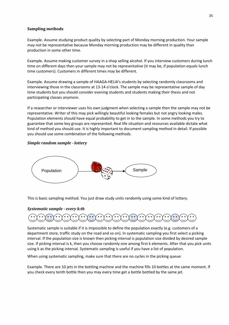
Simple random sample - lottery
This is basic sampling method. You just draw study units randomly using some kind of lottery.
Systematic sample - every k:th
Systematic sample is suitable if it is impossible to define the population exactly (e.g. customers of a department store, traffic study on the road and so on). In systematic sampling you first select a picking interval. If the population size is known then picking interval is population size divided by desired sample size. If picking interval is k, then you choose randomly one among first k elements. After that you pick units using k as the picking interval. Systematic sampling is useful if you have a list of population.
When using systematic sampling, make sure that there are no cycles in the picking queue:
Example. There are 10 jets in the bottling machine and the machine fills 10 bottles at the same moment. If you check every tenth bottle then you may every time get a bottle bottled by the same jet.
Population Sample
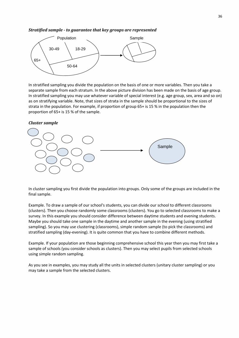
36
Stratified sample - to guarantee that key groups are represented
In stratified sampling you divide the population on the basis of one or more variables. Then you take a separate sample from each stratum. In the above picture division has been made on the basis of age group. In stratified sampling you may use whatever variable of special interest (e.g. age group, sex, area and so on) as on stratifying variable. Note, that sizes of strata in the sample should be proportional to the sizes of strata in the population. For example, if proportion of group 65+ is 15 % in the population then the proportion of 65+ is 15 % of the sample.
Cluster sample
In cluster sampling you first divide the population into groups. Only some of the groups are included in the final sample.
Example. To draw a sample of our school's students, you can divide our school to different classrooms (clusters). Then you choose randomly some classrooms (clusters). You go to selected classrooms to make a survey. In this example you should consider difference between daytime students and evening students. Maybe you should take one sample in the daytime and another sample in the evening (using stratified sampling). So you may use clustering (classrooms), simple random sample (to pick the classrooms) and stratified sampling (day-evening). It is quite common that you have to combine different methods.
Example. If your population are those beginning comprehensive school this year then you may first take a sample of schools (you consider schools as clusters). Then you may select pupils from selected schools using simple random sampling.
As you see in examples, you may study all the units in selected clusters (unitary cluster sampling) or you may take a sample from the selected clusters.
30-49 18-29
50-64
65+
Population Sample
Sample