Embed Size (px)
Citation preview
SHOW ME THE NUMBERS Designing your own data visualizations
September 2017

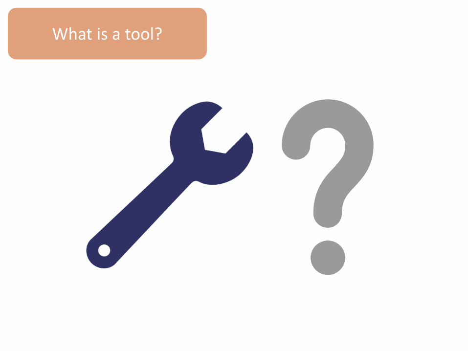
What is a tool?
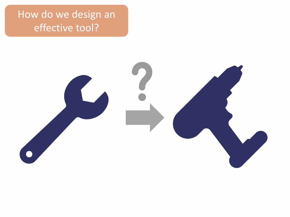
How do we design an effective tool?

How do we design an effective tool?
Data Viz Principles
Program Context
Software Skills
Structured Dataset
Guiding Question

What can we learn from a car dashboard?

How many ways can you represent….
75 37 and
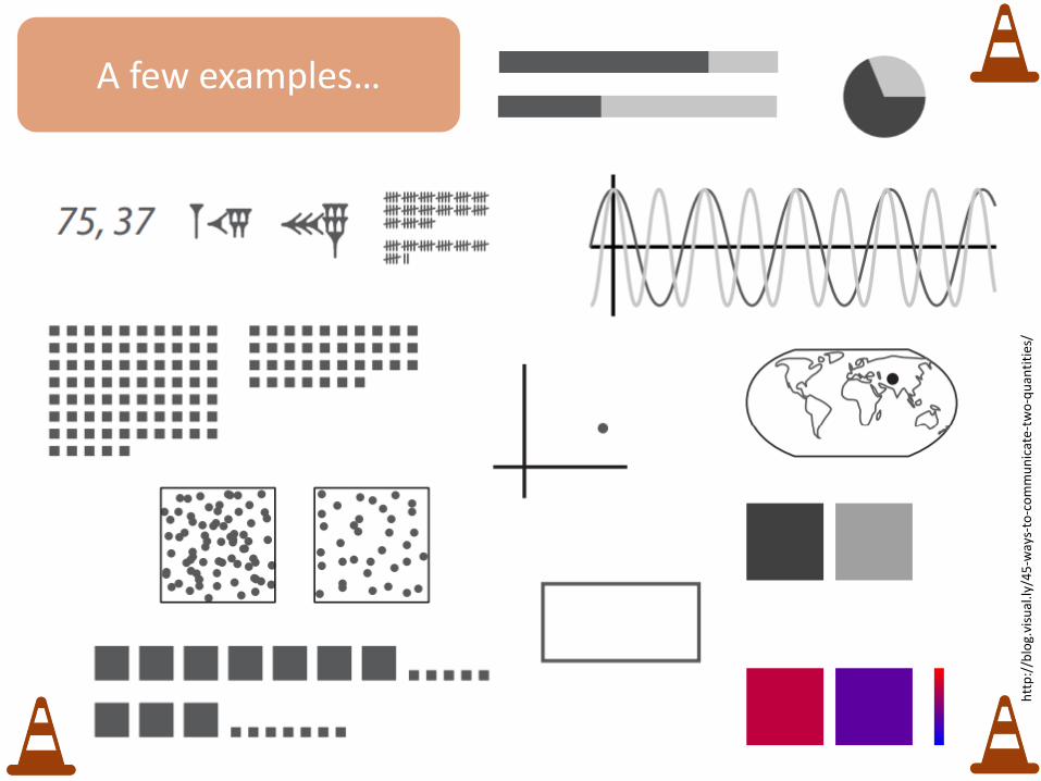
A few examples…
htt
p:/
/blo
g.vi
sual
.ly/4
5-w
ays-
to-c
om
mu
nic
ate
-tw
o-q
uan
titi
es/


Global
Single IM
Broad Focus Narrow Focus
PEPFAR Executives
TWG Leads
SI Advisers
Partners
Country Teams
Agency Leadership
Defining an audience
Sco
tt J
acks
on
, PW
C

Explore
Analyze
Communicate
Influence
A good visualization allows you to…
Ch
afet
z, E
ssam
, Hu
ghes
, Jo
hn
son
(2
01
6).
“Fu
nd
amen
tals
of
Dat
a A
nal
ysis
& V
isu
aliz
atio
n T
rain
ing”

Explore
Analyze
Communicate
Influence
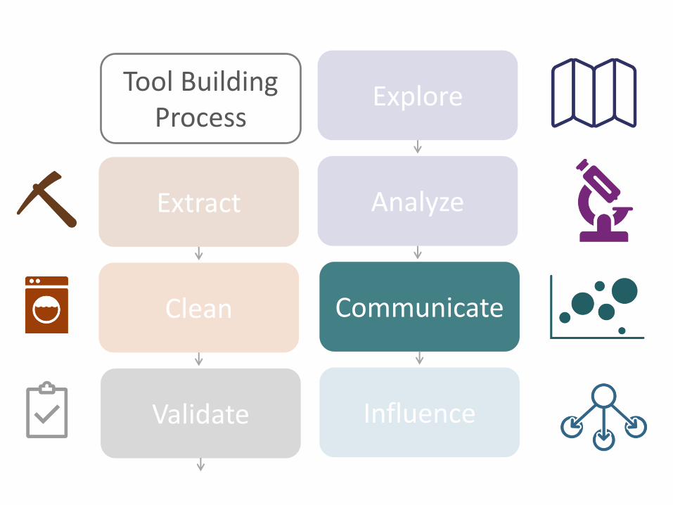
Extract
Clean
Validate
….but first you need to start by setting up the data
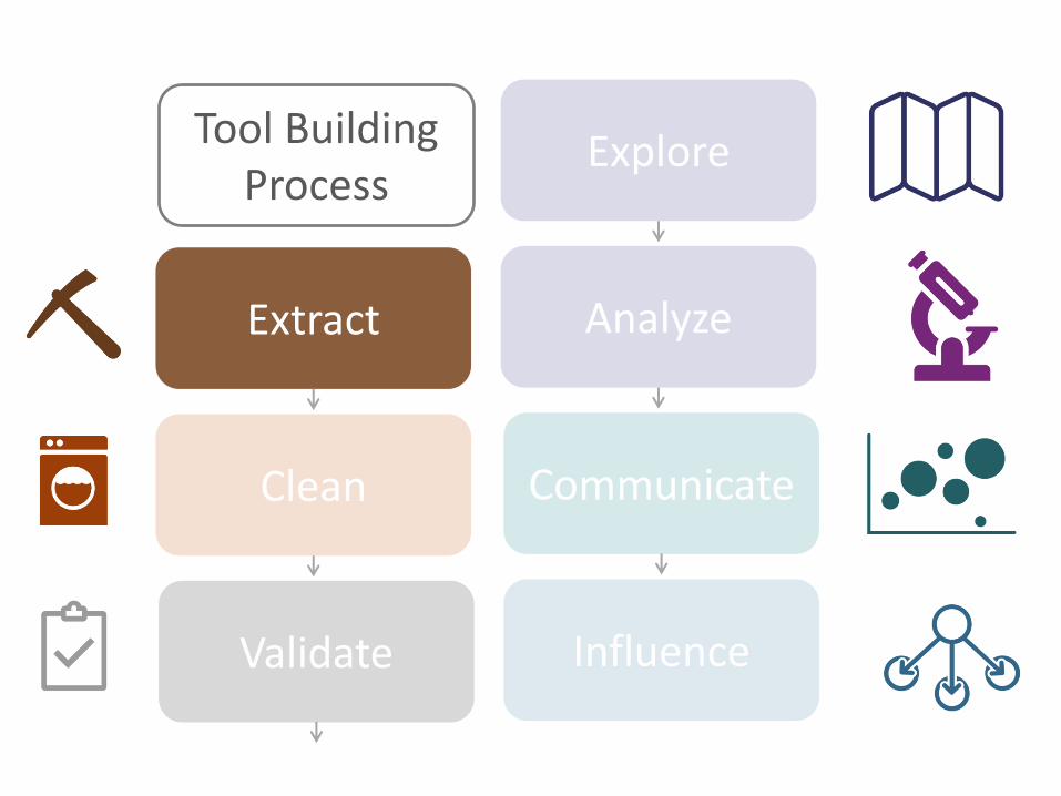
Extract
Clean
Validate
Explore
Analyze
Communicate
Influence
Tool Building Process

Where do you look for data?


We are interested in tracking the progress of the number of people on
treatment by age group against the COP target set in PEPFARlandia.
• Where do we go to access and extract the data?
• What information do we need to pull the data?

Extract
Clean
Validate
Explore
Analyze
Communicate
Influence
Tool Building Process
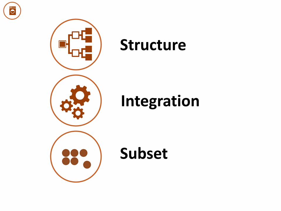
Structure
Integration
Subset

Differing structures even within PEPFAR data systems

Extract
Clean
Validate
Explore
Analyze
Communicate
Influence
Tool Building Process

80%
How complete is the dataset?

775
777
745
75
779
785
786
Total Numerator
Aggregated Age/Sex
Results
Age/Sex Aggregated/Result
Age/Sex/Result
ServiceDeliveryPoint
ServiceDeliveryPoint/Result
PEPFARlandia Completeness Check FY 2016 Q2 HTS_TST
thousands of people
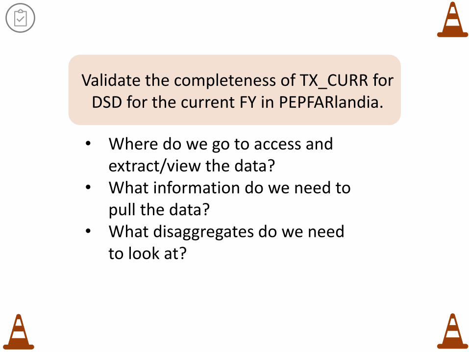
Validate the completeness of TX_CURR for DSD for the current FY in PEPFARlandia.
• Where do we go to access and extract/view the data?
• What information do we need to pull the data?
• What disaggregates do we need to look at?

How valid is the tool?
Panorama Tool
Investigate Adjust Tool Re-Validate

Extract
Clean
Validate
Explore
Analyze
Communicate
Influence
Tool Building Process


We are interested in tracking the progress PEPFARlandia is making.
• Using the handouts containing PEPFARlandia indicator data, explore the data by making some visualizations.
• What story are you trying to tell with the visualization?

Extract
Clean
Validate
Explore
Analyze
Communicate
Influence
Tool Building Process

Visual Analysis to Find Stories
An
dy
Kir
k, V
isu
aliz
atio
n W
ork
flo
w
o Categorical comparison and proportions
o Ranking: big, medium, small
o Measurements/values: absolutes
o Range and distribution o Context: Targets,
forecasts, averages o Hierarchical relationships
COMPARISONS
o Up and down vs flat? o Linear vs exponential o Steady vs fluctuating o Seasonal vs random o Rate of change vs
steepness
TRENDS
o Outliers o Intersections o Correlations o Connections o Clusters o Associations o Gaps
RELATIONSHIPS
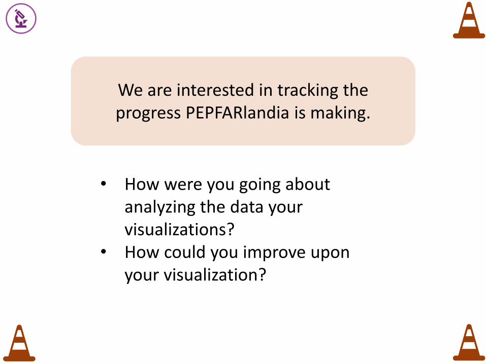
We are interested in tracking the progress PEPFARlandia is making.
• How were you going about analyzing the data your visualizations?
• How could you improve upon your visualization?

Tools for Analysis
Extract
Clean
Validate
Explore
Analyze
Communicate
Influence
Tool Building Process
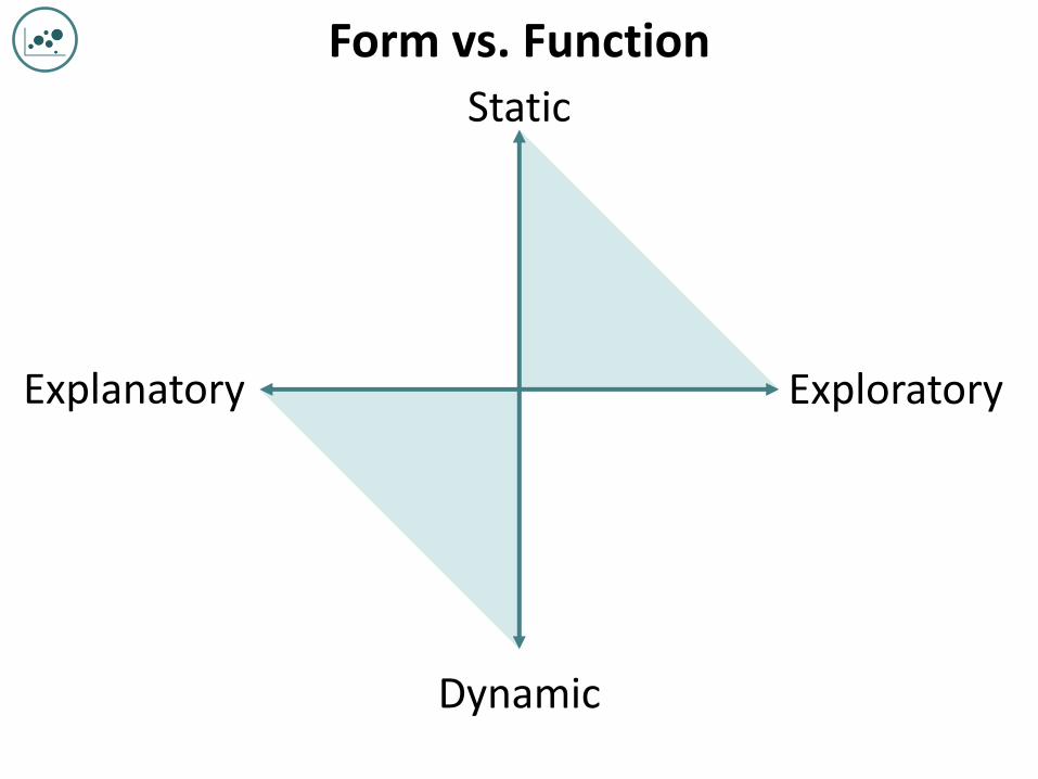
Static
Dynamic
Explanatory Exploratory
Form vs. Function
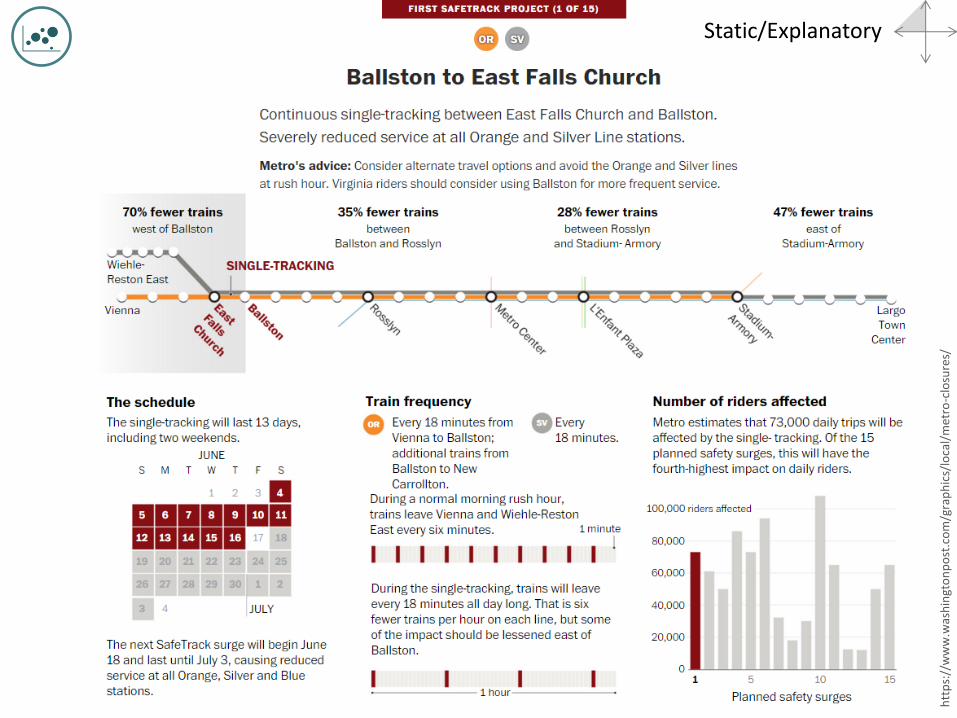
Static/Explanatory
htt
ps:
//w
ww
.was
hin
gto
np
ost
.co
m/g
rap
hic
s/lo
cal/
met
ro-c
losu
res/
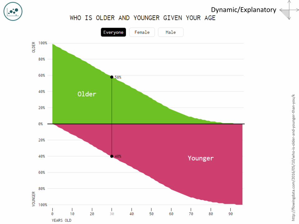
Dynamic/Explanatory
htt
p:/
/flo
win
gdat
a.co
m/2
01
6/0
5/1
0/w
ho
-is-
old
er-a
nd
-yo
un
ger-
than
-yo
u/k

Static/Exploratory
htt
p:/
/ww
w.w
sj.c
om
/art
icle
s/u
-s-e
mp
loye
rs-a
dd
-27
1-0
00
-jo
bs-
14
46
81
67
37
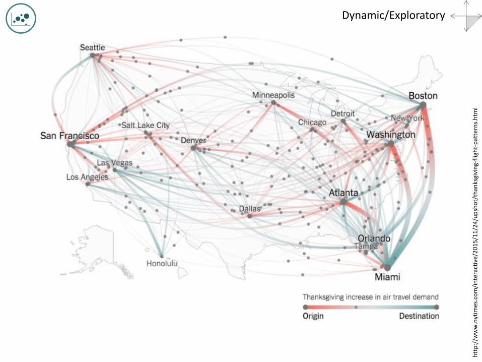
Dynamic/Exploratory
htt
p:/
/ww
w.n
ytim
es.c
om
/in
tera
ctiv
e/2
01
5/1
1/2
4/u
psh
ot/
than
ksgi
vin
g-fl
igh
t-p
atte
rns.
htm
l

Consistent color scheme
Consistent font family, vary size and emphasis t T Adjust size
Simplify
Logical Order
Integrate text and legend MWI
TNZ
Start with a sketch
Key Principles
Clear purpose

We are interested in tracking the progress PEPFARlandia is making.
• How could you improve upon your visualization?
• Add in some features mentioned on the last slide around key principles, starting with a clear title

Extract
Clean
Validate
Explore
Analyze
Communicate
Influence
Tool Building Process


Extract
Clean
Validate
Explore
Analyze
Communicate
Influence
Tool Building Process
Let’s critique some data
visualizations


• Prepared for the ICPI/CIT training, “Data Use Training” (DC), October 2016 (adapted from June 2016 version)
• Presentation material adopted from J. Schwabish (2014). “A Visualization Mapping: Form and Function” (http://policyviz.com/a-visualization-mapping-form-and-function/), S.Ortiz (2012). “45 Ways to Communicate Two Quantities, (http://blog.visual.ly/45-ways-to-communicate-two-quantities), A. Kirk (2013). Visualization WorkflowFinding Stories and Telling Stories (http://www.slideshare.net/visualisingdata/andy-kirks-facebook-talk) and Chafetz, Essam, Hughes, Johnson (2016). “Fundamentials of Data Analysis & Visualization Training” (http://geocenter.github.io/StataTraining )
• Image Sources • Youtube [Dashboard], Sears Auto Center • Unsplash, [Lake and Mountains], Justin Luebke • Extreme Presentation, “Chart Suggestions” • Icons downloaded from the Noun Project and designed by various artists: The Noun Project, [map],
Ivan Colic; “Microscope”, lastspark, “Graph”, gira Park; “Influencer”, Adam Beasley; “Pickaxe”, Creative Stall, “Detergent”, Megan Mitchell, “Washing Machine”, National Parks Service, “Clipboard”, matthew hall, Phil Goodwin; [country shape], Anna Gajowiec, “Traffic Cone”, Vicons Design, “Structure”, Alexandr Cherkinshy, “simplify”, Chameleon Design, “Analytics, Syafiqa Fickle; “Pencil”, David; “Target, Franck Junker, “Mouse”, John Testa, “Wrench”, Bluetip Desig, “Power Drill” Maksim Karalevich
Notes and Attribution