Embed Size (px)
Citation preview

Ribbon for WinForms2019.12.03 更新
グレープシティ株式会社グレープシティ株式会社

目次
Ribbon の概要 3
クラシックリボンから新しいリボンへのアップグレード 3-6
主な特長 7
クイックスタート 8-12
要素 13
アプリケーション メニュー 13-15
Backstage ビュー 15-18
クイックアクセスツールバー 18-21
設定ツールバー 21-22
コンテキストタブグループ 22-23
リボンタブ 23-25
リボングループ 25
リボンアイテム 26
ボタン 26-27
チェックボックス 27
カラーピッカー 27-28
コンボボックス 28-29
日付ピッカー 29
フォントコンボボックス 29-30
ギャラリー 30-35
ラベル 35
メニュー 35-37
数値ボックス 37-38
プログレスバー 38
区切り記号 38-39
スプリットボタン 39-40
テキストボックス 40-41
時刻ピッカー 41
トグルボタン 41-42
ツールバー 42
トラックバー 42-43
Ribbon for WinForms
1 Copyright © GrapeCity inc. All rights reserved.

コントロールホスト 43-46
ステータスバー 46-47
設計時のサポート 48
スマートタグ 48-49
コレクション エディター 49-54
フリー ツール バー 54-57
リボンの使用 58
簡略化リボン 58-60
ツールチップ 60-61
テーマ 61-63
アイコン 63-65
キーボードのサポート 65-67
実行時のインタラクティブ操作 68
クイックアクセスツールバーのカスタマイズ化 68-69
リボンビューの切り替え 69-71
ローカライゼーションの適用 72-75
Ribbon for WinForms
2 Copyright © GrapeCity inc. All rights reserved.

Ribbon の概要の概要
Ribbon for WinForms is a ribbon style flat menu similar to what Microsoft offers in its Office 365 applications. Withtabs, groups, numerous supported group items, toolbars, backstage view and above all, the simplified view, Ribbonlets you create latest Microsoft Office 2019 style applications with minimal code and great functionality. One caneasily categorize the related menu items into tabs and then groups for that organized and clean user interface.Support for contextual tab group gives you further flexibility to show some tabs only when they are required. Gallery,variety of light and dark themes, Quick Access Toolbar (QAT) and icon sets are some other essential features toenhance the end-user experience. Further more, the full-fledged API of Ribbon for WinForms provides all thesefeatures without any compromise with the run-time performance of your application.
Note that the new Ribbon for WinForms is a better, faster and latest version of the already existing Ribbon forWinForms, now referred to as Classic Ribbon for WinForms. Existing users of Classic Ribbon may migrate to the latestversion by following some simple steps described in Upgrade from Classic Ribbon to New Ribbon topic.
クラシックリボンから新しいリボンへのアップグレードクラシックリボンから新しいリボンへのアップグレード
A user can upgrade from classic Ribbon to the new Ribbon without any hassles. The image below depicts the appearance ofthe old Ribbon control at runtime.
Ribbon for WinForms
3 Copyright © GrapeCity inc. All rights reserved.

This section covers the steps required to upgrade the old ribbon control to new Ribbon control:
Step 1: Make Reserve CopyMake a reserve copy of your old project. You might need it during conversion if something doesn’t get right.
Step 2: Update ProjectRemove the C1.Win.C1Ribbon.4 assembly from References in the Solution Explorer, and add theC1.Win.Ribbon.4.5.2 assembly. Locate the licenses.licx file in your project and replace all the lines that refer toC1.Win.C1Ribbon.4 with C1.Win.Ribbon.4.5.2. Also, replace all C1.Win.C1Ribbon namespace with C1.Win.Ribbon.
Step 3: Handle API ChangesBuild the project. The user can observe that the designer has used IconSet property in place of Image,SmallImage and LargeImage properties. You can also see the error list with obsolete API. The changes have beenmade intentionally and indicate the following API changes:
To fix the errors related to RibbonEventHandler , change the subscription on RibbonEvent as theRibbonEventHandler has been removed.
this.c1Ribbon1.RibbonEvent += new RibbonEventHandler(c1Ribbon1_RibbonEvent);
to
this.c1Ribbon1.RibbonEvent += c1Ribbon1_RibbonEvent;
To fix the errors related to AppMenuAppearance enum, remove related code lines. Note that theC1BackstageView is a separate component now, so application can’t setup it via the AppMenuAppearanceenumeration member. To fix the errors related to VisualStyle and VisualStyleHolder properties and ResetVisualStyle method,remove all the related code lines as the Ribbon Form does not anymore contain such property or method.To fix the errors related to VerticalLayout property from the RibbonGalleryItem class, remove all relatedlines of code and use the GalleryItemTextImageRelation property.
Ribbon for WinForms
4 Copyright © GrapeCity inc. All rights reserved.

Step 4: Use IconSet propertyIf you open your form with Ribbon in Visual Studio designer, then you can observe that the Image, SmallImageand LargeImage properties have changed to IconSet property. You can see that instead of image-relatedproperties, code lines like these have appeared:this.FontBoldButton.IconSet.Add(new C1.Framework.C1BitmapIcon("", newSystem.Drawing.Size(16, 16), System.Drawing.Color.Transparent,((System.Drawing.Image)(resources.GetObject("FontBoldButton.IconSet")))));
Note that the new Ribbon has an updated set of embedded images. If you want to use them, you can replace theimages for individual elements using the Smart Designer. You can replace all the old images from embeddedpreset with new ones. Not only do they look better, it is also useful while switching to a simplified view. Forexample, retaining the old IncreaseIndentButton image in the new ribbon may give it a blurry look in thesimplified mode. Hence, it is preferred to replace all old images.
Note: The new Ribbon components have Image, SmallImage and LargeImage properties. These propertiesare used for compatibility with the classic version of the C1Ribbon, and can't be serialized and are hiddenfrom the PropertyGrid.
Step 5: Run the applicationRun your application and make sure that all the functionalities are working as expected.
The upgraded Ribbon control now looks like this:
The new C1Ribbon supports a feature called the Simplified Ribbon. The end-user can switch between theSimplified and Full views using the chevron button in the bottom right corner of the ribbon. This is how the ribbonlooks in its simplified view:
Ribbon for WinForms
5 Copyright © GrapeCity inc. All rights reserved.

Ribbon for WinForms
6 Copyright © GrapeCity inc. All rights reserved.

主な特長主な特長
The major features of C1Ribbon control are elucidated below:
Simplified Ribbon
Ribbon for WinForms is a simplified compact ribbon, which is streamlined to provide more space for content.It enables a user to toggle back and forth between the simplified and full view at runtime by clicking thechevron button located towards the lower right corner of the ribbon. The Simplified View allows the display ofsome commands in a single line, and others accessible through a drop-down menu.
Backstage
C1BackstageView is a separate component in C1Ribbon that imitates the Main Application Menu in oldRibbon-based applications. The backstage opens in a full-size window and works like a multi-level navigationcontrol. A user can access the backstage by clicking the main button located on the leftmost corner of theapplication window. It replaces the main application menu button. The backstage provides the user access tofunctions like opening, saving, creating, renaming and printing files.
Gallery
The Gallery Bar provides a gallery of items that you can select by clicking them. C1Ribbon supports someinteresting features like grouping, filtering and zooming of items within the gallery.
Quick Access Toolbar
The Quick Access Toolbar (QAT) provides end-users the access to frequently-used items, such as New, Open,Save, Undo, Redo etc. The user can customize the Quick Access Toolbar and add more items from tabs andgroups in the ribbon.
Icons
The Ribbon uses icon sets to display items with different sizes in various display modes and screen resolutions.The classic ribbon control offered only two options, large (32x32) and small (16x16) preset images for theRibbon items, but the new C1Ribbon control defines appropriate icon sizes for low, medium and high DPIenvironments.
New Images in Themes
The C1Ribbon control includes a new set of embedded images for both light (low contrast) and dark (highcontrast) themes. This helps to confer a better visual appearance to the ribbon.
Key Tips
The C1Ribbon control supports KeyTips to help the user reach a particular Ribbon command more easily bypressing a keyboard letter or number instead of mouse clicks.
Ribbon for WinForms
7 Copyright © GrapeCity inc. All rights reserved.

クイックスタートクイックスタート
The following quick start guide will take you through the basics of Ribbon control and its design customizations. Youcan add tabs, groups and items to the groups. By the end of this section, you will be able to create a simple text editorwith the Ribbon user interface.
1. Create a new Windows Forms application.2. Drag and drop the C1Ribbon control to your form.The Ribbon control is positioned at the top of the form. A
tab and group gets added to the Ribbon control in advance.
3. Add the RichTextBox control from the Toolbox to your form. Set its Dock property to Fill.4. To add a new tab, click the C1Ribbon control to enable its floating toolbar. Click the Actions button and select
Add Tab from the list of actions. Whenever you add a new tab, a group is already added to it.
5. Rename the tabs as 'Home' and 'Insert'. This can be done by in-place text editing by double clicking the tab.You can also add text from the Text Settings in floating toolbar or by editing the Text property in theProperties window.
Ribbon for WinForms
8 Copyright © GrapeCity inc. All rights reserved.

6. To add a new group, click the 'Home' Tab to enable its floating toolbar. Click the Actions button and selectAdd Group from the list of actions.
7. Rename the groups as 'Font' and 'Color' either by double clicking on it or by editing the Text property fromthe Properties window.
8. To add an item to the group, click the 'Font' group to enable its floating toolbar. Click the Actions button andSelect Add Font ComboBox from the list of actions.
Ribbon for WinForms
9 Copyright © GrapeCity inc. All rights reserved.

9. Enter the placeholder text 'Select a Font' in the Font ComboBox either by clicking on it or editing the Textproperty from the Properties window.
10. Similarly, select Add ColorPicker from the list of actions of 'Color' group to add it as an item.
Ribbon for WinForms
10 Copyright © GrapeCity inc. All rights reserved.

11. The Windows Form can be converted to a Ribbon Form by switching to the code view and replacing thefollowing:
Visual BasicPartial Class Form1 Inherits System.Windows.Forms.Form '...End Class
C#partial class Form1 : Form{ //...}
With
Visual BasicPartial Class Form1 Inherits C1.Win.C1Ribbon.C1RibbonForm '...End Class
C#partial class Form1 : C1RibbonForm{ //...}
The basic difference between the Windows form and the Ribbon Form is that in the Ribbon form, the title bar of theWindows Form is omitted and the title bar of the Ribbon Form comes into existence.
Run the application and observe the Ribbon Form generated in the following image. The Ribbon Form contains tabs,groups and FontComboBox and ColorPicker as items in the Group. Similarly, you can add other items from the groupitem list such as DatePicker, Gallery, Label, CheckBox, ToggleButton, TextBox etc.
Ribbon for WinForms
11 Copyright © GrapeCity inc. All rights reserved.

Ribbon for WinForms
12 Copyright © GrapeCity inc. All rights reserved.

要素要素
C1Ribbon comprises several visual elements, each of which represents a different functionality. The imagebelow depicts some of the UI elements provided by the Ribbon control:
The following topics throw more light on the UI elements in C1Ribbon.
Application Menu
BackStageView
Quick Access Toolbar
Configuration Toolbar
Contextual Tab Group
Ribbon Tab
Ribbon Item Group
Ribbon Items
アプリケーションアプリケーション メニューメニュー
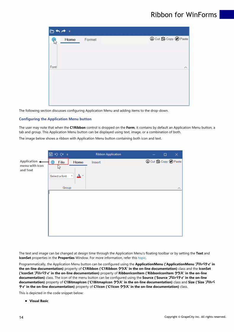
The Application Menu is located towards the top-left corner of the ribbon control. This application menu button when clickeddisplays a dropdown menu of specific commands that can be performed on the entire application such as Open, Close, Save, SaveAs, Print etc.
The GIF below shows the UI of the Application Menu.
Ribbon for WinForms
13 Copyright © GrapeCity inc. All rights reserved.
The following section discusses configuring Application Menu and adding items to the drop-down.
Configuring the Application Menu button
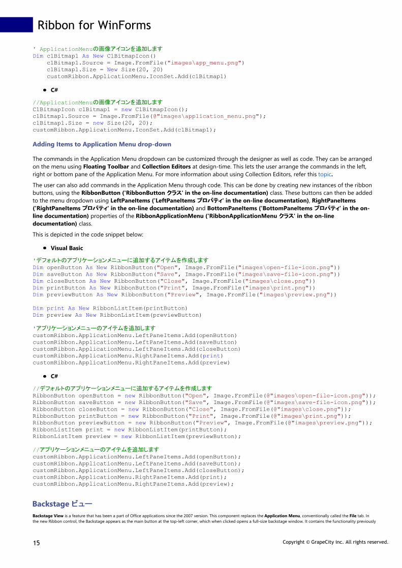
The user may note that when the C1Ribbon control is dropped on the Form, it contains by default an Application Menu button, atab and group. This Application Menu button can be displayed using text, image, or a combination of both.
The image below shows a ribbon with Application Menu button containing both icon and text.
The text and image can be changed at design time through the Application Menu's floating toolbar or by setting the Text andIconSet properties in the Properties Window. For more information, refer this topic.
Programmatically, the Application Menu button can be configured using the ApplicationMenu ('ApplicationMenu プロパティプロパティ' inthe on-line documentation) property of C1Ribbon ('C1Ribbon クラスクラス' in the on-line documentation) class and the IconSet('IconSet プロパティプロパティ' in the on-line documentation) property of RibbonIconItem ('RibbonIconItem クラスクラス' in the on-linedocumentation) class. The icon of the menu button can be configured using the Source ('Source プロパティプロパティ' in the on-linedocumentation) property of C1BitmapIcon ('C1BitmapIcon クラスクラス' in the on-line documentation) class and Size ('Size プロパプロパ
ティティ' in the on-line documentation) property of C1Icon ('C1Icon クラスクラス' in the on-line documentation) class.
This is depicted in the code snippet below:
Visual Basic
Ribbon for WinForms
14 Copyright © GrapeCity inc. All rights reserved.
' ApplicationMenuの画像アイコンを追加しますDim c1Bitmap1 As New C1BitmapIcon() c1Bitmap1.Source = Image.FromFile("images\app_menu.png") c1Bitmap1.Size = New Size(20, 20) customRibbon.ApplicationMenu.IconSet.Add(c1Bitmap1)
C#
//ApplicationMenuの画像アイコンを追加しますC1BitmapIcon c1Bitmap1 = new C1BitmapIcon();c1Bitmap1.Source = Image.FromFile(@"images\application_menu.png");c1Bitmap1.Size = new Size(20, 20);customRibbon.ApplicationMenu.IconSet.Add(c1Bitmap1);
Adding Items to Application Menu drop-down
The commands in the Application Menu dropdown can be customized through the designer as well as code. They can be arrangedon the menu using Floating Toolbar and Collection Editors at design-time. This lets the user arrange the commands in the left,right or bottom pane of the Application Menu. For more information about using Collection Editors, refer this topic.
The user can also add commands in the Application Menu through code. This can be done by creating new instances of the ribbonbuttons, using the RibbonButton ('RibbonButton クラスクラス' in the on-line documentation) class. These buttons can then be addedto the menu dropdown using LeftPaneItems ('LeftPaneItems プロパティプロパティ' in the on-line documentation), RightPaneItems('RightPaneItems プロパティプロパティ' in the on-line documentation) and BottomPaneItems ('BottomPaneItems プロパティプロパティ' in the on-line documentation) properties of the RibbonApplicationMenu ('RibbonApplicationMenu クラスクラス' in the on-linedocumentation) class.
This is depicted in the code snippet below:
Visual Basic
'デフォルトのアプリケーションメニューに追加するアイテムを作成しますDim openButton As New RibbonButton("Open", Image.FromFile("images\open-file-icon.png"))Dim saveButton As New RibbonButton("Save", Image.FromFile("images\save-file-icon.png"))Dim closeButton As New RibbonButton("Close", Image.FromFile("images\close.png"))Dim printButton As New RibbonButton("Print", Image.FromFile("images\print.png"))Dim previewButton As New RibbonButton("Preview", Image.FromFile("images\preview.png"))
Dim print As New RibbonListItem(printButton)Dim preview As New RibbonListItem(previewButton)
'アプリケーションメニューのアイテムを追加しますcustomRibbon.ApplicationMenu.LeftPaneItems.Add(openButton)customRibbon.ApplicationMenu.LeftPaneItems.Add(saveButton)customRibbon.ApplicationMenu.LeftPaneItems.Add(closeButton)customRibbon.ApplicationMenu.RightPaneItems.Add(print)customRibbon.ApplicationMenu.RightPaneItems.Add(preview)
C#
//デフォルトのアプリケーションメニューに追加するアイテムを作成しますRibbonButton openButton = new RibbonButton("Open", Image.FromFile(@"images\open-file-icon.png"));RibbonButton saveButton = new RibbonButton("Save", Image.FromFile(@"images\save-file-icon.png"));RibbonButton closeButton = new RibbonButton("Close", Image.FromFile(@"images\close.png"));RibbonButton printButton = new RibbonButton("Print", Image.FromFile(@"images\print.png"));RibbonButton previewButton = new RibbonButton("Preview", Image.FromFile(@"images\preview.png"));RibbonListItem print = new RibbonListItem(printButton);RibbonListItem preview = new RibbonListItem(previewButton);
//アプリケーションメニューのアイテムを追加しますcustomRibbon.ApplicationMenu.LeftPaneItems.Add(openButton);customRibbon.ApplicationMenu.LeftPaneItems.Add(saveButton);customRibbon.ApplicationMenu.LeftPaneItems.Add(closeButton);customRibbon.ApplicationMenu.RightPaneItems.Add(print);customRibbon.ApplicationMenu.RightPaneItems.Add(preview);
Backstage ビュービュー
Backstage View is a feature that has been a part of Office applications since the 2007 version. This component replaces the Application Menu, conventionally called the File tab. Inthe new Ribbon control, the Backstage appears as the main button at the top-left corner, which when clicked opens a full-size backstage window. It contains the functionality previously
Ribbon for WinForms
15 Copyright © GrapeCity inc. All rights reserved.

found in the File menu, such as Open, Save, Save As, New, Print etc.
The C1BackstageView is a separate component and can be added at design-time from the Toolbox. The C1Ribbon control can be integrated with C1BackstageView componentthrough the designer as well as code. The Backstage window contains the left and left bottom panes. The user can add items to both the panes in the window.
Backstage can be configured both by the designer and code. For design-time configuration, refer this topic.
The BackstageView Tab when clicked should open a collection of User Controls at runtime. This can be configured only through the code by creating instances of User Controls andassigning them to the Control ('Control プロパティプロパティ' in the on-line documentation) property of the BackstageViewTab ('BackstageViewTab クラスクラス' in the on-line documentation)class. This is depicted in the code below.
Visual Basic
Public Class BackstageView Public Property Owner() As C1BackstageView Get Return m_Owner End Get Friend Set m_Owner = Value End Set End Property
Private m_Owner As C1BackstageView
Private Sub browseCaption_Click_1(sender As Object, e As EventArgs) Handles browseCaption.Click Dim openDialog As OpenFileDialog openDialog = New OpenFileDialog() openDialog.Title = "Browse .rtf file" openDialog.Filter = "Rich Text Files (*.rtf)|*.RTF"
If openDialog.ShowDialog() = DialogResult.OK Then Dim rct As RichTextBox = DirectCast(DirectCast(sender, Control).TopLevelControl.Controls(1), RichTextBox) rct.LoadFile(openDialog.FileName) Owner.DroppedDown = False End If End Sub
Private Sub browseCaption_MouseHover(sender As Object, e As EventArgs) Handles browseCaption.MouseHover browseCaption.Font = New Font(browseCaption.Font.Name, browseCaption.Font.SizeInPoints, FontStyle.Underline) browseCaption.BackColor = Color.AliceBlue End Sub
Private Sub browseCaption_MouseLeave(sender As Object, e As EventArgs) Handles browseCaption.MouseLeave browseCaption.BackColor = Color.CornflowerBlue browseCaption.Font = New Font(browseCaption.Font.Name, browseCaption.Font.SizeInPoints, FontStyle.Regular) End SubEnd Class
C#
public BackstageOpenView(){ InitializeComponent();}public C1BackstageView Owner { get; internal set; }
private void browseCaption_Click(object sender, EventArgs e){ OpenFileDialog openDialog; openDialog = new OpenFileDialog(); openDialog.Title = "Browse .rtf file"; openDialog.Filter = "Rich Text Files (*.rtf)|*.RTF";
if (openDialog.ShowDialog() == DialogResult.OK) { RichTextBox rct = (RichTextBox)((Control)sender).TopLevelControl.Controls[1]; rct.LoadFile(openDialog.FileName); Owner.DroppedDown = false; }}private void browseCaption_MouseHover(object sender, EventArgs e){ browseCaption.Font = new Font(browseCaption.Font.Name, browseCaption.Font.SizeInPoints, FontStyle.Underline); browseCaption.BackColor = Color.AliceBlue;
}private void browseCaption_MouseLeave(object sender, EventArgs e){ browseCaption.BackColor = Color.CornflowerBlue; browseCaption.Font = new Font(browseCaption.Font.Name, browseCaption.Font.SizeInPoints, FontStyle.Regular);
Ribbon for WinForms
16 Copyright © GrapeCity inc. All rights reserved.

}
Configuring Backstage View By Code
The Backstage View can also be configured through code. The user can create an instance of C1BackstageView ('C1BackstageView クラスクラス' in the on-line documentation) class. TheRibbon Buttons can be created using the RibbonButton ('RibbonButton クラスクラス' in the on-line documentation) class. Further, the backstage tab can be created using theBackstageViewTab ('BackstageViewTab クラスクラス' in the on-line documentation) class, which can be bound to the User Control using the Control ('Control プロパティプロパティ' in the on-linedocumentation) property. The buttons and tabs can be added to the BackstageView with the LeftPaneItems ('LeftPaneItems プロパティプロパティ' in the on-line documentation) property ofC1BackstageView class. In order to integrate C1BackstageView with the C1Ribbon control, you can use the Owner ('Owner プロパティプロパティ' in the on-line documentation) property ofC1BackstageView class.
Visual Basic
Public Sub New() InitializeComponent() ApplyBackstageView(Me)End Sub
Public Sub ApplyBackstageView(form1 As Form1) 'BackstageViewを作成します Dim backstageView As New C1.Win.Ribbon.C1BackstageView() backstageView.Text = "File"
'新しいタブを作成します Dim tab = New BackstageViewTab()
'BackstageViewのユーザーコントロールのインスタンスを作成します Dim view As New BackstageView() view.Owner = backstageView tab.Control = view tab.Text = "Open"
'アイテムをBackStageViewに追加します Dim newButton As New RibbonButton("New", Image.FromFile("images\New.png")) Dim saveButton As New RibbonButton("Save", Image.FromFile("images\save-file-icon.png")) Dim closeButton As New RibbonButton("Close", Image.FromFile("images\close.jpg"))
'リボンアイテムをBackstageViewに追加します backstageView.LeftPaneItems.Add(newButton)
'タブをBackstageViewに追加します backstageView.LeftPaneItems.Add(tab)
backstageView.LeftPaneItems.Add(saveButton) backstageView.LeftPaneItems.Add(closeButton)
'ボタンに対してエベントイベントハンドラーを追加します AddHandler newButton.Click, AddressOf NewButton_Click AddHandler saveButton.Click, AddressOf SaveButton_Click AddHandler closeButton.Click, AddressOf CloseButton_Click
'BackstageViewをリボンアイテムに設定します backstageView.Owner = C1Ribbon1 Me.Controls.Add(C1Ribbon1)End Sub
Private Sub NewButton_Click(sender As Object, e As System.EventArgs) Me.RichTextBox1.Clear()End Sub
Private Sub SaveButton_Click(sender As Object, e As System.EventArgs) Dim saveDialog As New SaveFileDialog() saveDialog.Title = "Save rich text file" saveDialog.Filter = "Rich Text Files (*.rtf)|*.RTF" saveDialog.InitialDirectory = "C:\Users\GPCTAdmin\Desktop" If saveDialog.ShowDialog() = DialogResult.OK Then RichTextBox1.SaveFile(saveDialog.FileName) End IfEnd Sub
Private Sub CloseButton_Click(sender As Object, e As System.EventArgs) Me.Close()End Sub
'RibbonFontComboBoxのSelectedIndexChangedイベントを実装しますPrivate Sub RibbonFontComboBox1_SelectedIndexChanged(sender As Object, e As EventArgs) Handles RibbonFontComboBox1.SelectedIndexChanged RichTextBox1.Font = New Font(RibbonFontComboBox1.Text, RichTextBox1.Font.Size)End Sub
'ColorPickerのSelectedColorChangedイベントを実装しますPrivate Sub RibbonColorPicker1_SelectedColorChanged_1(sender As Object, e As EventArgs) Handles RibbonColorPicker1.SelectedColorChanged RichTextBox1.SelectionColor = RibbonColorPicker1.ColorEnd Sub
C#
public Form1(){ InitializeComponent(); ApplyBackstageView(this);}
public void ApplyBackstageView(Form1 form1){ //BackstageViewを作成します C1.Win.Ribbon.C1BackstageView backstageView = new C1.Win.Ribbon.C1BackstageView(); backstageView.Text = "File";
Ribbon for WinForms
17 Copyright © GrapeCity inc. All rights reserved.

//BackstageViewのユーザーコントロールのインスタンスを作成します BackstageOpenView openView = new BackstageOpenView(); openView.Owner = backstageView;
//BackStageViewの新しいタブを作成し、ビューにバインドします BackstageViewTab openTab = new BackstageViewTab(); openTab.Control = openView; openTab.Text = "Open";
//BackStageViewのボタンを作成し、ボタンのイベントハンドラーを定義します RibbonButton newButton = new RibbonButton("New", Image.FromFile(@"images\New.png")); newButton.Click += NewButton_Click;
RibbonButton saveButton = new RibbonButton("Save", Image.FromFile(@"images\save-file-icon.png")); saveButton.Click += SaveButton_Click;
RibbonButton closeButton = new RibbonButton("Close", Image.FromFile(@"images\close.jpg")); closeButton.Click += CloseButton_Click;
//リボンアイテム・タブをBackstageViewに追加します backstageView.LeftPaneItems.Add(newButton); backstageView.LeftPaneItems.Add(openTab); backstageView.LeftPaneItems.Add(saveButton); backstageView.LeftPaneItems.Add(closeButton);
//BackstageViewをリボンコントロールに設定します backstageView.Owner = customRibbon;
//リボンコントロールをフォームに追加します this.Controls.Add(customRibbon); }private void NewButton_Click(object sender, System.EventArgs e){ this.richTextBox1.Clear();}
private void SaveButton_Click(object sender, System.EventArgs e){ SaveFileDialog saveDialog = new SaveFileDialog(); saveDialog.Title = "Save rich text file"; saveDialog.Filter = "Rich Text Files (*.rtf)|*.RTF"; saveDialog.InitialDirectory = @"C:\Users\GPCTAdmin\Desktop"; if (saveDialog.ShowDialog() == DialogResult.OK) { richTextBox1.SaveFile(saveDialog.FileName); }}
private void CloseButton_Click(object sender, System.EventArgs e){ this.Close();}
//RibbonFontComboBoxのSelectedIndexChangedイベントを実装しますprivate void ribbonFontComboBox1_SelectedIndexChanged(object sender, System.EventArgs e){ richTextBox1.Font = new Font(ribbonFontComboBox1.Text, richTextBox1.Font.Size);}
//ColorPickerのSelectedColorChangedイベントを実装しますprivate void ribbonColorPicker1_SelectedColorChanged(object sender, System.EventArgs e){ richTextBox1.SelectionColor = ribbonColorPicker1.Color;}
クイックアクセスツールバークイックアクセスツールバー
The Quick Access Toolbar (QAT) is a customizable toolbar, which contains a set of buttons that representscommands. It is located on the top left corner of the Ribbon control. Some of the predefined list of commands used inthe QAT are New, Open, Save, Print, Print Preview, Undo, Redo, Email etc. More items can be added to the QAT.
The following image shows a Ribbon with a QAT of four Ribbon button items (Open, Undo, Redo and Save).
Ribbon for WinForms
18 Copyright © GrapeCity inc. All rights reserved.

At design time, a user can add items to QAT through the QAT Items Collection Editor. Note that the collection editordisplays only the existing items available in the RibbonTabs and Groups. Further, you can also add existing items tothe QAT from the floating toolbar of other Ribbon Items. For more information about design-time configuration, referto this topic.
The ribbon buttons can also be added to the QAT programmatically by setting the Items ('Items プロパティプロパティ' in theon-line documentation) property of the RibbonQat ('RibbonQat クラスクラス' in the on-line documentation) class. Thisis depicted in the code below:
Visual Basic
'アイテムをクイックアクションツールバーに追加しますDim openImage As Image = Image.FromFile("images\open.png")customRibbon.Qat.Items.Add(New RibbonButton("Open", openImage))Dim undoImage As Image = Image.FromFile("images\undo.png")customRibbon.Qat.Items.Add(New RibbonButton("Undo", undoImage))Dim redoImage As Image = Image.FromFile("images\redo.png")customRibbon.Qat.Items.Add(New RibbonButton("Repeat", redoImage))
C#
//アイテムをクイックアクションツールバーに追加しますImage openImage = Image.FromFile(@"images\open.png");customRibbon.Qat.Items.Add(new RibbonButton("Open", openImage));Image undoImage = Image.FromFile(@"images\undo.png");customRibbon.Qat.Items.Add(new RibbonButton("Undo", undoImage));Image redoImage = Image.FromFile(@"images\redo.png");customRibbon.Qat.Items.Add(new RibbonButton("Repeat", redoImage));Image saveImage = Image.FromFile(@"images\save-file-icon.png");customRibbon.Qat.Items.Add(new RibbonButton("Save", saveImage));
Moving the Quick Access Toolbar
A user can move the QAT between two possible locations, above and below the ribbon control. By default, the QAT islocated above the ribbon control. In order to move it down the ribbon, the user can set the BelowRibbon property toTrue at design time in the Properties Window.
Ribbon for WinForms
19 Copyright © GrapeCity inc. All rights reserved.

The QAT can also be added below the Ribbon control programmatically using the BelowRibbon ('BelowRibbon プロプロ
パティパティ' in the on-line documentation) property of RibbonQat ('RibbonQat クラスクラス' in the on-line documentation)class as shown below:
Visual Basic
'リボンコントロールの下にクイックアクセスツールバーを追加しますcustomRibbon.Qat.BelowRibbon = True
C#
//リボンコントロールの下にクイックアクセスツールバーを追加しますcustomRibbon.Qat.BelowRibbon = true;
Customizing QAT Menu
A user can add commands to drop-down menu of the QAT item. This menu will include some commands that the usermight want to add to the Quick Access Toolbar.
The image below shows a Ribbon QAT drop-down menu with commands (Open, Undo, Repeat and Print).
At design time, the user can display the Customize Quick Access Toolbar dropdown menu by setting the MenuVisibleproperty in the Properties Window to True. Further, the user can click on the QAT MenuItems Collection Editor toadd buttons on the dropdown menu. For more information, refer this topic.
The user can also add the dropdown menu to QAT programmatically using MenuVisible ('MenuVisible プロパティプロパティ' inthe on-line documentation) property and MenuItems ('MenuItems プロパティプロパティ' in the on-line documentation)property of RibbonQat ('RibbonQat クラスクラス' in the on-line documentation) class as shown below:
Visual Basic
'アイテムをQATのメニュードロップダウンに追加しますcustomRibbon.Qat.MenuItems.Add(New RibbonButton("Open", openImage))customRibbon.Qat.MenuItems.Add(New RibbonButton("Undo", undoImage))customRibbon.Qat.MenuItems.Add(New RibbonButton("Repeat", redoImage))customRibbon.Qat.MenuItems.Add(New RibbonButton("Print", printImage))
C#
//アイテムをQATのメニュードロップダウンに追加しますcustomRibbon.Qat.MenuVisible = true;customRibbon.Qat.MenuItems.Add(new RibbonButton("Open", openImage));customRibbon.Qat.MenuItems.Add(new RibbonButton("Undo", undoImage));
Ribbon for WinForms
20 Copyright © GrapeCity inc. All rights reserved.

customRibbon.Qat.MenuItems.Add(new RibbonButton("Repeat", redoImage));customRibbon.Qat.MenuItems.Add(new RibbonButton("Print", printImage));
設定ツールバー設定ツールバー
The Ribbon Configuration Toolbar (RibbonConfigToolBar) allows the user to place commonly-used commands in a toolbarlocated in the upper-right corner of the Ribbon. Unlike QAT, this toolbar cannot be moved below the Ribbon. The user canobserve that it is present at the same level as the Ribbon tabs.
The ribbon control depicted in the image below shows a Configuration Toolbar with Ribbon buttons (Cut, Copy and Paste).
Adding Items to Configuration Toolbar
A user can configure Ribbon buttons in the configuration toolbar. For instance, let's say a user wants to perform Cut, Copy orPaste operation in the application. For this, the user has to search through the tabs and groups to find the commands. With theconfiguration toolbar, you do not have to tediously search for commands. Instead, you can add these commands to the toolbarand customize it.
At design time, you can add items or buttons to the Configuration Toolbar with the help of Items property in the PropertiesWindow. The user can click on the RibbonConfigToolBar Items Collection Editor to add buttons on the toolbar. Further, thetext and icon image of these buttons can be customized using the Ribbon Button floating toolbar. For more information, referthis topic.
A user can also add buttons to the Configuration Toolbar programmatically. This is shown in the code below:
Visual Basic
Public Sub ConfigToolbarItems(customRibbon As C1Ribbon) 'デフォルトのConfigToolbarに追加するアイテムを作成します Dim cutButton As New RibbonButton("Cut", Image.FromFile("images\cut.png")) Dim copyButton As New RibbonButton("Copy", Image.FromFile("images\copy.png")) Dim pasteButton As New RibbonButton("Paste", Image.FromFile("images\paste.png"))
'ConfigToolbarのアイテムを追加します customRibbon.ConfigToolBar.Items.Add(cutButton) customRibbon.ConfigToolBar.Items.Add(copyButton) customRibbon.ConfigToolBar.Items.Add(pasteButton)End Sub
C#
public void AddConfigToolbarItems(C1Ribbon customRibbon)
Ribbon for WinForms
21 Copyright © GrapeCity inc. All rights reserved.

{ //デフォルトのConfigToolbarに追加するアイテムを作成します RibbonButton cutButton = new RibbonButton("Cut", Image.FromFile(@"images\cut.png")); RibbonButton copyButton = new RibbonButton("Copy", Image.FromFile(@"images\copy.png")); RibbonButton pasteButton = new RibbonButton("Paste", Image.FromFile(@"images\paste.png")); //ConfigToolbarのアイテムを追加します customRibbon.ConfigToolBar.Items.Add(cutButton); customRibbon.ConfigToolBar.Items.Add(copyButton); customRibbon.ConfigToolBar.Items.Add(pasteButton); }
コンテキストタブグループコンテキストタブグループ
The Ribbon control has a contextual tab group, which is a hidden tab of groups that appears only when texts or images are selected in yourapplication. Given below is a GIF that depicts the appearance of the contextual tab when a selection of text is being made.
At design-time, a user can customize the look of the contextual tab via the floating tool bar or Collection Editor, about which you can refer indetail in this topic.
This section basically discusses the implementation of contextual tab groups via code in a Ribbon control using theRibbonContextualTabGroup ('RibbonContextualTabGroup クラスクラス' in the on-line documentation) class.
Visual Basic
'ContextualTabGroupを作成しますDim selectionSettings As RibbonContextualTabGroupPrivate Sub Form1_Load(sender As Object, e As EventArgs) 'リボンの入力フォーカスを無効にします C1Ribbon1.Selectable = False 'ContextualTabGroupを初期化します selectionSettings = New RibbonContextualTabGroup("Format") '初期レンダリング時にコンテキストタブグループを非表示にします selectionSettings.Visible = False
'ContextualTabGroupのタブを作成します Dim styleSettings As New RibbonTab("Style") Dim fontSettings As New RibbonTab("Font") selectionSettings.Tabs.Add(styleSettings) selectionSettings.Tabs.Add(fontSettings)
'[スタイル]タブのグループを作成します Dim styleGroup As New RibbonGroup("Text Style") styleSettings.Groups.Add(styleGroup)
'RibbonItemsをText Styleグループに追加します Dim ribbonToolBar As New RibbonToolBar() Dim boldButton As New RibbonToggleButton(Image.FromFile("images\bold.png")) Dim italicButton As New RibbonToggleButton(Image.FromFile("images\italic.png")) Dim underlineButton As New RibbonToggleButton(Image.FromFile("images\underline.png")) ribbonToolBar.Items.Add(boldButton) ribbonToolBar.Items.Add(italicButton) ribbonToolBar.Items.Add(underlineButton) styleGroup.Items.Add(ribbonToolBar)
'[書式]タブのフォントグループを作成します
Ribbon for WinForms
22 Copyright © GrapeCity inc. All rights reserved.

Dim fontGroup As New RibbonGroup("Font Settings") fontSettings.Groups.Add(fontGroup)
'フォントグループにRibbonItemsを作成して追加します Dim fontComboBox As New RibbonFontComboBox() fontComboBox.Text = "Select a font" fontGroup.Items.Add(fontComboBox)
'C1RibbonコントロールにContextualTabGroupを追加します C1Ribbon1.ContextualTabGroups.Add(selectionSettings)End Sub
'テキスト選択に基づいてコンテキストタブを非表示/表示しますPrivate Sub RichTextBox1_SelectionChanged(ByVal sender As Object, ByVal e As EventArgs) If RichTextBox1.SelectedText.Length > 0 Then selectionSettings.Visible = True Else selectionSettings.Visible = False End IfEnd Sub
C#
RibbonContextualTabGroup selectionSettings;private void Form1_Load(object sender, EventArgs e){ //リボンの入力フォーカスを無効にします c1Ribbon1.Selectable = false; //ContextualTabGroupを初期化します selectionSettings = new RibbonContextualTabGroup("Format"); //初期レンダリング時にコンテキストタブグループを非表示にします selectionSettings.Visible = false;
//ContextualTabGroupのタブを作成します RibbonTab styleSettings = new RibbonTab("Style"); RibbonTab fontSettings = new RibbonTab("Font"); selectionSettings.Tabs.Add(styleSettings); selectionSettings.Tabs.Add(fontSettings);
//[スタイル]タブのグループを作成します RibbonGroup styleGroup = new RibbonGroup("Text Style"); styleSettings.Groups.Add(styleGroup);
//RibbonItemsをText Styleグループに追加します RibbonToolBar ribbonToolBar = new RibbonToolBar(); RibbonToggleButton boldButton = new RibbonToggleButton(Image.FromFile(@"images\bold.png")); RibbonToggleButton italicButton = new RibbonToggleButton(Image.FromFile(@"images\italic.png")); RibbonToggleButton underlineButton = new RibbonToggleButton(Image.FromFile(@"images\underline.png")); ribbonToolBar.Items.Add(boldButton); ribbonToolBar.Items.Add(italicButton); ribbonToolBar.Items.Add(underlineButton); styleGroup.Items.Add(ribbonToolBar);
//[書式]タブのフォントグループを作成します RibbonGroup fontGroup = new RibbonGroup("Font Settings"); fontSettings.Groups.Add(fontGroup);
//フォントグループにRibbonItemsを作成して追加します RibbonFontComboBox fontComboBox = new RibbonFontComboBox(); fontComboBox.Text = "Select a font"; fontGroup.Items.Add(fontComboBox);
//C1RibbonコントロールにContextualTabGroupを追加します c1Ribbon1.ContextualTabGroups.Add(selectionSettings);}
//テキスト選択に基づいてコンテキストタブを非表示/表示しますprivate void richTextBox1_SelectionChanged(object sender, EventArgs e){ if (richTextBox1.SelectedText.Length > 0) selectionSettings.Visible = true; else selectionSettings.Visible = false;}
Ribbon for WinForms
23 Copyright © GrapeCity inc. All rights reserved.

リボンタブリボンタブ
A user may require many commands in an application in order to work with different scenarios. The commands areusually grouped and put under different Ribbon Tabs. A Ribbon tab can contain many groups. Each Group comprisesa set of Items. For instance, in the Office application, the Home tab in the Ribbon is used to perform many commonoperations like changing fonts, applying styles, changing formats, editing texts (copy, cut and paste) etc. The Hometab contains many groups such as Clipboard, Font, Paragraph and Styles.
A tab can be added at design time through the Ribbon control's floating toolbar. A user can add a tab by selecting theAction drop down menu of the floating toolbar. The user can add the caption, image and tooltip to the Tab from thefloating toolbar. You can refer this topic to understand this in detail. Also, the user can add Ribbon Tabs through theProperties window by accessing the RibbonTab Collection Editor in the Tabs property. You can refer this topic formore details.
Further, the user can add Tabs in the Ribbon through code with the RibbonTab ('RibbonTab クラスクラス' in the on-linedocumentation) class and Tabs ('Tabs プロパティプロパティ' in the on-line documentation) property of C1Ribbon('C1Ribbon クラスクラス' in the on-line documentation) class.
Visual Basic
'リボンコントロールに新しいタブを作成して追加しますDim homeTab As New RibbonTab()'タブにラベルを付けますhomeTab.Text = "Home"customRibbon.Tabs.Add(homeTab)
Ribbon for WinForms
24 Copyright © GrapeCity inc. All rights reserved.
C#
//「ホーム」タブを作成して追加しますRibbonTab homeTab = new RibbonTab(); homeTab.Text = "Home";customRibbon.Tabs.Add(homeTab);
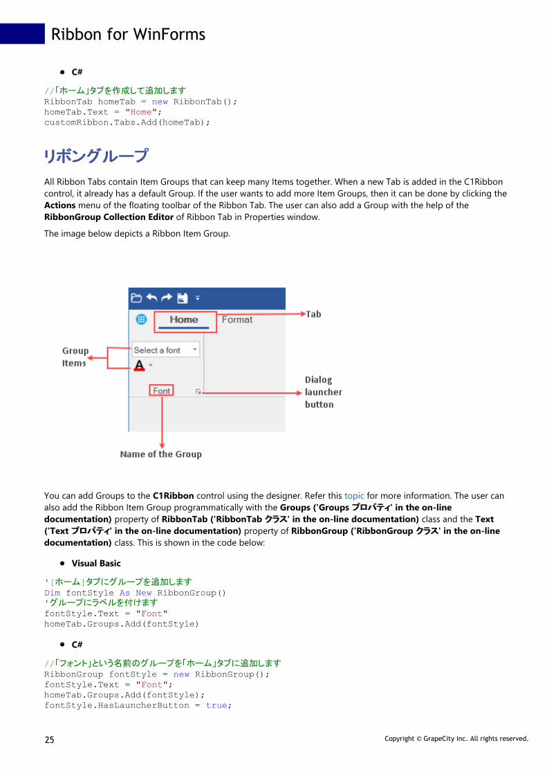
リボングループリボングループ
All Ribbon Tabs contain Item Groups that can keep many Items together. When a new Tab is added in the C1Ribboncontrol, it already has a default Group. If the user wants to add more Item Groups, then it can be done by clicking theActions menu of the floating toolbar of the Ribbon Tab. The user can also add a Group with the help of theRibbonGroup Collection Editor of Ribbon Tab in Properties window.
The image below depicts a Ribbon Item Group.
You can add Groups to the C1Ribbon control using the designer. Refer this topic for more information. The user canalso add the Ribbon Item Group programmatically with the Groups ('Groups プロパティプロパティ' in the on-linedocumentation) property of RibbonTab ('RibbonTab クラスクラス' in the on-line documentation) class and the Text('Text プロパティプロパティ' in the on-line documentation) property of RibbonGroup ('RibbonGroup クラスクラス' in the on-linedocumentation) class. This is shown in the code below:
Visual Basic
'[ホーム]タブにグループを追加しますDim fontStyle As New RibbonGroup()'グループにラベルを付けますfontStyle.Text = "Font"homeTab.Groups.Add(fontStyle)
C#
//「フォント」という名前のグループを「ホーム」タブに追加しますRibbonGroup fontStyle = new RibbonGroup();fontStyle.Text = "Font";homeTab.Groups.Add(fontStyle);fontStyle.HasLauncherButton = true;
Ribbon for WinForms
25 Copyright © GrapeCity inc. All rights reserved.

リボンアイテムリボンアイテム
A Ribbon group comprises group items which perform a specified command or action. There are various types ofgroup items available in the Ribbon group, such as buttons, check boxes, combo boxes, toolbars, menus, and so on.
The next section will take you through different RibbonGroup items.
Button
CheckBox
Color Picker
ComboBox
Date Picker
Font ComboBox
Gallery
Label
Menu
Numeric Box
Progress Bar
Separator
Split Button
TextBox
Time Picker
Toggle Button
Tool Bar
Track Bar
Control Host
ボタンボタン
A Button is a clickable ribbon item that executes a command. Inside a button item, you can put any text or image as required.
The image below displays a ribbon application with Clear Format button and tooltip.
Ribbon for WinForms
26 Copyright © GrapeCity inc. All rights reserved.

The Ribbon Button can be added at design-time using the Floating Toolbar or Collection Editor. Refer this topic for detailed information.
A ribbon button can also be added to the C1Ribbon control through the code. This can be done by using the RibbonButton ('RibbonButton クラクラ
スス' in the on-line documentation) class.
Visual Basic
' リボンボタンをフォーマットグループに追加しますDim clearButton As RibbonButton = New RibbonButton("Clear Format", Image.FromFile("images\clearformat.png"))clearButton.ToolTip = "Clear All Formatting"formatGroup.Items.Add(clearButton)
C#
// リボンボタンをフォーマットグループに追加しますRibbonButton clearButton = new RibbonButton("Clear Format", Image.FromFile(@"images\clearformat.png"));clearButton.ToolTip = "Clear All Formatting";formatGroup.Items.Add(clearButton);
チェックボックスチェックボックス
CheckBoxes are helpful when there are multiple options appearing in a list. It can be used to turn an option on or off.
The following ribbon group contains three CheckBox items.
The CheckBox can be added at design-time using the Floating Toolbar or Collection Editor. Refer this topic for detailed information.
The CheckBox can also be added to the C1Ribbon control programmatically. This can be done using the RibbonCheckBox ('RibbonCheckBox クラスクラス' in the on-linedocumentation) class.
Visual Basic
' リボン項目のCheckBoxボタンを追加しますDim reminderCheckBox As RibbonCheckBox = New RibbonCheckBox()reminderCheckBox.IconSet.Add(New C1BitmapIcon(Nothing, New Size(20, 20), Color.Transparent, Image.FromFile("images\reminder.png")))reminderCheckBox.Text = "Reminder"formatGroup.Items.Add(reminderCheckBox)
C#
// リボン項目のCheckBoxボタンを追加しますRibbonCheckBox reminderCheckBox1 = new RibbonCheckBox();reminderCheckBox1.IconSet.Add(new C1BitmapIcon(null, new Size(20, 20), Color.Transparent, Image.FromFile(@"images\reminder.png")));reminderCheckBox1.Text ="Thumbnails";formatGroup.Items.Add(reminderCheckBox1); RibbonCheckBox reminderCheckBox2 = new RibbonCheckBox();reminderCheckBox2.IconSet.Add(new C1BitmapIcon(null, new Size(20, 20), Color.Transparent, Image.FromFile(@"images\reminder.png")));reminderCheckBox2.Text = "Document map";formatGroup.Items.Add(reminderCheckBox2);
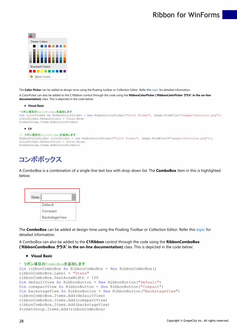
カラーピッカーカラーピッカー
A color picker is a button which when clicked displays a drop-down color palette. The user can select a specific color from the preset palette by clicking thecolor picker's drop-down arrow.
Ribbon for WinForms
27 Copyright © GrapeCity inc. All rights reserved.
The Color Picker can be added at design-time using the floating toolbar or Collection Editor. Refer this topic for detailed information.
A ColorPicker can also be added to the C1Ribbon control through the code using the RibbonColorPicker ('RibbonColorPicker クラスクラス' in the on-linedocumentation) class. This is depicted in the code below:
Visual Basic
'リボン項目のColorPickerを追加しますDim colorPicker As RibbonColorPicker = New RibbonColorPicker("Color Picker", Image.FromFile("images\fontcolor.png"))colorPicker.DefaultColor = Color.BlueformatGroup.Items.Add(colorPicker)
C#
// リボン項目のColorPickerを追加しますRibbonColorPicker colorPicker = new RibbonColorPicker("Color Picker", Image.FromFile(@"images\fontcolor.png"));colorPicker.DefaultColor = Color.Blue;formatGroup.Items.Add(colorPicker);
コンボボックスコンボボックス
A ComboBox is a combination of a single-line text box with drop-down list. The ComboBox item in this is highlightedbelow:
The ComboBox can be added at design-time using the Floating Toolbar or Collection Editor. Refer this topic fordetailed information.
A ComboBox can also be added to the C1Ribbon control through the code using the RibbonComboBox('RibbonComboBox クラスクラス' in the on-line documentation) class. This is depicted in the code below:
Visual Basic
' リボン項目のComboBoxを追加しますDim ribbonComboBox As RibbonComboBox = New RibbonComboBox()ribbonComboBox.Label = "State"ribbonComboBox.TextAreaWidth = 100Dim defaultView As RibbonButton = New RibbonButton("Default")Dim comapactView As RibbonButton = New RibbonButton("Compact")Dim backstageView As RibbonButton = New RibbonButton("BackstageView")ribbonComboBox.Items.Add(defaultView)ribbonComboBox.Items.Add(comapactView)ribbonComboBox.Items.Add(backstageView)formatGroup.Items.Add(ribbonComboBox)
Ribbon for WinForms
28 Copyright © GrapeCity inc. All rights reserved.

C#
//リボン項目のComboBoxを追加しますRibbonComboBox ribbonComboBox = new RibbonComboBox();ribbonComboBox.Label = "State";ribbonComboBox.TextAreaWidth = 100;RibbonButton defaultView = new RibbonButton("Default");RibbonButton comapactView = new RibbonButton("Compact");RibbonButton backstageView = new RibbonButton("BackstageView");ribbonComboBox.Items.Add(defaultView);ribbonComboBox.Items.Add(comapactView);ribbonComboBox.Items.Add(backstageView);formatGroup.Items.Add(ribbonComboBox);
日付ピッカー日付ピッカー
A date picker allows a user to choose a specific date from a drop-down calendar or enter a specific date in thenumeric box. The user can click the DatePicker's calendar icon to select a date.
The Date Picker can be added at design-time using the Floating Toolbar or Collection Editor. Refer this topic fordetailed information.
The date picker item can also be added to the C1Ribbon control through the code using the RibbonDatePicker('RibbonDatePicker クラスクラス' in the on-line documentation) class. This is depicted in the code below:
Visual Basic
' リボン項目のDatePickerを追加しますDim datePicker As RibbonDatePicker = New RibbonDatePicker()datePicker.Format = "yyyy/MM/dd"formatGroup.Items.Add(datePicker)
C#
// リボン項目のDatePickerを追加しますRibbonDatePicker datePicker = new RibbonDatePicker();datePicker.Format = "yyyy/MM/dd";formatGroup.Items.Add(datePicker);
フォントコンボボックスフォントコンボボックス
The Font ComboBox is a combination of drop-down list and list box that shows the available font styles. It also
Ribbon for WinForms
29 Copyright © GrapeCity inc. All rights reserved.

provides a single-line text box. The user can click the Font ComboBox to view the dropdown list of available fontstyles.
The Font ComboBox can be added at design-time using the Floating Toolbar or Collection Editor. Refer this topic fordetailed information.
A Font ComboBox can also be added to the C1Ribbon control through the code using the RibbonFontComboBox('RibbonFontComboBox クラスクラス' in the on-line documentation) class. This is depicted in the code below:
Visual Basic
'リボン項目のFontComboBox を追加しますDim fontComboBox As RibbonFontComboBox = New RibbonFontComboBox()fontComboBox.Text = "Select a font"fontComboBox.AutoCompleteMode = ComboBoxAutoCompleteMode.SuggestformatGroup.Items.Add(fontComboBox)
C#
// リボン項目のFontComboBox を追加しますRibbonFontComboBox fontComboBox = new RibbonFontComboBox();fontComboBox.Text = "Select a font";fontComboBox.AutoCompleteMode = ComboBoxAutoCompleteMode.Suggest;formatGroup.Items.Add(fontComboBox);
ギャラリーギャラリー
Gallery displays a collection of related commands in a Ribbon. The Gallery contains a list of clickable items. Each item when clicked shows the resultvisually on the selected text.
The GIF below illustrates how the text changes upon applying various Styles from the Gallery.
Ribbon for WinForms
30 Copyright © GrapeCity inc. All rights reserved.

The image below shows a gallery item in the C1Ribbon control.
The Ribbon Gallery has a page-up and page-down button to scroll up and down the gallery. There is also a popup launcher button that opens a windowwith ribbon items.
Configuring Gallery at Design-TimeThe Ribbon Gallery can be added at design-time using the Ribbon Group Floating Toolbar or RibbonGroup Items Collection Editor. Also, you cancustomize the look of the Ribbon Gallery using the Ribbon Gallery Floating ToolBar or by editing the properties of Gallery in the Properties Window.Refer this topic, for more information on floating toolbars. You can add items to Gallery using the RibbonGallery Items Collection Editor andRibbonGallery MenuItems Collection Editor. For more info on Collection Editors, refer this topic.
The image below shows the floating toolbar of Gallery.
Adding Ribbon Gallery and Ribbon Gallery ItemsThe user can also add Gallery and Gallery items in the C1Ribbon control through code using the RibbonGallery ('RibbonGallery クラスクラス' in the on-linedocumentation) class and RibbonGalleryItem ('RibbonGalleryItem クラスクラス' in the on-line documentation) class. For instance, the code below depictshow to add a gallery of shapes to the Ribbon control.
Visual Basic
' リボン項目のRibbonGalleryを追加しますDim shapesGallery As RibbonGallery = New RibbonGallery()shapesGallery.ToolTip = "Select a shape"Dim rectShape As RibbonGalleryItem = New RibbonGalleryItem("Rectangle", Image.FromFile("images\rect.png"))Dim circleShape As RibbonGalleryItem = New RibbonGalleryItem("Circle", Image.FromFile("images\circle.png"))Dim triangleShape As RibbonGalleryItem = New RibbonGalleryItem("Triangle", Image.FromFile("images\triangle.png"))Dim hexagonShape As RibbonGalleryItem = New RibbonGalleryItem("Hexagon", Image.FromFile("images\hexagon.png"))shapesGallery.Items.Add(rectShape)shapesGallery.Items.Add(circleShape)shapesGallery.Items.Add(triangleShape)shapesGallery.Items.Add(hexagonShape)
Ribbon for WinForms
31 Copyright © GrapeCity inc. All rights reserved.

formatGroup.Items.Add(shapesGallery)
C#
// リボン項目のRibbonGalleryを追加しますRibbonGallery shapesGallery = new RibbonGallery();shapesGallery.ToolTip = "Select a shape";RibbonGalleryItem rectShape = new RibbonGalleryItem("Rectangle", Image.FromFile(@"images\rect.png"));RibbonGalleryItem circleShape = new RibbonGalleryItem("Circle", Image.FromFile(@"images\circle.png"));RibbonGalleryItem triangleShape = new RibbonGalleryItem("Triangle", Image.FromFile(@"images\triangle.png"));RibbonGalleryItem hexagonShape = new RibbonGalleryItem("Hexagon", Image.FromFile(@"images\hexagon.png"));shapesGallery.Items.Add(rectShape);shapesGallery.Items.Add(circleShape);shapesGallery.Items.Add(triangleShape);shapesGallery.Items.Add(hexagonShape);formatGroup.Items.Add(shapesGallery);
The snapshot of the resulting ribbon control is shown below:
The user can change the position of the image and text of each gallery item. You can place the image above, before or after the text using theImageAboveText, ImageBeforeText and ImageAfterText properties of GalleryItemTextImageRelation enum.
You can also assign the position of image and text of each item in the gallery via code:
Visual Basic
' Specify the position of text And image for gallery itemsribbonGallery1.GalleryItemTextImageRelation = GalleryItemTextImageRelation.ImageBeforeTextribbonGallery2.GalleryItemTextImageRelation = GalleryItemTextImageRelation.ImageAfterTextribbonGallery3.GalleryItemTextImageRelation = GalleryItemTextImageRelation.ImageAboveTextribbonGallery4.GalleryItemTextImageRelation = GalleryItemTextImageRelation.ImageBeforeText
C#
// Specify the position of text and image for gallery itemsribbonGallery1.GalleryItemTextImageRelation = GalleryItemTextImageRelation.ImageBeforeText;ribbonGallery2.GalleryItemTextImageRelation = GalleryItemTextImageRelation.ImageAfterText;ribbonGallery3.GalleryItemTextImageRelation = GalleryItemTextImageRelation.ImageAboveText;ribbonGallery4.GalleryItemTextImageRelation = GalleryItemTextImageRelation.ImageBeforeText;
Gallery GroupingIf you click on the popup launcher button, it displays a small window of gallery items, which are grouped by group names.
The image below shows the popup gallery window with items arranged in two groups, Common and Extended.
Ribbon for WinForms
32 Copyright © GrapeCity inc. All rights reserved.
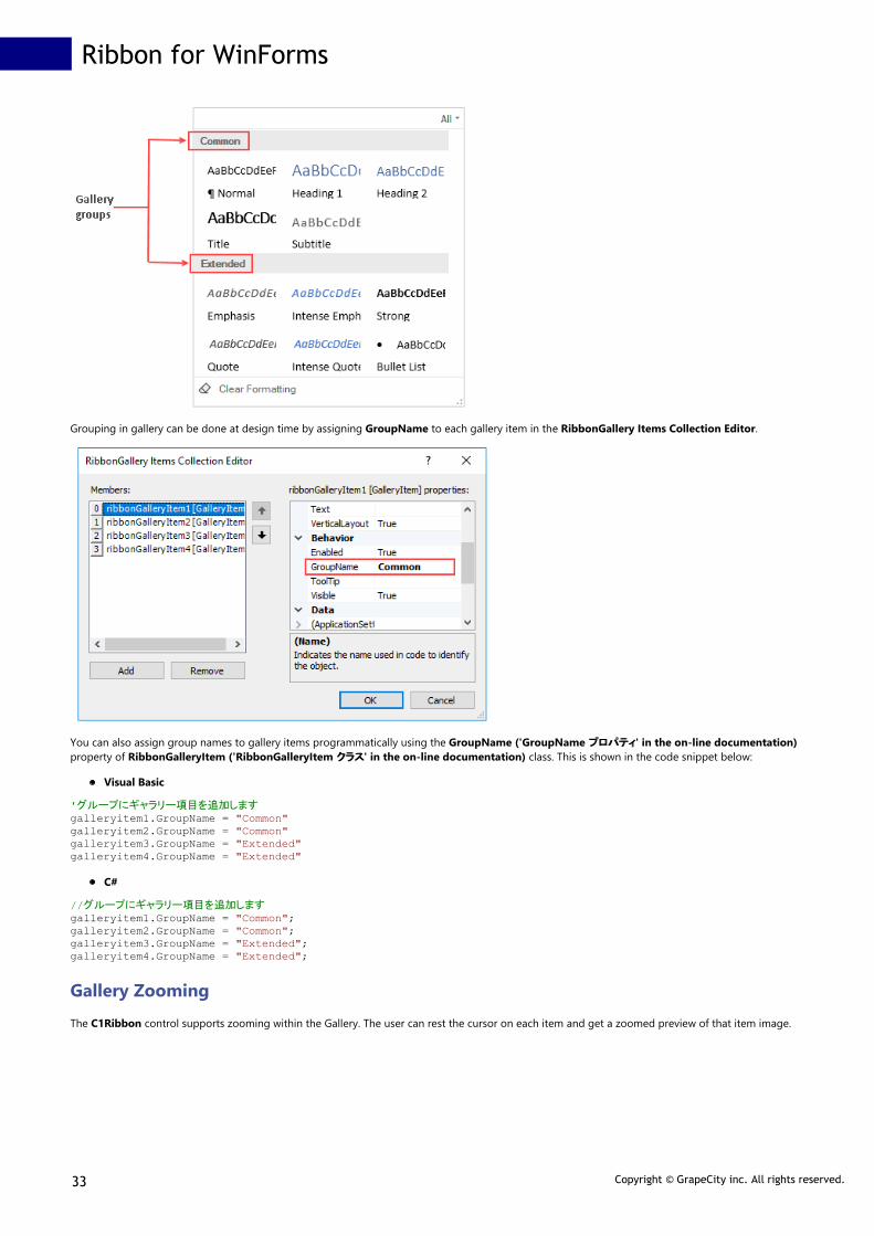
Grouping in gallery can be done at design time by assigning GroupName to each gallery item in the RibbonGallery Items Collection Editor.
You can also assign group names to gallery items programmatically using the GroupName ('GroupName プロパティプロパティ' in the on-line documentation)property of RibbonGalleryItem ('RibbonGalleryItem クラスクラス' in the on-line documentation) class. This is shown in the code snippet below:
Visual Basic
'グループにギャラリー項目を追加しますgalleryitem1.GroupName = "Common"galleryitem2.GroupName = "Common"galleryitem3.GroupName = "Extended"galleryitem4.GroupName = "Extended"
C#
//グループにギャラリー項目を追加しますgalleryitem1.GroupName = "Common";galleryitem2.GroupName = "Common";galleryitem3.GroupName = "Extended";galleryitem4.GroupName = "Extended";
Gallery ZoomingThe C1Ribbon control supports zooming within the Gallery. The user can rest the cursor on each item and get a zoomed preview of that item image.
Ribbon for WinForms
33 Copyright © GrapeCity inc. All rights reserved.

At design time, the zooming feature can be activated using the AllowZooming property of Ribbon Gallery in the Properties window. Note that for thezooming property to work, the ItemSize property of the Gallery should be less than the image size of each item.
You can also add the zooming feature via code using the AllowZooming ('AllowZooming プロパティプロパティ' in the on-line documentation) property ofRibbonGallery ('RibbonGallery クラスクラス' in the on-line documentation) class.
Visual Basic
'ギャラリーのズームを許可しますribbonGallery.AllowZooming = True
C#
//ギャラリーのズームを許可しますribbonGallery.AllowZooming = true;
Gallery FilteringThe C1Ribbon control supports filtering in the ribbon gallery. It allows you to filter items by gallery groups. This is illustrated in the GIF below:
At design time, the filtering feature can be activated using the AllowGroupFiltering property of Ribbon Gallery in the Properties window.
Ribbon for WinForms
34 Copyright © GrapeCity inc. All rights reserved.

You can also add the filtering feature via code using the AllowGroupFiltering ('AllowGroupFiltering プロパティプロパティ' in the on-line documentation)property of RibbonGallery ('RibbonGallery クラスクラス' in the on-line documentation) class.
Visual Basic
'ギャラリーグループでのフィルタリングを許可しますribbonGallery.AllowGroupFiltering = True
C#
//ギャラリーグループでのフィルタリングを許可しますribbonGallery.AllowGroupFiltering = true;
ラベルラベル
A label displays content and can point to the element next to it. It can include both text and image.
The image given below depicts a label.
The Label can be added at design-time using the Floating Toolbar or Collection Editor. Refer this topic for detailed information.
The Label can also be added to the C1Ribbon control through the code using the RibbonLabel ('RibbonLabel クラスクラス' in the on-linedocumentation) class. This is depicted in the code below:
Visual Basic
' リボン項目のラベルを追加しますDim ribbonLabel As RibbonLabel = New RibbonLabel("Feedback", Image.FromFile("images\feedback.png"))formatGroup.Items.Add(ribbonLabel)
C#
// リボン項目のラベルを追加しますRibbonLabel ribbonLabel = new RibbonLabel("Feedback", Image.FromFile(@"images\feedback.png"));formatGroup.Items.Add(ribbonLabel);
メニューメニュー
A Menu is a button with a drop-down arrow. It is used in a ribbon application when you need a menu for a small set of related commands. If a user clicks onthe arrow, then a dropdown of items is displayed.
The image below depicts the Menu item with commands such as Cut, Copy, Paste and ColorPicker.
Ribbon for WinForms
35 Copyright © GrapeCity inc. All rights reserved.

Adding Menu at Design-Time
The Ribbon Menu can be added at design-time using the Ribbon Group Floating Toolbar or RibbonGroup Items Collection Editor. Also, you cancustomize the look of the Ribbon Menu using the Ribbon Menu Floating ToolBar or by editing the properties in the Properties Window. For moreinformation about floating toolbars, refer this topic. The user can add items to the Menu using the Ribbon Menu Items Collection Editor. Refer this topic formore information on collection editors.
This image below shows the floating toolbar of Menu.
Adding Menu via Code
A Menu can also be added to the C1Ribbon control through the code using the RibbonMenu ('RibbonMenu クラスクラス' in the on-line documentation) class.This is depicted in the code below:
Visual Basic
' リボン項目のRibbonMenuを追加しますDim ribbonMenu As RibbonMenu = New RibbonMenu()ribbonMenu.Text = "Edit"Dim cutButton As RibbonButton = New RibbonButton("Cut", Image.FromFile("images\cut.png"))Dim copyButton As RibbonButton = New RibbonButton("Copy", Image.FromFile("images\copy.png"))Dim pasteButton As RibbonButton = New RibbonButton("Paste", Image.FromFile("images\paste.png"))Dim separator As RibbonSeparator = New RibbonSeparator()Dim colorpicker1 As RibbonColorPicker = New RibbonColorPicker("Color Picker", Image.FromFile("images\fontcolor.png"))Dim label As RibbonLabel = New RibbonLabel("Select Color")Dim colorItem As RibbonColorPickerItem = New RibbonColorPickerItem()ribbonMenu.Items.Add(cutButton)ribbonMenu.Items.Add(copyButton)ribbonMenu.Items.Add(pasteButton)ribbonMenu.Items.Add(separator)ribbonMenu.Items.Add(colorPicker)ribbonMenu.Items.Add(label)ribbonMenu.Items.Add(colorItem)formatGroup.Items.Add(ribbonMenu)
C#
// リボン項目のRibbonMenuを追加しますRibbonMenu ribbonMenu = new RibbonMenu();ribbonMenu.Text = "Edit";RibbonButton cutButton = new RibbonButton("Cut", Image.FromFile(@"images\cut.png"));RibbonButton copyButton = new RibbonButton("Copy", Image.FromFile(@"images\copy.png"));RibbonButton pasteButton = new RibbonButton("Paste",Image.FromFile(@"images\paste.png"));RibbonSeparator separator = new RibbonSeparator();RibbonColorPicker colorpicker = new RibbonColorPicker("Color Picker", Image.FromFile(@"images\fontcolor.png"));RibbonLabel label = new RibbonLabel("Select Color");RibbonColorPickerItem colorItem = new RibbonColorPickerItem();ribbonMenu.Items.Add(cutButton);ribbonMenu.Items.Add(copyButton);ribbonMenu.Items.Add(pasteButton);ribbonMenu.Items.Add(separator);ribbonMenu.Items.Add(colorpicker);ribbonMenu.Items.Add(label);ribbonMenu.Items.Add(colorItem);formatGroup.Items.Add(ribbonMenu);
A user can specify the item size in the dropdown menu by specifying the PreferredItemSize property. The image below depicts the Menu item in the ribboncontrol when the PreferredItemSize property is set to Large.
Ribbon for WinForms
36 Copyright © GrapeCity inc. All rights reserved.
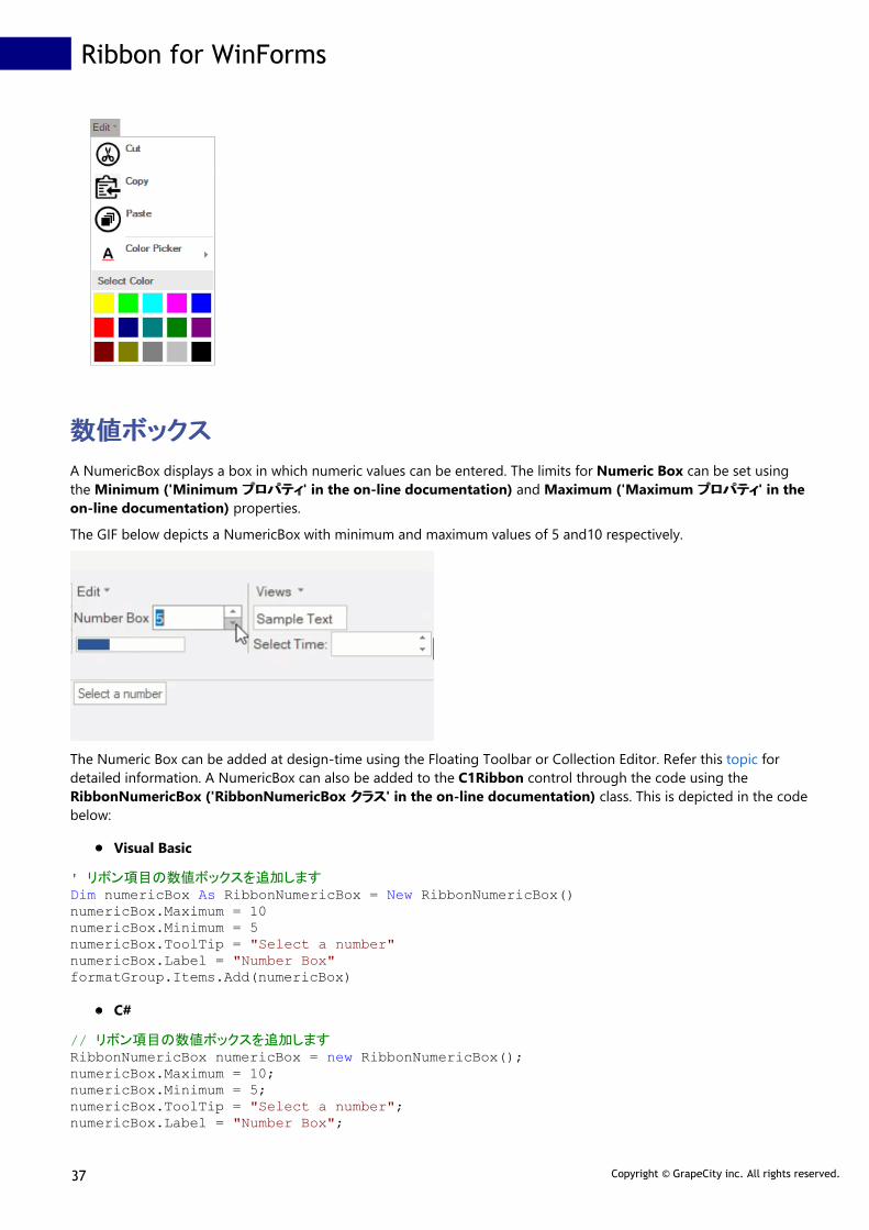
数値ボックス数値ボックス
A NumericBox displays a box in which numeric values can be entered. The limits for Numeric Box can be set usingthe Minimum ('Minimum プロパティプロパティ' in the on-line documentation) and Maximum ('Maximum プロパティプロパティ' in theon-line documentation) properties.
The GIF below depicts a NumericBox with minimum and maximum values of 5 and10 respectively.
The Numeric Box can be added at design-time using the Floating Toolbar or Collection Editor. Refer this topic fordetailed information. A NumericBox can also be added to the C1Ribbon control through the code using theRibbonNumericBox ('RibbonNumericBox クラスクラス' in the on-line documentation) class. This is depicted in the codebelow:
Visual Basic
' リボン項目の数値ボックスを追加しますDim numericBox As RibbonNumericBox = New RibbonNumericBox()numericBox.Maximum = 10numericBox.Minimum = 5numericBox.ToolTip = "Select a number"numericBox.Label = "Number Box"formatGroup.Items.Add(numericBox)
C#
// リボン項目の数値ボックスを追加しますRibbonNumericBox numericBox = new RibbonNumericBox();numericBox.Maximum = 10;numericBox.Minimum = 5;numericBox.ToolTip = "Select a number";numericBox.Label = "Number Box";
Ribbon for WinForms
37 Copyright © GrapeCity inc. All rights reserved.

formatGroup.Items.Add(numericBox);
プログレスバープログレスバー
A Progress Bar is a C1Ribbon Item used to visualize the progression of an extended task occurring within anapplication. The user can assign Minimum ('Minimum プロパティプロパティ' in the on-line documentation), Maximum('Maximum プロパティプロパティ' in the on-line documentation) and Value ('Value プロパティプロパティ' in the on-linedocumentation) properties to the ProgressBar range.
The image below depicts a Progress Bar with a Minimum and Maximum of 0 and 100 respectively. The current Value isshown as 50 here, indicating that the task is partly completed.
The ProgresBar can be added at design-time using the Floating Toolbar or Collection Editor. Refer this topic fordetailed information. A ProgressBar can also be added to the C1Ribbon control through the code using theRibbonProgressBar ('RibbonProgressBar クラスクラス' in the on-line documentation) class. This is depicted in the codebelow:
Visual Basic
' リボン項目のProgressBarを追加しますDim progressBar As RibbonProgressBar = New RibbonProgressBar()progressBar.Minimum = 0progressBar.Maximum = 100progressBar.Value = 50formatGroup.Items.Add(progressBar)
C#
// リボン項目のプログレスバーを追加しますRibbonProgressBar progressBar = new RibbonProgressBar();progressBar.Minimum = 0;progressBar.Maximum = 100;progressBar.Value = 50;progressBar.ToolTip = "50%";formatGroup.Items.Add(progressBar);
区切り記号区切り記号
The separator item is a horizontal or vertical bar used to provide visual separation between items/commands in agroup, toolbar, StatusBar or drop-down menus.
Ribbon for WinForms
38 Copyright © GrapeCity inc. All rights reserved.

The separator can be added at design-time using the Floating Toolbar or Collection Editor. Refer this topic fordetailed information. A separator can also be added to the C1Ribbon control through the code using theRibbonSeparator ('RibbonSeparator クラスクラス' in the on-line documentation) class. This is depicted in the codesnippet below:
Visual Basic
' リボン項目の区切り記号を追加しますDim separatorItem As RibbonSeparator = New RibbonSeparator()formatGroup.Items.Add(separatorItem)
C#
// リボン項目の区切り記号を追加しますRibbonSeparator separatorItem = new RibbonSeparator();formatGroup.Items.Add(separatorItem);
スプリットボタンスプリットボタン
A split button is a combination of a regular button and a drop-down list. The split button is useful in scenarios where a user has to combine a set of variations ofthe same command.
The Split Button element is shown in the GIF below:
Adding SplitButton at Design-Time
The Ribbon SplitButton can be added at design-time using the Ribbon Group Floating Toolbar or RibbonGroup Items Collection Editor. Also, you cancustomize the look of the Ribbon SplitButton using the Ribbon SplitButton Floating ToolBar or by editing the properties in the Properties Window. For moreinformation about floating toolbars, refer this topic. You can also add items to SplitButton using the RibbonSplitButton Items Collection Editor. Refer this topicfor more Collection Editors.
Adding SplitButton through Code
A split button can also be added to the C1Ribbon control through the code using the RibbonSplitButton ('RibbonSplitButton クラスクラス' in the on-linedocumentation) class. This is depicted in the code below:
Visual Basic
Ribbon for WinForms
39 Copyright © GrapeCity inc. All rights reserved.
' Add RibbonSplitButtonDim splitButton As RibbonSplitButton = New RibbonSplitButton("Views")Dim printLayout As RibbonButton = New RibbonButton("Print Layout", Image.FromFile("images\printlayout.png"))Dim fullScreenLayout As RibbonButton = New RibbonButton("Full Screen Reading", Image.FromFile("images\fullscreen.png"))Dim webLayout As RibbonButton = New RibbonButton("Web Layout", Image.FromFile("images\weblayout.png"))splitButton.Items.Add(printLayout)splitButton.Items.Add(fullScreenLayout)splitButton.Items.Add(webLayout)formatGroup.Items.Add(splitButton)'Specify the size of the items in dropdown menusplitButton.PreferredItemSize = ItemSize.Auto
C#
// Add Ribbon Split ButtonRibbonSplitButton splitButton = new RibbonSplitButton("Views");RibbonButton printLayout = new RibbonButton("Print Layout", Image.FromFile(@"images\printlayout.png"));RibbonButton fullScreenLayout = new RibbonButton("Full Screen Reading", Image.FromFile(@"images\fullscreen.png"));RibbonButton webLayout = new RibbonButton("Web Layout", Image.FromFile(@"images\weblayout.png"));splitButton.Items.Add(printLayout);splitButton.Items.Add(fullScreenLayout);splitButton.Items.Add(webLayout);formatGroup.Items.Add(splitButton);// Specify the size of the items in dropdown menusplitButton.PreferredItemSize = ItemSize.Auto;
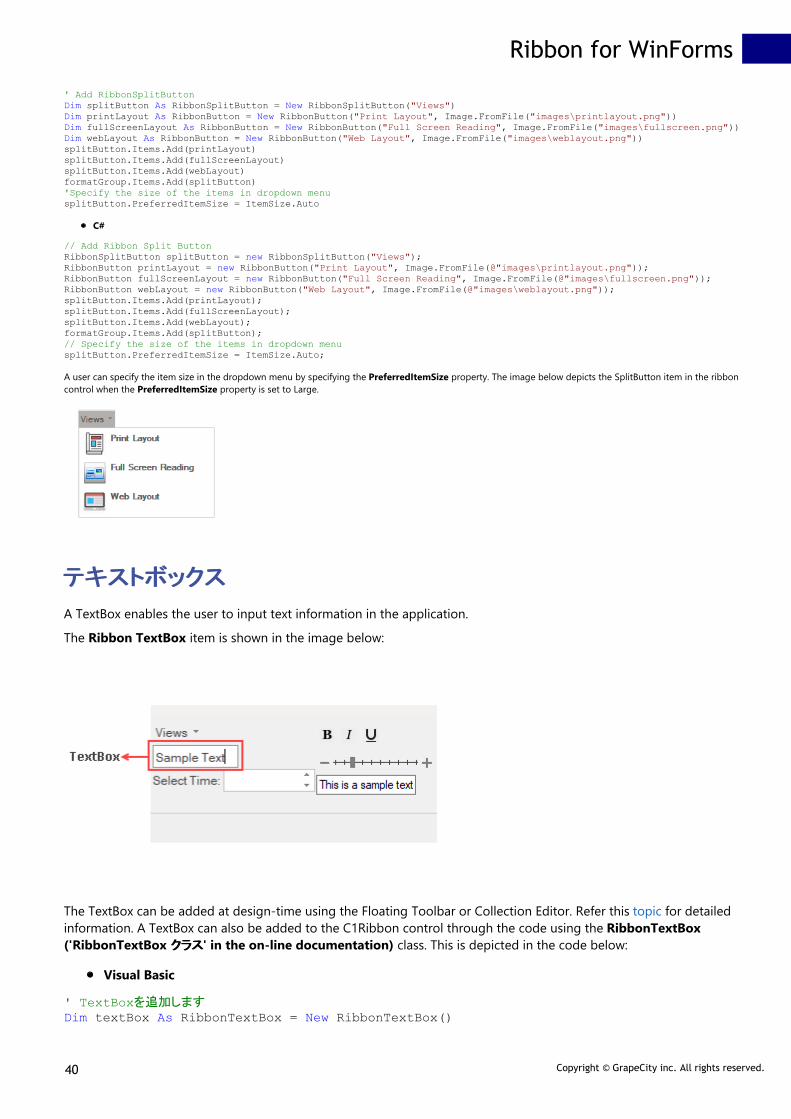
A user can specify the item size in the dropdown menu by specifying the PreferredItemSize property. The image below depicts the SplitButton item in the ribboncontrol when the PreferredItemSize property is set to Large.
テキストボックステキストボックス
A TextBox enables the user to input text information in the application.
The Ribbon TextBox item is shown in the image below:
The TextBox can be added at design-time using the Floating Toolbar or Collection Editor. Refer this topic for detailedinformation. A TextBox can also be added to the C1Ribbon control through the code using the RibbonTextBox('RibbonTextBox クラスクラス' in the on-line documentation) class. This is depicted in the code below:
Visual Basic
' TextBoxを追加しますDim textBox As RibbonTextBox = New RibbonTextBox()
Ribbon for WinForms
40 Copyright © GrapeCity inc. All rights reserved.

textBox.Text = "Sample Text"formatGroup.Items.Add(textBox)
C#
// TextBoxを追加しますRibbonTextBox textBox = new RibbonTextBox();textBox.Text = "Sample Text";formatGroup.Items.Add(textBox);
時刻ピッカー時刻ピッカー
The Time Picker works like a numeric box with increment and decrement buttons. It enables the user to choose aspecific time or enter a specific time in the numeric box.
The Time Picker can be added through the designer using the Floating Toolbar or Collection Editor. Refer this topic fordetailed information. A TimePicker can also be added to the C1Ribbon control through the code using theRibbonTimePicker ('RibbonTimePicker クラスクラス' in the on-line documentation) class. This is depicted in the codebelow:
Visual Basic
' TimePickerを追加しますDim timePicker As RibbonTimePicker = New RibbonTimePicker()timePicker.Label = "Select Time:"formatGroup.Items.Add(timePicker)
C#
// TimePickerを追加しますRibbonTimePicker timePicker = new RibbonTimePicker();timePicker.Label = "Select Time:";formatGroup.Items.Add(timePicker);
トグルボタントグルボタン
A toggle button is a command button that allows the user to switch between two states. When a user clicks on a toggle button, itswitches to the pressed/active state and on consecutive clicking, it returns back to the unpressed/inactive state.
The GIF below shows a toggle button with tooltip:
The Toggle Button can be added at design-time using the Floating Toolbar or Collection Editor. Refer this topic for detailed information.A toggle button can also be added to the C1Ribbon control through the code using the RibbonToggleButton ('RibbonToggleButton ククラスラス' in the on-line documentation) class. This is depicted in the code below.
Ribbon for WinForms
41 Copyright © GrapeCity inc. All rights reserved.

Visual Basic
' フォーマットグループにトグルボタンを追加しますDim leftAlign As RibbonToggleButton = New RibbonToggleButton(Image.FromFile("images\align_left.png"))leftAlign.ToolTip = "Align your content with left margin."formatGroup.Items.Add(leftAlign)
C#
// フォーマットグループにトグルボタンを追加しますRibbonToggleButton leftAlign = new RibbonToggleButton(Image.FromFile(@"images\align_left.png"));leftAlign.ToolTip = "Align your content with left margin.";formatGroup.Items.Add(leftAlign);
ツールバーツールバー
A toolbar comprises of a row of clickable items that can perform different tasks. The Ribbon ToolBar provides easy access tothe most frequently-used functions.
The image below shows a ToolBar with Bold, Italics and Underline buttons in the ribbon application.
The ToolBar can be added at design-time using the Floating Toolbar or Collection Editor. Refer this topic for detailedinformation. A toolbar can also be added programmatically to the Ribbon control using the RibbonToolBar ('RibbonToolBarクラスクラス' in the on-line documentation) class. This is depicted in the code below:
Visual Basic
' ツールバーを追加しますDim ribbonToolBar As RibbonToolBar = New RibbonToolBar()Dim boldButton As RibbonButton = New RibbonButton(Image.FromFile("images\bold.png"))Dim italicButton As RibbonButton = New RibbonButton(Image.FromFile("images\italic.png"))Dim underlineButton As RibbonButton = New RibbonButton(Image.FromFile("images\underline.png"))ribbonToolBar.Items.Add(boldButton)ribbonToolBar.Items.Add(italicButton)ribbonToolBar.Items.Add(underlineButton)formatGroup.Items.Add(ribbonToolBar)
C#
// ツールバーを追加しますRibbonToolBar ribbonToolBar = new RibbonToolBar();RibbonButton boldButton = new RibbonButton(Image.FromFile(@"images\bold.png"));RibbonButton italicButton = new RibbonButton(Image.FromFile(@"images\italic.png"));RibbonButton underlineButton = new RibbonButton(Image.FromFile(@"images\underline.png"));ribbonToolBar.Items.Add(boldButton);ribbonToolBar.Items.Add(italicButton);ribbonToolBar.Items.Add(underlineButton);formatGroup.Items.Add(ribbonToolBar);
トラックバートラックバー
Ribbon for WinForms
42 Copyright © GrapeCity inc. All rights reserved.

The Track Bar is a horizontal slider that enables the user to select values on a bar by moving the slider. The tick marksare spaced at regular intervals called the tick frequency. The user can set the Maximum and Minimum values on theTrackBar.
The GIF below shows the Ribbon TrackBar in a ribbon application.
The Track Bar can be added via the designer using Floating Toolbar or Collection Editor. Refer this topic for detailedinformation. The TrackBar can also be added programmatically to the Ribbon control using the RibbonTrackBar('RibbonTrackBar クラスクラス' in the on-line documentation) class. This is depicted in the code below:
Visual Basic
' TrackBarを追加しますDim trackBar As RibbonTrackBar = New RibbonTrackBar()trackBar.Minimum = 10trackBar.Maximum = 100trackBar.Value = 30trackBar.TickFrequency = 10formatGroup.Items.Add(trackBar)
C#
// TrackBarを追加しますRibbonTrackBar trackBar = new RibbonTrackBar();trackBar.Minimum = 10;trackBar.Maximum = 100;trackBar.Value = 30;trackBar.TickFrequency = 10;trackBar.Width = 200;formatGroup.Items.Add(trackBar);
コントロールホストコントロールホスト
The Control Host item enables the user to add a hosted control in the RibbonGroup of the C1Ribbon control. AControlHost item can be added both through the designer as well as code. In both the cases, the user has toprogrammatically configure the hosted control in the MainForm. Let's say a user wants to add a TextBox control. Forthis, the user needs to create a new TextBoxHost class that inherits the RibbonControlHost element. Likewise, inorder to add a ComboBox control, the user can create a new ComboBoxHost class that inherits theRibbonControlHost element.
The following sections cover in detail about the configuration of a ControlHost in the C1Ribbon control via both thedesigner and code.
By Designer
Complete the following steps to add a standard TextBox control to a Ribbon group via the designer:
1. Open the MainRibbonForm to view the Ribbon Form, and select View Code to open code view.2. Add the following code to your project to create a new TextBoxHost class that inherits the
RibbonControlHost element:Visual Basic
Public Sub New() MyBase.New(New System.Windows.Forms.TextBox())
Ribbon for WinForms
43 Copyright © GrapeCity inc. All rights reserved.

MyBase.Text = "This is a sample text."End Sub
C#public class TextBoxHost : C1.Win.Ribbon.RibbonControlHost{ public TextBoxHost() : base(new System.Windows.Forms.TextBox()) { base.Text = "This is a sample text."; }}
3. Build and close your project, and then return to Design view.4. Open the floating toolbar of the Group to which you want to add the ControlHost item.5. Click the Actions button, and select Add ControlHost.
6. The Adding RibbonControlHost dialog box will launch. The dialog box will request the class name of theRibbonControlHost. Enter the name of the control host in the Adding RibbonControlHost dialog box in thisformat "ProjectName.FormName+TextBoxHost" replacing ProjectName and FormName with the names of yourproject and form.
Ribbon for WinForms
44 Copyright © GrapeCity inc. All rights reserved.

Note: When you again add a TextBoxHost element, you won't have to type its name. The name of thisclass will be available in the drop-down list in the Adding RibbonControlHost dialog box.
7. Click OK to close the Adding RibbonControlHost dialog box.
Notice that the TextBox control now appears in the Ribbon group.
By Code
The RibbonControlHost item can be added programmatically with the RibbonControlHost ('RibbonControlHost ククラスラス' in the on-line documentation) class as shown in the code below:
Visual Basic
Private Sub Form1_Load(sender As Object, e As EventArgs) Handles MyBase.Load Dim textboxHost As RibbonControlHost = New RibbonControlHost() textboxHost = New AddRibbonItems.TextBoxHost() formatGroup.Items.Add(textboxHost)End Sub
Public Class TextBoxHost Inherits C1.Win.Ribbon.RibbonControlHost
Public Sub New() MyBase.New(New System.Windows.Forms.TextBox()) MyBase.Text = "This is a sample text." End Sub
C#
private void Form1_Load(object sender, EventArgs e) { //ControlHost項目を追加します RibbonControlHost textboxHost = new RibbonControlHost();
Ribbon for WinForms
45 Copyright © GrapeCity inc. All rights reserved.

textboxHost = new AddRibbonItems.TextBoxHost(); formatGroup.Items.Add(textboxHost);
} }
public class TextBoxHost : C1.Win.Ribbon.RibbonControlHost{ public TextBoxHost(): base(new System.Windows.Forms.TextBox()) { base.Text = "This is a sample text."; }}
ステータスバーステータスバー
The C1StatusBar control appears like a horizontal bar at the bottom of the Forms window. The StatusBar can display various kinds of status information in an application window.
The C1StatusBar control is a separate control and can be added at design-time from the Toolbox. When dropped on the Forms, C1StatusBar gets docked at the bottom. Items can be added tothe left and right pane of the StatusBar by using the floating toolbar in context menu or the collection editors in the Properties window. For more information about adding items through thedesigner, refer this topic.
The StatusBar control can also be added to the form programmatically. The items can be added to the left pane and right pane of the StatusBar using the LeftPaneItems ('LeftPaneItems プロパプロパ
ティティ' in the on-line documentation) and RightPaneItems ('RightPaneItems プロパティプロパティ' in the on-line documentation) properties of the C1StatusBar ('C1StatusBar クラスクラス' in the on-linedocumentation) class.
Visual Basic
Public Class Form1
Private statusBar As C1StatusBar Private _percents As Integer() = New Integer() {10, 20, 30, 40, 50, 60, 70, 80, 90, 100, 120, 150, 200, 250, 300, 400, 700, 1000}
Public Sub New() InitializeComponent() 'ステータスバーをリボンコントロールに追加します AddStatusBar(Me) End Sub
Public Sub AddStatusBar(form1 As Form1) 'ステータスバーを作成して追加します statusBar = New C1StatusBar() statusBar.Width = 150
'パーセンテージ値を表示するボタンを作成します Dim zoomButton As New RibbonButton(Nothing, Image.FromFile("images\zoomButton.png")) Dim wordcountLabel As New RibbonLabel() wordcountLabel.Text = "0 words" Dim charcountLabel As New RibbonLabel() charcountLabel.Text = "0 chars"
'TextChangedイベントハンドラーを追加します AddHandler RichTextBox1.TextChanged, AddressOf RichTextBox1_TextChanged
'リボントラックバーを作成します Dim zoomTrackBar As New RibbonTrackBar() zoomTrackBar.Minimum = 0 zoomTrackBar.Maximum = 17 zoomTrackBar.StepFrequency = 1
'イベントハンドラーを追加します AddHandler zoomTrackBar.ValueChanged, AddressOf ZoomTrackBar1_ValueChanged
'アイテムを左右のパネルに追加します statusBar.RightPaneItems.Add(zoomTrackBar) statusBar.RightPaneItems.Add(New RibbonLabel("10%"))
Ribbon for WinForms
46 Copyright © GrapeCity inc. All rights reserved.

statusBar.LeftPaneItems.Add(wordcountLabel) statusBar.LeftPaneItems.Add(charcountLabel)
'ステータスバーをメインフォームに追加します Me.Controls.Add(statusBar) End Sub
Private Sub ZoomTrackBar1_ValueChanged(sender As Object, e As EventArgs) Dim zoomBar As RibbonTrackBar = DirectCast(sender, RibbonTrackBar) Dim index = zoomBar.Value Dim zf As Integer = _percents(index) Dim zoomLabel = DirectCast(statusBar.RightPaneItems(1), RibbonLabel) zoomLabel.Text = zf.ToString() & "%" Me.RichTextBox1.ZoomFactor = zf / 100.0F End Sub
Private Sub RichTextBox1_TextChanged(sender As Object, e As EventArgs) Dim charcountLabel As RibbonLabel = DirectCast(statusBar.LeftPaneItems(0), RibbonLabel) Dim wordcountLabel As RibbonLabel = DirectCast(statusBar.LeftPaneItems(1), RibbonLabel) charcountLabel.Text = RichTextBox1.TextLength.ToString() & " chars" wordcountLabel.Text = RichTextBox1.Text.Split(New Char() {" "c}, StringSplitOptions.RemoveEmptyEntries).Length.ToString() & " words" End Sub
End Class
C#
public partial class Form1 : Form{ C1StatusBar statusBar; int[] _percents = new int[] { 10, 20, 30, 40, 50, 60, 70, 80, 90, 100, 120, 150, 200, 250, 300, 400, 700, 1000 }; public Form1() { InitializeComponent(); //ステータスバーをリボンコントロールに追加します AddStatusBar(this); }
public void AddStatusBar(Form1 form1) { //ステータスバーを作成して追加します statusBar = new C1StatusBar(); statusBar.Width = 150;
//パーセンテージ値を表示するボタンを作成します RibbonButton zoomButton = new RibbonButton(null, Image.FromFile("images\\zoomButton.png")); RibbonLabel wordcountLabel = new RibbonLabel(); wordcountLabel.Text = "0 words"; RibbonLabel charcountLabel = new RibbonLabel(); charcountLabel.Text = "0 chars";
//TextChangedイベントハンドラーを追加します richTextBox1.TextChanged += RichTextBox1_TextChanged;
//リボントラックバーを作成します RibbonTrackBar zoomTrackBar = new RibbonTrackBar(); zoomTrackBar.Minimum = 0; zoomTrackBar.Maximum = 17; zoomTrackBar.StepFrequency = 1;
//イベントハンドラーを追加します zoomTrackBar.ValueChanged += ZoomTrackBar1_ValueChanged;
//アイテムを左右のパネルに追加します statusBar.RightPaneItems.Add(zoomTrackBar); statusBar.RightPaneItems.Add(new RibbonLabel("10%")); statusBar.LeftPaneItems.Add(wordcountLabel); statusBar.LeftPaneItems.Add(charcountLabel);
//ステータスバーをメインフォームに追加します this.Controls.Add(statusBar);
} private void ZoomTrackBar1_ValueChanged(object sender, EventArgs e) { RibbonTrackBar zoomBar = (RibbonTrackBar)sender; var index = zoomBar.Value; int zf = _percents[index]; var zoomLabel = (RibbonLabel)statusBar.RightPaneItems[1]; zoomLabel.Text = zf.ToString() + "%"; this.richTextBox1.ZoomFactor = zf / 100f; } private void RichTextBox1_TextChanged(object sender, EventArgs e) { RibbonLabel charcountLabel = (RibbonLabel)statusBar.LeftPaneItems[0]; RibbonLabel wordcountLabel = (RibbonLabel)statusBar.LeftPaneItems[1]; charcountLabel.Text = richTextBox1.TextLength.ToString() + " chars"; wordcountLabel.Text = richTextBox1.Text.Split(new char[] { ' ' }, StringSplitOptions.RemoveEmptyEntries).Length.ToString() + " words"; } }
Ribbon for WinForms
47 Copyright © GrapeCity inc. All rights reserved.

設計時のサポート設計時のサポート
The Ribbon for WinForms provides visual editing to make it easier for a user to create Ribbon in their applications.You can make changes to Ribbon by using Smart Tags, Floating Toolbars or Collection Editors. The following topicswill walk you through C1Ribbon Design-Time support.
Smart Tags
Application Menu
Backstage View
Quick Access Toolbar
Configuration Toolbar
Contextual Tab Group
Ribbon Tab
Ribbon Group
RibbonGroup Items
StatusBar
スマートタグスマートタグ
The C1Ribbon and C1StatusBar controls provide quick and easy access to their common properties through theirsmart tags.
Ribbon Smart Tag
To access the Ribbon Tasks menu, click on the smart tag ( ) in the upper-right corner of the Ribbon control. This willopen the C1Ribbon Tasks menu.
The C1Ribbon Tasks menu can perform the following operations:
Load Ribbon TemplateIt opens the Load Ribbon Template dialog box where you can import an XML file that contains the pre-formatted Ribbon.Save Ribbon TemplateIt opens Save Ribbon Template dialog box where you can save the Ribbon layout as an XML file.QAT LocationIt allows you to select the location of the Quick Access Toolbar in relation to the Ribbon.Enable Smart DesignerSelecting or deselecting the Enable Smart Designer check box turns on or off the smart designer functionality.About C1Ribbon
Ribbon for WinForms
48 Copyright © GrapeCity inc. All rights reserved.

It displays a dialog box, which is helpful in finding the version number of C1Ribbon and online resources.LocalizeOpens the Localize dialog box, from where you can add user-defined localization for run-time string resources.
StatusBar Smart Tag
To access the StatusBar Tasks menu, click on the smart tag ( ) in the upper-right corner of the StatusBar control. Thiswill open the C1StatusBar Tasks menu.
The C1StatusBar Tasks menu can perform the following operations:
Load StatusBar TemplateIt opens the Load StatusBar Template dialog box where you can import an XML file that contains the pre-formatted status bar.Save StatusBar TemplateIt opens Save StatusBar Template dialog box where you can save the status bar layout as an XML file.Enable Smart DesignerSelecting or deselecting the Enable Smart Designer check box turns on or off the smart designer functionalityrespectively.About C1StatusBarIt displays a dialog box, which is helpful in finding the version number of C1Ribbon and online resources.LocalizeOpens the Localize dialog box, from where you can add user-defined localization for run-time string resources.
コレクションコレクション エディターエディター
Collection Editors are used to add, remove or edit items in a collection at design-time. A Collection Editor can belaunched by selecting the Ribbon element on the Form and then clicking the ellipsis next to Items, MenuItems,LeftPaneItems, RightPaneItems, BottomPaneItems or LeftBottomPaneItems properties in their respectiveProperties window.
The text label at the top of the Collection Editor Dialog Box displays the name of Collection Editor. The CollectionEditor dialog box usually comprises two sections: left and right sections. The Left part of the Collection Editor containsthe Add and Remove button that can be used to add and remove items. The added items gets displayed in theMembers section of the Collection Editor. You can click on each item added in the Members sections to view therespective item properties on the right pane. The Up and Down arrow buttons are used to navigate up and down theMembers.
The image below depicts the RibbonFontComboBox Menu Items Collection Editor.
Ribbon for WinForms
49 Copyright © GrapeCity inc. All rights reserved.

Types of Collection Editors
Collection editors are grouped into three major types: Items Collection Editors, Menu Items Collection Editors andPaneItems Collection Editors.
Items Collection Editors: It is used to add items to a particular Ribbon element. The image below depicts anexample of the Items Collection Editor.
Let's say a user wants to add and customize item(s) in the Gallery using RibbonGallery Items Collection
Ribbon for WinForms
50 Copyright © GrapeCity inc. All rights reserved.

Editor. Follow these steps to add items to the Items collection editor:
1. Click the RibbonGallery element on the Form at design time to activate it.2. In the Properties window, click on the ellipsis next to the Items property. The RibbonGallery Items
Collection Editor appears.3. Click the Add button to add gallery item(s) to the Gallery. Click the OK button.
Menu Items Collection Editors: It is used to add menu items to the dropdown portion of a Ribbon Element.For example, menu items can be added to Gallery using the RibbonGallery MenuItems Collection Editor. Theimage below depicts an example for Menu Items Collection Editor.
Let's say a user wants to add and customize menu item(s) in the Gallery using RibbonGallery MenuItemsCollection Editor. Follow the steps below to add items to the collection editor:
1. Click the RibbonGallery element on the Form at design time to activate it.2. In the Properties window, click on the ellipsis next to the MenuItems property. The RibbonGallery
MenuItems Collection Editor appears.3. Click the Add drop-down button to add menu items to the Gallery.
PaneItems Collection Editors: Certain Ribbon Elements contain left, right, bottom or left bottom panes. Fewexamples are Application Menu, Backstage View and StatusBar. Items can also be added to panes at designtime using PaneItems Collection Editors.The Application Menu contains Left Pane, Right Pane and Bottom Pane, while the Backstage View tab containsLeft Bottom Pane and Left Pane. Likewise, the C1StatusBar contains Left Pane and Right Pane. The image belowdepicts an example for PaneItems Collection Editor.
Ribbon for WinForms
51 Copyright © GrapeCity inc. All rights reserved.

Let's say a user wants to add and customize item(s) in the right pane of the StatusBar using C1StatusBarRightPaneItems Collection Editor. Follow these steps to add items to the collection editor:
1. Select the C1StatusBar on the Form at design time.2. In the Properties window, click on the ellipsis next to the RightPaneItems. The RibbonGallery
MenuItems Collection Editor appears.3. Click the Add drop-down button to add items to the Right Pane of the C1StatusBar.
Refer the table below to get an in-depth idea about the Collection Editors associated with different elements in theC1Ribbon control.
Elements Collection Editors Collection Editor Types
C1Ribbon C1Ribbon has 13 types of Collection Editors:
RibbonApplicationMenuLeftPaneItems Collection EditorRibbonApplicationMenuRightPaneItems Collection EditorRibbonApplicationMenuBottomPaneItems Collection EditorRibbonBottomToolBar ItemsCollection EditorRibbonConfigToolBar Items CollectionEditorRibbonMenu Items Collection EditorRibbonContextualTabGroup CollectionEditorQAT Items Collection EditorQAT MenuItems Collection EditorRibbonTopToolBar Items CollectionEditorBackstage View LeftBottomPaneItemsCollection EditorBackstage View LeftPaneItemsCollection Editor
Ribbon for WinForms
52 Copyright © GrapeCity inc. All rights reserved.

RibbonTab Collection Editor
Application Menu Application Menu has 3 types of CollectionEditors:
RibbonApplicationMenuLeftPaneItems Collection EditorRibbonApplicationMenuRightPaneItems Collection EditorRibbonApplicationMenuBottomPaneItems Collection Editor
Backstage View BackStage View has 2 types of CollectionEditors:
Backstage View LeftBottomPaneItemsCollection EditorBackstage View LeftPaneItemsCollection Editor
Configuration Toolbar RibbonConfigToolBar Items Collection Editor
Contextual Tab Group RibbonTab Collection Editor
Quick Access Toolbar The QAT has 2 types of Collection Editors:
QAT Items Collection EditorQAT MenuItems Collection Editor
Ribbon Group RibbonGroup Items Collection Editor
Ribbon Tab RibbonGroup Collection Editor
StatusBar StatusBar has 2 types of Collection Editors:
C1StatusBar LeftPaneItems CollectionEditorC1StatusBar RightPaneItemsCollection Editor
Button
CheckBox
ColorPicker
ComboBox ComboBox has 2 types of Collection Editors:
RibbonComboBox Items CollectionEditorRibbonComboBox MenuItemsCollection Editor
ControlHost
Date Picker
Ribbon for WinForms
53 Copyright © GrapeCity inc. All rights reserved.

Font ComboBox RibbonFontComboBox Menu ItemsCollection Editor
Gallery Gallery has 2 types of Collection Editors:
RibbonGallery Items Collection EditorRibbonGallery MenuItems CollectionEditor
Label
Menu RibbonMenu Items Collection Editor
NumericBox
ProgressBar
Separator
SplitButton RibbonSplitButton Items Collection Editor
TextBox
Time Picker
Toggle Button
ToolBar RibbonToolBar Items Collection Editor
TrackBar
フリーフリー ツールツール バーバー
The Floating Toolbar is a part of the Ribbon Smart Designer, which allows the user to customize different types ofRibbon Elements at design time. C1Ribbon provides visual editing to make it easier to create a Ribbon at design time.The user can set properties directly on the form using the Smart Designer Floating Toolbar.
Hovering the mouse over an item in the C1Ribbon smart designer in the form displays the ribbon element name. Thisis depicted in the GIF below:
Floating Toolbar Types
Each element in the Ribbon control has a floating toolbar. This is elaborated in the table below:
Elements Floating Toolbar
Ribbon for WinForms
54 Copyright © GrapeCity inc. All rights reserved.

C1Ribbon
Application Menu
BackstageView
Quick Access Toolbar
Configuration Toolbar
Contextual Tab Group
Ribbon Tab
Ribbon Group
StatusBar
Button
CheckBox
ColorPicker
ComboBox
ControlHost
Date Picker
Font ComboBox
Gallery
Label
Menu
Numeric Box
Progress Bar
Separator
SplitButton
Ribbon for WinForms
55 Copyright © GrapeCity inc. All rights reserved.

TextBox
Time Picker
Toggle Button
Tool Bar
Track Bar
Top Toolbar
Bottom Toolbar
From the table, it is evident that many ribbon elements have the same type of floating toolbar. For example, ribbonitems like QAT, Configuration Toolbar, Progress Bar, Tool Bar, Track Bar, Top Toolbar and Bottom Toolbar have thesame type of floating toolbar.
Floating Toolbar Options
The different types of options available in the floating toolbars are elucidated below.
Floating ToolbarOptions
Description
Actions: It opens a dropdown menu that usually contains the Cut,Copy, Paste andDeleteoptions. This lets the user cut, copy, paste or delete that item. Depending on thetype of Ribbon Item, more options can appear in the Actions dropdown menu. Forexample, the Tab Floating Toolbar has an extra option Add Group, while the GroupFloating Toolbar has options like AddButton, Add CheckBoxes, Add TrackBar, AddControlHost etc. The Contextual Tab Group has an Add Tab option to add tabs. TheActions menu in the C1Ribbon floating toolbar differs from the rest items and has uniqueoptions like Load Ribbon Template, Save Ribbon Template, Add Tab and AddContextual Tab Group.
Change Image: Use the Change Image option to customize the appearance/icon of theitem. The Change Image button now opens a window with four options specifying imagesizes in advance. The user can conveniently choose from 16 x 16 px, 20 x 20 px, 32 x 32 pximages or select a custom image. Clicking any one of the four options opens the SelectImage editor. Refer the Icons topic to know more about the Select Image editor.
Text settings: When the user clicks this option, the Text Setting dialog box appears. Theuser can add the Text, ToolTip, Cue, Label, Description etc. to the Ribbon element.
Miscellaneous settings: The Miscellaneous Settings option allows the user to configurecertain Properties associated with an element. Note that it can vary with Ribbon elements.For example, in case of Ribbon ComboBox, TextBox and FontComboBox, theMiscellaneous Settings dialog box allows the user to edit Properties like Text Area Width,Max Text Length and Horizontal Alignment. Similarly, the TrackBar and ProgressBar hasa Miscellaneous Settings dialog Box with properties like Maximum and Minimum.Likewise, the Toggle Button Miscellaneous Settings contains the ToggleGroupNameproperty.The Miscellaneous Settings option for other Ribbon elements contains checkboxes to enable or disable the respective ribbon element.
Ribbon for WinForms
56 Copyright © GrapeCity inc. All rights reserved.

Add Launcher Button / Remove Launcher Button: This option allows to add or removea dialog box launcher button to the Ribbon Group.
Add to Quick Access Toolbar: This option allows the user to add the Ribbon element toQAT (Quick Access Toolbar).
Add to Hot Item List: This option allows the user to add the Ribbon element to the HotItem List.
Contextual Color Scheme: It lets you change the color scheme of the Contextual TabGroup.
Localize: The Localize option opens the Localize dialog box.
Hide/show Ribbon items: It allows you to hide or show Ribbon items in the ribbon UI.This is available in the floating toolbar of C1Ribbon. Note that while adding more tabs orgroups, the smart designer may hide some tabs or groups. But the Hide/Show RibbonItems option lets the user get back to the first tab or group.
In-Place Caption Editing
An interesting feature of the smart designer is that it allows in-place text editing of the Ribbon element on the Form.Clicking on a Ribbon element launches the floating toolbar and a tooltip 'Click to edit item text/tabcaption'. Asdirected in the tooltip, the user can edit the text by simply clicking on the text label with the mouse pointer.
This is illustrated in the GIF below:
Ribbon for WinForms
57 Copyright © GrapeCity inc. All rights reserved.

リボンの使用リボンの使用
The C1Ribbon control is a collection of Tabs, Groups and Group Items. Ribbon for WinForms helps you to configurea feature-rich Ribbon UI. This section will walk you through the critical aspects of working with C1Ribbon:
Design-Time Support
Simplified Ribbon
TooltTip
Themes
Icon
Keyboard Support
簡略化リボン簡略化リボン
The C1Ribbon control allows a user to switch between simplified and full view of the Ribbon. The simplified viewmakes the ribbon more streamlined and occupy less space on the screen.
At runtime, this can be done using a chevron button located at the bottom right corner of the ribbon. By default, thesimplified view feature is present in C1Ribbon, but a user can disable it using the AllowSimplifiedView('AllowSimplifiedView プロパティプロパティ' in the on-line documentation) property of C1Ribbon ('C1Ribbon クラスクラス' in theon-line documentation) class.
At design time, the user can disable the simplified view feature using the AllowSimplifiedView property of C1Ribbonin the Properties window.
This can be done programmatically as shown in the code snippet below:
Visual Basic
'簡略化ビューを無効にします
Ribbon for WinForms
58 Copyright © GrapeCity inc. All rights reserved.
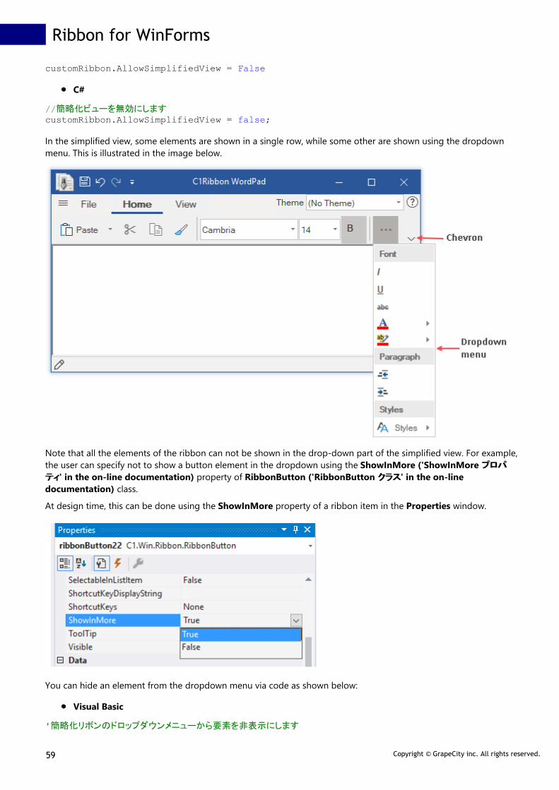
customRibbon.AllowSimplifiedView = False
C#
//簡略化ビューを無効にしますcustomRibbon.AllowSimplifiedView = false;
In the simplified view, some elements are shown in a single row, while some other are shown using the dropdownmenu. This is illustrated in the image below.
Note that all the elements of the ribbon can not be shown in the drop-down part of the simplified view. For example,the user can specify not to show a button element in the dropdown using the ShowInMore ('ShowInMore プロパプロパ
ティティ' in the on-line documentation) property of RibbonButton ('RibbonButton クラスクラス' in the on-linedocumentation) class.
At design time, this can be done using the ShowInMore property of a ribbon item in the Properties window.
You can hide an element from the dropdown menu via code as shown below:
Visual Basic
'簡略化リボンのドロップダウンメニューから要素を非表示にします
Ribbon for WinForms
59 Copyright © GrapeCity inc. All rights reserved.

clearButton.ShowInMore = False
C#
//簡略化リボンのドロップダウンメニューから要素を非表示にしますclearButton.ShowInMore = false;
ツールチップツールチップ
A Tooltip is a pop-up window with string that appears when you hold a cursor over an item in an application. The information in the window is usually a very briefdescription about the item's purpose.
Every element in the C1Ribbon control has a ToolTip property, be it Ribbon Tab, Group, Group Items, QAT or Configuration Toolbar. The ribbon application below showsa tooltip on a ColorPicker when the cursor rests on it.
Tooltips can be added via the Text Menu of the floating toolbar of ribbon items.
The tooltip for an item can also be added via the Properties window.
A user can also add a tooltip to a Ribbon Item programmatically using the TooTip ('ToolTip プロパティプロパティ' in the on-line documentation) property of the RibbonItem('RibbonItem クラスクラス' in the on-line documentation) class.
Visual Basic
Private Sub Form1_Load(sender As Object, e As EventArgs) Handles MyBase.Load 'FontComboBoxに対してツールチップを追加します fontComboBox.ToolTip = "Pick a new font for your text" '太字ボタンに対してリッチなツールチップを追加します boldButton.ToolTip = "<p><b>Bold (Ctrl + B)<b><p>" & "<p>Make your text Bold.</p> " '斜体ボタンに対してリッチなツールチップを追加します italicButton.ToolTip = "<p><b>Italic (Ctrl + I)<b><p>" & "<p>Italicize your text.</p> " '下線ボタンに対してリッチなツールチップを追加します underlineButton.ToolTip = "<p><b>Underline (Ctrl + U)<b><p>" & "<p>Underline your text.</p>" 'HTMLコードを使用してカラーピッカーに対してリッチなツールチップを追加します(Officeタブ) colorPicker.ToolTip = "<table><tr><td><img src = 'fontcolor1.png'></td><td><b> Font Color </b></td></tr></table>" & "<hr noshade size = 1 style = 'margin:2' color =#bebebe><div style = 'margin:1 12'>Change the color of your text</div>" & "<hr noshade size = 1 style = 'margin:2' color =#bebebe><table><tr><td><img src = 'help1.png'></td>" & "<td><b> Press F1 for more help.</b></td></tr></table>" End Sub
C#
// FontComboBoxに対してツールチップを追加します
Ribbon for WinForms
60 Copyright © GrapeCity inc. All rights reserved.
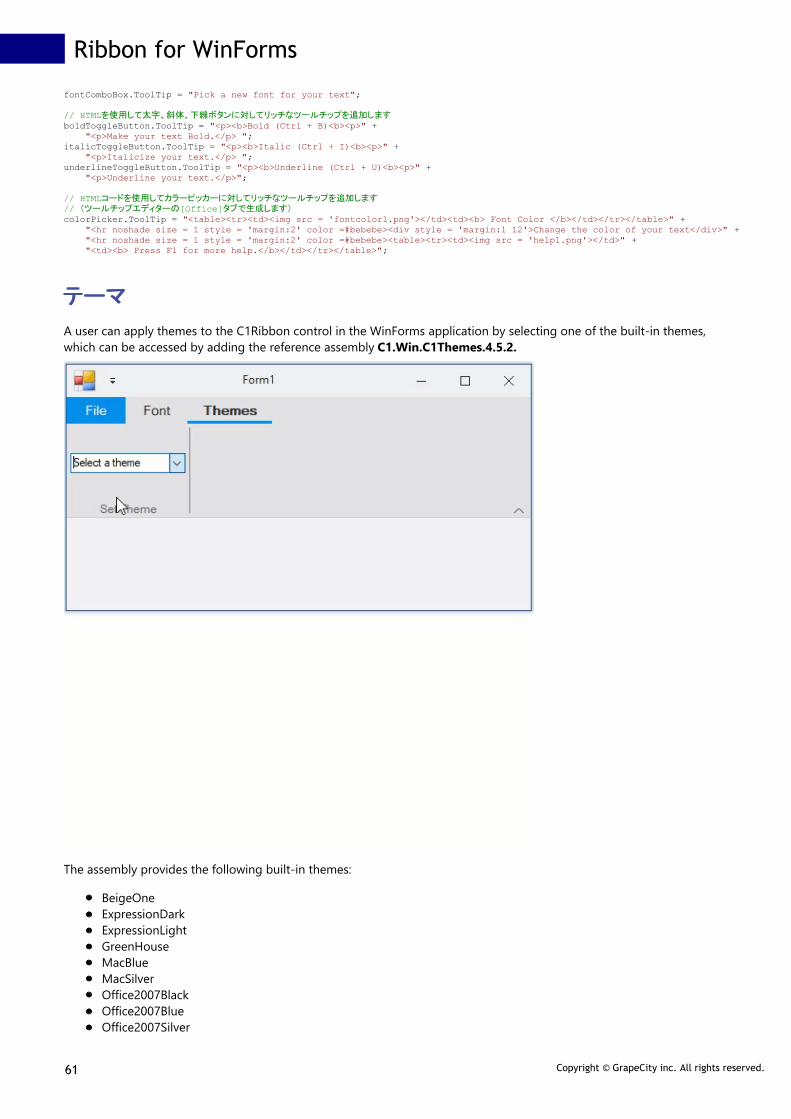
fontComboBox.ToolTip = "Pick a new font for your text";
// HTMLを使用して太字、斜体、下線ボタンに対してリッチなツールチップを追加しますboldToggleButton.ToolTip = "<p><b>Bold (Ctrl + B)<b><p>" + "<p>Make your text Bold.</p> "; italicToggleButton.ToolTip = "<p><b>Italic (Ctrl + I)<b><p>" + "<p>Italicize your text.</p> "; underlineToggleButton.ToolTip = "<p><b>Underline (Ctrl + U)<b><p>" + "<p>Underline your text.</p>";
// HTMLコードを使用してカラーピッカーに対してリッチなツールチップを追加します// (ツールチップエディターの[Office]タブで生成します)colorPicker.ToolTip = "<table><tr><td><img src = 'fontcolor1.png'></td><td><b> Font Color </b></td></tr></table>" + "<hr noshade size = 1 style = 'margin:2' color =#bebebe><div style = 'margin:1 12'>Change the color of your text</div>" + "<hr noshade size = 1 style = 'margin:2' color =#bebebe><table><tr><td><img src = 'help1.png'></td>" + "<td><b> Press F1 for more help.</b></td></tr></table>";
テーマテーマ
A user can apply themes to the C1Ribbon control in the WinForms application by selecting one of the built-in themes,which can be accessed by adding the reference assembly C1.Win.C1Themes.4.5.2.
The assembly provides the following built-in themes:
BeigeOneExpressionDarkExpressionLightGreenHouseMacBlueMacSilverOffice2007BlackOffice2007BlueOffice2007Silver
Ribbon for WinForms
61 Copyright © GrapeCity inc. All rights reserved.

Office2010BarbieOffice2010BlackOffice2010BlueOffice2010GreenOffice2010RedOffice2010SilverOffice2013DarkGrayOffice2013GrayOffice2013GreenOffice2013HighContrastOffice2013LightGrayOffice2013RedOffice2013WhiteOffice2016BlackOffice2016ColorfulOffice2016DarkGrayOffice2016WhiteRanierOrangeShinyBlueVioletteVS2013BlueVS2013DarkVS2013DarkSolarVS2013GreenVS2013LightVS2013PurpleVS2013RedVS2013TanWindows8BlueWindows8BrownWindows8GrayWindows8GreenWindows8RedMaterialMaterialDarkOffice2016Green
Themes can be added to the C1Ribbon control only through the code. In order to add the Themes functionality toC1Ribbon, you can create a ComboBox using the ControlHost RibbonGroup Item and populate the ComboBox with theavailable themes. The user can then call the GetThemeByName ('GetThemeByName メソッドメソッド' in the on-linedocumentation) method of the C1ThemeController ('C1ThemeController クラスクラス' in the on-line documentation) classto retrieve the themes registered with the application by their names. Further, you can call the ApplyThemeToControlTree('ApplyThemeToControlTree メソッドメソッド' in the on-line documentation) method to recursively apply a theme to a controland its children. This is depicted in the code snippet below:
Visual Basic
Public Class ComboBoxHost Inherits RibbonControlHost Public Sub New() MyBase.New(New System.Windows.Forms.ComboBox()) Dim ribbonBox = DirectCast(MyBase.Control, ComboBox) ribbonBox.Items.AddRange(C1ThemeController.GetThemes()) ribbonBox.Text = "Select a theme" AddHandler ribbonBox.SelectedIndexChanged, AddressOf RibbonBox_SelectedIndexChanged End Sub
Private Sub RibbonBox_SelectedIndexChanged(sender As Object, e As EventArgs) Dim themmeCombo As ComboBox = DirectCast(sender, ComboBox) Dim theme As C1Theme = C1ThemeController.GetThemeByName(themmeCombo.Text, False) C1ThemeController.ApplyThemeToControlTree(Me.Ribbon, theme)
Ribbon for WinForms
62 Copyright © GrapeCity inc. All rights reserved.

End SubEnd Class
C#
private void c1Ribbon1_RibbonEvent(object sender, RibbonEventArgs e) { //利用可能なテーマをコンボボックスに適用します var themeCombo = (ComboBox)comboBoxHost1.Control; themeCombo.Items.AddRange(C1ThemeController.GetThemes()); themeCombo.Text = "Select a theme"; themeCombo.SelectedIndexChanged += ThemeCombo_SelectedIndexChanged; }
//選択したテーマをリボンに適用します private void ThemeCombo_SelectedIndexChanged(object sender, EventArgs e) { ComboBox themmeCombo = ((ComboBox)sender); C1Theme theme = C1ThemeController.GetThemeByName(themmeCombo.Text, false); C1ThemeController.ApplyThemeToControlTree(this.Ribbon, theme); }}
//ControlHostのRibbonGroupアイテムを使用してComboBoxをリボンに追加しますpublic class ComboBoxHost : RibbonControlHost{ public ComboBoxHost() : base(new System.Windows.Forms.ComboBox()) {
}}
アイコンアイコン
Icons are the visual representation of commands in a Ribbon, and can help the user easily navigate the application UI. The Ribbon for WinForms uses icons to display the different elements on the ribbon user interface. C1Ribbon uses C1Icon ('C1Icon クラスクラス' in the on-line documentation) class, which is a part of C1.Framework ('C1.Framework 名前空名前空
間間' in the on-line documentation) namespace (C1.Win.4 and C1.Win.4.5 assemblies). C1Icon is a series of classes which allows to specify monochromatic icons that can be tinted and resized. These icons can be used internally in the controls. However, it also allows the customers to specify different icons through the API of the controls. The possiblesources for creating icons can be Fonts, Vectors (Polygons or SVG) and Images. C1.Framework supports Bitmap, Vector, Font, Path, Polygon and Composite icon types. All the Ribbon elements support the IconSet ('IconSet プロパティプロパティ' in the on-line documentation) property to define collection of images that should be used for different item size or DPIoptions.
The GIF below shows the Path, Font, Bitmap, Composite Icons and pressed Iconsets in the Ribbon control.
The different icons supported by C1Icon is listed in the table below:
Icon Type Description
Bitmap Icon BitmapIcon allows to wrap bitmap images from different sources.
Font Icon FontIcon allows to use symbols from different fonts instead of images. Note that the Font icon cannot be resized automatically.
Path Icon PathIcon allows to draw SVG paths (or XAML paths which have the same syntax). It rasterizes vector paths to bitmaps according to desired size and show bitmaps in UI.
Polygon Icon PolygonIcon allows to draw polygons defined by points.
Composite Icon Composite icons allow users to combine several icons into one. For example, the Ribbon Color Picker has a composite icon by default.
Vector Icon Vector icons allows to represent an icon created from a vectorial definition.
In C1Ribbon control, all Ribbon elements use the IconSet property to define set of icons of different sizes to use in a single UI element. For each element which supports images, the application can define one or more icons. For example, the application can define 16x16 icon for small view, 20x20 icon for medium view, 32x32 icon for large view and(optionally) icons of bigger size for HighDPI environments. At runtime, C1Ribbon will automatically select the most appropriate icon for the current item type and screen resolution. If there is no predefined icon of such size, then C1Ribbon will resize the most appropriate icon from the specified icon set.
The Icons can be set in the Ribbon items both via the designer as well as code.
Implementation at Design-TimeFor every element in C1Ribbon, you can add an icon with the help of Select Image editor. This editor allows to add and edit C1BimtapIcon , C1FontIcon and C1PathIcon.
The Select Image editor opens when a user clicks one of the four options in the Change Image button in the floating toolbar of a ribbon item.
Ribbon for WinForms
63 Copyright © GrapeCity inc. All rights reserved.

The user can also evoke the Select Image editor by clicking the IconSet property of an item in the Properties window.
The Select Image editor contains three panels. The first panel contains a menu of buttons for Bitmap, Path and Font icons. The second panel contains the Current Icon properties, while the third panel contains the Icons preset, where the user can choose different icons and specify different preset sizes (16x16 pixels, 20x20 pixels and 32x32 pixels). Clickingeach button displays the Current Icon properties and Icon preset for that button. For example, clicking the Bitmap icon displays the Current Icon properties and Icon preset options for bitmap icons. With the Current Icon properties list, the user can change the color, size, stroke, font, etc. of an icon. Further, there is an Import button to import images for theicon. Once you have selected a suitable Bitmap, Font or Path icon and modified its properties, you can click the OK button to confirm adding the icon to the ribbon item.Note that design-time support via the Select Image editor isn't available for Vector and Composite Icons as of now.
Implementation through CodeYou can also add icons to elements in the Ribbon control using the C1BitmapIcon ('C1BitmapIcon クラスクラス' in the on-line documentation), C1FontIcon ('C1FontIcon クラスクラス' in the on-line documentation), C1VectorIcon ('C1VectorIcon クラスクラス' in the on-line documentation), C1PathIcon ('C1PathIcon クラスクラス' in the on-line documentation) andC1CompositeIcon ('C1CompositeIcon クラスクラス' in the on-line documentation) classes.
To add a Bitmap icon, refer the code snippet below:
Visual Basic
Public Sub AddBitapIcon() 'Clear the IconSet Collection before adding new IconSet printButton.IconSet.Clear() 'Add Icon Sets for Print Button 'Large view printButton.IconSet.Add(New C1BitmapIcon("P", New Size(32, 32), Color.Transparent, Image.FromFile("images\print32.png"))) 'Medium View printButton.IconSet.Add(New C1BitmapIcon("P", New Size(20, 20), Color.Transparent, Image.FromFile("images\print20.png"))) 'Small View printButton.IconSet.Add(New C1BitmapIcon("P", New Size(16, 16), Color.Transparent, Image.FromFile("images\print16.png")))End Sub
C#
public void AddBitmapIcon(){ //Clear the IconSet Collection before adding new IconSet printButton.IconSet.Clear();
//Add Icons of different sizes to the Print Button IconSet using C1BitmapIcon //These icons will be used as Button images depending on the size of the Ribbon printButton.IconSet.Add(new C1BitmapIcon("P", new Size(32, 32), Color.Transparent, Image.FromFile(@"images\print32.png"))); printButton.IconSet.Add(new C1BitmapIcon("P", new Size(20, 20), Color.Transparent, Image.FromFile(@"images\print20.png"))); printButton.IconSet.Add(new C1BitmapIcon("P", new Size(16, 16), Color.Transparent, Image.FromFile(@"images\print16.png"))); }
To add a Path icon, refer the code snippet below:
Visual Basic
Public Sub AddPathIcon() 'Add C1PathIcon to Button (Supports Scalable Vector Graphics) triangleShape.Text = "Triangle" circleShape.Text = "Circle" triangleShape.IconSet.Add(New C1PathIcon("T", New Size(32, 32), Color.Black, "M150 0 L75 200 L225 200 Z")) circleShape.IconSet.Add(New C1PathIcon("C", New Size(32, 32), Color.Black, "M24.5,12.5 C24.5,19.127417 19.127417,24.5 12.5,24.5 C5.872583,24.5 0.5,19.127417 0.5,12.5 C0.5,5.872583 5.872583,0.5 12.5,0.5 C19.127417,0.5 24.5,5.872583 24.5,12.5 z"))End Sub
C#
public void AddPathIcon(){ //Apply a vector icon to button image using C1PathIcon triangleButton.IconSet.Add(new C1PathIcon("T", new Size(32,32), Color.Black, "M150 0 L75 200 L225 200 Z")); circleButton.IconSet.Add(new C1PathIcon("C", new Size(32, 32), Color.Black, "M24.5,12.5 C24.5,19.127417 19.127417,24.5 12.5,24.5 C5.872583,24.5 0.5,19.127417 0.5,12.5 C0.5,5.872583 5.872583,0.5 12.5,0.5 C19.127417,0.5 24.5,5.872583 24.5,12.5 z")); }
To add a Font icon, refer the code snippet below:
Visual Basic
Public Sub AddFontIcon() 'Add FontIcon for Bold Button Dim fontIconBold As C1FontIcon = New C1FontIcon() fontIconBold.Size = New Size(20, 20) fontIconBold.Text = "A" fontIconBold.Font = New Font("Times New Roman", 16.0F, FontStyle.Bold) 'Add C1FontIcon textEffects.IconSet.Add(fontIconBold)End Sub
C#
public void AddFontIcon(){ //Configure RibbonSplitButton textEffectsButton.TextImageRelation = C1.Win.Ribbon.TextImageRelation.ImageBeforeText; //Clear the IconSet collection before adding new IconSet textEffectsButton.IconSet.Clear();
//Apply image to textEffects RibbonSplitButton using C1FontIcon C1FontIcon fontIcon = new C1FontIcon(); fontIcon.Size = new Size(20, 20); fontIcon.Text = "A"; fontIcon.Font = new Font("Times New Roman", 16.0f, FontStyle.Bold); textEffectsButton.IconSet.Add(fontIcon);}
To add a Composite Icon, refer the code snippet below:
Visual Basic
Private Sub AddCompositeIcon() Dim ci = New C1CompositeIcon() ci.Size = New Size(16, 16) Dim bmp = New C1BitmapIcon With { .Size = New Size(16, 16), .Source = Image.FromFile("images\FillTool.png") } ci.Icons.Add(bmp) Dim pl = New C1PolygonIcon With { .AllowSmoothing = False, .Size = New Size(16, 16), .IsClosed = True, .Points = New PointF() {New PointF(0, 12), New PointF(15, 12), New PointF(15, 15), New PointF(0, 15)} } ci.Icons.Add(pl) compositeFill.IconSet.Clear() compositeFill.IconSet.Add(ci)End Sub
C#
private void AddCompositeIcon(){ // BackColor bmp + polygon var ci = new C1CompositeIcon(); ci.Size = new Size(16, 16); // first image var bmp = new C1BitmapIcon { Size = new Size(16, 16), Source = Image.FromFile(@"images\FillTool.png") }; ci.Icons.Add(bmp); // second image var pl = new C1PolygonIcon { AllowSmoothing = false, Size = new Size(16, 16), IsClosed = true, Points = new PointF[] { new PointF(0, 12), new PointF(15, 12), new PointF(15, 15), new PointF(0, 15) } }; ci.Icons.Add(pl);
//Clear the IconSet Collection before adding new IconSet compositeFill.IconSet.Clear();
//Add composite icon to fill button compositeFill.IconSet.Add(ci);}
Ribbon for WinForms
64 Copyright © GrapeCity inc. All rights reserved.
To add iconsets for the pressed state, refer the following code:
Visual Basic
Public Sub CreatePressedIconSet() 'Icon Set for Left Align Toggle Button leftAlign.IconSet.Add(New C1BitmapIcon("B", New Size(32, 32), Color.Transparent, Image.FromFile("images\align_left.png"))) 'Pressed Icon Set for Left Align Toggle Button leftAlign.PressedIconSet.Add(New C1BitmapIcon("Bold-Pressed", New Size(32, 32), Color.Transparent, Image.FromFile("images\align_left_pressed.png"))) 'Icon Set for Right Align Toggle Button rightAlign.IconSet.Add(New C1BitmapIcon("B", New Size(32, 32), Color.Transparent, Image.FromFile("images\align-right.png"))) 'Pressed Icon Set for Right Align Toggle Button rightAlign.PressedIconSet.Add(New C1BitmapIcon("Bold-Pressed", New Size(32, 32), Color.Transparent, Image.FromFile("images\align_right_pressed.png"))) End Sub
C#
public void CreatePressedIconSet(){ //IconSet for Left align Toggle Button leftAlign.IconSet.Add(new C1BitmapIcon("LA", new Size(32, 32), Color.Transparent, Image.FromFile(@"images\align_left.png")));
//PressedIconSet for Left align Toggle Button leftAlign.PressedIconSet.Add(new C1BitmapIcon("LA", new Size(32, 32), Color.Transparent, Image.FromFile(@"images\align_left_pressed.png")));
//IconSet for Right align Toggle Button rightAlign.IconSet.Add(new C1BitmapIcon("RA", new Size(32, 32), Color.Transparent, Image.FromFile(@"images\align-right.png")));
//PressedIconSet for Right align Toggle Button rightAlign.PressedIconSet.Add(new C1BitmapIcon("RA", new Size(32, 32), Color.Transparent, Image.FromFile(@"images\align_right_pressed.png")));}
キーボードのサポートキーボードのサポート
The C1Ribbon control supports keyboard shortcuts. You can perform tasks quickly by simply pressing a few keys. The user canaccess every command in the Ribbon using a key. For instance, to make the text bold, you can use the combination of Ctrl and Bkeys.
Note: This topic assumes that you have added a Ribbon button to the group and created a RibbonButton.Click eventhandler for the Bold button.
Complete the following steps for keyboard shortcuts.
1. Change the Windows Form to Ribbon Form.2. Select the Ribbon button (in this case, the Bold button) to display its properties in the Properties window.3. Locate the ShortcutKeys property and select the Ctrl check box and select B from the drop-down list.
4. Click outside the Shortcut Keys editor to accept the changes. Save and run the application.Now when you run the application, pressing the CTRL+B key combination will trigger the RibbonButton.Click event for theBold button and make the selected text bold in style.
You can also add keyboard shortcuts to the Ribbon control programmatically using the ShortcutKeyDisplayString('ShortcutKeyDisplayString プロパティプロパティ' in the on-line documentation) and ShortcutKeys ('ShortcutKeys プロパティプロパティ' in the on-line documentation) properties of RibbonButton ('RibbonButton クラスクラス' in the on-line documentation) class.
Visual Basic
Private Sub KeyboardShortcuts_Load(sender As Object, e As EventArgs) Handles MyBase.Load
'太字ボタンのキーボードショートカットを設定します boldButton.ShortcutKeyDisplayString = "Bold" boldButton.ShortcutKeys = (Keys.Control Or Keys.B)
'斜体ボタンのキーボードショートカットを設定します italicButton.ShortcutKeyDisplayString = "Italic" italicButton.ShortcutKeys = (Keys.Control Or Keys.I)
'下線ボタンのキーボードショートカットを設定します underlineButton.ShortcutKeyDisplayString = "Underline" underlineButton.ShortcutKeys = (Keys.Control Or Keys.U)End Sub
Private Sub boldButton_Click(sender As Object, e As EventArgs) Handles boldButton.Click RichTextBox1.SelectionFont = New Font("Times New Roman", 12, FontStyle.Bold)End Sub
Ribbon for WinForms
65 Copyright © GrapeCity inc. All rights reserved.

Private Sub italicButton_Click(sender As Object, e As EventArgs) Handles italicButton.Click RichTextBox1.SelectionFont = New Font("Times New Roman", 12, FontStyle.Italic)End Sub
Private Sub underlineButton_Click(sender As Object, e As EventArgs) Handles underlineButton.Click RichTextBox1.SelectionFont = New Font("Times New Roman", 12, FontStyle.Underline)End Sub
C#
public KeyboardShortcuts(){ InitializeComponent();
//太字ボタンのキーボードショートカットを設定します boldButton.ShortcutKeyDisplayString = "Bold"; boldButton.ShortcutKeys = (Keys.Control | Keys.B); //斜体ボタンのキーボードショートカットを設定します italicButton.ShortcutKeyDisplayString = "Italic"; italicButton.ShortcutKeys = (Keys.Control | Keys.I);
//下線ボタンのキーボードショートカットを設定します underlineButton.ShortcutKeyDisplayString = "Underline"; underlineButton.ShortcutKeys = (Keys.Control | Keys.U);
} private void boldButton_Click(object sender, EventArgs e){ richTextBox1.SelectionFont = new Font("Calibri", 12, FontStyle.Bold);}
private void italicButton_Click(object sender, EventArgs e){ richTextBox1.SelectionFont = new Font("Calibri", 12, FontStyle.Italic);}
private void underlineButton_Click(object sender, EventArgs e){ richTextBox1.SelectionFont = new Font("Calibri", 12, FontStyle.Underline);}
Adding KeyTips to Ribbon Items
The C1Ribbon control also supports KeyTips, with which you can display all the commands on the Ribbon. It also allows you tomove between elements on the C1Ribbon control using keyboard commands.
In order to see little boxes called Key Tips over each command, the user can press and release the ALTor F10 key.
The image below illustrates the Key Tips for Home and Font tabs:
Ribbon for WinForms
66 Copyright © GrapeCity inc. All rights reserved.

A user can make the key tips work at design time by setting the KeyTip property in the Properties Window. Every Item in theRibbon control has a KeyTip property. For example, the user can add a Key Tip to an item using the KeyTip ('KeyTip プロパティプロパティ' inthe on-line documentation) property of RibbonButton ('RibbonButton クラスクラス' in the on-line documentation). This is shown inthe code snippet given below:
Visual Basic
'ホーム・フォントタブのキーチップを設定しますhomeTab.KeyTip = "H"fontTab.KeyTip = "F"
'[ホーム]タブに太字・斜体・下線ボタンのキーチップを設定しますboldButton.KeyTip = "B"italicButton.KeyTip = "I"underlineButton.KeyTip = "U"
'[フォント]タブにFontComboBox・ColorPickerのキーチップを設定しますRibbonFontComboBox1.KeyTip = "T"RibbonColorPicker1.KeyTip = "C"
C#
//ホーム・フォントタブのキーチップを設定しますhomeTab.KeyTip = "H"; fontTab.KeyTip = "F";
//[ホーム]タブに太字・斜体・下線ボタンのキーチップを設定しますboldButton.KeyTip = "B"; italicButton.KeyTip = "I"; underlineButton.KeyTip = "U";
//[フォント]タブにFontComboBox・ColorPickerのキーチップを設定しますribbonFontComboBox1.KeyTip = "T"; ribbonColorPicker1.KeyTip = "C";
Ribbon for WinForms
67 Copyright © GrapeCity inc. All rights reserved.

実行時のインタラクティブ操作実行時のインタラクティブ操作
The Ribbon control can be customized at run-time according to your needs. For example, you can minimize theRibbon to save space on the page and get a simplified view. You can also customize the Quick Access Toolbar (QAT)by adding or removing commands from it and moving it above or below the Ribbon.
This section will take you through the following:
Customizing the Quick Access Toolbar
Switching Ribbon Views
クイックアクセスツールバーのカスタマイズ化クイックアクセスツールバーのカスタマイズ化
The Quick Access Toolbar (QAT) can be customized in just a few click(s). You can add or remove items from the QATas well as move the position of QAT above or below the Ribbon.
Add or Remove items from QAT
You can add the frequently-used commands from QAT easily.
To add a command to the QAT at run-time, simply right-click the item and select Add to Quick Access Toolbar fromthe context menu.
Similarly, you can remove any item from the QAT by right-clicking the item and selecting RemovefromQuick AccessToolbar from the context menu.
Move QAT
You can display the QAT above or below the Ribbon, depending upon your requirements.
To move the QAT below the Ribbon, click the drop-down arrow next to the QAT and select Show Below the Ribbon.
Ribbon for WinForms
68 Copyright © GrapeCity inc. All rights reserved.

To move the QAT back to its location above the Ribbon, click the drop-down arrow next to the QAT and select ShowAbove the Ribbon.
リボンビューの切り替えリボンビューの切り替え
The C1Ribbon control has three different view modes, Full, Simplified and Minimized. A user can switch from fullview to simplified or minimized view. Switching ribbon views can increase the workspace area for the user.
Full View
In Full or traditional view, the groups with commands are shown across three rows, giving the ribbon an expandedlook. By default, the Ribbon control appears in full view mode.
Sometimes, there may not be enough room to display all the tabs and groups at the same level. In such cases, theRibbon control supports smooth scrolling across tabs and groups by providing scroll buttons. This is very useful whileresizing the ribbon control as well.
Ribbon for WinForms
69 Copyright © GrapeCity inc. All rights reserved.

You can change the view of the Ribbon control by using the ViewMode property of C1Ribbon in the PropertiesWindow.
The user can programmatically change the ribbon view using the ViewMode ('ViewMode プロパティプロパティ' in the on-linedocumentation) property of C1Ribbon ('C1Ribbon クラスクラス' in the on-line documentation) class. This is shown inthe code below:
Visual Basic
'Ribbon Full view customRibbon.ViewMode = ViewMode.Full'Ribbon Simplified view customRibbon.ViewMode = ViewMode.Simplified
C#
//Ribbon Full view customRibbon.ViewMode = ViewMode.Full;//Ribbon Simplified view customRibbon.ViewMode = ViewMode.Simplified;
Simplified View
The Simplified view makes the ribbon compact by displaying all the commands in a single line without showing thegroups. You can switch to the simplified view from full view by using the chevron button at the bottom right corner ofthe ribbon.
For more information about Simplified view, refer the Simplified Ribbon topic.
Ribbon for WinForms
70 Copyright © GrapeCity inc. All rights reserved.

Minimized View
In Minimized view mode, a user can view only the tabs. The user can click on each tab to see the groups and itemswithin that tab. The minimized view lets the ribbon save up more space than the simplified view mode.
A user can switch to the minimized view using the QAT dropdown menu by selecting the Minimize the Ribbonoption. Further, you can also right click on the tabs, groups or items (buttons, combo-boxes, text-boxes etc.) andselect the Minimize the Ribbon option to view the Ribbon control in its minimized state.
In order to get back to the earlier view from minimized view, you can click on the Minimize the Ribbon option fromthe QAT or tabs.
The Minimized view mode feature is already present in the C1ribbon control by default, but you can disable it atdesign-time using the AllowMinimize property of C1Ribbon in the properties window.
This can also be done via code using the AllowMinimize ('AllowMinimize プロパティプロパティ' in the on-linedocumentation) property of C1Ribbon ('C1Ribbon クラスクラス' in the on-line documentation) class.
Visual Basic
'Disable minimized viewcustomRibbon.AllowMinimize = False
C#
//Disable minimized viewcustomRibbon.AllowMinimize = false;
Ribbon for WinForms
71 Copyright © GrapeCity inc. All rights reserved.

ローカライゼーションの適用ローカライゼーションの適用
The Ribbon control is embedded with a powerful localization feature which allows you to interact with it in different languages. The followingimage shows the Ribbon control when its localization is set to French.
Localize Dialog Box
The left pane of the Localize dialog box displays a tree listing the localizable string IDs, and on the right are the strings themselves. The string listcontains the following columns:
Column Description
Name The string's name (ID)
Default value The default (English) value of the string.
Value The string value for the currently selected culture (the column header displays that culture).
Below the list is the currently selected string's value, along with an optional description.
The status bar displays the project which will contain the localized resources and the name of the ComponentOne assembly which is currentlybeing localized.
The Localize dialog box contains the following toolbar menu buttons:
Ribbon for WinForms
72 Copyright © GrapeCity inc. All rights reserved.

Button Description
Create new translation begins a new localization for a ComponentOne assembly.
Open opens an existing translation for a particular assembly.
Save saves the current translation.
Save as saves the current translation and allows you to select the project in which to save the translation.
Add culture adds a new culture.
Delete culture removes a culture from the translations.
Select culture selects the culture to display and edit.
Options customizes the appearance and behavior of the localization window.
Create New Translation
Clicking the Create new translation button begins a new localization for a ComponentOne assembly. A dialog box opens for you to select theComponentOne assembly to localize.
Note: The assembly must be referenced in the currently open solution.
Open
Clicking the Open button opens an existing translation for a particular assembly. All translations that you create are stored as .resx files and areautomatically added to the project that you select while saving the translation. Clicking this item shows a dialog box where a previously savedtranslation can be selected.
After you have created and saved a translation, the Available cultures panel shows the list of cultures for which translations were created for theselected assembly.
Save
Clicking the Save button saves the current translation.
The translation is saved in the project shown in the status bar. When the translation is saved, a folder with the name C1LocalizedResources iscreated in the selected project (if it does not already exist), and the .resx files with translations are saved in that folder and added to the project.
Ribbon for WinForms
73 Copyright © GrapeCity inc. All rights reserved.

For each culture, a separate .resx file is created. These files are visible in the Solution Explorer window.
Note: If your translation is only for the invariant culture, the .resx file does not contain a culture suffix.
Save As
Clicking the Save as button saves the current translation and allows you to select the project in which to save the translation.
Add Culture
Clicking the Add culture button adds a new culture.
You can make translations for several cultures. For each culture, a separate .resx file is created in the C1LocalizedResources folder. Clicking theAdd culture button opens the Select culture dialog box that provides a list of available cultures:
Initially the list contains neutral cultures only. To show all cultures, uncheck the Show only neutral cultures checkbox. You can use the Englishname, Display name, and Code boxes to filter the list of shown cultures. After you have selected a culture, press the OK button to add it to thetranslations. The newly added culture will appear in the Culture drop-down in the toolbar and will become current in the window.
Delete Culture
Clicking the Delete culture button removes a culture from the translations. The Select cultures to delete dialog box provides the list of culturesexisting in the translations:
Selecting a culture and clicking OK removes it from the translations.
Select Culture
The Culture drop-down allows you to select the culture to display and edit.
Options
Clicking the Options button allows you to customize the appearance and behavior of the localization window.
Ribbon for WinForms
74 Copyright © GrapeCity inc. All rights reserved.

The available localization options include:
Option Description
Sync tree with grid When this item is checked, selecting a string in the right panel list also selects that string in thetree on the left. By default this item is unchecked.
Show names in grid When this item is checked, the Name column is shown in the right-hand panel, otherwise thatcolumn is hidden. By default this item is checked.
Show selected group only When this item is checked, the list of strings on the right contains only the strings from thegroup currently selected in the tree on the left. By default this item is unchecked.
Setting the Current CultureThe Ribbon control uses the localization files automatically according to the culture selected in the application as long as the files have not beenmoved to another location or excluded from the project. The CurrentCulture property looks for the default strings of the current culture whereasthe CurrentUICulture looks for the culture-specific resources at run-time. By default, the current culture is designated asSystem.Threading.Thread.CurrentThread.CurrentCulture. If you want to use a culture other than the current culture, you can set the desired culturein your application using the following code:
Visual Basic
Private Sub Form1_Load(sender As Object, e As EventArgs) Handles MyBase.Load System.Threading.Thread.CurrentThread.CurrentUICulture = New System.Globalization.CultureInfo("fr-FR") System.Threading.Thread.CurrentThread.CurrentCulture = New System.Globalization.CultureInfo("fr-FR") InitializeComponent()End Sub
C#
public Form1(){ // 現在のカルチャをフランス語に設定します System.Threading.Thread.CurrentThread.CurrentUICulture = new System.Globalization.CultureInfo("fr-FR"); System.Threading.Thread.CurrentThread.CurrentCulture = new System.Globalization.CultureInfo("fr-FR");
InitializeComponent();}
Ribbon for WinForms
75 Copyright © GrapeCity inc. All rights reserved.