Embed Size (px)
Citation preview

resolutionfoundation.org [email protected] +44 (0)203 372 2960 @resfoundation
REPORT
London StallingHalf a century of living standards in London
Stephen ClarkeJune 2018

This publication is available in the Incomes & Inequality section of our website @resfoundation
London Stalling: Half a century of living standards in London Acknowledgements 2
Acknowledgements
This work contains statistical data from ONS which is Crown Copyright. The use of the ONS statistical data in this work does not imply the endorsement of the ONS in relation to the interpretation or analysis of the statistical data. This work uses research datasets
which may not exactly reproduce National Statistics aggregates.
This work was funded by Trust for London. Trust for London is one of the largest independent charitable foundations funding work which tackles poverty and inequality in the capital. It supports work providing greater insights into the root causes of London’s social problems and how they can be overcome; activities which help people improve their lives; and work empowering Londoners to influence and change policy, practice and public attitudes. Each year it provides over £8 million in grants and at any one point is supporting some 300
voluntary and community organisations.
The author would like to thank Mubin Haq from Trust for London and James Gleeson, Ben Corr and William Tonkiss from the GLA for their comments and suggestions. James, Ben and William’s comments and suggestions do not constitute an endorsement by the GLA. All errors
and omissions remain the author’s own.

3London Stalling: Half a century of living standards in London Contents
This publication is available in the Incomes & Inequality section of our website @resfoundation
Contents
Executive summary ������������������������������������������������������������������������������������������� 4
Section 1
Introduction ���������������������������������������������������������������������������������������������������� 10
Section 2
The City is a world within itself ����������������������������������������������������������������������� 12
Section 3
It is not the walls that make the city, but the people who live within them ���� 21
Section 4
Hometown glory ��������������������������������������������������������������������������������������������� 28
Section 5
22 grand job / In the city it’s alright ��������������������������������������������������������������� 40
Section 6
The higher the buildings the lower the morals ����������������������������������������������� 50
Section 7
The average millionaire is only the average dishwasher dressed in a new suit �����65
Section 8
London streets are paved with gold ��������������������������������������������������������������� 79
Section 9
Conclusion ������������������������������������������������������������������������������������������������������ 85
Annex ������������������������������������������������������������������������������������������������������������� 87

This publication is available in the Incomes & Inequality section of our website @resfoundation
4London Stalling: Half a century of living standards in London Executive summary
Executive summary
The Resolution Foundation has long taken the measure of living standards in the UK. More recently the Foundation has assessed how city regions and nations of the UK are performing. To conclude our current project on devolved cities, we finish with the city with the longest history of devolved government: London. This report marks the first time the Foundation has provided a comprehensive assessment of how living standards have evolved in the country’s biggest city over the past half century. We find that London is an incredibly productive city. The average worker in the capital produces a third more per hour than than the UK average and, as a share of the workforce, twice as many people work in professional, scientific or technical roles than in other major UK cities. However, it also widely thought that London’s economy continues to race away. Yet, far from this being the case, London’s post-crisis recovery has been remarkably similar to that of the rest of the country. Where London is unique is that it has a number of looming problems
i Box 1: Key London statistics
London’s economy has grown faster than the rest of the country since the financial crisis. Yet, while output, and output per person have improved faster in London, output per hour – productivity – has not. While it was once the case that London’s productivity growth outstripped that of the rest of the country, since 2010 productivity growth has lagged behind. The result is that all of London’s increase in output since 2010 has been driven by increases in employment and hours, with London’s employment rate now almost 5 percentage points higher than its previous peak and just below that of the UK (75.2 per cent compared to 75.6 per cent).
The flipside of the capital’s employment boom has been a pronounced pay squeeze. The significant expansion of London’s labour force has brought nearly 600,000 people into work since the middle of 2012. However, for those entering work for the first time (either from unemployment or after leaving education) starting pay has been low, significantly reducing the average pay levels recorded
among this group. By contrast, London’s labour market still rewards for those in continuous employment and those switching jobs. The typical pay rise for someone switching jobs is 3.2 per cent higher in London than for elsewhere in the country.
While the capital’s post-crisis recovery has meant that, in some respects, it has become more like the rest of the country, London still faces some unique challenges. In the near future demographic change could be significant. Since 2009 London’s labour force has expanded by 19 per cent, and international migrants have accounted for almost all of this. A bigger-than-expected fall in international migration would have a big impact in London. Similarly, London has always exported people – more people leave London for elsewhere in the UK each year than move to the city from other parts of the country – but last year brought the largest net movement out of London since 2004. This movement was led by an increase in the number of people in their 30s leaving the capital.

This publication is available in the Incomes & Inequality section of our website @resfoundation
5London Stalling: Half a century of living standards in London Executive summary
– demographic change, high living costs and inequality – that are elsewhere less pronounced, and which make the city a particularly challenging place for those on low-incomes.
The popular narrative about the capital is that its economy is powering away from the rest of the country, propelled by high-paying, knowledge-intensive industries. There is some truth in this: output has increased faster in London than the rest of the UK since the financial crisis for instance.
However, the capital’s growth since the crisis this has been powered not by high-tech productivity improvements but by old-fashioned employment growth. So while output per person has increased faster in London than in other parts of the country, output per hour worked has not. London’s growth has also been concentrated in lower-paying sectors such as accommodation, transportation and administrative services. In short; although London’s economy may have grown faster than the rest of the UK over the past five years, this has been achieved by adding more people to the workforce rather than by producing things more efficiently.
So dramatic has been London’s increase in employment, that the capital is no longer afflicted by the same problem with economic inactivity that tends to affect the UK’s other major cities. In this regard London is now more similar to the rest of the country than it is to Birmingham, Manchester or Leeds. Although the city still (marginally) lags behind the UK average on key indicators such as employment and labour force participation, its recent impressive gains mean that London’s employment rate has drawn nearer to
i Box 1: Key London statistics (continued)
As well as demographics, London faces a uniquely acute housing problem. Had housing costs grown in line with incomes since the late 1960s, typical disposable income in London would today be £5,400 higher. Before taking housing costs into account typical equivalised household income in London was £28,600 in 2014-17, well above the UK figure of £25,700. However once housing costs are accounted for, incomes fall to £21,400 in London compared to £22,300 for the UK as a whole. No other part of the UK experiences such a sharp fall in income between the two measures, lowering household incomes by 25 per cent compared to 13 per cent for the rest of the country.
The city is also the most unequal place in the UK in terms of both income and wealth inequality. Since 1990 typical incomes have grown by a quarter for the working-age population, but have increased by 133 per cent for the top 1 per cent. London is the only place where the typical family has no net property wealth and is also the only part of Britain, aside from the North East, where poorer families (those at the 25th percentile of the wealth distribution) born in the 1960s have almost no net wealth.

This publication is available in the Incomes & Inequality section of our website @resfoundation
6London Stalling: Half a century of living standards in London Executive summary
the average than at any point since the early 1980s. In both outer and, more especially, inner London, relatively disadvantaged groups have benefited most markedly from this trend (although many still have lower employment rates than their counterparts in the rest of the UK).
The counterpoint to this impressive employment performance is the fact that London experienced a particularly acute post-crisis pay squeeze. The result is that although Londoners still earn more than people elsewhere in the UK, the London premium has fallen since the financial crisis. Employment has increased by around 600,000 since the middle of 2012, but those entering the labour market have tended to be lower-paid. And pay has been particu-larly squeezed for new starters. By contrast, a look at data that tracks people over time shows that for those in continuous employment the capital is still the place to be. The typical pay rise earned by those who stay in work in London tends to be higher than for employees in the rest of the UK. And for those switching jobs or moving to London, pay rises far outstrip those earned elsewhere. The decline in the London pay premium is therefore the result of people who move in and out of work; the rise in employment and changes to the in-work population has weighed on average pay growth.
Turning to the future, the capital faces some relatively unique challenges, relating to changing demographics, housing costs and inequality. We consider each in turn below.
International migrants have played an important and very obvious part in London’s post-crisis employment boom. But the fact that this trend goes back further is less well appreciated. Since the mid-1990s migrants have accounted for almost all the growth in the capital’s labour foce. And London continues to be a large exporter of people to the rest of the UK. It has always been the case that more people move out of the capital than move in from other parts of the country, however last year the net movement out of the capital rose to its highest level since 2004. This was driven by a doubling of the number of people in their 30s leaving London since 2009. If the number of working-age people leaving the capital continues to rise and immigration falls further than expected, then the capital’s workforce will be around 1 million people smaller in 2050 than currently projected.
Contributing to these demographic changes is London’s housing crisis. Sustained increases in housing costs mean typical household incomes in

This publication is available in the Incomes & Inequality section of our website @resfoundation
7London Stalling: Half a century of living standards in London Executive summary
the capital were £5,400 lower in 2016-17 than they would have been had housing costs grown in line with incomes since 1968: that’s a reduction of 20 per cent. This compares to a figure of £600 (3 per cent) for the UK as a whole.
However this housing costs crisis has played out differently across the city’s residents. While accessing home ownership has undeniably become more difficult, those who have bought spend much less of their income on housing costs today than in years gone by: the average housing cost to income ratio recorded among London’s owner-occupiers has fallen by 36 per cent since 1990. In contrast, private renters (a growing population) have not been so fortunate, with the average housing cost to income ratio for this group rising by 78 per cent over the same period.
While pronounced, the rise of the renter in London (especially inner London) is less a novel situation and more a return to the picture that existed in the 1950s before the rapid increase in homeownership started. What is new is that those who rent privately are increasingly likely to share with other people. Families that rent with another now account for 15 per cent of the total in the capital, and to a large extent shared private rental accommodation has replaced social housing in inner London.
Alongside these demographic and housing cost pressures, London must also deal with its place as the UK’s capital of inequality. While it has declined a little since the financial crisis (the Gini coefficient has fallen by 3 per cent since 2009) London’s income inequality remains around 30 per cent higher than the rest of the UK. And the problem comes at both ends of the distri-bution, with lower income households being left behind and a small group of super rich at the top powering away.
Between 1980 and the millennium for example, household incomes for the top 1 per cent of in the capital increased by nearly 450 per cent, compared with figures of 120 per cent for pensioner households and 70 per cent for working-age ones. Meanwhile low-income households in the capital have faced slower growth over the last 50 years than their counterparts elsewhere in the country; the benefits of higher wages, and rising employment have not been enough to offset the significant costs associated with living in London. Housing costs are a particular concern (as discussed above), however the prices of other goods are also higher in London (see Box 2), such as childcare (27 per cent higher in London than the rest of the country), hotels and

This publication is available in the Incomes & Inequality section of our website @resfoundation
8London Stalling: Half a century of living standards in London Executive summary
restaurants (13 per cent higher), household goods (12 per cent) and recrea-tional activities (14 per cent).
In contrast to the recent direction of travel on income inequality, London’s wealth divides have widened still further post-crisis. And the scale of the inequality is significantly larger too. Today the household at the 75th percentile of the wealth distribution has 24.5 times more wealth than the one at the 25th percentile (£856,000 compared to £35,000) and this ratio has grown by 15 per cent since 2006.
The entire absence of asset-holding among some groups is a particular problem in London. For example, London is unique in that it is the only part of the country where, in terms of wealth, typical family has no net property wealth. Such a picture means the pressures faced by lower income families are likely to be harder to deal with in the capital than in other areas. London also has a greater proportion of asset-poor middle-aged families than the rest of the UK and poorer Londoners born since the 1960s, have essentially no net wealth
For people on low-incomes – although living standards have improved in absolute terms – relatively the capital is probably a more challenging place to live today than ever before. Employment rates have improved significantly over the last decade and pay is higher too. But the headwinds generated by an overheating housing market, the failure of wages to rise enough for those at the bottom, the fact that the NLW has less of an impact in the capital, and growing wealth inequalities mean that low-income Londoners face unique cost pressures.
What then is the outlook for the capital? In some respects the city has all the attibutes to flourish in future; a well-educated workforce, the highest-concen-tration of high-paying sectors in the country and the highest employment rate in its (recorded) history. However the city faces old and new challenges, and its response to these will determine how living standards evolve in the future. London has long been the most unequal part of the country, and over time divisions have been deepened by the capital’s growing housing crisis. But the city must also grapple with an altered growth model. Before the crisis, the pace of London’s productivity improvements set it apart from the rest of the UK. Since 2009 however, its economic growth has – like much of the rest of the country – been dependent on an expanding workforce.
This publication is available in the Incomes & Inequality section of our website @resfoundation
9London Stalling: Half a century of living standards in London Executive summary
And this growing workforce has primarily come from abroad, offsetting the fact that each year more people leave London for other parts of the UK than move to the capital.
In the early 1980s, London’s population bottomed-out after almost 40 years of decline. Compared to a rapidly shrinking population the problems above may pale in comparison. Yet the old and new pressures facing the capital make it clear that it needs to forge a new approach to success. Its success in this endeavour matters not just for Londoners, but for the UK as a whole. That’s not just because of London’s importance to the overall UK economy, but also because many of the issues that the capital faces – from sluggish productivity growth to inequalities in wealth and income and a dysfunctional housing market – are problems that the rest of the country must also contend with.

This publication is available in the Incomes & Inequality section of our website @resfoundation
10London Stalling: Half a century of living standards in London Section 1: Introduction
Section 1
Introduction
London can claim many things. Founded in 43 AD it is one of oldest and certainly the largest, urban area in the UK. It has the fifth largest economy of any city[1] and is one of the most multi-cultural too.[2] As well as these accolades it can also claim to be the city with the longest pedigree of devolved government in the UK. Therefore it makes sense that we are concluding our project on living standards in the UK’s major cities in the city where devolution started. The report takes stock and casts an eye to the future. In doing so we provide a comprehensive assessment of London’s living standards; its economy, its jobs market, people’s earnings, and ultimately their household income and wealth.
The capital is the largest urban area of the UK with the long-est history of devolved government
This is the last in a series of reports by the Resolution Foundation on the UK’s major city regions. Previous analyses have examined Greater Manchester, the West Midlands City Region, Sheffield City Region and the West of England City Region.[3] One of the motivations for these reports was the fact that these city regions, and others, were – for the first time – electing regional mayors with new responsibilities and powers. These new powers offered these regions, and their political leaders, more opportunity to shape – albeit within the considerable constraints set by central government – the living standards of their constituents. A directly-elected metro mayor also provides these regions with new political leadership, a figurehead to promote their interests. The six new metro mayors have been in office for less than a year, too little time to offer a full assessment of their impact. However, it is fair to say that their presence has raised the profile of many of the regions and mayors have sought to tackle specific issues, such as homelessness in Greater Manchester and worklessness in the West Midlands.
While a directly-elected mayor has been a new development for these city regions, Greater London has had one since 2000 and the Greater London Authority has gained greater control over different areas of policy, including housing, transport and planning since 1999. For this reason, as well as the fact that the capital accounts for the largest share of economic activity of any part of the UK, it is worth understanding how living standards in London have evolved over time. Doing so provides important lessons for the rest of the UK, not just about the merits of city government but more broadly about the sectors that drive economic growth, the extent to which such growth benefits the least well-off, and how it places a burden on infrastructure – particularly housing.
[1] Brookings Institution, 2014 Global Metro Monitor
[2] BBC, ‘WS More or Less: The world’s most diverse city’, July 2017
[3] See: S Clarke & C D’Arcy, A western union: living standards and devolution in the West of England, Midlands engine trouble:
The challenges facing the West Midlands Combined Authority, Forging ahead or falling behind? Devolution and the future of
living standards in the Sheffield City Region, New Order: devolution and the future of living standards in Greater Manchester,
Resolution Foundation, 2016 - 2017

This publication is available in the Incomes & Inequality section of our website @resfoundation
11London Stalling: Half a century of living standards in London Section 1: Introduction
Navigating this report
The report is set out as follows:
» Section 2 analyses output and productivity in London, which sectors have driven growth and how this changed over the past two decades;
» Section 3 analyses the capital’s demographics, how these have changed over time and what the prospects for the future could be;
» Section 4 is the first section on the capital’s labour market, focusing on the jobs market;
» Section 5 is the second labour market section, with a particular focus on how the post-crisis earnings squeeze has played out in London;
» Section 6 turns to perhaps the greatest challenge facing London, its housing market;
» Section 7 looks at how household incomes have evolved over five decades in London and what the outlook could be over the next few years;
» Section 8 turns to household assets and explores how wealth inequalities have widened over recent years;
» Section 9 sets out some conclusions
We provide details of data and definitions in the Annex.
This publication is available in the Incomes & Inequality section of our website @resfoundation
12London Stalling: Half a century of living standards in London Section 2: The City is a world within itself
Section 2
The City is a world within itself
D. Morrier Evans, The City, 1852
People tend to think of London as the powerhouse of the UK economy, both in terms of output and productivity and it is popularly perceived that the London economy has accelerated away from the rest of the country since the crisis. However, the evidence suggests that this is only partly true. London does account for the largest share of national output and before the crisis productivity did grow faster in London than the rest of the UK.
However, the post-crisis picture confounds the stereotypes. While output has grown faster in London since the crisis, output per hour — productivity — has grown slower in London than the rest of the UK. Increases in employment have accounted for 98 per cent of the growth in output in the capital since the crisis.
Furthermore it has been relatively lower-paid sectors, not the high-paying knowledge-intensive ones we usually associate with the city, that have driven growth. Before the crisis the London economy relied on finance, professional services and IT for productivity growth. Finance contributed 22 per cent to average annual productivity growth between 1997 and 2010, professional services and IT contributed a further 28 per cent. However in the post-crisis period these sectors have weighed upon productivity growth and the capital has relied on lower-paid sectors such as hospitality, adminis-trative services, and transportation.
In terms of output growth London has outpaced the rest of the country since the crisis
The financial crisis resulted in a significant loss of output for the UK economy. Real gross value added (GVA), which measures the value of goods and services produced in an economy, minus intermediate consumption, peaked in 2007. And it wasn’t until 2013 that the UK economy returned to this peak. London also suffered a sharp correction, however in the capital the bounce-back was quicker, real GVA had returned to 2007 levels by 2012 and taking the last two decades as a whole London’s economy out-performed the rest of the UK both before and after the crisis (Figure 1). Output is now 17 per cent higher in London than before the crisis.

This publication is available in the Incomes & Inequality section of our website @resfoundation
13London Stalling: Half a century of living standards in London Section 2: The City is a world within itself
However before the crisis much of this out-performance was the result of faster population growth in the capital; once you correct for this (Figure 2) London grew in line with much of the UK until the crisis. After the crisis though, even adjusting for faster population growth in the capital, London eclipsed the rest of the UK (although the capital’s outperformance would look less marked if output was corrected to take into account the fact that people of working age are a higher share of London’s population). The result was that by 2016 (the year for which the most recent comparable GVA data is available) the UK economy was 1.2 per cent above its pre-crisis peak, whereas London’s was 2.8 per cent.
Figure 1: London grew faster than the rest of the country both before and after the crisis
Real (GDP-deflator) GVA (1998 = 100)
Source: RF analysis of ONS, Regional Gross Valued Added
100
110
120
130
140
150
160
170
180
1997 1999 2001 2003 2005 2007 2009 2011 2013 2015
United Kingdom Greater Manchester
West Midlands London
South East

This publication is available in the Incomes & Inequality section of our website @resfoundation
14London Stalling: Half a century of living standards in London Section 2: The City is a world within itself
As well as performing better than the rest of the country on average the London economy has also performed significantly better than nearly all of Britain’s other large city regions. As Figure 3 shows there is a decidedly North-South split in terms of which combined authorities have performed best since the financial crisis. London, along with the West of England and Cambridgeshire and Peterborough are all well-above their pre-crisis peaks and have performed better than the national average, whereas the major city regions in the North and Midlands are either just back at peak, or far from it.
Figure 2: London and the South East have grown significantly since the financial crisis
Real GVA per head (1998 = 100)
Source: RF analysis of ONS, Regional Gross Valued Added
100
105
110
115
120
125
130
135
140
145
1997 1999 2001 2003 2005 2007 2009 2011 2013 2015
United Kingdom Greater Manchester
West Midlands London
South East

This publication is available in the Incomes & Inequality section of our website @resfoundation
15London Stalling: Half a century of living standards in London Section 2: The City is a world within itself
But the capital’s productivity figures are far less encouraging
Although output per person in the capital has outpaced the rest of the UK since the crisis, in terms of output per hour worked, or productivity, there has been a more marked slowdown in London. The UK’s productivity puzzle is well-discussed and has been the subject of significant analysis,[4] and the data suggests that London – the region accounting for the largest share of national output – is part of the problem. This is because while the level of productivity is higher in London, the growth rate since the crisis has been below the UK average. Figure 4 shows real output per hour worked (excluding rental income) in London and the UK as a whole from 1997 to 2016. The series is indexed so that 2010 is equal to 100 the year in which output per hour worked peaked in the capital. While productivity grew faster in London than the rest of the UK between 2001 and 2007, productivity has not grown since this point in London and is currently around 1 per cent below peak. In contrast, although productivity growth has still been very poor in the UK as a whole, there has been some growth (1.4 per cent) since 2010.
[4] See recently: P Wales, UK productivity research summary: February 2018, ONS, February 2018
Figure 3: The West of England has been the best-performing city region since the crisis, closely followed by London
Change in real GVA per person from pre-crisis peak (GDP deflator): 2016
Source: RF analysis of ONS, Regional Gross Valued Added
2.7%
2.5%
2.2%
-1.1%
-1.2%
-1.8%
-2.4%
-4.1%
-4.2%
-7.6%
London
West of England
Cambridgeshire and Peterborough
West Midlands
Greater Manchester
Liverpool City Region
North East
West Yorkshire
Tees Valley
Sheffield City Region

This publication is available in the Incomes & Inequality section of our website @resfoundation
16London Stalling: Half a century of living standards in London Section 2: The City is a world within itself
London’s underperformance is also apparent in estimates produced by the ONS that show that hours worked increased by more than real GVA growth in four of the five regions that make up London between 2011 and 2016.[5] Indeed employment growth (predominantly increases in the number of people in work rather than increases in hours worked) has accounted for almost all (98 per cent) of the increase in output since productivity peaked in 2010. Far from ameliorating the UK’s poor productivity growth, London has been a significant drag on productivity since the crisis.
The downturn in financial services has driven the capital’s poor post-crisis productivity growth
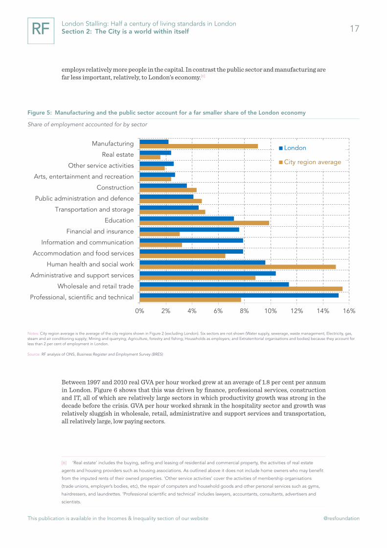
To understand what’s driven the decline in productivity since the crisis we can look at which sectors were contributing to productivity growth before and after 2010. Before doing so though it is worth briefly outlining how London’s economy differs from those of other city regions in England. Figure 5 shows that London’s economy relies far more on professional and technical industries, along with finance and IT than England’s other major city regions. Real estate also
[5] P Wales, UK productivity research summary: February 2018, ONS, February 2018
Figure 4: The post-crisis productivity slowdown has been more pronounced in London than the rest of the UK
Real (GDP-deflator) GVA per hour worked (excluding rental income): 2010 = 100
Notes: GVA per hour worked excluding rental income (this includes rental income for local authorities, corporations, households and non-profit institutions) is used because GVA including rental income includes the income from rents, including imputed rents (how much home owners would be willing to pay to live in their own houses) but does not include these homeowners in the employment figures. Pre-2004 figures (dotted lines) are based on the ONS’ Region by industry labour productivity series excluding real estate and so are not directly comparable.
Source: ONS, Subregional Productivity
75
80
85
90
95
100
105
1997 1999 2001 2003 2005 2007 2009 2011 2013 2015
United Kingdom London
Peak (2010=100)
This publication is available in the Incomes & Inequality section of our website @resfoundation
17London Stalling: Half a century of living standards in London Section 2: The City is a world within itself
employs relatively more people in the capital. In contrast the public sector and manufacturing are far less important, relatively, to London’s economy.[6]
Between 1997 and 2010 real GVA per hour worked grew at an average of 1.8 per cent per annum in London. Figure 6 shows that this was driven by finance, professional services, construction and IT, all of which are relatively large sectors in which productivity growth was strong in the decade before the crisis. GVA per hour worked shrank in the hospitality sector and growth was relatively sluggish in wholesale, retail, administrative and support services and transportation, all relatively large, low paying sectors.
[6] ‘Real estate’ includes the buying, selling and leasing of residential and commercial property, the activities of real estate
agents and housing providers such as housing associations. As outlined above it does not include home owners who may benefit
from the imputed rents of their owned properties. ‘Other service activities’ cover the activities of membership organisations
(trade unions, employer’s bodies, etc), the repair of computers and household goods and other personal services such as gyms,
hairdressers, and laundrettes. ‘Professional scientific and technical’ includes lawyers, accountants, consultants, advertisers and
scientists.
Figure 5: Manufacturing and the public sector account for a far smaller share of the London economy
Share of employment accounted for by sector
Notes: City region average is the average of the city regions shown in Figure 2 (excluding London). Six sectors are not shown (Water supply, sewerage, waste management; Electricity, gas, steam and air conditioning supply; Mining and quarrying; Agriculture, forestry and fishing; Households as employers; and Extraterritorial organisations and bodies) because they account for less than 2 per cent of employment in London.
Source: RF analysis of ONS, Business Register and Employment Survey (BRES)
0% 2% 4% 6% 8% 10% 12% 14% 16%
Professional, scientific and technical
Wholesale and retail trade
Administrative and support services
Human health and social work
Accommodation and food services
Information and communication
Financial and insurance
Education
Transportation and storage
Public administration and defence
Construction
Arts, entertainment and recreation
Other service activities
Real estate
ManufacturingLondon
City region average

This publication is available in the Incomes & Inequality section of our website @resfoundation
18London Stalling: Half a century of living standards in London Section 2: The City is a world within itself
Turning to the post-crisis period, a very different picture emerges. Average productivity growth was 1.4 percentage points lower than in the pre-crisis period. Productivity growth in finance averaged just 0.8 per cent per annum compared to almost 6 per cent in the pre-crisis period. In contrast productivity growth was strongest in the many of the large, relatively low-paying sectors that contributed little to productivity growth in the pre-crisis period. Productivity shrank in IT and professional services.
London’s productivity slowdown post-crisis therefore appears to be driven by high-valued added sectors such as finance, professional services and IT; the same sectors that drove produc-tivity before the crash. Other work has found that these sectors appear to be responsible for the productivity slowdown in the UK as a whole. Furthermore other work, and analysis of the data above, suggests that the productivity slowdown in London and the UK in general is the result of slowdowns within sectors and is not the result of changes in the composition of the economy, for instance more people moving into lower-productivity sectors.[7]
[7] R Riley, A Rincon-Aznar & L Samek, ‘Below the Aggregate: A Sectoral Account of the UK Productivity Puzzle’, ESCoE Discussion
Paper 2018-06, May 2018
Figure 6: Finance was the biggest contributor to annual growth in productivity before the crash
Average annual change in real output per hour worked (1997 - 2010)
Notes: Bubble size denotes the number of hours worked in that sector averaged over 1997 and 2010.
Source: RF analysis of ONS, Region by industry labour productivity
Non-manufacturing production
Manufacturing
Construction
Wholesale and retail trade
Transportation
Accommodation and food service activities
IT
Finance
Professional services
Administrative & support services
Public administration
Education
Human health
-3%
-2%
-1%
0%
1%
2%
3%
4%
5%
6%
7%
£10 £15 £20 £25 £30 £35 £40 £45 £50 £55 £60
Real output per hour worked (1997)

This publication is available in the Incomes & Inequality section of our website @resfoundation
19London Stalling: Half a century of living standards in London Section 2: The City is a world within itself
Too much of the city’s post-crisis output has been based on real estate
London’s economic performance in the post-crisis period has therefore been mixed. On the one hand the city has outperformed the rest of the UK in terms of growth in output and output per person, on the other hand productivity growth (output per hour worked) has lagged behind the rest of the country. Given that output has grown while productivity has flat-lined points to the fact that London’s post-crisis success has been achieved by increasing employment (See Section 4) and hours worked.
Figure 8 bears this out. In the post-crisis period the number of employees increased in all but two sectors of the London economy; manufacturing and public administration. Over the same period GVA increased across the majority of sectors too, and overall the increases in employees, hours worked and GVA were broadly similar (GVA increased by 22 per cent while the number of employees increased by 21 per cent and hours worked by 19 per cent).
Figure 7: Large, relatively low-paying sectors have driven productivity growth since the crash
Average annual change in real output per hour worked (2010 - 2015)
Notes: Bubble size denotes the number of hours worked in that sector averaged over 2010 and 2015.
Source: RF analysis of ONS, Region by industry labour productivity
Non-manufacturing production
Manufacturing
Construction
Wholesaleand retail
Transportation and storage
Accommodation and food service activities
IT
Finance
Professional services
Administrative & support services
Education
Human health
Arts and entertainment
Other service activities
-3%
-2%
-1%
0%
1%
2%
3%
4%
5%
6%
7%
£10 £20 £30 £40 £50 £60 £70 £80 £90 £100
Real GVA per hour worked (2010)

This publication is available in the Incomes & Inequality section of our website @resfoundation
20London Stalling: Half a century of living standards in London Section 2: The City is a world within itself
Figure 8 also emphasizes how dependent the capital has become on real estate and construction since the crash, and how the fortunes of financial services have reversed. The contribution of real estate and construction is perhaps not surprising when one bears in mind that the London housing market held up better than others following the crisis. Sales of residential property also increased faster in the capital, growing by an average of 7.2 per cent per annum compared to 5.6 per cent for the rest of the country.[8] Growth in the construction of residential buildings was not as impressive but London saw significant growth in commercial property during the period. The importance of real estate and construction to London’s recovery should not be understated, together they accounted for one-third of the total growth in GVA between 2009 and 2016.
More so than the rest of the UK London’s growth before the crash was powered by finance. Since the crisis though London’s economy has looked more like the rest of the country, driven by relatively lower-paying sectors such as hospitality and administrative services. Where London’s economy has differed over the past five years is the importance of real estate. Just as a serious downturn in financial services led to London suffering a deeper recession than the rest of the country, a serious downturn in the housing and property markets would leave the capital reeling. Given the sharp slowdown in the London housing market over the past year (see Section 6) we may be about to test this.
[8] RF analysis of ONS, House Price Index
Figure 8: Growth in GVA has been matched by growth in the number of employees
Proportional change in real (GDP-deflated) GVA, number of employees and hours worked: 2009 – 2016
Notes: Four sectors are not shown (Water supply, sewerage, waste management; Electricity, gas, steam and air conditioning supply; Mining and quarrying; Agriculture, forestry and fishing) because they account for less than 2 per cent of employment in London.
Source: RF analysis of ONS, Regional Gross Valued Added
-10% 0% 10% 20% 30% 40% 50% 60% 70%
Real estate activities
Construction
Other service activities
Accommodation and food service activities
Administrative and support service activities
Professional, scientific and technical activities
Arts, entertainment and recreation
Transportation and storage
Information and communication
All industries
Public administration
Human health and social work activities
Manufacturing
Wholesale and retail trade; repair of motor vehicles
Education
Financial and insurance activitiesHours worked
Employees
GVA

This publication is available in the Incomes & Inequality section of our website @resfoundation
21London Stalling: Half a century of living standards in London Section 3: It is not the walls that make the city, but the people who live within them
Section 3
It is not the walls that make the city, but the people who live within them
King George VI, Broadcast to the Empire during German bomber offensive, 1940
It is often believed that London sucks in talent from the rest of the country. There is some truth in this, the city does see a pronounced influx of younger workers, many of whom move to the capital after completing their studies in their early 20s. However, it is not the case that London keeps hold of these workers. More people aged 30 and over leave the capital each year than move to London from the rest of the country. In this sense London is exporting the same talent a decade later.
Why then has London’s capital recently surpassed its pre-WWII high, recovering from the decades of depopulation that followed the conflict? The answer is that the city attracts significant numbers of international migrants. London has become a magnet for people from all over the world and without international migration the capital’s population would not have recovered from the nadir it reached in the early 1980s. Indeed international migration has more than offset the internal migration of people out of London to other parts of the UK. International migration has also increased the capital’s workforce, accounting for much of the increase in employment and output that we discussed in the previous section. Given this, the city is perhaps the most exposed part of the country to any significant shift in migration that may occur when the UK leaves the EU, particu-larly if cost pressures keep pushing longer-term residents out of London.
London is younger and more ethnically diverse than the rest of the country
Before we explore how London’s population has changed over time it is worth a quick look at how the city’s population differs from other cities and the rest of the country. London is home to far more people who were not born in the UK, 38 per cent of London’s population are immigrants compared to just 14 per cent across the UK as a whole. Partly as a result of this London’s population is ethnically more diverse. As a share of the population there are three times as many Indians, Bangladeshis, Pakistanis and people of mixed ethnicity in London compared to the rest of the UK. There are more than three times as many black or black British residents and three times as many people from other ethnic groups (Table 1).

This publication is available in the Incomes & Inequality section of our website @resfoundation
22London Stalling: Half a century of living standards in London Section 3: It is not the walls that make the city, but the people who live within them
Table 1: London’s Population: 2017
UK London City regions
Immigrants 14% 38% 19%
16-19 6% 5% 6%20-24 8% 8% 9%25-34 17% 24% 19%35-49 24% 28% 25%50-64 23% 19% 22%65+ 22% 14% 19%
Mixed ethnic groups 1% 3% 2%Indian 2% 7% 4%Pakistani/Bangladeshi 2% 6% 4%Black or Black British 3% 11% 5%Other ethnic group 3% 11% 5%
Population 65.0 m 8.8 m 28.9 m
Notes: ‘City regions’ are those shown in Figure 3
Source: RF analysis of ONS, Annual Population Survey
Demographically London is a lot younger than the rest of the UK and even younger than other city regions. A quarter of London’s population is aged between 25 and 34, this figure is less than a fifth for the other city regions and 17 per cent for the UK as a whole. London also has far fewer people over 65, just 14 per cent of the population compared to over a fifth for the rest of the country.
In 2015 London’s population rose above its previous peak
In Section 2 we discussed the capital’s impressive performance in terms of output growth since the financial crisis, but far poorer record in terms of raising productivity. An examination of the demographic shifts in London since 2009 reinforces the point that since the crisis the capital has been adept at raising output through increasing labour input, but not particularly successful in increasing the productivity of workers. Figure 9 shows that London’s population has risen and fallen over time, but the increase between 2001 and 2011 was the fastest recorded since the turn of the 20th century.[9] Furthermore if the population continues to grow at the same rate between 2016 and 2021 as it did between 2011 and 2016, growth this decade will be even faster.
[9] The fastest growth most likely occurred between the early 18th century and late 19th century when the industrial revolution
caused a pronounced increase in Britain’s urban population, London included. An earlier population swell occurred between the
late 12th century and the middle of the 14th century when London’s population increased from around 40,000 to 115,000 before
shrinking to around 65,000 by the end of the century as a result of the Black Death. Historical accounts suggests that around 40
per cent of London’s population were killed by the plague. See P Ackroyd, London: The Biography, Vintage, 2001

This publication is available in the Incomes & Inequality section of our website @resfoundation
23London Stalling: Half a century of living standards in London Section 3: It is not the walls that make the city, but the people who live within them
Such a rapid increase contrasts with times in London’s history when the population shrank. Most recently, following nearly two centuries of relatively rapid growth the population declined noticeably after WWII. This decline (of around 23 per cent) was among the largest in the capital’s history and – in magnitude if not suffering – comparable to the decline of around 50 per cent that occurred between the mid-14th century and the mid-16th century when the capital was affected by the Black Death and successive plagues.
In 2015 the population of London rose above its previous peak recorded in 1939. The population of the capital is not much higher today than it was 78 years ago (8.8 million versus 8.6 million) although The GLA projects that it will rise significantly in the decades ahead to around 11 million in 2041. Interestingly the growth is expected to come in both outer and inner London, but inner London’s population is not expected to return to its pre-war level over the horizon. The strongest growth is expected in East London with the largest population growth projected to occur in Barking and Dagenham (33 per cent), Redbridge (30 per cent), Havering (30 per cent), and Tower Hamlets (29 per cent). The boroughs projected to experience the slowest increases are in west London – Kensington and Chelsea, Hammersmith and Fulham, Westminster and Wandsworth.
London is increasingly a magnet for people from all over the world. In 1939 only 2.7 per cent of the capital’s residents were born abroad, today that number is 38 per cent. Who those migrants are has also changed over time. In 1981 the largest migrant groups in the capital comprised people from Ireland (3 per cent), and the Caribbean (2.5 per cent), by 2016 people from India formed the most common group (3.4 per cent), followed by people from Poland (1.9 per cent).[10]
[10] A ‘migrant’ is defined as someone born outside the UK.
Figure 9: London’s population could grow to over 10 million by 2039
London population and GLA projection
Source: 1939 and Pre-1801 data from The London Encyclopedia, Edited by Ben Weinreb and Christopher Hibbert. ONS, Census. GLA projections.
Inner London
Outer London
London
0 m
1 m
2 m
3 m
4 m
5 m
6 m
7 m
8 m
9 m
10 m
11 m
1801 1821 1841 1861 1881 1901 1921 1941 1961 1981 2001 2021 2041
GLA Projection

This publication is available in the Incomes & Inequality section of our website @resfoundation
24London Stalling: Half a century of living standards in London Section 3: It is not the walls that make the city, but the people who live within them
Figure 10 shows the three components of population change: births minus deaths, net internal migration and net international migration. Net internal migration falls consistently below the zero line: every year more people leave London for other parts of the UK than arrive in the capital from elsewhere in the country. Above the zero line, we see that births minus deaths make a consistently positive contribution. Taken together these two trends broadly net to zero. Finally London has positive net international migration; more people move into capital from other parts of the world than leave the city for other countries. The last component is consistently the biggest driver of population growth, without it the capital’s population would not have grown over the past two decades.
Since 2009, migration out of the capital has been driven by those in their early 30s
Alongside the overall trend, it is worth digging into some of these constituent parts. Turning first to internal migration Figure 11 shows that more people in their 20s move to London from elsewhere in the UK every year. But it is a net exporter of every other age group. The result is that since 1999 approximately 37,000 people a year, on average, have moved out of London to other parts of the UK.
Figure 10: International migration is driving population growth in the capital
Components of population change in London
Source: RF analysis of ONS, Population Estimates
-150,000
-100,000
-50,000
0
+50,000
+100,000
+150,000
+200,000
+250,000
2002 2004 2006 2008 2010 2012 2014 2016
Other change Net international migrationNet internal migration Births - deathsPopulation change

This publication is available in the Incomes & Inequality section of our website @resfoundation
25London Stalling: Half a century of living standards in London Section 3: It is not the walls that make the city, but the people who live within them
Net inward migration has been trending consistently downwards since 2009, this has been driven by a slightly decrease (in recent years) in net inward migration of those aged 25-29 but, more importantly, net migration out of the capital for all those above 30 has steadily increased. The biggest change (in proportional terms) has been among the 30 to 34 age group. For this group numbers more than doubled since 2009; going from a net outward movement of 6,600 that year to 16,900 in 2016 – the third highest outflow on record.
Population projections are very sensitive to migration assumptions
Turning from internal to international migration, the important impact that international migrants have had on London’s demographics should not be understated. As well as being responsible for the majority of population growth since the millennium immigrants have also accounted for nearly all the growth in the labour force over the period. Given this the capital is likely to be particularly affected if there is a significant shift in international migration, something that appears increasingly likely as a result of the UK’s decision to leave the EU and improved economic conditions in Europe. Even before any change in the UK’s immigration system net migration has already declined from 330,000 in June 2016 to 244,000 in September 2017.
What might be the impact of a fall in migration on London’s population? We can get some sense of the magnitude of the long-run effect by taking the Greater London Authority’s (GLA) population projections and tweaking the international migration figures. Importantly in this we are only changing the international migration figures provided by the GLA, and not re-running its analysis with a different international migration assumption. This is important because different components of the GLA model interact. In particular the model assumes that if international
Figure 11: Rising numbers of those over 30 are leaving the capital
Net change in London’s population due to internal migration
Source: RF analysis of ONS, Population Estimates
-100,000
-80,000
-60,000
-40,000
-20,000
+0
+20,000
+40,000
1999 2001 2003 2005 2007 2009 2011 2013 2015
70-7465-6960-6455-5950-5445-4940-4435-3930-3425-2920-2415-19Total

This publication is available in the Incomes & Inequality section of our website @resfoundation
26London Stalling: Half a century of living standards in London Section 3: It is not the walls that make the city, but the people who live within them
net migration is lower then so is internal migration purely because lower international inflows leads to fewer people being ‘at risk’ of subsequently moving out of London. Given this it is likely that the estimates below overestimate the impact of a decline in international net migration on the London population (although there could be other countervailing forces as we discuss in the Annex). Nevertheless this is still a useful thought experiment.
In projecting London’s population the GLA uses historical data to calculate future international migration.[11] Such an approach makes sense but it is also worth considering what might be the impact if international migration falls sharper than the GLA or ONS expects, or if the government hits its target of reducing net migration to the tens of thousands per annum. The results of such an exercise are shown in Figure 12 where the GLA’s preferred projection is compared to two others in which international migration is lower than the GLA or ONS expects in future.
In Figure 12 the GLA assumes that international migration to London will average 80,000 a year between 2018 and 2050. The ONS assumes that net migration to the UK will be around 165,000 a year. Although the GLA and ONS use different methodologies, the GLA figure (80,000) suggests that around half of all migrants to the UK will settle in London. This is, marginally, higher than the outturn data from 2002 to 2017 when the average was 40 per cent. Therefore our ‘immigration down 20 per cent scenario’ assumes that international net migration is 20 per cent lower than the ONS expects (around 132,000 per annum). We also assume that 40 per cent of these settle in London based on the 2002 to 2016 average. Under such a scenario London’s population is around 800,000 smaller than expected in 2050.
Our ‘immigration 100k’ scenario assumes that the government hits its target of annual net migration of below 100,000, that is international net migration is 99,000 per annum between 2023 and 2050. In this scenario we again assume that 40 per cent of international migrants settle in London, with the result that London’s population is around 1.2 million smaller than expected in 2050.[12]
We also explore a scenario where internal migration out of the capital is reduced. The GLA assumes that internal migration will average -87,000 between 2017 and 2050. In this scenario we set internal migration to -60,000 the average over the last decade, for each year until 2050. This also has a significant impact; London’s population is 1.1 million larger in 2050.
[11] GLA Intelligence, GLA Trend-based Projection Methodology, November 2017
[12] If half of all international migrants settle in London then the respective figures will be 10.4 million for the ‘Immigration 100k’
scenario and 10.8 million for the ‘Immigration down 20%’ scenario.

This publication is available in the Incomes & Inequality section of our website @resfoundation
27London Stalling: Half a century of living standards in London Section 3: It is not the walls that make the city, but the people who live within them
Although all projections are necessarily imprecise the three above give some sense of how relatively marginal differences in migration can have significant effects in the long-run. Under the ‘100k’ scenario London’s population growth is reduced by over 1.2 million, currently the population of Barking and Dagenham, Barnet, Bexley and Brent. Furthermore under the GLA’s scenario there is little sense that London’s population could plateau by 2050 whereas under the 100k scenario growth is levelling off. By contrast if international migration holds up, and internal migration out of the capital falls, there is little prospect of a slowdown in the growth of the city’s population.
In the projections above we have independently varied the international migration and internal migration assumptions, however as the GLA points out all elements of its projection interact and are subject to uncertainty. We have already noted above that out-migration from London has increased recently and as we shall see in Chapter 6 cost pressures such as housing could have a bigger impact in reducing the attractiveness of the capital than any change to international migration.
Although the future is uncertain it is unarguable that there has been a pronounced change in London’s population over the past few decades. Much of this change has been driven by two forces; international migration and the net movement out of the capital by people over 30. Up to now international migration has been enough to offset the latter, but if cost-pressures in the capital continue to rise and migration falls faster than expected then London’s labour force could come under increased pressure in future. Given that employment has powered the city’s growth since the crisis this is particularly concerning.
Figure 12: London’s population could be significantly smaller than expected if international migration falls faster than expected
London’s population under four different scenarios
Source: RF modelling incorporating GLA, 2016-based Trend Projection Results, and ONS, Population projections. For full details see Annex.
GLA
Outturn
Net migration down 20%
Net migration 100k
Internal migration = - 60K
12.1 m
8.0 m
8.5 m
9.0 m
9.5 m
10.0 m
10.5 m
11.0 m
11.5 m
12.0 m
12.5 m
2011 2016 2021 2026 2031 2036 2041 2046
11.2 m
10.4 m
10 m
This publication is available in the Incomes & Inequality section of our website @resfoundation
28London Stalling: Half a century of living standards in London Section 4: Hometown glory
Section 4
Hometown glory
Adele, Hometown Glory, 2008
The last section showed that international migration has been the most important factor in increasing London’s population. The impact of migration on the labour market has been just as important; migrants have accounted for almost all the growth in the capital’s labour force over the past two decades. Migrants have helped increase London’s employment rate to a record high, bringing it in line with that of the rest of the UK for the first time since the late 1980s.
Improvements in the capital’s jobs market have also been driven by better job prospects for people that tend to suffer discrimination and disadvantage in the labour market both migrant and natives. Since the mid-1990s the employment rates of people with disabilities, single parents and ethnic minorities have improved markedly in London, often outstripping progress in the UK as a whole.
However, digging beneath the surface raises some questions about the quality of this work. Londoners, particularly those on mid- to low-earnings, are much more likely to want, but be unable to get, full-time work. And lower-paid Londoners are also more likely to be involuntarily working in a temporary role than their counterparts in the rest of the country.
One area where it does appear as though the London labour market is exceptional however is the far larger impact that technology and the gig economy has had on work in the capital. Although data is patchy, perhaps as much as a quarter of all people engaged in the gig economy are based in London. That could mean that approximately 8 per cent of people in London have had some involvement with it. If technology and on-demand forms of work are going to have a bigger impact on the UK economy in future, then London provides a sense of some of the challenges and opportunities that the rest of the country may face.
London’s and the UK’s employment rates have converged for the first time since the late 1980s
From the mid-1970s to the late 1980s the capital’s employment rate was above that of the UK’s but London had lost its advantage by early in the next decade and since the early 1990s London’s employment rate has been below the UK rate. The recovery from the financial crisis signalled a change in fortune however. Employment rose from a low of 66.8 per cent in late 2011 (a level still above that in the mid-1990s) to 75.2 per cent in the first quarter of 2018. London’s employment rate is now almost 5 percentage points higher than its previous peak and is just below that of the UK (75.2 per cent compared to 75.6 per cent).

This publication is available in the Incomes & Inequality section of our website @resfoundation
29London Stalling: Half a century of living standards in London Section 4: Hometown glory
This change has been dramatic. Figure 13 shows that it has been driven by both parts of London, although the change has been most pronounced in inner London. The employment rate in outer London rose from around 67 per cent in 2011 to 75.7 per cent in 2017, while the rate rose from below 65 per cent to 73.2 per cent in inner London.
Figure 14 suggests that specifically it is rising employment rates for residents in South and East inner London that drove a lot of the improvement. The increases in these areas have been dramatic, the employment rate rose 13 percentage points in Newham and Lewisham, and 12 percentage points in Lambeth. The turnaround in Lambeth has been the most pronounced, in 2011 the borough had an employment rate of 70 per cent, just above the London average of 68 per cent. Employment in the area now stands at 83 per cent, the highest in the capital.
Figure 13: Inner London has driven the improvement in the capital’s employment rate
Employment rates (16 - 64)
Notes: Pre-1992 data recorded on an annual, rather than quarterly basis. Separate data on inner and outer London is not available for some years before 1992.
Source: RF analysis of ONS, Quarterly Labour Force Survey & Annual Labour Force Survey
London
UK
Inner London
Outer London
55%
60%
65%
70%
75%
80%
1975 1978 1981 1984 1987 1990 1993 1996 1999 2002 2005 2008 2011 2014 2017

This publication is available in the Incomes & Inequality section of our website @resfoundation
30London Stalling: Half a century of living standards in London Section 4: Hometown glory
As we shall explore in greater detail below some of this improvement is down to big shifts in the population. Newham, Lewisham and Lambeth all experienced above-average increases in their population during this period (Newham’s population increased by approximately 30 per cent). However, there were many other areas where there were significant improvements in employment (such as Croydon and Ealing) without a significant increase in population; suggesting that population growth is not the whole story.
Disadvantaged groups have benefited from London’s success, but also shrunk as a share of the population
London’s apparently booming labour market appears to have enticed marginal workers into employment. We get a sense of this by looking at changes in the employment rate of people that tend to suffer disadvantage in the labour market, such as single parents, ethnic minorities and people with disabilities.[13] Figure 15 shows that some of the most dramatic improvements in employment rates occurred for these groups. For instance in 1996 single parents in outer London had an employment rate of 40 per cent; in 2016 this had risen to 73 per cent. The employment [13] We described these as ‘low activity’ groups. A full definition can be found in P Gregg & L Gardiner, The road to full employ-
ment: what the journey looks like and how to make progress, Resolution Foundation, March 2016
Figure 14: Inner East and South London have driven employment gains
Source: RF analysis of ONS, Annual Population Survey

This publication is available in the Incomes & Inequality section of our website @resfoundation
31London Stalling: Half a century of living standards in London Section 4: Hometown glory
rate for ethnic minorities also rose from 60 per cent to 71 per cent in outer London over the same period. The increases in inner London were often even greater. Particularly interesting is the employment rate for people with disabilities, which was 28 per cent in 2003 but is now 40 per cent. The story is not universally positive though. The employment rate for those aged 18 to 29 (excluding students) rose by only 3 per cent over the period in outer London. And outer London also made less progress in boosting the employment rate for mothers. Furthermore both inner and outer London failed to boost employment for people with relatively low qualifications, though it’s also worth noting that this group shrank as a proportion of the workforce from 14 per cent to just 3 per cent between 2011 and 2017.
In terms of what explains London’s rapidly rising employment rate since the crisis, the capital outperformed the rest of the country across the vast majority of low-activity groups from 2011 to 2017. Figure 16 shows that employment rates for single parents, younger workers, ethnic minorities, people with disabilities and mothers rose more in London. Only for older workers and the low-qualified did London fail to boost employment rates as much as occurred in the rest of the UK.
Figure 15: The biggest gains have been for low-activity groups in inner London
Change in employment rate (1996 - 2017)
Notes: Employment rate for people with disabilities is 2003 – 2016 due to changes in classification.
Source: RF analysis of ONS, Labour Force Survey
0% 5% 10% 15% 20% 25% 30% 35%
Low qualified
Mothers
People with disabilities
Ethnic minorities
50 -64
18-29 (no students)
Single parent
All
UK
Outer London
Inner London

This publication is available in the Incomes & Inequality section of our website @resfoundation
32London Stalling: Half a century of living standards in London Section 4: Hometown glory
On the whole then Figure 15 and, particularly, Figure 16 represents success. But at the same time as employment rates were improving for these groups in inner and outer London, such residents were falling as a share of the population. Between 2011 and 2017 in inner London, the share of the population with at least one of the characteristics above fell by 1.7 percentage points in inner London, there was smaller fall of 0.9 percentage points in outer London. [14]
However, notably though these changes are, they had relatively little impact on the changes in employment that we observe above. Changes in the share of the population accounted for by low-activity groups accounted for just 0.6 percentage points of the 7.5 percentage point rise in the employment rate in outer London. The impact, again dwarfed by changes in the employment rates of different groups, is larger in inner London. Overall the fall in the share of low-activity groups accounting for 1.6 percentage points of the 16 percentage point increase in the employment rate.[15]
The pronounced improvement in employment rates in the capital is not just down to the fact that London attracts high numbers of international migrants, for whom employment rates have improved by more than the native population. Figure 17 shows that although employment rates
[14] The groups are non-mutually exclusive so people may fall into more than one.
[15] These figures are based on a ‘shift-share’ analysis that decomposes changes in the employment rate into changes in the
employment rates of different groups (‘within’ group effect) and changes in the share of people accounted for by each group
(‘between’ group effect). The effect of the changing size of the ‘low-activity’ group is the ‘between’ group effect.
Figure 16: The capital’s post-crisis rise in employment has been driven by a range of groups
Change in employment rate (2011 - 2017)
Source: RF analysis of ONS, Labour Force Survey
0% 2% 4% 6% 8% 10% 12% 14% 16% 18%
50 -64
Low qualified
People with disabilities
Mothers
Ethnic minorities
18-29 (no students)
Single parent
All
UK London

This publication is available in the Incomes & Inequality section of our website @resfoundation
33London Stalling: Half a century of living standards in London Section 4: Hometown glory
have increased more for migrants than natives, there has still been a significant increase in the employment rates of those born in the UK since 2011.[16]
Compositional shifts between different groups of the population (including the migrant population – see footnote) pushed in the right direction, but it is the changes in the employment rate within groups that has been much more important. However, one note of caution is that we are unable in this analysis to track the same people over time. So although shifts in the share of the population accounted for by low-activity groups may not account for much of the employment growth, we cannot rule out that changes to the population within these groups has had an effect.
Furthermore there is still significant work to be done to raise the employment rates of these groups, which in many cases are below the overall national average (75.6 per cent). Figure 18 shows that despite the improvements over the past two decades employment rates are still lower in inner London (aside from 18 to 29 year olds) than in the UK as a whole. The employment rate for people with disabilities in inner London stands out as a particular concern, but rates are also well below the UK rate for people with low qualifications, single parents and mothers. Employment rates are higher in outer London, although mothers still perform below the UK average. Indeed it is notable that the employment rates for mothers in both inner and outer London are below the UK average,
[16] There has also been a shift in the migrant population, most notably in inner London. Over the last decade the share of
white migrants in inner London (predominantly from European countries) has increased by 20 per cent, while the share of black
migrants (predominantly from Africa and the Caribbean) has remained flat. These compositional shifts in the migrant population
have tended to push up the migrant employment rate in inner London.
Figure 17: Migrants as well as natives have experienced rising employment rates
Employment rates (annual rolling average)
Source: RF analysis of ONS, Labour Force Survey
Outer London (immigrant)
Inner London (immigrant)
Outer London (UK-born)
Inner London (UK-born)
45%
50%
55%
60%
65%
70%
75%
80%
1995 1997 1999 2001 2003 2005 2007 2009 2011 2013 2015 2017

This publication is available in the Incomes & Inequality section of our website @resfoundation
34London Stalling: Half a century of living standards in London Section 4: Hometown glory
and this is also the case for single parents in inner London. The fact that childcare costs are signif-icantly higher in the capital may partly explain this difference. The Family and Childcare Trust estimates that the cost of nursery provision is around 27 per cent higher in London than the rest of the country and the cost of a childminder is 33 per cent higher.[17]
More so than the rest of the UK, the gig economy is of increasing importance in the capital
While the UK labour market has created significant numbers of jobs, the recent surge in employment also bought with it an increase in ‘atypical’, in some cases ‘insecure’, work. In some cases relatively new types of employee-employer relationship emerged, such as zero-hours contracts. In other cases existing arrangements, such as self-employment and agency work, expanded. These developments occurred at the same time as technology has been reshaping some industries and ways of working. Mobile apps and digital platforms have undoubtedly played a part in encouraging the increase in atypical work, but the vast majority of the recent increase has little to do with technology. As we have discussed elsewhere, the tax system and the impact of the financial crisis has had much more of an impact.[18]
[17] Family and Childcare Trust, Childcare Survey 2017, 2017
[18] S Clarke ‘Atypical day at the office’ in S Clarke (eds) Work in Brexit Britain: reshaping the nation’s labour market, Resolution
Foundation, July 2017.
Figure 18: For most ‘low-activity’ groups in inner London employment rates are still well below the UK average
Employment rate (18-69): 2017
Source: RF analysis of ONS, Labour Force Survey
0% 10% 20% 30% 40% 50% 60% 70% 80% 90%
18-29 (no students)
50 -64
Single parent
Ethnic minorities
Mother
Low qualified
People with disabilities UK
Inner London
Outer London

This publication is available in the Incomes & Inequality section of our website @resfoundation
35London Stalling: Half a century of living standards in London Section 4: Hometown glory
Although the impact of technology on the world of work is more limited than popular discussion often suggests, this is less the case in London. London stands out, not necessarily because it has more employees working in ‘atypical’ roles, in fact a smaller share of employees in London are employed on a zero-hours contract (2.5 per cent, compared to 2.8 per cent in the rest of the UK), but rather because self-employment is a lot higher in the capital. A recent report by the Department for Business, Energy and Industrial Strategy (BEIS) found that around a quarter of those adults involved in the ‘gig’ economy lived in the capital. Based on BEIS’ figures we can estimate that this is approximately 670,000 people or 8 per cent of the population. Given this, it is perhaps unsurprising that a higher proportion of those in work in London are self-employed; 19 per cent, compared to 15 per cent for the rest of the UK. Furthermore since 2007 the share of those in work who are self-employed has increased by 23 per cent in the capital compared to 15 per cent in the rest of the UK.
Unfortunately we are unable to directly compare BEIS’ estimate of the number of people in the gig economy in London (670,000) with the figures for self-employment (850,000) in the capital and no all gig workers will be self-employed.[19] Nevertheless, it is likely that gig workers account for a far greater share of the self-employed in London. We can get some sense of this by comparing the sectors that account for the largest share of self-employed workers in London and the UK.
Figure 19 shows that two sectors stand out; real estate and transport. Transport and storage is interesting because it is the category in which many high profile firms in the gig economy, including Uber and Hermes are classified, furthermore the share of workers in this sector classified as self-employed has risen by 83 per cent in London since 2007.
[19] This is because BEIS figures were produced using a bespoke (and much smaller) survey, whereas our estimate of the
number of self-employed people comes from the Labour Force Survey. For example people may have answered the BEIS survey as
having worked in the gig economy in the past twelve months but not be in employment in the Labour Force Survey (because they
are now not in employment, or do not consider their work in the gig economy as employment).
Figure 19: Real estate and transport account for a far larger share of self-employment in London than in the rest of the UK
Proportion of self-employment accounted for various sectors: 2017
Source: RF analysis of ONS, Labour Force Survey
1.1%
6.8%
3.9%
1.5%
3.8%
5.9%
9.4%
7.0%
6.5%
12.5%
19.7%
20.3%
0.8%
0.9%
2.1%
2.9%
3.3%
4.1%
5.9%
7.6%
9.8%
14.0%
18.1%
29.3%
Public administration
Agriculture
Hotels & restaurants
Financial intermediation
Education
Manufacturing
Wholesale & retail
Health & social work
Transport and storage
Recreational and cultural
Construction
Real estate
London
Rest of the UK

This publication is available in the Incomes & Inequality section of our website @resfoundation
36London Stalling: Half a century of living standards in London Section 4: Hometown glory
And despite the increase in full-time jobs, insecurity remains a big problem
Despite the (growing) importance of the gig economy in the capital, in other respects recent developments in London’s labour market have been very traditional. London has experienced the strongest growth in full-time employment across all major regions and nations of the UK, so much so that the capital accounts for half of the increase in full-time employment since the crisis. Since the third quarter of 2008 approximately 920,000 more people have found full-time employment and of those 48 per cent live in London.
We should not assume that there is a binary distinction between those in full-time employment for an employer, and those, many self-employed or on casual contracts, with irregular forms of employment. However, the evidence suggests that atypical work has become more prevalent since the crisis and although many people in these forms of work are satisfied, dissatisfaction with atypical work appears highest in London. In particular the share of part-time and temporary workers who wish for more regular or full-time employment is higher in the capital. And for part-time work the difference in the capital is often more pronounced for lower-earning workers. Figure 20 shows that whereas 18 per cent of part-time workers in the bottom quintile of the earnings distribution in the UK want a full-time job, this figure is 25 per cent in London.
Figure 20: Temporary and part-time workers are less satisfied in London
‘Involuntary’ part-time and temporary working in London and UK: 2016
Source: RF analysis of ONS, Labour Force Survey
0%
5%
10%
15%
20%
25%
30%
35%
40%
45%
1st quintile 2nd quintile 3rd quintile 4th quintile 5th quintile
London temporary UK temporary London PT UK PT
Lower earning << >> Higher earning

This publication is available in the Incomes & Inequality section of our website @resfoundation
37London Stalling: Half a century of living standards in London Section 4: Hometown glory
The increase in ‘involuntary’ part-time and temporary work has also been more marked in the capital, particularly for low and middle earners. Involuntary temporary work increased by 15 percentage points in London for those in the second quintile of the income distribution, compared to 10 percentage points in the rest of the UK. Figure 21 shows that the figures were similar for part-time work and similar in the third quintile of the earnings distribution.
The danger is that, despite London’s success, a polarised labour market could be developing. Dissatisfaction with part-time and temporary work is higher in the capital and has increased as atypical forms of work have become more common. Policy makers need to take action to address such forms of work, whether they are in the gig economy or not.[20]
The capital’s labour force would not have grown since the mid-1990s without migrants
In the last section we discussed how international migration has reshaped London’s demographics, it has also reshaped the labour market. Despite a significant increase in net migration out of the capital since 2009 London’s labour force has expanded by 19 per cent over this period. Perhaps unsurprisingly international migrants have accounted for almost all of this, in fact people born in the UK have accounted for almost none of the net increase in the capital’s labour force since 1994. Figure 22 disaggregates the net increase in London’s labour force into people from various [20] For steps policy makers can take to address these issues see: S Clarke “’Atypical day at the office: Tackling the problems of
‘atypical work’, in Work in Brexit Britain: reshaping the nation’s labour market, Resolution Foundation, July 2017
Figure 21: Involuntary part-time and temporary work has increased markedly in London
Percentage point change in ‘involuntary’ part-time and temporary working in London and UK: 2007 - 2016
Source: RF analysis of ONS, Labour Force Survey
-10%
-5%
0%
5%
10%
15%
20%
1st quintile 2nd quintile 3rd quintile 4th quintile 5th quintile
London temporary UK temporary London PT UK PT
Lower earning << >> Higher earning
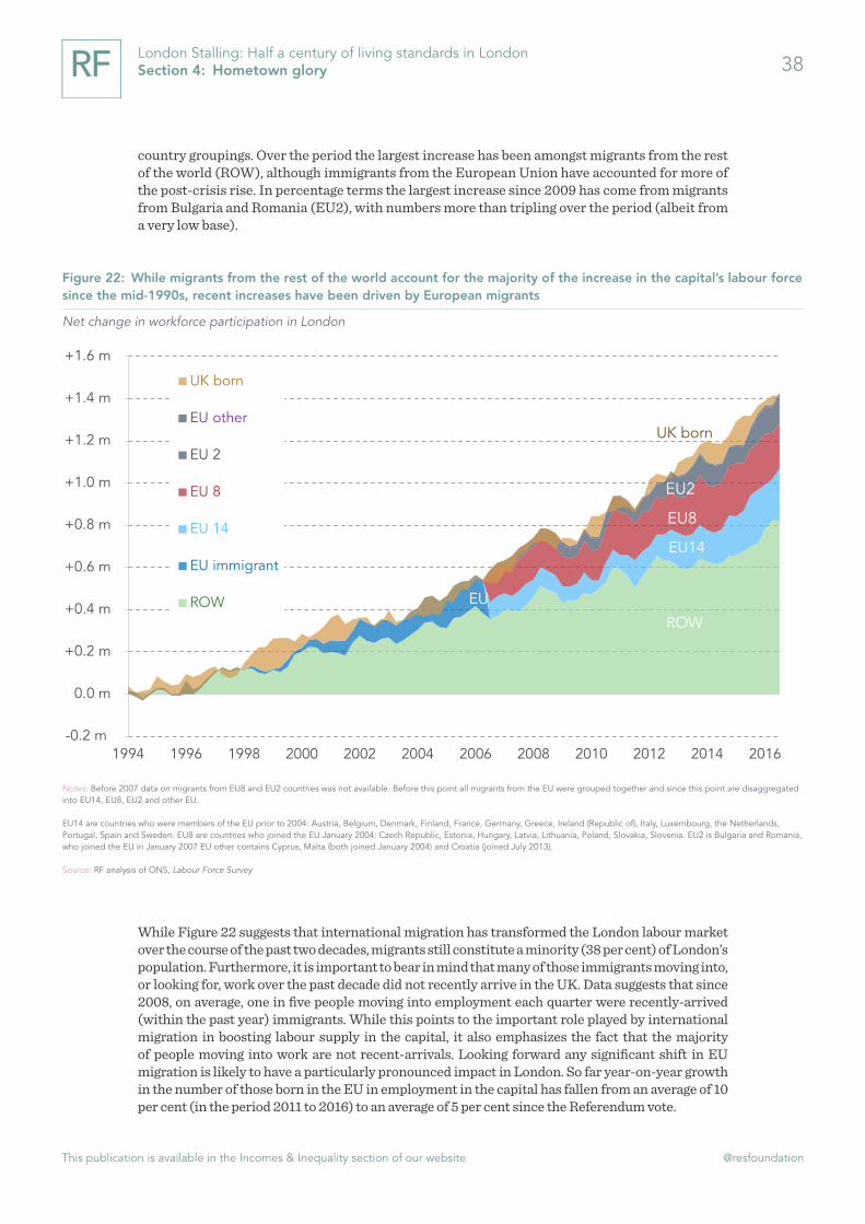
This publication is available in the Incomes & Inequality section of our website @resfoundation
38London Stalling: Half a century of living standards in London Section 4: Hometown glory
country groupings. Over the period the largest increase has been amongst migrants from the rest of the world (ROW), although immigrants from the European Union have accounted for more of the post-crisis rise. In percentage terms the largest increase since 2009 has come from migrants from Bulgaria and Romania (EU2), with numbers more than tripling over the period (albeit from a very low base).
While Figure 22 suggests that international migration has transformed the London labour market over the course of the past two decades, migrants still constitute a minority (38 per cent) of London’s population. Furthermore, it is important to bear in mind that many of those immigrants moving into, or looking for, work over the past decade did not recently arrive in the UK. Data suggests that since 2008, on average, one in five people moving into employment each quarter were recently-arrived (within the past year) immigrants. While this points to the important role played by international migration in boosting labour supply in the capital, it also emphasizes the fact that the majority of people moving into work are not recent-arrivals. Looking forward any significant shift in EU migration is likely to have a particularly pronounced impact in London. So far year-on-year growth in the number of those born in the EU in employment in the capital has fallen from an average of 10 per cent (in the period 2011 to 2016) to an average of 5 per cent since the Referendum vote.
Figure 22: While migrants from the rest of the world account for the majority of the increase in the capital’s labour force since the mid-1990s, recent increases have been driven by European migrants
Net change in workforce participation in London
Notes: Before 2007 data on migrants from EU8 and EU2 countries was not available. Before this point all migrants from the EU were grouped together and since this point are disaggregated into EU14, EU8, EU2 and other EU.
EU14 are countries who were members of the EU prior to 2004: Austria, Belgium, Denmark, Finland, France, Germany, Greece, Ireland (Republic of), Italy, Luxembourg, the Netherlands, Portugal, Spain and Sweden. EU8 are countries who joined the EU January 2004: Czech Republic, Estonia, Hungary, Latvia, Lithuania, Poland, Slovakia, Slovenia. EU2 is Bulgaria and Romania, who joined the EU in January 2007 EU other contains Cyprus, Malta (both joined January 2004) and Croatia (joined July 2013).
Source: RF analysis of ONS, Labour Force Survey
-0.2 m
0.0 m
+0.2 m
+0.4 m
+0.6 m
+0.8 m
+1.0 m
+1.2 m
+1.4 m
+1.6 m
1994 1996 1998 2000 2002 2004 2006 2008 2010 2012 2014 2016
UK born
EU other
EU 2
EU 8
EU 14
EU immigrant
ROWROW
EU14
EU8
EU2
UK born
EU

This publication is available in the Incomes & Inequality section of our website @resfoundation
39London Stalling: Half a century of living standards in London Section 4: Hometown glory
In terms of employment then the London labour market has chalked up some impressive successes since the crisis, but with a sense that there is a significant pocket of insecure work developing. Perhaps unsurprisingly this growth in the labour force has had a significant impact on the composition of pay in London. As we shall see in the next section the employment boom partly explains why the capital has experienced a sharp pay squeeze since 2009.

This publication is available in the Incomes & Inequality section of our website @resfoundation
40London Stalling: Half a century of living standards in London Section 5: 22 grand job / In the city it’s alright
Section 5
22 grand job / In the city it’s alright
The Rakes, 22 Grand Job, 2005
The UK suffered a particularly pronounced earnings squeeze off the back of the financial crisis with pay in London coming under particular pressure. Typical hourly pay is 7 per cent lower in the capital than before the crash compared to 4 per cent for the UK as a whole.
However, a look below the surface of these figures indicates that, in most cases, London’s labour market is delivering for those that remain engaged in employment. Pay rises are higher in London for those moving jobs, those staying with their employer and those switching to jobs in the capital. Instead the pay squeeze is being driven by new entrants to the labour market (those starting work for the first time or moving into employment from being out of work), of which as we know from the previous sections there have been a lot of since the crisis.
These new entrants are much more likely to work part-time, be born outside the UK or to not have a degree, all indicators associated with lower pay. The result is that the composition of the ‘new entrants’ group has changed significantly in the capital, exerting downward pressure on average pay. The London labour market – although in many respects a place of bumper pay rises – needs to offer more to those moving into employment.
Pay in London is higher than elsewhere in the country, but the post-crisis squeeze has gripped most tightly in the capital
It will not come as a surprise to know that pay is higher in London than elsewhere in the country and the ‘premium’ has increased over time. In 2017 employees in the capital were paid 34 per cent more per hour than employees elsewhere in Great Britain, up from 12 per cent in 1975. This increase reflects the fact that the relative ‘overperformance’ of London compared to the rest of the country in terms of productivity and the concentration of higher-paying jobs has increased over time. It also reflects the fact that London has become a more expensive place to live, higher wages have pushed up prices and wages have also had to keep up with rising living costs (although as we shall see in the following section the London pay ‘premium’ has not kept up with rising housing costs in the capital).
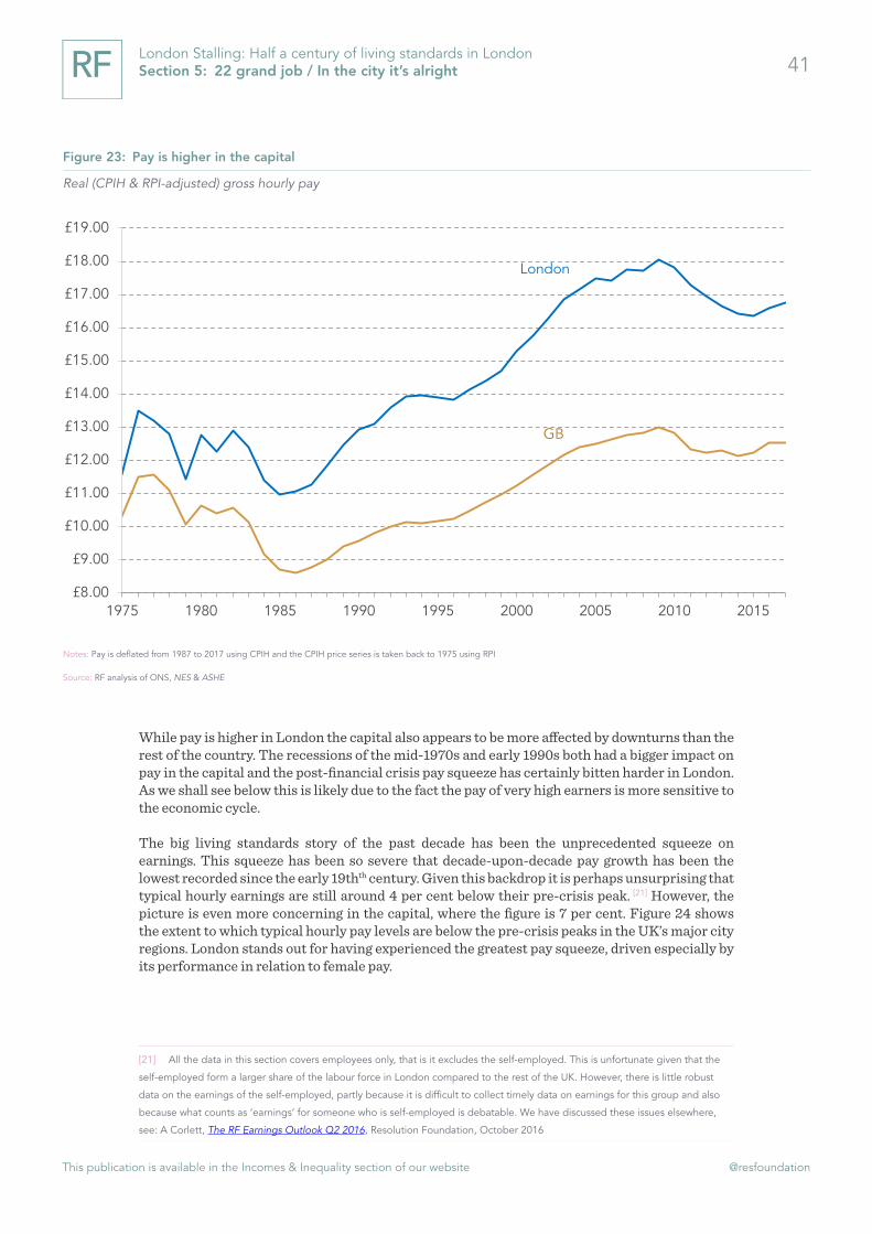
This publication is available in the Incomes & Inequality section of our website @resfoundation
41London Stalling: Half a century of living standards in London Section 5: 22 grand job / In the city it’s alright
While pay is higher in London the capital also appears to be more affected by downturns than the rest of the country. The recessions of the mid-1970s and early 1990s both had a bigger impact on pay in the capital and the post-financial crisis pay squeeze has certainly bitten harder in London. As we shall see below this is likely due to the fact the pay of very high earners is more sensitive to the economic cycle.
The big living standards story of the past decade has been the unprecedented squeeze on earnings. This squeeze has been so severe that decade-upon-decade pay growth has been the lowest recorded since the early 19thth century. Given this backdrop it is perhaps unsurprising that typical hourly earnings are still around 4 per cent below their pre-crisis peak. [21] However, the picture is even more concerning in the capital, where the figure is 7 per cent. Figure 24 shows the extent to which typical hourly pay levels are below the pre-crisis peaks in the UK’s major city regions. London stands out for having experienced the greatest pay squeeze, driven especially by its performance in relation to female pay.
[21] All the data in this section covers employees only, that is it excludes the self-employed. This is unfortunate given that the
self-employed form a larger share of the labour force in London compared to the rest of the UK. However, there is little robust
data on the earnings of the self-employed, partly because it is difficult to collect timely data on earnings for this group and also
because what counts as ‘earnings’ for someone who is self-employed is debatable. We have discussed these issues elsewhere,
see: A Corlett, The RF Earnings Outlook Q2 2016, Resolution Foundation, October 2016
Figure 23: Pay is higher in the capital
Real (CPIH & RPI-adjusted) gross hourly pay
Notes: Pay is deflated from 1987 to 2017 using CPIH and the CPIH price series is taken back to 1975 using RPI
Source: RF analysis of ONS, NES & ASHE
London
GB
£8.00
£9.00
£10.00
£11.00
£12.00
£13.00
£14.00
£15.00
£16.00
£17.00
£18.00
£19.00
1975 1980 1985 1990 1995 2000 2005 2010 2015

This publication is available in the Incomes & Inequality section of our website @resfoundation
42London Stalling: Half a century of living standards in London Section 5: 22 grand job / In the city it’s alright
Figure 25 provides more detail by considering the change in real pay for men and women at different points on the earnings distribution. Men at the bottom of the earnings distribution were afforded more protection by the NMW/NLW in the rest of the UK than in London. Furthermore the squeeze was more pronounced for men in London right at the top of the distribution, reflecting the fact that, across the UK, the highest earners saw a significant squeeze over the period and many of these people are in London.
Aside from the top two deciles of the earnings distribution, women in the capital felt the squeeze much more than their counterparts in the rest of the UK. Partly this is because the minimum wage and introduction of the National Living Wage (NLW) had far less of an impact in London over this period. Lower-earners in London are much more likely to be on rates of pay above the minimum wage and so were less cushioned from the effects of the squeeze. This is apparent in the fact that in the UK there was growth in the bottom two deciles of the female earnings distribution, whereas this was not the case (aside from growth of 0.3 per cent in the bottom percentile) in London. Overall the pay squeeze was more similar for men and women in the capital than elsewhere in the country.
Figure 24: The pay squeeze has had more of an effect in London
Change in real (CPIH-adjusted) median hourly earnings (ex. overtime) in 2017 from pre-crisis peak (2009)
Source: Source: RF analysis of ONS, Annual Survey of Hours and Earnings
-10%
-9%
-8%
-7%
-6%
-5%
-4%
-3%
-2%
-1%
0%
Men
-10%
-9%
-8%
-7%
-6%
-5%
-4%
-3%
-2%
-1%
0%
Women
-10%
-9%
-8%
-7%
-6%
-5%
-4%
-3%
-2%
-1%
0%
London
Sheffield city region
West Midlands city region
Leeds city region
Greater Manchester
Liverpool city region
Tyne & Wear
UK
Total

This publication is available in the Incomes & Inequality section of our website @resfoundation
43London Stalling: Half a century of living standards in London Section 5: 22 grand job / In the city it’s alright
The capital’s labour market is still delivering for those in continuous employment
Although Figure 24 and Figure 25 indicate that London experienced a deeper pay squeeze than the rest of the UK, when we track employees over time we find that those in London have tended to fare better than their counterparts across the rest of the UK. The top panel of Figure 26 shows that the typical pay rise associated with moving jobs in the capital (for both people moving within their current employer or from another organisation) is significantly higher than for the UK. On average, employees in London earn 3.2 percentage points more for moving jobs than do employees elsewhere.
Figure 25: In London the squeeze was tighter for men, but the gap between the performance of male and female pay was much smaller than in the rest of the UK
Change in real (CPIH-adjusted) median hourly earnings (ex. overtime) from pre-crisis peak: 2017
Source: RF analysis of ONS, Annual Survey of Hours and Earnings
-10%
-8%
-6%
-4%
-2%
0%
2%
4%
6%
8%
10th 20th 30th 40th 50th 60th 70th 80th 90th
London UK
Women
Lower earning << >> Higher earning
-10%
-8%
-6%
-4%
-2%
0%
2%
4%
6%
8%
10th 20th 30th 40th 50th 60th 70th 80th 90th
London UK
Men
Lower earning << >> Higher earning

This publication is available in the Incomes & Inequality section of our website @resfoundation
44London Stalling: Half a century of living standards in London Section 5: 22 grand job / In the city it’s alright
The bottom panel of Figure 26 analyses typical pay growth for employees who remain in the same job. Although here the picture is more mixed, in most years since 2007 the median pay rise in London has been higher than that in the UK. On average the pay rise associated with remaining in the same job is 0.4 percentage points higher in the capital.
Those who switch jobs and move to London also earn far higher pay rises than those who move to other parts of Great Britain. Figure 27 shows the typical pay rise earned by an employee moving to London compared to an average of the other parts of Great Britain. Someone moving jobs and relocating to the capital could expect to typically earn a real pay rise of 17 per cent last year, whereas the average across the rest of the country was 6 per cent, perhaps partly reflecting the fact that some of those moving out of the capital (Section 3 showed that significant numbers of people do every year) may take pay cuts.
Figure 26: Pay rises for those moving jobs tend to be higher in the capital
Median real (CPIH-adjusted) hourly pay rise
Notes: People moving job are identified as those who the firm states has moved job in the past year. This could be from another firm or internally.
Source: RF analysis of ONS, Annual Survey of Hours and Earnings
-3%
-2%
-1%
0%
1%
2%
3%
2007 2008 2009 2010 2011 2012 2013 2014 2015 2016 2017
London UK
Same job
0%
2%
4%
6%
8%
10%
12%
2007 2008 2009 2010 2011 2012 2013 2014 2015 2016 2017
London UK
Different job

This publication is available in the Incomes & Inequality section of our website @resfoundation
45London Stalling: Half a century of living standards in London Section 5: 22 grand job / In the city it’s alright
The fact that there is a ‘premium’ for moving to London is unsurprising given that the cost of living is higher in the capital (see Box 2). Nevertheless the premium is large and consistent. Even during the tightest pay squeeze in nearly 200 years, those remaining engaged in the labour market in London fared relatively well. Given this finding, how do we explain the fact that London’s pay squeeze appeared tighter than in the rest of the UK? The answer lies in those moving in and out of the labour market.
Figure 27: Those relocating to work in London earn large pay rises
Typical real (CPIH-adjusted) pay rise
Source: RF analysis of ONS, Annual Survey of Hours and Earnings
-5%
0%
5%
10%
15%
20%
25%
2007 2008 2009 2010 2011 2012 2013 2014 2015 2016 2017
Moving to London Moving to another part of the UK (average ex. LDN)

This publication is available in the Incomes & Inequality section of our website @resfoundation
46London Stalling: Half a century of living standards in London Section 5: 22 grand job / In the city it’s alright
i Box 2: How much!?
It is well known that the cost of living is higher in London. In particular people draw attention to the higher cost of housing in London (see Section 6). However, data from the Office for National Statistics suggests that the price of many other goods are higher in the capital. Overall the ONS estimates that the price level is 7 per cent higher in London than in the UK as a whole, that is goods and services are typically 7 per cent more expensive in the capital. Yet this hides a significant amount of variation across different items.
The price of alcohol and tobacco is actually pretty similar across the country. Many people who have felt aggrieved at the price of drinks in London’s pubs and bars may be surprised by this, but this is because these costs are
actually recorded in the category “restaurants and hotels” which are 13 per cent more expensive in London. It is perhaps also unsurprising that recreational and cultural activities are significantly more expensive in the capital given the higher cost of labour in London (which forms a big input cost for many firms in this category). More surprising is that furniture and household goods are more expensive in London, perhaps again because labour costs are higher. What the this data unfortunately cannot tell us is to the extent to which prices rise faster in the capital, although experimental work by the ONS in November 2017 suggested that inflation also tends to be higher in London.[1]
[1] C Jenkins, Feasibility study into producing CPIH consistent inflation rates for
UK regions, November 2017
Figure 28: The cost of living is higher in London: 2016
Source: ONS, Relative Regional Consumer Price Levels 2016
103
96.899.4
102.3
98.6
London Eng Scot Wales NI
Alcohol & tobacco (UK = 100)
113
97.4
100.495.1 98.3
London Eng Scot Wales NI
Restaurants & hotels (UK = 100)
112.2
97.4
103.2
95.599.8
London Eng Scot Wales NI
Furniture & household goods (UK = 100)
114.8
96.2101.4
96.895.8
London Eng Scot Wales NI
Recreation & culture (UK = 100)

This publication is available in the Incomes & Inequality section of our website @resfoundation
47London Stalling: Half a century of living standards in London Section 5: 22 grand job / In the city it’s alright
London.[22]
But new entrants to the labour market have fared much less well
The ‘churn’ of people moving into and out of work in London is greater than in the rest of the UK. In London around 18 per cent of employees have been with their employer for less than a year, whereas in the UK it is 16 per cent. Now partly this is because London has a higher job-to-job moves rate than the rest of the UK, but it also reflects the fact that there are more people moving in and out of work. Furthermore the squeeze on pay for new entrants in London is particularly pronounced. Figure 29 shows typical hourly pay for those starting work in London, this includes people starting work for the first time, but also those who may have previously been out of work. Pay for this (albeit heterogeneous) group is far below the levels it was in 2009. Pay for male new entrants is 19 per cent below its 2009 level and the figure for female new entrants is 10 per cent. Pay for new entrants across the UK has also been squeezed, but by less.
As well as the more pronounced fall in the pay of new starters London has also experienced a more significant compositional drag on pay as a result of more lower-paid people entering the labour market since the financial crisis. This is clear when we examine the people entering the labour market (from worklessness or for the first time) compared to those exiting (to worklessness or those retiring) in London compared to the UK as a whole. In order to explain the change in the level of pay in London we need to look at how the ‘enterers’ compared to ‘exiters’ has changed over time.[22] C Jenkins, Feasibility study into producing CPIH consistent inflation rates for UK regions, November 2017
Figure 29: The pay squeeze has been particularly pronounced for new entrants in London
Real (CPIH-adjusted) median hourly pay for new entrants (2009 = 100)
Source: RF analysis of ONS, Annual Survey of Hours and Earnings
London (men)
London (women)
UK (men)
UK (women)
70
75
80
85
90
95
100
105
2006 2007 2008 2009 2010 2011 2012 2013 2014 2015 2016 2017

This publication is available in the Incomes & Inequality section of our website @resfoundation
48London Stalling: Half a century of living standards in London Section 5: 22 grand job / In the city it’s alright
Figure 30 compares the group entering work to that exiting in the time periods that correspond to the pay data above; before the crisis (2006-2009) and post-crisis (2010-2016). It shows for example that between 2006 and 2009 more graduates exited employment than entered, resulting in a net decrease in graduates of 1.1 per cent. It is important to note that this just includes those entering and exiting work, and does not include graduates that may have moved into a job in London from one elsewhere in the country (who are analysed in Figure 27). In the post-crisis period this net outflow rises to 2.3 per cent. Figure 30 also shows that more people born in the UK exited the labour market than entered and that this outflow also increased in the post-crisis period (this may also explain the graduate outflow as many the qualifications of many migrants are not properly recorded in official statistics). By contrast there was a net increase in part-time work in both the pre- and post-crisis periods, although the increase was greater in the post-crisis period.
Figure 30 also shows the situation in the rest of the UK. There is a net outflow of graduates, but it is marginal and does not increase in the post-crisis period. Also in direct contrast to the situation in London, there is a net inflow of people born in the UK into employment and far smaller increases in the share of part-time people moving into work.
In the post-crisis period London appears to have suffered from a large compositional drag on pay due to the fact that there was a significant change in the types of people moving into employment. Significant increases in the proportion of new starters without a degree, born outside, the
Figure 30: Composition of new entrants to the London labour market shifted towards those with characteristics associated with lower pay in the post-crisis period
Proportion of those entering work minus the proportion exiting
Notes: We have excluded people entering and exiting employment in London from elsewhere in the country because such moves represent a very small proportion of total moves into and out of employment and the survey does not capture enough of these moves.
Source: RF analysis of ONS, Two-quarter longitudinal Labour Force Survey
-6% -2% 2% 6% 10% 14% 18%
Under 30
Part-time
Women
UK-born
DegreePre-crisis(2006 -2009)
Post-crisis(2010 -2016)
London
-6% -2% 2% 6% 10% 14% 18%
Under 30
Part-time
Women
UK-born
DegreePre-crisis(2006 -2009)
Post-crisis(2010 -2016)
UK (ex. London)

This publication is available in the Incomes & Inequality section of our website @resfoundation
49London Stalling: Half a century of living standards in London Section 5: 22 grand job / In the city it’s alright
UK or working part-time, weighed on pay growth. From Section 4 we know that the capital experienced an unusually jobs-rich recovery and bringing more people from marginalised groups into employment bought down median pay for new entrants. This is not to suggest that the slow increases in pay for new entrants, or the London pay squeeze more generally, is not something to be concerned about. Going forward the capital needs to devote more attention to the rewards for those entering the labour market.
In Sections 4 and 5 we have tackled two important components of the London economy; partic-ipation in the labour market and the associated rewards. In both cases the story was nuanced. What appears to be exceptionally strong performance in terms of employment and participation is somewhat marred by concerns around the security and quality of the jobs on offer. In terms of earnings the immediate impression is that London’s recent performance has been particularly poor. However, taking into account the changing composition of the capital’s workforce suggests a labour market that is delivering strong pay growth for those in continuous employment. The next section is far less nuanced; London’s housing market is mostly a cause for concern when it comes to living standards.

This publication is available in the Incomes & Inequality section of our website @resfoundation
50London Stalling: Half a century of living standards in London Section 6: The higher the buildings the lower the morals
Section 6
The higher the buildings the lower the morals
Noel Coward, Collected Sketches and Lyrics, 1931
London’s housing market is an almost-inexhaustible source of discussion, analysis and handwringing. Such preoccupation is hardly surprising given the way in which the capital has become an increasingly expensive place to live over recent decades, but the sense of London as being a special case on housing is likely to have intensified over the last decade. Rather than being on a steady upward trend, London’s housing costs have undergone two periods of take-off over the last 50 years. The first – during the 1980s – was an increase that was replicated elsewhere in the UK. However, the more recent period – in the decade following the financial crisis – was one in which London and the UK’s housing markets moved in opposite directions. Housing costs have continued to rise, even as cost-to-income ratios have fallen in the rest of the UK. In this latter period we also witnessed the emergence of a two-tier housing market in the capital, with home owners benefiting from falling mortgage rates and renters subject to rising rental costs.
Unsurprisingly such steep increases in costs have had an impact on the composition and distri-bution of housing in the capital, though in some respects it is more of a return to the past than a brand new world. Home ownership has become far less common and private renting has been on the increase, with levels returning to those that existed in the 1960s. However, it is the decline in the share of people in social housing that represents the biggest tenure change.
Raising housing supply is not the only strategy needed to tackle London’s housing problem, but it is encouraging that it has expanded relatively quickly over the past couple of years in London. But much more will be needed to make up for years of sluggish building numbers. And the performance of local authorities across the city varies. Particularly concerning is the fact that in many areas where demand is expected to increase the most, recent building numbers have been most disappointing.
House prices and rents have outpaced earnings in the post-crisis period
That housing has become increasingly unaffordable in the capital is unlikely to shock anyone, but the sheer scale of the divergence between house prices and earnings over the last decade or so is still incredible. As Figure 31 shows, average London house prices fell in the immediate aftermath of the financial crisis. But they recovered quickly from 2009, and really took off from 2011. Average weekly earnings in the capital increased by just 4 per cent in nominal terms between 2011 and 2017, but average house prices jumped by 67 per cent. Rental increases also outstripped earnings, rising by 22 per cent over the same period. As such, rents increased 5 times as fast as earnings and house prices increased 17 times as rapidly.

This publication is available in the Incomes & Inequality section of our website @resfoundation
51London Stalling: Half a century of living standards in London Section 6: The higher the buildings the lower the morals
Comparing rents or prices to earnings provides some indication of the relative affordability of housing and, for house prices, gives a good indication of the challenges of buying a property. However, to fully understand the extent to which high prices and rents are making housing less affordable we can look instead at how the share of their income that Londoners spend on housing has changed over time.
In terms of wider housing costs, the biggest increases in Lon-don came in the 1980s
Housing costs currently account for around 26 per cent of disposable incomes in London on average, compared to 17 per cent in the rest of the UK. [22] As Figure 32 shows, this gap in housing cost to income ratios (HCIRs) is long-established. It has, however, increased over time.
[22] Housing cost to income ratios (HCIRs) are calculated for each family and then averaged over the relevant population. To
avoid outliers we cap individual HCIRs at 100 per cent. Housing costs included are: mortgage interest payments, rent, structural
insurance premiums, water and sewerage costs and ground rent or service charges. Mortgage principal payments and council
tax are not included. See A Corlett & L Judge, Home Affront: housing across the generations, Resolution Foundation, September
2017 for more details.
Figure 31: London house prices and rents grew far faster than earnings in the post-crisis period
Indices (April 2011 = 100) of average earnings, private rental prices and house prices (all nominal)
Source: RF analysis of ONS, Average weekly earnings, House Price Index and Index of Private Housing Rental Prices
Rents
60
70
80
90
100
110
120
130
140
150
160
170
2005 2006 2007 2008 2009 2010 2011 2012 2013 2014 2015 2016 2017
House prices
Average weekly earnings
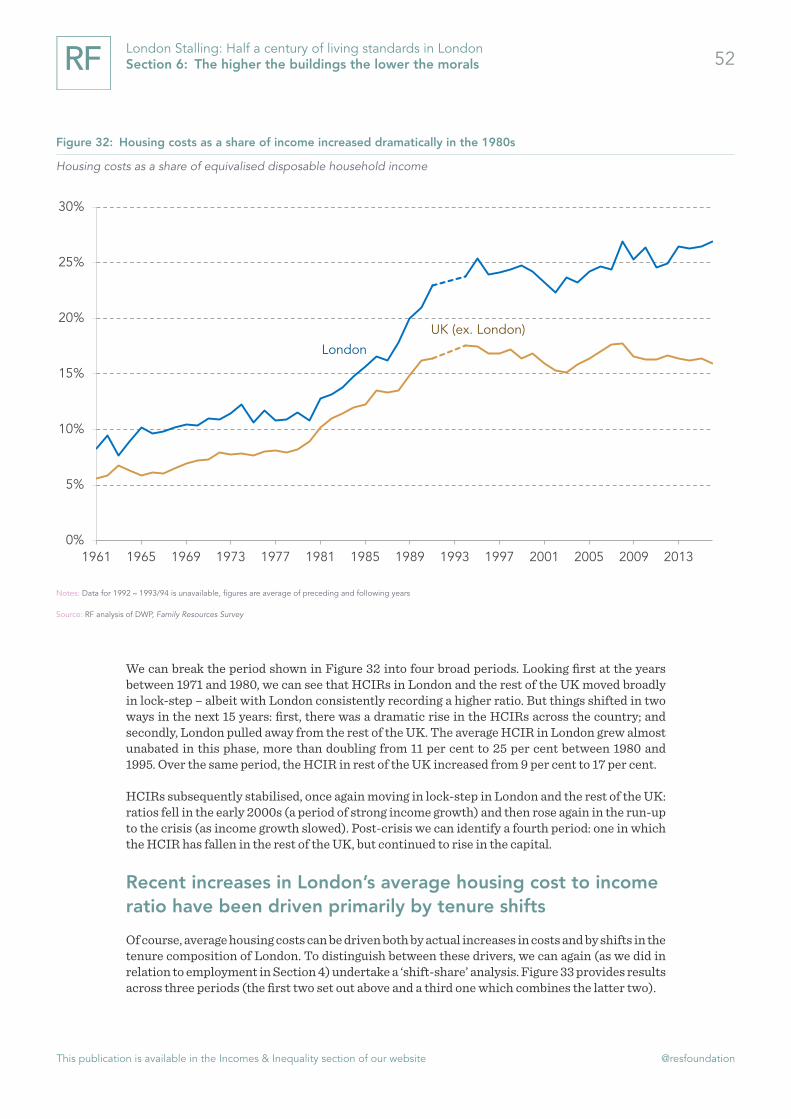
This publication is available in the Incomes & Inequality section of our website @resfoundation
52London Stalling: Half a century of living standards in London Section 6: The higher the buildings the lower the morals
We can break the period shown in Figure 32 into four broad periods. Looking first at the years between 1971 and 1980, we can see that HCIRs in London and the rest of the UK moved broadly in lock-step – albeit with London consistently recording a higher ratio. But things shifted in two ways in the next 15 years: first, there was a dramatic rise in the HCIRs across the country; and secondly, London pulled away from the rest of the UK. The average HCIR in London grew almost unabated in this phase, more than doubling from 11 per cent to 25 per cent between 1980 and 1995. Over the same period, the HCIR in rest of the UK increased from 9 per cent to 17 per cent.
HCIRs subsequently stabilised, once again moving in lock-step in London and the rest of the UK: ratios fell in the early 2000s (a period of strong income growth) and then rose again in the run-up to the crisis (as income growth slowed). Post-crisis we can identify a fourth period: one in which the HCIR has fallen in the rest of the UK, but continued to rise in the capital.
Recent increases in London’s average housing cost to income ratio have been driven primarily by tenure shifts
Of course, average housing costs can be driven both by actual increases in costs and by shifts in the tenure composition of London. To distinguish between these drivers, we can again (as we did in relation to employment in Section 4) undertake a ‘shift-share’ analysis. Figure 33 provides results across three periods (the first two set out above and a third one which combines the latter two).
Figure 32: Housing costs as a share of income increased dramatically in the 1980s
Housing costs as a share of equivalised disposable household income
Notes: Data for 1992 – 1993/94 is unavailable, figures are average of preceding and following years
Source: RF analysis of DWP, Family Resources Survey
London
UK (ex. London)
0%
5%
10%
15%
20%
25%
30%
1961 1965 1969 1973 1977 1981 1985 1989 1993 1997 2001 2005 2009 2013

This publication is available in the Incomes & Inequality section of our website @resfoundation
53London Stalling: Half a century of living standards in London Section 6: The higher the buildings the lower the morals
The very dramatic increase in the HCIR in the 1980-1995 period is immediately obvious, with more than 100 per cent of this shift being explained by rising HCIRs within each tenure rather than any change in the mix of tenures in London.[23] While less marked however, the increase in HCIR in the most recent period (1996–2016) stands out for the fact that in this instance it is the compositional mix that matters most. That is, the shift into more expensive tenure forms (in particular the private rented sector and accommodation provided by housing associations) and the shift away from cheaper tenure forms (in particular owning with a mortgage or living in housing provided by the local authority) pushed up the HCIR in London in this period. This is not to say that HCIRs haven’t moved within tenures over recent years however, as Box 3 discusses.
[23] The five tenure types in our analysis are outright owners, mortgagors, those in the private rented sector, those in local
authority housing and those in housing provided by housing associations.
Figure 33: Shifts in tenure have pushed up the HCIR in London over the past two decades
Contribution to change in housing costs as a share of equivalised disposable household income
Source: RF analysis of DWP, Family Resources Survey
-2%
0%
2%
4%
6%
8%
10%
12%
14%
16%
1965 - 1979 1980 - 1995 1996 - 2016
Within tenure shifts in HCIR
Shifts in tenure
Overall

This publication is available in the Incomes & Inequality section of our website @resfoundation
54London Stalling: Half a century of living standards in London Section 6: The higher the buildings the lower the morals
The fall of home ownership and the rise of private renting marks a return to past trends
The housing landscape has changed dramatically in London since the 1960s. Figure 35 shows how tenures have shifted in the capital, with a number of key trends that merit highlighting.
i Box 3: The evolution of housing cost to income ratios across different tenures
We can get a sense of how housing costs have evolved for each tenure type in London from Figure 34. Because the HCIR is the ratio between housing costs and incomes, it is always likely to be lower for groups with relatively high incomes (such as owner occupiers). Nevertheless, changes in the ratio show the extent to which living standards are being squeezed by either rising housing costs or falling incomes.
From 1961, but particularly from the mid-1960s, there was a steady increase in the HCIRs of all tenures, with the HCIR for those in council housing moving closer to that of those in the private rented sector.
Surging HCIRs in the 1980s were driven by different factors across tenures. In the private and social rented sectors, changes to the regulatory environment had a marked effect. For example, the introduction of the assured shorthold tenancy in 1988 meant both that tenants could be given just two months’ notice to vacate and that the landlord was able to charge market rents. Although rents had been increasing before this point, the average HCIR in the private rented sector increased dramatically after this point. At the same time, lots of council-owned housing was transferred to housing associations and new housing association tenants started their tenancies as ‘assured’ rather than ‘secure’ tenants with less protection in terms of rent rises. Among mortgagors, rising HCIRs were a product of both rapid house price growth (driven by a strong economy and credit liberalisation) and high and (after 1987) rising interest rates.
Thereafter, the HCIRs of renters and home owners diverged somewhat. Interest rates were cut sharply in response to the recession of the early 1990s and then the UK’s ejection from the ERM, bringing down costs for mortgagors but not for renters. Further divergence came post-financial crisis, with sharp interest rate cuts again lowering mortgagor HCIRs. In contrast, strong demand for private rented accommodation in the capital has pushed up rents. With an increasing share of Londoner’s living in the private rented sector, this shift has pushed up the overall HCIR (Figure 33).
Figure 34: Since the early 1990s, owning with a mortgage has become cheaper while the private rented sector has become more expensive Housing costs as a share of equivalised disposable household income by tenure in London
Notes Data for 1992 – 1993/94 is unavailable, figures are average of preceding and following years Source RF analysis of DWP, Family Resources Survey
Own outright
Own with mortgage
Private rented sector
Council
Housing Association
0%
5%
10%
15%
20%
25%
30%
35%
40%
45%
50%
1961 1966 1970 1974 1978 1982 1986 1990 1994 1998 2002 2006 2010 2014

This publication is available in the Incomes & Inequality section of our website @resfoundation
55London Stalling: Half a century of living standards in London Section 6: The higher the buildings the lower the morals
The first is the large fall from the 1960s to 1990s in the share of people living alone in private rented accommodation. Almost a quarter of Londoners lived in this way in the early 1960s; a share that fell to approximately 7 per cent in the late 1980s. There was also a fall in people sharing (with non-family members) in the private rented sector during this period. These falls were offset by large increases (at least initially) in the share of people in council housing and owning their home with a mortgage.
From the 1990s another shift occurs. The share of people owning their home with a mortgage falls dramatically, as does (although this started sooner) the share of people living in local authority accommodation. This shift is accompanied by the return of the private rented sector with the proportion of people sharing and living alone in the private rented sector rising.
A couple of other shifts are also worth noting. Although we have heard a lot about the ‘boomerang’ generation of young adults who return to live in their parents’ home after university, the share of adults in their parents’ home in London is lower today than in the mid-1980s. However, the share has been rising since the turn of the century. The rise in students living with their parents has coincided with the expansion of higher education. Nevertheless, it is worth noting that this group is larger in London than in the rest of the UK (3.7 per cent, versus 2.2 per cent), suggesting that cost-pressures may be having more of an effect on students’ behaviour in the capital.
While it may not be the case that Londoners are more likely to live with their parents than in the past, the impact that high house prices have had on the ownership rates of younger groups is clear.
Figure 35: There have been big falls in the share of mortgagors and council tenants, and big increases in sharing in the PRS
Share of families in each tenure: London
Notes: Data is provided at the benefit unit level. Data for “full-time students at parents” not available before 1984. Data between 1962 and 1984 smoothed over two-years.
Source: RF analysis of ONS, Family Expenditure Survey 1961-1983; Labour Force Survey 1984-2017
Mortgagor
Council
HA
Private alone
Private sharing
Other sharing
Adult at parents
FT student at parents
Own outright
0%
5%
10%
15%
20%
25%
30%
35%
1962 1967 1972 1977 1982 1987 1992 1997 2002 2007 2012 2017

This publication is available in the Incomes & Inequality section of our website @resfoundation
56London Stalling: Half a century of living standards in London Section 6: The higher the buildings the lower the morals
Around 46 per cent of those born after the war (the ‘baby boomer’ generation) owned a home at age 30; a rate that has fallen to just 20 per cent among millennials (at age 31). This is a trend that has been observed across the country, but nowhere is it more apparent than in the capital. By age 31, a third of millennials in the UK owned their own home, but only a fifth in London did.
It is worth noting that the picture looks a little different when those born outside the UK (covering those who have arrived recently and those who have lived in the country for decades) are removed from the analysis. Focusing just on UK-born Londoners, the decline in mortgagors is not so stark (dropping from 32 per cent to 24 per cent between 1995 and 2017, compared with a reduction from 32 per cent to 20 per cent for the population as a whole). Similarly, the rise in the share of people renting privately is not as great once we drop non-UK born Londoners (the proportion of UK-born Londoners living in the private rented sector has increased from 13 per cent to 17 per cent, compared with a jump from 15 per cent to 30 per cent among the wider Londoner population).
Inner London in particular has also been marked by a big drop in social housing
In both inner and outer London between 1990 and 2017, there have been big falls in the share of families owning their home with a mortgage, similar increases in the share of students living with their parents, and similar changes in the share of adults living at home, and in other shared accommodation. However some of the trends identified in Figure 35 have played out differently
Figure 36: Homeownership rates have declined dramatically for millennials
Share of families in each tenure: London
Source: RF analysis of ONS, Family Expenditure Survey 1961-1983; Labour Force Survey 1984-2017
Millennials (1981-2000)
Gen X (1966-1980)
Baby boomers (1946-1965)Silent gen (1926-1945) Greatest gen (1911-1925)
Forgotten gen (1896-1910)
Lost gen (1881-1895)
0%
10%
20%
30%
40%
50%
60%
70%
20 22 24 26 28 30 32 34 36 38 40 42 44 46 48 50 52 54 56 58 60 62 64 66 68 70 72 74

This publication is available in the Incomes & Inequality section of our website @resfoundation
57London Stalling: Half a century of living standards in London Section 6: The higher the buildings the lower the morals
in different parts of the capital.
For example, Figure 37 shows that renting from the council fell in both outer and inner London, but that this was to some extent offset in the former by an increase in the share of families in housing association accommodation. In contrast there was little increase in housing association accommodation in inner London during this period. Inner London is also the place where the increase in the private sector has been most marked. Over the past two decades then, social housing in inner London appears to have been replaced by private rented accommodation, often shared by a number of people or families.
Within inner London, the expansion of the private rented sector has been especially pronounced in East London. Figure 38 brings this out showing that, across neighbourhoods in Newham, the average share of families living in the private rented sector increased by 17 percentage points between 2001 and 2011. In Hackney it was 14 percentage points, and in Lambeth it was 11 percentage points. In the adjacent borough of Bromley, the increase was 5.2 percentage points.And in Havering, the figure was just 5.4 percentage points.[24]
[24] ‘Neighbourhoods’ here refers to Middle Super Output Areas which usually contain an average of approximately 8,000
residents.
Figure 37: The shift into private sharing has been much more pronounced in inner London
Share of families in each tenure
Source: RF analysis of ONS, Family Expenditure Survey 1961-1983; Labour Force Survey 1984-2017
OutrightMortgagor
CouncilHousing association
Private alonePrivate sharingOther sharing
Adult at parentsFT student at parents
0% 5% 10% 15% 20% 25% 30% 35% 40%
1990 2017Inner London
OutrightMortgagor
CouncilHousing association
Private alonePrivate sharingOther sharing
Adult at parentsFT student at parents
0% 5% 10% 15% 20% 25% 30% 35% 40%
1990 2017Outer London

This publication is available in the Incomes & Inequality section of our website @resfoundation
58London Stalling: Half a century of living standards in London Section 6: The higher the buildings the lower the morals
Figure 39 presents the flip side of these sharp increases in the share of households in the private rented sector – namely correspondingly sharp falls in the proportion of households living in social housing. Across neighbourhoods in Hackney the share of households in social accommodation fell by 6.3 percentage points on average, but the figure was close to 20 percentage points in some localities. Similarly in Southwark the share of households in social housing fell by 9.3 percentage points on average, but by as much as a 20 percentage points in some neighbourhoods in the north of the borough.
Figure 38: East London has seen the largest increase in people living in private rented accommodation
Change in the share of people in the private rented sector by MSOA: 2001 - 2011
Notes: Some MSOAs are missing data because they were reclassified between the 2001 and 2011 censuses.
Source: RF analysis of ONS, 2001 and 2011 Census
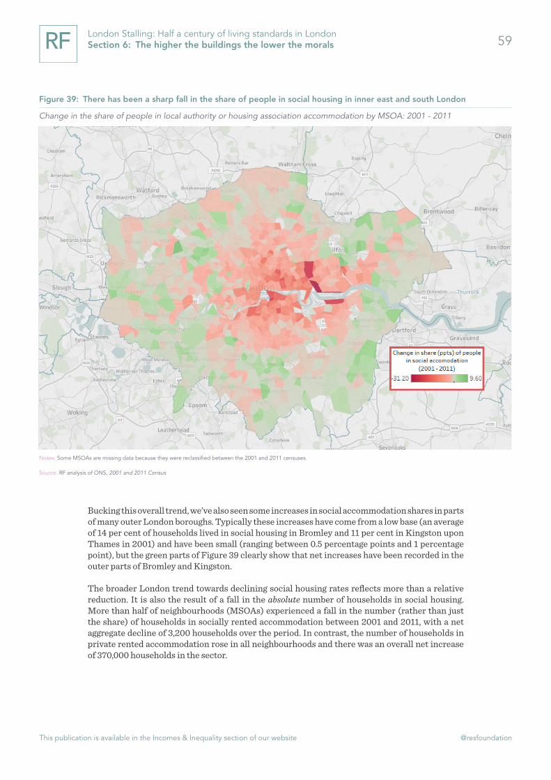
This publication is available in the Incomes & Inequality section of our website @resfoundation
59London Stalling: Half a century of living standards in London Section 6: The higher the buildings the lower the morals
Bucking this overall trend, we’ve also seen some increases in social accommodation shares in parts of many outer London boroughs. Typically these increases have come from a low base (an average of 14 per cent of households lived in social housing in Bromley and 11 per cent in Kingston upon Thames in 2001) and have been small (ranging between 0.5 percentage points and 1 percentage point), but the green parts of Figure 39 clearly show that net increases have been recorded in the outer parts of Bromley and Kingston.
The broader London trend towards declining social housing rates reflects more than a relative reduction. It is also the result of a fall in the absolute number of households in social housing. More than half of neighbourhoods (MSOAs) experienced a fall in the number (rather than just the share) of households in socially rented accommodation between 2001 and 2011, with a net aggregate decline of 3,200 households over the period. In contrast, the number of households in private rented accommodation rose in all neighbourhoods and there was an overall net increase of 370,000 households in the sector.
Figure 39: There has been a sharp fall in the share of people in social housing in inner east and south London
Change in the share of people in local authority or housing association accommodation by MSOA: 2001 - 2011
Notes: Some MSOAs are missing data because they were reclassified between the 2001 and 2011 censuses.
Source: RF analysis of ONS, 2001 and 2011 Census

This publication is available in the Incomes & Inequality section of our website @resfoundation
60London Stalling: Half a century of living standards in London Section 6: The higher the buildings the lower the morals
So, while densification played a part in the shift away from social housing, there was an absolute fall in the number of households in the social rented sector too. The fact that the fall was sharper in the centre of the capital merely speaks to the fact that social housing was (and remains) more common in inner London. What’s clear though is that this shift has significantly changed the make-up of large parts of the capital.
Encouragingly, home building in London reached a new high last year
There is an ongoing debate as to the importance of housing under-supply to rising housing costs across the UK.[25] One line of argument states that it is the relatively low cost of credit in recent decades that has had most impact on pushing up prices, with levels of house building appearing to broadly match household formation. An alternative argument states that, due to more houses being under-occupied and more homes being used as an investment, the effective supply is lower than the headline figures suggest. Proponents also point out that high house prices and high housing costs may be frustrating (and therefore artificially lowering) household formation.
These two views are not necessarily mutually exclusive. In reality both supply and credit matter, and for housing costs (as opposed to house prices) supply is – in the mid- to long-term – undeniably important. Given this it is important to analyse how London has fared in this regard.
In the run up to the financial crisis (between 2001 and 2008), net dwellings increased by an average of 27,000 a year in London. This equates to an increase in dwellings as a proportion of the stock of about 0.85 per cent a year. The rate for the whole of England (including London) was almost identical, suggesting that – if we assume that there was greater demand in the capital – housebuilding was not responding to it.
Like the whole of the country, house building in London slowed dramatically as a result of the financial crisis. There was a sharp drop in net new dwellings and output has only recently recovered. More positively though, last year London recorded the highest level of net additional dwellings since comparable records began at the turn of the millennium. Furthermore in the post-crisis period (2009 to 2016), new dwellings as a proportion of the existing stock increased more quickly in London (an annual average of 0.8 per cent) than in England as a whole (an annual average of 0.68 per cent).
Yet, while recent trends have been positive, the current building rate is still below that which the current (draft) GLA London Plan (which factors in poor building rates of the past) says is needed to meet the capital’s housing needs up to 2028/29 (shown as the red dotted line in Figure 40).
[25] See K Barker & N Hudson, Will building more homes help to reduce housing costs?, Resolution Foundation, November
2017 and I Mulheirn, Two housing crises, Resolution Foundation, March 2018
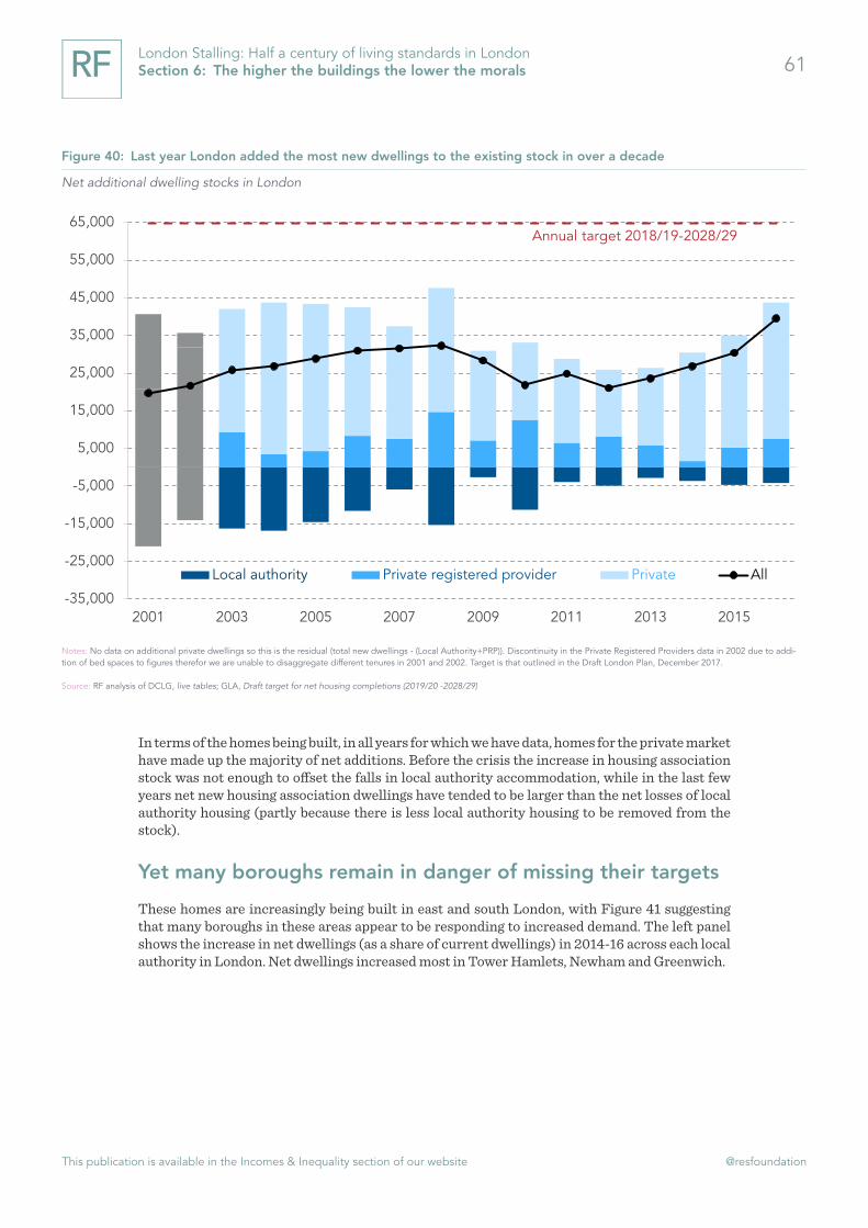
This publication is available in the Incomes & Inequality section of our website @resfoundation
61London Stalling: Half a century of living standards in London Section 6: The higher the buildings the lower the morals
In terms of the homes being built, in all years for which we have data, homes for the private market have made up the majority of net additions. Before the crisis the increase in housing association stock was not enough to offset the falls in local authority accommodation, while in the last few years net new housing association dwellings have tended to be larger than the net losses of local authority housing (partly because there is less local authority housing to be removed from the stock).
Yet many boroughs remain in danger of missing their targets
These homes are increasingly being built in east and south London, with Figure 41 suggesting that many boroughs in these areas appear to be responding to increased demand. The left panel shows the increase in net dwellings (as a share of current dwellings) in 2014-16 across each local authority in London. Net dwellings increased most in Tower Hamlets, Newham and Greenwich.
Figure 40: Last year London added the most new dwellings to the existing stock in over a decade
Net additional dwelling stocks in London
Notes: No data on additional private dwellings so this is the residual (total new dwellings - (Local Authority+PRP)). Discontinuity in the Private Registered Providers data in 2002 due to addi-tion of bed spaces to figures therefor we are unable to disaggregate different tenures in 2001 and 2002. Target is that outlined in the Draft London Plan, December 2017.
Source: RF analysis of DCLG, live tables; GLA, Draft target for net housing completions (2019/20 -2028/29)
Annual target 2018/19-2028/29
-35,000
-25,000
-15,000
-5,000
5,000
15,000
25,000
35,000
45,000
55,000
65,000
2001 2003 2005 2007 2009 2011 2013 2015
Local authority Private registered provider Private All

This publication is available in the Incomes & Inequality section of our website @resfoundation
62London Stalling: Half a century of living standards in London Section 6: The higher the buildings the lower the morals
Despite this success however, even boroughs that have significantly increased the dwelling stock in recent years may struggle to hit their targets over the next decade. The right-hand panel of Figure 41 compared net dwelling completion in 2014-16 with 2019/20 to 2028/29 targets. It shows that no borough except Kensington and Chelsea built more homes than its proposed target for 2018/19 to 2028/29, and this borough has the lowest target of any except for the City of London.
Some boroughs are some way off target. For instance Haringey increased its dwelling stock by an average of just 1 per cent a year (or 371 dwellings) between 2014 and 2016, compared to a London average of 2.8 per cent. As such, compared to the borough’s annual target for 2018/19 to 2028/29, Haringey built 1,131 fewer homes per year between 2014 and 2016 than it will need to. Likewise, three boroughs in outer East London – Redbridge, Barking and Dagenham and Havering – will all have to significantly increase building rates if they are to meet their targets. Between 2014 and 2016 the three boroughs combined completed 1,186 fewer dwellings a year than needed. There are poor performers in West London too: Hounslow built 344 fewer homes per year than needed, while the annual deficit was 297 in Richmond-upon-Thames.
And the majority of boroughs are still not building enough af-fordable housing
Furthermore, the issue is not just how many homes are being built but also what kinds of home. In particular, boroughs are failing to provide the right mix of affordable homes and those sold and rented at market rates. Between 2013/14 and 2015/16, just 25 per cent of new housing completions were affordable homes in London; a fall from the previous three years. In the latest Annual Monitoring Report the GLA acknowledged that it had failed to complete its target of 17,000 net additional affordable homes per year.[26]
[26] GLA, London Plan Annual Monitoring Report 2015/16, July 2017
Figure 41: There has been strong home building in parts of east London but many of the boroughs in the east are currently behind their targets
Net dwellings completed and net dwellings completed compared to 2019/20 -2028/29 target
Source: RF analysis of DCLG, live tables; GLA, Draft target for net housing completions (2019/20 -2028/29)

This publication is available in the Incomes & Inequality section of our website @resfoundation
63London Stalling: Half a century of living standards in London Section 6: The higher the buildings the lower the morals
Going forward, the Draft London Plan states that there is a need for “circa 43,500 affordable homes per year” between 2018/19 and 2028/29.[27] Yet between 2013/14 and 2015/16 just 7,200 more affordable homes were completed on average each year, and this number falls to 4,300 when shared ownership homes are excluded.
Figure 42 provides a sense of how each London borough is performing in terms of both overall house building and the provision of affordable housing. It shows that, some boroughs in East London – Tower Hamlets, Newham, Greenwich and Waltham Forest – are again performing quite well on both measures. Others – Haringey and Havering – are building affordable homes, but have relatively low completion rates in general.
[27] Mayor of London, The London Plan: The spatial development strategy for Greater London. Draft for Public Consultation,
December 2017
Figure 42: Many boroughs are not building enough homes, particularly affordable ones
Increase in net dwellings as a proportion of total dwellings (2014 -16)
Source: RF analysis of DCLG, live tables; GLA, Draft target for net housing completions (2019/20 -2028/29)
Barking & Dagenham
Bexley
Brent
Bromley
Croydon
Greenwich
Hackney
Haringey
Harrow HaveringHillingdon
Hounslow
Islington
Newham
Redbridge Richmond
Southwark
Tower Hamlets
Waltham Forest
Wandsworth
Westminster
0%
1%
2%
3%
4%
5%
6%
7%
8%
0% 5% 10% 15% 20% 25% 30% 35% 40% 45% 50%
Affordable homes as a proportion of total completions 2012/13 to to 2015/16
High net dwellingsLow affordable homes
High net dwellingsHigh affordable homes
Low net dwellingsLow affordable homes
Low net dwellingsHigh affordable homes

This publication is available in the Incomes & Inequality section of our website @resfoundation
64London Stalling: Half a century of living standards in London Section 6: The higher the buildings the lower the morals
More discouragingly, there are a large number of boroughs in the bottom left quadrant that are both building relatively few homes and with a low share of these being affordable properties. Many outer London boroughs fall into this category, including Harrow, Redbridge, Richmond and Bexley. The Draft London Plan sets ambitious targets and it is clear that achieving these goals will be challenging for all boroughs, particularly in terms of building enough affordable homes.
This chapter has chronicled what is perhaps the biggest problem facing the capital. Housing costs increased dramatically in the 1980s, with further subsequent increases disproportionately affecting renters. House building has picked up recently, but many of the boroughs likely to see the biggest increases in demand over the next couple of years look set to fail to build enough homes, particularly affordable ones. What’s apparent is that housing pressures have drastically altered the feel of many parts of the capital over recent decades, with Londoners allocating ever-larger shares of their incomes to this most basic of needs. In the next section we look at how high housing costs, among other factors, have affected people’s household incomes in the capital.

This publication is available in the Incomes & Inequality section of our website @resfoundation
65London Stalling: Half a century of living standards in London Section 7: The average millionaire is only the average dishwasher dressed in a new suit
Section 7
The average millionaire is only the average dishwasher dressed in a new suit
George Orwell, Down and Out in Paris and London, 1933
Household incomes are a lot higher in the capital than they were in 1960s, with the strongest growth in incomes occurring in the 1980s. However incomes for those of working-age peaked in the early 2000s. Furthermore, although the long-view is that household incomes have risen, the gains have not been equally shared across the distribution. Lower income Londoners have tended to experience lower rates of growth than their counterparts in the rest of the country and, pre-crisis, inequality has risen more rapidly. Despite falling a little since the financial crisis, income inequality remains higher in the capital than elsewhere.
As well as those on lower incomes faring worse in the capital, the incomes of the younger generation and some ethnic minorities have also underperformed. The inflation-adjusted incomes of millennials are lower than those of preceding generations at the same age; and income growth for black communities in the capital has been noticeably sluggish. The outlook for those on low incomes is not encouraging. The National Living Wage and tax cuts will boost incomes in the coming years, but the latter will have much more of an impact on higher-income households and neither is enough to offset significant cuts to working-age benefits.
Had housing costs grown in line with incomes since the late 1960s the typical Londoner would today be £5,400 better off
In this section we turn our attention to incomes. We will concentrate on after-housing cost (AHC) income,[28] which measures incomes after accounting for spending on mortgages and rent (net of Housing Benefit). Given that housing is a central need, this provides a better measure of living standards than a simple focus on net incomes. It is also of particular relevance in the capital, as we saw in the last chapter.
Indeed, on a before-housing costs basis (BHC) London is the region of the UK where incomes are highest; yet on an AHC basis London falls below the UK average. Table 2 highlights this, providing a comparison between BHC and AHC incomes in London and the rest of the UK over the period 2016-17. Typical (median) BHC income in London was £28,600, well above the UK figure of £25,700. However the AHC median of £21,350 falls someway below the UK average of £22,250. No other part of the UK experiences such a sharp fall in income between the two measures, with housing costs lowering household incomes by 25 per cent in London compared to 13 per cent across the country as a whole.
[28] Income after housing costs is household income after subtracting the cost of housing. Specifically mortgage interest pay-
ments, insurance and ground rent, rents (gross of housing benefit), water charges.

This publication is available in the Incomes & Inequality section of our website @resfoundation
66London Stalling: Half a century of living standards in London Section 7: The average millionaire is only the average dishwasher dressed in a new suit
Table 2: Housing costs have a bigger impact on the incomes of poorer households in London
London UK
Working-age household income: 2016-17
Median (BHC) £28,600 £25,700Median (AHC) £21,400 £22,300
Difference between AHC and BHC income (%)
75th percentile -19% -12%50th percentile (median) -25% -13%25th percentile -38% -25%
Source: RF analysis of ONS, Family Resources Survey
The table shows also that housing costs have a disproportionate effect on households with lower incomes. Among households at the 25th percentile of the income distribution (that is, where 74 per cent of households sit above them in the distribution), the inclusion of housing costs lowers incomes relative to the BHC measure by 38 per cent (and by 25 per cent in the UK). That’s a bigger effect than the one recorded at the median and at the 75th percentile (where just 24 per cent of households sit higher in the distribution).
Impacts of this scale obviously have much larger impacts when repeated year after year, particu-larly with housing cost to income ratios rising over time as we saw in the last section. Typical London household income was £5,400 lower in 2016-17 than it would have been had housing costs grown in line with incomes since 1968.[29] That’s a 20 per cent ‘housing penalty’, and compares with a figure of 3 per cent (or £600) for the UK as a whole.
Incomes for working age households are no higher than they were 15 years ago
Historically, incomes for households headed by someone of working-age have been higher than for pensioner households. However, since the 1980s and particularly since the mid-2000s pensioner incomes have caught up. In large part this is because during periods when incomes have plateaued or even fallen for working-age households (most notably in the early 1990s and following the financial crisis) they have continued to rise for pensioners. Figure 43 sets out the result; with median pensioner incomes overtaking median working-age ones from 2011.
[29] Had housing costs grown in line with income, median (AHC) household income in London would have been £26,736 rather
than £21,368 in 2016-17.

This publication is available in the Incomes & Inequality section of our website @resfoundation
67London Stalling: Half a century of living standards in London Section 7: The average millionaire is only the average dishwasher dressed in a new suit
In some respects this is the welcome result of the increased generosity of the State Pension, which has helped significantly reduce poverty among this group. It is also partly the result of changes in the composition of the pensioner group, with the gradual arrival of the generation born after the war (baby boomers) who have tended to have higher incomes than previous generations (more on this below). Nevertheless the relative success of the pensioner group casts a harsh light on the performance of working-age households, for whom household income has been essentially flat since the early 2000s.
Compared to the rest of the UK those on lower incomes do worse in London
While pensioners have outperformed working-age households in recent years, both have been eclipsed by the income growth of the top 1 per cent of households. Between 1980 and the millennium, household incomes for the top 1 per cent in the capital increased by nearly 450 per cent, while the equivalent figures for pensioners and working-age households were 120 per cent and 70 per cent respectively. This is evident in Figure 44 which shows the growth in household incomes since 1968. The fortunes of the top 1 per cent increased first in the 1980s and then dramatically in the 1990s.
Figure 43: Pensioner incomes are now higher than those of working-age households
Median real (2016-17 prices) equivalised household income (AHC): London
Notes: Household incomes deflated with a specific version of the consumer price index that excludes housing costs. Data for 1992 – 1993/94 is unavailable, figures are average of preceding and following years. Three-year rolling average is used.
Source: RF analysis of ONS, Family Expenditure Survey (1968 – 1991) and ONS, Family Resources Survey (1994-95 – 2016-17).
Working-age
Pensioner
£0
£5,000
£10,000
£15,000
£20,000
£25,000
1968 1972 1976 1980 1984 1988 1992 1997 2001 2005 2009 2013 2017

This publication is available in the Incomes & Inequality section of our website @resfoundation
68London Stalling: Half a century of living standards in London Section 7: The average millionaire is only the average dishwasher dressed in a new suit
The growth figures for the top 1 per cent should not be taken as precise estimates however. Their incomes are very volatile, not least due to their sensitivity to tax changes. For instance, incomes in 2008-09 were inflated by people bringing forward earnings to get ahead of the 50p higher rate of tax due for arrival in April 2009. As a result top incomes fell particularly sharply in 2009-10 (with post-crisis declines evident for all groups in this year). Similarly incomes were moved forward in 2015-16 so as to beat the dividend tax rise of April 2016. This may explain the sharp uptick in that year (although growth continued into 2016-17).[30]
Notwithstanding these caveats, Figure 44 presents clear evidence both that the incomes of the top 1 per cent and that of the rest of London began to diverge in the 1980s, and that there was likely a particularly marked fall in the incomes of this group in the wake of the financial crisis. This tallies both with what we know happened to the earnings of highly-paid people (see Section 5) and with the post-crisis performance of investments. This income fall among the top 1 per cent could be coming to an end however, with renewed growth evident since 2014-15.
[30] Another reason that these estimates are unlikely to be precise is that it is difficult to measure the incomes of this group due
to underreporting. Although survey data is corrected using information from HMRC, this process can be improved. Note also that
the data used to adjust the figures in 2016-17 are estimates, not actual figures (and will not be corrected for the actual figures
even after they are released). See A Corlett, Unequal results: improving and reconciling the UK’s household income statistics,
Resolution Foundation, December 2017. Data for the top 1 per cent in London is also based on a small sample (possible as few as
10 observations).
Figure 44: The rise of the “1%” in the capital happened in the 1980s and 1990s
Growth in real equivalised household income (AHC): London (1968=100)
Notes: Household incomes deflated with a specific version of the consumer price index that excludes housing costs. Data for 1992 – 1993/94 is unavailable, figures are average of preceding and following years.
Source: RF analysis of ONS, Family Expenditure Survey (1968 – 1991) and ONS, Family Resources Survey (1994-95 – 2015-16).
Top 1%
Working-age
Pensioner
0
100
200
300
400
500
600
700
800
900
1000
1968 1973 1978 1983 1988 1993 1999 2004 2009 2014

This publication is available in the Incomes & Inequality section of our website @resfoundation
69London Stalling: Half a century of living standards in London Section 7: The average millionaire is only the average dishwasher dressed in a new suit
Looking more widely at income growth across the distribution, Figure 45 sets out average annual real-terms growth in London in four distinct (pre-crisis) periods. In all four periods, income growth for those right at the bottom of the distribution (around the 10th percentile) in the capital was low (between -1 per cent and 2 per cent). Many contrasts are evident too however.
The first period (1970-1983) was a characterised by weak growth and a small rise in inequality. Incomes grew by a measly 1.5 per cent a year for those in the middle of the distribution, there was almost no growth for the bottom third of the distribution and incomes only grew by 2.8 per cent at the top.
Following the early 1980s recession things changed dramatically. The six years between 1984 and 1990 represented a time of rapid growth, but large increases in inequality. Incomes grew especially strongly among households above the 30th percentile in the distribution, with those right at the top faring especially well; average annual growth topped 8 per cent. Growth in London was also stronger than for the UK as a whole in this period: growth for the typical household in the UK over this period averaged 4.4 per cent, whereas the figure was 5 per cent in the capital. At the top this outperformance was even more marked: for households at the 90 percentile of the distribution in London growth in the late 1980s was 8.4 per cent, compared with 6.2 per cent for the UK as a whole.
Figure 45: The 1980s were a good time for mid- and high-earners in the capital
Average annual growth in real (2015-16 prices) equivalised household income (AHC)
Notes: Household incomes deflated with a specific version of the consumer price index that excludes housing costs. Percentiles refer to percentiles of the income distribution within London. Growth is averaged over 5 percentiles. The top and the bottom of the distribution are removed as their incomes are very volatile.
Source: RF analysis of ONS, Family Expenditure Survey (1968 – 1991) and ONS, Family Resources Survey (1994-95 – 2015-16).
"Weak growth, small rise in inequality"
"Rapid growth, large increase in inequality"
"Relatively strong, shared growth"
"Pre-crisis slowdown"-1%
0%
1%
2%
3%
4%
5%
6%
7%
8%
9%
0 10 20 30 40 50 60 70 80 90
1970 to 1983
1984 to 1990
1991 to 2000-01
2001-02 to 2007-08
Lower income << >> Higher income

This publication is available in the Incomes & Inequality section of our website @resfoundation
70London Stalling: Half a century of living standards in London Section 7: The average millionaire is only the average dishwasher dressed in a new suit
This period of rapid growth came to a halt with the recession of the early 1990s. Yet as the UK emerged from this recession another period of strong income growth began, covering the years from 1991 to 2000. This was a period of relatively strong, shared growth, with average annual income increases ranging from 2 per cent to 3 per cent across the majority of the distribution (with those at the top doing just marginally better and those at the bottom a little worse).
The final period set out in Figure 45 is the pre-crisis slowdown of 2001 to 2007. Household income growth slowed significantly, with median incomes increasing by just 0.4 per cent a year. This was however a period in which the lowest-earners benefitted from growth in the minimum wage and lower income households benefited from the increased generosity of working-age benefits. It was also an era in which the UK’s financial centre continued to perform strongly, bringing more rapid income gains at the top of the distribution.
Figure 46 updates this story, presenting two post-crisis periods. Overall, the decade since the financial crisis has been one of very weak income growth. But it has also been one in which the relative fortunes of higher- and lower-income residents in London reversed somewhat. In the immediate recession squeeze of 2008 to 2011, household incomes fell by between 2 per cent and 4 per cent for those in the top half of the income distribution (note that this excludes the top 10 per cent) while they rose (albeit marginally) for those in the bottom half. In the post-crisis recovery years of 2012 to 2016, income growth was poor for those below the 20th percentile but relatively even (and overall weak) across the rest of the distribution.
Figure 46: Higher-income Londoners fared worse in the immediate post-crisis period
Average annual growth in real (2015-16 prices) equivalised household income (AHC)
Notes: Household incomes deflated with a specific version of the consumer price index that excludes housing costs. Percentiles refer to percentiles of the income distribution within London. Growth is averaged over 5 percentiles. The top and the bottom of the distribution are removed as their incomes are very volatile.
Source: RF analysis of ONS, Family Resources Survey (1994-95 – 2015-16).
"Recession squeeze"
"Post-crisis recovery"
-4%
-3%
-2%
-1%
0%
1%
2%
3%
4%
0 10 20 30 40 50 60 70 80 90
2008-09 to 2011-12
2012-13 to 2016-17
Lower income << >> Higher income

This publication is available in the Incomes & Inequality section of our website @resfoundation
71London Stalling: Half a century of living standards in London Section 7: The average millionaire is only the average dishwasher dressed in a new suit
Figure 47 captures the whole span of years between 1968 and 2016-17. Across almost 50 years, income growth has been stronger in the UK for almost three-quarters of the distribution and only for those above the 80th percentile was growth noticeably stronger in the capital. The implication is that lower- and middle-income Londoners tend to fare worse in the capital than those elsewhere in the country. Housing costs are a big part of this story, with a very different picture apparent when comparing London and UK income growth across the distribution on a BHC basis for instance.
Figure 47 raises an interesting question: why, given the relatively poor growth for those on mid-to-low incomes, is London such a magnet? There may not be an inconsistency between London’s attraction and the fact that it appears such a difficult place for those on low incomes. One issue is housing. If we carry out the same analysis but use BHC incomes, average annual income growth is higher in London for households across the income distribution. Then of course there are lots of other reasons that London is an attractive place to live, the rewards for those who make it to the top are significant, recently jobs have been plentiful, and there are lots of non-economic reasons why people choose to live where they do. Finally it is worth pointing out that comparing London to the rest of the UK obviously throws up some demographic issues given that the population of the capital is different to that country as a whole.
Figure 47: Growth has been lower than in the rest of the UK for those on low-incomes
Average annual growth in real (2015-16 prices) equivalised household income (AHC): 1968 – 2016-17
Notes: Household incomes deflated with a specific version of the consumer price index that excludes housing costs. Data for 1992 – 1993/94 is unavailable, figures are average of preceding and following years.
Source: RF analysis of ONS, Family Expenditure Survey (FES) (1968 – 1991) and ONS, Family Resources Survey (FRS) (1994-95 – 2015-16).
LondonUK
0.0%
0.5%
1.0%
1.5%
2.0%
2.5%
3.0%
0 10 20 30 40 50 60 70 80 90
Lower income << >> Higher income

This publication is available in the Incomes & Inequality section of our website @resfoundation
72London Stalling: Half a century of living standards in London Section 7: The average millionaire is only the average dishwasher dressed in a new suit
Income inequality is higher in the capital than in the rest of the country
The picture set out above points to a city in which income inequality has grown significantly over recent decades. Indeed, Figure 48 shows that inequality is both higher and has grown more rapidly in London than in the UK overall. Measured using either the Gini coefficient or the ratio between incomes at the 80th and 20th percentiles, we see that inequality was broadly similar in the UK and London until the 1980s. From this point however inequality rose steeply in London and, although it rose in the UK as well, the London increase was much more pronounced and – at least in terms of the Gini coefficient – continued into the 2000s.
Post-crisis, the gap between inequality levels in London and the UK as a whole has narrowed a little. Although inequality fell everywhere in the immediate aftermath, it subsequently slowly ticked up again across the UK. Yet it continued its downward trend in London (until the latest year for which we have data). We know from Figure 46 that high income households experienced a more pronounced squeeze following the downturn, driven by a particularly significant fall in earnings (Figure 25). That would appear to be an effect that has been especially marked in London.
Figure 48: Inequality is higher and has grown faster in London
Gini coefficient and 80/20 ratio of equivalised household income (AHC)
Notes: London data is averaged over three years. Household incomes deflated with a specific version of the consumer price index that excludes housing costs. Data for 1992 – 1993/94 is unavailable, figures are average of preceding and following years.
Source: RF analysis of ONS, Family Expenditure Survey (1968 – 1991) and ONS, Family Resources Survey (1994-95 – 2015-16).
LDN gini: LHS
UK gini: LHS
LDN 80/20: RHS UK 80/20: RHS
1.0
1.5
2.0
2.5
3.0
3.5
4.0
4.5
20%
25%
30%
35%
40%
45%
50%
55%
1966 1970 1974 1978 1982 1986 1990 1994 1998 2002 2006 2010 2014

This publication is available in the Incomes & Inequality section of our website @resfoundation
73London Stalling: Half a century of living standards in London Section 7: The average millionaire is only the average dishwasher dressed in a new suit
The incomes of some, but not all, ethnic groups are catching up with those of white, British residents
The ethnic group with the highest household incomes in the capital are white, British, residents. This is partly because wages tend to be higher for this group, but also because members of this group – particularly second earners in a couple – are more likely to be in work in the first place. Yet, while the incomes of ethnic minority households are lower, some groups have significantly narrowed the gap over the past two decades.
This is evident in Figure 49. In 1995-97 (three years are used because of the relatively small sample sizes of some groups), typical household income for white British households was £350 a week; and by 2015-17 this had increased to £520, a gain of approximately 50 per cent. Some groups – most notably Indians, Pakistanis and Bangladeshis – experienced much faster income growth over the period and so narrowed the gap. However for others – particularly black residents – growth was slower than, or no more than in line with, white British residents.
Figure 49: Income of ethnic minorities are increasing in the capital but in most cases remain well below that of white, British residents
Real equivalised (2016/17 prices) disposable household income: London
Notes: Household incomes deflated with a specific version of the consumer price index that excludes housing costs. Three year average used due to relatively small sample sizes for some groups.
Source: RF analysis of ONS, Family Resources Survey (1994/95 – 2015/16).
50%
64%
41%
80%
76% 54%
£0
£100
£200
£300
£400
£500
£600
White - British Indian Black Carribbean Pakistani Bangladeshi Black African
1995 - 97 2015 - 17

This publication is available in the Incomes & Inequality section of our website @resfoundation
74London Stalling: Half a century of living standards in London Section 7: The average millionaire is only the average dishwasher dressed in a new suit
However, one of the limitations of this analysis is that it is based on successive cross-sections of people rather than data that tracks individuals over time. As a result it may suffer from the fact that the compositions of these groups are changing over time. For instance, while the household income for households from “any other white background” (not shown in Figure 49) fell by 21 per cent between 2001-02 and 2015-17, the composition of this group also changed rapidly due to immigration from the new EU countries from Eastern Europe.
Similar forces could be at work with the other groups. We cannot check this directly, but can get some sense of how much a population may have changed by how much it has grown. Between 1994 and 2016 the number of Bangladeshi and Indian people in London increased by similar amounts (81 per cent and 74 per cent respectively). In contrast, the Pakistani population in London increased by 150 per cent over the period. There were big changes to the black African community (the population grew by 267 per cent over the period) and the black Caribbean community experienced far smaller population growth (albeit it was still 92 per cent over the period) over the period.
Unfortunately we cannot definitively know the extent to which changes in the composition of the groups above has affected growth in typical incomes, though given the extent to which the capital’s population changes (see Section 4) it is plausible that compositional effects could be large.
The slowing of generational progress is more apparent in the capital
Elsewhere we have charted the slowdown of generational progress in living standards.[31] Across the UK the earnings, consumption and household incomes of recent cohorts are below, or no more than equal to, those recorded by earlier cohorts at the same age.[32] Taking the millennial generation as a whole (those born between 1981 and 2000), typical household incomes at age 29 were barely above those recorded by generation X (born between 1966 and 1980).[33]
In London this stalling of generational progress is even starker. Millennials at age 29 in London recorded typical household incomes of £21,000, well down on the £24,000 recorded by generation X at the same age. Figure 50 provides more detail. In addition to millennial Londoners falling behind their generation X counterparts, the chart shows that generation X Londoners in their early 40s have in turn fallen behind the baby boomers at the same age. In contrast, the UK-wide picture is one of younger generations just about keeping pace with older ones.
[31] See The Resolution Foundation, Intergenerational Commission for a full list of research and publications
[32] L Gardiner & P Gregg, Study, Work, Progress, Repeat? How and why pay and progression outcomes have differed across
cohorts, Resolution Foundation, February 2017; L Gardiner, D Hirsch & L Valadex-Martinez, Consuming forces: generational living
standards measured through household consumption, Resolution Foundation, September 2017; A Corlett, As time goes by: shift-
ing incomes and inequality between and within generations, Resolution Foundation, February 2017
[33] A Corlett, As time goes by: shifting incomes and inequality between and within generations, Resolution Foundation, Febru-
ary 2017

This publication is available in the Incomes & Inequality section of our website @resfoundation
75London Stalling: Half a century of living standards in London Section 7: The average millionaire is only the average dishwasher dressed in a new suit
One of the issues with the comparison above is that people are much more likely to move into, or out of, London: internal or international migration means London’s population changes a lot more than the UK’s. One of the things driving London’s poor incomes performance could therefore be migration.
While we can’t strip out the impact of migration we can see if London’s performance looks better for white, British residents, a group less affected by such population changes. Such an approach shows that the slowdown in generational progress is just as apparent for white British residents. As the top panel of Figure 50 showed, household incomes for generation X declined by 21 per cent from their peak at age 34. But even among white British residents the fall stands at a sizeable 22 per cent. Although incomes for white British residents are far higher than for the London population more generally (Figure 49), this group has not escaped the generational stalling.
The outlook is poor for those on low incomes
Elsewhere we have set out what could happen to household incomes across the whole of the UK in the years ahead.[34] The outlook is relatively poor with real median household disposable income (after housing costs) expected to grow by around 6 per cent between 2016-17 and 2022-23. The outlook is a little more positive for London, with incomes expected to grow by approximately 10 per cent. Furthermore this is just an average figure and is likely to mask significant variation. [34] A Corlett, G Bangham & D Finch, The Living Standards Outlook 2018, February 2018
Figure 50: Typical household incomes for millennials are lower than for generation X
Real equivalised (2016/17 prices) disposable household income after housing costs
Notes: Household incomes deflated with a specific version of the consumer price index that excludes housing costs. Data for 1992 – 1993/94 is unavailable, figures are average of preceding and following years.
Source: RF analysis of ONS, Family Expenditure Survey (1968 – 1991) and ONS, Family Resources Survey (1994-95 – 2015-16).
£0
£5,000
£10,000
£15,000
£20,000
£25,000
19 24 29 34 39 44 49 54 59 64 69 74 79 84
UK
Age
Lost gen (1881-1895)
Forgotten gen (1896-1910)
Greatest gen (1911-1925)
Silent gen (1926-1945)
Baby boomers (1946-1965)Gen X (1966-1980)Millennials (1981-2000)
£0
£5,000
£10,000
£15,000
£20,000
£25,000
£30,000
19 24 29 34 39 44 49 54 59 64 69 74 79 84
London
Age

This publication is available in the Incomes & Inequality section of our website @resfoundation
76London Stalling: Half a century of living standards in London Section 7: The average millionaire is only the average dishwasher dressed in a new suit
Although we cannot estimate income growth for households across the distribution in London, we can get a sense of how the two biggest living standards policies may play out in the capital over the next few years.
The first policy is the National Living Wage (NLW), announced by the government in 2015 and rolled out in April 2016. This new minimum wage for employees 25 years and over is currently set to reach around £8.50 by 2020. The policy will have a significant impact at the bottom of the earnings distribution, with approximately 14 per cent of all employees set to be on wage floor by 2020 (up from 7 per cent in 2016). However, as we have discussed elsewhere, the NLW will have a far smaller impact in London because – due to the higher cost of living – fewer employees are paid the legal minimum in the capital; by 2020 only 7 per cent of employees in London are expected to be paid the NLW.[35]
Furthermore, although the NLW is helping to reduce the incidence of low-pay in the UK, it does not explicitly target low-income households because many of the beneficiaries of the policy may live in higher income households (often as second earners). In previous work we have shown that although the poorest 10 per cent of households will see an average increase of £36 in their annual income as a result of the policy, the figure will be £100 for households in the middle of the income distribution. And incomes will increase by around £27 at the top.[36] It is a similar picture in the capital. Although 18 per cent of households in the bottom of the income distribution in London have someone earning the NLW, so too do 10 per cent of households in the third quintile of the distribution (and 2.7 per cent of those in the top quintile). As such, while the NLW will help raise incomes in the capital, its impact will be less than that in the rest of the UK and – like the rest of the UK – the benefits will be shared across the income distribution.
Turning to a second set of policies to impact on living standards in the coming years – the cuts to working-age welfare – the evidence is that these will have a significant effect in the capital. Of the cuts announced in 2015 – including the cuts to work allowances in Universal Credit, the freezing of working-age benefits, limiting support to two children and the removal of the family element in tax credits – four-fifths (totalling around £8 billion) are yet to be delivered (or at least haven’t been recorded in the data yet).[37] The impact of these cuts will offset the positive impacts of the NLW and planned income tax cuts (raising the higher rate threshold and increases to the personal allowance) for households in the bottom two-thirds of the income distribution.
Figure 51 shows how (implemented and planned) tax and welfare changes and the NLW have and will effect household incomes in London to the end of the current parliament. The green bars show how much households will gain on average as a result of the NLW and tax cuts; households at the top of the distribution will benefit far more from tax cuts than the NLW, but the situation is reversed for households at the bottom of the distribution. The red bars show the impact of the cuts to working-age benefits outlined above, the bottom 20 per cent of households will experience a net reduction in annual disposable income of around 5.5 per cent; in contrast the top 20 per cent of households will experience increases of approximately 0.4 per cent.
[35] C D’Arcy, Low Pay Britain 2018, Resolution Foundation, May 2018
[36] T Bell, ‘One Nation or Two?’, Resolution Foundation, March 2016
[37] Resolution Foundation, Sugar rush: Spring Statement response, March 2018

This publication is available in the Incomes & Inequality section of our website @resfoundation
77London Stalling: Half a century of living standards in London Section 7: The average millionaire is only the average dishwasher dressed in a new suit
The NLW – as welcome as it is – is unfortunately not enough to offset the impact of the cuts to working-age benefits that will occur over the next five years. And it is lower-income Londoners that will feel the pinch. Even if employment and earnings growth is exceptional we can expect a significant increase in inequality.[38]
If inequality does rise alongside overall weak income growth, the co-incidence would be somewhat unprecedented. History shows us that rising inequality is more usually associated with strong income growth. This is shown in Figure 52, which charts changes in median disposable household income against changes in the Gini coefficient. The relationship between changes in the two series is strong (the correlation coefficient is almost 0.5) and indicates that at times when the capital has experienced strong income growth it has also experienced rising inequality. This is not just the result in the large rise in inequality and strong income growth that occurred in London during the 1980s, the relationship is equally as strong if we limit our analysis to the 1990s onwards. The potential arrival in the coming years of a combination of weak income growth and rising inequality would likely prove especially unpalatable.
[38] A Corlett, G Bangham & D Finch, The Living Standards Outlook 2018, February 2018
Figure 51: Cuts to working-age benefits will far outweigh impact of the NLW and income tax cuts
Average annual proportional change in real weekly household income as a result of NLW, tax and welfare changes: London 2015-16 – 2021-22
Notes: Includes the implementation of the National Living Wage, announced cuts to income tax, removal of the family element, limiting support to two children, work allowance cuts, benefit freeze & reducing the UC taper to 63 per cent. Assumes: full take-up of entitlements; UC is fully rolled out. Three-year average of FRS used due to the need to obtain sufficient sample for regional analysis.
Source: RF analysis using ippr tax-benefit model, OBR, Economic and Fiscal Outlook, various.
-6%
-5%
-4%
-3%
-2%
-1%
0%
1%
1 2 3 4 5 6 7 8 9 10
Income tax
NLW
Welfare reforms
Total
<< Net equivalised household income decile >>

This publication is available in the Incomes & Inequality section of our website @resfoundation
78London Stalling: Half a century of living standards in London Section 7: The average millionaire is only the average dishwasher dressed in a new suit
In this chapter we have examined the evolution of household income growth in the capital. Although Londoners have historically (at least since the 1980s) enjoyed higher incomes than the rest of the country, this no longer holds once we account for housing costs. Unfortunately where the capital does still lead the way is in relation to inequality. And things may get worse before they get better. London is also exceptional in terms of the wealth of its residents, a topic to which we now turn.
Figure 52: Income growth is strongly correlated with rising inequality in London
Annual change in gini coefficient and real median equivalised disposable household income (3 year moving averages)
Notes: Household incomes deflated with a specific version of the consumer price index that excludes housing costs. Data for 1992 – 1993/94 is unavailable, figures are average of preceding and following years.
Source: RF analysis of ONS, Family Expenditure Survey (1968 – 1991) and ONS, Family Resources Survey (1994-95 – 2015-16).
Gini
Household income
-15%
-10%
-5%
0%
5%
10%
15%
20%
25%
30%
1973 1977 1981 1985 1989 1993 1997 2001 2005 2009 2013
Correlationcoefficient = 0.48

This publication is available in the Incomes & Inequality section of our website @resfoundation
79London Stalling: Half a century of living standards in London Section 8: London streets are paved with gold
Section 8
London streets are paved with gold
Dick Whittington and His Cat, early 1600s
Wealth in the capital has increased significantly over the past few years. Although London lags behind the South East as the wealthiest part of the country, since 2006-08 total household wealth has grown by 70 per cent in the capital, compared to 33 per cent for the rest of Great Britain. The recovery of London’s property market has powered this.
Perhaps unsurprisingly wealth in London is more unevenly divided than income. The household at the 75th percentile of the wealth distribution has 24.5 times more wealth than the one at the 25th percentile (£856,000 compared to £35,000). The multiple is ‘just’ 3 when focusing on incomes. Furthermore wealth inequality has been rising in London, it is now almost 15 per cent higher than it was before the crisis, a sharp increase in a relatively short space of time.
The ramifications of London’s wealth divide is evident in the assets (or lack of) of poorer Londoners. Those at the 25th percentile of the wealth distribution in the rest of the UK have much more wealth than their counterparts in the capital and this means that London has far more asset-poor middle-aged households than elsewhere in the country. As these households age many are likely to find that their retirements are particularly difficult.
London is the second-wealthiest part of the country, but the typical family has no property wealth
Having looked at income inequality in the last section, we now turn to an area where the differences between Londoners is even starker – wealth. London is home to 4,224 multi-millionaires and 54 billionaires according to data from WealthInsight,[39] however in terms of total household wealth the capital is marginally behind the South East. As measured in the latest Wealth and Assets Survey, total household wealth in the South East was £2.5 trillion compared to £2.2 trillion in London. Wealth in London and the South East is almost double that in the next-wealthiest part of the UK – the East – where total household wealth in 2014-16 was £1.3 trillion (Figure 53).[40]
[39] Guardian Datablog, ‘Which cities do the world’s millionaires and billionaires live in?’, May 2013
[40] The South East is the wealthier than London even if we take into account that more people live in the South East (3.6 mil-
lion households) than in London (3.2 million households)

This publication is available in the Incomes & Inequality section of our website @resfoundation
80London Stalling: Half a century of living standards in London Section 8: London streets are paved with gold
Despite coming second to the South East, wealth in London has grown rapidly over the past decade. Between 2006-08 and 2014-16 total household wealth grew by 70 per cent in the capital, compared to 33 per cent for the rest of Great Britain. Growth over this period was powered by rising property wealth which increased by 99 per cent in the capital between 2006-08 and 2014-16. In contrast median net property wealth fell in all other parts of Great Britain, by as much as 49 per cent in the North East. Partly this was the result of house price movements, with increases of 50 per cent in London and falls of 11 per cent in the North East over the period. Despite the capital’s wealth, and the role that housing wealth has played in the recent increase, the typical family in London has no net property wealth. This make the capital unique, in no other part of the country is this the case. Figure 54 shows that the typical family in every other part of Great Britain has property wealth of between £10,000 and £70,000.
Figure 53: London is second to the South East in terms of total wealth
Total household wealth by region/nation, Jul 2014-Jun 2016 (nominal)
Source: RF analysis based on ONS, Wealth in Great Britain
£0.0 tn £0.5 tn £1.0 tn £1.5 tn £2.0 tn £2.5 tn
North East
Wales
East Midlands
Yorkshire & The Humber
West Midlands
Scotland
North West
South West
East of England
London
South East

This publication is available in the Incomes & Inequality section of our website @resfoundation
81London Stalling: Half a century of living standards in London Section 8: London streets are paved with gold
Wealth is also becoming more unequally divided
Wealth inequality in also far higher in the capital than in the rest of the UK. The ratio of total wealth for the household at the 75th percentile of the distribution (richer than 74 per cent of families) compared to that at the 25th percentile was 24.5 in 2014-16. That is the household at the 75th percentile had 24.5 times (for Great Britain as a whole the figure is 10.2) more wealth than the one at the 25th percentile (£856,000 compared to £35,000). Compare this to income and the household at the 75th percentile had 3 times the income of the household at the 25th percentile (for Great Britain as a whole the figure is 2.6).
There is also evidence that London is becoming more unequal: the ratio increased from 21.5 in 2006-08 to 24.5 in 2014-16. This happened at a time when wealth inequality was falling across the rest of the UK. It also bucks a trend that has been going on for the last century in which the share of total wealth held by the richest people in the UK has been falling relatively consistently since 1915.[41] Figure 55 shows that from 2006-08 wealth inequality was falling in London and the UK, primarily as a result of the wealth of the very-rich being most affected by the declining value of financial assets following the credit crisis (financial wealth comprises 16 per cent of total wealth in London but just 13 per cent in Great Britain as a whole). However by 2012-14 wealth inequality rose back above its pre-crisis peak in London and has since climbed even higher.
[41] F Alvaredo, AB Atkinson and S Morelli, Top Wealth Shares in the UK over more than a Century, 2016
Figure 54: The typical family in the capital has no net property wealth
Total nominal (2012-14 prices) net family property wealth
Source: RF analysis based on ONS, Wealth and Assets Survey
£72,188
£56,491
£51,253
£34,597
£27,550
£27,421
£25,781
£23,487
£20,273
£9,847
£0
£0 £10,000 £20,000 £30,000 £40,000 £50,000 £60,000 £70,000 £80,000
South East
South West
East
Wales
East Midlands
Scotland
West Midlands
North West
Yorkshire & The Humber
North East
London
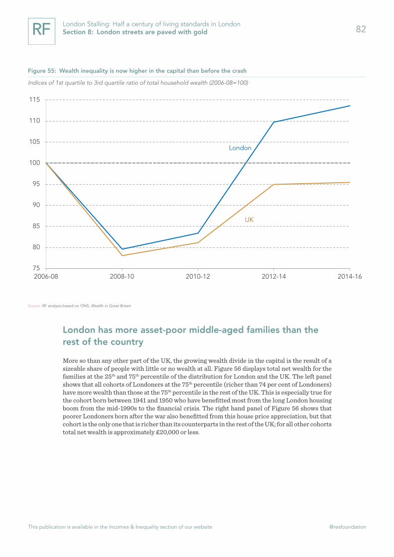
This publication is available in the Incomes & Inequality section of our website @resfoundation
82London Stalling: Half a century of living standards in London Section 8: London streets are paved with gold
London has more asset-poor middle-aged families than the rest of the country
More so than any other part of the UK, the growing wealth divide in the capital is the result of a sizeable share of people with little or no wealth at all. Figure 56 displays total net wealth for the families at the 25th and 75th percentile of the distribution for London and the UK. The left panel shows that all cohorts of Londoners at the 75th percentile (richer than 74 per cent of Londoners) have more wealth than those at the 75th percentile in the rest of the UK. This is especially true for the cohort born between 1941 and 1950 who have benefitted most from the long London housing boom from the mid-1990s to the financial crisis. The right hand panel of Figure 56 shows that poorer Londoners born after the war also benefitted from this house price appreciation, but that cohort is the only one that is richer than its counterparts in the rest of the UK; for all other cohorts total net wealth is approximately £20,000 or less.
Figure 55: Wealth inequality is now higher in the capital than before the crash
Indices of 1st quartile to 3rd quartile ratio of total household wealth (2006-08=100)
Source: RF analysis based on ONS, Wealth in Great Britain
London
UK
75
80
85
90
95
100
105
110
115
2006-08 2008-10 2010-12 2012-14 2014-16
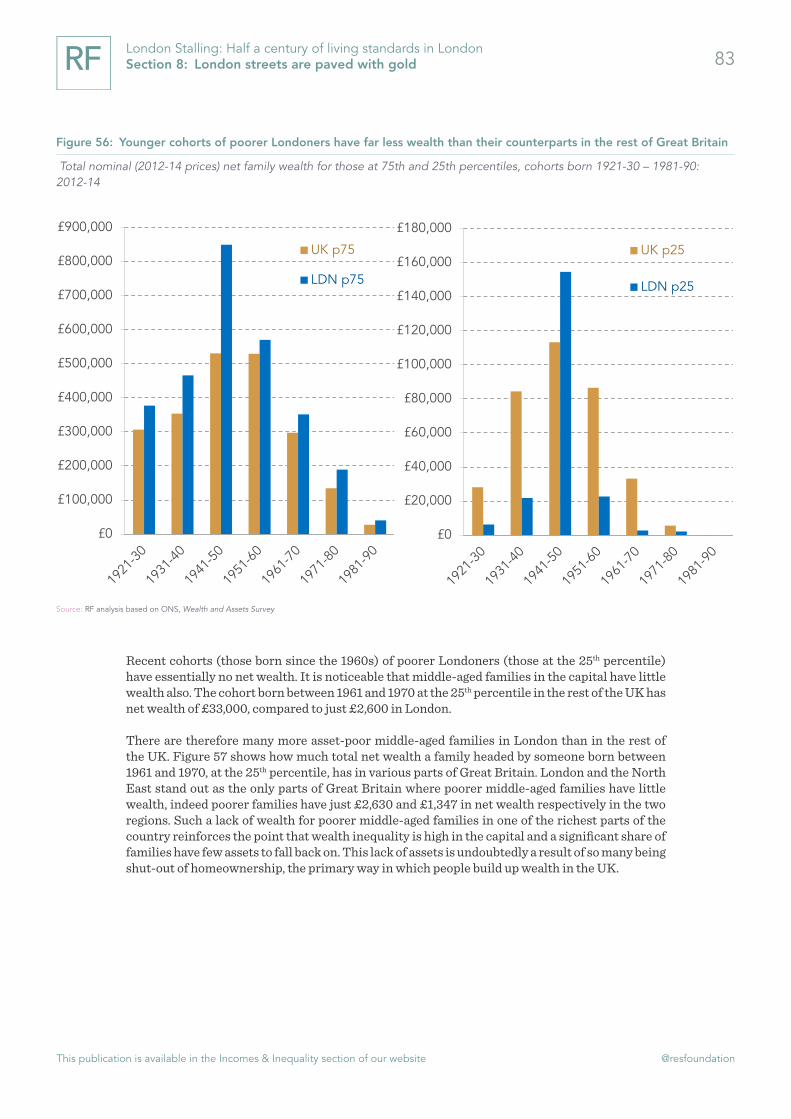
This publication is available in the Incomes & Inequality section of our website @resfoundation
83London Stalling: Half a century of living standards in London Section 8: London streets are paved with gold
Recent cohorts (those born since the 1960s) of poorer Londoners (those at the 25th percentile) have essentially no net wealth. It is noticeable that middle-aged families in the capital have little wealth also. The cohort born between 1961 and 1970 at the 25th percentile in the rest of the UK has net wealth of £33,000, compared to just £2,600 in London.
There are therefore many more asset-poor middle-aged families in London than in the rest of the UK. Figure 57 shows how much total net wealth a family headed by someone born between 1961 and 1970, at the 25th percentile, has in various parts of Great Britain. London and the North East stand out as the only parts of Great Britain where poorer middle-aged families have little wealth, indeed poorer families have just £2,630 and £1,347 in net wealth respectively in the two regions. Such a lack of wealth for poorer middle-aged families in one of the richest parts of the country reinforces the point that wealth inequality is high in the capital and a significant share of families have few assets to fall back on. This lack of assets is undoubtedly a result of so many being shut-out of homeownership, the primary way in which people build up wealth in the UK.
Figure 56: Younger cohorts of poorer Londoners have far less wealth than their counterparts in the rest of Great Britain
Total nominal (2012-14 prices) net family wealth for those at 75th and 25th percentiles, cohorts born 1921-30 – 1981-90: 2012-14
Source: RF analysis based on ONS, Wealth and Assets Survey
£0
£100,000
£200,000
£300,000
£400,000
£500,000
£600,000
£700,000
£800,000
£900,000
UK p75
LDN p75
£0
£20,000
£40,000
£60,000
£80,000
£100,000
£120,000
£140,000
£160,000
£180,000
UK p25
LDN p25

This publication is available in the Incomes & Inequality section of our website @resfoundation
84London Stalling: Half a century of living standards in London Section 8: London streets are paved with gold
The fact that it has more asset-poor middle-aged families than the rest of Great Britain is just another way in which London differs from the rest of the country. In the final section we offer some concluding thoughts on what half a century of data tells us about living standards in the capital.
Figure 57: London and the North East stand out for the lack of wealth amongst poorer middle-aged families
Total nominal (2012-14 prices) net family wealth for those at 25th percentile, cohort born 1961-70: 2012-14
Source: RF analysis based on ONS, Wealth and Assets Survey
£74,225
£61,445
£46,920
£40,076
£38,872
£35,065
£27,202
£26,438
£25,363
£2,630
£1,347
£0 £10,000 £20,000 £30,000 £40,000 £50,000 £60,000 £70,000 £80,000
South East
South West
East
Wales
North West
Yorkshire & The Humber
East Midlands
Scotland
West Midlands
London
North East
This publication is available in the Incomes & Inequality section of our website @resfoundation
85London Stalling: Half a century of living standards in London Section 9: Conclusion
Section 9
Conclusion
The popular stereotype of London is that it is the richest, most productive part of the country, sucking in people from all parts of the UK with the promise of high incomes. Furthermore the view is that differences between London and the rest of the country are increasing with the capital pulling further away. There is some truth in the first part at least. London is, after the South East, the wealthiest part of the country, it is the most productive part and household incomes are the highest.
However, a closer inspection suggests that London hasn’t been pulling away from the rest of the UK since the crisis. In fact productivity growth has lagged behind that of the rest of the country and output has been driven by an unprecedented increase in employment and by lower-paying sectors, not the knowledge-intensive services the capital is known for.
Furthermore, much of the other received wisdom about London is questionable. Household incomes are highest in London but only if housing costs are not taken into account, once they are, incomes in the capital are in line with the national average. Incomes in the capital have also not been racing away from the rest of the country, for people of working-age they have stagnated since the early 2000s.
Where the capital has — unfortunately — been racing away, is in terms of wealth inequalities. While wealth inequality has been falling relatively steadily over the past 100 years in the UK, wealth inequality has been rising in the capital. The result is that many Londoners are actually asset poor by UK standards.
London is a magnet for talent, the city tends to suck in younger workers, many of whom move to the capital after completing their studies. However, London is also an incubator of this talent. More people over 30 leave London for other parts of the UK each year than move to the capital. Such a movement would have led to a significant decline in the capital’s population had it not been for international migrants who have accounted for almost all of the growth in London’s workforce since the mid-1990s.
Far from being assured then London’s prospects are uncertain. Government policy over the next few years is set to – on balance – do more to support the household incomes of better-off Londoners than those on lower-incomes and that policies like the NLW, although welcome, will have less of an impact in the capital. This, combined with the fact that income growth is set to be relatively meagre over the next five years (averaging just 1.7 per cent per year), could create the situation where inequality rises at the same time as living standards plateau. Such a combination is likely to be particularly unpalatable.
Given the important role played by migrants in the capital’s labour force London is also particu-larly exposed to the end of free movement. Since the crisis employment growth – primarily by international migrants – has driven output growth. If migration falls then this could put significant pressure on the capital’s economy.

This publication is available in the Incomes & Inequality section of our website @resfoundation
86London Stalling: Half a century of living standards in London Section 9: Conclusion
How London faces up to these challenges will have ramifications beyond the M25. The city is not alone in struggling to deal with inequality, precarious work or a reliance on a source of labour that may soon dry up. Therefore if London can successfully navigate the years ahead and deliver for low-income households then this will help point the way for other parts of the UK. On the other hand, there is already concern across the rest of the country that too many places are copying London’s failures (particularly in the housing market and approach to development). A downturn in the capital’s fortunes will only make the ‘London-model’ less attractive.

This publication is available in the Incomes & Inequality section of our website @resfoundation
London Stalling: Half a century of living standards in London Annex 87
Annex
Datasets
The report uses a range of statistics and datasets produced by the Office for National Statistics. We make uses of the following microdata from the ONS: Quarterly Labour Force Survey, Annual Survey of Hours and Earnings, and Wealth and Assets Survey. We also make use of the Family Resources Survey and Households Below Average Income datasets produced by the DWP.
Definitions
Geography
London is identified using the government office region definition. London is broken up into inner and outer London based on the statistics definition that includes Haringey and Newham in inner London, but includes Greenwich in outer London.
Groups
In Section 3 we make use of a number of definitions to describe groups that tend to face disad-vantage in the labour market – ‘low-activity groups’ – these groups are defined as follows:
» Low-qualified: We use successive versions of the ‘hiqual’ variable in the LFS, which contains details of an individual’s highest qualification, with the variable ranked in descending order. We then split the 18-69 year old UK population into three equally-sized groups (randomly distributing those individuals with qualification levels that straddle the boundaries). We define the bottom third as ‘low-qualified’ and the top third as ‘high-qualified’. By repeating this process in each quarter, we capture ‘relative’ qualification levels and so control for the general improvement in the qualifications profile of the working age population over time.
» People with disabilities: We use the old Disability Discrimination Act (DDA) definition of disability, which was the most commonly-used prior to that established by the Equality Act 2010 (the Equality Act definition excludes some specific groups from its ‘core’ measure that are included in the DDA definition). We do this because the DDA measure provides the longest consistent definition over time (and captures a population that tends to experience more acute labour market disadvantage than, for example, the ‘work-limiting disabled only’ group also captured in the data over this time-period). Changes to question wording and questionnaire design mean that measures of disability in the LFS have discontinuities in 2010 and 2013 but as we start our analysis in 2013 this does not affect us.
» Single parents: Single parents are adults of either gender with dependent children and not living with partners. From 2006 onwards, this is defined using the ‘type of family unit’ variable - the same way as the ONS defines single-parenthood.
» Non-single parent mothers: Non-single parent mothers are women with dependent children living in couples.
» BAME groups and younger and older age groups are defined using the standard ethnicity and age variables available in the LFS.

This publication is available in the Incomes & Inequality section of our website @resfoundation
London Stalling: Half a century of living standards in London Annex 88
Population projections
In order to see how sensitive London population projections are to the size of international migration flows we start by using the population projections produced by the GLA as our baseline. These projections are based on a number of components: net domestic migration, net interna-tional migration, survival rates and birth rates. In our projections we just change the interna-tional figures provided by the GLA, and not re-running their analysis with a different interna-tional migration assumption. This is important because different components of their model interact. In particular the GLA’s model assumes that if international net migration is lower then so is domestic outflows purely because lower migration inflows leads to fewer people being ‘at risk’ of subsequently moving out of London. Given this it is likely that our estimates overestimate the impact of a decline in international net migration on the London population.
We use the GLA’s central scenario as our baseline, which assumes that net international migration will average 69,000 per year between 2017 and 2050, this is based on net international migration falling from 90,000 in 2017 to 66,000 in 2023. Under our “immigration down 20 per cent” scenario we assume that net international migration for the UK as a whole falls by 20 per cent from the level in the current ONS projections (132,000 rather than 165,000). We then apportion 40 per cent of the country’s net international migration to London (based on the historical average) which means that net international migration to the capital falls to 55,000 per year between 2017 and 2020. Under our “immigration 100k” scenario we assume that net international migration to the UK as a whole falls to 99,000 (thus meeting the government’s target) and again apportion 40 per cent of this to London. This means that net international migration to the capital falls to 44,000 between 2017 and 2050. Using these numbers (55,000 and 44,000) instead of the GLA’s 66,000 assumption results in the two alternative scenarios outlined in Figure 12.
These alternative scenarios are purely illustrative and created to show the impact that lower international migration could have on London’s population. As they rely on changing national net international migration figures one could argue that if UK international net migration falls then a larger proportion of international migrants may move to the capital (this is discussed in footnote 14). This would offset some of the declines we have projected. However, we have also just changed the international migration figures of the GLA’s assumptions and it could be argued that lower international migration would affect the other elements of the GLA’s forecast. Particularly lower international migration could reduce birth rates and raise death rates (because migrants tend to be younger than natives). On the other hand lower international migration could reduce domestic net migration out of the capital (as discussed above).

This publication is available in the Incomes & Inequality section of our website @resfoundation
London Stalling: Half a century of living standards in London 89

resolutionfoundation.org [email protected] +44 (0)203 372 2960 @resfoundation
Resolution Foundation is an independent research and policy organisation. Our goal is to improve the lives of people with low to middle incomes by delivering change in areas where they are currently disadvantaged. We do this by:
» undertaking research and economic analysis to understand the challenges facing people on a low to middle income;
» developing practical and effective policy proposals; and » engaging with policy makers and stakeholders to influence
decision-making and bring about change.
For more information on this report, contact:
Stephen ClarkeSenior Economic [email protected] 020 3372 2953