Embed Size (px)
Citation preview

Quarterly Energy Dynamics Q2 2021
Market Insights and WA Market Operations

Important notice
PURPOSE
AEMO has prepared this report to provide energy market participants and governments with information on
the market dynamics, trends and outcomes during Q2 2021 (1 April to 30 June 2021). This quarterly report
compares results for the quarter against other recent quarters, focusing on Q1 2021 and Q2 2020.
Geographically, the report covers:
• The National Electricity Market – which includes Queensland, New South Wales, the Australian Capital
Territory, Victoria, South Australia and Tasmania.
• The Wholesale Electricity Market operating in Western Australia.
• The gas markets operating in Queensland, New South Wales, Victoria and South Australia.
DISCLAIMER
This document or the information in it may be subsequently updated or amended. This document does not
constitute legal, market or business advice, and should not be relied on as a substitute for obtaining detailed
advice about:
• past, current or future market conditions, prices and outcomes; and
• the National Electricity Law, the National Electricity Rules, the Wholesale Electricity Market Rules, the
National Gas Law, the National Gas Rules, the Gas Services Information Regulations or any other
applicable laws, procedures or policies.
While AEMO has made reasonable efforts to ensure the quality of the information in this document, it cannot
guarantee its accuracy or completeness.
Accordingly, to the maximum extent permitted by law, AEMO and its officers, employees and consultants
involved in the preparation of this document:
• make no representation or warranty, express or implied, as to the currency, accuracy, reliability or
completeness of the information in this document; and
• are not liable (whether by reason of negligence or otherwise) for any statements or representations in this
document, or any omissions from it, or for any use or reliance on the information in it.
VERSION CONTROL
Version Release date Changes
1 23/07/2021

© AEMO 2021 | Quarterly Energy Dynamics Q2 2021 3
Executive summary
East coast electricity and gas highlights
Wholesale electricity and gas prices rebound from recent lows
• Q2 2021 (1 April to 30 June 2021) saw a dramatic turnaround in electricity prices following an
exceptionally low Q1. Mainland wholesale electricity prices rebounded strongly after a year in decline,
averaging1 $95/megawatt hour (MWh) compared to $37/MWh in Q1 2021.
− Queensland recorded its highest Q2 average on record at $128/MWh, while New South Wales also
increased significantly to $111/MWh, with significant price volatility in both regions. High spot prices
(>$300/MWh) contributed $61/MWh to the Queensland average price and $36/MWh to the New
South Wales average price.
− Coal-fired generator outages, combined with cooler weather, were key drivers. With a significant
incident at Callide Power Station on 25 May and several other extended outages, National Electricity
Market (NEM) black coal-fired generator availability fell to its lowest Q2 level on record.
• Gas prices increased in all east coast gas markets, averaging $8.20/gigajoule (GJ) for the quarter, up
from $6.03/GJ in the first quarter and nearly double the average of $4.37/GJ in Q2 2020. From late May,
average market prices rose sharply, ending the quarter at $12/GJ, influenced by rising international
prices and high June gas-powered generation (GPG) demand.
• Higher gas prices also impacted electricity prices with gas’ price-setting role increasing from 8% in Q1
2021 to 20% this quarter, with a large proportion of the increase occurring during the evening peak.
• ASX futures prices rallied strongly, influenced by high spot prices and the unexpected major outages at
Callide and Yallourn power stations. Calendar year (Cal) 2022 swap contract prices increased across all
states, from an average of $40/MWh at the end of Q1 2021, to finish Q2 at $53/MWh (+34%), with the
largest increase occurring in Queensland.
Major thermal generator outages drive significant price volatility
• On 25 May 2021, following an incident at Callide Power Station, multiple generators and transmission
lines in Queensland tripped, leading to under-frequency load shedding and extreme price volatility2.
The rapid reduction in Queensland coal-fired generation – more than 2,000 megawatts (MW) in five
minutes – and the transmission line outages, led to Queensland’s trading price spiking to the Market
Price Cap (MPC) for an extended period, and Queensland’s spot price averaging $1,638/MWh for the
day.
• Following the Callide incident and ongoing Callide (and other) coal-fired unit outages, the
supply-demand balance was tight in Queensland and New South Wales for much of the quarter,
contributing to significant price volatility.
1 Uses the time-weighted average which is the average of spot prices in the quarter. The Australian Energy Regulator (AER) reports the volume-weighted
average price which is weighted against demand in each 30minute trading interval.
2 For more preliminary report on operational outcomes on this day, see: AEMO 2021, Preliminary Report: Trip of multiple generators and lines in Queensland
and associated under-frequency load shedding on 25 May 2021. Available at: https://www.aemo.com.au/-
/media/files/electricity/nem/market_notices_and_events/power_system_incident_reports/2021/preliminary-report--trip-of-multiple-generators-and-lines-
in-queensland-and-associated-underfrequenc.pdf?la=en.

© AEMO 2021 | Quarterly Energy Dynamics Q2 2021 4
• Flood damage at the Yallourn mine severely affected Yallourn Power Station’s operation in mid-June,
with three units taken offline while repairs were undertaken. This contributed to Yallourn’s quarterly
average output falling to 900 MW, 146 MW lower than in Q2 2020.
• GPG was particularly high in June – almost twice as high as in May – with GPG providing backup
capacity following the Callide and Yallourn incidents. Newport ramped up output to cover for Yallourn’s
outages, while Darling Downs increased significantly as it returned from a planned outage.
Other highlights
• NEM quarterly average underlying demand3 increased by 571 MW compared to a COVID-19 impacted
Q2 2020, and 398 MW compared to Q2 2019, due to increased heating requirements in Sydney and
Brisbane resulting from colder than average conditions.
• Transmission line outages associated with upgrade of the Queensland – New South Wales
Interconnector (QNI) contributed to very high Frequency Control Ancillary Service (FCAS) costs
($141 million), increased occurrence of negative spot prices in Queensland (5.6% of the time), and
record high application of negative residue management (NRM) on the interconnector.
• High gas demand in May and June resulted in the rapid depletion of Iona Underground Gas Storage
(UGS) facility. Storage levels fell from a record high of 24.5 petajoules (PJ) on 10 May to finish the
quarter at 14.3 PJ, 3.6 PJ lower than at the end of Q2 2020 and the lowest level end of Q2 since storages
began being reported. The Iona UGS facility also took an unplanned maintenance outage on 24 June.
• Increased gas demand and prices also contributed to increased utilisation of Longford Gas Plant, with
output 8.8 PJ higher than in Q2 2020. However, Longford daily production finished the quarter at lower
levels due to a partial outage from 28 June, which reduced its production from 980 TJ/d to 771 TJ/d.
Western Australia electricity and gas highlights
Cold weather contributes to increased operational demand
• Perth experienced its coldest June in 31 years, with heating requirement increasing by 71% compared to
Q2 2020, contributing to an operational demand increase of 102 MW. A new Q2 operational demand
record of 3,528 MW occurred on 22 June, the coldest day of the quarter.
• Higher operational demand contributed to the quarterly average Balancing Price increasing to
$58/MWh, its highest since Q3 2017, and increased frequency of high price events (>$150/MWh).
Major cyclone event impacts wind generation
• On 11 April 2021, Cyclone Seroja made landfall on the Western Australian coast near Kalbarri, resulting in
the outage of several transmission lines connecting the North Country region to the rest of the South
West Interconnected System (SWIS). The region was islanded until 21 April and all transmission lines
were restored by 25 May. A total of 767 MW of installed wind capacity was affected by the network
outages.
Increasing withdrawals from gas facilities offset decreased production
• Total Western Australian gas production was down 15 PJ (13.7%) compared to the historic peak in Q2
2020, predominantly due to decreased production from Karratha Gas Plant. The reduced supply was
met by a net withdrawal of 5.4 PJ from gas storage facilities, in contrast to net injection of 7.4 PJ in
Q2 2020.
3 Underlying demand is operational demand that has been adjusted to remove the impact of distributed photovoltaics (PV) output.

© AEMO 2021 | Quarterly Energy Dynamics Q2 2021 5
Contents Executive summary 3
East coast electricity and gas highlights 3
Western Australia electricity and gas highlights 4
1. NEM market dynamics 6
1.1 Electricity demand 6
1.2 Wholesale electricity prices 9
1.3 Electricity generation 17
1.4 Inter-regional transfers 26
1.5 Power system management 29
2. Gas market dynamics 35
2.1 Gas demand 35
2.2 Wholesale gas prices 36
2.3 Gas supply 38
2.4 Pipeline flows 41
2.5 Gas Supply Hub 42
2.6 Pipeline capacity trading and day ahead auction 42
2.7 Gas – Western Australia 43
3. WEM market dynamics 45
3.1 Electricity demand 45
3.2 WEM prices 46
3.3 Electricity generation 49
3.4 Power System Management 52
Abbreviations 54

© AEMO 2021 | Quarterly Energy Dynamics Q2 2021 6
1. NEM market dynamics 1.1 Electricity demand
1.1.1 Weather
During the quarter, the weather was colder than average across the eastern seaboard. Notably, Brisbane and
Sydney experienced much cooler than average conditions, with overnight minimum temperatures 0.6°C and
0.8°C below the 10-year average respectively (Figure 1), and below-average maximum temperatures.
Colder temperatures in Brisbane and Sydney led to higher heating degrees days (HDDs4), which reached their
highest levels since 2011 and 2012 respectively (Figure 2), resulting in increased electricity demand
(Section 1.1.2).
Figure 1 Cold Q2 weather in the Sydney and Brisbane
Average minimum temperature variance by capital cities
Source: Bureau of Meteorology
Figure 2 Increased heating requirements in Sydney and Brisbane
Heating degree days (Q2s) – 2011 to 2021
4 A “heating degree day” (HDD) is a measurement used as an indicator of outside temperature levels below what is considered a comfortable temperature.
Here, the HDD value is the sum of daily HDD values over the quarter which are calculated as max (0, 18 – temperature).
-1.0
-0.5
0.0
0.5
1.0
BRI SYD MEL ADL HOB
°C
Q2 21 vs 10yr average Q2 21 vs Q2 20
0
50
100
150
200
250
300
350
400
2011 2012 2013 2014 2015 2016 2017 2018 2019 2020 2021
Heatin
g d
eg
ree d
ays
SYD BRI

© AEMO 2021 | Quarterly Energy Dynamics Q2 2021 7
1.1.2 Demand outcomes
NEM quarterly average operational demand increased by 350 megawatts (MW) compared to Q2 2020,
reversing the downward trend since Q2 2018. Higher operational demand was driven by a 571 MW increase in
underlying demand (+2.5%), which more than offset the impact of increased output from distributed
photovoltaics (PV)5 (+221 MW). NEM-average underlying demand reached 23,109 MW, not only higher than
the COVID-19 impacted Q2 2020, but its highest Q2 level since 20126 (Figure 3), with increases in all NEM
regions except for South Australia (Figure 4).
Figure 3 Highest NEM Q2 underlying demand
since 2012
Average NEM underlying demand (Q2s) – 2012 to 2021
Figure 4 New South Wales and Queensland lead
NEM 2.5% underlying demand increase
Change in average operational demand – Q2 2021 vs Q2 2020
The largest underlying demand increases occurred in New South Wales (+287 MW) and Queensland
(+168 MW). Drivers included:
• Cold Q2 conditions – colder-than-average temperatures in Brisbane and Sydney resulted in elevated
heating requirements contributing to increased underlying demand across the day (Figure 5).
• Lack of prolonged COVID-19 restrictions also contributed to increased underlying demand,
predominantly during the morning peak.
− With the exception of Victoria, there were almost no COVID-19 restrictions this quarter, and there was
a notable increase in underlying demand between 0600 hrs and 0900 hrs (+1,005 MW) as working
patterns returned to normal7.
• Increased liquefied natural gas (LNG) production (Section 2.3.1) contributed to increased underlying
demand in Queensland, mainly from increased electricity consumption in the gas production process.
While quarterly operational demand was up on Q2 2020 levels, the uptake of distributed PV continued to
contribute to declining daytime demand – on average, NEM average operational demand was down 298 MW
between 1000 hrs and 1430 hrs. The largest changes in distributed PV output occurred in New South Wales
(+105 MW) and Queensland (+63 MW).
5 Increased distributed PV generation results in reduced operational demand because distributed PV is behind the meter and is based on AEMO estimates
using ASEFS2.
6 Calculated using pre-2016 estimates for distributed PV output
7 See AEMO Quarterly Energy Dynamics Q2 2020 for more information: https://aemo.com.au/-/media/files/major-publications/qed/2020/qed-q2-
2020.pdf?la=en
21,500
22,000
22,500
23,000
23,500
2012
2013
2014
2015
2016
2017
2018
2019
2020
2021
Avera
ge M
W
-200
-100
0
100
200
300
400
NSW QLD SA TAS VIC
Avera
ge c
han
ge (
MW
)
Underlying Demand Distributed PV Impact
Operational Demand

© AEMO 2021 | Quarterly Energy Dynamics Q2 2021 8
Figure 5 Increased underlying demand across the day due to increased heating load
Change in combined New South Wales and Queensland average underlying demand by time of day – Q2 2021 compared Q2 2019
Maximum and minimum demand
During Q2 2021, new Q2 operational demand minimums were set in Victoria and South Australia, however,
these were only slightly lower than previous records.
• Victoria’s new Q2 minimum demand of 3,379 MW occurred at 1400 hrs on Easter Monday (5 April 2021),
and was 22 MW lower than the previous Q2 minimum set in Q2 2017. A combination of sunny, mild
conditions and low demand associated with the public holiday contributed to the record.
• South Australia’s new Q2 minimum demand of 523 MW occurred at 1330 hrs on its ANZAC day holiday,
Monday 26 April 20218, and was 10 MW lower than the previous record set in Q2 2020. Drivers were
similar to the Victorian record, with distributed PV providing 833 MW of output (61% of underlying
demand).
Extremely cold conditions in New South Wales led to it reaching its highest Q2 maximum operational
demand since 2010 (Figure 6). On 10 June 2021, New South Wales’ operational demand reached 13,007 MW at
1800 hrs as Sydney recorded its coldest day in 37 years9, contributing to significant spot price volatility
(Section 1.2.2).
Figure 6 Highest Q2 maximum demand in New South Wales since 2010
Q2 maximum operational demands – New South Wales
8In South Australia, Queensland and Northern Territory, ANZAC Day public holiday was observed on Monday 26 April 2021.
9 Weather Zone 2021, Sydney’s coldest day in decades: https://www.weatherzone.com.au/news/sydneys-coldest-day-in-decades-/534322
0
100
200
300
400
500
00:30 02:30 04:30 06:30 08:30 10:30 12:30 14:30 16:30 18:30 20:30 22:30
Avera
ge c
han
ge (
MW
)
Q2 2021 vs Q2 2019
11,000
11,500
12,000
12,500
13,000
13,500
2010 2011 2012 2013 2014 2015 2016 2017 2018 2019 2020 2021
Maxi
mu
m d
em
an
d (
MW
)
© AEMO 2021 | Quarterly Energy Dynamics Q2 2021 9
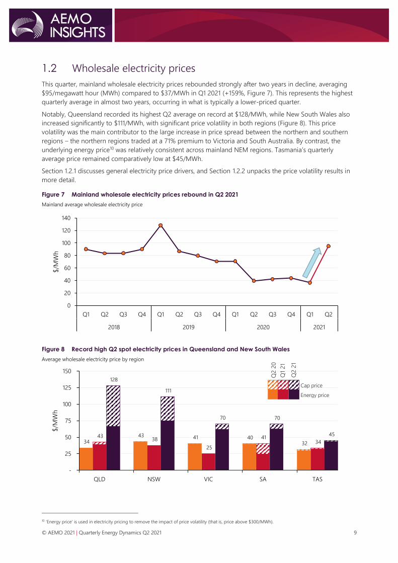
1.2 Wholesale electricity prices
This quarter, mainland wholesale electricity prices rebounded strongly after two years in decline, averaging
$95/megawatt hour (MWh) compared to $37/MWh in Q1 2021 (+159%, Figure 7). This represents the highest
quarterly average in almost two years, occurring in what is typically a lower-priced quarter.
Notably, Queensland recorded its highest Q2 average on record at $128/MWh, while New South Wales also
increased significantly to $111/MWh, with significant price volatility in both regions (Figure 8). This price
volatility was the main contributor to the large increase in price spread between the northern and southern
regions – the northern regions traded at a 71% premium to Victoria and South Australia. By contrast, the
underlying energy price10 was relatively consistent across mainland NEM regions. Tasmania’s quarterly
average price remained comparatively low at $45/MWh.
Section 1.2.1 discusses general electricity price drivers, and Section 1.2.2 unpacks the price volatility results in
more detail.
Figure 7 Mainland wholesale electricity prices rebound in Q2 2021
Mainland average wholesale electricity price
Figure 8 Record high Q2 spot electricity prices in Queensland and New South Wales
Average wholesale electricity price by region
10 ‘Energy price’ is used in electricity pricing to remove the impact of price volatility (that is, price above $300/MWh).
0
20
40
60
80
100
120
140
Q1 Q2 Q3 Q4 Q1 Q2 Q3 Q4 Q1 Q2 Q3 Q4 Q1 Q2
2018 2019 2020 2021
$/M
Wh
34 43
128
43 38
111
41
25
70
40 41
70
32 34
45
-
25
50
75
100
125
150
QLD NSW VIC SA TAS
$/M
Wh
Cap price
Energy price
Q2 2
0
Q2 2
1
Q1
21

© AEMO 2021 | Quarterly Energy Dynamics Q2 2021 10
1.2.1 Wholesale electricity price drivers
Table 1 outlines general drivers of increased electricity prices this quarter.
Table 1 Wholesale electricity price increase: Q2 2021 drivers
Price volatility The largest increase in NEM prices this quarter occurred in the peak evening period, largely due to
significant price volatility in Queensland and New South Wales (Section 1.2.2).
Thermal generator
outages Compared to Q2 2020, thermal generator availability was down across all generation types and all
NEM regions (Figure 9). These outages, coupled with rising fuel costs (as indicated by rising
domestic gas prices and international commodity prices [Section 2.2.1]), led to a substantial shift in
the NEM-wide thermal generation supply curve. Compared to Q2 2020, there was a 3,113 MW
reduction in offers below $100/MWh (Figure 10)11. By fuel type:
• Black coal-fired generator availability reduced by 1,479 MW due to increased planned and
unplanned outages (Section 1.3.1).
• Outages at Braemar 1, Darling Downs and Swanbank E reduced gas-powered generation (GPG)
availability by 773 MW.
• Hydro availability reduced by 668 MW, with the largest availability reductions occurring at
Shoalhaven (due to an extended outage), Murray, and Tumut 3.
• Flood damage at the Yallourn coal mine resulted in brown coal-fired generator availability
reducing by 113 MW.
Increased
demand Cold conditions in Sydney and Brisbane, as well as the lack of widespread COVID-19 related
restrictions of Q2 2020, contributed to increased operational demand (Section 1.1.2).
Figure 9 Significant reduction in thermal unit availability in Queensland and New South Wales
Change in availability by NEM region – Q2 2021 versus Q2 2020
Figure 10 Outages and rising fuel costs result in higher cost supply
NEM thermal generation bid supply curve – Q2 2021 and Q2 2020
11 The AER's Quarter 2 2021 Wholesale Market Quarterly Report will analyse weekly black coal and gas offers.
-1,500
-1,000
-500
0
500
NSW QLD VIC SA TAS
Availa
bili
ty c
han
ge
(MW
)
Black coal Gas Hydro Brown coal
0
50
100
150
200
250
300
13,000 14,000 15,000 16,000 17,000 18,000 19,000 20,000 21,000 22,000 23,000 24,000 25,000
Pri
ce (
$/M
Wh
)
Offers (MW)
Q2 2021
Q2 2020

© AEMO 2021 | Quarterly Energy Dynamics Q2 2021 11
1.2.2 Wholesale electricity price volatility
Q2 2021 marked a return to extreme spot price volatility after an absence of more than a year. NEM-wide cap
returns12 increased to the third highest level since market start, with Queensland’s cap returns of $61/MWh,
and New South Wales’ cap returns of $36/MWh the second highest quarters on record for both regions
(Figure 11). Of note, there was a greater spread in Queensland’s trading price compared to Q2 2020, with a
higher proportion of negatively priced intervals during the daytime, and a higher proportion of high-priced
intervals during the peak evening period (Figure 12).
Victoria and South Australia recorded cap returns of around $8/MWh, much lower than the northern regions,
but higher than usual for a Q2 in these regions.
Figure 11 Extreme spot price volatility in Queensland and New South Wales
Quarterly average cap returns by region - stacked
Figure 12 Large occurrence of high and low price volatility in Queensland
Queensland frequency of prices <=$0/MWh and >$300/MWh by time of day – Q2 2021
Callide incident – 25 May 2021
On 25 May 2021, the trip of multiple generators and transmission lines in Queensland led to under-frequency
load shedding and extreme price volatility13. On this day, Callide C4 ceased exporting active power at
1334 hrs, with CS Energy reporting a turbine hall fire. Subsequently, at 1344 hrs, Callide C3 tripped, and then
at 1406 hrs trip of the following occurred14: Callide B2, three Stanwell Power Station units to house load, three
12 A measure of volatility in electricity prices is the presence of high price events – prices above $300/MWh. This is often represented as ‘quarterly cap
returns’, which is the sum of the NEM pool price minus the $300 cap price for every half hour in the contract quarter where the pool price exceeds
$300/MWh, divided by the number of half-hours in the quarter.
13 For more details, on operational outcomes on this day, see: AEMO 2021, Preliminary Report: Trip of multiple generators and lines in Queensland and
associated under-frequency load shedding on 25 May 2021, at https://www.aemo.com.au/-/media/files/electricity/nem/market_notices_and_events/
power_system_incident_reports/2021/preliminary-report--trip-of-multiple-generators-and-lines-in-queensland-and-associated-underfrequenc.pdf?la=en
14 The exact sequence of events is subject to investigation.
0
50
100
150
Q1 Q3 Q1 Q3 Q1 Q3 Q1 Q3 Q1 Q3 Q1 Q3 Q1 Q3 Q1 Q3 Q1 Q3 Q1 Q3 Q1 Q3 Q1
2010 2011 2012 2013 2014 2015 2016 2017 2018 2019 2020 2021
Cap
retu
rns
($/M
Wh
)
NSW QLD SA TAS VIC
-40%
-30%
-20%
-10%
0%
10%
20%
30%
00:30 04:30 08:30 12:30 16:30 20:30
Pri
ce o
ccu
rren
ce
Negative price Above $300/MWh

© AEMO 2021 | Quarterly Energy Dynamics Q2 2021 12
Gladstone Power Station units, Yarwun Power Station, multiple transmission lines, and the Queensland – New
South Wales Interconnector (QNI).
The rapid reduction in Queensland coal-fired generation – more than 2,000 MW in five minutes – and the
transmission line outages, led to Queensland’s trading price spiking to the Market Price Cap (MPC,
$15,000/MWh) for 90 minutes (Figure 13). This resulted in a daily average price of $1,638/MWh, Queensland’s
third-highest day on record15.
Figure 13 Extreme Queensland price volatility following the Callide incident – 25 May 2021
Queensland coal-fired generation and trading price – 25 May 2021
In response to the coal-fired generator outages and price volatility, Queensland GPG, hydro, and diesel
generators ramped up to high output, increasing by around 2,200 MW within three hours of the event. In
addition, Stanwell Power Station – which had tripped to house load – ramped up output between 1450 hrs
and 1830 hrs. During this period (1415 hrs to 1725 hrs), around 400 MW of Queensland solar and wind output
was automatically constrained in response to the reduction in system strength.
The large reduction of generation availability also led to actual Lack of Reserve 1 (LOR1) and LOR2 conditions,
and forecast LOR3 conditions in Queensland, as well as activation of 15 MW of Reliability and Emergency
Reserve Trader (RERT) capacity in Queensland (Section 1.5). Actual LOR1 and forecast LOR2 conditions also
occurred in New South Wales.
Further price volatility and steep bid stacks
Following the Callide incident and ongoing Callide (and other) coal-fired unit outages, the supply-demand
balance was tight in Queensland and New South Wales for much of the quarter, contributing to significant
price volatility on several days (Table 2). While much of this volatility occurred during and after the Callide
incident, several other factors meant there was already increased risk of price volatility in Queensland and
New South Wales. These included:
• Coal-fired generator outages removed an average of 2,110 MW of low-priced supply (<$60/MWh)
compared to Q2 2020 (Section 1.3.1).
• Steep bid stack during evening peak – this is covered in more detail later in this section.
• Increased peak evening demand – colder than average weather contributed to a combined 374 MW
increase in New South Wales and Queensland peak evening16 demand compared to Q2 2020
(Section 1.1.2). On 10 June, very cold winter conditions led to New South Wales’ highest Q2 operational
demand since 2010 and significant price volatility resulted.
• Transmission line outages – transmission line outages – including those required for the upgrade of the
QNI – limited transfers into Queensland, contributing to price volatility.
15 The AER publishes $5000/MWh reports which analyse the cause of these events in more details: https://www.aer.gov.au/taxonomy/term/310
16 1600 hrs to 1900 hrs
0
5,000
10,000
15,000
0
1,000
2,000
3,000
4,000
5,000
6,000
00:30 02:30 04:30 06:30 08:30 10:30 12:30 14:30 16:30 18:30 20:30 22:30
Pri
ce (
$/M
Wh
)
Ou
tpu
t (M
W)
Callide Gladstone Stanwell Other black coal QLD1 PRICE

© AEMO 2021 | Quarterly Energy Dynamics Q2 2021 13
Table 2 Volatile days in the NEM – Q2 2021
Day Affected region(s) Daily average price ($/MWh) Trading intervals > $2,000/MWh
18 May NSW, VIC, & SA 442 (NSW); 440 (VIC); 411 (SA) 3 in all regions
25 May QLD & NSW 1,638 (QLD); 369 (NSW). 9 in QLD; 3 in NSW.
3 June QLD 793 4
10 June NSW and QLD 774 (NSW); 762 (QLD) 11 in both regions
15 June NSW and QLD 564 (NSW); 648 (QLD) 8 in both regions
Price volatility on these days was characterised by sharp and sudden price spikes, sometimes followed by zero
or negative price spikes. Figure 14 shows an example of this in New South Wales on 10 June, when dispatch
regularly bounced between below $100/MWh and above $10,000/MWh.
Figure 14 New South Wales dispatch price volatility – 10 June 2021
New South Wales dispatch price
During Q2 2021, NEM dispatch prices soared from below $100/MWh to above $10,000 within one dispatch
interval 66 times, more than the last four years combined. This type of price volatility also contributed to high
occurrence of negative inter-regional settlement residue (IRSR), and frequent application of Negative Residue
Management (NRM, Section 1.4.1). Drivers included:
• Steep bid stack – during peak evening periods in May and June, there were multiple occasions when the
bid stack became highly polarised, with all generation bids either below $0/MWh or above $12,000/MWh.
Figure 15 shows this occurring in New South Wales during the evening peak on 18 May, and contrasts this
with a typical bid stack.
• Generator re-bidding – following Queensland dispatch prices spiking above $10,000/MWh, some
generators – including Braemar 2, Oakey, and Millmerran – frequently re-bid capacity from high-priced
bands to low-priced bands to capture the higher prices during the trading interval.
Figure 15 Steep bid supply curve in New South Wales – 1830 hrs 18 May 2021
New South Wales bid supply curves
0
5,000
10,000
15,000
16:00 18:00 20:00 22:00
Dis
patc
h p
rice
($/M
Wh
)
-1,000
4,000
9,000
14,000
0 4,000 8,000 12,000
Pri
ce (
$/M
Wh
)
Offers (MW)
Steep curve (1830 hrs, 18 May 2021)
Typical curve
Bid prices jump from
negative $25/MWh
to $12,500/MWh

© AEMO 2021 | Quarterly Energy Dynamics Q2 2021 14
1.2.3 Negative wholesale electricity prices
During Q2 2021, negative and zero spot prices17 occurred in 5.5% of all trading intervals, up from 4% in
Q2 2020. Contrasting recent quarters, the occurrence of negative prices was no longer confined to South
Australia and Victoria, with increased prevalence in Queensland and Tasmania (Figure 16).
In Queensland, spot prices were negative 5.6% of the time, its second highest quarter on record, while
Tasmania reached a record quarterly high of 6.6%. In South Australia and Victoria, spot prices were negative
more often than Q2 2020, but were down compared to the record levels of recent quarters.
While negative spot price occurrences were relatively high across the four states, the negative price impact
was very limited. Negative prices only reduced Queensland and Tasmania prices by $1.3/MWh and $0.5/MWh
respectively, due to very few intervals where prices were below minus $100/MWh.
Figure 16 High prevalence of negative spot prices in four NEM regions
Quarterly negative price percentage occurrence
In Queensland, drivers of increased occurrence of negative prices included:
• Interconnector constraints – outages on multiple transmission lines due to upgrade works on the QNI
contributed to reduced interconnector limits (Section 1.4). The quarterly average import limit on QNI was
728 MW, 123 MW below the two-year average.
− With low daytime operational demand and daytime grid-solar output, lower limits on the
interconnector contributed to periods of oversupply in Queensland; spot prices were negative 84% of
the time when the import limit was less than 500 MW.
• Reduced daytime demand – increased distributed PV output reduced daytime operational demand18 by
100 MW compared to Q2 2020, with 84% of negative price intervals in Queensland occurring during this
period.
• Increased local hydro output resulted in an additional 71 MW of offers below $0/MWh during daytime
hours.
Negative spot prices in Tasmania mostly occurred during the peak evening hours, with 56% of negative price
intervals occurred between 1730 hrs and 2330 hrs. During these hours, around 100 MW more Tasmanian
generation was offered below $0/MWh than in Q2 2020, influenced by high peak Victorian prices (which can
incentivise increased Tasmanian transfers into Victoria via Basslink).
17 Hereafter referred to as negative spot prices.
18 0930 hrs to 1430 hrs.
0%
4%
8%
12%
16%
20%
Q2 2
0
Q3 2
0
Q4
20
Q1
21
Q2 2
1
Q2 2
0
Q3 2
0
Q4
20
Q1
21
Q2 2
1
Q2 2
0
Q3 2
0
Q4
20
Q1
21
Q2 2
1
Q2 2
0
Q3 2
0
Q4
20
Q1
21
Q2 2
1
South Australia Victoria Queensland Tasmania
Neg
ative
pri
ce o
ccu
rren
ce

© AEMO 2021 | Quarterly Energy Dynamics Q2 2021 15
1.2.4 Price-setting dynamics
Price-setting outcomes reversed recent trends, with black coal-fired generation’s price-setting role somewhat
diminished, as gas and hydro played greater roles (Figure 17). By fuel type:
• Black coal decreased its NEM average price-setting role to 34% of the time, significantly down from 46%
in Q1 2021. Drivers included decreased black coal-fired generator availability, and spot prices more often
occurring outside levels in which coal-fired generation was the marginal unit (typically $0-$40/MWh).
• Gas and hydro’s price-setting roles increased from a combined average of 39% in Q1 2021 to 54% this
quarter, their highest quarterly levels since Q3 2019. A large proportion of the increase occurred during
the evening peak, setting the price 73% of the time between 1730 hrs and 2130 hrs.
− Gas’ price-setting role rebounded from the lows of Q1 2021 (8%) to 20% this quarter, largely due to
the shift in the bid stack (Section 1.2.1), and GPGs bidding in higher price bands. Notably in
Queensland, the average marginal price set by GPGs increased significantly to $358/MWh (Figure 18).
− Hydro set the price 34% of the time this quarter, up from 31% in Q1 2021, as output increased in New
South Wales and Queensland. Similar to GPG, the average Queensland price set by hydro generators
this quarter ($151/MWh) more than tripled prices set in Q1 2021.
Figure 17 Diminished price-setting role for black coal
Price-setting by fuel type
Note: price setting can occur inter-regionally: for example, Victoria’s price can be set by generators in other NEM regions.
Figure 18 Gas and hydro set spot prices at high levels
Average marginal price set for Queensland for the key price setting fuel types
0%
20%
40%
60%
80%
100%
Q2 2
0
Q3 2
0
Q4
20
Q1
21
Q2 2
1
Q2 2
0
Q3 2
0
Q4
20
Q1
21
Q2 2
1
Q2 2
0
Q3 2
0
Q4
20
Q1
21
Q2 2
1
Q2 2
0
Q3 2
0
Q4
20
Q1
21
Q2 2
1
Q2 2
0
Q3 2
0
Q4
20
Q1
21
Q2 2
1QLD NSW VIC SA TAS
Perc
en
tag
e o
f tim
e (
%)
Black Coal Brown Coal Gas Hydro Other
34 38 49 41 70
358
44 49
151
0
50
100
150
200
250
300
350
400
Q2 2020 Q1 2021 Q2 2021 Q2 2020 Q1 2021 Q2 2021 Q2 2020 Q1 2021 Q2 2021
Black coal Gas Hydro
$/M
Wh

© AEMO 2021 | Quarterly Energy Dynamics Q2 2021 16
1.2.5 Electricity futures markets
This quarter, ASX futures prices rallied strongly influenced by high spot prices and spot price volatility, and
unexpected major outages – including the Callide incident and flood damage of Yallourn’s mine
(Section 1.3.1).
Calendar year (Cal) 2022 swap contract prices increased across all states, from an average of $40/MWh at the
end of Q1 2021 to finish Q2 at $53/MWh (+34%). The largest increase occurred in Queensland, following the
Callide incident, finishing the quarter at $54/MWh (+$15/MWh). Cal22 prices also increased in the southern
states, with South Australia increasing by $15/MWh, while Victoria became the lowest-priced state on a
futures basis at $47/MWh.
Ongoing uncertainty about the short-term availability of units at Callide and Yallourn power stations led to
sharp price increases in near-term futures prices. Queensland’s Q3 2021 swap price rose by $35/MWh during
the quarter (+98%), while Victoria’s Q3 2021 swaps increased by $29/MWh (+79%).
Figure 19 ASX CAL22 swap price rallies 34 percent in Q2 2021
ASX Energy – Cal22 swap price by region – seven-day averages
ASX cap prices also rose sharply, influenced by the high levels of spot price volatility this quarter. Queensland
and New South Wales’ Q3 2021 cap prices increased by around $9/MWh to finish the quarter at $12/MWh,
while Queensland’s Q1 2022 cap price increased to $24/MWh (+$11/MWh) narrowing the gap to New South
Wales at $26/MWh.
With the return of NEM price volatility and the listing of 5-minute cap products in late March 2021, there was
a significant increase in ASX cap volumes, particular in May and June (Figure 20). June alone had higher
volumes than all of Q2 2020, with the largest increases occurring in Queensland and New South Wales.
Figure 20 ASX cap volumes increase significantly in Q2
ASX Energy – monthly cap volumes
$30
$35
$40
$45
$50
$55
$60
$/M
Wh
NSW VIC QLD SA
0
2,000
4,000
6,000
8,000
Cap
vo
lum
e (
MW
)
NSW QLD VIC SA

© AEMO 2021 | Quarterly Energy Dynamics Q2 2021 17
1.3 Electricity generation
Figure 21 and Table 3 show the change in NEM
generation mix compared to Q2 2020, while Figure 22
shows the change by time of day. Key outcomes
compared to Q2 2020 included:
• Despite a significant level of outages, black coal-fired
output was comparable to Q2 2020. This was due to
available generators running at high capacity factors,
including units at Stanwell and Eraring.
• Brown coal-fired generation decreased by 182 MW
as Yallourn declined to its lowest Q2 average since
NEM start due to mine flood damage in June.
• GPG was similar to Q2 2020, with increased output
during the high-priced peak evening period almost
offsetting reductions during other times.
• Grid-scale variable renewable energy (VRE – wind
and solar) increased by 457 MW on average
compared to Q2 2020 due to new capacity, while hydro generation ramped up by 130 MW during the
quarter despite dry conditions in some NEM regions.
Table 3 NEM supply mix by fuel type
Quarter Black coal Brown coal Gas Hydro Wind Grid solar
Q2 2020 51.6% 18.6% 8.2% 9.0% 9.9% 2.7%
Q2 2021 50.7% 17.5% 7.9% 9.4% 10.9% 3.6%
Change -0.9% -1.1% -0.3% 0.4% 1.0% 0.9%
Figure 22 Greater role for GPG and hydro generation during evening peak
Change in supply – Q2 2021 versus Q2 2020 by time of day
-1,500
-1,000
-500
0
500
1,000
1,500
2,000
00:00 02:00 04:00 06:00 08:00 10:00 12:00 14:00 16:00 18:00 20:00 22:00 00:00
Ave
rag
e c
han
ge (
MW
)
Brown Coal Black Coal Wind Gas Hydro Grid Solar Distributed PV
Figure 21 Renewable generation increases as
thermal generation declines
Change in supply – Q2 2021 versus Q2 2020
-200
-100
0
100
200
300
Win
d
Dis
trib
ute
d S
ola
r
Gri
d S
ola
r
Hyd
ro
Bla
ck c
oal
Gas
Bro
wn C
oal
Avera
ge c
han
ge (
MW
)

© AEMO 2021 | Quarterly Energy Dynamics Q2 2021 18
1.3.1 Coal-fired generation
Black coal-fired fleet
During Q2 2021, average black coal-fired generation declined to 11,164 MW, only slightly lower than Q2 2020
(-26 MW). This was despite a very high number of outages, which reduced black coal-fired unit availability by
1,479 MW, its lowest Q2 since NEM start19 (mostly planned in New South Wales and unplanned in
Queensland, Figure 23).
Figure 23 High levels of planned outages in New South Wales and unplanned outages in Queensland
Average black coal-fired generation outage by classification (Q2s)
Reduced black coal-fired generator availability was almost offset by those black coal-fired generators which
were online bidding in at lower prices to run at elevated levels, particularly after the major incident at Callide
Power Station on 25 May. Queensland black coal-fired generator utilisation increased across the fleet to 84%,
up from 74% in Q2 2020, while New South Wales generator utilisation increased to 88%, up from 80% in Q2
2020 (Figure 24).
Figure 24 Online black coal-fired units run hard during Q2 2021
Black coal utilisation rate20 by region – April 2020 to June 2021
While average output from the New South Wales fleet during April and May was lower than Q2 2020 levels
due to high levels of outages, there was a notable increase in output following the Callide incident (Figure
25). Higher output was due to a combination of increased operational demand, higher utilisation across the
fleet, and improved availability as units returned to service.
19 Black coal availability excludes coal-fired generators that have retired
20 Ratio of generator’s average generation divided by average availability
-
500
1,000
1,500
2,000
2,500
3,000
Q217 Q218 Q219 Q220 Q221 Q217 Q218 Q219 Q220 Q221
NSW Black Coal QLD Black Coal
Avera
ge M
W
Planned
Unplanned
70%
75%
80%
85%
90%
95%
Utilis
atio
n r
ate
(%
)
NSW Black coal QLD Black coal

© AEMO 2021 | Quarterly Energy Dynamics Q2 2021 19
Figure 25 New South Wales black coal-fired fleet ran hard after the Callide incident
Average coal-fired generation output by generator – Q2 2021 (Pre and post Callide event21) vs Q2 2020
Key changes by power station compared to Q2 2020 were:
• Callide Power Station output reduced by 409 MW due to the incident on 25 May 202122, which resulted in
the loss of three out of four units (one unit was already on outage). By the end of the quarter, two Callide
units returned to service (Callide B Unit 1 and 2), with Unit 3 scheduled to return in July and Unit 4 by
December 202223.
• Tarong North output increased by 341 MW as there was no repeat of the extended outage in Q2 2020.
• Stanwell Power Station output increased by 158 MW, despite increased outages, as 128 MW of offers
were shifted from higher price bands to below $40/MWh. This, coupled with higher spot prices, resulted
in Stanwell’s utilisation rate increasing from 65% in Q2 2020 to 93% this quarter.
• Fewer outages, and increased utilisation at Eraring Power Station, increased average output by 456 MW.
Eraring’s utilisation rate increased to 82% this quarter, up from 67% in Q2 2020.
• Output at Bayswater Power Station reduced by 484 MW on average, driven by a large increase in time on
outage. Unit 2 was out of service for the entire quarter (since early March), undertaking a major
maintenance and upgrade program24 to increase its nameplate capacity from 660 MW to 685 MW.
• Vales Point output reduced by 110 MW on average, due to a major planned outage of Unit 6.
Brown coal-fired fleet
Compared to Q2 2020, average brown coal-fired generation decreased by 182 MW, driven by reductions
from Yallourn (-146 MW) and Loy Yang B (-64 MW), which more than offset the increase from Loy Yang A
(+28 MW).
Yallourn’s quarterly average output declined to 900 MW, its lowest Q2 since NEM start (Figure 26), as heavy
rainfall and subsequent mine flood damage severely affected the power station’s operation in mid-June.
While repair works were undertaken at the Yallourn mine, three units were taken offline, with only one unit
remaining online at minimum generation levels (occasionally increasing to two units to meet evening energy
peak). By the end of the quarter, three out of four units returned to service as mining activity resumed, with
the fourth unit returning on 2 July (Figure 27) 25.
21 Post Callide output refers to average output from 1430hrs on 25 May 2021 to end of quarter.
22 More details on this incident, including the market impact, can be found in Section 1.3.2.
23 Unit 4 was originally expected to return by June 2022.
24 AGL 2021, Largest maintenance works underway at AGL Bayswater: https://www.agl.com.au/about-agl/media-centre/asx-and-media-
releases/2021/march/largest-maintenance-works-underway-at-agl-bayswater
25 EnergyAustralia 2021, EnergyAustralia statement on the Yallourn mine – 29 June 2021: https://www.energyaustralia.com.au/about-
us/media/news/energyaustralia-statement-yallourn-mine-29-june-2021
0
500
1,000
1,500
2,000
2,500B
aysw
ate
r
Era
rin
g
Lid
dell
Mt
Pip
er
Vale
s Po
int
B
Calli
de
Gla
dst
on
e
Ko
gan C
reek
Mill
merr
an
Sta
nw
ell
Taro
ng
Taro
ng
No
rth
NSW Black Coal QLD Black Coal
Avera
ge O
utp
ut
(MW
)
Q2 2020 Q2 2021 (Pre Callide) Q2 2021 (Post Callide)

© AEMO 2021 | Quarterly Energy Dynamics Q2 2021 20
Figure 26 Yallourn declined to its lowest Q2 output
since NEM start
Yallourn average quarterly output (Q2s) – 2000 to 2021
Figure 27 Yallourn’s output impacted by severe
floods in June
Yallourn generation by unit – June 2021
1.3.2 Gas-powered generation
NEM quarterly average GPG rebounded from near-record low output in Q1 2021 but was comparable to
Q2 2020. GPG output was particularly high in June, increasing by 1,111 MW compared to May, providing
backup capacity following the Callide and Yallourn incidents (Figure 28).
Figure 28 GPG rebounds from near record lows
Average GPG generation by state and month
The return of NEM spot price volatility this quarter (Section 1.2.2), saw peaking GPGs play a greater role,
increasing output by 380 MW compared to Q1 2021 (Figure 29). With high morning and evening peak prices,
but low daytime prices, GPGs were increasingly ‘two-shifting’: turning on for the morning peak, off during the
daytime, and on again for the evening peak. Key examples of a move to ‘two-shifting’ include Jeeralang and
Braemar, leading to total GPG quarterly starts increasing to 3,101, the highest level in recent years (Figure 30).
800
900
1,000
1,100
1,200
1,300
1,400
1,500
2000
2002
2004
2006
2008
2010
2012
2014
2016
2018
2020
Avera
ge M
W
0
250
500
750
1,000
1,250
1,500
1/06 6/06 11/06 16/06 21/06 26/06
Gen
era
tio
n (
MW
)YWPS1 YWPS2 YWPS3 YWPS4
0
500
1,000
1,500
2,000
2,500
3,000
Ave
rag
e M
W
Queensland South Australia New South Wales Victoria

© AEMO 2021 | Quarterly Energy Dynamics Q2 2021 21
Figure 29 GPG peakers ramp up
Average quarterly NEM GPG generation by classification26
Figure 30 Highest GPG starts in recent years
Number of GPG starts by classification
Key regional changes included:
• Queensland’s quarterly average GPG decreased by 125 MW compared to Q2 2020, although increased
significantly following the Callide incident in May (from 477 MW prior to the incident to 1,072MW on
average for the remainder of the quarter, Figure 31).
− Most of the post-Callide response came from Darling Downs (+193MW), Braemar (+201 MW), and
Swanbank E (+107 MW).
Figure 31 Queensland GPG ramps up after the Callide incident
Queensland monthly average GPG and black coal-fired generation – Jan-20 to Jun-21
• Despite significant price volatility (Section 1.2.2), New South Wales GPG only increased by 39 MW to a
quarterly average of 150 MW. This was due to reduced availability at Tallawarra, as well as a large amount
of New South Wales GPG offers remaining at high prices: during the quarter, 84% of its capacity was
bidding at prices above $10,000/MWh.
• Victorian GPG output increased by 71 MW compared to Q2 2020, largely due to increased output during
June to cover for Yallourn following the flood damage at its mine. Newport led the increase in June
compared to May (+188 MW), returning from a two-month planned outage to cover for Yallourn’s
reduced generation, while Mortlake (+48 MW) and Laverton (+24 MW) also ramped up output in June.
26 Classification Baseload/mid-merit: Darling Downs, Swanbank E, Mortlake, Newport, Osborne, Pelican Point, Tallawarra, Torrens Island, Tamar Valley,
remaining are peakers.
0
500
1,000
1,500
2,000
Q2 Q3 Q4 Q1 Q2 Q3 Q4 Q1 Q2
2019 2020 2021
Avera
ge G
en
era
tio
n (
MW
)
Baseload/mid-merit Peaking
0
500
1,000
1,500
2,000
2,500
3,000
3,500
Q216
Q4
16
Q217
Q4
17
Q218
Q4
18
Q219
Q4
19
Q220
Q4
20
Q221
Nu
mb
er
of
start
s
Baseload/mid-merit Peaking
0
1,000
2,000
3,000
4,000
5,000
6,000
7,000
Avera
ge o
utp
ut
(MW
)
QLD GPG QLD Black Coal
© AEMO 2021 | Quarterly Energy Dynamics Q2 2021 22
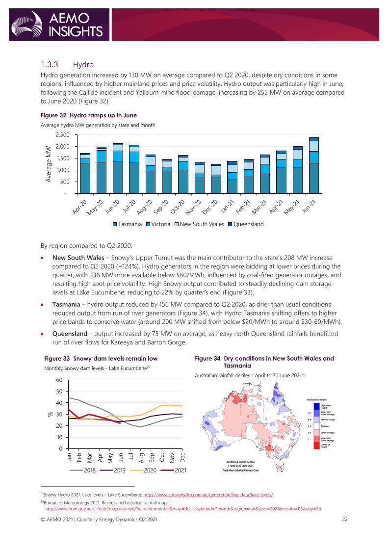
1.3.3 Hydro
Hydro generation increased by 130 MW on average compared to Q2 2020, despite dry conditions in some
regions, influenced by higher mainland prices and price volatility. Hydro output was particularly high in June,
following the Callide incident and Yallourn mine flood damage, increasing by 255 MW on average compared
to June 2020 (Figure 32).
Figure 32 Hydro ramps up in June
Average hydro MW generation by state and month
By region compared to Q2 2020:
• New South Wales – Snowy’s Upper Tumut was the main contributor to the state’s 208 MW increase
compared to Q2 2020 (+124%). Hydro generators in the region were bidding at lower prices during the
quarter, with 236 MW more available below $60/MWh, influenced by coal-fired generator outages, and
resulting high spot price volatility. High Snowy output contributed to steadily declining dam storage
levels at Lake Eucumbene, reducing to 22% by quarter‘s end (Figure 33).
• Tasmania – hydro output reduced by 156 MW compared to Q2 2020, as drier than usual conditions
reduced output from run of river generators (Figure 34), with Hydro Tasmania shifting offers to higher
price bands to conserve water (around 200 MW shifted from below $20/MWh to around $30-60/MWh).
• Queensland – output increased by 75 MW on average, as heavy north Queensland rainfalls benefitted
run of river flows for Kareeya and Barron Gorge.
Figure 33 Snowy dam levels remain low
Monthly Snowy dam levels - Lake Eucumbene27
Figure 34 Dry conditions in New South Wales and
Tasmania
Australian rainfall deciles 1 April to 30 June 202128
27Snowy Hydro 2021, Lake levels – Lake Eucumbene: https://www.snowyhydro.com.au/generation/live-data/lake-levels/
28Bureau of Meteorology 2021, Recent and historical rainfall maps:
http://www.bom.gov.au/climate/maps/rainfall/?variable=rainfall&map=decile&period=3month®ion=nat&year=2021&month=06&day=30
-
500
1,000
1,500
2,000
2,500
Avera
ge M
W
Tasmania Victoria New South Wales Queensland
0
10
20
30
40
50
60
Jan
Feb
Mar
Ap
r
May
Jun
Jul
Aug
Sep
Oct
No
v
Dec
%
2018 2019 2020 2021
© AEMO 2021 | Quarterly Energy Dynamics Q2 2021 23
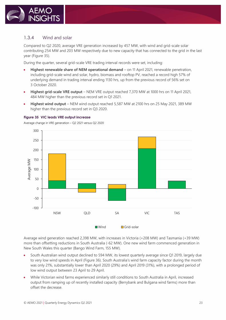
1.3.4 Wind and solar
Compared to Q2 2020, average VRE generation increased by 457 MW, with wind and grid-scale solar
contributing 254 MW and 203 MW respectively due to new capacity that has connected to the grid in the last
year (Figure 35).
During the quarter, several grid-scale VRE trading interval records were set, including:
• Highest renewable share of NEM operational demand – on 11 April 2021, renewable penetration,
including grid-scale wind and solar, hydro, biomass and rooftop PV, reached a record high 57% of
underlying demand in trading interval ending 1130 hrs, up from the previous record of 56% set on
3 October 2020.
• Highest grid-scale VRE output – NEM VRE output reached 7,370 MW at 1000 hrs on 11 April 2021,
484 MW higher than the previous record set in Q1 2021.
• Highest wind output – NEM wind output reached 5,587 MW at 2100 hrs on 25 May 2021, 389 MW
higher than the previous record set in Q3 2020.
Figure 35 VIC leads VRE output increase
Average change in VRE generation – Q2 2021 versus Q2 2020
Average wind generation reached 2,398 MW, with increases in Victoria (+208 MW) and Tasmania (+39 MW)
more than offsetting reductions in South Australia (-62 MW). One new wind farm commenced generation in
New South Wales this quarter (Bango Wind Farm, 155 MW).
• South Australian wind output declined to 594 MW, its lowest quarterly average since Q1 2019, largely due
to very low wind speeds in April (Figure 36). South Australia’s wind farm capacity factor during the month
was only 21%, substantially lower than April 2020 (29%) and April 2019 (31%), with a prolonged period of
low wind output between 23 April to 29 April.
• While Victorian wind farms experienced similarly still conditions to South Australia in April, increased
output from ramping up of recently installed capacity (Berrybank and Bulgana wind farms) more than
offset the decrease.
-100
-50
0
50
100
150
200
250
300
NSW QLD SA VIC TAS
Avera
ge M
W
Wind Grid-solar

© AEMO 2021 | Quarterly Energy Dynamics Q2 2021 24
Figure 36 Low wind capacity factors in April 2021
South Australian volume weighted wind capacity factors (%)
Grid-scale solar output increased by 203 MW on average, with the largest increase compared to Q2 2020
occurring in New South Wales (+139 MW).
• Increased New South Wales output was driven by ramping up of recently installed capacity, with the
three largest solar farms in the region (Darlington Point, Limondale and Sunraysia solar farms) accounting
for 52% of the increase.
• Similar to New South Wales, higher Victorian output (+61 MW) was driven by continued ramp up of
recently installed capacity (Kiamal and Glenrowan solar farms).
• Despite continued ramp up of recently installed capacity, average Queensland output decreased by
19 MW, mainly due to increased self-curtailment resulting from negative spot prices and high frequency
control ancillary service (FCAS) prices (Section 1.5.3).
1.3.5 NEM emissions
Quarterly NEM emissions declined to the lowest Q2 total on record at 32.1 million tonnes carbon dioxide
equivalent (MtCO2-e), 1% lower than Q2 2020 (Figure 37). This occurred despite increased demand and was a
function of reduced coal-fired generation and continuing growth in VRE output.
Figure 37 Record low Q2 emissions
Quarterly NEM emissions and emissions intensity (Q2s)
0%
5%
10%
15%
20%
25%
30%
35%
40%
April May June April May June April May June
2019 2020 2021
Win
d C
ap
aci
ty F
act
or
(%)
-
0.2
0.4
0.6
0.8
1.0
-
5
10
15
20
25
30
35
40
45
50
2011 2012 2013 2014 2015 2016 2017 2018 2019 2020 2021
Em
issi
on
s In
ten
sity
(tC
O2-e
/MW
h)
Em
issi
on
s (M
tCO
2-e
)
Emissions Emissions Intensity

© AEMO 2021 | Quarterly Energy Dynamics Q2 2021 25
1.3.6 Storage
Batteries
During Q2 2021, total net battery market revenue increased to $18 million, representing the third-highest
quarter on record. Net revenue increased compared to Q1 2021 (+$8.1 million), with contributions from both
FCAS and energy arbitrage. FCAS remained the primary source of battery revenue, contributing 78% of the
total (Figure 38). By market:
• Higher FCAS revenue (+$7.2 million) was mainly due to the increase in average South Australia and
Victoria Contingency Raise 6 Second (+$20/MWh) and 60 Second FCAS prices (+$8/MWh, Section 1.5.1).
• With some energy price volatility in South Australia and Victoria this quarter (particularly in May),
grid-batteries benefitted from increased average energy price arbitrage, which resulted in total net
energy revenue increasing by $1 million compared to Q1 2021.
− While energy revenue was up compared to the previous quarter, it was somewhat limited as batteries
were only generating at 44% of their total availability on average during high prices (>$1,000/MWh).
A factor contributing to this was some batteries optimising between FCAS and energy markets
(conserving state of energy charge to remain available for FCAS provision).
Figure 38 Highest battery net revenue since Q1 2020
Battery revenue sources
Pumped hydro
Pumped hydro spot market net revenue in Q2 2021 was $35 million, up from $3.5 million in Q2 2020 (Figure
39). The marked increase was primarily driven by Wivenhoe Pumped Hydro, which accounted for 99% of net
revenue as Shoalhaven was out of service from 18 April and remained offline by the end of the quarter.
Figure 39 Record high pumped hydro revenue
Pumped hydro revenue sources
Figure 40 Wivenhoe captured QLD price spikes
Wivenhoe pumped hydro operations on 25 May 2021
-10
10
30
50
70
Q3 19 Q4 19 Q1 20 Q2 20 Q3 20 Q4 20 Q1 21 Q2 21
Reve
nu
e/c
ost
($m
illio
n)
Energy Energy cost Charge (negative prices)
Regulation FCAS Contingency FCAS Net Revenue
-10
0
10
20
30
40
Q2 20 Q3 20 Q4 20 Q1 21 Q2 21
Reve
nu
e/c
ost
($m
illio
n)
Energy
Energy cost
Charge (negative prices)
Regulation FCAS
Contingency FCAS
Net Revenue
0
5,000
10,000
15,000
-400
-200
0
200
400
600
00:0
0
03:0
0
06:0
0
09:0
0
12:0
0
15:0
0
18:0
0
21:
00
Pri
ce (
$/M
Wh
)
Ou
tpu
t (M
W)
Generation [LHS] Pump [LHS]
QLD Price [RHS]

© AEMO 2021 | Quarterly Energy Dynamics Q2 2021 26
Record high spot market revenue from Wivenhoe this quarter was due to high Queensland price volatility, of
which 40% was captured on 25 May when Queensland recorded its third highest average daily price since
NEM start (Figure 40). Compared to Q2 2020, Wivenhoe’s dispatch increased by 69% as average energy
arbitrage values increased to $582/MWh in Q2 2021.
While Wivenhoe was responsive to high prices, generating 77% of the time when prices exceeded
$1,000/MWh, its output was somewhat limited during those trading intervals, only generating 28% of its total
availability. This was due to 63% of its available capacity being offered above $10,000/MWh during high
priced events.
1.4 Inter-regional transfers
Figure 41 shows inter-regional transfers for Q2 2021, with total transfers slightly lower than recent quarters.
Compared to Q2 2020 transfers were down 11% with reductions on three of the four regional interconnectors.
Figure 41 Electricity transfers across regional interconnectors
Quarterly inter-regional transfers
Key outcomes by regional interconnector included:
• Queensland to New South Wales – net transfers south reduced by 159 MW on average compared to
Q2 2020, largely due to reduced availability of Queensland black coal-fired generation, and increased
Queensland operational demand.
− Continuation of works upgrading QNI lowered the average southerly interconnector limit from
856 MW in Q2 2020 to 728 MW this quarter. This contributed to the interconnector binding at its
limits more frequently (27% of the time compared to 21% in Q2 2020), and increased price separation
between Queensland and New South Wales (Section 1.2).
• Victoria to New South Wales – lower interconnector limits led to net flows north into New South Wales
reducing by 67 MW compared to Q2 2020.
− Factors contributing to lower interconnector limits included increased congestion arising from recently
commissioned wind and solar farms, and transmission line outages.
− Lower limits also led to increased time the interconnector was binding at its limits (33% of the time
compared to 21% in Q2 2020), contributing to price separation between the two regions.
• Tasmania to Victoria (Basslink) – net transfer into Victoria reduced by 132 MW compared to Q2 2020,
due to reduced Tasmania hydro output (which was influenced by dry conditions). Transfers north were
relatively unchanged during the peak morning and evening periods, with the largest reductions occurring
overnight (2200 hrs to 0500 hrs) and the middle of the day (0930 to 1500 hrs). These periods coincided
with comparatively low Victorian spot prices.
-600
-400
-200
0
200
400
600
800
Ave
rag
e f
low
s (M
W)
QLD
NSW
VIC
NSW
VIC
VIC
TAS
SA
Q2 20
Q1 21
Q2 21
Net

© AEMO 2021 | Quarterly Energy Dynamics Q2 2021 27
• Victoria to South Australia – results were similar to recent quarters, with a small reduction in transfers
from South Australia to Victoria compared to Q2 2020. Drivers of this change included reduced South
Australian wind output and increased Victorian wind and solar output.
1.4.1 Inter-regional settlement residue
Total inter-regional settlement residue (IRSR) rose significantly from $23 million in Q2 2020 to $115 million this
quarter, representing the highest Q2 on record (Figure 42).
The main increase occurred for IRSR into New South Wales, driven by periods of high price separation
between Victoria and New South Wales (it was the second most volatile quarter on record for New South
Wales), coinciding with strong transfers north on the interconnector.
Despite high price volatility in Queensland, IRSR value for transfers into the region did not increase
significantly compared to previous Q2s, due to:
• Price volatility occurring in Queensland and New South Wales at the same time, with high trading prices
in New South Wales (>$1,000/MWh) occurring 48% of the time there were high prices in Queensland.
• Counter-price flows arising from network outages, resulting in negative IRSR rather than very high IRSR
(see negative residue management section below).
There was comparatively lower IRSR for transfers into Victoria and South Australia due to lower price volatility
and low price spread between these regions.
Figure 42 Inter-regional settlement residues increase dramatically into New South Wales
Quarterly positive IRSR value – Q2s
Negative residue management
This quarter, negative residues29 occurred at very high levels, increasing to $14 million, 14 times higher than
the two-year average ($0.9 million average in Q2 2019 and Q2 2020, Figure 43). This was driven by extended
periods of counter price flows from Queensland into New South Wales resulting from network outages.
29 Negative residues accumulate from counter-priced flows, that is flows from higher price regions to lower priced regions where the spot market revenue
collected on the flow in the receiving region is less than the spot market amount paid in the sending region. Residues are distributed to the importing
region’s Transmission Network Service Provider (TNSP), either directly or through the Settlement Residue Auction (SRA).
The SRA has a floor of zero on distributions, which means negative residues are passed directly to the TNSP. AEMO has requirements under clauses 3.8.1
and 3.8.10 of the National Electricity Rules to minimise the accumulation of negative residues.
0
20
40
60
80
100
120
2014 2015 2016 2017 2018 2019 2020 2021
$m
illio
n
Into QLD Into NSW Into VIC Into SA

© AEMO 2021 | Quarterly Energy Dynamics Q2 2021 28
Figure 43 Negative residues rise significantly due to counter priced flows between Queensland and New
South Wales
Quarterly negative inter-regional settlement residue
As required by the National Electricity Rules (NER), AEMO automatically triggers negative residue
management (NRM) constraints when the accumulation of negative residues on each regulated
interconnector reaches or exceeds minus $100,000 in previous intervals, the current interval, or based on
30 minute pre-dispatch values30. These constraints prevent further accumulation of negative residues by
reducing the counter-price flow on the relevant directional interconnector and are designed to violate if
security limits are exceeded31.
During the quarter, the NRM constraint associated with counter-price flows from Queensland into New South
Wales (NRM_QLD1_NSW1) bound for a record 1.8% of the time (Figure 44). The constraint also violated for
35% of the time it was activated, meaning the flow on the interconnector was not able to be reversed to
satisfy the NRM requirements. This was due to limited Queensland FCAS supply available to meet local
requitements, which contributed to very high Queensland FCAS prices and costs during these periods
(Section 1.5.1).
Figure 44 Queensland to New South Wales NRM constraint binding for 1.8% of the quarter
Proportion of time NRM constraints were binding by quarter
30 As a part of AEMO’s requirements, it implemented negative residue management (NRM) automated constraints in August 2012.
31 The constraints are lifted when the accumulative of residues are greater than the threshold of -$100,000. Once triggered, the NRM constraints are activated
for the current and next trading interval. If the residues are not above the threshold by the end of trading interval, then the NRM period is extended for
another trading interval. Brief on Automation of Negative Residue Management, AEMO 2018. https://www.aemo.com.au/-
/media/Files/Electricity/NEM/Security_and_Reliability/Dispatch/Policy_and_Process/2018/Brief-on-Automation-of-Negative-Residue-Management.pdf
-15
-10
-5
0
Q1 Q2 Q3 Q4 Q1 Q2
2020 2021
$m
illio
n
Into NSW Into VIC Into SA Into QLD
0.0%
0.5%
1.0%
1.5%
2.0%
Q3 Q4 Q1 Q2 Q3 Q4 Q1 Q2 Q3 Q4 Q1 Q2 Q3 Q4 Q1 Q2 Q3 Q4 Q1 Q2
2016 2017 2018 2019 2020 2021
% o
f tim
e N
RM
co
nst
rain
t is
bin
din
g
NRM_VIC1_SA1
NRM_VIC1_NSW1
NRM_SA1_VIC1
NRM_QLD1_NSW1
NRM_NSW1_VIC1
NRM_NSW1_QLD1

© AEMO 2021 | Quarterly Energy Dynamics Q2 2021 29
1.5 Power system management
Total NEM system costs32 increased to $156 million, $93 million higher than Q2 2020. Higher costs were
largely driven by the significant increase in FCAS costs (Figure 45).
• FCAS costs increased to $141 million this quarter, $97 million higher than Q2 2020, accounting for 91% of
total system costs. Section 1.5.1 provides details on FCAS.
• Despite slightly higher time on directions, the cost of directing South Australian units to maintain
system security was $2.2 million lower than in Q2 2020 due to lower compensation price. Section 1.5.2
provides details on system security directions.
• Estimated VRE curtailment costs33 decreased to $5.5 million, mainly due to reduced system strength and
other curtailment. Section 1.5.3 provides details on VRE curtailment for the quarter.
• AEMO activated RERT in Queensland on 25 May 2021 due to actual LOR2 conditions, and a forecast
LOR3 condition, following the major incident at Callide Power Station (Section 1.2.2). The event lasted for
4.5 hours (1700 hrs to 2130 hrs), and an estimated contracted reserve capacity of 15 MW was procured for
$0.45 million34.
Figure 45 NEM system costs increase to $156 million
Quarterly system costs by category
32 In this report, ‘NEM system costs’ refer to the costs associated with FCAS, directions compensation, Reliability and Emergency Trader (RERT), and
curtailment.
33 Excludes economic curtailment. The cost of curtailed VRE output is estimated to be $40/MWh of output curtailed.
34 See AEMO RERT Reporting for more information: https://aemo.com.au/-/media/files/electricity/nem/emergency_management/rert/2021/rert-activation-
estimates-25-may-2021.pdf?la=en
0
50
100
150
200
250
300
350
Q2 Q3 Q4 Q1 Q2 Q3 Q4 Q1 Q2
2019 2020 2021
$m
illio
n
FCAS
RERT
Directions
Curtailment

© AEMO 2021 | Quarterly Energy Dynamics Q2 2021 30
1.5.1 Frequency control ancillary services
Quarterly FCAS costs rebounded sharply to $141 million, representing the second highest quarter on record,
with most of the cost increases occurring in Queensland (Figure 46)35. By market, 95% of the cost increases
compared to Q2 2020 occurred in the Contingency Raise markets (+$92 million), driven by higher prices
(particularly in the Raise 6 Second and Raise 60 Second markets).
Drivers of rebounding Contingency Raise prices included:
• Localised Queensland requirements and resulting FCAS price volatility – compared to Q2 2020,
Queensland Raise 6 Second and Raise 60 Second prices increased by 840% on average due to significant
price volatility (see below for more details).
• Black coal-fired generator outages – compared to Q2 2020, supply from black coal-fired generators fell
by around 20% in the Raise 6 Second and Raise 60 Second markets due to outages.
• Higher energy prices volatility – as detailed in Section 1.2, NEM spot prices increased significantly this
quarter. Raise FCAS market prices often move in line with energy prices, due to the opportunity cost of
service provision.
Figure 46 FCAS costs rebound to $142 million
Quarterly FCAS cost by region36
35 The AER Quarter 2 2021 Wholesale Market Quarterly Report will focus on the drivers of high FCAS prices in Queensland.
36 Based on AEMO Settlement data and represents preliminary data that will be subject to minor revisions.
0
50
100
150
200
250
Q3 19 Q4 19 Q1 20 Q2 20 Q3 20 Q4 20 Q1 21 Q2 21
To
tal C
ost
($m
)
NSW1 QLD1 SA1 VIC1 TAS1

© AEMO 2021 | Quarterly Energy Dynamics Q2 2021 31
FCAS price volatility
The significant increase in FCAS costs this quarter was largely driven by event-based price volatility, with
high-priced periods37 contributing $87 million (or 62%) of total quarterly FCAS costs. The majority (84%) of
these volatility-related costs occurred Queensland, mostly during June in the Raise 6 Second and Raise 60
Second markets. Key days included:
• 3 June 2021 – Raise 6 Second and Raise 60 Second prices spiked above $10,000/MWh for 215 minutes
and 85 minutes, respectively, leading to a daily FCAS cost of $26 million.
• 4 June 2021 – Raise 6 Second and Raise 60 Second prices spiked above $10,000/MWh for 30 minutes
and 25 minutes, respectively, leading to a daily FCAS cost of $9 million.
− On 5 June, following further FCAS price spikes, the Cumulative Price Threshold was exceeded, leading
to leading to application of the Administered Price Cap in the region.
• 15 June 2021 – Raise 6 Second and Raise 60 Second prices spiked above $10,000/MWh for 75 minutes
and 35 minutes, respectively, leading to a daily FCAS cost of $5 million.
• 25 June 2021 – Raise 6 Second and Raise 60 Second prices spiked above $10,000/MWh for 150 minutes
and 120 minutes, respectively, leading to a daily FCAS cost of $21 million.
Drivers of FCAS costs on these days included:
• High local Queensland FCAS requirements – periods of very high localised Queensland FCAS
requirements resulting from line outages and subsequent NRM (Section 1.4.1) led to very tight
supply-demand conditions in Queensland’s Contingency Raise markets.
− Figure 47 shows an example of this on 3 June 2021, when transmission line outages led to localised
FCAS requirements which rose sharply to very high levels from 1700 hrs following application of NRM
on the interconnector. Between 1700 hrs and 2400 hrs, Queensland’s average Raise 6 Second FCAS
requirement was 277 MW, around three times its typical enablement level.
Figure 47 Very high localised Queensland FCAS requirements lead to extended price spikes
Queensland Raise 6 Second FCAS enabled and price – 3 June 2021
• Black coal-fired generation outages – unit outages at key FCAS providers, including Callide, Stanwell
and Tarong power stations, reduced Queensland’s available FCAS supply.
• Energy price volatility – extreme energy price volatility in Queensland this quarter (Section 1.2.2)
frequently led to very high Queensland Contingency Raise FCAS prices due to the co-optimisation of the
markets.
37 Prices equal to or above $300/MWh in a given FCAS market.
0
2,000
4,000
6,000
8,000
10,000
12,000
14,000
16,000
0
50
100
150
200
250
300
350
00:05 04:05 08:05 12:05 16:05 20:05
FC
AS p
rice
($/M
Wh
)
FC
AS e
nab
led
(M
W)
QLD FCAS enabled [LHS] QLD Raise 6 Second price [RHS]

© AEMO 2021 | Quarterly Energy Dynamics Q2 2021 32
1.5.2 Directions
During Q2 2021, AEMO continued to issue directions to GPGs in South Australia to maintain system security in
the region. Total NEM directions costs for energy declined to $8.3 million, reversing the upward trend in
recent quarters (Figure 48). The reduction in South Australian directions costs compared to record highs in Q1
2021 (-$14.6 million) was largely due to lower time on direction, falling from 70% of the time in Q1 2021 to
30% this quarter. Reduced time on direction also led to lower amounts of directed output, with only 7% of
total South Australian GPG output directed this quarter, down from 30% in Q1 2021 (Figure 49).
Figure 48 South Australian direction costs down from record highs in Q1 2021
Time and cost of system security directions (energy only) in South Australia
Note: direction costs are preliminary costs which are subject to revision.
The key driver of reduced time on direction was higher spot prices (Section 1.2), influenced by lower local
wind output (Section 1.3.4), and thermal unit outages in other NEM regions. With South Australian electricity
prices exceeding $70/MWh 33% of the time compared to only 6% in Q1 2021, it was more economic for GPGs
to remain online than in recent quarters.
Figure 49 Directed South Australian GPG falls from recent highs
Proportion of South Australian GPG directed of total South Australian GPG output
While quarterly direction costs were substantially lower due to reduced directions, the proportion of
additional compensation claims have increased, accounting for 27% of total this quarter, up from 18% in Q1
2021. With average 12-month 90th percentile spot price (used as a benchmark for compensating participants)
averaging at $71/MWh as well as rising South Australian gas prices ($8.7/GJ), AEMO received 35 of these
additional claims during the quarter38.
38 As these additional compensation claims are processed, final direction costs are likely to be higher than the preliminary costs published in the report.
Additional claims and additional claims that require independent expert may take up to 30 weeks to finalise.
0%
20%
40%
60%
80%
0
5
10
15
20
25
Q2 Q3 Q4 Q1 Q2 Q3 Q4 Q1 Q2
2019 2020 2021
Tim
e (
%)
Co
st (
$m
)
SA Direction cost [LHS] SA Direction time [RHS]
0%
10%
20%
30%
40%
Q2 Q3 Q4 Q1 Q2 Q3 Q4 Q1 Q2
2019 2020 2021
%

© AEMO 2021 | Quarterly Energy Dynamics Q2 2021 33
1.5.3 VRE curtailment
VRE curtailment increased to 114 MW on average (or 4% of total semi-scheduled VRE output), slightly higher
than Q1 2021 (+26 MW), however lower than in 2020 (Figure 50). By category:
• Curtailment due to system strength averaged 25 MW this quarter, up from very low levels in Q1, driven
by increased system strength curtailment in South Australia (+18 MW). This was due to an increase in the
periods in which semi-scheduled wind farm availability in the region was very high, exceeding 1,200 MW
10% of the time compared to 3% of the time in Q1 2021.
• Economic curtailment was relatively flat on Q1 2021 levels as increased self-curtailment from wind and
solar farms in Queensland (+24 MW) was mostly offset by reductions in South Australia (-21 MW) and
Victoria (-5 MW).
− With high occurrence of negative spot prices in Queensland, coupled with periods of extremely high
Contingency Raise FCAS prices, Queensland VRE generators responded by self-curtailing output to
either avoid paying to generate and/or minimise their FCAS costs. For example, on 3 June, around
76% of the Queensland VRE fleet self-curtailed in response to high FCAS prices, with average daily
Raise 6 Second price reaching $3,179/MWh (Figure 51).
− Increased economic curtailment in Queensland was the main driver of its semi-scheduled curtailment
rising from 1% in Q1 2021 to 6% this quarter (Figure 52).
• Other curtailment contributed to 38 MW of curtailment this quarter, up slightly on Q1 2021 levels. It
includes unclassified sources of curtailment that can occur due to project specific issues, grid congestion,
and other network constraints.
Figure 50 VRE curtailment increased slightly from previous quarter
Average NEM VRE curtailed by curtailment type
Note: curtailment amount is based on combination of market data and AEMO estimates. For more information on the calculation, see
www.wattclarity.com.au/articles/2020/06/not-as-simple-as-it-appears-estimating-curtailment-of-renewable-generation/?utm_source
=rss&utm_medium=rss&utm_campaign=not-as-simple-as-it-appears-estimating-curtailment-of-renewable-generation.
0
50
100
150
200
250
Q2 Q3 Q4 Q1 Q2 Q3 Q4 Q1 Q2
2019 2020 2021
Ave
rag
e c
urt
aile
d (
MW
)
System strength Economic Other Solar Separation

© AEMO 2021 | Quarterly Energy Dynamics Q2 2021 34
Figure 51 Queensland VRE responsive to extremely high FCAS prices
Queensland VRE response to high Raise 6 Second FCAS prices – 3 June 2021
Figure 52 Queensland VRE curtailment increases from Q1 lows
% of VRE curtailed by region
0
2,500
5,000
7,500
10,000
12,500
15,000
0
50
100
150
200
250
300
00:05 02:05 04:05 06:05 08:05 10:05 12:05 14:05 16:05 18:05 20:05 22:05
FC
AS P
rice
($/M
Wh
)
VR
E c
urt
aile
d (
MW
)
QLD R6 Prices [RHS] QLD VRE curtailed [LHS]
0%
5%
10%
15%
Q1 Q2 Q3 Q4 Q1 Q2 Q3 Q4 Q1 Q2
2019 2020 2021
% c
urt
aile
d
NSW QLD SA TAS VIC

© AEMO 2021 | Quarterly Energy Dynamics Q2 2021 35
2. Gas market dynamics 2.1 Gas demand
Total east coast gas demand increased by 4% compared to Q2 2020, mostly due to increased Queensland
liquefied natural gas (LNG) demand (+19 petajoules [PJ], Table 4). International gas markets were particularly
impacted by COVID-19 in Q2 2020 which led to lower gas prices and lower LNG exports. While GPG demand
only slightly increased (+2 PJ39), there were significant increases in late May and June as a result of the Callide
and Yallourn outages.
Table 4 Gas demand – quarterly comparison
Demand (PJ) Q2 2021 Q1 2021 Q2 2020 Change from Q2 2020
AEMO Markets * 97.8 57.6 97.5 0.3 (+0.3%)
GPG ** 35.4 21.6 33.3 2 (+6%)
QLD LNG 335.8 356.8 316.6 19 (+2%)
TOTAL 469 436 447.4 22 (+5%)
* AEMO Markets demand is the sum of customer demand in each of the Short Term Trading Markets (STTMs) and the Declared
Wholesale Gas Markey (DWGM) and excludes GPG in these markets.
** Includes demand for GPG usually captured as part of total DWGM and STTM demand. Excludes Yabulu Power Station.
The large increase in Queensland LNG exports continued recent trends, influenced by strong Asian LNG
demand and high prices (Section 2.2.1). Despite a 21 PJ decrease from Q1 2021 it was the fourth highest
quarter and the highest Q2 export quantity on record (Figure 53).
Compared to Q2 2020 Australia Pacific LNG (APLNG) recorded the largest increase of 20.3 PJ, and Gladstone
Liquefied Natural Gas (GLNG) increased by 6.2 PJ, while Queensland Curtis LNG (QCLNG) decreased by 7.3 PJ.
During the quarter, 86 LNG cargoes were exported, an increase from 81 in Q2 202040.
On 25 May 2021, QCLNG experienced an unplanned production interruption related to the Callide incident,
with its production decreasing from 1,706 TJ to 1,076 TJ, and Curtis Island flows decreasing from 1,368 TJ to
919 TJ. APLNG and GLNG production was also affected but to a lesser extent. While production dropped,
flows to Curtis Island also decreased, and no additional gas volumes flowed into the domestic market.
Figure 53 GLNG and QCLNG drive record Q2 flows to Curtis Island for LNG export
Total quarterly pipeline flows to Curtis Island
39High number of gas peaking plant starts this quarter contributed towards increased GPG PJ despite slightly lower average GPG MW compared to Q2 2020.
40Queensland Government 2021, Maritime Safety Queensland: https://qships.tmr.qld.gov.au/webx/
0
100
200
300
400
Q1 Q2 Q3 Q4 Q1 Q2 Q3 Q4 Q1 Q2 Q3 Q4 Q1 Q2 Q3 Q4 Q1 Q2 Q3 Q4 Q1 Q2
2016 2017 2018 2019 2020 2021
PJ
APLNG GLNG QCLNG

© AEMO 2021 | Quarterly Energy Dynamics Q2 2021 36
2.2 Wholesale gas prices
Quarterly average gas prices increased in all east coast gas markets, averaging $8.20/GJ compared to
$4.37/GJ in Q2 2020 (Table 5). From late May, prices rose sharply, influenced by higher international prices,
rebounding GPG demand (Section 1.3.2), and higher QLD LNG demand (Figure 54). Key outcomes included:
• Gas prices in the Brisbane Short Term Trading Market (STTM) averaged $8.48/GJ, 33% higher than Q1
2021 levels and 118% higher than Q2 2020, reflecting higher-priced offers (Figure 55) and increased
demand. Prices jumped considerably in June 2021 to an average of $10.80/GJ, reflecting a substantial shift
in marginal bid prices above $9/GJ.
• Victoria’s Declared Wholesale Gas Market (DWGM) quarterly average gas price of $7.22/GJ remained
the lowest east coast average, 15% lower than other markets. This was influenced by increased local
production, and higher utilisation of Iona Underground Gas Storage (UGS) (Section 2.3.1). Like Brisbane,
prices jumped considerably in June to $9.34/GJ, with higher GPG demand a key driver.
Table 5 Gas prices – quarterly comparison
Price ($/GJ) Q2 2021 Q2 2020 Change from Q2 2020
DWGM 7.22 4.65 +55%
Adelaide 8.69 5.13 +70%
Brisbane 8.48 3.89 +118%
Sydney 8.46 4.31 +97%
GSH 8.14 3.88 +110%
Figure 54 DWGM and Brisbane gas prices rise sharply from late May
Figure 55 Brisbane STTM bids at higher prices than Q2 2020
Brisbane STTM – proportion of marginal bids by price band
0
2
4
6
8
10
12
Ap
r-19
May-1
9
Jun-1
9
Jul-
19
Aug
-19
Sep
-19
Oct
-19
No
v-19
Dec-
19
Jan-2
0
Feb
-20
Mar-
20
Ap
r-20
May-2
0
Jun-2
0
Jul-
20
Aug
-20
Sep
-20
Oct
-20
No
v-20
Dec-
20
Jan-2
1
Feb
-21
Mar-
21
Ap
r-21
May-2
1
Jun-2
1
$/G
J
DWGM BRI
0%
20%
40%
60%
80%
100%
Q2 2020 Jan-21 Feb-21 Mar-21 Apr-21 May-21 Jun-21
Pro
po
rtio
n o
f m
arg
inal
bid
s
$4-7/GJ $7-9/GJ $9-11/GJ $11-15/GJ $15-20/GJ

© AEMO 2021 | Quarterly Energy Dynamics Q2 2021 37
2.2.1 International energy prices
During Q2 2021, international energy prices continued to rise, with drivers including sustained demand
recovery, post Northern hemisphere winter LNG storage refilling, and supply disruptions.
Japan Korea Marker (JKM) LNG prices increased steadily from A$9/GJ at the end of previous quarter to finish
Q2 at A$17/GJ, averaging A$12/GJ for the quarter (Figure 56). Key drivers included refilling of gas storages,
which reached their lowest levels in more than a decade in Europe (and lowest in recent years in Asia),
increased Northern hemisphere summer GPG demand due to warmer than average temperatures, and
post-winter supply maintenance41.
Figure 56 Brent and JKM prices continue at high levels
Brent Crude oil and JKM prices in Australian dollars
Source: Bloomberg data in 14-day averages
Brent Crude oil prices continued trending up from A$83/barrel from the end of Q1 2021 to finish Q2 at
pre-COVID levels of A$100/barrel, influenced by the Organisation of the Petroleum Exporting Countries
(OPEC42) ongoing production cuts and drawdowns of global oil stocks due to economic recovery43.
Thermal coal export prices reached a record high of A$180/ton by the end of Q2, A$52/ton higher than the
end of the previous quarter. Drivers included strong Asian demand, supply disruptions from Indonesia (the
world’s largest exporter) due to heavy rainfall, and mine safety issues in China44.
Figure 57 Record thermal coal export price
Newcastle export thermal coal prices in A$/ton
Source: Bloomberg
41 AFR 2021, Not enough natural gas to calm a global price rally: https://www.afr.com/markets/commodities/not-enough-natural-gas-to-calm-a-global-
price-rally-20210626-p584g8
42 OPEC 2021, Ministerial Meeting highlights importance of ongoing rebalancing efforts: https://www.opec.org/opec_web/en/press_room/6429.htm
43 Bloomberg 2021, OPEC sees tight oil market as ministers set for supply talks: https://www.bloomberg.com/news/articles/2021-05-31/opec-tightens-oil-
market-outlook-and-forecasts-sharp-stock-draws?sref=kkhkDP70
44 Bloomberg 2021, It’s not over yet for coal as global prices surge on hot demand: https://www.bloomberg.com/news/articles/2021-06-03/it-s-not-over-for-
coal-yet-as-global-prices-surge-on-hot-demand?sref=kkhkDP70
$0
$5
$10
$15
$20
$25
$0
$50
$100
$150
JKM
(A
$/G
J)
Bre
nt
(AU
D/B
arr
el) Brent (LHS) JKM (RHS)
$60
$100
$140
$180
$220
A$/T
on

© AEMO 2021 | Quarterly Energy Dynamics Q2 2021 38
2.3 Gas supply
2.3.1 Gas production
In line with increased gas demand, east coast gas production increased by 17.2 PJ compared to Q2 2020
(+4%, Figure 58), with key changes including:
• Higher Longford production (+8.8 PJ), assisted by the commissioning of the West Barracouta gas field
during April, which resulted in an increase in interstate exports from Victoria. Longford’s capacity factor
was 92% for the quarter, an increase from 83% in Q2 2020 (Figure 59). However, Longford daily
production finished the quarter at lower levels due to a partial outage from 28 June, which reduced
Longford’s production from 980 TJ/d to 770 TJ/d45.
• Increased Queensland production from GLNG (+9.9 PJ), APLNG (+3 PJ) and other Queensland facilities
(+0.5 PJ) to meet increased demand for LNG export (Section 2). This was partially offset by a decrease
from QCLNG (-2.9 PJ), particularly at Ruby Jo (-9.5 PJ).
Figure 58 Longford and GLNG production increase
Change in east coast gas supply – Q2 2021 versus Q2 2020
Figure 59 Highest Q2 Longford production since 2017
45 This developed into an extended outage, reducing Longford’s capacity during July.
-4
-2
0
2
4
6
8
10
12
NGP Longford Otway Moomba Bass Gas Orbost APLNG GLNG QCLNG Other*
Non-QLD QLD
PJ
0
20
40
60
80
100
120
Q1 Q2 Q3 Q4 Q1 Q2 Q3 Q4 Q1 Q2 Q3 Q4 Q1 Q2 Q3 Q4 Q1 Q2
2017 2018 2019 2020 2021
PJ
Longford Production Unutilised Capacity

© AEMO 2021 | Quarterly Energy Dynamics Q2 2021 39
2.3.2 Gas storage
During the quarter, there was rapid emptying of Iona UGS facility. It finished the quarter with a gas balance of
14.3 PJ, 3.6 PJ lower than at the end of Q2 2020 and the lowest level at 30 June since storage levels began
being reported in October 2016 (Figure 60).
Of note, this occurred despite Iona storage levels reaching a record high level of 24.5 PJ on 10 May. Iona was
heavily utilised from that point on, with high GPG demand in Queensland and Victoria, and a reduction in
Queensland gas flows south compared to Q2 2020, contributing factors. Iona also supplied 2.2 PJ from
storage from 14 June to 20 June, a weekly record that was mainly driven by higher Victorian GPG demand in
response to the Yallourn outage.
On 21 June, Lochard identified a gas leak on a section of piping at the Iona plant. As a result, Iona required an
unplanned plant outage for repairs. This went ahead from noon on 24 June and the plant resumed availability
from early morning on 25 June, with no material market impact. An additional 24-hour outage will be
required before the end of winter to reinstate a section of piping, and it is unable to inject gas into storage
until this outage occurs.
Figure 60 Iona storage empties at record rates
Iona storage levels
0
5
10
15
20
25
01-Jan 01-Feb 01-Mar 01-Apr 01-May 01-Jun 01-Jul 01-Aug 01-Sep 01-Oct 01-Nov 01-Dec
PJ
2017 2018 2019 2020 2021
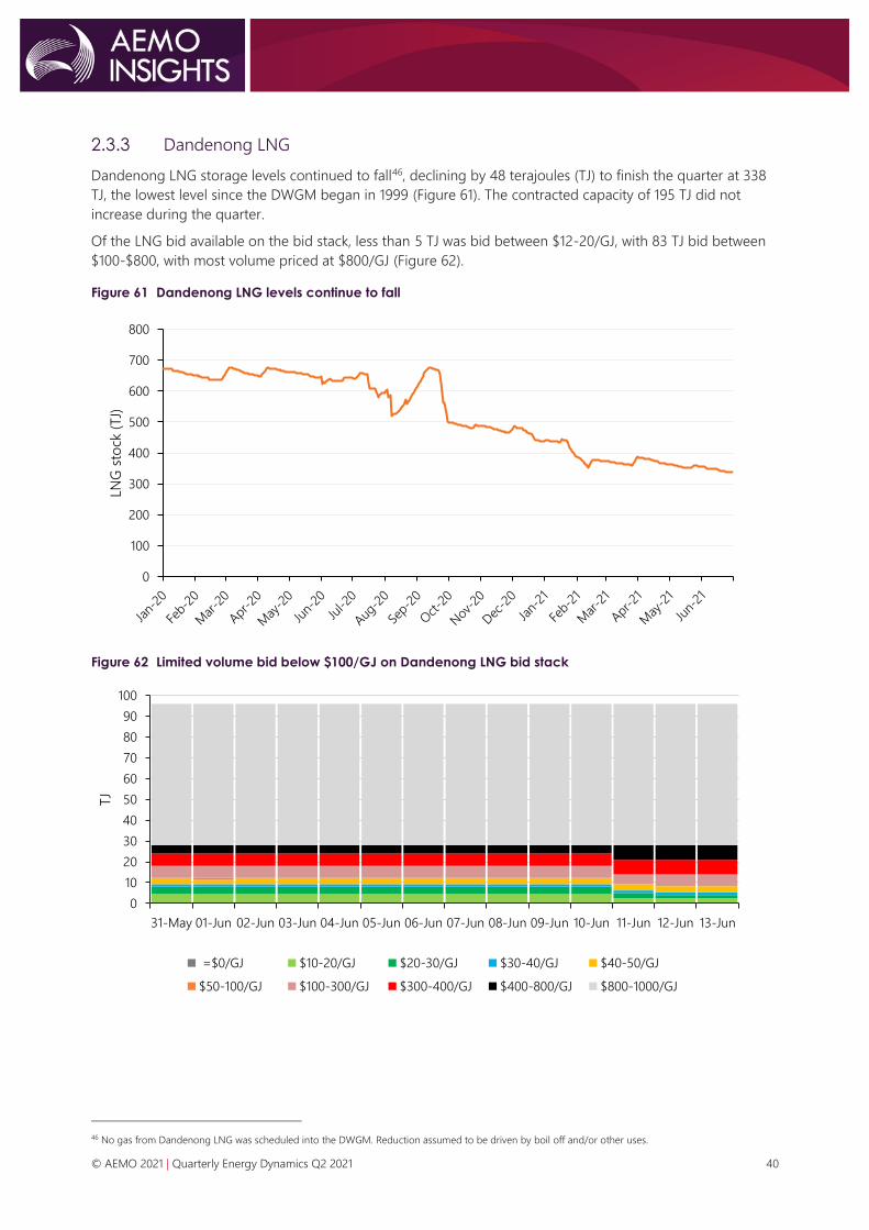
© AEMO 2021 | Quarterly Energy Dynamics Q2 2021 40
2.3.3 Dandenong LNG
Dandenong LNG storage levels continued to fall46, declining by 48 terajoules (TJ) to finish the quarter at 338
TJ, the lowest level since the DWGM began in 1999 (Figure 61). The contracted capacity of 195 TJ did not
increase during the quarter.
Of the LNG bid available on the bid stack, less than 5 TJ was bid between $12-20/GJ, with 83 TJ bid between
$100-$800, with most volume priced at $800/GJ (Figure 62).
Figure 61 Dandenong LNG levels continue to fall
Figure 62 Limited volume bid below $100/GJ on Dandenong LNG bid stack
46 No gas from Dandenong LNG was scheduled into the DWGM. Reduction assumed to be driven by boil off and/or other uses.
0
100
200
300
400
500
600
700
800
LNG
sto
ck (
TJ)
0
10
20
30
40
50
60
70
80
90
100
31-May 01-Jun 02-Jun 03-Jun 04-Jun 05-Jun 06-Jun 07-Jun 08-Jun 09-Jun 10-Jun 11-Jun 12-Jun 13-Jun
TJ
=$0/GJ $10-20/GJ $20-30/GJ $30-40/GJ $40-50/GJ
$50-100/GJ $100-300/GJ $300-400/GJ $400-800/GJ $800-1000/GJ

© AEMO 2021 | Quarterly Energy Dynamics Q2 2021 41
2.4 Pipeline flows
During the quarter, net 4.2 PJ of gas flowed south from Queensland to Moomba, compared to net 13.8 PJ in
Q2 2020, representing the lowest Q2 flows south since 2017 (Figure 63). The decrease in gas flows was a
function of high Queensland LNG export demand, higher Victorian production, and higher GPG demand.
Figure 63 Lowest Q2 net gas flows from Queensland since 2017
Flows on the South West Queensland Pipeline at Moomba
Victorian net gas transfers to other states increased by 15.2 PJ compared to Q2 2020 (Figure 64), reflecting
increased Victorian production and a larger drawdown of Iona storage inventory than usual.
• Victoria to New South Wales – Victoria exported a net 1.9 PJ of gas via Culcairn, compared to an import
of 4.2 PJ in Q2 2020. Exports to New South Wales via the Eastern Gas Pipeline (EGP) increased by 7.8 PJ.
• Victoria to South Australia – transfers increased by 1.3 PJ despite stagnant South Australian demand,
reflecting lower Moomba to Adelaide Pipeline flows. This was due to increased Victorian production and
decreased Queensland flows to Moomba.
Figure 64 Highest Q2 Victorian gas exports since 2017
Victorian net gas transfers to other regions
-25
-20
-15
-10
-5
0
5
10
15
20
25
30
Q1 Q2 Q3 Q4 Q1 Q2 Q3 Q4 Q1 Q2 Q3 Q4 Q1 Q2 Q3 Q4 Q1 Q2
2017 2018 2019 2020 2021
PJ
North at Moomba South at Moomba Sum of Net
0
10
20
30
40
50
60
70
Q1 Q2 Q3 Q4 Q1 Q2 Q3 Q4 Q1 Q2 Q3 Q4 Q1 Q2 Q3 Q4 Q1 Q2
2017 2018 2019 2020 2021
PJ
to NSW to SA to Tas

© AEMO 2021 | Quarterly Energy Dynamics Q2 2021 42
2.5 Gas Supply Hub
In Q2 2021, there were increased trading volumes and delivered volumes on the Gas Supply Hub (GSH)
compared to Q2 2020, with deliveries up by 2.5 PJ, and trades up by 4.5 PJ. This represented the highest
traded volume for any quarter since Q2 2019 and highest delivered volume since Q1 2020 (Figure 65).
Figure 65 Gas Supply Hub volumes highest since 2019
Gas Supply Hub – quarterly trades and deliveries
2.6 Pipeline capacity trading and day ahead auction
Day ahead auction (DAA) utilisation was the highest on record, increasing by 6.9 PJ compared to Q2 2020
(+88%). The largest increases occurred on the Moomba to Sydney Pipeline (MSP, +2 PJ), EGP (+1.2 PJ),
Wallumbilla Compressor (+0.9 PJ), Moomba Compressor, Roma to Brisbane Pipeline (RBP) and SWQP (+0.8
PJ each). Vic Hub was also used for the first time (+0.2 PJ)47.
Average auction clearing prices remained at close to $0/GJ on most pipelines. The exceptions to this were the
EGP, which averaged $0.20/GJ, the South West Queensland Pipeline (SWQP), which averaged $0.07/GJ, the
RBP which averaged $0.04/GJ, and the MSP, which averaged $0.03/GJ.
Figure 66 Highest quarterly Day Ahead Auction utilisation since market start
Day Ahead Auction results by quarter
47 The AER's Quarter 2 2021 Wholesale Market Quarterly Report will (include) additional analysis on the day ahead auction highlighting in demand routes.
0
2
4
6
8
10
12
Q1 Q2 Q3 Q4 Q1 Q2 Q3 Q4 Q1 Q2 Q3 Q4 Q1 Q2 Q3 Q4 Q1 Q2
2017 2018 2019 2020 2021
PJ
Traded Delivered
0
2
4
6
8
10
12
14
Q1 Q2 Q3 Q4 Q1 Q2
2020 2021
PJ
WCF RBP SWQP MSP EGP BWP MAPS ICF QGP Vichub

© AEMO 2021 | Quarterly Energy Dynamics Q2 2021 43
2.7 Gas – Western Australia
Total Western Australian domestic gas consumption in Q2 2021 decreased to 99 PJ, down 1.9% from Q2 2020
(Figure 67). The key drivers for this change were a 1.3 PJ (5.5%) decrease in consumption for electricity
generation, as GPG was displaced in the fuel mix by increased wind, solar and coal generation, and a 1.2 PJ
(5.2%) decrease for mining.
Consumption by distribution systems increased by 1 PJ (+14%) due to increased heating requirements, as
heating degree days increased by 71% from Q2 2020 to Q2 2021 (Section 3.1.1). This was particularly driven by
a very cold June, during which gas distribution networks recorded their highest monthly consumption since
commencement of the Western Australian Gas Bulletin Board (GBB WA) in August 2013.
Figure 67 Western Australia domestic gas consumption drops 4.6% from Q2 2020
WA quarterly gas consumption by industry – Q2 2019 to Q2 2021
Total Western Australian gas supply was 94.7 PJ in Q2 2021, representing a 15 PJ (14%) decrease from the
historic peak in in Q2 2020 (Figure 68). This was driven primarily by the Karratha Gas Plant, which decreased
production from 28 PJ to 1.4 PJ over the same period. This reduction has been attributed to the ending of at
least one long-term domestic gas supply contract in 202048.
Figure 68 Western Australia domestic gas production drops 14% from Q2 2020
WA quarterly gas production by facility – Q2 2019 to Q2 2021
The deficit in production compared to demand was met by a 5.4 PJ net withdrawal from gas storage facilities
during the quarter, contrasting a net injection of 7.4 PJ in Q2 2020. Over this period, both Western Australian
48AEMO Gas Statement of Opportunities 2020, Section 3.1.3, Domestic Gas Production: https://aemo.com.au/-
/media/files/gas/national_planning_and_forecasting/wa_gsoo/2020/2020-wa-gsoo-report.pdf?la=en
0
25
50
75
100
Q2 2019 Q3 2019 Q4 2019 Q1 2020 Q2 2020 Q3 2020 Q4 2020 Q1 2021 Q2 2021
Pro
du
ctio
n (
PJ)
Distribution Electricity Industrial
Mineral Processing Mining Other Large User
Other (Non-Large User)
0
20
40
60
80
100
120
Q2 2019 Q3 2019 Q4 2019 Q1 2020 Q2 2020 Q3 2020 Q4 2020 Q1 2021 Q2 2021
Pro
du
ctio
n (
PJ)
Karratha Gas Plant Varanus Island Macedon Wheatstone Gorgon Devil Creek Other

© AEMO 2021 | Quarterly Energy Dynamics Q2 2021 44
storage facilities (Mondarra and Tubridgi) shifted from net injection to net withdrawal (Figure 69).
This represents a significant change in operation of Tubridgi, which was historically a large importer: between
commencement of operations in 2018 and the end of Q2 2020, Tubridgi injected 54.3 PJ and withdrew only
0.2 PJ, nearing its storage capacity of 60 PJ. Since then, Tubridgi has injected 1.2 PJ and withdrawn 6.9 PJ.
Figure 69 Gas storage facilities move from net injection to net withdrawal to meet drop in production
WA gas storage facility injections and withdrawals – Q2 2019 to Q2 2021
-10
-5
0
5
10
15
Q2 2019 Q3 2019 Q4 2019 Q1 2020 Q2 2020 Q3 2020 Q4 2020 Q1 2021 Q2 2021
Sto
rag
e F
low
s (P
J)
Mondarra Filling Mondarra Emptying Tubridgi Filling Tubridgi Emptying Net

© AEMO 2021 | Quarterly Energy Dynamics Q2 2021 45
3. WEM market dynamics 3.1 Electricity demand
3.1.1 Operational and underlying demand
Operational demand49 increased from an average of 1,940 MW in Q2 2020, to 2,042 MW this quarter, with
increases during most times of day due to increased underlying demand (Figure 70). The only decreases in
operational demand occurred between 1100 hrs and 1300 hrs50 due to continuing growth in distributed PV
output. Average estimated underlying demand increased from an average of 2,066 MW in Q2 2020 to
2,207 MW in Q2 2021 (+7%), largely due to the increased heating load.
Figure 70 Increased underlying demand throughout the day, but higher distributed PV output dampens
midday operational demand
Change in Q2 2021 WEM-average operational and underlying demand by time of day compared to Q2 2020
Colder temperatures in Q2 2021 led to increased heating requirements, with HDDs up 71% compared to Q2
2020 (Figure 71). This was predominantly driven by cold weather in June, as Perth experienced its coldest June
in 31 years51. A new record high Q2 operational demand of 3,528 MW was set at 1800 hrs on 22 June 2021,
which included Perth’s lowest minimum temperature since 2015.
A new record was also set for the minimum Q2 operational demand, reaching 1,105 MW at 1200 hrs on
Sunday 18 April 2021, 50 MW lower than the previous Q2 minimum. The new minimum was a function of low
underlying demand (2,130 MW) resulting from mild weather, and high distributed PV output at 1,025 MW
(48% of underlying demand).
49 Operational demand is total wholesale generation from registered Facilities in the SWIS and is based on non-loss adjusted sent out SCADA data, averaged
over a 30-minute interval. Underlying demand is operational demand that has been adjusted to remove the impact of distributed PV output.
50 In this section, time is in Australian Western Standard Time (AWST).
51 According to BOM data for Perth Airport: http://www.bom.gov.au/climate/current/month/wa/archive/202106.summary.shtml#recordsAvgRecentLow
-50
0
50
100
150
200
00:0
0
01:
00
02:0
0
03:0
0
04:0
0
05:0
0
06:0
0
07:0
0
08:0
0
09:0
0
10:0
0
11:0
0
12:0
0
13:0
0
14:0
0
15:0
0
16:0
0
17:0
0
18:0
0
19:0
0
20:0
0
21:
00
22:0
0
23:0
0
Avera
ge C
han
ge (
MW
)
Impact of Change in Distributed PV Operational Demand Underlying Demand

© AEMO 2021 | Quarterly Energy Dynamics Q2 2021 46
Figure 71 Increased heating requirements driven by cold June weather
Heating Degree Days compared to previous Q2s by month52
3.2 WEM prices
The WEM average Balancing Price increased from $52/MWh in Q2 2020 to $58/MWh in Q2 2021, the highest
quarterly average since Q3 2017 (Figure 72). There was a greater spread of Balancing Prices compared to Q2
2020, with a higher proportion of negatively priced intervals due to more wind and solar generation
(Section 3.2.1), and a high proportion of high-priced intervals due to an increase in operational demand
(Section 3.2.2).
The quantity cleared in the Short Term Energy Market (STEM) increased significantly from previous Q2s, rising
from an average 36.5 MWh per trading interval in Q2 2020 to 50 MWh in Q2 2021. Over the last five years
there has been a gradual increase in the energy traded by Market Participants in the STEM.
The average STEM Price was $8/MWh below the averaging Balancing Price in Q2 2021, the largest difference
since Q3 2016. This difference was driven by dynamic trading and hedging by participants, and indicates the
value to energy sellers of securing a day ahead price to minimise exposure to low or negative prices.
Figure 72 WEM Balancing Prices rose to their highest levels since Q3 2017
WEM Average Balancing and STEM Prices, and STEM Cleared Quantity
52 A “heating degree day” (HDD) is a measurement used as an indicator of outside temperature below what is considered a comfortable temperature. The
HDD value for each day is calculated as max (0, baseline temperature – average [maximum temperature, minimum temperature]). The HDD baseline
temperature used for the WEM region is 16oC as per the AEMO Electricity Statement of Opportunities 2021.
0
20
40
60
80
100
120
140
Q2 2017 Q2 2018 Q2 2019 Q2 2020 Q2 2021
Heatin
g D
eg
ree D
ays
June May April
30
35
40
45
50
55
60
65
70
0
10
20
30
40
50
60
70
Q2 Q3 Q4 Q1 Q2 Q3 Q4 Q1 Q2 Q3 Q4 Q1 Q2 Q3 Q4 Q1 Q2
2017 2018 2019 2020 2021
Pri
ce (
$/M
Wh
)
Cle
are
d Q
uan
tity
(M
Wh
)
STEM Cleared Quantity [LHS] Balancing Price [RHS] STEM Price [RHS]
© AEMO 2021 | Quarterly Energy Dynamics Q2 2021 47
3.2.1 Negative prices
During Q2 2021, negative Balancing Prices (including zero prices) occurred in 3.7% of all intervals, up from
2.3% in Q2 2020, and continuing the trend upwards (Figure 73). Drivers include:
• An increasing quantity of energy was made available in the balancing market at or below $0/MWh,
largely associated with new wind and solar farms that have commenced trading within the last few years.
In Q2 2021, there was an additional 60 MW of zero or negatively-priced offers available compared to Q2
2020, primarily from the Yandin and Warradarge facilities which commenced operations in Q3 2020.
• The growth in distributed PV output has led to falling demand during the middle of the day, resulting in
more zero or negatively-priced intervals during this period. In Q2 2021, operational demand between
1100 hrs and 1300 hrs decreased by 10 MW compared to Q2 2020 despite an estimated increase in
underlying demand of 181 MW during the same period.
The overall impact of negative prices on the quarterly average price53 remained low, at $0.82/MWh, as most
negative intervals cleared between -$10/MWh and $0/MWh, and the lowest cleared price was -$73.83/MWh.
However, this represents a material increase from Q2 2020, at $0.32/MWh.
Figure 73 Frequency and impact of negative price events continues to grow
WEM Q2 average negative price percentage occurrence and impact – 2017 to 2021
3.2.2 High price events
This quarter, there was an increase in the number of high price events, with 4.4% of all intervals clearing at
$150/MWh or higher, compared to 2.0% in Q2 2020 (Figure 74), driven by increased in operational demand.
Figure 74 Frequency of negative and high price events grows
WEM Q2 cleared Balancing Price distributions – 2017 to 2021
53 Impact of negative prices is a measure of both frequency and magnitude of negative prices. It is defined as the difference in average Balancing Price
caused by negative intervals compared to if the Floor Price were $0/MWh. It is calculated as the absolute sum of the Balancing Price in all negatively
priced intervals, divided by the total number of intervals.
0
0.2
0.4
0.6
0.8
1
0%
1%
2%
3%
4%
5%
Q2 2017 Q2 2018 Q2 2019 Q2 2020 Q2 2021
Neg
ative
Pri
ce Im
pact
($/M
Wh
/In
terv
al)
Neg
ative
Pri
ce
Occ
urr
en
ce
Negative Price Occurrence [LHS] Negative Price Impact [RHS]
0%
20%
40%
60%
80%
100%
Q2 2017 Q2 2018 Q2 2019 Q2 2020 Q2 2021
Pro
po
rtio
n o
f In
terv
als
<$0/MWh $0 to $25/MWh $25 to $50/MWh $50 to $75/MWh
$75 to $100/MWh $100 to $150/MWh ≥$150/MWh

© AEMO 2021 | Quarterly Energy Dynamics Q2 2021 48
Offsetting the impact of increased demand was an increase in average capacity available at or below
$160/MWh, which rose by 209 MW compared to Q2 2020. As a result, most of the high priced intervals
cleared between $150/MWh and $160/MWh (2.8% of all intervals, compared to 1% in Q2 2020), limiting the
impact of high demand on even higher prices.
3.2.3 Price-setting dynamics
Price-setting outcomes changed significantly in Q2 2021 compared to Q1 2021, with the Balancing Portfolio54
playing a greater role in setting the price compared to coal, gas, and wind from Independent Power
Producers (IPPs) (Figure 75), with higher operational demand contributing to this outcome.
In Q4 2019 the Balancing Portfolio set the price 75% of the time, compared to 67% in Q2 2021. In that time
more than 490 MW of Facility nameplate capacity has been connected to the SWIS, leading to the
longer-term trend of the Balancing Portfolio setting the price less frequently. This highlights that the WEM is
becoming more diversified.
Key price-setting outcomes by type included55:
• Balancing Portfolio generation set the price 67% of the time in Q2 2021, up from 52% in Q1 2021 and
61% in Q2 2020. The increased price-setting role in Q2 2021 compared to Q1 2021 was the result of
higher-priced generation being dispatched. The Balancing Portfolio represents the majority of the bids in
the greater than $100/MWh category. Thus, an increase in demand typically causes increased
price-setting from the Balancing Portfolio.
• Coal-fired generation set the price 10% of the time in Q2 2021, compared to 20% in Q1 2021. Significant
outages of coal-fired generators reduced the average availability56 from 94% in Q1 2021 to 88% in Q2
2021, resulting in coal-fired generators setting the price less frequently than in recent quarters.
• With no major changes in availability, gas and distillate generation played a relatively similar
price-setting role to past quarters, setting the price 19% of the time.
• As wind and solar facilities enter the market, their price setting share has increased from 0.6% of the
time in Q2 2019 to a high of 7% in Q1 2021.
Figure 75 Higher operational demand contributes to increased price-setting role of the Balancing Portfolio
Price-setting by the Balancing Portfolio and fuel type of non-Balancing Portfolio Facilities
54 The Balancing Portfolio has a total Sent Out Capacity of more than 2,700 MW, which represents about 44% of Sent Out Capacity in the WEM.
55 Type has been separated by Balancing Portfolio, and fuel-type of non-Balancing Portfolio Facilities.
56 Availability is the time averaged proportion of capacity not on outage.
0
10
20
30
40
50
60
70
0%
20%
40%
60%
80%
100%
Q4 Q1 Q2 Q3 Q4 Q1 Q2
2019 2020 2021
Bala
nci
ng
Pri
ce (
$/M
Wh
)
Perc
en
tag
e o
f tim
e (
%)
Balancing Portfolio Coal Gas and Distillate
Landfill Gas and Biomass Wind and Solar Average Balancing Price

© AEMO 2021 | Quarterly Energy Dynamics Q2 2021 49
3.3 Electricity generation
3.3.1 Change in fuel mix
Compared to Q2 2020, a 141 MW rise in underlying demand in Q2 2021 and reduced GPG was met by
increased coal, wind, distributed PV, and grid-solar generation (Figure 76).
Key outcomes by fuel type compared to Q2 2020 included:
• Coal-fired generation increased by 140 MW (+17%), with the largest increases occurring in the peak
morning and evening period. Collie Power Station average output increased by 123 MW, due to reduced
outages which increased its availability to 81% (compared to 20% in Q2 2020).
• Wind generation increased by 77 MW (+37%) due to the addition of two wind farms – with a combined
capacity of 392 MW – in Q3 2020 (Yandin Wind Farm and Warradarge Wind Farm). Cyclone Seroja had a
large impact on wind generation (Section 3.3.3) – wind generation was up 91 MW compared to Q2 2020 if
ignoring the period when the North Country region was disconnected from the SWIS. Wind generation
was particularly high in June 2021 with the top 15 intervals by wind generation since market start. The all-
time wind generation record of 945 MW was set between 1300 hrs and 1330 hrs on 27 June 2021.
• Distributed PV output increased by 40 MW (+32%) due to the installation of an estimated 351 MW of
additional capacity in the last year.
• Grid solar generation increased by 22 MW (+662%) due to the addition of 130 MW of capacity in Q3 2020
(Merredin Solar Farm and an upgrade to Greenough River Solar Farm).
• GPG decreased by 98 MW (-15%) as it was displaced by lower-priced supply from other fuel types.
Figure 76 Increased output from wind, solar, and coal; decreased output from gas
Average change in WEM generation – Q2 2021 versus Q2 2020
-300
-200
-100
0
100
200
300
400
500
00:0
0
01:
00
02:0
0
03:0
0
04
:00
05:0
0
06:0
0
07:0
0
08:0
0
09:0
0
10:0
0
11:
00
12:0
0
13:0
0
14:0
0
15:0
0
16:0
0
17:0
0
18:0
0
19:0
0
20:0
0
21:
00
22:0
0
23:0
0
Ave
rag
e C
han
ge (
MW
)
Gas Coal Wind Grid Solar Distributed PV Other

© AEMO 2021 | Quarterly Energy Dynamics Q2 2021 50
3.3.2 WEM emissions
Quarterly emissions by registered generators in the WEM for Q2 2021 was estimated57 at 2.8 MtCO2-e, down
10.2% from five year ago (Q2 2016, Figure 77). Drivers of this trend include increased grid scale wind and solar
generation (+135%) and increased distributed PV generation (+236%). This also led to lower Q2 emissions
intensity58, which has been declining since Q2 2017.
Compared to Q2 2020, emissions from coal-fired facilities was up 18%, in line with increased coal-fired
generation (due to increased demand and higher availability at Collie Power Station). This led to a 0.12
MtCO2-e increase in emissions between Q2 2020 and Q2 2021.
Figure 77 The Q2 WEM emissions intensity has been declining since 2017
WEM Emissions compared to previous Q2s
3.3.3 Impact of Cyclone Seroja
Cyclone Seroja made landfall on the Western Australian coast near Kalbarri around 2000 hrs on 11 April 2021,
resulting in the outage of several transmission lines connecting the North Country region to the rest of the
South West Interconnected System (SWIS). The North Country region was islanded from the SWIS from
14 April, and was resynchronised with the SWIS on 21 April, with all damaged transmission lines restored by
25 May59.
To maintain system security and electricity supply for customers in North Country during the islanded period,
two generation units at the Mungarra Gas Turbine Station were required to run under a Network Control
Service contract, and Tesla’s Geraldton plant was constrained on during evening peaks.
During this period, wind facilities with a combined capacity of 676 MW, plus a 40 MW solar facility, were
affected by the network outages. Figure 78 shows the daily generation of the affected wind farms, which
dropped from an average of 500 MW on 11 April to 25 MW on 12 April, before gradually increasing through
late April and early May as infrastructure damaged by the cyclone was restored.
57 Facility generation data is based on sent-out facility SCADA, as available on the AEMO website. Facility emissions intensities published by the Clean Energy
Regulator for FY 2019-20 were used. Emissions due to energy consumed by the power stations themselves are not included, and hence these results is not
directly comparable to the CDEII published for the NEM.
58 Emissions per sent out MWh of generation.
59 Western Power Cyclone Seroja power supply updates: https://www.westernpower.com.au/community/news-opinion/cyclone-seroja-power-supply-
updates/
0
0.1
0.2
0.3
0.4
0.5
0.6
0.7
0.0
0.5
1.0
1.5
2.0
2.5
3.0
3.5
2016 2017 2018 2019 2020 2021
Em
issi
on
s In
ten
sity
(MtC
O2-e
/ M
Wh
)
Em
issi
on
s (M
tCO
2-e
)
Coal Gas Other Emissions Intensity
© AEMO 2021 | Quarterly Energy Dynamics Q2 2021 51
Figure 78 Cyclone Seroja affected 767 MW of wind capacity
Daily generation of North Country wind farms during April and May
Figure 79 shows the change in fuel mix for the SWIS by time of day from the period in April 2021 before
Cyclone Seroja made landfall compared to the rest of April. The islanding in the North Country contributed to
a 277 MW reduction in average wind generation, which was offset by a 150 MW increase in GPG and a 19 MW
increase in coal-fired generation. The remaining decrease in generation was a result of a seasonal reduction
in demand associated with mild temperatures later in April.
Figure 79 Wind generation dropped 277 MW in April following Cyclone Seroja
Change in fuel mix by time of day due to Cyclone Seroja in April 2021 (post-cyclone compared to pre-cyclone)
0
100
200
300
400
500
600
700
1-A
pr
3-A
pr
5-A
pr
7-A
pr
9-A
pr
11-A
pr
13-A
pr
15-A
pr
17-A
pr
19-A
pr
21-
Ap
r
23-A
pr
25-A
pr
27-A
pr
29-A
pr
1-M
ay
3-M
ay
5-M
ay
7-M
ay
9-M
ay
11-M
ay
13-M
ay
15-M
ay
17-M
ay
19-M
ay
21-
May
23-M
ay
25-M
ay
27-M
ay
29-M
ay
31-
May
Win
d G
en
era
tio
n (
MW
)
ALINTA_WWF BADGINGARRA_WF1 BLAIRFOX_BEROSRD_WF1
BLAIRFOX_KARAKIN_WF1 BLAIRFOX_WESTHILLS_WF3 EDWFMAN_WF1
KALBARRI_WF1 MWF_MUMBIDA_WF1 WARRADARGE_WF1
YANDIN_WF1
-500
-400
-300
-200
-100
0
100
200
300
400
00:0
0
01:
00
02:0
0
03:0
0
04
:00
05:0
0
06:0
0
07:0
0
08:0
0
09:0
0
10:0
0
11:0
0
12:0
0
13:0
0
14:0
0
15:0
0
16:0
0
17:0
0
18:0
0
19:0
0
20:0
0
21:
00
22:0
0
23:0
0
Ch
an
ge in
gen
era
tio
n (
MW
)
Wind Landfill Solar Coal Gas and Distillate

© AEMO 2021 | Quarterly Energy Dynamics Q2 2021 52
3.4 Power System Management
3.4.1 Ancillary Services
The cost of Ancillary Services60 in Q2 2021 was an estimated $23.7 million, compared to $22.2 million in Q2
2020 (Figure 80). The main driver for the increase in cost was Spinning Reserve Ancillary Service (SRAS), which
increased by $1.4 million (50%). SRAS costs are primarily driven by the Margin Value review61, an
administrative process that sets the price of SRAS paid to Synergy for the uncontracted portion of the SRAS
requirement based on the determined Margin Values and the Balancing Price.
Quarterly Load Following Ancillary Service (LFAS) costs were $18.2 million, similar to Q2 2020, accounting for
77% of the total Ancillary Service costs. In that time, the average LFAS Up and Down prices dropped by 31%
and 14% respectively (Figure 81), counteracting the 20% increase in LFAS requirement effective from 25
September 202062.
The fall in average LFAS prices follows the general trend of decreasing prices since Q2 2020, driven by
increased participation in the LFAS market. Market Participants active in the LFAS market offered 13% more
LFAS quantity (in MW) in Q2 2021 compared to Q2 2020.
Figure 80 Ancillary Service costs up by 7% compared to Q2 2020
Cost of ancillary services by quarter
60 Ancillary Services cost includes the cost of LFAS, Backup LFAS, Spinning Reserve, Load Rejection, and System Restart Service. The Q2 2021 cost is projected
due to June 2021 NSTEM Settlement not occurring until August 2021. The projected value for June 2021 uses the average cost of each component in April
and May to estimate the cost for June.
61 Each year AEMO submits a report with proposed Margin Values to the ERA who makes the final determination as per clause 3.13.3A of the WEM Rules.
62The LFAS requirement was increased from 85 MW to 95 MW between 0530 hrs and 1930 hrs, and from 50 MW to 70 MW between 1930 hrs and 0530 hrs
to accommodate the connection of new wind and solar generators. For more information refer to the Ancillary Services Report for the WEM 2021.
0
5
10
15
20
25
30
Q1 Q2 Q3 Q4 Q1 Q2
2020 2021
Co
st (
$M
)
LFAS Backup LFAS Spinning Reserve Load Rejection System Restart

© AEMO 2021 | Quarterly Energy Dynamics Q2 2021 53
Figure 81 LFAS prices decreasing since Q2 2020
Average LFAS Down and LFAS Up Price by quarter
14
16
18
20
22
24
26
28
30
Q1 2020 Q2 2020 Q3 2020 Q4 2020 Q1 2021 Q2 2021
Avre
ag
e P
rice
($/M
W)
LFAS Down Price LFAS Up Price
© AEMO 2021 | Quarterly Energy Dynamics Q2 2021 54
Abbreviations Abbreviation Expanded term
AEMO Australian Energy Market Operator
ASX Australian Securities Exchange
APLNG Australia Pacific LNG
AWST Australian Western Standard Time
Cal Calendar year
DAA Day Ahead Auction
DWGM Declared Wholesale Gas Market
EGP Eastern Gas Pipeline
ERA Economic Regulation Authority
FCAS Frequency control ancillary services
GBB Gas Bulletin Board
GJ Gigajoule
GLNG Gladstone LNG
GPG Gas-powered generation, gas-powered generator
GSH Gas Supply Hub
HDD Heating Degree Day
IPP Independent Power Producer
IRSR Inter-regional settlement residue
JKM Japan Korea Marker
LFAS Load Following Ancillary Services
LNG Liquefied natural gas
LOR Lack of Reserve
MPC Market Price Cap
MSP Moomba to Sydney Pipeline
MtCO2-e Million tonnes of carbon dioxide equivalents
MW Megawatts
MWh Megawatt hours
NEM National Electricity Market
NEVR National Electricity Rules

© AEMO 2021 | Quarterly Energy Dynamics Q2 2021 55
Abbreviation Expanded term
NRM Negative residue management
OPEC Organisation of Petroleum Exporting Countries
PJ Petajoule
PV Photovoltaic
QCLNG Queensland Curtis LNG
QNI Queensland – New South Wales Interconnector
RBP Roma Brisbane Pipeline
RERT Reliability and Emergency Reserve Trader
SRA Settlement Residue Auction
SRAS Spinning Reserve Ancillary Service
STEM Short Term Energy Market
STTM Short Term Trading Market
SWIS South West Interconnected System
SWQP South West Queensland Pipeline
TNSP Transmission Network Service Provider
TJ Terajoule
UGS Underground Gas Storage
VRE Variable renewable energy
WEM Wholesale Electricity Market