Embed Size (px)
DESCRIPTION
Process Book for Public Type
Citation preview

publictypographybreanne fenclprocess | designer as author
patrick dooley
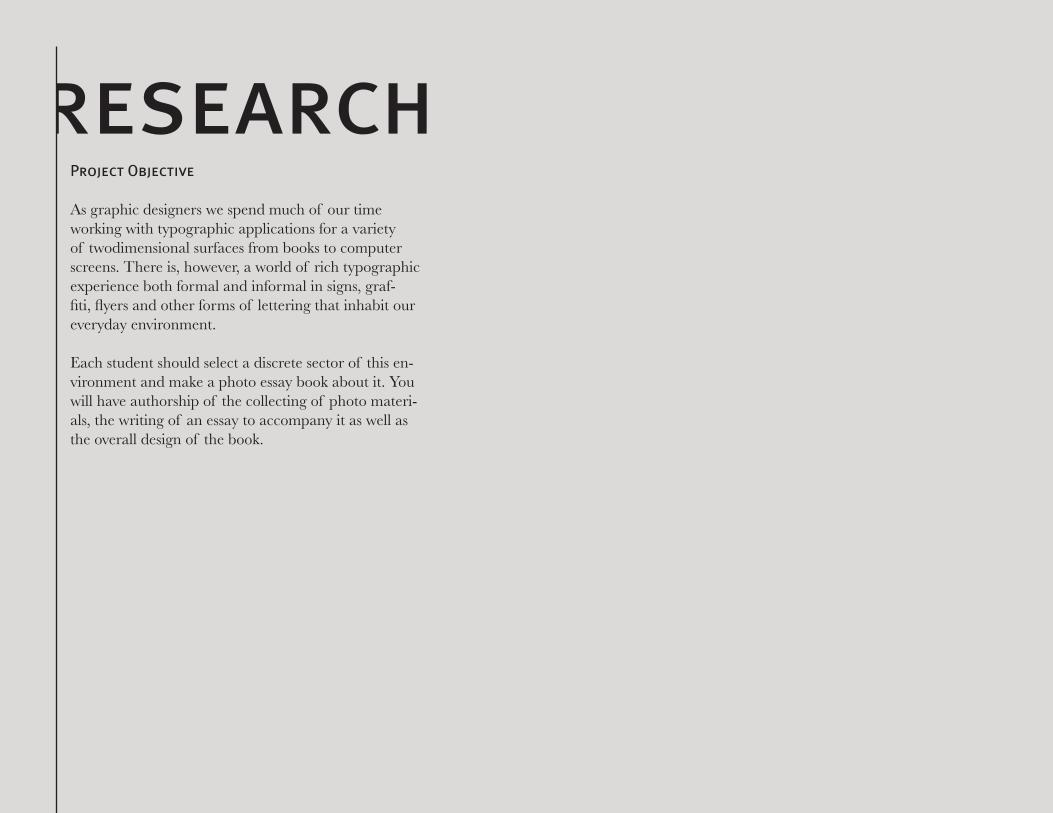
researchProject Objective
As graphic designers we spend much of our time working with typographic applications for a variety of twodimensional surfaces from books to computer screens. There is, however, a world of rich typographic experience both formal and informal in signs, graf-fiti, flyers and other forms of lettering that inhabit our everyday environment.
Each student should select a discrete sector of this en-vironment and make a photo essay book about it. You will have authorship of the collecting of photo materi-als, the writing of an essay to accompany it as well as the overall design of the book.

book copy text
IntroTypography is all around us, even when it is not in-tentional. Architecture, objects, and materials can also mimic the shape of familiar letterforms. These shapes are appealing to the public but can often go unnoticed. Look around you. The angles and shapes that the structures and objects around you will form shapes and soon letterforms with just a bit of concentration and creativity from you. See that tangled mess of extension cords beside your desk? Is there an ‘e’ or a ‘g’ there? I decided to take this concept out of my room and travel in Lawrence, Kansas, Kansas City, Missouri, and St. Louis, Missouri to find other examples of this hid-den type. My goal was to look at the world differently. Maybe seeing things I have never seen before even though I had passed by them multiple times before; and defiantly seeing the world from a different angle. It is amazing how much more one can appreciate the world when taking time to view the small details.
Lawrence, KSI have been going to school here in Lawrence for 2 full years now. As a graphic design student, you would think I would have noticed some of these letterforms before, especially when learning about the anatomy of type. Nope. The small details expose themselves only to the person who takes the time to notice. At first it was very difficult to look at objects in a different way. I found my-self finding a lot of “O” “L” and “X.” This is normal. It
is easy to spot a circular window, or doorknob, a corner of a door frame, or a cross in the sidewalk. These shapes are not only letterforms but basic structural devices. Right angles make things sturdy and regular, circles are symmetrical and easy to interact with.
I went to Massachusetts Street, the Lawrence equivalent of Main Street, for my first adventure of finding these letterforms. As I was walking down Mass, I walked past one f my favorite ice cream shops, Sylas & Maddy’s. On any other day, I would have walked past this store without a second glance however, that day, I was looking with a detailed eye. I saw a door handle for the employee entrance. There was nothing too spectacular about it, just a door knob. But on closer inspection, this door knob made an ‘S.’ I then was able to continue down Mass and find all the letters of the alphabet.
With a bit more concentration, I was able to find all the letterforms and compile my favorites into a alphabet. I found the majority of these letterforms on Massachusetts Street, a Lawrence equivalent of Main Street. The col-lection of small shops, restaurants, and storefront archi-tecture created a subdued and rural feel to the alphabet.
Kansas City, MOI am not familiar with Kansas City very well. I decided to go to an outdoor mall called Zona Rosa to try to find letterforms. I thought the variety of the store-fronts in combination with the different architecture styles would lend itself to letterforms well. I found it

much easier to find these abstract letterforms prob-ably because I was in a new environment and I did not have any past experiences and connections with these objects or buildings. Every object and building was a new opportunity for a letterform whereas the objects in more familiar areas I had already associated with their natural uses. In this new environment, I was able to detach any preconceived notions and concentrate on finding new letterforms. Instantly, I noticed a lamp that created a ‘C’ shape. What would have been a decora-tive swirl to the naked eye, transformed instantlly for me into a letterform. I then found additional letter-forms within Zona and was able to compile a different alphabet with its own characteristics.
St. Louis, MOI grew up in St. Louis. I was interested to go to St. Louis and see how my experiences in Lawrence and Kansas City would influence how i saw my home town. I decided to go to one of my favorite places growing up, Laumeier Sculpture Park. I used to go to the park often to view the numerous sculptures and spend time with my family. Now I was going to see if the vast variety of sculptures would provide me with some new letterforms. As I arrived I approached a pedestal which had a miniature version of a sculpture. These are used for the visually impaired so they can still experience the sculptures. While closely looking at the brass rendition, I found the letter ‘K’ in the branches. I then found a ‘Y’ in the same location. This was the beginning of a journey through the park experiencing the sculptures
I grew up learning about in a new way. I began seeing countless letterforms in different styles. The natural contrast of many of the sculptures’ hard, metal, and urban look with the natural surroundings lent well to the overall appearance of the letterforms.
ProportionAnother variable in the differences in letterforms is proportions. Four major variables control letterform proportion. These include, stroke to height ratio, contrast in stroke weight, x-height and proportion, and finally expanded and condensed styles. The last of which being most applicable to finding letterforms in everyday objects. Take for example this ‘O’ which I found on Mass Street in Lawrence. It appears to be a perfect circle. this is one example on how an ‘O’ might be found, it can be condensed like an oval as well. Keep your eye out for all different styles of letters and compare them to one another.
WeightLetterforms come in all shapes and sizes as we have already seen. Some large, some small; some thick, some thin. All of these characteristics contribute to weight. Weight is the relative darkness or lightness of the char-acters which results from the thickness of the strokes. A given font might have many different weights such as light, bold, extra bold, and hairline. When we are look-ing for letterforms in public spaces, it is important to remember that these letterforms will also come in dif-ferent weights as well. Looking on the streets of Zona,

I found a ‘Y’ in this lamp post. This particular example has a very thin weight.
Negative SpaceIt becomes easy to see letters formed from objects with objects. But what about the space around those objects? This space is called negative space and this is also useful for finding hidden letterforms. Isaac Witkin’s piece Haw-thorne Tree is a bronze work made up of sweeping liquid-like forms creating various negative spaces within itself. When looking for letterforms within this piece, it was important for me to address the negative space. I soon found an ‘R’ in the negative space created in this piece. Only by looking at the space around the physical object was I able to find this letterform.
AIn ancient middle eastern cultures, the ox was an ex-tremely valuable animal. Not only did it provide meat, and hides, but it aided in farming. Originally, the letter-form ‘A’ looked like an ox head. You can see remnants of this imagery when we turn the letter upside down.
DThe letter ‘D’ most likely began as the Phoenician letter daleth meaning door. Some people believe that the let-terform represents a flap of animal skin used as a door for a tent and others believe that it resembles a carved panel of a wooden door.
WThe letter ‘W’ is derived from the sixth letter of the proto-Sinaitic alphabet: vav. This letter originated F, U, and V as well. In Hebrew, vav means “nail” or “hook.” In ancient form it looked similar to a modern day Y, which was reminiscent of the bracket that supported a folded ship’s mast.
ConclusionNow look around you. What else in your environment is more than meets the eye? Using this refined and creative mindset, what can you discover? This experi-ence has taught me to appreciate the small things in my environment. Someone has designed everything that is around us. The way it exists, the way it decays, all are beautiful. When appreciated, the world becomes a much more exciting place to live.

class notes9.11Narrowing down subjects. Thinking of type of dance or hidden type.
9.18Decided on hidden type. Went got some photos from lawrence. Some are too hard for individuals to interpret.
9.25Got more pictures from Lawrence. Struggling on com-ing up with chapters. Decided on the history of type for non narritive parts.
9.27Trouble with moodboards. Need to tell a story rather than a compilation of what I want the book to look like.
10.2Took pictures in Kansas City. Perhaps split chapters by location?
10.4Need more establishing shots. One more location.
10.11Took pictures in St Louis last weekend at the sculp-ture park. They are a great contrast with the other ones I have.
10.16Simple type. Photographs need to be the star.
10.18Make cover image an obvious letter, not an establishing shot. Lead the reader into the book.
10.23Pages need refinement. Concept is there. Take the reader on an adventure.
10.25Book mock-up was helpful. Cover needs to show the whole letter. Make it obvious.
10.30Need more color on the cover. Work on credits page. Work in leading in the text.
11.1Finalized book. Minor refinements needed.
11.6Sent off book to blurb with no problems.


photography


designdevelopment
hidden type
“The most beautiful thing we can experience is the mysterious. It is the source of all true art and science.”
f o r c r e a t i v e e y e s o n l yTypography is all around us,
even when it is not intentional.
Architecture, objects, and materials
can also mimic the shape of familiar
letterforms. These shapes are
appealing to the public but can
often go unnoticed. Look around
you. The angles and shapes that the
structures and objects around you
will form shapes and soon letterforms
with just a bit of concentration and
creativity from you. See that tangled
mess of extension cords beside your
desk? Is there an ‘e’ or a ‘g’ there? I
decided to take this concept out of
my room and travel in Lawrence, Kansas,
Kansas City, Missouri, and St. Louis,
Missouri to find other examples of this
hidden type. My goal was to look at the
world differently. Maybe seeing things
I have never seen before even though
I had passed by them multiple times
before; and defiantly seeing the world
from a different angle. It is amazing how
much more one can appreciate the world
when taking time to view the small details.
aIn ancient middle eastern cultures, the ox was an extremely valuable animal. Not only did it provide meat, and hides, but it aided in farming. Originally, the letterform ‘A’ looked like an ox head. You can see remnants of this imagery when we turn the letter upside down.
-Albert Einstein
‘A’ taken at Zona Rosa in Kansas City, Missouri.
Among a wall of zig zags, A stylish, geomet-
ric A stands out.
HIDD
ENty
pe
Typography is all around us, even when
it is not intentional. Architecture, objects,
and materials can also mimic the shape
of familiar letterforms. These shapes are
appealing to the public but can often go
unnoticed. Look around you. The angles
and shapes that the structures and objects
around you will form shapes and soon
letterforms with just a bit of concentration
and creativity from you. See that tangled
mess of extension cords beside your desk?
Is there an ‘e’ or a ‘g’ there? I decided to
take this concept out of my room and
travel in Lawrence, Kansas, Kansas City,
Missouri, and St. Louis, Missouri to find
other examples of this hidden type. My
goal was to look at the world differently.
Maybe seeing things I have never seen
for cr
eativ
e eye
s onl
y
A In ancient middle eastern cultures, the ox was an extremely valuable animal. Not only did it provide meat, and hides, but it aided in farming. Originally, the letterform ‘A’ looked like an ox head. You can see remnants of this imagery when we turn the letter upside down.
“Change the way you look at things and the things you look at change.”
Wayne W Dyer
‘A’ taken at Zona Rosa in Kansas City, Missouri.Among a wall of zig zags, A stylish, geometric A stands out.
type palettes

A“Change the way you look at things and the things you look at change.” Wayne W Dyer
Typography is all around us, even when it is not
intentional. Architecture, objects, and materials
can also mimic the shape of familiar letterforms.
These shapes are appealing to the public but can
often go unnoticed. Look around you. The
angles and shapes that the structures and objects
around you will form shapes and soon letterforms
with just a bit of concentration and creativity from
you. See that tangled mess of extension cords beside
your desk? Is there an ‘e’ or a ‘g’ there? I decided
to take this concept out of my room and travel in
Lawrence, Kansas, Kansas City, Missouri, and St.
Louis, Missouri to find other examples of this hidden
type. My goal was to look at the world differently.
Maybe seeing things I have never seen before even
though I had passed by them multiple times before;
and defiantly seeing the world from a different
angle. It is amazing how much more
one can appreciate the world when
taking time to view the small details.
for creative eyes only
‘A’ taken at Zona Rosa in Kansas City, Missouri.Among a wall of zig zags, A stylish, geometric A stands out.
In ancient middle eastern cultures, the ox was an extremely
valuable animal. Not only did it provide meat, and
hides, but it aided in farming. Originally, the letterform
‘A’ looked like an ox head. You can see remnants of
this imagery when we turn the letter upside down.
Typography is all around us,
even when it is not intentional.
Architecture, objects, and materials
can also mimic the shape of
familiar letterforms. These shapes
are appealing to the public but
can often go unnoticed. Look
around you. The angles and shapes
that the structures and objects
around you will form shapes and
soon letterforms with just a bit
of concentration and creativity
from you. See that tangled mess
of extension cords beside your
desk? Is there an ‘e’ or a ‘g’ there?
I decided to take this concept
out of my room and travel in
for creative eyes onlya
In a
ncie
nt
mid
dle
east
ern
cu
ltu
res,
th
e o
x
was
an
extr
em
ely
valu
ab
le a
nim
al.
No
t o
nly
did
it
pro
vid
e m
eat,
an
d h
ides,
bu
t it
aid
ed
in
farm
ing
. O
rig
inally
, th
e lett
erf
orm
‘A’ lo
oked
like a
n o
x h
ead
. Y
ou
can
see r
em
nan
ts o
f th
is
imag
ery
wh
en
we t
urn
th
e lett
er
up
sid
e d
ow
n.
“Change the way you look at things and the things you look at change.” Wayne W Dyer
‘A’ taken at Zona Rosa in Kansas City, Missouri.Among a wall of zig zags, A stylish, geometric A stands out.
hidden typef o r c r e a t i v e e y e s o n l y
Typography is all around us, even when it is not intentional. Architecture, objects,
and materials can also mimic the shape of familiar letterforms. These shapes are
appealing to the public but can often go unnoticed. Look around you. The
angles and shapes that the structures and objects around you will form shapes and
soon letterforms with just a bit of concentration and
creativity from you. See that tangled mess of extension
cords beside your desk? Is there an ‘e’ or a ‘g’ there? I
decided to take this concept out of my room and travel
in Lawrence, Kansas, Kansas City, Missouri, and St.
Louis, Missouri to find other examples of this hidden type. My goal was to look
at the world differently. Maybe seeing things I have never seen before even though
I had passed by them multiple times before; and defiantly seeing the world from a
different angle. It is amazing how much more one can appreciate
the world when taking time to view the small details. Typography is
all around us, even when it is not intentional. Architecture, objects, and materials can
also mimic the shape of familiar letterforms. These shapes are appealing to the public
but can often go unnoticed. Look around you. The angles and shapes that the
structures and objects around you will form shapes and soon letterforms with just a bit
of concentration and creativity from you. See that tangled mess of extension cords beside
“Change the way you look at things and the things
you look at change.” Wayne W Dyer
‘A’ taken at Zona Rosa in Kansas City, Missouri.
Among a wall of zig zags, A stylish, geomet-
ric A stands out.
aIn ancient middle eastern cultures, the ox was an extremely valuable animal. Not only did it provide meat, and hides, but it aided in farming. Originally, the letterform ‘A’ looked like an ox head. You can see remnants of this imagery when we turn the letter upside down.

hidden type:urban typography
hidden type:urban typography
moodboards

hidden type:urban typography

n e g a t i v e s p a c eIt becomes easy to see letters formed from
objects with objects. But what about the
space around those objects? This space is
called negative space and this is also useful
for finding hidden letterforms. Isaac Witkin’s
piece Hawthorne Tree is a bronze work
made up of sweeping liquid-like forms
creating various negative spaces within itself.
When looking for letterforms within this
piece, it was important for me to address the
negative space. I soon found an ‘R’ in the
negative space created in this piece. Only
by looking at the space around the physical
object was I able to find this letterform.
n e g a t i v e s p a c e
It becomes easy to see letters formed from
objects with objects. But what about the
space around those objects? This space is
called negative space and this is also useful
for finding hidden letterforms. Isaac Witkin’s
piece Hawthorne Tree is a bronze work
made up of sweeping liquid-like forms
creating various negative spaces within itself.
When looking for letterforms within this
piece, it was important for me to address the
negative space. I soon found an ‘R’ in the
negative space created in this piece. Only
by looking at the space around the physical
object was I able to find this letterform.
stlouis
I was born and raised in St. Louis.
I was interested to go back to St. Louis
and see how my experiences in Lawrence
and Kansas City would influence how i
saw my home town. I decided to go to
one of my favorite places growing up,
Laumeier Sculpture Park. I used to
go to the park often to view the numerous
sculptures and spend time with my family.
Now I was going to see if the vast variety
of sculptures would provide me with some
new letterforms.
As I arrived I approached a pedestal which
had a miniature version of a sculpture.
These are used for the visually impaired
so they can still experience the sculptures
through touch. While closely looking at the
brass rendition, I found the letter ‘K’ in the
metal branches. I then found a ‘Y’ in the
same location. This was the beginning of
a journey through the park experiencing
the sculptures I grew up learning about
in a new way. I began seeing countless letterforms in different styles.
The natural contrast of many of the sculptures’
hard, metal, and urban look with the natural
surroundings lent well to the overall appearance
of the letterforms.
The letter ‘W’ is derived from the sixth
letter of the proto-Sinaitic alphabet: vav.
This letter originated F, U, and V as well.
In Hebrew, vav means “nail” or “hook.” In
ancient form it looked similar to a modern
day Y, which was reminiscent of the bracket
that supported a folded ship’s mast.
I was born and raised in St. Louis.
I was interested to go back to St. Louis
and see how my experiences in Lawrence
and Kansas City would influence how i
saw my home town. I decided to go to
one of my favorite places growing up,
Laumeier Sculpture Park. I used to
go to the park often to view the numerous
sculptures and spend time with my family.
Now I was going to see if the vast variety
of sculptures would provide me with some
new letterforms.
As I arrived I approached a pedestal which
had a miniature version of a sculpture.
These are used for the visually impaired
so they can still experience the sculptures
through touch. While closely looking at the
brass rendition, I found the letter ‘K’ in the
metal branches. I then found a ‘Y’ in the
same location. This was the beginning of
a journey through the park experiencing
the sculptures I grew up learning about
in a new way. I began seeing countless
letterforms in different styles. The natural
contrast of many of the sculptures’ hard,
metal, and urban look with the natural
surroundings lent well to the overall
appearance of the letterforms.
The letter ‘W’ is derived from the sixth
letter of the proto-Sinaitic alphabet: vav.
This letter originated F, U, and V as well.
In Hebrew, vav means “nail” or “hook.” In
ancient form it looked similar to a modern
day Y, which was reminiscent of the bracket
that supported a folded ship’s mast.
vertical spreads horizontal spreads

n e g a t i v e s p a c e
It becomes easy to see letters formed
from objects with objects. But what
about the space around those objects?
This space is called negative space
and this is also useful for finding
hidden letterforms. Isaac Witkin’s
piece Hawthorne Tree is a bronze
work made up of sweeping liquid-like
forms creating various negative
spaces within itself. When looking
for letterforms within this piece, it
was important for me to address the
negative space. I soon found an ‘R’
in the negative space created in this
piece. Only by looking at the space
around the physical object was I able
to find this letterform.
R I G H T :
An ‘R’ found using the nega-
tive space in Isaac Witlin’s
Hawthorne Tree
I was born and raised in St. Louis. I
was interested to go back to St. Louis and
see how my experiences in Lawrence and
Kansas City would influence how i saw
my home town. I decided to go to one of
my favorite places growing up, Laumeier
Sculpture Park. I used to go to the park
often to view the numerous sculptures and
spend time with my family. Now I was going
to see if the vast variety of sculptures would
provide me with some new letterforms.
As I arrived, I approached a pedestal which
had a miniature version of a sculpture.
These are used for the visually impaired
so they can still experience the sculptures
through touch. While closely looking at the
brass rendition, I found the letter ‘K’
in the metal branches. I then found
a ‘Y’ in the same location. This was the
beginning of a journey through the park
experiencing the sculptures I grew up learning
about in a new way. I began seeing countless letterforms in different
styles. The natural contrast of many of the
sculptures’ hard, metal, and urban look with
the natural surroundings lent well to the
overall appearance of the letterforms.
“Change the way you look at things and the things you look at change.” w a y n e w d y e r R I G H T :
A ‘K’ found in the
branches of a miniture
model of a piece at
Laummeier Sculpture Park in
St. Louis, MO.
L E F T T O R I G H T :
L,M,N,O found at Laumeier
Sculpture park.
The letter ‘W’ is derived from the sixth
letter of the proto-Sinaitic alphabet: vav.
This letter originated F, U, and V as well.
In Hebrew, vav means “nail” or “hook.” In
ancient form it looked similar to a modern
day Y, which was reminiscent of the bracket
that supported a folded ship’s mast.
hiddentypeu r b a n t y p o g r a p h y
b r e a n n e f e n c l
hiddentypeu r b a n t y p o g r a p h y
b r e a n n e f e n c l
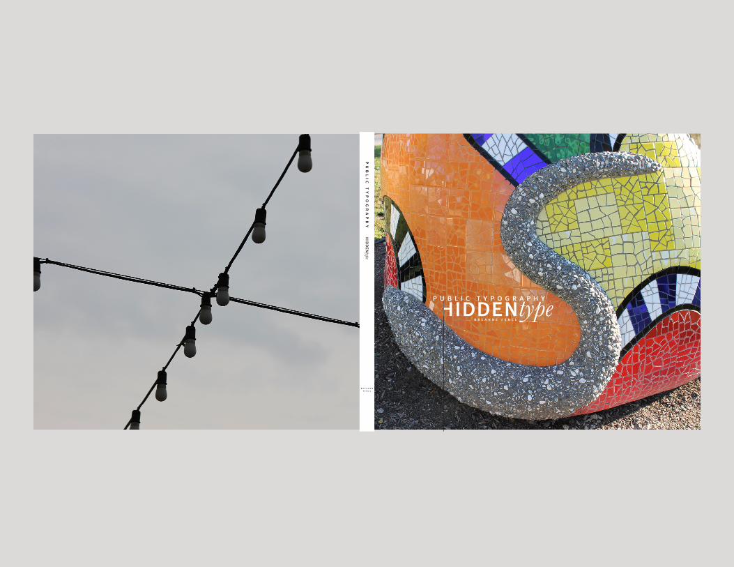
hiddentypep u b l i c t y p o g r a p h y
b r e a n n e f e n c l
hidden
typep
ub
lic
ty
po
gr
ap
hy
b r e a n n e f e n c l
hiddentypeu r b a n t y p o g r a p h y
b r e a n n e f e n c l
hiddentypeu r b a n t y p o g r a p h y
b r e a n n e f e n c l
hiddentypeu r b a n t y p o g r a p h y
b r e a n n e f e n c l
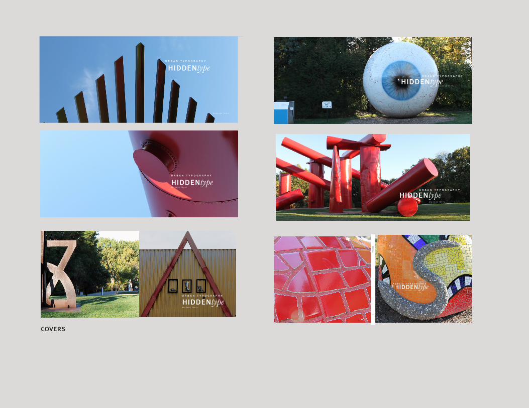
covers
hiddentypep u b l i c t y p o g r a p h y
b r e a n n e f e n c l
hidden
typep
ub
lic
ty
po
gr
ap
hy
b r e a n n e f e n c l

conceptstatementBeyond the world of intentional printed type, is a world that often goes unnoticed. The world of hidden type is one that is only exposed to those who are looking for it. With a trained eye, one can uncover a new world full of new letterforms. In my book, I narrate my experi-ences in three cities on a mission to find these hid-den letterforms. I was able to compile three complete alphabets and obtain a new outlook on the world.


p r o p o r t i o n
to be a perfect circle. this is one example
on how an ‘O’ might be found, it can be
condensed like an oval as well. Keep your
eye out for all different styles of letters
and compare them to one another.
2 2 2 2
An important variable in the differences
in letterforms is proportions. Four
major variables control letterform
proportion. These include, stroke to
height ratio, contrast in stroke weight,
x-height and proportion, and expanded
and condensed styles. The last of
which being most applicable to finding
letterforms in everyday objects. Take for
example this ‘O’ which I found on Mass Street in Lawrence. It appears
finalprojecthiddentype
p u b l i c t y p o g r a p h y
b r e a n n e f e n c l
introTypography is all around us, even when
it is not intentional. Architecture, objects, and
materials can also mimic the shape of familiar
letterforms. These shapes are appealing to
the public but can often go unnoticed. Look
around you. The angles and shapes that
the structures and objects around you will
form shapes and soon letterforms with just a bit of
concentration and creativity from you. See
that tangled mess of extension cords beside
your desk? Is there an ‘e’ or a ‘g’ there? What
about your coffee table? Is there a letterform
there? I decided to take this concept out of
my room and travel in Lawrence, KS, Kansas
City, MO, and St. Louis, MO to find other
examples of this hidden type. My goal
was to look at the world differently.
Seeing things I have never seen before in
environments that are familiar; and definitely
seeing the world from a different angle. It is
amazing how much more one can appreciate
the world when taking time to view the
small details.
L E F T :
‘I’ found at Zona Rosa
outdoor mall in Kansas
City, MO.
2 222
2 2
I have been goIng to school here In
Lawrence for 2 full years now. As a graphic
design student, you would think I would have
noticed some of these letterforms before,
especially when learning about the anatomy
of type. Nope. The small details expose
themselves only to the person who
takes the time to notice. At first it was
very difficult to look at objects in a different
way. I found myself finding a lot of “O” “L” and
“X.” This is normal. It is easy to spot a
circular window, or doorknob, a corner of a
door frame, or a cross in the sidewalk. These
shapes are not only letterforms but basic
structural devices. Right angles make things
sturdy and regular, circles are symmetrical
and easy to interact with.
“True originality consists not in a new manner but in a new vision.”
E d i t h W h a r t o n
The letter ‘A’ found on
Massachusetts Street in
Lawrence, KS.
2 2
2 2
I went to Massachusetts Street, the Lawrence
equivalent of Main Street, for my first
adventure of finding these letterforms.
As I was walking down Mass, I walked past
one of my favorite ice cream shops, Sylas &
Maddy’s. On any other day, I would have
walked past this store without a second
glance. However, that day, I was looking with
a detailed eye. I saw a door handle for the
employee entrance. There was nothing too
spectacular about it, just a door knob. But on
closer inspection, this door knob made an ‘S.’
I then was able to continue down Mass and
find all the letters of the alphabet.
L E F T T O R I G H T :
‘T’ ‘U’ ‘V’ all found in
Lawrence, KS.
22
In ancient middle eastern cultures, the ox was an
extremely valuable animal. Not only did it provide
meat, and hides, but it aided in farming. Originally,
the letterform ‘A’ looked like an ox head. You can
see remnants of this imagery when we turn the
letter upside down.
2222

With a bit more concentration, I was able to find all the
letterforms and compile my favorites into an alphabet. I found
all of these letterforms on Massachusetts Street, the Lawrence
equivalent of Main Street.
23
kansascityI am not famIlIar wIth Kansas cIty very
well. I decided to go to an outdoor mall
called Zona Rosa to try to find letterforms.
I thought the variety of the storefronts in
combination with the different architecture
styles would lend itself to letterforms well. I
found it much easier to find these abstract
letterforms probably because I was in a
new environment and I did not have any
past experiences and connections with
these objects or buildings. Every object
2323
and building was a new opportunity
for a letterform, whereas the objects in
more familiar areas I had already associated
with their natural uses. In this new
environment, I was able to detach any
preconceived notions and concentrate on
The letter ‘M’ found at Zona
Rosa in Kansas City.
Instantly, I noticed a lamp that created a ‘C’
shape. What would have been a decorative
swirl to the naked eye, transformed
instantlly for me into a letterform. I
then found additional letterforms within
Zona and was able to compile a different
alphabet with its own characteristics.
L E F T T O R I G H T :
‘D’ ‘E’ ‘F’ all found in
Kansas City, MO.
2323
w e i g h t
When we are looking for letterforms
in public spaces, it is important to
remember that these letterforms will
also come in different weights as well.
Looking on the streets of Zona, I found
a ‘Y’ in this lamp post. This particular
23 23
Letterforms come in all shapes and
sizes as we have already seen. Some
large, some small; some thick, some
thin. All of these characteristics
contribute to weight. Weight is the
relative darkness or lightness of the
characters which results from the
thickness of the strokes. A given font
might have many different weights such
as light, bold, extra bold, and hairline.
23
The letter ‘D’ most likely began as the Phoenician
letter daleth meaning door. Some people believe
that the letterform represents a flap of animal skin
used as a door for a tent and others believe that it
resembles a carved panel of a wooden door.
“The most beautiful thing we can experience is the mysterious. It is the source of all true art and
a l b e r t e i n s t e i n
23
After a good amount of walking and searching around Zona, I
was able to form a complete alphabet. Although different from
the Lawrence equavalent, the Zona alphabet has very similar
characteristics, and tone.

It becomes easy to see letters formed
from objects with objects. But what
about the space around those objects?
This space is called negative space
and this is also useful for finding
hidden letterforms. Isaac Witkin’s
piece Hawthorne Tree is a bronze
work made up of sweeping liquid-like
forms creating various negative
spaces within itself. When looking
for letterforms within this piece, it
was important for me to address the
negative space. I soon found an ‘R’
in the negative space created in this
piece. Only by looking at the space
around the physical object was I able
to find this letterform.
n e g a t i v e s p a c e
R I G H T :
An ‘R’ found using the nega-
tive space in Isaac Witlin’s
Hawthorne Tree
24 24
“Change the way you look at things and the things you look at change.”
w a y n e w d y e r
stlouis2424
I was born and raIsed In st. LouIs. I
was interested to go back to St. Louis and
see how my experiences in Lawrence and
Kansas City would influence how I saw
my home town. I decided to go to one of
my favorite places growing up, Laumeier
Sculpture Park. I used to go to the park
often to view the numerous sculptures and
spend time with my family. Now I was going
to see if the vast variety of sculptures would
provide me with some new letterforms.
As I arrived, I approached a pedestal which
had a miniature version of a sculpture.
These are used for the visually impaired
so they can still experience the sculptures
through touch. While closely looking at the
brass rendition, I found the letter ‘K’ in
the metal branches. I then found a ‘Y’ in
the same location. This was the beginning of
a journey through the park experiencing the
sculptures I grew up learning about in a new
way. I began seeing countless letterforms in different
styles. The natural contrast of many of
the sculptures’ hard, metal, and urban look
with the natural surroundings lent well to the
overall appearance of the letterforms.
L E F T T O R I G H T :
L,M,N,O found at Laumeier
Sculpture park.
R I G H T :
A ‘K’ found in the
branches of a miniture
model of a piece at
Laummeier Sculpture Park in
St. Louis, MO.
2424
The letter ‘W’ is derived from the sixth
letter of the proto-Sinaitic alphabet: vav.
This letter originated F, U, and V as well.
In Hebrew, vav means “nail” or “hook.” In
ancient form it looked similar to a modern
day Y, which was reminiscent of the bracket
that supported a folded ship’s mast.
2424
My day spent in Laumeier was an enjoyable and productive
one. I was able to collect examples of all the letters of the
alphabet and was able to compile them into a collection that is
rich in creativity and originality.
24
conclusion
now looK around you. what else In your
environment is more than meets the eye?
Using this refined and creative mindset,
what can you discover? This experience
has taught me to appreciate the small
things in my environment. Someone
has designed everything that is around us.
The way it exists, the way it decays, all are
beautiful. When appreciated, the world
becomes a much more exciting place to live.
2424
breanne fenclPublic Type | VISC 402: Designer as Author
Patrick Dooley | University of Kansas | Fall 2012
camera used:
Cannon eos rebel T3
typefaces:
Meta Plus, Baskerville
references:
ox, house, stIcK: the hIstory of our alphabet by Don Robb
mysterIes of the alphabet by Marc-Alain Ouaknin
typographIc desIgn: form and communIcatIon: fourth edItIon by Rob Carter, Ben Day, and Philip Meggs
25


reflectionI think overall I enjoyed this project. I had a pretty easy time choosing my topic but a hard time conveying what I saw to other people. I also found it hard to find things to research and put in my book. The text was the hard-est part for me. I wrote the narrative fine but needed more content. That is when I added the facts about the individual letterforms. Photographing was an interest-ing journey as well. I traveled to three different cities to get my content and it payed off. I particularly enjoyed the pictures I got from St Louis. Playing the roles of author, designer, and photographer gave me an ap-preciation for all the difficulties and perks each job has. In the future, if I am working with another individual with these jobs I will be able to better understand what they are going through and their goals. It also helped make the book all that more mine.