Embed Size (px)
Citation preview

1
© 2008 R. C. Lloyd & Associates, R. Scoville and the IHI
Better QualityThrough Better Measurement
Asia Pacific Forum on
Quality Improvement in Health Care
Robert Lloyd, PhD, Mary Seddon, MD and
Richard Hamblin
Wednesday 19 September 2012
© 2008 Institute for Healthcare Improvement/R. Lloyd & R. Scoville
Faculty
Robert Lloyd, PhDExecutive Director Performance ImprovementInstitute for Healthcare ImprovementBoston, Massachusetts, USA
Mary Seddon, MDClinical DirectorCentre for Quality Improvement, Ko AwateaCounties Manukau DHB, Auckland, NZ
Richard Hamblin, Director of Health Quality EvaluationHealth Quality & Safety Commission, Wellington, NZ

2
©Copyright 2010 Institute for Healthcare Improvement/R. Lloyd3
Discussion Topics
• Why are you measuring?
• The Quality Measurement Journey
• Understanding variation conceptually
• Understanding variation statistically
• Linking measurement to improvement
Exercise
Quality Measurement Journey Self-AssessmentThis self-assessment is designed to help quality facilitators gain a better understanding of where they personally
stand with respect to the milestones in the Quality Measurement Journey (QMJ). What would your reaction be
if you had to explain why using a run or control chart is preferable to computing only the mean, the standard
deviation or calculating a p-value? Can you construct a run chart or help a team decide which control is most
appropriate for their data?
You may not be asked to do all of the things listed below today or even next week. But, if you are facilitating a
QI team or advising a manager on how to evaluate a process improvement effort, sooner or later these
questions will be posed. How will you deal with them?
The place to start is to be honest with yourself and see how much you know about the QMJ. Once you have had
this period of self-reflection, you will be ready to develop a learning plan for self-improvement and
advancement.
Use the following Response Scale. Select the one response which best captures your opinion.
1 I could teach this topic to others!
2 I could do this by myself right now but would not want to teach it!
3 I could do this but I would have to study first!
4 I could do this with a little help from my friends!
5 I'm not sure I could do this!
6 I'd have to call in an outside expert!Source: R. Lloyd, Quality Health Care: A Guide to
Developing and Using Indicators. Jones & Bartlett
Publishers, 2004: 301-304.

3
Quality Measurement Journey Self-AssessmentSource: R. Lloyd, Quality Health Care: A Guide to Developing and Using Indicators.
Jones & Bartlett Publishers, 2004: 301-304.
Measurement Topic or SkillResponse Scale
1 2 3 4 5 6
Moving a team from concepts to set of specific quantifiable measures
Building clear and unambiguous operational definitions
Developing data collection plans (including frequency and duration of data collection)
Helping a team figure out stratification strategies
Explain and design probability and nonprobability sampling options
Explain why plotting data over time is preferable to using aggregated data and summary
statistics
Describe the differences between common and special causes of variation
Construct and interpret run charts (including the run chart rules)
Decide which control chart is most appropriate for a particular measure
Construct and interpret control charts(including the control chart rules)
Link measurement efforts to PDSA cycles
Build measurement plans into implementation and spread activities
©Copyright 2010 Institute for Healthcare Improvement/R. Lloyd
What are we trying toAccomplish?
How will we know that achange is an improvement?
What change can we make that will result in improvement?
The Model for Improvement
Act Plan
Study Do
Source:
Langley, et al. The Improvement Guide, 1996.
Our focus today
When you combine the 3 questions with the…
PDSA cycle, you get…
…the Model for Improvement.
4
©Copyright 2010 Institute for Healthcare Improvement/R. Lloyd
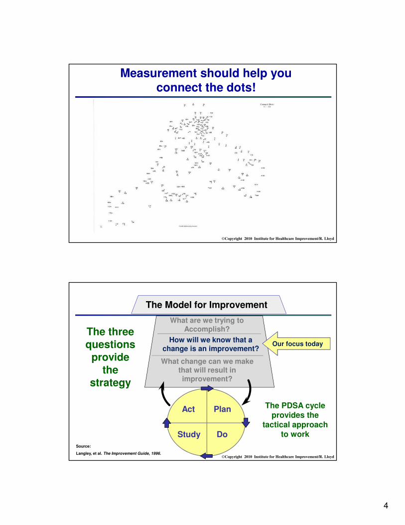
Measurement should help you connect the dots!
©Copyright 2010 Institute for Healthcare Improvement/R. Lloyd
What are we trying toAccomplish?
How will we know that achange is an improvement?
What change can we make that will result in improvement?
The Model for Improvement
Act Plan
Study Do
Source:
Langley, et al. The Improvement Guide, 1996.
Our focus today
The three questions
provide the
strategy
The PDSA cycle provides the
tactical approach to work

5
©Copyright 2010 Institute for Healthcare Improvement/R. Lloyd9
1. By understanding the variation that lives within your data
2. By making good management decisions on this variation (i.e., don’t
overreact to a special cause and don’t think that random movement of your data up and down is a
signal of improvement).
How will we know that achange is an improvement?
©Copyright 2010 Institute for Healthcare Improvement/R. Lloyd
Why are you measuring?
The answer to this question will guide your entire quality measurement journey!
Improvement?

6
©Copyright 2010 Institute for Healthcare Improvement/R. Lloyd
“The Three Faces of Performance Measurement: Improvement, Accountability and Research”
“We are increasingly realizing not only how critical measurement is to the quality improvement we
seek but also how counterproductive it can be to mix measurement for accountability or research
with measurement for improvement.”
byLief Solberg, Gordon Mosser and Sharon McDonald
Journal on Quality Improvement vol. 23, no. 3, (March 1997), 135-147.
©Copyright 2010 Institute for Healthcare Improvement/R. Lloyd
The Three Faces of Performance Measurement
Aspect Improvement Accountability Research
Aim Improvement of care
(efficiency & effectiveness)
Comparison, choice,
reassurance, motivation for
change
New knowledge
(efficacy)
Methods:
• Test ObservabilityTest observable
No test, evaluate current
performance Test blinded or controlled
• Bias Accept consistent bias Measure and adjust to reduce
bias
Design to eliminate bias
• Sample Size “Just enough” data, small
sequential samples
Obtain 100% of available,
relevant data
“Just in case” data
• Flexibility of
Hypothesis
Flexible hypotheses, changes
as learning takes place No hypothesis
Fixed hypothesis
(null hypothesis)
• Testing Strategy Sequential tests No tests One large test
• Determining if achange is animprovement
Run charts or Shewhart
control charts
(statistical process control)
No change focus
(maybe compute a percent
change or rank order the
results)
Hypothesis, statistical tests (t-
test, F-test,
chi square), p-values
• Confidentiality ofthe data
Data used only by those
involved with improvement
Data available for public
consumption and review
Research subjects’ identities
protected

7
©Copyright 2010 Institute for Healthcare Improvement/R. Lloyd
“Health Care Economics and Quality”by Robert Brook, et. al. Journal of the American Medical Association vol. 276, no. 6, (1996): 476-480.
Three approaches to research:
• Research for Efficacy(experimental and quasi-experimental designs/clinical trials, p-values)
• Research for Efficiency
• Research for EffectivenessQuality
Improvement Research
©Copyright 2010 Institute for Healthcare Improvement/R. Lloyd
Tin Openers and Dials• Concept from Carter and Klein (1992)
• Tin openers open up cans of worms
• Dials measure things to make judgements
• Most of the time you need to ask the right
questions before you try and get the right
answers
8
©Copyright 2010 Institute for Healthcare Improvement/R. Lloyd
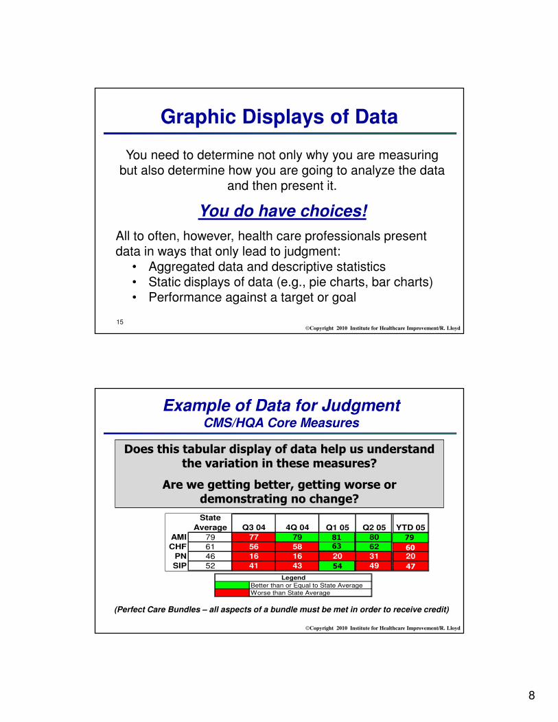
Graphic Displays of Data
15
You need to determine not only why you are measuring but also determine how you are going to analyze the data
and then present it.
You do have choices!
All to often, however, health care professionals present data in ways that only lead to judgment:
• Aggregated data and descriptive statistics• Static displays of data (e.g., pie charts, bar charts)• Performance against a target or goal
©Copyright 2010 Institute for Healthcare Improvement/R. Lloyd
Better than or Equal to State Average
Worse than State Average
Legend
State
Average Q3 04 4Q 04 Q1 05 Q2 05 YTD 05
AMI 79 77 79 78 80 78
CHF 61 56 58 56 62 58
PN 46 16 16 20 31 20
SIP 52 41 43 43 49 44
63
54
81 79
60
47
Example of Data for JudgmentCMS/HQA Core Measures
Does this tabular display of data help us understand the variation in these measures?
Are we getting better, getting worse or demonstrating no change?
(Perfect Care Bundles – all aspects of a bundle must be met in order to receive credit)

9
©Copyright 2010 Institute for Healthcare Improvement/R. Lloyd
0
0.1
0.2
0.3
0.4
0.5
0.6
Jan
-01
Feb
-01
Mar-
01
Ap
r-01
May-0
1
Ju
n-0
1
Ju
l-01
Au
g-0
1
Sep
-01
Oct-
01
No
v-0
1
Dec-0
1
Jan
-02
Feb
-02
Mar-
02
Ap
r-02
May-0
2
Ju
n-0
2
Ju
l-02
Au
g-0
2
Sep
-02
Oct-
02
No
v-0
2
Dec-0
2
Pro
po
rtio
n
Control Chart - p-chart11552 - Vaginal Birth After Cesarean Section (VBAC) Percentage
These data points are all common cause variation
Data for
Improvement
0
0.1
0.2
0.3
0.4
0.5
0.6
Pro
port
ion
Data for Judgment
©Copyright 2010 Institute for Healthcare Improvement/R. Lloyd
So, how do you view the Three Faces of Performance Measurement?
Or,
As… As a…
Imp
rovem
en
t
Ju
dg
men
t
Researc
h

10
©Copyright 2010 Institute for Healthcare Improvement/R. Lloyd
Relating the Three Faces ofPerformance Measurement to your work
The three faces of performance measurement should not be seen as mutually exclusive silos. This is not an either/or situation.
All three areas must be understood as a system. Individuals need to build skills in all three areas.
Organizations need translators who and be able to speak the language of each approach.
The problem is that individuals identify with one of the approaches and dismiss the value of the other two.
©Copyright 2010 Institute for Healthcare Improvement/R. Lloyd
Dialogue #1
Why are you measuring?─ How much of your organization’s energy is
aimed at improvement, accountability and/or
research?
─ Does one form of performance measurement
dominate your journey?
─ Does your organization approach measurement
from an enumerative or an analytic perspective?

11
©Copyright 2010 Institute for Healthcare Improvement/R. Lloyd
Do you have a plan to guide your quality measurement journey?
“The greatest thing in the world is not so much where we stand, as in what direction we are going.” Oliver Wendell Holmes
©Copyright 2010 Institute for Healthcare Improvement/R. Lloyd22
AIM (How good? By when?)
Concept
Measure
Operational Definitions
Data Collection Plan
Data Collection
Analysis ACTION
The Quality Measurement Journey
Source: Lloyd, R. Quality Health Care. Jones and Bartlett Publishers, Inc., 2004: 62-64.

12
©Copyright 2010 Institute for Healthcare Improvement/R. Lloyd23
AIM – freedom from harm
Concept – reduce patient falls
Measure – IP falls rate (falls per 1000 patient days)
Operational Definitions - # falls/inpatient days
Data Collection Plan – monthly; no sampling; all IP units
Data Collection – unit submits data to RM; RM assembles
and send to QM for analysis
Analysis – control chartTests of Change
The Quality Measurement Journey
©Copyright 2010 Institute for Healthcare Improvement/R. Lloyd24
AIM (Why are you measuring?)
Concept
Measure
Operational Definitions
Data Collection Plan
Data Collection
Analysis ACTION
The Quality Measurement Journey

13
©Copyright 2010 Institute for Healthcare Improvement/R. Lloyd
Moving from a Concept to Measure
“Hmmmm…how do I move from a concept
to an actual measure?
Every concept can have MANY measures. Which one is most appropriate?
©Copyright 2010 Institute for Healthcare Improvement/R. Lloyd26
Concept Potential Measures
Hand Hygiene Ounces of hand gel used each day
Ounces of gel used per staff
Percent of staff washing their hands (before & after visiting a patient)
Medication Errors Percent of errors
Number of errors
Medication error rate
VAPs Percent of patients with a VAP
Number of VAPs in a month
The number of days without a VAP
Every concept can have many measures

14
©Copyright 2010 Institute for Healthcare Improvement/R. Lloyd27
• Outcome Measures: Voice of the customer or patient. How is the system performing? What is the result?
• Process Measures: Voice of the workings of the system. Are the parts/steps in the system performing as planned?
• Balancing Measures: Looking at a system from different directions/dimensions. What happened to the system as we improved the outcome and process measures? (e.g. unanticipated consequences, other factors influencing outcome)
Three Types of Measures
©Copyright 2010 Institute for Healthcare Improvement/R. Lloyd28
Potential Set of Measures for Improvement in the ED
Topic
Outcome Measures
Process Measures
Balancing Measures
Improve waiting time
and patient
satisfaction in
the ED
Total Length of
Stay in the ED
Patient
Satisfaction
Scores
Time to registration
Patient / staff
comments on flow
% patient receiving
discharge materials
Availability of
antibiotics
Volumes
% Leaving without
being seen
Staff satisfaction
Financials

15
©Copyright 2010 Institute for Healthcare Improvement/R. Lloyd29
Balancing Measures: Looking at the System from Different Dimensions
• Outcome (quality, time)
• Transaction (volume, no. of patients)
• Productivity (cycle time, efficiency, utilisation, flow, capacity, demand)
• Financial (charges, staff hours, materials)
• Appropriateness (validity, usefulness)
• Patient satisfaction (surveys, customer complaints)
• Staff satisfaction
©Copyright 2010 Institute for Healthcare Improvement/R. Lloyd30
AIM (Why are you measuring?)
Concept
Measure
Operational Definitions
Data Collection Plan
Data Collection
Analysis ACTION
The Quality Measurement Journey

16
©Copyright 2010 Institute for Healthcare Improvement/R. Lloyd31
Operational Definitions
“Would you tell me, please, which way I ought
to go from here,” asked Alice?
“That depends a good deal on where you want
to get to,” said the Cat.
“I don’t much care where” - said Alice.
“Then it doesn’t matter which way you go,”
said the Cat.
From Alice in Wonderland, Brimax Books, London, 1990.
©Copyright 2010 Institute for Healthcare Improvement/R. Lloyd32
An Operational Definition...
… is a description, in quantifiable terms, of what to measure and the steps to follow to measure it consistently.
• It gives communicable meaning to a concept
• Is clear and unambiguous
• Specifies measurement methods and equipment
• Identifies criteria

17
©Copyright 2010 Institute for Healthcare Improvement/R. Lloyd33
How do you define the following Concepts?
• World Class Performance
• Alcohol related admissions
• Teenage pregnancy
• Cancer waiting times
• Health inequalities
• Asthma admissions
• Childhood obesity
• Patient education
• Health and wellbeing
• Adding life to years and years to life
• Children's palliative care
• Safe services
• Smoking cessation
• Urgent care
• Delayed discharges
• End of life care
• Falls (with/without injuries)
• Childhood immunisations
• Maternity services
• Engagement with measurement for improvement
• Moving services closer to home
• Breastfeeding
• Ambulatory care
• Access to health in deprived areas
• Diagnostics in the community
• Productive community services
• Vascular inequalities
©Copyright 2010 Institute for Healthcare Improvement/R. Lloyd
• Identify a project you are currently working on or plan to address in the near future.
• Select 1-2 Process , 1-2 Outcome and 1 Balancing measure and develop a clear operational definition for each measure.
• Use the Measurement Plan and Operational Definitions Worksheet s to record your work.
Exercise: Developing a Set of Measures andOperational Definitions

18
©Copyright 2010 Institute for Healthcare Improvement/R. Lloyd
Measure NameType(Process,
Outcome or
Balancing)
Operational Definition
1.
P
2.
P
3.
O
4.
O
5.
B
Measurement Plan Worksheet
Source: Lloyd & Scoville 2010
©Copyright 2010 Institute for Healthcare Improvement/R. Lloyd
Team name: _____________________________________________________________________________
Date: __________________ Contact person: ____________________________________
WHAT PROCESS DID YOU SELECT?
WHAT SPECIFIC MEASURE DID YOU SELECT FOR THIS PROCESS?
OPERATIONAL DEFINITIONDefine the specific components of this measure. Specify the numerator and denominator if it is a percent or a rate. If it is an average, identify the calculation for deriving the average. Include any special equipment needed to capture the data. If it is a score (such as a patient satisfaction score) describe how the score is derived. When a measure reflects concepts such as accuracy, complete, timely, or an error, describe the criteria to be used to determine “accuracy.”
Operational Definition Worksheet
Source: R. Lloyd. Quality Health Care: A Guide to Developing and Using Indicators. Jones and Bartlett, 2004.

19
©Copyright 2010 Institute for Healthcare Improvement/R. Lloyd
DATA COLLECTION PLANWho is responsible for actually collecting the data?How often will the data be collected? (e.g., hourly, daily, weekly or monthly?)What are the data sources (be specific)?What is to be included or excluded (e.g., only inpatients are to be included in this measure or only stat lab requests should be tracked).How will these data be collected?
Manually ______ From a log ______ From an automated system
BASELINE MEASUREMENTWhat is the actual baseline number? ______________________________________________What time period was used to collect the baseline? ___________________________________
TARGET(S) OR GOAL(S) FOR THIS MEASUREDo you have target(s) or goal(s) for this measure?Yes ___ No ___
Specify the External target(s) or Goal(s) (specify the number, rate or volume, etc., as well as the source of the target/goal.)
Specify the Internal target(s) or Goal(s) (specify the number, rate or volume, etc., as well as the source of the target/goal.)
Operational Definition Worksheet(cont’d)
Source: R. Lloyd. Quality Health Care: A Guide to Developing and Using Indicators. Jones and Bartlett, 2004.
©Copyright 2010 Institute for Healthcare Improvement/R. Lloyd
Measure Name(Provide a specific name such as
medication error rate)
Operational Definition(Define the measure in very specific terms.
Provide the numerator and the denominator if a
percentage or rate. Indicate what is to be included
and excluded. Be as clear and unambiguous as
possible)
Data Source(s)(Indicate the sources of the
data. These could include
medical records, logs,
surveys, etc.)
Data
Collection:•Schedule (daily, weekly,
monthly or quarterly)
•Method (automated systems,
manual, telephone, etc.)
Baseline•Period
•Value
Goals•Short term
•Long term
Dashboard Worksheet
Name of team:_______________________________ Date: _____________
Source: R. Lloyd. Quality Health Care: A Guide to Developing and Using Indicators. Jones and Bartlett, 2004.
See Worksheet Packet

20
©Copyright 2010 Institute for Healthcare Improvement/R. Lloyd
NON-SPECIFIC CHEST PAIN PATHWAY MEASUREMENT PLAN
Measure Name(Provide a specific name such as medication error
rate)
Operational Definition(Define the measure in very specific terms.Provide the numerator and the denominator if a percentage or rate. Indicate what is to be included and excluded. Be as clear and
unambiguous as possible)
Data Source(s)(Indicate the sources of the data. These could include
medical records, logs, surveys, etc.)
DataCollection:
•Schedule (daily, weekly, monthly or quarterly)•Method (automated systems, manual, telephone, etc.)
Baseline•Period•Value
Goals•Short term•Long term
Percent of patients who have MI or Unstable Angina as diagnosis
Numerator = Patients entered into the NSCP path who have Acute MI or Unstable Angina as the discharge diagnosis
Denominator = All patients entered into the NSCP path
1.Medical Records
2.Midas
3.Variance Tracking Form
1.Discharge diagnosis will be identified for all patients entered into the NSCP pathway2.QA-URwill retrospectively review charts of all patients entered into the NSCP pathway. Data will be entered into MIDAS system
1.Currently collecting baseline data.
2.Baseline will be completed by end of 1st Q 2010
Since this is essentially a descriptive indicator of process volume, goals are not appropriate.
Number of patients who are admitted to the hospital or seen in an ED due to chest pain within one week of when we discharged them
Operational Definition:A patient that we saw in our ED reports during the call-back interview that they have been admitted or seen in an ED (ours or some other ED) for chest pain during the past week
All patients who have been managed within the NSCP protocol throughout their hospital stay
1.Patients will be contacted by phone one week after discharge
2.Call-back interview will be the method
1.Currently collecting baseline data.
2.Baseline will be completed by end of 1st Q 2010
Ultimately the goal is to have no patients admitted or seen in the ED within a week after discharge. The baseline will be used to help establish initial goals.
Total hospital costs per one cardiac diagnosis
Numerator =Total costs per quarter for hospital care of NSCP pathway patients
Denominator =Number of patients per quarter entered into the NSCP pathway with a discharge diagnosis of MI or Unstable Angina
1.Finance
2.Chart Review
Can be calculated every three months from financial and clinical data already being collected
1.Calendar year 2010
2.Will be computed in June 2010
The initial goal will be to reduce the baseline by 5%within the first six months of initiating the project.
Source: R. Lloyd. Quality Health Care: A Guide to Developing and Using Indicators. Jones and Bartlett, 2004.
See Worksheet Packet
©Copyright 2010 Institute for Healthcare Improvement/R. Lloyd40
Now that you have selected and defined your measures, it is time to head out, cast your net and
actually gather some data!

21
©Copyright 2010 Institute for Healthcare Improvement/R. Lloyd41
Key Data Collection Strategies
Stratification• Separation & classification of
data according to predetermined categories
• Designed to discover patterns in
the data
• For example, are there differences by shift, time of day, day of week, severity of patients, age, gender or type of procedure?
• Consider stratification BEFORE
you collect the data
©Copyright 2010 Institute for Healthcare Improvement/R. Lloyd
1C-42
0
500
1000
1500
2000
2500
3000
3500
3/1/20
08
3/8/200
8
3/15
/200
8
3/22
/200
8
3/29
/200
8
4/5/20
08
4/12
/200
8
4/19
/200
8
4/26
/200
8
5/3/
2008
5/10
/200
8
5/17
/200
8
5/24
/200
8
5/31
/200
8
6/7/20
08
6/14
/200
8
6/21
/200
8
6/28
/200
8
7/5/200
8
7/12
/200
8
7/19
/200
8
7/26
/200
8
8/2/20
08
8/9/200
8
8/16
/200
8
8/23
/200
8
8/30
/200
8
9/6/20
08
9/13
/200
8
9/20
/200
8
What does a stratification problem look like?
Measure: running calorie total
There are two distinctprocesses at work here!
© Richard Scoville & I.H.I.
To
tal C
alo
ries

22
©Copyright 2010 Institute for Healthcare Improvement/R. Lloyd
The data should be divided into two stratification levels
0
500
1000
1500
2000
2500
3000
3500
3/1/20
08
3/8/200
8
3/15
/200
8
3/22
/200
8
3/29
/200
8
4/5/20
08
4/12
/200
8
4/19
/200
8
4/26
/200
8
5/3/
2008
5/10
/200
8
5/17
/200
8
5/24
/200
8
5/31
/200
8
6/7/20
08
6/14
/200
8
6/21
/200
8
6/28
/200
8
7/5/200
8
7/12
/200
8
7/19
/200
8
7/26
/200
8
8/2/20
08
8/9/200
8
8/16
/200
8
8/23
/200
8
8/30
/200
8
9/6/20
08
9/13
/200
8
9/20
/200
8
Travel days
Home days
What factors might influence your process?
Track them in your data to provide insights about variation and how to change the process!
© Richard Scoville & I.H.I.
To
tal
Calo
ries
©Copyright 2010 Institute for Healthcare Improvement/R. Lloyd
Common Stratification Levels
• Day of week
• Shift
• Severity of patients
• Gender
• Type of procedure
• Payer class
• Type of visit
• Unit
• Age
What stratification
levels are appropriate for
your data?

23
©Copyright 2010 Institute for Healthcare Improvement/R. Lloyd
When you can’t gather data on the entire population
due to time, logistics or
resources, it is time to consider
sampling.
Sampling
©Copyright 2010 Institute for Healthcare Improvement/R. Lloyd
The Relationships Between a Sample and the Population
Population
Negative Outcome Positive Outcome
What would a “good” sample look like?
Source: R. Lloyd

24
©Copyright 2010 Institute for Healthcare Improvement/R. Lloyd
Population
Negative Outcome Positive Outcome
A
A representative sample has the same shape and location as the total
population but have fewer observations (curve A).
A representative sample
The Relationships Between a Sample and the Population
Randomization is key – every element of the population has
the same chance of being selected.
Source: R. Lloyd
©Copyright 2010 Institute for Healthcare Improvement/R. Lloyd
Population
A sample improperly pulled could result in a positive sampling bias
(curve B) or a negative sampling bias (curve C).
A negatively biased sample
A positively biased sample
C B
Negative Outcome Positive Outcome
A
Estimates of the population based on a biased sample will be incorrect.
Source: R. Lloyd
Sampling Bias

25
©Copyright 2010 Institute for Healthcare Improvement/R. Lloyd
Non-probability Sampling Methods
• Convenience sampling
• Quota sampling
• Judgment sampling
Probability Sampling Methods
• Simple random sampling
• Stratified random sampling
• Stratified proportional random sampling
• Systematic sampling
• Cluster sampling
Sampling Methods
Source: R. Lloyd. Quality Health Care: A Guide to Developing and Using Indicators. Jones and Bartlett Publishers, 2004.
©Copyright 2010 Institute for Healthcare Improvement/R. Lloyd50
Sampling Options
Simple Random Sampling
Population Sample
Stratified proportional Random Sampling
Population Sample
Medical Surgical OB Peds
Judgment Sampling
Jan March April May JuneFeb
S S M PM M MOB OB SE
nu
mera
tiv
e A
pp
roach
es
Analytic Approach

26
©Copyright 2010 Institute for Healthcare Improvement/R. Lloyd
51
Judgment Sampling
• Include a wide range of conditions
• Selection criteria may change as understanding increases
• Successive small samples instead of one large sample
Especially useful for PDSA testing. Someone with process knowledge selects items to be sampled.
Characteristics of a Judgment Sample:
Source: R. Lloyd. Quality Health Care: A Guide to Developing and Using Indicators. Jones and Bartlett Publishers, 2004, 75-94.
©Copyright 2010 Institute for Healthcare Improvement/R. Lloyd
Judgment Sampling in Action!
It always seems pretty calm to me
here in the afternoon.
It is absolutely nuts here
between 8 and 10 AM!
Well the night shift is totally different from the day shift!

27
©Copyright 2010 Institute for Healthcare Improvement/R. Lloyd
How often and for how long do you need to collect data?
• Frequency – the period of time in which you collect data (i.e., how often will
you dip into the process to see the variation that exists?)• Moment by moment (continuous monitoring)?• Every hour?• Every day? Once a week? Once a month?
• Duration – how long you need to continue collecting data• Do you collect data on an on-going basis and not end until the measure is always
at the specified target or goal?• Do you conduct periodic audits?• Do you just collect data at a single point in time to “check the pulse of the
process”
• Do you need to pull a sample or do you take every occurrence of the data (i.e., collect data for the total population)
©Copyright 2010 Institute for Healthcare Improvement/R. Lloyd
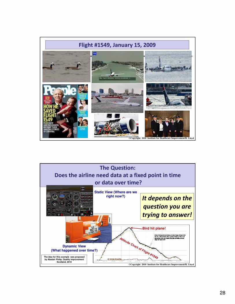
The Frequency of Data Collection:
The Story of Flight #1549, January 15, 2009
28
©Copyright 2010 Institute for Healthcare Improvement/R. Lloyd
Flight #1549, January 15, 2009
©Copyright 2010 Institute for Healthcare Improvement/R. Lloyd
The Question:
Does the airline need data at a fixed point in time
or data over time?
It depends on the
question you are
trying to answer!
The idea for this example was proposed by Alastair Philip, Quality improvement
Scotland, 2010
Bird hit plane!
Dynamic View(What happened over time?)
Static View (Where are we right now?)

29
©Copyright 2010 Institute for Healthcare Improvement/R. Lloyd
Exercise: Data Collection Strategies(frequency, duration and sampling)
• This exercise has been designed to test your knowledge of and skill with developing a data collection plan.
• In the table on the next page is a list of eight measures.
• For each measure identify:
– The frequency and duration of data collection.
– Whether you would pull a sample or collect all the data on each measure.
– If you would pull a sample of data, indicate what specific type of sample you would pull.
• Spend a few minutes working on your own then compare your ideas with others at your table.
©Copyright 2010 Institute for Healthcare Improvement/R. Lloyd
Exercise: Data Collection Strategies(frequency, duration and sampling)
The need to know, the criticality of the measure and the amount of data required to make a conclusion should drive the frequency, duration and whether you need to sample decisions.
MeasureFrequency and
DurationPull a sampling or take
every occurrence?
Vital signs for a patient connected to full telemetry in the ICU
Blood pressure (systolic and diastolic) to determine if the newly prescribed medication and dosage are having the desired impact
Percent compliance with a hand hygiene protocol
Cholesterol levels (LDL, HDL, triglycerides) in a patient recently placed on new statin medication
Patient satisfaction scores on the inpatient units
Central line blood stream infection rate
Percent of inpatients readmitted within 30 days for the same diagnosis
Percent of surgical patients given prophylactic antibiotics within 1 hour prior to surgical incision

30
©Copyright 2010 Institute for Healthcare Improvement/R. Lloyd59
AIM (Why are you measuring?)
Concept
Measure
Operational Definitions
Data Collection Plan
Data Collection
Analysis ACTION
The Quality Measurement Journey
©Copyright 2010 Institute for Healthcare Improvement/R. Lloyd60
You have performance data.
Now what the heck do you do with it?

31
©Copyright 2010 Institute for Healthcare Improvement/R. Lloyd61
Quality
Old Way versus the New Way
QualityBetter BetterWorse Worse
Old Way(Quality Assurance)
New Way(Quality Improvement)
Threshold
No action taken here
Action taken on all
occurrences
Action taken here
©Copyright 2010 Institute for Healthcare Improvement/R. Lloyd62
“If I had to reduce my message for
management to just a few words, I’d say it all had to do with reducing variation.”
W. Edwards Deming
Understanding Variation Statistically

32
©Copyright 2010 Institute for Healthcare Improvement/R. Lloyd63
The Problem
Aggregated data presented in tabular formats or with summary
statistics, will not help you measure the impact of process
improvement efforts. Aggregated data can only lead to judgment,
not to improvement.
©Copyright 2010 Institute for Healthcare Improvement/R. Lloyd
Thin-Slicing
“Thin-slicing refers to the ability of our unconscious to find patterns in situations and behavior based on very narrow slices
of experience.” Malcolm Gladwell, blink, page 23
When most people look at data they thin-slice it. That is, they basically use their unconscious to find patterns and trends in the data. They look for extremely high or
low data points and then make conclusions about performance based on limited data. R. Lloyd
33
©Copyright 2010 Institute for Healthcare Improvement/R. Lloyd
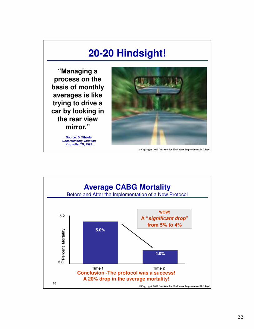
20-20 Hindsight!
“Managing a process on the
basis of monthly averages is like trying to drive a car by looking in
the rear view mirror.”
Source: D. Wheeler Understanding Variation,
Knoxville, TN, 1993.
©Copyright 2010 Institute for Healthcare Improvement/R. Lloyd66
Average CABG MortalityBefore and After the Implementation of a New Protocol
Pe
rce
nt
Mo
rta
lity
Time 1 Time 2
3.8
5.2
5.0%
4.0%
WOW!
A “significant drop”
from 5% to 4%
Conclusion -The protocol was a success! A 20% drop in the average mortality!

34
©Copyright 2010 Institute for Healthcare Improvement/R. Lloyd67
Average CABG MortalityBefore and After the Implementation of a New Protocol A Second Look at the Data
Pe
rce
nt
Mo
rta
lity
24 Months
1.0
9.0
Now what do you conclude about the impact of the protocol?
5.0
UCL= 6.0
LCL = 2.0
CL = 4.0
Protocol implemented here
©Copyright 2010 Institute for Healthcare Improvement/R. Lloyd68
The average of a set of numbers can be created by many different distributions
X (CL)
Measu
re
Time

35
©Copyright 2010 Institute for Healthcare Improvement/R. Lloyd69
If you don’t understand the variation that lives in your data, you will be tempted to ...
• Deny the data (It doesn’t fit my view of reality!)
• See trends where there are no trends
• Try to explain natural variation as special events
• Blame and give credit to people for things over
which they have no control
• Distort the process that produced the data
• Kill the messenger!
©Copyright 2010 Institute for Healthcare Improvement/R. Lloyd70
The
to understanding quality performance, therefore, lies in understanding variation over time not in preparing aggregated data and calculating summary statistics!

36
©Copyright 2010 Institute for Healthcare Improvement/R. Lloyd
“A phenomenon will
be said to be
controlled when,
through the use of
past experience, we
can predict, at least
within limits, how the
phenomenon may be
expected to vary in
the future”Shewhart - Economic Control of Quality of
Manufactured Product, 1931
Dr. Walter A Shewhart
©Copyright 2010 Institute for Healthcare Improvement/R. Lloyd72
“What is the variation in one system over time?” Walter A. Shewhart - early 1920’s, Bell Laboratories
time
UCL
Every process displays variation:• Controlled variation
stable, consistent pattern of variation“chance”, constant causes
• Special cause variation“assignable” pattern changes over time
LCL
Static View
Sta
tic V
iew
Dynamic View

37
©Copyright 2010 Institute for Healthcare Improvement/R. Lloyd73
Types of VariationCommon Cause Variation• Is inherent in the design of the
process
• Is due to regular, natural or ordinary causes
• Affects all the outcomes of a process
• Results in a “stable” process that is predictable
• Also known as random or unassignable variation
Special Cause Variation
• Is due to irregular or unnatural
causes that are not inherent in the
design of the process
• Affect some, but not necessarily all aspects of the process
• Results in an “unstable” process
that is not predictable
• Also known as non-random or
assignable variation
©Copyright 2010 Institute for Healthcare Improvement/R. Lloyd74
Point …
Common Cause does not mean “Good Variation.” It only means that the process is stable and predictable. For example, if a patient’s systolic blood pressure averaged around 165 and was usually between 160 and 170 mmHg, this might be stable and predictable but completely unacceptable.
Similarly Special Cause variation should not be viewed as “Bad Variation.” You could have a special cause that represents a very good result (e.g., a low turnaround time), which you would want to emulate. Special Cause merely means that the process is unstable and unpredictable.
You have to decide if the output of the process is acceptable!

38
©Copyright 2010 Institute for Healthcare Improvement/R. Lloyd© Richard Scoville & I.H.I.
Decision Tree for Managing Variation
Statistically relevant variation in “real” time
Plot goes up
when there is a
death
Down when a
patient
survives
Plot can never fall
below zero
Alert signalled

39
Continuous
background
monitoring
Initial analysis
Central
clinical reviewLocal, detailed
clinical
review
No issueArtefact
Improvement
plan
Alert!!
Responding to alerts in real time
©Copyright 2010 Institute for Healthcare Improvement/R. Lloyd78
12
/95
2/9
6
4/9
6
6/9
6
8/9
6
10
/96
12
/96
2/9
7
4/9
7
6/9
7
8/9
7
10
/97
12
/97
2/9
8
4/9
8
6/9
8
8/9
8
10
/98
12
/98
2/9
9
4/9
9
6/9
9
month
Pe
rce
nt C
-se
ctio
ns
0.0
5.0
10.0
15.0
20.0
25.0
30.0
35.0
UCL=27.7018
CL=18.0246
LCL=8.3473
Percent of Cesarean Sections Performed Dec 95 - Jun 99
Common Cause Variation
Normal Sinus Rhythm (a.k.a. Common Cause Variation)
Week
Num
ber
of M
edic
ations E
rrors
per
1000 P
atient D
ays
0.0
2.5
5.0
7.5
10.0
12.5
15.0
17.5
20.0
22.5
UCL=13.39461
CL=4.42048
LCL=0.00000
Medication Error Rate
Atrial Flutter Rhythm (a.k.a. Special Cause Variation)
Special Cause Variation
Deaths from accidental causes Referral rate
Death
s/
mo
nth
Refe
rrals
per
week

40
©Copyright 2010 Institute for Healthcare Improvement/R. Lloyd
Attributes of a Leader WhoUnderstands Variation
Leaders understand the different ways that variation is viewed.
They explain changes in terms of common causes and special causes.
They use graphical methods to learn from data and expect others to consider variation in their decisions and actions.
They understand the concept of stable and unstable processes and the potential losses due to tampering.
Capability of a process or system is understood before changes are attempted.
©Copyright 2010 Institute for Healthcare Improvement/R. Lloyd
• Select several measures your organization
tracks on a regular basis.
• Do you and the leaders of your organization evaluate these measures
according the criteria for common and
special causes of variation?
• If not, what criteria do you use to determine if data are improving or getting worse?
12/9
5
2/9
6
4/9
6
6/9
6
8/9
6
10/9
6
12/9
6
2/9
7
4/9
7
6/9
7
8/9
7
10/9
7
12/9
7
2/9
8
4/9
8
6/9
8
8/9
8
10/9
8
12/9
8
2/9
9
4/9
9
6/9
9
month
Perc
ent
C-s
ections
0.0
5.0
10.0
15.0
20.0
25.0
30.0
35.0
UCL=27.7018
CL=18.0246
LCL=8.3473
Percent of Cesarean Sections Performed Dec 95 - Jun 99
Week
Num
ber
of
Medic
ations E
rrors
per
1000 P
atient
Days
0.0
2.5
5.0
7.5
10.0
12.5
15.0
17.5
20.0
22.5
UCL=13.39461
CL=4.42048
LCL=0.00000
Medication Error Rate
Dialogue #2Common and Special Causes of Variation

41
©Copyright 2010 Institute for Healthcare Improvement/R. Lloyd81
STATIC VIEW
Descriptive StatisticsMean, Median & Mode
Minimum/Maximum/RangeStandard Deviation
Bar graphs/Pie charts
DYNAMIC VIEWRun Chart
Control Chart
(plot data over time)
Statistical Process Control (SPC)
Ra
te p
er 1
00
ED
Pa
tien
ts
Unp la nned R eturns to E d w /in 72 Ho urs
M41.78
17
A43.89
26
M39.86
13
J40.03
16
J38.01
24
A43.43
27
S39.21
19
O41.90
14
N41.78
33
D43.00
20
J39.66
17
F40.03
22
M48.21
29
A43.89
17
M39.86
36
J36.21
19
J41.78
22
A43.89
24
S31.45
22
M onth
E D/100
Retu r ns
u cha r tu cha r tu cha r tu cha r t
1 2 3 4 5 6 7 8 910
11
12
13
14
15
16
17
18
19
0 .0
0 .2
0 .4
0 .6
0 .8
1 .0
1 .2
UC L = 0. 88
Mean = 0.54
LC L = 0. 19
Understanding Variation Statistically
©Copyright 2010 Institute for Healthcare Improvement/R. Lloyd
1 2 3 4 5 6 7 8 9 10 11 12 13 14 15 16 17 18 19 20 21 22 23 24 25 26 27 28 29
Point Number
Po
un
ds o
f R
ed
Ba
g W
aste
3.25
3.50
3.75
4.00
4.25
4.50
4.75
5.00
5.25
5.50
5.75
6.00
Median=4.610
Me
as
ure
Time
The centerline (CL) on a Run Chart is the Median
Four simple run rules are used to determine if special cause variation is present
X (CL)~
Elements of a Run Chart

42
©Copyright 2010 Institute for Healthcare Improvement/R. Lloyd83
How do we count the number of runs?
• One or more consecutive data points on the same side
of the Median
• Do not include data points that fall on the Median
What is a Run?
• Draw a circle around each run and count the number of circles you have drawn
• Count the number of times the sequence of data points crosses the Median and add “1”
©Copyright 2010 Institute for Healthcare Improvement/R. Lloyd84
1 2 3 4 5 6 7 8 9 10 11 12 13 14 15 16 17 18 19 20 21 22 23 24 25 26 27 28 29
Point Number
Po
un
ds o
f R
ed
Ba
g W
aste
3.25
3.50
3.75
4.00
4.25
4.50
4.75
5.00
5.25
5.50
5.75
6.00
Median=4.610
Points on the Median
(don’t count these when counting the number of runs)
Run Chart: Medical WasteHow many runs are on this chart?

43
©Copyright 2010 Institute for Healthcare Improvement/R. Lloyd85
1 2 3 4 5 6 7 8 9 10 11 12 13 14 15 16 17 18 19 20 21 22 23 24 25 26 27 28 29
Point Number
Po
un
ds o
f R
ed
Ba
g W
aste
3.25
3.50
3.75
4.00
4.25
4.50
4.75
5.00
5.25
5.50
5.75
6.00
Median=4.610
Points on the Median
(don’t count these when counting the number of runs)
14 runs
Run Chart: Medical WasteHow many runs are on this chart?
©Copyright 2010 Institute for Healthcare Improvement/R. Lloyd86
Rules to Identify non-random patterns in the data displayed on a Run Chart
• Rule #1: A shift in the process, or too many data points in a run (6 or more consecutive points above or below the median)
• Rule #2: A trend (5 or more consecutive points all increasing or decreasing)
• Rule #3: Too many or too few runs (use a table to determine this one)
• Rule #4: An “astronomical” data point

44
©Copyright 2010 Institute for Healthcare Improvement/R. Lloyd87
Non-Random Rules for Run Charts
Source: The Data Guide by L. Provost and S. Murray, Austin, Texas, February, 2007: p3-10.
A Shift: 6 or more
An astronomical data point
Too many or too few runs
A Trend
5 or more
©Copyright 2010 Institute for Healthcare Improvement/R. Lloyd88
This is NOT a trend!

45
©Copyright 2010 Institute for Healthcare Improvement/R. Lloyd
Rule #3: Too many or too few runs
• If our change is successful, we will have
disrupted the previous process
• How many runs should we expect if the values all come from a stable process?
• If there are fewer runs (or more), we have
evidence that our change has made a difference
©Copyright 2010 Institute for Healthcare Improvement/R. Lloyd90
Rule #3: Too few or too many runsUse this table by first calculating the number of "useful observations" in your data set. This is done by subtracting the number of data points on the median from the total number of data points. Then, find this number in the first column. The lower number of runs is found in the second column. The upper number of runs can be found in the third column. If the number of runs in your data falls below the lower limit or above the upper limit then this is a signal of a special cause.
# of Useful Lower Number Upper Number Observations of Runs of Runs15 5 1216 5 1317 5 1318 6 1419 6 1520 6 1621 7 1622 7 1723 7 1724 8 1825 8 1826 9 1927 10 1928 10 2029 10 2030 11 21
Total data points with2 on the median
Total useful observations

46
©Copyright 2010 Institute for Healthcare Improvement/R. Lloyd91
Source: Swed, F. and Eisenhart, C. (1943) “Tables for Testing
Randomness of Grouping in a Sequence of Alternatives.” Annals
of Mathematical Statistics. Vol. XIV, pp. 66-87, Tables II and III.
©Copyright 2010 Institute for Healthcare Improvement/R. Lloyd92
25 Men and a Test
0
5
10
15
20
25
1 3 5 7 9 11 13 15 17 19 21 23 25
Individuals
Sc
ore
Rule #4: An Astronomical Data Point
What do you think about this data point?
Is it astronomical?

47
©Copyright 2010 Institute for Healthcare Improvement/R. Lloyd
©Copyright 2010 Institute for Healthcare Improvement/R. Lloyd
Run Chart Exercise
1. % of patients with Length of Stay shorter than six days
2. Average Length of Stay DRG373
3. Number of Acute Surgical Procedures
Source: Peter Kammerlind, ([email protected]), Project LeaderJönköping County Council, Jonkoping, Sweden.
Now it is your turn!• Interpret the following run charts• Is the median in the correct location?• What do you learn by applying the run chart rules?

48
©Copyright 2010 Institute for Healthcare Improvement/R. Lloyd
Mäta för att leda
Antal patienter med vårdtid < 6dygn i % vid primär elektiv knäplastik
(operationsdag= dag1)
0
10
20
30
40
50
60
70
80
90
1 2 3 4 5 6 7 8 9 10 11 12 13 14 15 16 17 18
Månad
Anta
l patiente
r i %
Source: Peter Kammerlind, ([email protected]), Project LeaderJönköping County Council, Jonkoping, Sweden.
% of patients with Length of Stay shorter than six days
©Copyright 2010 Institute for Healthcare Improvement/R. Lloyd
Grundläggande statistik och analys
Sekvensdiagram DRG 373
0
0,5
1
1,5
2
2,5
3
3,5
2005
2006
janu
ari
Febr
Mar
sAp
ril
Maj
Juni
Juli
Aug
usti
Sep
tembe
r
Oktob
er
Nov
embe
r
Dec
embe
r
janu
ari
Febr
Mar
sAp
ril
Maj
Juni
Juli
Aug
usti
Sep
tembe
r
Tidsenhet
Vård
dygn
Average Length of Stay DRG 373
Source: Peter Kammerlind, ([email protected]), Project LeaderJönköping County Council, Jonkoping, Sweden.

49
©Copyright 2010 Institute for Healthcare Improvement/R. Lloyd
Mäta för att leda
Akut kirurgi
80
90
100
110
120
130
140
150
160
1 2 3 4 5 6 7 8 9 10 11 12 13 14 15 16 17 18 19 20
Månad
Anta
l opera
tioner
Source: Peter Kammerlind, ([email protected]), Project LeaderJönköping County Council, Jonkoping, Sweden.
Number of Acute Surgical Procedures
©Copyright 2010 Institute for Healthcare Improvement/R. Lloyd98
Why are Control Charts preferredover Run Charts?
Because Control Charts…1. Are more sensitive than run charts
� A run chart cannot detect special causes that are due to point-to-point variation (median versus the mean)
� Tests for detecting special causes can be used with control charts
2. Have the added feature of control limits, which allow us to determine if the process is stable (common cause variation) or not stable (special cause variation).
3. Can be used to define process capability.
4. Allow us to more accurately predict process behavior and future performance.

50
©Copyright 2010 Institute for Healthcare Improvement/R. Lloyd
Jan01 Mar01 May01 July01 Sept01 Nov01 Jan02 Mar02 May02 July02 Sept02 Nov02
Month
Nu
mb
er
of
Co
mp
lain
ts
5.0
10.0
15.0
20.0
25.0
30.0
35.0
40.0
45.0
50.0
A
B
C
C
B
A
UCL=44.855
CL=29.250
LCL=13.645
Elements of a Control Chart
X (Mean)
Measu
re
Time
An indication of a special cause (Upper Control Limit)
(Lower Control Limit)
©Copyright 2010 Institute for Healthcare Improvement/R. Lloyd
Common Cause Variation• Is inherent in the design of the
process
• Is due to regular, natural or ordinary causes
• Affects all the outcomes of a process
• Results in a “stable” process that is predictable
• Also known as random or unassignable variation
Special Cause Variation• Is due to irregular or unnatural
causes that are not inherent in the design of the process
• Affect some, but not necessarily all aspects of the process
• Results in an “unstable” process that is not predictable
• Also known as non-random or assignable variation
How do we classify Variationon control charts?

51
©Copyright 2010 Institute for Healthcare Improvement/R. Lloyd101
UCL
LCL
X (CL)
Measu
re
Time
Zone B
Zone A
Zone C
Zone C
Zone B
Zone A
+3 SL
+1 SL
+2 SL
-1 SL
-2 SL
-3 SL
How do I use the Zones on a control chart?
©Copyright 2010 Institute for Healthcare Improvement/R. Lloyd102
Rule #1: 1 point outside the +/- 3 sigma limits
Rule #2: 8 successive consecutive points above (or below) the centerline
Rule #3: 6 or more consecutive points steadily increasing or decreasing
Rule #4: 2 out of 3 successive points in Zone A or beyond
Rule #5: 15 consecutive points in Zone C on either side of the centerline
There are many rules to detect special cause. The following five rules are recommended for general use and will meet most applications of control charts in healthcare.
Rules for Special Causes on Control Charts

52
©Copyright 2010 Institute for Healthcare Improvement/R. Lloyd
103
Rules for Detecting
Special Causes
1.
5.
4.
3.
2.
©Copyright 2010 Institute for Healthcare Improvement/R. Lloyd
Rule #1: 1 point outside the +/- 3 sigma limits A point exactly on a control limit is not considered outside the limit . When there is not a
lower or upper control limit Rule 1 does not apply to the side missing the limit.
Rule #2: 8 successive consecutive points above (or below) the centerlineA point exactly on the centerline does not cancel or count towards a shift.
Rule #3: 6 or more consecutive points steadily increasing or decreasingTies between two consecutive points do not cancel or add to a trend. When control charts
have varying limits due to varying numbers of measurements within subgroups, then rule
#3 should not be applied.
Rule #4: 2 out of 3 successive points in Zone A or beyond When there is not a lower or upper control limit Rule 4 does not apply to the side missing a
limit.
Rule #5: 15 consecutive points in Zone C on either side of the centerlineThis is known as “hugging the centerline”
Notes on Special Cause Rules

53
©Copyright 2010 Institute for Healthcare Improvement/R. Lloyd105
UCL
LCL
X (CL)
Measu
re
Time
Zone B
Zone A
Zone C
Zone C
Zone B
Zone A
+3 SL
+1 SL
+2 SL
-1 SL
-2 SL
-3 SL
Using the Zones on a control chart
©Copyright 2010 Institute for Healthcare Improvement/R. Lloyd
ApplyingControl Chart Rules: You Make the Call!

54
©Copyright 2010 Institute for Healthcare Improvement/R. Lloyd
Ra
te p
er
10
0 E
D P
atie
nts
Unp lanned Returns to E d w/in 72 Hours
M41.78
17
A43.89
26
M39.86
13
J40.03
16
J38.01
24
A43.43
27
S39.21
19
O41.90
14
N41.78
33
D43.00
20
J39.66
17
F40.03
22
M48.21
29
A43.89
17
M39.86
36
J36.21
19
J41.78
22
A43.89
24
S31.45
22
Mon th
ED/100
Re tu rns
u ch a r tu ch a r tu ch a r tu ch a r t
1 2 3 4 5 6 7 8 9 10 11 12 13 14 15 16 17 18 19
0 .0
0 .2
0 .4
0 .6
0 .8
1 .0
1 .2
U C L = 0 .88
Mean = 0.54
LC L = 0.19
Is there a Special Cause on this chart?
©Copyright 2010 Institute for Healthcare Improvement/R. Lloyd108
PERCENT PATIENTS C/O CHEST PAIN SEEN BY
CARDIOLOGIST WITHIN 10 MINUTES OF ARRIVAL TO ED
EXAMPLE CHART
81.5 %
0%
10%
20%
30%
40%
50%
60%
70%
80%
90%
100%
110%
120%
1 2 3 4 5 6 7 8 9 10 11 12 13 14 15 16 17 18 19 20 21 22 23 24
24 Weeks: October 2003 -- March 2004
Percent
Pati
ents
Seen 1
0 M
inute
s
P
UCL
Average
LCLXYZ Medical CenterPerformance Improvement Report
March 25, 2004
Fict it ious dat a for educat ional purposes
Target Goal / Desired Direction:
INCREASE in the PERCENT of patients c/o chest
pain seen by cardiologist within 10 minutes of
arrival to Emergency Department.
Interpretation: Current performance shows
(desirable) upward trend.
p-chart, possible range 0-100%
What special cause is on this chart?

55
©Copyright 2010 Institute for Healthcare Improvement/R. Lloyd109
Number of Patient Complaints by Month(XmR chart)
Are there any special causes present? If so, what are they?
Jan01 Mar01 May01 July01 Sept01 Nov01 Jan02 Mar02 May02 July02 Sept02 Nov02
Month
Nu
mb
er
of
Co
mp
lain
ts
5.0
10.0
15.0
20.0
25.0
30.0
35.0
40.0
45.0
50.0
A
B
C
C
B
A
UCL=44.855
CL=29.250
LCL=13.645
©Copyright 2010 Institute for Healthcare Improvement/R. Lloyd110
Appropriate Management Response to Common & Special Causes of Variation
Type of variation
Right Choice
Wrong Choice
Consequences of making the wrong
choice
Is the process stable?
YES NO
Only Common
Change the process
Treat normal variation as a special cause (tampering)
Increased variation!
Special + Common
Change the process
Wasted resources!
Investigate the origin of the special cause

56
©Copyright 2010 Institute for Healthcare Improvement/R. Lloyd
I know the right
chart has to be
hiding in here
somewhere!SPC
Sphere of
Knowledge
©Copyright 2010 Institute for Healthcare Improvement/R. Lloyd
Variables Data
Attributes DataDefects
(occurrences only)
Defectives(occurrences plus non-occurrences)
Nonconforming UnitsNonconformities
The choice of a Control Chart depends on the Type of Data you have collected

57
©Copyright 2010 Institute for Healthcare Improvement/R. Lloyd
There Are 7 Basic Control Charts
Variables Charts Attributes Charts
• p-chart(proportion or percent of
defectives)
• np-chart(number of defectives)
• c-chart(number of defects)
• u-chart(defect rate)
• X & R chart(average & range chart)
• X & S chart (average & SD chart)
• XmR chart (individuals & moving range chart)
©Copyright 2010 Institute for Healthcare Improvement/R. Lloyd
The Control Chart Decision Tree
Variables Data Attributes Data
More than one observation per
subgroup?
< than 10 observations
per subgroup?
X bar & R X bar & S XmR
Are the subgroups of equal size?
Is there an equal area of opportunity?
Occurrences & Non-
occurrences?
np-chartp-chartu-chartc-chart
Decide on the type of data
Yes
YesYes
Yes
Yes No NoNo
No No
The percent of
Defective UnitsThe number
of Defects
The Defect
Rate
Individual
Measurement
Average and
Standard
Deviation
Average and
Range
The number of
Defective Units
Source: Carey, R. and Lloyd, R. Measuring Quality Improvement in Healthcare: A Guide to Statistical Process Control Applications. ASQ Press, Milwaukee, WI, 2001.

58
©Copyright 2010 Institute for Healthcare Improvement/R. Lloyd115
Key Terms for Control Chart SelectionSubgroup
How you organize you data (e.g., by day, week or month)
The label of your horizontal axis
Can be patients in chronological order
Can be of equal or unequal sizes
Applies to all the charts
Observation
The actual value (data) you collect
The label of your vertical axis
May be single or multiple data points
Applies to all the charts
Area of Opportunity
Applies to all attributes or counts charts
Defines the area or frame in which a defective or defect can occur
Can be of equal or unequal sizes
31
©Copyright 2010 Institute for Healthcare Improvement/R. Lloyd116
Type of Chart Medication Production AnalysisX bar & S Chart What is the TAT for a daily sample of 25 medication
orders?
Individuals Chart
(XmR)
How many medication orders do we process each
week?
C-Chart
Using a sample of 100 medication orders each week,
how many errors (defects) are observed?
U-Chart
Out of all medication orders each week, how many
errors (defects) are observed?
P-Chart
For all medication orders each week, what
percentage have 1 or more errors (i.e., are
defective)?
The choice of a control chart depends on the question you are trying to answer!

59
©Copyright 2010 Institute for Healthcare Improvement/R. Lloyd117
©Copyright 2010 Institute for Healthcare Improvement/R. Lloyd118
AIM (Why are you measuring?)
Concept
Measure
Operational Definitions
Data Collection Plan
Data Collection
Analysis ACTION
The Quality Measurement Journey

60
©Copyright 2010 Institute for Healthcare Improvement/R. Lloyd119
PDSASphere of
Knowledge
Okay, I found the right
chart in here, now all I
have to do is to find the
right improvement
strategy!
©Copyright 2010 Institute for Healthcare Improvement/R. Lloyd120
1. Which process do you want to improve or redesign?
2. Does the process contain non-random patterns or special causes?
3. How do you plan on actually making improvements? What
strategies do you plan to follow to make things better?
4. What effect (if any) did your plan have on the process performance?
Run & Control Charts will help you answer Questions 2 & 4.
YOU need to figure out the answers to Questions 1 & 3.
A Simple Improvement Plan

61
©Copyright 2010 Institute for Healthcare Improvement/R. Lloyd121
February April
1
2
3
4
5
6
7
8
9
10
11
12
13
14
15
16
17
18
19
20
21
22
23
24
25
26
27
28
29
30
31
32
16 Patients in February and 16 Patients in April
Min
ute
s
2.5
5.0
7.5
10.0
12.5
15.0
17.5
20.0
22.5
25.0
27.5
30.0
A
B
C
C
B
A
UCL=15.3
CL=10.7
LCL=6.1
XmR Chart
Wait Time to See the Doctor
Baseline Period
Intervention
Where will the process go?
Freeze the Control Limits and Centerline, extend them and compare the new process performance to these
reference lines to determine if a special cause has been introduced as a result of the intervention.
©Copyright 2010 Institute for Healthcare Improvement/R. Lloyd122
February April
1
2
3
4
5
6
7
8
9
10
11
12
13
14
15
16
17
18
19
20
21
22
23
24
25
26
27
28
29
30
31
32
16 Patients in February and 16 Patients in April
Min
ute
s
2.5
5.0
7.5
10.0
12.5
15.0
17.5
20.0
22.5
25.0
27.5
30.0
A
B
C
C
B
A
UCL=15.3
CL=10.7
LCL=6.1
XmR Chart
Freeze the Control Limits and compare the new process performance to the baseline
using the UCL, LCL and CL from the baseline period as reference lines
A Special Cause is detected
A run of 8 or more data points on one side of
the centerline reflecting a sift in the
process
Baseline Period
Intervention
Wait Time to See the Doctor

62
©Copyright 2010 Institute for Healthcare Improvement/R. Lloyd123
February April
1
2
3
4
5
6
7
8
9
10
11
12
13
14
15
16
17
18
19
20
21
22
23
24
25
26
27
28
29
30
31
32
16 Patients in February and 16 Patients in April
Min
ute
s
2.5
5.0
7.5
10.0
12.5
15.0
17.5
20.0
22.5
25.0
27.5
30.0
A
B
C
C
B
A
UCL=15.3
CL=10.7
LCL=6.1
XmR Chart
Intervention Make new control limits for the process to show the
improvement
Baseline Period
Wait Time to See the Doctor
©Copyright 2010 Institute for Healthcare Improvement/R. Lloyd124
“Change is possible if
we have the desire and
commitment to make it
happen.”Mohandas Gandhi

63
©Copyright 2010 Institute for Healthcare Improvement/R. Lloyd
The Primary Drivers of Improvement
Will
Ideas Execution
QI
Having the Will (desire) to change the current state to one that is better
Developing Ideas
that will contribute to making processes and outcome better
Having the capacity to apply CQI theories, tools and techniques that enable the Execution of the ideas
©Copyright 2010 Institute for Healthcare Improvement/R. Lloyd126
Key Components* Self-Assessment
• Will (to change)
• Ideas
• Execution
• Low Medium High
• Low Medium High
• Low Medium High
*All three components MUST be viewed together. Focusing on one or even two of the components will guarantee suboptimized performance. Systems thinking lies at the heart of CQI!
How prepared is your Organization?

64
©Copyright 2010 Institute for Healthcare Improvement/R. Lloyd
The Sequence of Improvement
Sustaining and improvements and Spreading a changes to other locations
Developing a change
Implementing a change
Testing a change
Act Plan
Study Do
Theory and Prediction
Test under a variety of conditions
Make part of routine operations
©Copyright 2010 Institute for Healthcare Improvement/R. Lloyd128
Summary of Key Points• Understand why you are measuring
• Improvement, Accountability, Research
• Build skills in the area of data collection• Operational definitions
• Stratification & Sampling (probability versus non-probability)
• Build knowledge on the nature of variation
• Understanding variation conceptually
• Understanding variation statistically
• Know when and how to use Run & Control Charts • Numerous types of charts (based on the type of data)• The mean is the centerline (not the median which is on a run chart)• Upper and Lower Control Limits are sigma limits• Rules to identify special and common causes of variation• Linking the charts to improvement strategies

65
©Copyright 2010 Institute for Healthcare Improvement/R. Lloyd129
“Quality begins with intent, which is fixed by management.”
W. E. Deming, Out of the Crisis, p.5
©Copyright 2010 Institute for Healthcare Improvement/R. Lloyd
Thanks for joining us!
Please contact us if you have any questions:
Robert [email protected]
Mary [email protected]
Richard [email protected]

66
©Copyright 2010 Institute for Healthcare Improvement/R. Lloyd131
Appendices
• Appendix A: General References on Quality
• Appendix B: References on Measurement
• Appendix C: References on Spread
• Appendix D: References on Rare Events
• Appendix E: Basic “Sadistical” Principles
©Copyright 2010 Institute for Healthcare Improvement/R. Lloyd132
Appendix AGeneral References on Quality
• The Improvement Guide: A Practical Approach to Enhancing Organizational Performance. G. Langley, K. Nolan, T. Nolan, C. Norman, L. Provost. Jossey-Bass Publishers., San Francisco, 1996.
• Quality Improvement Through Planned Experimentation. 2nd edition. R. Moen, T. Nolan, L. Provost, McGraw-Hill, NY, 1998.
• The Improvement Handbook. Associates in Process Improvement. Austin, TX, January, 2005.
• A Primer on Leading the Improvement of Systems,” Don M. Berwick, BMJ, 312: pp 619-622, 1996.
• “Accelerating the Pace of Improvement - An Interview with Thomas Nolan,” Journal of Quality Improvement, Volume 23, No. 4, The Joint Commission, April, 1997.

67
©Copyright 2010 Institute for Healthcare Improvement/R. Lloyd133
Appendix BReferences on Measurement
• Brook, R. et. al. “Health System Reform and Quality.” Journal of the American Medical Association 276, no. 6 (1996): 476-480.
• Carey, R. and Lloyd, R. Measuring Quality Improvement in healthcare: A Guide to Statistical Process Control Applications. ASQ Press, Milwaukee, WI, 2001.
• Langley, G. et. al. The Improvement Guide. Jossey-Bass Publishers, San Francisco, 1996.
• Lloyd, R. Quality Health Care: A Guide to Developing and Using Indicators. Jones and Bartlett Publishers, Sudbury, MA, 2004.
• Nelson, E. et al, “Report Cards or Instrument Panels: Who Needs What? Journal of Quality Improvement, Volume 21, Number 4, April, 1995.
• Solberg. L. et. al. “The Three Faces of Performance Improvement: Improvement, Accountability and Research.” Journal of Quality Improvement 23, no.3 (1997): 135-147.
©Copyright 2010 Institute for Healthcare Improvement/R. Lloyd134
Appendix CReferences on Spread
• Gladwell, M. The Tipping Point. Boston: Little, Brown and Company, 2000.
• Kreitner, R. and Kinicki, A. Organizational Behavior (2nd ed.) Homewood, Il: Irwin, 1978.
• Lomas J, Enkin M, Anderson G. Opinion Leaders vs Audit and Feedback to Implement Practice Guidelines. JAMA, Vol. 265(17); May 1, 1991, pg. 2202-2207.
• Myers, D.G. Social Psychology (3rd ed.) New York: McGraw-Hill, 1990.
• Prochaska J., Norcross J., Diclemente C. In Search of How People Change, American Psychologist, September, 1992.
• Rogers E. Diffusion of Innovations. New York: The Free Press, 1995.
• Wenger E. Communities of Practice. Cambridge, UK: Cambridge University Press, 1998.

68
©Copyright 2010 Institute for Healthcare Improvement/R. Lloyd135
Appendix DReferences for Rare Events Control Charts
• Benneyan, JC, Lloyd, RC and Plsek, PE. “Statistical process control as a tool for research and healthcare improvement”, Quality and Safety in Health Care12:458-464.
• Benneyan JC and Kaminsky FC (1994): "The g and h Control Charts: Modeling Discrete Data in SPC", ASQC Annual Quality Congress Transactions, 32-42.
• Jackson JE (1972): "All Count Distributions Are Not Alike", Journal of Quality Technology 4(2):86-92.
• Kaminsky FC, Benneyan JC, Davis RB, and Burke RJ (1992): "Statistical Control Charts Based on a Geometric Distribution", Journal of Quality Technology24(2):63-69.
• Nelson LS (1994): "A Control Chart for Parts-Per-Million Nonconforming Items", Journal of Quality Technology 26(3):239-240.
©Copyright 2010 Institute for Healthcare Improvement/R. Lloyd
Appendix EA few basic “Sadistical” Principles
The sum of the deviations (xi – x ) of a set of observations
about their mean is equal to zero.Σ Σ Σ Σ (xi – x ) = 0
The average deviation (AD) is obtained by adding the
absolute values of the deviations of the individual values
from their mean and dividing by n.
ΣΣΣΣ | xi – x |
n
The sample variance (s2) is the average of the squares of
the deviations of the individual values from their mean.
ΣΣΣΣ ( xi – x ) 2
n -1
Which finally leads us to our good old friend, the standard deviation, which is the positive square root of the variance.
(See the next page for
this fun formula!)
AD =
s2 =
Statistics related to depicting variation

69
©Copyright 2010 Institute for Healthcare Improvement/R. Lloyd137
Appendix E (continued)
What is the Standard Deviation?
Σ (Σ (Σ (Σ (Xi – X)
n-1
2
The Standard Deviation (sd) is created by taking
the deviation of each individual data point (Xi)
from the mean (X), squaring each difference,
summing the results, dividing by the number of cases and then taking the
square root.


![[Leo Jason-Lloyd, Leonard Jason-Lloyd] an Introduc(BookSee.org)](https://img.dokumen.tips/doc/110x75/55cf8e0f550346703b8e1817/leo-jason-lloyd-leonard-jason-lloyd-an-introducbookseeorg.jpg)