Embed Size (px)
Citation preview

DESIGN
APAlejandra Padilla
B.A Design studentSan Jose State University

Alejandra Padilla . (408)796-2967 . [email protected]
DISCO SOUR DISCO SOUR
It’s natural li
tmus st
rip Butterfly Pea Flowerhttp://w
ww.nytimes.com/2016/07/06/dining/blue-cocktails-blure-butterfly
-pea-flow
MOOD-RING co
lor ch
ange
A Mood-Ring Ingredient Cocktails Change Color

Alejandra Padilla . (408)796-2967 . [email protected]
R
O U N D R O U N D R O U N D R O
U N
D
R
O U N D R O U N D R O U N D R O U N
D
C MPRESS
Alejandra Padilla . (408)796-2967 . [email protected]
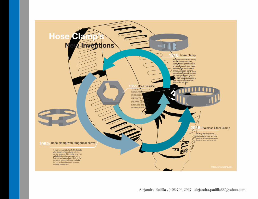
Hose Clamp’s New Inventions
1855: Albert M. Waterhouse was one of an inventor who designs the hose clamp. Hose clamp was referred as "hose-coupling".His invention was composed of three pieces that were made of brass and other metals. The hose coupling screws with two pipes that can bring together. It had benefits to holding a grip and strength the pressure through those pipes. This invention is simply an easy tool to adjust and easily loosen.
1916:An inventor named Wilmer F. Kenly who invented a useful and improvement in hose clamp. The clamp has an end piece of a hose to a pipe or a nozzle ,or to clamp the hose about any cylindrical objects. This object provides securing around the object . It also provides a flexible metal band that can construct together when the band is a piece of hose. The two ends of the clamp can be drawn to each other by using the screw-driver on the bolt head.
Hose Coupling
hose clamp
1982: hose clamp with tangential screw
A inventor named Alan F. Meckstroth who design a hose clamp with tan-gential screw. A thick metal strip that cylinderical portion connects with a fold ear and second ear. Both of the ears also connects the screw to be tighted and produce non-stripping cocking engagment.
2016:Stainless-Steel ClampA WWll veteran Commander Lumley Robinson who invented Stainless-Steel Clamp. It is water resistants and flexible metal band. Clamp can used any home tool.
https://www.uspto.gov

Alejandra Padilla . (408)796-2967 . [email protected]
This progressive, radical movement in graphic design is not concerned with the graphic design in Switzerland, but rather w i th the new style that had been proposed, attacked and defended in the 1920s in Switzerland. Keen attention to detail, precision, craft skills, system of education and technical training, a high standard of printing as well as a clear re f ined and invent ive le t ter ing and typography laid out a foundation for a new movement that has been exported worldwide in 1960s to become an international style.
Emerging from the modernist and constructivist ideals, the Swiss Style can be defined as an authen-tic pursue for simplicity – the beauty in the underlines of a purpose, not beauty as a purpose in itself. The principle “form follows function” became a battle-cry of Modernist architects after the 1930s. As a consequence of this principle, most of the Swiss Style craft is devoted to the minimal elements of style such as typogra-phy and content layout rather than on textures and illustrations.
UNIFORMITY AND GE-OMETRYEven a quick study of classic Swiss style works reveals a strong attention of graphic designers to uniform design elements and strong geometric shapes. Graphic artists have experimented with abstract geometric patterns, uncomon color combinations, text manipulations and striking abstract visuals that were used to clearly convey
their purpose in a very remarkable way.
WHITESPACE: LET THE TEXT BREATH
Whitespace can never be underrated. It’s a very important element for both visual impact and readability. It feels quite inviting when a web page is laid out in such a fashion that the organization of the page (and the site) is clearly conveyed in a split of a second. It’s also good for business, since people use interfaces that they understand and tend reject the ones they don’t.
A common way that people pursue organization is by having markers that separate the different parts of the site: in web design icons and illustrations are used to separate various types of content. But Swiss style is all about using less, so instead of adding more elements to work with, they prefer to remove as much as possible. This is a great example of the ‘less is more’ principle and of the ‘the content is the interface’ wisdom.
GRID SYSTEMSA grid system is a rigid framework that is supposed to help graphic designers in the meaningful, logical and consistent organi-zation of information on a page. Rudimen-tary versions of grid systems existed since the medieval times, but a group of graphic designers, mostly inspired in ideas from typographical literature started building a more rigid and coherent system for page layout. The core of these ideas were first presented in the book Grid Systems in Graphic Design by Josef Müller-Brock-mann which helped to spread the knowl-edge about the grids thorough the world.
DROP THE SERIF (…OR RATHER DON’T)One of the strongest characteristics of the Swiss style typography is the use of sans-ser-if typefaces such as Akzidenz Grotesk and
Neue Haas Grotesk (a.k.a Helvetica). In fact, when Jan Tschichold wrote Die neue Typographie, he ignored any use of non sans-serif typefaces. With this philosophy, graphic designers were aiming at clarity, simplicity and universality. Helvetica, for instance, is a typeface that is famous for its pervasiveness: it is used in corporate identi-ty, street signs, magazines and pretty much everywhere else. The Swiss Style advocates that the typeface does not have to be expres-sive in itself, it must be an unobtrusive instrument of expression.
FONT-SIZE AS A TOOL FOR READABILITY, IMPACT AND RHYTHMIt’s very common to spot the use of font-size contrast in the works of the Swiss Style.
Different font-sizes not only generate visual impact, but also provide readers with a hint about the hierarchy of the presented data. Huge words are the entry points, the top-level elements in the content’s information architecture and page’s hierarchy. This is a very efficient way of guiding the reader’s eyes through the page, thus working as an
interface to the content.
PHOTOGRAPHY. YES, PHOTOGRAPHY.Despite not being particularly famous for it, one important part of the Swiss Style is its remarkable use of photography. Following the modernist ideas in which photography was a much better tool to portray reality than drawings and illustrations, the Neue grafik magazine, a very important Swiss graphic design publication at the time, dedicated a big part of its content to photography and its application in design.
CreditBy Diogo Terror
Lessons fromSwiss Style
Graphic Design
This progressive, radical movement in graphic design is not concerned with the graphic design in Switzerland, but rather with the new style that had been proposed, attacked and defended in the 1920s in Switzerland. Keen attention to detail, precision, craft skills, system of education and technical training, a high standard of printing as well as a clear refined and inventive lettering and typography laid out a foundation for a new movement that has been exported worldwide in 1960s to become an international style.
Emerging from the modernist and constructivist ideals, the Swiss Style can be defined as an authentic pursue for simplicity – the beauty in the underlines of a purpose, not beauty as a purpose in itself. The principle “form follows function” became a battle-cry of Modernist archi-tects after the 1930s. As a consequence of this principle, most of the Swiss Style craft is devoted to the minimal elements of style such as typography and content layout rather than on textures and illustrations.
UNIFORMITY AND GEOMETRYEven a quick study of classic Swiss style works reveals a strong attention of graphic designers to uniform design elements and strong geometric shapes. Graphic artists have experimented with abstract geometric patterns, uncomon color combinations,
text manipulations and striking abstract visuals that were used to clearly convey their purpose in a very remarkable way.
WHITESPACE: LET THE TEXT BREATHWhitespace can never be underrated. It’s a very important element for both visual impact and readability. It feels quite inviting when a web page is laid out in such a fashion that the organization of the page (and the site) is clearly conveyed in a split of a second. It’s also good for business, since people use interfaces that they understand and tend reject the ones they don’t.
A common way that people pursue organization is by having markers that separate the different parts of the site: in web design icons and illustrations are used to separate various types of content. But Swiss style is all about using less, so instead of adding more elements to work with, they prefer to remove as much as possible. This is a great example of the ‘less is more’ principle and of the ‘the content is the interface’ wisdom.
GRID SYSTEMSA grid system is a rigid framework that is supposed to help graphic designers in the meaningful, logical and consistent organi-zation of information on a page. Rudimen-tary versions of grid systems existed since the medieval times, but a group of graphic designers, mostly inspired in ideas from typographical literature started building a more rigid and coherent system for page layout. The core of these ideas were first presented in the book Grid Systems in Graphic Design by Josef Müller-Brock-mann which helped to spread the knowl-edge about the grids thorough the world.
DROP THE SERIF (…OR RATHER DON’T)
One of the strongest characteristics of the Swiss style typography is the use of sans-ser-if typefaces such as Akzidenz Grotesk and Neue Haas Grotesk (a.k.a Helvetica). In fact, when Jan Tschichold wrote Die neue Typographie, he ignored any use of non sans-serif typefaces. With this philosophy, graphic designers were aiming at clarity, simplicity and universality. Helvetica, for instance, is a typeface that is famous for its pervasiveness: it is used in corporate identi-ty, street signs, magazines and pretty much everywhere else. The Swiss Style advocates that the typeface does not have to be expres-sive in itself, it must be an unobtrusive instrument of expression.
FONT-SIZE AS A TOOL FOR READABILITY, IMPACT AND RHYTHMIt’s very common to spot the use of font-size contrast in the works of the Swiss Style.
Different font-sizes not only generate visual impact, but also provide readers with a hint about the hierarchy of the presented data. Huge words are the entry points, the top-level elements in the content’s information architecture and
page’s hierarchy. This is a ver y efficient way of guiding the reader’s eyes through the
page, thus working as an interface to the content.
PHOTOGRAPHY. YES, PHOTOGRAPHY.Despite not being particularly famous for it, one important part of the Swiss Style is its remarkable use of photography. Follow-ing the modernist ideas in which photogra-phy was a much better tool to portray reality than drawings and illustrations, the Neue grafik magazine, a very important Swiss graphic design publication at the time, dedicated a big part of its content to photography and its application in design.
lso known as International
Style, the Swiss Style does
not simply describe a style of
graphic design made in
Switzerland. It became famous through the
art of very talented Swiss graphic designers,
but it emerged in Russia, Germany and
Netherlands in the 1920’s. This style in art,
architecture and culture became an
‘international’ style after 1950’s and it was
produced by artists all around the globe.
Despite that, people still refer to it as the
Swiss Style or the Swiss Legacy.
“Form Follows Function”
Swiss Style Magazine
ww
w.sm
ashingmagazine.com
/
Alejandra Padilla . (408)796-2967 . [email protected]