Embed Size (px)
Citation preview

MASTHEAD The masthead, much like VICE magazine is located at the top of the cover on the leA. NME use a standard colour scheme for their Dtle which is very recognizable, they maintain this yet again on this cover and use the sharp reds of the Dtle to help compliment the subheadings and tag lines featured through out the cover. This adds a feeling of finesse to the magazine and a consistent colour scheme of reds and whites helps the cover seem crowded and almost packed full of content. The size of the masthead is enough for it to be easily recognizable in a shops magazine rack yet rarely draws much aIenDon from the main image in the centre of the page. NME uses this well, it seems that the aspects of the cover compliment each other rather than looking like they are all fighDng for the most prominent posiDon.
IMAGE The main image takes central focus in this ediDon of NME magazine much like every other magazine, it is clear from the text and the tag lines that this ediDon features heavily the arDsts Gorillaz, the image itself features both Blurs and Gorillaz Damon Albarn, hence the pun ‘reality BLURS’. The image incorporates both Damon, who is the brains and the lead singer behind Gorillaz and its cartoon alter egos that feature so frequently in Gorillaz music videos and tours. To almost any reader, these characters are immediately recognizable and also interesDng, even if the potenDal reader has liIle knowledge of Gorillaz. This is another clever feature that stops alienaDon of a chunk of readers of NME that may feel ‘leA out’ for not recognizing the main arDst the ediDon seems to be covering. ArDsDcally, it also very intriguing how both reality (Damon) and his Manga-‐esque companies blend so comfortably on the cover, it makes Gorillaz seem more interesDng, and in turn this ediDon NME magazine.
TAGLINES NME have a broad audience in terms of its readers, due to this, the taglines used are oAen designed to appeal and aIract every one of these readers, on the cover of this issue and many others, NME have used bold fonts in block capitals for their taglines, this makes the topics seem more urgent and important, there is a sense of direcDvity that accompanies these taglines and makes the topics stand out a deal more. ArDsts names are doIed around the top and boIom secDons of the cover in the same style, whereas topics within the magazine are placed in no parDcular order in the bigger body of the cover, this makes the magazine look more ‘packed’ full of interesDng arDcles.
NME MAGAZINE ANALYSIS, FRONT COVER
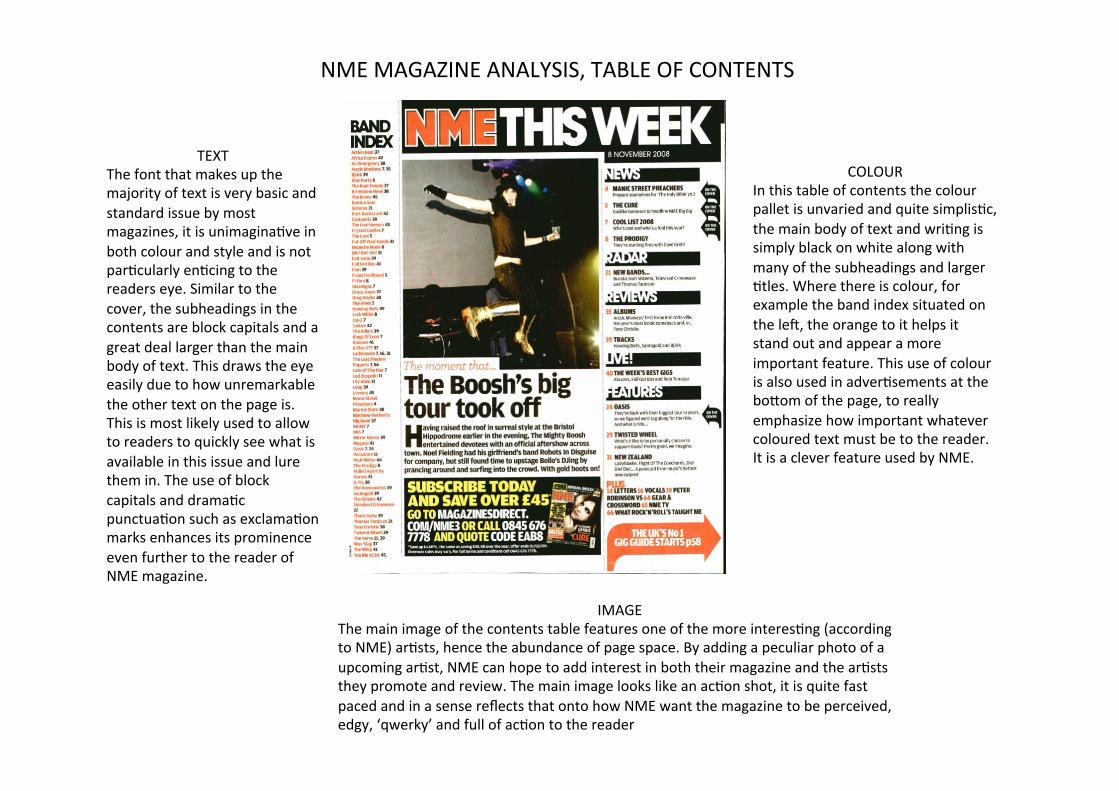
COLOUR In this table of contents the colour pallet is unvaried and quite simplisDc, the main body of text and wriDng is simply black on white along with many of the subheadings and larger Dtles. Where there is colour, for example the band index situated on the leA, the orange to it helps it stand out and appear a more important feature. This use of colour is also used in adverDsements at the boIom of the page, to really emphasize how important whatever coloured text must be to the reader. It is a clever feature used by NME.
TEXT The font that makes up the majority of text is very basic and standard issue by most magazines, it is unimaginaDve in both colour and style and is not parDcularly enDcing to the readers eye. Similar to the cover, the subheadings in the contents are block capitals and a great deal larger than the main body of text. This draws the eye easily due to how unremarkable the other text on the page is. This is most likely used to allow to readers to quickly see what is available in this issue and lure them in. The use of block capitals and dramaDc punctuaDon such as exclamaDon marks enhances its prominence even further to the reader of NME magazine.
IMAGE The main image of the contents table features one of the more interesDng (according to NME) arDsts, hence the abundance of page space. By adding a peculiar photo of a upcoming arDst, NME can hope to add interest in both their magazine and the arDsts they promote and review. The main image looks like an acDon shot, it is quite fast paced and in a sense reflects that onto how NME want the magazine to be perceived, edgy, ‘qwerky’ and full of acDon to the reader
NME MAGAZINE ANALYSIS, TABLE OF CONTENTS

TITLE & TEXT The Dtle is done so that it spreads across the enDrety of the two pages in this NME magazines double page spread. This emphasizes its importance and status, and draws aIenDon to its odd news paper cut out’ design, immediately it catches the eye which in turn makes the reader focus on what is actually said. It is quite dramaDc, this is used to lure the reader of NME into reading the lengthy arDcle below. The text below the Dtle is less significant, it is a standard font and considerably smaller than the Dtle, this is so enough interesDng content can be placed in the double page spread – and also to make the Dtle stand out even further.
IMAGE Like the Dtle, the image also spreads across the two pages, yet again emphasizing its importance, or rather her importance. Without even reading the Dtle or any of the text the reader can be immediately aware of who the arDcle features/focuses on, this saves Dme for them and is a manner of convenience more than anything. Along with this, by NME placing the main arDst at the focal point of the page, fans of the arDst will be a great deal more inclined to focus directly on the double spread. The way Lily Allen is placed on the page (to the right) and the main quoted Dtle (on the right) makes it seem as though she has directly said the dramaDc Dtle, which in effect she has.
COLOUR The colours on this double page spread are to an extent unremarkable, mostly blacks and whites are used which may be deliberate to compliment the ‘news paper cut out’ Dtle theme. The odd word from the arDcle is enlarged slightly and is in a red shade of colour, this makes the word stand out completely from the otherwise very consistent colour scheme. Lily Allen herself is wearing a shirt of both reds and blacks, not only does this fit in with the colour pallet, but I think NME chose that abre to make her more colourfully prominent on the page.
NME MAGAZINE ANALYSIS, DOUBLE PAGE SPREAD