Embed Size (px)
Citation preview

NGO Websites
Course Instructors:Eric R. Jacobs, M.B.A.
Sandra M. Jacobs, M.B.A.US Peace Corps
L’viv Catholic University’s Institute for Non-Profit Management February 2006 Certificate Program

Agenda
• Why does your NGO need a Website?• Fundamental Website Principles• Development Strategies• Real ‘Live’ Examples• Practical Application Exercise

Why does your NGO need a Website?
• The internet has become the first source of communication for most organizations– Domestically – Internationally
• Websites allow a direct link to your service recipients, employees and volunteers…even to those who did not know you otherwise existed!
• Websites are a relatively inexpensive way to disseminate as much information as you wish

Key Website Principles
• KISS (Keep it Simple, Silly)• Identify your audience• Homepage basics…what to include?• Language options and translation strategies• 2 click principle• Font and color strategies• Remember loading time• Photos – to include or not to include?

KISS (Keep it Simple, Stupid)
• Don’t create a monster or website for everyone, focus on your audiences
• Only include information you need to effectively communicate to your audience
• Build your website in stages. It is better to have small site than one “under construction”
• The home page should answer who, what, where, why, when and how

Identify your audience
• Answer the following questions:– Who needs information about my NGO?
• Potential donors• Members and or staff• Service recipients• Others
– What information will be helpful to them?– What language(s) do they speak?– Culture, Time Zone, etceteras?

Homepage basics…what you need?
• Important homepage information or links:– Mission and vision of your NGO– Services provided by your NGO & to whom
• Donors• Service recipients• Members page
– ‘Contact Us’ page – Annual report, if applicable– Current Projects – Success stories and past projects– Fundraising and or donation information– Index page

Language translation strategies
• Consider your language requirements:– Is Ukrainian or Ukrainian/Russian sufficient to meet
your website and organizational needs?– If English or other languages are required, who will
translate the website?
• When presenting information for foreign donors or partners, professionalism is critical!– Find a native speaker if possible to proofread your
website content before posting online.
• Translations of new material must be timely and accurate.
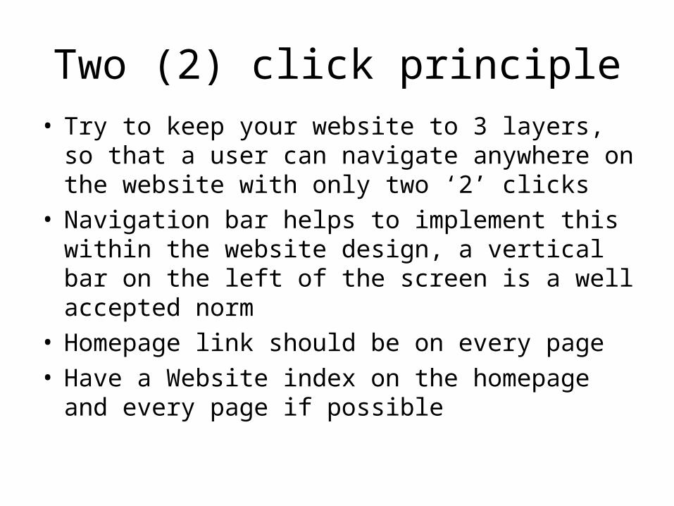
Two (2) click principle• Try to keep your website to 3 layers, so that a
user can navigate anywhere on the website with only two ‘2’ clicks
• Navigation bar helps to implement this within the website design, a vertical bar on the left of the screen is a well accepted norm
• Homepage link should be on every page• Have a Website index on the homepage and
every page if possible

Font and color strategies
• Try to keep the fonts standard and easy to read– Information first, style second
• Stay away from cursive, mixed fonts and blinking texts
• Bolding is acceptable and effective to highlight headings and titles, but do not “over do it”
• It is acceptable to use your organization’s fonts when expressing symbols, emblems and titles.

Font and color strategies
• Keep the color schemes simple, easy to read and pleasant to the eyes.
• Stay away from black, red, purples and yellow backgrounds.
• Try to use soothing colors; grey, blues, earth tones and greens.
• It is acceptable to use your organizations colors, symbols or emblems, but use them sparingly if they are not a good website colors

Remember loading time
• Your homepage should consider lower connectivity speed users.
• If a user does not see the homepage, they will not wait to see the rest of the site
• 5 seconds should be the maximum loading time for your homepage (1 - 2 seconds is the norm in America)
• 10 second maximum for other pages on the site• If you do not expect a lot of users to download
information, do not include it

Photos, to include or not to include?
• Pros– A picture tells a thousand words– They grab people attention– They create familiarity
• Cons– They slow page download speed– They can miscommunicate a message– They can be perceived as unprofessional

Development Strategies• What if your organization has no knowledge of
websites?– Incorporate website design and development into a
larger or specific project proposal– Research Ukrainian and international websites of
organizations similar to yours• What do you like? What don’t you like? What is missing? What
is annoying? • Use the answers assist in the development of your site
– Work with a university or institute to find technical students looking for ‘practical internship’

Development Strategies
• Building an effective website is a project first, then an ongoing operation. Plan accordingly.– Create a project to build or overhaul your website
• Determine who builds the site• Who will host the site• Develop a budget and stick to it
– Develop an operational strategy to keep you website updated and maintained
• Will the site be maintained internally or externally?• Develop a budget and stick to it• Review the plan every six months
– A neglected website can do more harm than good to your organization, do not build it and forget it!

Development Strategies80 / 20 Rule
• The classic definition of the principle states: that a small number of the causes (20%) are responsible for most (80%) of the effect.
• With respect to web design, it can be said that 20% of the work will take up 80% of your time.
• Success can be found in identifying that expensive 20% and taking proactive steps to mitigate the costs and time.

Good and Bad Websites
• The following slides show three examples of websites from good to fair to bad.
• A good website is easily understood, with a high information to data ratio. It can be read over quickly and effectively and has left side or top navigation.
• A fair website has all the right components, but may have too large a homepage or too long a loading time or some missing key elements
• A poor website it confusing, requires a lot of work form the reader and looks unprofessional, it does not invite someone back regardless of the information’s value
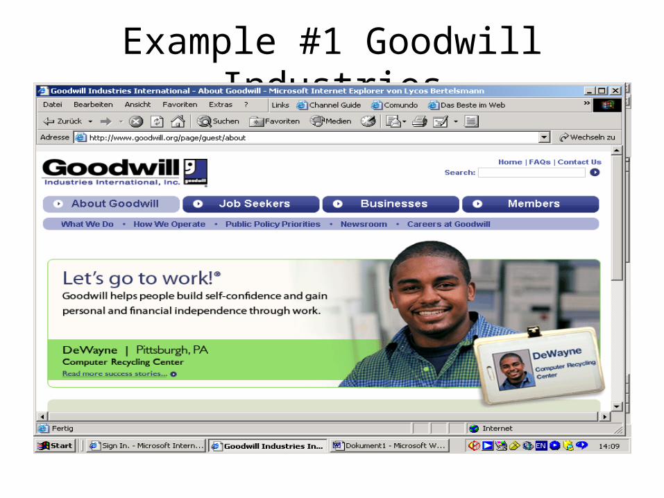
Example #1 Goodwill Industries

Example #1 Goodwill Industries

Example #2 Youth Can

Example #2 Youth Can

Example #3 Youth Can

Example #3 RAFSG – L,R&V

Example #3 RAFSG – L,R&V

NGO Website Design
.
Any Questions?