Embed Size (px)
Citation preview

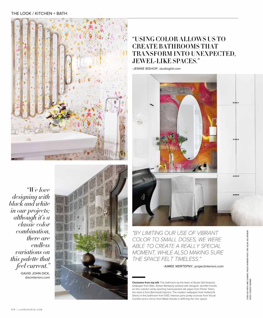
THE LOOK / KITCHEN + BATH
l u x e s o u r c e .c o m / 1 2 7
Share your design vision. The house was a historic remodel, and the kitchen was a blank space aside from the blue La Cornue oven. My first goal was to integrate the color of the range so it felt like part of an overall story rather than a random dash of color. I think many are nervous to jump into a bold range choice, but this is proof that it can be done without being too overwhelming.
Best ways to introduce pattern into the kitchen? I love patterned back-splashes! This is an area where you can really set the tone for a kitchen, and it’s an obvious area you can have a lot of fun with. Even tonal or monochromatic patterns can add interest. In this kitchen, we also added the carved island, which gave us a nice, ethnic twist to help balance the backsplash, as well as the very colorful range.
How can color revive and freshen up a kitchen? Color is a great addition to everyday life. White is classic and timeless, of course, but it is also a very safe option. This kitchen is a bit of a hybrid of pattern and color, and I think it is so much more interesting as a result. Plus, as more spaces are open-plan these days, embracing a little more color in kitchens allows you to connect rooms more cohesively.
HAUTE DISHTAYLOR BORSARIDesigner Taylor Borsari channels Morocco in a Coronado, California, kitchen that dazzles with heavy doses of color, pattern and glammed-out gold. taylorborsari.com
COLOR REENERGIZES THE HOME’S MOST-FREQUENTED ROOMS FOR STUNNING SPACES THAT SHUN TRADITION AND DARE TO SHAKE THINGS UP. WRITTEN BY BRIELLE M. FERREIRA
KITCHEN + BATH
OUTSIDE THE LINESTypically, when whipping up a confectionary masterpiece, you don’t want to break the mold; it’s a vital part of keeping those baked goods looking their best. But that’s where following form in the kitchen should end: The best kitchen design is equal parts functional and unexpected, which is why incorporating color is becoming such an important element for a truly remarkable space. So, while crisp white cabinetry in both the kitchen and bathroom isn’t going anywhere soon, mixing in bold hues—whether it’s on the island and appliances in the kitchen or in the form of a statement-making wallpaper in the powder bath—is fast becoming the not-so-secret ingredient to cooking up spaces that will stand the test of time. Here, we celebrate the color-happy palettes and products that are taking the workhorse rooms of the home from bland to beautiful.
pho
tos:
kar
yn m
ille
t.
The island, which is painted in Benjamin Moore’s Brick Red, is surrounded by stools from Ballard
Designs beneath a handsome vintage chandelier. The striking backsplash tiles are from Mosaic House.
BLACK BEAUTYBringing color into the kitchen doesn’t have to mean looking to the rainbow for inspiration: quiet black matte can be just as impactful and statement-making, as demonstrated by the latest addition to Brizo’s high-fashion faucet line. Featuring a hidden pull-down wand, the Solna faucet makes a big impression with its articulating arm and fashion-forward finish. brizo.com
SHELF LIFEIt’s no surprise that open shelving continues to be wildly popular in today’s kitchen, but for lovers of color, this modern design device is even more effective. Stacking brightly colored bowls, glasses, mugs and ceramics can infuse happy hues into the most neutral of kitchens, making it the perfect solution for homeowners who are looking to play it a little safer but still want to incorporate an element of fun and whimsy into their rooms. This vignette from designer Emily Henderson shows that there are no rules when it comes to styling your shelves; just don’t be shy to share your favorite pieces, regardless of color scheme or theme. stylebyemilyhenderson.com
THE LOOK / KITCHEN + BATH
blac
k be
auty
ph
oto
: co
urt
esy
briz
o. s
hel
f li
fe p
ho
to: t
essa
neu
stad
t. b
ake
off
ph
oto
: co
urt
esy
off
icin
e g
ull
o. f
ree
& c
lear
ph
oto
: co
urt
esy
snai
der
o.
1 2 8 / l u x e s o u r c e .c o m
FREE & CLEARSnaidero’s newest introduction, Code, in collaboration with designer Michele Marcon, is challenging the kitchen’s status quo with its innovative paint-by-number system. In Code, consumers can opt for cabinets in varying finishes and colors with an easy online ordering system that makes it a breeze to mix and match for infinite layout solutions. It’s about as personal as you can get in the kitchen. snaidero-usa.com
BAKE OFFOFFICINE GULLOCrafted from heavy-gauge stainless steel and solid brass, Italian manufacturer Officine Gullo’s Grand Villa oven range is serious about both cooking and its own good looks. And the best part? The oven can be fabricated in literally any RAL color—Europe’s version of the popular Pantone system—for endless opportunities for inspiration and customization. officinegullousa.com
was
h u
p ph
oto
: co
urt
esy
du
ravi
t. e
very
day
art
ph
oto
: co
urt
esy
gro
upw
ork
. mak
e a
spla
sh p
ho
to: c
ou
rtes
y aq
uab
rass
.
1 3 0 / l u x e s o u r c e .c o m
EVERYDAY
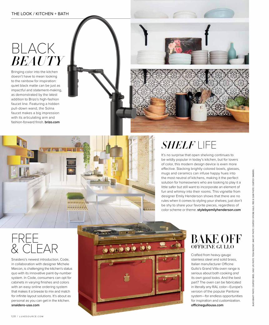
ARTGROUPWORK Last year’s trend toward metallics continues to be prevalent this year, and it’s easy to see why in the presence of Groupwork’s latest line of fixtures for the bathroom, Simplify. Australian designer Sarah Trotter’s newest initiative, created in collaboration with architect Murray Barker and artist Esther Stewart, turns something as practical as a towel rack into a veritable work of art. groupworkstudio.com
Not content to let pristine porcelain tubs lie, the creative team at Aquabrass recently released its Kanvas collection of highly artistic freestanding tubs, each hand-painted and signed by the artist responsible for the striking scenes depicted on their glossy white finishes. From cool graffiti patterns to multicolor mosaic-inspired prints, the limited-edition series promises you’ll have a lot more to soak in than bubbles during bath time. aquabrass.com
MAKE A SPLASH
While Duravit’s L-Cube vanity, designed by Christian Werner, takes its cues from one of geometry’s simplest shapes, it is far from ordinary. Refined down to its most fundamental form, it’s the unassuming details that sing here: from the handle-free façade to the elegant shadow gap between the countertop and the shelving—not to mention the line’s nearly exhaustive color options, like the pretty peachy version shown here. duravit.us
Wash UP
THE LOOK / KITCHEN + BATH
THE LOOK / KITCHEN + BATH
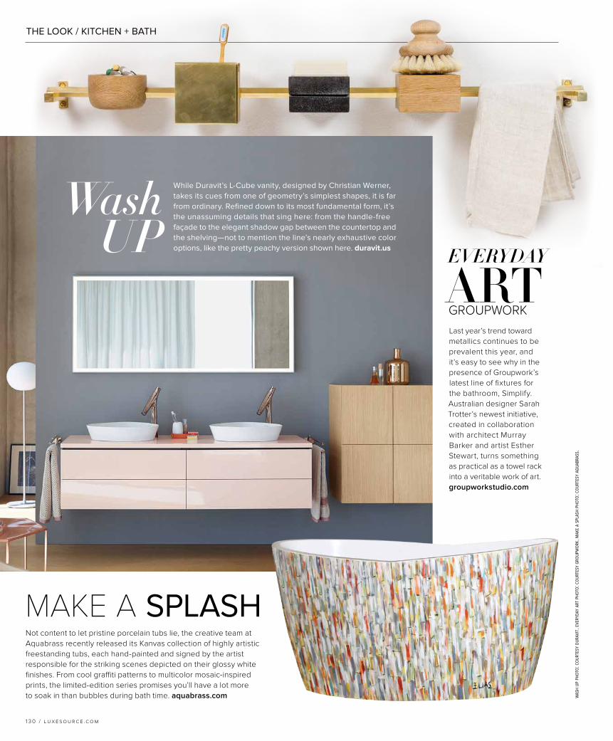
This serene vanity space by Toronto designer Anne Hepfer is transformed with color. Benjamin Moore’s Coventry Gray on the cabinetry acts as both statement-maker and pretty neutral against the softer walls painted in Benjamin Moore’s Stonington Gray. “The cabinetry is tailored but feminine, with some round detailing to maintain traditional character but in a cleaner more current design,” explains Hepfer. Far from traditional, though, is what she sees as the next big thing in powerful palettes: “I have a feeling that gray is here to stay for a while, so we’re popping spaces with bold hits of color—fuchsia, canary yellow, teal—and, of course, black and white accents. I’m loving the play of contrast and unexpected combinations!” annehepfer.com
VANITY PROJECT
1 3 2 / l u x e s o u r c e .c o m
pho
to: v
irg
inia
mac
do
nal
d.
Sconces from Galerie des Lampes and an art piece, Jay Hodgins’ Straumi 8, add an air of modern elegance to the
room. The chair is custom by Anne Hepfer, upholstered in fabric from Kravet and trim from Samuel & Sons.
THE LOOK / KITCHEN + BATH
stud
io g
ild
pho
to: m
ike s
chw
artz
. pro
ject
inte
rio
rs ph
oto
: to
ny so
luri
. dis
c in
teri
ors
ph
oto
: co
urte
sy d
esig
ner.
“USING COLOR ALLOWS US TO CREATE BATHROOMS THAT TRANSFORM INTO UNEXPECTED, JEWEL-LIKE SPACES.”-JENNIE BISHOP, studiogild.com
“We love designing with
black and white in our projects;
although it’s a classic color
combination, there are
endless variations on
this palette that feel current.”
-DAVID JOHN DICK, discinteriors.com
“BY LIMITING OUR USE OF VIBRANT COLOR TO SMALL DOSES, WE WERE ABLE TO CREATE A REALLY SPECIAL MOMENT, WHILE ALSO MAKING SURE THE SPACE FELT TIMELESS.”
-AIMEE WERTEPNY, projectinteriors.com
1 3 4 / l u x e s o u r c e .c o m
Clockwise from top left: This bathroom by the team at Studio Gild features wallpaper from Élitis. Aimee Wertepny worked with designer Jennifer Kranitz on this colorful vanity sporting hand-painted silk paper from Porter Teleo; the stool is from Bernhardt Interiors. The modern wallpaper from Holland & Sherry in this bathroom from DISC Interiors joins pretty sconces from Visual Comfort and a mirror from Made Goods in defining the chic space.