Embed Size (px)
Citation preview

1
JMP TIP SHEET FOR BUSINESS STATISTICS – CENGAGE LEARNING
INTRODUCTION
JMP software provides introductory statistics in a package designed to let students visually explore data in an interactive way with a
comprehensive and extendable software package. Students can quickly access the statistics they need from menus and toolbars
organized to complement leading textbooks. Data can be easily typed, imported, or copied into familiar worksheets and simple
dialogs completed to allow creation of complementary graphs within a single analysis.
A free 30 day trial can be downloaded at http://www.jmp.com/en_us/software.html. If you are accessing this product, it is most
likely that your school/organization has a perpetual license to the product. More detail about the statistical processes described in
this card can be found in the Help menu. This tip sheet will provide tips for analyses completed in introductory and intermediate
business statistics courses.
BASIC STATISTICS
This statistics section includes information on probability distributions, summary statistics, inference, tables, and graphs.
PROBABILITY DISTRIBUTIONS
DISTRIBUTION PLOT
Use the Continuous or Discrete Fit options to select the probability distribution that best describes your data. When you fit a
probability distribution, you specify one or more distributions and a curve is overload on the histogram and a parameter estimates
report is presented so that you can visualize and compare distributions.
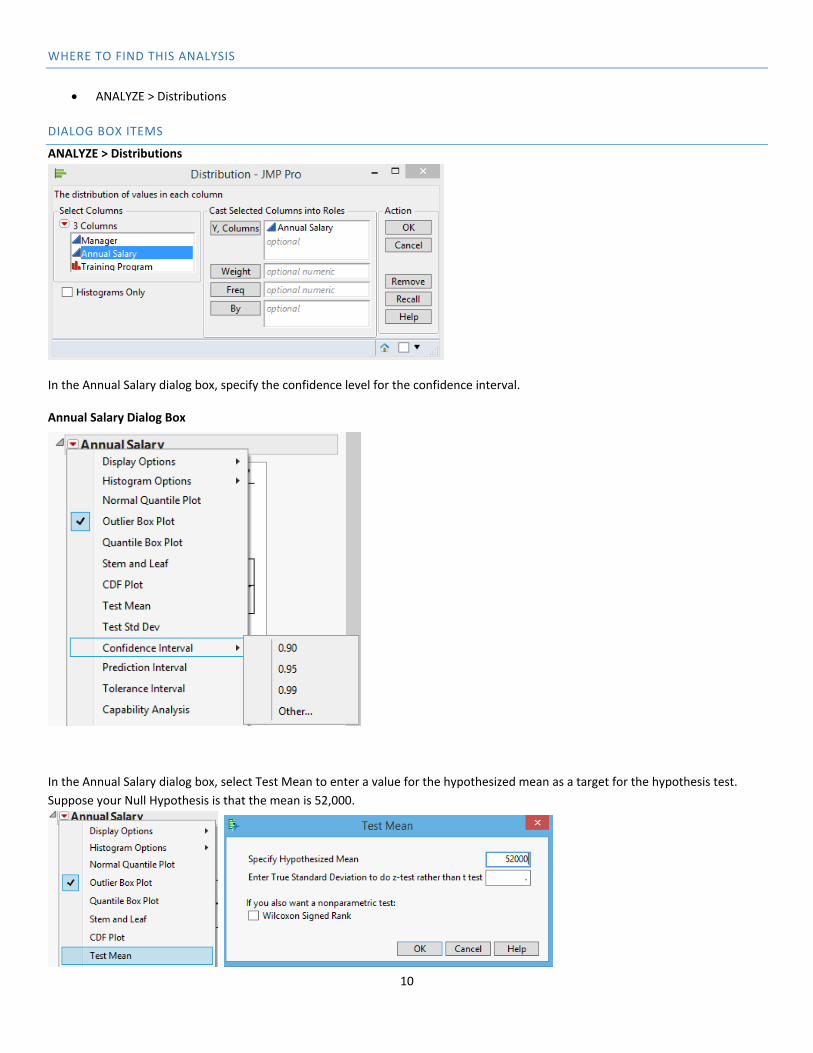
WHERE TO FIND THIS ANALYSIS
ANALYZE > Distributions
DIALOG BOX ITEMS
JMP calculates the probability distribution(s) for a variable that you specify. There are two options for fitting a probability
distribution: select a single distribution or fit all applicable distributions to a variable.
For example, consider the Electronics Associates data listing annual salaries. To select a single distribution, look at the Distribution of
Annual Salary output and select the distribution that best characterizes the variable. In the Annual Salary dialog box, specify the
distribution in the drop down list box as Normal, LogNormal, Weibull, Exponential, Gamma, Beta, Normal Mixtures (fits a mixture of
normal distributions capable of fitting multi‐modal data), Smooth Curve (uses non parametric density estimate), Johnson Su,
Johnson Sb, Johnson Si, or Generalized Log.
In the Annual Salary dialog box, select the All option to fit all applicable continuous distributions to a variable. The compare
distributions report contains statistics about each fitted distribution. By default, the best fit distribution is selected and the
remaining distributions are sorted by AICc in ascending order (as shown in the Sample Output). Distributions with threshold
parameters, like Beta and Johnson Sb, are not included in the list of possible distributions.
Each fitted distribution has additional options in the Fitted Distribution dialog box: Diagnostic Plot, Density Curve (default option
already selected), Goodness of Fit, Quantiles, Set Spec Limits for K Sigma, Spec Limits, Save Fitted Quantiles, Save Density Formula,
Save Spec Limits.

2
ANALYZE > Distributions
Annual Salary Dialog Box

3
Fitted Distribution Dialog Box
SAMPLE OUTPUT
JMP shows that the Normal 2 Mixture is the best fit probability distribution for the Annual Salary data. The curve is overload on the
histogram and the summary statistics and parameter estimates are output.

4
SUMMARY STATISTICS
DESCRIPTIVE STATISTICS
To ensure that your results are valid, consider the following guidelines when you collect data, perform the analysis, and interpret your results: data must be continuous (weights) or discrete (number) numeric data; sample data should be collected randomly; collect a medium to large sample of data to ensure data represent the distribution of your data.
WHERE TO FIND THIS ANALYSIS
ANALYZE > Distributions
OR
TABLES > Summary
DIALOG BOX ITEMS
The ANALYZE > Distributions option provides an extensive array of descriptive statistics for one specific variable of interest.
The TABLES > Summary option provides the user the ability to create a table of a limited number of descriptive statistics for multiple
variables at the same time and by subgroups.
ANALYZE > Distributions
For example, consider the Electronics Associates data listing annual salaries. The default summary statistics are as follows: Mean, Std
Dev, St Err Mean, Upper Mean Confidence Limits, Lower Mean Confidence Limits, and N. Additional options in the Summary
Statistics dialog box under “Customize Summary Statistics”.

5
Summary Statistics Dialog Box, Customize Summary Statistics

6
TABLES > Summary
For example, consider the Electronics Associates data listing annual salaries. The summary dialog box allows you to choose the
specific options you want to calculate for quantitative and/or qualitative data.
SAMPLE OUTPUT
ANALYZE > Distributions The following output provides summary statistics for the Electronic Associates salary example.
TABLES > Summary For the Electronic Associates example, the following output groups selected salary summary statistics by whether manager participated in the training program.

7
TALLY
Use this analysis to list the unique values in a column and to count the number of times each value occurs. You can display counts,
cumulative counts, percentages, and cumulative percentages.
WHERE TO FIND THIS ANALYSIS
TABLES > Summary
DIALOG BOX ITEMS
In the Summary dialog box, specify the variable you want to group the data by and the summary statistics to include in your output.
SAMPLE OUTPUT
NORMALITY TEST
Use this analysis to determine whether data follows a normal distribution. For example, a company wants to analyze the aptitude
test scores for 50 randomly chosen job applicants. The company wants to determine whether their sample data follows a normal
distribution before performing other analyses with this data.
WHERE TO FIND THIS ANALYSIS
ANALYZE > Distributions

8
DIALOG BOX ITEMS
In the Summary dialog box, specify the data you want to evaluate for normality.
In the Score dialog box, select Normal under Continuous Fit.
Select Normal under Continuous Fit and the fitted normal data will appear. In the Fitted Normal dialog box, select Goodness of Fit.

9
SAMPLE OUTPUT
A probability plot creates an estimated cumulative distribution function (CDF) from your sample by plotting the value of each
observation against the observation's estimated cumulative probability. Use a probability plot to visualize how well your data fit the
normal distribution. To visualize the fit of the normal distribution, examine the probability plot and assess how closely the data
points follow the fitted distribution line. If your data are perfectly normal, the data points on the probability plot form a straight line.
Skewed data form a curved line.
JMP uses the Shapiro‐Wilk statistic to calculate the p‐value for sample sizes less than or equal to 2000, and the KSL test for samples
greater than 2000. The p‐value is a probability that measures the evidence against the null hypothesis (that the population is
normally distributed). Smaller p‐values provide stronger evidence against the null hypothesis. Larger values indicate that the data
DO follow the normal distribution.
INFERENCE
1‐SAMPLE T
Use a 1‐sample t‐test to estimate the mean of a population and to compare it to a target value or a reference value when you do not
know the standard deviation of the population. For example, consider the Electronics Associates data for annual salaries. The level of
significance for the test will be set to α = .05, and the population standard deviation will be estimated by the sample.
10
WHERE TO FIND THIS ANALYSIS
ANALYZE > Distributions
DIALOG BOX ITEMS
ANALYZE > Distributions
In the Annual Salary dialog box, specify the confidence level for the confidence interval. Annual Salary Dialog Box
In the Annual Salary dialog box, select Test Mean to enter a value for the hypothesized mean as a target for the hypothesis test.
Suppose your Null Hypothesis is that the mean is 52,000.

11
SAMPLE OUTPUT
The p‐value (0.0125) is less than the significance level (0.05) indicating that the Null hypothesis (μ = 52,000) is rejected in favor of the
alterna ve hypothesis (μ ≠ 52,000) indica ng that the average salary for managers is not equal to 52,000.
1‐SAMPLE Z
Use a 1‐sample Z‐test to estimate the mean of a population and to compare it to a target value or a reference value when you know
the standard deviation of the population. For example, consider the Electronics Associates data for annual salaries, the population
standard deviation σ = 4,500 is assumed known and the level of significance is α = .05.
WHERE TO FIND THIS ANALYSIS
ANALYZE > Distributions
DIALOG BOX ITEMS
ANALYZE > Distributions

12
In the Annual Salary dialog box, specify the confidence level for the confidence interval. Annual Salary Dialog Box
In the Annual Salary dialog box, select Test Mean to enter a value for the hypothesized mean as a target for the hypothesis test.
Suppose your Null Hypothesis is that the mean is 52,000 and the population standard deviation σ = 4,500.
SAMPLE OUTPUT
In these results, the p‐value (0.0263) is less than the significance level (0.05) indicating that the Null hypothesis (μ = 52,000) is
rejected in favor of the alterna ve hypothesis (μ ≠ 52,000) indica ng that the average salary for managers is not equal to 52,000.

13
1 PROPORTION
Use a 1 proportion test to estimate a binomial population proportion and to compare the proportion to a target value or a reference value. For example, consider the proportion of female golfers at Pine Creek golf course. Pine Creek golf course is interested in increasing the proportion of women players and has implemented a special promotion designed to attract women golfers. One month after the promotion was implemented; the course manager would like to determine if the proportion of women players has increased.
WHERE TO FIND THIS ANALYSIS
ANALYZE > Distributions
DIALOG BOX ITEMS
ANALYZE > Distributions
In the Golfer dialog box, specify the confidence level for the confidence interval. Golfer Dialog Box
In the Golfer dialog box, select Test Probabilities to enter a value for the hypothesized mean as a target for the hypothesis test.

14
Suppose we want to test if the proportion of female golfers is less than or equal to 20, then we would set up the hypothesis test
Ho: p 20 and Ha: p > 20.
SAMPLE OUTPUT
In these results, the p‐value (.0086) is less than the significance level (.05) indicating that the Null hypothesis is rejected in favor of
the alternative hypothesis (Ha: p > 0.2). The proportion of women players at Pine Creek golf course has increased.
2‐SAMPLE T
Use a 2‐sample t‐test to determine whether the population means of two independent groups differ and calculate a range of values
that is likely to include the difference between the population means. For example, checking account balances for the Cherry Grove
and the Beechmont branches of a local bank. A hypothesis test will be conducted to determine if the checking account balances for
the Cherry Grove and the Beechmont branches of a local bank differ and a 95% confidence interval provided.
WHERE TO FIND THIS ANALYSIS
ANALYZE > Fit Y by X

15
DIALOG BOX ITEMS
In the Y, Response: enter (or double‐click to select) the variable that you want to explain (Balance). In the X, Factor: enter the variable that might explain changes in the Y variable (Bank).
In the OneWay Analysis Dialog box, Set α level to select confidence level.
In the OneWay Analysis Dialog box, select t Test and Analysis of Means Methods.
16
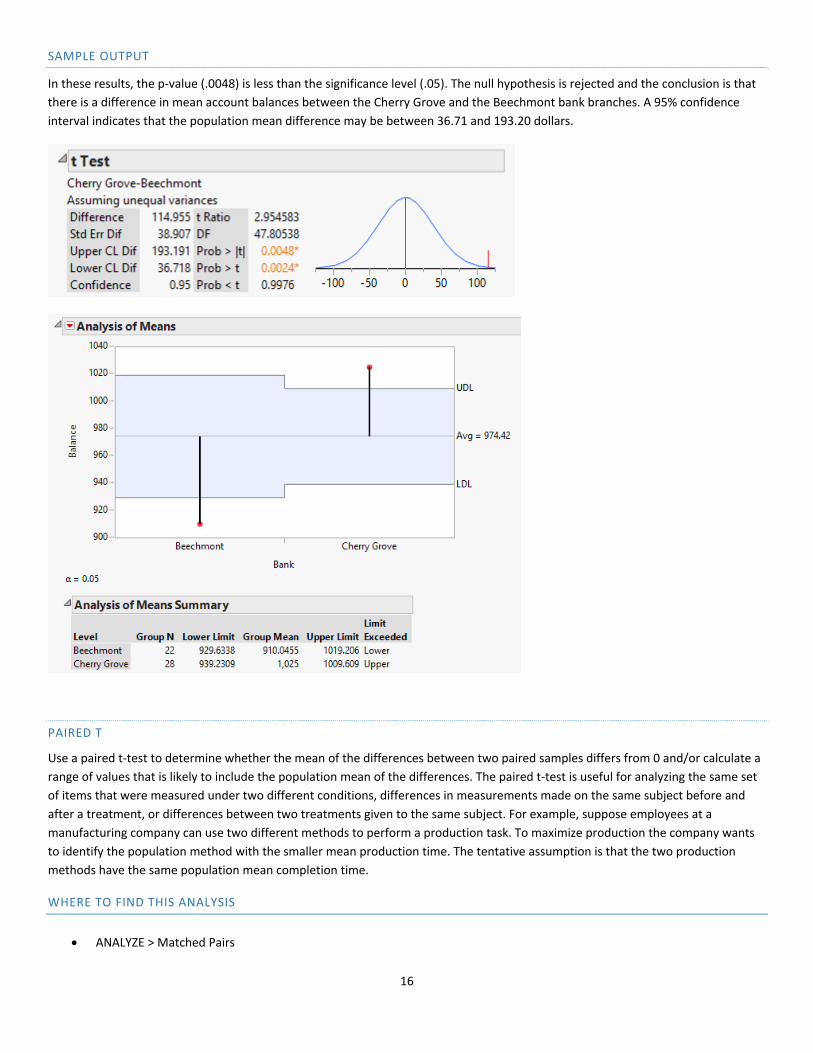
SAMPLE OUTPUT
In these results, the p‐value (.0048) is less than the significance level (.05). The null hypothesis is rejected and the conclusion is that
there is a difference in mean account balances between the Cherry Grove and the Beechmont bank branches. A 95% confidence
interval indicates that the population mean difference may be between 36.71 and 193.20 dollars.
PAIRED T
Use a paired t‐test to determine whether the mean of the differences between two paired samples differs from 0 and/or calculate a
range of values that is likely to include the population mean of the differences. The paired t‐test is useful for analyzing the same set
of items that were measured under two different conditions, differences in measurements made on the same subject before and
after a treatment, or differences between two treatments given to the same subject. For example, suppose employees at a
manufacturing company can use two different methods to perform a production task. To maximize production the company wants
to identify the population method with the smaller mean production time. The tentative assumption is that the two production
methods have the same population mean completion time.
WHERE TO FIND THIS ANALYSIS
ANALYZE > Matched Pairs

17
DIALOG BOX ITEMS
SAMPLE OUTPUT
In these results, the p‐value (.0795) is NOT less than the significance level (.05). There is insufficient evidence to reject the null
hypothesis. There may be no difference in the two mean production methods to perform a production task.
2 PROPORTIONS
Use a 2 proportions test to determine whether the population proportions of two groups differ and to calculate a range of values
that is likely to include the difference between the population proportions. For example, a tax preparation firm is interested in
comparing the quality of work at two of its regional offices. Samples of tax returns are examined to estimate the proportion of
erroneous returns prepared at each office. The alternative hypothesis indicates that the proportion of erroneous returns in Office 1
is not the same in Office 2.
WHERE TO FIND THIS ANALYSIS
ANALYZE > Fit Y by X

18
DIALOG BOX ITEMS
SAMPLE OUTPUT
In these results, the p‐value (.0471) is less than the significance level (0.05). There is sufficient evidence to reject the null hypothesis
and conclude that the proportion of erroneous returns in Office 1 and Office 2 are not the same.

19
GRAPHS
HISTOGRAM
Use a histogram to examine the shape and spread of your data. A histogram works best when the sample size is at least 20. A
histogram divides sample values into many intervals and represents the frequency of data values in each interval with a bar. After
you create a histogram, you can add a normal distribution fit line, change the scale type, and more.
WHERE TO FIND THIS ANALYSIS
ANALYZE > Distributions
DIALOG BOX ITEMS
In the Histogram of a Single Y Variable dialog box, select the Y variable: as the column in the worksheet to be plotted.
SAMPLE OUTPUT
In the sample output below, a histogram of the frequency of Audit Times is provided with a table of Summary Statistics.

20
CUSTOMIZE THE OUTPUT
In the Audit Time Dialog Box, select Display Options or Histogram Options to display options to customize your histogram
.
STEM‐AND‐LEAF PLOT
Use a stem‐and‐leaf plot to examine the shape and spread of sample data. A stem‐and‐leaf plot works best when the sample size is
less than approximately 50. A stem‐and‐leaf plot is similar to a histogram that is turned on its side. However, instead of displaying
bars, a stem‐and‐leaf plot displays digits from the actual data values to denote the frequency of each bin (row). The following stem‐
and‐leaf plot shows the distribution of the time in days required to complete year‐end audits for a sample of 20 clients of Sanderson
and Clifford, a small public accounting firm.
WHERE TO FIND THIS ANALYSIS
ANALYZE > Distributions
DIALOG BOX ITEMS

21
In the Audit Time Dialog Box, select Stem and Leaf.
SAMPLE OUTPUT
In the sample output below, a stem‐and‐leaf plot of the number of the time in days required to complete the year‐end audits.
SCATTERPLOT
Use a scatterplot to investigate the relationship between a pair of continuous variables. A scatterplot displays ordered pairs of X and
Y variables in a coordinate plane. After you create a scatterplot, you can add a fitted regression line and choose a linear, quadratic,
or cubic regression model. In the example below, the scatterplot investigates the relationship between the number of commercials
shown and sales at the store the following week.
22
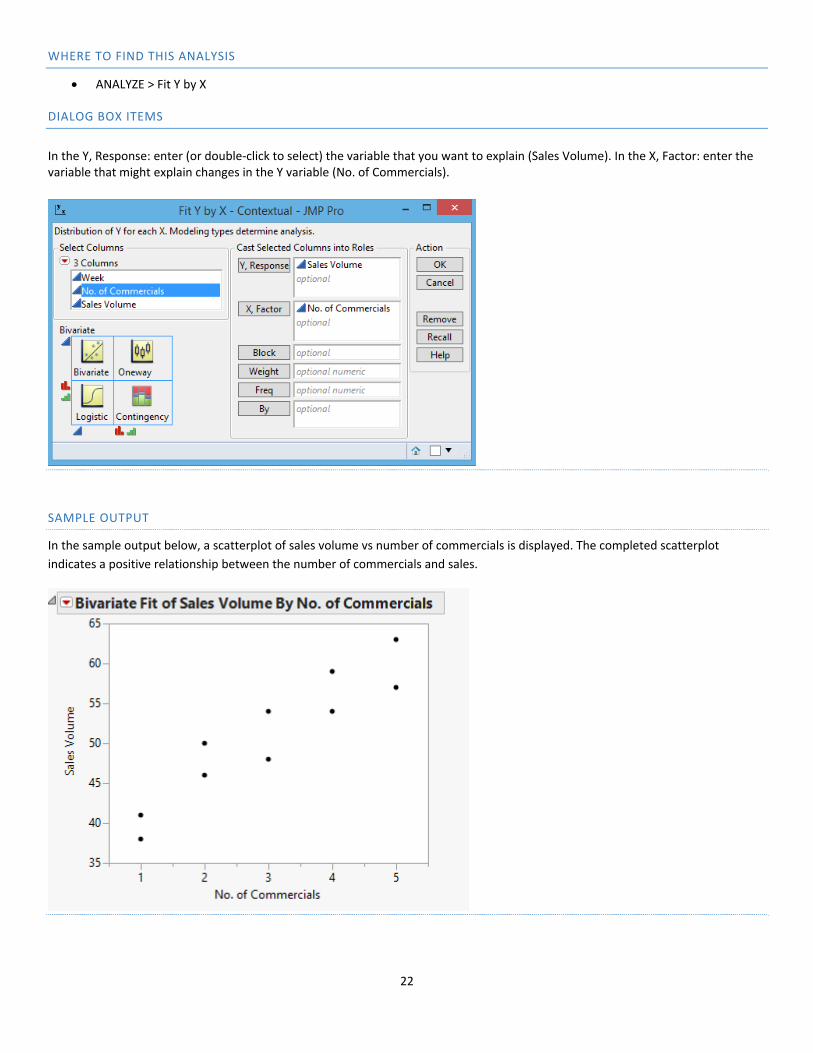
WHERE TO FIND THIS ANALYSIS
ANALYZE > Fit Y by X
DIALOG BOX ITEMS
In the Y, Response: enter (or double‐click to select) the variable that you want to explain (Sales Volume). In the X, Factor: enter the variable that might explain changes in the Y variable (No. of Commercials).
SAMPLE OUTPUT
In the sample output below, a scatterplot of sales volume vs number of commercials is displayed. The completed scatterplot
indicates a positive relationship between the number of commercials and sales.

23
BOXPLOT
Use a boxplot to assess and compare the shape, central tendency, and variability of sample distributions and to look for outliers. A
boxplot works best when the sample size is at least 20. A boxplot shows the median, interquartile range, range, and outliers for each
group. In the following example, a box plot graphical summary of starting salaries for 111 business school graduates by major.
WHERE TO FIND THIS ANALYSIS
GRAPHS > Graph Builder
DIALOG BOX ITEMS/SAMPLE OUTPUT
In the Y variable: drag the variable that you want to graph (Monthly Starting Salary).

24
Select the box‐plot option at the top of the screen.
To view box‐plots by major, drag the Major to the

25
LINEAR REGRESSION
Linear regression is the most frequently used statistical method. The principle of linear regression is to model a quantitative
dependent variable Y through a linear combination of p quantitative explanatory variables, X1, X2, …, Xp. While a distinction is
usually made between simple regression (with only one explanatory variable) and multiple regression (several explanatory
variables), the overall concept and calculation methods are identical.
WHERE TO FIND THIS ANALYSIS
ANALYZE > Fit Model
DIALOG BOX ITEMS
Select the quantitative data you want to model as the Y, Response variable (Sales) and the X, Factor choose qualitative explanatory
variable and drag to the Construct Model Effects (Population).

26
SAMPLE OUTPUT
From the results below it appears the quarterly sales data appear to be higher at campuses with larger student populations and
there appears to be a positive linear relationship between the size of the student population and quarterly sales.
ANOVA
Use this tool to carry out ANOVA (ANalysis Of VAriance) of one or more balanced or unbalanced factors.
ANOVA uses the same conceptual framework as linear regression. The presented dialog box options will be much the same. The
main difference is that the explanatory variables are qualitative. Consider the following data from National Computer Products, Inc.
A quality awareness examination was given to employees from three plants. Managers want to test the hypothesis that the mean
examination score is the same for all three plants.
WHERE TO FIND THIS ANALYSIS
ANALYZE > Fit Y by X

27
DIALOG BOX ITEMS
Select the quantitative data you want to model as the Y, Response variable (Score) and the X, Factor choose qualitative explanatory
variable (City).
In the OneWay Analysis Dialog box, select Means/ANOVA
28
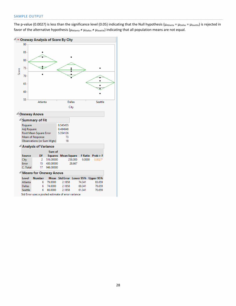
SAMPLE OUTPUT
The p‐value (0.0027) is less than the significance level (0.05) indicating that the Null hypothesis (μAtlanta = μDallas = μSeattle) is rejected in
favor of the alternative hypothesis (μAtlanta ≠ μDallas ≠ μSeattle) indicating that all population means are not equal.