Embed Size (px)
Citation preview

AgendaIntroduction
Communications Workshop
Storytelling Presentation

What we can do for youWe work with NASA-based teams on a wide range of communications efforts, and our goal is to lay the foundation for effective communications by:
Aiding in the communications outreach process
Helping to ensure your work is
resonating with the right people in the
right way
Helping you to identify
& amplify key messages
Applied Sciences Communications Team
Workshop

Try to choose a partner who is not as familiar with your work
Partner-Up!

Take five minutes to fill out the first page of your worksheetBe sure to limit your responses to one sentence each.
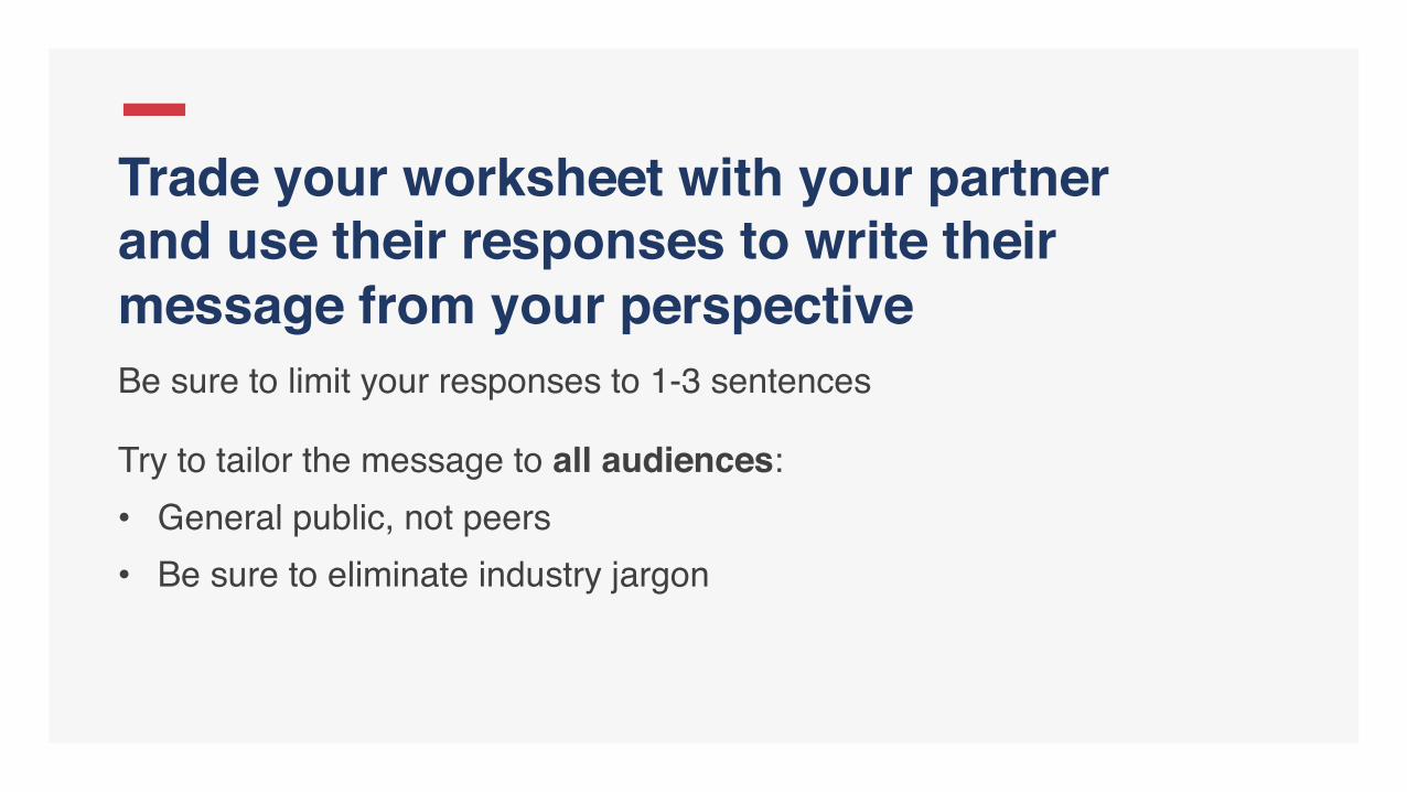
Trade your worksheet with your partner and use their responses to write their message from your perspectiveBe sure to limit your responses to 1-3 sentences
Try to tailor the message to all audiences:• General public, not peers• Be sure to eliminate industry jargon

Switch back sheets with your partner and spend 5 minutes reviewing the message they wroteMake sure the message conveys all the 'need-to-know' information about your work, and write your final message in the space provided

Time for Some Practice!
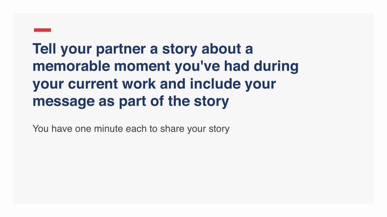
Tell your partner a story about a memorable moment you've had during your current work and include your message as part of the storyYou have one minute each to share your story

Join together with a few other sets of partners and share your story with them. You again have one minute each to tell your story
Time for some (more) practice!
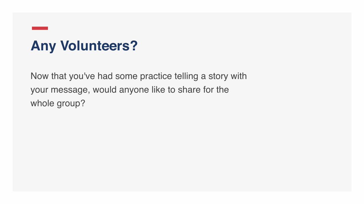
Now that you've had some practice telling a story with your message, would anyone like to share for the whole group?
Any Volunteers?

Amplifying Your Work Through Storytelling
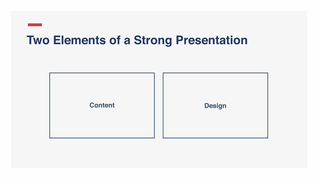
Two Elements of a Strong Presentation
Content Design

Content

Studies have shown storytelling is up to seven times as effective of a means to retain information than providing the information alone.
Bower, G. H. and M. C. Clark (1969). “Narrative stories as mediators for serial learning.” Psychonomic Science 14: 181–182.

Stories are a great way to engage your audience quickly, make sure yours is:
Relatable — engages your audience
Relevant — ties into your work
Real — your emotions/passion go a long way towards engaging the audience
Personal stories as presentation hooks
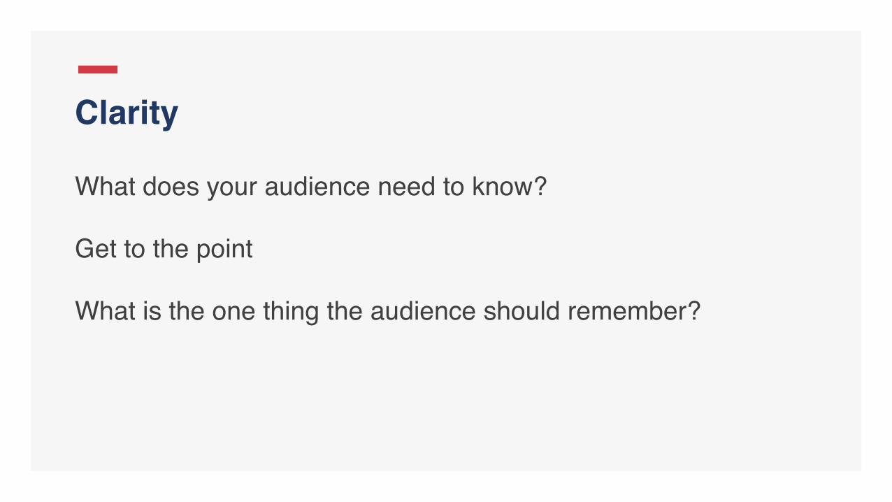
What does your audience need to know?
Get to the point
What is the one thing the audience should remember?
Clarity

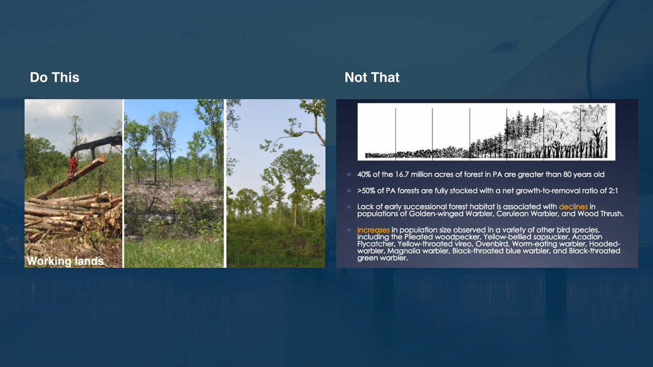
Do This Not That
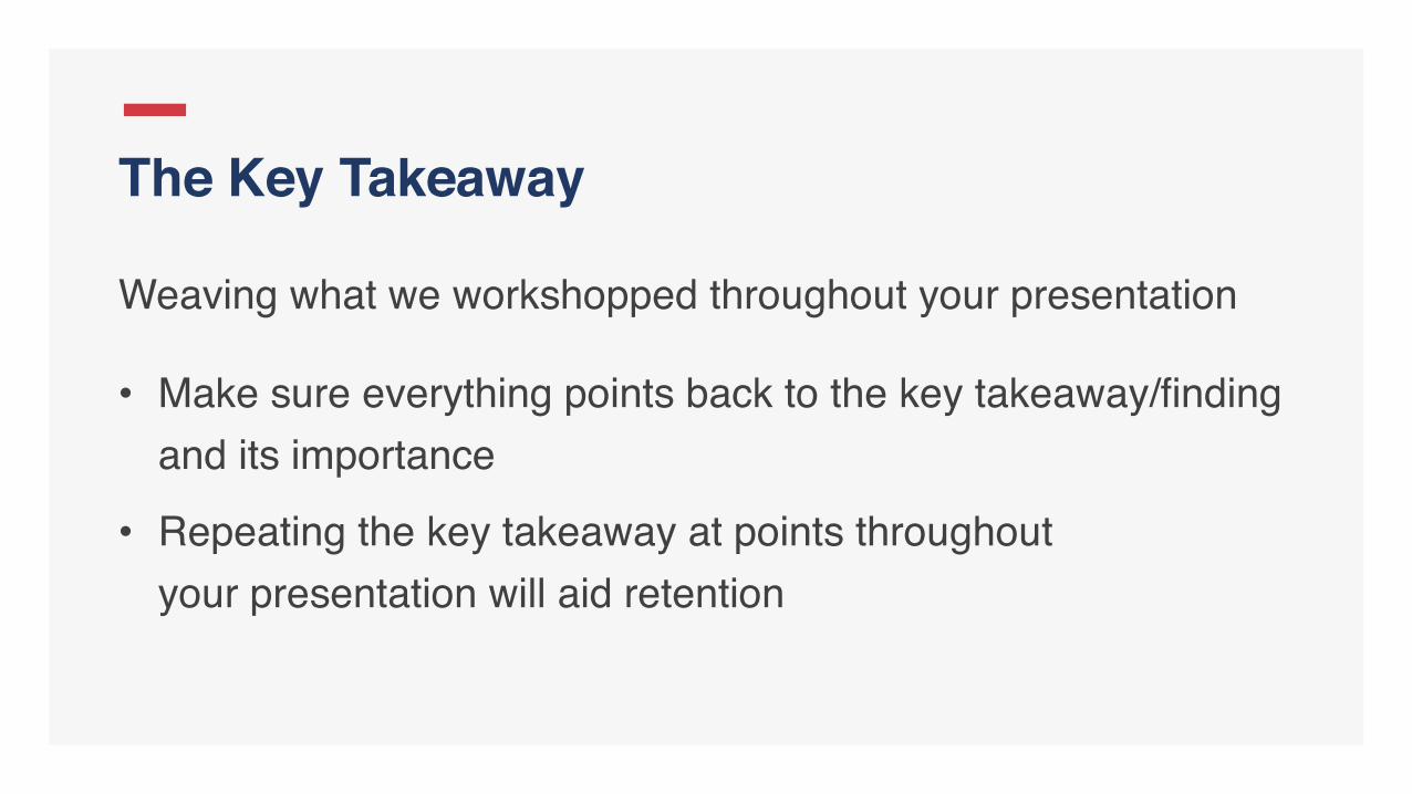
Weaving what we workshopped throughout your presentation
• Make sure everything points back to the key takeaway/finding and its importance
• Repeating the key takeaway at points throughout your presentation will aid retention
The Key Takeaway
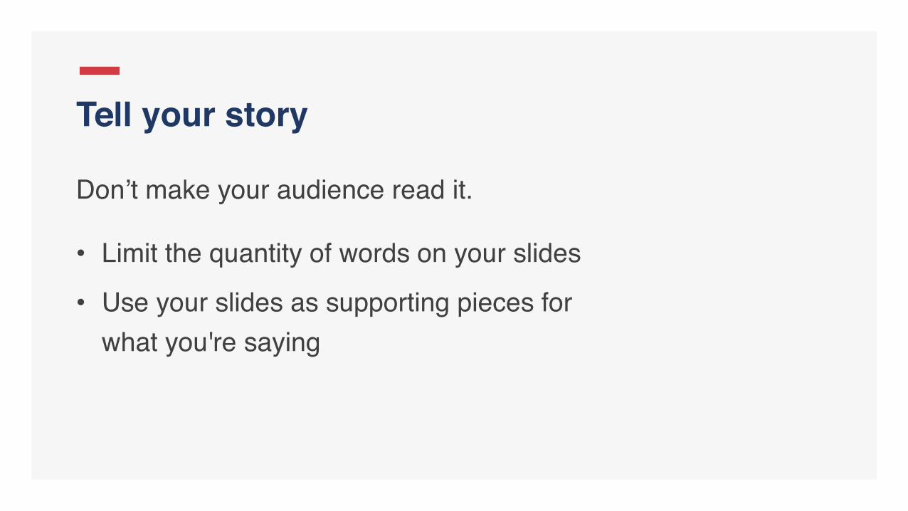
Don’t make your audience read it.
• Limit the quantity of words on your slides
• Use your slides as supporting pieces for what you're saying
Tell your story
Do This Not That

• What's next for your audience?
• How can they act? Learn more? Support?
The Call to Action
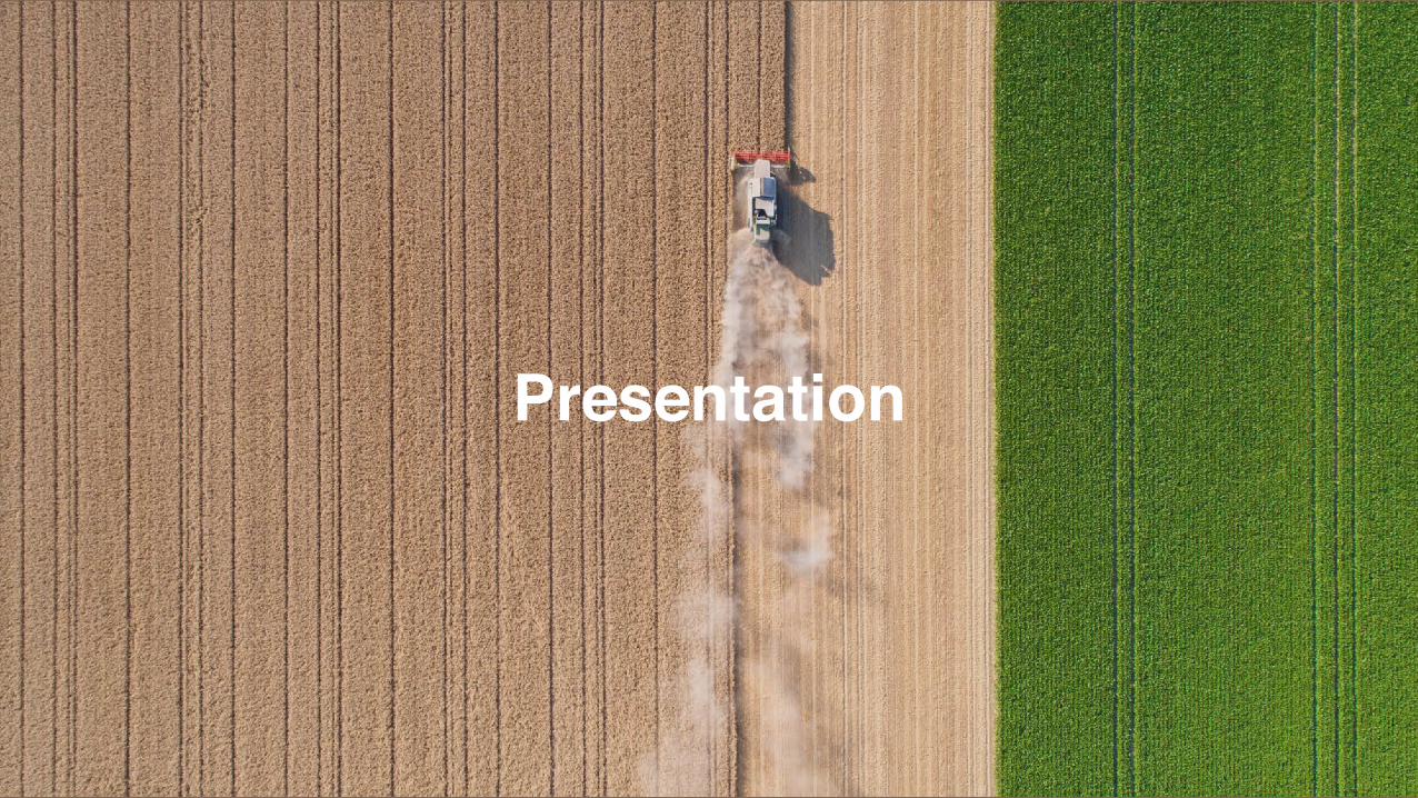
Presentation

65% of people are visual learners, meaning "they need to see what they are learning, and ... have difficulty following oral lectures"
Bradford, William C., Reaching the Visual Learner: Teaching Property Through Art (September 1, 2011). The Law Teacher Vol. 11, 2004. Available at SSRN: https://ssrn.com/abstract=587201

5 keys to successful presentation design

Principle 1
People Respond to People
Get Personal

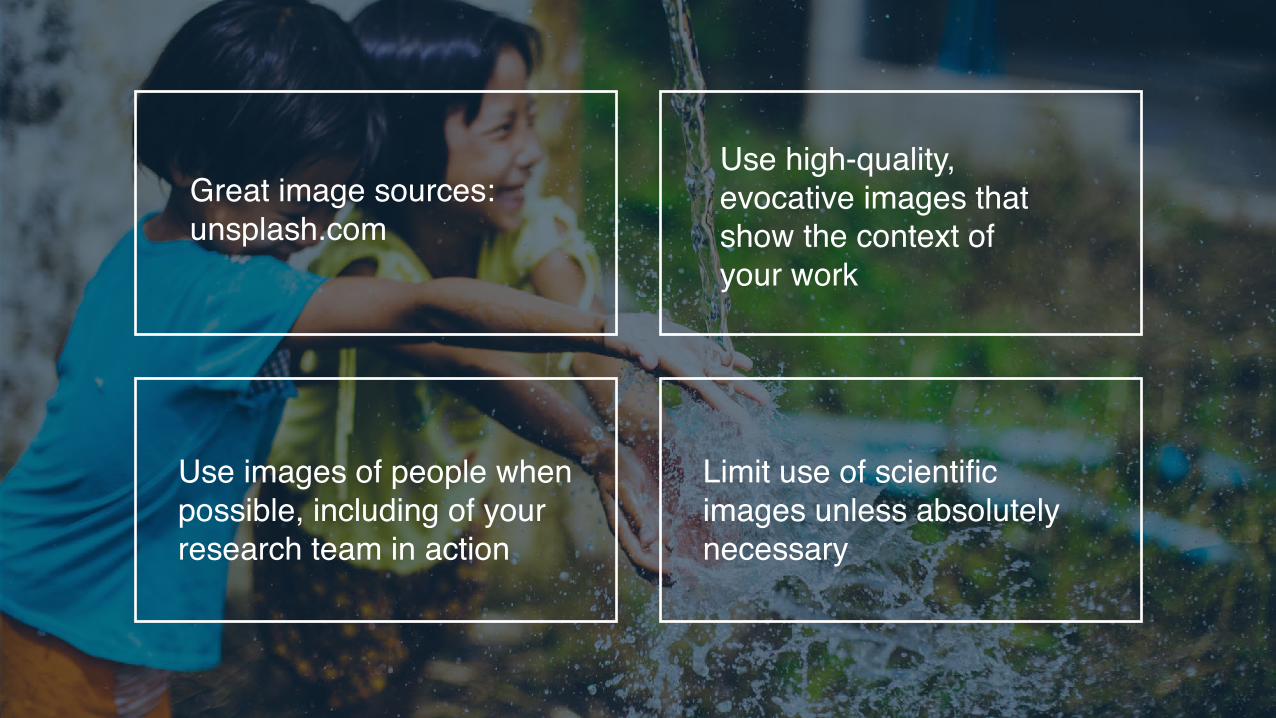
Great image sources: unsplash.com
Use high-quality, evocative images that show the context of your work
Use images of people when possible, including of your research team in action
Limit use of scientific images unless absolutely necessary

Do This Not That

Principle 2
Be ConsistentWithout Being Boring

Map of U.S. Evaporative Stress Index (ESI)
Rates of Evaporation
ESI for the 3-month period ending August 31, 2016. Color indicates evapotranspiration rates. Red shading indicates anomalously low rates, and green shading represents anomalously high rates.
Place headlines in a consistent position for smooth slide-to-slide transitions
Honor white space boundaries
Keep proportions consistent for headlines, subheads and text

Principle 3
Less is More
Don’t Overdo It

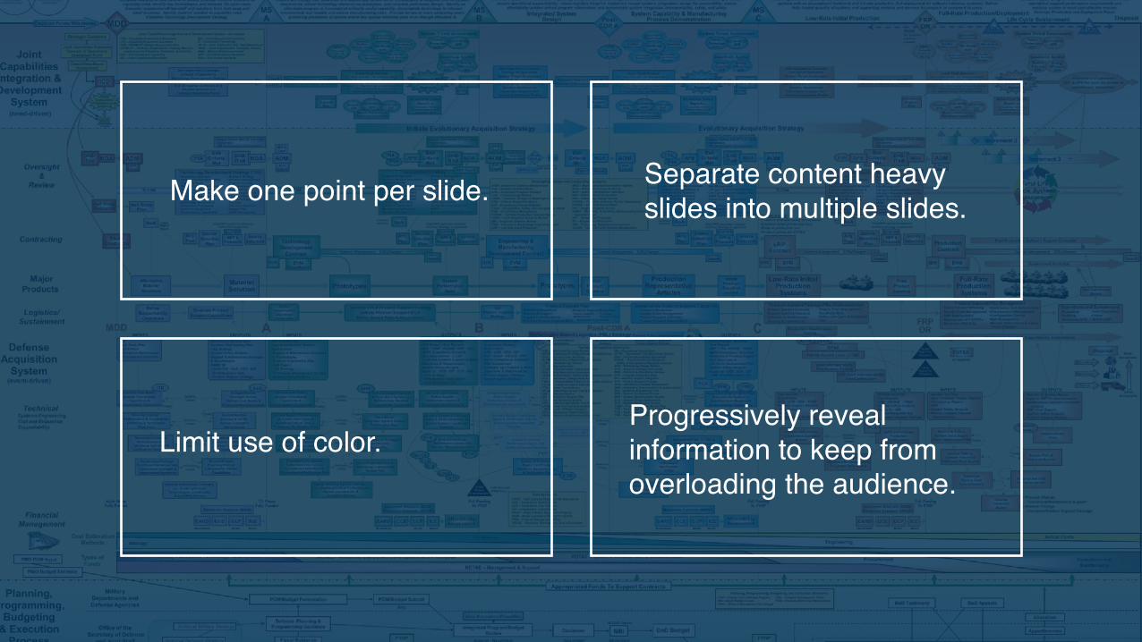
Make one point per slide. Separate content heavy slides into multiple slides.
Limit use of color.Progressively reveal information to keep from overloading the audience.

Principle 4
Show the dynamic nature of your work.
Highlight Change

Use data visualization to illustrate complex stories and show contrasting information

Use animated graphics to turn your data into a powerful story.
Avoid animation that does not have a specific purpose.

Principle 5
It keeps things interesting
Be Unexpected
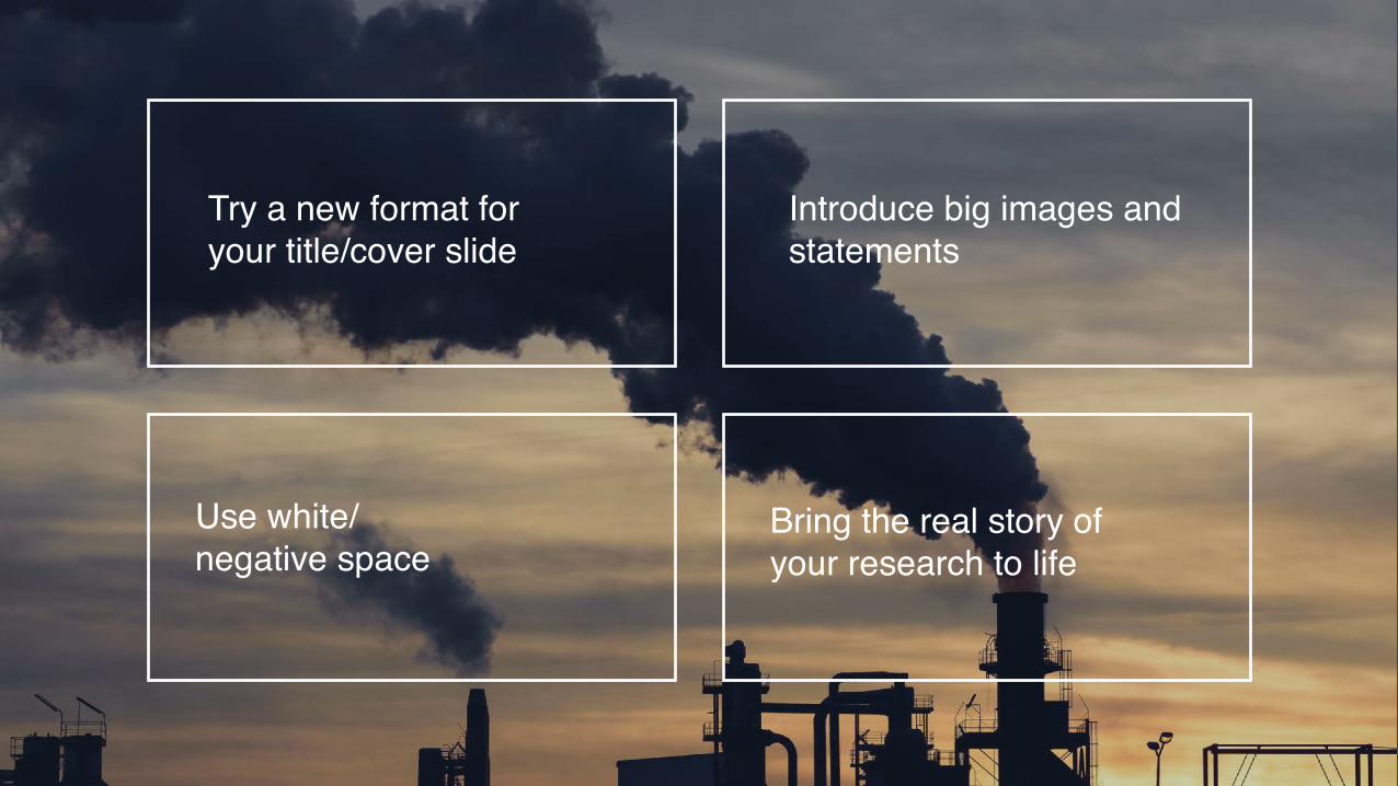
Try a new format for your title/cover slide
Introduce big images and statements
Use white/negative space
Bring the real story of your research to life

Reach out to us!If you have a more formal relationship with NASA, we're here to help. Here are some ways you can reach us:
• Office hours (there's still time left!)
• Reach out to us via [email protected]

Backup slides
41


45

Applied Sciences Communications Team

Reach out to us!If you have a more formal relationship with NASA, we're here to help. Here are some ways you can reach us:
• Office hours (there's still time left!)
• Reach out to us via [email protected]


![[Abridged] Concept Bureau Storytelling Presentation](https://img.dokumen.tips/doc/110x75/58700c9d1a28ab427f8b75df/abridged-concept-bureau-storytelling-presentation.jpg)