Embed Size (px)
Citation preview

Interactive Visual Analysis inAutomotive Engineering Design
DISSERTATION
zur Erlangung des akademischen Grades
Doktor/in der technischen Wissenschaften
eingereicht von
Zoltán Konyha, MSc.Matrikelnummer 0627536
an derFakultät für Informatik der Technischen Universität Wien
Betreuung: Priv.-Doz. Dipl.-Ing. Dr.techn. Helwig Hauser
Diese Dissertation haben begutachtet:
(Priv.-Doz. Dipl.-Ing.Dr.techn. Helwig Hauser)
(Ao.Univ.Prof. Dipl.-Ing.Dr.techn. Eduard Gröller)
Wien, 19.12.2012(Zoltán Konyha, MSc.)
Technische Universität WienA-1040 Wien � Karlsplatz 13 � Tel. +43-1-58801-0 � www.tuwien.ac.at


Interactive Visual Analysis inAutomotive Engineering Design
DISSERTATION
submitted in partial fulfillment of the requirements for the degree of
Doktor/in der technischen Wissenschaften
by
Zoltán Konyha, MSc.Registration Number 0627536
to the Faculty of Informaticsat the Vienna University of Technology
Advisor: Priv.-Doz. Dipl.-Ing. Dr.techn. Helwig Hauser
The dissertation has been reviewed by:
(Priv.-Doz. Dipl.-Ing.Dr.techn. Helwig Hauser)
(Ao.Univ.Prof. Dipl.-Ing.Dr.techn. Eduard Gröller)
Wien, 19.12.2012(Zoltán Konyha, MSc.)
Technische Universität WienA-1040 Wien � Karlsplatz 13 � Tel. +43-1-58801-0 � www.tuwien.ac.at


Erklärung zur Verfassung der Arbeit
Zoltán Konyha, MSc.Lilienthalgasse 39, 8020 Graz
Hiermit erkläre ich, dass ich diese Arbeit selbständig verfasst habe, dass ich die verwende-ten Quellen und Hilfsmittel vollständig angegeben habe und dass ich die Stellen der Arbeit -einschließlich Tabellen, Karten und Abbildungen -, die anderen Werken oder dem Internet imWortlaut oder dem Sinn nach entnommen sind, auf jeden Fall unter Angabe der Quelle als Ent-lehnung kenntlich gemacht habe.
(Ort, Datum) (Unterschrift Zoltán Konyha, MSc.)


Interactive Visual Analysis inAutomotive Engineering Design
Zoltan Konyha, PhD thesis
mailto:[email protected]


To my wife Edit,and to my daughters
Anna and Julia


Abstract
Computational simulation has become instrumental in the design process in automotive enginee-ring. Virtually all components and subsystems of automobiles can be simulated. The simulationcan be repeated many times with varied parameter settings, thereby simulating many possibledesign choices. Each simulation run can produce a complex, multivariate, and usually time-dependent result data set. The engineers’ goal is to generate useful knowledge from those data.They need to understand the system’s behavior, find correlations in the results, conclude howresults depend on the parameters, find optimal parameter combinations, and exclude the onesthat lead to undesired results.
Computational analysis methods are widely used and necessary to analyze simulation datasets, but they are not always sufficient. They typically require that problems and interestingdata features can be precisely defined from the beginning. The results of automated analysisof complex problems may be difficult to interpret. Exploring trends, patterns, relations, anddependencies in time-dependent data through statistical aggregates is not always intuitive.
In this thesis, we propose techniques and methods for the interactive visual analysis (IVA) ofsimulation data sets. Compared to computational methods, IVA offers new and different analysisopportunities. Visual analysis utilizes human cognition and creativity, and can also incorporatethe experts’ domain knowledge. Therefore, their insight into the data can be amplified, and alsoless precisely defined problems can be solved.
We introduce a data model that effectively represents the multi-run, time-dependent simula-tion results as families of function graphs. This concept is central to the thesis, and many of theinnovations in this thesis are closely related to it. We present visualization techniques for familiesof function graphs. Those visualizations, as well as well-known information visualization plots,are integrated into a coordinated multiple views framework. All views provide focus+context vi-sualization. Compositions of brushes spanning several views can be defined iteratively to selectinteresting features and promote information drill-down. Valuable insight into the spatial aspectof the data can be gained from (generally domain-specific) spatio-temporal visualizations. Inthis thesis, we propose interactive, glyph-based 3D visualization techniques for the analysis ofrigid and elastic multibody system simulations.
We integrate the on-demand computation of derived data attributes of families of functiongraphs into the analysis workflow. This facilitates the selection of deeply hidden data featuresthat cannot be specified by combinations of simple brushes on the original data attributes. Thecombination of these building blocks supports interactive knowledge discovery. The analyst canbuild a mental model of the system; explore also unexpected features and relations; and gene-
i

rate, verify or reject hypotheses with visual tools; thereby gaining more insight into the data.Complex tasks, such as parameter sensitivity analysis and optimization can be solved. Althoughthe primary motivation for our work was the analysis of simulation data sets in automotive en-gineering, we learned that this data model and the analysis procedures we identified are alsoapplicable to several other problem domains. We discuss common tasks in the analysis of datacontaining families of function graphs.
Two case studies demonstrate that the proposed approach is indeed applicable to the analysisof simulation data sets in automotive engineering. Some of the contributions of this thesis havebeen integrated into a commercially distributed software suite for engineers. This suggests thattheir impact can extend beyond the visualization research community.
ii

Kurzfassung
Computersimulationen spielen fur Designprozesse in der Automobilindustrie eine entscheiden-de Rolle. So gut wie alle Komponenten und Subsysteme von Autos konnen simuliert werden.Da Simulationen mit verschiedenen Parameterkombinationen immer wieder aufs Neue durch-gefuhrt werden konnen, ergeben sich viele verschiedene Designmoglichkeiten. Jeder Simulati-onsdurchgang kann einen komplexen, multivariaten und normalerweise zeitabhangigen Ergeb-nisdatensatz erzeugen. Das Ziel der Ingenieure ist es, aus diesen Daten nutzbringendes Wissenzu generieren. Dazu mussen sie das Verhalten des Systems verstehen, optimale Parameterkombi-nationen finden und jene Kombinationen ausschließen, die zu unerwunschten Resultaten fuhren.
Automatische Datenanalysemethoden sind weit verbreitet und auch notwendig, um Simula-tionsergebnisse zu analysieren, aber sie sind nicht immer ausreichend. Sie setzen typischerweisevoraus, dass die Problemstellung und interessante Datenmerkmale bereits am Anfang prazise de-finierbar sind. Die Ergebnisse einer automatischen Analyse von komplexen Problemstellungenkonnen jedoch schwierig zu interpretieren sein. Das Erforschen von Trends, Mustern, Relatio-nen und Abhangigkeiten in zeitabhangigen Datensatzen durch statistische Merkmale ist nichtimmer einfach und unmittelbar zuganglich.
In dieser Dissertation schlagen wir Techniken und Methoden fur die interaktive visuelleAnalyse (IVA) von Simulationsergebnissen vor. Im Vergleich zu automatischen Methoden bie-tet IVA neue und andersartige Analysemoglichkeiten. Die visuelle Analyse stutzt sich auf diemenschliche Wahrnehmung und Kreativitat und kann zusatzlich das Fachwissen der Ingenieureintegrieren. Auf diese Weise kann das Verstandnis der Daten vertieft werden und auch wenigerexakt definierte Problemstellungen konnen gelost werden.
Wir stellen ein Datenmodell vor, das die mehrlagigen, zeitabhangigen Simulationsresultateals Funktionenschar darstellt. Dieses Konzept steht im Zentrum dieser Dissertation und vie-le darin prasentierte Innovationen stehen mit ihm in engem Zusammenhang. Wir prasentierenVisualisierungstechniken fur Funktionenscharen. Genauso wie bekannte Informationsvisualisie-rungsdarstellungen sind diese Visualisierungen in ein koordiniertes Mehrbildsystem eingebettet.Alle Ansichten stellen Fokus+Kontext-Visualisierungen zur Verfugung.
Markierungen konnen uber mehreren Ansichten iterativ kombiniert werden, um interessan-te Merkmale zu definieren und um das Informationssuchen zu erleichtern. Wertvolle Einsich-ten bezuglich des raumlichen Aspekts der Daten konnen durch (ublicherweise fachspezifische)Raum-Zeit-Visualisierungen erreicht werden. In dieser Dissertation schlagen wir außerdem in-teraktive, glyph-basierte 3D-Visualisierungstechniken fur die Analyse von starren und elasti-schen Mehr-korpersystemen vor.
iii

Wir integrieren bedarfsbasierte Berechnungen von abgeleiteten Datenattributen von Funktio-nenscharen in den Analyseablauf. Dies ermoglicht das Aufspuren von versteckten Datenmerk-malen, die durch Kombinationen von einfachen Markierungen auf den ursprunglichen Datenat-tributen nicht spezifiziert werden konnen. Die Kombination dieser Komponenten unterstutzt dasinteraktive Auffinden von Wissen. Die Analytiker konnen ein gedankliches Modell des Systemskonstruieren, konnen auch unerwartete Merkmale und Beziehungen erforschen, konnen Hypo-thesen uber visuelle Tools generieren, verifizieren oder verwerfen, und konnen dadurch einenErkenntnisgewinn uber die Daten erlangen. Komplexe Aufgaben, wie zum Beispiel eine Para-metersensitivitatsanalyse oder Optimierungen, konnen gelost werden. Obwohl die ursprunglicheMotivation fur unsere Arbeit die Analyse von Simulationsdaten in der Automobilindustrie war,zeigte sich, dass dieses Datenmodell und die Analyseverfahren, die wir identifiziert haben, auchauf viele andere Problemfelder anwendbar sind. Wir diskutieren daher ubliche Aufgaben in derAnalyse von Daten, die Funktionenscharen enthalten.
Zwei Fallstudien zeigen, dass der vorgeschlagene Ansatz tatsachlich auf die Analyse vonSimulationsergebnissen in der Automobilindustrie anwendbar ist. Einige der Beitrage dieserDissertation wurden bereits in eine kommerziell verbreitete Software fur Ingenieure integriert,was darauf hindeutet, dass ihre Wirkung weit uber die Kreise der Visualisierungsforschung hin-ausgehen kann.
iv

Related Publications
This thesis is based on the following publications:
Zoltan Konyha, Kresimir Matkovic, and Helwig HauserInteractive 3D Visualization Of Rigid Body SystemsProceedings of the IEEE Visualization (VIS 2003), pages 539-546, 2003.
Zoltan Konyha, Josip Juric, Kresimir Matkovic, and Jurgen KrasserVisualization of Elastic Body Dynamics for Automotive Engine SimulationsProceedings of the IASTED Visualization, Imaging, and Image Processing (VIIP 2004), pages742–747, 2004
Zoltan Konyha, Kresimir Matkovic, Denis Gracanin, Mario Jelovic, and Helwig HauserInteractive Visual Analysis of Families of Function GraphsIEEE Transactions on Visualization and Computer Graphics, 12(6), pages 1373-1385, 2006.
Zoltan Konyha, Kresimir Matkovic, Denis Gracanin, and Mario DurasInteractive Visual Analysis of a Timing Chain Drive Using Segmented Curve View andother Coordinated ViewsProceedings of the Fifth International Conference on Coordinated and Multiple Views in Ex-ploratory Visualization (CMV 2007), pages 3-15, 2007
Kresimir Matkovic, Denis Gracanin, Zoltan Konyha, and Helwig HauserColor Lines View: An Approach to Visualization of Families of Function GraphsProceedings of the 11th International Conference Information Visualization (IV’07), pages 59-64, 2007.
Zoltan Konyha, Alan Lez, Kresimir Matkovic, Mario Jelovic, and Helwig HauserInteractive Visual Analysis of Families of Curves using Data Aggregation and DerivationProceedings of the 12th International Conference on Knowledge Management and KnowledgeTechnologies (i-KNOW ’12), pages 31–38, 2012.
v

The following publications are also related to this thesis:
Kresimir Matkovic, Josip Juric, Zoltan Konyha, Jurgen Krasser, and Helwig HauserInteractive Visual Analysis of Multi-Parameter Families of Function GraphsProceedings of the Third International Conference on Coordinated and Multiple Views in Ex-ploratory Visualization (CMV 2005), pages 54-62, 2005
Kresimir Matkovic, Mario Jelovic, Josip Juric, Zoltan Konyha, and Denis GracaninInteractive Visual Analysis and Exploration of Injection Systems SimulationsProceedings of the IEEE Visualization (VIS 2005), pages 391-398, 2005.
Zoltan Konyha, Kresimir Matkovic, and Helwig HauserInteractive Visual Analysis in Engineering: A SurveyPosters at the 25th Spring Conference on Computer Graphics (SCCG 2009), pages 31–38, 2009.
vi

Contents
Abstract i
Kurzfassung iii
Related Publications v
1 Introduction and Overview 11.1 Automotive Engineering Design . . . . . . . . . . . . . . . . . . . . . . . . . 11.2 Visualization and Interactive Visual Analysis . . . . . . . . . . . . . . . . . . 31.3 Contribution . . . . . . . . . . . . . . . . . . . . . . . . . . . . . . . . . . . . 51.4 Organization . . . . . . . . . . . . . . . . . . . . . . . . . . . . . . . . . . . . 8
2 Interactive Visual Analysis in Engineering, the State of the Art 92.1 Interactive Visual Analysis . . . . . . . . . . . . . . . . . . . . . . . . . . . . 9
2.1.1 Visual Analytics . . . . . . . . . . . . . . . . . . . . . . . . . . . . . 102.1.2 Coordinated Multiple Views . . . . . . . . . . . . . . . . . . . . . . . 11
2.2 Time-Dependent Data . . . . . . . . . . . . . . . . . . . . . . . . . . . . . . . 122.2.1 Visualization Techniques for Time-Dependent Data . . . . . . . . . . . 132.2.2 Visual Analysis of Time-Dependent Data . . . . . . . . . . . . . . . . 14
2.3 Multivariate Data . . . . . . . . . . . . . . . . . . . . . . . . . . . . . . . . . 162.3.1 Multivariate Data Visualization . . . . . . . . . . . . . . . . . . . . . 162.3.2 Visual Analysis of Multivariate Data . . . . . . . . . . . . . . . . . . . 19
2.4 Multi-run Data . . . . . . . . . . . . . . . . . . . . . . . . . . . . . . . . . . 202.4.1 Visualization of Multi-run Data . . . . . . . . . . . . . . . . . . . . . 202.4.2 Visual Analysis of Multi-run Data . . . . . . . . . . . . . . . . . . . . 21
2.5 Chapter Conclusions . . . . . . . . . . . . . . . . . . . . . . . . . . . . . . . 23
3 Interactive Visual Analysis of Families of Function Graphs 253.1 Motivation . . . . . . . . . . . . . . . . . . . . . . . . . . . . . . . . . . . . . 263.2 Data Model . . . . . . . . . . . . . . . . . . . . . . . . . . . . . . . . . . . . 27
3.2.1 Data Definition . . . . . . . . . . . . . . . . . . . . . . . . . . . . . . 273.2.2 Manipulation Language . . . . . . . . . . . . . . . . . . . . . . . . . 29
3.3 Tools for the Analysis of Families of Function Graphs . . . . . . . . . . . . . . 303.3.1 Generic Interaction Features . . . . . . . . . . . . . . . . . . . . . . . 31
vii

3.3.2 Brushing Function Graphs . . . . . . . . . . . . . . . . . . . . . . . . 323.4 Analysis Procedures . . . . . . . . . . . . . . . . . . . . . . . . . . . . . . . . 33
3.4.1 Black Box Reconstruction . . . . . . . . . . . . . . . . . . . . . . . . 333.4.2 Analysis of Families of Function Graphs . . . . . . . . . . . . . . . . 353.4.3 Multidimensional Relations . . . . . . . . . . . . . . . . . . . . . . . 353.4.4 Hypothesis Generations via Visual Analysis . . . . . . . . . . . . . . . 37
3.5 Chapter Conclusions . . . . . . . . . . . . . . . . . . . . . . . . . . . . . . . 37
4 Analysis using Data Aggregation and Derivation 394.1 Motivation . . . . . . . . . . . . . . . . . . . . . . . . . . . . . . . . . . . . . 404.2 Three Levels of Complexity in Interactive Visual Analysis . . . . . . . . . . . 414.3 Analysis of Families of Function Graphs . . . . . . . . . . . . . . . . . . . . . 45
4.3.1 Aggregates and Thresholds . . . . . . . . . . . . . . . . . . . . . . . . 464.3.2 Exploring Slopes . . . . . . . . . . . . . . . . . . . . . . . . . . . . . 474.3.3 Exploring Shapes . . . . . . . . . . . . . . . . . . . . . . . . . . . . . 494.3.4 Cross-Family Correlations . . . . . . . . . . . . . . . . . . . . . . . . 50
4.4 Chapter Conclusions . . . . . . . . . . . . . . . . . . . . . . . . . . . . . . . 52
5 Additional Views for Families of Function Graphs 535.1 Motivation . . . . . . . . . . . . . . . . . . . . . . . . . . . . . . . . . . . . . 535.2 The Segmented Curve View . . . . . . . . . . . . . . . . . . . . . . . . . . . 54
5.2.1 Segmentation and Binning . . . . . . . . . . . . . . . . . . . . . . . . 555.2.2 Color Mapping Strategies and Linking . . . . . . . . . . . . . . . . . . 585.2.3 Brushing in the Segmented Curve View . . . . . . . . . . . . . . . . . 595.2.4 Comparison with the Function Graph View . . . . . . . . . . . . . . . 60
5.3 The Color Lines View . . . . . . . . . . . . . . . . . . . . . . . . . . . . . . . 605.3.1 Introducing the Color Lines View . . . . . . . . . . . . . . . . . . . . 615.3.2 Interaction with the Color Lines View . . . . . . . . . . . . . . . . . . 635.3.3 Visual Analysis with the Color Lines View . . . . . . . . . . . . . . . 645.3.4 Comparison with the Function Graph View . . . . . . . . . . . . . . . 68
5.4 Chapter Conclusions . . . . . . . . . . . . . . . . . . . . . . . . . . . . . . . 69
6 Interactive 3D Visualization of Multibody Dynamics 716.1 Motivation . . . . . . . . . . . . . . . . . . . . . . . . . . . . . . . . . . . . . 726.2 Interactive 3D Visual Analysis of Rigid Body Dynamics . . . . . . . . . . . . 73
6.2.1 Rigid Body Simulation . . . . . . . . . . . . . . . . . . . . . . . . . . 736.2.2 Glyph-Based Visualization of Rigid Body Dynamics . . . . . . . . . . 746.2.3 Application Example . . . . . . . . . . . . . . . . . . . . . . . . . . . 80
6.3 Interactive 3D Visual Analysis of Elastic Body Dynamics . . . . . . . . . . . . 836.3.1 Simulation of Elastic Body Systems . . . . . . . . . . . . . . . . . . . 836.3.2 3D Visualization of Elastic Multibody Systems . . . . . . . . . . . . . 846.3.3 Visualization of Simulation Results . . . . . . . . . . . . . . . . . . . 87
6.4 Evaluation . . . . . . . . . . . . . . . . . . . . . . . . . . . . . . . . . . . . . 906.5 Chapter Conclusions . . . . . . . . . . . . . . . . . . . . . . . . . . . . . . . 92
viii

7 Demonstration 937.1 Visual Analysis of a Fuel Injection System . . . . . . . . . . . . . . . . . . . . 93
7.1.1 Diesel Common Rail Injection Systems . . . . . . . . . . . . . . . . . 947.1.2 Fuel Injection Simulation . . . . . . . . . . . . . . . . . . . . . . . . . 967.1.3 Analysis of the Pilot Injection . . . . . . . . . . . . . . . . . . . . . . 987.1.4 Analysis of the Main Injection . . . . . . . . . . . . . . . . . . . . . . 997.1.5 Insight Gained from the Analysis . . . . . . . . . . . . . . . . . . . . 103
7.2 Interactive Visual Analysis of a Timing Chain Drive . . . . . . . . . . . . . . . 1047.2.1 Simulation of Timing Chain Drives . . . . . . . . . . . . . . . . . . . 1047.2.2 Finding Invalid Parameter Combinations . . . . . . . . . . . . . . . . 1087.2.3 Parameter Sensitivity Analysis . . . . . . . . . . . . . . . . . . . . . . 1097.2.4 Optimization . . . . . . . . . . . . . . . . . . . . . . . . . . . . . . . 1117.2.5 Insight Gained from the Analysis . . . . . . . . . . . . . . . . . . . . 115
8 Summary 1178.1 Interactive Visual Analysis of Families of Function Graphs . . . . . . . . . . . 1188.2 Analysis using Data Aggregation and Derivation . . . . . . . . . . . . . . . . 1208.3 Interactive 3D Visualization of Multibody Dynamics . . . . . . . . . . . . . . 1238.4 Application Examples . . . . . . . . . . . . . . . . . . . . . . . . . . . . . . . 1258.5 Discussion . . . . . . . . . . . . . . . . . . . . . . . . . . . . . . . . . . . . . 127
9 Conclusions 129
Acknowledgments 131
Curriculum Vitae 133
Bibliograpy 135
ix


Chapter 1
Introduction and Overview
“The soul never thinks without a picture.”
— Aristotle (384–322 BC)1
This thesis presents new methods for the interactive visual analysis of automotive engineeringsimulation data sets. Visual analysis can amplify the engineers’ cognition of simulation resultsand facilitates the generation of useful knowledge from raw data attributes. Understanding thecomplex relationships in the data helps engineers perform typical design tasks and solve com-mon problems while designing complex subsystems found in modern automobiles. In this chap-ter, we first provide a brief description of the problem domain, the design process in automotiveengineering. Then a short introduction to the proposed methodology, interactive visual analysis,is given. Finally, we outline the main contributions of this work and provide an overview of thestructure of this thesis.
1.1 Automotive Engineering Design
The design process in automotive engineering is cyclic. Engineers virtually never start fromscratch. New designs often evolve by making changes to previous ones. In an iteration, theeffects of changes and new design ideas are evaluated and the design is refined based on theknowledge gained. Traditionally, new designs are evaluated by building physical prototypes andperforming measurements on test bed systems.
There are several problems associated with development cycles involving prototype test-ing. Intense market competition requires that development costs are reduced and new designsreach production in a short time. Unfortunately, prototype production is expensive and time-consuming. Furthermore, there are certain physical attributes that cannot be directly measuredon test beds, or only with insufficient accuracy, or only with limited spatial or temporal resolu-tion. For example, direct and accurate measurements of gas temperature and flow velocity in thecombustion chamber is not even remotely trivial.
1Greek philosopher and polymath, one of the most important founding figures in Western philosophy.
1

2 CHAPTER 1. INTRODUCTION AND OVERVIEW
Alternatively, the data necessary to evaluate a design can also be acquired by computersimulation of physical phenomena in car and engine components. Virtually all aspects and com-ponents of automobiles can be simulated. Examples include mixture formation and combus-tion [20, 27], engine cooling [193], Diesel particulate filter regeneration [144], air conditioningin the passenger cabin and windscreen deicing [12], vibration and noise emission [97, 188, 225],and entire hybrid powertrains [70]. Testing new designs in simulation is more cost effectiveand allows shorter development cycles than making measurements on prototypes. Simulationcan also compute attributes that cannot be measured in practice. Access to those attributes canfacilitate more informed design decisions, which, in turn, can potentially improve product qual-ity. This does not imply that testing prototypes on test beds can completely disappear from thedesign process [56, 198]. Computational simulation and test bed measurements complementeach other at different phases of the design process. When possible, simulation models can bevalidated against test bed measurements [206].
Recent advances in computational resources have drastically reduced the time required forcomputing simulations. Accurate simulation models of complex systems can be computedrapidly. This allows the computation of many repeated simulations of the same model withdifferent input parameters, within a reasonable time. Input parameters to the simulation in-clude boundary conditions, for example, engine speed, external loads, and similar operatingpoint parameters. Therefore, the system’s behavior under different operating conditions can beexamined. The input parameters can also reflect design choices and variants. For example, re-peated simulations of a fuel injection system with different injection timing and fuel pressureparameters can be computed to evaluate the injection process in different design variants. Seriesof simulations produced by such parameter variations are called multi-run, or ensemble simu-lations [118, 203], and they are commonly performed in engineering [56, 95, 233], in climateresearch [181], and in other application domains. Accordingly, the resulting data sets, contain-ing the parameters’ value settings and results of all simulations, are called multi-run data sets.It is important to mention that while the mapping from simulation parameters to simulation re-sults can be computed, the inverse computation is generally not possible [257]. It is usuallyimpossible to explicitly determine the design parameters that produce a given set of simulationresults.
The analysis of multi-run simulations offers interesting possibilities, because parameter sen-sitivity analysis [85, 91, 92] can be performed to study the relationships between the results andthe parameters for different parameter value settings. Hamby [85] defines the following goals ofparameter sensitivity analysis: identifying parameters that require additional research to reduceoutput uncertainty; identifying insignificant parameters that can be eliminated from the model;identifying parameters that contribute most to the output variability and are most highly corre-lated with the output; and investigating the consequences of changing a given input parameter.
When the model’s sensitivity to the different parameters is known, then engineers can op-timize the design to meet requirements. Design requirements are generally formulated in termsof expected simulation results. Therefore, the task is to find design parameters that producedesired results [257]. The results often depend on the parameters in a highly non-linear fashion,and small changes in the parameter values can cause profound changes in the results. Conse-quently, it is possible that small deviations from the optimal design parameter values produce

1.2. VISUALIZATION AND INTERACTIVE VISUAL ANALYSIS 3
results that are very far from the designated target range. Unfortunately, such small deviationsof design parameters are inevitable in manufacturing. In other words, design parameters canonly be specified with a tolerance. Therefore, the engineer needs to define the design parameterssuch, that given the tolerances and the system’s sensitivity to those parameters, the producedresults always lie within the target range [257].
Computational data analysis methodologies, such as statistics, data mining, or machinelearning are often used to analyze simulation data sets. Statistical methods [64, 176] and ge-netic algorithms [95, 233] are often used in optimization tasks. While computational methodsare widely used and necessary, they are not always sufficient. They typically require that prob-lems and interesting data features can be precisely defined from the beginning. The results ofautomated analysis of complex problems may be difficult to interpret. Exploring trends, patterns,relations, and dependencies in time-dependent data through statistical aggregates is not alwaysintuitive. Certain prior knowledge of data patterns and properties of interest is required in orderto compute useful statistical aggregates, and such knowledge is not always available. Withoutsuch knowledge, only using common statistical aggregates, important data features may remaincompletely hidden [11]. Data mining may fail to find interesting data features that appear naturalto us [69]. Visualization and interactive visual analysis can support the analysis and knowledgegeneration from complex simulation data when computational methods prove insufficient.
1.2 Visualization and Interactive Visual Analysis
Card et al. [40] define visualization as “the use of computer-supported, interactive, visual repre-sentations of data to amplify cognition”. Visualization utilizes the advanced human visual andcognitive system to support information drill-down in a guided human-computer dialogue [236].There are three major goals of visualization [128]: (1) exploration, (2) analysis, and (3) presen-tation. This thesis mostly is concerned with the first two. Visualization for presentation usuallydemands different considerations that are not in the main scope of this work.
Exploration is generally the first stage in data investigation. Exploration involves searchingfor new, potentially useful information. The analyst tries to discover trends, patterns, clusters,outliers, and relationship in the data; and also check whether the data appear valid at all. Partsof the data set may need to be excluded, for example, because a simulation was non-converging.Visualizations need to offer a lot of flexibility and interaction to support exploration. Duringexploration, the analyst formulates hypotheses about the relationships and dependencies in thedata.
The main goal of visualization for analysis (also called confirmatory visualization [228]) isto verify or reject those hypotheses; hence it is a more target-oriented drill-down for information.In the process, new questions and more refined hypotheses can be formulated, iteratively makinguse of the knowledge generated during analysis. Therefore, the analysis can alternate betweenexploratory and confirmatory tasks. In order to support analysis, the visualization software mustallow the interactive formulation of visual queries that reflect the analyst’s questions [236].
The goal of visualization for presentation is the effective visual communication and dissemi-nation of the knowledge gained in analysis. The focus is not on knowledge discovery, but on thepresentation of already known information. Therefore, visualization for presentation requires

4 CHAPTER 1. INTRODUCTION AND OVERVIEW
different values compared to exploratory and confirmatory visualization. Interaction becomesless important, but the visual quality of the representations is essential. It is also often consid-ered important that the visualization application is intuitive to use and does not require a longlearning curve.
Interestingly, the three main goals of visualizations appear in history in exactly the oppositeorder as they usually follow in the analysis process. Presentation was the goal of most of theearly visualizations in history; maps being obvious examples. Static confirmatory visualizations(charts) have been used in statistics for more than a century. Exploratory data analysis waspromoted in Tukey’s seminal book [253] in 1977. The origins of interactive, computer-aidedvisualization as a discipline are commonly dated to 1987 [169].
Interactive visual analysis (IVA) has evolved out of the fields of information and scientificvisualization [127]. IVA is a multi-disciplinary approach to the analysis of complex data sets:it combines computational and interactive visual data analysis methods. Visual analysis facil-itates the step-by-step data exploration and supports discovering unanticipated phenomena andrelations in the data. In contrast to computational methods, it does not necessarily require thatanalysts explicitly formulate their questions [69], but promotes iterative knowledge discovery.Therefore, it can complement computational analysis methods. IVA is seen as a promising andvaluable approach to the investigation of complex simulation data [88].
IVA systems can usually show different aspects of the data set in several distinct views [15].Each individual view can be one of the commonly used representations in information visual-ization (histograms, scatter plots, parallel coordinates, etc.), or custom-built visualizations [131,230]. If the data have an important spatial aspect, then spatial views, such as maps, volumerendering [6], flow visualizations [63], and other physical views [278] can be integrated.
The analyst can select subsets (often called features of interest) of the data, generally byvisual means directly in one of the views. Data items of the selected subset are consistentlyhighlighted in all views. This linking-and-brushing technique [21, 33] ensures that interestingparts of the data can be emphasized and the analyst can correlate the different perspectives ofthe features of interest. The visually emphasized subset represents the user’s current focus. Therest of the data can be shown in a reduced form (in less detail, in less prominent color, etc.) toprovide its context. Focus+context visualization [40, 87] helps the analyst to navigate in the dataand to maintain his or her focus on the features of interest while also seeing its orientation withrespect to the whole of the data. IVA, in its simplest form, involves brushing different parts ofthe data and comparing the different perspectives of the brushed subset.
Complex features cannot be defined by a single criterion on only one of the data attributes.Combined criteria on several data attributes are necessary to specify them [61]. Consequently,IVA systems generally provide means to combine brushes in several different views. Logicalcombinations of the individual brushes can be used to define features of interest over severaldata attributes [59]. Sometimes interesting data features cannot be directly expressed in termsof criteria directly on the attribute values. For example, exploring changes is often central to theanalysis [10, 61], and that task can be supported by the computation of the first derivatives, or, inthe discrete case, differences. Similarly, additional, synthetic data attributes can be computed byprocedures from computational analysis such as principal component analysis or clustering. Thepower of the visual analysis is greatly increased by providing access to those derived, synthetic

1.3. CONTRIBUTION 5
attributes.The integration of visual and computational methods is especially promising, because the
best of both worlds can be combined [127]. Visual analysis tightly involves humans in theanalysis. Humans are creative. We can select or invent suitable analysis strategies to deriveknowledge. We can intuitively recognize interesting data features also in less well defined prob-lems, which are often difficult to tackle with automated analysis methods. On the other hand,our cognitive capabilities have not increased significantly over time. Computers have becomefaster by several orders of magnitude in a few decades, but the same cannot be said about the hu-man brain. The amount of information that the brain can process and analyze is limited. Unlikecomputers, humans are likely to make mistakes, especially when the same, monotonous tasksare performed.
Automated methods can process amounts of data that we cannot even effectively visual-ize. However, certain prior knowledge is usually necessary to design the automated analysisprocess—computers do not work by intuition. Automated analysis is also cheaper, comparedto the labor costs of experienced analysts [129]. Hence it follows, that the strengths of the twoapproaches are complementary [25], and their combination can be a very powerful problemsolving methodology. Tackling the same problems with a combination of the two approaches isexpected to produce better results than the individual disciplines, in a more efficient way [121].This realization led to the emergence of visual analytics [126, 128, 246, 247]. Visual analytics isa promising methodology to solve some of today’s most pressing data analysis problems [129].The combination of automated and visual analysis tools helps the analyst to synthesize informa-tion and derive insight from massive, dynamic, ambiguous, and often conflicting data; detect theexpected and discover the unexpected; provide timely, defensible, and understandable assess-ments; and also to communicate assessment effectively for action [121, 126].
1.3 Contribution
This thesis is concerned with the interactive visual analysis of multi-run, multivariate, time-dependent simulation data sets in automotive engineering. The framework presented in thisthesis is suitable for the analysis of data from a wide range of problem domains, including fuelinjection, timing chain drive and elastic multibody simulations. The same principles have alsobeen successfully used to analyze the evacuation of a building [74], a social network [137], andgeospatial-temporal data [173].
The main contributions of this thesis advance certain aspects of the state of the art in thevisual analysis of multi-run, multivariate, and time-dependent simulation data. We introduce anovel data model based on the concept of families of function graphs to represent simulation dataeffectively. We introduce iterative composite brushing to support step-by-step visual analysis.The computation of derived data attributes and aggregates is discussed as a method to finddeeply hidden, implicit features in the data. We also address some of the specific requirementsof visualization and visual analysis of rigid and elastic multibody systems. In the following, asummary of the main contributions is given.

6 CHAPTER 1. INTRODUCTION AND OVERVIEW
Families of function graphs
Generally speaking, simulation computes values of physical quantities for each simulation timestep. We use the term function graph to denote values of a single scalar quantity for differentvalues of an independent variable. The independent variable is generally (but not necessarily)simulation time. It can also be frequency, or the even the index of a chain link in a chainmotion simulation. A family of function graphs is a set of function graphs that represent thesame quantity, but belonging to different simulation runs. The concept of families of functiongraphs is central to the analysis methods and techniques discussed in this thesis. We propose adata model which supports, in addition to scalar data attributes, function graphs as atomic datatypes. This data model significantly improves the analysis possibilities for time-dependent data,and it can also intuitively represent families of function graphs. Providing specific tools forthe interactive visual analysis of function graphs (or curves, in general) is especially relevant,because many of the typical analysis tasks are related to the shapes and patterns in the curves.Those features are not easily defined in terms of explicit numeric values, therefore those tasksare difficult to tackle by computational methods.
We discuss several visualization techniques for families of function graphs. The functiongraph view is essentially a line chart that can simultaneously display all function graphs of afamily. Overlaying many function graphs can cause visual clutter. We offer alpha-blending toimprove the visual quality. Well-designed interaction features are important to support interac-tive analysis. We introduce the line brush as a tool to brush items in the function graph viewintuitively and effectively.
When the independent variable is not continuous (frequency, for instance), then the contin-uous lines in the function graph view misleadingly suggest continuity. Furthermore, it is oftendifficult to choose the transparency factor in the function graph view that preserves outliers andmakes details in crowded regions discernible at the same time. We propose the segmented curveview to overcome those limitations. We also introduce the color lines view which can effec-tively visualize clusters in families of function graphs, also with respect to other data attributes.All of these visualizations provide interaction and brushing features that support iterative visualanalysis when embedded in a coordinated multiple views framework.
Multiple coordinated views and iterative composite brushing
IVA applications generally use multiple, coordinated views to display different aspects of thedata. Most of the visualization and interaction techniques discussed in this thesis have beenimplemented in the flexible research prototype called ComVis [159]. A selection of well-knownviews from information visualization is offered, including histograms, scatter plots, and parallelcoordinates; as well as views for families of function graphs. The combination of views and alsothe data attributes displayed in each view can be freely configured. Views can be temporarilymaximized to help a more detailed examination. All views support consistent focus+contextvisualization: focus is shown in a bright color, while context is displayed in light gray. There isa linked table view of raw data values that supports quantitative assessments.
We offer iterative composite brushing to facilitate the flexible selection of data features. Allviews offer means of brushing data items. Several brushes can be defined in each view. Brushes

1.3. CONTRIBUTION 7
in the same or in different views can be combined using logical operators in an iterative manner.The new brush is used as the second argument of the Boolean operation, while the first argumentis the current selection. This provides an intuitive way to narrow (AND, SUB operations) orbroaden (OR operation) the selection. This simple approach has proven to be very effective insupporting interactive analysis. A color gradient can be applied to the brushed items. The colorgradient is consistent over all view. This establishes visual links between the brushed items indifferent views.
The entire analysis status (data, view configuration, and brushes) can be saved and restored.Exchanging those session files facilitates collaboration among several analysts working on thesame project. We have also found this feature very useful when collaborating on the publicationsrelated to this thesis.
Integrated computation of derived data attributes for families of function graphs
Not all interesting data features can be specified by combinations of brushes on the originaldata attributes. The definition of complex features may require that additional, synthetic dataattributes are computed. The feature can be specified by brushing the synthetic attributes (com-pare to the work of Doleisch et al. [61]). We describe a framework to compute derived attributesfor families of function graphs. This enables the analyst to specify features of interest that arenot directly expressed in the data. The idea is inspired by curve sketching. In curve sketching,we aim to understand the shape of the curve. Attributes such as minimum, maximum, or zero-crossing are computed for a curve; as well as additional curves, such as the first derivative. Wepropose to compute similar derived data attributes, aggregates and curves for entire families offunction graphs to support some typical analysis tasks. For example, finding function graphs ofspecific slopes can be supported by computing the first derivative and allowing the user to brushfirst derivative values. Engineers often want to find the function graph with the largest minimumor the smallest maximum in a family. Those features are usually occluded and not readily seenin a line chart. Computing the extrema of the function graphs generates scalar aggregates foreach function graph. The scalar aggregates can be displayed in simple views (histograms, scatterplots) and the features can be brushed more easily.
The computation of derived attributes and aggregates is tightly integrated in the visual anal-ysis system, so that it does not interrupt the analysis process. The derived attributes can beused in exactly the same way as the “original” data attributes. They can also be used as inputsto compute further derived attributes. With a sufficiently rich set of basis operations, includ-ing computation of first derivatives and integrals, curve smoothing, extrema, mean values, andpercentiles, complex synthetic attributes can be derived interactively to support exploration ofhidden, implicit data features. The aggregates that are found useful in an interactive analysissession can also be integrated into the design of computational analysis methods.
3D visualizations of rigid and elastic multibody systems
On the one hand, combinations of scatter plots, function graph views, and similar abstract viewsare useful in the analysis of relationships between different data variates. On the other hand,if the data set has a relevant spatial aspect, then additional views are necessary to provide the

8 CHAPTER 1. INTRODUCTION AND OVERVIEW
spatial perspective. Different problem domains require different spatial visualizations. In thisthesis, we present a framework for the visual analysis of multibody systems. We introduce3D, glyph-based visualization for rigid multibody systems, as well as glyphs to visualize scalar,vector, and rotational attributes of the motion. We provide several strategies of mapping dataattributes to visual glyph properties to support different analysis tasks. Numeric values can beshown together with the glyphs on demand to support quantitative assessments.
We propose a similar, glyph-enhanced visualization for elastic multibody systems. We offerseveral techniques to counter occlusion—a serious concern in the visualization of elastic multi-body systems. We also propose a method to improve the perception of torsional deformation,which is of special interest when the motion of rotating parts, such as crankshafts, is visualized.
1.4 Organization
The remaining parts of this thesis are organized as follows: Chapter 2 surveys the state of the artin fields related to the interactive visual analysis of multi-run, time-dependent, and multivariatesimulation data. Section 3 describes a data model based on the concept of families of functiongraphs to represent simulation data sets effectively and efficiently. This chapter also introduces acoordinated multiple views framework with iterative composite brushing. Furthermore, genericanalysis procedures are identified. In Chapter 4, we discuss three different levels of complexitywe identified in visual analysis. Advanced brushing techniques and interactive computation ofderived data attributes are discussed and compared as tools supporting complex analysis tasks.Chapter 5 introduces two novel visualization techniques for families of function graphs, as wellas interaction features that support specific visual analysis tasks. Chapter 6 addresses the visualanalysis of multibody systems, where data has a very relevant 3D spatial context.
A substantial part of this work has been done in cooperation with domain experts from theautomotive industry. Chapter 7 documents the interactive visual analysis of simulation resultsof two engine subsystems, the fuel injection system and the timing chain drive. Both case stud-ies result from our close collaboration with engineers and they demonstrate the applicability andusefulness of the methodology described in the previous chapters. Chapter 8 contains a summaryof the work presented in this thesis. Chapter 9 provides some closing remarks. Acknowledg-ments and an extensive list of references conclude this thesis.

Chapter 2
Interactive Visual Analysis inEngineering, the State of the Art
“If you wish to make an apple pie from scratch, you must first invent the universe.”
— Carl Sagan (1934–1996)1
In this chapter we survey the state of the art in the visual analysis of engineering simulation datasets. The structure of this chapter follows, in part, the classification by Kehrer and Hauser [118].We discuss related work in visual analytics, in the visualization and visual analysis of time-dependent and multivariate data, as well as work on the comparative analysis of multiple sim-ulations. We admit that the list of related work we review is by no means exhaustive. Severaluseful surveys are available in each of the fields mentioned here [3, 4, 36, 77, 126, 214, 283]. Asa matter of course, they contain more in-depth reviews of the respective fields. We try to extractand present only the most relevant aspects with respect to the contribution of this thesis.
2.1 Interactive Visual Analysis
Interactive visual analysis is an approach to generating knowledge from large and complexdata sets. It evolved from information visualization [127]; and it is an alternative to com-putational data analysis methodologies, such as statistics, machine learning, and data mining.Unfortunately, research has been evolving independently in visual and computational analysis.The two fields of science have remained relatively isolated, even though their goals are sim-ilar. Indeed, very promising synergies can be created by the integration of visual and com-putational methods [237], because the advantages and disadvantages of the two approachesare complementary [25]. This is also evidenced by the large volume of active, ongoing re-search [126, 127, 246, 247].
1American astronomer, astrophysicist, cosmologist, and science communicator in astronomy and natural sciences.
9

10 CHAPTER 2. STATE OF THE ART
2.1.1 Visual Analytics
The aim of visual analytics, as defined by Thomas and Cook [246, 247] is to facilitate analyticalreasoning supported by interactive visual interfaces. This very concise definition refers to analyt-ical reasoning, a subfield in cognitive science, where there are many open questions [182, 270].Therefore, Keim et al. [127] suggest a different, more specific definition:
“Visual analytics combines automated analysis techniques with interactive visual-izations for an effective understanding, reasoning and decision making on the basisof very large and complex datasets.”
Visual analytics evolved out of the fields of information visualization [128]. Visual datamining combines data mining techniques with visualization. There are several excellent surveyson information visualization and visual data mining by Keim [123], Keim et al. [130], and deOliveira and Levkowitz [55]. According to which approach is more emphasized, Bertini andLalanne [25] classify solutions into pure visualization, computationally enhanced visualization,visually enhanced mining, and integrated visualization and mining.
Compared to visual data mining, visual analytics is a more interdisciplinary science. It com-bines, among others, visualization, data mining, data management, machine learning, patternextraction, statistics, cognitive and perceptual science, and human-computer interaction [246].This rich combination of sophisticated methods from different disciplines enables the analyststo derive insight from complex, massive, and often conflicting data; detect the expected anddiscover the unexpected; find patterns and dependencies in the data; generate, reject or ver-ify hypotheses; and also communicate the results of the analytical process [246]. Furthermore,tackling the same problems with a combination of visual and automated approaches can producemore accurate and more trustable results than the individual disciplines; and it can also be moreefficient [121].
Visual approaches involve the human in the process, and that is not without disadvantages.It is human to make mistakes, especially when repeating the same task. It is cost-intensive toemploy highly specialized experts [261]. Therefore, efficient automated analysis methods areoften favored for well-defined problems, where the data properties are known and the analy-sis goals can be precisely specified [129]. Conversely, interactive visualization may be favoredfor vaguely defined problems [69] and also when the problem requires dynamic adaptation ofthe analysis solution, which is difficult to handle by an automated algorithm [129]. Findingsfrom the visualizations can be used to steer the automated analysis [126], and, conversely, theknowledge gained from automated analysis can be used to generate more intelligent visualiza-tions [155].
The visual analysis process generally follows the principles of Shneidermans visual informa-tion seeking mantra [236]: “overview first, zoom and filter, then details-on-demand”. However,when the data set is large and/or very complex, then its direct visualization may be incapable ofgenerating a useful overview, or it may not be possible at all. It becomes necessary to apply au-tomated data reduction, aggregation, or abstraction before visualization. Two of the commonlyused data reduction techniques are sampling [205] and filtering [123, 236]. Data aggrega-tion methods include clustering [263], binning [43], and descriptive statistical moments [117].

2.1. INTERACTIVE VISUAL ANALYSIS 11
Dimensionality reduction approaches reduce the dimensionality but attempt to preserve char-acteristics of high-dimensional data as good as possible. They include principal componentanalysis [111], multidimensional scaling [52], self-organizing maps [134], and feature extrac-tion [200].
Keim et al. [127] define the visual analytics process as a transformation of data sets intoinsight, using interactive visualizations and automated analysis. The process begins with auto-mated data transformations, including data cleansing, reduction, and aggregation. The resultingcondensed data set preserves the important aspects of the data, and its size and complexity makeit suitable for further analysis. This process is summarized in the visual analytics mantra [128]:“Analyse First — Show the Important — Zoom, Filter and Analyse Further — Details on De-mand”.
The condensed data set can be analyzed by visual means. The user can interact, select, zoom,and filter in the visualization; discover relationships, patterns, and gain insight directly from thevisualization. The analyst can also generate hypotheses based on the visualization. He or shecan evaluate them visually, or use computational tools to evaluate them, leading to new insights.Based on the insight gained, the analyst can request the computation of additional, syntheticdata attributes [88], which can again be analyzed by visual or automated means. This leads to auseful feedback loop in the analysis process [126]. There are several visual analysis systems thatintegrate the computation of statistics and derived data attributes [58, 93, 120, 136, 194, 277].
The purpose of the analysis process is gaining insight [40]. It follows, that the success ofanalysis tools can be estimated by measuring the insight gained. However, the definition ofinsight often remains fairly informal, making success difficult to measure [183]. Yi at el. [289]describe four categories of insight gaining processes. Understanding what insight is about canmake us able to design systems that promote insights, and also to evaluate analysis systemsin an insight-based manner. Studies conducted within the visualization and visual analyticscommunity are often limited to a relatively short period of observation time and therefore fail tocapture the long-term analysis process. Saraiya et al. [223] have presented a longitudinal study ofanalysis of bioinformatics data. The paper documents the entire process (over one month) fromthe raw data set to the insights generated. Such studies (see also Gonzalez and Kobsa [81]) canenhance our understanding of visual analytics and provide guidelines for future development.
Keim et al. [128], as well as Gonzalez and Kobsa [81] emphasize that visual analysis toolsshould not stand alone, but should integrate seamlessly into the applications of diverse domains,and allow interaction with other already existing systems. Sedlmair et al. [231] report theirexperiences in integrating novel visual analysis tools into an industrial environment. Chen [47]discusses visual analytics from an information-theoretic perspective.
2.1.2 Coordinated Multiple Views
There is usually no single visual representation that can display all of relevant aspects of com-plex data sets. Interactive visual analysis systems often combine different views on the samedata in such a way that a user can correlate the different views. The survey by Roberts [214]provides an overview on the state of the art in coordinated multiple views (CMV). There are alot of well-known visualization systems based on the CMV approach, including GGobi [243],Improvise [274], Mondrian [245], SimVis [58], Snap-Together Visualization [184], Visplore [197],

12 CHAPTER 2. STATE OF THE ART
WEAVE [83], and XmdvTool [220]. Baldonado et al. [15] suggest that multiple views shouldbe used when the data attributes are diverse, or when different views can highlight correlationsor disparities. Smaller, manageable views can also help decompose the data into manageablechunks. They also point out that multiple views demand increased cognitive attention from theuser and introduce additional system complexity.
Individual views in a CMV system can display different dimensions, subsets, or aggregatesof the data, thus the visualization can follow a “divide-and-conquer” approach. General purposeCMV systems usually offer a selection of attribute views [118] well-known from informationvisualization, including bar charts, scatter plots [251, 195], and parallel coordinates [101, 106,108, 185]. Time-dependent data can be displayed in line charts [96, 178]. Systems targetedat specific problem domains can incorporate specialized views [131, 230]. Systems for theanalysis of data with a relevant spatial context (e.g., flow simulation or CT scans) can integrate3D views [58, 83, 116].
CMV systems can be categorized based on the number of views they manage. On the onehand, dual view systems [51] combine only two views of the data set. For example, one viewcan provide overview while the other shows details; or one view can be used to control the other.On the other hand, general multi-view environments allow any number of views to be created.Most commonly, views are created using standard menus or buttons [2, 184, 245]. One canalso attempt to find expressive visualizations in a (semi-)automatic manner [156]. For example,Tableau [157] and Visage [218] can create a set of views based on data characteristics and userpreferences. As the number of linked views and the amount of coordination increases, it maybecome necessary to visualize how the views are linked [184, 275].
Efficient interaction with the visualization is crucial in the analysis process [213, 288]. Re-lationships between data attributes can be detected visually if interesting parts of the data set canbe selected and the related items are consistently highlighted in linked views [33]. The selec-tion is typically defined directly in the views by brushing [21]. Brushing and linking effectivelycreates a focus+context [50, 87, 178] visualization where the selection is in focus and the restof the data set provides its context. Complex queries can be expressed by logical combinationsof several brushes [158]. Brushes can be combined via a feature definition language [59], or inconjunctive visual forms [276].
The selection in most systems is binary: a data item is either selected by the brush or not.This is not always beneficial. Flow simulation data, for instance, often exhibits a rather smoothdistribution of attribute values in space. This smooth nature is reflected in smooth brushing [60],which results in a continuous degree-of-interest (DOI) function. The DOI can also be interpretedas the degree of being in focus, analogous to generalized fisheye views [79]. The continuous DOIfunction can be used for opacity modulation in the linked views; thereby smooth focus+contextvisualization is achieved. Muigg et al. [178] propose a four-level focus+context visualization,consisting of three different kinds of focus and the context.
2.2 Time-Dependent Data
Computer simulations or repeated measurements generate time-dependent data in many dif-ferent disciplines, including engineering [6, 62], medicine [160, 187], climate research [119],

2.2. TIME-DEPENDENT DATA 13
meteorology, and economics. In certain cases, time can be treated as one of the quantitativedimensions and displayed as such in parallel coordinates or in scatter plots, for example. Thissimple approach may even outperform specialized time-dependent data visualizations for somebasic analysis tasks [3]. Time, however, is an outstanding dimension with particular meaningand properties that generally need to be reflected in the visualization in order to support analysis.Due to the special role of time, several books [5, 10] and surveys have been published on thevisualization [3, 179, 240] and visual analysis [4] of time-dependent data.
Aigner et al. [3] propose systematic categorizations of time-dependent data. The first aspectin their classification reflects the characteristics of the time axis. The primitives on the time axisare either points or intervals. The ordering of the primitives can be linear, cyclic, or branching.Frank [73] also suggests the concept of multiple perspectives to describe events on differenttime axes. Aigner et al. [3] also classify the data with respect to the frame of reference (spatialvs. abstract) and the number of variables (univariate vs. multivariate). They also differentiatebetween the visualization of data per se and abstractions thereof. Increasingly higher levels ofabstractions are classified as aggregates [264], features [208], and events [66].
In the following we review visualization techniques and visual analysis methods for time-dependent data.
2.2.1 Visualization Techniques for Time-Dependent Data
The visualization techniques for time-dependent data can be classified into two distinct groupsbased on whether or not the visual representation itself is time-dependent [3, 179]. Dynamic(time-dependent) visualizations depict time directly by automatically changing the visual rep-resentation over physical time, essentially producing an animated view. On the contrary, staticvisualization techniques do not automatically change over time. Whether user interaction canchange the visualization is immaterial to this categorization. Dynamic visualizations can of-ten provide a general overview of the data and support qualitative assessments. For instance,many flow visualization techniques display time-varying flow via animation [62, 208, 260]. Un-fortunately, humans find it difficult to perceive and conceptualize animations accurately [254],especially when long time series are animated. In visual analysis, static representations are oftenpreferred when quantitative assessments need to be made [179].
Several visualization techniques originally not designed for time-dependent data have beenenhanced to depict time. Small multiples [252] use multiples of a chart, each capturing anincremental moment in time. Each image must be interpreted separately, and side-by-side com-parisons must be made to detect differences. This is only feasible for short time series. Time-Histograms [142, 290] display histograms of scalar data at each time step either in 3D as arow of cuboids, or in 2D as an image. Wegenkittl et al. [280] proposed parallel coordinatesextruded in 3D for the visualization of high dimensional time-dependent data. Blaas et al. [28]and Johansson et al. [107] propose using transfer functions in parallel coordinates to visualizetime-dependent data.
A lot of special visual metaphors have been proposed for time-dependent data. In the scopeof this thesis, the visualization of multivariate time-dependent data is particularly relevant. Javedet al. [103] surveyed several line graph techniques involving multiple time series and com-pared user performance for comparison, slope, and discrimination tasks. The Line Graph Ex-

14 CHAPTER 2. STATE OF THE ART
plorer [132] provides a compact overview of a set of line graphs. The Y dimension is encodedusing color, thus a line graph is represented by a thin row of pixels. Rows representing individualline graphs are packed tightly over one another to display an overview of the entire set. Usingcolor instead of vertical height (as in traditional line graphs) reduces the level of perceivable de-tail. The authors propose focus+context visualization to compensate for that: selected lines canbe expanded and shown as traditional line graphs. A similar visualization by Peng [190] doesnot use a continuous color gradient, but represents low, middle, and high values in time series inthree discrete colors. The two-tone color mapping [221] uses two neighboring colors of a colormap in several rows of pixels instead of only one. This communicates the values with moreaccuracy and also makes the slope of the line graph more visible. Daae Lampe and Hauser [53]propose a technique based on kernel density estimation for rendering smooth curves also with afrequency higher than the pixel width. Transitions between high frequency areas (context) andsingle line curves (recent values) are also smooth.
Tominski et al. [249] have proposed two radial layouts of axes for the visualization of mul-tivariate time-dependent data: the TimeWheel and the MultiComb. Lexis pencils [72] displayseveral time-dependent variables on the faces of a pencil. Pencils can be positioned in space toindicate the spatial context of the data. Tominski et al. [250] have used 3D icons on a map tovisualize linear or cyclic patterns in time series in a spatial context. Kapler and Wright [115]propose a 3D visualization of time-dependent data where the X-Y plane provides geospatial in-formation and time is represented along the Z axis. The ground plane marks the instant of focus.Past events are shown under the ground plane, future events over the plane. Andrienko and An-drienko [9] have proposed an aggregation based approach for the visualization of proportions inspatio-temporal data.
The ThemeRiver [90, 273] visualizes changes in topics in large document collections. Thefrequency of certain topics is depicted by colored bands that narrow or widen to indicatedchanges in the frequency. Byron and Wattenberg [39] survey similar stacked graph techniques,also considering aesthetics and legibility. Spiral layouts have been proposed [42, 279] as meansof highlighting periodic and cyclic patterns in time series.
2.2.2 Visual Analysis of Time-Dependent Data
Andrienko and Andrienko [10] categorize common analysis tasks associated with spatio-temporaldata, such as relation and pattern seeking, lookup and comparison. Aigner et al. [4] survey visualanalysis methods for time-oriented data.
SimVis [62] has been adapted for the analysis of time-dependent simulation data. Eachview can either show data of one time step or accumulate the data of many successive timesteps. A two-level focus and context visualization is implemented. The first level is a traditionalfocus and context view for data in the currently active time steps. The second level of contextdisplays the data of all time steps. Akiba and Ma [6] propose a system where time-dependentflow features can be explored using a combination of time histograms, parallel coordinates,and volume rendering. This approach effectively partitions the three factors contributing to thecomplexity of the data into three views: (1) time histograms display the time-dependent natureof the data, (2) parallel coordinates display multivariate data, (3) the volume rendering providesspatial details. Fang et al. [67] represent time-varying 3D data as an array of voxels where each

2.2. TIME-DEPENDENT DATA 15
voxel contains a time-dependent value, a time-activity curve (TAC). The volume visualizationuses transfer functions based on similarity between TACs. The authors propose three similaritymeasures: similarity to a template TAC (represented in a 1D histogram), similarity and Euclideandistance to the template TAC (represented in a 2D histogram), and similarities between all pairsof TACs (represented in a 2D scatter plot via multidimensional scaling). The user can explorethe time-dependent volume by brushing the respective similarity measures.
TimeSearcher [96] is a well-known tool for the interactive exploration of time-dependentdata. Combinations of timebox widgets can be used to brush both the time axis and the attributeaxis. Changes in the time series can be found by angular queries. When large sets of func-tion graphs are analyzed, it is necessary to compare them against a certain pattern. Similaritybrushing [34, 35] enables the user to brush all time series similar to a selected one. In QueryS-ketch [272], the user can draw a sketch of a time series profile and similar time series are re-trieved, with similarity defined by Euclidean distance. Muigg et al. [178] allow the user to sketcha polyline approximation of the desired shape. Frequency binmaps [185] are used to aggregatefunction graphs and maintain performance with larger data sets. Visual clutter is reduced bydrawing pixels through which more function graphs pass in higher luminance. LiveRAC [171]uses a reorderable matrix of charts, with semantic zooming adapting each chart’s visual rep-resentation to the available space. Side-by-side visual comparison of arbitrary groupings ofdevices and parameters at multiple levels of detail is possible.
Aigner et al. [4] point out that the analysis of larger volumes of time-oriented data can be fa-cilitated by combining visual and analytical methods, such as aggregation, temporal data abstrac-tion, principal component analysis, and clustering (compare to the visual analytics mantra [128]).Lopez et al. [264] survey aggregation approaches for spatiotemporal data.
The Calendar View [263] groups time series data into clusters, effectively displaying trendsand repetitive patterns on different time scales in univariate data. VizTree [152] transforms thetime series into a tree in which the frequency and other properties of patterns are mapped tocolor and other visual properties. It provides interactive solutions to pattern discovery problems,including the discovery of frequently occurring patterns (motif discovery), surprising patterns(anomaly detection), and query by content. Hao et al. [86] describe a system to explore poten-tially overlapping motifs in large multivariate time series. The visualization of the time seriescan be distorted to emphasize the motifs discovered in automated motif mining, or their context.Bak et al. [14] analyze animals’ movement using hierarchical clustering in the time domain andgrowth ring maps to manage overlapping in space. Temporal summaries, proposed by Wang etal. [265], dynamically aggregate events in multiple granularities (year, month, week, etc.) forthe purpose of spotting trends over time and comparing several groups of records.
Zhang et al. [292] introduce the first Fourier harmonic projection to transform the multivari-ate time series data into a two dimensional scatter plot. The spatial relationship of the pointsreflects the structure of the original data set, and relationships among clusters become two di-mensional. Woodring and Shen [285] use wavelet transformation to transform time-dependentdata to a multiresolution temporal representation, which is then clustered to derive groups ofsimilar trends. The user can make adjustments to the data in the cluster through brushing andlinking. Ward and Guo [269] map small sections of the series into a high-dimensional shapespace, followed by a dimensionality reduction process to allow projection into screen space.

16 CHAPTER 2. STATE OF THE ART
Glyphs are used to convey the shapes. Interactive remapping, filtering, selection, and linking toother visualizations assist the user in revealing features, such as cycles of varying duration andvalues, anomalies, and trends at multiple scales.
Oeltze et al. [187] integrate correlation analysis and principal component analysis to im-prove the understanding of the inter-parameter relations in perfusion data. Voxel-wise temporalperfusion parameters and principal components can be jointly analyzed using brushing and link-ing to specify features. The authors demonstrate their approach in the diagnosis of ischemicstroke, breast cancer, and coronary heart disease. Kehrer et al. [119] derive temporal character-istics such as linear trends or signal-to-noise ratio and enable the user to brush them to steer thegeneration of hypotheses.
2.3 Multivariate Data
Simulation data sets contain the values of the simulation control parameters that represent theboundary conditions and choices of design parameters. They are independent variables from theperspective of the simulation process. The results of the simulation depend on the values of theindependent variables. Typically, many different data attributes are computed simultaneously.Therefore, simulation data sets are of high dimensionality. The visualization and analysis ofhigh dimensional data sets has a long history. Accordingly, there is a vast body of related liter-ature [77, 284]. Wong and Bergeron [284] suggest using the term multidimensional to refer tothe dimensionality of the independent variables. The term multivariate refers to the dimension-ality of the dependent variables. Burger and Hauser [36] classify multivariate data visualizationtechniques by data dimensionality and based on the stages of the visualization pipeline at whichthey take effect.
2.3.1 Multivariate Data Visualization
In this section we discuss visualization techniques specifically designed to display multivariatedata in a single view. An alternative to displaying all variates in one view is showing subsetsof the variates (projections of the data set) in coordinated multiple views. Indeed, when datais of very high dimensionality, then that is often the only feasible approach. Keim [123] clas-sifies visualization techniques of high dimensional data into the following groups: geometricprojections, iconic techniques, pixel-based techniques, and hierarchical methods.
Geometric projections attempt to provide informative projections of multivariate data sets.Geometric projections include many of the well-known, traditional views in information vi-sualization. Scatter plots [251] are one of the oldest and most commonly used projections.Correlations between more than two dimensions can be explored by arranging scatter plots ina matrix [49], using a Hyperbox [8], or the HyperSlice [262]. The Prosection Matrix [80, 257]projects data points in the vicinity of the 2D slices to scatter plots. There are several ways toencode more than two dimensions in scatter plots by using symbols or glyphs instead of points,or by modulating the points’ size or color [195]. Scatter plots can be extended into 3D [143],but the issues related to occlusion, comprehension and interaction difficulties need to be ad-dressed [195].

2.3. MULTIVARIATE DATA 17
The conventional layout of axes representing dimensions is orthogonal, which allows a max-imum of only three axes. There are many techniques that suggest a different, potentially non-orthogonal layout of more than three axes. Parallel coordinates [100, 101, 291] arrange axesside-by-side vertically. The ordering of the axes has a major impact on the expressiveness of thevisualization [106, 286]. Different orderings highlight different aspects and correlations in thedata and produce a varying amount of visual clutter [191]. The visual clutter due to overdrawwhen plotting many data items can be reduced by binning [185], clustering [76], and transferfunctions on high-precision textures [108]. Zhou et al. [293] use curved lines in parallel coordi-nates. The lines form visual bundles that are perceived as clusters. In star coordinates [99, 112],axes radiate out from the center of a circle and extend to the perimeter. The visualization isactually star glyphs superimposed over each other. In Radviz [24, 98], dimensions are repre-sented by anchors arranged around a circle. Data points are connected with springs to each ofthe anchor points.
Pixel-oriented techniques [122] map data items to colored pixels. Each dimension is usuallypresented in a separate subwindow, thus each pixel represents one attribute value. The subwin-dows are usually rectangular and they are arranged in a matrix, but circle segments arranged ina disk have also been proposed [122]. The problem of finding a good layout of the subwindowsrepresenting dimensions is similar to that of ordering the axes in the parallel coordinates. Pixelbar charts [124, 125] visualize additional data attributes within bars of a bar chart. The colorscale that maps attribute values to color should be intuitive for the application domain [122],and, at the same time, should be perceptually uniform [149, 215]. The gray scale, for instance,has the nice property that it increases monotonically in luminance, but the number of just no-ticeable differences in gray is only 60–90 [149]. The often used rainbow color map is plaguedwith a number of perceptual problems [30, 215], such as lack of perceptual ordering, artificialcolor gradients that do not represent contours in the data, and uncontrolled luminance variation.The heated object color scale [151] and the linearized optimal color scale [150] are perceptuallyuniform and perform better than the gray scale. Keim [122] proposed creating color maps bylinear interpolation in a special hue-saturation-intensity color model.
The arrangement of pixels within a subwindow is important, because only good arrange-ments allow the discovery of clusters and correlations. If there is some natural ordering in thedata, then that can be used as a guideline for the arrangement of pixels. If some two dimensionalordering exists in the data, then the mapping can be trivial. Space-filling curves [122] have beenproposed as a method of mapping the one dimensional ordering in the data to a two dimensionalarray of pixels. The recursive pattern technique [122] recursively organizes pixels in groups.For example, with time series data, the grouping can follow the natural grouping of days, weeks,months, and years; in order to highlight patterns of different time scales. Alternatively, dataitems can be ordered based on their distances from the user’s query. This is especially relevantwhen only data relevant in the context of a specific query are visualized, or when there is nonatural ordering in the data, but distance between two data items can be defined. Space-fillingcurves and recursive pattern techniques do not intuitively convey the notion of distance. Spirallayouts and combinations of spirals and space-filling curves [122] preserve both ordering andclusters. Items satisfying the query are positioned in the middle. Items approximately matchingthe query are shown further away from the center, according to their distance to the query.

18 CHAPTER 2. STATE OF THE ART
Iconic, or glyph-based techniques [268] map multivariate data items to icons. Examples ofwell-known iconic visualizations include Chernoff faces [48], stick figures [192], star glyphs [44](comparable to star coordinates [99]), color icons [148], Lexis pencils [72], and specializedglyphs proposed for flow visualization [54, 199] and other custom-built glyphs [209].
In iconic visualizations, data attributes are mapped to visual properties (orientation, size,shape, curvature, color, etc.) of the icons. Ward [268] classifies mapping into three categories.One-to-one mappings map each data attribute to one distinct visual property. One-to-many map-pings create redundancy, which can make the visualization more accurate or easier to interpret.Many-to-one mappings display several data attributes using the same visual property, separatedin space, orientation or other transformation. Certain visual properties are processed preatten-tively by the human visual system [270], and information encoded into those properties “popsout”. It sounds logical that the most important data attributes should be mapped to visual prop-erties that are most accurately assessed, for example, length and angle [156]. Nowell and hercolleagues [186] suggest that the best choice of graphical encoding depends on the nature ofthe task. Naturally, the user’s domain knowledge can also be considered when searching forintuitive mappings. Ward [268] suggests four strategies (correlation-driver, symmetry-driven,data-driven, and user-driven) to define the order in which dimensions are mapped to graphicalproperties. Some properties and relationships between properties are easier and more accu-rately perceived than others, hence, depending on the mapping, the assessment of relationshipsbetween dimensions can suffer from bias.
The placement of glyphs can encode significant information. Ward [267] suggests severalguiding principles to classify glyph placement strategies. Data-driven strategies position glyphsbased on original or derived data values. Structure-driven placement methods are based on anexplicit or implicit order or other relationships between data items. If glyphs are allowed tooverlap, then this can have an impact on the quality of the visualization. On the other hand,if overlapping is not allowed, then the size of glyphs or the number of data items is limited.The placement can be space-filling, or use the empty space between glyphs to express distancebetween data items. A further consideration is whether the computed initial placement can beadjusted interactively.
Ropinski et al. [216, 217] propose a glyph taxonomy based on the theory of perception,instead of technical properties. They distinguish preattentive stimuli (shape, color, placement)that provide a first impression, and attentive stimuli (composite glyph shapes, glyph legends,interaction), that provide more quantitative detail. They suggest that the attributes should bemapped to glyphs such, that the users’ attention is focused to the important ones, and glyphsshould support quantitative analysis in the attentive phase. The authors also suggest glyph usageguidelines. For instance, 3D glyph shapes should be unambiguously perceivable independentof the viewing direction. The superquadric glyphs proposed by Jankun-Kelly [102] and Kindl-mann [133] satisfy this criterion. Kehrer et al. [120] place glyphs as billboards in 3D space toavoid ambiguity depending on the viewing direction.
Hierarchical methods subdivide the data space and present subspaces in a hierarchical fash-ion. The resulting visualization does not treat dimensions equally. Different hierarchies producedifferent views of the data, featuring different dimensions as more important. Users may needtraining to be able to interpret the visualization [55]. An example of a one dimensional hierarchy

2.3. MULTIVARIATE DATA 19
is the hierarchical axis [172]. Dimensional stacking [147, 266] is a well-known example in twodimensions and works well for discrete categorical data. In “worlds within worlds” [68], eachlocation in a 3D space can contain another nested 3D space that the user can explore in a hier-archical fashion to analyze an n-dimensional function. Treemaps [235] and mosaic plots [75]hierarchically partition the window into regions, depending on attribute values.
2.3.2 Visual Analysis of Multivariate Data
One of the principal challenges in the visual analysis of multivariate data is finding relationshipsbetween different data dimensions. Multivariate data is often analyzed using coordinated multi-ple views (see Section 2.1.2). Brushing and linking between the views establish visual links be-tween dimensions, thus the user can discover relationships. Some systems, such as SimVis [58]and WEAVE [83], incorporate 3D visualizations. This enables the user to investigate spatialcorrelations and localize features of interest in space. The Attribute Explorer [256, 242] useslinked histograms to simultaneously represent the interactions between attributes and allow theuser to narrow the focus by defining limits on certain attributes.
Allowing the user to reorder [23] columns and rows in a matrix layout sounds trivial, butit facilitates surprisingly powerful data exploration [239]. Parallel coordinates are often used todisplay high dimensional data. The perceived correlations between dimensions depend on theorder of axes [106]. Therefore, interactive reordering of axes [28] can help the user in discov-ering them. Hauser et al. [89] introduce angular brushing in parallel coordinates. Correlationsbetween neighboring axes can be discovered by selecting the line segments of similar slopesbetween axes. Novotny and Hauser [185] describe an enhancement of parallel coordinates thatpreserves both outliers and main trends. Each line segment between adjoining axes contributesto one bin of a 2D binmap. Clusters and outliers are detected in the binmaps, and this infor-mation is used to render trends and outliers. Johansson et al. [108] utilize clustering and applydifferent transfer functions to a high-precision texture to emphasize outliers, or facilitate thesimultaneous analysis of many clusters.
Dimensions can be ordered in a computer-assisted manner to (semi-)automatically generateuseful visualizations. Peng et al. [191] propose measures of visual clutter for four popular visu-alization techniques and aim to improve the expressiveness of the visualization by automaticallyreordering the dimensions to minimize clutter. The Rank-by-Feature Framework [234] presentsprojections of multidimensional data sets in histograms and scatter plots. The user can order thevisualizations by the statistical moments of the displayed dimensions. This framework enablesthe user to find interesting projections. Tatu et al. [244] propose measures to rank scatter plotsand parallel coordinates to generate potentially useful visualizations.
Dimensionality reduction is often applied to multivariate data during analysis. The grandtour technique [13, 32] projects multidimensional data onto two dimensional planes. The pro-jection planes can be moved in the high dimensional data space to generate an animated view.Automated dimensionality reduction, such as principal component analysis and multidimen-sional scaling may generate lower dimensional spaces that have little intuitive meaning. Jeonget al. [104] developed a systems that visualizes the results of principal component analysis andoffers interaction features that assist the user in better understanding and utilizing PCA. The vi-sual hierarchical dimension reduction proposed by Yang et al. [287] enables the user to control

20 CHAPTER 2. STATE OF THE ART
the dimension reduction process interactively, in order to generate lower dimensional spaces thatare meaningful to the analyst. In their later work [286], the authors also filter out dimensions thatare similar to others or uninteresting for the user’s visualization task. The filtering automaticallygenerates an initial result that the user can modify interactively.
The specification of flow features (e.g., vortices) typically requires criteria spanning severaldimensions. Henze [93] uses “portraits” in linked derived spaces. The portraits are essentiallyenhanced scatter plots that display pairs of flow attributes. A rich selection of brush types can beused to select regions of interest in each portrait. In SimVis [59], compositions of smooth brushesin scatter plots and histograms can be used to specify flow features. The specifications are ex-pressed in an XML-based feature definition language and are persistent across analysis sessions.Feature extraction is a method of reducing high dimensional data. Burger et al. [37, 38] integratemultiple local vortex detectors into an interactive flow feature detection system. The user can ag-gregate the information from the individual detectors to combine their advantages and increasethe credibility of the feature extraction. In their more recent work, Fuchs et al. [78] combinemachine learning and visual analysis. The user creates an initial hypothesis via brushing andlinking, and a heuristic search algorithm finds alternative or related hypotheses. The hypothesesare represented as a set of fuzzy selections in the visualization. The generated hypotheses areautomatically added to the visualization and are available for further refinement.
2.4 Multi-run Data
Multi-run simulation data is produced when the simulation is repeated with perturbed parame-ter settings to represent different design choices or boundary conditions. The idea is rooted inMonte-Carlo simulations [26, 177], dating back to the 1940s. With recent increase in computa-tional power, accurate multi-run simulations of complex systems can be computed in reasonabletime. Multi-run simulations are commonly used in many different application domains, forexample, in automotive industry [163, 194], climate research [181], biology [227], and epidemi-ology [1].
The analysis of multi-run simulations is of interest for engineers because they can studyhow parameters influence the behavior of the simulated system and choose optimal parametercombinations. In parameter sensitivity analysis [85, 91, 92], the significance of parametersis determined and their correlations with the output is studied. When the model’s sensitivityto its parameters is understood, engineers can optimize the design by appropriately choosingparameters.
In this section, we discuss possible approaches to the visualization and visual analysis ofmulti-run simulation data. An alternative to multi-run visualization is the very actively re-searched field of uncertainty visualization. There are several surveys and state of the art reportson uncertainty visualization by Brodlie et al. [31], Griethe and Schumann [84], Johnson andSanderson [110], and Pang et al. [189].

2.4. MULTI-RUN DATA 21
2.4.1 Visualization of Multi-run Data
Visualization of multi-run data sets is especially challenging, because they are typically high-dimensional, contain several different time-dependent result attributes (independent variables),and are also multivariate in the sense that multiple data values are given for each position inspace and time, which complicates direct spatio-temporal visualization.
Data pertaining to different runs can be directly displayed in small multiples [203] or ina coordinated multiple views framework. Abstract information visualization views as well asdetailed spatio-temporal views can be incorporated. However, this approach is limited to dis-playing only a few runs at a time. If the data set has no relevant spatial aspect, then the simulationcontrol parameters can be considered independent variables in the data set and multi-run data canbe compactly visualized using techniques for high-dimensional data [166, 194]. Alternatively,one can visualize statistical measures of the individual distributions of the time-dependent at-tributes from multiple simulation runs [181, 202].
The standard representation of distributions in statistics is the box plot [170, 253]. Box plotsdisplay the minimum and maximum data values, the median, and the lower and upper quartiles.Unlike histograms and probability density functions, box plots do not require assumptions ofthe statistical distribution. Potter [201] surveys several modifications of box plots that provideadditional information, including the sample size, density information and further statisticalproperties, such as skewness and kurtosis. Hintze and Nelson [94] propose a combination ofbox plots and density shapes called violin plots. Potter et al. [202] extend violin plots by acolor mapped histogram and glyphs representing additional descriptive statistics such as mean,standard deviation, and higher order moments.
The box plot can also be used for higher dimensional data. The main problem is how torepresent the summary values using simple visual metaphors with meaningful spatial positions.Proposed extensions of box plots for bivariate distribution include the rangefinder box plot, two-dimensional box plot, bagplot, relplot and quelplot [201]. Potter et al. [202] present an extensionof their summary plot to 2D distributions.
Box plots cannot be placed in a dense spatial context. Kao et al. [113, 114] display summarystatistics of 2D distributions on surfaces using color mapping and line glyphs. This is sufficientwhen the distribution can be adequately characterized by its statistical parameters. When that isnot possible, the authors create a 3D volume from the 2D distribution by adding the data rangeas a third dimension. The voxel values represent the probability density function. Standardvolume visualization techniques can be applied to this density estimate volume. Moreover,shape descriptors (number, location, height, and width of peaks) are computed from the densityestimate volumes and can also be visualized by colored slices and line glyphs.
Kehrer et al. [120] represent statistical properties computed from the multi-run data usingbillboard glyphs placed in a 3D context. Sanyal et al. [222] combine glyph-based uncertaintyvisualization with the spaghetti plots to display ensemble meteorological simulations. Spaghettiplots [57] combine contours of an attribute at a selected time step over all simulation runs. Theyare commonly used in meteorology.
Chan et al. [45] represent sensitivity parameters as tangent lines in 2D scatter plots. Thishelps analysts discover local and global trends in a 2D projection. Changes in one variablecan be correlated to changes in another one. The sensitivity information can be understood

22 CHAPTER 2. STATE OF THE ART
as velocity, and the resulting visualization resembles a flow field. The artificial flow field canbe explored also based on flow-field analysis. For example, data points can be selected andclustered by streamlines. This groups points with similar local trends in a non-linear manner.
2.4.2 Visual Analysis of Multi-run Data
In some cases, multi-run data can be analyzed using methods that were originally designed forhigh-dimensional data. The HyperSlice [262] displays a multi-dimensional function as a matrixof orthogonal two-dimensional slices around a focus point in the multi-dimensional space. TheInfluence Explorer [257] allows the exploration of data computed from a model using given setsof parameter values as input values. The user can select a set of points in either the parameterspace or the result space and see how that set corresponds to points in other dimensions in bothspaces. The Prosection Matrix [80, 257] allows the user to define a slice of adjustable thickness(representing tolerance) and projects data points in the slice to scatter plots. Matkovic et al.[166]describe a system based on coordinate multiple attribute views and interactive brushing that canbe used for the analysis of multi-run simulations. The work presented in Chapters 3, 4, and 5 ofthis thesis extends this framework. Nocke et al. [181] analyze statistical aggregates of multi-runclimate simulations in multiple linked attribute views.
Multi-run data can be analyzed based on statistical moments. The system proposed by Potteret al. [203] for spatio-temporal multi-run data links overview and statistical displays. Kehreret al. [117] integrate the computation of higher-order statistical moments like skewness andkurtosis as well as robust estimates in the visual analysis process and enable the analyst to brushparticular statistics. In more recent work by Kehrer et al. [120], multi-run data and aggregatedproperties are related via an interface, so that selection information between the data parts canbe communicated. The statistical properties are represented using glyphs. The glyphs can beexplored using focus+context visualization and brushing of statistical aggregates.
The results of time-consuming multi-run simulations can be approximated by simpler sur-rogate models. The HyperMoVal [194] enables the user to validate such models visually. Thesystem shows multiple 2D and 3D projections of the n-dimensional function space around afocal point. The predictions can be compared to known simulation results. The validity of themodel at different points can be analyzed, thus regions of bad fit can be found. Unger et al. [258]discuss a framework for the validation of geoscientific simulation ensembles.
Berger et al. [22] propose a tool, based on HyperMoVal, for the continuous exploration ofa sampled space of simulation input parameters and results. The neighborhood of a selectedpoint in the input parameter space can be projected to the result space using nearest-neighboror model-based predictors. The inverse mapping, from results to parameters, is generally notpossible. The authors visualize the neighborhood around the selected point where changes inpredicted output produced by the variations of the input parameter remain below a threshold.The uncertainty of the predictions is visualized by box plots.
Matkovic et al. [164] visualize families of data surfaces, i.e., data sets with respect to pairsof independent dimensions. Different levels of abstraction (scalar aggregates, projections withrespect to one variable) can be analyzed using multiple views and brushing. Direct visualizationof surfaces is used only when the user drills down to one (or a few) interesting surface(s), inorder to avoid problems related to occlusion. Piringer et al. [196] analyze and compare surfaces
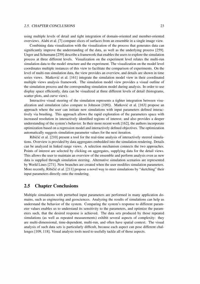
2.5. CHAPTER CONCLUSIONS 23
using multiple levels of detail and tight integration of domain-oriented and member-orientedoverviews. Alabi et al. [7] compare slices of surfaces from an ensemble in a single image view.
Combining data visualization with the visualization of the process that generates data cansignificantly improve the understanding of the data, as well as the underlying process [259].Unger and Schumann [259] describe a framework that enables the users to explore the simulationprocess at three different levels. Visualization on the experiment level relates the multi-runsimulation data to the model structure and the experiment. The visualization on the model levelcoordinates multiple instances of this view to facilitate the comparison of experiments. On thelevel of multi-run simulation data, the view provides an overview, and details are shown in timeseries views. Matkovic et al. [161] integrate the simulation model view in their coordinatedmultiple views analysis framework. The simulation model view provides a visual outline ofthe simulation process and the corresponding simulation model during analysis. In order to usedisplay space efficiently, data can be visualized at three different levels of detail (histograms,scatter plots, and curve view).
Interactive visual steering of the simulation represents a tighter integration between visu-alization and simulation (also compare to Johnson [109]). Matkovic et al. [163] propose anapproach where the user can initiate new simulations with input parameters defined interac-tively via brushing. This approach allows the rapid exploration of the parameters space withincreased resolution in interactively identified regions of interest; and also provides a deeperunderstanding of the system’s behavior. In their more recent work [162], the authors incorporateoptimization based on a regression model and interactively defined objectives. The optimizationautomatically suggests simulation parameter values for the next iteration.
Ribicic et al. [210] present a tool for the real-time analysis of interactively steered simula-tions. Overview is provided by data aggregates embedded into the simulation rendering. Detailscan be analyzed in linked range views. A selection mechanism connects the two approaches.Points of interest are selected by clicking on aggregates, supplying data for the detail views.This allows the user to maintain an overview of the ensemble and perform analysis even as newdata is supplied through simulation steering. Alternative simulation scenarios are representedby World Lines [271]. New branches are created when the user modifies simulation parameters.More recently, Ribicic et al. [211] propose a novel way to steer simulations by “sketching” theirinput parameters directly onto the rendering.
2.5 Chapter Conclusions
Multiple simulations with perturbed input parameters are performed in many application do-mains, such as engineering and geosciences. Analyzing the results of simulations can help usunderstand the behavior of the system. Comparing the system’s response to different param-eter values enables us to understand its sensitivity to the parameters, and optimize the param-eters such, that the desired response is achieved. The data sets produced by those repeatedsimulations (as well as repeated measurements) exhibit several aspects of complexity: theyare multi-dimensional, time-dependent, multi-run, and often have spatial context. The visualanalysis of such data sets is particularly difficult, because each aspect can pose different chal-lenges [109, 118]. Visual analysis tools need to usefully tackle all of those aspects.

24 CHAPTER 2. STATE OF THE ART
In this chapter we provided an overview of the related state of the art. There are many vi-sualization and visual analysis approaches that address some of those aspects of complexity, butfew handle all of them. One popular technique to fuse different approaches is coordinated mul-tiple views [118, 214], where individual views show different perspectives of the data. Multipleattribute dimensions (including simulation input parameters) can be displayed in well-known in-formation visualization views [166]. Spatio-temporal data can be displayed, for instance, usingvolume rendering [6]. Statistical aggregates of multi-run data can be visualized by embeddingglyphs in the 3D visualization [120].
The challenge in such systems is to coordinate the views effectively, i.e., enable the userto correlate data items in the individual views, also the ones that represent different levels ofabstraction [120]. The visual analysis system must provide intuitive and efficient means ofinteraction so that the user can select, explore, filter, and connect items in the visualization [288].The interaction helps the users to relate his or her internal mental model of the analysis to thevisualization [153, 236], so that they can formulate, verify or reject hypotheses.
It is very promising to integrate visual and automated analysis methods [121, 246]. Auto-mated analysis can usually deliver quantitative, more accurate, and more reliable answers. It isgenerally faster and cheaper, and it scales also to very large data sets. However, it requires thatthe problem is precisely defined. It may not work well for new, unanticipated types of analysistasks. Conversely, visual analysis can tackle vaguely defined problems, and incorporate domainknowledge and human intuition. The interplay of the two approaches constitutes a very power-ful analysis methodology. In an iterative process, the insights gained via one approach can helpformulate hypotheses also for the other one. Similarly, hypotheses generated by any of the twoapproaches can be confirmed or rejected also by the other one, and lead to new insights. Throughthis cooperation, data analysis problems can be solved that are not solvable with neither of theindividual approaches [129].
The ultimate goal of visual analysis is to support domain experts in generating knowledgefrom data. That said, it is interesting to observe that the communication between the visualiza-tion community and application domains leaves a lot to be desired [282]. Domain experts rarelyuse recent results in visualization, and visualization research rarely incorporates the knowledgeof domain experts in designing new visualizations and analysis tools. Johnson [109] suggeststhat establishing mutually beneficial peer relationships between visualization and applicationexperts is one of the most important factors in increasing the acceptance of visualization, andultimately integrating it with the analysis workflow. Recently, Sedlmair et al. [232] survey thedesign of problem-driven visualizations.

Chapter 3
Interactive Visual Analysis of Familiesof Function Graphs
“It is only in appearance that time is a river. It is rather a vast landscapeand it is the eye of the beholder that moves.”
— Thornton Niven Wilder (1897–1975)1
The exploration and analysis of multidimensional and multivariate data is one of the most chal-lenging areas in the field of interactive visual analysis. In this chapter, we describe an approachto the visual analysis of an especially interesting set of problems that exhibit a complex internaldata structure. We describe the interactive visual exploration and analysis of data that includesseveral families of function graphs fi(x, t). We describe a data model that handles functiongraphs as atomic data types. We discuss analysis procedures and practical aspects of the in-teractive visual analysis with special emphasis on the function graph characteristic of the data.We adopted the well-proven approach of multiple, linked views [214]. Standard views, suchas histograms, scatter plots, and parallel coordinates, as well as the function graph view areused to jointly visualize data. Iterative visual analysis is supported by providing means to createcomplex, composite brushes that span multiple views and that are constructed using differentcombination schemes.
This chapter is organized as follows. Section 3.1 provides context and motivation. Sec-tion 3.2 gives a brief description of the data model used and the exploration procedures. Sec-tion 3.3 describes our proposed tools and methods for supporting these tasks. Section 3.4 intro-duces the typical tasks in the analysis of such data sets. Section 3.5 contains closing remarks.A case study of the optimization of a Diesel fuel injection system based on the concepts in thischapter is described in Section 7.1.
1American playwright and novelist, three time Pulitzer Prize winner.
25

26 CHAPTER 3. VISUAL ANALYSIS OF FAMILIES OF FUNCTION GRAPHS
3.1 Motivation
The development of effective visualization and interaction techniques requires the understandingof the properties of the data and the typical tasks the users want to perform [246]. Unfortunately,this requirement is not always met, often because of insufficient collaboration and communi-cation between visualization experts and the users. The users’ ultimate goal is to find expectedphenomena to support (or reject) their hypotheses or to discover unexpected results that questiontheir assumptions or the validity of the data acquisition process. That can lead to the generationof new hypotheses.
The challenges of data analysis and exploration are associated with large and complex datasets, increased dimensionality, and the consideration of data semantics, including features, focusand context [59]. Therefore, a visualization tool should be designed in close collaboration withpotential users. Tool developers must be aware of the users’ actual requirements, the usualtasks they need to solve, the shortcomings of their previously used tools, and their feedback onnew ideas. A part of that process is a development of intuitive and effective visualization andinteraction techniques based on a common data model. If designed well, the same principles canbe used across several application domains, including engineering design [138, 139, 164, 161,163, 166], medicine [160], and ethology [168].
Modern simulation software can generate massive amounts of complex data that require suit-able analysis techniques to get an insight into the practical implications of the results. Simulationis increasingly used to assess the quality and potential of new designs early in the process forexample in aeronautical design [17, 65] or in the automotive industry [163]. Building real pro-totypes is time-consuming and expensive. Even though measurements on test bed systems arelikely to remain an important way to verify designs in the future, the use of computational sim-ulation in the design and production process can help to minimize the costs of the developmentand shorten the time-to-market for new products.
For example, in the automotive industry many different aspects of new designs are checkedusing simulation long before a new car is manufactured. Examples include mixture formationand combustion, engine cooling and filter regeneration, air conditioning in the passenger cabinand front shield deicing, and many others. The increasing complexity of automotive subsystems,e.g., the power train, the intake and exhaust system, or the fuel injection subsystem, also requiressimulation for optimization. Tuning of an injection system for modern cars is an example of amulti-parameter optimization process. The operation of the injection system depends, in a veryindirect way, on several parameters. Therefore, optimization by experience and/or intuition isusually not possible.
In this chapter, we present a new approach to the interactive visual exploration and analysisof simulation (or measurement) data containing families of function graphs. This approach isgeneral enough for a number of application scenarios that share the same characteristics, includ-ing multi-parameter tuning problems. A major challenge, in general, is how to visually relatethe multivariate dependent variables to their multidimensional reference parameters (indepen-dent variables). We suggest a combination of different kinds of views with specific brushinginteractions, all adapted to work well for the families of function graphs in order to facilitatethe interactive visual exploration and analysis of such data sets. We introduce our concept via

3.2. DATA MODEL 27
Figure 3.1: Left: the map of all sensor locations in the Minneapolis freeway system traffic data.A schematic map is underlayed to provide context information. Each red dot marks the locationof one station (which usually encompasses several sensors, detectors, one per lane). Right: roadtraffic occupancy family of function graphs. Data from some sensors (marked with the blackrectangle on road 35W in the map) is highlighted in red. Occupancy is defined as a percentageof time a detector detects vehicles. It is measured in ten minute intervals. An occupancy valueof 0.7 means that for seven out of ten minutes a sensor detected vehicles.
an illustrative example analysis of road traffic measurement data. The case study of a Dieselfuel injection system optimization in Section 7.1 demonstrates the usability of our ideas in areal-world engineering context.
3.2 Data Model
Generally speaking, a data model consists of a data definition and a manipulation language(structuring and operational definitions) [248]. Data definitions that result from engineeringsimulations, real-world sensor data sets, or intelligence data may be very similar. Consequently,the data sets under consideration share some common characteristics.
3.2.1 Data Definition
The data sets contain values for m independent variables and n dependent variables. The in-dependent variables x = [x1, . . . , xm] are real-valued and their values define a subset I of thedata set. A member of I ⊆ ℜm represents a specific set of values xi of independent variables.For each xi, the corresponding set of values of dependent variables is provided; this data modeldoes not handle missing values. There are two types of dependent variables, regular and func-tion graphs. While regular variables have a singular value for each xi, function graph variablesuse an additional independent variable (often time) to provide a set of values for each xi. A

28 CHAPTER 3. VISUAL ANALYSIS OF FAMILIES OF FUNCTION GRAPHS
Figure 3.2: Two approaches to the management of function graph data. (a) The independentvariable of the function graphs (e.g. time) is represented by adding an additional dimension.Records 1 to 144 represent one function graph. The scalar dimensions of the records need to beduplicated for each value of the independent variable. (b) A function graph is represented as anatomic type in the data. Duplication of scalar dimensions is not necessary. Columns of this tableare families of function graphs.
function graph can be visualized as a 2D plot that shows how the value of a dependent variablechanges over time. In other words, the regular variables r = [r1, . . . , rnr ] depend only on xwhile the function graph variables f = [f1, . . . , fnf
] depend on x and time t ∈ ℜ. For a specificset of values xi of independent variables and fixed time tj we can define the set of values ofdependent variables as d = [r1(xi), . . . , rnr(xi), f1(xi, tj), . . . , fnf
(xi, tj)], nr +nf = n. Thedependent variables and their values (possibly, over time) define a subset D of the data set. For agiven function graph variable, fj(x, t), we define a family of function graphs as a set of functiongraphs for each possible value of x, {fj(xi, t)|∀xi ∈ I}.
We use a road traffic measurements data set to illustrate the concepts described in Sec-tions 3.3 and 3.4. The data set is provided by the Traffic Management Center of MinnesotaDepartment of Transportation2 that maintains an archive database of road traffic measurementsfrom the freeway system in the Twin Cities metropolitan area (Figure 3.1). The data set contains28 days of measurements from approximately 4,000 sensors grouped into about 1,000 stationscovering ten main roads in the Twin Cities metropolitan area. Opposite directions on a road(e.g., northbound vs. southbound) are treated separately, thus effectively creating 20 one-wayroads. I consists of the positions of the sensors, road numbers, and weekdays. The sensorsreport traffic volume and occupancy, thus D consists of two families of function graphs in thisdata set. Each function graph in each family represents one day’s worth of measurement data,so there are in total about 112,000 function graphs in the data set (4,000 sensors times 28 days).The sensor data are aggregated into 10 minute intervals, therefore each function graph contains144 points to represent the 24 hours of a day.
Such data in databases and also in IVA applications are generally stored as records thatconsist of attributes. This concept is well-known, records can be considered as points in a space
2Twin Cities Traffic Data Archive, http://www.d.umn.edu/˜tkwon/TMCdata/TMCarchive.html

3.2. DATA MODEL 29
of m + n dimensions, representing all (independent and dependent) attributes. All attributes(dimensions) are scalars, either numeric or categorical. We omit a more detailed discussionincluding nominal and ordinal types here. Time-dependent data like function graphs can berepresented by adding time as an additional dimension.
The table in Figure 3.2(a) illustrates a conventional way of storing such data. Time appearsas an additional column in the table. For each combination of the independent variables (dayand sensor location), there are 144 records to represent a function graph variable, one recordfor each time step. The scalar dimensions of the records need to be duplicated for each timestep. If, however, we take into account the nature of the data and allow some columns to containfunction graphs, we get a different model, shown in Figure 3.2(b). We have now one record thatcontains the time series Volume(t) as a function graph, as opposed to having 144 records withTimeStep and Volume attributes, as in Figure 3.2(a). Duplication of scalar dimensions is not nec-essary. Note that we have substantially reduced the number of data records and, simultaneously,increased the complexity of the data model. We did not lose any of the data; to the contrary, wehave gained additional information. Now values pertaining to a given day and sensor locationare grouped into a single record. All function graphs populating one column in Figure 3.2(b)constitute a family of function graphs.
If dimensions can be not only scalars, but also function graphs, then we can improve theanalysis significantly. This data model has proven itself in several case studies we have donein different fields, for example optimization of Diesel fuel injection (Section 7.1), timing chaindrive design (Section 7.2), medical data [160], and ethology [168]. Fang et al. [67] have pro-posed a similar data model for medical image data sets.
3.2.2 Manipulation Language
Once the data set is defined, the question is how to analyze the data. In our data model, the ma-nipulation language is an exploration language that enables search and pattern discovery withoutmodifying the data set. From the visual analytics point of view, the goal is to discover, in an iter-ative manner, trends, tendencies and outliers in the data and to see how patterns in D map to thecorresponding subsets in I and vice-versa. In order to achieve that, data exploration techniquesmust be conceptually simple, easily combined and visually intuitive.
The visualization framework is based on the described data model and a set of visual oper-ators (brushing techniques) and views (histograms, scatter plots, parallel coordinates, etc.) thatare linked together. The design of interactive visual analysis within this framework is based onthe following principles. The analyst can select a varying number of views. Within each view,the variables of interest can be selected and the corresponding values displayed. The visual op-erators are used to select a subset of “interesting” values for the specific variables in the view.The selection is immediately displayed in all other views. Families of function graphs are ofspecial importance in providing a visual space for patterns. Within a family of function graphs,we would like to select function graphs based on their shapes. It is possible to use a combinationof function graph values to specify the desired shape of a function graph, i.e., the pattern.

30 CHAPTER 3. VISUAL ANALYSIS OF FAMILIES OF FUNCTION GRAPHS
Figure 3.3: Several occupancy function graphs of atypical shape have been selected by the redline brush. We conclude from very high occupancy values that those function graphs indicatemalfunctioning sensors. In the linked map view (scatter plot view of sensor coordinates) wecan see that there are two malfunctioning sensors next to each other. In another linked scatterplot view weekdays and road numbers are displayed. Each column represents one direction (forinstance, southbound) of a road. We can see that those sensors are on road 35E and that they didnot work for three days.
3.3 Tools for the Analysis of Families of Function Graphs
We have developed a tool based on premises described in Section 3.2. The combination of basic,highly interactive views is sufficient to carry out a wide range of sophisticated analysis tasks.Interactivity plays a crucial role in analysis. Important and novel aspects that support interactiveprocedures are described in the following.
We currently offer a combination of linked views including histograms, scatter plots, paral-lel coordinates and function graphs. We do not make any assumptions about independent anddependent variables in the sense that we would restrict any of the basic views to display eitherof them. The views can display any attribute of the data set, both independent and dependentvariables. The user can create new views, arrange views as desired, and can have more than oneinstance of the same view type showing the same or different attribute sets. In practice, displaysizes typically limit the number of views to six. It is possible to temporarily maximize one viewfor more detailed examinations. Histograms, parallel coordinates and scatter plots are standard,well-known views [40], thus we do not describe them in detail. However, it is worth mentioningthat the point size in scatter plot views can optionally be made proportional to the number of dataitems represented by a single point (compare to Piringer et al. [195]). The more items a pointrepresents the larger it is. An example is shown in Figure 3.3: larger points indicate more sen-sors on the road. Similarly, the sizes of points highlighted in the focus set are also proportionalto the number of items brushed. Thus the ratio of brushed items versus context represented by apoint in the scatter plot is indicated by point sizes.
The function graph view displays a family of function graphs at once. If the number offunction graphs in the family is large then the display can become visually cluttered and non-informative. In order to represent the characteristics of the family better, we can (optionally)

3.3. TOOLS FOR THE ANALYSIS OF FAMILIES OF FUNCTION GRAPHS 31
Figure 3.4: A snapshot from an interactive visual analysis session of traffic data in the Min-neapolis metropolitan area. Red numbers indicate the brush creation order. Here we look forlocations of high volume morning traffic on a given road on weekdays. The user has selectedthe road and weekdays in the scatter plot (brush 1) and then removed low traffic volume graphsintersecting brush 2 using SUB operation. The locations are highlighted in the linked map. Theroad number (35WSB, i.e., 35W southbound) is shown on mouse-over. We can see that heavymorning traffic on southbound 35W occurs mainly north of the downtown area, i.e., towards it,and towards the airport, which is south of downtown Minneapolis.
render the pixels where more graphs pass through with higher intensity, effectively producingan alpha-blended display.
In the following we describe generic interaction principles and elaborate on the specificrequirements of brushing and linking in various views.
3.3.1 Generic Interaction Features
If the basic views listed above are independent, then they provide a limited insight into the dataset. However, if areas of focus can be highlighted with applicable brushing techniques and thisfocus area is linked to the other views, then correlations and dependencies in the data can berevealed. Our system supports interactive brushing and linking (Figure 3.4). The number ofcurrently brushed data items versus the total number of items is always indicated. The user canperform brushing in any of the views and all the other views will highlight the brushed items

32 CHAPTER 3. VISUAL ANALYSIS OF FAMILIES OF FUNCTION GRAPHS
while the context is shown in a different, less saturated color. Whenever applicable, the viewcan be zoomed to show the brushed region only. The brushes can be resized and dragged tonew locations, which helps in the interactive data exploration. A tabular display of the currentlybrushed items can be opened when the user needs detailed numeric information.
With simple brushing and linking it is usually a problem to locate the matching brushed dataitems in different views. If more data items are brushed in a view then all corresponding itemsare highlighted in other views, but we cannot visually identify the same item in the differentviews. We have applied an optional color gradient along the brush and used this color gradientin the linked views to establish a visual link between the correlated data items. This also helpsin discovering tendencies in the data set. Figure 7.7 shows an example where the color gradientestablishes visual links between a scatter plot and the function graph view.
Another improvement is composite brushing, a query tool which is a result of logical opera-tions performed on brushes. Composite brushing makes it possible to build queries that specifyseveral overlapping or intersecting ranges of criteria in the same or different views. We couldhave chosen to offer AND, OR and XOR operations to composite brushes and add a formulaeditor to allow controlling the order of operations by bracketing, similar to the feature definitionlanguage proposed by Doleisch et al. [59]. In contrast, we use composite brushing by offeringAND, OR, and SUB operations where the first operand is always the result of the latest composi-tion. This allows a simplified, intuitive, and more iterative workflow compared to working witha formula editor. The user defines the first brush, then (optionally) selects a Boolean operation,adjusts the composition setting (to either AND, OR, or SUB) and then defines the next brush toadjust the current selection. Subsequent brushes and operations will be applied to the result ofprior brushes only. Iteratively, every new brush alters the current selection status according tothe composition rule in use. The process continues in this way: new brushes and operations areapplied to the latest state only. Each new brushing operation provides immediate visual feedbackand the user can interactively refine (using AND and SUB) or broaden (using OR) the currentselection and steer the information drill-down. The user can also resize or move any existingbrush in the chain to gain even more flexibility.
Brushing and linking is a powerful feature in understanding how outputs depend on inputsand finding input parameter sets when desired properties of outputs are known. Because we treatall variables in the same manner, one can brush in views of independent variables and study howdependent variables change in other views, or perform the inverse kind of investigation to findsuitable inputs for specified results by brushing in the views showing output parameters.
Brushing conventional views is quite straightforward [158]. The user can select histogrambins, rectangular areas in scatter plot views or ranges of parallel coordinates axes. We haveintroduced a novel brushing tool in the function graph view that we describe in more detail.
3.3.2 Brushing Function Graphs
We suggest two brushing methods to meet the specific requirements of queries on families offunction graphs.
A line brush is a simple line segment drawn in the function graph view. It selects all functiongraphs that intersect the line. Figure 3.3 shows an example of selecting several graphs that havehigh and constant occupancy value. That indicates malfunctioning sensors. Linking them to

3.4. ANALYSIS PROCEDURES 33
the corresponding points in I in the map, we identify those sensors. It is very easy to excludeoutliers in a family of function graphs or to isolate function graphs with desired characteristicswith just a few line brushes (see brush 2 in Figure 3.4). Additionally, it is very useful to providea polyline brushing opportunity, i.e., a brush in the form of a polyline which selects all functiongraphs which intersect any of the polyline segments. The line brush, together with the above-mentioned composition functionality, assists the user when looking for function graphs whoseapproximate shape is known. A logical operation can be defined individually for each line brushwhich supports very complex queries. An example of composite brushing is shown in Figure 3.6.A complex combination of line brushes is used to include and remove various function graphshapes in the focus set. We have found compositions of line brushes very intuitive and effectivein brushing function graphs.
A rectangular brush selects all function graphs that pass through the rectangle. The time-box widget [96] is an analogy to rectangular brushing. We have enhanced the original idea byallowing the user to optionally limit the brushing to function graphs that enter and leave the rect-angular brush at given edges. Probably the most useful ones are those where the function graphis required to enter and leave at the bottom or on the top edge of the rectangle. These functiongraphs have a local maximum or minimum inside the rectangle, which is often a criterion in theanalysis of function graphs. This is especially useful if the display of a family of function graphsis dense and areas of maxima and minima are occluded by other function graphs. Alternatively,the similarity brush [35, 96, 178] (see also Section 4.3.3) and working with the first derivativesof the function graphs (see Section 4.3.2) can also be useful in such cases. The rectangular brushcan be represented as a composition of line brushes.
3.4 Analysis Procedures
The shapes of function graphs depend on the independent variables x and in practical cases theshapes usually exhibit similarities for slight variations in the variable values, albeit this corre-lation may be quite indirect. For example, complex physical systems can be considered “blackboxes” that return output for an input parameter set, but their exact dependencies on the inputsare unknown. This can also happen if a system is simulated using a computer. In that case theboundary conditions can have so diverse effects on the results that in the analysis of such systemsit is more feasible to reconstruct the black box by exploration rather than by trying to deduce itsinternals from a simulation process. The analysis and exploration of this class of data involvesseveral types of procedures, including discovering trends and tendencies or finding outliers inD. For certain data sets, similar analysis of I can also be of interest. However, in this sectionwe focus on finding patterns and dependencies in the union of I and D.
3.4.1 Black Box Reconstruction
We call the process of understanding the influence of independent variables on dependent func-tion graph variables black box reconstruction. To accomplish this, we usually need to have anoverview of the entire data set, following the principles of Shneiderman’s visual informationseeking mantra: overview first, zoom and filter, then details-on-demand [236]. We are interested

34 CHAPTER 3. VISUAL ANALYSIS OF FAMILIES OF FUNCTION GRAPHS
Figure 3.5: Another snapshot of an iterative, interactive visual analysis of the Minneapolis trafficdata. Red numbers indicate the brush creation order. First, entries into the freeway system areselected using the union (OR) of four brushes (labeled 1 to 4) in the top left map. Next, lowvolume evening traffic is excluded from the focus by subtracting graphs which intersect brush 5.Using logical AND with brush 6 in the map view we can restrict the investigation to one specificentry. By dragging this brush to other entries we can quickly change the focus to one of the fourentries. Thereby a comparison of traffic patterns with respect to the four entries is possible. Inthis snapshot evening traffic on the south entry is shown. The highlighted points in the lowermiddle scatter plot and the linked histograms reveal that heavy traffic direction is southboundfrom Mondays to Thursdays, but interestingly, shifts to northbound on Fridays and Saturdays(road number and direction are displayed on mouse-over).
in how dependent variables, including function graphs, change as values of independent vari-ables are changed. We want to fix values of some independent variables to reduce the focus areaand vary other independent variables while studying the corresponding dependent variables andfunction graphs. This is an interactive and iterative data exploration process: brushes are createdand moved to areas of interest. When we have built up an overview of the dependencies we wantto zoom in on details in both I and D in order to discover more subtle correlations in the data. Incase of function graphs it is especially important to provide context information so that changesin shape are more obvious as various ranges of values are brushed.
An example of black box reconstruction is shown in Figure 3.5. We are interested in eveningtraffic characteristics entering the Minneapolis area freeway system. The freeway system has en-trances from North, South, East and West. We first brush these entry points in the map view witha logical OR combination of four brushes labeled 1 through 4. Then low traffic volume in the

3.4. ANALYSIS PROCEDURES 35
evening is excluded using a line brush with SUB operation (5). Finally, we create a larger brushin the map using the AND operation (6) to restrict the focus to one of the entries. By draggingthis last brush to the other three entries we can quickly change the focus and compare trafficpatterns of the four entry points, while still being accurate with respect to brushes 1 to 4. Aftereach interaction step all views are immediately updated in order to support iterative analysis.
3.4.2 Analysis of Families of Function Graphs
In this type of analysis we (approximately) know the desired or expected shape of functiongraphs and our goal is to find combinations of independent variables that produce those shapes.We also want to exclude combinations that produce undesirable or invalid function graphs andwe want to find out how the deviations from the desired shape depend on the independent vari-ables. This could be considered an inverse investigation compared to the one in Section 3.4.1.However, this type of analysis requires that we have an idea of the operation of the black box sothat we avoid erroneously identifying dependencies that are a mere coincidence.
The procedure requires focus+context views of the graphs where criteria can be defined toselect graphs of specific shapes. The desired shapes of graphs can be characterized by brushing.The typical procedure is to locate invalid or undesired function graphs first, as illustrated inFigure 3.3. We brush them in the function graph view and find the related values of independentvariables, in this case locations of the malfunctioning sensors. We will exclude these items fromfurther analysis.
The desired properties of a function graph can be defined by line brushes, as shown inFigure 3.4. Here we look for locations of high volume morning traffic on a given road onweekdays. This can be accomplished by selecting the road and weekdays in the scatter plot(brush 1) and then removing low traffic volume function graphs using SUB operation (brush 2).The locations are highlighted in the linked map.
3.4.3 Multidimensional Relations
Another interesting aspect of the analysis is the correlation between different families of functiongraphs. We want to investigate features of one family of function graphs depending on theproperties of a set of function graphs in another family, for example, relationships betweentraffic volume and occupancy. This analysis within multidimensional time series data requiresthat families of function graphs are displayed simultaneously and the user can interactively brushspecific groups of function graphs in one family and study the corresponding ones in the otherfamilies. We may also want to narrow the search by specifying filters on the function graph’sindependent variables x. Furthermore, we want to be able to define criteria for various familiesof function graphs.
As an illustrative example let us consider the following query on the traffic data: we look forareas where traffic is strong, but still moving both in the morning and in the afternoon. Thoseare heavily used roads without traffic jams. If cars travel at higher speeds then many cars passover the sensors but with relatively large gaps. This is indicated by high volume and relativelylow occupancy values. In the analysis tool this is expressed as a combination of brushes in bothfamilies of function graphs. There is no direct correlation between the two function graphs. The
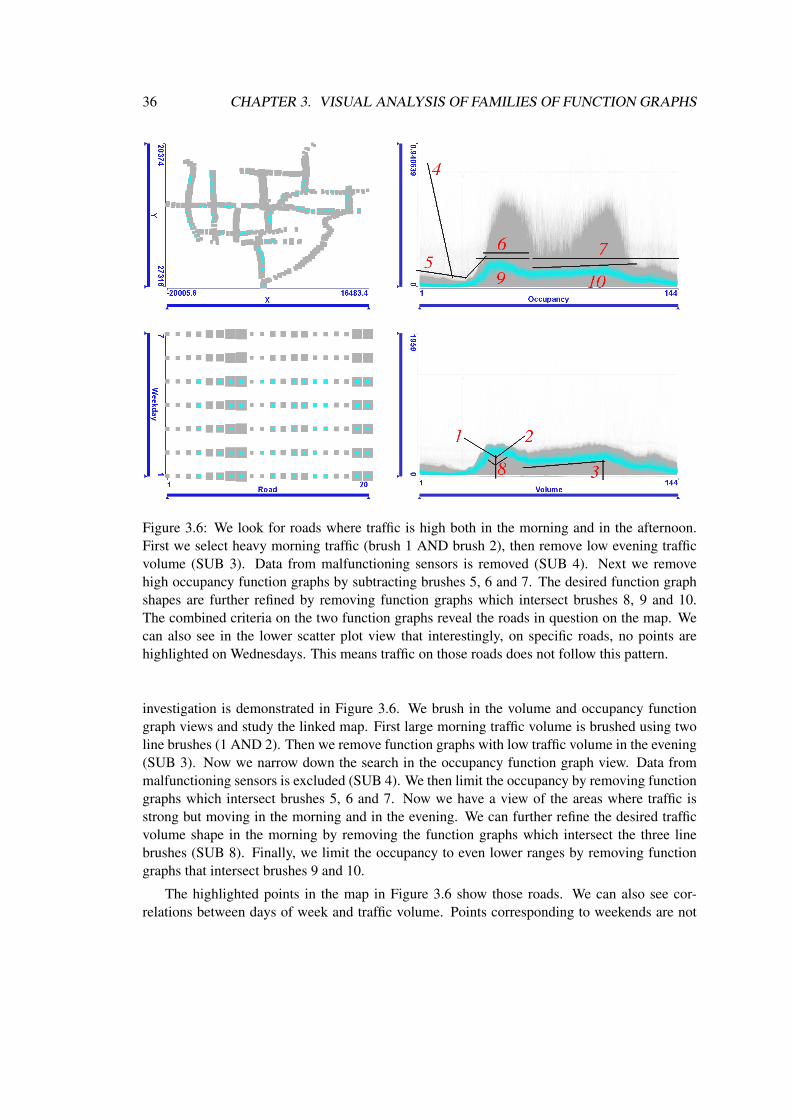
36 CHAPTER 3. VISUAL ANALYSIS OF FAMILIES OF FUNCTION GRAPHS
Figure 3.6: We look for roads where traffic is high both in the morning and in the afternoon.First we select heavy morning traffic (brush 1 AND brush 2), then remove low evening trafficvolume (SUB 3). Data from malfunctioning sensors is removed (SUB 4). Next we removehigh occupancy function graphs by subtracting brushes 5, 6 and 7. The desired function graphshapes are further refined by removing function graphs which intersect brushes 8, 9 and 10.The combined criteria on the two function graphs reveal the roads in question on the map. Wecan also see in the lower scatter plot view that interestingly, on specific roads, no points arehighlighted on Wednesdays. This means traffic on those roads does not follow this pattern.
investigation is demonstrated in Figure 3.6. We brush in the volume and occupancy functiongraph views and study the linked map. First large morning traffic volume is brushed using twoline brushes (1 AND 2). Then we remove function graphs with low traffic volume in the evening(SUB 3). Now we narrow down the search in the occupancy function graph view. Data frommalfunctioning sensors is excluded (SUB 4). We then limit the occupancy by removing functiongraphs which intersect brushes 5, 6 and 7. Now we have a view of the areas where traffic isstrong but moving in the morning and in the evening. We can further refine the desired trafficvolume shape in the morning by removing the function graphs which intersect the three linebrushes (SUB 8). Finally, we limit the occupancy to even lower ranges by removing functiongraphs that intersect brushes 9 and 10.
The highlighted points in the map in Figure 3.6 show those roads. We can also see cor-relations between days of week and traffic volume. Points corresponding to weekends are not

3.5. CHAPTER CONCLUSIONS 37
selected, as expected. We can also see something unexpected: on some roads, no points are high-lighted on Wednesdays. On those roads, traffic does not follow the above pattern on Wednesdays.The road number (road 35 westbound) is displayed on mouseover.
3.4.4 Hypothesis Generations via Visual Analysis
There is a particularly strong need in engineering applications to perform automatic optimizationof designs using several simulation iterations with suitably varied boundary conditions. Theautomatic optimization process must have an approximate model of the simulation in order toknow how boundary conditions should be adjusted in search for an optimum. Visual analysis canbe used to create hypotheses and rules that the automatic optimization can use in its simplifiedmodel and also to find out if the optimization misses some families of function graphs whilesearching for an optimum.
Gaining insight into the current design and setting up hypotheses about its operation via vi-sual analysis has a very important additional advantage over pure numeric optimization. Whendesigning a new component, engineers almost never start from scratch, but the new designevolves from an old one. Because of this iterative nature of design in engineering, the insightgained from the analysis of previous designs can be useful in improving future ones. This alsoimplies that the simulation models of new designs are not radically different from those of theold ones and their results are comparable to some extent, too. By analyzing the relationshipsbetween the two, tendencies can be found and extrapolated to improve future designs.
3.5 Chapter Conclusions
The analysis of relationships between families of function graphs is a common task in manyapplication domains. A novel combination of established visualization techniques, linked viewsand advanced brushing features represents a valuable tool for interactive visual exploration andanalysis of data sets that include families of function graphs. Independent and dependent vari-ables in the data set are treated the same, providing improved support for iterative explorationand analysis of the entire data space. Multiple, linked views enable simultaneous viewing ofindependent and dependent variables with immediate feedback.
Brushing proved to be especially effective, since it allows the interactive exploration of rela-tions between independent and dependent variables. The color gradient improves the visual con-nection of the brushed items to the linked focus+context visualizations. The composite brushingwith AND, OR, and SUB operations supports the iterative refinement of information drill-downand the detection or extraction of patterns from the application domain. The line brush techniqueproves to be especially useful in selecting function graphs. It is intuitive, easy to use and veryeffective. Figure 3.6 shows how a composition of nearly a dozen line brushes is used to identifya pattern in a family of traffic volume function graphs.
The process of the composite brush construction captures the essence of visual analytics pro-cedures: it is interactive and iterative. The initial brush provides the initial data selection in oneview. That selection is immediately displayed in the linked views and analyzed from differentperspectives to formulate a hypothesis that is then tested using new brushes. During this iterative

38 CHAPTER 3. VISUAL ANALYSIS OF FAMILIES OF FUNCTION GRAPHS
procedure new, possibly unexpected patterns can be found. Figure 3.3 shows a discovery of apattern in D (constant high occupancy) that indicates a pattern in I (malfunctioning sensors).Such discoveries are more difficult or even impossible without interactive visual analysis.

Chapter 4
Analysis using Data Aggregation andDerivation
“The important thing in science is not so much to obtain new factsas to discover new ways of thinking about them.”
— Sir William Henry Bragg (1862–1942)1
Time-series data are regularly collected and analyzed in a wide range of (scientific) domains.Acquiring values of a physical quantity via simulation or measurement over time produces time-series data. The data can be described as a function of time and it can be represented as a functiongraph. Multiple simulation runs or multiple measurements of the same physical quantity resultin ensembles of function graphs which we call families of function graphs. The analysis offunction graphs, (more generally: curves) is extensively studied in mathematics, statistics, andvisualization; but less research is focused on the analysis of entire families of function graphs.Interactive visual analysis in combination with a complex data model, which supports familiesof function graphs in addition to scalar parameters, represents a premium methodology for suchan analysis. In this chapter we describe the three levels of complexity of interactive visualanalysis we identified during several case studies from different disciplines. The first two levelsrepresent the current state of the art. The newly introduced third level makes an in-depth analysisof families of function graphs possible. The two essential components of the third level analysisare data derivation and advanced interaction. This is often the only way to extract deeply hiddenimplicit information from complex data sets. We seamlessly integrate data derivation, advancedinteraction, and visual exploration to facilitate interactive visual analysis of families of functiongraphs. We illustrate the proposed approach with typical analysis patterns identified in two casestudies from the automotive industry.
1British physicist, chemist, mathematician, and sportsman. Received the 1915 Nobel Prize in Physics for theanalysis of crystal structure using X-ray diffraction.
39

40 CHAPTER 4. ANALYSIS USING DATA AGGREGATION AND DERIVATION
4.1 Motivation
Generating useful knowledge from the information that is often only implicitly available incomplex data sets is one of the key challenges in analysis. Interactive visual analysis (IVA)has proven itself, recently, as an important and valuable method of getting insight into, under-standing, and analyzing complex data. However, IVA is still not well integrated into the wholeanalysis work flow. There is a multitude of powerful methods presented, but, unfortunately, theyoften remain isolated.
Our work is motivated by case studies we have done with domain experts from differentfields including engineering [138, 139, 161] (see also Chapter 7) and medicine [160]. We haverealized that many details of the data sets from those very different problem domains can berepresented as families of function graphs, introduced in Section 3.2. We could also identifysimilar procedures in the analysis of such data sets. We suggest that representing function graphsas an atomic type opens new analysis possibilities. We focus on a set of tools for the analysis ofdata that contains families of function graphs.
The analysis of function graphs is a well-known and extensively researched topic in scienceand mathematics. However, there is not much research on the analysis of entire families offunction graphs. As demonstrated in Chapter 3, IVA offers an effective and efficient opportu-nity to analyze even larger families of function graphs. The state of the art follows the visualinformation seeking mantra [236]: overview first, zoom and filter, then details-on-demand. Thisapproach has often been proven powerful, but especially when working with families of func-tion graphs, there are cases when zooming and filtering is not sufficient. Our work is in partmotivated by curve sketching, a topic all of us are familiar with from high school. We needfunctionality to extend the data set by computing new attributes and additional derived curveswhen analyzing families of function graphs; just as we compute new attributes (e.g., extrema)and curves (e.g., first derivative) in curve sketching. Curve sketching helps us in the analysis ofsingle curves. In this chapter, we propose related analysis methods for entire families of functiongraphs. The proposed ideas are in part suitable for the analysis of families of generic curves,too.
Traditional visualization systems often limit data manipulation to filtering and require morecomplex pre-processing to be performed in a separate step before the visual analysis. Whenthe pre-processing is designed, one needs to estimate what properties of the data are expectedto be of interest. Such a priori knowledge is often not available, in particular not in more in-tricate analysis cases. In this chapter we present a set of tools which extends the conventionalapproach and facilitates on demand data generation. By allowing the synthetic extension of databy attribute derivation (in addition to filtering, of course) at any time, new analysis possibilitiesarise. We claim that such an interactive attribute derivation mechanism is useful in particular forexperts. An integrated system makes it possible to reveal deeply hidden information in the datawithout requiring detours or a priori knowledge to design the pre-processing.
The main contribution of this chapter is a set of analysis procedures, cleverly combined inone toolbox, which makes the deep and flexible analysis of complex data containing familiesof function graphs possible. We argue that a rich set of tightly integrated (general) analysismechanisms can help in a wide range of application scenarios. We classify the analysis process

4.2. THREE LEVELS OF COMPLEXITY IN INTERACTIVE VISUAL ANALYSIS 41
Figure 4.1: Interactive visual analysis on three levels of complexity. The first level is linking andbrushing with one brush. On the second level, more views are used and brushes are combinedwith logical operators. On a third level, advanced interaction (brushing) and attribute derivationare added.
itself and suggest what should be included in an advanced IVA framework. We have identifiedthree levels of complexity in the analysis process. The first two levels represent the currentstate of the art. We propose a third level that includes advanced interaction and on-demanddata aggregation and attribute derivation in order to facilitate the exploration of deeply hiddendetails. We claim that there are two distinct ways to explore hidden features. One is to keepdata intact and offer more complex interaction. The other possibility is to extend the data tobe more complex and keep interaction simple. We demonstrate that the two approaches arecomplementary; there is no universally preferable way. We use examples from several casestudies with domain experts from various fields to illustrate the possible use of the proposedcombination of techniques.
4.2 Three Levels of Complexity in Interactive Visual Analysis
Interactive visual analysis is an iterative process. It usually starts with a simple analysis of theoriginal data to gain overview. Then, for a more advanced analysis, the analyst needs to use morecomplex procedures and can combine findings from earlier stages of the analysis. The need fora more advanced analysis arises as information should be extracted which is more difficult toaccess. At a certain point it becomes difficult or even impossible to find features of interest byanalyzing the original data only using conventional IVA methods. More advanced and complexinteraction possibilities are required. Alternatively, or perhaps in addition to that, the data canbe enhanced by computing aggregates or first derivatives of time series, for instance. Figure 4.1illustrates our view on the three levels of complexity in interactive visual analysis.
We exemplify those three levels using a climate simulation data set [19]. Climate researcherstry to develop models that can predict climate development in the future. The models are of-ten tested and validated against known scenarios from the past. In our example, the simulatedclimate response to the outburst of meltwater from Lake Agassiz was studied [19]. The diffu-sivity parameters of the ocean model (two scalars, diff H and diff V) were varied across multiplesimulation runs. There were 10 variations of each parameter, producing ensemble data [118] of100 individual simulation runs. In each simulation run, time series data are generated, including

42 CHAPTER 4. ANALYSIS USING DATA AGGREGATION AND DERIVATION
Figure 4.2: An example of a level one analysis with linking and brushing. The function graphview depicts air temperature. A line brush is used to select items with high temperatures at alater point in time. The corresponding model parameters diff H and diff V are highlighted in thescatter plot.
surface air temperature over land and oceans, global precipitation, and various differential mea-sures such as heat transport and ice transport. Each simulation run spans 500 years, representedas 500 time steps in each series.
In a coordinated multiple views system, the first level (smallest circle, left in Figure 4.1) canbe interpreted as simple linking and brushing with one brush. Simple brushing includes selectinga rectangular region in scatter plots, a range of an axis in parallel coordinates or using a line brushintroduced in Section 3.3.2 in the function graph view. The user can interactively select someitems in one view, and the selected data subsets are highlighted consistently in all views. Then adifferent set of items (another feature of interest) can be brushed and the highlighted patterns inthe linked views can be studied. The user repeats this process, engaging in an iterative IVA loop.This is sufficient in many cases, for example, when identifying diffusivity parameters that leadto high temperatures (Figure 4.2), but we cannot formulate more complex queries. We cannotidentify the droughtiest cases, for instance, because we would need to brush high temperatureand low precipitation simultaneously.
On the second level (larger circle in the middle of Figure 4.1) more views are used andbrushes can be combined with logical operators. This makes answering such questions possible,and it is at large the current state of the art [178]. Several brushes can be defined in the sameor in different views. Brushes can be combined using logical operations (AND, OR, and NOT).Only the data selected by the composition of the brushes is highlighted in all views. Brushescan be composited via a feature definition language [59], or in an iterative manner, described inSection 3.3.1. This enables further drill-down (AND and NOT operations) or broadening (ORoperation) of the selection. An example can be seen in Figure 4.3. The droughtiest cases can befound easily with composite brushing. For more detailed analysis of complex data this is stillnot sufficient. There are many more analysis goals that cannot be achieved by the use of thosemethods, for example, identifying cases which have rising temperature at some point in time, orfinding temperature curves of some specific shape.
We can see some jagged lines in Figure 4.3, especially noticeable in the area marked with thegreen ellipse. There are also some faintly visible jagged lines in the precipitation plot. Is there

4.2. THREE LEVELS OF COMPLEXITY IN INTERACTIVE VISUAL ANALYSIS 43
Figure 4.3: An example of a level two analysis. A composition of two brushes highlights thedroughtiest cases. High temperatures (top left) and low precipitation levels (bottom left) atthe same point in time are brushed. The scatter plot displays model parameters diff H and diff V.Greenland temperature is shown in the bottom right. However, level two analysis is not powerfulenough to select the jagged lines marked by the green ellipse.
any correlation between them? Do they belong to the same simulation run? How do we selectthem? One possibility is to compute the first derivatives of the function graphs. Extreme (eitherpositive or negative) values of the first derivatives can be brushed to select jagged curves. Theprocedure is illustrated in Figure 4.4. It must be mentioned that the first derivative of discretelysampled data is approximated by finite differences, and the data often needs to be smoothedbefore differentiation to compensate for frequency amplification due to derivation.
We observed that there is a certain duality in complex analysis tasks. One option is to usecomplex interaction methods and visualizations, and retain the data set in its original form.Complex interactions include, for instance, the angular brush in parallel coordinates [89] andthe angular line brush [161] in the function graph view. Conversely, new data can be synthe-sized during the analysis. This derived data can often be analyzed with simpler interactiontechniques. Both approaches have advantages and disadvantages. There is usually a learningcurve associated with complex visualization and interaction techniques before analysts can usethem effectively [126]. On the other hand, the meaning of derived data is not always intuitive.Depending on the task and the analyst’s experience and background one or the other methodis preferred. Our experience is that none of the two approaches is universally preferable. Theinteractive visual analysis framework needs to provide support for both.
The combination of complex interaction and on-demand computation of derived data at-

44 CHAPTER 4. ANALYSIS USING DATA AGGREGATION AND DERIVATION
Figure 4.4: An example of a level three analysis. In a first step, the user triggered the computa-tion of first derivatives of the temperature and precipitation curves. The plots show temperatureand precipitation (top left and right) and their first derivatives (bottom left and right). Two linebrushes select extreme temperature derivates near the end of the simulation run. The jaggedtemperature curves become visible, including two that were completely hidden in Figure 4.3.The highlighted precipitation curves are similarly jagged, indicating correlation.
tributes constitutes the third level of visual analysis, shown in the rightmost circle in Figure 4.1.In order to compute the derived data for the next iteration of the analysis, the analyst should notneed to interrupt the analysis session and use some different tool to perform computations. Suchdetours can significantly hinder the analysis. Quite the contrary, the computation must be tightlyintegrated into the IVA framework. Therefore, while the data in levels one and two of the visualanalysis remains static throughout the analysis session, it becomes dynamic in level three. Datachange as a result of the on-demand computations—for each computation, a new dimension (acolumn in the table in Figure 3.2(b)) is added to the data.
Note that each of the three circles in Figure 4.1 encloses the previous ones from the lowerlevel(s), indicating that a seamless transition between circles (levels of analysis) is possible. Forexample, after a new derived attribute is computed (third level), the analyst can open a new viewand combine a selection on the new derived data with already existing selections (transition tothe second level). A brush in one of the views can be moved and the highlighted selection canbe observed in other views (transition to the first level).
It is worthwhile to discuss the expected response time of the visual analysis applicationduring analysis at different levels of complexity. Card et al. [41] have identified three thresholdsof response times in human-computer interaction. If the application responds within 0.1 seconds,

4.3. ANALYSIS OF FAMILIES OF FUNCTION GRAPHS 45
then the response is perceived instantaneous. If the response takes longer, but less than 1 second,then the delay is noticed, but the user’s flow of thought remains uninterrupted. If the responsetakes longer than 10 seconds, then users find it difficult to focus their attention and their flow ofthought is interrupted. Actually, these findings resonate with a much older study by Miller [174],indicating that the pace of human cognition has not changed significantly for decades.
An interesting analogy can be drawn between the three levels of complexity in analysis andthe three time constraints in human-computer interaction. The users’ actions in level one analysisare spontaneous; they move a brush and observe the changes. The cycle time of the analysisloop is very short and many iterations are done in a short time. The user expects instantaneousresponse from the computer, so that the exploration remains fluid. At level two, the users’actions are more complex. When they choose to open a new view, they need to think about thetype of view and the data attribute. When brushes are combined, they need to consider possiblelogical operators to use. The pace of action becomes slower, and slower computer response canbe acceptable. Nevertheless, if the system does not respond within one second, then the user’scognitive process is interrupted. At analysis level three, the user can trigger the computation ofnew data attributes when he or she realizes that those can advance the analysis. This decisionoften reflects elaborate thinking, involving a broader overview of the analysis process. Userswill likely accept longer response times, provided they have some feedback of the computer’sactions in the form of a progress bar or the visualization being progressively updated.
4.3 Analysis of Families of Function Graphs
In this section we illustrate the above described principles in the context of simulations in auto-motive industry. Current emission regulations and very high efficiency requirements for moderncar engines lead to very complex engine designs. Engineers have to deal with many, often con-tradicting, parameter settings. The use of simulation is unavoidable in modern engine design.Advances in simulation and computation technology have made multiple simulation runs, orsimulation ensembles [118], possible. The idea is to run simulations for the same simulationmodel with different sets of control parameters. Interactive visual analysis is a perfect method toanalyze and explore the resulting data sets. In our previous work, we have analyzed two impor-tant systems, a Diesel fuel unit injector [161] and a variable valve actuation system, by means ofinteractive visual analysis. A complete description of the two case studies is out of the scope ofthis dissertation. We rather give a short summary to provide context for this section. Interestedreaders can find additional information in the referenced literature [82, 204].
Variable valve actuation (VVA) [204] is an active research field in automotive industry. Theoperation of four-stroke internal combustion engines consists of intake, compression, power, andexhaust strokes. During the intake stroke, the inlet valve opens and vaporized fuel mixture entersthe combustion chamber. During the exhaust stroke, the exhaust valve opens and the exhaustgases leave the combustion chamber. Conventional systems use a camshaft, where cams openand close the valves at specific times, dependent on the mechanical construction of the cams.Different operating conditions (e.g., load or engine speed) require different valve opening andclosing timings to achieve optimal efficiency and emission. In engines equipped with a VVAmechanism, the valves’ opening and closing times, as well as the valve lift can be controlled

46 CHAPTER 4. ANALYSIS USING DATA AGGREGATION AND DERIVATION
Figure 4.5: The histogram depicts the maximum of the pressure in the valve actuator. The itemswith the smallest maximum are brushed.
based on the load and engine speed. We explore the design of a hydraulically supported camoperated VVA system. Such a system has a camshaft with cams, and an additional hydraulicmechanism which opens the valve independently of the cams’ position. Approximately 600simulation runs were computed with different parameter settings and the ensemble data wasanalyzed.
Besides valve actuation, the fuel injection subsystem [82] is another engine component thathas crucial impact on emissions and performances. Currently, the two most important types ofinjection systems for Diesel engines are the common rail and the unit injector systems. Commonrail systems keep fuel pressurized to the injection pressure in a fuel rail which feeds the cylinders.The rail is common to all cylinders. In contrast, unit injector systems have the high pressure fuelpump integrated with the injector. There is one injector/pump unit per cylinder in the cylinderhead assembly. We analyzed [161] the Delphi E3 Diesel Electronic Unit Injector (EUI) [82], anadvanced unit injector with two independent, fast-response precision actuators that can changethe injection pressure level and adjust the fuel delivery timing and duration, allowing a veryflexible choice of fuel injection characteristics. 2880 different simulation runs were computedand analyzed in the case study [161].
In the following, we describe four of the most interesting analysis patterns detected in the twocase studies. These patterns are applicable to virtually all domains where families of functiongraphs are analyzed.
4.3.1 Aggregates and Thresholds
Some of the typical goals in the analysis of families of function graphs can be effectively tackledby computing some aggregate of each member curve of the family. The most important aggre-gates from the IVA perspective are minimum, maximum, arithmetic mean, percentile (whichalso includes median), and integral. These aggregates are easily computed, yet they conveyuseful information. Aggregates are scalars that represent an entire function graph, significantlyreducing data complexity. Thereby, standard visual analysis tools that are available for scalardata can be used in the exploration of families of function graphs. This possibly requires less

4.3. ANALYSIS OF FAMILIES OF FUNCTION GRAPHS 47
Figure 4.6: (a) Over 2800 overlapping function graphs depicting injected fuel rate. There aresome curves rising near the end (region marked by the green rectangle), but they cannot beidentified because of occlusion. (b) The user requested the computation of first derivatives. Theslopes of interest can be brushed easily in the plot of the first derivatives. (c) A zoomed view ofthe selected curves with rising parts.
complex displays and simpler interaction, too.The most often used aggregates in engineering are certainly minimum and maximum. It is
interesting that analysts are often interested in function graphs with the smallest maximum orthe largest minimum values. Such constraints describe curves that do not go over or fall belowspecific thresholds. The thresholds may represent desirable cases or outliers that need to beavoided. In Figure 4.5, the maximum values of the pressure in the valve actuator were computed.The reduced data complexity allows selecting function graphs with the smallest maximum in thehistogram—a view much simpler than the ones normally used for families of function graphs.
4.3.2 Exploring Slopes
In many fields, a typical task when analyzing families of function graphs is finding curves thatrise or fall at a certain point in time. This would not be easily possible with only level oneand level two IVA. It would require stopping the analysis process, precomputing first deriva-tives, loading the data set again and then using another function graph view to brush positiveor negative first derivatives at the time point. Level three, on demand attribute derivation oradvanced interaction, makes this kind of query much easier and faster, without interrupting theIVA process.
During the analysis of the Delphi E3 EUI we want to achieve the high power mode ofoperation. The injection rate curve has to rise and decrease very steeply. Furthermore, theinjection pressure must be as high as possible in order to inject the sufficient amount of fuel.
Before analyzing the control parameters causing the desired slope, we want to make surethere is no second needle opening, an undesirable phenomenon that happens sometimes. Theneedle is opened once more at the end of the cycle. This leads to an unwanted, uncontrolledsubsequent injection, resulting in the rapid deterioration of the quality of the combustion. In thedata this phenomenon appears as short rising sections in the injected fuel rate function graphs.There are more than 2800 overlapping curves in the function graph view in Figure 4.6(a), andwe cannot see if there are any with rising sections near the end. In order to examine such cases

48 CHAPTER 4. ANALYSIS USING DATA AGGREGATION AND DERIVATION
Figure 4.7: The angular line brush selects curves that intersect it at a given threshold of angles.Steep rising curves can be selected. The angular line brush is shown magnified on the right.
we use the first derivative of the injected fuel rate function graphs. The user simply “orders” thefirst derivative of the family of function graphs and a new dimension is created in the data set.A new function graph view is opened in the CMV where the first derivative curves are depicted(Figure 4.6(b)). We can see positive first derivative at the beginning of the injection cycle—risingcurves, as expected. At the end of the injection cycle we can see curves with negative values(falling curves, as expected), and also positive ones. Positive derivatives here are unwanted;those are the curves we wanted to identify. We can easily select (and also exclude) them nowusing a simple line brush.
We can also select function graphs having a certain slope by enhancing the interaction. Theangular line brush [161] is proposed as a method for the intuitive brushing of the function graphsbased on the angle. As the function graph view already has its own type of brush, the line brush,which is proven and well accepted, it seemed as a best solution to improve it to be able to brushfunction graphs with a specific slope interval. In parallel coordinates, angular brushing [89]has been proposed as a method to brush lines that have particular slopes. In our case, the usercan simply define a range of angles on the line brush. Only function graphs that cross the lineat an angle within that range are selected. Figure 4.7 illustrates a case from the EUI analysiswhere steep rising curves are brushed. Although we can allow the angle constraint for arbitrarilyoriented line brushes, it proved to be most intuitive in combination with either horizontal orvertical ones. For arbitrarily oriented line brushes, the user would need to mentally combinethe angle constraint with the slope of the line brush in order to brush particular slopes. Theangular line brush is used in the original function graph view, so it saves valuable screen space.The alternative approach, computing the first derivate and using a simple line brush requires anadditional view.
Once the first derivative is computed it can be used as input to aggregation. When looking forfunction graphs which do not rise or fall significantly, the first derivative can be computed first,and then its minimum and maximum scalar aggregates. The scalar aggregates are depicted in ascatter plot and function graphs having high minimum and low maximum of the first derivativecan be brushed now. These are flat curves. Figure 4.8 illustrates such a case.

4.3. ANALYSIS OF FAMILIES OF FUNCTION GRAPHS 49
Figure 4.8: The analyst is interested in temperature curves that remain “flat”, i.e., do not havesteep rising or falling sections. The minimum and maximum values of the first derivatives arecomputed and depicted in the scatter plot. Low maximum and high minimum values of the firstderivative can be brushed to select the curves of interest.
Brushing slopes is a premium example of the two identified approaches for improving IVA.We described both approaches, i.e., attribute derivation and using standard interaction methods;versus introducing new interaction methods that work with the original data. They are equallyintuitive and both have their advantages, depending on the task.
4.3.3 Exploring Shapes
In many cases, engineers are looking for function graphs of certain shapes. Sometimes a com-bination of several line brushes is sufficient to isolate curves of desired shape [139], but mostoften a more advanced approach is needed. This problem, too, can be solved by using more ad-vanced interaction, or by computing several specific aggregates and using simple brushes. Thewell-known similarity brush [35, 96, 178] represents the solution using advanced interaction.We propose two ways to perform similarity brushing: the user sketches the shape and then allsimilar curves are selected; or the user picks one of the curves and all curves similar to that oneare selected. Various smoothing methods are available to alleviate the detrimental effect of noiseon the performance of the shape recognition algorithm. The tolerance used in curve comparisoncan also be specified.
An example from the analysis of variable valve actuation simulation is shown in Figure 4.9.We are interested in a specific shape of the function graphs: quick rise, a certain span of timewhile the valve is opened, then quick fall to a given range, and finally smooth closing. InFigure 4.9(a), the shape is defined using a similarity brush composed of four segments. Thesimilarity thresholds can be specified per segment. This facilitates very precise control overshape. As an alternative, we can compute four scalar aggregates, r1, pw, r2, br, shown inFigure 4.9(b). The aggregates are visualized in a parallel coordinates view in Figure 4.9(c) andwe can brush desired values for all aggregates. A similar set of function graphs is selected again,shown in Figure 4.9(d). We needed specific aggregates in this case, and an additional view todefine the shape via aggregates.
Less complex shapes are often easier brushed by several angular line brushes, or by usingline brushes on the first derivative. Using the first derivate for brushing shapes requires an

50 CHAPTER 4. ANALYSIS USING DATA AGGREGATION AND DERIVATION
Figure 4.9: (a) A specific shape of function graphs is brushed by a similarity brush that consistsof four segments. Similarity is defined in terms of maximum allowed deviation from the shape.(b) A set of scalar aggregates—timings of characteristic points—that describe shape. (c) Specificshapes of function graphs can be brushed by selecting ranges of the scalar aggregates in theparallel coordinates. (d) The same set of function graphs is highlighted as by the similaritybrush.
additional view. Curvature, the amount by which a line deviates from being straight, is alsoproposed as a means of finding curves of certain shapes, although it is useful in only somespecial cases.
4.3.4 Cross-Family Correlations
Up to now, families of function graphs have been depicted in separate views. We have usedthe CMV system to compare multiple families; see also Section 3.4.3. That is not always suffi-cient. We use an example from the VVA simulation. The hydraulic model of the VVA must bedeveloped based on the energy conservation of the complete system (hydraulic power unit com-posed of engine and hydraulic pump, the accumulator, and the valve system composed of thevalve actuator and the valve itself). The complete hydraulic valve actuator model is simulated.From among the approximately 600 simulation runs, we are looking for the runs where energyconsumption is low.
The data contains three families of function graphs: valve lift, actuator volume and actuatorpressure. We can depict them using three function graph views. First we select the desired valvelift shape. We can see the corresponding shapes of the actuator pressure and volume curves. The

4.3. ANALYSIS OF FAMILIES OF FUNCTION GRAPHS 51
Figure 4.10: (a) The desired valve lift curves are selected by a combination of three line brushes.(b) The phase diagram simultaneously displays pressure and volume. A simple line brush ex-cludes high energy consumption cases. (c) and (d): Corresponding pressure and volume curves.
energy consumption depends on both actuator pressure and volume.
We propose using phase diagrams—a plot often used in physics—to visualize two families offunction graphs with a common independent variable (e.g., time) in a single view. The horizontaland vertical axes of the phase diagram represent the two families. Points are plotted by usingthe corresponding values of the function graphs in the two families as horizontal and verticalcoordinates. A point is plotted for each value of the common independent variable. Successivepoints are connected by line segments. The result is one line showing values of the two functiongraphs. The process is repeated for all other pairs of function graphs from the two families. Thisplot often reveals interesting relations between different dimensions of the data set that wouldbe more difficult to discern using only function graph views. The phase diagram is also fullyinteractive. Like the function graph view, it supports angular line brush and similarity brushwhich makes finding and brushing hidden relations possible.
In Figure 4.10, pressure and volume are depicted in the phase diagram. The area outlinedby each closed curve in the phase diagram corresponds to the energy used in one simulationrun. Once the function graphs with desired lift shapes are selected in a separate function graphview, we can refine the selection in the phase diagram by excluding cases with large energyconsumption.

52 CHAPTER 4. ANALYSIS USING DATA AGGREGATION AND DERIVATION
4.4 Chapter Conclusions
Data sets from many different problem domains contain families of function graphs, and in-teractive visual analysis represents a premium methodology for their analysis. We describedthree levels of complexity in IVA. The first level is represented by linking and brushing withone brush. On the second level, more views are used and brushes can be combined with logicaloperators. The third level calls for the seamless integration of attribute derivation and advancedinteraction.
An advantage of using advanced interaction is that it does not increase the amount of dataand the visual complexity, because usually no additional views are necessary. On the other hand,it generates an additional cognitive load, because the user needs to manage the advanced inter-action method mentally. New types of analysis tasks may require new, specialized interactiontechniques. Designing specialized advanced interaction mechanisms requires a priori knowledgeof the expected analysis tasks, which is often not available.
In contrast, attribute derivation increases the amount of data by generating additional syn-thetic data attributes. The visual complexity is usually increased, because typically new viewsare necessary to display the derived data. It is essential that the analysts understand the meaningof the derived attributes. In fact, the derived attributes are often exactly the ones that are used incomputational analysis, thus experienced analysts are familiar with them. Well-known, simplemechanisms can be used to interact with the data. Due to the step-by-step approach, with asufficiently rich set of basis operations, a lot of very different derivations are possible, also onesthat were not necessarily anticipated at the time when the IVA system is designed. This openspossibilities to solve unforeseen analysis tasks, too. The step-by-step, iterative procedure ismore aligned with the iterative nature of interactive visual analysis. The series of visualizationsgenerated when using attribute derivation can be used to discuss findings and communicate theanalysis procedure. On the other hand, when advanced interaction patterns are employed, theanalysis process is not intuitively captured in the visualizations but it needs to be documented insome other manner.
The advantages and drawbacks of the two essential building blocks, advanced interactionand attribute derivation, are complementary. There is no universally better choice. In open andflexible IVA systems that can be used for a variety of problems, attribute derivation may bepreferred. However, in more targeted IVA solutions, where similar problems need to be solvedrepeatedly, advanced interaction can be more time-efficient for the experienced user.

Chapter 5
Additional Views for Families ofFunction Graphs
“Nothing’s beautiful from every point of view.”
— Horace (65–8 BC)1
In the previous chapters we have used the function graph view to display families of functiongraphs. In this chapter we introduce two novel views, the segmented curve view and the colorlines view that can also display families of function graphs. They improve certain shortcomingsof the function graph view. The segmented curve view can effectively display distributions infamilies of function graphs while also preserving outliers. Moreover, it avoids suggesting con-tinuity in the data, which can be misleading when the independent variable is not continuous,e.g., it is frequency. For a fixed value of the independent variable of the functions, a bar extendsfrom the minimum to the maximum values across the family of function graphs. Each bar isdivided into segments (bins) that are color mapped to represent the number of function graphswith the value in that segment. We also propose the color lines view to better visualize patternsand clusters in families of function graphs. The color lines view provides a pixel-based, twodimensional, rectangular view where each row of pixels represents a single function graph. Thehorizontal point positions in the row correspond to values of the independent variable. The pointcolors represent the corresponding value of the function graph. The rows, placed directly aboveone another in parallel, show a family of function graphs. The color lines view offers sortingand brushing features which support visual analysis procedures that are difficult to perform withthe function graph view.
5.1 Motivation
In the previous chapters we have used the alpha-blended function graph view to display a familyof function graphs. This approach proved to be very effective. The function graph view was
1Quintus Horatius Flaccus, Roman lyric poet during the time of Augustus.
53

54 CHAPTER 5. ADDITIONAL VIEWS FOR FAMILIES OF FUNCTION GRAPHS
Figure 5.1: Function graph view of a family of function graphs. The x axis represents the chainlink index (1–100). The y axis indicates the maximum connection force at the given link. Inthis function graph view there is one function graph for each of the 1,152 simulation variants,producing an overlay of 1,152 individual function graphs of maximum connection force.
used to successfully display, explore and analyze data sets containing more than 40,000 functiongraphs per dimension.
Unfortunately, the function graph view may fail to reflect certain properties of some data setscontaining families of function graphs. The continuous lines suggest continuity in the displayeddata series. If the actual data are continuous in nature, then connecting the sample points withcontinuous lines in a function graph plot is a valid and meaningful approach. However, if thedata are not continuous, then the visualization is semantically incorrect. Choosing the righttransparency factor in an alpha-blended function graph overlay is always a difficult task. Atransparency setting that reveals the distribution in densely populated regions makes outliersbarely visible. Conversely, a transparency setting that preserves outliers makes dense regionsindiscernible because of overdraw. This problem is exemplified in Figure 5.1. We address theseissues in Section 5.2 by proposing a novel view, the segmented curve view, for the visualizationof families of function graphs.
When lines in the function graph view cross each other then it is often not easy to trace them.For example, assume that the values of several function graphs in a family are relatively close ata given t1. In other words, there is a cluster at t1. It is often difficult to assess if they are similarlyclustered at a different time t2, and if yes, then whether their relative ordering is the same at t1and t2. Using the formalism introduced in Section 3.2, the question can be also expressed as:does f(x1, t1) < f(x2, t1) imply that f(x1, t2) < f(x2, t2)? In Section 5.3 we propose anothernovel view, the color lines view, with interaction features to support such analysis tasks.
5.2 The Segmented Curve View
We propose the segmented curve view to overcome some of the shortcomings associated withthe function graph view. A part of a timing chain simulation data set is used in this chapter asan illustrative example. The independent variable of the function graphs in this data set is nottime, but the index of the chain link. Please refer to Section 7.2 for a more detailed description

5.2. THE SEGMENTED CURVE VIEW 55
of this data set. The maximum connection forces between neighboring chain links are shown inFigure 5.1. There are 100 links in the chain, thus the horizontal axis is labeled from 1 to 100.There are 1,152 different simulation variants with different settings of design parameters. Eachsimulation variant is represented by one function graph, thus the function graph view shows afamily of 1,152 function graphs. We use the data set in Figure 5.1 to introduce the segmentedcurve view so that direct comparisons between the two views can be made.
It is often necessary to use aggregation methods to reveal characteristics of large data sets.An aggregation-based alternative to function graph displays is proposed by Andrienko and An-drienko [9]. Their approach displays the distribution very well, but fails to preserve the actualvalues of the function graphs. Johansson et al. [108] have proposed using different transferfunctions to preserve and highlight outliers and clusters in parallel coordinates.
The process of binning [205] partitions the data space into intervals (bins) and assigns anoccupancy value to each bin indicating the number of data items that belong to the bin. In otherwords, the “new data” represents a count of the original data items in each bin. A histogram isone example of binning. The width of each bin and the offset of where the bins start determinehow the histogram appears. There are many other applications of binning, for example, theidentification of outliers in parallel coordinates visualization of large data sets [185].
The segmented curve view is related to histograms and histogram-like frequency-based vi-sualization techniques. For each fixed value of the independent variable, a bar extends from theminimum to the maximum values across a family of function graphs. Therefore, the bars depictminimum and maximum values of the dependent variable for each independent variable. Theindividual bars provide segmentation along the independent axis and avoid the possibly falsesuggestion of continuity. Similar approaches have been used, for instance, in the InformationMural [105]. However, we extended it and instead of showing only the minimum to maximumrange, we also show the distribution of the dependent variables in a bar. Each bar is dividedinto segments (bins) where color represents the number of function graphs with the value in thatsegment. The new view provides a valuable insight into data containing families of functiongraphs, and offers, in some cases, significant advantages over the function graph view.
5.2.1 Segmentation and Binning
The segmented curve view provides two-fold segmentation of the displayed data. The individualbars for each value of t provide segmentation along the independent axis and avoid the possiblyfalse suggestion of continuity.
In order to depict the distribution we introduce segmentation along the vertical axis. Eachbar is divided into segments (bins) of uniform height where each segment is colored to indicatethe number of function graphs passing through the segment. We use the same color mapping(the orange to black color gradient) throughout this section to provide a consistent presentationof views. Bins with the smallest curve count are shown in orange and the ones with the largestcurve counts are black. Although a detailed discussion of color scales is not in the scope ofthis dissertation, we must mention that there are a lot of perceptual issues related to color map-ping [150, 270]. The human eye distinguishes some hues and gradients better than others. Theorange to black gradient was chosen because it seems to convey the density of function graphswell, and maintains reasonable contrast to the light gray used to indicate context.

56 CHAPTER 5. ADDITIONAL VIEWS FOR FAMILIES OF FUNCTION GRAPHS
(a) Global binning creates equal size bins in all bars, which makes direct comparison of barseasier, but fails to show fine details of distribution in shorter bars.
(b) Local binning creates the same number of bins in all bars, which reveals more informationin densely populated areas.
Figure 5.2: (a) Global and (b) local binning in the segmented curve view using 16 bins. Orangebins contain few function graphs while black ones contain many. In (a) black bins contain 412function graphs while in (b) they contain 338.
When segmenting a bar we can take the bar’s actual minimum and maximum and uniformlypartition this range. We term this local binning. Alternatively, we can partition the range definedby the overall minimum and maximum of all bars. We term this global binning. Figure 5.2illustrates both binning strategies.
Global binning produces bins in different bars that have the same limits. That makes thedirect comparison of distributions in different bars possible. However, when the minima andmaxima of the bars are very different, then many bins will be out of that range and they re-main empty. That leaves relatively few bins within the vertical bars and they cannot display thedistribution with sufficient detail. We can create more bins to offset that and achieve a betterresolution. The number of function graphs in the most populated bin will decrease and the colorgradient will have fewer entries. Therefore, the visualization does not convey distribution verywell.
One way to improve the visualization is to use local binning. Local binning creates thesame number of bins in each bar. This provides a finer resolution for bars whose minimum

5.2. THE SEGMENTED CURVE VIEW 57
maximum value in bin
minimum value in binwith an empty bin below
with an empty bin above
curves passingthrough the bar
empty bin
limits of bins next to theempty one are changed
Empty bins hiddenAll bins shown
Figure 5.3: The process of removing emptybins. This figure shows one bar of the seg-mented curve view. The limits of the binsnext to the removed one are set to the actualminimum and maximum values of the func-tion graphs in them.
Figure 5.4: Empty bins are hidden using theidea shown in Figure 5.3. Compare to Fig-ure 5.2(b).
Figure 5.5: Framing the bars with rectangles (left) or boxplot-like lines (right) helps preservethe integrity of bars when empty bins are hidden.
and maximum values are closer. Since the bin limits in different bars are different, comparingdistributions in different bars is less straightforward. Consequently, global binning works betterwith more uniform minimum and maximum values, while local binning shows distribution invery non-uniform data using relatively few bins.
Some bins between the minimum and maximum of a bar may have no function graphs inthem so they should not be visible. Bins beside empty ones are not drawn using original binslimits. If a non-empty bin has an empty bin as a neighbor, then the limits of the non-empty binare moved to the actual minimum or maximum values of the bin. Figure 5.3 shows the procedureand Figure 5.4 shows the result.
We propose two possibilities to add frames to the individual bars in order to preserve theirintegrity when empty bins are hidden. A bounding rectangle (left in Figure 5.5) can be drawnaround individual bars. If that makes the display too crowded, then we also offer framing lines(right in Figure 5.5), similar to box plots.
58 CHAPTER 5. ADDITIONAL VIEWS FOR FAMILIES OF FUNCTION GRAPHS
(a) Absolute color scale. The last color of the color gradient is mapped to the most populatedbin in the entire family. The distribution is not visible very well.
(b) Relative color scale. The last color of the color gradient is mapped to the most populatedbin in the current focus set. The distribution in the focus set becomes more visible.
Figure 5.6: (a) Absolute and (b) relative color scales.
5.2.2 Color Mapping Strategies and Linking
The natural approach to apply color mapping to the bins is to assign the first color of the colorgradient to bins that contain one function graph. The most populated bin of all is drawn usingthe last color of the color gradient. This is termed absolute color scale.
The segmented curve view provides focus+context visualization. Figure 5.6 illustrates thatthe focus set is rendered using colored bins and the context is drawn in uniform gray. As de-scribed in the previous section, local binning is normally performed between the minimum andmaximum values in each bar. In contrast, when a part of the data set is selected, then the localbinning is performed on the range between the minimum and maximum values of the currentlybrushed items in each bar, thus more details of the distribution are displayed in the focus.
When the segmented curve view is linked to other views in a coordinated multiple viewssystem, then the most populated bin in the focus set can contain considerably fewer curvesthan the absolute maximum. This means that only the first few colors of the color gradient areused for the displayed bins. That is a disadvantage of using the absolute color scale, shownin Figure 5.6(a). It renders the color gradient and thereby the distribution less visible. We canovercome this problem by mapping the last color in the gradient to the number of curves in the

5.2. THE SEGMENTED CURVE VIEW 59
(a) Function graphs that never leave the brush are selected by taking a logical AND of thebrushed items in individual bars.
(b) Function graphs that enter the brush anywhere are selected by taking a logical OR of thebrushed items in individual bars.
Figure 5.7: Comparison of the brushes spanning multiple bars. In both (a) and (b) middle rangesof the first six bars are brushed by the blue rectangle. The difference is how the sets of itemsselected in the individual bars are combined.
most populated bin in the actual focus set. This approach is called relative color scale and it isshown in Figure 5.6(b). It helps to reveal the details of the distribution in the focus.
However, using an absolute color scale has an important advantage: the same color rep-resents the same number of curves regardless of how many items are actually brushed. Thispreserves the temporal coherence of the visualization also when the number of brushed itemschanges.
5.2.3 Brushing in the Segmented Curve View
We can brush a specific range in the segmented curve view to reveal finer details of the distri-bution. Local binning is performed on the brushed range to show more details and the brusheditems are also highlighted in the linked views. We offer a rectangular brush that can span multi-ple bars, similar to the timebox widget [96]. There are two ways to interpret a brush that spansmultiple bars.
60 CHAPTER 5. ADDITIONAL VIEWS FOR FAMILIES OF FUNCTION GRAPHS
• A function graph can be selected if it enters and leaves the rectangle through its verticaledges (Figure 5.7(a)). That is the intersection (logical AND) of the sets of function graphsselected in the individual bars.
• Alternatively, a function graph can be selected if it enters and leaves the rectangle throughany edge (Figure 5.7(b)). This is the union (logical OR) of the function graphs selected inthe individual bars.
5.2.4 Comparison with the Function Graph View
The function graph view suggests that the displayed data series is continuous while the seg-mented curve view does not. For example, the time scale of function graph data acquired viameasurements or produced in simulation is inherently discrete. Depending on the semantics ofthe data, the segmented curve view may be a better choice for such discrete data. It is attractivein particular when connecting the sample points with continuous lines may be misleading. Anobvious example is the Fourier spectrum of time series data.
Furthermore, the analysts are often interested in the minima, maxima and distribution offunction graphs of a family. They want to see and compare the number of function graphs thatfall within given ranges and discover patterns or outliers in the distribution. More specifically,they want to find out if there is any correlation between the distributions at different values of t.In Figure 5.7(a) for example, the relatively narrow and uniformly distributed range expands butstill has a roughly uniform distribution around the middle of the horizontal axis. However, nearthe right end of the axis most function graphs are concentrated in the lower ranges.
One could argue that the segmented curve view is nothing more than a discretized version ofthe alpha-blended function graph view, especially if many bins are created with global binning.However, there is a very important advantage of the segmented curve view compared to alpha-blended function graph overlays: the colors assigned to the segments can be chosen from anarbitrary color scale.
This avoids a particular disadvantage of the alpha-blended function graph view. When manyfunction graphs are displayed in alpha-blended function graph view, their transparency has tobe increased to avoid clutter because of overdraw. However, it is often difficult to discern finedetails of the distribution, especially in areas where only few function graphs pass through. Theindividual function graphs are simply too transparent to be visible. With the segmented curveview one can use a color scale for the segments that is clearly visible against the background andthe visualization preserves both outliers and fine details in the distribution.
5.3 The Color Lines View
In this section we introduce another novel view for the visualization of a family of functiongraphs: the color lines view. Each function graph is displayed as a row of pixels. The horizontalpositions in the row correspond to values of the independent variable of the function. The cor-responding function value is indicated by the color of the pixel. Each function in the family isrepresented by one such row of pixels. The rows are placed directly above one another to display

5.3. THE COLOR LINES VIEW 61
1 . . . i . . . o {t}
1
p
.
j
.
{x}
fk(xj,ti)
Figure 5.8: A rectangular arrangement of o× p pixels for a family of function graphs fk(x, t).
a family of function graphs. The color lines view offers several sorting and brushing possibilitiesthat make it a powerful technique for the visual exploration of clusters and patterns in a family offunction graphs. This view is also integrated into a coordinated multiple views system, similarto the function graph view (Section 3.3) and the segmented curve view (Section 5.2).
The color lines view is a pixel-oriented visualization technique [122], similar to the LineGraph Explorer proposed by Kincaid and Lam [132]. Pixel-oriented displays simultaneouslyrepresent many data items by mapping each of them to the color of a pixel and arranging thepixels suitably. The value of each dimension is visualized as a colored pixel. The pixels belong-ing to each dimension are grouped into adjacent areas. Visualizations resulting from changesin the arrangement and the coloring of the pixels provide information on dependencies and pat-terns [122]. The proper arrangement of pixels is important to allow pattern discovery and supportvisual analysis. Data sets can have a natural ordering of elements (e.g., time-series data) or canbe without ordering (e.g., categorical data) [122]. The perception of clusters and patterns can befurther improved if the arrangement can also depend on the user’s query [122, 238].
Mapping data values to color is a key aspect of pixel-based methods [122]. Color gradientscan provide more just noticeable differences than grayscale ones. A single optimal color scalemay not be feasible, but a combination of several interchangeable color scales can provide abetter perception of the information [151].
5.3.1 Introducing the Color Lines View
The color lines view can display one function graph dimension of the data model introduced inSection 3.2. A function graph (data series over t) fk(x, t) contains o data elements, one for eachvalue of t ∈ {t1, . . . , to}. x = [x1, . . . , xm] ∈ I represents a vector of the independent variablesI . The number of function graphs in a family (p) is equal to the number of all possible values ofx, Therefore, a family of function graphs contains p function graphs, each with o data points, atotal of o× p data points.
Figure 5.8 shows that these data points can be arranged in a rectangle. The color of thepixel at coordinates (i, j) corresponds to the value of fk(xj , ti). Thus each function graph in the

62 CHAPTER 5. ADDITIONAL VIEWS FOR FAMILIES OF FUNCTION GRAPHS
family appears as a straight horizontal line whose color changes to indicate the function value.The color lines view shows the lines placed one above the other. This dense pixel representationprovides a compact overview of a family of function graphs. If p or o is larger than the number ofrows or columns in the display, then some aggregation method needs to be used in order to fit thedata set into the available display space. The Information Mural [105] is one possible aggrega-tion approach. When o is larger than the number of display columns, then neighboring points ofa function graph are aggregated. Those points are generally similar in value, thus comparativelylittle information is lost due to the aggregation. Unfortunately, when p is larger than the numberof rows, then the corresponding values of several different function graphs are aggregated intoone pixel. Those values can be quite different, and therefore important details can be lost due tothe aggregation. Ideally, at least the minimum and maximum values aggregated into one pixelshould be indicated. Alternatively, the extrema-preserving downsampling described by Piringeret al. [196] can be adapted; or a distortion-based focus+context approach similar to the TableLens [207] can be used. It should be noted that when p is only slightly larger than the numberof rows, then it may be more practical to let the user simply scroll the view vertically instead ofcomputing any aggregates.
We use a simple meteorological data set to demonstrate this view. The data set consists ofdata from 303 weather stations in California2. Several attributes including station ID, longitude,latitude, and elevation are given for each station. Monthly average temperature and precipitationare given as functions over time. Note that this is a reduced data set and contains only 303stations and covers only one year. It is used only for illustration purposes.
This data set matches the data model in Section 3.2. There is one independent variable,the station ID (m = 1) with 303 different values (p = 303). The dependent variables includelongitude, latitude, elevation, temperature and precipitation (n = 5). Longitude, latitude, andelevation are scalars while temperature and precipitation values are data series of 12 points, onesample per month (t ∈ {1, . . . , 12}, o = 12.
Therefore, there is one temperature function graph for each station. The set of all 303 tem-perature function graphs constitutes a family of function graphs. Figure 5.9 shows the tempera-ture graphs in two different views, the function graph view and the segmented curve view. Theblue to red color gradient is often used to represent temperature, but this color scale is perhapsnot the best choice with respect to perceptual issues [30]. We use the linearized optimal colorscale described by Levkowitz [150] throughout this section. Black indicates low temperature,then the scale goes through red and green, and finally cyan indicates the highest temperatures.The overall trend, cold winters and warm summers can clearly be seen in both views. In fact,the traditional function graph view is a clear winner for such an overview.
If we need a deeper insight into the data, then the simple overview provided in Figure 5.9(b)is not sufficient. However, if we can discover patterns in the data that are less obvious in othervisualizations, then additional knowledge can be gained. The arrangement of lines obviouslyinfluences the patterns that appear [122]. If we provide an intuitive way of reordering them, thenwe can support visual analysis [238].
2World Data Center for Meteorology, http://www.ncdc.noaa.gov/oa/wmo/wdcamet.html

5.3. THE COLOR LINES VIEW 63
(a) Temperature data in a traditional function graph plot.There are 303 function graphs over 12 time points inthe figure.
(b) The same data set in the color lines view. There are303 lines and 12 segments in each line, following thearrangement in Figure 5.8. The color indicates tem-perature. The scale goes from black (22 ◦F) throughred and green to cyan (101 ◦F).
Figure 5.9: Temperature data from 303 stations over a period of 12 months as a family offunction graphs in (a) the function graph view and (b) in the color lines view. The horizontalaxis represents the months January through December in both views.
5.3.2 Interaction with the Color Lines View
The visual analysis procedures, or search for patterns, involve transformations of the dense pixeldisplay in a way that allows grouping of “similar” pixels while preserving the overall rectangularshape [23]. We assume that there is a natural ordering of the values of t so the transformationsshould preserve that ordering and keep individual data series intact. In other words, each rowis an invariant of the transformations. Therefore, transformations are limited to swapping rowswithin the rectangle.
Given the initial ordering of rows, 1, . . . , p, the end result of a transformation is a permu-tation of those rows. The number of all possible permutations of p elements is p!, which isprohibitively large for exhaustive exploration. Therefore, some guiding criteria are needed forselecting a permutation. We suggest three criteria: internal sorting, external sorting (by a scalardimension or by another function graph dimension), and brushing criteria.
Internal sorting
The internal sorting means that for a fixed value of t, ti, we sort rows based on the values oftheir i-th pixels. The corresponding permutation π that is the result of the sorting of the valuesat the i-th pixel has the property:
fk(xπ1 , ti) ≤ . . . ≤ fk(xπl, ti) ≤ . . . ≤ fk(xπp , ti)
where πl is the row index with the l-th smallest value of fk for the fixed ti.

64 CHAPTER 5. ADDITIONAL VIEWS FOR FAMILIES OF FUNCTION GRAPHS
External sorting
External sorting takes another dimension, scalar or function graph, as guiding criterion. Theexternal sorting by another function graph dimension does not use fk but another function,fl(x, ti) to determine the order of the rows such that
fl(xπ1 , ti) ≤ . . . ≤ fl(xπl, ti) ≤ . . . ≤ fl(xπp , ti)
The external sorting can also use a scalar dimension s as sorting criterion. s is either one ofthe independent variables {x1, . . . , xm}, or one of the dependent variables {r1, . . . , rnr}. Therows are then sorted so that
sπ1 ≤ . . . ≤ sπl≤ . . . ≤ sπp
Brushing
Brushing does not permute the rows, but marks a range of rows to be observed in subsequent per-mutations. The brushed rows are displayed using the default color scale. A different (grayscale)color gradient is used in the other rows. Therefore, the color lines view provides focus+contextvisualization where focus and context are shown in different color schemes. Furthermore, theview is split (Figure 5.11). The brushed lines are drawn separately under the view so that pat-terns in brushed lines can be explored in more detail. The brushed lines are also drawn in theiroriginal position to preserve their context information. This becomes relevant when the userbrushes some rows, and then changes the sorting to use a different criterion. The positions ofthe brushed lines can potentially change because of the different sorting, but they retain theircolors against the grayscale context. The arrangement of the brushed lines with respect to theircontext can convey valuable information, since it offers a means of comparing the results of thetwo different sorting criteria. This is exemplified in Figure 5.11(b).
5.3.3 Visual Analysis with the Color Lines View
Visual analysis with the color lines view uses the interaction building blocks introduced in theprevious section. Typical visual analysis procedures include:
• Sort rows based on the i-th pixel values and observe patterns at other pixel positions.
• Sort rows based on another variable and observe color patterns.
• Sort rows, brush a range of the sorted rows, perform another sort, and observe the distri-bution and color patterns of the brushed rows.
These simple procedures allow one to discover patterns in the shapes of the function graphs,correlations between function values at different values of t, and correlations between a familyof function graphs and other dimensions of the data set. The focus+context visualization alsoeffectively displays clusters with respect to the context.

5.3. THE COLOR LINES VIEW 65
(a) The color lines view is sorted by January tempera-tures. This is indicated by the blue rectangle in thebottom left corner. The colors are remarkably variedin the middle, which means there is little direct cor-relation between January and summer temperatures.
(b) The color lines view is sorted by elevation. Coldwinters correspond to high elevations, but hot sum-mers do not correspond to low elevation.
Figure 5.10: Sorting the lines by January temperatures (internal sorting) and by elevation (exter-nal sorting). The data and the color scale are the same in Figure 5.9(b).
(a) High January temperatures are brushed by the bluevertical line near the left edge of the view. Thebrushed lines are shown in the split view under themain one, too.
(b) The lines are sorted by temperature in July. Thebrushed set is quite scattered in the context, but thesplit view still allows its detailed exploration. Thebrush (blue line) persists to indicate that the high-lighted items were clustered in January.
Figure 5.11: Brushing and sorting in the color lines view.
Finding patterns in function graphs
The basic interaction with the view is sorting the rows. The user can simply click a location onthe horizontal axis representing the independent variable of the function graphs—in our exam-ple, months from January to December. Rows will be sorted and drawn according to the functionvalues at this position. This is demonstrated in Figure 5.10(a). The color pattern in the clicked

66 CHAPTER 5. ADDITIONAL VIEWS FOR FAMILIES OF FUNCTION GRAPHS
(a) The lines are sorted by temperatures in February andhigh temperatures in February are brushed by theblue vertical line.
(b) The lines are sorted by temperatures in July. Most ofthe brushed set stays clustered together. The brushremains at February to indicate the sorting at thetime of brushing.
Figure 5.12: Brushing and sorting based on the February data. Compare this to Figure 5.11.
column is a monotonous transition. The color patterns in other columns may be similar, indi-cating correlations between the corresponding function values, or they may be quite different.Figure 5.10(a) shows that if the user selects January, the lines with low January temperaturesare drawn at the top and the lines with high January temperatures are drawn at the bottom. Wecan see similar color patterns in January and in December, indicating that those temperatures arecorrelated, as expected. There are many lines at different rows that are red in the middle, whichmeans low summer temperatures. Therefore, we can see that stations which are relatively warmin January are not necessarily warm in the summer.
We can also brush lines in the color lines view to mark them as features of interest. Lines inthe color lines view can be brushed by simply drawing a line across them. Remember that eachline represents one item in the data set. Therefore, whole lines are selected and the set of selectedlines is independent from the actual horizontal location of the brush. Actually, the brush line isdisplayed as a vertical line at a horizontal coordinate corresponding to the sorting position. Forexample, if the view is sorted by January and a brush is created at any horizontal position thenit will be drawn in the left of the view. This is useful, because the sorting can be changed later,but the position of the brush indicates the sorting applied at the moment of brushing.
The highest January temperatures are brushed in Figure 5.11(a) and then the view is sortedby July (Figure 5.11(b)). The lines in the focus set are sorted in the lower part. We can also seethose lines in the context where they are spread almost over the entire view. This means thatmild January does not necessarily mean warm July in the data set.
Figure 5.12 shows the same procedure for February. We sort the lines by values in February,brush warm temperatures and sort the lines according to July. Figure 5.12(a) shows the viewwith the highest February temperature selected. We sort the view for July (Figure 5.12(b)). Thecolor lines view shows a peak for the July values. Interestingly, mild February does mean warmJuly at most stations!

5.3. THE COLOR LINES VIEW 67
(a) The color lines view is sorted by January tempera-tures (blue rectangle on the left) and high tempera-tures are brushed (blue vertical line on the left).
(b) The brushed lines sorted by elevation. Highest tem-peratures in January correspond to low elevation.
(c) The corresponding function graph view shows howcurves with high temperature values in January(and December) diverge in temperatures for summermonths.
Figure 5.13: Brushing and external sorting based on the January data and elevation.
Finding inter-dimensional correlations
We can explore inter-dimensional correlations if we can sort the color lines view by some otherdimension. Let us examine what happens if we sort temperature lines according to the elevationsof the stations. High elevations are drawn in the bottom and low elevations in the top in Fig-ure 5.10(b). We can see that cold winters (black at left and right) correspond to high elevations,as expected. On the contrary, hot summers (cyan in the middle) can be seen at many different el-evations. The highest peak temperature is actually near the middle row. The correlation betweenelevation and high summer temperatures is less direct.
The correlation can be made more visible by brushing. The highest January temperatures areselected in Figure 5.13(a). Then the view is sorted by elevation in Figure 5.13(b). Low elevationis near the top of this image, high elevation is near the bottom. The majority of the brushed lines

68 CHAPTER 5. ADDITIONAL VIEWS FOR FAMILIES OF FUNCTION GRAPHS
(a) The lines are sorted by temperature in January andmild January temperature is brushed.
(b) The view is sorted by precipitation in January. Mostof the brushed lines are at the top of the image,which indicates low precipitation.
Figure 5.14: Using external sorting by another function to reveal correlations between tempera-ture and precipitation.
is near the top, thus we can see that high temperatures in January correspond to low elevation.We can also find correlations between two function graph dimensions of the data set with
the color lines view. We can use brushing and external sorting by another function graph. Asan illustration, we try to find out if there is correlation between temperature and precipitationIn January. The procedure is captured in Figure 5.14. The view is first sorted by January tem-peratures (Figure 5.14(a)). The lines with mild January are at the bottom. The mildest ones arebrushed. The view is then sorted by precipitation in January. Data from stations where Januaryis dry appears at the top and wet appears at the bottom. The brushed lines have moved to thetop of the view in Figure 5.14(b). This means that the places where January is mild get littleprecipitation in January.
5.3.4 Comparison with the Function Graph View
One of the advantages of the color lines view compared to the function graph view is the bettercontrol over the number of items selected by a brush. In the color lines view, we can see preciselywhat percentage of the data set is brushed. Figure 5.13(a) shows a brush in the color linesview that selects 20% of the temperature values. Its length is exactly 20% of the height of therectangle. Due to the overlapping of curves, it is not possible to determine the exact percentageof curves brushed in the corresponding function graph view (Figure 5.13(c)). The color linesview is more suitable for brushing a specific percentage of the total number of curves.
Figure 5.15 illustrates a different point. After selecting the top half of the temperature val-ues in the function graph view in Figure 5.15(a), we discover in the linked color lines view(Figure 5.15(b)) that significantly more than one half of the curves are brushed. Therefore, thefunction graph view is better for brushing a given range of y-values.

5.4. CHAPTER CONCLUSIONS 69
(a) Selecting the curves above the mean value in De-cember using the function graph view (black linebrush on the right).
(b) The corresponding color lines view shows that sig-nificantly more than half of curves are selected.
Figure 5.15: The function graph view is more suitable for the brushing of curves within a rangeof values.
5.4 Chapter Conclusions
We introduced two novel views that address some specific problems and analysis tasks in datasets containing families of function graphs. Both views are integrated into the coordinated mul-tiple views framework and provide focus+context visualization. The segmented curve view sup-ports the analysis of distributions in families of function graphs, which is a common task. Itcan visualize fine details in the distribution while also preserving outlier graphs. Two differ-ent binning methods are proposed to support different goals. The global binning allows directcomparisons of the distribution at different values of the independent variable. Local binning,on the other hand, reveals more information in densely populated regions. Two color mappingstrategies are available. The absolute color scale makes the visualization consistent when thefocus changes. The relative color scale improves the resolution of the focus. Exploring patternsand clusters in families of function graphs is another common task in many problem domains.We have also introduced the color lines view that can display patterns and clusters in families offunction graphs that are difficult to show with the function graph view. The sorting and brushingfeatures provide support for complex visual analysis procedures, including the comparison ofpatterns and clusters in a family of function graphs at different values of the independent vari-able. The combination of brushing and sorting also allows finding relations between a familyof function graphs and a scalar dimension, as well as the comparison of clusters between twofamilies of function graphs.

70 CHAPTER 5. ADDITIONAL VIEWS FOR FAMILIES OF FUNCTION GRAPHS

Chapter 6
Interactive 3D Visualization ofMultibody Dynamics
“Time and space are modes by which we think and not conditionsin which we live.”
— Albert Einstein (1879–1955)1
The focus of the previous chapters of this thesis has been on the exploration and analysis ofdata sets that include scalar dimensions and families of function graphs. Data has been plottedin a coordinated multiple views system in rather abstract views, such as scatter plots, paral-lel coordinates, and views displaying function graphs. Those abstract representations can beuseful for many analysis tasks, especially if the data has no relevant spatial context. The anal-ysis of a fuel injection system presented in Section 7.1 is one such example. However, if thespatial context of the data is relevant, then the analyst can often benefit from spatio-temporalvisualizations. There is a lot of work published on interactive 3D visual analysis in the con-text of automotive engineering. Much of the literature focuses on the analysis of computationalfluid dynamics [6, 37, 62, 146] or particle simulation data [281]. In this chapter we address aslightly different problem: the 3D visualization and visual analysis of rigid and elastic multi-body systems. Such systems are commonly used to model and simulate certain components andaspects of internal combustion engines, but their visual analysis has perhaps received less inter-est to date. We describe an interactive and intuitive 3D visualization framework for the detailedanalysis of rigid and elastic multibody simulation data. The proposed visualizations are iconic(glyph-based). We introduce glyphs representing vector attributes, such as force and velocity, aswell as angular attributes including angular velocity and torque.
1German born American theoretical physicist who developed the general theory of relativity. Received the 1921Nobel Prize in Physics.
71
72 CHAPTER 6. INTERACTIVE 3D VISUALIZATION OF MULTIBODY DYNAMICS
6.1 Motivation
Simulation of rigid and elastic body dynamics has been a field of active research for decades [16,18, 175]. The motion of certain parts of an engine (timing chain drives, for instance) can be sim-ulated in software based on the concept of rigid body dynamics [241]. The vibration of theengine block and the stresses of the crankshaft can be computed using elastic body dynam-ics [154]. There is a relatively large body of literature on the simulation. However, the visualanalysis of those simulation results has received less attention so far.
The concepts introduced in the previous chapters can be useful for the analysis of suchsimulation results. As a demonstration, a case study of a timing chain drive is presented in Sec-tion 7.2. An experienced engineer can certainly gather a lot of information from abstract viewsof the simulation results, and even from traditional, non-interactive, static 2D charts. Neverthe-less, it is difficult and often even impossible to imagine complex 3D geometry only from suchabstract representations. Spatio-temporal visualizations can improve the understanding of thesimulated system’s behavior significantly.
For instance, consider a sprocket and a chain link. The shapes of both objects are defined bythe engineer and the simulation computes their positions and orientations. Without a physicalview of the bodies, it can be very difficult to tell whether the chain link actually touches thesprocket, and if it does, then exactly where the contact point is. Similarly, rather all 3D vectorquantities, like forces acting between sprockets and chain links, accelerations, etc. are difficultto imagine without physical views.
The motion of the bodies is described by the time-dependent simulation results. Visual-ization techniques for time-dependent data can be classified into two families: static (not timedependent) and dynamic (time dependent) visualizations [179]. Static representations, for in-stance, a plot of position as a function of simulation time, can allow the conclusion of quantita-tive statements. An example of dynamic visualizations is the actual animation of the bodies in3D to show their motion. This puts the motion into a spatial context and provides an intuitiveand qualitative overview of the system’s dynamic behavior. 3D visualizations can also be usefulwhen one wants to define a spatial focus of interest. If one wants to explore a certain part of thesystem, for example, the place where the chain leaves the sprocket, then he or she can simplyzoom in there and explore simulation results of chain links passing by.
We collaborated with AVL-List GmbH (www.avl.com), a company developing industry-leading software for dynamic simulation of cranktrains. We have developed an interactive 3Dvisualization system where simulation results of multibody systems can be analyzed. The 3Dvisualization can convey important spatial information that is difficult to infer from more abstractrepresentations. The 3D visualization has not been integrated into the coordinated multiple viewsframework introduced in Section 3; the reason in part being historic. Chronologically, the workpresented in this chapter predates the rest of the thesis. Before the introduction of the 3D visualanalysis system, the means of analysis for multibody simulations at AVL had been restricted tosemi-automatically generated batches of static charts and diagrams. The interactive analysis andcomparison of many simulation runs of multibody systems was not widely practiced, becauseavailable computational resources at the time were insufficient to compute more than a fewvariants in reasonable time.

6.2. INTERACTIVE 3D VISUAL ANALYSIS OF RIGID BODY DYNAMICS 73
6.2 Interactive 3D Visual Analysis of Rigid Body Dynamics
In this section we present a glyph-based system for the 3D interactive visual analysis of rigidbody systems, in particular, for chain and belt drives. The simulation models of chain and beltdrives in AVL’s software are identical and the same attributes are computed. Therefore, it isjustifiable to apply the same visualization methods to both drive types. In the following, weprovide a very brief introduction to the use of rigid body based simulation in the context ofchain and belt drives. Then we describe a glyph based visualization system that represents rigidbodies as well as scalar, vector and angular simulation result quantities. Finally, we illustratehow the system can be used in the context of timing chain drive analysis.
6.2.1 Rigid Body Simulation
Simulation of rigid body dynamics is an established model of real world dynamics that al-lows reasonably accurate simulation of certain systems at an affordable computational price.It has gained wide-spread acceptance in many fields of science, including virtual reality [224],robotics, and vehicle and spacecraft design [212]. The aim of some of those applications is pro-ducing convincing, “realistic looking”, interactive animations, preferably in real time. On thecontrary, others, including automotive engineering design applications, aim to maximize simu-lation accuracy and generally forsake real-time performance. In rigid body simulation [16, 175],real world objects are modeled by physically ideal rigid bodies that can have 6 degrees of free-dom (translation and rotation along all three major axes), but cannot be deformed. The bodiesare connected by connection elements that are basically springs with dampers. Bodies can alsocome into contact occasionally by colliding with each other.
Rigid body simulation is extensively used in the automotive industry [97, 225, 241]. Wehave cooperated with mechanical engineers at AVL-List GmbH and used AVL’s EXCITE TimingDrive software to compute rigid body simulation data. This application is used in the design oftiming drives in engines. Both chain and belt drives are handled in the same way in simulation.In chain drives, each chain link is a rigid body. The bodies are interconnected via stiff springsthat model the pins. Belt drives are simulated by dividing the belt into many interconnected rigidsections. In the case of toothed belt drives, the sections generally contain one tooth. A typicalchain drive contains 100-200 chain links. The simulation computes data for approximately 5000time steps. For each time step and rigid body, e.g., chain link a, set of approximately 20 attributesis computed. The attributes include:
• displacement and orientation of bodies• translational and angular velocity of bodies• translational and angular acceleration of bodies• forces and torques in connections between bodies• relative displacement and relative velocity between endpoints of the connections• locations of contact points between bodies, if they are in contact
Before the introduction of the visual analysis framework described in this chapter, the sim-ulation results had been analyzed using static diagrams with little to no association to the actual

74 CHAPTER 6. INTERACTIVE 3D VISUALIZATION OF MULTIBODY DYNAMICS
Contact Force
-600
-500
-400
-300
-200
-100
0
100
For
ce[N
]
0.04 0.045 0.05 0.055 0.06 0.065 0.07 0.075 0.08
time[s]
Friction[N]Contact[N]
Connection Force
0
200
400
600
800
1000
1200F
orce
[N]
0.04 0.045 0.05 0.055 0.06 0.065 0.07 0.075 0.08
time[s]
Force[N]
Figure 6.1: 2D charts showing (a) forces between two neighboring chain links and (b) forcesbetween a chain link and sprocket.
3D models. Figure 6.1 shows two such diagrams of connection forces between two neighboringchain links and contact forces between a chain link and the sprockets. Note that these two chartsrepresent one link only, and that there are about 200 such charts describing only one attribute,e.g., force between chain links, for a single simulation run. It is obvious that the number ofdiagrams produced for even a relatively simple system is huge and not easy to manage. Ourgoal is to develop a more intuitive 3D visualization system for rigid body simulation data whichenables engineers to explore the data in ways not possible with 2D charting.
6.2.2 Glyph-Based Visualization of Rigid Body Dynamics
AVL’s simulation model of rigid body systems does not use actual 3D models to represent thebodies. In fact, such geometry is often not available at all at that stage of the design process. Theshapes of bodies are described by using a simplified set of contours. The contours represent theshapes of bodies that are relevant for the simulation. The rest of the shape is irrelevant for thesimulation and remains undefined. This concept actually accelerates the modeling process, butmakes the 3D visualization less straightforward, since there are no meshes to show. We proposeglyphs to represent the bodies and connections; as well as the simulation results, including vectorattributes (force, velocity, acceleration) and angular attributes.
Traditionally, glyph based visualizations often display more than one data attribute in oneglyph [48, 54, 268]. Different visual properties of the glyph can encode different data attributes.For instance, the size and the color of an arrow glyph could encode two different attributes.Still we propose relatively simple glyphs that are used to visualize one attribute only. Severalinstances of the same type of glyph (preferably different variants, see below) can be created tovisualize different attributes. We found that this offers more flexibility in the context of the chainand belt drive analysis.
It is well known that the placement of glyphs can also effectively convey information andimprove or enhance the visualization [267]. We have chosen a data driven placement approach.Glyphs representing the motion of the bodies (velocity, acceleration) are always positioned atthe center of gravity of the respective body, which we found intuitive. Glyphs representing datapertaining to connection and contacts between the bodies (force, moment) can be placed at thecontact point of the two bodies or at the link point (see below) of either involved body.

6.2. INTERACTIVE 3D VISUAL ANALYSIS OF RIGID BODY DYNAMICS 75
Center of gravityLink point
(a)
Link contour
Connection
Contact point
(b) (c)
Figure 6.2: (a) Model of a chain drive.Overview and zoom of a part showing ele-ments. (b) and (c) options for drawing centerof gravity and local coordinate system.
Figure 6.3: Color mapped disks visualizingthe magnitude of contact forces between asprocket and chain links. The disks are po-sitioned at the contact points.
Model of the rigid body system
Rigid body systems in physics consist of rigid bodies and (generally elastic) connections. Thebodies have a center of gravity and any number of link points defined in the body’s local coor-dinate system. The center of gravity is by default represented by a cube which also indicatesthe orientation of the body. Optionally, the center of gravity can be represented by a sphere,too. The orientation is also indicated by drawing the body’s local coordinate system as shown inFigure 6.2(b) and (c). This is especially necessary when the user decides to use a sphere glyphto represent the center of gravity.
Connections run between link points of two bodies. Each link point has a contour as-signed which is used in the simulator to calculate contact points between bodies. This modelingparadigm implies that, for example, a sprocket is modeled as a single rigid body with one linkpoint at its center. The contour of this link point (shown in green in Figure 6.2(a)) is the actualshape of the sprocket. Similarly, each chain link has link points at both of its pins that havecircular contours, shown in blue. The smaller circle is the roller’s surface that comes into con-tact with the sprocket’s teeth while the larger circle is the outer surface of the link sliding on theguides.
The actual shape of the bodies is represented by their contours. The perception of space andthe general aesthetical value of this simplified representation are limited. We can significantlyimprove the situation by showing 3D models. Although there is no actual 3D simulation geom-etry associated with the bodies, the contours can be extruded to create a better impression, asshown in Figure 6.9

76 CHAPTER 6. INTERACTIVE 3D VISUALIZATION OF MULTIBODY DYNAMICS
Scalar attributes
A colored disk is a very simple glyph that can represent a scalar value by mapping it to color.Many of the simulation results are not scalars, but vectors. We offer two options to reduce themto scalars so that they can be visualized using colored disks. Either the length of the vector canbe displayed by color, or one of the vector’s components. Despite their simplicity, colored diskshave been found to be especially useful in visualizing magnitudes of forces. They provide aquick and simple way of locating the areas of extreme forces; something engineers perform veryoften as a first step when investigating chain drives. The colored disks in Figure 6.3 are drawnat the contact points between chain links and the sprocket and they visualize the contact forces.There is one disk at each contact point.
Additional attributes could potentially be encoded in the diameter of the disks, but we donot do that. The reason is the typical way engineers use the colored disk glyphs. They view theentire chain and look for extreme values. There are disks at each chain link, and they appearrelatively small when the entire chain is visible. Their diameter is definitely too small to beperceivably modulated. Therefore, the sizes of all disks are the same.
We offer three options to map numbers to colors to support different analysis situations.We refer to them as global, local, and user defined scaling. Global scaling maps the minimumand maximum of the selected data attribute over all simulation time steps to the first and lastcolor in the color gradient. This preserves the consistency of the visualization during animation.The actual range of result values in the current time step can be significantly smaller than theglobal range. There are often transient phenomena in the simulation that have a profound impacton the global extreme values, but they are present only in a few specific time steps. In allother time steps, the global color mapping uses only a small fraction of the color gradient,thereby impairing the resolution of the visualization. Local scaling maps the minimum andmaximum of the selected attribute in the current time steps to the color gradient. This providesbetter resolution for the more detailed analysis of the currently displayed time step, at the costof loosing temporal coherence. Finally, the mapped range can be user defined, which allowsthe analyst to “zoom in” on a specific range of result values. The values below the specifiedminimum and above the specified maximum are displayed using two dedicated colors to indicateany clipping.
Vector attributes
Probably the most straightforward way to visualize vector quantities is using arrows. Force,translational velocity and acceleration are often represented by arrows in physics, thus it comesnatural to use them in our visualization framework, too. The direction and the magnitude of thevisualized attribute are indicated by the direction and length of the arrow. The starting point ofthe arrow identifies the point in space where the vector acts.
We offer 4 different drawing styles of arrow glyphs (flat head, cross head, 3D cone head, andpyramid-shaped variants), each with several customizable parameters, shown in Figure 6.4. Onecan use different drawing styles for the simultaneous visualization of different vector attributesand avoid confusion. It is possible to visualize the complete 3D vector or only its componentswith respect to the body’s local coordinate system. For example, the normal component of the

6.2. INTERACTIVE 3D VISUAL ANALYSIS OF RIGID BODY DYNAMICS 77
LLL
W W W
W
D(a) (b) (c) (d)
Figure 6.4: Models of (a) flat head, (b) cross head, (c) cone head and (d) pyramid-shaped arrows.Customizable parameters (width and length of arrow head, diameter of shaft) are also indicated.
Figure 6.5: Tangential velocities of chainlinks. Arrows occlude each other when drawnin their actual direction.
Figure 6.6: Tangential velocities of chain linksdrawn normal to the actual direction. Com-pared to Figure 6.5, occlusion is reduced.
chain links’ velocity is of great interest to engineers, because it is directly related to the chain’svibration. If arrows display that component only, then the visualization can highlight this featureof interest. An example is shown in Figure 6.12.
In addition, it is also possible to show any component along any axis of the local coordi-nate system. The advantage of this becomes obvious when one tries to display the tangentialvelocities of chain links. The arrows would “pile up”, occlude each other and render the imageillegible, as shown in Figure 6.5. We propose to display the tangential component normal tothe chain itself, as shown in Figure 6.6. This creates a useful visualization of the magnitudewhile the direction is known to be tangential. It must be mentioned that novice users can easilymisinterpret such visualizations. However, experienced mechanical engineers are used to suchrepresentations because it has been a common method of displaying chain forces in figures [180].
Either the length of the arrow glyph can be changed to visualize the assigned attribute, orone can scale the entire arrow glyph in 3D. Although the latter introduces the “visualizationlie” [251] effect because of the nonlinear change in surface, in some scenarios it still turns out

78 CHAPTER 6. INTERACTIVE 3D VISUALIZATION OF MULTIBODY DYNAMICS
heig
ht
radius
radius
(a) (b) (c)
Figure 6.7: Glyphs for angular attributes. (a) sector glyph on one body visualizing angularvelocity. (b), (c) sketch of a spiral mapped on the side of a cone. (b) side view, (c) top view.
to be preferred by engineers because it makes extremely large attributes stand out even more.The mapping from data attribute to geometric length follows a scheme similar to that of thecolor mapping of colored disks. The data range mapped to the arrow size can be global, local,or user defined. It is also possible to apply optional color mapping to the arrows to reflect theirmagnitude. Annotations displaying actual numeric values can be attached to the arrow glyphs tosupport quantitative analysis [216]. This is also illustrated in Figure 6.12.
Angular attributes
The visualization of angular velocity and acceleration is somewhat more challenging. In com-puter graphics, orientation and angular velocity are commonly described by the axis of rotation(a vector) and the angle of rotation (a scalar) around that axis. To the contrary, the rigid bodydynamics simulator we worked with represents the rotation with Euler angles, and the engineersexpect to see those three angles in the visual analysis, too.
Inventing a glyph that can visualize three rotational degrees of freedom in an intuitive andunambiguous way is not easy. Therefore, we have opted to visualize only one component of theangular velocity in the body’s local coordinate system with one glyph. Additional glyphs of thesame type can be instantiated to visualize further components.
Sectors One glyph that has proven to be intuitive is a sector. The sector’s center is at the centerof gravity of the body. The axis of rotation is indicated by rotating the sector glyph such, that itsnormal coincides with axis of rotation. The magnitude is visualized by the angle of the sector.The direction of the rotation (clockwise vs. counter-clockwise) is made clear by changing thetransparency along the arc. That intuitively indicates the direction of the movement since itgives the impression of an arm leaving traces while sweeping the arc. Figure 6.7(a) shows asingle body (the center of gravity of a sprocket) and a sector glyph that indicates its angularvelocity. The mapping from simulation results to sector angles can also follow the previouslymentioned global, local, or user defined schemes. As with arrows, magnitudes can also beoptionally mapped to color and actual values can be displayed as annotations.

6.2. INTERACTIVE 3D VISUAL ANALYSIS OF RIGID BODY DYNAMICS 79
(f)(d) (e)
(c)(b)(a)
Figure 6.8: Different ways to draw the spirals: (a) wireframe, (b) wireframe with circle, (c)filled, (d) helix, (e) pyramid, (f) ribbon.
Spirals The sector glyph is quite intuitive, but it has a serious shortcoming. It is a flat, twodimensional object, and when viewed under very small angles it is difficult to interpret. In theextreme case it appears as thin lines on the screen and it is completely unable to convey anyinformation other than perhaps the color.
To overcome this problem we propose a glyph that can reliably visualize angular attributesindependent from the view direction. The basic idea, illustrated in Figure 6.7(b) and (c) issimple: take a star-shaped glyph with a few arms and transform it into a spiral by twisting itscenter. The larger the attribute the more the spiral is twisted. This object is still 2D, therefore itis prone to similar visibility problems as the sectors. Now map these lines onto the surface of acone and make the cone’s height also a function of the attribute being visualized. This results ina 3D glyph that can visualize angular attributes reliably regardless of the viewing angle. Whenviewed from the top or bottom, the twisted spiral arms are easily interpreted. When seen fromthe side, the spiral arms are not as clearly visible as from the top, but in this case the height ofthe cone provides additional clues. The cone is rotated so that its axis coincides with the axisof rotation. The direction of the rotation is indicated by twisting the spiral clockwise or counterclockwise, respectively.
The user can change (1) the maximum twist angle, (2) the radius of the disk at the base of thecone, (3) the number of spiral arms, and (4) the scaling factor of the cone’s height. To facilitatethe simultaneous visualization of many attributes, we offer six variants, shown in Figure 6.8. Thescaling of the cones’ height can be disabled, so that only the twisting indicates the rotation (see(d) and (e) in Figure 6.8), or they can be made flat, as in (a). The previously mentioned global,

80 CHAPTER 6. INTERACTIVE 3D VISUALIZATION OF MULTIBODY DYNAMICS
Figure 6.9: Interactive 3D visualization of chain drives. The two views show the same model.The 3D geometry in the right hand side window is created by extruding the contours.
local or user defined scaling schemes can be used to map numbers to the amount of twist. Colormapping and annotations are again optional.
To further improve the perception of rotation and angular attributes, the spirals can option-ally be animated. The speed and direction of the rotation reflects the attribute visualized. Thisfeature has been surprisingly popular with users, perhaps, because it indicates rotation in themost natural way, although the assessment of the rotational velocity in such animated visualiza-tion may not be very accurate.
6.2.3 Application Example
The glyph-based 3D visualization has been integrated into IMPRESS, a commercial applicationdeveloped at AVL-List GmbH, originally for the interactive 3D visual analysis of computationalfluid dynamics simulations [146]. Integrating the approach described in this section into theapplication added the capability of analyzing rigid multibody systems. Mechanical engineersuse it regularly to analyze chain and belt driven timing drives in engines. In this section wepresent a demonstration of the visual analysis procedures.
Integrating rigid body visualization into IMPRESS
A snapshot of the application is shown in Figure 6.9. The application window consists of a menubar, several toolbars, a tree view of the model and, finally, one or more 3D views in the middle.Model elements (sprockets, tensioners, etc.) are listed in the tree view on the left. Groups ofbodies, e.g., bodies that belong to one chain are shown as one entity. These groups are referredto as systems.

6.2. INTERACTIVE 3D VISUAL ANALYSIS OF RIGID BODY DYNAMICS 81
Figure 6.10: This figure captures the mo-ment when a toothed belt skips a tooth of thesprocket. Black crosses indicate the contactpoints. Note that the belt does not properlymesh with the sprocket, but only the teethcome into contact with the tips of the cogs.
Figure 6.11: Connection forces between chainlinks (colored disks) and contact forces be-tween chain links and the sprockets and guides(arrows). This figure also demonstrates cre-ating several visualization objects simultane-ously.
The model is displayed in 3D views. The view can be panned, rotated and zoomed as desired.The components of the systems (center of gravity symbols, link points, etc. in Figure 6.2) canbe shown or hidden and their colors and sizes can be customized. It is possible to hide or draggroups that are temporarily out of interest in order to reduce occlusion. Dragged objects can bereturned to their original position by a single click.
In order to view attributes of bodies or connections in a system, the user selects the systemand clicks the icon “Rigid body results”. A visualization object consisting of a group of glyphs iscreated. The visualization object contains one glyph for each body or connection in the system.A dialog pops up where the user can select the attribute and glyph type as well as customizeglyph parameters and color mapping options. Any number of these visualization objects can becreated for each system, and they can be hidden or dragged just like the systems themselves.
Any number of 3D viewing windows can be opened, displaying the same or different sim-ulation runs. The model can be animated using VCR-like controls, enabling the user also tosingle-step or fast-forward on the time axis. If data are not available for a point on the time axis,then the system can interpolate them from the adjacent time steps. Viewing windows can belinked to animate together, also when they display different simulation runs, to facilitate theircomparison. The system is fully interactive during animation, too. New visualization objectscan be created while the display is animated. There is a movie director module to facilitate thecreation of movies for presentations. Events such as show/hide objects, change the properties ofthe mapping from data attributes to glyphs, zoom in/out, rotate view, etc. can be added to thetimeline. All settings are saved in a project file to allow the users to continue exactly where theyleft off.

82 CHAPTER 6. INTERACTIVE 3D VISUALIZATION OF MULTIBODY DYNAMICS
Figure 6.12: Rotational velocity of chain linksvisualized using the sector glyph. Anno-tated arrows show the normal component ofthe translational velocity. Vibration is clearlyseen.
Figure 6.13: Rotational acceleration depictedby spiral glyphs. Opposing directions of rota-tion are indicated by opposite twist directionsand different orientation of the cone, too.
Interactive visual analysis workflow
The engineers typically start the analysis by examining if the simulation was correctly set up.They run the animation looking for obvious signs of incorrect initial conditions. Mismatchingchain and sprocket contours, sprockets defined at the wrong position or in the wrong orientationare very easy to detect. With toothed belt drives, loose tensioners may allow the belt to skip atooth of the pulley, which is also easily seen in the animation (see Figure 6.10). This is a seriousproblem and it can potentially cause the complete destruction of the engine. These modelingerrors are very difficult to discover without 3D visualization.
The next step of the analysis is examining forces along the chain drive, looking for areasof extremely high forces. These areas are quickly found by creating colored disks that showconnection forces between chain links and then running the animation. In Figure 6.11 the spanof the chain on the left entering the sprocket is easily identified as being under heavy tension.Engineers are interested in the contact positions and contact forces of the chain links and thesprockets. This information is valuable in order to understand which areas will be subjected toextreme wear. In Figure 6.11 the location and direction of the forces are seen which would bequite difficult without 3D visualization.
The vibrational motion of chain links in long spans is of concern to the engineer. Thiscan be visualized by showing the translational and angular velocities of chain links as seen inFigure 6.12. The relevant component of the vibration is the one normal to the chain links’general direction of travel. The vibration is clearly visible in Figure 6.12, because the arrowsshow only the relevant normal component.
Rotational acceleration and torque can be visualized using the spirals introduced in Sec-tion 6.2.2. Figure 6.13 shows a close-up of rotational acceleration of chain links. It is obviousin this figure that the chain links undergo abrupt acceleration as they come into contact with the

6.3. INTERACTIVE 3D VISUAL ANALYSIS OF ELASTIC BODY DYNAMICS 83
yellow tensioner guide. This can be an indication to the engineer to change the profile of thetensioner to allow a smoother contact. Naturally, this can reduce noise levels and extend thechain’s expected life span.
We must mention that not all color scales shown here are perceptually uniform [30, 151,149]. The rainbow color map in Figure 6.11, for instance, has a large section of shades greenthat are hard to distinguish. Actually, this is not a disadvantage in this application context,because users are generally more interested in the extremely small or large magnitudes.
6.3 Interactive 3D Visual Analysis of Elastic Body Dynamics
In this section we describe tools for the interactive 3D visual analysis of elastic body simulations.The framework includes glyphs similar to those used in the previous section. Elastic bodies,unlike rigid bodies, do have actual 3D meshes associated with them. Therefore, we also proposemethods for the visualization of simulation results directly in the context of those meshes. Themethods described in this section have been integrated into the same application as the rigidbody visualization. As detailed in Section 6.2.3, several 3D views can be opened, the views canbe panned, rotated and zoomed, several visualization objects can be created to depict simulationresults, and animations and movies can be created.
It is possible to jointly analyze rigid and elastic body simulations. This is very relevant,because the motion of certain engine components (e.g., timing chain) is computed using rigidbody simulation, while the motion of other components (e.g., the crankshaft) is computed us-ing elastic body simulation. The components of the same engine are simulated using differentprinciples. The two simulation models can be coupled during computation to represent the in-teraction between engine components. It is very important that the resulting multi-model [118]data set can be jointly visualized and analyzed in the same 3D view.
6.3.1 Simulation of Elastic Body Systems
Many components of internal combustion engines suffer significant deformations when the en-gine is running. Conrods bend under load during the combustion, crankshafts endure bendingand torsional deformation, and the engine block itself vibrates as well. The amplitude of the de-formation is of course not very large, but the deformation reduces the durability and contributesto the emission of noise. The deformation can be computed using a simulation model based onthe theory of elastic multibody systems. This concept is often used in engineering in fatigue andstress analysis [154] as well as in engine noise analysis [188]. The simulation model consists oftwo fundamentally different types of entities: linear elastic bodies that represent engine compo-nents (crankshaft, conrods, pistons, etc.); and joints (bearings, dampers, etc.) that connect thebodies and often feature non-linear behavior.
Bodies are defined via finite element (FE) meshes that are built from 3D CAD models.The FE mesh of an engine block, for example, may consist of several hundred thousands ofelements. Each node has three translational and three rotational degrees of freedom. Runningforced response analysis in the time domain on a structure with so many degrees of freedom

84 CHAPTER 6. INTERACTIVE 3D VISUALIZATION OF MULTIBODY DYNAMICS
is not feasible on current hardware. Therefore, the meshes go through a condensation processbefore simulation.
The condensation process [229] creates a simplified, “condensed” mesh. It chooses a subsetof the nodes (typically not more than a few hundred) of the mesh that represent the body in thesimulation. The nodes are identified by node IDs (numbers). The engineer can also manuallymark degrees of freedom of specific nodes that are to be preserved in the condensed model.These nodes are called retained static degrees of freedom. Single point constraints can be definedto disable one or more degrees of freedom of specific nodes. Multiple point constraints establisha relationship between degrees of freedom of a group of nodes. The condensation also createsmass, stiffness and damping matrices that describe the dynamic properties assigned to the nodesin the condensed mesh. The resulting reduced model and the matrices define the bodies inthe simulator. The simulator output is directly available for the condensed mesh nodes only.The data can be recovered for the entire FE mesh using the information from the condensationprocess. It is important to understand that the simulator works only with the condensed meshes,not with original FE meshes. The result is a much faster simulation which produces results thatare still valid for the entire structure, provided the condensation was correct. FE modeling andcondensation is performed in third party software (Abaqus 2, MSC.Nastran3, etc.).
Joints establish connections between bodies and restrict their motion. A joint connectsgroups of nodes in two bodies. The nodes are referenced by their node IDs, for example: “con-nect node 2 of the crankshaft with nodes 10,11,12,13 of the block”. Alternatively, named nodesets containing several nodes can be defined and used in the specification of joints. For exam-ple, the nodes of the engine block that can come in contact with the crankshaft can be listed insets called “MainBearing1”, “MainBearing2”, and so forth, for each main bearing, respectively.There is a utility that can automatically identify the nodes that constitute main bearings.
After all bodies and joints are created, additional information about the crank train, externalloads and boundary conditions, such as lubricant type are defined, and then the simulation is run.The simulation is usually run for 3–4 engine cycles which equal 6–8 complete revolutions of thecrankshaft to allow the initial transients to settle. Depending on model’s complexity and thelength and the resolution of the simulated time interval this may take several hours for a singlesimulation case. The computed motion of the bodies consists of two components: (1) the globalmotion, and (2) the local displacement of nodes. About 10 additional attributes are computed foreach node, including load and inertia forces, as well as shear rate and stress. The interaction ofthe crankshaft’s overall rotation with the vibration of its parts is taken into account. The resultingnon-linear inertia forces like gyroscopic effects are also handled in the simulator.
6.3.2 3D Visualization of Elastic Multibody Systems
The visualization of elastic multibody systems involves displaying the meshes of the bodiesenhanced with several different glyphs to indicate features like joints and constraints. Occlusionis generally a major issue in this visualization; hence we propose possible techniques to alleviatethe problem.
2ABAQUS Inc. http://www.simulia.com3MSC.Software Corp. http://www.mscsoftware.com

6.3. INTERACTIVE 3D VISUAL ANALYSIS OF ELASTIC BODY DYNAMICS 85
Bodies
Bodies are the structural components of the model. Each body has a local coordinate systemwhich is also indicated by an axis triad. The axis of rotation is highlighted in a different color.Each body can have two associated meshes: the FE mesh and the condensed one.
FE mesh This is the FE mesh that was used as input for the mesh condensation process. Sur-face and/or wireframe FE meshes can be shown. Occlusion is a major issue in this context, sincevirtually everything (crankshaft, conrods, etc.) that is of interest to the engineer is contained.Furthermore, joints usually represent contacts between bodies thus these bodies almost alwaysobscure them. We offer four means of reducing occlusion in FE meshes:
• The outermost layers of FE meshes can be removed one-by-one temporarily, much likepeeling an onion. This allows investigation of the inner elements.
• An arbitrary clipping plane can be applied to each FE mesh. The elements (cells) inone half-space are removed. This can be used to remove half of the engine block, forinstance, creating an exploded view of the engine. The plane can be freely rotated anddragged. Unlike typical clipping planes defined in OpenGL or other libraries, this planeclips complete elements of the FE mesh. An element (cell) is either completely visible orcompletely clipped, but never cut in half, thus the notion of elements in the mesh is betterpreserved.
• Similarly, an arbitrary intersection plane can also be used. Only elements that intersectthe plane are shown. As with the clipping plane, complete elements are preserved.
• Arbitrary groups of FE elements called cell sets can exist. Those sets often representsemantic parts of the mesh; for instance, the left side of the engine block. They can behidden or rendered in different colors. Cell sets in FE mesh files are read automatically.In addition, there are several powerful ways to define and edit sets.
Transparency can be combined with any of the above tools. Figure 6.14 demonstrates thesemethods in order to provide a good view of the whole engine. Half of the block is clipped awayand the crankshaft is drawn semi-transparently.
Special node constraints are represented by small wireframe glyphs attached to the nodes(see Figure 6.15). Retained static degrees of freedom are indicated by a small coordinate systemicon. For each enabled translational degree of freedom, the corresponding axis of the coordinatesystem is shown. Rotational degrees of freedom are indicated by small arcs around the respectiveaxes. Single point constraints are depicted by the triangular “constraint” icon commonly usedin mechanical engineering software. Multiple point constraints are displayed by connecting theconstrained nodes.
Condensed mesh As described in Section 6.3.1, this is a reduced mesh, consisting of nodesonly. The visualization simply shows the nodes with optional node ID labels and line segmentsconnecting the nodes. Figure 6.16 shows the reduced mesh of a crankshaft.

86 CHAPTER 6. INTERACTIVE 3D VISUALIZATION OF MULTIBODY DYNAMICS
Figure 6.14: 3D view of a 4 cylinder inline engine. Half of the engine block is clipped to makethe inside visible.
Figure 6.15: Close-up views of an engine block with glyphs representing retained static degreesof freedom (left), single point constraints (middle), and multiple point constraints (right). Labelsshow node IDs.

6.3. INTERACTIVE 3D VISUAL ANALYSIS OF ELASTIC BODY DYNAMICS 87
Figure 6.16: Condensed mesh of the crankshaft used in the simulator. The transparent FE meshis also shown as context.
Joints
It is worth mentioning that joints cannot be represented as easily as bodies because they differfundamentally: there is no mesh associated with them. They merely describe the contacts be-tween nodes of meshes. There are over 20 different joint types in the elastic body dynamicssimulator we used. In the 3D view they are represented by lines that connect the actual nodesof the bodies. We also show different icons for each joint type, the same small bitmaps thatare used elsewhere in the simulator’s user interface to represent joints. For some specific types(bearings, piston liners, etc.) 3D glyphs have been incorporated. A main bearing is shown inFigure 6.17(a). In this image the ring is a glyph that indicates the diameter and the width of thebearing. In Figure 6.17(b), a piston-liner guidance is shown. The beams indicate how nodes ofthe engine block are connected to the piston pin for simulation. The yellow labels show IDs ofthe connected nodes.
6.3.3 Visualization of Simulation Results
The simulation computes results for the condensed mesh. The results on the condensed meshnodes can be visualized by glyphs placed on the nodes. Several visualization objects consistingof glyphs can be created, analogous to the rigid body visualization detailed in Section 6.2.3.The results for the original FE mesh can be recovered using the information generated duringthe condensation. Data that are recovered to the FE mesh can also be visualized directly on themesh.
Deformation of bodies
At each simulation time step t, simulation result data contain the global motion g(t) of the bodyand the local displacement component di(t) of each node. The complete motion mi(t) of eachnode is the sum of the two, mi(t) = g(t)+di(t). The basic approach is to produce an animatedvisualization of the elastic body’s motion by displacing its nodes by mi(t) for each time step t.

88 CHAPTER 6. INTERACTIVE 3D VISUALIZATION OF MULTIBODY DYNAMICS
(b)(a)
Figure 6.17: (a) One of the main bearings of the engine. Part of the crankshaft is clipped toreduce occlusion. The IDs of the connected nodes are shown. (b) Piston-liner contact. Thepiston itself is hidden to reveal the connection.
The deformation is generally very small. The displacement of nodes is often smaller than apixel. The deformation can be made more visible when scaled up by a factor c so the motion ofnodes is mi(t) = g(t)+c ·di(t). Note that this magnified deformation is not physically correct.It is merely a geometric magnification to make deformation more visible. The global motion(overall rotation) of rotating bodies (e.g., crankshafts) can be turned off and only the vibrationcomponent shown to allow exact comparison of the crankshaft’s deformation at various crankangles.
When deformation of rotating components (e.g., crankshafts) is analyzed, the torsional de-formation is often of special interest. The linear magnification of displacement can create verystrange visualizations. Parts of the body are distorted in a very disproportional way, and thetorsional deformation, which is often the interesting feature, is very difficult to discern. Some ofthe problems associated with this approach are shown in Figure 6.18.
The situation can be improved by magnifying the displacements in a cylindrical coordinatesystem defined by the body’s center of gravity and axis of rotation. Different scaling factors canbe used for the radial, angular and axial component of the deformation. If the radial and axialscaling factors are set to zero and the angular scaling factor is not zero, then only the angularcomponent of the deformation is preserved. The resulting visualization, shown in Figure 6.19,better depicts the torsional deformation. We must again note that this is not a physically correctdeformation, but merely a method of making torsional deformation more visible. The magni-

6.3. INTERACTIVE 3D VISUAL ANALYSIS OF ELASTIC BODY DYNAMICS 89
Figure 6.18: Deformation of a crankshaftscaled up 500 times. Note the disproportionaldistortion of the flywheel and the crank webs.Compare this to the original shape as shownin Figure 6.16.
Figure 6.19: The same crankshaft as in Fig-ure 6.18 with only the angular component ofthe deformation scaled up 500 times. Tor-sional vibration is more visible.
fication of the deformation in the cylindrical coordinate system is described by the followingalgorithm:
for each node i in the meshp = original local coordinates of node i in the meshq = p+ di(t)(rp, ϕp, zp) = cartesian to cylindrical(p)(rq, ϕq, zq) = cartesian to cylindrical(q)rs = rp + cradial(rq − rp)ϕs = ϕp + cangular(ϕq − ϕp)zs = zp + caxial(zq − zp)s = cylindrical to cartesian(rs, ϕs, zs)f = p+ s+ g(t)move node i to position f
Surfaces and cross-sections
Attributes can be displayed using color mapping on the surface of the FE mesh. For example, inFigure 6.20 the displacement of the surface of the engine block is shown. Parts of the mesh canbe hidden by the tools described in Section 6.3.2 so that data pertaining to cells inside the bodycan be made visible. The global, local, and user-defined color mapping schemes introduced inSection 6.2.2 can be used to support different analysis tasks. When parts of the mesh are hidden,then the color mapping can use the range pertaining to the visible part of the mesh. Analogousto coloring the mesh surface, planar cross-sections of the meshes can be created and colored todisplay attributes of the cells that the plane intersects. The intersection plane can be rotated andtranslated in the volume as a probe. The cross-sections can also be used as the reference planeof height fields (shown in red in Figure 6.21). The height field can depict any scalar attribute,including components and magnitudes of vectors.

90 CHAPTER 6. INTERACTIVE 3D VISUALIZATION OF MULTIBODY DYNAMICS
Figure 6.20: Displacement of the surface ofthe engine block shown using color mapping.
Figure 6.21: Stresses on the cross-section ofthe crankshaft visualized using a height field.Peaks highlight areas of high stress.
Glyphs
Many of the simulation results’ attributes are vectors. Displacement, velocity, acceleration,and forces can be visualized very intuitively by arrow glyphs, similar to those used for thevisualization of rigid multibody systems (Section 6.2). Arrows are positioned at the nodes ofthe condensed mesh. In Figure 6.22 the arrows show the constraint forces on the crankshaft.Furthermore, vector attributes can be visualized by drawing arrows at each cell of the surfaceor the cross-section, similar to the hedgehog visualization [226] used in computational fluiddynamics. Unfortunately, this often leads to a very crowded display when the mesh is of highresolution. In order to reduce the visual clutter and occlusion, the resampling tool proposed byLaramee [145] can be adapted. As an illustration, note that there are fewer arrows than nodesindicated by the wireframe in Figure 6.23. Drawing arrows at each node would only clutter theview.
6.4 Evaluation
Before the introduction of the 3D glyph-based visualization, engineers at AVL-List GmbH usedstatic diagrams to evaluate and analyze timing drive simulation results. Experienced engineerscan certainly infer useful information from diagrams. However, they still face difficulties un-derstanding position and orientation of bodies as well as directions in 3D space. It is especiallydifficult to judge and compare relative positions and distances. Characteristics of temporal be-havior, such as frequency of vibration are also intuitively visualized using animation. Engineersusing the application listed the following advantages to their previous workflow:
• Contours that are in contact and the actual contact point positions are clearly identified. This isespecially important if the model is somehow incorrect, for example the contour of a sprocketis not continuous or it does not match the contour of the toothed belt. Discovering a very loose

6.4. EVALUATION 91
Figure 6.22: Distortion of the crankshaft un-der load. Deformation is magnified by two or-ders of magnitude. The arrows indicate theconstraint forces at the nodes of the reducedcrankshaft mesh.
Figure 6.23: Arrows depicting displacementon a cross-section of the crankshaft. The dis-placement data available at all nodes are re-sampled to a grid of lower resolution to reducevisual clutter.
toothed belt that skips the teeth of a pulley (see Figure 6.10) is also very easy. Errors in modelingand initial conditions became a lot easier to detect. Finding these types of problems used tobe complicated because the irrational simulation results (e.g., extreme forces) were the onlyindication.
• Directions of forces are made clear. This is important when the engineer expects a force to actin one direction, but simulation proves that it acts in some other direction. In fact showing thedirection and magnitude of vector attributes at the same time is something they could not dobefore without 3D visualization.
• Motion of tensioners can be seen clearly. This has also been very difficult to understand bystudying diagrams.
• Animation shows all chain links at a given time step creating an overall impression of how thechain moves. To the contrary, individual charts were created previously for each chain link andthe overall motion was difficult to infer from them.
• It is easier to spot periodic behavior at a given point in space.
• Distribution of forces between chain links is seen. Areas of extreme tension are quickly found.
Less experienced engineers and professionals working in neighboring fields (manufacturing,namely) can also profit from the more accessible presentation of the simulation results. Con-vincing movies for presentations can be generated with little effort, which is also valuable formarketing purposes. Many user groups ranging from inexperienced, young engineers throughexperienced professionals to marketing department can benefit from interactive 3D visualization.

92 CHAPTER 6. INTERACTIVE 3D VISUALIZATION OF MULTIBODY DYNAMICS
6.5 Chapter Conclusions
Tasks like exploring the dependency between simulation control parameters and results, or opti-mization require the simultaneous analysis of many simulation runs. 3D depictions of differentsimulation runs can be shown in windows arranged side by side, but in practice this only allowsthe comparison of a few (two to four) cases. The interactive 3D visualization system is notsuitable for the analysis and comparison of many simulation runs and it is not meant for thatpurpose. To the contrary, it is meant as a tool for the detailed analysis of one or a few simula-tions with complete 3D spatial context. Those few simulation runs that are analyzed in depthin 3D can be identified using the more abstract approaches described in the previous chapters.The 3D view could be integrated into the coordinated multiple views framework introduced inChapter 3, and show data pertaining to the brushed simulation cases when there are only a few.We admit, however, that this integration has not been implemented yet.

Chapter 7
Demonstration
“Reality is frequently inaccurate.”
— Douglas Adams (1952–2001)1
The science of visual analytics is very applicable in engineering applications. Simulation andmeasurement data sets are complex, optimization goals are often conflicting, the trends anddependencies in the data can be indirect. Engineers and designers must make defensible andresponsible decisions because design mistakes can have very expensive consequences if short-comings are discovered during production. The time-to-market for new designs needs to beshort, so designers work under time pressure. They also need to communicate their findings tocollaborating teams.
In this chapter we present two case studies that document the visual exploration and analysisof real-world simulation data sets from automotive engineering. Section 7.1 contains the analysisof Diesel fuel injection system simulation data. In Section 7.2, an optimization of a timing chaindrive is presented. Both case studies were performed working in cooperation with engineers atAVL-List GmbH (www.avl.com), the largest privately owned company for the developmentof powertrain systems with internal combustion engines. The case studies demonstrate that theapproach described in the previous chapters is indeed applicable and useful in the analysis of reallife engineering problems. All simulation data in this chapter are courtesy of AVL-List GmbH.
7.1 Interactive Visual Analysis of a Fuel Injection System
There are many (often conflicting) goals of Diesel engine design including the need for highpower and good fuel efficiency, meeting emission regulations, reducing noise levels, and im-proving driveability (smooth and reliable delivery of power at various engine speeds). The fuelinjection system is the key Diesel engine component to achieve those goals. The followingproperties are considered important in the fuel injection procedure:
• high injection pressure for good atomization and combustion,
1English writer, humourist, and dramatist, best known as the author of The Hitchhiker’s Guide to the Galaxy.
93

94 CHAPTER 7. DEMONSTRATION
Figure 7.1: Main components of a common rail injector system. Image courtesy of AVL-ListGmbH.
• flexible timing of the injection,• short pre-injection before the main burst to reduce combustion noise,• accurate control of injected fuel quantity,• ability to inject small amounts of fuel to achieve economical operation and good emission
properties.
Currently, the two most popular injection systems for Diesel engines are the electronic unitinjector type [46, 82] and the common rail injection systems [29]. Matkovic et al. [161] havedemonstrated the interactive visual analysis of an electronic unit injector. In this section, we an-alyze a common rail injection system. Common rail injection has been identified as an attractiveinjection system for Diesel car engines. It is offered by all major car manufacturers today.
7.1.1 Diesel Common Rail Injection Systems
Common rail injection systems can be controlled in a very flexible way. Injection pressure andquantity can be controlled with a high degree of flexibility, multiple fuel injections are possiblewithin one injection cycle, and the time and duration of the injections can be controlled preciselyby the engine control unit based on the engine speed and load. These properties are instrumentalin meeting current and future very stringent emission regulations. Therefore, common rail injec-tion systems are seen as a very popular option by many manufacturers. In this case study we usethe simulation results of a conventional series common rail Diesel fuel injection system [29].
The injector is the central part of an injection system that injects a desired fuel quantityinto the cylinder. Figure 7.1 shows a typical injector with main components. The common rail

7.1. VISUAL ANALYSIS OF A FUEL INJECTION SYSTEM 95
Figure 7.2: Operation of the common rail injector. 1. ECU activates the solenoid valve. 2. Theoutlet throttle opens. Fuel flow causes a pressure drop in the control chamber. Low pressureresults in the needle going up. Injection starts. 3. The needle is open. 4. Injection has the bestperformances. ECU starts releasing the solenoid valve. 5. The outlet throttle closes. Pressure inthe control chamber and the spring force move the needle down. Injection stops.
injector system is controlled by a 2/2 solenoid operated valve. The main components of theinjector include:
• needle with the control piston,• multi-hole VCO nozzle,• two orifices controlling the pressure in the control chamber and a corresponding control
piston (inlet and outlet throttle), and• solenoid valve body with opening/closing throttle.
The principle of the common rail injector operation is outlined in Figure 7.2. The red, darkblue and light blue colors represent pressure levels. The injection process is initiated when theECU (Electronic Control Unit) energizes the solenoid valve (Figure 7.2.1). As a result, the out-let throttle opens. Fuel flows through the control volume towards the solenoid volume, and asa result, the pressure in the control volume drops. The pressure difference between the top andbottom sides of the needle pushes the needle up (Figure 7.2.2), at the same time opening theinjection nozzle. After some time the needle reaches the stable open position resulting in the op-timum injection of fuel into the cylinder (Figure 7.2.3). When the ECU deactivates the solenoidvalve, the spring in the solenoid valve closes the outlet throttle in the injector (Figure 7.2.4). Asa result, the pressure in the control volume increases. The pressure on the top side of the con-trol piston, together with the nozzle spring force, closes the nozzle and injection process ends(Figure 7.2.5).

96 CHAPTER 7. DEMONSTRATION
Figure 7.3: Control parameters for the simulation. Left: inlet pressure characteristics arepressure levels Plow, Phigh, and the time interval of pressure increase dTp. Right: injectorvalve opening/closing properties are the time Tv1 when the valve starts to open, and the open-ing/closing time interval dTv.
7.1.2 Fuel Injection Simulation
The simulation of the fuel injection process is based on the theory of 1D fluid dynamics and 2Dvibrations of multibody systems. Multiple runs (termed cases) of the simulation were computed.Each case is represented by its own set of simulation control parameter values. The software canautomatically loop the parameters over a specified range and run a simulation variant for eachresulting case. The engineers study the resulting output data and attempt to find ideal simula-tion input parameters for various engine operating situations. This data set follows the modelintroduced in Section 3.2: I consists of the simulation control parameters and D consists ofthe simulation output. We now provide a detailed description of the dependent and independentvariables.
Simulation control parameters
The injection shape depends mainly on three factors: the nozzle geometry, injection pressure,and timings for valve opening and closing procedures. The influence of control parametersrelated to nozzle geometry has already been investigated in our previous work [166]. Once (anearly) optimal nozzle geometry is found and it goes into production, it cannot be changed veryoften because that would be too expensive. The focus of fuel injection optimization afterwardsis usually on varying the remaining two factors.
Therefore, the independent variables in our current investigation are related to injection pres-sure and injector valve timings only. The injection pressure is controlled by the injection pressuremodulation device which is positioned between the rail and injector. In our investigations thisdevice is not modeled in detail, but we take the modulated pressure as input. The characteris-tics of the pressure on the injector’s inlet are described by three independent variables (the redlabels 1, 2, and 3 in Figure 7.3). The injector valve actuator that controls the injection timing isdescribed by its opening/closing times and velocities (see the red labels 4 and 5 in Figure 7.3).Although this is a simplified model, it allows the simulation of various types of valve actuators

7.1. VISUAL ANALYSIS OF A FUEL INJECTION SYSTEM 97
Figure 7.4: A typical shape of the fuel injec-tion rate function graph is highlighted in red.There is a short pilot injection first, followedby the main injection. The function graphs re-sulting from other combinations of control pa-rameters are gray.
Figure 7.5: Ideal shape of the main injectionfor various engine operating points defined byengine speed and load. The shape can be clas-sified into three types: square (injection ratesteeply increases to a maximum level), ramp(the slope is more gentle), and boot (follow-ing a nearly horizontal segment injection raterapidly increases to maximum level at the mo-ment of ignition).
including the popular solenoid type or the more recent piezoelectric [71] ones. Consequently,the set I contains five independent variables. The number of variations for each independentvariable is indicated in parenthesis.
1. Plow: low pressure on the injector inlet (5),2. Phigh: high pressure on the injector inlet (5),3. dTp: time interval of modulated pressure increase on the injector’s inlet (5),4. dTv: time interval of the injector valve opening and closing (5),5. Tv1: injector valve opening time (7).
The total number of variations of the independent variables is 54 × 7, which means 4,375different sets of simulation boundary conditions.
Simulation output
For each combination of the independent variables the simulator computes three sets of time-dependent results. In other words, there are three families of function graphs in this data set.Furthermore, the following regular (scalar) dependent variables are computed. A list of thedependent variables is provided in Table 7.1.
Arbitrary shaped injection rate function graphs cannot be produced because of the physicalrequirements of the combustion in the engine. The engine will not run properly if the shape ofthe injection rate function graph does not approximately follow the ones in Figure 7.4. There

98 CHAPTER 7. DEMONSTRATION
Function graph Regular (scalar)Qinj(t): injection rate Qp: amount of fuel injected during pilot injectionPinj(t): injection pressure Qm: amount of fuel injected during main injectionAn(t): needle lift Qvo: amount of fuel flowing back to the fuel tank
Vopen: needle opening velocityVclose: needle closing velocityLp: spray penetration depthPia: average injection power
Table 7.1: Simulation results (dependent variables) of the fuel injection simulation.
Figure 7.6: The function graph view is zoomed to show only the pilot injection. Pilot injectionswith high amount of fuel are brushed with a line brush. As seen in the parallel coordinates viewof the independent variables, these all correspond to high Plow values.
are usually one (as in Figure 7.4) or two small peaks called pilot injection in the first quarter ofthe injection procedure in order to reduce combustion noise and NOx emission in combinationwith the main injection. The goal is to find combinations of simulation parameters that controlthe volume of the pilot injection and produce the desired shape of the main injection.
7.1.3 Analysis of the Pilot Injection
We investigate how the amount of fuel and the timing of the pilot injection depend on the controlparameters. We zoom to the pilot injection part of the Qinj(t) function graph and select functiongraphs with high peaks using a line brush (Figure 7.6). The corresponding items are highlightedin the parallel coordinates view of the input parameters. We can see that strong pilot injectionsare linked with high Plow values. We suspect that there is a direct correlation between Plow
and the amount of fuel injected during pilot injection. To support this hypothesis we brushall Plow and high dTv values with a color gradient brush (see Section 3.3.1) in a scatter plotview (Figure 7.7). The color gradient from red to green establishes visual links between thebrushed items in the scatter plot view of the injection control parameters and the graph view of

7.1. VISUAL ANALYSIS OF A FUEL INJECTION SYSTEM 99
Figure 7.7: High dTv and all Plow simulation parameters are brushed in the scatter plot diagramusing a gradient brush. The correlation of Plow and the amount of pilot injection is revealed bythe color gradient.
the injection rate.
Next, we try to find the parameters that determine the timing of the pilot injection. We brushthe peaks of the function graph with a line brush and examine the parallel coordinates view ofthe control parameters. We conclude that the time of the pilot injection’s peak depends on dTv.This hypothesis can be counter-checked in an interactive way. A brush is moved in the scatterplot diagram of Plow and dTv, and the highlighted injection rate function graphs are observed.We find that large dTv values cause the pilot injection to start later and also to have slightly lowervolume. The fully covered axes of the three other control parameters in the parallel coordinatesview suggest that the pilot injection’s shape does not depend on them.
7.1.4 Analysis of the Main Injection
The shape of the main injection is critical in achieving emission, efficiency, and combustionnoise goals [219]. The optimal shape of the main injection is different for each particular engineoperating point, shown in Figure 7.5. Note that this classification is somewhat arbitrary, since theshape changes from square to boot in a continuous manner as the control parameters vary. Theengine control unit (ECU) measures engine speed and load to determine the current operatingpoint. For each operating point the ECU contains a lookup table of injection control parametersused to control the injection system. The goal is to find suitable sets of control parametersfor characteristic points in the diagram and understand how various properties of the injectionrate function graph can be controlled. In the following we investigate how suitable controlparameters can be found for specific main injection shapes. For each case we also demonstratesome additional dependencies and tendencies in the data set.

100 CHAPTER 7. DEMONSTRATION
Figure 7.8: Ranges of control parameters that produce square shaped injections. First the userattempted to select square shaped graphs with brush 1. This brush selects several not squareshaped graphs, too. These are removed by subtracting graphs that intersect brush 2. Brush 3removes graphs that drop under a certain threshold in the main injection part. This property is aresult of vibrations in the fuel line, which should be avoided.
Square shaped main injection
Square shaped main injection is desirable when load is very low or when the engine speed andload are both high. We used a combination of three line brushes to select square shaped injectionrate function graphs (Figure 7.8). Brush 3 excludes undesired shock wave reflections.
Taking steps similar to the ones used when investigating the pilot injection we discover thatTv1 is high for the brushed function graphs. That means the injector valve opens late whenthe pressure on its inlet is already very high. This leads to a sudden increase of injection rate,creating square shaped injection rate function graphs. As brush 3 is created we observe in thelinked scatter plot diagram that most of the items with low dTp (time interval of modulatedpressure increase) are removed from the focus. This means dTp must not be very low in order toavoid shock wave reflections.
We also study the desired needle opening and closing velocities and the correlations betweenthe injection rate and the needle lift function graphs for this case. In order to do so, high Tv1
and dTp are brushed in the scatter plot diagram in Figure 7.9. The highlighted points in theVclose/Vopen scatter plot show that fairly fast needle opening and closing is required for squareshaped injections. The needle lift function graph (bottom right) is also linked. The color gradientof the brush shows a strong correlation between the needle lift and the injection rate graphs.
Ramp shaped main injection
Ramp shaped main injection is desirable when the engine speed and load are in a mid-range. Inthe previous case we have found a correlation between Tv1 and the shape of the injection ratefunction graph. We also know that the time interval of the modulated pressure increase on theinjector’s inlet should be fairly high to avoid reflections. Based on this we start the investigation

7.1. VISUAL ANALYSIS OF A FUEL INJECTION SYSTEM 101
Figure 7.9: Required needle movement characteristics for square shaped main injections. Topleft: control parameters that produce square shaped injections are brushed. Top right: red togreen gradient shows that earlier valve opening times cause deviation from the ideal squareshape. Bottom left: needle opening and closing velocities must be fairly high for this shape.Bottom right: the shape of the needle lift function graph is closely correlated to that of theinjection rate function graph.
by brushing cases when the injector valve starts opening a little later, and we exclude low dTp
ranges (brush 1 in Figure 7.10).The histogram of Phigh is also brushed (brush 2). The intersection of the two brushes is
studied in the injection rate and injection pressure function graphs. The corresponding functiongraphs of injection rate and pressure are similar in shape but differ in their maxima as Phigh isvaried (Figure 7.10).
Boot shaped main injection
Boot shaped main injection is desirable for engine operating points of mid-range engine speedsand high load. From our previous experience we assume that the injector valve has to be openedvery early to achieve this shape. This assumption is verified in Figure 7.11 by brushing the

102 CHAPTER 7. DEMONSTRATION
Figure 7.10: Top left: brush 1 selects control parameters for ramp shaped main injections. Bot-tom left: brush 2 selects different values of the high pressure on injector inlet. The two brushesare combined using the AND operation. Top right: injection rate function graphs of the brusheditems. Bottom right: injection pressure function graphs of the brushed items. By draggingbrush 2 and studying the linked function graph views we observe that injection rate functiongraphs have similar shapes but different maxima.
corresponding region in the scatter plot diagram of Tv1 and dTp.
Now we investigate how the desired amounts of fuel in the main injection and various in-jection penetration levels are achieved. The scatter plot diagram of these dependent variablesis brushed and the brushed items are observed in the linked views in Figure 7.12. We observethat the brushed injection rate function graphs are all boot shaped. In the parallel coordinatesview it is obvious that boot shaped injection does not require fast injection rate increase, butfast needle closing and injection rate decrease are still preferred. We also discover that for deepfuel spray penetration and high injection powers (brushed in green in Figure 7.12) fast needleclosing velocities are required. The injected fuel mass (Qm) and the amount of fuel returnedto the fuel tank (Qvo) are both fairly high. This matches our expectations, since we see in theparallel coordinates view that fuel pressure Phigh was also quite high in these cases.

7.1. VISUAL ANALYSIS OF A FUEL INJECTION SYSTEM 103
Figure 7.11: If the injector valve is opened very early then the injection rate quickly increases tothe “boot” level. It reaches its maximum when the mixture is ignited in the combustion chamber.
Figure 7.12: We investigate the conditions when fuel is injected deep in the combustion chamberand with high power. The corresponding items are brushed in the scatter plot diagram. Thelinked injection rate function graphs show that this requires boot shaped main injections. Thedesired needle opening and closing velocities are highlighted in the parallel coordinates view.
7.1.5 Insight Gained from the Analysis
In this example we have gained valuable insight into the fuel injection simulation data set andthereby into the fuel injection process. We found that the amount of injected fuel in the maininjection stage can be controlled by adjusting Phigh. The amount of pilot injection is controlledmostly by Plow, but dTv also has some influence on it. We observed that choosing dTp and Tv1 isthe key to achieving the desired injection shapes for various engine operating conditions. Whenthe pressure on the injector’s inlet increases too fast, then the resulting wave can be reflectedinto the fuel line, which impairs our control over the injection’s shape. By studying the needlelift function graph and the related Vopen and Vclose simulation outputs we can define the desiredneedle characteristics for specific injection shapes and see how tightly the injection rate and theneedle lift function graphs are correlated.

104 CHAPTER 7. DEMONSTRATION
7.2 Interactive Visual Analysis of a Timing Chain Drive
The operation of the valves in an engine must be synchronized with the piston’s motion. Mostautomotive engines use chain or toothed belt drives to transfer the rotation of the engine’scrankshaft to the camshaft that operates the valves. Thus the camshaft rotation is synchronizedwith the piston’s motion. Durability and low noise levels are two important goals when design-ing such timing drive mechanisms. Various factors such as high engine speeds, dynamic andinertial phenomena may cause undesired vibrations that increase noise levels and mechanicalwear. This behavior can be simulated in software thus simulation tools are used extensively inthe design of timing chain drives.
The design process of timing chain drives typically involves running computer simulationsof many design variants with several combinations of input (control) parameter values in orderto find an optimum. The analysis of many simulation runs poses new challenges. Previously, theanalysis of those results at our industrial partner AVL-List GmbH (www.avl.com) was basedon using static 2D diagrams [241] and the 3D visualizations described in Section 6.2 of thisthesis. They are suitable for the detailed analysis of one or a few simulation variants, but they donot facilitate the interactive analysis of many simulation runs. In this section we demonstrate acase study of a timing chain drive optimization task using the segmented curve view introducedin Section 5.2, integrated into a coordinated multiple views system.
7.2.1 Simulation of Timing Chain Drives
Timing chains (or toothed belts) transfer the rotation of the engine’s crankshaft to the camshaftwhich in turn actuates the valves, synchronized to the piston’s motion. The crankshaft mustcomplete precisely two rotations to one camshaft rotation. The chain’s motion deviates from itsideal kinematic path especially at high engine speeds. Dynamic and inertial phenomena causevibrations that increase noise levels and mechanical wear. The vibration also causes the accuracyof the motion coupling to deteriorate. Thus the camshaft’s rotational velocity is not constant butcontains undesired high frequency components. This can induce rougher and less controlledvalve operation which can also reduce fuel economy, engine performance, and degrade emissionquality. This behavior can be simulated in software thus simulation tools are used extensively inthe design of timing chain drives.
Simulation model
Strictly speaking, timing drives consist of the chain or belt, sprockets on the crankshaft andon the camshaft(s), and one or more fixed or spring-loaded guides. The basic approach is tomodel each chain link as a single rigid body connected by spring/damper units to neighboringchain links, and simulate the resulting multibody system based on the Newton-Euler laws. Thecrankshaft and the camshaft sprockets are modeled as generic mass elements with only onedegree of freedom (DOF), the rotation around the x-axis, which coincides with their naturalaxis. Similarly, guides can rotate around the x-axis on their pivot point. The motion of the chainis computed only in the y-z plane. The motion perpendicular to the plane can be ignored without

7.2. INTERACTIVE VISUAL ANALYSIS OF A TIMING CHAIN DRIVE 105
Figure 7.13: Contact forces between chain links and sprockets. The red region indicates theoverlap area of the contact contours. Each chain link has smaller circular contours at both endsthat model the bushing which comes into contact with the sprockets. The side-bar contour is theouter edge of the chain link that slides on guides.
influencing the validity of the simulation. Therefore, each chain link has three enabled DOFs:translation in y and z directions and rotation around x-axis.
In a simulation the objects are described using their contact contours. The contours ofsprockets and guides reflect their actual shapes. The contours of chain links are a less intu-itive. The contour of a chain link consists of circles around the pins that interconnect the chainlinks. There are two circular contours at each pin of the chain link. The smaller circle is thesurface that comes into contact with sprockets. The larger circle is the outer surface of the linkthat slides on guides. Simulation of toothed belt drives works in a very similar way. The beltis represented as a spring-connected sequence of rigid sections, typically one section per tooth.The contour of each section is the cross-section of the respective part of the belt.
The simulation computes dynamic motion quantities of all chain links and forces betweenelements. There are two classes of forces: (a) contact forces between chain links and the sprock-ets/guides, and (b) connection forces between neighboring chain links. The contact forces actwhen a link comes into contact with a sprocket or guide. The algorithm for computing contactforces is based on evaluating the size of the overlap area between the contact contours of thetwo objects, the stiffness of materials, the relative velocities, and the damping properties of thematerials. The connection forces act between neighboring chain links and are computed in asimilar way. Figures 7.13 and 7.14 illustrate the corresponding connection and contact forcemodels. For a more detailed explanation about the simulation of chain drives with rigid bodydynamics please refer to the work of Sopouch et al. [241].
In this case study we use a model of a basic type chain drive system which consists of two

106 CHAPTER 7. DEMONSTRATION
Figure 7.14: A model of the connection forces in the chain drive simulation. Each chain link isconnected to its neighbors via stiff spring and damper elements.
Parameter Values Unitsprocket stiffness 1.0E+7, 4.0E+7, 7.0E+7, 1.0E+8 [N/m]
guide stiffness 5.0E+6, 2.0E+7, 3.5E+7, 5.0E+7 [N/m]chain preload 100, 200, 300, 400 [N]sprocket offset -0.5, 0.0, +0.5 [mm]engine speed 1000, 2000, 3000, 4000, 5000, 6000 [rpm]
Table 7.2: Control parameters (independent variables) of the timing chain drive simulation.
sprockets, the camshaft sprocket (38 teeth) and the crankshaft sprocket (19 teeth). Two guideslead a bushing chain along the chain path to reduce lateral vibrations. The constant load isapplied at the camshaft sprocket and a constant rotation is prescribed at the crankshaft sprocket.Lash in the chain and friction in the contacts between the chain and sprockets are not considered.A commercially available software package, EXCITE Timing Drive from AVL was used for thetiming drive simulation. It is a multibody simulation software tool for the simulation of enginevalve train components. The model is shown in Figure 7.15.
Simulation parameters
Several control parameters can be defined in the simulation software. In the scope of this casestudy we varied engine speed and four design parameters: stiffness of the sprocket material,stiffness of the guide material, chain preload and camshaft sprocket offset from the designedposition in the z direction (see Figure 7.15). A positive offset means that the camshaft sprocketis further away from the crankshaft than its kinematically ideal position; therefore the chainbecomes relatively short. Table 7.2 shows the ranges of variation of the parameters. With respectto the data model in Section 3.2, the control parameters are the independent variables in the dataset. There are 1,152 possible combinations of these parameters or, in other words, 1,152 differentsimulation runs. In each simulation run the simulation period is long enough for all chain linksto complete a full revolution.

7.2. INTERACTIVE VISUAL ANALYSIS OF A TIMING CHAIN DRIVE 107
Figure 7.15: Left: 3D model of the chain. Right: the model simplified to simulation contactcontours. Red boxes indicate the centers of gravity of chain links.
108 CHAPTER 7. DEMONSTRATION
In the context of timing drive simulation, the simulation results are termed response pa-rameters. In the visual analysis data model, they are the dependent variables. Three responseparameters were computed for each simulation run from the raw simulation output described inSection 6.2.1. All three are function graphs.
• Maximum contact forces [N] over the simulation time for each chain link.• Maximum connection forces [N] over the simulation time for each chain link.• Fourier transform of the camshaft sprocket’s rotational velocity [rad/s vs. orders].
The independent variable t in function graphs is often time. On the contrary, in the contactand connection force function graphs t rather represents a chain link numbered from 1 to 100,thus 1 ≤ t ≤ 100, t ∈ N. The value of the function graph represents the maximum of thecontact or connection forces that act on the given link during the entire simulation time span.That implies that the function graphs are not continuous.
Engineers generally face four main tasks in the analysis of chain drive simulations:
• finding invalid parameter combinations• parameter sensitivity analysis• reducing chain noise• keeping contact and connection forces within a range
In the following, we demonstrate many of the concepts introduced in the previous chapters,including iterative composite brushing, the segmented curve view, data aggregation, and the 3Dvisualization of rigid body systems are useful in the analysis of timing chain drive simulationdata.
7.2.2 Finding Invalid Parameter Combinations
The first task engineers are interested in is checking if some of the control parameter combina-tions result in invalid responses. These combinations must be excluded from further analysis.This is an exploration process.
In order to check results, the curve view is used to investigate maximum contact forces. Oneclear outlier curve is visible in Figure 7.16. This graph shows that a number of chain links sufferextremely high contact forces.
We computed the maxima of the contact force and connection force function graph families(see Section 4.3.1), and plotted them in a scatter plot. The OR combination of two brushesselects large maximum contact or connection force values. In fact, a single point is selected inthe extreme top right corner of the scatter plot. The parameters that lead to such system behaviorare shown in the parallel coordinates view. This outlier comes from a simulation run where thevery stiff camshaft sprocket is pushed 0.5 mm away from the crankshaft, the preload is smalland the engine speed was high.
The 3D visualization (see Section 6.2) can be used to investigate this case in more detail.The animation reveals that the chain is vibrating wildly. Three frames of the animation areshown in Figure 7.17. We suspect that the aforementioned combination of parameters producesa resonance in the chain that generates extremely high forces. The behavior is actually so out of

7.2. INTERACTIVE VISUAL ANALYSIS OF A TIMING CHAIN DRIVE 109
Figure 7.16: Finding invalid parameter combinations using three linked views. Top left: one ofthe contact force function graphs has a very unusual shape. Other graphs are shown in gray toprovide context. Top right: the maxima of the contact force and connection force function graphfamilies are plotted in a scatter plot. The OR combination of two brushes selects large maximumvalues. Bottom: the parallel coordinates reveal that extreme forces appear at 6000 rpm when thecamshaft sprocket is offset by 0.5 mm, the sprocket material is very stiff, and the preload issmall.
control that we assume that there may be some error in the simulation itself, too. Before runningthe simulation, the software computes the initial positions of bodies in the system. We suspectthat this computation went wrong and failed to estimate the correct initial conditions for thiscase. This simulation run must be excluded from further analysis.
7.2.3 Parameter Sensitivity Analysis
Parameter sensitivity analysis is also an exploration process where the goal is to identify the mainparameters and understand how changing those parameters influences the defined results [85,255]. If one considers the simulation process as a black box, then this procedure can be called ablack box reconstruction step (see Section 3.4.1).
First, we investigate connection forces at various engine speeds. The engine speed is nota design parameter that we can control but we want to understand how the results depend onengine speed. We brush various engine speeds and study the linked segmented curve viewdisplays. Connection forces at 1000 rpm and at 4000 rpm are shown in Figure 7.18.
There are three clearly visible clusters of connection forces at 1000 rpm in Figure 7.18(a).We assume that there is a control parameter causing this clustering. This will be investigated

110 CHAPTER 7. DEMONSTRATION
Figure 7.17: Three frames of the animated 3D view of the extreme chain vibration.
later. We also note that at 4000 rpm there are no clearly visible clusters. This indicates that theindividual graphs exhibit more variety. We infer that it is probably more complicated to keep theconnection forces in a specified range at higher engine speeds.
We examine the clusters noted in Figure 7.18(a). This time we brush 1000 rpm in the parallelcoordinates view and then brush one of the three clusters of connection forces (Figure 7.19,brushes number 1 and 2). The corresponding sprocket offsets are highlighted in the parallelcoordinates view. We can move brush 2 to select the other clusters and infer from the highlighteditems in the parallel coordinates view that the low, middle, and high clusters correspond to -0.5 mm, 0 mm, and +0.5 mm sprocket offsets, respectively. Cases with high connection forcesare not invalid, but they are not desired, since they cause increased wear.
We can examine the influence of different preload parameter values by brushing the corre-sponding axis in the parallel coordinates view (brush number 3 in Figure 7.19). Larger preloadvalues generate slightly larger connection forces, but the influence is far more subtle than that ofthe sprocket offset.
Finally, we examine the influences of the different guide and sprocket stiffness parameterson the contact forces. A snapshot of this interactive exploration is captured in Figure 7.20.We brush those two parameters in a scatter plot, move the brush to various combinations andstudy the contact forces. This would be a difficult task with the alpha-blended curve view. Itis practically impossible to choose an alpha value which is transparent enough to reveal detailsin densely populated regions but at the same time opaque enough to preserve graphs in lesscrowded parts of the view.
The segmented curve view manages to display the details of the distribution in dense areasand the outlier graphs at the same time. We find that using stiffer material for sprockets increasesthe maximum contact force on chain links. Stiffer guide material has similar implications, but italso makes the distribution of contact forces less even. A very stiff guide results in some of the

7.2. INTERACTIVE VISUAL ANALYSIS OF A TIMING CHAIN DRIVE 111
(a) Connection forces at 1000 rpm.
(b) Connection forces at 4000 rpm.
Figure 7.18: Engine speeds of (a) 1000 rpm and (b) 4000 rpm are brushed and the correspondingconnection forces are highlighted in the segmented curve view that uses 64 bins, global binning,and a relative color scale. The connection forces are rather varied at 4000 rpm, but at 1000 rpmthere are three clearly visible clusters.
chain links suffering extremely high contact forces, while forces on others links is kept within atighter range. It is obvious that this uneven distribution of forces causes extra wear of the moreloaded chain links and it is more preferable to have an even distribution.
7.2.4 Optimization
In this section we investigate two optimization goals. We try to reduce chain noise and keep themagnitude and fluctuation of maximum forces low in order to reduce dynamic load on the chainthat would cause extreme wear.
The level of chain noise is in correlation with the magnitudes of the contact forces. The noisespectrum is related to the higher order components of the camshaft sprocket’s rotational velocity.Therefore, we want to minimize peaks in the Fourier transform of the rotational velocity. We firstexamine what conditions lead to high peaks in the spectrum. Figure 7.21 shows that these peaksappear at higher engine speeds only. However, not all of the histogram bars corresponding to

112 CHAPTER 7. DEMONSTRATION
Figure 7.19: First, engine speed of 1000 rpm was brushed in the parallel coordinates view. Thishighlighted three clusters in the segmented curve view of connection forces (Figure 7.18(a)).An AND brush (see Section 5.2.3) spanning all bars was used to select the middle cluster. Thecorresponding sprocket offset is shown in the parallel coordinates view. Brush number 3 narrowsthe focus to a specific preload setting in order to examine the additional influence of preload onthe forces. By moving brush 3 we discover that higher preload causes slightly higher connectionforces.
high engine speeds are highlighted. A part of even the 6000 rpm bar remains gray, which meansthere are parameter combinations which avoid those high peaks in the spectrum at 6000 rpm.
There is an interesting peak at the 19th order (located at the right end of the spectrum).This is related to the “polygon effect” specific to chain drives [225]. Chain links engage anddisengage to/from the sprocket as it rotates. That produces a whining noise with a frequencyof n ∗ (u/60) where n is the number of crankshaft sprocket teeth and u is the engine speed(rotations per minute).
There is another important consequence. The sprocket’s moment is distributed onto a dif-ferent number of chain links depending on the sprocket’s angular position. This change in thenumber of engaged chain links can be considered as a discrete process due to the high contactstiffness. These abrupt changes in load lead to oscillations in the sprocket’s rotational velocityand in the chain connection forces with an order that equals the number of crankshaft sprocketteeth. This peak has been brushed in the segmented curve view in Figure 7.22 and we discoverthat all simulation cases at 1000 rpm are highlighted in the histogram. This indicates that thepolygon effect cannot be completely eliminated with any combination of parameters used here.It can be minimized, though.
We now try to find the parameter values that produce optimal chain behavior. The ideal casehas low contact and connection forces and the fluctuation of forces should also be minimal. Thecamshaft sprocket’s rotational velocity spectrum should not have high amplitude components,especially at higher orders, in order to reduce high frequency noise.
We now have an overview of how the parameters influence the result. We want to narrowthe set of design parameter values progressively to a single combination which provides the bestcompromise. This is a highly interactive process where the analyst creates and moves brushesand examines the linked views of the response parameters.
We brush different ranges of control parameters in a parallel coordinates view of the designparameters and observe the linked function graph views of connection force and contact forcediagrams as well as a segmented curve view of the spectrum of the sprocket’s rotational velocity

7.2. INTERACTIVE VISUAL ANALYSIS OF A TIMING CHAIN DRIVE 113
(a) Low guide and sprocket stiffness produces low contact forces. The distribution is very even, which means similarforces act on all chain links.
(b) Higher sprocket stiffness creates higher contact forces. Very few chain links have exceptionally high forces. Thereason for the three-way clustering is again the different sprocket offset parameter. Compare to Figure 7.18(a).
(c) Stiffer guide material also increases the contact forces, and it makes their distribution more varied, too. Somechain links suffer considerably larger contact forces than others.
Figure 7.20: Three snapshots showing the influences of different stiffness parameter values oncontact force. The guide and sprocket stiffness are displayed in the scatter plot, and a brush ismoved to select different combinations. The contact forces are displayed in the linked segmentedcurve view.

114 CHAPTER 7. DEMONSTRATION
Figure 7.21: High peaks are brushed with the red rectangle in the Fourier transform of thecamshaft sprocket’s rotational velocity. This OR brush (see Section 5.2.3) selects all graphs thatenter the rectangle. The histogram shows that these peaks appear at high engine speeds. Notethat in this segmented curve view we use local binning (see Section 5.2.1) because it is moreuseful for the visualization of the wide variations in the maxima.
to see its distribution. Figure 7.23 captures the final snapshot of this process.Figure 7.19 shows that sprocket offset settings above -0.5 mm produce undesirably high
connection forces so we brush -0.5 mm sprocket offset. Different preload parameter valuesare then brushed and the logical AND of the two brushes is shown in the linked views of theresponse parameters. The preload of 400 N is selected because the spectrum of the rotationalvelocity shows the smallest peaks in the segmented curve view, while the maximum contact andconnection forces are kept relatively low.
Finding the optimal stiffness of sprockets and guides is the next target. We achieve thatby adding new brushes to the parallel coordinates for those parameters and moving them whileobserving the other three linked views. The smallest sprocket stiffness creates the smoothestcontact force diagrams, as expected. However, while the lowest guide stiffness also produceslow forces, the spectrum of the rotational velocity has a more expressed peak at the 7th order.The guide stiffness value selected in Figure 7.23 is slightly larger, because that reduces the7th order amplitude. The connection and contact forces are still relatively low and with littlefluctuation which is desirable. Unfortunately, the peak at the 19th order in the spectrum is stillthere but its amplitude is reduced. As we can see in Figure 7.22 we cannot remove this peakcompletely with this range of design parameters.
Considering all these factors, we find the optimal set of design parameters that provides thebest compromise for noise, motion coupling accuracy, and durability. Figure 7.23 shows theoptimal parameters and the corresponding simulation response. Note that we use the alpha-blended curve view to display the contact and connection forces in this figure. The reason is thatwe are interested in the actual exact shapes of those graphs rather than their distributions since

7.2. INTERACTIVE VISUAL ANALYSIS OF A TIMING CHAIN DRIVE 115
Figure 7.22: We brush the peak at the 19th order of the FFT of the sprocket’s rotational ve-locity (red rectangle at the right end of the segmented curve view). That peak is related to thepolygon effect specific to chain drives. All simulation cases of 1000 rpm engine speed are high-lighted in the histogram. That means the polygon effect at 1000 rpm cannot be removed by anycombination of the parameters.
we narrowed down the focus to the optimal set. The alpha-blended curve view works better forthis purpose than the segmented curve view. A summary of the optimal design parameters isgiven in Table 7.3.
Parameter Value UnitSprocket stiffness 1.0E+7 [N/m]
Guide stiffness 2.0E+7 [N/m]Chain preload 400 [N]Sprocket offset -0.5 [mm]
Table 7.3: Optimum parameters of the timing chain.
7.2.5 Insight Gained from the Analysis
We have analyzed a timing chain drive simulation data set in this section. Different sprocket andguide stiffness, sprocket offset, and chain preload parameters were used in a total of 1,152 sim-ulation runs and the chain’s motion was computed for each combination of the parameters andat different engine speeds. During the analysis, we identified an invalid parameter combinationwhich produced extremely high contact forces. We explored how connection and contact forcesdepend on the parameters. We learned that the connection forces between chain links dependprimarily on the sprocket’s offset and, to a lesser extent, on the chain’s preload. The contactforces depend on the sprocket and guide stiffness settings. We also found that if the guide ma-

116 CHAPTER 7. DEMONSTRATION
Figure 7.23: This snapshot captures the last iteration of the optimization process and showsthe optimum design parameters. Top left: The design parameters are brushed in the parallelcoordinates view. Top right: The segmented curve view shows that the Fourier transform ofthe sprocket’s rotational velocity has few peaks and they have small amplitude. Bottom left:Maximum contact forces are small at all chain links. Bottom right: All chain links have verysmall maximum connection forces.
terial is very stiff, then some chain links suffer significantly larger contact forces than others.After understanding the dependencies between parameters and forces, in an iterative optimiza-tion process we could find a combination of parameters that represents a favorable compromisein reducing noise and maximizing durability.
Chapter 8
Summary
“The existing scientific concepts cover always only a very limited part of reality,and the other part that has not yet been understood is infinite.”
— Werner Heisenberg (1901–1976)1
Computational simulation is increasingly used to assess the quality and potential of new de-signs in the automotive industry [188, 225], as well as in other application domains [17, 65].The currently available computational power makes it possible to compute many repeated sim-ulations of the same model with different input parameters, representing different operatingconditions and design choices. The analysis of data sets produced by such multi-run [118] sim-ulations is especially challenging, because the data are relatively large, often time-dependent,and high-dimensional; both in terms of independent variables, i.e. simulation parameters, anddependent variables, i.e. result attributes. Computational analysis methods are widely used, butthey are not always sufficient, for the analysis of such data sets; especially when trends, patterns,relations, and dependencies are explored.
In this thesis we introduce new methods for the interactive visual analysis of automotiveengineering simulation data sets. Section 8.1 describes a novel data model for time-dependent,multivariate simulation data. We introduce a coordinated multiple views framework and novelvisualization techniques for such data sets. The framework provides interaction features thatsupport interactive analysis. In Section 8.2, we discuss the computation of derived data at-tributes. Tight integration of the computation of derived attributes into the analysis workflow isnecessary when the system needs to support complex analysis goals that cannot be accomplishedby traditional visual analysis methods of the original data set.
Simulation data often has a relevant spatial context, which calls for (generally domain-specific) spatio-temporal visualizations. In Section 8.3, we introduce glyph-based visualizationsfor rigid and elastic multibody systems. Section 8.4 contains a summary of two case studiesthat were done with engineers using our system, as well as other application examples outsideengineering.
1German theoretical physicist, received the 1932 Nobel Prize in Physics for the creation of quantum mechanics.
117

118 CHAPTER 8. SUMMARY
8.1 Interactive Visual Analysis of Families of Function Graphs
In this section we introduce a data model and a framework of novel visualization and interactiontechniques that support interactive visual analysis of high dimensional and time-dependent data.We describe common analysis procedures and exemplify how our system supports them.
Data Model
Multi-run, multivariate, and time-dependent simulation data can be effectively represented by adata model consisting of m independent variables (the simulation parameters) and n dependentvariables (simulation results). The independent variables have scalar values and can be ex-pressed as x = [x1, . . . , xm] ∈ I . Here I denotes the set of all possible combinations of valuesof independent variables, representing all simulation runs. Dependent variables are functions ofthe independent variables and they constitute a subset D of the data set. There are two types ofdependent variables, regular and function graphs, the latter representing time-dependent results.When the value of a dependent variable k is a function graph (data series over t) fk(x, t), itcontains o data elements, one for each value of t ∈ t1, . . . , to. A family of function graphs isthen a set of function graphs for each possible value of x, fk(xi, t)|∀xi ∈ I . In other words, afamily of function graphs represents the time-dependent results of the same physical attributefrom all simulation runs. Considering function graphs an atomic type in the data model opensnew analysis opportunities.
Visualization Framework
The visualization framework offers a combination of linked views including standard histograms,scatter plots, and parallel coordinates for scalar attributes, as well as specialized views for fam-ilies of function graphs. The user can create and arrange views as desired, and can have morethan one instance of the same view type showing any combination of independent and dependentvariables. Views can be temporarily maximized to facilitate detailed examinations. The entireanalysis session (arrangement of views, data, and brushes) can be saved. Exchanging thosesession files provides a means of offline collaboration among analysts.
A set of conceptually simple, easily combined, and intuitive visual operators (brushing tech-niques) support analysis and exploration. The visual operators are used to select a subset of“interesting” values for the specific variables in any of the views. The selection is immediatelyhighlighted in all other views. All views provide consistent focus+context visualization. Thereis a linked tabular view of raw data values that facilitates quantitative assessments. We haveapplied an optional color gradient along the brush and used this color gradient in the linkedviews to establish a visual link between the correlated data items. The color gradient also helpsin discovering tendencies in the data set.
Complex queries can be formulated using iterative composite brushing. Several brushes canbe defined in the same or in different views, and they can be combined by logical operations. Wedid not develop a complex feature definition language [59], but realized composite brushing byAND, OR, and SUB operations where the first operand is always the result of the latest compo-sition. This results in a simplified, intuitive, and iterative workflow. Every new brush alters the

8.1. INTERACTIVE VISUAL ANALYSIS OF FAMILIES OF FUNCTION GRAPHS 119
current selection status according to the composition rule in use. The user can interactively re-fine (using AND and SUB) or broaden (using OR) the current selection and steer the informationdrill-down. The user can also resize or move any existing brush in the chain. In conventionalviews, the user can select histogram bins, rectangular areas in scatter plots, or ranges of parallelcoordinates axes [158]. Brushing function graphs is discussed in the following.
Visualizing Families of Function Graphs
We offer three visualization techniques for families of function graphs: the function graph view,the segmented curve view, and the color lines view.
The function graph view is essentially a line chart that displays all function graphs of a fam-ily at once. In order to reduce visual clutter produced by overplotting, we can render the pixelswhere more graphs pass through with higher intensity, effectively producing an alpha-blendedoverlay of line charts. The function graph view offers two brushing methods. The rectangularbrush selects all function graphs that pass through the rectangle, similar to the timebox wid-get [96]. The brush can be limited to function graphs that enter and leave the brush at givenedges. This facilitates the selection of function graphs that have a local extrema in the rectangle.The line brush is a simple line segment drawn in the function graph view. It selects all functiongraphs that it intersects. We have found compositions of line brushes very intuitive and effectivein selecting or excluding function graphs whose approximate shape is known.
If the data series are not continuous, then the continuous lines in the function graph viewfalsely suggest continuity. Furthermore, choosing a transparency factor that reveals the distribu-tion in densely populated regions and preserves outliers at the same time is not always possible.We address those issues with the novel segmented curve view. In that view, bars extend fromthe minimum to the maximum values across the family of function graphs for each fixed valueof the independent variable of the functions. The bars provide segmentation along the indepen-dent axis. Each bar is divided into segments (bins) with a color that represents the number offunction graphs passing through that segment. We offer different binning strategies to make thedirect comparison of distributions in different bars possible, and to provide finer resolution inbars whose minimum and maximum values are closer.
The segmented curve view provides focus+context visualization (see Figure 5.6 on page 58).The bins containing one function graph are filled with the first color of the color gradient. Thelast color of the color gradient is used for the most populated bin of all. Alternatively, it can beused for the most populated bin in the focus set, in order to retain better resolution in the focus.
We offer a rectangular brush that can span multiple bars. There are two ways to interpret abrush that spans multiple bars: (1) a function graph can be selected if it enters and leaves therectangle through its vertical edges, or (2) a function graph can be selected if it enters and leavesthe rectangle through any edge.
Finding clusters in families of function graphs is a common task. We propose a pixel-basedtechnique, the color lines view to support such tasks. Each function graph is displayed as arow of pixels. The horizontal positions correspond to values of the independent variable of thefunction. The corresponding function value is indicated by the color of the pixel. The rowsrepresenting individual function graphs are placed directly above one another to display an en-tire family. The color lines view also offers focus+context visualization (see Figure 5.11 on

120 CHAPTER 8. SUMMARY
page 65). The arrangement of rows is important in the discovery of clusters and correlations.We offer three criteria to control the arrangement: (1) sorting based on the values at a given hori-zontal coordinate, (2) sorting based on the value of another variable, and (3) brushing. Brushingdoes not change the order of rows, but marks a range of rows to be observed in subsequentpermutations. Combinations of these simple operations can be used to solve tasks like findingpatterns in a family of function graphs or understanding inter-dimensional correlations.
Analysis Procedures
From the visual analytics point of view, the goal of the analyst is to discover, in an iterativemanner, trends, patterns, clusters, tendencies, and outliers in the data and to see how patternsin D map to the corresponding subsets in I and vice-versa. In the following we describe sometypical analysis task in more detail.
Computational simulation of complex physical systems can be considered a “black box”that returns output for an input parameter set. The parameters can have so diverse effects on theresults, that it is more feasible to reconstruct the black box by exploration rather than by tryingto deduce its internals from a simulation process. To reconstruct the black box, the analystfixes values of some independent variables to reduce the focus area and varies other independentvariables while studying the corresponding dependent variables and function graphs. This isan interactive and iterative data exploration process: brushes are created and moved to areas ofinterest. When we have built up an overview of the dependencies we want to zoom in on detailsin both I and D in order to discover more subtle correlations in the data.
Finding combinations of independent variables that produce the desired shapes of functiongraphs is a common task. The procedure requires focus+context views of the graphs wherecriteria can be defined to select graphs of specific shapes, for example, by using combinationsof line brushes. The related values of independent variables are highlighted in the linked views.
When finding correlation between families of function graphs, we want to investigate fea-tures of one family of function graphs depending on the properties of a set of function graphs inanother family. This requires the simultaneous display of the families. The user brushes groupsof function graphs in one family, and studies the corresponding ones in the other families. Wemay also want to narrow the search by filtering on the function graph’s independent variables x.
There is a strong need in engineering applications to perform automatic optimization ofdesigns using several simulation iterations with suitably varied boundary conditions. The auto-matic optimization process must have an approximate model of the simulation in order to knowhow boundary conditions should be adjusted in search for an optimum. Visual analysis can beused to create hypotheses and rules that the automatic optimization can use in its simplifiedmodel and also to find out if the optimization misses some families of function graphs whilesearching for an optimum.
8.2 Analysis using Data Aggregation and Derivation
We propose a three-level classification of complexity in visual analysis tasks. Levels one andtwo represent the current state of the art. The third level requires advanced interaction and data

8.2. ANALYSIS USING DATA AGGREGATION AND DERIVATION 121
Figure 8.1: Interactive visual analysis on three levels of complexity. The first level is linking andbrushing with one brush. On the second level, more views are used and brushes are combinedwith logical operators. On a third level, advanced interaction (brushing) and attribute derivationare added.
manipulation features so that deeply hidden implicit information from complex data sets can beextracted. Based on our experience gained from several case studies, we present some typical,complex analysis tasks of data sets containing families of function graphs and discuss how thevisual analysis framework can support them.
Three Levels of Complexity in Interactive Visual Analysis
Interactive visual analysis is an iterative process. It usually starts with a simple analysis of theoriginal data to gain overview. Then, for a more advanced analysis, the analyst needs to use morecomplex procedures and can combine findings from earlier stages of the analysis. The need fora more advanced analysis arises as information should be extracted which is more difficult toaccess. At a certain point it becomes difficult or even impossible to find features of interest byanalyzing the original data only using conventional IVA methods. More advanced and complexinteraction possibilities are required. Alternatively, or perhaps in addition to that, the data canbe enhanced by computing aggregates or first derivatives of time series, for instance. Figure 8.1illustrates our view on the three levels of complexity in interactive visual analysis.
In a coordinated multiple views system, the first level (smallest circle, left in Figure 8.1) canbe expressed as simple linking and brushing with one brush. The user interactively selects someitems in one view, and they are highlighted consistently in all views. Then a different set ofitems (another feature of interest) is brushed and the highlighted patterns in the linked views arestudied. The user repeats this process, engaging in an iterative IVA loop. This is sufficient inmany cases, but we cannot formulate more complex queries, spanning several attributes.
On the second level (larger circle in the middle of Figure 8.1) more views are used and sev-eral brushes can be combined with logical operators. Queries can be expressed as combinationsof criteria on several (original) data attributes. However, this is insufficient to achieve manyanalysis goals, for example, selecting those function graphs in a family that are increasing at agiven value of the independent variable; or finding curves of some specific shape.
In order to select increasing function graphs, an advanced brush can be designed, whichconsiders the slopes of the lines. Another possibility is to compute the first derivatives of the

122 CHAPTER 8. SUMMARY
function graphs, and brush high values of the first derivative to select increasing function graphs.The combination of complex interaction and on-demand computation of such synthetic, derivedattributes constitutes the third level (rightmost circle in Figure 8.1) of visual analysis, supportingcomplex analysis goals. Note that each of the three circles in Figure 8.1 encloses the previousones from the lower level(s), indicating that a seamless transition between circles (levels ofanalysis), and also their integration, is possible.
The advantages and drawbacks of the two essential building blocks of complex analysis,advanced interaction and attribute derivation, are complementary. Advanced interaction doesnot increase the amount of data, nor does it usually require additional views, but the user needsto mentally manage the advanced interaction method. New types of analysis tasks may requirenew, specialized interaction techniques.
Attribute derivation increases the amount of data and usually requires additional views. Thesynthetic data attributes are often exactly the ones that are used in computational analysis, thusexperienced analysts are familiar with them. Well-known, simple mechanisms can be used tointeract with the data. Due to the step-by-step approach, with a sufficiently rich set of basisoperations, a lot of very different derivations are possible, also ones that were not necessarilyanticipated at the time when the IVA system is designed.
In open and flexible IVA systems that can be used for a variety of problems, attribute deriva-tion may be preferred. However, in more targeted IVA solutions, where similar problems need tobe solved repeatedly, advanced interaction can be more time-efficient for the experienced user.
An interesting analogy can be drawn between the three levels of complexity in analysis andthe three thresholds of response times in human-computer interaction (refer to Card et al. [41]).The users’ actions in level one analysis are spontaneous, and instantaneous response is expectedfrom the computer. At level two, the users’ actions are more complex, the pace of action be-comes slower, and response within a second is sufficient to avoid the interruption of the users’cognitive process. At analysis level three, the users’ decision to request the computation of new,synthetic data attributes reflects elaborate thinking. They are likely to accept longer responsetimes, provided they have some feedback in the form of a progress bar or the visualization beingprogressively updated.
Complex Analysis of Families of Function Graphs
Based on our previous case studies, we identified some typical, complex analysis tasks asso-ciated with data sets containing families of function graphs. We demonstrate that they can besupported by specialized, advanced interaction techniques, and also by the computation of de-rived data attributes. Our work is in part motivated by curve sketching, where new attributes(e.g., extrema) and curves (e.g., first derivative) are computed to analyze single curves. We pro-pose related analysis methods for entire families of function graphs. The proposed ideas are inpart suitable for the analysis of families of generic curves, too.
Some of the typical goals in the analysis of families of function graphs can be effectivelytackled by computing some aggregate (e.g., minimum, maximum, arithmetic mean, percentile,and integral) of each member curve of the family. A family of function graphs is then representedby a set of scalars, significantly reducing data complexity. Thereby, standard visual analysis tools

8.3. INTERACTIVE 3D VISUALIZATION OF MULTIBODY DYNAMICS 123
(e.g., histograms) available for scalar data can be used in the exploration of families of functiongraphs.
In many fields, a typical task when analyzing families of function graphs is finding curvesthat have a specific slope at a certain point in time. This can be achieved if the user can triggerthe computation of the first derivative of a family of function graphs. A new function graph di-mension is created and displayed in a new view, where items can be selected, for example, usinga line brush. Once the first derivative is computed it can be used as input to aggregation. Whenlooking for function graphs which rise steeply, the first derivative can be computed first, andthen its maximum scalar aggregate can be brushed in a histogram. We can also select functiongraphs having a certain slope by enhancing the interaction. The angular line brush [161] selectsfunction graphs that intersect the line at a specific slope interval.
Engineers often look for function graphs of certain shapes. In simple cases, combinations ofline brushes are sufficient to select the shape. In general, this problem, too, can be solved usingmore advanced interaction, or by deriving attributes and using simple brushes. The similaritybrush [35, 96, 178] represents the solution using advanced interaction: the user can either sketcha curve, or pick one of the curves; and all similar curves are selected. Alternatively, a set ofspecific scalars describing characteristic features of the curves can be computed and the desiredvalues of those aggregates can be brushed [166].
Finding correlations across families of function graphs is generally accomplished by dis-playing the two families in two separate views and using the CMV system to compare them.We propose using phase diagrams to visualize two families of function graphs with a commonindependent variable (e.g., time) in a single view, in order to support such analysis. The phasediagram shows curves defined by the corresponding pairs of function graph values from the twofamilies. This plot often reveals interesting relations between different dimensions of the dataset that would be more difficult to discern using only function graph views. The phase diagram isalso fully interactive. Like the function graph view, it supports angular line brush and similaritybrush which makes finding and brushing hidden relations possible.
8.3 Interactive 3D Visualization of Multibody Dynamics
Rigid and elastic multibody systems are commonly used to model and simulate certain compo-nents of internal combustion engines. We introduce an interactive, glyph-based framework forthe visualization and visual analysis of such multibody dynamics. The framework consists of anarbitrary number of 3D visualizations showing the model from different viewpoints. The viewscan be animated in concert.
It is possible to jointly analyze rigid and elastic body simulations. This is very relevant,because the components of the same engine are simulated using different principles. Timingdrive components are modeled as rigid bodies, while cranktrain components use elastic bodysimulation. The two simulation models can be coupled during computation to represent theinteraction between engine components. It is very important that the resulting multi-model [118]data set can be jointly visualized and analyzed in the same 3D view.

124 CHAPTER 8. SUMMARY
Rigid Multibody Dynamics
In the automotive industry, rigid body simulation is extensively used to compute the motionof timing drive components, including timing chain drives. Each link in the chain, as well asthe sprockets, idlers, and guides are represented as rigid bodies. The simulation model uses asimplified set of contours to represent the bodies, instead of actual 3D models. The simula-tion computes the motion of bodies over several thousands of time steps, representing severalcomplete revolutions of the engine.
In our proposed glyph-based visualization, bodies are displayed using their actual positionand orientation, with icons indicating the contours of the body, the location of the center ofgravity, and the local coordinate system. Additional simulation results, such as translational andangular velocity and acceleration, forces, and moments acting between bodies can be displayedby attaching further glyphs to the bodies. Instead of complex glyphs capable of displaying manydifferent attributes, we opted for simpler ones, and allow several instances of them to be createdto visualize different attributes. We found that this approach is more flexible in the context ofthe chain and belt drive analysis.
A colored disk is a very simple glyph that can represent a scalar value, a component of avector, or a vector’s magnitude by mapping it to a color in a color gradient. Displaying connec-tion forces by showing colored disks at each chain link provides a simple way of locating areasof extreme forces, which is often the first step when investigating chain drives. We offer threeapproaches to map scalars to colors. The color gradient can be mapped to: (1) the minimumand maximum of the selected data attribute over all simulation time steps, (2) the minimum andmaximum in the current time step, or (3) a user defined range. These choices allow the user tobalance consistent coloring during animation versus accessing details in the current time step,and also to “zoom in” on a specific range of result values.
Vector quantities are intuitively visualized by arrows glyphs. We offer several drawing stylesfor arrow glyphs, so that one can use different styles for the simultaneous visualization of dif-ferent vector attributes and avoid confusion. The complete 3D vector or some of its componentscan be shown. It is also possible to show any component along any axis of the local coordinatesystem. This is useful when the tangential velocities of chain links is displayed normal to thechain drive, in order to avoid occlusion.
Angular velocity and acceleration can be visualized by the sector glyph. The sector’s centeris at the center of gravity of the body. The normal of the sector coincides with axis of rotation.The magnitude is visualized by the angle of the sector. The direction of the rotation (clockwisevs. counter-clockwise) is indicated by changing the transparency along the arc.
A disadvantage of the sector glyph is that it is flat and when viewed under very small anglesit is difficult to interpret. In order to reliably visualize angular attributes independent fromthe view direction, we introduce the spiral glyph. A star is twisted around its center, and theresulting spiral is mapped onto the surface of a cone. The amount of twist and the cone’s heightare functions of the attribute being visualized. The axis of the cone indicates the axis of rotation.
The mapping from physical attributes to geometric properties (arrow length, sector angle,spiral height and twist) follows the principles described above for coloring the disk glyphs. An-notations displaying actual numeric values can be attached to the glyphs to support quantitativeanalysis.

8.4. APPLICATION EXAMPLES 125
Elastic Multibody Dynamics
Many components of internal combustion engines suffer significant deformations when the en-gine is running. Conrods bend under load during combustion, crankshafts endure bending andtorsional deformation, and the engine block itself vibrates as well. The deformation can be sim-ulated based on the theory of elastic multibody systems, where each body models a structuralengine component.
The visual representation of a body includes a finite element (FE) mesh, a simplified beammesh on which the simulator operates, and several glyphs. Occlusion is a major issue, sincevirtually everything (crankshaft, conrods, etc.) that is of interest to the engineer is contained inthe engine block. We offer four means of reducing occlusion in FE meshes: (1) the outermostlayers of FE meshes can be peeled, (2) clipping planes can be applied to each FE mesh, (3) anintersection plane can be used to show only elements that intersect the plane, and (4) arbitrarygroups of FE elements can be selected and hidden. Transparency can be combined with anyof the above tools. Before simulation, the engineer can define constraints on certain degrees offreedom of specific nodes. These constraints are visualized by glyphs attached to the nodes. Thelocal coordinate system and the axis of rotation (when applicable) are also indicated by glyphs.
The simulation computes the global motion of the body and the local displacement of eachnode. The deformation of bodies can be visualized by directly displacing their nodes. The defor-mation computed in simulation usually needs to be magnified to become visible. The torsionaldeformation of rotating components (e.g., crankshafts) is often of special interest. Simple lin-ear magnification of the displacement can distort parts of the body in strange, disproportionalways, and the torsional deformation is very difficult to discern. The situation can be improvedby magnifying the displacements in a cylindrical coordinate system defined by the body’s cen-ter of gravity and axis of rotation. If the scaling factors of the radial and axial components areset to zero and the angular scaling factor is nonzero, then only the angular component of thedeformation is preserved. The resulting visualization better depicts the torsional deformation.
Attributes can be displayed using color mapping on the surface of the FE mesh or on ar-bitrary cross-sections across the mesh. The mapping of physical attributes to color follows thepreviously described principles for coloring glyphs. The previously introduced arrow, sectorand spiral glyphs can be attached to the mesh nodes to visualize results. Attaching glyphs toeach node of a high resolution mesh can create busy, cluttered, and uninformative visualiza-tions. We adapted the resampling tool proposed by Laramee [145]. Glyphs can be positioned inthe reduced resolution resampling grid in order to improve the visual quality.
8.4 Application Examples
The main motivation behind this thesis was to improve the visual exploration and analysis ofdata sets in automotive engineering. In this section we summarize two case studies we didtogether with engineers working at AVL-List GmbH (www.avl.com), a company active ininternal combustion engine research and development. Furthermore, we mention several appli-cation areas outside engineering where the methodology described in this thesis has been usedsuccessfully.
126 CHAPTER 8. SUMMARY
Diesel Fuel Injection System Simulation
There are many (often conflicting) goals of Diesel engine design including high power, fuelefficiency, reducing noise levels, and meeting emission regulations. The fuel injection system isthe key engine component to achieve those goals, and its behavior can be simulated using 1Dcomputational fluid dynamics. We analyzed a common rail Diesel fuel injection system [29].
Over 4000 simulations of the injection process were computed, with different input fuelpressure and injection timing setting used as control parameters. For each combination of thecontrol parameters, the simulation computes the amount of fuel injected as a function of time.Together they constitute a family of function graphs. Similarly, the injection pressure and theposition of the needle in the injector are also given as families of function graphs. The idealshape of the injected fuel amount function graphs is different for different operating conditions(engine speed and load). The goal is to identify the optimal combinations of control parametersthat produce the desired shapes. Those parameters are programmed into the ECU (ElectronicControl Unit) that manages the engine.
During the analysis, the control parameters were displayed in scatter plots, histograms, andparallel coordinates. We could select the desired injection shapes using combinations of linebrushes in function graph views, and observe the highlighted control parameters. We alsolearned, that when pressure on the injector’s inlet increases too fast, then the resulting wavecan be reflected into the fuel line, which impairs our control over the injection shape. We alsofound that the injection rate and the needle lift function graphs are tightly correlated.
Timing Chain Drive
Timing chains transfer the rotation of the engine’s crankshaft to the camshaft which in turn actu-ates the valves, synchronized to the piston’s motion. Especially at high engine speeds, dynamicand inertial phenomena cause vibrations that increase noise levels and mechanical wear, anddeteriorate the accuracy of the motion coupling. The chain’s motion can be computed basedon rigid body dynamics when each link, as well as the sprocket and guides in the system areconsidered rigid bodies [241].
More than 1100 simulations were computed with different control parameter settings (stiff-ness of the sprockets and guides, preload force on the chain) and at different engine speeds. Thesimulation results include function graphs that describe the maximum connection force betweenchain links over the simulation time. The independent variable of the function graphs is not time,but rather the index of the link in the chain. The Fourier transform of the camshaft sprocket’srotational velocity is also given as a family of function graphs.
We used the segmented curve view, since the domain of the function graphs (chain link index)is discrete. During the analysis, we identified an invalid parameter combination which producedextremely high contact forces. This was also confirmed in the 3D view: the chain vibratedwildly. We learned that the connection forces between chain links depend primarily on thesprocket’s offset and, to a lesser extent, on the chain’s preload. The contact forces depend on thesprocket and guide stiffness settings. After understanding the dependencies between parametersand forces, in an iterative optimization process we could find a combination of parameters thatrepresents a favorable compromise in reducing noise and maximizing durability.

8.5. DISCUSSION 127
Application Examples outside Engineering
The framework presented in this thesis is suitable also for the analysis of data from problemdomains outside engineering. We have successfully used the same principles to analyze theevacuation of a building [74], a social network [137], and a geospatial-temporal data set [173].Based on a collaboration with medical experts, the system has been adapted and improved tosupport the analysis of medical measurement data recorded at the intensive care unit of a hospi-tal [160]. Another enhancement of the system has been used, in cooperation with ethologists, toanalyze animals’ paths of motion in behavioral experiments [168].
8.5 Discussion
Sophisticated tools are required to explore and analyze complex, high-dimensional, and time-dependent data sets generated by the simulation of car components and subsystems. Computa-tional analysis methods have been widely used for such data sets. This thesis describes different,interactive visual analysis based approaches, which allow users to interact with the data and aidengineers in getting insight and generate useful knowledge from the raw numbers in a guidedhuman-computer dialogue. We described a framework based on the concept of coordinatedmultiple views, specialized visualizations for time-dependent data, integrated computation ofderived data attributes, and interaction techniques that support interactive data analysis. We alsointroduced novel 3D visualizations for multibody systems. The selection of tools and methodspresented support common tasks, such as parameter sensitivity analysis and optimization. Wediscussed the benefits of those techniques and how engineers gain valuable insight into real-world simulation data using the proposed set of tools.

128 CHAPTER 8. SUMMARY

Chapter 9
Conclusions
“Everything‘s got a moral if only you can find it.”
— Lewis Carroll (1832–1898)1
Simulations of complex systems are routinely performed in several applications domains, in-cluding automotive engineering and meteorology. The simulation can be repeated with per-turbed input parameters to represent different boundary conditions or design choices. The goalof the analysts is to generate useful knowledge from the complex simulation results. Interactivevisual analysis is seen as a valuable approach to assist them in this process [88]. Simulationresults are multi-run, multivariate, and time-dependent. The analysis of this kind of data isparticularly challenging, because analysis tools need to address all of those different data char-acteristics [118]. This thesis presented interactive visual tools and methods for the analysis ofsuch complex data sets. Although our work is motivated by the need for the analysis of simu-lation results in the automotive industry, the discussed concepts are applicable to several otherproblem domains.
We use coordinated multiple views [214] to display different perspectives of the data. Novelvisualizations for time-dependent data are integrated. A rich set of interaction possibilities en-ables the user to focus on interesting features. Focus+context visualization helps relate featuresto the rest of the data [59]. The focus can be iteratively changed, refined, or broadened, reflect-ing the user’s mental process during exploration. The rapid brushing and studying of the linkedviews helps in the development of a mental model of the relations in the data. Correlations inmultivariate results can be found, and relationships between features in parameter space and inresult space can be explored.
We have integrated the on-demand computation of derived data attributes [61], such as ex-trema and first derivative of time-dependent data, into the visual analysis. This enables the ana-lyst to select also those features that cannot be specified via simple brushing of the original datavariates. The combination of those building blocks allows the users to explore and analyze theirdata effectively. They can formulate and evaluate hypotheses visually to generate insight. Theycan use the insight gained to refine their hypotheses or generate new ones, making the process
1English author, mathematician, and logician. His most notable work is Alice’s Adventures in Wonderland.
129

130 CHAPTER 9. CONCLUSIONS
iterative. They can achieve complex analysis goals, such as exploring the system’s sensitivityto its parameters and finding optimal simulation parameter values. We also propose 3D visu-alizations to capture the spatio-temporal aspect of data generated by simulations of multibodydynamics.
Much of the work presented in this thesis was done while collaborating with engineers work-ing in automotive engine design. This collaboration was very inspiring, because we had a chanceto understand what they want to achieve, what they expect from the visualization, and how theymake sense of data. It was interesting to observe that engineers and the visualization commu-nity often have very different views on the analysis, even on basic terminology. Indeed, the twogroups sometimes have markedly different concepts of “data”, “visualization”, and “analysis”.
We found that 3D visualizations were generally well-received. Engineers deemed themintuitive and they were able and willing to work productively with them. On the contrary, themore abstract visualizations integrated in coordinated multiple views were initially received withless enthusiasm. Interaction is crucial in working with such systems, and some of the engineerswe collaborated with needed time to become able to leverage brushing and the coordination ofviews effectively (compare to Liu and Stasko [153]). Initially, they did not naturally engage ininteractive exploration, but rather opted to use visualization only for confirmation. This is alsoreflected, to some extent, in their terminology, referring to visualization as “post-processing”,with little interaction implied. The flexibility in interaction that a general purpose system shouldoffer is perhaps too much when the user focuses on more specific tasks. For visual analysissolutions targeted at specific tasks and domains, it may be more productive to streamline theinterface for ease of use, also considering domain knowledge in the design [109].
In the traditional workflow, the analysis of simulation data begins after the simulation hasfinished and all data is available. Recently, there is an increased interest in real-time analysisand also real-time, interactive steering of simulations [210]. A challenge for future work is toincorporate new data into the analysis progressively as it is being generated, without causing theusers to lose their overview and focus.
It is generally accepted in the visualization community that visualization for presentationrequires very different values compared to visualization for exploration and analysis. Still, mostof the engineers we worked with wished to use the same tools to analyze data and to documentand present their findings. Considering their workflow, this requirement sounds natural. Never-theless, it is very difficult to provide tools that blend the interactivity, flexibility and performancerequired for exploration and analysis with the aesthetic values one expects in presentation. Asa matter of fact, analysts often have to resort to using different, independent tools for the dif-ferent purposes, which hinders their workflow [223]. We speculate that the better integration ofvisual analysis systems with the tools used for presentation could lead to their more wide-spreadacceptance.

Acknowledgments
“The only thing that will redeem mankind is cooperation.”
— Bertrand Russell (1872–1970)1
Completing this thesis would not have been possible without the support and cooperation froma lot people. First and foremost, I would like to thank my supervisor Helwig Hauser (now withthe University of Bergen, formerly with the VRVis Research Center) for his support. He wasalways there to point out the most interesting directions of work and also to provide the mostvaluable constructive comments and feedback, exactly at the right time. Very special thanks goto Kresimir Matkovic (VRVis) for the immense professional and moral support. Thank you forsteadily encouraging me to continue working on and eventually finishing this thesis.
This thesis was written while working for the VRVis Research Center (www.vrvis.at)and collaborating with AVL-List GmbH (www.avl.com), active in internal combustion engineresearch and development. AVL’s contribution goes far beyond providing data sets for testingand demonstrating ideas. People at AVL contributed in many different ways to this thesis. Theyidentified open issues and problems in their everyday work where interesting opportunities forinteractive visual analysis could be found. Their input as domain experts is invaluable. I amthankful to my coauthors at AVL, in alphabetical order: Mario Duras, Mario Jelovic, JosipJuric, and Jurgen Krasser, as well as Alan Lez at VRVis. Furthermore, the long and fruitful dis-cussions with Sasa Bukovnik, Wolfgang Hellinger, Bernhard Loibnegger, Gunter Offner, MartinSopouch, and Christian Vock at AVL have made me more aware of the engineering background,which inevitably also made me understand the visualization and visual analysis problem better.Additional thanks go to Audrey Cahill (AVL), Mark A. Mitterdorfer (now with Intel Corporation,formerly with AVL), Robert S. Laramee (now with Swansea University, formerly with VRVis),Johannes Tax, and Michaela Haller for their feedback on my papers. I am also grateful to theanonymous reviewers for their constructive comments.
I am particularly thankful to Denis Gracanin (Virginia Tech) for the perfectly timed collab-orations on papers and for using the time zone difference between Austria and the United Statesto our maximum advantage. He really knows how to make that productive. Special thanks go toMeister Eduard Groller and Werner Purgathofer (Vienna University of Technology) for turningseemingly big problems into non-problems. This thesis could not have been finished withouttheir support. I am grateful to Laszlo Szirmay-Kalos (Budapest University of Technology), the
1British philosopher, logician, mathematician, and social critic. Received the 1950 Nobel Prize in Literature inrecognition of his varied and significant writings in which he champions humanitarian ideals and freedom of thought.
131

132 ACKNOWLEDGMENTS
supervisor of my master’s thesis. I have always been interested in computer graphics since I wasabout 12, but he was the one who encouraged me to write my first conference paper and startedme out on the path of computer graphics research. After so many years, thank you.
Finally, but most importantly, thanks go to my lovely wife Edit who supported and encour-aged me during the long days and nights before submitting papers and endured my occasionalramblings about visual analysis at home. Very special thanks and warm hugs to my daughtersAnna and Julia, who missed Daddy so much while he was working on this thesis. I appreciatethe sacrifices they made.

Curriculum Vitae
About Zoltan Konyha
Zoltan Konyha, MSc, born on 27 December 1976, in Gyor, Hungary, as the first son of Dipl.-Ing.Marta Csiffary and Dipl. Ing.-Laszlo Konyha.Married with Edit Csapo, MSc.Two daughters, Anna (2006) and Julia (2011).
Contact information
Address: Lilienthalgasse 39, A-8080 Graz, Austria. Email: [email protected]
Education1991–1995 Revai Miklos Gimnazium (high school) in Gyor, Hungary. Graduation (Matura)
with highest distinction in June 1995.
1995–2001 Studies of Computer Science at the Budapest University of Technology and Eco-nomics, focus on Business Telecommunication and Computer Aided Design ofInformation Systems.
2001 Diploma thesis: Automobile Simulation in Virtual Environment (in Hungarian).Supervisor: Dr. Laszlo Szirmay-Kalos. Graduation to “Master of Science inTechnical Informatics”.
2006– Phd student in Computer Science (Informatik) at the Vienna University of Tech-nology, resulting in work on this Phd thesis at the VRVis Research Center.
Professional activities1998–1999 Teaching assistant, lab on the Unix operating system, at the Dennis Gabor Col-
lege, Budapest, Hungary. (ref: Dr. Pal Jedlovszky)
2001–2012 Junior Researcher and Software Developer at VRVis Research Center, Vienna,Austria. (ref: Dipl.-Ing. Georg Stonawski)
2012– Software Engineer at AVL-List GmbH, Graz, Austria. (ref: Dr. Jurgen Krasser)
133

134 CURRICULUM VITAE
Activities related to scientific work
• Research project Simulation and analysis of TCP traffic over ATM telecommunicationnetworks with Ericsson Research Hungary in 1998 during my studies at the BudapestUniversity of Technology and Economics. (ref: Dr. Gergely Seres, Ericsson ResearchHungary)
• Diploma thesis: Automobile Simulation in Virtual Environment (in Hungarian) at theDepartment of Control Engineering and Information Technology, Budapest University ofTechnology and Economics. Supervisor: Dr. Laszlo Szirmay-Kalos. (January 2001)
• Reviewer for conferences: Advanced Visual Interfaces (2010), Eurographics / IEEESymposium on Visualization (2009-2010), Spring Conference on Computer Graphics (2010),Winter School of Computer Graphics (2010),
• Co-author of the “Simple and Effective Integrated Display” award winning entry [173]to the VAST Challenge 2008 (a participation category of the IEEE VAST 2008 Symposium,part of VisWeek 2008).
Publications
Please see the Related Publications and the Bibliography sections of this thesis for a list ofpublications related to the contents of this thesis.

Bibliography
[1] S. Afzal, R. Maciejewski, and D. S. Ebert. Visual analytics decision support environment forepidemic modeling and response evaluation. In Proceedings of the IEEE Conference on VisualAnalytics Science and Technology (VAST 2011), pages 191–200, 2011.
[2] C. Ahlberg. Spotfire: An information exploration environment. SIGMOD Record, 25(4):25–29,1996.
[3] W. Aigner, S. Miksch, W. Muller, H. Schumann, and C. Tominski. Visualizing time-oriented data– A systematic view. Computer and Graphics, 31(3):401–409, 2007.
[4] W. Aigner, S. Miksch, W. Muller, H. Schumann, and C. Tominski. Visual methods for analyzingtime-oriented data. IEEE Transactions on Visualization and Computer Graphics, 14(1):47–60,2008.
[5] W. Aigner, S. Miksch, H. Schumann, and C. Tominski. Visualization of Time-Oriented Data.Human Computer Interaction. Springer Verlag, 1st edition, 2011.
[6] H. Akiba and K.-L. Ma. A tri-space visualization interface for analyzing time-varying multivariatevolume data. In Proceedings of Eurographics/IEEE VGTC Symposium on Visualization, pages115–122, 2007.
[7] O. S. Alabi, X. Wu, J. M. Harter, M. Phadke, L. Pinto, H. Petersen, S. Bass, M. Keifer, S. Zhong,C. G. Healey, and R. M. Taylor II. Comparative visualization of ensembles using ensemble surfaceslicing. In Proceedings of Visualization and Data Analytics (VDA 2012), pages 1–12, 2012.
[8] B. Alpern and L. Carter. The hyperbox. In Proceedings of the 2nd conference on Visualization(VIS ’91), pages 133–139, 1991.
[9] G. Andrienko and N. Andrienko. Visual exploration of the spatial distribution of temporal behav-iors. In Proceedings of the Ninth International Conference on Information Visualisation (IV’05),pages 799–806, 2005.
[10] N. Andrienko and G. Andrienko. Exploratory Analysis of Spatial and Temporal Data: A SystematicApproach. Springer-Verlag New York, Inc., Secaucus, NJ, USA, 2005.
[11] F. J. Anscombe. Graphs in statistical analysis. The American Statistician, 27(1):12–21, 1973.
[12] A. Aroussi, A. Hassan, and Y. Morsi. Numerical simulation of the airflow over and heat trans-fer through a vehicle windshield defrosting and demisting system. Heat and Mass Transfer,39(5):401–405, 2003.
[13] D. Asimov. The grand tour: A tool for viewing multidimensional data. SIAM Journal on Scientificand Statistical Computing, 6(1):128–143, 1985.
135

136 BIBLIOGRAPHY
[14] P. Bak, F. Mansmann, H. Janetzko, and D. Keim. Spatiotemporal analysis of sensor logs usinggrowth ring maps. IEEE Transactions on Visualization and Computer Graphics, 15(6):913–920,2009.
[15] M. Q. W. Baldonado, A. Woodruff, and A. Kuchinsky. Guidelines for Using Multiple Views in In-formation Visualization. In Proceedings of the working conference on Advanced Visual Interfaces(AVI ’00), pages 110–119, 2000.
[16] D. Baraff. Analytical methods for dynamic simulation of non-penetrating rigid bodies. ComputerGraphics, 23(3):223–232, 1989.
[17] T. R. Barrett, N. W. Bressloff, and A. J. Keane. Airfoil design and optimization using multi-fidelityanalysis and embedded inverse design. In Proceedings of the 47th AIAA/ASME/ASCE/AHS/ASCStructures, Structural Dynamics and Materials Conference, pages 1–21, 2006.
[18] O. A. Bauchau. Computational schemes for flexible, nonlinear multi-body systems. MultibodySystem Dynamics, 2:169–225, 1998.
[19] E. Bauer and A. Ganopolski. Simulation of the cold climate event 8200 years ago by meltwateroutburst from Lake Agassiz. Paleoceanography, 19(PA3014):1–13, 2004.
[20] C. Baumgarten. Mixture Formation in Internal Combustion Engines. Springer, 2006.
[21] R. A. Becker and W. S. Cleveland. Brushing scatterplots. Technometrics, 29(2):127–142, 1987.
[22] W. Berger, H. Piringer, P. Filzmoser, and M. E. Groller. Uncertainty-aware exploration of contin-uous parameter spaces using multivariate prediction. Computer Graphics Forum, 30(3):911–920,2011.
[23] J. Bertin. Semiology of graphics. University of Wisconsin Press, 1983.
[24] E. Bertini, L. Dell’ Aquila, and G. Santucci. Springview: Cooperation of radviz and parallel coor-dinates for view optimization and clutter reduction. In Proceedings of the International Conferenceon Coordinated and Multiple Views in Exploratory Visualization (CMV ’05), pages 22–29, 2005.
[25] E. Bertini and D. Lalanne. Surveying the complementary role of automatic data analysis andvisualization in knowledge discovery. In Proceedings of the ACM SIGKDD Workshop on VisualAnalytics and Knowledge Discovery: Integrating Automated Analysis with Interactive Exploration(VAKD ’09), pages 12–20, New York, NY, USA, 2009. ACM.
[26] K. Binder and D. W. Heermann. Monte Carlo Simulation in Statistical Physics: An Introduction,volume 80 of Springer Series in Solid-State Sciences. Springer, 2010.
[27] A. R. Binesh and S. Hossainpour. Three dimensional modeling of mixture formation and combus-tion in a direct injection heavy-duty Diesel engine. World Academy of Science, Engineering andTechnology, 17:207–212, 2008.
[28] J. Blaas, C. P. Botha, and F. H. Post. Extensions of parallel coordinates for interactive explorationof large multi-timepoint data sets. IEEE Transactions on Visualization and Computer Graphics,14(6):1436–1451, 2008.
[29] W. Boehner and K. Hummel. Common Rail Injection System for Commercial Diesel Vehicles.SAE Transactions, SAE 970345, 1997.
[30] D. Borland and R. M. Taylor II. Rainbow color map (still) considered harmful. IEEE ComputerGraphics and Applications, 27(2):14–17, 2007.

BIBLIOGRAPHY 137
[31] K. Brodlie, R. AllendesOsorio, and A. Lopes. A review of uncertainty in data visualization. InJ. Dill, R. Earnshaw, D. Kasik, J. Vince, and P. C. Wong, editors, Expanding the Frontiers of VisualAnalytics and Visualization, pages 81–109. Springer London, 2012.
[32] A. Buja and D. Asimov. Grand tour methods: An outline. In Proceedings of the SeventeenthSymposium on the Interface of Computer Sciences and Statistics, pages 63–67, 1986.
[33] A. Buja, J. A. McDonald, J. Michalak, and W. Stuetzle. Interactive data visualization using focus-ing and linking. In Proceedings of the 2nd conference on Visualization (VIS ’91), pages 156–163,1991.
[34] P. Buono, A. Aris, C. Plaisant, A. Khella, and B. Shneiderman. Interactive pattern search in timeseries. In Proceedings of Visualization and Data Analysis (VDA 2005), pages 175–186, 2005.
[35] P. Buono and A. L. Simeone. Interactive shape specification for pattern search in time series. InProceedings of the working conference on Advanced visual interfaces (AVI ’08), pages 480–481,2008.
[36] R. Burger and H. Hauser. Visualization of multi-variate scientific data. In EuroGraphics 2007State of the Art Reports, pages 117–134, 2007.
[37] R. Burger, P. Muigg, H. Doleisch, and H. Hauser. Interactive cross-detector analysis of vorticalflow data. In Proceedings of the Fifth International Conference on Coordinated and Multiple Viewsin Exploratory Visualization (CMV ’07), pages 98–110, 2007.
[38] R. Burger, P. Muigg, M. Ilcik, H. Doleisch, and H. Hauser. Integrating local feature detectors inthe interactive visual analysis of flow simulation data. In K. Museth, T. Moller, and A. Ynnerman,editors, Proceedings of Eurographics/ IEEE-VGTC Symposium on Visualization 2007, pages 171–178, 2007.
[39] L. Byron and M. Wattenberg. Stacked graphs — geometry & aesthetics. IEEE Transactions onVisualization and Computer Graphics, 14(6):1245–1252, 2008.
[40] S. K. Card, J. D. Mackinlay, and B. Shneiderman. Readings in Information Visualization: UsingVision to Think. Morgan Kaufmann Publishers Inc., 1999.
[41] S. K. Card, G. G. Robertson, and J. D. Mackinlay. The information visualizer, an informationworkspace. In Proceedings of the SIGCHI conference on Human factors in computing systems:Reaching through technology (CHI ’91), pages 181–186, New York, NY, USA, 1991. ACM.
[42] J. V. Carlis and J. A. Konstan. Interactive visualization of serial periodic data. In Proceedings ofthe 11th annual ACM Symposium on User Interface Software and Technology (UIST ’98), pages29–38, 1998.
[43] D. B. Carr. Looking at large data sets using binned data plots. In A. Buja and P. A. Tukey, editors,Computing and Graphics in Statistics, pages 7–39. Springer-Verlag New York, Inc., 1991.
[44] J. M. Chambers, W. S. Cleveland, B. Kleiner, and P. A. Tukey. Graphical Methods for DataAnalysis. Chapman and Hall, New York, 1983.
[45] Y.-H. Chan, C. D. Correa, and K.-L. Ma. Flow-based scatterplots for sensitivity analysis. InProceedings of the IEEE Conference on Visual Analytics Science and Technology (VAST 2010),pages 43–50, 2010.
[46] P. Chaufour, G. Millet, S. Neyrat, M. Hedna, and E. Botelle. Advanced modeling of a heavy-truckunit-injector system and its applications in the engine design process. In SAE 2004 World Congress& Exhibition, 2004.

138 BIBLIOGRAPHY
[47] C. Chen. An information-theoretic view of visual analytics. IEEE Computer Graphics and Appli-cations, 28(1):18–23, 2008.
[48] H. Chernoff. The use of faces to represent points in k-dimensional space graphically. Journal ofthe American Statistical Association, 68(342):361–368, 1973.
[49] W. S. Cleveland. The Elements of Graphing Data. Wadsworth Publ. Co., Belmont, CA, USA,1985.
[50] A. Cockburn, A. Karlson, and B. B. Bederson. A review of overview+detail, zooming, and fo-cus+context interfaces. ACM Computing Surveys, 41(1):2:1–2:31, 2009.
[51] G. Convertino, J. Chen, B. Yost, Y.-S. Ryu, and C. North. Exploring context switching and cog-nition in dual-view coordinated visualizations. In Proceedings of the International Conference onCoordinated and Multiple Views in Exploratory Visualization (CMV ’03), pages 55–62, 2003.
[52] T. F. Cox and M. A. A. Cox. Multidimensional Scaling. Chapman & Hall, 1994.
[53] O. Daae Lampe and H. Hauser. Curve density estimates. Computer Graphics Forum, 30(3):633–642, 2011.
[54] W. C. de Leeuw and J. J. van Wijk. A probe for local flow field visualization. In ProceedingsVisualization ‘93, pages 39–45, 1993.
[55] M. C. F. de Oliveira and H. Levkowitz. From visual data exploration to visual data mining: Asurvey. IEEE Transactions on Visualization and Computer Graphics, 9(3):378–394, 2003.
[56] A. de Risi, P. Carlucci, T. Donateo, and A. Ficarella. A combined optimization method for commonrail Diesel engines. In ASME 2002 Proceedings of the Internal Combustion Engine Division SpringTechnical Conference (ICES2002), pages 243–250, 2002.
[57] P. J. Diggle, P. Heagerty, K.-Y. Liang, and S. L. Zeger. Analysis of Longitudinal Data, volume 25of Oxford Statistical Science Series. Oxford University Press, USA, 2002.
[58] H. Doleisch. SIMVIS: Interactive visual analysis of large and time-dependent 3D simulation data.In Proceedings of the 39th conference on Winter Simulation Conference (WSC ’07), pages 712–720, 2007.
[59] H. Doleisch, M. Gasser, and H. Hauser. Interactive feature specification for focus+context visual-ization of complex simulation data. In Proceedings of the 5th Joint IEEE TCVG - EUROGRAPH-ICS Symposium on Visualization (VisSym 2003), pages 239–248, 2003.
[60] H. Doleisch and H. Hauser. Smooth brushing for focus+context visualization of simulation data in3D. Journal of WSCG, 10(1):147–154, 2002.
[61] H. Doleisch, H. Hauser, M. Gasser, and R. Kosara. Interactive focus+context analysis of large,time-dependent flow simulation data. Simulation, 82(12):851–865, 2006.
[62] H. Doleisch, M. Mayer, M. Gasser, and H. Hauser. Case study: Visual analysis of complex, time-dependent simulation results of a Diesel exhaust system. In Proceedings of the 6th Joint IEEETCVG - EUROGRAPHICS Symposium on Visualization (VisSym 2004), pages 91–96, 2004.
[63] H. Doleisch, M. Mayer, M. Gasser, P. Priesching, and H. Hauser. Interactive feature specificationfor simulation data on time-varying grids. In Proceedings of the Conference on Simulation andVisualization 2005 (SimVis 2005), pages 291–304, 2005.
[64] S. P. Edwards, A. D. Pilley, S. Michon, and G. Fournier. The optimisation of common rail FIEequipped engines through the use of statistical experimental design, mathematical modeling andgenetic algorithms. SAE Transactions, SAE 97346, 1997.

BIBLIOGRAPHY 139
[65] D. C. Eleni, T. I. Athanasios, and M. P. Dionissios. Evaluation of the turbulence models for thesimulation of the flow over a National Advisory Committee for Aeronautics (NACA) 0012 airfoil.Journal of Mechanical Engineering Research, 4(3):100–111, 2012.
[66] J. A. Fails, A. K. Karlson, L. Shahamat, and B. Shneiderman. A visual interface for multivari-ate temporal data: Finding patterns of events across multiple histories. In Proceedings of IEEESymposium on Visual Analytics Science and Technology (VAST 2006), pages 167–174, 2006.
[67] Z. Fang, T. Moller, G. Hamarneh, and A. Celler. Visualization and exploration of time-varyingmedical image data sets. In Proceedings of Graphics Interface 2007 (GI ’07), pages 281–288,2007.
[68] S. Feiner and C. Beshers. Worlds within worlds: Metaphors for exploring n-dimensional virtualworlds. In Proceedings of the 3rd annual ACM SIGGRAPH Symposium on User Interface Softwareand Technology (UIST ’90), pages 76–83, 1990.
[69] J.-D. Fekete, J. J. Wijk, J. T. Stasko, and C. North. The value of information visualization. InA. Kerren, J. T. Stasko, J.-D. Fekete, and C. North, editors, Information Visualization, pages 1–18.Springer-Verlag, 2008.
[70] R. Fellini, N. Michelena, P. Papalambros, and M. Sasena. Optimal design of automotive hybridpowertrain systems. In Proceedings of the First International Conference on EnvironmentallyConscious Design and Inverse Manufacturing (ecodesign’99), pages 400–405, 1999.
[71] C. Fettes and A. Leipertz. Potentials of a piezo-driven passenger car common rail system tomeet future emission legislations – an evaluation by means of in-cylinder analysis of injection andcombustion. SAE Technical Paper 2001-01-3499, 2001.
[72] B. Francis and J. Pritchard. Visualisation of historical events using Lexis pencils. In D. Unwinand P. Fisher, editors, Case studies of visualisation in the social sciences. JISC Advisory group onComputer Graphics, Bristol, 1997.
[73] A. U. Frank. Different types of “times” in GIS. In M. J. Egenhofer and R. G. Golledge, editors,Spatial and Temporal Reasoning in Geographic Information Systems. Oxford University Press,New York, 1998.
[74] W. Freiler, K. Matkovic, Z. Konyha, D. Gracanin, T. Lipic, R. Miklin, and M. Beric. Analysis ofevacuation traces. In IEEE VisWeek Compendium, pages 135–136, 2008.
[75] M. Friendly. Mosaic displays for multi-way contingency tables. Journal of the American StatisticalAssociation, 89(425):190–200, 1994.
[76] Y.-H. Fua, M. O. Ward, and E. A. Rundensteiner. Hierarchical parallel coordinates for explorationof large datasets. In Proceedings of the conference on Visualization (VIS ’99), pages 43–50, LosAlamitos, CA, USA, 1999. IEEE Computer Society Press.
[77] R. Fuchs and H. Hauser. Visualization of multi-variate scientific data. Computer Graphics Forum,28(6):1670–1690, 2009.
[78] R. Fuchs, J. Waser, and M. E. Groller. Visual human+machine learning. IEEE Transactions onVisualization and Computer Graphics, 15(6):1327–1334, 2009.
[79] G. W. Furnas. Generalized fisheye views. In Proceedings of the SIGCHI Conference on HumanFactors in Computing Systems (CHI ’86), pages 16–23, 1986.
[80] G. W. Furnas and A. Buja. Prosection views: Dimensional inference through sections and projec-tions. Journal of Computational and Graphical Statistics, 3(4):323–353, 1994.

140 BIBLIOGRAPHY
[81] V. Gonzalez and A. Kobsa. A workplace study of the adoption of information visualization sys-tems. In 3rd International Conference on Knowledge Management (I-KNOW’03), pages 92–102,2003.
[82] G. Greeves, S. Tullis, and B. Barker. Advanced two-actuator EUI and emission reduction forheavy-duty Diesel engines. SAE Transactions, 112(3):914–931, 2003.
[83] D. L. Gresh, B. E. Rogowitz, R. L. Winslow, D. F. Scollan, and C. K. Yung. WEAVE: A system forvisually linking 3-D and statistical visualizations applied to cardiac simulation and measurementdata. In Proceedings of the IEEE Visualization (VIS 2000), pages 489–492, 2000.
[84] H. Griethe and H. Schumann. The visualization of uncertain data: Methods and problems. InProceedings of the Conference on Simulation and Visualization 2006 (SimVis 2006), pages 143–156, 2006.
[85] D. M. Hamby. A review of techniques for parameter sensitivity analysis of environmental models.Environmental Monitoring and Assessment, 32(2):135–154, 1994.
[86] M. C. Hao, M. Marwah, H. Janetzko, U. Dayal, D. A. Keim, D. Patnaik, N. Ramakrishnan, andR. K. Sharma. Visual exploration of frequent patterns in multivariate time series. InformationVisualization, 11(1):71–83, 2012.
[87] H. Hauser. Generalizing focus+context visualization. In Scientific Visualization: The Visual Ex-traction of Knowledge from Data, Mathematics and Visualization, pages 305–327. Springer, 2005.
[88] H. Hauser. Interactive visual analysis - an opportunity for industrial simulation. In Proceedings ofthe Conference on Simulation and Visualization 2006 (SimVis 2006), pages 1–6, 2006.
[89] H. Hauser, F. Ledermann, and H. Doleisch. Angular brushing of extended parallel coordinates. InProceedings of the IEEE Symposium on Information Visualization (INFOVIS ’02), pages 127–130,2002.
[90] S. Havre, E. G. Hetzler, P. Whitney, and L. T. Nowell. ThemeRiver: Visualizing thematic changesin large document collections. IEEE Transactions on Visualization and Computer Graphics,8(1):9–20, 2002.
[91] J. C. Helton and F. J. Davis. Illustration of sampling-based methods for uncertainty and sensitivityanalysis. Risk Analysis, 22(3):591–622, 2002.
[92] J. C. Helton, J. D. Johnson, C. J. Sallaberry, and C. B. Storlie. Survey of sampling-based methodsfor uncertainty and sensitivity analysis. Reliability Engineering & System Safety, 91(10-11):1175–1209, 2006.
[93] C. Henze. Feature detection in linked derived spaces. In Proceedings of the conference on Visual-ization (VIS ’98), pages 87–94, 1998.
[94] J. L. Hintze and R. D. Nelson. Violin plots: A box plot-density trace synergism. The AmericanStatistician, 52(2):181–184, 1998.
[95] T. Hiroyasu, M. Miki, M. Kim, S. Watanabe, H. Hiroyasu, and H. Miao. Reduction of heavy dutyDiesel engine emission and fuel economy with multi-objective genetic algorithm and phenomeno-logical model. SAE Technical Paper 2004-01-0531, 2004.
[96] H. Hochheiser and B. Shneiderman. Dynamic query tools for time series data sets: timebox wid-gets for interactive exploration. Information Visualization, 3(1):1–18, 2004.
[97] D. M. W. Hoffman and D. R. Dowling. Modeling fully coupled rigid engine dynamics and vibra-tions. In SAE Noise & Vibrations Conference & Exposition, 1999.

BIBLIOGRAPHY 141
[98] P. Hoffman, G. Grinstein, and D. Pinkney. Dimensional anchors: a graphic primitive for multidi-mensional multivariate information visualizations. In Workshop on New Paradigms in InformationVisualization and Manipulation, pages 9–16, 1999.
[99] P. E. Hoffman. Table Visualizations: A Formal Model and its Applications. PhD thesis, Universityof Massachusetts Lowell, 2000.
[100] D. Holten and J. J. van Wijk. Evaluation of cluster identification performance for different PCPvariants. Computer Graphics Forum, 29(3):793–802, 2010.
[101] A. Inselberg. The plane with parallel coordinates. The Visual Computer, 1(2):69–91, 1985.
[102] T. Jankun-Kelly and K. Mehta. Superellipsoid-based, real symmetric traceless tensor glyphs mo-tivated by nematic liquid crystal alignment visualization. IEEE Transactions on Visualization andComputer Graphics, 12(5):1197–1204, 2006.
[103] W. Javed, B. McDonnel, and N. Elmqvist. Graphical perception of multiple time series. IEEETransactions on Visualization and Computer Graphics, 16(6):927–934, 2010.
[104] D. H. Jeong, C. Ziemkiewicz, B. D. Fisher, W. Ribarsky, and R. Chang. iPCA: An interactivesystem for PCA-based visual analytics. Computer Graphics Forum, 28(3):767–774, 2009.
[105] D. F. Jerding and J. T. Stasko. The information mural: A technique for displaying and navigatinglarge information spaces. IEEE Transactions on Visualization and Computer Graphics, 4(3):257–271, 1998.
[106] J. Johansson, C. Forsell, M. Lind, and M. Cooper. Perceiving patterns in parallel coordinates:determining thresholds for identification of relationships. Information Visualization, 7(2):152–162, 2008.
[107] J. Johansson, P. Ljung, and M. Cooper. Depth cues and density in temporal parallel coordinates.In Proceedings of the 9th Joint Eurographics / IEEE VGTC Conference on Visualization (EURO-VIS’07), pages 35–42, 2007.
[108] J. Johansson, P. Ljung, M. Jern, and M. Cooper. Revealing structure within clustered parallelcoordinates displays. In Proceedings of the 2005 IEEE Symposium on Information Visualization(INFOVIS ’05), pages 125–132, 2005.
[109] C. R. Johnson. Top scientific visualization research problems. IEEE Computer Graphics andApplications, 24(4):13–17, 2004.
[110] C. R. Johnson and A. R. Sanderson. A next step: Visualizing errors and uncertainty. IEEE Com-puter Graphics and Applications, 23(5):6–10, 2003.
[111] I. T. Jolliffe. Principal Component Analysis. Springer, 2002.
[112] E. Kandogan. Visualizing multi-dimensional clusters, trends, and outliers using star coordinates.In Proceedings of the 7th ACM SIGKDD Intrnational Conference on Knowledge Discovery andData mining, pages 107–116, 2001.
[113] D. Kao, J. L. Dungan, and A. Pang. Visualizing 2d probability distributions from EOS satelliteimage-derived data sets: A case study. In Proceedings of the conference on Visualization (VIS ’01),pages 457–460, 2001.
[114] D. T. Kao, A. Luo, J. L. Dungan, and A. Pang. Visualizing spatially varying distribution data.In Proceedings of the Sixth International Conference on Information Visualisation (IV ’02), pages219–226, 2002.
142 BIBLIOGRAPHY
[115] T. Kapler and W. Wright. GeoTime information visualization. Information Visualization,4(2):136–146, 2005.
[116] D. Keefe, M. Ewert, W. Ribarsky, and R. Chang. Interactive coordinated multiple-view visualiza-tion of biomechanical motion data. IEEE Transactions on Visualization and Computer Graphics,15(6):1383–1390, 2009.
[117] J. Kehrer, P. Filzmoser, and H. Hauser. Brushing moments in interactive visual analysis. ComputerGraphics Forum, 29(3):813–822, 2010.
[118] J. Kehrer and H. Hauser. Visualization and visual analysis of multi-faceted scientific data: a survey.IEEE Transactions on Visualization and Computer Graphics, 2012. Preprint, 10 April 2012.
[119] J. Kehrer, F. Ladstadter, P. Muigg, H. Doleisch, A. Steiner, and H. Hauser. Hypothesis generationin climate research with interactive visual data exploration. IEEE Transactions on Visualizationand Computer Graphics, 14(6):1579–1586, 2008.
[120] J. Kehrer, P. Muigg, H. Doleisch, and H. Hauser. Interactive visual analysis of heterogeneousscientific data across an interface. IEEE Transactions on Visualization and Computer Graphics,17(7):934–946, 2011.
[121] D. Keim, G. Andrienko, J.-D. Fekete, C. Gorg, J. Kohlhammer, and G. Melancon. Visual analytics:Definition, process, and challenges. In A. Kerren, J. T. Stasko, J.-D. Fekete, and C. North, editors,Information Visualization, pages 154–175. Springer-Verlag, 2008.
[122] D. A. Keim. Designing pixel-oriented visualization techniques: Theory and applications. IEEETransactions on Visualization and Computer Graphics, 6(1):59–78, 2000.
[123] D. A. Keim. Information visualization and visual data mining. IEEE Transactions on Visualizationand Computer Graphics, 8(1):1–8, 2002.
[124] D. A. Keim, M. C. Hao, and U. Dayal. Hierarchical pixel bar charts. IEEE Transactions onVisualization and Computer Graphics, 8(3):255–269, 2002.
[125] D. A. Keim, M. C. Hao, U. Dayal, and M. Hsu. Pixel bar charts: a visualization technique for verylarge multi-attribute data sets. Information Visualization, 1(1):20–34, 2002.
[126] D. A. Keim, J. Kohlhammer, G. Ellis, and F. Mansmann, editors. Mastering The Information Age- Solving Problems with Visual Analytics. Eurographics, 2010.
[127] D. A. Keim, F. Mansmann, J. Schneidewind, J. Thomas, and H. Ziegler. Visual analytics: Scopeand challenges. In S. J. Simoff, M. H. Bohlen, and A. Mazeika, editors, Visual Data Mining:Theory, Techniques and Tools for Visual Analytics, pages 76–90. Springer, 2008. Lecture Notes inComputer Science (LNCS).
[128] D. A. Keim, F. Mansmann, J. Schneidewind, and H. Ziegler. Challenges in visual data analysis. InProceedings of the conference on Information Visualization (IV ’06), pages 9–16, 2006.
[129] D. A. Keim, F. Mansmann, and J. Thomas. Visual analytics: How much visualization and howmuch analytics? SIGKDD Explorations Journal, 11(2):5–8, 2010.
[130] D. A. Keim, W. Muller, and H. Schumann. Visual data mining. In D. Fellner and R. Scopigno,editors, STAR Proceedings of Eurographics 2002. Eurographics Association, 2002.
[131] R. Keller, C. M. Eckert, and P. J. Clarkson. Multiple views to support engineering change manage-ment for complex products. In Proceedings of the International Conference on Coordinated andMultiple Views in Exploratory Visualization (CMV ’05), pages 33–41, 2005.

BIBLIOGRAPHY 143
[132] R. Kincaid and H. Lam. Line graph explorer: Scalable display of line graphs using focus+context.In Proceedings of the working conference on Advanced Visual Interfaces (AVI ’06), pages 404–411,2006.
[133] G. Kindlmann. Superquadric tensor glyphs. In Proceedings of the Sixth Joint Eurographics - IEEETCVG Conference on Visualization (VISSYM’04), pages 147–154, 2004.
[134] T. K. Kohonen, M. R. Schroeder, and T. S. Huang, editors. Self-Organizing Maps. Springer-VerlagNew York, Inc., Secaucus, NJ, USA, 3rd edition, 2001.
[135] Z. Konyha, J. Juric, K. Matkovic, and J. Krasser. Visualization of elastic body dynamics forautomotive engine simulations. In Proceedings of IASTED Visualization, Imaging, and ImageProcessing (VIIP 2004), pages 742–747, 2004.
[136] Z. Konyha, A. Lez, K. Matkovic, M. Jelovic, and H. Hauser. Interactive Visual Analysis of Fam-ilies of Curves using Data Aggregation and Derivation. In Proceedings of the 12th InternationalConference on Knowledge Management and Knowledge Technologies (i-KNOW ’12), pages 31–38, 2012.
[137] Z. Konyha, K. Matkovic, W. Freiler, R. Miklin, T. Lipic, M. Beric, and D. Gracanin. Analysis ofcell phone calls history. In IEEE VisWeek Compendium, pages 133–134, 2008.
[138] Z. Konyha, K. Matkovic, D. Gracanin, and M. Duras. Interactive Visual Analysis of a TimingChain Drive Using Segmented Curve View and other Coordinated Views. In Proceedings of theFifth International Conference on Coordinated and Multiple Views in Exploratory Visualization(CMV ’07), pages 3–15, 2007.
[139] Z. Konyha, K. Matkovic, D. Gracanin, M. Jelovic, and H. Hauser. Interactive Visual Analysisof Families of Function Graphs. IEEE Transactions on Visualization and Computer Graphics,12(6):1373–1385, 2006.
[140] Z. Konyha, K. Matkovic, and H. Hauser. Interactive 3D visualization of rigid body systems. InProceedings of IEEE Visualization 2003 (CIS 2003), pages 539–546, 2003.
[141] Z. Konyha, K. Matkovic, and H. Hauser. Interactive visual analysis in engineering: A survey. InPoster Proceedingss of the 25th Spring Conference on Computer Graphics (SCCG 2009), pages31–38, 2009.
[142] R. Kosara, F. Bendix, and H. Hauser. Timehistograms for large, time-dependent data. In Proceed-ings of the 6th Joint IEEE TCVG - EUROGRAPHICS Symposium on Visualization (VisSym 2004),pages 45–54, 2004.
[143] R. Kosara, G. N. Sahling, and H. Hauser. Linking scientific and information visualization withinteractive 3D scatterplots. In Proceedings of the 12th International Conference in Central Europeon Computer Graphics, Visualization and Computer Vision (WSCG), pages 133–140, 2004.
[144] M. Kostoglou, P. Housiada, and A. G Konstandopoulos. Multi-channel simulation of regenerationin honeycomb monolithic Diesel particulate filters. Chemical Engineering Science, 58(14):3273–3283, 2003.
[145] R. S. Laramee. FIRST: A flexible and interactive resampling tool for CFD simulation data. Com-puters and Graphics, 27:905–916, 2003.
[146] R. S. Laramee, C. Garth, H. Doleisch, J. Schneider, H. Hauser, and H. Hagen. Visual analysis andexploration of fluid flow in a cooling jacket. In Proceedings of the IEEE Visualization 2005, pages623–630, 2005.

144 BIBLIOGRAPHY
[147] J. LeBlanc, M. O. Ward, and N. Wittels. Exploring n-dimensional databases. In Proceedings ofthe 1st conference on Visualization (VIS ’90), pages 230–237, 1990.
[148] H. Levkowitz. Color icons: merging color and texture perception for integrated visualization ofmultiple parameters. In Proceedings of the 2nd conference on Visualization (VIS ’91), pages 164–170, 1991.
[149] H. Levkowitz. Perceptual steps along color scales. International Journal of Imaging Systems andTechnology, 7:97–101, 1996.
[150] H. Levkowitz. Color Theory and Modeling for Computer Graphics, Visualization, and MultimediaApplications. Kluwer Academic Publishers, Norwell, MA, USA, 1997.
[151] H. Levkowitz and G. T. Herman. Color scales for image data. IEEE Computer Graphics andApplications, 12(1):72–80, 1992.
[152] J. Lin, E. Keogh, and S. Lonardi. Visualizing and discovering non-trivial patterns in large timeseries databases. Information Visualization, 4(2):61–82, 2005.
[153] Z. Liu and J. T. Stasko. Mental models, visual reasoning and interaction in information visual-ization: A top-down perspective. IEEE Transactions on Visualization and Computer Graphics,16(6):999–1008, 2010.
[154] B. Loibnegger, T. Resch, and B. Zmire. Enhanced Crankshaft Vibration and Stress Analysis. In19th CAD-FEM Users’ Meeting 2001, 2001.
[155] K.-L. Ma. Machine learning to boost the next generation of visualization technology. IEEE Com-puter Graphics and Applications, 27(5):6–9, 2007.
[156] J. Mackinlay. Automating the design of graphical presentations of relational information. ACMTransactions on Graphics, 5(2):110–141, 1986.
[157] J. Mackinlay, P. Hanrahan, and C. Stolte. Show me: Automatic presentation for visual analysis.IEEE Transactions on Visualization and Computer Graphics, 13(6):1137–1144, 2007.
[158] A. R. Martin and M. O. Ward. High dimensional brushing for interactive exploration of multi-variate data. In Proceedings of the 6th conference on Visualization (VIS ’95), pages 271–278,1995.
[159] K. Matkovic, W. Freiler, D. Gracanin, and H. Hauser. Comvis: A coordinated multiple views sys-tem for prototyping new visualization technology. In Proceedings of the 2008 12th InternationalConference Information Visualisation (IV ’08), pages 215–220, 2008.
[160] K. Matkovic, H. Gan, A. Ammer, D. Bennett, W. Purgathofer, and M. Terblanche. Interactive vi-sual analysis of intensive care unit data: Relationship between serum sodium concentration, its rateof change, and survival outcome. In Proceedings of the International Conference on InformationVisualization Theory and Applications (IVAPP 2012), pages 648–659, 2012.
[161] K. Matkovic, D. Gracanin, M. Jelovic, A. Ammer, A. Lez, and H. Hauser. Interactive visual anal-ysis of multiple simulation runs using the simulation model view: Understanding and tuning of anelectronic unit injector. IEEE Transactions on Visualization and Computer Graphics, 16(6):1449–1457, 2010.
[162] K. Matkovic, D. Gracanin, M. Jelovic, and Y. Cao. Adaptive interactive multi-resolution compu-tational steering for complex engineering systems. In Proceedings of the International Workshopon Visual Analytics (EuroVA 2011), pages 45–48, 2011.

BIBLIOGRAPHY 145
[163] K. Matkovic, D. Gracanin, M. Jelovic, and H. Hauser. Interactive visual steering - rapid visualprototyping of a common rail injection system. IEEE Transactions on Visualization and ComputerGraphics, 14(6):1699–1706, 2008.
[164] K. Matkovic, D. Gracanin, B. Klarin, and H. Hauser. Interactive visual analysis of complex scien-tific data as families of data surfaces. IEEE Transactions on Visualization and Computer Graphics,15(6):1351–1358, 2009.
[165] K. Matkovic, D. Gracanin, Z. Konyha, and H. Hauser. Color lines view: An approach to visual-ization of families of function graphs. In Proceedings of International Conference on InformationVisualisation (IV ’07), pages 59–64, Los Alamitos, CA, USA, 2007.
[166] K. Matkovic, M. Jelovic, J. Juric, Z. Konyha, and D. Gracanin. Interactive visual analysis andexploration of injection systems simulations. In Proceedings of the IEEE Visualization (VIS 2005),pages 391–398, 2005.
[167] K. Matkovic, J. Juric, Z. Konyha, J. Krasser, and H. Hauser. Interactive visual analysis of multi-parameter families of function graphs. In Proceedings of the International Conference on Coordi-nated and Multiple Views in Exploratory Visualization (CMV’05), pages 54–62, 2005.
[168] K. Matkovic, C. Winding, R. Splechtna, and M. Balka. Interactive visual analysis of ethologicalstudies: Getting insight from large ensembles of animals’ paths. In International Workshop onVisual Analytics (EuroVA 2012), pages 85–89, 2012.
[169] B. H. McCormick, T. A. DeFanti, and M. D. Brown. Visualization in scientific computing. Com-puter Graphics, 21(6), 1987.
[170] R. McGill, J. W. Tukey, and W. A. Larsen. Variations of box plots. The American Statistician,32(1):12–16, 1978.
[171] P. McLachlan, T. Munzner, E. Koutsofios, and S. North. Liverac: Interactive visual explorationof system management time-series data. In Proceedings of the SIGCHI Conference on HumanFactors in Computing Systems (CHI ’08), pages 1483–1492, 2008.
[172] T. Mihalisin, J. Timlin, and J. Schwegler. Visualizing multivariate functions, data, and distribu-tions. IEEE Computer Graphics and Applications, 11(3):28–35, 1991.
[173] R. Miklin, T. Lipic, Z. Konyha, M. Beric, W. Freiler, K. Matkovic, and D. Gracanin. Simple andeffective integrated display: Geo-temporal analysis of migrant boats. In Proceedings of the IEEESymposium on Visual Analytics Science and Technology, (IEEE VAST 2008), pages 203–204, 2008.
[174] R. B. Miller. Response time in man-computer conversational transactions. In Proceedings of theFall Joint Computer Conference, Vol 33, part I (AFIPS ’68), pages 267–277, 1968.
[175] B. Mirtich and J. Canny. Impulse-based simulation of rigid bodies. In Proceedings of the 1995Symposium on Interactive 3D Graphics, pages 181–188, 1995.
[176] D. T. Montgomery and R. D. Reitz. Optimization of heavy-duty Diesel engine operating parame-ters using a response surface method. SAE Technical Paper 2000-01-1962, 2000.
[177] C. Z. Mooney. Monte Carlo Simulation, volume 116 of Quantitative Applications in the SocialSciences. Sage Publications, Incorporated, 1997.
[178] P. Muigg, J. Kehrer, S. Oeltze, H. Piringer, H. Doleisch, B. Preim, and H. Hauser. A four-levelfocus+context approach to interactive visual analysis of temporal features in large scientific data.Computer Graphics Forum, 27(3):775–782, 2008.
146 BIBLIOGRAPHY
[179] W. Muller and H. Schumann. Visualization methods for time-dependent data - an overview. InProceedings of the 35th conference on Winter simulation (WSC ’03), pages 737–745, 2003.
[180] G. Niemann and H. Winter. Maschinenelemente. Springer-Verlag, 1986.
[181] T. Nocke, M. Flechsig, and U. Bohm. Visual exploration and evaluation of climate-related simula-tion data. In Proceedings of the 39th conference on Winter simulation (WSC ’07), pages 703–711,2007.
[182] D. A. Norman. Twelve issues for cognitive science. Cognitive Science, 4(1):1–32, 1980.
[183] C. North. Toward measuring visualization insight. IEEE Computer Graphics and Applications,26(3):6–9, 2006.
[184] C. North and B. Shneiderman. Snap-together visualization: a user interface for coordinating visu-alizations via relational schemata. In Proceedings of the working conference on Advanced visualinterfaces (AVI ’00), pages 128–135, 2000.
[185] M. Novotny and H. Hauser. Outlier-preserving focus+context visualization in parallel coordinates.IEEE Transactions on Visualization and Computer Graphics, 12(5):893–900, 2006.
[186] L. Nowell, R. Schulman, and D. Hix. Graphical encoding for information visualization: An em-pirical study. In Proceedings of the IEEE Symposium on Information Visualization (InfoVis’02),pages 43–50, 2002.
[187] S. Oeltze, H. Doleisch, H. Hauser, P. Muigg, and B. Preim. Interactive visual analysis of perfusiondata. IEEE Transactions on Visualization and Computer Graphics (IEEE TVCG), 13(6):1392–1399, 2007.
[188] G. Offner and H.-H. Priebsch. Flexible multi-body dynamics simulation - a powerful methodfor prediction of structure borne noise of internal combustion engines. In Proceedings of theInternational Conference on Noise and Vibration Engineering (ISMA2006), pages 2663–2677,2006.
[189] A. T. Pang, C. M. Wittenbrink, and S. K. Lodha. Approaches to uncertainty visualization. TheVisual Computer, 13(8):370–390, 1997.
[190] R. Peng. A method for visualizing multivariate time series data. Journal of Statistical Software,Code Snippets, 25(1):1–17, 2008.
[191] W. Peng, M. O. Ward, and E. A. Rundensteiner. Clutter reduction in multi-dimensional datavisualization using dimension reordering. In Proceedings of the IEEE Symposium on InformationVisualization (INFOVIS ’04), pages 89–96, 2004.
[192] R. M. Pickett and G. G. Grinstein. Iconographic displays for visualizing multidimensional data.In Proceedings of the IEEE International Conference on Systems, Man, and Cybernetics, pages514–519, 1988.
[193] Z. Ping, O. Guangyao, B. Lufeng, W. Zhaowen, and D. Peng. Study on solid-fluid coupled heattransfer simulation of cylinder head of high power density Diesel engine. In Proceedings of the In-ternational Conference on Intelligent Computation Technology and Automation, Volume 03, (ICI-CTA ’10), pages 542–544, 2010.
[194] H. Piringer, W. Berger, and J. Krasser. HyperMoVal: Interactive visual validation of regressionmodels for real-time simulation. Computer Graphics Forum, 29(3):983–992, 2010.

BIBLIOGRAPHY 147
[195] H. Piringer, R. Kosara, and H. Hauser. Interactive focus+context visualization with linked 2D/3Dscatterplots. In Proceedings of the Second International Conference on Coordinated & MultipleViews in Exploratory Visualization (CMV’04), pages 49–60, 2004.
[196] H. Piringer, S. Pajer, W. Berger, and H. Teichmann. Comparative visual analysis of 2d functionensembles. Computer Graphics Forum, 31(3):1195–1204, 2012.
[197] H. Piringer, C. Tominski, P. Muigg, and W. Berger. A multi-threading architecture to sup-port interactive visual exploration. IEEE Transactions on Visualization and Computer Graphics,15(6):1113–1120, 2009.
[198] D. Popovic, M. Jankovic, S. Magner, and A. R. Teel. Extremum seeking methods for optimizationof variable cam timing engine operation. IEEE Transactions on Control Systems Technology,14(3):398–407, 2006.
[199] F. H. Post, F. J. Post, T. V. Walsum, and D. Silver. Iconic techniques for feature visualization. InProceedings of the 6th conference on Visualization (VIS ’95), pages 288–295, 1995.
[200] F. H. Post, B. Vrolijk, H. Hauser, R. S. Laramee, and H. Doleisch. The state of the art in flowvisualisation: Feature extraction and tracking. Computer Graphics Forum, 22(4):775–792, 2003.
[201] K. Potter. Methods for presenting statistical information: The box plot. Visualization of Large andUnstructured Data Sets, S-4:97–106, 2006.
[202] K. Potter, J. Kniss, R. Riesenfeld, and C. R. Johnson. Visualizing summary statistics and uncer-tainty. Computer Graphics Forum, 29(3):823–832, 2010.
[203] K. Potter, A. Wilson, P.-T. Bremer, D. Williams, C. Doutriaux, V. Pascucci, and C. R. Johnson.Ensemble-vis: A framework for the statistical visualization of ensemble data. In Proceedings ofthe 2009 IEEE International Conference on Data Mining Workshops (ICDMW ’09), pages 233–240, 2009.
[204] M. Pournazeri, A. Khajepour, and A. Fazeli. An efficient lift control technique in electro-hydrauliccamless valvetrain using variable speed hydraulic pump. SAE Int. J. Engines, 4(1):1247–1259,2011.
[205] D. Pyle. Data Preparation for Data Mining. Morgan Kaufmann Publishers Inc., San Francisco,CA, USA, 1999.
[206] C. D. Rakopoulos, D. C. Rakopoulos, E. G. Giakoumis, and D. C. Kyritsis. Validation and sensi-tivity analysis of a two zone Diesel engine model for combustion and emissions prediction. EnergyConversion and Management, 45(9):1471–1495, 2004.
[207] R. Rao and S. K. Card. The table lens: Merging graphical and symbolic representations in aninteractive focus+context visualization for tabular information. In Proceedings of the SIGCHIconference on Human factors in computing systems (CHI ’94), pages 318–322, 1994.
[208] F. Reinders, F. H. Post, and H. J. Spoelder. Visualization of time-dependent data with featuretracking and event detection. The Visual Computer, 17:55–71, 2001.
[209] W. Ribarsky, E. Ayers, J. Eble, and S. Mukherjea. Glyphmaker: Creating customized visualizationsof complex data. Computer, 27(7):57–64, 1994.
[210] H. Ribicic, J. Waser, R. Fuchs, G. Bloschl, and E. Groller. Visual analysis and steering of floodingsimulations. IEEE Transactions on Visualization and Computer Graphics (accepted for publica-tion), 2012.

148 BIBLIOGRAPHY
[211] H. Ribicic, J. Waser, R. Gurbat, B. Sadransky, and M. E. Groller. Sketching uncertainty intosimulations. IEEE Transactions on Visualization and Computer Graphics, 18(12):2255–2264,2012.
[212] R. E. Roberson and R. Schwertassek. Dynamics of Multibody Systems. Springer, 1988.
[213] J. C. Roberts. Exploratory visualization with multiple linked views. In A. MacEachren, M.-J.Kraak, and J. Dykes, editors, Exploring Geovisualization. Amsterdam: Elseviers, 2004.
[214] J. C. Roberts. State of the art: Coordinated & multiple views in exploratory visualization. In Pro-ceedings of the Fifth International Conference on Coordinated and Multiple Views in ExploratoryVisualization (CMV ’07), pages 61–71, 2007.
[215] B. E. Rogowitz and A. D. Kalvin. The “Which Blair Project”: A quick visual method for evaluatingperceptual color maps. In Proceedings of the conference on Visualization ’01, pages 183–190,2001.
[216] T. Ropinski, S. Oeltze, and B. Preim. Survey of glyph-based visualization techniques for spatialmultivariate medical data. Computers and Graphics, 35(2):392–401, 2011.
[217] T. Ropinski and B. Preim. Taxonomy and usage guidelines for glyph-based medical visualization.In Simulation and Visualization 2008 (SimVis 2008), pages 121–138, 2008.
[218] S. F. Roth, P. Lucas, J. A. Senn, C. C. Gomberg, M. B. Burks, P. J. Stroffolino, J. A. Kolojejchick,and C. Dunmire. Visage: A user interface environment for exploring information. In Proceedingsof the IEEE Information Visualization, pages 3–12, 1996.
[219] M. Rottmann, C. Menne, S. Pischinger, V. Luckhchoura, and N. Peters. Injection rate shapinginvestigations on a small bore DI Diesel engine. SAE Technical Paper 2009-01-0850, 2009.
[220] E. A. Rundensteiner, M. O. Ward, J. Yang, and P. R. Doshi. XmdvTool: visual interactive dataexploration and trend discovery of high-dimensional data sets. In Proceedings of the 2002 ACMSIGMOD international conference on Management of data (SIGMOD ’02), pages 631–631, 2002.
[221] T. Saito, H. N. Miyamura, M. Yamamoto, H. Saito, Y. Hoshiya, and T. Kaseda. Two-tone pseudocoloring: Compact visualization for one-dimensional data. In Proceedings of the 2005 IEEE Sym-posium on Information Visualization INFOVIS ’05, pages 23–30, 2005.
[222] J. Sanyal, S. Zhang, J. Dyer, A. Mercer, P. Amburn, and R. Moorhead. Noodles: A tool for visu-alization of numerical weather model ensemble uncertainty. IEEE Transactions on Visualizationand Computer Graphics, 16(6):1421–1430, 2010.
[223] P. Saraiya, C. North, V. Lam, and K. A. Duca. An insight-based longitudinal study of visualanalytics. IEEE Transactions on Visualization and Computer Graphics, 12(6):1511–1522, 2006.
[224] J. Sauer and E. Schomer. A constraint-based approach to rigid body dynamics for virtual realityapplications. In Proceedings of the ACM Symposium on Virtual Reality software and technology,pages 153–162, 1998.
[225] T. Schaffner, M. Sopouch, and H.-H. Priebsch. Chain noise excitation in combustion enginesnumerical simulation and verification of different chain types. In Proceedings of the InternationalConference on Noise and Vibration Engineering, pages 975–990, 2004.
[226] W. Schroeder, K. Martin, and B. Lorensen. The Visualization Toolkit: An Object-Oriented Ap-proach to 3D Graphics. Kitware Inc., 3rd edition, 2003.

BIBLIOGRAPHY 149
[227] H.-J. Schulz, A. M. Uhrmacher, and H. Schumann. Visual analytics for stochastic simulation incell biology. In Proceedings of the 11th International Conference on Knowledge Management andKnowledge Technologies (i-KNOW ’11), pages 48:1–48:8, 2011.
[228] H. Schumann and W. Muller. Visualisierung — Grundlagen Und Allgemeine Methoden. Springer,2000. (in German).
[229] R. Schwertassek, S. von Dombrowski, and O. Wallrapp. Modal Representation of Stress in FlexibleMultibody Simulation. Nonlinear Dynamics, 20(4):381–399, 1999.
[230] M. Sedlmair, W. Hintermaier, K. Stocker, T. Buring, and A. Butz. A dual-view visualizationof in-car communication processes. In Proceedings of the 2008 12th International ConferenceInformation Visualisation (IV ’08), pages 157–162, 2008.
[231] M. Sedlmair, P. Isenberg, D. Baur, and A. Butz. Information visualization evaluation in largecompanies: Challenges, experiences and recommendations. Information Visualization, 10(3):248–266, 2011.
[232] M. Sedlmair, M. D. Meyer, and T. Munzner. Design study methodology: Reflections fromthe trenches and the stacks. IEEE Transactions on Visualization and Computer Graphics,18(12):2431–2440, 2012.
[233] P. K. Senecal, D. T. Montgomery, and R. D. Reitz. A methodology for engine design using multi-dimensional modelling and genetic algorithms with validation through experiments. InternationalJournal of Engine Research, 1(3):229–248, 2000.
[234] J. Seo and B. Shneiderman. A rank-by-feature framework for unsupervised multidimensionaldata exploration using low dimensional projections. In Proceedings of the IEEE Symposium onInformation Visualization (INFOVIS ’04), pages 65–72, 2004.
[235] B. Shneiderman. Tree visualization with tree-maps: 2-d space-filling approach. ACM Transactionson Graphics, 11(1):92–99, 1992.
[236] B. Shneiderman. The eyes have it: A task by data type taxonomy for information visualizations.In Proceedings of the 1996 IEEE Symposium on Visual Languages, page 336, 1996.
[237] B. Shneiderman. Inventing discovery tools: combining information visualization with data mining.Information Visualization, 1(1):5–12, 2002.
[238] H. Siirtola. Interaction with the reorderable matrix. In Proceedings of the Third InternationalConference on Information Visualisation (IV ’99), pages 272–277, 1999.
[239] H. Siirtola and E. Makinen. Constructing and reconstructing the reorderable matrix. InformationVisualization, 4(1):32–48, 2005.
[240] S. F. Silva and T. Catarci. Visualization of linear time-oriented data: A survey. In Proceedingsof the First International Conference on Web Information Systems Engineering (WISE’00), pages310–319, 2000.
[241] M. Sopouch, W. Hellinger, and H. H. Priebsch. Prediction of vibroacoustic excitation due to thetiming chains of reciprocating engines. Proceedings of the Institution of Mechanical Engineers,Part K: Journal of Multi-body Dynamics, 217(3):225–240, 2003.
[242] R. Spence and L. Tweedie. The attribute explorer: information synthesis via exploration. Interact-ing with Computers, 11(2):137–146, 1998.

150 BIBLIOGRAPHY
[243] D. F. Swayne, D. Temple Lang, A. Buja, and D. Cook. GGobi: evolving from XGobi into anextensible framework for interactive data visualization. Computational Statistics & Data Analysis,43:423–444, 2003.
[244] A. Tatu, G. Albuquerque, M. Eisemann, J. Schneidewind, H. Theisel, M. Magnor, and D. A.Keim. Combining automated analysis and visualization techniques for effective exploration ofhigh-dimensional data. In Proceedings of the IEEE Symposium on Visual Analytics Science andTechnology (VAST 2009), pages 59–66, 2009.
[245] M. Theus. Interactive data visualization using mondrian. Journal of Statistical Software, 7(11):1–9, 2002.
[246] J. J. Thomas and K. A. Cook, editors. Illuminating the Path: The Research and DevelopmentAgenda for Visual Analytics. National Visualization and Analytics Center, 2005.
[247] J. J. Thomas and K. A. Cook. A visual analytics agenda. IEEE Computer Graphics and Applica-tions, 26(1):10–13, 2006.
[248] E. Thomsen. OLAP Solutions: Building Multidimensional Information Systems. John Wiley &Sons, Inc., New York, 1997.
[249] C. Tominski, J. Abello, and H. Schumann. Axes-based visualizations with radial layouts. InProceedings of the 2004 ACM symposium on Applied computing (SAC ’04), pages 1242–1247,2004.
[250] C. Tominski, P. Schulze-Wollgast, and H. Schumann. 3D information visualization for time de-pendent data on maps. In Proceedings of the Ninth International Conference on Information Visu-alisation (IV ’05), pages 175–181, 2005.
[251] E. R. Tufte. The Visual Display Of Quantitative Information. Graphics Press, 1983.
[252] E. R. Tufte. Envisioning Information. Graphics Press, Cheshire, CT 06410, 1990.
[253] J. W. Tukey. Exploratory Data Analysis. Addison-Wesley, Reading, MA, 1977.
[254] B. Tversky, J. B. Morrison, and M. Betrancourt. Animation: can it facilitate? International Journalof Human-Computer Studies, 57(4):247–262, 2002.
[255] L. Tweedie, B. Spence, H. Dawkes, and H. Su. The Influence Explorer. In Conference companionon Human factors in computing systems CHI ’95, pages 129–130, 1995.
[256] L. Tweedie, B. Spence, D. Williams, and R. Bhogal. The Attribute Explorer. In Conferencecompanion on Human factors in computing systems (CHI ’94), pages 435–436, 1994.
[257] L. Tweedie, R. Spence, H. Dawkes, and H. Su. Externalising abstract mathematical models. InProceedings of the SIGCHI conference on Human factors in computing systems (CHI ’96), pages406–412, 1996.
[258] A. Unger, S. Schulte, V. Klemann, and D. Dransch. A visual analysis concept for the validationof geoscientific simulation models. IEEE Transactions on Visualization and Computer Graphics,18(12):2216–2225, 2012.
[259] A. Unger and H. Schumann. Visual support for the understanding of simulation processes. InIEEE Pacific Visualization Symposium (PacificVis 2009), pages 57–64, 2009.
[260] J. J. van Wijk. Image based flow visualization. ACM Transactions on Graphics, 21(3):745–754,2002.

BIBLIOGRAPHY 151
[261] J. J. van Wijk. The value of visualization. In Proceedings of the 16th IEEE Visualization Confer-ence (VIS 2005), pages 79–86, 2005.
[262] J. J. van Wijk and R. van Liere. Hyperslice: Visualization of scalar functions of many variables.In Proceedings of the 4th conference on Visualization (VIS ’93), pages 119–125, 1993.
[263] J. J. van Wijk and E. R. van Selow. Cluster and calendar based visualization of time series data.In Proceedings of the 1999 IEEE Symposium on Information Visualization (INFOVIS ’99), pages4–9, 1999.
[264] I. F. Vega Lopez, R. T. Snodgrass, and B. Moon. Spatiotemporal aggregate computation: A survey.IEEE Transactions on Knowledge and Data Engineering, 17(2):271–286, 2005.
[265] T. D. Wang, C. Plaisant, B. Shneiderman, N. Spring, D. Roseman, G. Marchand, V. Mukher-jee, and M. Smith. Temporal summaries: Supporting temporal categorical searching, aggregationand comparison. IEEE Transactions on Visualization and Computer Graphics, 15(6):1049–1056,2009.
[266] M. O. Ward. XmdvTool: Integrating multiple methods for visualizing multivariate data. In Pro-ceedings of the conference on Visualization (VIS ’94), pages 326–333, 1994.
[267] M. O. Ward. A taxonomy of glyph placement strategies for multidimensional data visualization.Information Visualization, 1(3/4):194–210, 2002.
[268] M. O. Ward. Multivariate data glyphs: Principles and practice. In C.-H. Chen, W. Hardle, andA. Unwin, editors, Handbook of Data Visualization, Springer Handbooks of Computational Statis-tics, pages 179–198. Springer, 2008.
[269] M. O. Ward and Z. Guo. Visual exploration of time-series data with shape space projections.Computer Graphics Forum, 30(3):701–710, 2011.
[270] C. Ware. Information Visualization. Morgan Kaufmann Publishers Inc., second edition, 2004.
[271] J. Waser, R. Fuchs, Ribicic, B. Schindler, G. Bloschl, and M. E. Groller. World lines. IEEETransactions on Visualization and Computer Graphics, 16(4):1458–1467, 2010.
[272] M. Wattenberg. Sketching a graph to query a time-series database. In Extended Abstracts onHuman Factors in Computing Systems (CHI EA ’01), pages 381–382, 2001.
[273] M. Wattenberg and J. Kriss. Designing for social data analysis. IEEE Transactions on Visualizationand Computer Graphics, 12(4):549–557, 2006.
[274] C. Weaver. Building highly-coordinated visualizations in Improvise. In Proceedings of the IEEESymposium on Information Visualization (INFOVIS’04), pages 159–166, 2004.
[275] C. Weaver. Visualizing coordination in situ. In Proceedings of the IEEE Symposium on InformationVisualization (INFOVIS’05), pages 165–172, 2005.
[276] C. Weaver. Conjunctive visual forms. IEEE Transactions on Visualization and Computer Graphics,15(6):929–936, 2009.
[277] C. Weaver. Cross-filtered views for multidimensional visual analysis. IEEE Transactions on Visu-alization and Computer Graphics, 16(2):192–204, 2010.
[278] G. H. Weber, O. Rubel, M.-Y. Huang, A. H. DePace, C. C. Fowlkes, S. V. E. Keranen, C. L.Luengo Hendriks, H. Hagen, D. W. Knowles, J. Malik, M. D. Biggin, and B. Hamann. Visualexploration of three-dimensional gene expression using physical views and linked abstract views.IEEE Transactions on Computational Biology and Bioinformatics, 6(2):296–309, 2009.

152 BIBLIOGRAPHY
[279] M. Weber, M. Alexa, and W. Muller. Visualizing time-series on spirals. In Proceedings of theIEEE Symposium on Information Visualization 2001 (INFOVIS’01), pages 7–14. IEEE ComputerSociety, 2001.
[280] R. Wegenkittl, H. Loffelmann, and E. Groller. Visualizing the behavior of higher dimensionaldynamical systems. In Proceedings of the IEEE Visualization (VIS ’97), pages 119–125, 1997.
[281] J. Wei, H. Yu, R. Grout, J. Chen, and K.-L. Ma. Visual analysis of particle behaviors to understandcombustion simulations. IEEE Computer Graphics and Applications, 32(1):22–33, 2012.
[282] J. J. v. Wijk. Bridging the gaps. IEEE Computer Graphics and Applications, 26(6):6–9, 2006.
[283] A. T. Wilson and K. C. Potter. Toward visual analysis of ensemble data sets. In Proceedings of the2009 Workshop on Ultrascale Visualization (UltraVis ’09), pages 48–53, 2009.
[284] P. C. Wong and R. D. Bergeron. 30 years of multidimensional multivariate visualization. InScientific Visualization, Overviews, Methodologies, and Techniques, pages 3–33, 1997.
[285] J. Woodring and H.-W. Shen. Multiscale time activity data exploration via temporal clustering vi-sualization spreadsheet. IEEE Transactions on Visualization and Computer Graphics, 15(1):123–137, 2009.
[286] J. Yang, W. Peng, M. O. Ward, and E. A. Rundensteiner. Interactive hierarchical dimension order-ing, spacing and filtering for exploration of high dimensional datasets. In Proceedings of the IEEESymposium on Information Visualization 2003 (InfoVis 2003), pages 105–112, 2003.
[287] J. Yang, M. O. Ward, E. A. Rundensteiner, and S. Huang. Visual hierarchical dimension reductionfor exploration of high dimensional datasets. In Joint Eurographics/IEEE TCVG Symposium onVisualization (VisSym ’03), pages 19–28, 2003.
[288] J. S. Yi, Y. a. Kang, J. T. Stasko, and J. A. Jacko. Toward a deeper understanding of the roleof interaction in information visualization. IEEE Transactions on Visualization and ComputerGraphics, 13(6):1224–1231, 2007.
[289] J. S. Yi, Y.-a. Kang, J. T. Stasko, and J. A. Jacko. Understanding and characterizing insights: Howdo people gain insights using information visualization? In Proceedings of the 2008 conferenceon BEyond time and errors (BELIV ’08), pages 1–6, 2008.
[290] H. Younesy, T. Moller, and H. Carr. Visualization of time-varying volumetric data using differentialtime-histogram table. In Proceedings of the Fourth Eurographics / IEEE VGTC Workshop onVolume Graphics 2005, pages 21–29. Eurographics Association, 2005.
[291] X. Yuan, P. Guo, H. Xiao, H. Zhou, and H. Qu. Scattering points in parallel coordinates. IEEETransactions on Visualization and Computer Graphics, 15(6):1001–1008, 2009.
[292] L. Zhang, A. Zhang, and M. Ramanathan. Fourier harmonic approach for visualizing temporalpatterns of gene expression data. In Proceedings of the 2nd IEEE Computer Society BioinformaticsConference (CSB 2003), pages 137–147, 2003.
[293] H. Zhou, X. Yuan, H. Qu, W. Cui, and B. Chen. Visual clustering in parallel coordinates. ComputerGraphics Forum, 27(3):1047–1054, 2008.