Embed Size (px)
Citation preview
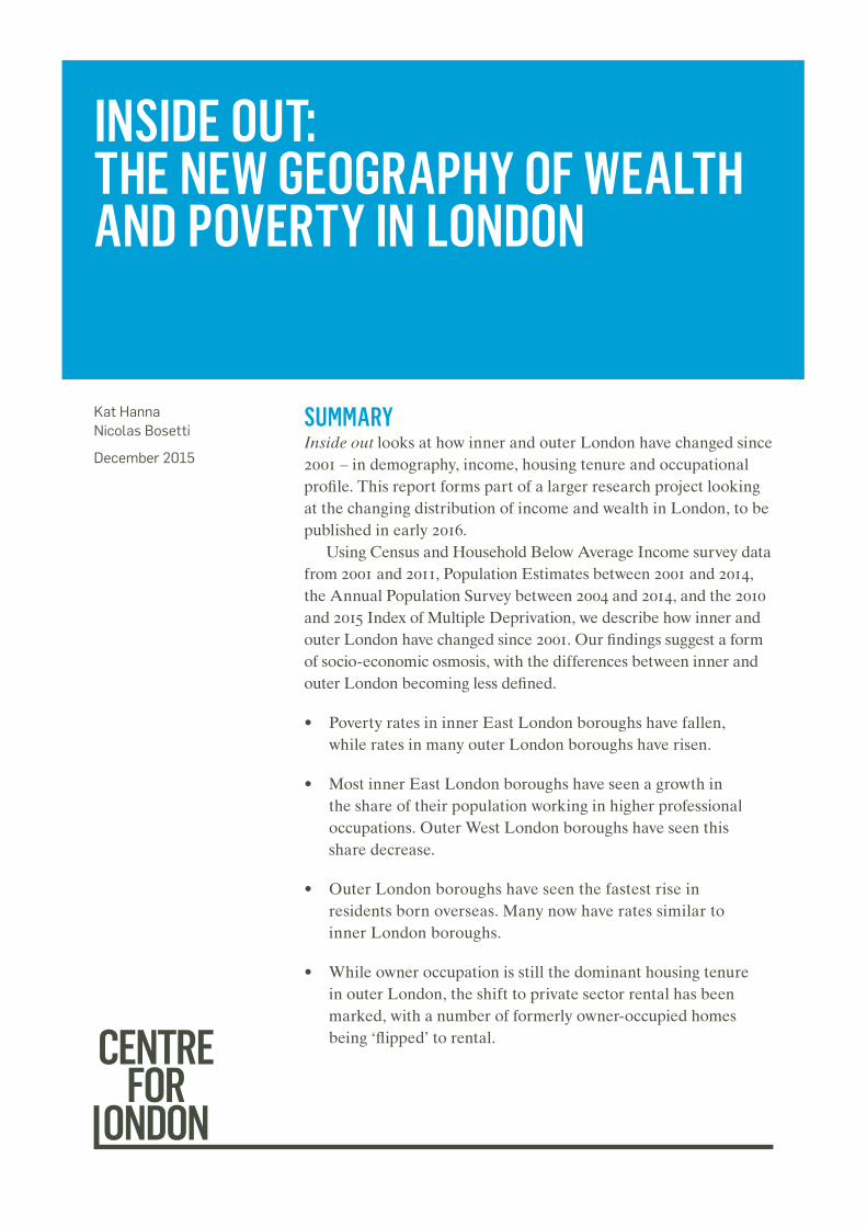
SUMMARYInside out looks at how inner and outer London have changed since 2001 – in demography, income, housing tenure and occupational profile. This report forms part of a larger research project looking at the changing distribution of income and wealth in London, to be published in early 2016.
Using Census and Household Below Average Income survey data from 2001 and 2011, Population Estimates between 2001 and 2014, the Annual Population Survey between 2004 and 2014, and the 2010 and 2015 Index of Multiple Deprivation, we describe how inner and outer London have changed since 2001. Our findings suggest a form of socio-economic osmosis, with the differences between inner and outer London becoming less defined.
• Poverty rates in inner East London boroughs have fallen, while rates in many outer London boroughs have risen.
• Most inner East London boroughs have seen a growth in the share of their population working in higher professional occupations. Outer West London boroughs have seen this share decrease.
• Outer London boroughs have seen the fastest rise in residents born overseas. Many now have rates similar to inner London boroughs.
• While owner occupation is still the dominant housing tenure in outer London, the shift to private sector rental has been marked, with a number of formerly owner-occupied homes being ‘flipped’ to rental.
Kat Hanna Nicolas Bosetti
December 2015
INSIDE OUT: THE NEW GEOGRAPHY OF WEALTH AND POVERTY IN LONDON
INSIDE OUT: THE NEW GEOGRAPHY OF WEALTH AND POVERTY IN LONDON | DECEMBER 20152
BACKGROUND AND CONTEXT
London is frequently said to be becoming increasingly unequal.1 Headlines about “beds in sheds” and overcrowding sit alongside tales of billionaire basements, contributing to this widely held view. The real story however, is a good deal more complicated.
In early 2016, Centre for London will publish a report looking at the changing patterns of wealth and poverty in London. This report will build on previous work by the Centre, which has analysed how different Londoners’ lives are being affected by the rapid pace of change in the capital. Our 2014 report Hollow Promise highlighted the challenges for households on modest incomes have been affected by the recession, and by rising housing and other living costs. We found that a number of Londoners who earn below average but are not entitled to benefits are finding the capital an increasingly difficult place to live. The report of our 2015 Commission on Intermediate Housing, Fair to Middling, looked at how housing schemes could help these modest earners afford to live in London.
This report presents early findings from our forthcoming research on changing patterns of wealth and poverty. We show how traditional assumptions about inner and outer London are becoming increasingly detached from the nuanced reality of a fast-changing city – a reality that must form the backdrop to public policy and politics over the next five years.
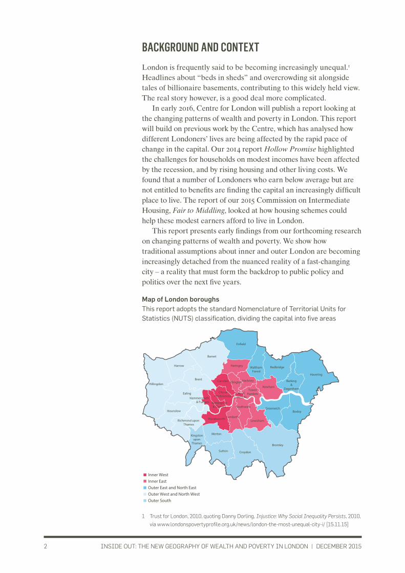
Map of London boroughs This report adopts the standard Nomenclature of Territorial Units for Statistics (NUTS) classification, dividing the capital into five areas
1 Trust for London, 2010, quoting Danny Dorling, Injustice: Why Social Inequality Persists, 2010,
via www.londonspovertyprofile.org.uk/news/london-the-most-unequal-city-i/ [15.11.15]
Inner WestInner East Outer East and North EastOuter West and North WestOuter South
Hillingdon
Ealing
Hounslow
Richmond upon Thames
MertonKingstonupon
Thames
Sutton Croydon
Bromley
Brent
Barnet
En�eld
Haringey Waltham Forest
Redbridge
Barking&
Dagenham
Havering
Bexley
Newham
HackneyIslingtonCamden
City ofWestminster
Hammersmith& Fulham Kensington
& Chelsea
Wandsworth
City ofLONDON
Lambeth
Southwark
Lewisham
Greenwich
TowerHamlets
Harrow

INSIDE OUT: THE NEW GEOGRAPHY OF WEALTH AND POVERTY IN LONDON | DECEMBER 20153
FINDINGS
1. LONDON’S POPULATION HAS CHANGED DRAMATICALLY SINCE 2001London’s population change over the last decade has resulted from a mix of natural growth, net international and net national migration. As Figure 1 shows, 3.8 million people arrived in London between 2001 and 2009, while 3.4 million left the city. Most new arrivals in London came from the rest of the UK, but their numbers were outweighed by people moving from London to the rest of the UK. Net population increase is highest from natural growth (the balance of births and deaths) and from international migration.
Figure 1: Natural change and migration in London, between 2001 and 2009
Source: ONS, mid-year population estimates, 2001–20092
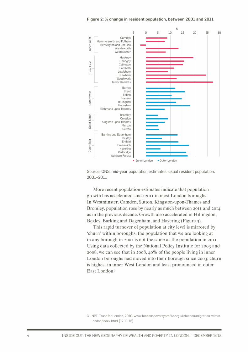
All London boroughs except Kensington and Chelsea saw their population increase in the decade to 2011. Inner London boroughs had the fastest growth rates. The population of Hackney, Newham, Tower Hamlets and Westminster rose by 20% between 2001 and 2011. In outer London, Waltham Forest, Brent, Greenwich and Hounslow had the fastest population increases, between 15% and 20%, while outer South London boroughs grew at a slower pace (Figure 2).
2 ONS, Mid-year population estimates via GLA Intelligence Unit, Focus on London 2010,
Population and Migration. https://files.datapress.com/london/dataset/focus-on-london-
population-and-migration/FocusOnLondon-PopulationAndMigration.pdf [12.11.15]
-2,500,000
-2,000,000
-1,500,000
-1,000,000
-500,000
0 500,000
1,000,000
1,500,000
2,000,000
2,500,000
Natural
National
International
Out In
People
INSIDE OUT: THE NEW GEOGRAPHY OF WEALTH AND POVERTY IN LONDON | DECEMBER 20154
Figure 2: % change in resident population, between 2001 and 2011
Source: ONS, mid-year population estimates, usual resident population, 2001–2011
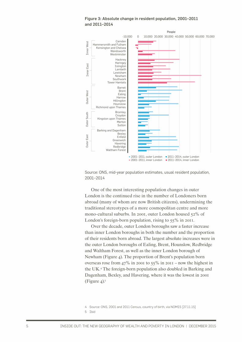
More recent population estimates indicate that population growth has accelerated since 2011 in most London boroughs. In Westminster, Camden, Sutton, Kingston-upon-Thames and Bromley, population rose by nearly as much between 2011 and 2014 as in the previous decade. Growth also accelerated in Hillingdon, Bexley, Barking and Dagenham, and Havering (Figure 3).
This rapid turnover of population at city level is mirrored by ‘churn’ within boroughs; the population that we are looking at in any borough in 2001 is not the same as the population in 2011. Using data collected by the National Policy Institute for 2003 and 2008, we can see that in 2008, 40% of the people living in inner London boroughs had moved into their borough since 2003; churn is highest in inner West London and least pronounced in outer East London.3
3 NPI, Trust for London, 2010. www.londonspovertyprofile.org.uk/london/migration-within-
london/index.html [12.11.15]
-5 0 5 10 15 20 25 30
Barnet Brent
Ealing Harrow
Hillingdon Hounslow
Richmond upon Thames
Bromley Croydon
Kingston upon Thames Merton Sutton
Barking and Dagenham Bexley Enfield
Greenwich Havering
Redbridge Waltham Forest
Camden Hammersmith and Fulham
Kensington and Chelsea Wandsworth Westminster
Hackney Haringey Islington Lambeth
Lewisham Newham
Southwark Tower Hamlets
Inne
r E
ast
Inne
r W
est
Out
er E
ast
Out
er S
outh
O
uter
Wes
t
Outer London Inner London
%
INSIDE OUT: THE NEW GEOGRAPHY OF WEALTH AND POVERTY IN LONDON | DECEMBER 20155
Figure 3: Absolute change in resident population, 2001–2011 and 2011–2014
Source: ONS, mid-year population estimates, usual resident population, 2001–2014
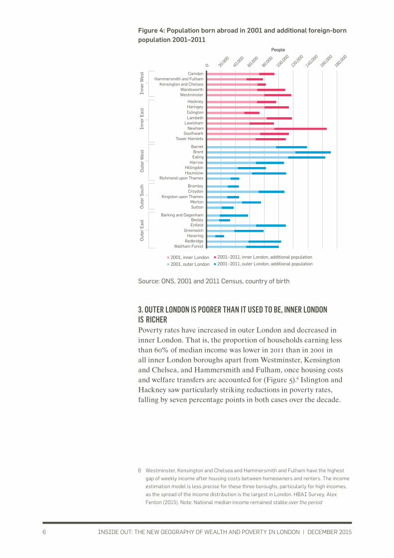
One of the most interesting population changes in outer London is the continued rise in the number of Londoners born abroad (many of whom are now British citizens), undermining the traditional stereotypes of a more cosmopolitan centre and more mono-cultural suburbs. In 2001, outer London housed 52% of London’s foreign-born population, rising to 55% in 2011.
Over the decade, outer London boroughs saw a faster increase than inner London boroughs in both the number and the proportion of their residents born abroad. The largest absolute increases were in the outer London boroughs of Ealing, Brent, Hounslow, Redbridge and Waltham Forest, as well as the inner London borough of Newham (Figure 4). The proportion of Brent’s population born overseas rose from 47% in 2001 to 55% in 2011 – now the highest in the UK.4 The foreign-born population also doubled in Barking and Dagenham, Bexley, and Havering, where it was the lowest in 2001 (Figure 4).5
4 Source: ONS, 2001 and 2011 Census, country of birth, via NOMIS [27.11.15]
5 Ibid
0 10,000 -10,000 20,000 30,000 40,000 50,000 60,000 70,000
Hackney Haringey Islington Lambeth
Lewisham Newham
Southwark Tower Hamlets
Camden Hammersmith and Fulham
Kensington and Chelsea Wandsworth Westminster
Inne
r E
ast
Inne
r W
est
Barking and Dagenham Bexley Enfield
Greenwich Havering
Redbridge Waltham Forest
Bromley Croydon
Kingston upon Thames Merton Sutton
Barnet Brent
Ealing Harrow
Hillingdon Hounslow
Richmond upon Thames
Out
er E
ast
Out
er S
outh
O
uter
Wes
t
2001–2011, outer London 2011–2014, outer London 2001–2011, inner London 2011–2014, inner London
People
INSIDE OUT: THE NEW GEOGRAPHY OF WEALTH AND POVERTY IN LONDON | DECEMBER 20156
Figure 4: Population born abroad in 2001 and additional foreign-born population 2001–2011
Source: ONS, 2001 and 2011 Census, country of birth
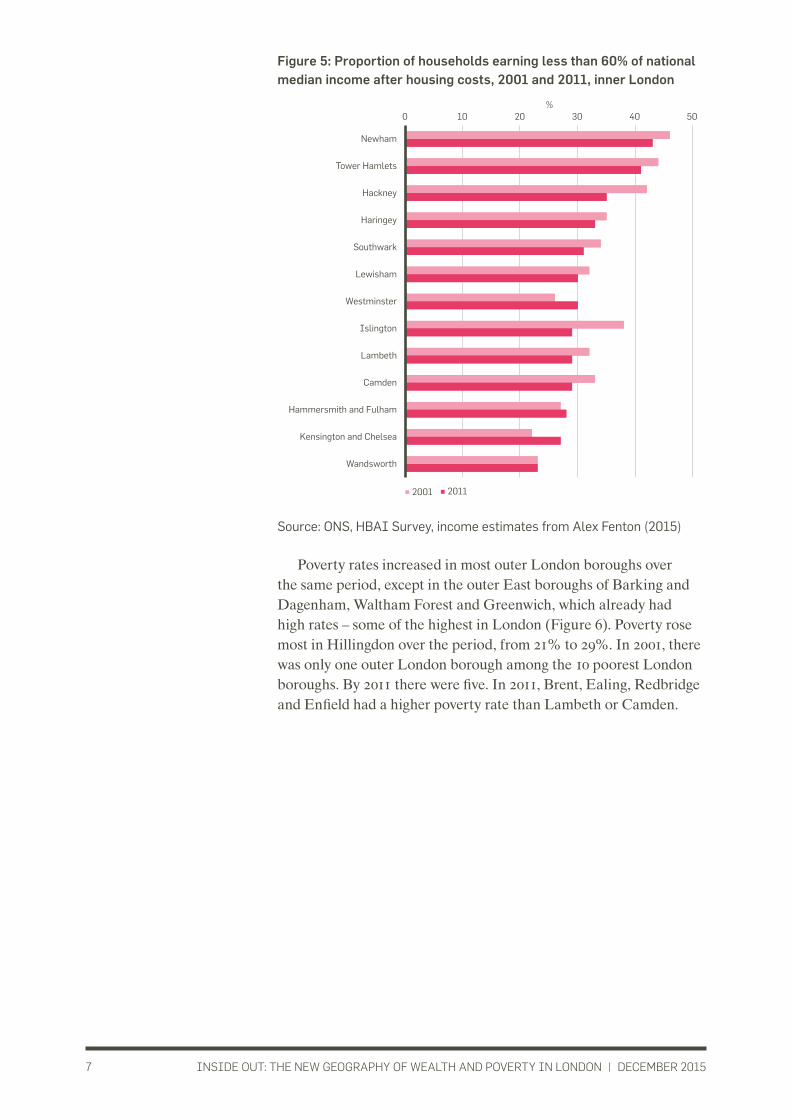
3. OUTER LONDON IS POORER THAN IT USED TO BE, INNER LONDON IS RICHERPoverty rates have increased in outer London and decreased in inner London. That is, the proportion of households earning less than 60% of median income was lower in 2011 than in 2001 in all inner London boroughs apart from Westminster, Kensington and Chelsea, and Hammersmith and Fulham, once housing costs and welfare transfers are accounted for (Figure 5).6 Islington and Hackney saw particularly striking reductions in poverty rates, falling by seven percentage points in both cases over the decade.
6 Westminster, Kensington and Chelsea and Hammersmith and Fulham have the highest
gap of weekly income after housing costs between homeowners and renters. The income
estimation model is less precise for these three boroughs, particularly for high incomes,
as the spread of the income distribution is the largest in London. HBAI Survey, Alex
Fenton (2015). Note: National median income remained stable over the period
0 20,000
40,000
60,000
80,000
100,000
120,000
140,000
160,000
180,000
Newham
Tower Hamlets Southwark
Lambeth Lewisham
Haringey Hackney
Islington
Wandsworth Westminster
Hammersmith and Fulham Camden
Kensington and Chelsea
Redbridge Waltham Forest
Enfield Greenwich
Barking and Dagenham Bexley
Havering
Croydon
Merton Sutton
Kingston upon Thames
Bromley
Ealing Brent
Hounslow
Barnet
Hillingdon Harrow
Richmond upon Thames
Inne
r E
ast
Inne
r W
est
Out
er E
ast
Out
er S
outh
O
uter
Wes
t
2001, inner London 2001–2011, inner London, additional population
2001, outer London 2001–2011, outer London, additional population
People
INSIDE OUT: THE NEW GEOGRAPHY OF WEALTH AND POVERTY IN LONDON | DECEMBER 20157
Figure 5: Proportion of households earning less than 60% of national median income after housing costs, 2001 and 2011, inner London
Source: ONS, HBAI Survey, income estimates from Alex Fenton (2015)
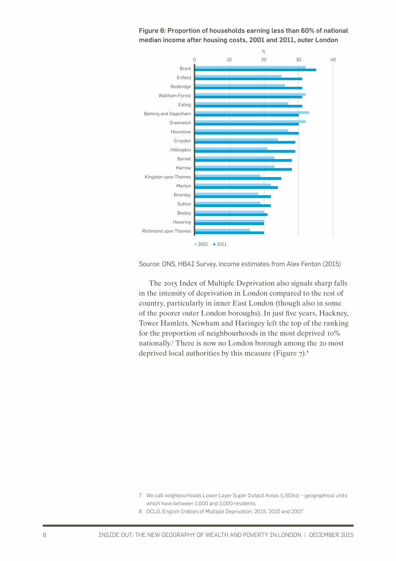
Poverty rates increased in most outer London boroughs over the same period, except in the outer East boroughs of Barking and Dagenham, Waltham Forest and Greenwich, which already had high rates – some of the highest in London (Figure 6). Poverty rose most in Hillingdon over the period, from 21% to 29%. In 2001, there was only one outer London borough among the 10 poorest London boroughs. By 2011 there were five. In 2011, Brent, Ealing, Redbridge and Enfield had a higher poverty rate than Lambeth or Camden.
0 10 20 30 40 50
Newham
Tower Hamlets
Hackney
Haringey
Southwark
Lewisham
Westminster
Islington
Lambeth
Camden
Hammersmith and Fulham
Kensington and Chelsea
Wandsworth
2001 2011
%
INSIDE OUT: THE NEW GEOGRAPHY OF WEALTH AND POVERTY IN LONDON | DECEMBER 20158
Figure 6: Proportion of households earning less than 60% of national median income after housing costs, 2001 and 2011, outer London
Source: ONS, HBAI Survey, income estimates from Alex Fenton (2015)
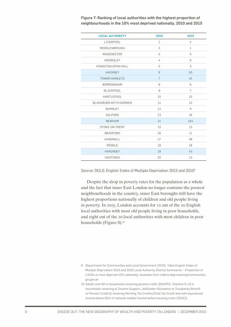
The 2015 Index of Multiple Deprivation also signals sharp falls in the intensity of deprivation in London compared to the rest of country, particularly in inner East London (though also in some of the poorer outer London boroughs). In just five years, Hackney, Tower Hamlets, Newham and Haringey left the top of the ranking for the proportion of neighbourhoods in the most deprived 10% nationally.7 There is now no London borough among the 20 most deprived local authorities by this measure (Figure 7).8
7 We call neighbourhoods Lower Layer Super Output Areas (LSOAs) – geographical units
which have between 1,000 and 3,000 residents
8 DCLG, English Indices of Multiple Deprivation, 2015, 2010 and 2007
0 10 20 30 40
Brent
Enfield
Redbridge
Waltham Forest
Ealing
Barking and Dagenham
Greenwich
Hounslow
Croydon
Hillingdon
Barnet
Harrow
Kingston upon Thames
Merton
Bromley
Sutton
Bexley
Havering
Richmond upon Thames
2001 2011
%
INSIDE OUT: THE NEW GEOGRAPHY OF WEALTH AND POVERTY IN LONDON | DECEMBER 20159
Figure 7: Ranking of local authorities with the highest proportion of neighbourhoods in the 10% most deprived nationally, 2010 and 2015
Source: DCLG, English Index of Multiple Deprivation 2015 and 20109
Despite the drop in poverty rates for the population as a whole and the fact that inner East London no longer contains the poorest neighbourhoods in the country, inner East boroughs still have the highest proportions nationally of children and old people living in poverty. In 2015, London accounts for 12 out of the 20 English local authorities with most old people living in poor households, and eight out of the 20 local authorities with most children in poor households (Figure 8).10
9 Department for Communities and Local Government (2015). Table English Index of
Multiple Deprivation 2015 and 2010 Local Authority District Summaries – Proportion of
LSOAs in most deprived 10% nationally. Available from indices.deprivation@communities.
gsi.gov.uk
10 Adults over 60 in households receiving pension credit (IDAOPI). Children 0–15 in
households receiving a) Income Support, JobSeeker Allowance or Incapacity Benefit
or Pension Credit b) receiving Working Tax Credits/Child Tax Credit and with equivalised
income below 60% of national median income before housing costs (IDACI)
LOCAL AUTHORITY 2010 2015
LIVERPOOL 1 4
MIDDLESBROUGH 2 1
MANCHESTER 3 5
KNOWSLEY 4 6
KINGSTON UPON HULL 5 3
HACKNEY 6 50
TOWER HAMLETS 7 24
BIRMINGHAM 8 6
BLACKPOOL 9 7
HARTLEPOOL 10 10
BLACKBURN WITH DARWEN 11 12
BURNLEY 12 9
SALFORD 13 16
NEWHAM 14 104
STOKE-ON-TRENT 15 13
BRADFORD 16 11
SANDWELL 17 28
PENDLE 18 18
HARINGEY 19 45
HASTINGS 20 13

INSIDE OUT: THE NEW GEOGRAPHY OF WEALTH AND POVERTY IN LONDON | DECEMBER 201510
Figure 8: Ranking of local authorities with the highest income deprivation affecting children and the elderly, 2015
Source: DCLG, English Index of Multiple Deprivation 2015
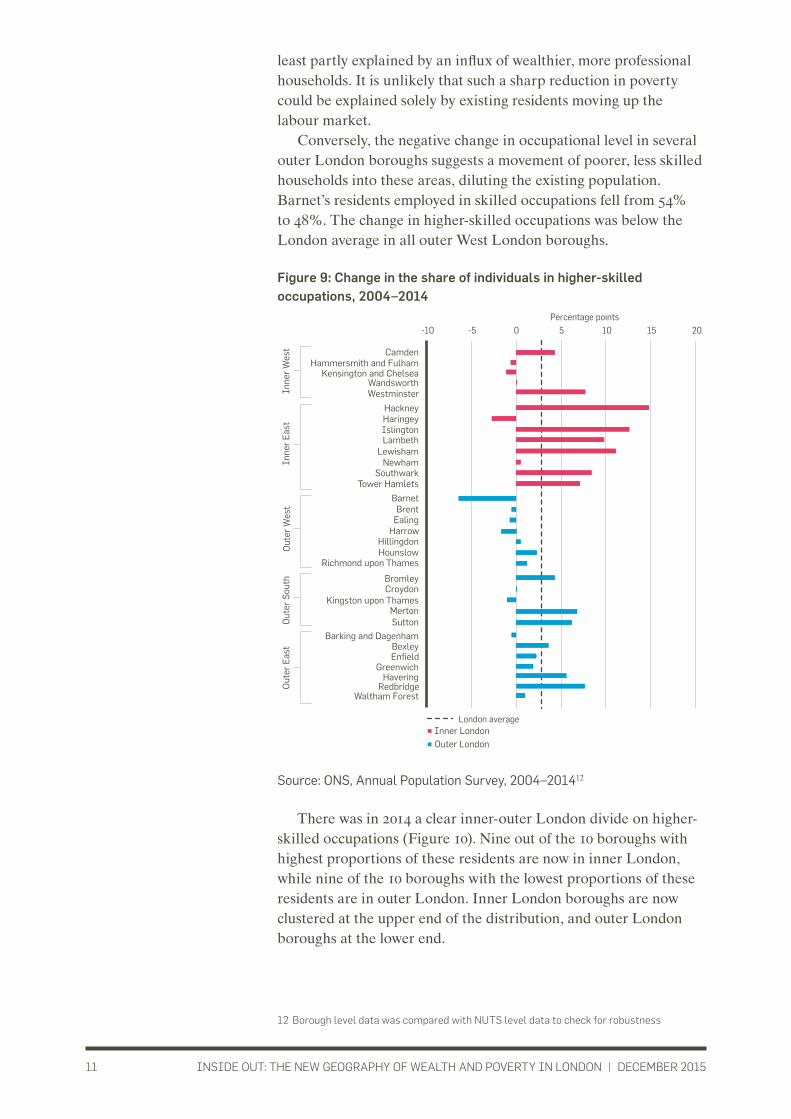
4. OCCUPATIONAL CLASS AND POPULATION MOVEMENT: PROFESSIONALS MOVING BACK INTO THE CENTREAcross London, the proportion of residents in “higher-skilled occupations” rose from 50% to 53% between 2004 and 2014, but the change has been unevenly distributed (Figure 9).11 In inner London, the proportion of residents working in these occupations has increased substantially. In absolute terms, the number of people employed in skilled occupations doubled in Hackney and Tower Hamlets between 2004 and 2014. In relative terms, it went up from 49% to 64% in Hackney, from 60% to 73% in table-topping Islington, from 46% to 57% in Lewisham and from 54% to 64% in Lambeth. The scale of these increases in the proportion of higher-skilled residents, from two to three times faster the London average, suggests that these boroughs’ reduced poverty rates are at
11 The proportion of all individuals in employment who are 1: Managers, Directors and senior
officials, 2: Professional Occupations, 3: Associate Professions and Tech Occupations
(ONS, SOC 2010 categories 1, 2, 3)
RANK
2015
LOCAL
AUTHORITY
PROPORTION OF
CHILDREN LIVING IN
INCOME-DEPRIVED
HOUSEHOLDS (%)
RANK
2015
LOCAL
AUTHORITY
PROPORTION OF
OLDER PEOPLE LIVING
IN INCOME-DEPRIVED
HOUSEHOLDS (%)
1 TOWER HAMLETS 39.3 1 TOWER HAMLETS 49.7
2 MIDDLESBROUGH 35.7 2 HACKNEY 43.1
3 ISLINGTON 35.3 3 NEWHAM 41.0
4 NOTTINGHAM 34.5 4 MANCHESTER 36.3
5 MANCHESTER 34.3 5 ISLINGTON 36.1
6 KINGSTON UPON HULL 34.0 6 SOUTHWARK 34.3
7 KNOWSLEY 33.7 7 LAMBETH 33.2
8 LIVERPOOL 33.4 8 LIVERPOOL 32.7
9 BLACKPOOL 32.9 9 KNOWSLEY 32.6
10 HACKNEY 32.2 10 HARINGEY 31.8
11 BARKING AND DAGENHAM 31.9 11 LEICESTER 31.5
12 WOLVERHAMPTON 31.3 12 SANDWELL 29.2
13 ENFIELD 30.7 13 KINGSTON UPON HULL 28.4
14 HARTLEPOOL 30.7 14 BIRMINGHAM 28.2
15 BIRMINGHAM 30.5 15 BRENT 28.0
16 LAMBETH 30.4 16 BARKING AND DAGENHAM 27.9
17 SOUTHWARK 30.3 17 HAMMERSMITH AND FULHAM 27.5
18 SANDWELL 29.9 18 NOTTINGHAM 25.9
19 LEWISHAM 29.6 19 LEWISHAM 25.7
20 NORWICH 29.0 20 CAMDEN 25.4
INSIDE OUT: THE NEW GEOGRAPHY OF WEALTH AND POVERTY IN LONDON | DECEMBER 201511
least partly explained by an influx of wealthier, more professional households. It is unlikely that such a sharp reduction in poverty could be explained solely by existing residents moving up the labour market.
Conversely, the negative change in occupational level in several outer London boroughs suggests a movement of poorer, less skilled households into these areas, diluting the existing population. Barnet’s residents employed in skilled occupations fell from 54% to 48%. The change in higher-skilled occupations was below the London average in all outer West London boroughs.
Figure 9: Change in the share of individuals in higher-skilled occupations, 2004–2014
Source: ONS, Annual Population Survey, 2004–201412
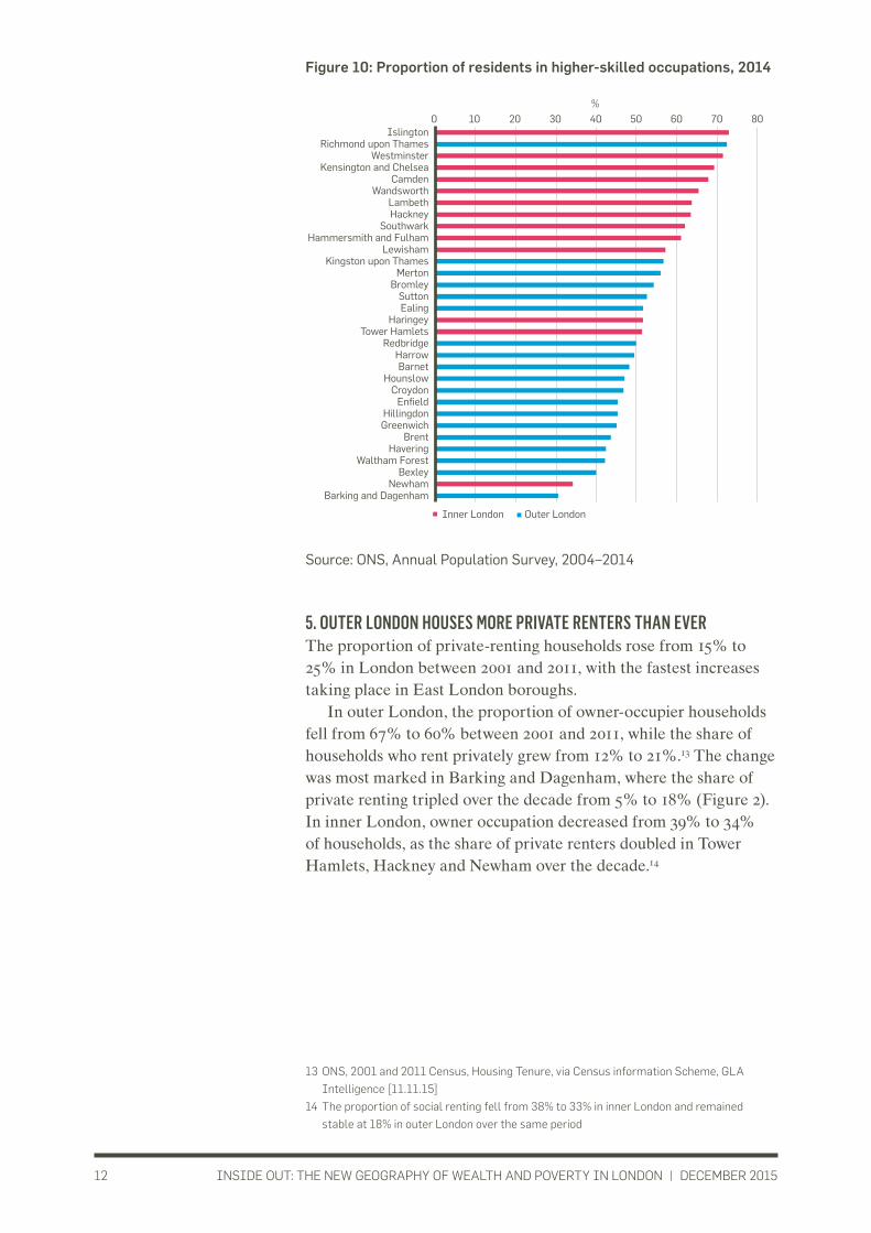
There was in 2014 a clear inner-outer London divide on higher-skilled occupations (Figure 10). Nine out of the 10 boroughs with highest proportions of these residents are now in inner London, while nine of the 10 boroughs with the lowest proportions of these residents are in outer London. Inner London boroughs are now clustered at the upper end of the distribution, and outer London boroughs at the lower end.
12 Borough level data was compared with NUTS level data to check for robustness
-10 -5
London average
Percentage points5 0 10 15 20
Richmond upon Thames
Harrow Hillingdon
Barnet
Hounslow
Brent Ealing
Bromley
Kingston upon Thames Croydon
Sutton Merton
Havering
Bexley Barking and Dagenham
Greenwich Enfield
Waltham Forest Redbridge
Kensington and Chelsea
Camden Hammersmith and Fulham
Westminster Wandsworth
Islington
Hackney Haringey
Lewisham Lambeth
Southwark Tower Hamlets
Newham Inne
r E
ast
Inne
r W
est
Out
er E
ast
Out
er S
outh
O
uter
Wes
t
Inner LondonOuter London
INSIDE OUT: THE NEW GEOGRAPHY OF WEALTH AND POVERTY IN LONDON | DECEMBER 201512
Figure 10: Proportion of residents in higher-skilled occupations, 2014
Source: ONS, Annual Population Survey, 2004–2014
5. OUTER LONDON HOUSES MORE PRIVATE RENTERS THAN EVERThe proportion of private-renting households rose from 15% to 25% in London between 2001 and 2011, with the fastest increases taking place in East London boroughs.
In outer London, the proportion of owner-occupier households fell from 67% to 60% between 2001 and 2011, while the share of households who rent privately grew from 12% to 21%.13 The change was most marked in Barking and Dagenham, where the share of private renting tripled over the decade from 5% to 18% (Figure 2). In inner London, owner occupation decreased from 39% to 34% of households, as the share of private renters doubled in Tower Hamlets, Hackney and Newham over the decade.14
13 ONS, 2001 and 2011 Census, Housing Tenure, via Census information Scheme, GLA
Intelligence [11.11.15]
14 The proportion of social renting fell from 38% to 33% in inner London and remained
stable at 18% in outer London over the same period
0 10 20 30 40 50 60 70 80Islington
Richmond upon Thames Westminster
Kensington and Chelsea Camden
Wandsworth Lambeth Hackney
Southwark Hammersmith and Fulham
Lewisham Kingston upon Thames
Merton Bromley
Sutton Ealing
Haringey Tower Hamlets
Redbridge Harrow Barnet
Hounslow Croydon
Enfield Hillingdon Greenwich
Brent Havering
Waltham Forest Bexley
Newham Barking and Dagenham
Outer London Inner London
%

INSIDE OUT: THE NEW GEOGRAPHY OF WEALTH AND POVERTY IN LONDON | DECEMBER 201513
The increase in the number of households private renting was mirrored by a fall in the number of owner-occupier households in outer London, suggesting that many of the ‘new’ private rented homes in 2011 were not new builds, but houses that had changed their tenure from owner occupation.15
Figure 11: Absolute change in housing tenure, 2001–2011
Source: ONS, 2001 and 2011 Census, housing tenure
15 The London dwelling stock increased by 270,000 homes between 2001 and 2011, while
the number of households increased by 352,000
-10,000
-5,000
5,000
0
10,000
15,000
20,000
25,000
Hac
kney
H
arin
gey
Islin
gton
La
mbe
th
Lew
isha
m
New
ham
S
outh
war
k To
wer
Ham
lets
Cam
den
Ham
mer
smith
and
Ful
ham
K
ensi
ngto
n an
d C
hels
ea
Wan
dsw
orth
W
estm
inst
er
Bar
king
and
Dag
enha
m
Bex
ley
Enfi
eld
Gre
enw
ich
Hav
erin
g R
edbr
idge
W
alth
am F
ores
t
Bro
mle
y C
royd
on
Kin
gsto
n up
on T
ham
es
Mer
ton
Sut
ton
Bar
net
Bre
nt
Eal
ing
Har
row
H
illin
gdon
H
ouns
low
R
ichm
ond
upon
Tha
mes
Homeowners, outer London Homeowners, inner LondonPrivate renters, outer London Private renters, inner London
Inner East Inner West Outer East Outer South Outer West
Households
INSIDE OUT: THE NEW GEOGRAPHY OF WEALTH AND POVERTY IN LONDON | DECEMBER 201514
SUMMARY AND IMPLICATIONSLondon boroughs have seen tremendous change since 2001. The city’s population has increased quickly between 2001 and 2011, and even more quickly since. Most new Londoners were not born in London but came from the rest of the country and abroad in almost equal numbers, while the majority of people who left London settled elsewhere in the UK. Outer London boroughs are now as cosmopolitan as inner London boroughs.
Over the same period, London’s geography of wealth and poverty changed dramatically. The old assumption that inner London boroughs are poorer than outer London boroughs became an exception in just over ten years. Wealthier, higher-skilled residents have moved into inner East London while poorer, lower-skilled people have moved to the more affordable parts of outer London. However, alongside this unprecedented increase in higher-skilled residents, the proportion of children and old people in inner East London who live in poverty is still the highest in the country. The number of private renters has risen in all parts of London, back to its mid-1970s level as a share of tenure.
While this report has not sought to make recommendations as to how policy makers should respond to these changes in London’s demography at a time of public spending reductions, we can identify the following policy implications:
• Wealth accumulation: as more Londoners are now renters rather than owner-occupiers, the wealth accumulation that property ownership has enabled in recent years is available to fewer and fewer Londoners. This has implications for wealth and income distribution that will be explored in our forthcoming report.
• Public services and health: changes to London’s demographic geography are taking place in the context of continuing cuts to local authority funding. Outer London in particular now has a larger, poorer population than a decade ago, and the rapid pace of change will raise pressure on local authority services and the NHS. As the local authority funding regime changes, the changing balance of growth and need between different parts of London will be an important area for negotiation.
• Voluntary sector: historically, many trusts and foundations were established to tackle inner city poverty in London, and this is reflected in their location and operations today. As outer London poverty becomes a growing challenge, resources may need to be refocused to meet emerging needs.
• Access to economic opportunities: outer London is housing an increasing share of London’s less well off population and the majority of London’s lower-skilled workers. The cheapest

INSIDE OUT: THE NEW GEOGRAPHY OF WEALTH AND POVERTY IN LONDON | DECEMBER 201515
areas of outer London boroughs like Harrow, Barnet, Enfield, Redbridge and Bexley are generally less well-connected by public transport. Poorer people moving into these areas are at risk of isolation from jobs and other opportunities in central London, especially given the high cost of transport. A forthcoming Centre for London report will explore how transport and public spaces can better benefit low-income Londoners.
• Economic development: changing demographics will have implications both for borough growth strategies, and for pan-London strategies such as the London Plan. Investment in infrastructure, including housing, must take into account the changing spatial distribution of London’s population and changing type of households.
• London’s political map: The changes we have documented also have implications for politics and in particular for the politics of the mayoral election. As London’s population shifts, so does its political map. Up until now, mayoral candidates could assume that inner London was more likely to vote Labour and outer London Conservative. Ken Livingstone was often described as an “inner London Mayor” meaning his policies favoured Labour voters in the inner boroughs. Boris Johnson, by contrast, is said to have won his two elections by adopting a donut strategy and courting the outer boroughs.
The 2015 election saw Labour win four new seats, all of which were in outer London. Our research suggests that the political demography of London continues to change. With the relative enrichment of inner London and the spread of poverty in outer boroughs, mayoral candidates will have to campaign across the capital. Focusing on inner or outer rings is unlikely to prove electorally effective.
This report forms part of a larger research project looking at the changing distribution of income and wealth in London, to be published in early 2016. Our thanks go to Public Health England London, Family Mosaic and L&Q for supporting this project.
Published by: Centre for London 2015
© Centre for London.Some rights reserved.1 Plough PlaceLondon EC4A 1DEt: 020 3102 [email protected] Number: 8414909 Charity Number: 1151435
Typeset by Soapbox, www.soapbox.co.uk
Open Access. Some rights reserved.
Anyone can download, save or distribute this work without written permission, subject to the Centre for London licence. The main conditions are: that Centre for London and the author(s) are credited; that the text is not altered; and that the work is not resold. Full terms can be found at www.centreforlondon.org/terms-and-conditions
About the authorsKat Hanna is Research Manager at Centre for London.
Nicolas Bosetti is Junior Researcher at Centre for London.
About Centre for LondonCentre for London generates ideas for a successful and inclusive city.
We hold events. We publish research. We collaborate and influence.