Embed Size (px)
Citation preview
Information Visualization0(0) 1 –13© The Author(s) 2011Reprints and permission: sagepub.co.uk/journalsPermissions.navDOI: 10.1177/1473871611430769ivi.sagepub.com
IntroductionMotivationMany time series contain sequences of frequently occurring patterns, often called motifs. Motif discovery is used to reveal trends, relationships, and anomalies, and assist users in hypothesis evaluation and knowl-edge discovery. Efficient algorithms for detecting motifs in time series data1 have been used in many applica-tions, such as identifying words in different languages, detecting anomalies in patients’ medical records over time,2 and chiller efficiency in data centers.3
Figure 1 shows an example of the visual analysis of a pair of data center chillers (chiller 1 and chiller 2), a percentage utilization time series in which different motifs were discovered. A chiller is a key component of the cooling infrastructure of a data center.4,5 The cool-ing efficiency of a chiller unit, also called its coeffi-cient of performance (COP),6 indicates how efficiently the unit provides cooling and is defined as
the ratio between the cooling provided and the power consumed. In Figure 1, chiller 1 is the primary chiller. Chiller 2 is the secondary chiller, which is used only when the utilization of the primary chiller becomes high (close to 100%). Motifs are a sequence of frequently occurring patterns, depicted by rectangles. Each motif is specified in terms of its starting and ending times. Motifs can be of varying lengths, with many shorter
Visual exploration of frequent patterns in multivariate time series
Ming C. Hao1, Manish Marwah1, Halldór Janetzko2, Umeshwar Dayal1, Daniel A. Keim2 , Debprakash Patnaik3, Naren Ramakrishnan3 and Ratnesh K. Sharma4
AbstractThe detection of frequently occurring patterns, also called motifs, in data streams has been recognized as an important task. To find these motifs, we use an advanced event encoding and pattern discovery algorithm. As a large time series can contain hundreds of motifs, there is a need to support interactive analysis and exploration. In addition, for certain applications, such as data center resource management, service managers want to be able to predict the next day’s power consumption from the previous months’ data. For this purpose, we introduce four novel visual analytics methods: (i) motif layout – using colored rectangles for visualizing the occurrences and hierarchical relationships of motifs; (ii) motif distortion – enlarging or shrinking motifs for visualizing them more clearly; (iii) motif merging – combining a number of identical adjacent motif instances to simplify the display; and (iv) pattern preserving prediction – using a pattern-preserving smoothing and prediction algorithm to provide a reliable prediction for seasonal data. We have applied these methods to three real-world datasets: data center chilling utilization, oil well production, and system resource utilization. The results enable service managers to interactively examine motifs and gain new insights into the recurring patterns to analyze system operations. Using the above methods, we have also predicted both power consumption and server utilization in data centers with an accuracy of 70–80%.
KeywordsFrequent patterns, multivariate time series, motifs, distortion, merging, seasonal data, prediction
1HP Labs, Palo Alto, CA, USA 2University of Konstanz, Konstanz, Germany3Virginia Tech, USA4NEC Laboratories America, Inc., USA
Corresponding author:Ming C. Hao, HP Labs, 1501 Mill Road, ms 1u-2, Palo Alto, CA 94304, USA. Email: [email protected]
430769 IVI0010.1177/1473871611430769Hao et al.Information Visualization2011
Article

2 Information Visualization 0(0)
motifs nested within longer motifs, as a consequence of the level-wise motif mining algorithm.3 Motifs are colored according to how efficiently the chiller ensemble performs within the motif.
In addition to discovering frequent patterns in the past data, users also want to predict future behavior. For example, data center service managers and system analysts want to predict the next day’s chiller utiliza-tion from the past data. A retailer needs to predict the number of products to be stored in the warehouse this month using last year’s sales data. In this paper, we also apply pattern-preserving methods to predict the next day’s resource utilization, thus avoiding the risk of exceeding the provided resource capacities, which can lead to damage or unavailability of equipment.
Chiller operators can examine and explore the motifs discovered in the historical data (before 7 September in Figure 1). The motifs are color-coded by their efficiency; the red motifs are less efficient than the blue. Figure 1 has 1 day of predicted data, starting at 09-08 00:00 and ending at 23:59. The motifs in the predicted period inform the operator of the future effi-ciency of the system. When low efficiency motifs (red) are predicted, the service manager could make suitable configuration changes, if possible to transform the operation to more efficient motifs. Furthermore, in this specific instance, the predicted time series indicates that chiller 2 would probably switch on during the time interval 11:06–18:08 to assist chiller 1.
In summary, visual exploration of motifs in multi-variate time series has to overcome the following challenges:
• displaying and predicting a large number of potentially overlapping motifs associated with multivariate time series;
• searching and retrieving the most efficient motifs by efficiency; and
• visually analyzing both the motifs and the con-text around the motifs for root-cause analysis.
Related workA common method to visualize time series patterns is to use line charts. Line charts are widely used and are intuitive and easy to understand. But if the dataset contains many time series with a large number of observations and many repeated patterns, the time series will have a high degree of overlap, which obscures important information. Buono et al7 provided the abil-ity to interactively search patterns in multivariate time series by preselecting an interesting pattern. McLachlan et al.’s LivePRAC8 supports the analysis of large sys-tem management time series with a visual comparison of devices and parameters. In work by Hao et al.,9 the problem of visualizing large time series is addressed by pixel cell-based high-density displays.
Motif mining is the task of finding approximately repeated subsequences in multivariate time series, which is studied in various works (e.g. references 5, 10 and 11). Mining motifs in symbolized representations of time series can be found in the rich body of literature in bioinformatics, where motifs have been used to char-acterize regulatory regions in the genome. As the work closest to ours, we explicitly focus on the SAX repre-sentation,12 which also provides some significant advan-tages for mining motifs. First, a random projection algorithm is used to hash segments of the original time series into a map. If two segments are hashed into the same bucket, they are considered as candidate motifs. In a refinement step all candidate motif subsequences are compared using a distance metric to find the set of
Figure 1. Exploring frequent patterns (motifs) in data center chiller utilization multivariate time series (x-axis: time; y-axis: percentage utilization of two chillers; blue, high cooling efficiency; red, low cooling efficiency). This figure shows a data center chiller utilization multivariate time series line chart with actual and predicted data measured in 1-minute intervals. Frequently occurring patterns in the time series, also known as motifs, are represented by rectangles of different sizes. The height of a motif is proportional to its average duration. The color of a motif represents its cooling efficiency, which is the ratio between the cooling it provides and the power it consumes. Efficiency-coded motifs allow service managers to compare chiller efficiency at different periods of time. Motifs discovered in the predicted data provide information about future chiller cooling efficiency. The certainty band shows the confidence of prediction. The key contribution is to discover and provide visual analytics of frequently occurring patterns for system monitoring and planning.

Hao et al. 3
motifs with the highest number of non-trivial matches. A contrasting framework, referred to as the frequent episode discovery, is an event-based framework that is also applicable to symbolic data that are non-uniformly sampled. This enables the introduction of junk, or ‘don’t care’, states into the definition of what consti-tutes a frequent episode.
To visualize motifs, Lin et al.’s VizTree13 transforms a large time series into a symbolic representation, encoding the data into a tree with branches to repre-sent symbols and motifs. The frequency of a motif is encoded in the thickness of a group of branches. Lin et al. employ both tree and line charts to link different pieces of information. To understand a motif, VizTree requires user domain knowledge and interactions on the tree. To simplify the motif analysis process, Ordonez et al.14 add radial representations to their line charts for further analyzing the relationships among their 15 patients’ medical records over time.
Holt15 and Winters16 both used exponentially weighted moving averages to forecast seasonal sales data. Their forecast is a function of past and current sales using exponential smoothing. Taylor17 applied the Holt–Winters techniques to predict daily supermarket sales using exponentially weighted quantile regression for inventory control. Taylor extended the exponential smoothing-based forecast to cumulative distributed function level forecast for better prediction. We apply Holt–Winters algorithms to predict the next day’s chiller utilization for the data center. The results from Holt–Winters are very close to our prediction results, but peaks are missing from their prediction. Ichikawa and Tsunawaki18 introduced a visualization environment that allows users to view a large number of stock price predictions using different types of line charts, texture, color, and 3D graphs. Masse19 proposed a visual approach for the US presidential election prediction.
All the above techniques have contributed innovative visualization solutions emphasizing the finding of motifs and transforming large volumes of data into valuable information. However, analysts want to have an overview of repeated patterns and the transitions between those patterns in a single view. In addition, they want to iden-tify a motif as the most or least efficient using a perfor-mance metric, for example the chiller cooling efficiency metric for a data center or an oil well production metric for oil well data. For data center and resource utilization seasonal data, we would like to inform the analysts how many system resources are needed for the next day.
Our contributionFor analyzing frequent patterns in large time series, we derive four new techniques: (i) motif discovery and layout, using colored rectangles for visualizing the occurrences and hierarchical relationships of motifs in a multivariate time series; (ii) motif distortion, which
enlarges either motif or non-motif areas to allow the analyst to focus on the content and the structure of the areas; (iii) motif merging, which allows analysts to combine repeated motifs into a single area for data reduction and visual uncluttering; and (iv) motif seasonal data prediction using pattern-preserving prediction algorithms that service managers can use for resource planning. In order to quickly identify the most efficient motifs from a large time series, each motif is linked to its performance coefficient for quick retrieval of information as needed.
We have combined the above visual analytics tech-niques to provide a better understanding of the results of the motif mining algorithms, allowing the service man-agers to explore the big picture, namely the sequence of motifs and their behaviors, including their dependency on other attributes such as the cooling efficiency in a data center. Our motif discovery and data mining approach provides both qualitative and quantitative characteriza-tions of the time series. Finally, we evaluate these tech-niques with respect to three real-world applications: data center chiller utilization, oil well flow production, and system resource utilization prediction.
The paper is structured as follows: in ‘Pattern finding in large multivariate time series’, we introduce a visual pattern analysis pipeline and describe the main stages used to discover motifs in a large multivariate time series. In ‘Motif pattern visualization’, we present the construc-tion of visual motif layouts, our new visualization tech-niques, and pattern preserving prediction. ‘Applications and evaluation’ describes three applications and evalua-tions in which real-world data are used. The final section contains the conclusions and future work.
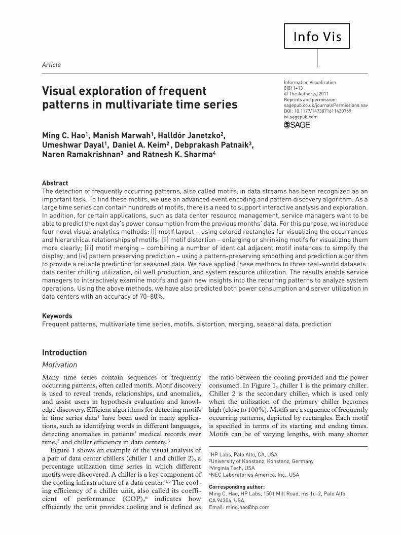
Pattern finding in large multivariate time seriesA schematic overview of our approach is provided in Figure 2. The illustrated process can be subdivided into three phases: (i) motif pattern discovery phase, where motifs are discovered in a multivariate time series and characterized in terms of an efficiency metric; (ii) the motif visual analytics phase, to lay out the discovered motifs in the same multivariate time series; and (iii) the visual prediction, to visualize the predictions for the next day’s data with preserved patterns. With the new motif distortion and merging techniques, users are able to visualize the relationships and efficiencies of the motifs. As we will show, a combination of visual and motif analysis is the key to finding trends and anomalies in the time series.
Motif pattern finding techniques have previously been described in reference 3. Our primary goal is to link the multivariate, numeric, time series data to high-level efficiency characterizations. We decompose this goal into symbolic representation, event encoding, motif
4 Information Visualization 0(0)
mining, and efficiency characterization, and thus we use motifs as a crucial intermediate representation to aid data pattern analysis and reduction. The following are the main stages involved in discovering frequent motifs.
Event encodingWe are given a multivariate time series T = ‹t1,…,tm› where each real-valued vector ti, for example, captures the utilization values of an ensemble of chillers. We first perform k-means clustering on the multivariate time series, considering each time point as a vector, and use the cluster labels as symbols to encode the time series. The number of clusters can be appropriately chosen; in this particular instance we found 20 clusters provide a good trade-off between separation of clusters and size of individual clusters.3 Observe that the multivariate series is now encoded as a single (one-dimensional) symbol sequence.3 Essentially, we have stripped off the temporal information, clustered the data, and put the temporal information back, thus ‘redescribing’ the data. The resulting sequence of cluster labels is analyzed to detect change points. Change point detection transduces the symbol stream into a sequence of events where an event is defined as a transition in the cluster label.
Motif discovery and miningFrequent episode mining is conducted on the transition event stream to detect repetitive motifs. The framework of serial episodes with inter-event time constraints is used. The structure of a serial episode α is given by:
α = E E Ed dnn1
(0, 1]2
(0, -1] → →
E1,…, En are the transition events characterized by a pair of cluster identifications participating in the transitions. Each pair of event-types in α is associated with an inter-event constraint, which specifies the maximum allowed time gap between them. The mining process follows a level-wise procedure similar to the Apriori20 algorithm, that is candidate generation fol-lowed by counting.
The candidate generation scheme is based on match-ing the n–1 size suffix of one n-node frequent episode with the n–1 size prefix of another n-node frequent epi-sode at a given level to generate candidates for the next level. The time complexity of the candidate generation
process is O(m2n), where n is the size of each frequent episode in the given level and m is the number of fre-quent episodes on that level, as all pairs of frequent epi-sodes need to be compared for a prefix–suffix match.
The algorithm for counting the set of candidate epi-sodes is given in Algorithm 1. The frequency measure for an episode is based on non-overlapping counting. Two occurrences, that is sets of transition events cor-responding to a motif, are said to be non-overlapping if they do not share any portion of the time series.
Efficiency characterizationFinally, each motif is characterized in terms of an efficiency metric. It is difficult (and subjective) to compare two motifs in terms of their efficiency by inspecting them visually. Therefore, it is necessary to quantify the efficiency of all motifs by computing a suitable metric for them. This enables efficiency comparisons between motifs: their categorization as ‘good’ or ‘bad’ from the efficiency metric point of view. Furthermore, this information helps to provide guidance to a service manager or a management system regarding the most ‘efficient’ configurations.
Figure 2. A schematic overview of our approach.

Hao et al. 5
In general, we use the above methods to map a multi-variate time series to frequent patterns. Now the chal-lenge is to translate these discovered patterns back to the original time series for users to continue to analyze the patterns and their behaviors. This gap requires visualiza-tion to map the discovered motifs back to the time series.
Motif pattern visualizationMotif layoutAfter applying the above-mentioned methodology, we present the discovered motifs in a single display. For nested motifs, it is often difficult to recognize their start-ing and ending time; a long-duration motif can contain several short-duration motifs or can overlap other motifs. To overcome these difficulties, we derive a new layout algorithm (Algorithm 2) and draw rectangles to represent the occurrence of motifs. The color of a rec-tangle represents the efficiency of a motif – different colors are used to distinguish between different effi-ciency levels. The definition of efficiency is application-specific and is usually defined by the service manager. The nested rectangles are used for visualizing the hier-archical relationships among motifs. The rectangle’s height is linearly proportional to the statistical rank of the average duration of a motif. The statistical rank is used to distinguish motifs with nearly the same height. Figure 2 shows 11 consecutive occurrences of motifs (blue rectangles) nested in two other types of motifs (yellow and pink rectangles).
Figure 3. Distorting the time scale according to given weights.
Visualizing the properties and behaviors of motifs in a massive multivariate time series is a complex task because there may be a large number of motifs (hundreds or even thousands) and they may be nested and overlapping. We introduce two new techniques, motif distortion and motif merging, to enable analysts to perform the following tasks:
• explore motifs and their structure; and• find the root cause of a low-efficiency motif by
analyzing a sequence of transition events in a time series before the low-efficiency motif occurred.
Motif distortionDistortion enlarges either areas that contain motifs or areas that do not contain motifs using a user-activated slider. Distorting the time series is done by applying a specific density-equalizing distortion technique. We calculate weights for each time interval between two consecutive data points and use them as the input to the distortion algorithm.

6 Information Visualization 0(0)
These weights are based on the number of motifs occurring during that time interval. In a preprocessing step, we calculate the weights for both motif areas and non-motif areas within each time interval. To enlarge the motifs, we use the number of motifs in a time series. To enlarge areas without motifs, we use the inverse of the number of motifs in the time interval. If there are no motifs in the time interval, we use a constant weight of 1. The calculation of weights for enlarging motifs and enlarging non-motif areas is depicted in Algorithm 3. Figure 3 shows how the distortion algorithm works. Our technique attempts to enlarge or shrink areas according to the weights.
When the user moves the slider to the left, areas with-out motifs are enlarged. The slider’s middle position is its origin scale. When the user moves the slider to the right, motifs are enlarged. For determining the distor-tion for the intermediate positions of the slider, we use a weighted interpolation between the original scale and the fully distorted view.
Motif mergingIn order to merge multiple occurrences of motifs to a single rectangle and to reduce the number of motifs and the visual clutter we provide a second slider (see Figure 4b). If the slider is moved to the right, motifs of the same type that begin or end at adjacent posi-tions are combined. We define two occurrences of the same motif as adjacent if the time duration between those occurrences does not exceed a given threshold. The threshold is set by the user via a slider. The value is measured in minutes and ranges from zero minutes to a calculated upper bound. For each motif,
we compute the minimum gap length between its occurrences and average values over all instances of the motif. Note that only the same types of motifs are merged. Users can mouse over the time series in a merged motif to display the current time interval and the efficiency measure value.
After applying various degrees of distortion and merging, the motif time series is greatly simplified for further visual analysis.
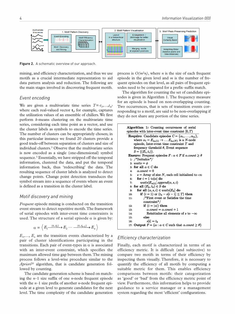
Pattern-preserving predictionFor our application, in data centers, in addition to motif detection, it is important to predict the resource consumption for the immediate future. With standard methods such as the well-known ARIMA and Holt–Winters prediction models, described in reference 21, however, in many cases the prediction does not provide sufficiently good results, as shown in Figure 5.
One reason is that the data are usually very noisy. Smoothing based on moving averages using a varying time interval can help to reduce the negative effects of noise on the prediction. In our data center application, however, this is not enough. In the prediction it is especially important to retain peaks as they are essen-tial in planning resource consumption. To obtain a pattern-preserving prediction, we derive a variant of the well-known Douglas and Peucker22 algorithm, which reduces a graph to its most significant data points. The algorithm starts with creating a connecting line, which connects the first and the last value. Then, it searches for the highest or lowest data point in between these values with respect to the connecting line. If the absolute height of the data point exceeds a

Hao et al. 7
certain threshold, this data point is tagged as a peak. The algorithm performs these steps recursively again until no more peaks can be found, and then the pro-cess terminates.
After smoothing, the pattern-preserving prediction algorithm (Algorithm 4) generates the predicted data points based on the time period of the historical data as following:
1. Compute the predicted data points in hours, days, weeks, and months across the entire dataset.
2. Use daily grouping. For example, we want to predict the data point for the time 0:00, we look for all measurements made at 0:00.
3. Assign each of the data points different weight factors and aggregate the values according to the weights. Then, we add the currently seen data value to the temporary storage slot by multiplying it with a combined weight. The combinedWeights method calculates a weighted average of two values, v1 and v2, by using the userSetValue (abbreviated to α):
Figure 4. Motif distortion and merging operations. (a) Motif visual distortion (x-axis: time; y-axis: percentage utilization of chiller R1; rectangles: motifs; color: cooling efficiency). Moving the distortion slider to the right enlarges motifs. Moving the distortion slider to the left enlarges the non-motif areas. In Figure 4a, our technique divides the time series into equally sized parts and resizes each part according to the aggregated weight of the part. We first calculate a fully distorted view for each task (enlarging motifs or enlarging areas without motifs) and then calculate the zero slider position. (b) Motif visual merging (x-axis: time; y-axis: percentage utilization of chiller R1; rectangles: motifs; color: cooling efficiency). Move the slider to the right to merge adjacent motifs of the same type.
8 Information Visualization 0(0)
combinedWeights v v v v( , , ) ( )1 2 1 2 1α α α= ⋅ + ⋅ −
Applications and evaluation
Motif visual analysis has a large number of applications, including anomaly detection, prediction, and cluster-ing. We will demonstrate the above techniques with data center chiller sensor time series, oil well production sensor data (e.g. oil flow, pressure), and resource utili-zation prediction. The identified motifs help the users to visualize cooling/oil production efficiency quickly. Most importantly, service managers are ena-bled to avoid the inefficient patterns and guide the operations towards more efficient ones.
Data center cooling monitoringThe motif time series in Figure 6 show the utilization of four chillers (R1–R4) with 13,578 records at 1-min-ute intervals. The color shows the motif efficiency computed from the cooling efficiency metric. The cooling efficiency metric, or COP, is calculated by dividing the heat extracted by the power consumed. Service managers can quickly identify that motif 5 is more efficient than the other motifs (blue color of motif 5). Furthermore, service managers are able to interact with the other motifs to analyze the charac-teristics of these motifs. For example, in motif 5, chiller R2 runs at medium utilization, while chiller R4 runs at high utilization. In motif 8, chiller R1 operates
Figure 5. A comparison of prediction between ARIMA and Holt–Winters prediction model and pattern-preserving prediction. The predicted power consumption trend line is flat in the top graph. The pattern-preserving prediction is better.

Hao et al. 9
in a low utilization with many small oscillations. As motifs are overlaid on the time series, it is easy to observe that the utilization of chiller R4 is the highest in motif 5.
Evaluation. The new motif finding, distortion, and merging visualization techniques have been success-fully used on two production data centers of different sizes, about 300 sq. m to 13,000 sq. m, respectively, and containing up to hundreds of racks. Several mil-lion records from data centers have been analyzed.
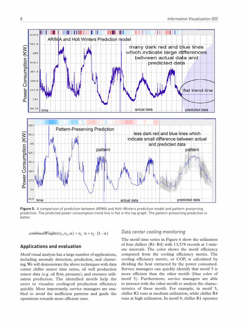
Using existing regular time series plots, as shown in Figure 7, can potentially take hours for data center ser-vice managers to analyze and observe the variation of utilization over time. However, service managers can-not easily determine which set of patterns represent an efficient mode of operation, nor can they determine whether a pattern had occurred previously. Usually,
such operational patterns are characteristic of a delay in matching chiller cooling supply with data center cooling demand. Not all chillers can scale uniformly in capacity with a rise in demand. Also demand does not change uniformly over time. However, this kind of monitoring is essential in building efficient manage-ment systems.
The motif time series, as shown in Figure 6, helps service managers identify motifs and their cooling efficiencies and provides guidance on how current performance compares with past performance. Our new techniques can assist service managers to move the chiller system to a more efficient state.
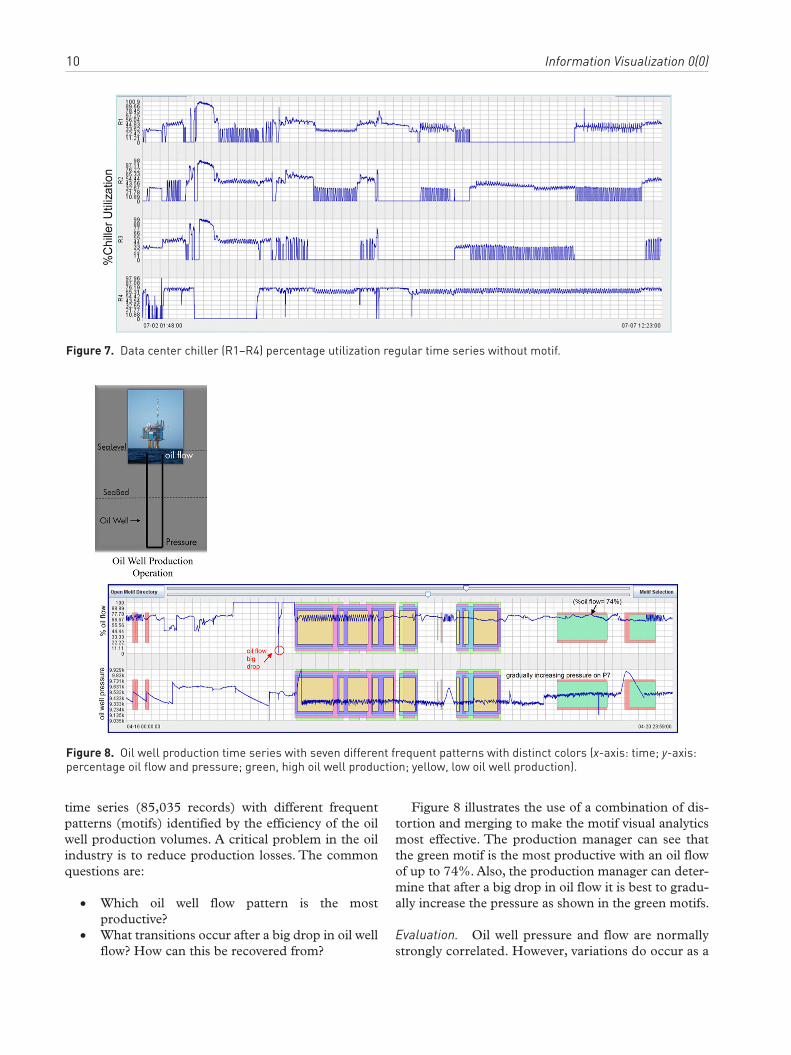
Oil well production motif observationsThe picture on the left of Figure 8 is a typical oil well. The figure on the right shows oil flow and pressure
Figure 6. Visual analytics of data center cooling management. Motifs 5 and 8 are enlarged to compare their chiller utilization. Motif 5 is more efficient than motif 8. Motif 8’s chillers R1 and R3 have some oscillatory behavior (x-axis: 07-02 01:48 to 07-04 21:33; y-axis: percentage utilization of chillers R1–R4; color: cooling efficiency).
10 Information Visualization 0(0)
Figure 7. Data center chiller (R1–R4) percentage utilization regular time series without motif.
Figure 8. Oil well production time series with seven different frequent patterns with distinct colors (x-axis: time; y-axis: percentage oil flow and pressure; green, high oil well production; yellow, low oil well production).
time series (85,035 records) with different frequent patterns (motifs) identified by the efficiency of the oil well production volumes. A critical problem in the oil industry is to reduce production losses. The common questions are:
• Which oil well flow pattern is the most productive?
• What transitions occur after a big drop in oil well flow? How can this be recovered from?
Figure 8 illustrates the use of a combination of dis-tortion and merging to make the motif visual analytics most effective. The production manager can see that the green motif is the most productive with an oil flow of up to 74%. Also, the production manager can deter-mine that after a big drop in oil flow it is best to gradu-ally increase the pressure as shown in the green motifs.
Evaluation. Oil well pressure and flow are normally strongly correlated. However, variations do occur as a

Hao et al. 11
result of well-head problems or geological issues. The variations can be complicated and depend on the geology of the oil well and its composition. Identifica-tion of motifs in oil well pressure and oil flow can help in the classification of such issues. Finding the motifs that are able to maximize oil flow at the normal pressure is the goal of the well production manager. Without our motif layout, it is almost impossible for the production manager to find these frequent patterns, as shown in Figure 9. Using motifs, as illustrated in Figure 8, the production manager can quickly find the most efficient motifs (green). Furthermore, production managers can reduce the motifs (yellow) that cause fluctuations in pressure (or flow). The motifs with high oscillations can be detrimental to well operation and lead to reliability issues.
Resource utilization predictionOptimizing the utilization of servers has a major impact on costs in IT services centers. The basic power con-sumption of an idle server is significant – approximately 50% of peak power usage. This leads to the conclusion that a server is utilizing power best when it is fully loaded and idle servers should be turned off. To reduce the risk of performance degradation, service managers have to analyze the server utilization patterns and
relocate applications away from underutilized servers. To get a reasonably high utilization, service managers are required to consolidate applications into fewer servers.
Figure 10 shows a server’s daily utilization based on two attributes (server utilization and number of user) of 36,338 measurements. The time series on the left of Figure 10 shows the actual data. The time series on the right shows the predicted data on 10/15. The colored motifs are used to show resource utilization efficiency, which is the ratio between the server utilization and the number of user. The color of the motifs is used to show resource utilization efficiency (red: low; blue: high). The narrow certainty band indicates that it is safe to move the applications to another server and power down this server from 10 pm to 9 am the next day, as indicated by the red motifs. The peak time for running applications is during the day between hours 9 and 16 and at night between hours 20 and 21 for system work, as shown in blue motifs with high efficiencies. From our experi-ments, a power saving of up to 30% seems realistic. Interestingly, the motif occurrences are highly correlated to the number of users as all motifs contain only those areas where the number of users is high. Combining motifs and prediction is, in this case, very important to enlarging the influence of motifs in the prediction pro-cess, which leads to an overall better prediction result.
Figure 10. Resource utilization predictions using pattern-preserving visual analytics technique. An interesting observation shows a low-efficient motif occurred every morning from 6 am to 9 am because there were not enough users (x-axis: time; y-axis: server utilization and number of users; blue, high server efficiency; red, low server efficiency).
Figure 9. Oil well production regular times series without motif.

12 Information Visualization 0(0)
Using motifs, service managers can quickly recognize which time intervals have a low utilization and which servers can be shut down to save energy.
Evaluation on prediction accuracy. The server utiliza-tion from 10/06 to 10/15 has been used to measure the accuracy of the pattern-preserving prediction tech-niques. The values of each single day are predicted and compared with the observed actual data. The result of the comparison between actual and predicted data shows an accuracy of 70–80%, with an average accuracy of 75%. Figure 11 shows the predictions for one day, 10/14.
ConclusionFinding frequently occurring patterns and analyzing them allows data center service managers and oil well production managers to determine which configura-tions are more efficient and which ones result in poor efficiency so that the latter can be avoided. In this paper we address the whole visual analysis pipeline for motifs. First, we briefly describe a novel motif discov-ery algorithm, which is based on cluster analysis, event encoding, frequent motif mining, and the efficiency characterization of those motifs. Second, we introduce three new visualization and interaction techniques (motif layout, distortion, and merge) for the analysis of motifs discovered from mining. We allow users to adjust the degree of distortion and merge to generate the best view on a single display. To enable the users to find the most efficient motifs, our techniques link the motifs to the associated efficiency metrics for root-cause analysis. Furthermore, our techniques provide a visual analytics approach for the pattern-preserving prediction of large seasonal multivariate data. Our
results from both the real-world data center and oil production time series sensor data show that our techniques successfully enable users to identify both efficient and inefficient patterns. Furthermore, our techniques also provide reliable predictions. This dem-onstrates the wide applicability and usefulness of our techniques. In the future, we want to detect motifs in real time to perform immediate intervention.
AcknowledgmentsThe authors wish to thank M. Hsu, C. Patel, Laura Hill, and Cullen Bash for their suggestions and encouragement, and Walter Hill and Sebastian Mittelstädt for providing pre-diction comments and suggestions.
Declaration of Conflicting InterestsThe authors declare that they do not have any conflict of interest.
FundingThis research received no specific grant from any funding agency in the public, commercial, or not-for-profit sectors.
References 1. Chiu B, Keogh E, and Lonardi S. Probabilistic discovery
of time series motifs. In: KDD ‘03: Proceedings of the ninth ACM SIGKDD international conference on knowledge dis-covery and data mining, 2003, pp. 493–498. New York: ACM, New York.
2. Chen L, Ozsu T and Oria V. Symbolic Representation and Retrieval of Moving Object Trajectories. Waterloo, Canada: University of Waterloo, 2003.
3. Patnaik D, Marwah M, Sharma R and Ramakrishnan N. Sustainable operation and management of data center chillers using temporal data mining. In: Proceedings of KDD ’09, June 2009, France.
4. Bash C, Patel C and Sharma R. Dynamic thermal management of air cooled data centers. IEEE Itherm06, 10, April 2008, Bangalore, India.
5. Sharma T, Shih R, Bash C. et al. On building next gen-eration data centers: Energy flow in the information technology stack. In: Proceedings of Compute 2008.
6. Moran MJ and Shapiro HN. Fundamentals of Engineer-ing Thermodynamics, 6th edition. Wiley, 2007. (the ISBN of the book is: ISBN-10: 0471274712, ISBN-13: 978-0471274711).
7. Buono P, Aris A, Plaisant C, Khella A, Shneiderman B, Hochheiser H and Schneiderman B. Interactive pattern search in time series. In: Proceedings of Conference on Visualization and Data Analysis, VDA 2005, SPIE. San Jose, CA.
8. McLachlan P, Munzner T, Koutsofios E and North S. LivePRAC: Interactive visual exploration of system management time-series data. In: CHI 2008, April 2008, Florence, Italy.
9. Hao M, Dayal U, Keim DA and Schreck T. Multi- resolution techniques for visual exploration of large time- series data. In: Proceedings: IEEE VGTC Symposium on Visualization, EuroVis 2007. Norrköping, Sweden.
Figure 11. Prediction accuracy comparison between actual and predicted data (blue, predicted values; red, actual values).

Hao et al. 13
10. Lin J, Keogh E, Lonardi E and Patel P. Finding motifs in time series. In: Proceedings of the Second Workshop on Temporal Data Mining, 2002.
11. Patel P, Koeogh E, Lin J and Lonardi S. Mining motifs in massive time series database. In: ICDM ’02: Proceedings of the 2002 IEEE International Conference on Data Mining (ICDN ’02), Washington, DC, 2002, p. 370.
12. Lin J, Keogh E, Wei L and Lonardi S. Experiencing SAX: a novel symbolic representation of time series. DMKD Journa. 2007, 15(2): 107–144.
13. Lin J, Keogh E, Lonardi S, Lankford J and Mystrom D. VizTree: a tool for visually mining and monitor-ing massive time series database. In: Proceedings of the 30th VLDB Conference, Canada, 2004, p. 1260.
14. Ordonez P, des Jardins M, Feltes C et al. Visualizing multivariate time series data to detect specific medical conditions. In: AMIA Annual Symposium Proceedings, 2008, MD.
15. Holt CC. Forecasting seasonal and trends by expo-nentially weighted moving averages. ONR Research Memorandum, Carnegie Institute 52.
16. Winters PR. Forecasting sales by exponentially weighted moving averages. Management Science 1960; 6.
17. Taylor JW. Forecasting daily supermarket sales using exponentially weighted quantile regression. European Operational Research 2007; 207.
18. Ichikawa Y and Tsunawaki T. A visualization environ-ment for multiple daytime stock price predictions, 2002. IEIC Technical Report.
19. Masse CF. 2008 US presidential election prediction – a visual approach of InTrade’s prediction markets. InTrade 2008.
20. Agrawal R and Srikant R. Fast algorithms for min-ing association rules in large databases. VLDB 1994; 487–499.
21. Chatfield C. The Analysis of Time Series: An Introduction, 6th edn. Boca Raton, FL: CRC Press, 2004.
22. Douglas D and Peucker T. Algorithms for the reduction of the number of data points required to represent a digitized line or its caricature. The Canadian Cartographer 1973; 10: 112–122.


![672 IEEE TRANSACTIONS ON VISUALIZATION AND …people.cs.vt.edu/naren/papers/07001093-themedelta.pdf · grouping of words into topics. Another similar design is TimeNets [24], which](https://img.dokumen.tips/doc/110x75/6046c2441bfdba44cb073831/672-ieee-transactions-on-visualization-and-grouping-of-words-into-topics-another.jpg)