Embed Size (px)
Citation preview
› Conclusions Paper
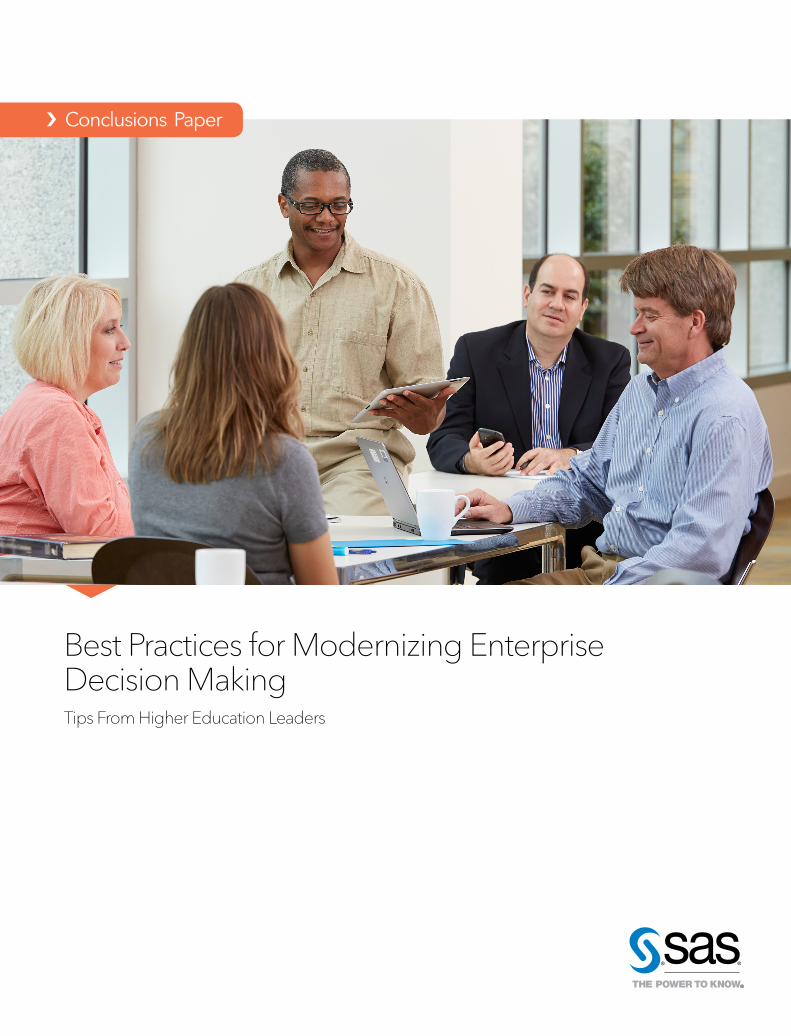
Best Practices for Modernizing Enterprise Decision MakingTips From Higher Education Leaders
ContentsCreate a Centralized Enterprise Reporting System ... 1
Strategies for Creating an Effective Enterprise Reporting System ......................................................................................2
Data Quality: Getting to Good, Clean Data .....................3
Make It Easy to Use Analytics ......................................... 3
Going Beyond Business Intelligence With Data Visual-ization .......................................................................................4
Optimize Your Reporting Environment to Meet User Needs .................................................................................. 6
Simplify Access – Anytime, Anywhere ...............................6
Empower People With Visualizations ...............................6
Give People Options to Tailor Reports to Meet Specific Needs .......................................................................................6
Create a Culture of Data Use ...............................................7
Reaping the Benefits ....................................................... 8
About SAS in Education .................................................. 9
About the Interviewees.................................................... 9
1
Imagine that you are in a meeting with several department heads discussing issues around enrollment. As people begin to share their thoughts, you quickly realize that each person in the room is working from conflicting information – and everyone thinks their information is correct. The group spends most of the meeting arguing over whose data and reports are correct rather than understanding the problem and making decisions.
Sound familiar? When organizations have their data fragmented across many systems and departments, these situations are all too common. Without a single, trusted source of truth and easy-to-use tools to interpret and understand the data, conversations are limited by everyone’s departmental perspectives and resources.
Now imagine having the same discussion, but each person in the meeting has accurate data from a shared, trusted enterprise reporting system readily available on their mobile devices. Using data visualization software, they can identify issues and trends – for example, that enrollment is up in some departments and way down in others. And together, they can dig into the data to determine possible causes of underenrollment and come up with a strategy to rectify the situation.
Sounds great, doesn’t it? When people can better visualize enterprise data, they can have data-informed discussions that result in better decisions and outcomes.
The good news is, your organization is probably on a path to realizing this ideal scenario – you just need to take the next step. Colleges and universities have always collected vast amounts and types of data, but it has traditionally been spread across different schools, departments and campuses in various formats and systems. Many have already centralized data management, created BI reporting services, and even enabled self-service access to reports to make enterprise data more available, connected and usable.
To take your use of data to the next level, as illustrated in the second scenario above, you need to make it easier to use enterprise data for faster, better decision making, anytime and anywhere. Data visualization solutions make this possible. These powerful, easy-to-use solutions allow people to look at more options, uncover hidden opportunities, identify key relationships and make precise decisions faster than ever before. And when they support self-service, ad hoc visual data discovery and exploration, data visualization solutions place lightning-fast insights within everyone’s reach – even while sitting in a meeting.
For example, SAS® Visual Analytics allows people to explore all relevant data quickly and easily – no coding required. This solution empowers anyone to make sense of complex data, regardless of analytic skill level (or lack thereof). It combines sophisticated analytics such as decision trees, network diagrams, on-the-fly forecasting, goal seeking and scenario analysis, path analysis and text sentiment analysis – with ease-of-use features, such as autocharting, “what does it mean” pop-ups and drag-and-drop capabilities. And it’s all delivered through a single, intuitive user interface.
To better understand how colleges and universities are deploying and using data visualization software to modernize decision making processes, SAS interviewed experts from three colleges and universities, including:
• Tuesdi Helbig, PhD, Director of Institutional Research, Western Kentucky University.
• Karl Konsdorf, Acting Director of Research, Analytics and Reporting, Sinclair Community College.
• Sivakumar Jaganathan, PhD, Executive Director of Data Warehouse and Business Analytics, University of Connecticut.
This paper summarizes some of the insights and best practices they shared, which you can use to inform your organization’s journey to faster, data-informed decision making.
Create a Centralized Enterprise Reporting SystemThe foundation of modern, data-informed decision making is an enterprise reporting system, which typically includes a data warehouse. “Enterprise reporting systems give you a single source of truth,” explained Helbig. “They integrate data from systems across the enterprise and validate and reconcile data from different sources.”
As demonstrated at Sinclair Community College in Dayton, OH, deploying an enterprise reporting system can also help you move from decentralized to centralized reporting for everything from enrollment and academic affairs to compliance. “In our case, we deployed a federated data warehouse to capture data from about 20 to 25 systems, and over time, layered SAS Business Intelligence and SAS Visual Analytics on top of it to surface information for our users,” said Konsdorf. People can use it to answer complex “Why?” questions (for example, why students dropped out of school), not just “What?” questions (such as how many students dropped out).
2
“Centralizing the data from disparate sources into one reporting platform allows us to use data as a strategic asset, not just the by-product of operational transactions,” Konsdorf added. “So we need to manage it as such. Just the way we have HR departments to manage human assets, we need the enterprise reporting systems to manage our data, or intellectual assets.”
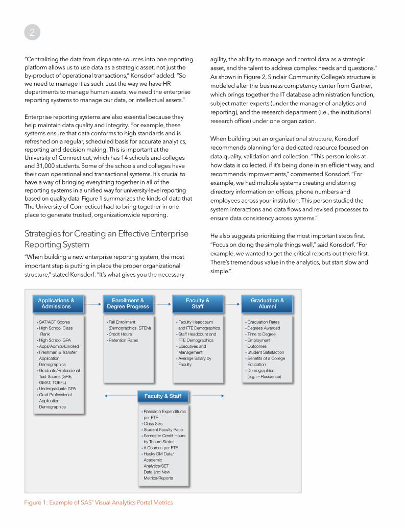
Enterprise reporting systems are also essential because they help maintain data quality and integrity. For example, these systems ensure that data conforms to high standards and is refreshed on a regular, scheduled basis for accurate analytics, reporting and decision making. This is important at the University of Connecticut, which has 14 schools and colleges and 31,000 students. Some of the schools and colleges have their own operational and transactional systems. It’s crucial to have a way of bringing everything together in all of the reporting systems in a unified way for university-level reporting based on quality data. Figure 1 summarizes the kinds of data that The University of Connecticut had to bring together in one place to generate trusted, organizationwide reporting.
Strategies for Creating an Effective Enterprise Reporting System“When building a new enterprise reporting system, the most important step is putting in place the proper organizational structure,” stated Konsdorf. “It’s what gives you the necessary
agility, the ability to manage and control data as a strategic asset, and the talent to address complex needs and questions.” As shown in Figure 2, Sinclair Community College’s structure is modeled after the business competency center from Gartner, which brings together the IT database administration function, subject matter experts (under the manager of analytics and reporting), and the research department (i.e., the institutional research office) under one organization.
When building out an organizational structure, Konsdorf recommends planning for a dedicated resource focused on data quality, validation and collection. “This person looks at how data is collected, if it’s being done in an efficient way, and recommends improvements,” commented Konsdorf. “For example, we had multiple systems creating and storing directory information on offices, phone numbers and employees across your institution. This person studied the system interactions and data flows and revised processes to ensure data consistency across systems.”
He also suggests prioritizing the most important steps first. “Focus on doing the simple things well,” said Konsdorf. “For example, we wanted to get the critical reports out there first. There’s tremendous value in the analytics, but start slow and simple.”
Figure 1: Example of SAS® Visual Analytics Portal Metrics
Applications & Admissions
• SAT/ACT Scores• High School Class Rank• High School GPA• Apps/Admits/Enrolled• Freshman & Transfer Application Demographics• Graduate/Professional Test Scores (GRE, GMAT, TOEFL)• Undergraduate GPA• Grad Professional Application Demographics
• Fall Enrollment (Demographics, STEM)• Credit Hours• Retention Rates
• Research Expenditures per FTE• Class Size• Student Faculty Ratio• Semester Credit Hours by Tenure Status• # Courses per FTE• Husky DM Data/ Academic Analytics/SET Data and New Metrics/Reports
• Faculty Headcount and FTE Demographics• Staff Headcount and FTE Demographics• Executives and Management• Average Salary by Faculty
• Graduation Rates• Degrees Awarded• Time to Degree• Employment Outcomes• Student Satisfaction• Benefits of a College Education• Demographics (e.g.,—Residence)
Enrollment & Degree Progress
Faculty &Staff
Faculty & Staff
Graduation &Alumni

3
Data Quality: Getting to Good, Clean DataAs noted by Helbig, the success of any enterprise reporting system is contingent upon having clean data. “If you do not have good, clean data, the credibility of the system will be in doubt, and it will not be used. We have spent inordinate amounts of time cleaning our data so that sound decisions can be made using them.”
And Konsdorf agreed: “People need to have trust in the data that they are consuming – that the data they are looking at and analyzing is correct,” he said. “Otherwise, they won’t use it.”
Take something simple – like student records. Usually, institutions have too many places where student records are created, resulting in duplicate records, inaccuracies and questions regarding what’s the most authoritative source. It’s a huge undertaking to work with departments to reduce instances of record creation, merge data, and ultimately get to a single source of truth with only one record per student. But once this work is done, every area of your organization can benefit from it. “Instead of everyone create their own student record, we have them linking to our student record data and using that,” explained Konsdorf. “In this way, the enterprise reporting system acts as a central data hub.”
Figure 1
ManagerResearch
Admin (PT)
Research Analyst
Predictive Analytics Research (2)
Data Visualization Analyst (TAACCCT)
Manager Analytics & Reporting
Data Collection Analyst
Data QualityAnalyst
Senior ReportAnalyst
DatabaseAdmin (2)
Director
hdhdh
SAS Visual Analytics handles detailed data with ease. If you want to use aggregated data, you will need to spend some time configuring it to display and roll up properly based on what you want to show and let users manipulate.
Jaganathan also emphasized that if you are implementing SAS Visual Analytics, clean data is a must. “But don’t fill in missing data in the enterprise data store. Take the time to fix how data is captured by your transactional systems so that the system corrects the problem going forward,” he said. “You also need to make sure everything is validated. People will see things out of SAS Visual Analytics based on the data and wonder if it’s accurate. So validation is very fundamental to the success of these programs and technologies.”
Make It Easy to Use Analytics Of course, the ultimate objective of deploying an enterprise reporting system is to help people make better decisions faster. And as Helbig noted, these systems do this by “taking the human component out of decision making. Too often, good-hearted people make decisions based on what they think will be good for students, but in the end, these decisions aren’t good for them. Analytics running on an enterprise reporting system helps people understand what’s really going on today – and in the future – so they can make more informed decisions.”
Figure 2: Research Analytics and Reporting Organizational Structure

4
statistically determined relationships that can yield business insights to help you answer ‘Why?’ And this reshapes the decision-making process.”
Using predictive analytics, you can even forecast when things will happen. For example, at WKU, they can predict which students are thinking about leaving and why. And based on these insights, the university can proactively engage in targeted
retention strategies.
Going Beyond Business Intelligence With Data VisualizationAll of the experts interviewed had gone beyond reporting and business intelligence (BI) by implementing data visualization software – an essential tool to achieving the ideal scenario described in the beginning of this paper. Their users increasingly want to quickly interact with data independently, explore it quickly and understand it faster by visualizing patterns and trends. BI doesn’t do this – hence the need to modernize decision making using data visualization software.
“Using SAS Visual Analytics reveals patterns that you wouldn’t see if you were using business intelligence tools,” said Helbig. “These tools also make it faster and easier to dig into tons of
Consider a recent example from Western Kentucky University (WKU). For years, students were placed in one of two math tracks: the algebra track if their major required heavy math, and a general math track for other majors. The problem was, sometimes general math students changed their major to one that required heavy math, in which case they had to go back and take the advanced math classes. So WKU decided that all students would take the algebra track, just in case. But before long, pass rates started to fall.
This time, the administration took a data-driven approach to solving the problem. “The data revealed that only 14 percent of the student body actually needed to take the algebra track,” Helbig said. “The vast majority – 86 percent – were taking classes that they didn’t need and weren’t succeeding in. Based on these insights, the decision was made to immediately start placing students in math classes according to their major. But we wouldn’t have understood the need to do this if we hadn’t gone in and analyzed the data.”
Jaganathan echoed the sentiments. “Without analytics, decisions are made based on anecdotal evidence,” he said. “People rely on static reports that only tell them, for example, how many students have dropped out – not why they dropped out. Analytics running on a solid data warehouse provides
Figure 3: Enrollment and Revenue Status

5
data and get meaningful results. You don’t even have to know all of the questions to ask … simply seeing the data visually generates questions you didn’t know to ask. And at any time, users can delve deeper into the visualizations – into the data behind them – to know more.”
For example, for the past 15 years, WKU has been one of the fastest-growing public institutions in the state. Student enrollment numbers were up; however, tuition revenue was not keeping up – and no one knew why. “By visualizing the data on restricted and non-restricted revenue, we could see that we were putting revenue toward specific programs to help support them, and that had continued to grow,” said Helbig (see Figure 3). “But that money wasn’t available anymore. Seeing things visually solidified what was going on in the minds of decision makers so they could take action.”
The benefits of using SAS Visual Analytics have been huge for the organizations represented in this paper. It can empower non-technical people to see patterns in data very quickly and easily – and they don’t have to understand all the analytics behind the visualizations they create. And they can get to exactly the results they want without assistance by simply
selecting specific subsets of data (for example, professors can analyze data related to just their students) and go bigger if they need to.
“Without SAS Visual Analytics, you are really making decisions blindly,” said Helbig. “SAS Visual Analytics helps you necessarily see what’s in your data and what’s happening within your institution.”
With SAS Visual Analytics, it’s faster and easier to just start playing around with the data and discover patterns.
Visualizations can also help you explain unexpected trends and hidden patterns. For instance, Helbig explained how recently she used SAS Visual Analytics to look at weekly enrollment over five years. The bottom line shows a drop in enrollment, as well as a stretch where enrollment was flat for two weeks. When she looked into this unexpected trend, she found that the data had not been recorded last term, but rather had been replaced with the data from the week before. “This might not been a big deal, but when projecting enrollment or tuition revenue, this data error caused a huge dip in projections, as shown in the bottom left hand corner,” Helbig said. “By being able to see the data visually, I was able to pinpoint this error very quickly and look into why it happened.”
In Figure 4, you can also see in the bottom left report that the data trend changes from a big dip to a large spike. To understand why that happened, she used SAS Visual Analytics and found that international students (the top right report) had come to campus two weeks earlier than usual, which threw off the projection models. “These examples highlight that using data visualizations helps people see things they might have missed,” she said. “They can explore trends further by digging into the data to understand why things happened.”
At the University of Connecticut, SAS Visual Analytics helps decision makers understand their data faster – including the relationships between variables – and prepare it very quickly for analysis. As an example, they were trying to understand salary equality between men and women at the university. It took them less than three minutes to understand what was going on. They could quickly drag and drop data into SAS Visual Analytics – for example, gender, positions they hold, how many years they have been working, the degrees they have, and the difference in salary. Normally, it would have taken several days to find and drag all that data into a spreadsheet and slice and dice it. With fast data visualization, they could just drag and drop the data that mattered, and then take those variables and build a model – for example, a decision tree or a cluster analysis. They could then make informed decisions about how to address inequities.
Figure 4: Five-Year Enrollment and Tuition Projections
6
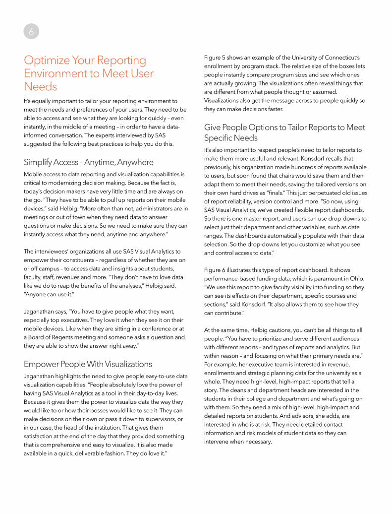
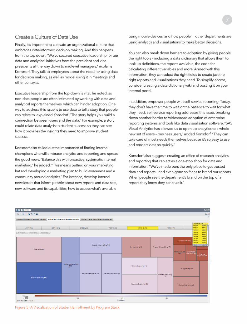
Figure 5 shows an example of the University of Connecticut’s enrollment by program stack. The relative size of the boxes lets people instantly compare program sizes and see which ones are actually growing. The visualizations often reveal things that are different from what people thought or assumed. Visualizations also get the message across to people quickly so they can make decisions faster.
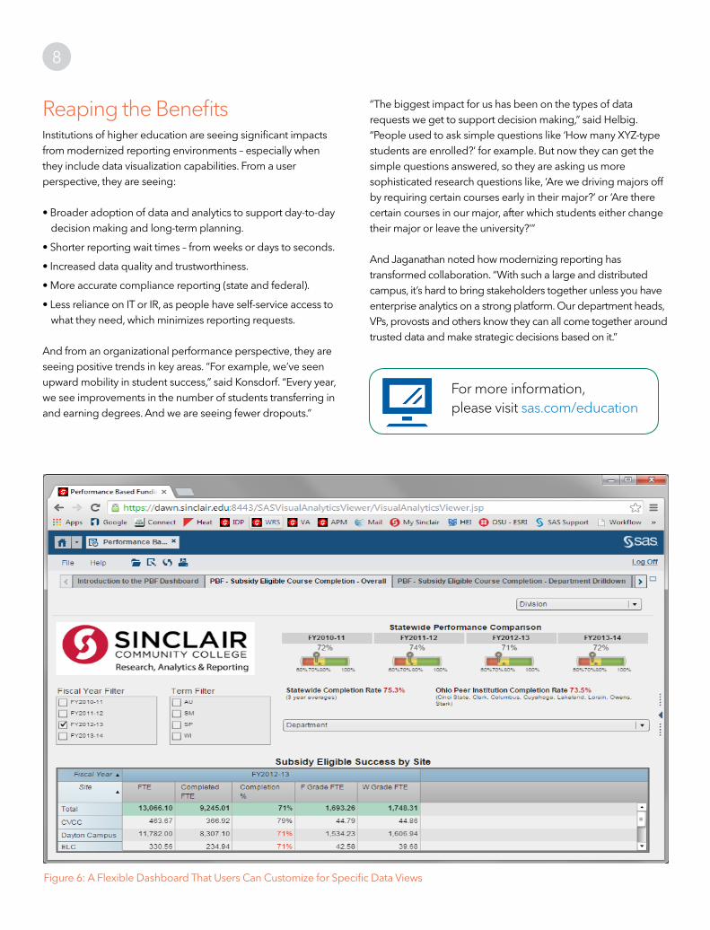
Give People Options to Tailor Reports to Meet Specific NeedsIt’s also important to respect people’s need to tailor reports to make them more useful and relevant. Konsdorf recalls that previously, his organization made hundreds of reports available to users, but soon found that chairs would save them and then adapt them to meet their needs, saving the tailored versions on their own hard drives as “finals.” This just perpetuated old issues of report reliability, version control and more. “So now, using SAS Visual Analytics, we’ve created flexible report dashboards. So there is one master report, and users can use drop-downs to select just their department and other variables, such as date ranges. The dashboards automatically populate with their data selection. So the drop-downs let you customize what you see and control access to data.”
Figure 6 illustrates this type of report dashboard. It shows performance-based funding data, which is paramount in Ohio. “We use this report to give faculty visibility into funding so they can see its effects on their department, specific courses and sections,” said Konsdorf. “It also allows them to see how they can contribute.”
At the same time, Helbig cautions, you can’t be all things to all people. “You have to prioritize and serve different audiences with different reports – and types of reports and analytics. But within reason – and focusing on what their primary needs are.” For example, her executive team is interested in revenue, enrollments and strategic planning data for the university as a whole. They need high-level, high-impact reports that tell a story. The deans and department heads are interested in the students in their college and department and what’s going on with them. So they need a mix of high-level, high-impact and detailed reports on students. And advisors, she adds, are interested in who is at risk. They need detailed contact information and risk models of student data so they can intervene when necessary.
Optimize Your Reporting Environment to Meet User NeedsIt’s equally important to tailor your reporting environment to meet the needs and preferences of your users. They need to be able to access and see what they are looking for quickly – even instantly, in the middle of a meeting – in order to have a data-informed conversation. The experts interviewed by SAS suggested the following best practices to help you do this.
Simplify Access – Anytime, AnywhereMobile access to data reporting and visualization capabilities is critical to modernizing decision making. Because the fact is, today’s decision makers have very little time and are always on the go. “They have to be able to pull up reports on their mobile devices,” said Helbig. “More often than not, administrators are in meetings or out of town when they need data to answer questions or make decisions. So we need to make sure they can instantly access what they need, anytime and anywhere.”
The interviewees’ organizations all use SAS Visual Analytics to empower their constituents – regardless of whether they are on or off campus – to access data and insights about students, faculty, staff, revenues and more. “They don’t have to love data like we do to reap the benefits of the analyses,” Helbig said. “Anyone can use it.”
Jaganathan says, “You have to give people what they want, especially top executives. They love it when they see it on their mobile devices. Like when they are sitting in a conference or at a Board of Regents meeting and someone asks a question and they are able to show the answer right away.”
Empower People With Visualizations Jaganathan highlights the need to give people easy-to-use data visualization capabilities. “People absolutely love the power of having SAS Visual Analytics as a tool in their day-to-day lives. Because it gives them the power to visualize data the way they would like to or how their bosses would like to see it. They can make decisions on their own or pass it down to supervisors, or in our case, the head of the institution. That gives them satisfaction at the end of the day that they provided something that is comprehensive and easy to visualize. It is also made available in a quick, deliverable fashion. They do love it.”
7
Create a Culture of Data UseFinally, it’s important to cultivate an organizational culture that embraces data-informed decision making. And this happens from the top down. “We’ve secured executive leadership for our data and analytical initiatives from the president and vice presidents all the way down to midlevel managers,” explains Konsdorf. They talk to employees about the need for using data for decision making, as well as model using it in meetings and other contexts.
Executive leadership from the top down is vital, he noted, as non-data people are often intimated by working with data and analytical reports themselves, which can hinder adoption. One way to address this issue is to use data to tell a story that people can relate to, explained Konsdorf. “The story helps you build a connection between users and the data.” For example, a story could relate data analysis to student success so they can see how it provides the insights they need to improve student success.
Konsdorf also called out the importance of finding internal
champions who will embrace analytics and reporting and spread
the good news. “Balance this with proactive, systematic internal
marketing,” he added. “This means putting on your marketing
hat and developing a marketing plan to build awareness and a
community around analytics.” For instance, develop internal
newsletters that inform people about new reports and data sets,
new software and its capabilities, how to access what’s available
using mobile devices, and how people in other departments are
using analytics and visualizations to make better decisions.
You can also break down barriers to adoption by giving people the right tools – including a data dictionary that allows them to look up definitions, the reports available, the code for calculating different variables and more. Armed with this information, they can select the right fields to create just the right reports and visualizations they need. To simplify access, consider creating a data dictionary wiki and posting it on your internal portal.
In addition, empower people with self-service reporting. Today, they don’t have the time to wait or the patience to wait for what they need. Self-service reporting addresses this issue, breaking down another barrier to widespread adoption of enterprise reporting systems and tools like data visualization software. “SAS Visual Analytics has allowed us to open up analytics to a whole new set of users – business users,” added Konsdorf. “They can take care of most needs themselves because it’s so easy to use and renders data so quickly.”
Konsdorf also suggests creating an office of research analytics and reporting that can act as a one-stop shop for data and information. “We’ve made ours the only place to get trusted data and reports – and even gone so far as to brand our reports. When people see the department’s brand on the top of a report, they know they can trust it.”
Figure 5: A Visualization of Student Enrollment by Program Stack
8
“The biggest impact for us has been on the types of data requests we get to support decision making,” said Helbig. “People used to ask simple questions like ‘How many XYZ-type students are enrolled?’ for example. But now they can get the simple questions answered, so they are asking us more sophisticated research questions like, ‘Are we driving majors off by requiring certain courses early in their major?’ or ‘Are there certain courses in our major, after which students either change their major or leave the university?’”
And Jaganathan noted how modernizing reporting has transformed collaboration. “With such a large and distributed campus, it’s hard to bring stakeholders together unless you have enterprise analytics on a strong platform. Our department heads, VPs, provosts and others know they can all come together around trusted data and make strategic decisions based on it.”
Reaping the Benefits Institutions of higher education are seeing significant impacts from modernized reporting environments – especially when they include data visualization capabilities. From a user perspective, they are seeing:
• Broader adoption of data and analytics to support day-to-day decision making and long-term planning.
• Shorter reporting wait times – from weeks or days to seconds.
• Increased data quality and trustworthiness.
• More accurate compliance reporting (state and federal).
• Less reliance on IT or IR, as people have self-service access to what they need, which minimizes reporting requests.
And from an organizational performance perspective, they are seeing positive trends in key areas. “For example, we’ve seen upward mobility in student success,” said Konsdorf. “Every year, we see improvements in the number of students transferring in and earning degrees. And we are seeing fewer dropouts.”
Figure 6: A Flexible Dashboard That Users Can Customize for Specific Data Views
For more information, please visit sas.com/education

9
About SAS in EducationWith a special focus on education, SAS strives to give everyone THE POWER TO KNOW®. SAS software is widely used to run the business of education. In fact, it’s the same world-class analytics software used by more than 80,000 business, government and university sites around the world, including 91 of the top 100 companies on the 2015 Fortune Global 500® list and more than 3,000 educational institutions. And because of our commitment to education, SAS provides P-12 and degree-granting educational institutions access to SAS software at a significantly discounted rate. SAS also provides free curriculum and mobile apps for K-12, as well as free and low-cost student access to world-class software through SAS Analytics U. Additionally, SAS collaborates with colleges and universities around the world to launch degree and certificate programs to foster the current and next generation of analytics talent. With almost four decades of working in education, SAS brings together individuals, institutions, communities and data to derive insights in order to prepare students for college, careers and a brighter future.
About the IntervieweesTuesdi Helbig, PhDTuesdi Helbig is the Director of Institutional Research at Western Kentucky University (WKU), where she has worked for the past 20 years. She currently leads a team of researchers and data analysts who provide executive-level decision support for university leadership.
Karl Konsdorf Karl Konsdorf is the Acting Director of Research, Analytics and Reporting at Sinclair Community College. He is responsible for shaping the business intelligence strategy, architecture and budget for the college. In addition, he has developed the marketing and communication plans for the institution to ensure all constituents understand the value derived from business intelligence. In 2008, Konsdorf and his team of talented BI developers, programmers and analysts received the Best Practices award for Government and Higher Education from the Data Warehousing Institute.
Sivakumar Jaganathan, PhDSivakumar (Shiva) Jaganathan is the Executive Director (Data Warehouse and Business Analytics) at the University of Connecticut. He has more than 20 years of experience in higher education, primarily in the Institutional Research area with key expertise in data warehousing and business intelligence technologies. He is a leader in implementing SAS Visual Analytics and SAS Visual Statistics at the enterprise level to enhance the predictive analytics, big data harvesting and social media analytics for purposes of executive decision making. Some of his expertise is in the areas of enrollment and retention modeling, student lifecycle management (including financial aid), faculty productivity and next-generation technology adoption.

To contact your local SAS office, please visit: sas.com/offices
SAS and all other SAS Institute Inc. product or service names are registered trademarks or trademarks of SAS Institute Inc. in the USA and other countries. ® indicates USA registration. Other brand and product names are trademarks of their respective companies. Copyright © 2016, SAS Institute Inc. All rights reserved.
107937_S151963.0316