Embed Size (px)
Citation preview

Graduate School Professional Development
Creating an Effective Poster
Presentation
Donna W Bailey [email protected]
Center for Teaching and Learning http://www.unc.edu/depts/ctl
The University of North Carolina at Chapel Hill Chapel Hill, North Carolina 27599-3470
919-966-1289

Background
Poster sessions provide us with a great opportunity to interact, inform and develop
networks of people with similar interests. It is one of several ways that scholars
and professionals communicate their work. Often seen as a simple communication
tool, poster sessions are far from simple if done effectively. They are more than
gluing graphics and tables to a piece of cardboard. The purpose of this session is to
actively work through the development of your poster session so that it is effective
in communicating your desired message and facilitating the functions of informing
the viewer, stimulating interaction and network development.
Objectives
At the conclusion of this session, the participant will be able to:
1. Describe the process of poster development,
2. List the elements of an effective poster,
3. Begin the development of their poster, using the strategies and tools
provided in the workshop.

Poster Development Process and Strategies Conceptualization and RFP
• Identify material that you want to
communicate in a poster session • Identify audience • Submit proposal
Acceptance
• Review acceptance and poster requirement
Development
• Outline your poster • Collect materials with two goals in mind:
o Selections are visually powerful o Selections are information dense
• Experiment with visual layout • Put a prototype together • Decide on printing option
Review
• Find a critic • Make adjustments
Final Steps
• Proof poster before final printing • Create handout • Determine setup/takedown process
Post-event Review
• Evaluate the benefits/opportunities to improve
from this audience and version •
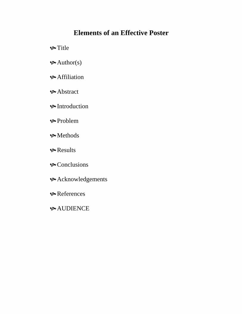
Elements of an Effective Poster
Title Author(s) Affiliation Abstract Introduction Problem Methods Results Conclusions Acknowledgements References AUDIENCE
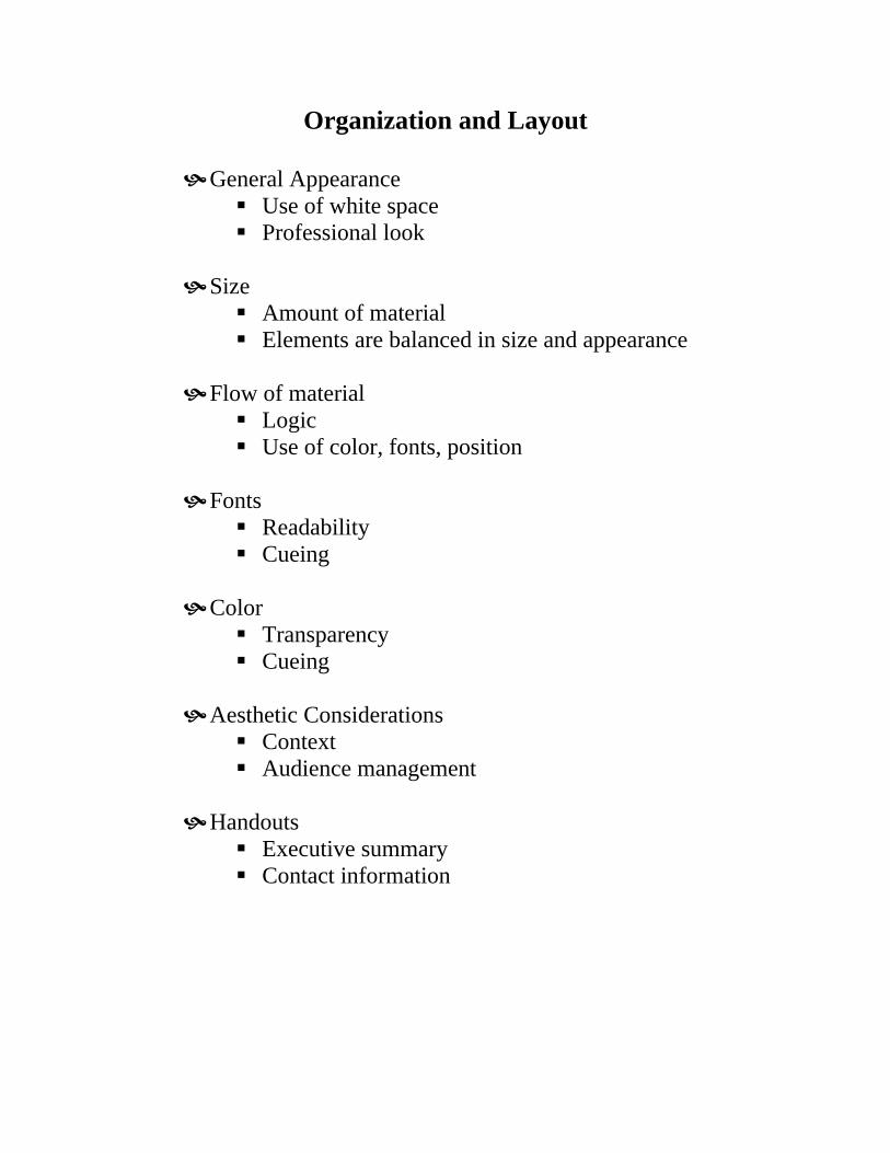
Organization and Layout
General Appearance Use of white space Professional look
Size
Amount of material Elements are balanced in size and appearance
Flow of material
Logic Use of color, fonts, position
Fonts
Readability Cueing
Color
Transparency Cueing
Aesthetic Considerations
Context Audience management
Handouts
Executive summary Contact information
22
Effective Poster Design
A Step-by-Step Guide
Developed and produced byTeaching Support Services
University of Guelph

21

1
Well done!... your paper has been accepted for presentation at a conference poster session. It is neatlytyped on 8 1/2 by 11" pages. Photographs, charts, tables, etc. have been made. Now allyou have to do is buy some Bristol board to stick the whole thing on and you're all set...
... or is there a better way?
This guide to creating posters will take you through six important steps:
Step 1 - Define your audienceStep 2 - Gather the content for your posterStep 3 - Make a heading and statement for each sectionStep 4 - Eliminate noiseStep 5 - Find your focusStep 6 - Put it together
- Create a poster on your computer

2
IntroductionPresenting the information from your paper in a poster session is different from making apresentation before an audience or publishing your paper in a journal.
Presenting your Presenting your Presenting yourpaper in a journal paper face to face paper as a poster
Time • audience controlled • 10 - 50 minutes • 3 seconds to• infinite stimulate interest *
• 30 seconds to convey
overall concept
• 2 - 5 minutes to provideenough information forfurther exploration
Place • controlled by the • in front of a captive • in a room or hall withaudience audience many other posters
- audience on the move
Mode of Visual Aural / Visual VisualCommuni- • reading • pacingcation • print • body language
• responsive toaudience reaction
• visual aids
* the success of your first 3 seconds will determine whether or not your audience will staylonger to explore the content at the next stage.
How can youretain theadvantages of theother presentationmodes in yourposter?

3
The Harsh Reality
At poster sessions there is intense competition for audience attention.
The room is filled with posters displaying a wealth of information and ideas.
How can you make sure that your poster will be noticed, let alone read?
The harsh reality is that you have less than three seconds to attract attention to your poster.
If you succeed in capturing the audience, you have another 30 seconds to convey an overallunderstanding of the problem/ process/ conclusion. If your audience is interested, they willspend additional time exploring the information you are presenting and may approach youpersonally.
A poster on display provides an opportunity for making valuable contacts and engaging inmeaningful dialogue with colleagues. However, if your poster does not immediately grabpeople's attention, your efforts have been in vain.
The following guidelines are intended to help organize the ideas and information in your paperto create an effective poster design.
It may look like a lot of work – but the results are worth it!
Poster Noise

4
STEP 1:
Define Your Audience
To ensure that your poster communicates as effectively as possible, it is very important tounderstand who your audience is.
When you begin to design for your audience, consider the fact that :
• the audience may not have read your paper• they have only a short time to spend looking at posters• they may still be jetlagged• they may be there mainly to network with their colleagues• they may be short sighted• they may be primarily colleagues (who may provide valuable suggestions,
comments, insights and reactions to your findings)or• they may be the general public with less background information in your area of
expertise.
Who is the audience for your poster?
the general public
industry / government
academics
academics within your discipline
Note: for maximum effectiveness in communicating ideas you should selectonly one audience.

5
STEP 2:
Gather the Content for your Poster
Divide the information you have into the following main sections (or use your own sectionheadings) :
TITLEINTRODUCTIONPROBLEMMETHODRESULTSCONCLUSION
Hint: Use a separate file folder or envelope for each section and label it with the sectionheading. Place all the appropriate resources (copy, photos, illustrations, charts,etc.) in each folder. If something is incomplete or missing, add a reminder sheet tothe folder.
What to Include:
Title Name of poster, contributors, organization
Introduction Statement giving quick overview of poster
Problem Statement of the problem
Method Brief description of the processes and procedures
Results Outcomes, findings, data
Conclusion Summary, discussion of significance of results, a few easilyremembered key conclusions
Check the contents of each folder - do you have all the relevant information?(if not, add reminder notes)
6
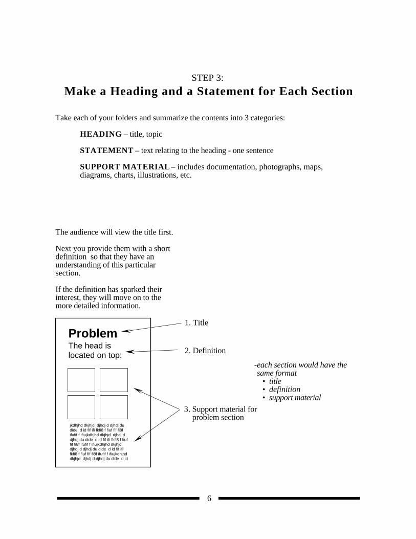
STEP 3:
Make a Heading and a Statement for Each Section
Take each of your folders and summarize the contents into 3 categories:
HEADING – title, topic
STATEMENT – text relating to the heading - one sentence
SUPPORT MATERIAL – includes documentation, photographs, maps,diagrams, charts, illustrations, etc.
The audience will view the title first.
Next you provide them with a short definition so that they have anunderstanding of this particularsection.
If the definition has sparked their interest, they will move on to themore detailed information.
ProblemThe head is located on top:
jkdhjhd dkjhjd djhdj d djhdj dudide d id fif ifi fkfi8 f fiuf fif fi8fifufif f ifiujkdhjhd dkjhjd djhdj ddjhdj du dide d id fif ifi fkfi8 f fiuffif fi8f ifufif f ifiujkdhjhd dkjhjddjhdj d djhdj du dide d id fif ififkfi8 f fiuf fif fi8f ifufif f ifiujkdhjhddkjhjd djhdj d djhdj du dide d id
2. Definition
1. Title
3. Support material forproblem section
-each section would have the same format
• title• definition• support material
7
STEP 4:
Eliminate Noise
Before you start editing, think about your audience.
Is your audience primarily made up of your colleagues?If so, think about:• what your audience already knows• what will be of most interest to those doing similar research• emphasizing the visual – it helps to facilitate the process of communication
or
the general public? If so, you need to: • pare down the detail• define or eliminate scientific terminology• emphasize the visual display to encourage and help facilitate understanding
Edit, edit, edit !
• eliminate all but the vital elements
• reduce your information to brief but concise, legible statements
• whenever possible, reinterpret text as charts, graphs or illustrations
• use point form – it is easier to read than sentences
8
STEP 5:
Find Your Focus - "The Attention Grabber"
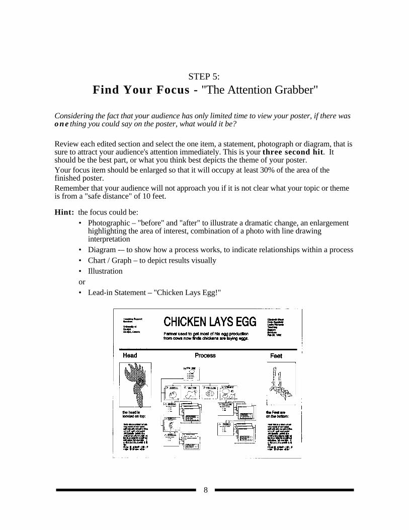
Considering the fact that your audience has only limited time to view your poster, if there wasone thing you could say on the poster, what would it be?
Review each edited section and select the one item, a statement, photograph or diagram, that issure to attract your audience's attention immediately. This is your three second hit. Itshould be the best part, or what you think best depicts the theme of your poster.Your focus item should be enlarged so that it will occupy at least 30% of the area of thefinished poster.Remember that your audience will not approach you if it is not clear what your topic or themeis from a "safe distance" of 10 feet.
Hint: the focus could be:• Photographic – "before" and "after" to illustrate a dramatic change, an enlargement
highlighting the area of interest, combination of a photo with line drawinginterpretation
• Diagram -– to show how a process works, to indicate relationships within a process• Chart / Graph – to depict results visually• Illustrationor • Lead-in Statement – "Chicken Lays Egg!"

9
STEP 6:Put It Together
How you display your information is just as important as its accuracy.
Take time to plan your visual display.
Before you move on to the final layout, several considerations will help increase the poster'seffectiveness...
Think about:
• Layout
• Colour
• Text - size, style (typeface)
• Visuals (photographs, illustrations, etc.)
• Space
Remember that one of the rules of good design is maintaining consistancy in all of the above(for example, all headings should be the same colour, text size and style, same distance fromthe border, etc.)

10
Layout
There are a number of ways that you can put it all together and do a rough layout of your finalposter.
1. Full-sized layout:
• On a tabletop, or on the floor, use masking tape to delineate an area the same size asyour finished poster (approximately 4' x 5') or use a chalkboard to map out thelayout of your information (headings, statements, text, photographs, diagrams etc.).
• Roughly letter the headings in the appropriate size on separate pieces of paper andcut them out.
• Cut out pieces of paper the exact size of photos, charts etc.
Remember, don't crowd your information, make sure sections are clearly definedwith adequate spacing.
• Re-arrange until you are satisfied and ready to take the poster to the final productionstage.
2. Scaled down layout: (The following scale represents 1/6 of the size of a 4 X 5' final poster).
• take an 81/2 X 11" sheet of paper.
• draw a grid (vertical and horizontal lines) 1/8" apart.
• this will give you a scale of 1/8" = 1" of your poster.
• rough in your text and indicate the placement of photos, graphs, illustrations etc.
e.g. if you’re using an 8 X 10" photograph, the area on the gird would be 1 X 1/4".
3. Computer layout:
• you can do the layout and create the finished poster on your computer (see page 15).
11
Colour
Never use colour on a poster display only for its own sake. It always needs to be used forgood reason and in limited quantities.
Hints:
• Text: Black text is clean and easy to read. Coloured text is more difficult to read.
• A single background colour serves to unify a poster and clearly distinguish it from neighbouring posters.
• Select a neutral background colour such as: greybeigelight brownlight greencream
Neutral colours act as a natural foil to the material that will be displayed on top. Avoid using yellow, orange or red which would distract from your information.
• Colour can enhance the hues or contrast of photographs. Dark photographs willlook darker on a light background, colour photographs will look more vibrant whendisplayed on a neutral background.
• Colour can be used to highlight, separate, define, and associate information.
• Colours are often used for coding. As the number of colour-coded items increase,the value of colour as a cue for selecting important information decreases.
12
Text
Text Size
Your audience shouldn't need a magnifying glass to read your information. Standard wordprocessing text is too small! A common error in poster design is using text that is too small,and is spaced too far apart.
Recommended text heights for a poster are:
MAIN TITLE / HEADING: at least 1 1/2" high
SUBHEADING: 1/2 - 7/8" high
BODY COPY: 1/4 - 3/8" high
Hints:
• Use one text style consistently throughout.
• A Word with the first letter capitalized and the remaining letters in lower case iseasier to read than a WORD all in capital letters.
• Avoid ORNATE and ITALIC styles. Artsy typefaces can be hard to read.
• BOLD FACE can be used for titles, headings or for emphasis.
• Abbreviations may be used as they are in the published abstracts.
13
Visuals
Hints:
• Visuals for instruction should be attractive, clear and specific, not ambiguous.
• All non-essential information should be removed from figures.
• Crop and enlarge photographs to focus attention on the significant details.
• All maps and diagrams should have a brief title and be clearly labelled. The legendhas a great impact on image perception. To a large degree, viewers see what theyare told to see in an image.
• Labels on photographs, graphs, and diagrams need to have a minimum type size of1/4" height.
• Colour photographs enhance the poster but need not be used if black and whitephotos communicate the point equally well.
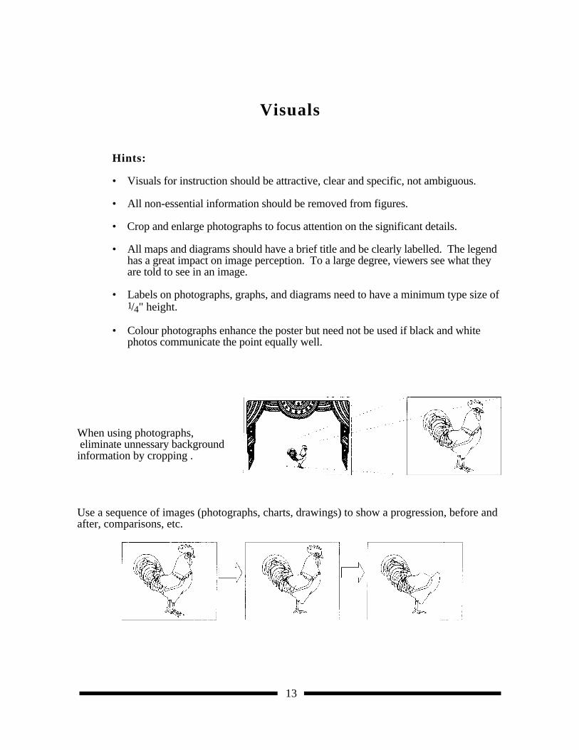
When using photographs, eliminate unnessary background information by cropping .
Use a sequence of images (photographs, charts, drawings) to show a progression, before andafter, comparisons, etc.

14
Space
You don't need to fill every square inch of your allotted space. A busy layout can lead toaudience confusion and distraction. Adequate white space (the background board on whichyou display your information) will direct attention to the key elements which you have selectedto present to the audience.
Hints:
• Leave a substantial amount of white space. A well designed poster might have upto 50% white space.
• Information should flow from left to right and from top to bottom.
• Long visual lines help organize groups of information. Think about hanging piecesof information from an imaginary clothesline. The tops will all be at the same level.
• Remember that the eye looks for edges. Align edges in groups of photographs. Align headings and text material. Align X or Y axes in groups of graphs.
• Groups of related information function best if arranged close together within adefined border.
15
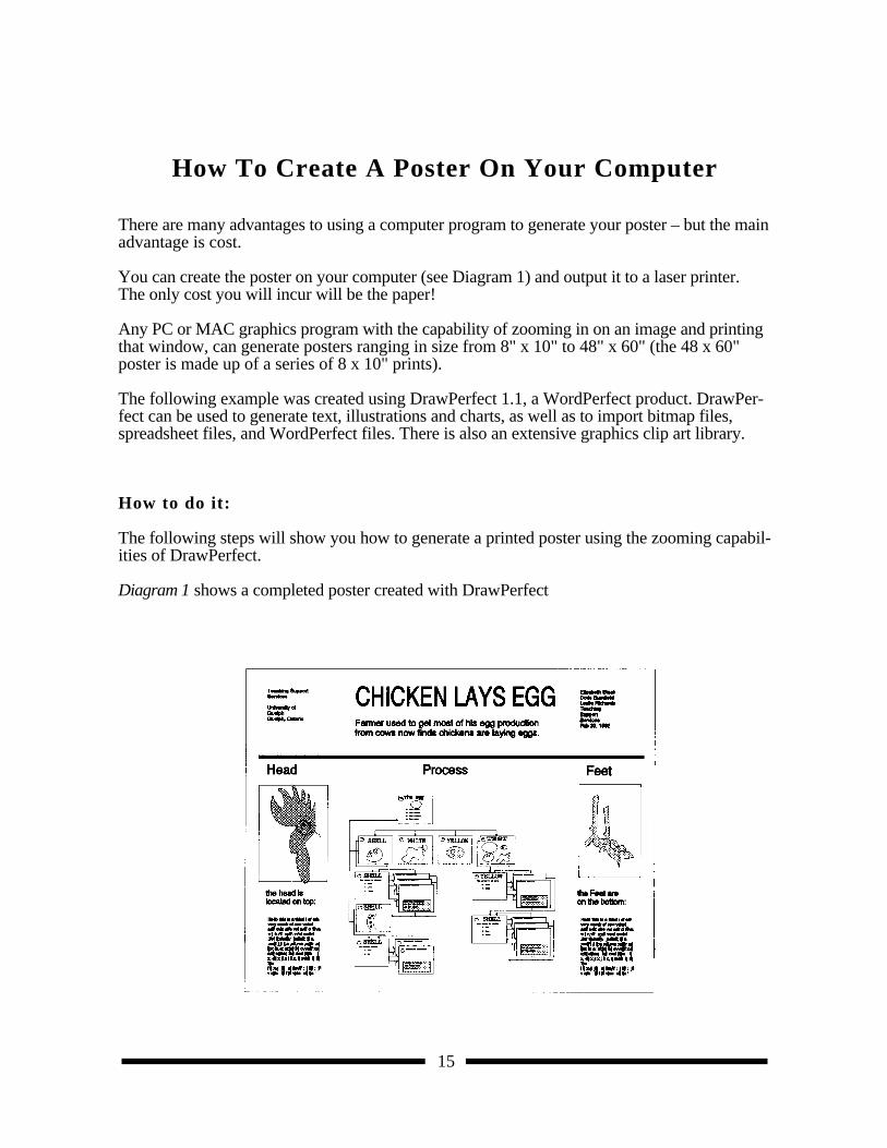
How To Create A Poster On Your Computer
There are many advantages to using a computer program to generate your poster – but the mainadvantage is cost.
You can create the poster on your computer (see Diagram 1) and output it to a laser printer.The only cost you will incur will be the paper!
Any PC or MAC graphics program with the capability of zooming in on an image and printingthat window, can generate posters ranging in size from 8" x 10" to 48" x 60" (the 48 x 60"poster is made up of a series of 8 x 10" prints).
The following example was created using DrawPerfect 1.1, a WordPerfect product. DrawPer-fect can be used to generate text, illustrations and charts, as well as to import bitmap files,spreadsheet files, and WordPerfect files. There is also an extensive graphics clip art library.
How to do it:
The following steps will show you how to generate a printed poster using the zooming capabil-ities of DrawPerfect.
Diagram 1 shows a completed poster created with DrawPerfect
16
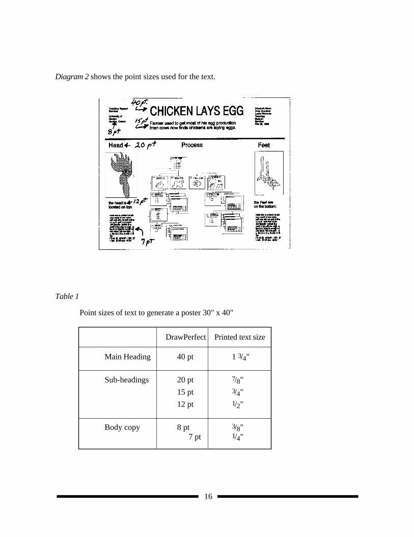
Diagram 2 shows the point sizes used for the text.
Table 1
Point sizes of text to generate a poster 30" x 40"
DrawPerfect Printed text size
Main Heading 40 pt 1 3/4"
Sub-headings 20 pt 7/8"
15 pt 3/4"
12 pt 1/2"
Body copy 8 pt 3/8" 7 pt 1/4"
17
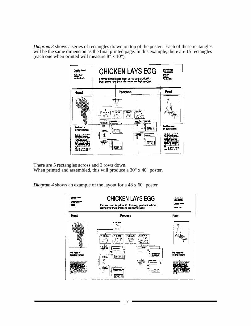
Diagram 3 shows a series of rectangles drawn on top of the poster. Each of these rectangleswill be the same dimension as the final printed page. In this example, there are 15 rectangles(each one when printed will measure 8" x 10").
There are 5 rectangles across and 3 rows down. When printed and assembled, this will produce a 30" x 40" poster.
Diagram 4 shows an example of the layout for a 48 x 60" poster
18
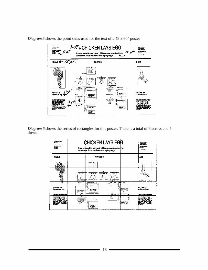
Diagram 5 shows the point sizes used for the text of a 48 x 60" poster
Diagram 6 shows the series of rectangles for this poster. There is a total of 6 across and 5down.
19
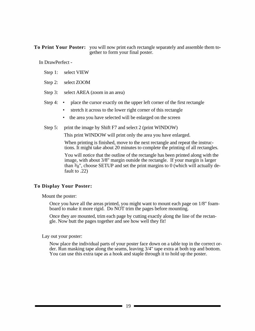
To Print Your Poster: you will now print each rectangle separately and assemble them to-gether to form your final poster.
In DrawPerfect -
Step 1: select VIEW
Step 2: select ZOOM
Step 3: select AREA (zoom in an area)
Step 4: • place the cursor exactly on the upper left corner of the first rectangle
• stretch it across to the lower right corner of this rectangle
• the area you have selected will be enlarged on the screen
Step 5: print the image by Shift F7 and select 2 (print WINDOW)
This print WINDOW will print only the area you have enlarged.
When printing is finished, move to the next rectangle and repeat the instruc-tions. It might take about 20 minutes to complete the printing of all rectangles.
You will notice that the outline of the rectangle has been printed along with theimage, with about 3/8" margin outside the rectangle. If your margin is largerthan 3/8", choose SETUP and set the print margins to 0 (which will actually de-fault to .22)
To Display Your Poster:
Mount the poster:
Once you have all the areas printed, you might want to mount each page on 1/8" foam-board to make it more rigid. Do NOT trim the pages before mounting.
Once they are mounted, trim each page by cutting exactly along the line of the rectan-gle. Now butt the pages together and see how well they fit!
Lay out your poster:
Now place the individual parts of your poster face down on a table top in the correct or-der. Run masking tape along the seams, leaving 3/4" tape extra at both top and bottom.You can use this extra tape as a hook and staple through it to hold up the poster.
20
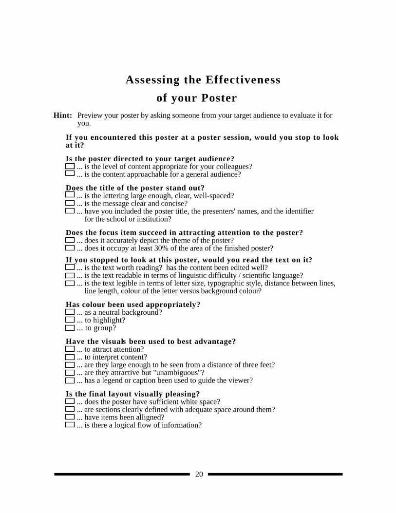
Assessing the Effectiveness
of your Poster Hint: Preview your poster by asking someone from your target audience to evaluate it for
you.
If you encountered this poster at a poster session, would you stop to lookat it?
Is the poster directed to your target audience?... is the level of content appropriate for your colleagues?... is the content approachable for a general audience?
Does the title of the poster stand out?... is the lettering large enough, clear, well-spaced?... is the message clear and concise?... have you included the poster title, the presenters' names, and the identifier
for the school or institution?
Does the focus item succeed in attracting attention to the poster?... does it accurately depict the theme of the poster?... does it occupy at least 30% of the area of the finished poster?
If you stopped to look at this poster, would you read the text on it?... is the text worth reading? has the content been edited well?... is the text readable in terms of linguistic difficulty / scientific language?... is the text legible in terms of letter size, typographic style, distance between lines,
line length, colour of the letter versus background colour?
Has colour been used appropriately?... as a neutral background?... to highlight?... to group?
Have the visuals been used to best advantage?... to attract attention?... to interpret content?... are they large enough to be seen from a distance of three feet?... are they attractive but "unambiguous"?... has a legend or caption been used to guide the viewer?
Is the final layout visually pleasing?... does the poster have sufficient white space?... are sections clearly defined with adequate space around them?... have items been alligned?... is there a logical flow of information?


![ancient egyptian art.ppt [Last saved by user]dbailey1.weebly.com/uploads/6/6/5/4/6654052/ancient_egyptian_art2.pdf · 1/22/2013 1 Ancient Egyptian Art Predynastic Art Palette of King](https://img.dokumen.tips/doc/110x75/5e2f273ab3ad0169eb0be953/ancient-egyptian-artppt-last-saved-by-user-1222013-1-ancient-egyptian-art-predynastic.jpg)


![quoctd@email.unc.edu arXiv:2002.08246v2 [math.OC] 20 Sep 2021](https://img.dokumen.tips/doc/110x75/62da3b61eead230c8c409d7a/quoctdemailuncedu-arxiv200208246v2-mathoc-20-sep-2021.jpg)