Embed Size (px)
Citation preview

UK Association for Accessible Formats (UKAAF)
Because format quality matters
Creating clear print and large print documents
Guidance from UKAAF
G003
2
Why format quality matters
"When organisations send me information in formats that I
can read myself it allows me to be independent, feel informed
and appreciated - just like every other customer."
End-user
"Producing consistently high quality accessible formats helps
us to maintain our reputation, to gain new customers and to
retain existing ones."
Transcription agency
"We are committed to ensuring that our customers with print
disabilities receive the same information, of the same quality,
as everyone else."
Service provider
Copyright © 2012 UK Association for Accessible Formats
(UKAAF).
Not for re-sale. You may reproduce in whole or in part with
acknowledgement to UKAAF. Refer to inside back cover for
citation guidance.

Creating clear print and large print documents
Copyright © 2012 UK Association for Accessible Formats
3
Who is this guidance for?
This guidance from the UK Association for Accessible Formats
(UKAAF) is primarily aimed at anyone producing clear print or
large print documents. It will be particularly useful for people
aiming to create accessible printed materials, either for the general
public (clear print) or specifically for people with low vision (large
print).
The guidance includes:
Minimum standards for clear and large print
Guidelines for clear and large print
Endnotes giving more detailed guidance and examples
A glossary
Disclaimer
This guidance may include references to external websites,
services or products for which UKAAF accepts no responsibility.
This information is given without any representation or
endorsement of those websites, services or products.

Creating clear print and large print documents
Copyright © 2012 UK Association for Accessible Formats
4
Contents
Introduction ................................................................................... 5
About UKAAF ................................................................................ 5
Definition of print disability ............................................................. 6
Minimum standards for clear print and large print .......................... 7
Clear print and large print golden rules .......................................... 9
Detailed guidance on the production of clear and large print ...... 10
Notes ........................................................................................... 16
Glossary ...................................................................................... 42
Further resources ........................................................................ 47
Where to get further help ............................................................. 48
Your feedback is welcome ........................................................... 49
Appendix 1 Large print guidance for educational materials ......... 50
Appendix 2 Modified Stave Notation ............................................ 59

Creating clear print and large print documents
Copyright © 2012 UK Association for Accessible Formats
5
Introduction
By obtaining these guidelines you are demonstrating your
commitment to helping people with a print disability to read your
materials if they find reading standard print materials difficult or
impossible.
This guidance concentrates specifically on materials suitable for
blind and partially sighted people - such as large print, audio,
braille and electronic file formats. However, others with a print
disability, for example with dyslexia or motor-difficulties, may also
find such materials necessary.
The provision of accessible information is a key requirement of the
Equality Act which service providers must follow, but good
customer service and business practice includes communicating
with your customers and staff in ways which meet their reading
needs. By providing accessible format materials, you not only
demonstrate your commitment to equality and inclusion, but also
increase your reach and customer base. It therefore makes good
business sense.
This guidance will help you and your organisation to incorporate
good practice into your business and provide good quality
accessible format materials in a timely and appropriate way.
About UKAAF
The UK Association for Accessible Formats (UKAAF) is the
industry association whose mission is to set standards for
accessible formats that meet end-user needs through:
development, delivery and promotion of codes, standards, and
best practice for the production and provision of accessible
formats

Creating clear print and large print documents
Copyright © 2012 UK Association for Accessible Formats
6
consultation and collaboration with transcribers, service
providers and users of accessible formats.
Members of UKAAF include organisations and individuals with an
interest in the provision of quality accessible formats, such as
service providers, transcribers, educators, researchers, print
services, publishers, and end-users.
Through its leadership and representation, standards-setting, and
by fostering a spirit of cooperation between members, UKAAF
ensures that the needs and requirements of end-users are
understood by service providers and transcribers to help improve
the quality of accessible formats.
Please see the section on "Where to get further help" towards the
end of this document for more information about the benefits of
being a member of UKAAF.
Definition of print disability
A print-disabled person is anyone for whom a visual, cognitive, or
physical disability hinders the ability to read print. This includes all
visual impairments, dyslexia, and any physical disabilities that
prevent the handling of a physical copy of a print publication.
Source: Copyright Licensing Agency Print Disability Licensing
Scheme, Guidelines for Licensees 2010.

Creating clear print and large print documents
Copyright © 2012 UK Association for Accessible Formats
7
Minimum standards for clear print and large print
As a minimum, UKAAF expects clear and large print materials to
comply with the following standards.
Copyright
Permission, or the legal right to produce the clear or large print
version of the document has been confirmed
User needs and preferences
Individual end user’s requirements ascertained and met where
possible, without compromising the integrity of the original
information
Presentation
Document has not been created by enlarging with a photocopier
(other than exceptional cases)
A4 paper used unless content or purpose dictates otherwise
Minimum text size of 12 point for clear print, ideally 14 point
Minimum text size of 16 point for large print, ideally minimum of
18 point
Text such as page numbers, labels, superscripts is ideally the
same size as the body text
Legible typeface such as Arial
No italics, underlining or large blocks of capital letters
Adequate line spacing
Adequate space between paragraphs
Text is left aligned except in exceptional circumstances

Creating clear print and large print documents
Copyright © 2012 UK Association for Accessible Formats
8
Text is horizontal
Words and single pieces of information are not split onto two
lines unless unavoidable
Columns avoided or reduced in number if appropriate
If columns are used, there is adequate space between them
and possibly a vertical dividing line
Good contrast between text and background
No information conveyed solely through colour, images or
diagrams
No text overlapping images (other than exceptional cases)
Paper is non-glossy
Paper is of sufficient weight to avoid show-through
Identification and navigation of document
Title and originator of the document should be at the beginning
of the information
Layout is clear and consistent
Headings are clearly differentiated from text
Appropriate use of page numbers
Appropriate use of print page references (e.g. for educational
material)
Appropriate use of table of contents
Appropriate use of headers and footers
Interpretation and adaptation
Images and diagrams are presented in an accessible way
Tables are presented in an accessible way

Creating clear print and large print documents
Copyright © 2012 UK Association for Accessible Formats
9
Accuracy
Document is an accurate representation of the original
Quality control measures in place (e.g. proofing, testing
production equipment, regular servicing etc)
Finishing and packaging
Appropriately bound
Appropriately packaged
Clearly labelled
Cover is non-glossy
Despatched in good time
Clear print and large print golden rules
These are simple rules you may wish to refer to when designing a
document. They are a subset of the minimum standards,
particularly relevant to design.
1 For clear print use a minimum type size of 12 point. For large
print use a minimum type size of 16 point
2 Use a legible typeface
3 Avoid italics, underlining and large blocks of capital letters
4 Use adequate line spacing
5 Left align text
6 Keep text horizontal
7 Provide a good contrast between text and background
8 Avoid overlapping text and images
9 Use a clear and consistent layout
10 Use non-glossy paper

Creating clear print and large print documents
Copyright © 2012 UK Association for Accessible Formats
10
Detailed guidance on the production of clear and large print
These guidelines explain how to produce clear and large print
documents. If you want to learn more about any of the guidance
below refer to the corresponding note in the following section.
1. Ask the end user what they need
These guidelines give general guidance for the adaptation of
materials into clear and large print; the ideal is to find out and apply
the user's individual preference. If possible, always try to meet the
user's needs [Note 1].
2. Do not enlarge text with a photocopier
It is not acceptable to enlarge a document to A3 on a photocopier.
This produces documents that are unwieldy; difficult to read; any
inaccessible design inherent in the original is not improved, and it
degrades the quality of images and graphics. The information
needs to be re-formatted to conform to these guidelines [Note 2].
3. Use an accessible typeface / font and appropriate
paper
1 For clear print use 12 point text size minimum, though 14 point
is recommended. For large print use 16 point minimum,
though 18 point is recommended [Note 3.1].
2 Avoid italics, underlining, and blocks of capital letters because
they make text difficult to read [Note 3.2].
3 Use a legible typeface. Arial is a good choice as it is legible
and commonly available on computers, but some others are
equally suitable [Note 3.3].

Creating clear print and large print documents
Copyright © 2012 UK Association for Accessible Formats
11
4 Do not use a smaller text size anywhere in the document. For
example page numbers, footnotes, subscripts and
superscripts, image captions and ‘small print’ should all be the
same size as the body text. For example, scientific formulae
or maths equations may need to be in a larger text size than
the rest of the content so that subscripts and superscripts can
be an appropriate text size. Headings may need to be in larger
text to differentiate them from body text [Note 3.4].
5 Ensure a well-defined contrast between text and background.
Black on white offers the strongest contrast. For some people,
different colour combinations or coloured paper can be easier
and more comfortable to read [Note 3.5].
6 Do not use colour alone to convey information, as some
people cannot differentiate between different colours [Note
3.6]
7 Use matt paper, as it is non-reflective and helps to eliminate
glare from lights. It must be thick or opaque enough to prevent
print showing through. 80 gsm is sometimes sufficient but not
always. 100 gsm is usually suitable.
8 In general, use A4 paper unless the content or purpose
dictates otherwise [Note 3.8].
4. Label the document clearly
1 Include on the front page who the document is from and a title
giving the subject matter unless there is a good reason not to
do so.
2 Specify the text size on the cover (front or back) [Note 4.2].
Creating clear print and large print documents
Copyright © 2012 UK Association for Accessible Formats
12
5. Use a clear layout to aid navigation
1 Use a consistent layout [Note 5.1].
2 Left align text and headings unless exceptionally convention
dictates otherwise [Note 5.2].
3 Clearly differentiate headings from body text, and differentiate
different levels of heading. Bold text, larger text, and line
spacing can all help to do this [see Note 5.19 for examples].
4 Do not place images to the left of text as the reader may not
realise there is any text to the right of the image.
5 In general, avoid printing text over an image. If it is necessary,
ensure good contrast and place on an area of plain
background [Note 5.5].
6 Avoid single pieces of information splitting onto two lines, for
example: names, telephone numbers, dates, postcodes,
measurements and their units [Note 5.6].
7 Use a minimum of single line spacing to avoid cramped text
[Note 5.7]
8 Avoid indenting text at the start of paragraphs, but consider
using hanging indents in numbered or bulleted lists. Leave
space between paragraphs [Note 5.8].
9 Keep text horizontal, including labels on diagrams, maps and
other graphics.
10 Ensure linked items are connected visually. If there is a large
amount of space between linked items (for example in
contents lists or invoices) it is easy to lose the visual
connection. For example, use a row of dots in contents lists,
and show cell lines in tables to link the information.
11 Place page breaks at an appropriate place in the text,
avoiding widows and orphans [Note 5.11].

Creating clear print and large print documents
Copyright © 2012 UK Association for Accessible Formats
13
12 Tables may become difficult to interpret if the text size is
enlarged. It is usually easier if the full width of the table is
available to the reader, so consider whether changing page
orientation, using A3 paper, or printing on two facing pages
may help. Consider whether reformatting would be helpful, for
example changing column width or splitting the table into two.
Repeat the heading row for any tables breaking over a page.
13 If enlarging the text size of a document which has been
formatted with columns, consider whether you need to
reduce the number of columns or get rid of columns altogether
so that the line length and words per line are suitable
[Note 5.13]. If columns are considered appropriate, ensure the
reader can easily distinguish between them by having an
adequate space between them, and possibly a vertical
dividing line, to avoid the user reading across columns rather
than down the page.
14 Have adequate margins, especially from the spine in a bound
document. Some people need an area of plain paper around
the text to separate the document from its surroundings.
Others use Low Vision Aids (LVAs) such as a handheld or
video magnifier (CCTV) to further magnify text, and need to be
able to lay the document flat.
15 Include page numbers in documents of more than two pages
to aid navigation. Do this even if the original document does
not have page numbers, unless there is a good reason not to
have them.
16 Consider including page numbers from the original text as
well as the new page numbering, so the reader knows
whereabouts in the standard version they are. This can be
achieved by including the information within the text [perhaps
in square brackets]; or including it at the top or bottom of the
page. This can be useful for: anything with an index; text

Creating clear print and large print documents
Copyright © 2012 UK Association for Accessible Formats
14
books; novels (useful in book groups); bills (useful if the
customer has to phone with an enquiry).
17 Update the contents list to include the new page numbers. If
the original does not have a table of contents, consider if this
would be a useful addition. Remember, a large print version
will be a significantly larger document than the original
[Note 5.17].
18 Consider including a line at the header or footer of each page
that contains information additional to the page number. For
example this could include section and / or chapter headings.
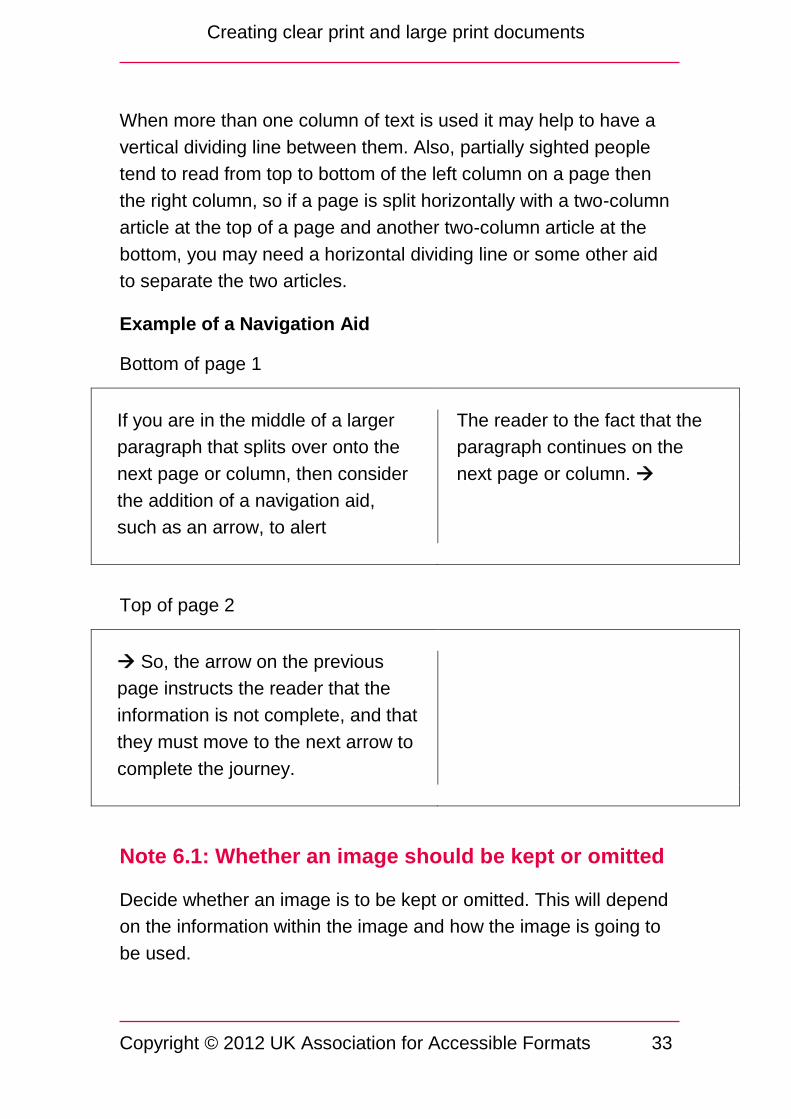
19 Consider adding navigation aids, for example where the
reader should look for a diagram. These could be bold and in
square brackets [Note 5.19].
6. Make images and diagrams accessible
1 Consider whether an image conveys relevant information, or
would be better omitted altogether [Note 6.1].
2 Consider if an image needs to be modified or simplified. This
includes ensuring sufficient colour contrast [Note 6.2].
3 If an image is to be included, add a text description / caption
conveying essential information [Note 6.3].
4 If modifying an image, ensure the information in the original
version is conveyed in the modified version, even if the format
is changed slightly. For example, if a graph is too large to
present in the same way as the standard print version, you
may need to redesign the layout. If so, be sure you have
correctly interpreted the original information [Note 6.4].
5 Consider solidifying objects using colour or greyscale. Line
drawings of objects can be very difficult to interpret. Fill
objects in such images to 'solidify' them [Note 6.5].

Creating clear print and large print documents
Copyright © 2012 UK Association for Accessible Formats
15
6 When modifying images, diagrams and tables, consider the
appropriate orientation and / or using larger paper [Note 6.6].
7 Ensure text labels printed on diagrams are horizontal, the text
size and typeface are as stipulated for the rest of the
document, and the labels do not overprint other information
[Note 6.7].
7. Consider using templates
1 Consider using templates for frequently required formats as
this will make transcription quicker, more accurate, and more
consistent [Note 7].
8. Check the document
1 Check the document layout has been accurately reinterpreted
from the original, and ensure the content matches the original.
9. Use appropriate binding and packaging
1 Bind the document so that it lies flat, has adequate margins,
and the binding does not interfere with the text. (See guideline
5.14 for explanation).
2 If your binding includes a cover, ensure this is non-glossy to
avoid glare.
3 Label the package clearly, and in the same size text as used
in the document.
4 If required by the client, clearly mark who the package is from.
5 Make sure the package can be opened safely and easily by
someone who cannot necessarily see what they are doing.

Creating clear print and large print documents
Copyright © 2012 UK Association for Accessible Formats
16
10. Get the document there in good time
1 Ensure the document arrives with the user at the same time
as sighted users receive their copy or by a pre-determined
deadline agreed with the customer, and to give ample
opportunity to take any action required.
Notes
These notes add additional detail to the corresponding guidance in
the previous section.
Note 1: User needs and preferences
People’s vision varies greatly. Reading vision is affected by a wide
range of factors including:
Acuity (ability to see detail)
Visual field (for example someone with tunnel vision might only
be able to see a few letters at a time. This affects reading speed
and makes it impossible to scan read, but they might have good
acuity. Someone with loss of central vision such as macular
degeneration will not be able to see detail)
Contrast sensitivity (so that faint text may be impossible to see)
Light sensitivity (many people need good light but others see
better in dimmer light, and many people are sensitive to glare)
Colour vision (some people cannot differentiate some colours)
Different sight conditions have different effects, and the effect of a
particular sight condition will vary from person to person. Any one
person may have more than one sight condition.
Legibility is therefore affected not just by the text size, but also by
contrast, typeface, line and letter spacing, and paper colour. It is
also affected by the person’s circumstances, for example the

Creating clear print and large print documents
Copyright © 2012 UK Association for Accessible Formats
17
lighting conditions when they are reading, or their state of health
on the day. Someone may be able to read a short item in a
particular text size, but may need larger text for sustained reading,
or to use an alternative medium such as audio.
Note 2: Do not enlarge text with a photocopier
This creates several problems for the reader. An A3 document is
unwieldy to read, carry and store, and this may be particularly
difficult for someone who gets very close to the page to read. It
may be unacceptable because it makes the reader stand out, for
example within a school class. If the text is faint or of poor quality,
this is likely to get worse when enlarged in a copier, as are
graphics and images. Any design features that are difficult for
someone with sight problems to read such as italics are not
resolved.
It may be acceptable under certain circumstances to enlarge with a
photocopier, for example from A5 to A4, but in this case you
should check the document still complies with the clear and large
print guidelines.
Having said that, A3 can be suitable in some situations, see ‘paper
size and orientation’ at Note 3.8.
Note 3.1: Text size
A given numerical text size such as 12 or 14 point will vary from
typeface to typeface. For example Arial 14 point appears larger
than Times New Roman 14 point. So although point sizes are used
for convenience, they are not precise. A more precise measure is
x-height, which is the height of the letter x in the given typeface.
The recommended x-height for 12 point is 2 mm, for 14 point it is

Creating clear print and large print documents
Copyright © 2012 UK Association for Accessible Formats
18
2.3 mm, for 16 point 2.8 mm, and for 18 point approximately
2.9 mm.
In general UKAAF recommends 12 point as the minimum with
14 point recommended for generally accessible documents, and
16 point minimum and 18 point preferred as the default for large
print. 24 point is sometimes known as giant print.
However many people will need larger text, and one option is to
produce documents in a range such as 14, 18 and 24 point which
will meet many people’s needs, although some will need larger text
than this.
A few people with sight problems prefer smaller print than 14 point.
For example someone with tunnel vision who only sees a few
letters at a time but who has good acuity may be slowed down by
larger print.
You may wish to consider including a note offering the opportunity
for people to request a different text size.
Note 3.2: Italics, underlining and blocks of capitals
Italics reduce the clarity of text as they distort the standard letter
form readers are used to seeing and affect the spacing between
letters. Underlining also affects the standard letter form and
overtypes descenders. Blocks of capitals can be hard to read as all
letters are the same height, removing the visual cues provided by
letters with descenders (y, g) or ascenders (k, h), although a few
words in capitals are acceptable, for example in a heading. In
general, bold text is preferred as a method of emphasizing text.
If the user requires ordinary body text to be bold, an alternative
method will have to be used for emphasis. Possibilities include:
quotation marks; a larger text size; capitals; or even italics. Italics

Creating clear print and large print documents
Copyright © 2012 UK Association for Accessible Formats
19
and blocks of capitals are inaccessible to some users, so these
should be agreed with the user.
Example of the effect of italics, capitals and bold text:
Italics reduce the clarity of text as they distort the standard letter
form readers are used to seeing and affect the spacing between
letters. Underlining also affects the standard letter form and
overtypes descenders. BLOCKS OF CAPITALS CAN BE HARD
TO READ AS ALL LETTERS ARE THE SAME HEIGHT,
REMOVING THE VISUAL CUES PROVIDED BY LETTERS
WITH DESCENDERS (y, g) OR ASCENDERS (k, h), although a
few words in capitals are acceptable, for example in a heading. In
general, bold text is preferred as a method of emphasizing
text. If the user requires ordinary body text to be bold, an
alternative method will have to be used for emphasis. Possibilities
include: quotation marks; a larger text size; capitals; or even
italics. Italics and blocks of capitals are inaccessible to some
users, so these should be agreed with the user.
Note 3.3: Typeface
Use a legible typeface
Some people will see everything as blurred, or have difficulty in
distinguishing fine detail. It will therefore be easier to read a
document that has a clear uncluttered typeface, and preferably one
in which different letters are clearly distinguishable. Many people
express a preference for either a sans serif typeface or a serif
typeface. However there is no definitive evidence as to whether
serif or sans serif typefaces are easier to read for most people, and
some evidence that it makes no difference. Examples of legible
typefaces include Arial, Verdana, Trebuchet, Times New Roman.

Creating clear print and large print documents
Copyright © 2012 UK Association for Accessible Formats
20
An example of a difficult typeface is Monotype Corsiva. Some
typefaces have inaccessible forms, for example Arial comes in a
light version which is not accessible.
Example of different font styles:
This is typed in Arial.
This is typed in Verdana.
This is typed in Trebuchet.
This is typed in Times New Roman.
This is typed in Monotype Corsiva.
Use a font commonly available on computers
When choosing a font, try to use one that is available on most
computers. For example, a font that came with your computer is
more likely to be commonly available than one installed or
downloaded separately. If you have used a font that is not
available on the computer being used to print your document,
another font will be used as a substitute. As you have no control
over the substitute font, it may not have a legible typeface. Using a
commonly available font such as Arial means that this situation is
unlikely to arise.
Note 3.4: Small print, subscript and superscript
When transcribing a document into large or clear print, you are
doing so to a set point size, for example 18 point. If we assume
that a reader requires this size of text because anything smaller
will be inaccessible, it follows that all of the text must be at least
18 point. Therefore, any ‘small print’ must be increased to match
the remainder of the document. Ensure that subscript and
superscript text is also set to 18 point.

Creating clear print and large print documents
Copyright © 2012 UK Association for Accessible Formats
21
If it is important to keep the relationship of larger and smaller point
sizes, for example in chemical formulae, ensure that the smallest
size matches that of the document as a whole.
Example:
No Yes
Superscript 18th September 18th September
Intersection1 Intersection (note 1)
Subscript CO2 CO2
Note 3.5: Contrast
Creating documents and images which contain high contrast
between text and background will make documents more
accessible.
Reversing out type (white on dark background) is preferred by
some readers as it also reduces paper glare. When doing this,
use a dark background colour with a bold font as white text can
appear smaller; or if badly printed the darker ink may start to fill
in the white. The text size may also need to be increased to
compensate for this.
Avoid placing text directly over an image or patterned
background as the contrast will vary and the shapes of the
letters may appear distorted.
When using colour with text:
use a plain coloured background if using text against colour
use high contrast between text and background colour

Creating clear print and large print documents
Copyright © 2012 UK Association for Accessible Formats
22
using a paper colour with a coloured tint of 10% – 15%, such as
a pale yellow, can help reduce paper glare which some people
find uncomfortable
avoid using similar colours together, for example red and
orange, or green and turquoise, particularly if they are similar in
brightness as they will not be easy to distinguish
avoid placing achromatic colours (black, white, grey) against
colours of similar lightness or darkness, for example dark grey
against black
avoid placing pastel colours against white or grey
avoid placing dark colours together or against black
avoid placing light colours together or against white
use complementary colours together with care, for example
orange with blue, red with green, or purple with yellow, as they
can cause a jarring effect if they are too similar in tone
Note 3.6: Colour differentiation
Some blind and partially sighted people have difficulty
distinguishing colours of similar contrast or similar tone such as
dark blue and black. In addition many people have colour vision
deficiency, where they find specific colours difficult to distinguish.
Colour vision deficiency
Colour vision deficiency, also known as ‘colour blindness’, can be
present from birth (congenital), affecting about eight per cent of
men and one per cent of women, or can be acquired in later life.
The most common type of colour vision deficiency is genetic red-
green colour vision deficiency. Most people who have this type of
deficiency are unable to distinguish between red and green in dim

Creating clear print and large print documents
Copyright © 2012 UK Association for Accessible Formats
23
light, and a small percentage have difficulty doing this even in
brighter light.
Rods and cones
Rods and cones are the light receptors in the back of the eye. It is
the cones that respond to colour. There are three different kinds of
cone, reacting to short, medium and long wavelengths of light.
These correspond to the red, green and blue areas of the visible
colour spectrum. The absence of sensitivity, or an altered
sensitivity, in any of the cones will result in confusion between
some colours. Some people have little, or no ability to see colour at
all.
People with genetic variations are more likely to be able to
distinguish yellow as a colour than red or green. People with
acquired colour vision deficiency (brought about by injury, age or
by developing an eye condition) are less likely to be able to
distinguish yellow.
Simple guidance
There are no set rules to ensure that anyone with colour vision
deficiency will be able to distinguish the full range of colour in any
publications, but following some simple guidelines can minimise
the difficulties:
ensure there is a good contrast between text and background
avoid combining red and green
avoid combining yellow and blue
avoid combining colours of similar tone such as dark blue and
black.

Creating clear print and large print documents
Copyright © 2012 UK Association for Accessible Formats
24
Note 3.8: Paper size and orientation
In general A4 portrait is preferred for standard documents.
However some layouts may be clearer on larger paper or in
landscape orientation. For example, using larger paper or a
different orientation may make it possible to include the full width of
a table, more columns of a spreadsheet, a whole diagram, or a
complete map. The greater ease of comprehension this gives may
outweigh the general unwieldiness of larger paper.
Note 4.2: Printing text size on the cover
Many people do not know what size a specific piece of text is, so
cannot tell you their preferred text size. It is very helpful to both the
user and yourself if the text size of your document is stated on the
cover, to provide a starting point for any discussion. If you are
printing a document without being sure what the user needs, one
option is to state the text size along with a statement that if they
require larger text or a different medium they can request it.
Note 5.1: Layout
Page layout is important to partially sighted people because it can
help them to find their way around a document in an easy and
logical way. This can be achieved by using type and images in a
consistent way and by using a grid on which to place these
elements.
Grids are an invisible set of lines that are used as guides to place
type or images in a consistent way throughout a document. These
are set when you first create a document but can usually be
changed later. These guides can include: margins (the distance of
text columns from the edges of the page and from the spine); text
Creating clear print and large print documents
Copyright © 2012 UK Association for Accessible Formats
25
column depth; gutter width (space between text columns); position
of page numbers; and placing of headers or footers.
Not all elements have to be aligned to the top line on a grid, for
example a chapter heading may appear lower down the page. This
is acceptable providing the chapter heading always appears in the
same place in each chapter so the reader knows where to look
for it.
Page numbers, headers and footers may appear to the left on a
left hand page and to the right on a right hand page, providing they
are used consistently throughout the document.
Note 5.2: Text and heading alignment
In general text and headings should be left aligned. This assists a
reader with a restricted visual field to locate the beginning of the
line easily. Unlike full justification, it also ensures that word and
character spacing is consistent. Full justification can lead to large
spaces between words which may be mistaken for the end of a
line, and conversely text may be crammed.
It can be acceptable to centre headings where they are used in a
consistent way, such as chapter titles or main headings on a new
page, although this should be designed with care.
On some short printed materials it is conventional to centre text,
such as invitations or menus, and most partially sighted people will
be able to cope with a small amount of text in these circumstances.
If headings are to be centred, wider headings that take up nearly
the full width of a column for each line will make it easier to find the
start of each new line. Short headings will make this more difficult.
Therefore it is important to check throughout the whole document
that headings are sufficiently long enough to make reading them
Creating clear print and large print documents
Copyright © 2012 UK Association for Accessible Formats
26
as easy as possible. If there are too many short headings it will
make it difficult to navigate the document and it may be necessary
to left align all of the headings.
It is important that the use of headings is consistent throughout a
document to make navigation as easy as possible. For example,
by using the same typeface in the same colour, size and weight for
similar kinds of information, and by having the same amount of
space above and below the heading. There should also be a
distinct visual difference between the different heading levels.
Note 5.5: Separating text and images
Placing text over images should usually be avoided, as there is
normally insufficient contrast between the text and background for
the text to be legible.
However, placing text over an image can be acceptable providing
there is sufficient contrast for the text to maintain legibility. For
example, placing dark text over an even tone on a photograph,
such as a very light blue sky may be acceptable, or placing white
text over a very dark night sky.
Making text larger and / or a heavier weight will help maximise
contrast between text and background.
It should be taken into account that text placed over an image may
not be noticed by some partially sighted people, as they may not
expect to find text there.
Note 5.6: Splitting items of information
It is important that items of information are not split across lines of
text as it disrupts reading flow. For example, splitting telephone

Creating clear print and large print documents
Copyright © 2012 UK Association for Accessible Formats
27
numbers or website addresses across lines of text may make them
difficult to read or to remember.
This is especially important for someone who is partially sighted
and may be using some kind of magnification to read.
Information that includes a combined symbol and word should also
be kept together, for example £10.00, 50 per cent, 80 mm,
3 million, 2 x magnification. Hyphenated words should be kept
intact whenever possible. Ideally people’s forename and surname
should also be kept together.
Automatic hyphenation should be avoided as it adds hyphens
throughout the text to allow more words per line, but reduces
reading flow by splitting words.
Note 5.7: Line, word and letter spacing
Leading and line spacing
Leading is the vertical distance between two lines of text measured
from the baselines of the text.
Reducing leading can make text appear to merge between two
lines, or at worst cause letters from different lines to touch or cross,
making letter recognition difficult.
Some programs refer to leading as line spacing.
Word and letter spacing
People read words by recognising whole word shapes rather than
individual letters, but to achieve this it is important that the
individual shapes of letters are easy to distinguish.
Reducing the space between letters or words, or changing the
proportion of letters (by horizontal scaling) is often used to fit more

Creating clear print and large print documents
Copyright © 2012 UK Association for Accessible Formats
28
words to a line, but this can make letters run visually into each
other, thereby reducing legibility.
It is also important to keep consistent spacing between letters and
words as this helps with word shape recognition.
Text should be left aligned and not justified. Justification works by
altering the space between letters and between words to fit words
exactly to a column width.
Increasing leading can help with letter shape recognition and
improve reading speed.
However too much space between lines, words or characters can
also make reading harder.
Note 5.8: Indenting
In general indentation should be avoided for the same reason as
left alignment is preferable – avoiding indentation makes it easier
to find the beginning of the line. Instead, paragraphs can be
differentiated by putting a blank line between them. However in
some circumstances indentation can assist navigation by imposing
a visual pattern on the page. For example a hanging indent in a
bulleted or numbered list may make it easier to locate each item in
the list. Staggered indents may assist in identifying the main points
and sub-paragraphs.
Note 5.11: Page breaks, widows and orphans
Widow
A line at the end of a paragraph that sits at the start of the next
page or column. This results in the end of the paragraph being
separate from the rest of the text.

Creating clear print and large print documents
Copyright © 2012 UK Association for Accessible Formats
29
Example of a Widowed line
This is the text of the paragraph in
question which ends a little way
after the actual end of the page or
column. The line (or part of the line)
that sits on the next page or column
is the ‘Widow’.
This is the text of the following
paragraph.
Orphan
A line at the beginning of a paragraph that sits by itself at the end
of a page or column.
Example of an Orphan line
This is the text of the previous
paragraph which ends a little way
before the actual end of the page or
column.
This is the ‘Orphan’ line as it sits
on the previous page or
column. This is the remainder
of the text of the following
paragraph.
Note 5.13: Columns and optimum line length for text
It is impossible to give a specific optimum line length for
reading text.
Some research suggests that using between 47 and 75 characters
per line is a satisfactory line length, and 66 characters, including
spaces, is the ideal. More recent research suggests that longer line
lengths increase reading speed as there are fewer distractions,
Creating clear print and large print documents
Copyright © 2012 UK Association for Accessible Formats
30
with some suggesting that between 72 and 96 characters per line
(even up to 110 characters), is faster to read, even though readers
in this research said they preferred shorter line lengths. Very short
line lengths can increase eyestrain as time taken to read forwards
and time taken to scan backwards to find the next line become
shorter.
It must be noted that most recent research has been carried out on
screen use rather than printed material use, and on fully sighted
readers. Many partially sighted people hold the page quite close to
their eyes, reducing the number of characters they can read
without moving their head or the paper. Therefore, longer line
lengths may not necessarily be as easy for partially sighted people
to read as fully sighted people, so for now the results of this new
research remain ambiguous.
However, the shape of the letters, the size and weight, letter
spacing, word spacing and contrast can all affect reading speed
and reading comfort.
Note 5.17: Contents list
The original document may not have a contents list, but the longer
length of the large print copy can make one helpful for the user to
find their way around.
The contents list could have original page equivalents as well as
the page numbers of the new large print document.

Creating clear print and large print documents
Copyright © 2012 UK Association for Accessible Formats
31
Example of a contents list
Chapter 1………....
Chapter 2………....
Contents
Large print
page number
15……………….......
35……………………
Original text
page number
..9
27
This is particularly helpful if the user needs to view the text at the
same time as sighted companions.
The original text page number is inserted in the large print version
in the appropriate place, while the large print page number
appears in the footer.
Note 5.19: Navigational aids
Navigational aids are used to tell a reader what kind of information
they are looking at, for example how big or bold a heading is will
indicate the kind of information that follows. Symbols such as
arrows or triangles can be used to indicate if text continues over a
page, or is continued from a previous page; or a square can be
used to indicate that an article has finished. The specific symbol
used is not as important as its consistent use.
Consistent use of type is important. Similar kinds of information
should be presented in the same way. For instance a hierarchy of
headings (A heading, B heading; or heading 1, heading 2 etc. See
example at the end of this paragraph) will help the reader to know
what kind of information they are looking at. There should be
sufficient difference between the heading styles to make them

Creating clear print and large print documents
Copyright © 2012 UK Association for Accessible Formats
32
easy to tell apart. There should also be consistent spacing
between headings and text.
Example of a heading hierarchy
Chapter heading
Heading 1
Heading 2
Heading 3
Text
Aids can also include information such as image captions, which
need to be identifiable as different from headings or text, for
example by placing text in square brackets. These should appear
in the same place in relation to their image each time they are
used.
It may be necessary because of lack of space to separate a
diagram or table from the text it refers to. In this case there should
be an indication in the text of where the relevant image is, and an
indication with the image of where the text is.
In a contents list, if there is text on the left of the page and
numbers on the right, a partially sighted person may have trouble
aligning the information, so it is helpful to join the two elements, for
example with a dotted line.
Creating clear print and large print documents
Copyright © 2012 UK Association for Accessible Formats
33
When more than one column of text is used it may help to have a
vertical dividing line between them. Also, partially sighted people
tend to read from top to bottom of the left column on a page then
the right column, so if a page is split horizontally with a two-column
article at the top of a page and another two-column article at the
bottom, you may need a horizontal dividing line or some other aid
to separate the two articles.
Example of a Navigation Aid
Bottom of page 1
If you are in the middle of a larger
paragraph that splits over onto the
next page or column, then consider
the addition of a navigation aid,
such as an arrow, to alert
The reader to the fact that the
paragraph continues on the
next page or column.
Top of page 2
So, the arrow on the previous
page instructs the reader that the
information is not complete, and that
they must move to the next arrow to
complete the journey.
Note 6.1: Whether an image should be kept or omitted
Decide whether an image is to be kept or omitted. This will depend
on the information within the image and how the image is going to
be used.

Creating clear print and large print documents
Copyright © 2012 UK Association for Accessible Formats
34
If there is useful information within the image; such as how a
concept works, or data which needs to be interpreted, it will be
appropriate to keep the image. Some concepts work best when
presented as diagrams, so it is important that these images are
retained.
If an image is decorative, decide if the image is needed at all.
Images can be used to add interest to a document though they
may take some time to interpret; judge if the image is necessary.
Again this will depend on the context in which the image is going to
be used.
Note 6.2: Image modification
If you decide that the image needs to be kept, evaluate whether it
needs to be modified or simplified to make it easier to read.
To do this, evaluate what the purpose of the image is and what
information it is conveying. It is essential this information is
retained. For diagrams which are very detailed or cluttered you
could remove any unnecessary detail or break the image down into
a series of simpler images.
Images will also need to be checked for:
Good colour contrast: use light colours against dark colours;
and very pale greys against very dark greys to ensure the
image is clear and easy to read
Legible text labels: these will need to follow large print
guidelines: be in a legible font; be in an appropriate text size;
and be printed outside the image or in the clear spaces within it
rather than overprinting detail.

Creating clear print and large print documents
Copyright © 2012 UK Association for Accessible Formats
35
Note 6.3: Image description
Ensure the reader is receiving the same information that a sighted
reader receives. If the image is simple, for example a photograph
of a person, a brief caption stating the person’s name may be
sufficient. Providing a description of an image will help readers
understand what the image is showing and the information it
contains. Assess whether the image is conveying information
which is not given in any accompanying text. This information is
vital to include in the description.
To write an effective description:
Give the image a title: this will quickly tell a reader what the
image is of
Start a description by briefly stating what, and where, the main
features are in an image. The image will be easier to
understand if this information is given in a logical structure
around the diagram.
If necessary, after writing a brief description, give any further
in-depth detail
Follow this by giving any information or data the image is
showing. Take care with educational images used in tests or
assessments to avoid giving away any answers in the
description.
Following this order will mean that the image’s main features will
be described and its information will make sense. Aim for the
description to be as brief and succinct as possible.
Note 6.4: Conveying information from original image
It is vital that a partially sighted reader is provided with the same
information as a sighted reader. Some diagrams; such as pie

Creating clear print and large print documents
Copyright © 2012 UK Association for Accessible Formats
36
charts and graphs could be reformatted and presented as simple
tables instead. Carefully review the information and data provided
in an image and ensure this is maintained in any modification.
Note 6.5: Solidifying images
Some black and white line images can be difficult to interpret as
there is too much white space; for a person using a magnifier it can
be unclear what they are looking at. These images can be adapted
by adding colour. The two sets of images below provide examples
of this. The map shown in images 1 and 2 below is a very good
example of the need to solidify line art – if you didn't know where
those cities were, it would be difficult to spot the sea. Similarly, in
images 3 – 5; although the differing textures in the geographical
image help to differentiate the sea, sky, sand, cliff and grass, it is
far easier if they are also differentiated by solidifying, whether by
colour or greyscale.

Creating clear print and large print documents
Copyright © 2012 UK Association for Accessible Formats
37
Image 1: Map of England and Wales with the motorway
network as a line drawing

Creating clear print and large print documents
Copyright © 2012 UK Association for Accessible Formats
38
Image 2: The same map with the addition of colour
Image 3: Geographical image of coastal features as a line
drawing

Creating clear print and large print documents
Copyright © 2012 UK Association for Accessible Formats
39
Image 4: The same image with greyscale shading
Image 5: The same image with colour shading

Creating clear print and large print documents
Copyright © 2012 UK Association for Accessible Formats
40
Note 6.6: Altering paper orientation and size for
images
If any images need enlarging consider altering the page
orientation. For example, an image on a portrait layout that is wider
than it is tall may be enlarged effectively if placed on a landscape
layout instead, and similarly an image that is taller than it is wide
can be enlarged by placing on a portrait layout rather than
landscape. A larger page size such as A3 can also be used to give
more room. Use A3 with care; as it can be physically awkward to
handle and can take up a lot of space.
Note 6.7: Image text labels
Ensure any labels are presented horizontally, as this will be easier
to read. Using rotated text means that the end user will have to
rotate the page in order to read it. This makes reading the image
challenging and awkward.
Any text labels must also match the size of any accompanying text
to ensure they are legible. Text must be printed on a clear
background, with good colour contrast. Avoid placing text directly
over an image as this can distort the letter shapes, making any
labels difficult to read. Any lines pointing from the label to the
relevant part of the image must stand out clearly.
Note 7: Templates and Styles
Templates and Styles are invaluable for supporting consistent look
and feel, and efficient production of documents in alternative
formats. Different software programs may use different
terminology, but essentially using a template with built in styles
supports efficient, accurate and consistent transcription. For

Creating clear print and large print documents
Copyright © 2012 UK Association for Accessible Formats
41
example, if styles are used, modifying the size, spacing and font
style of a specific level of heading only requires one style definition
to be altered. Without styles, the transcriber would need to locate
and alter every heading individually. Similarly, copying text from a
document based on one template into a document based on
another template automatically updates the formatting. For
example if body text was Arial 12 and heading text Arial 16 in the
first document, copying the text to a document based on a
template with body text set to Arial 18 bold and heading text Arial
24 bold would automatically increase the text sizes and bold the
text.

Creating clear print and large print documents
Copyright © 2012 UK Association for Accessible Formats
42
Glossary
A3 paper
A size of paper, 420 mm x 297 mm (16.5 inches x 11.7 inches).
(Dimensions of the A series paper sizes, as defined by ISO 216.)
See ISO.
A4 paper
A size of paper, 297 mm x 210 mm (11.7 inches x 8.3 inches).
(Dimensions of the A series paper sizes, as defined by ISO 216.)
See ISO.
CCTV
See Video magnifier.
Font
A complete set of characters in a particular size and style of type.
For example, Arial Bold 12 point is a different font to Arial Bold
14 point, although they both belong to the same typeface. See
Point size and Typeface.
GSM
Weight of paper in grams per square metre (gsm). Typical
photocopier paper is 80 gsm; letterhead paper can be up to
120 gsm; a typical postcard is 300 gsm.
Gutter
The gap separating columns of text.

Creating clear print and large print documents
Copyright © 2012 UK Association for Accessible Formats
43
ISO
International Organization for Standardization.
Kerning
Adjusting the horizontal space between pairs of letters to create
visually equal spacing throughout the text, aiding the eye to move
smoothly. This is especially necessary with pairs of letters that
have overlapping space such as AV, WA, LY, Wa or Vo.
Kerning is usually applied to all text automatically to a set of
pre-determined values, but some programs allow manual kerning
to make fine adjustments.
Kerning is often necessary with larger text sizes and headings
where inter-letter spacing becomes more obvious.
Leading / line spacing
The amount of vertical space between the baselines of two lines of
text. Programs apply leading automatically based on the point size
of the text, but most programs allow manual leading to make fine
adjustments. For example 12 point text could be given 3 point
leading giving an overall leading of 15 point. This is expressed as
12/15 point. See Point size
Closer leading fits more text on the page, but decreases legibility.
Looser leading can increase legibility. Leading can also be
negative, where the lines of text are so close that they overlap or
touch.

Creating clear print and large print documents
Copyright © 2012 UK Association for Accessible Formats
44
Letter spacing / tracking
Adjusting the average distance between letters in a whole word,
single line or block of text to give control over line length. See
Word spacing
Low Vision Aids (LVAs)
Aids that someone partially sighted may use to make things easier
to see. A typical example is a hand held magnifying glass used to
enlarge detail.
Navigation
How easy it is to find your way around a document. Titles and
section headings; table of contents and page numbering can all be
used to assist document navigation.
Navigation aids
Instructions added to the original document, often in bold text in
square brackets; or symbols such as arrows. These either direct
readers to specific sections or elements in a document, such as
graphs or tables; or they indicate where text runs over a page.
Paper orientation
Landscape
The aspect of paper when the horizontal dimension is greater than
the vertical. For example, for A4 size paper, the height is 210 mm
and the width 297 mm.

Creating clear print and large print documents
Copyright © 2012 UK Association for Accessible Formats
45
Portrait
The aspect of paper when the vertical dimension is greater than
the horizontal. For example, for A4 size paper the height is
297 mm and the width 210 mm.
Point size
The height of a typeface. There are 72 points to the inch, so one
point is 1/72 of an inch high (0.3527 mm). However, type sizes are
not standard, that is, one size in a particular typeface is not
necessarily the same size as the same point size in another
typeface; for example, 14 point Arial appears larger than 14 point
Times New Roman.
Serif / sans serif
Serifs are the small flourishes at the ends of characters in some
typefaces. Sans serif typefaces omit the small flourishes (see
example below). Popular sans serif typefaces include Helvetica,
Avant Garde, Arial, and Geneva. Serif typefaces include Times
Roman, Courier, New Century Schoolbook, and Palatino.
E E serif sans serif
Subscript
Characters or symbols written next to and slightly below a letter or
number. For example, in
H2O

Creating clear print and large print documents
Copyright © 2012 UK Association for Accessible Formats
46
the subscript is '2'.
Superscript
Characters or symbols written next to and slightly above a letter or
number. For example, in
3rd
the superscript is 'rd'.
Table cell
A table cell is one grouping within a table. Cells are grouped
horizontally (rows of cells) and vertically (columns of cells).
Typeface
A set of fonts of the same family design. For example, Arial is a
typeface, but Arial Bold 12 point is a font. See Font.
Video magnifier (sometimes known as a CCTV)
An electronic magnifier, usually used to enlarge close work
although distance models also exist. A camera is focused on the
item to be enlarged, and an enlarged image is displayed on
screen. Typically the user places a page on a sliding tray
underneath a camera, and a magnified image of the paper is
displayed on a monitor. It is usually possible to adjust
magnification level and contrast, including reversing the colours to
white on black. Hand held video magnifiers also exist, with a small
inbuilt screen.
Creating clear print and large print documents
Copyright © 2012 UK Association for Accessible Formats
47
Word spacing
Adjusting the average distance between words to give control over
line length.
Further resources
Accessible information
Pages on RNIB’s website designed to help people understand a
little more about making information accessible, provide key
information to get people started, and to signpost additional
resources to help people achieve the goal of ensuring any
information they create is as accessible as possible.
http://www.rnib.org.uk/professionals/accessibleinformation/Pages/a
ccessible_information.aspx
See it Right book
The See it Right book gives organisations the tools they need to
improve their policies and procedures in terms of information
provision.
http://www.rnib.org.uk/professionals/accessibleinformation/Pages/s
ee_it_right.aspx
Well Prepared book
A guide to modifying examination and assessment materials for
blind and partially sighted learners.
http://www.rnib.org.uk/shop/Pages/ProductDetails.aspx?productID
=ED51601

Creating clear print and large print documents
Copyright © 2012 UK Association for Accessible Formats
48
Where to get further help
UKAAF assists businesses and organisations by advising how to
meet the needs of customers and clients with print disabilities;
providing guidance on how to source and provide quality
accessible formats like large print, audio, braille, electronic file
formats and Easy Read; and helping you to understand your
responsibilities as a service provider.
Through our website and magazine, members will also gain
access to:
findings from public consultations and end-user research
research and innovation in accessible formats
information on suppliers of transcription services
guidance and advice on standards for accessible formats
opportunities to review and help to develop standards and
guidance.
In addition to supporting service providers and transcribers,
UKAAF also represents people with print disabilities. We believe
that because format quality matters, end-users should have
genuine input into the development of standards for accessible
information. By collecting and sharing users’ views with service
providers and transcribers we can help them to deliver a quality
service which meets users' needs.
UKAAF has a User Advisory Group (UAG) so we can include blind
and partially sighted people and others with print disabilities in
ongoing research and consultation on key accessible format
issues.

Creating clear print and large print documents
Copyright © 2012 UK Association for Accessible Formats
49
There are many benefits of being a member of UKAAF, not least to
demonstrate your commitment to quality accessible formats. For
more information visit us at www.ukaaf.org.
Your feedback is welcome
We would welcome your views on this guidance, any suggestions
for additions, or case studies of how this guidance has helped you.
You might like to share your experience in an article in our
magazine 'Format Matters'.
You can phone, email or write to us - our details are at the back, or
use the feedback form on our website www.ukaaf.org.
If you find UKAAF's guidance valuable, please encourage others to
join by visiting our website.

Creating clear print and large print documents
Copyright © 2012 UK Association for Accessible Formats
50
Appendix 1 Large print guidance for educational materials
Introduction
These notes are for use as a guide to the optimal large print
modification of educational materials.
Please read the ‘Detailed guidance on the production of clear and
large print’ section in conjunction with this appendix, which
provides additional guidance for the modification of educational
materials, and may also be helpful for other complex documents.
It is a legal requirement that students with a visual impairment
have access to modified versions of materials that their peers are
given, and that these modified materials are supplied at the same
time as those received by their peers.
Access to educational materials
There are of course a number of ways for students to access
materials, such as the use of large print, magnifiers, CCTVs, audio,
one to one support providing access and so on. The decision as to
how each lesson or text will be made accessible lies with Qualified
Teachers of the Visually Impaired (QTVI) and other appropriate
professionals.
Short lead times for modification are often a reality, and the
modifier will have to decide on the optimal method of modifying
materials or otherwise making them accessible within the available
time.
From primary school onwards, but more so as the student gets
older, students should be exposed to and taught strategies for

Creating clear print and large print documents
Copyright © 2012 UK Association for Accessible Formats
51
accessing materials which are not modified or not optimally
modified. This skill is needed, for example, so that students can
access reference material in libraries using an LVA (magnifier).
The use of these skills should not be seen as negating the
requirement to provide the majority of materials in a suitably
modified format.
The balance between learning to access non-modified materials,
using optimally modified materials, and the time available to
provide these has to be achieved by QTVIs, modifiers and other
professionals.
The modification process
Educational materials should be adapted into large print by a
suitably experienced person. Both text and graphics need to be
appropriately modified.
It helps to have a reasonable understanding of the subject of the
material being adapted, as well as its intended educational
purpose and technique.
The modifier needs to know how the student is going to answer
any questions in an exercise. For example will they be writing on
the material; is their handwriting very large; will they be answering
on a laptop; would a laptop have the correct characters for
answering a maths question; and so on. Younger pupils may need
to be prompted as to how and where to answer questions if it is not
apparent.
It helps to know when adapting material, particularly with younger
students, whether a support worker will be present or not when the
item is used.

Creating clear print and large print documents
Copyright © 2012 UK Association for Accessible Formats
52
It is important to know the purpose of the material within a lesson.
For example, it may occasionally be acceptable or desirable to
take information out of a table format and put it into a list format -
but what if the teacher is studying the table format in that lesson?
Equally it may be desirable to colour the rivers on a map, but that
may be an activity in the lesson.
Minimising volume
Large print users have to carry around large volumes of adapted
materials, and so all of the considerations in this guidance must be
balanced against minimising the final volume of the adapted
resource. Intelligent compromises should be made in consultation
with the student.
As a consequence of this, duplex (two-sided) printing should be
used where possible. However, when a student has to write on the
material, such as in an exam paper, single sided printing should be
used in order to avoid felt tips etc. soaking through and obscuring
content on the reverse of the sheet.
Public exams
Public exams are currently produced in a limited range of large
print formats and there are restrictions on the early opening of
exam papers for further modification. It is important to check what
formats are available and to make sure that appropriate
arrangements are in place for a student to access these
successfully. Gaining practice with past papers is an important part
of exam preparation.

Creating clear print and large print documents
Copyright © 2012 UK Association for Accessible Formats
53
Guidelines for the optimal large print modification of
educational materials
Assessing the student
Even with well adapted content, it is often the case that large print
users have a considerable degree of difficulty accessing materials.
The results of this can be:
It will take longer for the student to read the material than their
peers
They can become fatigued
They can become stressed.
Consequently it helps if each student is individually assessed and
the optimum font, point size, line spacing and letter spacing
established.
It is also necessary to establish what colour vision the student has
in order to establish which colours can be used to aid navigation
and structure.
Always aim to minimise the effort the student must put in to access
educational materials.
Layout and navigation
A modern text book will often contain, over two facing pages, many
text panels and graphics. These panels are often colour coded, or
use different type styles and layout, in order to help the student
navigate and comprehend the nature and structure of different
sections of information on the page. The student can scan,
comprehend, and move around the pages quickly and easily.

Creating clear print and large print documents
Copyright © 2012 UK Association for Accessible Formats
54
For the partially sighted student however, this information can be
spread over ten or even twenty pages, making it much more
difficult to navigate, and forcing them to jump back and forward in
the text.
Consequently it helps to review the content of the pages, and:
Add navigation comments (in a consistent typeface or box
distinct from the main text). These comments guide the student
to items, which though adjacent in the original, may be several
pages apart in the large print material.
If necessary re-order the material to make it more
comprehensible when read in a linear fashion. Do not, however,
re-structure material in such a way that it cannot be followed
along with other students in the class if this is likely to be a
requirement of the lesson.
Repeat some items, such as a necessary equation, on each
page.
Carefully consider what information to best fit and include on
each pair of facing pages.
Developing suitable styles for the student
Just as standard text books often use different styles to structure
the content, the use of styles will help the large print user.
Two facing pages in a physics text book may use six or seven
distinct type styles, background colours or boxes to structure
information. If this is turned into fifteen pages of identical
20 point Arial paragraphs in the adapted version, it can become
impossible to access.

Creating clear print and large print documents
Copyright © 2012 UK Association for Accessible Formats
55
It therefore helps to sit down with the student and identify a range
of distinct paragraph styles which can be used to structure the text.
Styles can include:
A standard, default paragraph style for the main text of the
book. If possible this should be a plain font so that bold and
italic can be used to highlight individual or groups of words.
Note - italic fonts can be inaccessible to many users. In
consultation with the user, a few italic words may be used, only
very rarely will a student be comfortable with whole paragraphs
in italic. However, some students require bold as their default
typeface.
A range of bulleted styles, of varying indent, possibly using a
range of colours for the bullets
A range of indents
A range of fonts
Plain and bold paragraphs
A range of paragraph numbering and lettering styles
A range of coloured boxes around paragraphs
Combinations of bullets and boxes can be used.
Keep the number of styles to a minimum, whilst still having
sufficient range to structure the text.
When using boxes around text, establish a suitable margin
between text and box.
Developing a template for the student
For each student, a suitable template of styles for the software in
use can be created. If this is done, the modification of materials
Creating clear print and large print documents
Copyright © 2012 UK Association for Accessible Formats
56
can be carried out much more quickly than manually altering each
paragraph.
Although the use of 'styles' for formatting text may not be familiar, it
is worth learning how to use this technique in your software, as the
savings in time, and improvements in quality for the student can be
substantial.
It is desirable that a common range of style names is established
and used for all student templates.
Thus you may for example, in every student's template, have the
following styles:
Default text 1, Default text 2, Heading 1, Heading 2, Heading 3,
Caption, Indent 1, Indent 2, Indent 3, Hanging 1, Hanging 2,
Hanging indented 1, Hanging indented 2, Page number, Boxed 1,
Boxed 2, Bulleted boxed, No paragraph gap.
Although each student will have their own type styles for each of
these names, each template will have the same 'set' of style
names.
The consequence of this is that if student A has a set of paragraph
styles based around 24 point, and student B around 16 point, a
24 point version of the book can be used, the 16 point template
applied, and because the style names are the same, the book will
be automatically converted to 16 point with all the correct styles in
place for the 16 point user. This saves a great deal of time.
Using this procedure, it is of course still necessary to go through
the new 16 point version, adjusting page breaks, the position of
graphics (though if correctly formatted originally they will at least
'follow' the paragraph they were 'attached' to in the 24 point
version), navigation cues etc.

Creating clear print and large print documents
Copyright © 2012 UK Association for Accessible Formats
57
Page numbering
The page numbering of the original text should be included.
For example, this can be included in square brackets within the
text, in bold [Page 78]. This technique can be appropriate for large
amounts of prose such as novels.
However, if the student will need to find page numbers quickly in a
text book using a range of paragraph styles, then consider using a
particular style for the page numbers, put them on their own line,
and perhaps have a blank line above and below. Sometimes, in
agreement with the student, these numbers can be in colour. In
general avoid coloured text, but putting blank lines above and
below, and a flash of colour, can help the student quickly find a
page number in a long text. Also consider writing the word 'Page'
before the number, as this gives a larger target for the student to
find, for example:
Here is the final sentence of page six in the book, which ends here.
Page 7
Here is the first line of page seven in the book.
As the original standard print may cover several sheets in the large
print version, it helps to place page numbers at the beginning of
the text from that page, rather than at the end, as in the example
above.
Left hand navigation
Where possible text should be left aligned. However, a title can be
centred without causing major accessibility issues.

Creating clear print and large print documents
Copyright © 2012 UK Association for Accessible Formats
58
Graphics
Graphics should be suitably adapted and inserted in the text or
presented separately, as appropriate.

Creating clear print and large print documents
Copyright © 2012 UK Association for Accessible Formats
59
Appendix 2 Modified Stave Notation
Please read the ‘Detailed guidance on the production of clear and
large print’ section in conjunction with this appendix, which is
additional and is specific to the transcription of music notation.
Find out what size music notation the user can read. Remember
that the text size may need to differ from the default stave size of
the notation. Find out how the user will use the score: in hand for
choral, on piano stand, on free-standing music stand, pinned to
wall.
Different users and different types of score will need different
modifications: thickened stave lines and / or (de)crescendo
hairpins, larger articulation marks, different size text etc.
Unless the user specifies otherwise:
Use appropriate paper: A4 is the maximum size for hand-held
choral music. Large stave widths (18mm and above) for double
stave music, as in piano music, will probably need A3 paper
and landscape orientation. Some users find coloured paper
easier to read.
Use a minimum stave depth of 14 mm
Use a minimum text size of 18 point bold for expression marks,
lyrics, fingering, chord symbols
Use a sans serif typeface, such as Arial, for all text including
expression markings and dynamics: do not use Opus text
Be consistent in placement: all fingering above treble stave and
below bass stave; chord marks above stave; all lyrics below
stave
Omit abbreviation dots and page numbers; bar numbers /
rehearsal marks will usually be sufficient

Creating clear print and large print documents
Copyright © 2012 UK Association for Accessible Formats
60
Compress bars and increase number of bars per line to remove
unnecessary spacing between notes
Where possible, create page breaks at rests in the music.
Glossary for Modified Stave Notation
Articulation marks
The dots, small lines and other such small marks close to the
noteheads used to indicate staccato, tenuto or accented playing of
the notes.
Hairpins
The angled lines used to indicate crescendo and decrescendo.
Modified Stave Notation (MSN)
A term given to describe music in large print. MSN enlarges the
music generally and makes a score more consistent, but it also
alters the proportions involved. The spacing of notes is adjusted
and other features such as articulations and expression marks may
be disproportionately enlarged.
Opus text
A font used in music characterised by elaborate curlicues. It is
generally used for expression marks such as f or p.
The stave or staff
The horizontal grouping of five lines on which the notes are written.

Creating clear print and large print documents
Copyright © 2012 UK Association for Accessible Formats
61
Image 1: Example of Modified Stave Notation

Creating clear print and large print documents
Copyright © 2012 UK Association for Accessible Formats
62
Document reference information
Citation guidance
Creating clear print and large print
documents: Guidance from UKAAF (2012)
UK Association for Accessible Formats. Ref:
G003
Document title Creating clear print and large print
documents: Guidance from UKAAF
Publisher
UK Association for Accessible Formats
(UKAAF)
Document ref G003
Version number 1.0
Publication date June 2012
Document purpose Good practice guidance for transcribers
Primary contributors
UKAAF large print subject group and Sarah
Morley Wilkins
Board approval June 2012
Acknowledgements
With thanks to all our reviewers for their
valuable comments
Superseded
documents
N/A
Template version 1.0

Creating clear print and large print documents
Copyright © 2012 UK Association for Accessible Formats
63
Notes
UK Association for Accessible Formats (UKAAF)
Contact details
UKAAF
PO Box 127
Cwmbrân
NP44 9BQ
Tel: 0845 60 85223
Fax: 0845 60 85224
Email: [email protected]
Web: www.ukaaf.org
Registered address
UKAAF
c/o Pia
Victoria Street
Cwmbrân
NP44 3YT
President: Lord Low of Dalston CBE
Registered charity number: 1126966
Registered as a company in England and Wales number: 6748900