For Keepnig YourA udeni ce - NOAA Office for … · For Keepnig YourA udeni ce . A. wake, A. lert,...
80
Cathy Angell, Coordinator - Coastal Training Program - Padilla Bay Reserve –Washington State 15 Strategies For Keeping Your Audience Awake, Alert, and Inter-Active!
For Keepnig YourA udeni ce - NOAA Office for … · For Keepnig YourA udeni ce . A. wake, A. lert, and Inter-A. ctive! ... The purpose of this program was to display presentations
Cathy Angell, Coordinator - Coastal Training Program - Padilla Bay Reserve – Washington State
15 Strategies For Keeping Your Audience
Awake, Alert, and Inter-Active!
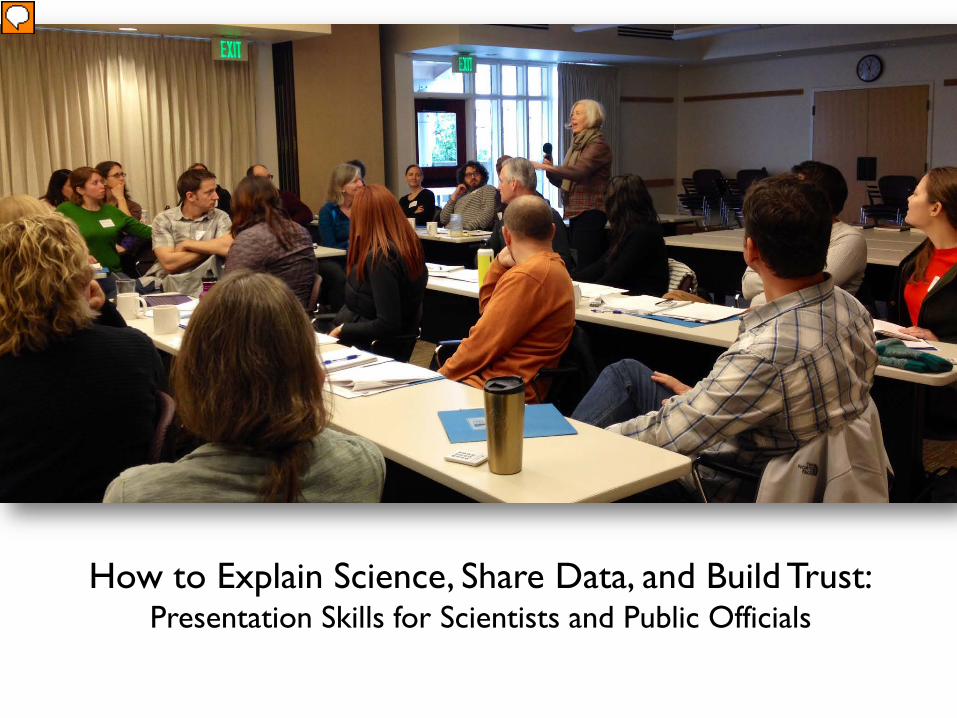
How to Explain Science, Share Data, and Build Trust:Presentation Skills for Scientists and Public Officials
Presenter
Presentation Notes
I teach a 2-day class in Washington State called How to Explain Science, Share Data, and Build Trust: Presentation Skills for Scientists and Public Officials. This session features some of the best practices that I teach in this class – particularly on the topic of creating better PowerPoints.
Presenter
Presentation Notes
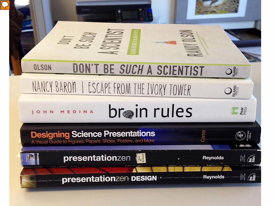
I pulled these best practices from a myriad of books and combined them with my own personal experience.
Polling QuestionWhere do you present the most?
1 2 3 4 5 6
0% 0% 0%0%0%0%
1. Public Meetings2. Conferences3. Staff Meetings4. Trainings/Education
Programs5. Meetings with Elected
Officials6. I never give presentations
Polling Question:How comfortable are you with giving presentations?
1 2 3
0% 0%0%
1. Very comfortable (“I love it!”)
2. Somewhat comfortable (“I’ll do it if I have to.”)
3. Not comfortable (“Please don’t make me.”)
There are simple strategies that will help ANYONE become a better and more confident presenter.
Presenter
Presentation Notes
But, first, a little history lesson….
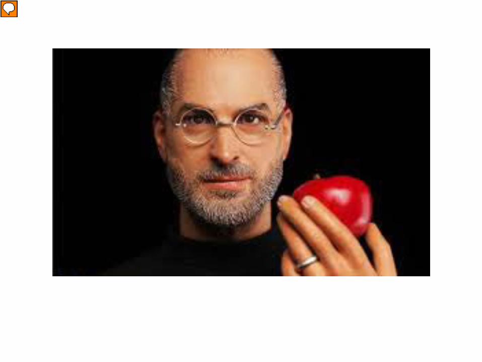
Once upon a time….
Presenter
Presentation Notes
Once upon a time, a company called Apple released a software program named The Presenter.
Presenter
Presentation Notes
The purpose of this program was to display presentations on a Mac. It was cool and visually elegant.
Later that year, the application was sold to Microsoft, and the world hasn’t been the same since.
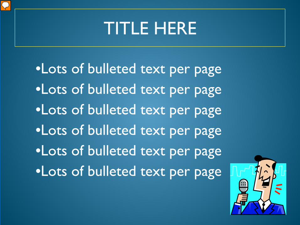
TITLE HERE
•Lots of bulleted text per page•Lots of bulleted text per page•Lots of bulleted text per page•Lots of bulleted text per page•Lots of bulleted text per page•Lots of bulleted text per page
Presenter
Presentation Notes
They brought us the concept of templates – with sound, bulleted text – and clip art.
Death By PowerPoint
Presenter
Presentation Notes
We’ve learned a new term called “Death by PowerPoint”. Many people feel that PowerPoint has been a failure because it’s not being used in the way that it was originally envisioned.
Presenter
Presentation Notes
But with all that said, PowerPoint has become the global standard and used by businesses, schools, government agencies, and other institutions.
IMHO.
Presenter
Presentation Notes
In my humble opinion, I believe that PowerPoint presentations are often more about the presenter and the slides, and less about the learner.
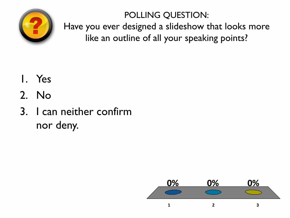
POLLING QUESTION:Have you ever designed a slideshow that looks more
like an outline of all your speaking points?
1 2 3
0% 0%0%
1. Yes2. No3. I can neither confirm
nor deny.
Presenter
Presentation Notes
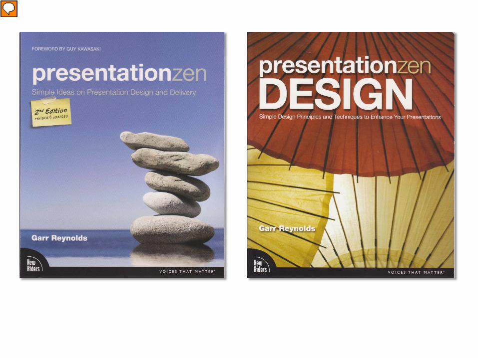
One of my favorite gurus is Garr Reynolds. He used to work for Apple and now gives presentation workshops all over the world.
Presenter
Presentation Notes
He wrote two books called Presentation Zen and Presentation Zen Design in which he applies Zen principles to giving presentations.
Every. Important. Thing.
Presenter
Presentation Notes
He talks about how we often feel that we need to put every important thing on our slides.
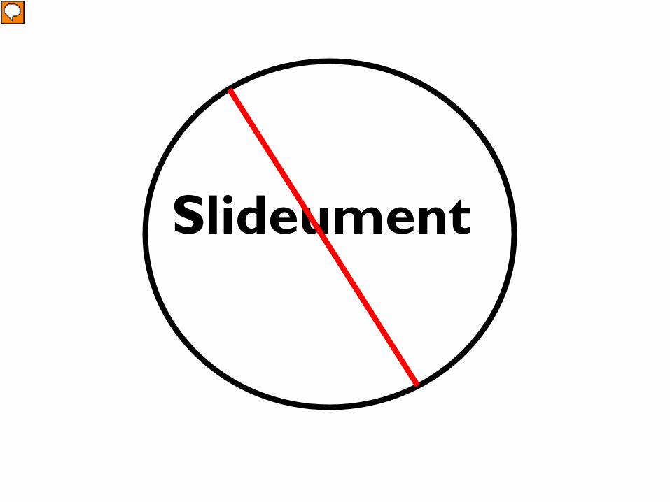
Slideument
Presenter
Presentation Notes
He calls this type of slide a “slideument”. It’s not a slide and it’s not a document.
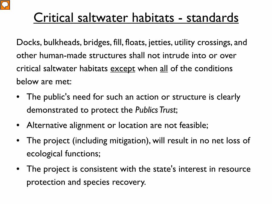
Critical saltwater habitats - standards
Docks, bulkheads, bridges, fill, floats, jetties, utility crossings, and other human-made structures shall not intrude into or over critical saltwater habitats except when all of the conditions below are met:
• The public's need for such an action or structure is clearly demonstrated to protect the Publics Trust;
• Alternative alignment or location are not feasible;
• The project (including mitigation), will result in no net loss of ecological functions;
• The project is consistent with the state's interest in resource protection and species recovery.
Presenter
Presentation Notes
Slideument
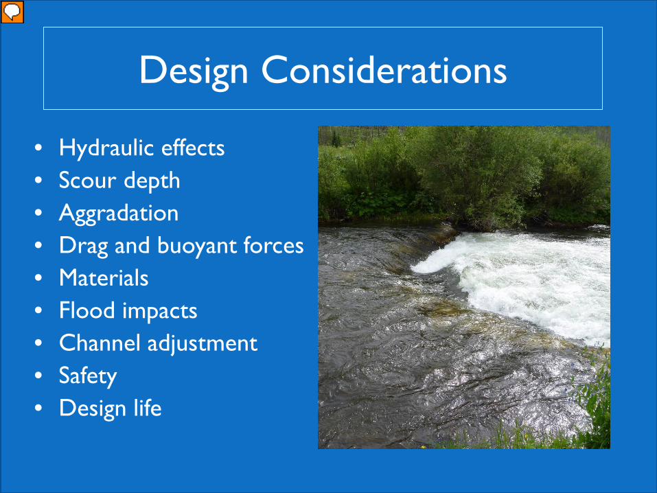
Design Considerations
• Hydraulic effects• Scour depth• Aggradation• Drag and buoyant forces• Materials• Flood impacts• Channel adjustment• Safety• Design life
Presenter
Presentation Notes
slideument
Example Issue Areas:
Presenter
Presentation Notes
Slideument.
Presenter
Presentation Notes
Slideument.
Risk and Uncertainty
• Risk to habitat• Risk to infrastructure and property
– Hydraulic impacts– Erosion– Infrastructure damage– Factors of safety
• Risk to public safety– Recreation– User groups– Flooding and erosion hazards
• Uncertainty of technique
Bruce Heiner
Presenter
Presentation Notes
Slideument.
The Truth about Text
Presenter
Presentation Notes
Research has shown that people have a very hard time listening to the presenter and reading a lot of text on the slide.
BP #1
Presenter
Presentation Notes
Best Practice #1: focus on one concept per slide.
Bruce Heiner
How do we deal with risk and uncertainty?
Presenter
Presentation Notes
Once concept.
27 27
Pore Linings
Presenter
Presentation Notes
Once concept.
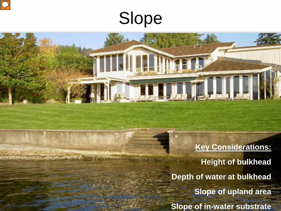
Slope
Key Considerations:
Height of bulkhead
Depth of water at bulkhead
Slope of upland area
Slope of in-water substrate
Presenter
Presentation Notes
Once concept.
Presenter
Presentation Notes
Your audience should not look at your slide and know everything you’re going to say…. Your slides should compliment what you’re saying but should never stand alone. That’s why YOU’RE there.
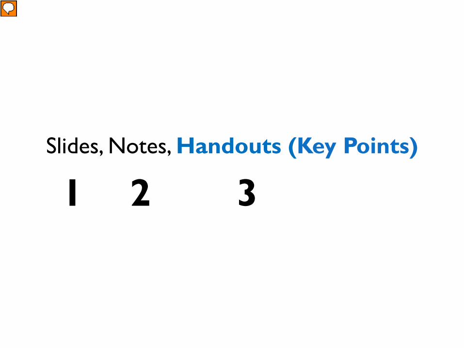
Slides, Notes, Handouts (Key Points)
1 2 3
Presenter
Presentation Notes
Garr Reynolds suggests that the solution is to use: slides, notes for yourself, and handouts of key points for your students. It’s best to use simple slides while you focus on the narrative and telling stories. Then put the critical detailed information on handouts.
“Key Point” Handouts will set you free.BP #2
Presenter
Presentation Notes
Best Practice #2 – Using handouts of your KEY POINTS will free up your creativity and satisfy your need to leave the attendees with critical information.
Slide Design
Simplicity
BP #3
Presenter
Presentation Notes
One of the important principles of slide design is simplicity. A simple clear message and lots of white space. Why is white space important? It helps get rid of distractions.
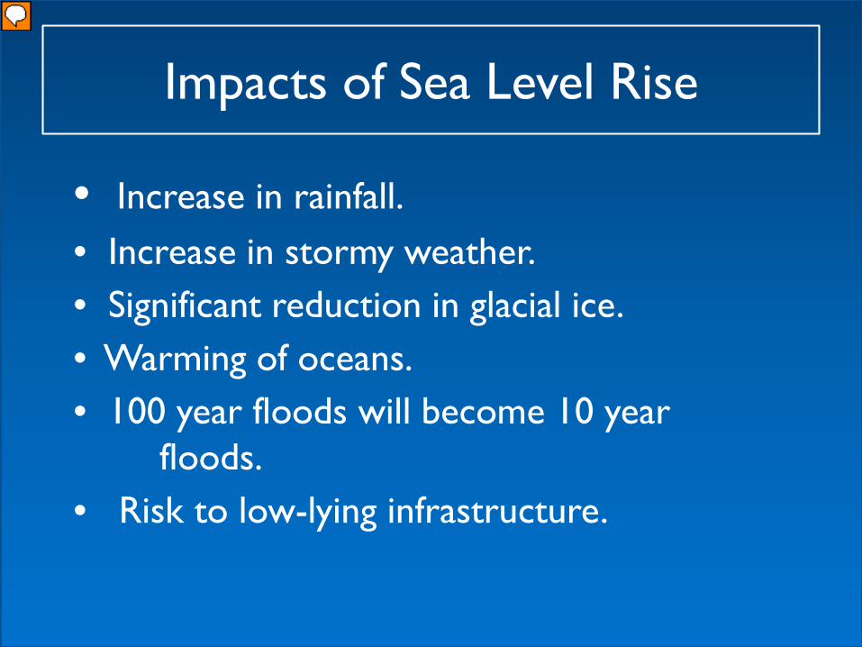
Impacts of Sea Level Rise
• Increase in rainfall.• Increase in stormy weather.• Significant reduction in glacial ice. • Warming of oceans.• 100 year floods will become 10 year
floods. • Risk to low-lying infrastructure.
Presenter
Presentation Notes
Here is an example of a traditional slide.
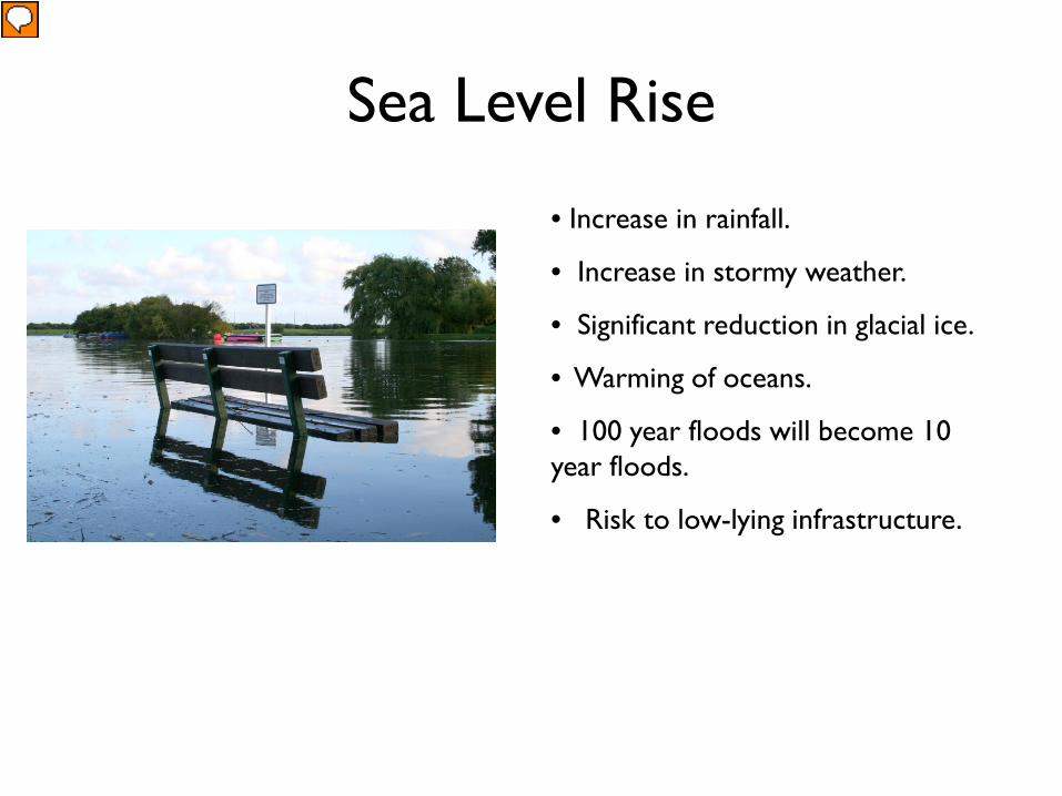
Sea Level Rise
• Increase in rainfall.
• Increase in stormy weather.
• Significant reduction in glacial ice.
• Warming of oceans.
• 100 year floods will become 10 year floods.
• Risk to low-lying infrastructure.
Presenter
Presentation Notes
Adding an image helps. But what has greater impact….this or…..(next slide)…..
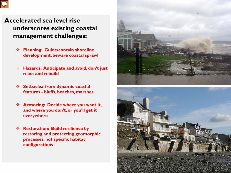
Hazards: Anticipate and avoid, don’t just react and rebuild
Setbacks: from dynamic coastal features - bluffs, beaches, marshes
Armoring: Decide where you want it, and where you don’t, or you’ll get it everywhere
Restoration: Build resilience by restoring and protecting geomorphic processes, not specific habitat configurations
Presenter
Presentation Notes
Tune into how you feel viewing this…..
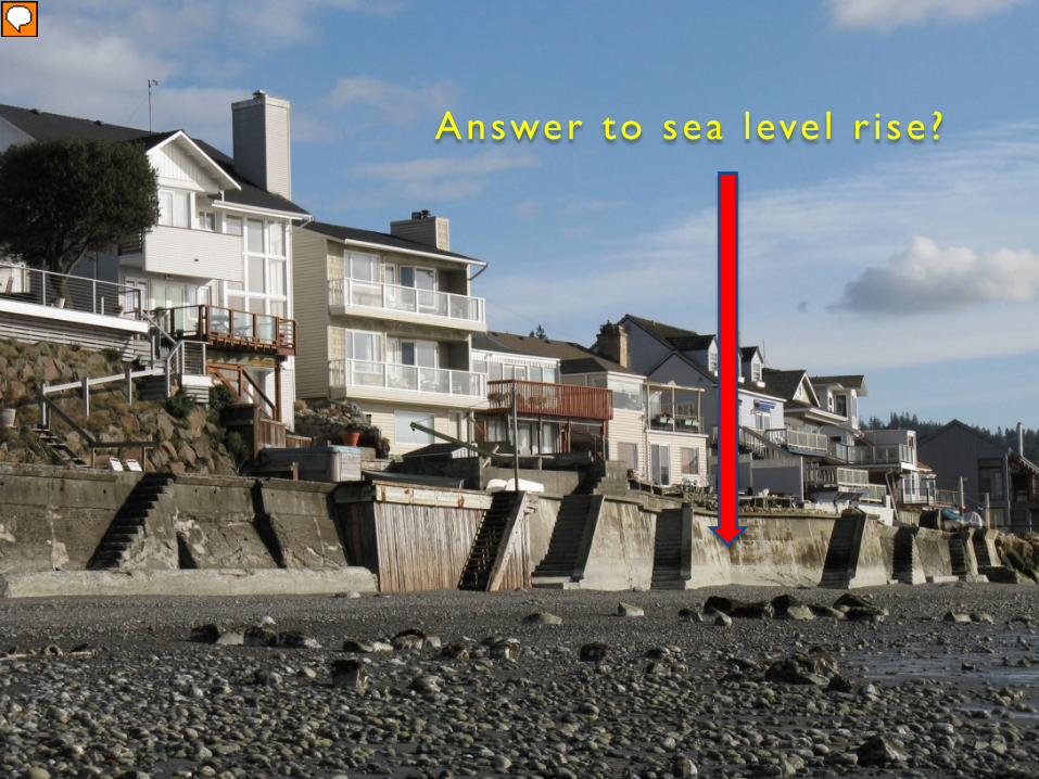
Answer to sea leve l r i se?
Presenter
Presentation Notes
Or this…. Large images are superior way to communicate information. Why is that?
Presenter
Presentation Notes
So…why is that? In Dr. John Medina’s book called, “Brain Rules”, he claims that if you hear something, you’ll only remember 10% in 3 days. When you add a photograph, how much do you think you’ll remember? 65%
Pictures from Hydrant Erosion
Use Large Images.
BP #4
Presenter
Presentation Notes
Best Practice #4 – Use large images.
Tell stories, give examples.
BP #5
Presenter
Presentation Notes
Best practice #5 goes hand in hand with using large images: Tell stories, give examples. Stories also trigger our emotions and help us remember information longer.
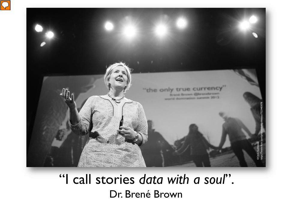
“I call stories data with a soul”. Dr. Brené Brown
Dr. Brene Brown says “I call stories data with a soul”. Stories make information come alive for the people in your audience….
Every environmental issue is connected to human activity.
Presenter
Presentation Notes
We all have stories. Human beings are curious animals and they love to hear stories about people. What types of stories are you able to tell as people who deal with environmental issues?
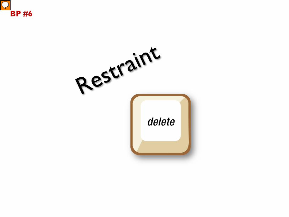
BP #6
Presenter
Presentation Notes
Best practice number 6 is Restraint. What does this mean to you? Our tendency is to put way to share everything we know about a certain topic.
Displaying Data
(Oh, no.)
Ranking Country Area Sq. MilesPopulation Yesterday Yearly Growth Daily Increase Population Today
WORLD 510,072,000 7,122,015,204 1.10% 211,757 7,122,226,961
1. China 9,596,960 1,359,046,612 0.45% 16,503 1,359,063,115
2. India 3,287,590 1,273,608,494 1.34% 46,235 1,273,654,729
3. United States of America 9,826,630 317,325,329 0.54% 4,649 317,329,977
4. Indonesia 1,919,440 247,111,993 1.06% 7,100 247,119,093
5. Brazil 8,511,965 199,898,784 0.86% 4,660 199,903,444
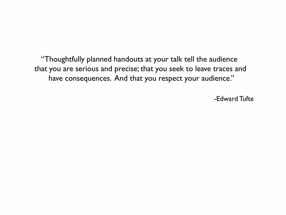
How many of you have seen a presenter put a chart or graph up on the screen and say, “now I know you can’t see this, but….”? Let’s talk about charts (B Key)…lots of info…easy to make comparisons…that important? Make a handout.
“Thoughtfully planned handouts at your talk tell the audience that you are serious and precise; that you seek to leave traces and
have consequences. And that you respect your audience.”
-Edward Tufte
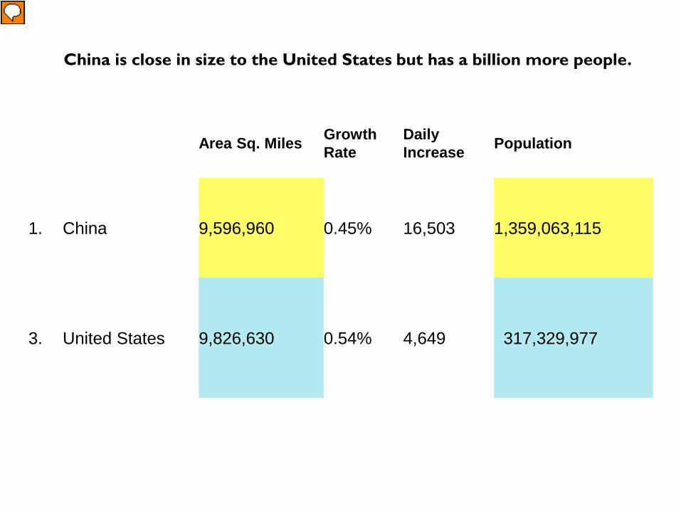
Area Sq. Miles Growth Rate
DailyIncrease Population
1. China 9,596,960 0.45% 16,503 1,359,063,115
3. United States 9,826,630 0.54% 4,649 317,329,977
China is close in size to the United States but has a billion more people.
Presenter
Presentation Notes
The important thing is to figure out what message that you’d like to relay from the data. In this instance, let’s say that we want to show the world’s population and to let people know how fast it’s growing. Here’s one way you could do it….
Japan 94%
South Korea 89%
U.S.A. 34%
France 13%
U.K. 13%
China 5%
We connect to the internet much more slowly.
Presenter
Presentation Notes
….is through simple bar graphs. Rather than use a graph with the X and Y axis and lots of data, make it easy to read with only the information that matches your message. Color the one that you’d like to stand out.
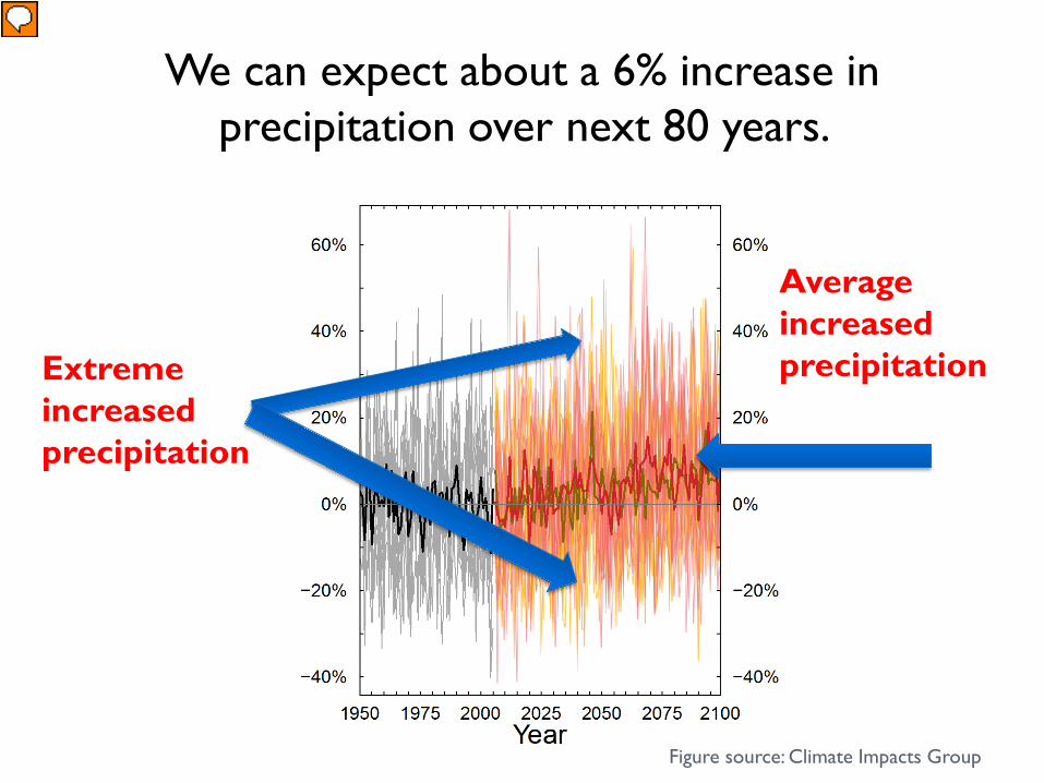
We can expect about a 6% increase inprecipitation over next 80 years.
Average increased precipitationExtreme
increased precipitation
Figure source: Climate Impacts Group
Presenter
Presentation Notes
Use arrows and clear labels with graphs. Make it easy for your audience to interpret the graph. The title is a clear, informative sentence. We can expect up to 20% increase in precipitation over the next 80 years based upon research conducted by the University of Washington Climate Impacts Group
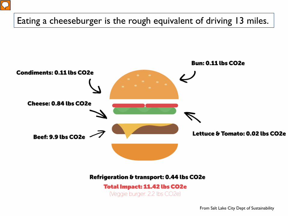
The Hamburger…
From Salt Lake City Dept of Sustainability
Eating a cheeseburger is the rough equivalent of driving 13 miles.
Presenter
Presentation Notes
I borrowed this graphic from the Salt Lake City Department of Sustainability because I thought it was a clever way to talk about how our food choices impact our carbon footprint. Cheeseburger is equivalent to driving roughly 13 miles Veggie burger is equivalent to driving 2.5 miles
Presenter
Presentation Notes
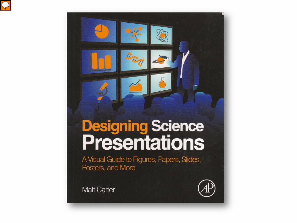
One of my favorite design books is called Designing Science Presentations. It is packed with very detailed information about designing graphs, using colors, creating graphics, so this is a good go-to book for specific instructions. There’s way more information than I have time to share today, but I’ve pulled out a few points to highlight in this class.
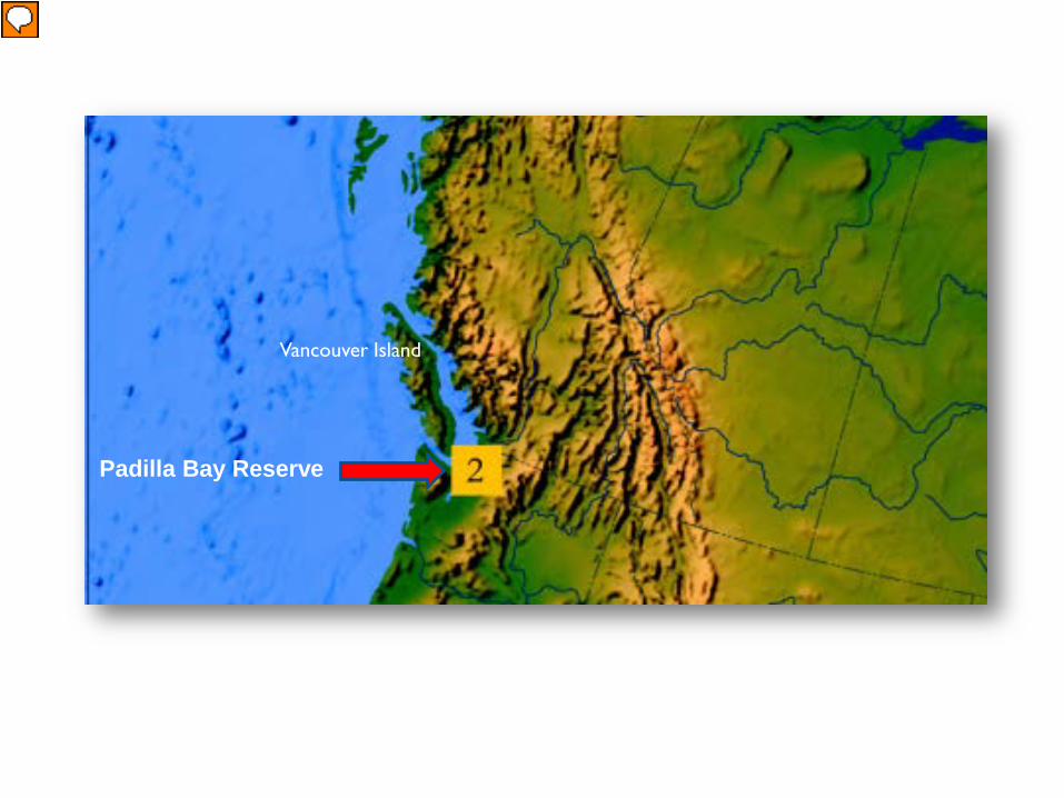
Maps
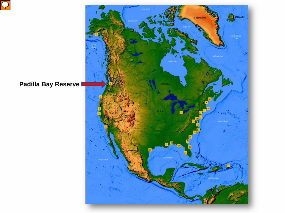
Padilla Bay Reserve
Presenter
Presentation Notes
When designing a map, try to provide your audience with a sense of scale. It’s helpful to show the global scale, before focusing on the small scale.
Padilla Bay Reserve
Vancouver Island
Presenter
Presentation Notes
Add a point of reference.
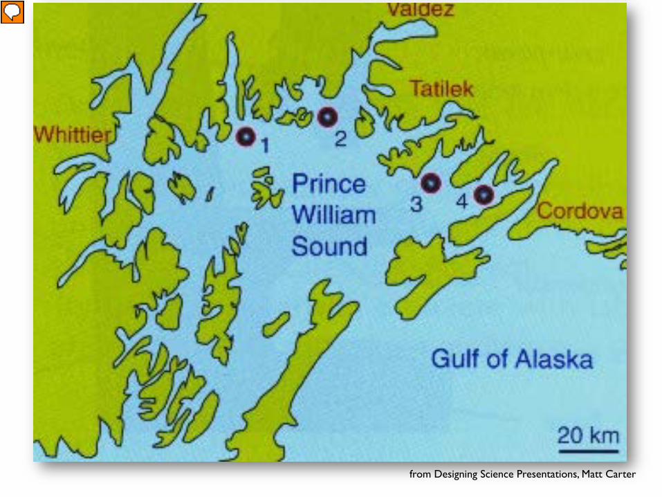
from Designing Science Presentations, Matt Carter
Presenter
Presentation Notes
When designing a map, be sure and show at least one landmark for orientation. This map of Prince William Sound shows the location of sampling sites for a fisheries study. p. 130
Padilla Bay NERR
SamishIsland
Hat Is.
Saddlebag Is.
Presenter
Presentation Notes
This is an aerial shot and not a map, but you can see how things are labeled for points of reference.
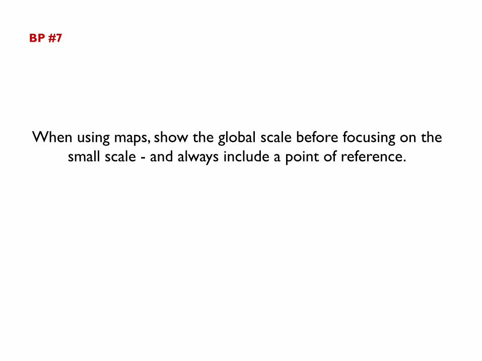
BP #7
When using maps, show the global scale before focusing on the small scale - and always include a point of reference.
Animating Information
Presenter
Presentation Notes
Animating information is a way to highlight data one set at a time.
0
2,000
4,000
6,000
2000 20152005 2010
Num
ber
of F
ish
Years
Herring
Coho Salmon
Rockfish
Demonstration Only
BP #8
Animate datasets on a graph so that each set enters one at a time.
BP #9
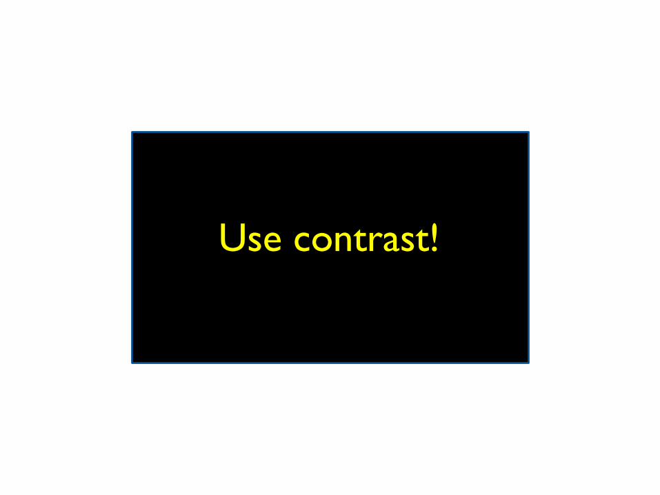
Use contrast!
Presenter
Presentation Notes
Contrasting colors are much easier to see and they also print better in black and white or grayscale.
Use contrast!
Use contrast!
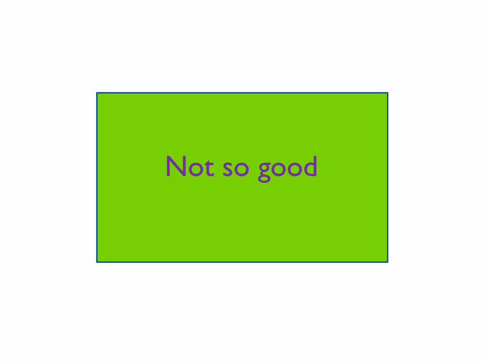
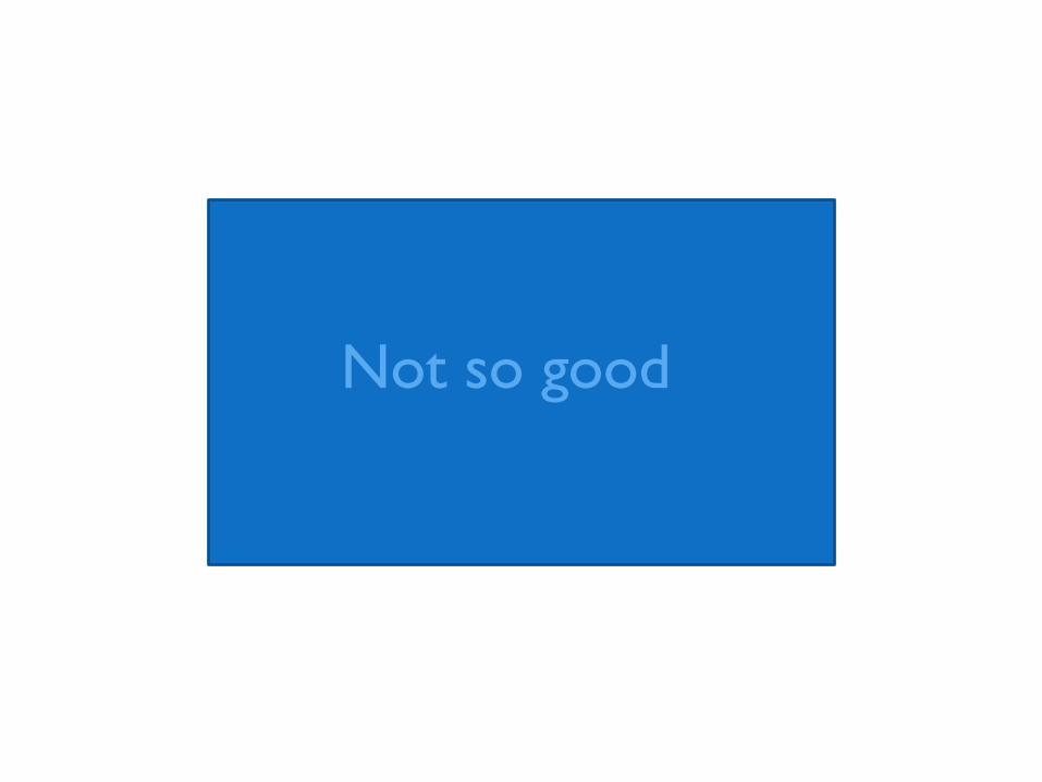
Not so good
Not so good
Not so good
Never this!
Presenter
Presentation Notes
A color blind person could never read this.
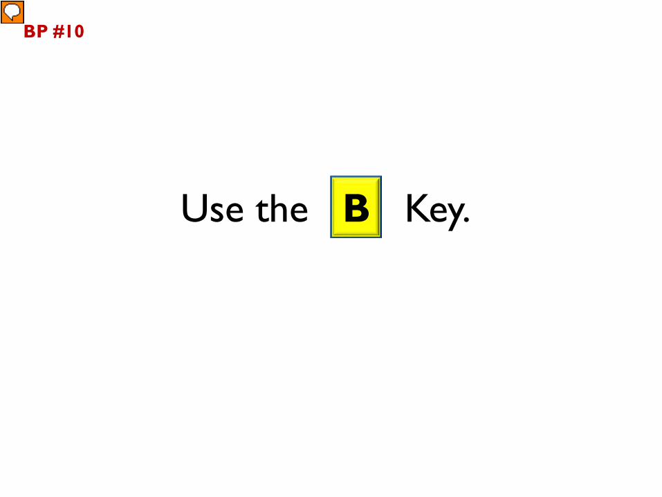
Use the B Key.
BP #10
Presenter
Presentation Notes
Best Practice #10– Use the “B” key on PC’s – to black out the screen during a presentation – hit it again to light up the screen. This does not work on Macs. This is the closest thing I could find – which actually puts the computer to sleep, so it’s not so quick. “You can instantly darken you Mac's screen by pressing ctrl-shift-eject. To turn the brightness back to where it was, press any key or move the mouse.”
BP #11
Interact with your audience.
Presenter
Presentation Notes
Eye contact, use their names, ask questions, keypad polling….
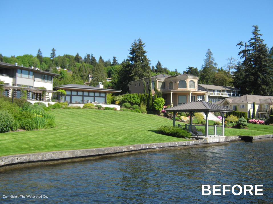
Use “before” and “after” slides to show contrast.
BP #12
BEFOREDan Nickel, The Watershed Co.
AFTERDan Nickel, The Watershed Co.
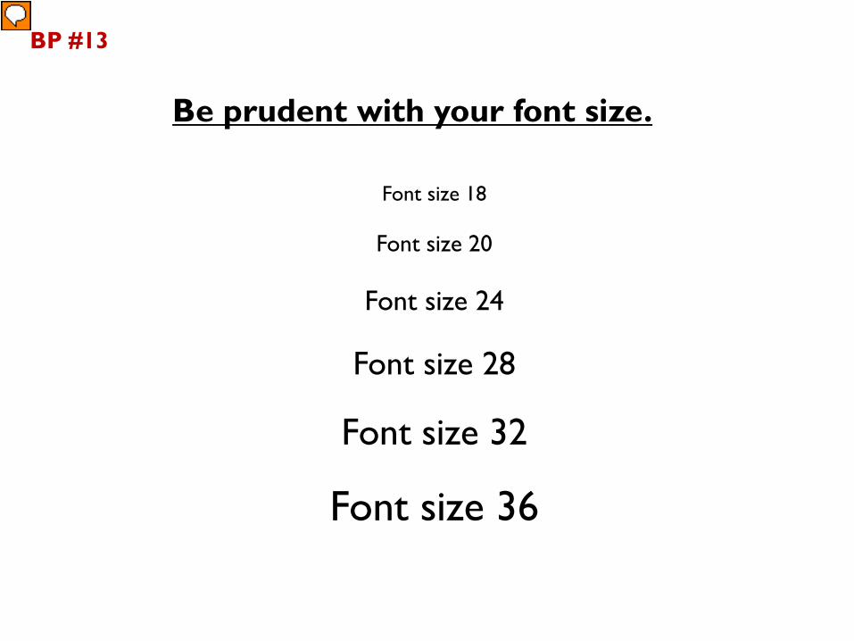
Font size 18
Font size 20
Font size 24
Font size 28
Font size 32
Font size 36
BP #13
Be prudent with your font size.
Presenter
Presentation Notes
Large fonts are harder to read and take up too much space on the slide.
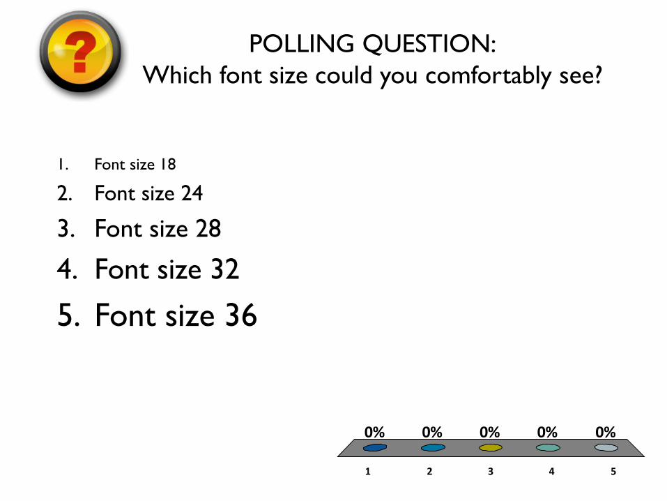
1 2 3 4 5
0% 0% 0%0%0%
POLLING QUESTION:Which font size could you comfortably see?
1. Font size 18
2. Font size 24
3. Font size 28
4. Font size 32
5. Font size 36
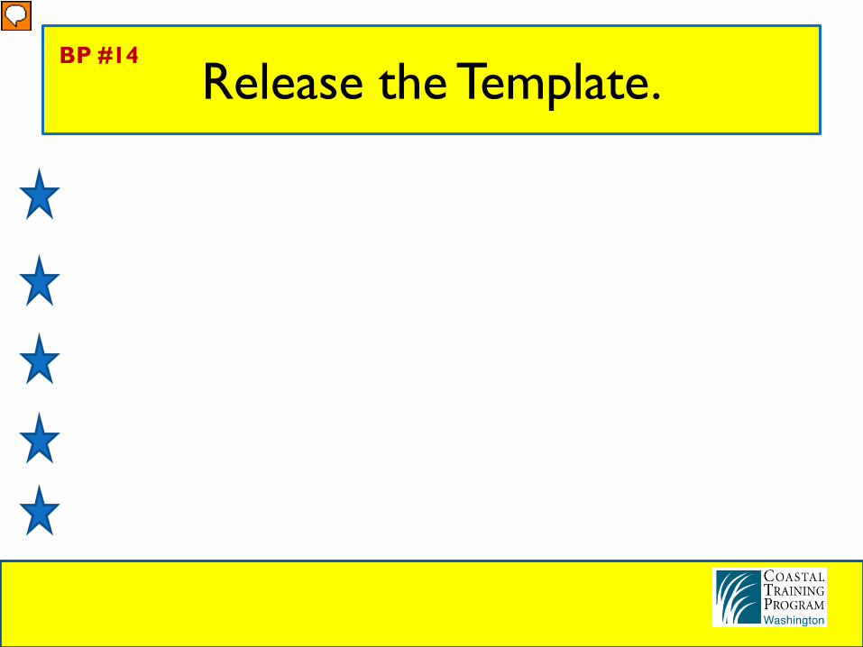
Release the Template.BP #14
Presenter
Presentation Notes
Templates have artwork that takes up valuable space on your slide. If it isn’t relevant to your slide, it shouldn’t be on there. It’s best to start with a completely blank slide. Your logo and agency name can go on the title and ending slide.
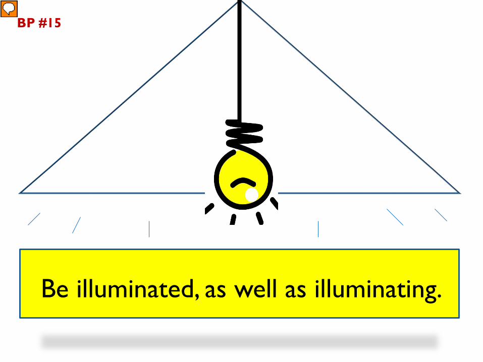
Be illuminated, as well as illuminating.
BP #15
Presenter
Presentation Notes
Students need to see YOU, not just the slides. Test the lighting beforehand to make sure that you are illuminated.