Embed Size (px)
Citation preview


2
First printing: October 2019
Copyright © 2019 by Savannah Barclay. All rights reserved. No part of this book may be used or reproduced in any manner whatsoever without written permission of the publisher, except in the case of brief quotations in articles and reviews. For information write:
Master Books®, P.O. Box 726, Green Forest, AR 72638
Master Books® is a division of the New Leaf Publishing Group, Inc.
ISBN: 978-1-68344-188-5
Library of Congress Number: 2019950266
Unless otherwise noted, Scripture quotations are from the English Standard Version (ESV) of the Bible.
Printed in the United States of America
Please visit our website for other great titles:www.masterbooks.com
Author: Savannah Barclay
Master Books Creative Team:
Editor: Laura Welch
Design: Diana Bogardus
Cover Design: Diana Bogardus
Copy Editors: Judy LewisWillow Meek
Curriculum Review: Kristen Pratt Laura Welch Diana Bogardus
Permission is granted for copies
of reproducible pages from this
text to be made for use within
your own homeschooling family
activities. Material may not be
posted online, distributed digitally,
or made available as a download.
Permission for any other use of
the material must be requested
prior to use by email to the
publisher at [email protected].
Cover photo: @welcometoourcabin on Instagram - Jeana
Interior photos, and illustrations: All images are from shutterstock.com or istockphotos.com, NLPG staff, wikimedia or provided by the author and her family unless otherwise noted. Wikimedia images used under (CC BY-SA 2.0) (CC BY-SA 2.0 DE) (CC BY-SA 2.5) (CC BY-SA 3.0), (CC BY-SA 4.0)
Savannah Barclay is a homeschool graduate, world traveler, artist, writer, and explorer of antique shops. She lives in a rural Minnesota town with her husband, Travis, and their new baby boy, Owen. As the daughter of Master Books author, Angela O’Dell, she spent her childhood exploring and learning in an out-of-the-box style and discovering and developing her artistic ability and skill. This natural and unhurried approach to education is evident in Savannah’s own writing and teaching style.

3
observing lines
observing shapes
observing color
observing value
observing texture
observing form
observing space
9 27 47 67 81 99 121

4
A WORD TO THE TEACHER
The purpose of art is to express our individuality and uniqueness. There are many artistically talented children who have developed their own art style, and I do not want to change their styles to become more like mine. I believe that this is the wrong approach in any art program, because it stifles any artistic imagination on the student’s part.
On the other hand, there are students who have not developed their own styles yet, simply because they do not understand art. This program will teach them about the seven elements of art and the basics of art, and they will know enough about art to experiment with it on their own. I chose these elements because they are the most obvious and the most observable in nature around us and the most common in everyday items (food, building/structures, etc.) That is the beauty of art...it comes in many styles!
I wanted to create a program that would actually be completed. So many art courses I’ve seen are complicated, and I know from experience, that they will get dropped when moms get busy. (My mom shelved quite a few by Christmas in my homeschool years!) When I wrote this course, I was looking at it from the students point of view and wrote what I knew would be interesting and helpful to them. I wanted it to be open-and-go as much as possible and use items that most homeschool families have around most of the time.
When I was a homeschooled student, my mom always stressed the importance of developing observation skills. She always told me that critical thinking ability was rooted in the ability to observe and analyze the world around us. I wanted to build this into this course. Nature is such an amazing way to learn about the artistry of God’s nature, so it seemed natural for me to include a nature study element in the course—which is something I’ve never encountered in another art program. It seems that most programs are humanistic in the sense that they focus on art that man has created. I wanted the students to focus on the art that God has created first, and then learn how to emulate it.
Because most of the course is written to the student, with clear instructions and short and interesting lessons, most students will be able to use it at least mostly independently. However, it is also user-friendly for a mom who has a few children in that age range.
I also want the student to understand that being creative is fun. So many times, young children are afraid of failure. I want to encourage them to experiment and explore without fear of messing something up.

5
A WORD TO THE STUDENT
As your art teacher, I ask only one thing when it comes to art. Do not be afraid to try new things, especially with art. I hope you have fun as you work through this art program and learn a lot about art. I am looking forward to teaching you this school year.
As we get ready to begin, please give your best efforts, and remember to enjoy this course. At the end of the year, you will have a chance to have your own art show. This means displaying your projects for family and friends so they can see and enjoy the hard work you have completed.
When I look at your heavens,
the work of your fingers, the
moon and the stars, which
you have set in place, what is
man that you are mindful of
him, and the son of man that
you care for him? Yet you
have made him a little lower
than the heavenly beings and
crowned him with glory and
honor. Psalm 8:3–5

6
BASIC ART KIT
The basic art kit will be the core part of many activities within this art course. A master supply list and a convenient weekly schedule for the course is included in the associated Student Art Journal. The art journal provides work space for your young artist as well as educational activities and challenges.
� Pencil
� Colored pencils
� Colored fine-tip markers
� Crayons
� Colored chalk
� Mixed media sketchpad, 90 lb. or higher paper weight, 9" x 12", 20 to 40 pages (suitable for wet/dry mediums)
� Erasers
� Pencil sharpener (small, manual type)
� Scissors
� Glue (white school glue is fine)
� Ruler
� Construction paper (variety of colors)
� Portfolio (large folder or envelope style) or large pocket folder
TIPS FOR PREPARING YOUR WORK AREA
Make sure the table or countertop where you will be creating your project is protected with newspaper or a disposable tablecloth. Art mediums such as pastels and watercolors may stain whatever they touch, so make sure you are wearing a protective art frock or “paint-shirt” that you don't mind getting spills on. Always make sure your paintbrushes are clean and dry before starting your project, and, so they are ready for their next use, clean them well with warm water and dry them on a paper towel after each project. It is always a good idea to have a well-organized art supply storage area.

7
SCAVENGER HUNT SUPPLIES
� Water bottle
� Binoculars
� Magnifying glass
� Backpack
� Nature Guides (optional: assorted kinds—trees, plants, birds, etc.)
� Pencils, colored pencils, pens, markers, and crayons
� Artist’s Journal
This symbol indicates where activities and worksheets from the Artist’s
Journal are incorporated into the daily reading or as part of projects. It also contains the course calendar and helpful supply lists.

observing lines
observing lines9
Basic Straight Lines
Thick, Thin, Solid, Broken, and Parallel Lines
Basic Curvy Lines

10observing lines
BASIC STRAIGHT LINES
Welcome, Young Artist, to the first day of Living Art Lessons:
The 7 Elements study. This week we will talk about all of the basic straight lines, the basic curvy lines, and thick, thin, solid, broken, and parallel lines. Learning about lines will help you dig deeper into the seven elements of art. You will be able to observe the different types of lines all around you, in artist’s work, and in nature. Let’s begin this new adventure!
Study the lines shown above, and then answer the questions below orally to your teacher.
Do you see these lines everyday?
Which type of line do you think you see the most?
Which type of line reminds you of the horizon? Hint: take a look at the root word of horizontal. This is how you can remember this specific line.
Week
1
Horizontal: flat, level
Diagonal:slanted, kitty–cornered
Vertical: upright, erect
Three basic straight lines:
See page 19 for related activity page.

observing lines11
BASIC CURVY LINES
Yesterday you learned about the three basic straight lines. Today you will learn about the five basic curvy lines, and like the basic straight lines, curvy lines are everywhere, too.
Study the five basic curvy lines above, and then answer the questions below orally to your teacher.
Do you think that you see these types of lines everyday?
Which type of line looks like the waves in a body of water?
BONUS question: Which type of line would look like stairs if it were diagonal?
Week
1
Five basic curvy lines:
Zigzag: winding, crookedWavy: rippled, squiggly
Looped: spiral, hoop
Curly: ringlet, wavy
Scalloped: an upside down wave
See page 20 for related activity page.

observing shapes27
observing shapes
Very Basic Shapes
Other Shapes
Positive and Negative Shapes

28observing shapes
Week7 VERY BASIC SHAPES
Our adventure continues as we talk and learn about the second element of art, shapes. Previously, you learned all about lines. Did you know that lines make up shapes? They do—think of it as a simple math equation. Look at the example below.
Answer the following questions below orally to your teacher.
Which type of line do you think you see everyday? Do you see all of them?
Lines make shapes. Which type(s) of lines make a triangle?
When you draw the sun, what type of shape do you use? Which type of line(s)?
diagonal lines + horizontal line =
Three very basic shapes:
Circle: round, enclosed Triangle: three–sided Square: horizontal, vertical
This sun is painted with both a circle and triangles.

observing shapes29
Week
7
OTHER SHAPES
Circles, triangles, and squares are not the only shapes we see. Every object has a shape. Look at your hands. The outline of your fingers and palms create the shape of your hand. Have you ever traced your hand onto a piece of paper, and then shown it to someone? They knew immediately that it was your hand that you had traced. They did not have to ask you. How did they know it was a hand and not a foot? They looked at the shape of your drawing and recognized it as a hand shape.
In addition to the very basic shapes, there are MANY other basic shapes, and since there are so many, we will talk about only a few of them. They are heart, diamond, star, oval, rectangle, and octagon. I’m sure you have seen these shapes hundreds of times, and you probably have drawn them too!
DiamondOctagon Star Heart
Rectangle Oval
Other basic shapes:

30observing shapes
Week7
Study the six basic shapes on the previous page and answer the following questions orally to your teacher.
Which shape reminds you of a stop sign? Hint: it has eight sides.
Which shape looks a little bit like a circle? How is this shape different from a circle?
How are rectangles and diamonds different from squares?
How many sides does an octagon have?
Optional shapes for you to learn: a polygon is a shape that has three or more sides. Octagons, pentagons, and hexagons are all polygons. There are a few others as well.
A hexagon has six sides.A pentagon has five sides.
12
35
6
4
12
35
4

observing color47
observing color
Primary, Secondary & Tertiary Colors
Warm & Cool Colors
Complementary Colors
48observing color
Week 13
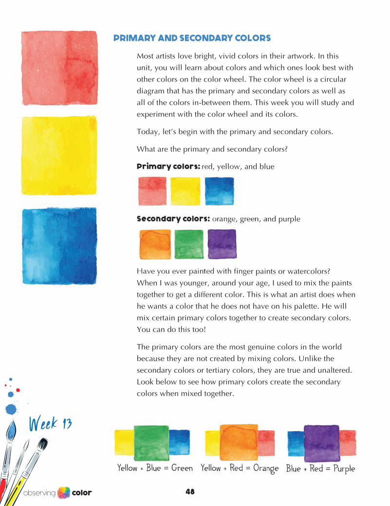
PRIMARY AND SECONDARY COLORS
Most artists love bright, vivid colors in their artwork. In this unit, you will learn about colors and which ones look best with other colors on the color wheel. The color wheel is a circular diagram that has the primary and secondary colors as well as all of the colors in-between them. This week you will study and experiment with the color wheel and its colors.
Today, let’s begin with the primary and secondary colors.
What are the primary and secondary colors?
Primary colors: red, yellow, and blue
Secondary colors: orange, green, and purple
Have you ever painted with finger paints or watercolors? When I was younger, around your age, I used to mix the paints together to get a different color. This is what an artist does when he wants a color that he does not have on his palette. He will mix certain primary colors together to create secondary colors. You can do this too!
The primary colors are the most genuine colors in the world because they are not created by mixing colors. Unlike the secondary colors or tertiary colors, they are true and unaltered. Look below to see how primary colors create the secondary colors when mixed together.
Yellow + Blue = Green Yellow + Red = Orange Blue + Red = Purple
sad
happy
observing color49
Week 13
Primary
Prim
ary
Primary
Seco
ndar
y Se
condar
ySecondary
Blue + Red = Purple
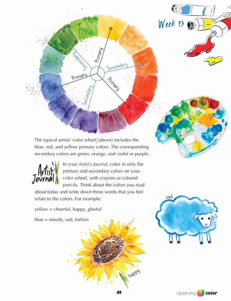
The typical artists’ color wheel (above) includes the blue, red, and yellow primary colors. The corresponding secondary colors are green, orange, and violet or purple.
In your Artist’s Journal, color in only the primary and secondary colors on your color wheel, with crayons or colored pencils. Think about the colors you read
about today and write down three words that you feel relate to the colors. For example:
yellow = cheerful, happy, gleeful
blue = moody, sad, forlorn

50observing color
BASIC TERTIARY COLORS
Yesterday you learned that when you mix certain primary colors together, you will get a secondary color. Did
you know that you can do the same thing when you mix both the primary and secondary
colors together? You can! When you mix these colors together, you create an entirely new and different color scheme called the tertiary (TER-she-airy) colors. These colors are not as bright as the primary and secondary colors; they tend to have a murky, muted appearance, especially if they are compared to the other colors on
the color wheel.
The very basic tertiary colors are: orange-red, yellow-orange, yellow-green, blue-green,
blue-purple, and red-purple.
What if I decided to use colored pencils and mix red and purple together, in that order, and then do it again,
starting with purple and mixing red on top? Do you think both mixed colors would look the same side by side? Think about my question for a minute and explain to your teacher why you think it is either yes or no. The answer to my question is no. Red-purple and purple-red are both tertiary colors that have been mixed differently. You see, there are actually many more tertiary colors than just orange-red, yellow-orange, yellow-green, blue-green, blue-purple, and red-purple.
purple–red
red –purple
Week 13

observing color51
Take a look at these tertiary colors.
Try it yourself! In your Artist’s Journal, mix the primary and secondary colors together to create the tertiary colors on your color wheel that you started in the last lesson, and experiment with the other tertiary colors on page 49 of your Journal.
Remember, the other tertiary colors are just the basic tertiary colors that have been flipped. Tip: When you are first trying to blend colors, use colored pencils. Markers or crayons may not work as well when you are first learning this technique.
orangered
redorange
yellow orange
orangeyellow
yellowgreen
greenyellow
bluegreen
greenblue
bluepurple
purpleblue
redpurple
purplered
Week 13
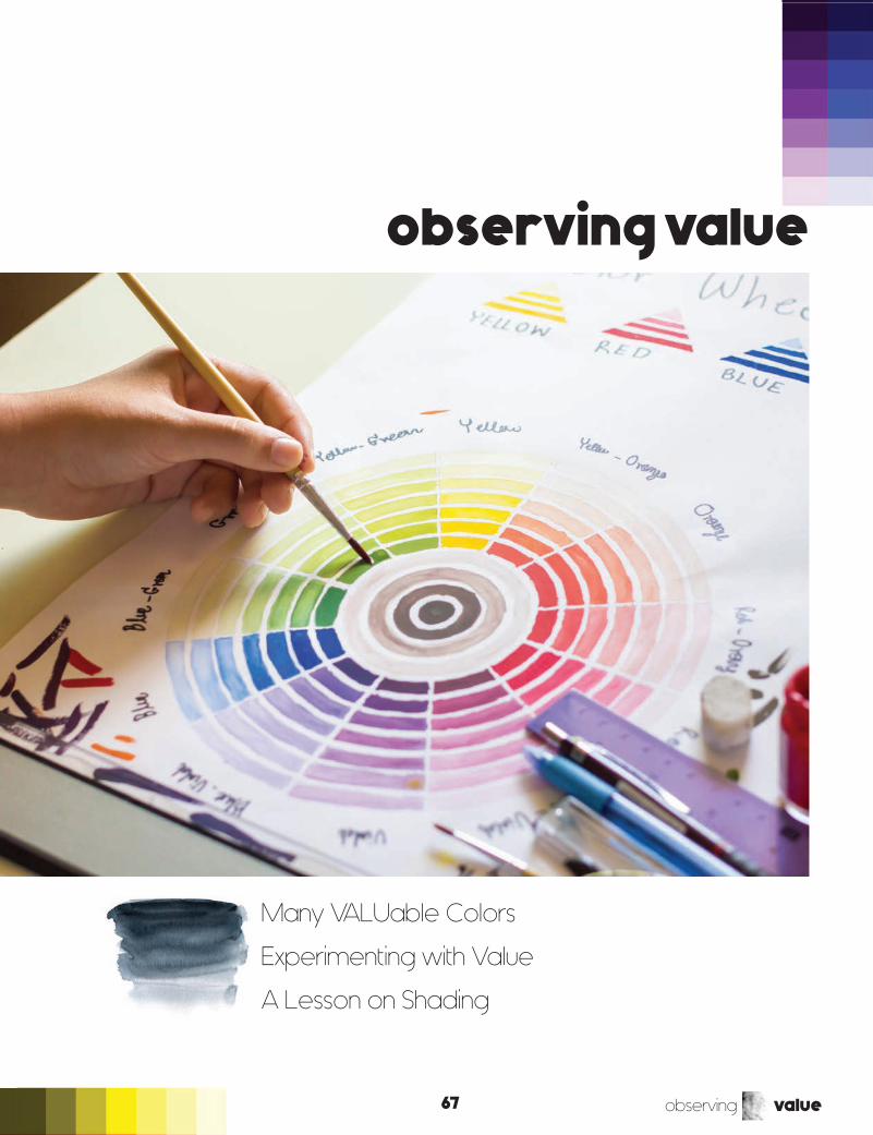
observing value67
observing value
Many VALUable Colors
Experimenting with Value
A Lesson on Shading

68observing value
MANY VALUABLE COLORS
The colors that you see on the color wheel each have many hues, tones, and values. When you see these colors at their full value, they appear bold and brilliant. When colors have been blended with either white paint or water, they become muted and take on an entirely different look and feel.
Colors have many values!
The ability to change the values and tones of different colors is a big blessing to artists. Mary Cassatt used this technique in her artwork. This VALUable color technique is distinctly evident in her painting Margot in Blue. The girl’s dress in the painting has numerous shades of blue that make the painting appear brighter in some areas and muted and lighter in others. In the next lesson you will experiment with this VALUable color technique in your own artwork, using black and white tempera paint on watercolor paper. Week 18
Dark Light

observing value69
Week 18EXPERIMENTING WITH VALUE
Welcome back! Today you are going to experiment with value using the colors of the color wheel and white paint. Tear page 63 from your Artist’s Journal, and mix your paint. Tempera paint will work. On a paper or styrofoam plate, with drops of white paint, lightly paint in each circle with the right colors and values. Each time you add a drop of white paint, notice how it changes the way the colors look and feel. Explain to your teacher why it changes color.
Place your experimenting paper, after it has completely dried, in your pocket folder or paper clip it into your Artist’s Journal.
Red one drop of white paint
another dropof white paint...
and another dropof white paint

70observing value
A LESSON ON SHADING
Shading is another important technique in the art world, and it goes hand-in-hand with value. In this lesson, you will learn how to control your pencil and do a small lesson in shading. (You will learn more about shading in “Observing Form.”) Controlling your pencil must be mastered before you learn how to shade realistically.
Turn to page 65 in your Artist’s Journal. Hold your pencil lightly between your fingers, and slowly, not yet touching the paper, move it back and forth in slow, smooth movements. This may seem like a strange thing to do, but even as you do this, you are already learning how to control your hand and your pencil. Jerky, impatient movements will not improve your work. Your fingers must be relaxed and patient with what you are working on, and it will show in your artwork.
Once you have mastered this step, you may begin using this slow, smooth movement with your pencil on the paper. The element of value is the key to shading. Move your pencil lightly, starting from the top of box 1, and as you travel down, increase the value of the pencil by pressing down a little harder. This is called simple shading. Do the same in box 2, except begin by pressing down hard on your pencil, and as you move down the paper, decrease the value instead of increasing it. Continue to practice this in your Artist’s Journal until you feel comfortable and can control your pencil in smooth, slow movements. If you would like, try this technique using colored pencils or even crayons. Color makes all the difference!
Week 18

observing value71
Week 18

observing texture81
observing texture
What Is Texture?
Experimenting with Texture

82observing texture
WHAT IS TEXTURE?
What is texture, and how do we observe it? Everything has texture, whether it be smooth, wrinkled, weathered, rough, gritty, pebbly, powdery, dusty, dry, wet, slimy, slippery, silky, crinkled, bumpy, lumpy, glossy, glassy, etc. These are all texture words, and there are MANY more of these describing words, also called adjectives.
We can see texture and sometimes feel it, too. Numerous artists use texture in their artwork. We can see the texture of the objects in a painting or drawing, but we cannot feel it. The element of texture is everywhere! Look at your hands. How would you describe your palms and your fingers? What word(s) come to your mind when you look closely at the loose skin around each knuckle, when you
open your hands? Do they look wrinkled?
Texture is one of my favorite elements. When I was younger, around your age, I did leaf rubbings with crayons on smooth paper. The leaf rubbings would show all of the veins and crinkled edges of the textured leaves. You can do this project with other objects in nature and around your house too. In tomorrow’s lesson you will get to experiment with texture using crayons, your Artist’s Journal, and textured objects to make textured rubbings.
For Fun! Use some playdough to make impressions of different textures.
Week 22

observing texture83
EXPERIMENTING WITH TEXTURE
In today’s lesson, you will begin by collecting three objects with three different textures. You will also need crayons (any color or colors will work for this project)
Artist’s Journal
Instructions:
ST E P 1 Find three objects with unique textures. Example: a wicker basket, the coils on a spiral notebook, a leaf, etc.
ST E P 2 Put each object under your Artist’s Journal paper and rub your crayon(s) over the area
ST E P 3 In the blanks, write about each object and its texture. Is is smooth or bumpy? Give a three-word definition for each object.
Take the 2-minute challenge! See how many different textures you can find in two minutes right where you are sitting. List them in your Artist’s Journal.
Week 22

observing form99
observing form
What Is Form?
Experimenting with Form
More on Shading and Shadows

100observing form
WHAT IS FORM?
What is form? Is form used by artists in the art world? Yes, like the last five elements you have learned about, form is also an important part of the art world. Form is a three-dimensional geometrical figure (sphere, cube, cylinder, cone, etc.), rather than a shape, which is two-dimensional, or flat. Artists use form in their artwork to create a 3-dimensional look, and sculptors use form when they sculpt statues and sculptures. You will learn more about sculpting and one of the art world’s famous sculptors, Michelangelo, next week.
ONE-DIMENSIONAL TWO-DIMENSIONAL THREE-DIMENSIONAL
A line is something which connects two points; it has distance but no thickness or depth, and so it is considered to be 1-dimensional.
An object such as a square, circle, or triangle are known as ‘plane’ figures. These objects have length and height on a page, but they have no depth. These shapes are 2-dimensional (2-D).
A solid object, such as a ball or a box, has three dimensions, meaning that these objects have length, breadth (width), and height. We are 3-dimensional because we have all of these.
Week 26
What is 1–dimensional, 2–dimensional (2–D), and 3–dimensional (3–D)?
OR

observing form101
Week 26
HOW DO WE CREATE A 3-DIMENSIONAL FORM FROM A 2-DIMENSIONAL FORM?
We can easily take a 2-dimensional form and create a 3-dimensional form. A simple square or rectangle can become a 3-D box with form. Shading in the correct areas and adding lines (a line is 1-dimensional) to the 2-dimensional form creates depth and “character” to the shapes making them into a 3-dimensional form.
2–D 3–D 3–D
2–D 3–D 3–D
or
or

102observing form
EXPERIMENTING WITH FORM: 2-D TO 3-D
Today you are going to experiment with form by cutting out two 2-dimensional shapes and recreating them into 3-dimensional forms, a pyramid and a cube from the templates in your Artist’s
Journal. Simply cut around each shape, fold along the edges, and glue (or tape) each shape to create your 3-dimensional forms.
Keep your 3-D forms in a safe place until the next lesson, when you experiment with shadows and shading with both paper forms, other 3-dimensional objects, and a light source, such as a desk lamp.
Pyramid
Cube
Week 26

observing space121
observing space
Learning & Experimenting with Space: 2-D
Learning & Experimenting with One-Point Perspective

122observing space
Week 32
LEARNING & EXPERIMENTING WITH SPACE
What is space? Space in artwork makes a flat, level (2-D) image look like it has a 3-dimensional form. The look and feeling of space in a drawing or painting is always an illusion. There are several ways an artist can add space in their artwork. Look below at the three chosen space techniques that create 3-D perspectives. You can also use these techniques in your own artwork!
Overlapping: placing an object in front of another object makes the object in front look closer than the one behind it. In simple overlapping, an object partially hides the other object that’s supposedly behind it. Since our eyes are easily fooled, we willingly agree that one is closer than the other. Also notice the size of each object. The overlapping affect is heightened because the circle “behind” is smaller than the circle “in front.”
Changing size: an object that is smaller looks like it is farther away while an object that is larger looks like it is closer.
Overlapping
Changing size

observing space123
Week 32
Using perspective: a technique of portraying dimensions and space on a flat surface. Overlapping and changing the size of objects in artwork are two techniques out of many that create different perspectives in artwork.
Today you will have the opportunity to experiment with space in your own artwork. Turn to page 95 in your Artist’s Journal and cut out
each individual circle. Choose a colorful piece of construction paper for your background. You may also color each circle if you would like.
Techniques to create the illusion of space in your overlapping collage:
ST E P 1 The smallest circle should be the farthest away, behind the other circles.
ST E P 2 The next circle will overlap a small part of the previous circle, and so on.
ST E P 3 Rearrange your circles if necessary and glue each in place. You may decorate the construction paper with crayons or markers if you wish.
Do you understand the concept of space and perspective by experimenting with overlapping and changing the size of objects in your art? You understand (and obviously see) that by placing objects in certain positions, you create a 3-dimensional look to your artwork even though it is still 2-dimensional.
In the next lesson you will learn and experiment with one-point perspective.
perspective

124observing space
LEARNING & EXPERIMENTING WITH ONE-POINT PERSPECTIVE
Perspective is a technique that artists use to create space in their art. Today we will be talking about one-point perspective and experimenting with this new concept.
What is one-point perspective? One-point perspective is a type of linear (straight, like a line) perspective. All kinds of linear perspective include a horizon line (look back to “Observing Lines” for review) and a stationary line (the place of the observer). In one-point perspective, there is only one disappearing point. See above for an example of this concept in three steps. The dots on the horizontal line represents the disappearing point.
At this step, I make the backside of the shape parallel with the front by using the lines touching the vanishing point as a guide. Erase the remaining lines touching the vanishing point.
The best way for you to learn this concept is to experiment with it yourself.
1.2. 3.
disappearing point
Week 32

observing space125
Turn to page 97 in your Artist’s Journal and do each step by following the instructions below. You will need a ruler and a pencil for this experiment.
Another helpful, one-point perspective concept to know: While you are drawing your lines from the shape to the vanishing point, it is important to know that any line or lines that would have to go across the shape should not be drawn. The correct lines only touch the corner points of the shape.
Step-by-step instructions:
ST E P 1 Use your ruler and draw a horizon line, parallel to the top and bottom of the paper.
ST E P 2 Decide where you wish the vanishing point to be and draw a small dot.
ST E P 3 Use your ruler and draw a shape, preferably a square, below the horizon line.
ST E P 4 Use the ruler to connect the corners of the square to the vanishing spot.
ST E P 5 Now draw the backside of the shape parallel to the front. Look at my example on the earlier page for help with this.
ST E P 6 Erase the lines still connected to vanishing point.
ST E P 7 Color your shape with varying values of one color.
Good job!
Add light source and shading.Challenge: Go at, above, or below horizon line.
Week 32