Embed Size (px)
Citation preview

FDA Visual Identity Guidelines September 27, 2016
Introduction:
FDA, ITS VISUAL IDENTITY, AND THIS STYLE GUIDE The world in which the U.S. Food and Drug Administration (FDA) operates today is one of growing complexity, new challenges, and increased risks. Thanks to revolutionary advances in science, medicine, and technology, we have enormous opportunities that we can leverage to meet many of these challenges and ultimately benefit the public health.
As a public health and regulatory agency that makes its decisions based on the best available science, while maintaining its far-reaching mission to protect and promote the public health, FDA is uniquely prepared and positioned to anticipate and successfully meet these challenges.
Intrinsically tied to this is the agency’s crucial ability to provide the public with clear, concise and accurate information on a wide range of important scientific, medical, regulatory, and public health matters.
In doing so, the agency has traditionally used multiple communication channels to reach a wide range of stakeholders. Unfortunately, there has not been a uniform look and feel across the FDA’s communication materials, which can create confusion about the source of the information and also reduce the effectiveness of the communication.
Therefore, the agency embarked on a comprehensive examination of FDA’s communication materials, including an analysis of the FDA’s mission and key audiences, in order to establish a more unified communications program using consistent and more cost-effective pathways for creating and disseminating information in a recognizable format. This has resulted in what you see here today: a standard and uniform Visual Identity system.
This new Visual Identity program will improve the effectiveness of the FDA’s communication by making it much easier to identify the FDA, an internationally recognized, trusted, and credible agency, as the source of the information being communicated.
The modern and accessible design will be used to inspire how we look, how we speak, and what we say to the people we impact most. And with “U.S. Food & Drug Administration” as the cornerstone, and unifier, of the agency’s identity, the system will allow for increased understanding of the FDA, its broad public health mission, and the essential role it plays in protecting – and enhancing the lives of – consumers across the United States and around the world.
FDA Visual Identity Guidelines

THE NEW FDA DESIGN
The FDA is responsible for ensuring the safety, effectiveness, and quality of products that account for about 20 cents of every dollar spent by Americans each year. People everywhere, in all walks of life, depend on these products from the time they awake until the moment they go to bed.fr These products are everywhere. They are essential elements of everyday life. This means that the FDA’s real-world influence is pervasive, an essential element in the modern world. Simply put, the FDA is just like an element of the periodic table.
And it’s the periodic table of the elements that inspires, that gives life to, FDA’s visual identity. The periodic table of elements is a universally recognized, orderly arrangement of elements, the building blocks of the universe. The periodic table is reflected in the boxes of the FDA’s grid system design, keeping everything organized and clear.
The periodic table of elements is fundamental to the FDA scientists who drive the agency’s mission through their indispensable work, the same work that helps improve the lives of Americans every day. The Visual Identity's grid design system allows for the adding and stacking of information, such as office and center names in the logo lockups. The design helps unify the offices and centers which are each a key element that make up the logical and orderly structure of the entire agency.
For more than a century, the FDA has based its public health protection work on sound science. It is only fitting that the FDA’s visual identity takes its inspiration from the periodic table of the elements. Drawing on FDA’s tradition, this identity will only strengthen the agency’s communications, making FDA even more trusted and effective.
FDA Visual Identity Guidelines

ADDITIONAL LONG-TERM BENEFITS OF THE DESIGN Over time, implementation of the grid-inspired design will also create internal efficiencies throughout the agency, reducing costs by eliminating redundant design expenses.
• Previously, with no uniform visual identity, and without a style guide, every new communication vehicle FDA created had to be designed from scratch.
• That was not only expensive, but resulted in a muddle of designs and logos across the agency.
• With the style guide in place, establishing the format, design, logo, colors and typeface for FDA communication, the cost of producing new materials is expected to be significantly reduced.
FDA Visual Identity Guidelines
CONTENTS 1.0 Brand Style 5.0 Imagery 1.1 Section Introduction 5.1 Section Introduction 1.2 Brand Architecture 5.2 Correct Usage 1.3 MonogramFDA logo 5.3 Incorrect Usage 1.4 WordmarkFDA logo 1.5 Monogram and Wordmark lock-upFDA logo 1.6 Monogram and WordmarkFDA logo 6.0 Graphic Elements 1.7 Hierarchy Clear Space FDA logo 6.1 Section Introduction 1.8 Minimum SizeFDA logo 6.2 Logo Clear Space 1.9 Logo BackgroundsFDA logo
1.10 Incorrect Usage - Primary LogoFDA logo 1.11 Incorrect Usage - Secondary LogoFDA logo 7.0 Communications
1.12 Office/CenterLock-ups 7.1 Section Introduction
1.13 Office/Center Lock-upLock-ups 7.2 Letterhead 1.14 Co-Branding/Partnership Lock-upLock-ups 7.3 Fact Sheet 1.15 Office/Center ColorLock-ups 7.4 News Release Publication 1.16 Horizontal HHS Lock-upLock-ups 1.17 Vertical HHS Lock-upLock-ups 1.18 HHS & Office/Center Lock-upLock-ups 1.19 Logo Overview
2.0 Co-Branding and Partnerships 2.1 Section Introduction 2.2 Logos 2.3 FDA Monogram with HHS Logo
3.0 Typography 3.1 Section Introduction 3.2 Primary TypefaceType 3.3 Secondary TypefaceType
7.5 Publication Templates 7.6 PowerPoint Presentations 7.7 Television and Live Feed/Streaming 7.7.1 Videos
7.8 Envelope
7.9 Email Signature
7.10 Business Card
7.11 Stationery Products 7.12 Awards/Certificates 7.13 Signage 7.14 Exhibits Style 7.15 E-Newsletter 7.16 Website 7.17 Web Banner Ads 7.18 Mobile User Interface (UI) 7.19 Social Media
3.4 Primary - Principles & Best PracticesType 7.20 Twitter
3.5 Incorrect UsageType
4.0 Color Palette 4.1 Section Introduction 4.2 SpecificationsColor Palette 4.3 PercentagesColor Palette 4.4 GradientColor Palette
8.0 8.1 8.2 8.3 8.4 8.5 8.6 8.7 8.8
9.0
Example Applications Section Introduction Stamp Signage Awards Wearables Items Handbook Street Poster
Contact Information
FDA Visual Identity Guidelines

How to use this guide
The FDA Visual Identity Guidelines provides the tools and guidance for properly applying the new brand of the agency across external and internal communications.
This guide takes users through each step of the process of implementing the new identity and offers examples of correct brand application.
Sections 1-5 provide detailed instructions for using the brand components.
Sections 6-8 provide both examples and best practices of the new visual identity through a series of applications.
The final section of the guide provides contact information that directs users to the appropriate contacts that can help answer any questions specific to the use of the Visual Identity Guidelines.
Section Title Page Title
Detailed instructions and rules for each page.
Advice & best practices when using this guide.
FDA Visual Identity Guidelines
Visual representation of the rules explained in the blue box.
FDA Visual Identity Guidelines

1. BRAND STYLE
1.1 1.2 1.3 1.4 1.5 1.6 1.7 1.8 1.9
1.10 1.11 1.12 1.13 1.14 1.15 1.16 1.17 1.18 1.19
Section Introduction Brand Architecture FDA logo Monogram FDA logo Wordmark FDA logo Monogram & Wordmark lock-up FDA logo Monogram & Wordmark Hierarchy FDA logo Clear Space FDA logo Minimum Size FDA logo Logo Backgrounds FDA logo Incorrect Usage - Primary Logo FDA logo Incorrect Usage - Secondary Logo Lock-ups Office/Center Lock-ups Office/Center Lock-up Lock-ups Co-Branding/Partnership Lock-up Lock-ups Office/Center Color Lock-ups Horizontal HHS Lock-up Lock-ups Vertical HHS Lock-up Lock-ups HHS & Office/Center Lock-up Logo Overview
1.0 FDA Visual Identity Guidelines
INTRODUCTION The Brand Style section covers proper use of the logo and logo lockup applications. There are several types of logos and the type of logo that will be used will depend on the type of material that is being produced. This section provides guidance on how to use the logo in all scenarios.
The logo designs cannot be altered.
1.1 FDA Visual Identity Guidelines

Brand Architecture
The FDA consists of thirteen (13) Centers and Offices.
OFFICE OF THE COMMISSIONER
OFFICE OF FOODS AND VETERINARY MEDICINE
CENTER FOR FOOD SAFETY AND APPLIED NUTRITION
CENTER FOR VETERINARY MEDICINE
OFFICE OF GLOBAL REGULATORY OPERATIONS AND POLICY
OFFICE OF MEDICAL PRODUCTS AND TOBACCO
CENTER FOR BIOLOGICS EVALUATION AND RESEARCH
CENTER FOR DEVICES AND RADIOLOGICAL HEALTH
CENTER FOR DRUG EVALUATION AND RESEARCH
CENTER FOR TOBACCO PRODUCTS
OFFICE OF OPERATIONS
OFFICE OF POLICY, PLANNING, LEGISLATION, AND ANALYSIS
OFFICE OF REGULATORY AFFAIRS
1.2 FDA Visual Identity Guidelines

FDA Logo Monogram
The box system allows for easy adding and stacking of additional information for office/center names (logo lockups), and emphasis can be adjusted based on box size and treatment of the type.
All tools are controlled by a 6/5 modular grid. This makes a relationship between the blue box and acronym common in all tools. It is set to maximize the effect of the logo. A grid transforms according to various media, and it derives a monogram that will be the most suitable size for the media.
5/6 Modular Grid System
5
6
½ ½
1.3 FDA Visual Identity Guidelines

Horizontal
FDA Logo Wordmark
The FDA’s custom-made wordmark should always be used in uppercase. Its primary color is the FDA Blue, although color weights vary according to background color.
1.4 FDA Visual Identity Guidelines
5
6
6
Horizontal
FDA Logo Monogram and Wordmark Lock-up - The Primary Logo
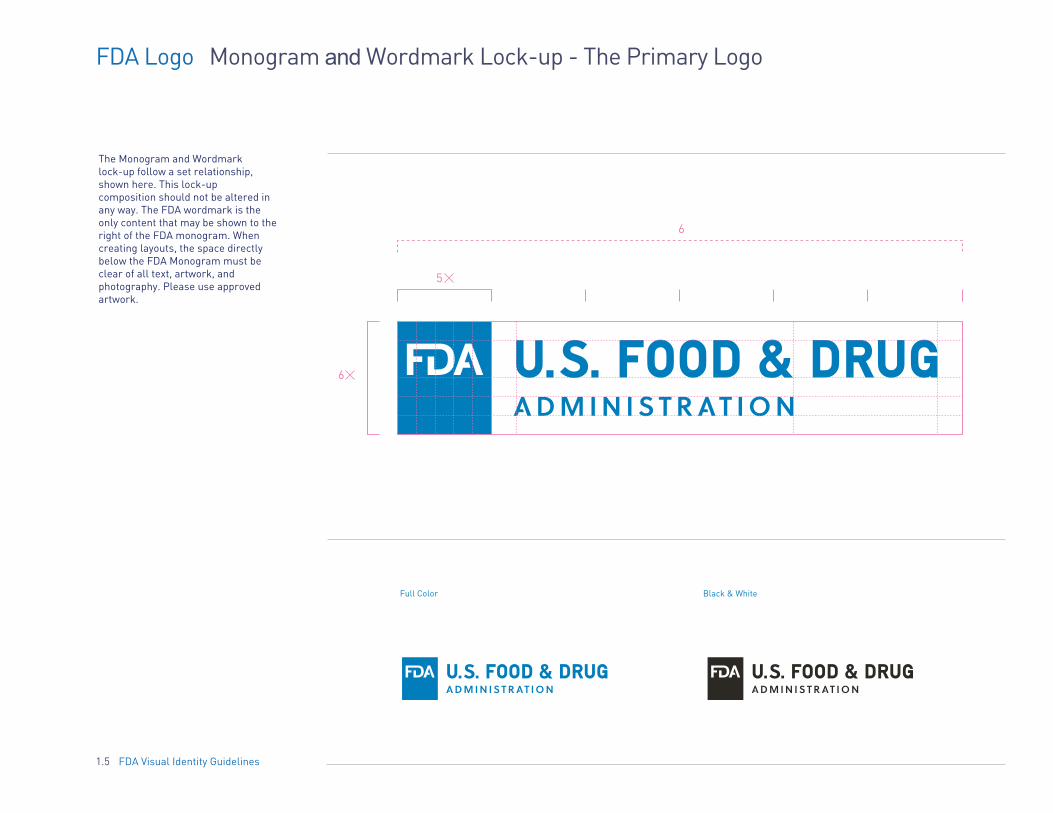
The Monogram and Wordmark lock-up follow a set relationship, shown here. This lock-up composition should not be altered in any way. The FDA wordmark is the only content that may be shown to the right of the FDA monogram. When creating layouts, the space directly below the FDA Monogram must be clear of all text, artwork, and photography. Please use approved artwork.
FDA Visual Identity Guidelines1.5
Full Color Black & White

FDA Logo Monogram and Wordmark Hierarchy
When using the FDA wordmark or monogram, the preferred order of usage is as follows:
Primary Logo
Primary Agency Identifier: Monogram with wordmark centered to the right.
Secondary Agency Identifier: Monogram by itself.
Use cases for the monogram would be social media/mobile where space is limited and for co-branding and partnership logo placement.
Secondary Logo
1.6 FDA Visual Identity Guidelines

FDA Logo Clear Space
Horizontal x = cap height of wordmark
The minimum clear space around the logo and wordmark is equal to the cap height. The clear space should be present on all sides of the logo, and should be completely free of other type and graphics.
Monogram x = cap height of FDA Acronym
Getting It Right
Clear space should be maximized whenever possible.
1.7 FDA Visual Identity Guidelines

FDA Logo Minimum Size
The FDA logo is set for maximum visibility and impact. The logo may be scaled up as large as desired. The logo lock-up should never be smaller than the minimum horizontal and monogram size illustrated here.
Horizontal x = 0.125’/ 3.175 mm (Logo at actual size.)
1.8 FDA Visual Identity Guidelines

FDA Logo Logo Backgrounds
FDA Visual Identity Guidelines1.9
White LogoBlack background
FDA Blue LogoFDA Black Logo
White background
White Logo Image Background
The three standard color logos are the preferred look for all applications.
Background color dictates which logo to employ.
FDA Acronym will always live in either FDA Blue or FDA White.
Black backgrounds Use FDA White Logo
White backgrounds Use the FDA Blue Logo Use FDA Black Logo
Image background Use FDA White Logo

FDA Visual Identity Guidelines1.10
1
4
7
10
2
5
8
11
3
6
9
12
Consistent presentation is an important part of making the logo immediately recognizable wherever it appears.
The FDA logo should never be altered or shown in unauthorized colors. The following are examples of improper logo usage and pitfalls to avoid. These rules apply to all versions of the logo.
Getting it Right
1 Never change the colors within the logo
2 Never rotate logo elements
3 Never distort the size or proportion of
the logo elements
4 Never add a drop shadow to the logo
5 Never extrude the logo
6 Never distort the logo
7 Never add type elements to the logo in
violation of clear space rules
8 Never change the opacity of the logo
9 Never frame the logo within a shape
10 Never place the logo at an angle
11 Never use part of the FDA logo in copy
12 Never change the position of logo elements
Official Blog of the
Open-source APIs for drug,device, and food data.
FDA Logo Primary Logo Incorrect Use

1
4
7
2
5
8
3
6
9
Consistent presentation is an important part of making the secondary logos immediately recognizable wherever they appear.
The secondary FDA logos should never be altered or shown in unauthorized colors. The following are examples of improper logo usage and pitfalls to avoid. These rules apply to all versions of the secondary logo (monogram).
Getting it Right
1 Never change the color of the background block
2 Never rotate logo elements
3 Never reposition the accronym inside the block
4 Never add a drop shadow to the logo
5 Never extrude the logo
6 Never distort the logo
7 Never change the opacity of the logo
8 Never change the color of the FDA acronym
(It is either in FDA White or FDA Blue)
9 Never remove the acronym from the box
10 Never outline the box, making the center
transparent
FDA Visual Identity Guidelines1.11
FDA Logo Secondary Logo Incorrect Use

FDA Lock-up Office/Center
Follow the sizes and positions illustrated in this section when presenting the FDA full logo in conjunction with internal offices and centers.
The relationship between the FDA logo and the Office and Center names should always be constant, with the FDA primary logo the primary mark.
Minimum sizes are dictated by the font size of the Office/Center. Never go smaller than 7pt.
No more than 2 tiers are allowed (as seen in the tertiary level lock-up diagram).
Single Level Lock-up x = 1/6 height of the monogram
Tertiary Level Lock-up x = 1/6 height of the monogram
Office/Center names is flush left within the second box
4 OFFICE/CENTER NAMESECOND TIER OFFICE/CENTER OR DIVISION NAME
OFFICE/CENTER NAME 2
1.12 FDA Visual Identity Guidelines
FDA Lock-up Offices/Centers
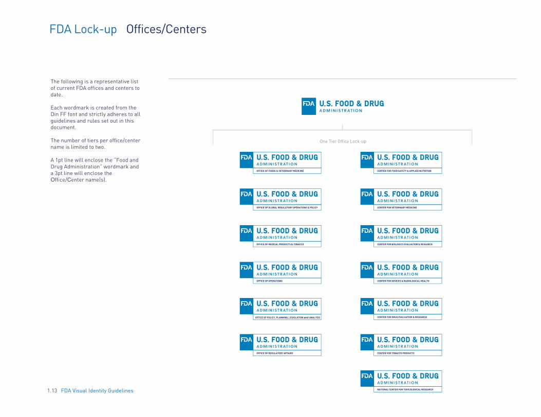
The following is a representative list of current FDA offices and centers to date.
Each wordmark is created from the Din FF font and strictly adheres to all guidelines and rules set out in this document.
The number of tiers per office/center name is limited to two.
A 1pt line will enclose the “Food and Drug Administration” wordmark and a 3pt line will enclose the Office/Center name(s).
1.13 FDA Visual Identity Guidelines
One Tier Office Lock-up
OFFICE OF FOODS & VETERINARY MEDICINE
OFFICE OF GLOBAL REGULATORY OPERATIONS & POLICY
OFFICE OF MEDICAL PRODUCTS & TOBACCO
OFFICE OF OPERATIONS
OFFICE OF POLICY, PLANNING, LEGISLATION and ANALYSIS
OFFICE OF REGULATORY AFFAIRS
CENTER FOR FOOD SAFETY & APPLIED NUTRITION
CENTER FOR VETERINARY MEDICINE
CENTER FOR BIOLOGICS EVALUATION & RESEARCH
CENTER FOR DEVICES & RADIOLOGICAL HEALTH
CENTER FOR DRUG EVALUATION & RESEARCH
CENTER FOR TOBACCO PRODUCTS
NATIONAL CENTER FOR TOXICOLOGICAL RESEARCH
OFFICE OF GLOBAL REGULATORY OPERATIONS & POLICY
FDA Lock-up Office/Center Color
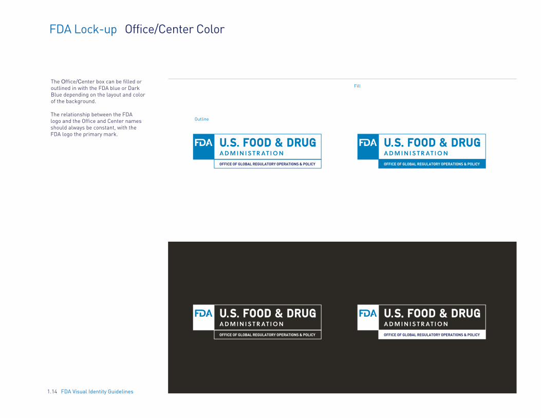
The Office/Center box can be filled or outlined in with the FDA blue or Dark Blue depending on the layout and color of the background.
Outline
Fill
The relationship between the FDA logo and the Office and Center names should always be constant, with the FDA logo the primary mark.
OFFICE OF GLOBAL REGULATORY OPERATIONS & POLICY
OFFICE OF GLOBAL REGULATORY OPERATIONS & POLICY OFFICE OF GLOBAL REGULATORY OPERATIONS & POLICY
1.14 FDA Visual Identity Guidelines

2 2 2
FDA Lock-up Horizontal HHS Lock-up Primary Lockup
Follow the sizes and positions illustrated in this section when presenting the FDA monogram in conjunction with the HHS logo.
The relationship between the HHS and FDA logos should always be the same: HHS to the left of FDA in the horizontal configuration, and above the FDA in the vertical presentation.
Getting It Right
FDA monogram only x = 1/6 height of the monogram
FDA Visual Identity Guidelines
White Lockup Full Color Lockup Black & White LockupHHS logo should always be larger than the FDA monogram, as shown.
1.15
FDA Lock-up Vertical HHS Lock-up Secondary Lockup
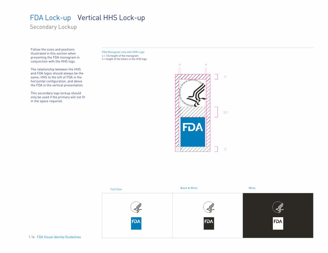
Follow the sizes and positions illustrated in this section when presenting the FDA monogram in conjunction with the HHS logo.
The relationship between the HHS and FDA logos should always be the same: HHS to the left of FDA in the horizontal configuration, and above the FDA in the vertical presentation.
This secondary logo lockup should only be used if the primary will not fit in the space required.
FDA Monogram only with HHS Logo x = 1/6 height of the monogram n = height of the letters in the HHS logo
n n
2
Black & White WhiteFull Color
FDA Visual Identity Guidelines1.16

FDA Lock-up HHS and Office/Center Lock-up
Follow the sizes and positions illustrated in this section when presenting the FDA Office/Center lock-up in conjunction with the HHS logo.
The relationship between the HHS and FDA logos should always be the same: HHS to the left of FDA in the horizontal configuration, and above the FDA in the vertical presentation.
FDA monogram only x = 1/6 height of the monogram
2 2 2
2OFFICE OF GLOBAL REGULATORY OPERATIONS & POLICY
1.17 FDA Visual Identity Guidelines

FDA Lock-up Co-Branding/Partnerships Lockup
The name of the co-brand or partnership will be placed in the second box under the FDA Wordmark as shown here.
MEDWATCH
OPEN FDA
1.18 FDA Visual Identity Guidelines

FDA Logo Overview
FDA Visual Identity Guidelines1.19
FDA Logo Primary Mark
UseThis is the FDA logo lock-up and is the preferred application. Use this primary FDA logo when prominent visual brand communication is desired.
Example: Handbook, Brochure
FDA MonogramSecondary Mark
Use
Use when making simple, declarative, brand-forward statements.
Example: Social Media (Pinterest)
PUBLICATION TITLE
November 2013FDA.GOV
FDA Joint InformationCenter HandbookOffice of Crisis Managementhttp://inside.fda.gov:9003/downloads/PolicyProcedures/SOPsbyProgram/EmergencyResponse/UCM381278.pdf U.S. Food & Drug Administration

2. CO-BRANDING & PARTNERSHIPS
2.1 Section Introduction 2.2 Logos 2.3 FDA Monogram with HHS logo 2.4 Co-Branding Mockup
2.0 FDA Visual Identity Guidelines
INTRODUCTION The FDA works with outside agencies and partners to produce and release communications materials. This section covers the best practices for using the logo and HHS logo lockup within instances that require the logos to live next to partner logos.
2.1 FDA Visual Identity Guidelines
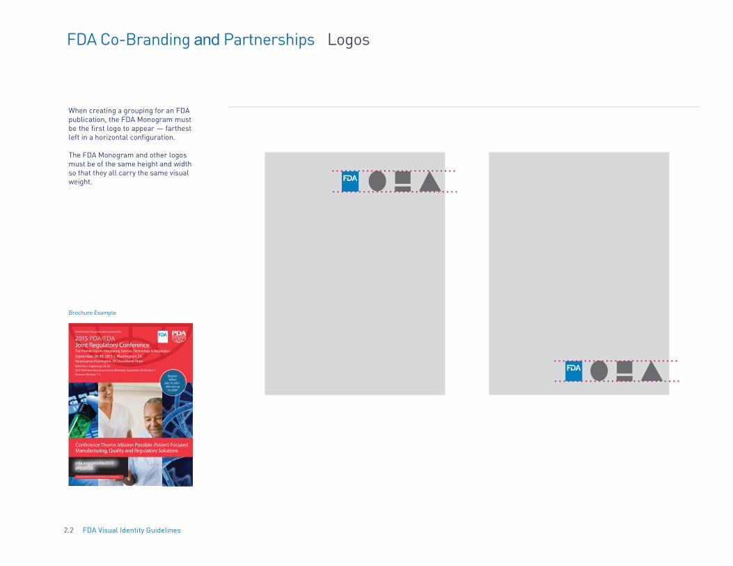
FDA Co-Branding and Partnerships Logos
When creating a grouping for an FDA publication, the FDA Monogram must be the first logo to appear — farthest left in a horizontal configuration.
The FDA Monogram and other logos must be of the same height and width so that they all carry the same visual weight.
Brochure Example
The Parenteral Drug Association presents the...
2015 PDA/FDA Joint Regulatory ConferenceThe Premier Forum Integrating Science, Technology & Regulation
September 28-30, 2015 | Washington, DCRenaissance Washington, DC Downtown HotelExhibition: September 28-29 2015 PDA Manufacturing Science Workshop: September 30-October 1 Courses: October 1-2
pda.org/pdafda2015 #PDAFDA
Conference Theme: Mission Possible: Patient-Focused Manufacturing, Quality and Regulatory Solutions
This preliminary agenda is current as of May 12, 2015
TAPE RECORDINGS ARE PROHIBITED AT ALL PDA EVENTS
Registerbefore
July 19, 2015and save up
to $550!
2.2 FDA Visual Identity Guidelines

FDA Co-Branding and Partnerships FDA Monogram with HHS logo
When locking up the FDA Monogram with the HHS logo, refer to page 1.17 for size relationships. This is the only instance the HHS logo will sit horizontally with the FDA Monogram.
2.3 FDA Visual Identity Guidelines
3. TYPOGRAPHY
3.1 Section Introduction 3.2 Type Primary Typeface 3.3 Type Secondary Typeface 3.4 Type Primary - Principles & Best Practices 3.5 Type Incorrect Usage
3.0 FDA Visual Identity Guidelines
INTRODUCTION The FDA has carefully selected typography options for the entire agency to use across all external and internal materials. A primary and secondary font style have been selected.
The primary font style is used for headlines, subheads, and when the material includes plenty of open space. The secondary font style will be used as body copy only.
If these options are not available on your computer, please refer to the backup font options that have been selected for both the primary and secondary fonts.
No other font options are permitted to be used within communications materials. This is to ensure that the brand is consistent.
3.1 FDA Visual Identity Guidelines
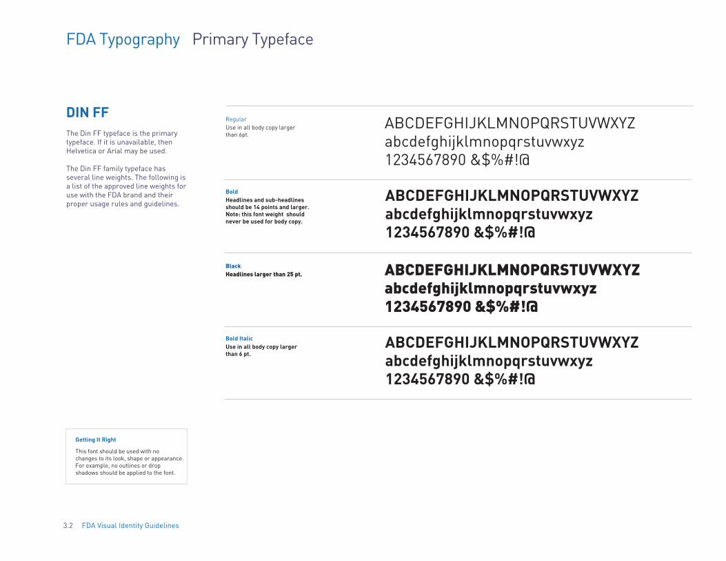
FDA Typography Primary Typeface
DIN FF Regular ABCDEFGHIJKLMNOPQRSTUVWXYZ
abcdefghijklmnopqrstuvwxyz1234567890 &$%#!@
Use in all body copy largerthan 6pt. The Din FF typeface is the primary
typeface. If it is unavailable, then Helvetica or Arial may be used.
The Din FF family typeface has several line weights. The following is a list of the approved line weights for use with the FDA brand and their proper usage rules and guidelines.
Bold ABCDEFGHIJKLMNOPQRSTUVWXYZabcdefghijklmnopqrstuvwxyz1234567890 &$%#!@
Headlines and sub-headlinesshould be 14 points and larger. Note: this font weight should never be used for body copy.
Black ABCDEFGHIJKLMNOPQRSTUVWXYZ abcdefghijklmnopqrstuvwxyz 1234567890 &$%#!@
Headlines larger than 25 pt.
Bold Italic ABCDEFGHIJKLMNOPQRSTUVWXYZabcdefghijklmnopqrstuvwxyz 1234567890 &$%#!@
Use in all body copy larger than 6 pt.
Getting It Right
This font should be used with no changes to its look, shape or appearance. For example, no outlines or drop shadows should be applied to the font.
3.2 FDA Visual Identity Guidelines
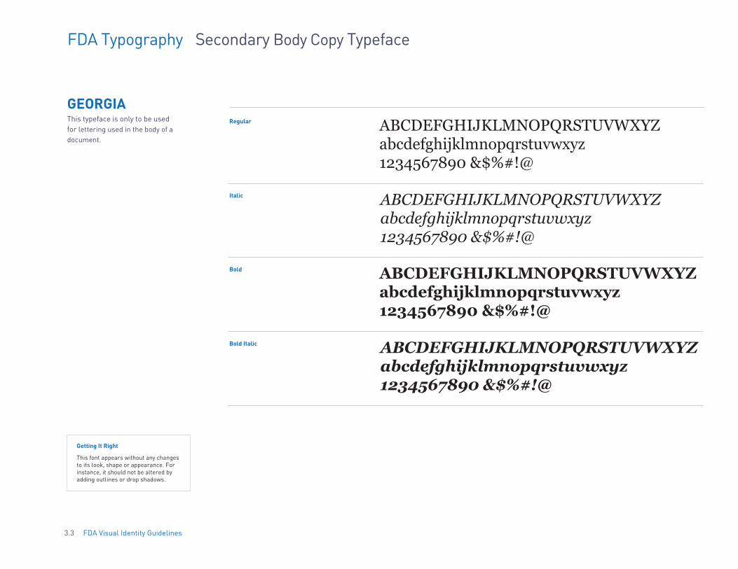
FDA Typography Secondary Body Copy Typeface
Regular ABCDEFGHIJKLMNOPQRSTUVWXYZ abcdefghijklmnopqrstuvwxyz 1234567890 &$%#!@
GEORGIA This typeface is only to be used for lettering used in the body of a document.
Italic ABCDEFGHIJKLMNOPQRSTUVWXYZ abcdefghijklmnopqrstuvwxyz 1234567890 &$%#!@
Bold ABCDEFGHIJKLMNOPQRSTUVWXYZ abcdefghijklmnopqrstuvwxyz 1234567890 &$%#!@
Bold Italic ABCDEFGHIJKLMNOPQRSTUVWXYZ abcdefghijklmnopqrstuvwxyz 1234567890 &$%#!@
Getting It Right
This font appears without any changes to its look, shape or appearance. For instance, it should not be altered by adding outlines or drop shadows.
3.3 FDA Visual Identity Guidelines
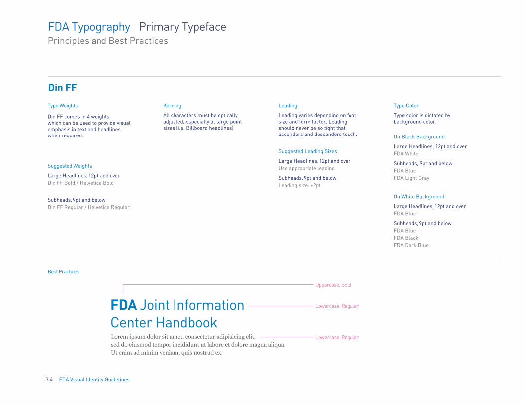
Lowercase, RegularFDA Joint Information Center Handbook Lorem ipsum dolor sit amet, consectetur adipisicing elit, Lowercase, Regular
Uppercase, Bold
sed do eiusmod tempor incididunt ut labore et dolore magna aliqua. Ut enim ad minim veniam, quis nostrud ex.
FDA Typography Primary Typeface Principles and Best Practices
Din FF
Type Weights
Din FF comes in 4 weights, which can be used to provide visual emphasis in text and headlines when required.
Suggested Weights
Large Headlines, 12pt and over Din FF Bold / Helvetica Bold
Subheads, 9pt and below Din FF Regular / Helvetica Regular
Kerning Leading Type Color
All characters must be optically adjusted, especially at large point sizes (i.e. Billboard headlines)
Leading varies depending on font size and form factor. Leading should never be so tight that ascenders and descenders touch.
Type color is dictated by background color.
On Black Background
Suggested Leading Sizes Large Headlines, 12pt and over FDA White
Large Headlines, 12pt and over Use appropriate leading
Subheads, 9pt and below FDA Blue
Subheads, 9pt and below Leading size: +2pt
FDA Light Gray
On White Background
Large Headlines, 12pt and over FDA Blue
Subheads, 9pt and below FDA Blue FDA Black FDA Dark Blue
Best Practices
3.4 FDA Visual Identity Guidelines

FDA Typography Incorrect Usage for body copy
It is recommended that all body copy be flush left, unjustified.
Morbi non volutpat libero. Morbi vestibulum ultrices ullamcorper. Nullam orci ligula, mollis at massa id, feugiat vulputate ante. morbi arcu purus, mattis a massa eget, tincidunt aliquam massa. Sed pharetra suscipit condimentum. Quisque luctus eget purus vitae fermentum. Curabitur id odio mollis, eleifend dolor auctor, placerat metus. Donec id tellus lectus.
Morbi non volutpat libero. Morbi vestibulum ultrices ullamcorper.
Nullam orci ligula, mollis at massa id, feugiat vulputate ante. Morbi arcu
purus, mattis a massa eget, tincidunt aliquam massa. Sed pharetra suscipit
condimentum. Quisque luctus eget purus vitae fermentum. Curabitur id
odio mollis, eleifend dolor auctor, placerat metus. Donec id tellus.
Morbi non volutpat libero. Morbi vestibulum ultrices ullamcorper.
Nullam orci ligula, mollis at massa id, feugiat vulputate ante. Morbi arcu
purus, mattis a massa eget, tincidunt aliquam massa. Sed pharetra suscipit
condimentum. Quisque luctus eget purus vitae fermentum. Curabitur id
odio mollis, eleifend dolor auctor, placerat metus.
Do not insert the FDA logo into body text. Do not set text flush right. Do not center text.
Morbi non volutpat libero. Morbi vestibulum ultrices ullamcorper. Nullam orci ligula, mollis at massa id, feugiat vulputate ante. Morbi arcu purus, mattis a massa eget, tincidunt aliquam massa. Sed pharetra suscipit condimentum. Quisque luctus eget purus vitae fermentum. Curabitur id odio mollis, eleifend dolor auctor, placerat metus. Donec id tellus lectus.
Morbi non volutpat libero. Morbi vestibulum ultrices ullamcorper. Nullam orci ligula, mollis at massa id, feugiat vulputate ante. Morbi arcu purus, mattis a massa eget, tincidunt aliquam massa. Sed pharetra suscipit condimentum. Quisque luctuseget purus vitae fermentum. Curabitur id odio mollis, eleifend dolor auctor, placerat metus. Donec id tellus lectus.
Morbi non volutpat libero. Morbi vestibulum ultrices ullamcorper. Nullam orci ligula, mollis at massa id, feugiat vulputate ante. Morbi arcu purus, MATTIS A MASSA EGET, tincidunt aliquam massa. Sed pharetra suscipit condimentum. Quisque luctus eget purus vitae fermentum. Curabitur id odio mollis, eleifend dolor auctor, placerat metus. DONEC id tellus lectus.
Don’t justify text, it can create visual gaps within the paragraph.
Don’t use more than one font size within body text.
Don’t use more than one font style, weight or color in a sentence.
3.5 FDA Visual Identity Guidelines

4. COLOR PALETTE
4.1 Section Introduction 4.2 Color Palette Specifications 4.3 Color Palette Ratios 4.4 Color Palette Gradient
4.0 FDA Visual Identity Guidelines
INTRODUCTION The Color Palette section provides the seven colors that will be used across all materials. These colors establish the look and feel of the visual identity. These are the only colors that can be used.
4.1 FDA Visual Identity Guidelines

FDA Color Palette Specifications
FDA Visual Identity Guidelines4.2
FDA Black
Gray
Gold
Red
Color Palette Equivalents
FDAPrimary
Colors
CMYK RGB Hex
FDA Blue 95 / 41 / 6 / 0
100 / 94 / 24 / 23
66 / 64 / 67 / 67
0 / 1 / 0 / 43
2 / 22 / 100 / 8
9 / 100 / 79 / 2
0 / 124 / 186
34 / 44 / 103
46 / 41 / 37
160 / 160 / 163
229 / 182 / 17
214 / 0 / 54
FDA Dark Blue
N/AFDA White N/A
The family of FDA colors has been clearly specified to ensure accurate representation across all media.
FDA Blue is the dominant color of the brand, followed by FDA Dark Blue and White.
For printing use CMYK, or consult your printing specialist for the equivalent spot color.
For digital applications, use RGB and Hex.
Printed colors should always match the color swatch.
#007CBA
#222C67
#2E2925
#FFF
#A0A0A3
#E5B611
#D60036
FDA Color Palette Percentages
FDA Visual Identity Guidelines4.3
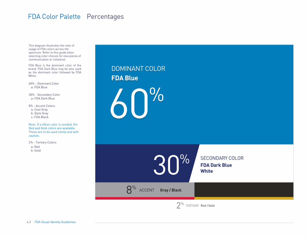
This diagram illustrates the ratio of usage of FDA colors across the spectrum. Refer to this guide when selecting color choices for new pieces of communication or collateral.
FDA Blue is the dominant color of the brand. FDA Dark Blue may be also used as the dominant color followed by FDA White.
60% - Dominant Color a: FDA Blue
30% - Secondary Color a: FDA Dark Blue
8% - Accent Colors a: Cool Gray b: Dark Gray c: FDA Black
Note: If a offset color is needed, the Red and Gold colors are available. These are to be used rarely and with caution.
2% - Tertiary Colors a: Red b: Gold
30%FDA Dark BlueWhite
SECONDARY COLOR
ACCENT8% Gray / Black
2% TERTIARY Red / Gold
60%FDA BlueDOMINANT COLOR
FDA Color Palette Gradient
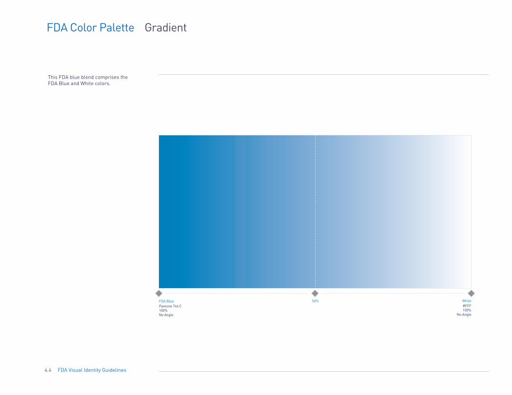
This FDA blue blend comprises the FDA Blue and White colors.
FDA Blue 50% White Pantone 746 C #FFF 100% 100% No Angle No Angle
4.4 FDA Visual Identity Guidelines

5. IMAGERY
5.1 Section Introduction 5.2 Photography 5.3 Incorrect Usage
5.0 FDA Visual Identity Guidelines

INTRODUCTION Images are a key element to the entire visual identity of the FDA. They impact the message as much as the data and content within the actual document. Therefore, it is very important to select the right types of images that will be able to clearly express the new brand.
This section provides guidance on the types of images to use in FDA communications materials, as well as the types of images to avoid using.
5.1 FDA Visual Identity Guidelines
FDA Imagery Photography
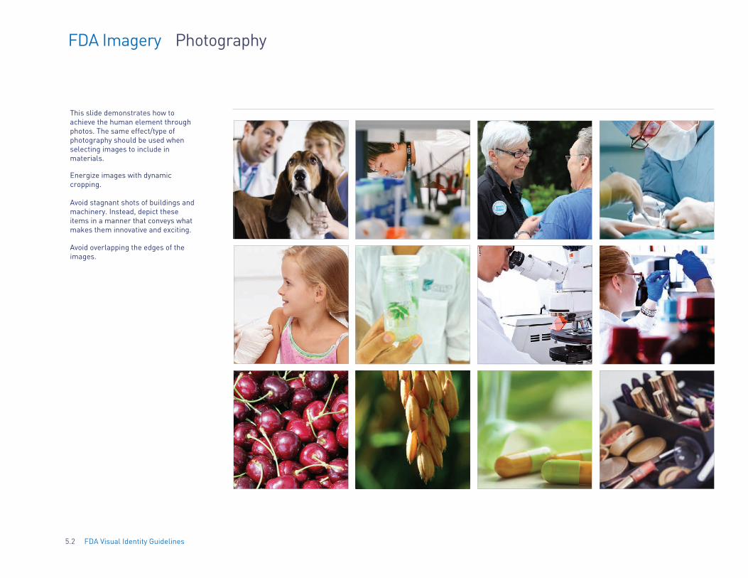
This slide demonstrates how to achieve the human element through photos. The same effect/type of photography should be used when selecting images to include in materials.
Energize images with dynamic cropping.
Avoid stagnant shots of buildings and machinery. Instead, depict these items in a manner that conveys what makes them innovative and exciting.
Avoid overlapping the edges of the images.
5.2 FDA Visual Identity Guidelines

FDA Imagery Incorrect Usage
Examples shown here demonstrate how to not photograph or choose an image.
Use caution when using line art and 3D renderings. Refer to page 5.2 for correct usage.
In order from left to right, top to bottom:
- Avoid bad subject lighting - Avoid blurry images - Avoid monochromatic images - Avoid magnifying too close
- Avoid stagnant shots of lab equipment and machinery - Avoid cutting subjects out of their
original setting
5.3 FDA Visual Identity Guidelines
- Avoid clip art

6. GRAPHIC ELEMENTS
6.1 Section Introduction 6.2 Logo Clear Space
6.0 FDA Visual Identity Guidelines

INTRODUCTION The FDA logo will live in different spaces within the communications materials. As the first section of the Visual Identity guidelines describes, there will always be a certain amount of clear space that has to live around the actual logo. Nothing else can be placed within this designated area. This section explains the use of graphic elements and how they can coincide with the logo.
6.1 FDA Visual Identity Guidelines

FDA Graphic Elements Logo - Top Clear (Protected) Space
When creating communication materials with the FDA logo and its lock-ups, the space above the bottom of the FDA Monogram must remain clear of any text or graphics.
Refer to section 1.0 for sizing and clear space for the FDA logo.
Content
www.fda.gov
6.2 FDA Visual Identity Guidelines

7. COMMUNICATIONS
7.1 Section Introduction 7.2 Letterhead 7.3 7.4 News Release 7.5 Publication Templates 7.6 Powerpoint 7.7 Video Title 7.8 Envelope 7.9 Email Signature
7.10 Business Card 7.11 Stationery Products 7.12 Awards/Certificates 7.13 Signage 7.14 Exhibits Style 7.15 E-Newsletter 7.16 Website 7.17 Web Banner Ads 7.18 Mobile UI 7.19 Social Media 7.20 Twitter Handle
Fact Sheet
7.0 FDA Visual Identity Guidelines

INTRODUCTION Now that we’ve addressed the correct usage of all of the brand components – from the FDA logo to the typography – the visual identity of the FDA is established. The instructions in the previous sections are meant to be used when developing all of the communications materials that the agency produces.
This next section takes the established brand components and provides examples of several commonly used templates that correctly apply the brand identity.
It is important to remember that the Offices and Centers will have access to templates shown in this section. Therefore, as long as the materials that are being developed follow the guidelines and standards outlined in section 1-6 of the Visual Identity Guidelines, or by using the pre-made templates, the communications materials produced will be considered valid.
7.1 FDA Visual Identity Guidelines
FDA Communications
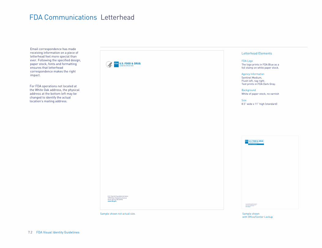
Email correspondence has made receiving information on a piece of letterhead feel more special than ever. Following the specified design, paper stock, fonts and formatting ensures that letterhead correspondence makes the right impact.
Letterhead
U.S. Food & Drug Administration 10903 New Hampshire Avenue Silver Spring, MD 20993 www.fda.gov
Sample shown not actual size.
Letterhead Elements
FDA Logo The logo prints in FDA Blue as a foil stamp on white paper stock.
Agency Information Sentinel Medium, Flush left, rag right. Text prints in FDA Dark Gray.
Background White of paper stock, no varnish
Size 8.5” wide x 11” high (standard)
OFFICE OF THE COMMISSIONER
U.S. Food & Drug Administration 10903 New Hampshire Avenue Silver Spring, MD 20993 www.fda.gov
Sample shown with Office/Center Lockup
7.2 FDA Visual Identity Guidelines
For FDA operations not located at the White Oak address, the physical address at the bottom left may be changed to identify the actual location's mailing address.

FDA Communications Fact Sheet
Sed ut perspiciatis unde omnis iste natus error sit voluptatem accusantium doloremque laudantium, totam rem aperiam, eaque ipsa quae ab illo inventore veritatis et quasi architecto beatae vitae dicta sunt explicabo. Nemo enim ipsam voluptatem quia voluptas sit aspernatur aut odit aut fugit, sed quia consequuntur magni dolores eos qui ratione voluptatem sequi nesciunt. Neque porro quisquam est, qui dolorem ipsum quia dolor sit amet, consectetur, adipisci velit, sed quia non numquam eius modi tempora incidunt ut labore et dolore magnam aliquam quaerat voluptatem. Ut enim ad minima veniam, quis nostrum exercitationem ullam corporis suscipit laboriosam, nisi ut aliquid ex ea commodi consequatur? Quis autem vel eum iure reprehenderit qui in ea voluptate velit esse quam nihil molestiae consequatur, vel illum qui dolorem eum fugiat quo voluptas nulla pariatur.
Sed ut perspiciatis unde omnis iste natus error sit voluptatem accusantium doloremque laudantium, totam rem aperiam, eaque ipsa quae ab illo inventore veritatis et quasi architecto beatae vitae dicta sunt explicabo. Nemo enim ipsam voluptatem quia voluptas sit aspernatur aut odit aut fugit, sed quia consequuntur magni dolores eos qui ratione voluptatem sequi nesciunt.
Nemo enim ipsam voluptatem quia voluptas sit aspernatur aut odit aut fugit, sed quia consequuntur magni dolores eos qui ratione voluptatem sequi nesciunt. Neque porro quisquam est, qui dolorem ipsum quia dolor sit amet, consectetur, adipisci velit, sed quia non numquam eius modi tempora incidunt ut labore et dolore magnam aliquam quaerat voluptatem. Ut enim ad minima veniam, quis nostrum exercitationem ullam corporis suscipit laboriosam, nisi ut aliquid ex ea commodi consequatur? Quis autem vel eum iure reprehenderit qui in ea voluptate velit esse quam nihil molestiae consequatur, vel illum qui dolorem eum fugiat quo voluptas nulla pariatur.
Neque porro quisquam est, qui dolorem ipsum quia dolor sit amet, consectetur, adipisci velit, sed quia non numquam eius modi tempora incidunt ut labore et dolore magnam aliquam quaerat voluptatem.
Ut enim ad minima veniam, quis nostrum exercitationem ullam corporis suscipit laboriosam, nisi ut aliquid ex ea commodi consequatur? Quis autem vel eum iure reprehenderit qui in ea voluptate velit esse quam nihil molestiae consequatur, vel illum qui dolorem eum fugiat quo voluptas nulla pariatur
FDA Fact Sheet Template (using no-color 1-tier lock-up
CENTER FOR TOBACCO CONTROL
FACT SHEET PROTECTING PUBLIC HEALTH
BACKGROUND: Nemo enim ipsam voluptatem quia voluptas sit aspernatur aut odit aut fugit, sed quia consequuntur magni dolores eos qui ratione voluptatem sequi nesciunt.
Nemo enim ipsam voluptatem quia voluptas sit aspernatur aut odit aut fugit, sed quia consequuntur magni dolores eos qui ratione voluptatem sequi nesciunt. Neque porro quisquam est, qui dolorem ipsum quia dolor sit amet, consectetur, adipisci velit, sed quia non numquam eius modi tempora incidunt ut labore et dolore magnam aliquam quaerat voluptatem. Ut enim ad minima veniam, quis nostrum exercitationem ullam corporis suscipit laboriosam, nisi ut aliquid ex ea commodi consequatur? Quis autem vel eum iure reprehenderit qui in ea voluptate velit esse quam nihil molestiae consequatur, vel illum qui dolorem eum fugiat quo voluptas nulla pariatur.
Neque porro quisquam est, qui dolorem ipsum quia dolor sit amet, consectetur, adipisci velit, sed quia non numquam eius modi tempora incidunt ut labore et dolore magnam aliquam quaerat voluptatem.
Ut enim ad minima veniam, quis nostrum exercitationem ullam corporis suscipit laboriosam, nisi ut aliquid ex ea commodi consequatur? Quis autem vel eum iure reprehenderit qui in ea voluptate velit esse quam nihil molestiae consequatur, vel illum qui dolorem eum fugiat quo voluptas nulla pariatur
September 2, 2015
FDA Fact Sheet Template (using color 1-tier lock-up
7.3 FDA Visual Identity Guidelines

7.4 FDA Visual Identity Guidelines
Logo Area
Article Headline
Contact Information
Body
FDA Communications News Release
WWW.FDA.GOV

FDA Communications Publication Templates
The format and layout of newsletters and publications should be designed as part of the overall communication goal of the item with both the subject matter and audience in mind. There are no layout specifications for the inside pages of a multipage publication. The only specification is the placement of the brand elements per this guide.
FDA.GOV
Example of a lettersize layout
FDA.GOV
Example of a trifold brochure layout
FDA.GOV
Example of a custom-size layout
FDA.GOV
Example of a lettersize cover design
FOOD SAFETY
FDA.GOV
FOOD SAFETY RESEARCH 2015
Example of a trifold brochure cover design
Example of a custom-size layout
7.5 FDA Visual Identity Guidelines

LOREM IPSUM DOLOR SIT AMET, CONSECTETUR ADIPISCING ELIT SED
LOREM IPSUM DOLOR SIT
Quote http://www.fda.gov/Food/IngredientsPackagingLabeling/FoodAdditivesIngredients/ucm449162.htm
could prevent thousands of heart attacks and deaths each year.
FDA.GOV 4
FDA Communications PowerPoint Presentations
Designed with the ease of printing in mind, PowerPoint presentations are Cover Page (with graphic ) optional Title Page Section Divider Page Quote Text Page set on a white background. They should be short, image-heavy and text-light.
2 LOREM IPSUM DOLOR SIT AMET, CONSECTETUR
FDA.GOV 3
Two Column Text Page Three Column Text Page Image with Text Page Product Image Page
LOREM IPSUM DOLOR - Quisque volutpat ante ut - Quisque volutpat ante ut
- Magna ornare malesuada. - Magna ornare malesuada.
- Nam aliquet libero vel - Nam aliquet libero vel
- Lacus interdum mollis. - Lacus interdum mollis.
- Aliquam scelerisque tortor - Aliquam scelerisque tortor
- Quis arcu cursus, quis - Quis arcu cursus, quis
- Pharetra sapien dapibus. - Pharetra sapien dapibus.
- Sed ut tortor id lorem - Sed ut tortor id lorem
- Ornare tincidunt. - Ornare tincidunt.
- Curabitur eu lorem vitae - Curabitur eu lorem vitae
- Eiam malesuada pulvinar - Eiam malesuada pulvinar
- Quis arcu cursus, quis - Quis arcu cursus, quis
- Pharetra sapien dapibus. - Pharetra sapien dapibus.
- Sed ut tortor id lorem - Sed ut tortor id lorem
FDA.GOV 5
Large Statement Page
LOREM IPSUM DOLOR SIT AMET, CONSECTUR ADLING ELIT, SED DO EIUSMOD TEMPOR INCIDIDUNT UT LABORE ET DOLORE.
FDA.GOV 9
LOREM IPSUM DOLOR Lorem ipsum dolor sit amet, consectetur
adipiscing elit, sed do eiusmod tempor
incididunt ut labore et dolore magna aliqua.
Ut enim ad minim veniam, quis nostrud
exercitation ullamco laboris nisi ut aliquip ex
ea commodo consequat.
Lorem ipsum dolor sit amet, consectetur
adipiscing elit, sed do eiusmod tempor
incididunt ut labore et dolore.
7
LOREM IPSUM DOLOR - Quisque volutpat ante ut - Quisque volutpat ante ut - Quisque volutpat ante ut
- Magna ornare malesuada. - Magna ornare malesuada. - Magna ornare malesuada.
- Nam aliquet libero vel - Nam aliquet libero vel - Nam aliquet libero vel
- Lacus interdum mollis. - Lacus interdum mollis. - Lacus interdum mollis.
- Aliquam scelerisque tortor - Aliquam scelerisque tortor - Aliquam scelerisque tortor
- Quis arcu cursus, quis - Quis arcu cursus, quis - Quis arcu cursus, quis
- Pharetra sapien dapibus. - Pharetra sapien dapibus. - Pharetra sapien dapibus.
- Sed ut tortor id lorem - Sed ut tortor id lorem - Sed ut tortor id lorem
- Ornare tincidunt. - Ornare tincidunt. - Ornare tincidunt.
- Curabitur eu lorem vitae - Curabitur eu lorem vitae - Curabitur eu lorem vitae
- Eiam malesuada pulvinar - Eiam malesuada pulvinar - Eiam malesuada pulvinar
- Quis arcu cursus, quis - Quis arcu cursus, quis - Quis arcu cursus, quis
- Pharetra sapien dapibus. - Pharetra sapien dapibus. - Pharetra sapien dapibus.
- Sed ut tortor id lorem - Sed ut tortor id lorem - Sed ut tortor id lorem
6
LOREM IPSUM DOLOR - Quisque volutpat ante ut
- Magna ornare malesuada.
- Nam aliquet libero vel
- Lacus interdum mollis.
- Aliquam scelerisque tortor
- Quis arcu cursus, quis
- Quisque volutpat ante ut
- Magna ornare malesuada.
- Nam aliquet libero vel
- Lacus interdum mollis.
- Aliquam scelerisque tortor
- Quis arcu cursus, quis
Interior Page Template/ FDA Monogram Placement
Getting It Right
When you do have to include longer pieces of text, use bullets whenever possible.
Last Page
Content
7.6 FDA Visual Identity Guidelines

FDA Communications Television and Live Feed/Streaming
Each FDA-branded video includes a standard identifier and closing slide, consisting of the FDA Monogram on blue background, as shown below. Logo Position
The logo will be at bottom center-aligned across the screen as shown below.
Closing screen
7.7 FDA Visual Identity Guidelines
FDA Communications Videos
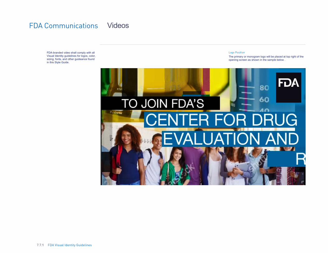
FDA-branded video shall comply with all Visual Identity guidelines for logos, color, sizing, fonts, and other guideance found in this Style Guide.
Logo Position
The primary or monogram logo will be placed at top right of theopening screen as shown in the sample below .
7.7.1 FDA Visual Identity Guidelines
FDA Communications Envelope
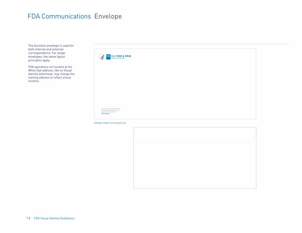
The business envelope is used for both internal and external correspondence. For larger envelopes, the same layout principles apply.
FDA operations not located at the White Oak address, like on Visual Identity letterhead, may change the mailing address to reflect actual location.
U.S. Food & Drug Administration 10903 New Hampshire Avenue Silver Spring, MD 20993 www.fda.gov
Sample shown not actual size.
7.8 FDA Visual Identity Guidelines

FDA Communications Email Signature
Email Signature Elements
Standardized email signatures that list all pertinent contact information per the example. Customize individual contact details only.
Type: 9/12 pt.Arial Upper and lower case Aligned flush left/rag right
7.9 FDA Visual Identity Guidelines
Signature Block Example:
Your Name Your title
Your Center Your Office U.S. Food and Drug Administration Tel: xxx-xxx-xxxx [Your email name]@fda.hhs.gov

FDA Communications Business Cards
Business Card Elements To ensure specifications are exactly as follows, business cards may be ordered for a fee through the Government Printing Office "Ability One" GSA contract, or through the HHS "Professional Services Center (PSC)."
Note: ORA Investigator and Special Agent Badged Employees Only There are four contact lines for input-T-telephone; C-cell; F-fax, (or for a second contact number); and E-email address. Note: The "F" line may also be left blank if desired.
Front Standard card with HHS Lockup
Back Standard Card
FDA Logo Front: FDA Blue, and FDA White logo. Back: FDA Monogram in FDA Blue
Front Investigator
Front Special Agent
7.10 FDA Visual Identity Guidelines
Attention Public Health Service Commissioned Corp Officers:
Please use the ORA Investigator and Special Agent order form. In the comments section, ask for PHS emblem to be placed on the right side of the business cards (where the ORA badges are placed in this example).

FDA Communications Stationery Products
Name Badge
First, Last Name
Folder
John J. Doe Invitation, Note Card and Thank You Card
OFFICIAL TITLE OFFICE/CENTER
Alternate Folder
Table Tent
7.11 FDA Visual Identity Guidelines

FDA Communications
FDA Visual Identity Guidelines7.12
Awards/Certificates
One signature certificate
Two signature certificate
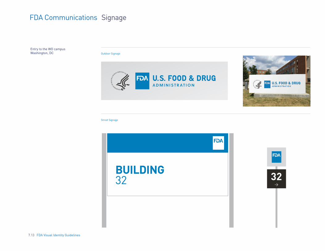
FDA Communications Signage
Entry to the WO campus Washington, DC Outdoor Signage
Street Signage
BUILDING 32 32
>
7.13 FDA Visual Identity Guidelines

FDA Communications Exhibits Style
As with all publications, the FDA identifying elements must be used according to specifications.
Logo Area (align right)Banner Treatment
www.fda.gov
www.fda.gov
Consider the space 2’ from the lower edge as an allowance for table space. The main subject matter of the exhibit should be placed higher than this allowance.
7.14 FDA Visual Identity Guidelines

FDA Communications E-Newsletter
FDA Visual Identity Guidelines7.15
Absolute care and consideration should be taken when creating E-Newsletters/emails that will arrive directly in a consumer’s inbox. Ensure that the design and writing meet the highest standards — informative and interesting — to avoid any possibility of being viewed as spam.
Remember to always Include all required legal and disclaimer copy.
Office of Health & Constituent Affairs
VOLUME 5 | NUMBER 17 | AUGUST 19, 2015PATIENT NETWORK NEWS
This bi-weekly newsletter provided by the Office of Health and Constituent Affairs at the Food and Drug Administration (FDA) is intended to inform you of FDA-related information on a variety of topics, including new product approvals, significant labeling changes, safety warnings, notices of upcoming public meetings, proposed regulatory guidances and opportunity to comment, and other information of interest to patients and patient advocates. Subscribe or update your subscriber preferences.
Header Module
2 Rows with Label Module
Large Image, action items, and Label Module
Co-Brand Label and double column Module
Footer Module
PRODUCT SAFETY
IMAGE
Achieving Zero Contains Hidden Drug IngredientThe Food and Drug Administration (FDA) is advising consumers not to purchase or use Achieving Zero, a product promoted and sold for weight loss on various websites such as www.amazon.com.
FDA laboratory analysis confirmed that Achieving Zero contains sibutramine. Sibutramine is a controlled substance that was removed from the market in October 2010 for safety reasons. The product poses a threat to consumers because sibutramine is known to substantially increase blood pressure and/or pulse rate in some patients and may present a significant risk for patients with a history of coronary artery disease, congestive heart failure, arrhythmias, or stroke. This product may also interact, in life-threatening ways, with other medications a consumer may be taking. More information
FDA's Role in Ensuring American Patients Have Access to Safe and Effective Medical Device Technology
Over the past five years, the Food and Drug Administration's device program has shown a pattern of markedly improved performance. Today it is performing strongly across a wide range of performance measures. At the same time, FDA has implemented a range of initiatives to promote access to safe and effective medical devices for American patients.
These improvements include those to 510(k) and premarket approval (PMA) review times along with a reduction in Investigational Device Exemption (IDE) review times of almost a full year-which means many devices investigated in the United States now reach the market a full year sooner than they did at the beginning of this decade. Performance in FDA's review of novel, moderate risk devices has also improved markedly, demonstrating the success of FDA's efforts to expand use of its de novo review pathway. More information
Over the past five years, the Food and Drug Administration's device program has shown a pattern of markedly improved performance. Today it is performing strongly across a wide range of performance measures. At the same time, FDA has implemented a range of initiatives to promote access to safe and effective medical devices for American patients.
PRODUCT SHORTAGES & DISCONTINUATIONS
Achieving Zero Contains Hidden Drug IngredientThe Food and Drug Administration (FDA) is advising consumers not to purchase or use Achieving Zero, a product promoted and sold for weight loss on various websites such as www.amazon.com.
Nulla tincidunt nibh eget egestas condimentum.Nullam eu dui posuere, finibus diam in, cursus ligula.Phasellus nec nisl pulvinar, vestibulum turpis vel, tincidunt velit.Maecenas viverra mauris sit amet enim laoreet, ut venenatis ligula tristique.
FDA laboratory analysis confirmed that Achieving Zero contains sibutramine. Sibutramine is a controlled substance that was removed from the market in October 2010 for safety reasons. The product poses a threat to consumers because sibutramine is known to substantially increase blood pressure and/or pulse rate in some patients and may present a significant risk for patients with a history of coronary artery disease, congestive heart failure, arrhythmias, or stroke. This product may also interact, in life-threatening ways, with other medications a consumer may be taking. More information
IMAGE
REPORT A PROBLEM SAFETY INFORMATION STAY INFORMED
YOUR FDA GATEWAY FOR CLINICALLY IMPORTANT SAFETY INFORMATION ANDREPORTING SERIOUS PROBLEMS WITH HUMAN MEDICAL PRODUCTS.
MedWatch Safety Alert: OxyTOTE Portable Oxygen Unit by Western/Scott Fetzer Company: Class I Recall - May Ignite and BurstThe company received reports that when the OxyTote is mishandled or dropped, the oxygen cylinder may ignite causing an internal flash fire and the canister to burst. See FDA Recall notice for a list of affected Lot and Model numbers. The firm has received a total of 2 reports of incidents in which the device has malfunctioned, including 1 injury and 1 death. When the injury occurred,
MEDWATCH
IMAGE
HEADER 2MedWatch Safety Alert: OxyTOTE Portable Oxygen Unit by Western/Scott Fetzer Company: Class I Recall - May Ignite and BurstThe company received reports that when the OxyTote is mishandled or dropped, the oxygen cylinder may ignite causing an internal flash fire and the canister to burst. See FDA Recall notice for a list of affected Lot and Model numbers. The firm has received a total of 2 reports of incidents in which the device has malfunctioned, including 1 injury and 1 death. When the injury occurred,
HEADER 2
IMAGE

FDA Communications Website
This is a mockup of the logo living on the current website.
7.16 FDA Visual Identity Guidelines

Example 1 Example 2 Example 3
LARGE HEADLINE TEXT
HEA
DLI
NE
STA
TEM
ENT
Sub-Headline
LARGE HEADLINE TEXT Sub-Headline
FDA Communications Web Banner Ads
Each web banner ad should be designed to create maximum impact within its size and resolution. Copy should be extremely short and to the point. Every ad must display an FDA master logo or monogram as well as a call to action.
Vertical Horizontal Rectangular
Example 1 (Top)
Example 2
HEADLINE Sub-Headline
LEARN MORE
HEADLINE Sub-Headline
HEADLINE Sub-Headline
Example 1 (Top)
Example 2
7.17 FDA Visual Identity Guidelines
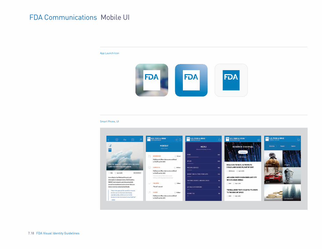
FDA Communications Mobile UI
App Launch Icon
Smart Phone, UI
7.18 FDA Visual Identity Guidelines
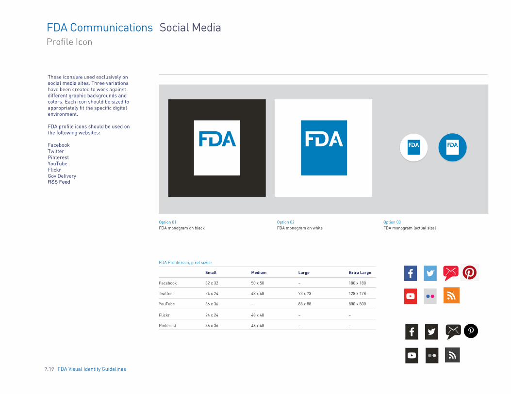
FDA Communications Social Media Profile Icon
These icons are used exclusively on social media sites. Three variations have been created to work against different graphic backgrounds and colors. Each icon should be sized to appropriately fit the specific digital environment.
FDA profile icons should be used on the following websites:
Facebook Twitter Pinterest YouTube Flickr Gov Delivery RSS Feed
Option 01 FDA monogram on black
Option 02 FDA monogram on white
Option 03 FDA monogram (actual size)
FDA Profile icon, pixel sizes:
Small Medium Large Extra Large
Facebook 32 x 32 50 x 50 – 180 x 180
Twitter 24 x 24 48 x 48 73 x 73 128 x 128
YouTube 36 x 36 – 88 x 88 800 x 800
Flickr 24 x 24 48 x 48 – –
Pinterest 36 x 36 48 x 48 – –
7.19 FDA Visual Identity Guidelines

FDA Communications Twitter
7.20 FDA Visual Identity Guidelines

8. EXAMPLE APPLICATIONS
8.1 8.2 8.3 8.4 8.5 8.6 8.7 8.8
Section Introduction Stamp Signage Awards Wearables Items Handbook Street Poster
8.0 FDA Visual Identity Guidelines
INTRODUCTION Similar to Section 7 of the Visual Identity Guidelines, this next section includes several examples of the brand. These are examples of best practices for implementing the brand throughout various materials and platforms. These examples demonstrate the correct use of the logo and help bring the new brand to life.
These examples are not the only implementations that can be used. The Offices and Centers have the option to design their own variations of these applications, as long as the brand guidelines outlined within section 1-6 are being followed.
8.1 FDA Visual Identity Guidelines

FDA Example Applications Stamp
8.2 FDA Visual Identity Guidelines

Text goes here.
FDA Example Applications Signage
8.3 FDA Visual Identity Guidelines

FDA Visual Identity Guidelines8.4
Text goes here.
2015FDA Scientific Achievement Award
2015
2015
Presented to:Margaret Bash, MD
Presented to:Michelle L. Kornele, PhD
Excellence inREVIEW SCIENCE
30 Year Length of ServiceRichard Barror
CENTER FOR BIOLOGICS & RESEARCH
CENTER FOR VETERINARY MEDICINE
Excellence inMentoring Award
FDA Example Applications Awards

Text goes here.
FDA Best Practices Wearables
FDA baseball cap Lab coat
8.5 FDA Visual Identity Guidelines

Text goes here.
FDA Example Applications Items
Tshirt/Polo Briefcase/Messenger Bag Coffee Mug
8.6 FDA Visual Identity Guidelines

FDA Example Applications Handbook
8.7 FDA Visual Identity Guidelines

FDA Example Applications Street Poster
8.8 FDA Visual Identity Guidelines

9. CONTACT INFORMATIONPlease contact the Office of External Affairs if you have any
questions about the use of the FDA Visual Identity Guidelines.
Email: [email protected]
9.0 FDA Visual Identity Guidelines