Embed Size (px)
DESCRIPTION
Eura's digital folio
Citation preview


BRANDING PRINTING DESIGNEDITORIAL DESIGN
ILLUSTRATIONPHOTOGRAPHY


‘Eura’ is identity as a designer. I made a logo with my name in a circle. My friends chose yellow because it reminds them of me. The shape and colour reminded me of a balloon, so I designed it as a poster.

BRANDING
[Colour Jean]Clothing Tag

The triangular shaped tag was designed for a new jean line ‘Skinny Fit Tapered Colour Jeans’. Gymnasts represent the product’s flexibility and elasticity.

Quality Water
WHY Organic?
Higher levels
of Nutrition
Less of
CarbonFoot print
AND
EVEN
TASTESBETTER
Co2
CaFe
NOChemical fertilisers, Insecticides, Hervicides and Fungicides.
When It’s Good for USIt’s Good for
our NATURE, too.
GM Free Feed
Well Structured
Soil
[Kind Milk]Packaging & Infographic
A design for ‘Kind Milk’ organic milk. The packaging design emphasizes the benefit of organic milk with a simple and easy infographic.


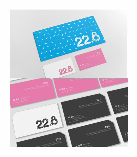
22.8 is a group of creative people in Korea who make various forms of media art. I was asked to design a logo and a business card.
[22.8]Logo & Business card


[Herb Island]Menu design
Herb Island is a restaurant in Korea that recently renovated their style. I designed a youth-focused menu seeing as the follow that trend.

[The North Cereal]Packaging


PRINTING DESIGN
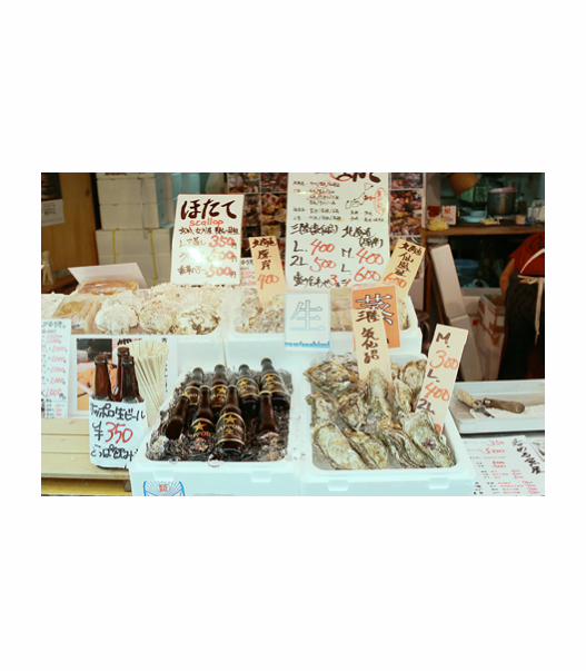
[Oyster]Postcard
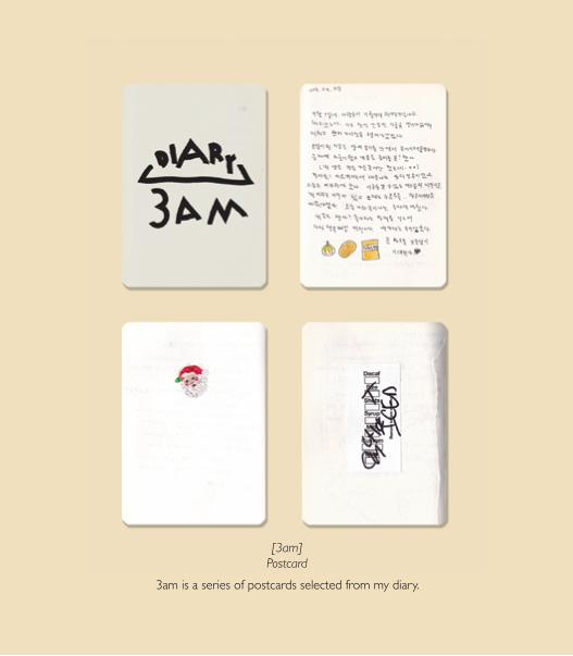
[3am]Postcard
3am is a series of postcards selected from my diary.

‘The Sea’ is a multipage publication about Robert Lynd’s essay: The Sea.
The requirements included using only one A3 sized paper, some kind of fold, and two colours. I used a pop-up of the contour of an island in Hawaii inside.

EDITORIAL DESIGN
[The Sea]A3, Publication

[Winter X Game]A5, Brochure
A small booklet about the extreme winter sports known as ‘X Game.’


[Key Mag]21cm X 21cm, Magazine
‘Key Mag’ is a fashion magazine created in collaboration with Emele. It was developed as an assignment for the Graphic Design course at Southbank Institute of Technology.

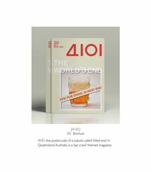
[4101]A5, Brochure
4101, the postal code of a suburb called ‘West end’ in Queensland, Australia, is a ‘bar crawl’ themed magazine.


ITALYGENOA
PISA
CINQUE TERRE
MonterossoVernazza
CornigliaManarola
Riomaggiore
3 nights accommodation with private facilities Breakfast included
The “Five Lands” on the Ligurian Riviera coastline is renowned for spectacular, unspoilt scenery and walking and hiking trails including the ‘Via d’Amore’ (Route of Love). The villages making up the Cinque Terre are perched high on the cliff tops.
*Cost includes: Accommodation with private facilities. Breakfast daily. Service charges and tax.
LIMITED OFFER 4Days / 3Nights
from $348 per person twin share
Prices are a guide only and not valid during special events. Season dates may vary; reductions, supplements or minimum stays may apply during certain periods. Please contact your travel agent for exact seasons and prices. Specials are released throughout the year.
Punta MescoVia Molinelli, 35 Monterosso Al MareColourful hotel completely renewed and located just 300 metres from the rail station. 17 well appointed rooms featuring satellite TV, internet connection and hairdryer. The restaurant is located on the seashore, a short walk from the hotel. Parking is available. A/C.
CINQUE TERRE
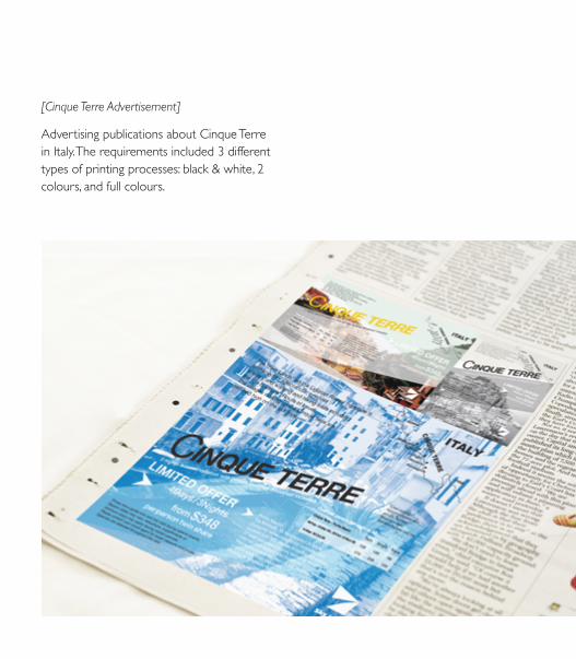
[Cinque Terre Advertisement]
Advertising publications about Cinque Terre in Italy. The requirements included 3 different types of printing processes: black & white, 2 colours, and full colours.

[Q Digital]A4, Annual report


ILLUSTRATION[Gold Fish]
Water colour
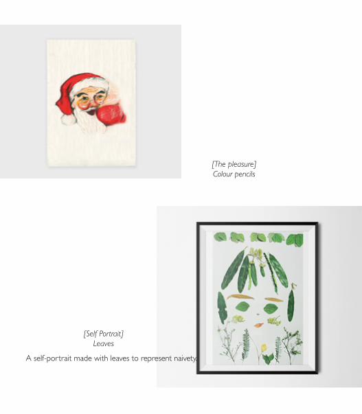
[The pleasure]Colour pencils
[Self Portrait]Leaves
A self-portrait made with leaves to represent naivety.

[Map To Get Lost]Illustrator
My first project in university: to design a map of the way from my home to school. I presented the map in the form of plastic assembling toys.

[Gift Wrappers]Summer / Winter Theme
Packaging


PHOTOGRAPHY