Embed Size (px)
Citation preview

Diagrams as Tools for Scientific Reasoning
Adele Abrahamsen & William Bechtel
Published online: 12 November 2014# Springer Science+Business Media Dordrecht 2014
Abstract We contend that diagrams are tools not only for communication but also forsupporting the reasoning of biologists. In the mechanistic research that is characteristicof biology, diagrams delineate the phenomenon to be explained, display explanatoryrelations, and show the organized parts and operations of the mechanism proposed asresponsible for the phenomenon. Both phenomenon diagrams and explanatory relationsdiagrams, employing graphs or other formats, facilitate applying visual processing tothe detection of relevant patterns. Mechanism diagrams guide reasoning about how theparts and operations work together to produce the phenomenon and what experimentsneed to be done to improve on the existing account. We examine how these functionsare served by diagrams in circadian rhythm research.
1 Introduction
Anyone who has read a journal article or attended a talk by a biologist knows thatbiologists make extensive use of diagrams. What functions do these serve? The mostobvious function is communication. Late in the research process, diagrams are de-ployed in research reports to convey to others the hypotheses, apparatus, methods,findings, and other completed aspects of the research process. If that is their onlyfunction, those interested in the cognitive activities of scientific inquiry may regarddiagrams as epiphenomenal. We contend that in fact scientists use diagrams as toolsthroughout the research process. In this paper we focus in particular on the distinctivefunctions served by diagrams in three aspects of mechanistic research:
(1) delineating the phenomenon to be explained;(2) identifying explanatory relations (relations between variables that are relevant to
explaining the phenomenon);(3) constructing and revising a mechanistic explanation of the phenomenon.
The term diagram does not have clear boundaries. Its etymology suggests a veryinclusive meaning—any visuospatial representation—which would cover virtually all
Rev.Phil.Psych. (2015) 6:117–131DOI 10.1007/s13164-014-0215-2
A. Abrahamsen :W. Bechtel (*)University of California, San Diego, USAe-mail: [email protected]

of the figures in a scientific paper including photographs, flow charts of aprocedure, and line drawings of an experimental apparatus. Here, though, wefocus more narrowly on those diagrams serving the epistemic functions mostrelevant to mechanistic explanation, which includes graphs and relatively ab-stract figures but usually excludes drawings and photographs. We distinguishthese three types, which correspond to the three aspects of mechanistic researchjust noted:
(a) Phenomenon diagrams help delineate the phenomenon of interest, often taking theform of a graph depicting the relation between two or more variables;
(b) Explanatory relations diagrams almost always take the form of a graph depictingthe relation between two or more variables, at least one of which is not in (a) butmay contribute to its explanation through its linkage to a part or operation in (c).
(c) Mechanism diagrams provide a visuospatial representation of the organized partsand operations of a mechanism, which may explain the phenomenon in (a).
This project has benefited from several existing strands of cognitive science researchon diagrams. Elucidating how diagrams convey information differently than text waspioneered by Larkin and Simon (1987) and addressed most comprehensively byTversky (2011), who has emphasized the use of space, icons, and what she callsglyphs (simple shapes and lines). Hegarty (Hegarty and Just 1993; Hegarty 2011) hasinvestigated the use of diagrams as tools for reasoning; for example, displaying adiagram of a pulley, she tracks eye movements as people judge the truth of sentencesabout its expected movements. Cheng (2002, 2011) has developed innovations in thedesign of diagrams and shown that they improve students’mastery of technical subjectssuch as electric circuitry and probability theory. In case studies of how specificdiagrams were used as tools for the cognitive activities of scientists—physicalscientists in particular—Cheng and Simon (1995) focused on Galileo andNersessian (2008) on Maxwell. We too examine diagrams as tools for scientistsbut focus on those pursuing mechanistic explanations, which predominate inbiology. The most relevant previous work is that of Gooding (2004, 2010) onthe role of diagrams in reconstructing extinct organisms. He showed how scientistsdeveloped representational formats that enabled their visual processing capacities tosee relevant patterns—for example, in diagrams spatially displaying the organizedparts of a reconstructed organism.
This project is situated at the nexus of work on diagrams in cognitive science andwork on explanation in philosophy of science. The latter is in flux. Mechanisticexplanations were pursued by biologists throughout the 19th and 20th centuries.However, they were little discussed in the dominant approaches to philosophy ofscience in the 20th century, which emphasized derivation from laws as the primaryexplanatory activity (Hempel 1965; Nagel 1961). Salmon (1984) advanced an influen-tial alternative perspective that focused on causal relations; although often referred to ascausal/mechanical, it did not incorporate biologists’ focus on the organized parts andoperations that compose a mechanism. Now a newer cohort of philosophers, includingBechtel and Richardson (1993/2010), Bechtel and Abrahamsen (2005), Craver (2007),Glennan (1996) and Machamer, Darden, and Craver (2000) are focusing on this kind ofmechanistic explanation in biology. Most recently, some have incorporated the
118 A. Abrahamsen, W. Bechtel

increased role of computational modeling of the dynamics of such mechanisms(Bechtel and Abrahamsen 2010, 2012b) Many are attending as well to the scientists’epistemic commitments and cognitive processes (e.g., Burnston 2013; Burnston et al.2014; Craver and Darden 2013). Another perspective is offered by philosophers ofscience who have embraced cognitive science research on distributed cognition (Giere2002; Osbeck, Nersessian, Malone, and Newstetter 2010). On these accounts, cognitivetasks are distributed across not only agents but also artifacts—which would promi-nently include diagrams for the tasks of science.
We will use the research field of circadian rhythms as an exemplar throughout thispaper, since it provides an especially fruitful specific case in which to examine howdiagrams serve as tools for scientists more generally. As the name suggests (circa =about + dies = day), circadian rhythms are oscillations with a period of approximately24 h. They are generated endogenously within organisms, but importantly, areentrainable to the day-night cycle in the local environment. These oscillations havebeen studied in organisms ranging from cyanobacteria and fungi to plants andanimals. While in humans they are perhaps most widely associated with sleeppatterns, they can be observed in a broad range of physiological and behavioralactivities. A major advance was the discovery that the underlying mechanism wasa 24-hour molecular clock: intracellular oscillations in the expression of certaingenes are responsible for the observed oscillations in metabolism, body tempera-ture, alertness, and numerous other measures. To facilitate discussion without havingto introduce too much biological detail, we will focus on the two most-studied variantsof the molecular clock, those in fruit flies and mice. Because these mechanisms containmany homologous components that share the same name, we will not emphasize thespecies differences.
2 Phenomenon Diagrams
We begin with diagrams that present the target of explanation—the phenomenon to beexplained—in a visual form that supports the scientist’s ability to detect salient patterns.In pointing to phenomena as the targets of explanation, Bogen and Woodward (1988)distinguished phenomena from the data they generate. On their account, a phenomenonis a repeatable regularity, and data are observed instances that point to or provideevidence for the phenomenon. Although Bogen and Woodward treat phenomena “as inthe world, as belonging to the natural order itself and not just to the way we talk aboutor conceptualize that order” (p. 321), it is important to note that it is only throughcognitive activity that researchers arrive at the patterns or regularities that they desig-nate as phenomena to be explained. Many of these cognitive activities take advantageof graphs or other external data displays that help our internal visual informationprocessing system to pick up patterns. The scientist may posit a phenomenon whenthe same general pattern is obtained repeatedly under appropriate conditions. When amechanism is proposed to explain that phenomenon, an important task in evaluating theproposed mechanism is to demonstrate, either qualitatively or quantitatively, that it iscapable of producing the general pattern.
Several diagram formats have been advantageous for identifying and thinking aboutcircadian phenomena; we will discuss three. We begin with line graphs, the most
Diagrams as Tools for Scientific Reasoning 119
ubiquitous format, in which values of a variable of interest can be plotted against time.We then turn to two other formats, actograms and phase response curves, which weredeveloped by circadian researchers to render particular phenomena visually accessible.
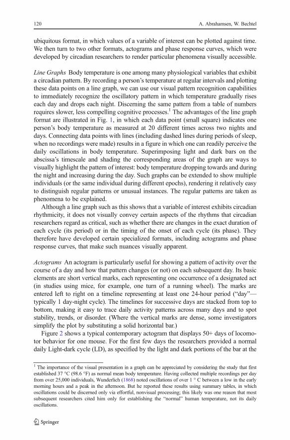
Line Graphs Body temperature is one among many physiological variables that exhibita circadian pattern. By recording a person’s temperature at regular intervals and plottingthese data points on a line graph, we can use our visual pattern recognition capabilitiesto immediately recognize the oscillatory pattern in which temperature gradually riseseach day and drops each night. Discerning the same pattern from a table of numbersrequires slower, less compelling cognitive processes.1 The advantages of the line graphformat are illustrated in Fig. 1, in which each data point (small square) indicates oneperson’s body temperature as measured at 20 different times across two nights anddays. Connecting data points with lines (including dashed lines during periods of sleep,when no recordings were made) results in a figure in which one can readily perceive thedaily oscillations in body temperature. Superimposing light and dark bars on theabscissa’s timescale and shading the corresponding areas of the graph are ways tovisually highlight the pattern of interest: body temperature dropping towards and duringthe night and increasing during the day. Such graphs can be extended to show multipleindividuals (or the same individual during different epochs), rendering it relatively easyto distinguish regular patterns or unusual instances. The regular patterns are taken asphenomena to be explained.
Although a line graph such as this shows that a variable of interest exhibits circadianrhythmicity, it does not visually convey certain aspects of the rhythms that circadianresearchers regard as critical, such as whether there are changes in the exact duration ofeach cycle (its period) or in the timing of the onset of each cycle (its phase). Theytherefore have developed certain specialized formats, including actograms and phaseresponse curves, that make such nuances visually apparent.
Actograms An actogram is particularly useful for showing a pattern of activity over thecourse of a day and how that pattern changes (or not) on each subsequent day. Its basicelements are short vertical marks, each representing one occurrence of a designated act(in studies using mice, for example, one turn of a running wheel). The marks areentered left to right on a timeline representing at least one 24-hour period (“day”—typically 1 day-night cycle). The timelines for successive days are stacked from top tobottom, making it easy to trace daily activity patterns across many days and to spotstability, trends, or disorder. (Where the vertical marks are dense, some investigatorssimplify the plot by substituting a solid horizontal bar.)
Figure 2 shows a typical contemporary actogram that displays 50+ days of locomo-tor behavior for one mouse. For the first few days the researchers provided a normaldaily Light-dark cycle (LD), as specified by the light and dark portions of the bar at the
1 The importance of the visual presentation in a graph can be appreciated by considering the study that firstestablished 37 °C (98.6 °F) as normal mean body temperature. Having collected multiple recordings per dayfrom over 25,000 individuals, Wunderlich (1868) noted oscillations of over 1 ° C between a low in the earlymorning hours and a peak in the afternoon. But he reported these results using summary tables, in whichoscillations could be discerned only via effortful, nonvisual processing; this likely was one reason that mostsubsequent researchers cited him only for establishing the “normal” human temperature, not its dailyoscillations.
120 A. Abrahamsen, W. Bechtel

top. On the remaining days the mouse was in constant darkness (DD), except for a brieflight pulse on 1 day, as indicated by the arrow labeled LP. The timeline at the bottomextends 48 h, not 24 h, because like many other actograms this one is double plotted:each day’s data is plotted not only below the previous day’s data but also (redundantly)to its right. This convention was developed to make it easier to detect patterns,especially by not cutting off an activity phase that straddles the 24th hour. It is visuallyobvious that different patterns are obtained in the LD vs. DD conditions. In the normalLD condition, this nocturnal animal’s activity begins at the onset of darkness andcontinues until shortly before “dawn.” But once in the DD condition (constant dark-ness, also known as free-running), its activity begins somewhat earlier each day,increasingly intruding into what previously had been the hours of light. From thesecontrasting patterns in the actogram it can be inferred that the period of the mouse’sendogenous cycle (revealed by DD) is a bit less than 24 h, and it is entrainment to lightin the external environment that stretches the normal (LD) period to 24 h.
Entrainment to light (or to certain other signals, such as a change in temperature) is acentral concern in circadian research. One tactic is to interject a single, isolated pulse oflight into the DD condition. The actogram in Fig. 2, in addition to visually conveyingthe activity patterns for LD and DD, shows the effect of one such light pulse on theonset of activity: substantially delayed on the first relevant day, but partially recoveredthe next day and, resuming the usual DD pattern, a bit earlier each subsequent day.
Fig. 1 Line graph from Koukkari and Southern (2006) showing the circadian oscillation in body temperaturefor one person across 48 h
Diagrams as Tools for Scientific Reasoning 121

Phase Response Curves In everyday life the capacity for entrainment is what enablesus to adjust, albeit slowly, when traveling across time zones or experiencing changes inthe amount of daylight at different times of year. While an actogram provides a way toshow that a single light pulse can advance or delay the next activity phase, circadianresearchers wanted to know more specifically the effect of the timing of the light pulseon the extent of advance or delay. They ran the necessary experiments and developed aspecialized type of line graph, the phase response curve, to visually display thequantitative findings.
To obtain Fig. 3, for example, hamsters were first maintained in an LD condition for7 days and then switched to DD (constant darkness) for another 7 days. On day 15, theresearchers provided a 60-minute pulse of light to each hamster at its assigned timewithin the 24-hour timeline on the abscissa and then recorded when its next activityphase began. The shift in that onset time (relative to the mean activity onset time for the7 baseline DD days) is shown on the ordinate. Zero shift (horizontal line) indicates noeffect of the light pulse; positive values indicate a phase advance and negative values aphase delay. (Note that the timeline is on circadian time, in which by convention thetime of activity onset for a nocturnal animal is designated as hour 12, the beginning ofsubjective night, and hour 0 is the beginning of subjective day. The duration of 24 h ofcircadian time in this example is a bit less than 24 h of clock time, and each hour is 1/24of that duration.)
Fig. 2 Example from Lowrey and Takahashi (2004) of a contemporary actogram. It makes apparent how theactivity of a mouse is entrained to light when it is under a light-dark cycle during the initial days (LD), freeruns with a period somewhat less than 24 h when in constant darkness (DD), and is only briefly affected by alight pulse (LP)
Fig. 3 Example (Takahashi, DeCoursey, Bauman, and Menaker 1984) of a contemporary phase responsecurve for a nocturnal species. The time at which a light pulse is delivered is shown on the abscissa and theextent of phase delay or advance is shown on the ordinate
122 A. Abrahamsen, W. Bechtel

Each data point in the phase response curve is the shift resulting from a light pulse atthe indicated circadian time, averaged across the six hamsters tested at that hour. Thecurve makes clear that a light pulse delivered during subjective day (hours 0–10) haslittle effect on when the next activity phase begins—which is not surprising, since thisis when light would have been expected but for the switch to constant darkness. Incontrast, a light pulse during the first 2 h of subjective night delays activity onset.Again this is not surprising, since the light would signal either that the hamster’scircadian clock was running too fast or that, as in spring, the period of daylight waslengthening. The phase delay is evidence of appropriate entrainment. Finally, a lightpulse imposed later in the night has the opposite effect: it advances the onset of thenext activity phase. Thus, the hamsters are interpreting these pulses as signaling anearlier than expected dawn (rather than an extension of dusk), and are entrainingaccordingly. The effect is most dramatic at hour 16 and weakens as the pulses comecloser to the anticipated start of subjective day—a finding that is easy to spot in thephase response curve due to its quantitative precision and good design.
The three diagrams discussed in this section were designed to provide a visualdisplay of the overall phenomenon of circadian rhythmicity (Fig. 1) and of morespecific circadian phenomena, especially the shorter period of endogenous cycles(Fig. 2) and the effect of the phase of the endogenous cycle on its entrainment toexternal light (Fig. 3). Each of the diagram formats used—line graph with light bar,actogram, and phase response curve—is the product of considerable revisions andtweaks to earlier versions (as discussed in detail in Bechtel and Abrahamsen 2012a).Thanks to the good design of today’s formats, anyone familiar with them has readyaccess via visual pattern recognition to key circadian phenomena.
3 Explanatory Relations Diagrams
Explanatory relations diagrams are visually indistinguishable from many phenomenondiagrams, in that they display the relations between two or more variables using linegraphs or other graphical formats. What makes a particular diagram explanatory is thatone or more of its variables is not among those portraying the phenomenon but iscausally linked to it—often due to its role in an existing or emerging mechanisticexplanation. The notion of an explanatory relation has not previously been recognizedin philosophical discussions of explanation. However, the theories, models, or mech-anistic accounts that are the focus of such discussions came about when scientists didthe empirical research required to find relevant explanatory relations and the mentalwork of pursuing their implications. Explanatory relations are at the center of actualscientific practice.2
As in the case of phenomena, scientists commonly plot raw data or summarymeasures of data in graphs so that visual perception can be exploited to grasp thepattern that gives the explanatory relation its specific form. This often involves
2 Our frequent collaborator, Daniel Burnston, first called our attention to explanatory relations and has led ourresearch group’s initial consideration of how explanatory relations diagrams figure in scientific practice. Thespecific construals and applications in this section are ours.
Diagrams as Tools for Scientific Reasoning 123
diagramming the same or related data in multiple ways, each designed to enable seeingthe relation differently or seeing a different relation. In this section we present twoexplanatory relations diagrams that provide exemplars of this practice. Notably, bothhone in on molecular genetics as the most promising level from which to findexplanatory relations to circadian phenomena at the behavioral level. The implications(as pursued in the next section) would include identifying parts of the molecularmechanism responsible for circadian rhythms in locomotor and other behaviors. Thesecond example brings in as well the cellular level, since it focuses on interactionsbetween the molecular mechanisms in different neurons.
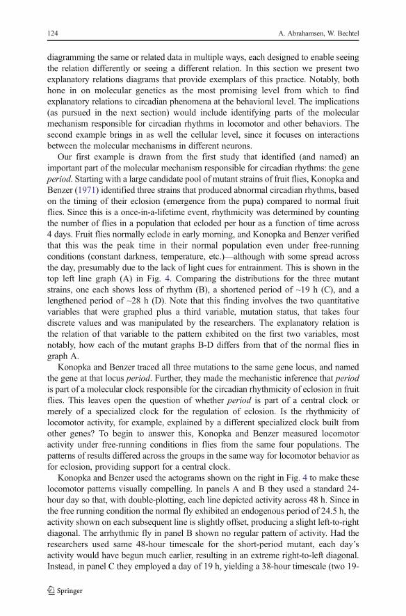
Our first example is drawn from the first study that identified (and named) animportant part of the molecular mechanism responsible for circadian rhythms: the geneperiod. Starting with a large candidate pool of mutant strains of fruit flies, Konopka andBenzer (1971) identified three strains that produced abnormal circadian rhythms, basedon the timing of their eclosion (emergence from the pupa) compared to normal fruitflies. Since this is a once-in-a-lifetime event, rhythmicity was determined by countingthe number of flies in a population that ecloded per hour as a function of time across4 days. Fruit flies normally eclode in early morning, and Konopka and Benzer verifiedthat this was the peak time in their normal population even under free-runningconditions (constant darkness, temperature, etc.)—although with some spread acrossthe day, presumably due to the lack of light cues for entrainment. This is shown in thetop left line graph (A) in Fig. 4. Comparing the distributions for the three mutantstrains, one each shows loss of rhythm (B), a shortened period of ~19 h (C), and alengthened period of ~28 h (D). Note that this finding involves the two quantitativevariables that were graphed plus a third variable, mutation status, that takes fourdiscrete values and was manipulated by the researchers. The explanatory relation isthe relation of that variable to the pattern exhibited on the first two variables, mostnotably, how each of the mutant graphs B-D differs from that of the normal flies ingraph A.
Konopka and Benzer traced all three mutations to the same gene locus, and namedthe gene at that locus period. Further, they made the mechanistic inference that periodis part of a molecular clock responsible for the circadian rhythmicity of eclosion in fruitflies. This leaves open the question of whether period is part of a central clock ormerely of a specialized clock for the regulation of eclosion. Is the rhythmicity oflocomotor activity, for example, explained by a different specialized clock built fromother genes? To begin to answer this, Konopka and Benzer measured locomotoractivity under free-running conditions in flies from the same four populations. Thepatterns of results differed across the groups in the same way for locomotor behavior asfor eclosion, providing support for a central clock.
Konopka and Benzer used the actograms shown on the right in Fig. 4 to make theselocomotor patterns visually compelling. In panels A and B they used a standard 24-hour day so that, with double-plotting, each line depicted activity across 48 h. Since inthe free running condition the normal fly exhibited an endogenous period of 24.5 h, theactivity shown on each subsequent line is slightly offset, producing a slight left-to-rightdiagonal. The arrhythmic fly in panel B shown no regular pattern of activity. Had theresearchers used same 48-hour timescale for the short-period mutant, each day’sactivity would have begun much earlier, resulting in an extreme right-to-left diagonal.Instead, in panel C they employed a day of 19 h, yielding a 38-hour timescale (two 19-
124 A. Abrahamsen, W. Bechtel

hour days). Since the actual period was 19.5 h, the actogram exhibits a slight left-to-right diagonal similar to that in panel A. Likewise, for the long-period mutant theyemployed a 56-hour timescale (two 28-hour days). Since the actual period was 28.6, thediagonal is similar to that for the normal fly (vs. an extreme left-to-right diagonal on a48-hour timescale). By adapting the timescales in this way the active phases stackednicely across days, so the short periods looked short at a glance, the long periods lookedlong at a glance, and the half-hour discrepancies for all except the arrhythmic allproduced the same slight diagonal.
Our second example brings out even more clearly how researchers oftenutilize a variety of diagram formats to understand explanatory relations. Thisresearch focused on relations between different neural cells in a mammalianbrain region that is specialized for coordinating circadian rhythms across theorganism, the suprachiasmatic nucleus (SCN). Individual neurons in the SCNhave been shown to maintain circadian rhythms but with varying periods. Aregular circadian rhythm is generated only by synchronizing the activity ofthese individually oscillating neurons, and (Ciarleglio, Gamble, Axley, Strauss,Cohen, Colwell, and McMahon 2009) investigated the role of a particularmolecule released by some SCN cells, vasoactive intestinal polypeptide (VIP),in achieving the synchrony that is important in producing circadian behavior.Specifically, in Fig. 5 the researchers compared six mice that differed in theirmutation status: VIP+/+ had two normal copies of the VIP gene; VIP+/− had onenormal and one deleted copy, and VIP−/− had both copies deleted. Within eachmutation status, one mouse had been maintained under a light-dark cycle (LD) andthe other in total darkness (DD).
Fig. 4 Left: Line graphs from Konopka and Benzer (1971) showing circadian rhythms of eclosion from apopulation of normal flies (a) and three mutant populations (b–d). Right: actogram showing the activityperiods of normal flies (a) and the three mutant populations (b–d)
Diagrams as Tools for Scientific Reasoning 125

In an earlier figure (not reproduced here), the researchers first provided actograms ofrunning wheel activity to show how these genetic and environmental conditions affectedbehavioral cycles. More indirect measures were needed to determine how they affectedthe molecular clocks within SCN neurons. For tractability these researchers focused onjust one clock component: a mammalian version of the period gene first identified infruit flies by Konopka and Benzer. As the expression activity of the two period genes inthe neuron’s nucleus oscillate, the result (at some delay) is similarly oscillating concen-trations of PER proteins in the neuron’s cytoplasm. Ciarleglio et al. attached a greenfluorescent reporter gene to period such that the expression activity of the two genes wasyoked. In consequence, oscillations in PER protein concentrations could be indirectlymeasured by visually tracking the fluorescent proteins. Specifically, values of relativefluorescence intensity over time were obtained with a special camera directed at SCNtissue slices (which, though removed from the rest of the SCN, continued to function).
The line graphs in Fig. 5 display these values for the slices from each of the six mice.The overall fluorescence fluctuations across 96 h are in Panel A, broken down to showthe variations across individual neurons in Panel B. It can be seen that the molecularclock within each neuron continues to produce oscillations under all conditions, but thatthe clocks become desynchronized within 2 days in the absence of VIP (strain VIP−/−)whereas in other conditions the oscillations remained fully synchronized (VIP+/+) orpartially synchronized (VIP+/−).
Panel C represents the Day 1 data using a different format, the Rayleigh plot, inwhich the 24 h of a single day are arranged in a circle rather than horizontally. The time
Fig. 5 Multiple diagram formats Ciarleglio et al. (2009) employed to identify a family of explanatoryrelations between VIP and the synchronization of SCN neurons
126 A. Abrahamsen, W. Bechtel

at which each detectable neuron in the slice reached 50 % of its maximum fluorescenceis marked by a blue arrowhead. 3 The distribution of these arrowheads presents adifferent way of visualizing the contrast between synchronized and desynchronizedclock activity in neurons. The red arrow in each plot shows the direction and strength ofthe overall vector characterizing that slice (which is very weak for the two VIP−/−
mutants). Finally, panel D uses yet another format, bar graphs, for a crisper depiction ofthe Panel B finding that the loss of VIP results in more variable phase timing. The lastbar graph informs us that this also results in a 6-hour phase advance on average.Although the diagrams in Panels A-D all draw on the same data, they identify differentrelations in those data that the researchers viewed as explanatorily relevant at the neuraland molecular levels. More specifically, VIP is not a component of the clock in eachneuron but is causally involved in the synchronization of clocks across neurons.
Each diagram in this section displays evidence that a manipulated variable wascausally related to variables characterizing the phenomenon of interest: an explanatoryrelation. Such relations can take a variety of forms (differing in number of variablesinvolved, whether they are discrete or quantitative, etc.), as can the diagrams conveyingthem (actogram, line graph, bar graph, Rayleigh plot, etc.). The diverse options can beadvantageous for obtaining different perspectives on the same data. Most important,though, is what they have in common: each diagram makes the explanatory relationaccessible via visual pattern recognition.
Researchers often stop here, satisfied to have identified a variable that in some wayis causally related to the phenomenon of interest and hence explanatorily relevant to it.Our interest is in those who take the next step, inferring from the specific causal relationeither the first sketch of the mechanism responsible for the phenomenon or someaddition or refinement to an existing mechanistic explanation. The examples in thissection point to the period gene as a part in the molecular clock mechanism, and VIP asa messenger between the clocks in different neurons. In the next section we examineanother researcher’s diagram showing period and possible associated parts and oper-ations as well as a later, more advanced version of the molecular clock mechanism.
4 Mechanism Diagrams
We turn finally to mechanism diagrams: those using icons or labels to represent variousparts of a mechanism and arrows or other devices to represent operations throughwhich parts are transformed or affect other parts. Although limited to the two dimen-sions of the page, researchers sometimes use spatial relations to directly represent actualspatial locations of parts and operations. More often, they use the space to cluster partsand operations that affect each other, so as to form a conceptual perspective on theorganization of the mechanism and how it works. Such diagrams support scientists’reasoning as they plan experiments to help fill in missing parts, explore alternativeconfigurations, mentally simulate the flow of activity through the mechanism, at leastto rule out versions that cannot work, or in many other ways seek to verify or improve
3 At those times of day with the most molecular clock activity, arrowheads are stacked further into the circle asnecessary to keep them distinct. The number of arrowheads per plot is not of interest; it simply indicates howmany neurons in the slice fluoresced.
Diagrams as Tools for Scientific Reasoning 127

the account. As more experiments are completed, revealing additional explanatoryrelations, more elaborate diagrams bring together their implications in user-friendlyformats.
We present two examples of mechanism diagrams in Fig. 6. Both were developed inthe process of achieving a mechanistic explanation of circadian rhythms in fruit flies.Hardin, Hall, and Rosbash (1990), building on Konopka and Benzer’s discovery of thegene period (per), were the first to demonstrate 24-hour oscillations in the concentra-tions of permRNA and (at some delay) PER protein. To account for this they proposedthat PER figured in some sort of feedback process whereby the greater its concentration,the more it inhibited its own further production. It was known that a negative feedbackloop was the type of organization that could generate oscillations, and that withsufficient delays and non-linearities these oscillations could be sustained indefinitely.
Hardin et al. therefore offered the diagram on the left side of Fig. 6, not as a firmproposal but rather as one that laid out in a common space the possible ways such anegative feedback loop might be constructed. There were three possible origins of thefeedback: the PER protein itself (X); an unidentified biochemical product of PER (Y);or some behavior (Z) of the organism that in some way relied on PER. Moreover, therewere two possible targets of the negative feedback, either of which would inhibitprotein production: per and its transcription into mRNA; or mRNA and its translationinto PER. The question marks on these alternative paths are a notable feature, used inmany mechanism diagrams in biology. They are a strong signal that the researchers areusing the diagram as an aid for reasoning about a mechanistic explanation and that it isstill in flux, pending empirical research. As results pruned some of the paths, a diagramlike this could serve as a dynamic tool in achieving an account of the molecularmechanism responsible for a phenomenon of interest (here, circadian rhythmicity).
Fig. 6 Left: Hardin, Hall, and Rosbash’s (1990) mechanism diagram proposing a transcription-translationfeedback loop for generating circadian rhythms in fruit flies. Right: Harmer, Panda, and Kay’s (2001) diagramshowing how the understanding of the fruit fly clock mechanism had developed over the following decade.Note the prominent use of question marks in both figures
128 A. Abrahamsen, W. Bechtel
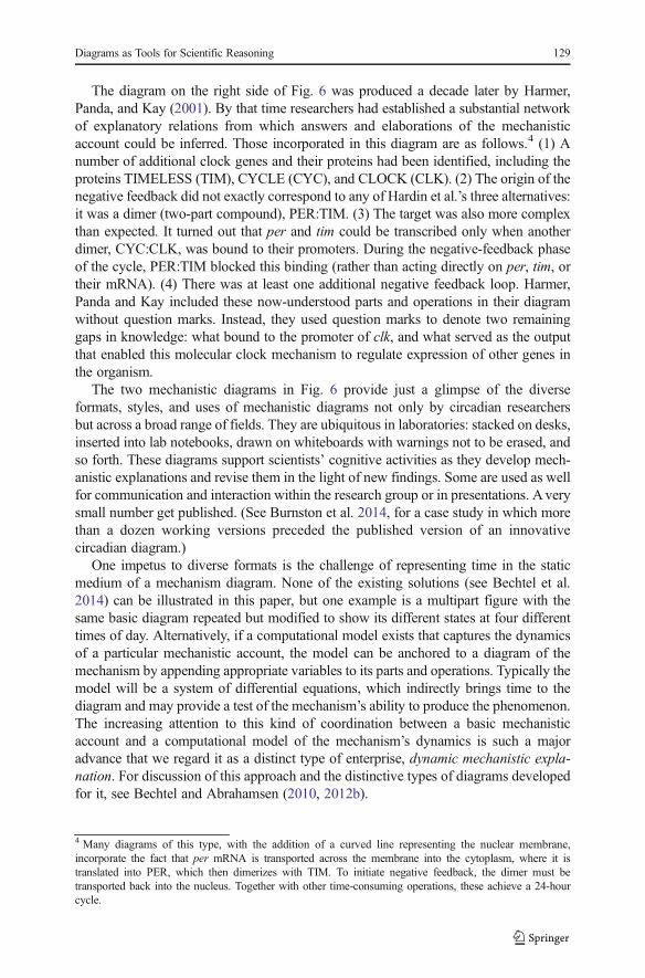
The diagram on the right side of Fig. 6 was produced a decade later by Harmer,Panda, and Kay (2001). By that time researchers had established a substantial networkof explanatory relations from which answers and elaborations of the mechanisticaccount could be inferred. Those incorporated in this diagram are as follows.4 (1) Anumber of additional clock genes and their proteins had been identified, including theproteins TIMELESS (TIM), CYCLE (CYC), and CLOCK (CLK). (2) The origin of thenegative feedback did not exactly correspond to any of Hardin et al.’s three alternatives:it was a dimer (two-part compound), PER:TIM. (3) The target was also more complexthan expected. It turned out that per and tim could be transcribed only when anotherdimer, CYC:CLK, was bound to their promoters. During the negative-feedback phaseof the cycle, PER:TIM blocked this binding (rather than acting directly on per, tim, ortheir mRNA). (4) There was at least one additional negative feedback loop. Harmer,Panda and Kay included these now-understood parts and operations in their diagramwithout question marks. Instead, they used question marks to denote two remaininggaps in knowledge: what bound to the promoter of clk, and what served as the outputthat enabled this molecular clock mechanism to regulate expression of other genes inthe organism.
The two mechanistic diagrams in Fig. 6 provide just a glimpse of the diverseformats, styles, and uses of mechanistic diagrams not only by circadian researchersbut across a broad range of fields. They are ubiquitous in laboratories: stacked on desks,inserted into lab notebooks, drawn on whiteboards with warnings not to be erased, andso forth. These diagrams support scientists’ cognitive activities as they develop mech-anistic explanations and revise them in the light of new findings. Some are used as wellfor communication and interaction within the research group or in presentations. Averysmall number get published. (See Burnston et al. 2014, for a case study in which morethan a dozen working versions preceded the published version of an innovativecircadian diagram.)
One impetus to diverse formats is the challenge of representing time in the staticmedium of a mechanism diagram. None of the existing solutions (see Bechtel et al.2014) can be illustrated in this paper, but one example is a multipart figure with thesame basic diagram repeated but modified to show its different states at four differenttimes of day. Alternatively, if a computational model exists that captures the dynamicsof a particular mechanistic account, the model can be anchored to a diagram of themechanism by appending appropriate variables to its parts and operations. Typically themodel will be a system of differential equations, which indirectly brings time to thediagram and may provide a test of the mechanism’s ability to produce the phenomenon.The increasing attention to this kind of coordination between a basic mechanisticaccount and a computational model of the mechanism’s dynamics is such a majoradvance that we regard it as a distinct type of enterprise, dynamic mechanistic expla-nation. For discussion of this approach and the distinctive types of diagrams developedfor it, see Bechtel and Abrahamsen (2010, 2012b).
4 Many diagrams of this type, with the addition of a curved line representing the nuclear membrane,incorporate the fact that per mRNA is transported across the membrane into the cytoplasm, where it istranslated into PER, which then dimerizes with TIM. To initiate negative feedback, the dimer must betransported back into the nucleus. Together with other time-consuming operations, these achieve a 24-hourcycle.
Diagrams as Tools for Scientific Reasoning 129

Acknowledgments We gratefully acknowledge the support of National Science Foundation grant 1127640and the numerous contributions of our collaborators Daniel Burnston and Benjamin Sheredos.
References
Bechtel, W., and A. Abrahamsen. 2012a. Diagramming phenomena for mechanistic explanation. Proceedingsof the 34th Annual Conference of the Cognitive Science Society (pp. 102–107). Austin, TX: CognitiveScience Society.
Bechtel, W., and A. Abrahamsen. 2012b. Thinking dynamically about biological mechanisms: Networks ofcoupled oscillators. Foundations of Science 1–17.
Bechtel, W., and A. Abrahamsen. 2005. Explanation: A mechanist alternative. Studies in History andPhilosophy of Biological and Biomedical Sciences 36: 421–441.
Bechtel, W., and A. Abrahamsen. 2010. Dynamic mechanistic explanation: Computational modeling ofcircadian rhythms as an exemplar for cognitive science. Studies in History and Philosophy of SciencePart A 41: 321–333.
Bechtel, W., and R.C. Richardson. 1993/2010. Discovering complexity: Decomposition and localization asstrategies in scientific research. Cambridge, MA: MIT Press. 1993 edition published by PrincetonUniversity Press.
Bechtel, W., D. Burnston, B. Sheredos, and A. Abrahamsen. 2014. Representing time in scientific diagrams.Proceeding of the 36th Annual Conference of the Cognitive Science Society. Austin, TX: CognitiveScience Society.
Bogen, J., and J. Woodward. 1988. Saving the phenomena. Philosophical Review 97: 303–352.Burnston, D.C. 2013. Mechanism diagrams as search organizers. Proceedings of the 35th Annual Conference
of the Cognitive Science Society (pp. 1952–1957). Austin, TX: Cognitive Science Society.Burnston, D. C., B. Sheredos, A. Abrahamsen, and W. Bechtel. 2014. Scientists’ use of diagrams in
developing mechanistic explanations: A case study from chronobiology. Pragmatics and Cognition.Cheng, P.C.-H. 2002. Electrifying diagrams for learning: principles for complex representational systems.
Cognitive Science 26: 685–736.Cheng, P.C.-H. 2011. Probably good diagrams for learning: Representational epistemic recodification of
probability theory. Topics in Cognitive Science 3: 475–498.Cheng, P.C.-H., and H.A. Simon. 1995. Scientific discovery and creative reasoning with diagrams. In The
creative cognition approach, ed. S.M. Smith, T.B. Ward, and R.A. Finke, 205–228. Cambridge: MITPress.
Ciarleglio, C.M., K.L. Gamble, J.C. Axley, B.R. Strauss, J.Y. Cohen, C.S. Colwell, and D.G. McMahon.2009. Population encoding by circadian clock neurons organizes circadian behavior. Journal ofNeuroscience 29: 1670–1676.
Craver, C.F. 2007. Explaining the brain: Mechanisms and the mosaic unity of neuroscience. New York:Oxford University Press.
Craver, C.F., and L. Darden. 2013. In search of mechanisms: Discoveries across the life sciences. Chicago:University of Chicago Press.
Giere, R.G. 2002. Scientific cognition as distributed cognition. In The cognitive bases of science, ed. P.Carruthers, S. Stich, and M. Siegal. Cambridge: Cambridge University Press.
Glennan, S. 1996. Mechanisms and the nature of causation. Erkenntnis 44: 50–71.Gooding, D.C. 2004. Cognition, construction and culture: Visual theories in the sciences. Journal of Cognition
and Culture 4: 551–593.Gooding, D.C. 2010. Visualizing scientific inference. Topics in Cognitive Science 2: 15–35.Hardin, P.E., J.C. Hall, and M. Rosbash. 1990. Feedback of the Drosophila period gene product on circadian
cycling of its messenger RNA levels. Nature 343: 536–540.Harmer, S.L., S. Panda, and S.A. Kay. 2001. Molecular bases of circadian rhythms. Annual Review of Cell and
Developmental Biology 17: 215–253.Hegarty, M. 2011. The cognitive science of visual-spatial displays: Implications for design. Topics in
Cognitive Science 3: 446–474.Hegarty, M., and M.A. Just. 1993. Constructing mental models of machines from text and diagrams. Journal
of Memory and Language 32: 717–742.Hempel, C.G. 1965. Aspects of scientific explanation. In Aspects of scientific explanation and other essays in
the philosophy of science, ed. C.G. Hempel, 331–496. New York: Macmillan.
130 A. Abrahamsen, W. Bechtel

Konopka, R.J., and S. Benzer. 1971. Clock mutants of Drosophila melanogaster. Proceedings of the NationalAcademy of Sciences of the United States of America 89: 2112–2116.
Koukkari, W., and Southern, R. N. 2006. Introducing biological rhythms. New York: Springer.Larkin, J.H., and H.A. Simon. 1987. Why a diagram is (sometimes) worth ten thousand words. Cognitive
Science 11: 65–99.Lowrey, P.L., and J.S. Takahashi. 2004. Mammalian circadian biology: Elucidating genome-wide levels of
temporal organization. Annual Review of Genomics and Human Genetics 5: 407–441.Machamer, P., L. Darden, and C.F. Craver. 2000. Thinking about mechanisms. Philosophy of Science 67: 1–
25.Nagel, E. 1961. The structure of science. New York: Harcourt, Brace.Nersessian, N. 2008. Creating scientific concepts. Cambridge: MIT Press.Osbeck, L.M., N. Nersessian, K.R. Malone, and W.C. Newstetter. 2010. Science as psychology: Sense-making
and identity in science practice. Cambridge: Cambridge University Press.Salmon, W.C. 1984. Scientific explanation and the causal structure of the world. Princeton: Princeton
University Press.Takahashi, J.S., P.J. DeCoursey, L. Bauman, and M. Menaker. 1984. Spectral sensitivity of a novel photore-
ceptive system mediating entrainment of mammalian circadian rhythms. Nature 308: 186–188.Tversky, B. 2011. Visualizing thought. Topics in Cognitive Science 3: 499–535.Wunderlich, K.R.A. 1868. Das Verhalten der Eigenwärme in Krankheiten. Leipzig: Otto Wigard.
Diagrams as Tools for Scientific Reasoning 131