Embed Size (px)
Citation preview

1
Innovations in Data Visualization:
Why communication is first and technology is second!
Marc ChesterVP Business Development
Toby FowlerVP Business Development

2
Do these dashboards really encourage decision-makers to make the most out of their valuable market research data and find new insights?

3
How to create a more effective way to present and distribute insights that inspire action and influence change?
Why communication is first and technology is second!

4
The Dashboard-Funnel
Dapresy’s five-step approach to creating convincing dashboards that inspire action and influence change!
Impact

5
#1 - Go For the Visually Appealing
If you like what you see you are more likely to proceed to try to understand.

6
Turn boring graphs and tedious tables into appealing infographics that will encourage big usage of data
Increase the data-ink ratio
Make the report look like it will be easy to read
Consider using decorative framing to enhance its appeal

7
#2 - Ensure it’s Self-Explanatory
If you understand what you see you are more likely to engage with it.

8
Create visualizations that can be understood with minimum effort.
Make the dashboard’s purpose and content clear
Use symbols and iconography to enhance comprehension and reduce unnecessary labelling
9
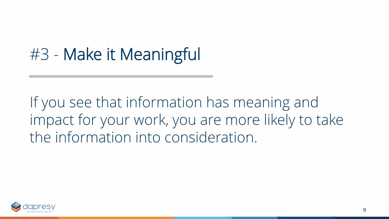
#3 - Make it Meaningful
If you see that information has meaning and impact for your work, you are more likely to take the information into consideration.

10
Provide information that is directly related to your audience’s area of interest
Provide relevant information only
Carve out relationships visually by introducing infographics

11
#4 - Make it Actionable
If you grasp how the insights can improve your decision-making, you are more likely to use them.

12
Transform information into tangible insights that enable precise actions
Build the dashboard around concrete business questions and create guided pathways to insights

13
#5 - Make it Memorable
If you remember insights, you are more likely to act when the decision is required – even a month later.

14
Create a lasting impression so your audience remembers what is really important.

15
Want to learn more?
Visit our booth IG56 and see our dashboards in action
Or go to dapresy.com
and download our
latest e-book Impact

Thank You