Embed Size (px)
Citation preview

Compassion. Action. Change.
GRAPHIC STANDARDS GUIDE
DRAFT
GRAPHIC STANDARDS GUIDE
3 Overview
4 Tagline
6 Imagery
7 Identity Overview
8 CalMHSA Logo
10 Logo Usage
12 CalMHSA Logo Configurations
14 Color Palette
15 Typography
19 Design Samples
Contents
GRAPHIC STANDARDS GUIDE 3
The following pages contain detailed instructions and guidelines for implementing the California Mental Health Services Authority’s (CalMHSA) identity system in a variety of applications.
The purpose of this graphic standards guide is to add consistency to every level of printed communication. This consistency, over time, will provide staff, partners and the general public with a clear impression of who we are as each piece of communication relies upon and compliments the established image guidelines.
Consistency in the presentation of the CalMHSA brand will build stability and raise the level of recognition among our constituents, as well as in the community at large. Therefore, we ask our staff and partners to adhere to the standards in this guide to promote and support the brand. The strength of this system relies upon its consistent implementation. Do not hesitate to ask if there are any areas requiring further explanation.
For assistance please contact:
Ann CollentineProgram [email protected]
Overview
GRAPHIC STANDARDS GUIDE 4
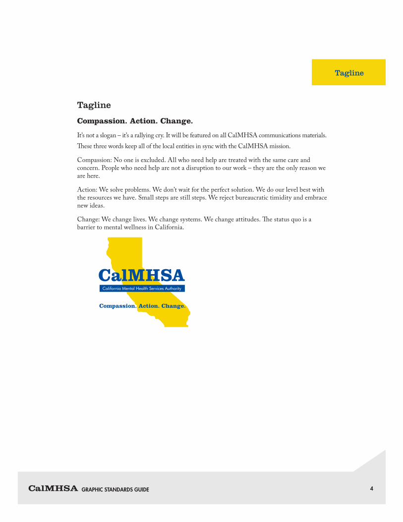
Tagline
Tagline
Compassion. Action. Change.
It’s not a slogan – it’s a rallying cry. It will be featured on all CalMHSA communications materials.These three words keep all of the local entities in sync with the CalMHSA mission.
Compassion: No one is excluded. All who need help are treated with the same care and concern. People who need help are not a disruption to our work – they are the only reason we are here.
Action: We solve problems. We don’t wait for the perfect solution. We do our level best with the resources we have. Small steps are still steps. We reject bureaucratic timidity and embrace new ideas.
Change: We change lives. We change systems. We change attitudes. The status quo is a barrier to mental wellness in California.
Compassion. Action. Change.
GRAPHIC STANDARDS GUIDE 5
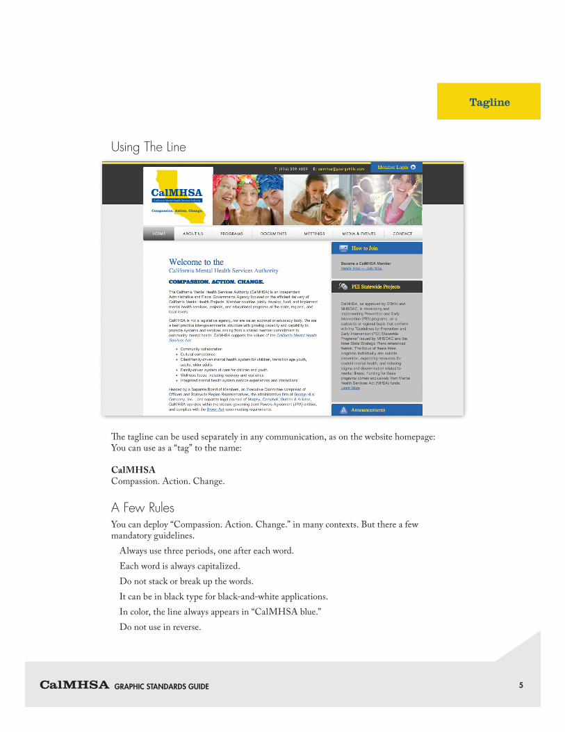
Using The Line
The tagline can be used separately in any communication, as on the website homepage:You can use as a “tag” to the name:
CalMHSACompassion. Action. Change.
A Few RulesYou can deploy “Compassion. Action. Change.” in many contexts. But there a few mandatory guidelines.
Always use three periods, one after each word.Each word is always capitalized.Do not stack or break up the words.It can be in black type for black-and-white applications.In color, the line always appears in “CalMHSA blue.”Do not use in reverse.
Tagline
COMPASSION. ACTION. CHANGE.
GRAPHIC STANDARDS GUIDE 6
Imagery
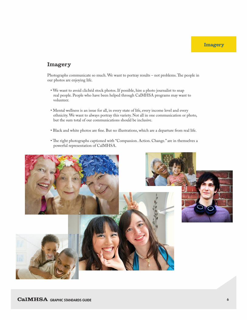
Imagery
Photographs communicate so much. We want to portray results – not problems. The people in our photos are enjoying life.
• We want to avoid clichéd stock photos. If possible, hire a photo journalist to snap real people. People who have been helped through CalMHSA programs may want to volunteer.
• Mental wellness is an issue for all, in every state of life, every income level and every ethnicity. We want to always portray this variety. Not all in one communication or photo, but the sum total of our communications should be inclusive.
• Black and white photos are fine. But no illustrations, which are a departure from real life.
• The right photographs captioned with “Compassion. Action. Change.” are in themselves a powerful representation of CalMHSA.

GRAPHIC STANDARDS GUIDE 7
Identity Overview
The look and feel of the CalMHSA identity is determined by three basic components: the CalMHSA logo, color and typography. These elements have been carefully designed and selected to project a coherent, pleasing and meaningful brand to our audiences. Your careful application throughout a wide variety of media will ensure the continued strength of our visual presence.
The LogoThe identity is comprised of a graphic with logotype overlay. Do not attempt to recreate the logo. No alterations should be made to the identity outside the indications of this guide. Proper and improper use of the CalMHSA logo are discussed later in this guide.
ColorThe colors of the CalMHSA logo are PMS 286 (blue) and PMS 116 (yellow). The logo may also be reproduced in black and white. For specifics on color usage see the CalMHSA Logo Configurations (p. 15) and Color Palette (p. 17) sections of this guide.
TypographyA small library of fonts has been selected to support the CalMHSA identity in a variety of applications. For the specific typeface and appropriate uses see Typography (p. 18).
Compassion. Action. Change.
Identity Overview
GRAPHIC STANDARDS GUIDE 8
CalMHSA Logo
The CalMHSA logo’s construction and placement is of the utmost importance in maintaining the integrity of its expression. The space around the logo is just as important as the logo itself. Please review this guide to find the best way to support CalMHSA’s brand within your application. By adhering to all of the principles that govern its usage, we ensure that the logo remains a powerful and consistent representation of the organization.
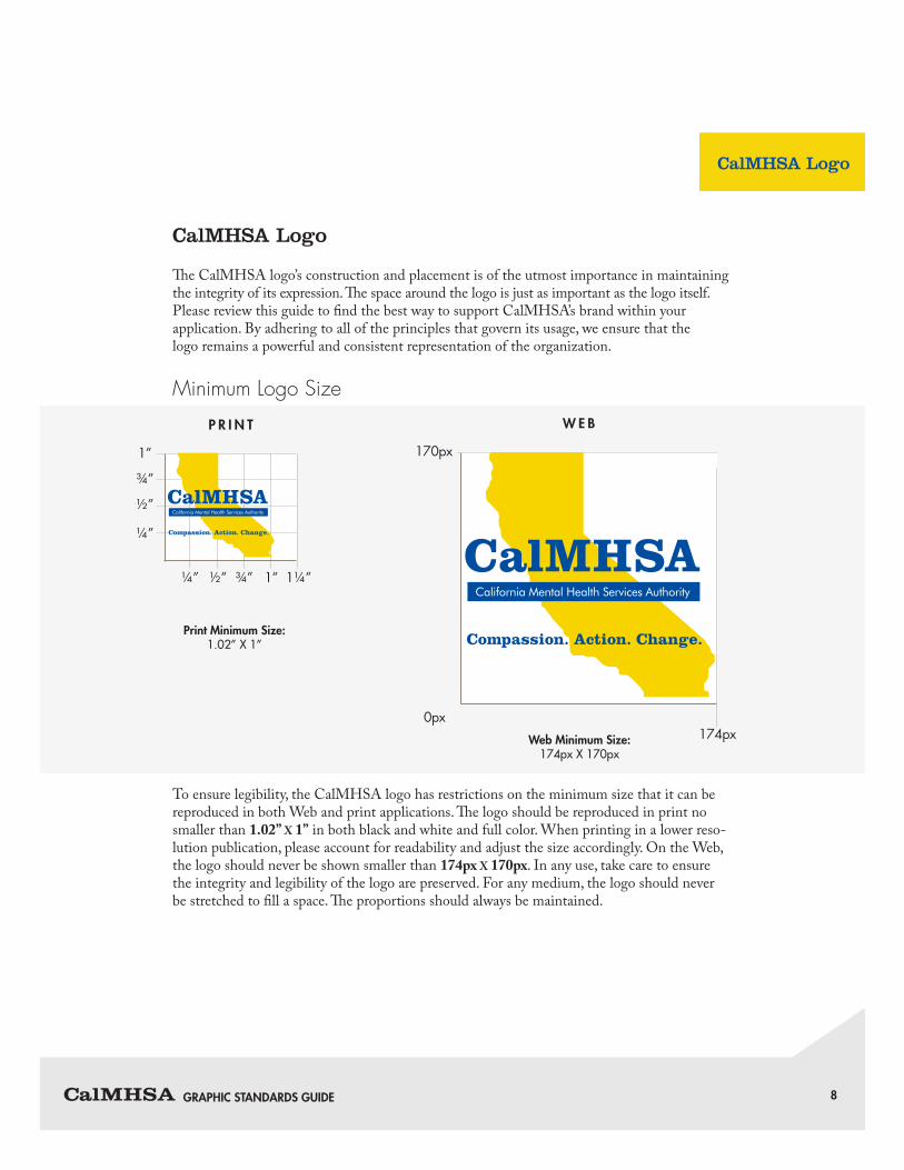
Minimum Logo Size
To ensure legibility, the CalMHSA logo has restrictions on the minimum size that it can be reproduced in both Web and print applications. The logo should be reproduced in print no smaller than 1.02” X 1” in both black and white and full color. When printing in a lower reso-lution publication, please account for readability and adjust the size accordingly. On the Web, the logo should never be shown smaller than 174px X 170px. In any use, take care to ensure the integrity and legibility of the logo are preserved. For any medium, the logo should never be stretched to fill a space. The proportions should always be maintained.
Compassion. Action. Change.
174px0px
170px
Web Minimum Size:174px X 170px
W E B
¼”
¼”
½”
½”
¾”
¾”
1”
1” 1¼”
Print Minimum Size:1.02” X 1”
P R I N T
Compassion. Action. Change.
CalMHSA Logo
GRAPHIC STANDARDS GUIDE 9
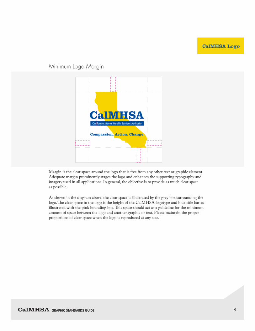
Minimum Logo Margin
Margin is the clear space around the logo that is free from any other text or graphic element. Adequate margin prominently stages the logo and enhances the supporting typography and imagery used in all applications. In general, the objective is to provide as much clear space as possible.
As shown in the diagram above, the clear space is illustrated by the grey box surrounding the logo. The clear space in the logo is the height of the CalMHSA logotype and blue title bar as illustrated with the pink bounding box. This space should act as a guideline for the minimum amount of space between the logo and another graphic or text. Please maintain the proper proportions of clear space when the logo is reproduced at any size.
Compassion. Action. Change.
CalMHSA Logo
GRAPHIC STANDARDS GUIDE 10
Logo Usage
The CalMHSA logo’s construction and placement is of the utmost importance in maintaining the integrity of its expression. The space around the logo is just as important as the logo itself. Please review this guide to find the best way to support CalMHSA’s brand within your application. By adhering to all of the principles that govern its usage, we ensure that our logo remains a powerful and consistent representation of our organization.
The success of the CalMHSA identity depends largely on the consistent application of the logo. The logo is shown in its entirety. The logo may not be broken up or any part of its elements removed.
Logo Usage
When Used with Other Program LogosWhen the CalMHSA logo is used along with other program logos, the proportions of each logo should be equal in size and color use needs to be consistant. For example, if one logo is in color, than all the logos being used need to be in color. Do not mix grayscale and color logos. Do not make one logo larger than the others.

GRAPHIC STANDARDS GUIDE 11
Samples of MisuseThese samples demonstrate how the CalMHSA logo should never appear. Always use the official reproduction artwork provided by the organization. Do not attempt to recreate.
D O N O T C H A N G E L AY O U T O F T H E L O G O .
D O N O T R O TAT E T H E L O G O .
D O N O T C H A N G E O R S WA P C O L O R S .
D O N O T M O V E T H E P O S I T I O N O F T H E G R A P H I C O R T E X T.
D O N O T D I S T O R T T H E L O G O .
D O N O T R E M O V E A N Y PA R T O F T H E L O G O .
Logo Usage
1 2
3 4
5 6
GRAPHIC STANDARDS GUIDE 12
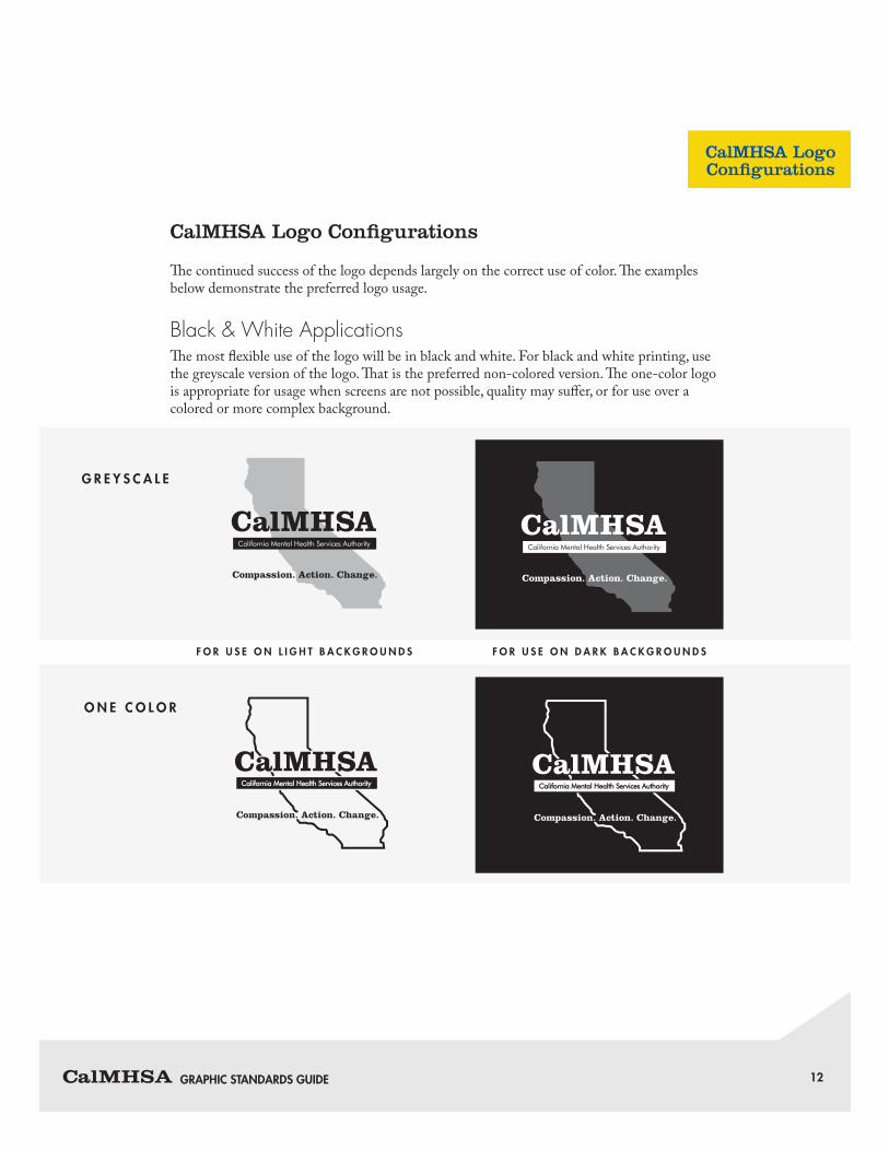
CalMHSA Logo Configurations
The continued success of the logo depends largely on the correct use of color. The examples below demonstrate the preferred logo usage.
Black & White ApplicationsThe most flexible use of the logo will be in black and white. For black and white printing, use the greyscale version of the logo. That is the preferred non-colored version. The one-color logo is appropriate for usage when screens are not possible, quality may suffer, or for use over a colored or more complex background.
G R E Y S C A L E
O N E C O L O R
F O R U S E O N L I G H T B A C K G R O U N D S F O R U S E O N D A R K B A C K G R O U N D S
CalMHSA LogoConfigurations
GRAPHIC STANDARDS GUIDE 13
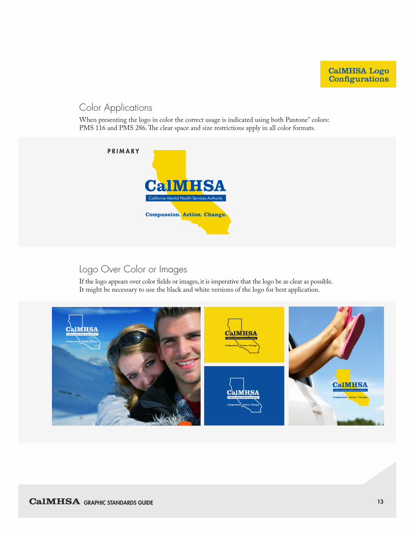
Color ApplicationsWhen presenting the logo in color the correct usage is indicated using both Pantone® colors: PMS 116 and PMS 286. The clear space and size restrictions apply in all color formats.
Logo Over Color or ImagesIf the logo appears over color fields or images, it is imperative that the logo be as clear as possible. It might be necessary to use the black and white versions of the logo for best application.
P R I M A R Y
Compassion. Action. Change.
Compassion. Action. Change.
CalMHSA LogoConfigurations
GRAPHIC STANDARDS GUIDE 14
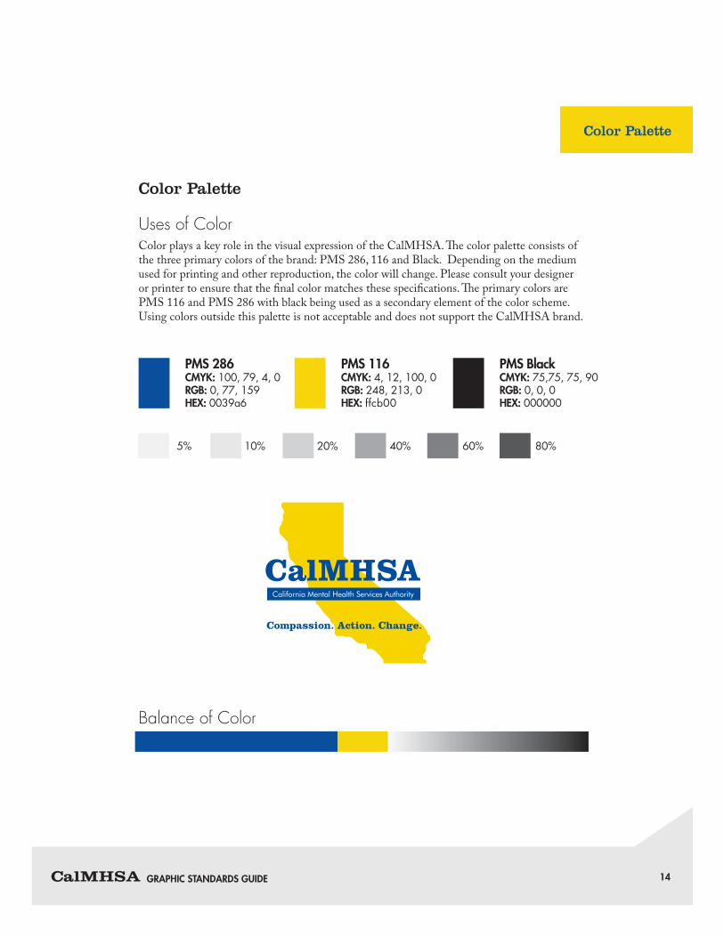
Color Palette
Uses of ColorColor plays a key role in the visual expression of the CalMHSA. The color palette consists of the three primary colors of the brand: PMS 286, 116 and Black. Depending on the medium used for printing and other reproduction, the color will change. Please consult your designer or printer to ensure that the final color matches these specifications. The primary colors are PMS 116 and PMS 286 with black being used as a secondary element of the color scheme. Using colors outside this palette is not acceptable and does not support the CalMHSA brand.
Balance of Color
PMS 286CMYK: 100, 79, 4, 0RGB: 0, 77, 159HEX: 0039a6
5% 10% 20% 40% 60% 80%
Compassion. Action. Change.
PMS 116CMYK: 4, 12, 100, 0RGB: 248, 213, 0HEX: ffcb00
PMS BlackCMYK: 75,75, 75, 90RGB: 0, 0, 0HEX: 000000
Color Palette
GRAPHIC STANDARDS GUIDE 15
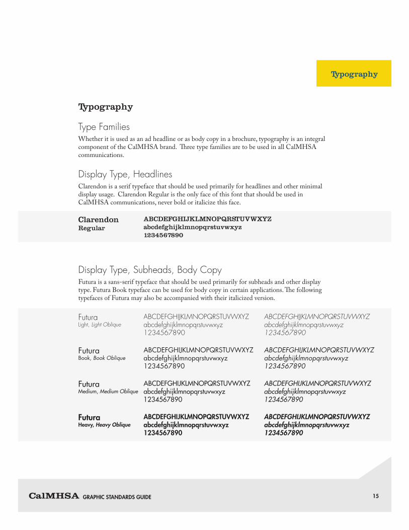
Typography
Type FamiliesWhether it is used as an ad headline or as body copy in a brochure, typography is an integral component of the CalMHSA brand. Three type families are to be used in all CalMHSA communications.
Display Type, HeadlinesClarendon is a serif typeface that should be used primarily for headlines and other minimal display usage. Clarendon Regular is the only face of this font that should be used in CalMHSA communications, never bold or italicize this face.
Display Type, Subheads, Body CopyFutura is a sans-serif typeface that should be used primarily for subheads and other display type. Futura Book typeface can be used for body copy in certain applications. The following typefaces of Futura may also be accompanied with their italicized version.
ABCDEFGHIJKLMNOPQRSTUVWXYZabcdefghijklmnopqrstuvwxyz1234567890
ABCDEFGHIJKLMNOPQRSTUVWXYZ abcdefghijklmnopqrstuvwxyz 1234567890
ABCDEFGHIJKLMNOPQRSTUVWXYZ abcdefghijklmnopqrstuvwxyz 1234567890
ABCDEFGHIJKLMNOPQRSTUVWXYZabcdefghijklmnopqrstuvwxyz1234567890
ABCDEFGHIJKLMNOPQRSTUVWXYZabcdefghijklmnopqrstuvwxyz1234567890
ABCDEFGHIJKLMNOPQRSTUVWXYZabcdefghijklmnopqrstuvwxyz1234567890
ABCDEFGHIJKLMNOPQRSTUVWXYZabcdefghijklmnopqrstuvwxyz1234567890
ABCDEFGHIJKLMNOPQRSTUVWXYZabcdefghijklmnopqrstuvwxyz1234567890
ABCDEFGHIJKLMNOPQRSTUVWXYZabcdefghijklmnopqrstuvwxyz1234567890
Clarendon Regular
Futura Light, Light Oblique
Futura Book, Book Oblique
Futura Medium, Medium Oblique
Futura Heavy, Heavy Oblique
Typography

GRAPHIC STANDARDS GUIDE 16
Body CopyAdobe Caslon Pro is a serif typeface that should be used primarily for body copy and minimal display type. Adobe Caslon Pro is a classic and flexible face for use in all general correspondence. This is the preferred face for all letters written on CalMHSA letterhead, as well as in forms, emails and any other uses of body copy. The face is available in Regular, Italic, Semibold, Semibold Italic, Bold and Bold Italic, providing the user with great flexibility for various applications.
ABCDEFGHIJKLMNOPQRSTUVWXYZ abcdefghijklmnopqrstuvwxyz 1234567890
ABCDEFGHIJKLMNOPQRSTUVWXYZ abcdefghijklmnopqrstuvwxyz 1234567890
ABCDEFGHIJKLMNOPQRSTUVWXYZabcdefghijklmnopqrstuvwxyz1234567890
ABCDEFGHIJKLMNOPQRSTUVWXYZabcdefghijklmnopqrstuvwxyz1234567890
ABCDEFGHIJKLMNOPQRSTUVWXYZabcdefghijklmnopqrstuvwxyz1234567890
ABCDEFGHIJKLMNOPQRSTUVWXYZabcdefghijklmnopqrstuvwxyz1234567890
Adobe Caslon Pro Regular, Italic
Adobe Caslon Pro Semibold, Semibold Italic
Adobe Caslon Pro Bold, Bold Italic
Typography
GRAPHIC STANDARDS GUIDE 17
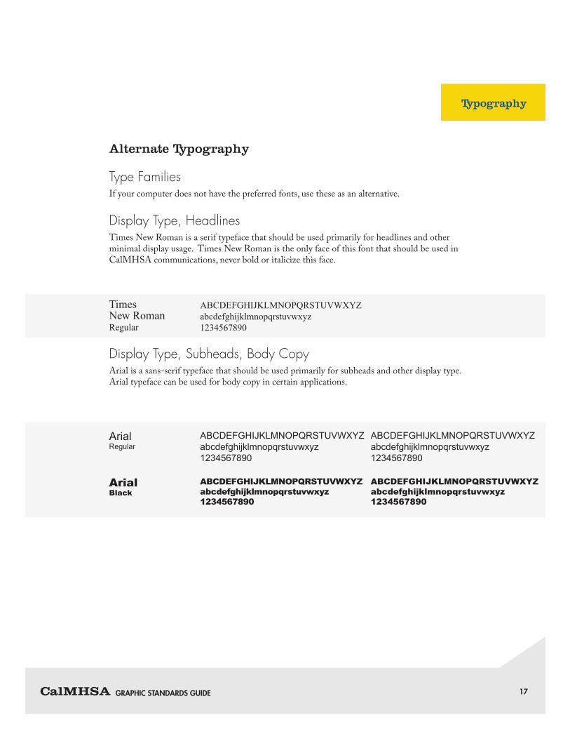
Alternate Typography
Type FamiliesIf your computer does not have the preferred fonts, use these as an alternative.
Display Type, HeadlinesTimes New Roman is a serif typeface that should be used primarily for headlines and other minimal display usage. Times New Roman is the only face of this font that should be used in CalMHSA communications, never bold or italicize this face.
Display Type, Subheads, Body CopyArial is a sans-serif typeface that should be used primarily for subheads and other display type. Arial typeface can be used for body copy in certain applications.
ABCDEFGHIJKLMNOPQRSTUVWXYZabcdefghijklmnopqrstuvwxyz1234567890
ABCDEFGHIJKLMNOPQRSTUVWXYZ abcdefghijklmnopqrstuvwxyz 1234567890
ABCDEFGHIJKLMNOPQRSTUVWXYZ abcdefghijklmnopqrstuvwxyz 1234567890
ABCDEFGHIJKLMNOPQRSTUVWXYZabcdefghijklmnopqrstuvwxyz1234567890
ABCDEFGHIJKLMNOPQRSTUVWXYZabcdefghijklmnopqrstuvwxyz1234567890
Times New Roman Regular
Arial Regular
Arial Black
Typography

GRAPHIC STANDARDS GUIDE 18
Body CopyGeorgia is a serif typeface that should be used primarily for body copy and minimal display type. Georgia is a classic and flexible face for use in all general correspondence. This is the preferred face for all letters written on CalMHSA letterhead, as well as in forms, emails and any other uses of body copy. The face is available in Regular, Italic, Bold and Bold Italic, providing the user with great flexibility for various applications.
ABCDEFGHIJKLMNOPQRSTUVWXYZ abcdefghijklmnopqrstuvwxyz 1234567890
ABCDEFGHIJKLMNOPQRSTUVWXYZ abcdefghijklmnopqrstuvwxyz 1234567890
ABCDEFGHIJKLMNOPQRSTUVWXYZabcdefghijklmnopqrstuvwxyz1234567890
ABCDEFGHIJKLMNOPQRSTUVWXYZabcdefghijklmnopqrstuvwxyz1234567890
GeorgiaRegular, Italic
Georgia Bold, Bold Italic
Typography
GRAPHIC STANDARDS GUIDE 19
Design Samples
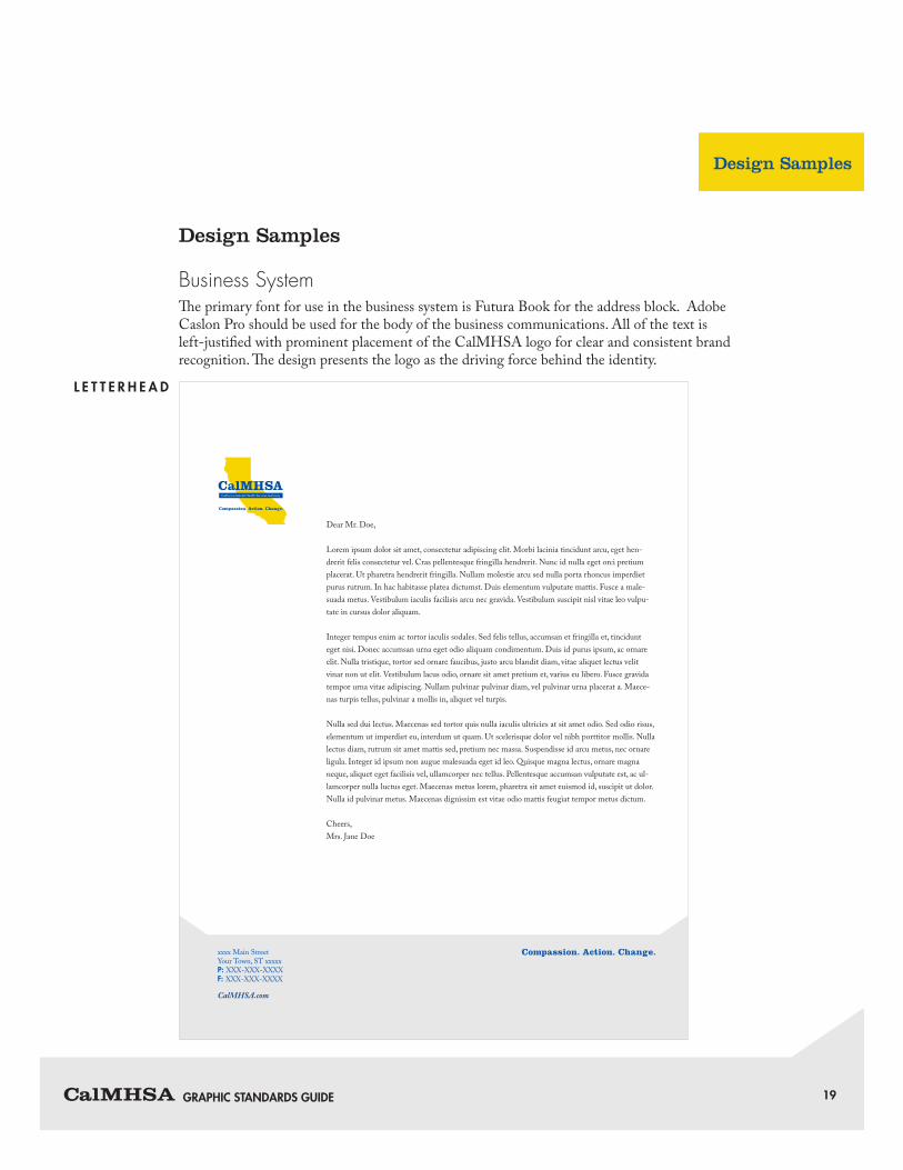
Business SystemThe primary font for use in the business system is Futura Book for the address block. Adobe Caslon Pro should be used for the body of the business communications. All of the text is left-justified with prominent placement of the CalMHSA logo for clear and consistent brand recognition. The design presents the logo as the driving force behind the identity.
Compassion. Action. Change.
xxxx Main StreetYour Town, ST xxxxxP: XXX-XXX-XXXXF: XXX-XXX-XXXX
CalMHSA.com
Dear Mr. Doe,
Lorem ipsum dolor sit amet, consectetur adipiscing elit. Morbi lacinia tincidunt arcu, eget hen-drerit felis consectetur vel. Cras pellentesque fringilla hendrerit. Nunc id nulla eget orci pretium placerat. Ut pharetra hendrerit fringilla. Nullam molestie arcu sed nulla porta rhoncus imperdiet purus rutrum. In hac habitasse platea dictumst. Duis elementum vulputate mattis. Fusce a male-suada metus. Vestibulum iaculis facilisis arcu nec gravida. Vestibulum suscipit nisl vitae leo vulpu-tate in cursus dolor aliquam.
Integer tempus enim ac tortor iaculis sodales. Sed felis tellus, accumsan et fringilla et, tincidunt eget nisi. Donec accumsan urna eget odio aliquam condimentum. Duis id purus ipsum, ac ornare elit. Nulla tristique, tortor sed ornare faucibus, justo arcu blandit diam, vitae aliquet lectus velit vinar non ut elit. Vestibulum lacus odio, ornare sit amet pretium et, varius eu libero. Fusce gravida tempor urna vitae adipiscing. Nullam pulvinar pulvinar diam, vel pulvinar urna placerat a. Maece-nas turpis tellus, pulvinar a mollis in, aliquet vel turpis.
Nulla sed dui lectus. Maecenas sed tortor quis nulla iaculis ultricies at sit amet odio. Sed odio risus, elementum ut imperdiet eu, interdum ut quam. Ut scelerisque dolor vel nibh porttitor mollis. Nulla lectus diam, rutrum sit amet mattis sed, pretium nec massa. Suspendisse id arcu metus, nec ornare ligula. Integer id ipsum non augue malesuada eget id leo. Quisque magna lectus, ornare magna neque, aliquet eget facilisis vel, ullamcorper nec tellus. Pellentesque accumsan vulputate est, ac ul-lamcorper nulla luctus eget. Maecenas metus lorem, pharetra sit amet euismod id, suscipit ut dolor. Nulla id pulvinar metus. Maecenas dignissim est vitae odio mattis feugiat tempor metus dictum.
Cheers,Mrs. Jane Doe
Design Samples
L E T T E R H E A D
Compassion. Action. Change.

GRAPHIC STANDARDS GUIDE 20
John Doe, Title
xxxx Main StreetYour Town, ST xxxxxP: XXX-XXX-XXXXF: XXX-XXX-XXXX
CalMHSA.com
Compassion. Action. Change.
xxxx Main StreetYour Town, ST xxxxx
Design Samples
First [email protected]
CalMHSA.org
B U S I N E S S C A R D
# 1 0 E N V E L O P E
E M A I L S I G N AT U R E
12 pt Futura Medium10 pt Adobe Caslon Pro Italic 10 pt Adobe Caslon Pro Regular
1 pt rule (14 characters long)10 pt Adobe Caslon Pro Bold Italic
Color: BlueRGB 0, 77, 159
Compassion. Action. Change.
CalMHSA.org